
Effect of Displaying Uncertainty in Line and Bar Charts
Presentation and Interpretation
D. Jan van der Laan, Edwin de Jonge and Jessica Solcer
Statistics Netherlands, Henri Faasdreef 312, The Hague, The Netherlands
Keywords:
Uncertainty Visualization.
Abstract:
This paper investigates the effect of presenting uncertainty in bar and line charts in trend-finding and compari-
son tasks. Different options for presenting uncertainty were investigated in a carefully designed user evaluation
that was conducted on statistical analysts, policy makers and journalists (N = 108). The study includes explor-
ing several options for displaying interval estimates with and without point estimates in line and bar charts. We
discuss the results for all options and derive presentation suggestions. Our study indicates that showing un-
certainty improves the validity of user statements and that data without point estimates have different display
needs.
1 INTRODUCTION
In scientific publications experimental results are usu-
ally presented with a measure of uncertainty. Sur-
prisingly, this is seldom the case for statistical fig-
ures presented by national statistical offices and other
statistical agencies. When a measure of uncertainty
is known, it is usually not presented or little com-
municated. (Manski, 2014) argues that by not pre-
senting uncertainty measures users may think that the
data is error-free or that they conjecture wrong error
magnitudes. Census data, inflation, GDP are shown
in tables, bar and line charts without an indication
of their precision, although important policy deci-
sions are made based on these data (Reckhow, 1994;
Spiegelhalter et al., 2011). Setting aside that calculat-
ing uncertainty measures for these figures may not be
trivial, the supposed difficulty in their interpretation
by the general public is one of the reasons why un-
certainty is often omitted from the presentations. In
this paper we investigate methods for presenting un-
certainty in the most used chart types, namely bar and
line charts (Playfair, 1786), explore variants that dis-
play interval estimates and investigate their effect on
user interpretation of these graphs.
We use a simple but very general definition of un-
certainty. A statistic y has at least an interval estimate,
meaning that its value lies with high probability (e.g.
95%) between a lower bound ˆy
l
and upper bound ˆy
u
:
ˆy
l
≤ y ≤ ˆy
u
y may have in addition a point estimate ˆy, which indi-
cates its most probable value. We make no further as-
sumptions on the shape of the probability distribution
within the interval [ˆy
l
, ˆy
u
] or the source of its uncer-
tainty. It could be a classic 95% confidence interval
based on a normally distributed estimator, it may be
a Bayesian credible interval, but it might also include
estimates of systematic and measurement errors. Be-
cause the probability distribution (pdf) within the in-
terval is unknown and can be asymmetric, the visual
representation of the uncertainty interval should en-
code equal probability within the interval, with the
(possible) exception of ˆy. Furthermore, the chart type
should preferably also work in case the point esti-
mate ˆy is not known and only the interval estimate
[ ˆy
l
, ˆy
u
] is available. The reason for this requirement
is that some statistical methods provide good interval
estimates without point estimates. For example some
statistical disclosure control methods that are used to
protect the privacy of respondents in a survey gener-
ate intervals without point estimate.
There is a limited body of literature on visualiza-
tion methods for uncertainty especially for basic chart
types such as the line and bar chart. A number of pa-
pers give an overview of possible encodings for un-
certainty (Thomson et al., 2005; Pang et al., 1997;
Pang et al., 2001; Griethe and Schumann, 2006; Gri-
ethe and Schumann, 2005; Zuk, 2008). However,
most are applied to more complex graphs such as
3D scientific visualizations and maps. Several papers
stress the importance of visualizing uncertainty and
give examples and guidelines. (Spiegelhalter et al.,
225
van der Laan D., de Jonge E. and Solcer J..
Effect of Displaying Uncertainty in Line and Bar Charts - Presentation and Interpretation.
DOI: 10.5220/0005300702250232
In Proceedings of the 6th International Conference on Information Visualization Theory and Applications (IVAPP-2015), pages 225-232
ISBN: 978-989-758-088-8
Copyright
c
2015 SCITEPRESS (Science and Technology Publications, Lda.)
2011) focuses on the interpretation of probabilistic
uncertainty in predictions and introduces methods
such as shading and uncertainty areas to visualize this
uncertainty. (Cleveland and McGill, 1984; Cleveland
and McGill, 1985) show how statistical data can be
analysed using visualizations. They introduce error
bars in scatter plots and bar charts. (Cumming and
Finch, 2005) argue that confidence intervals should
be used more and offers guidelines for using and dis-
playing confidence intervalsto increase their readabil-
ity. (Olston and Mackinlay, 2002) differentiate be-
tween statistical and bounded uncertainty providing
different visualization methods for these types of un-
certainty. They reserve error bars for statistical uncer-
tainty and use area graphs for bounded uncertainty.
The paper visualizes multiple chart types with both
types of uncertainty, but does not test these in a user
study. (Sanyal et al., 2009) provides a user study on
the effectiveness of uncertainty on 1D and 2D data.
The paper compares error bars, glyph sizes, glyph
color and surface color for displaying uncertainty in
dense data and tests for correctness of the size of the
uncertainty using an evaluation framework. The fo-
cus is on assessing uncertainty and letting users find
regions of high uncertainty. Noteworthy is that er-
ror bars performed worse than the other methods that
were tested. (Tak et al., 2013) describe research on
the perception of uncertainty by non-experts, which
is similar to our paper, but test user certainty to assess
the likelihood of several ˆys given different uncertainty
visualizations. Most papers, except the last two do
not include an user study to test the effectiveness of
their suggestions. More importantly, while previous
papers describe how uncertainty should be displayed
so a user can accurately assess the amount of uncer-
tainty (e.g. [ ˆy
l
, ˆy
u
]) or the likelihood of ˆy, we focus on
the effect of displaying uncertainty on the interpreta-
tion and usage of the line and bar chart.
2 CHARTS
We discuss below the methods used to show uncer-
tainty intervals in line and bar charts. For bar charts it
is necessary to introduce new variants, as the existing
method is not suitable for showing interval estimates
without a point estimate.
2.1 Line Chart
A line chart connects individual data points with a
line. Almost always the order in which they are con-
nected is time, so line charts are most often used to
display time series, with time projected on the x-axis
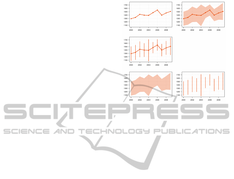
Figure 1: 5 types of line charts: line, ribbon + line, error bar
+ line, ribbon, error bar.
and the statistic y of interest on the y-axis. In this pa-
per we restrict the use of a line chart to time series and
assume that its intention is to reveal change of statistic
y over a period of time [t
1
,t
n
]: is the phenomenon vi-
sualized in the chart increasing, stable or decreasing?
Each ˆy(t
i
) in a line chart is uncertain so the (overall)
change of the statistic can be noisy and difficult to as-
sess. Since reading and interpreting this trend is its
most important goal, we focus on how displaying the
uncertainty interval affects the perception of the trend
in the series ˆy(t
1
), · ·· , ˆy(t
n
). It is assumed that the un-
certainty in a line chart is one dimensional: it is in the
ˆy but not in time.
There are two popular ways of displaying uncer-
tain data in line charts: error bars and ribbon charts
(see figure 1). Error bars are used mostly in aca-
demic literature while ribbon charts were popular-
ized in weather forecasts. Both error bars and rib-
bon charts are able to show the uncertainty interval
and optionally the point estimate. Note that line chart
types ribbon and error bar allow for investigating the
perception of interval estimates when no point esti-
mate is available.
2.2 Bar Chart
Bar charts plot data points by encoding the estimated
value ˆy
i
for group i in the length of bar b
i
. Bar charts
are typically used for comparing the absolute values
of ˆy between different groups. Is the population of
Berlin larger than that of Paris? Is drug a more ef-
fective than drug b? Comparing absolute values ex-
plains for a large part the popularity of the bar chart
in the sciences and communication of official statis-
IVAPP2015-InternationalConferenceonInformationVisualizationTheoryandApplications
226

tics. We focus on the more difficult and ambiguous
task of comparing absolute values when uncertainty
intervals are displayed. For displaying uncertainty in-
tervals [ ˆy
i,l
, ˆy
i,u
] in a bar chart almost always the error
bar is used. Research (Sanyal et al., 2009) indicates
that error bars are not the most readable type of charts.
A bar chart with error bars has several perceptual
problems. First, the bar chart puts a visual focus on
the point estimate. Since ˆy is encoded in a color filled
rectangle and [ ˆy
l
, ˆy
u
] in a error bar, the point estimate
ˆy visually dominates. Second, the upper bound ˆy
u
gets
more visual attention than the lower bound ˆy
l
. Since
the bar has a color fill and the background of a chart
usually has no fill, the contrast of the upper and lower
boundary of the error bar is very different. Finally,
in a bar chart it is not possible to present an interval
estimate without a point estimate.
There are some other visualization methods found
in literature used for comparing distributions, most
notably the boxplot (Tukey, 1977), dotplot, stripchart
(Cleveland, 1993) and violin plot (Hintze and Nelson,
1998). However, none of these is very suitable for
presenting statistical estimates. All of them except
the dotplot present distributions and some display in-
dividual values, which is not possible for statistical
estimates. Furthermore, none of them use length to
encode the absolute value of the data as they focus on
the differences between the measured points.
To account for the perceptual problems of the
bar chart we created two alternatives: the chisel and
cigarette chart. These had the following require-
ments:
• They should be closely related to the bar chart:
use length for encoding ˆy
• They should put the same visual attention on
[ ˆy
l
, ˆy
u
] and ˆy.
• They should support plotting [ˆy
l
, ˆy
u
] without ˆy.
• Lower bound ˆy
l
and upper bound ˆy
u
should be
equally visible.
2.2.1 The Chisel and Cigarette Chart
The chisel and cigarette chart are based on the box-
plot in which the most probable interval is visualized
using a box and the most likely value with a line in
this box. For the chisel and cigarette chart, this was
translated into drawing a rectangle from ˆy
l
to ˆy
u
and a
(optional) line at ˆy. The charts differ in the way the to-
tal length of the bar is drawn. Both variants are shown
in figure 2.
The chisel chart is a bar chart in which [ ˆy
l
, ˆy
u
] is
encoded with a rectangle with increased width, hence
its name. The optional ˆy is drawn with a line. The
Point estimate Upper boundLower boundOrigin
Lower bound Point estimate Upper boundOrigin
Cigarette without point estimate
Cigarette with point estimate
Chisel with point estimate
Chisel without point estimate
Bar plot with point estimate
Lower bound Point estimate Upper boundOrigin
Figure 2: Chisel, cigarette and bar chart.
chisel chart shows the uncertainty interval clearly and
allows to omit ˆy. However it is to be expected that
since the chisel chart is very similar to a bar chart that
visual attention is drawn to the upper boundary. A
user might think that the upper bound ˆy
b
is the point
estimate ˆy.
The cigarette chart is a bar chart in which [ ˆy
l
, ˆy
u
]
is encoded with a lighter colored rectangle enclosed
in the bar. The optional ˆy is indicated with a line. The
cigarette chart shows the uncertainty interval clearly
and allows to omit ˆy. A possible disadvantage of the
cigarette chart is the same as for the chisel chart: a
user could mistake the upper bound for the point esti-
mate.
3 METHODS
3.1 Experimental Design
The goal of present research is to investigate how dis-
playing uncertainty effects a user to find a trend in a
line chart and how it affects the comparison of values
in a bar chart. Note that it was not investigated how
well [ˆy
l
, ˆy
u
] could be estimated by the respondents or
how certain a user is about reading a value from a
chart.
The variants of the two chart types were tested us-
ing an online survey in which respondents were asked
to perform regular tasks with these charts. The target
population of the research are statistical analysts, pol-
icy makers and journalists. Therefore, crowd source
testing (Heer and Bostock, 2010) was not a viable op-
tion for the survey. The large number of questions
also made this difficult. Therefore the charts were
tested using an online survey. Emails were sent to
a list of contacts we had in government departments,
government institutes and some data journalists with
the request to pass the message on to relevant con-
tacts. The survey started with a few background ques-
tions (education level, type of occupation, previous
experience) which were followed by five groups of
questions on line graphs, six groups of questions on
EffectofDisplayingUncertaintyinLineandBarCharts-PresentationandInterpretation
227

bar charts and finally two groups of questions on pref-
erences.
As line charts are used to show trends, respon-
dents were asked if there was a trend visible in the
graph, which they could answer in five certainty lev-
els. Bar charts are used to compare figures and read
figures from the graphs. Therefore, respondents were
asked to do just that and again could answer this in 5
different certainty degrees.
Five possible types of line charts were tested: line,
ribbon + line, error bar + line, ribbon and error bar.
To test the difference in perception for each type, five
data sets were created. Two of these have no trend
(high and low uncertainty), two have an increasing
trend (high and low uncertainty) and one has an de-
crease followed by an increase. To exclude learning
effects each respondent was randomly assigned to one
of five groups that was shown each line chart type
with a different data set. Therefore, the respondents
of each group saw all 5 line chart types and all data
sets, but each group was shown a different combina-
tion of the two. Furthermore, each line chart type was
tested with each of the data sets which should largely
correct for any effects of the data set on the interpre-
tation of the graph.
The same design was used for the bar chart. There,
six types were tested: each of the three types (er-
ror bar, cigarette and chisel) with and without show-
ing the point estimate. Therefore, six data sets were
generated and the respondents were divided into six
groups.
For the line chart, each respondent was asked 4
different questions for each chart type. In the first
question the respondent had to answer if the trend
was increasing or not (5 possible answers), the sec-
ond was to assess if value ˆy
t
was probably higher than
ˆy
t−1
in previous year, the third to approve a detailed
statement on the data and the last one was to read a
specific value from the chart. The last three questions
should be straightforward for a normal line chart, but
were included to see how they perform in the other
chart types.
For the bar chart, the respondents were asked four
different questions for each graph. In the first three
the respondents had to answer for a combination of
two bars which of the two was higher (5 possible an-
swers). In the final question they were asked to read
a figure from the graph (open answer). The last ques-
tion was included to assess the chisel and cigarette
plot and to find out what users do when point estimate
ˆy is not available.
Table 1: Response overview.
Complete responses 108
Professional background
Policy maker 7 6.5%
Researcher 50 46.3%
Statistician 33 30.6%
Other 18 16.7%
Education level
Higher professional or lower 17 15.7%
University level 69 63.9%
Phd 22 20.4%
Incomplete responses 98
3.2 Analysis
Most of the answer categories could be recoded to di-
chotomous variables. In principle the design should
be balanced. However, because of the large num-
ber of combinations of graphs and data sets (25 and
36 for the line and bar charts respectively) and the
limited number of respondents, some unbalance re-
mained. Therefore, in order to test for a significant ef-
fect of the graph type on the results a logistics model
was fitted that predicts the variable under investiga-
tion. This model contained the interaction of the data
set and the question (in case of multiple questions),
and the graph type. A significant effect of graph type
indicates that even when correcting for question and
data set, the graph type has an effect on the response.
For brevity, the results of the logistic regressions
are not presented in the results section. Only tables
and figures are presented. However, significant effects
(following from the logistic model) are indicated in
the text. A confidence of 95% was used for the tests.
4 RESULTS
When the survey was closed, we had 108 complete
responses of which 78 came from our statistical of-
fice. We had quite a large number of incomplete sur-
veys (98) which were not used in the final analysis.
The probable reason for this is that respondents found
the survey harder to fill in than anticipated (it was
pre-tested on a few colleagues) and, therefore, took
more time than anticipated. Table 1 gives an overview
of the response and shows that the respondents are
highly educated and most have a job in which they
work regularly with data: our target group.
4.1 Line Chart
In the first question for each of the line charts the re-
spondentshad to assess if the trend in the chart was in-
creasing with the following answer options: certainly
IVAPP2015-InternationalConferenceonInformationVisualizationTheoryandApplications
228

Table 3: Types of given answers when asked to read a value from a line chart with uncertainty (estimated standard deviations
omitted for space).
Answer With line Without line Tot.
type Line Ribbon Error bar Ribbon Error bar
No answer 1% 2% 3% 4% 4% 3%
Point 90% 65% 54% 51% 51% 62%
LB 0% 0% 0% 0% 0% 0%
Point+LB 1% 0% 0% 0% 0% 0%
UB 0% 0% 0% 0% 0% 0%
Point+UB 0% 0% 0% 0% 0% 0%
LB+UB 6% 19% 28% 37% 37% 25%
Point+LB+UB 3% 15% 16% 8% 7% 10%
Total 108 108 108 108 108 540
Table 2: Correctness of trend assessment and correctness of
assessment of year to year change in line charts for different
chart types. In brackets the estimated standard deviation.
Type Answers Trend Change
Correct Correct
Ribbon + line 90 88.9(3.3)% 67.6(4.9)%
Error bar 83 85.5(3.9)% 82.4(4.2)%
Error bar + line 82 81.7(4.3)% 66.7(5.2)%
Ribbon 86 80.2(4.3)% 79.6(4.4)%
Line 91 74.7(4.6)% 67.6(4.9)%
increasing, probably increasing, probably not increas-
ing, certainly not increasing. The answers of the re-
spondents on the different types were compared with
the statistical significance of the trends in the data.
Data sets 1 and 2 had no significant trend but data
sets 3 and 4 did have a trend. Data set 5 had a de-
crease followed by an increase and was excluded in
the analysis of this question. The answers of the re-
spondents were split into two variables: correctness
and certainty. An answer is considered correct when
the respondent sees an increase when there is a sig-
nificant trend and seeing no increase when there is no
increase. An answer is considered certain when an an-
swer category is chosen without the word ’probably’
in it. As discussed in section 3.2, a logistic regression
regression was applied to test for significance in both
correctness and certainty.
The results for correctness (table 2) show that
line without indication of uncertainty scores lowest
on correctness. The ribbon + line chart scores best,
which may be due to its frequent use in media. Re-
markable is that error bar is second and scores con-
siderately better than the other options, including rib-
bon. Error bar may emphasize the uncertainty in the
value leading to better assessment of the significance
of the trend, while in other options the direction of the
line or ribbon may influence user perception.
Unsurprisingly respondents get more uncertain in
their answers for chart types where uncertainty is
shown and even more cautious when no line is shown.
For error bar this is most clear and statistically signif-
icant (p < 0.001).
In the second question respondents had to answer
whether y(t
i
) was probably higher than y(t
i−1
), with
two answer options: ‘Yes’ or ‘No’”. Their answers
were recoded in correct and incorrect: when the un-
certainty interval of y(t
i
) overlapped more than 50%
with the uncertainty interval of y(t
i−1
) (or vice versa),
the correct answer for each question was considered
‘No’ and ‘Yes’ otherwise. Notice that this correctness
criterion could be unfair to line, since that chart does
not show uncertainty intervals. However since the
time series contained noise, respondents were aware
that the values of the line were not exact. Furthermore
in ambiguous cases line might induce a more clear de-
cision. The criterion stresses the point that users need
an indication of uncertainty for a valid reading of a
line chart. The correctness of the answers for year to
year change over all the data is shown in table 2.
The scores show two groups: with and without
point estimate (i.e. line). The figure indicates that
in general adding a line deteriorates the validity as-
sessment of a year to year change. It should be noted
that the scores for the different line charts differ over
the data sets and in specific cases (e.g. data set 2),
line scores among the best. This can be explained by
the fact that in those cases the overlap of the uncer-
tainty intervals was considerable but less than 50%.
Line shows a clear change, expressed in the slope of
the line segment [ ˆy
t−1
, ˆy
t
], while the interval methods
are more ambiguous to the respondents.
In the final question respondents had to read a
value from the graph which was an open question.
Although for charts with a point estimate (i.e. line)
this should be straightforward, for the charts without
line this task is ambiguous. The answers ranged from
“don’t know”, to point estimates, the upper and lower
bound and a combination thereof.
Table 3 shows the percentages in answers for each
line chart type and answer type. Most respondents
EffectofDisplayingUncertaintyinLineandBarCharts-PresentationandInterpretation
229

give a point estimate (62%) even for the chart types
that do not have a line. These participants derive a
point estimate by choosing a value in the middle of the
interval. Apparently most users expect that this ques-
tion has one and only one answer, namely the point
estimate. In 25% of the answers an interval is given,
which is the second most popular answer type. While
this answer is natural for chart types without line, it
is remarkable for the other charts, such as line. Those
respondents are more confident in giving an interval
estimation and chose to exclude the point estimate.
10% of the answers try to give a complete answer:
both point and interval estimates.
A final question in the line chart part of the survey
was a preference question. Which of the line chart
types did the respondents prefer? The answers to this
question shown in table 4. When a line is shown, most
users prefer ribbon + line, when no line is shown, they
prefer error bar.
Table 4: Preferences for each of line chart types depending
on whether or not the line is shown. In brackets the esti-
mated standard deviation.
Chart type With line Without line
Line chart 24 22.2(4.0)% - -
Ribbon chart 56 51.9(4.8)% 45 41.7(4.7)%
Error bar 28 25.9(4.2)% 63 58.3(4.7)%
4.2 Bar Chart
In the first three questions for each bar chart, the re-
spondents were asked to compare two bars to each
other with answer options: A is larger than B, A is
probably larger than B, they are approximately equal,
B is probably larger than A, B is larger than A. After-
wards the answers have been ordered in such a way
that the point estimate of B is always larger than that
of A. Figure 3 shows the distribution of the answers
of the respondents.
Since ˆy
B
is always larger than ˆy
A
, the answer cat-
egories ‘A is (probably) larger than B’ are wrong.
The answer ‘approximately equal’ was also consid-
ered wrong when the confidence intervals of the two
bars do no overlap. The figure shows that number
of wrong answers are larger when no point estimates
are shown, especially for the error bars. Tests con-
firmed both effects as significant. The figure further-
more shows that the answer category ‘approximately
equal’ is more frequently chosen when the point es-
timate is not shown. It is less frequently chosen for
the cigarette chart. Users seem to be more confident
when ˆy is shown especially for the cigarette chart.
In the final question respondents were asked to
Err.b.
Chisel
Cigarette
Err.b. w/o point Chisel w/o point
Cig. w/o point
A
Prob A
Approx equal
Prob B
B
Figure 3: Distribution of answers when comparing bars for
each of the bar chart types.
read information from the table with the following
question: ‘According to you, what is the turnover
in [X]?’ The respondent had a input box where they
could type in their answers. These answers were then
recoded into three variables: the lower bound, the
upper point and the point estimate. Each of these
variables were left missing when missing from the
answer. Therefore, for an answer containing only a
point estimate only the point estimate is coded, the
lower and upper bound are coded missing.
Table 5 shows the types of answers given by the
respondents. Most respondents (approx. 60%) only
give a point estimate even for the graphs that do not
show a point estimate. However, for these graph types
this number is slightly lower. Also, a large num-
ber of respondents (approx. 30%) only give a lower
and upper bound. This number is slightly higher for
the graph types that do not show the point estimate.
The differences between the different graph types
are small and except for the aforementioned slightly
smaller number of point estimates for the graph types
without point estimate, other differences (probability
of lower bound, upper bound, no answer) are not sig-
nificant.
Figure 4 shows the distribution of the point esti-
mates given by the respondents. The true values of
the point estimates and lower and upper bounds are
shown by the vertical lines. Each column of graphs
shows the distribution for one data set for the differ-
ent types of graphs investigated. The first thing that
can be noted from the figure is that the answers of the
respondents are influenced by the position of the tick
marks. For example in the third data set (third column
in the figure) the true point estimate is 16.6. Since this
is between the tick marks 15 and 20, respondents have
to interpolate and values of 16 and 17 are reported.
As was mentioned earlier, when the point estimate
is not shown most respondents will still report a point
estimate. When doing so, they will report a value that
IVAPP2015-InternationalConferenceonInformationVisualizationTheoryandApplications
230

Table 5: Types of answers given when asked to read a bar chart showing uncertainty (estimated standard deviations omitted
for space).
Answer With point estimate Without point estimate Tot.
type Err.b. Chis. Cig. Err.b. Chis. Cig.
No answer 2% 6% 3% 5% 6% 6% 5%
Point 59% 66% 63% 59% 58% 56% 60%
LB 2% 0% 0% 0% 0% 0% 0%
Point+LB 0% 1% 1% 1% 0% 0% 0%
UB 0% 0% 0% 0% 0% 0% 0%
Point+UB 0% 1% 0% 0% 0% 0% 0%
LB+UB 31% 22% 24% 30% 31% 33% 28%
Point+LB+UB 6% 5% 9% 6% 5% 4% 6%
Total 108 108 108 108 108 108 648
is midway between the lower bound and upper bound,
i.e. they assume symmetric confidence intervals al-
though in practice this need not be the case. Further-
more, when the point estimate is not shown there is
a group of respondents that give the lower bound as
point estimate for the graph using error bars. This
results in a significantly lower point estimate for this
graph type.
The data from figure 4 was recoded to show
whether the answer was closest to the lower bound,
point value, center of the confidence interval, upper
bound. When answer is exactly midway between the
lower bound and point estimate or between the point
estimate and the center, it is assumed that the respon-
dent tried to give the value of the point estimate. This
data can be used to test the effects visible in the fig-
ure. These tests were performed using separate lo-
gistic regressions for each of the four categories. In
all models except for the upper bound the effect of
the type of graph was significant. A number of ob-
servations can be drawn from these results. First, re-
spondents give more correct answers for cigarette and
chisel chart compared to error bars. When confronted
with a bar graph with error bars respondents seem to
have a tendency to give the center of the confidence
interval as point estimate. The reason for this is un-
clear. Second, when the point estimates are not avail-
able respondents give the center of the confidence in-
terval as their estimate except for the error bars where
they give the lower bound as their estimate. Finally,
respondents hardly ever give the upper bound as es-
timate. Even for the cigarette and chisel chart where
this was expected.
Finally, respondents were asked which of the chart
types was clearest to them. Table 6 shows the prefer-
ences of the respondents. When the point estimate is
shown most respondents prefer the bar chart with er-
ror bars. When point estimates are not available this
changes to the cigarette chart. Surprisingly, in this
Table 6: Preferences for each of graph types depending on
whether or not the point estimate is shown. In brackets the
estimated standard deviation.
Graph type With point Without point
estimate estimate
Bar chart 70 64.8(4.6)% 38 35.2(4.6)%
Chisel chart 8 7.4(2.5)% 23 21.3(3.9)%
Cigarette chart 30 27.8(4.3)% 47 43.5(4.8)%
case the bar chart is still preferred by many respon-
dents, even though this user study shows that many of
them have trouble interpreting it. The chisel chart is
less preferred in both cases.
5 CONCLUSIONS
We found that showing uncertainty in line charts im-
proves the validity of the statements users make on
the depicted data. When omitting the display of un-
certainty, respondents are overconfident in spotting a
trend, even though the increase is not statistically sig-
nificant. They are more cautious when a line chart
contains an indication of its uncertainty. When a point
estimate ˆy is available and shown, a ribbon+line chart
scores best in our test. However when ˆy is not avail-
able, error bar without a line generates the most accu-
rate user statements. Error bars are to be preferred for
interval estimates. When a point estimate ˆy is shown
most users prefer the regular bar chart with error bars
over the new chisel and cigarette charts. However,
these last two chart types score slightly better in the
task of comparing two bars in length. When data does
not contain a point estimate, most users prefer the
cigarette chart. The results also show that the data
in a bar chart with error bars without point estimate is
often wrongly interpreted. There are no differences in
interpretation between the chisel chart and cigarette
chart. Most important to us, against common opin-
EffectofDisplayingUncertaintyinLineandBarCharts-PresentationandInterpretation
231
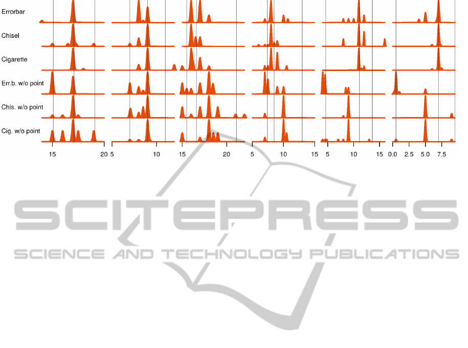
Figure 4: Density plots of the answers given by the respondents for the position of the point estimate for each of the data
sets (columns) and bar chart types (rows). The true lower bound, point estimate and upper bound are indicated by the vertical
lines. The tick marks correspond to the tick marks shown to the respondents.
ion, is that users of official government statistics ap-
preciate the appearance of uncertainty intervals and
are able to interpret graphs showing uncertainty. This
opens up the possibility to start publishing uncertainty
for more output tables as presentation of this extra in-
formation is possible in a usable way.
REFERENCES
Cleveland, W. and McGill, R. (1984). Graphical perception:
Theory, experimentation, and application to the devel-
opment of graphical methods. Journal of the Ameri-
can Statistical Association, 79(387):531–554.
Cleveland, W. and McGill, R. (1985). Graphical perception
and graphical methods for analyzing scientific data.
Science, 229(4716):828–833.
Cleveland, W. S. (1993). Visualizing Data, volume 36 of
O’Reilly Series. Hobart Press.
Cumming, G. and Finch, S. (2005). Inference by eye: con-
fidence intervals and how to read pictures of data. The
American psychologist, 60(2):170–80.
Griethe, H. and Schumann, H. (2005). Visualizing Un-
certainty for Improved Decision Making. Computer,
pages 3–4.
Griethe, H. and Schumann, H. (2006). The visualization
of uncertain data: Methods and problems. In SimVis,
pages 143–156.
Heer, J. and Bostock, M. (2010). Crowdsourcing graphical
perception: using mechanical turk to assess visualiza-
tion design. In Proceedings of the SIGCHI Conference
on Human Factors in Computing Systems, pages 203–
212. ACM.
Hintze, J. and Nelson, R. (1998). Violin plots: a box plot-
density trace synergism. The American Statistician,
52(2):181–184.
Manski, C. F. (2014). Communicating uncertainty in of-
ficial economic statistics. Technical report, National
Bureau of Economic Research.
Olston, C. and Mackinlay, J. (2002). Visualizing data with
bounded uncertainty. pages 37–40.
Pang, A. et al. (2001). Visualizing uncertainty in geo-spatial
data. In Proceedings of the Workshop on the Intersec-
tions between Geospatial Information and Informa-
tion Technology, pages 1–14.
Pang, A. T., Wittenbrink, C. M., and Lodha, S. K. (1997).
Approaches to uncertainty visualization. The Visual
Computer, 13(8):370–390.
Playfair, W. (1786). The Commercial and Political At-
las: Representing, by Means of Stained Copper-Plate
Charts, the Progress of the Commerce, Revenues, Ex-
penditure and Debts of England during the Whole of
the Eighteenth Century.
Reckhow, K. H. (1994). Importance of scientific uncer-
tainty in decision making. Environmental Manage-
ment, 18(2):161–166.
Sanyal, J., Zhang, S., Bhattacharya, G., Amburn, P., and
Moorhead, R. J. (2009). A user study to compare
four uncertainty visualization methods for 1D and 2D
datasets. IEEE transactions on visualization and com-
puter graphics, 15(6):1209–18.
Spiegelhalter, D., Pearson, M., and Short, I. (2011). Visual-
izing uncertainty about the future. Science (New York,
N.Y.), 333(6048):1393–400.
Tak, S., Toet, A., and van Erp, J. (2013). The perception of
visual uncertainty representation by non-experts.
Thomson, J., Hetzler, E., Maceachren, A., and Gahegan, M.
(2005). A Typology for Visualizing Uncertainty. In
Visualization and Data Analysis, volume 5669, pages
146–157.
Tukey, J. W. (1977). Exploratory Data Analysis, volume 2
of Quantitative applications in the social sciences.
Addison-Wesley.
Zuk, T. D. (2008). Visualizing Uncertainty. PhD thesis.
IVAPP2015-InternationalConferenceonInformationVisualizationTheoryandApplications
232
