
Towards Highly Affine Visualizations of Consumption Data from
Buildings
Matthias Nielsen and Kaj Grønbæk
Department of Computer Science, Aarhus University, Aabogade, Aarhus, Denmark
Keywords: Interactive Visual Analytics, Spatial Visualizations, Energy Management Support.
Abstract: This paper presents a novel approach AffinityViz to visualize live and aggregated consumption data from
multistory buildings. The objective of the approach is to provide a generic but high affinity relation between
real buildings’ spatial layouts and the consumption data visualizations. Current approaches come short on
maintaining such affinity. This implies an avoidable cognitive load on users such as energy managers and
facility managers who need to monitor consumption and make decisions from consumption data. To
alleviate this we have transformed three conventional types of visualizations into highly affine
visualizations lowering the cognitive load for users. The contributions are: 1) Development of the
AffinityViz techniques featuring three generic designs of highly affine visualizations of consumption data.
2) Comparison of the affine visualizations with the conventional visualizations. 3) Initial evaluation of the
AffinityViz designs by expert users on real world data. Finally, the design challenges of AffinityViz are
discussed, including prospects for AffinityViz as a future tool for visual analysis of data from buildings.
1 INTRODUCTION
The research behind this paper took place in the
EcoSense project (EcoSense, 2014), where we study
human energy related behavior in a dorm living lab
equipped with multiple sensors continually
monitoring consumption data from the dorm
apartments (Blunck, H., et. al., 2013).
As energy and resource consumption data in
large buildings is collected at an increasingly
granulated level from sensors in modern buildings, it
is necessary to rethink how such data is visualized.
Although existing types of visualizations are
technically capable of visualizing high granularity
consumption data from multistory buildings, novel
visualization techniques are needed to create
visualization that cater to a broader spectrum of
professionals wanting to analyze such data. This
applies to use cases where building administrators
need to analyze and understand patterns in
consumption to better understand requirements for
infrastructure revisions or building upgrades.
Another use case is interventionists (researchers,
administrators, or others) who want to launch
initiatives to lower consumption and therefore need
to understand which parts of the building, or which
tenants, are evident targets. This means that
professionals from a wide range of disciplines could
need to analyze buildings consumption data, and that
they need to analyze varying types of data, such as
consumption of water, electricity, district heating,
etc.
In the design of AffinityViz, we exploit that
many multistory buildings such as office buildings
and apartment buildings have a simple recurring
physical layout across office/apartment size and
floor plans, by rendering a simplified 3D layout
plotted with data points representing single units
(apartments or offices) in the building. This results
in a novel visualization technique that leverages user
understanding of visualized data by retaining a
building’s spatial layout.
The paper is structured as follows. First, we
describe related work on conventional visualization
techniques as well as current state of the art in
visualizations of consumption data from buildings.
Second, we discuss how conventional visualization
techniques can be adapted to become affine
visualizations as well as a more radical highly affine
visualization. Third, we elaborate on the design of
AffinityViz –in terms of current implementation as
well as envisioned enhancements. Fourth, we
elaborate on the implementation of the current
prototype and lessons learned from testing it with
facility managers. Finally, we discuss AffinityViz
247
Nielsen M. and Grønbæk K..
Towards Highly Affine Visualizations of Consumption Data from Buildings.
DOI: 10.5220/0005315102470255
In Proceedings of the 6th International Conference on Information Visualization Theory and Applications (IVAPP-2015), pages 247-255
ISBN: 978-989-758-088-8
Copyright
c
2015 SCITEPRESS (Science and Technology Publications, Lda.)

and future work on tools for visual analysis of
consumption data.
2 RELATED WORK
This review covers conventional visualization
techniques appropriate for visualizing consumption
data from multistory buildings, examples of usages
of 3D data representation in information
visualization, examples of state of the art in spatial
and volume-based visualization, examples of
academic work in energy consumption visualization,
and a related architecture concept.
Cluster based heat maps (Wilkinson, L., et. al.,
2009) visualizes data in a matrix using color to
represent data values. They have wide-ranging
applicability and excel in visualizing ordinal data
while retaining hierarchies in the data. Jacques
Bertin (Bertin, J., 1969) discusses the use of 3D
topographic reliefs to visualize data from nations or
regions in effect creating 3D cartograms. Reliefs are
extruded to represent data values of topographic
areas and the reliefs themselves serve as
contextualization.
Perspective visualization have been explored as
general information visualization interface technique
(Carpendale, M. S. T., et. al., 1995). They discuss
in-depth different ways of handling distortion of
graphs when visualizing data in three dimensions.
Wright (Wright, W., 1995) has pioneered 3D
information visualization for applications in capital
markets. Wright constructs 3D scenes, plotted with
abstract 3D geometrical objects, which users can
navigate and explore. Wright’s work builds upon the
3D user interface design paradigm, Information
Visualizer, developed by Robertson et. al.
(Robertson, 1993).
Power BI for Office 365 (Microsoft, 2014) is a
plugin visualization tool for Microsoft Excel that
supports overlays on 2D maps, viewing maps from
tilted angles, creating a 3D view, and plotting data
with a geospatial reference onto the map as 3D
histograms. Other general tools for data visualization
include Tableau (Tableau Software, 2014), a BI tool
creation of interactive visualizations and dashboards.
Data-Driven Documents (Bostock, M., et. al., 2011)
is a multipurpose JavaScript library for transforming
datasets into web browser DOM elements.
The New York City Energy Usage Map
(Howard, B., et. al., 2012) is an interactive map that
plots energy usage on block and lot level in New
York City, creating a high detail cartogram. Data is
visualized as polygons that are colored according to
energy usage in terms of kWh per m
2
. A
contemporary practice of consumption data is to
create an interactive visualization dashboard that
visualizes resource consumption data in faceted
views. Examples include Lucid’s BuildingOS and
Building Dashboard (Lucid, 2014) and Buildings
Alive (Buildings Alive, 2014), all products using
composition of visualizations to support visual
analysis of consumption data for various settings.
Cube Lease (Cube Cities, 2014) visualizes entire
floor plans or single leases superimposed onto
renderings of the shape of large multistory buildings.
South Korean studio randomwalks has proposed a
futuristic architectural concept, Data Formation
(randomwalks, 2009), which interconnects the
resource consumption of inhabitants in a tall rise
building with their physical habitat in order to create
a symbiotic relationship.
3 DATA ABOUT BUILDINGS
In section 2, we saw examples of data with a
geospatial reference to locations. But, we did not
find any that relate data to the spatial layout of
buildings. Visualizing data with a geospatial
reference in a layout adhering to the geospatial
reference, such as the topographic reliefs discussed
in (Bertin, J., 1967), is a commonly used technique.
It creates a direct relation between the data and the
location of its origin and uses a familiar spatial
layout of territories rather than abstract textual
descriptors and graphs. The same argument can be
applied to visualizations of consumption data from
large multistory buildings – by retaining the spatial
layout of a building in a visualization of data from
the building, we use a familiar layout and lessen the
cognitive load on the user. It is, however, not a
straightforward to retain the spatial layout of a
building when visualizing data from a building.
One approach is to model true to a building or its
shell and visualize data using overlays. However,
this would limit the visualization to the particular
building and limited its generalizability. Instead, we
propose the AffinityViz techniques (Figure 2, Figure
4, Figure 6) to adhere to a simple model that retains
the spatial layout of a building and is generalizable
across multistory buildings with a simple recurring
layout as well as it is implementable in
programming environments that can render visual
elements. Using simple geometric objects and
shapes in a 3D scene is similar to the Wright’s
approach (Wright, 1995), but in AffinityViz the
spatial layout of the scene is a familiar reference,
IVAPP2015-InternationalConferenceonInformationVisualizationTheoryandApplications
248
like the relief topographic (Bertin, J., 1967) only to a
building instead of a territory.
We have created three AffinityViz designs that
retain the spatial layout of a building through a
simplified model of the building. Each design
represents data differently, but derived from or
inspired by conventional visualization techniques.
Two are derived directly from cluster based heat
maps (Wilkinson, L., 2009) and area maps (Tableau
Software, 2014), and the third is inspired by bar
charts, but makes a radical leap beyond these. Below
we elaborate on the underlying assumptions of a
building and its consumption measurements before
we discuss and compare our designs to similar
conventional visualization techniques. The visual
representation in AffinityViz relies on that the real
building being analyzed has a comparatively simple
layout. This excludes certain types of large buildings
that have complex shapes such as the Sydney Opera
House and the Gherkin in London.
3.1 Data from Multistory Buildings
Consumption data in large buildings can be gauged
for a number of resources. For AffinityViz, we
assume consumption data is a continuously
measurable resource, such as electricity
consumption, gas usage, district heating, etc. The
resource consumption itself is assumed to take place
in a particular unit out many similar units – e.g. an
apartment or office. These units will have a spatially
significant location in the building in the form of a
[floor, room] symbolic coordinate. Floors, we can
assume, are ordinal, meaning that they are categories
of data that have an interrelationship that can be
ordered – i.e. floor 12 is a higher floor than floor 11.
Rooms, on the other hand, can only be assumed to
be discrete, meaning that may or may not follow a
spatially sequential order.
3.2 Foundations of AffinityViz
We have developed three AffinityViz designs –
AffinityHeat, AffinityArea, and AffinityBar – by
exploring strengths and shortcomings in
conventional visualization techniques applicable for
visualizing building consumption data. Here we
discuss our three AffinityViz designs in relation to
the founding conventional visualization techniques.
Legends are omitted to emphasize the visual
representations and all examples visualize the same
data ordered in the same way.
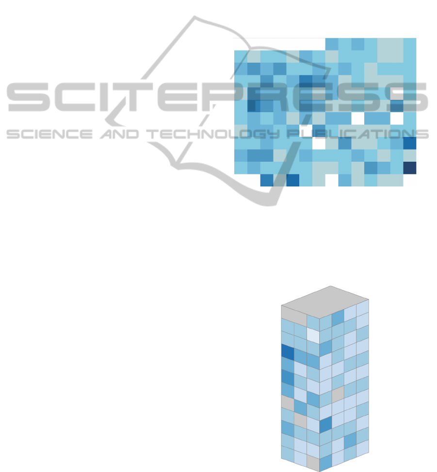
3.2.1 From Heat Map to AffinityHeat
The cluster based heat map (Wilkinson, L., et. al.,
2009) is used for visualization three dimensional
data in a uniformly distributed 2D matrix of fixed
size rectangles with color or color intensity for
conveying data values. Data points in a heat map can
vary greatly in granularity from high granularity
visualizations showing gradual transitions to low
granularity categorical steps between boxed data
points. Either way the layout of a heat map is
commonly a meaningful ordinal layout of e.g. geo
coordinate based data of high or low granularity.
Figure 1: Heat map of building consumption data. Created
with Tableau (Tableau Software, 2014).
The ordinal layout of the heat map makes it
suitable for visualization of resource consumption
data as it adapts effortlessly to a [floor, room] spatial
layout. A heat map visualizing consumption data
from a multistory building is shown in Figure 1.
Figure 2: AffinityHeat visualization of building
consumption data.
TowardsHighlyAffineVisualizationsofConsumptionDatafromBuildings
249

Represented in 2D a heat map is capable of showing
a complete overview of resource consumption data
across floors and rooms in a large building.
However, as the spatial layout of the real building is
converted to what is basically an ordinal 2D
coordinate system, the affinity between the
visualization and the real building is lowered
considerably. Although a complete overview might
be desired in some circumstances its abstraction
away from the real building’s layout introduces a
mental indirection as the user is required to mentally
map a data point in the heat map to an actual
apartment. This is depicted as AffinityHeat in Figure
2, with the same data and ordinal layout as Figure 1.
For infrequent users an abstract layout can imply
a recurrent comprehension cycle. For users who are
familiar with the actual building and its spatial
layout resource consumption data can be visualized
with considerably higher affinity by complying with
the ordinal layout of floors and rooms in three
dimensions instead of just two dimensions. This
means that an important property of the real building
is retained in the visualization, namely that data
points wrap the same way apartments do in the real
building. This means that just like one would expect,
on, e.g. a floor with 14 apartments, that apartment 2
and 3 are next to each other, so will apartment 14
and 1 be neighbors. In a cuboid building this will
conceal three of the six surfaces, but by making it
rotatable all surfaces can be viewed, though not at
the same time. The issue of lacking overview is
lessened by the heat map’s usage of color intensity
to visualize data, because outliers and patterns will
still be conspicuous. Only now, outliers or patterns
that are a product of their surface will become easier
to identify, such as whether surfaces with high solar
radiation has lower heat consumption.
By visualizing data on a rectangular cuboid
building structure, patterns in data points grouped by
surfaces of the building become more apparent, and
data points wrap the visualization in a manner true to
the real building. Thus, by sacrificing complete
overview, it is possible to create a direction relation
to the spatial layout of the real building, while also
retaining the visual properties of the heat map and
lower the cognitive load on the user.
3.2.2 From Area Map to AffinityArea
The area map utilizes its other visual dimension –
the 2D area of its data. This is appropriate in high
granularity heat maps, but for low granularity heat
maps, with relatively few data points, substituting
color or color intensity with area size frees up color
Figure 3: Area map of building consumption data. Created
with Tableau (Tableau Software, 2014).
as visual dimension to encode other properties of a
dataset. This is done in area map. An area map
version of a heat map is shown in Figure 3.
As in a heat map, outliers are easy to detect in an
area map because a considerably large or small areas
are conspicuous compared to similarly sized areas.
Comparison of two resembling areas, however,
becomes more difficult because a data value is
encoded as area, which is the product of two lengths
multiplied, meaning that two spatial dimensions
must be compared concurrently. Nevertheless,
freeing up color means that this visual dimension
can be used to encode surfaces of a large building by
grouping data using a distinct tone for each surface.
Figure 4: AffinityArea visualization of building
consumption data.
Although individual surfaces becomes
distinguishable a 2D representation of the area map
otherwise share similar drawbacks and advantages
IVAPP2015-InternationalConferenceonInformationVisualizationTheoryandApplications
250
as the 2D heat map; it adheres to the ordinal layout
of floors and rooms but introduces an abstract layout
in order to facilitate a complete overview of all data
points. Also like the heat map, the area map can be
visualized on a rectangular cuboid achieving high
affinity with the real building in terms of layout as
well as a layout of data points that wraps in a
manner true to the real building. This is visualized as
an AffinityArea visualization shown in Figure 4.
Here the color encoding from the 2D area has been
retained for consistency, but color can be used to
encode other data as area encodes consumption.
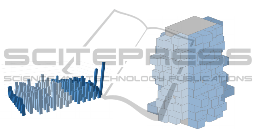
3.2.3 From Bar Charts to AffinityBar
Opposed to the previously discussed area map,
which uses area of data points to encode data values,
the bar chart uses area as a supplementary visual
encoding to its primary encoding – extend of bars.
Figure 5: 3D Bar chart of building consumption data.
Created with Microsoft Excel (Microsoft, 2014).
It does this by fixing one dimension of the area
of all bars changing only one dimension in order to
facilitate easy comparison of two bars. The bar
chart, however, adapts poorly to a multidimensional
layout because its layout only expands in a single
direction necessitating either multiple bar charts
with a similar layout or a recurring bar chart to
represent the [floor, room] layout of a large building.
The 3D bar chart in Figure 5 attempts to
facilitate an ordinal 2D layout, similar to the heat
map and the area map but uses height of bars for
encoding data, which both sacrifices a complete
overview of data points as well as potentially hiding
outliers in the lower range of data. Although the 3D
bar chart seems inferior, the heat map and the area
map in terms of its ability to represent layout and
encode data values, the principle of a volume based
bar chart is very useful when combined with a high
affinity spatial layout of a real building. By applying
the principle of a volume based bar chart to the
spatial layout of a real building encoded as a
rectangular cuboid, by fixing two dimension of each
apartment data point and extruding each apartment
in a single direction dependent on its orientation
relative to its position on the building. The result is
the AffinityBar design in Figure 6. The volume of a
data point is used to encode consumption and color
of units is retained for consistency. The volume of
the core structure can be used to encode resource
consumption that is not attributable to an apartment,
and thus serve as a common reference for the extent
of the extrusion of individual apartments. Because
the core structure differ in three dimensions, it can
be difficult to compare it to individual units because
they only expand in one dimension.
Figure 6: AffinityBar visualization of building
consumption data.
However, it does make it possible to derive
whether the apartments’ consumption is
comparatively large or small compared to the
common consumption by evaluating the extend of
the apartments’ extrusion. If the extrusion generally
has a long extend, then the common consumption is
low and if the extrusion generally has a short extend
then the common consumption is high. This function
is not easy to incorporate in the discussed
visualizations because a high common consumption
will drown out the size scale of either color or area.
4 QUALITIES OF AffinityViz
The basic construction is a simplified isometric 3D
model that utilizing a real building’s spatial layout
as layout in order to create a direct relation to that
building. In this section we discuss the key features
of AffinityViz – both common and unique features
for the designs (Figure 2, Figure 4, Figure 6).
TowardsHighlyAffineVisualizationsofConsumptionDatafromBuildings
251

4.1 Simplified 3D Model
AffinityViz’s usage of volume in a visual
representation is new in that it uses volume to
achieve physical affinity with the building whose
data is visualized. All three AffinityViz designs uses
the three dimensions of units of a multistory
building as the key layout feature. In the AffinityBar
(Figure 6) visualization, the volume created by the
three dimensions of units of a multistory building
are used as a relative measure for extent of the single
units. This is done by using common consumption
(e.g. elevator electricity usage) as reference for
calculating the volume (extent) of a single unit. If no
common consumption is available or it is not
appropriate to use, then the volume of a cubic unit is
set to the average consumption of all units.
AffinityViz is designed to achieve physical
affinity by mimicking the spatial layout of a
building, boiled down to its simplest rendition
retaining a common unit (apartment, office, etc.)
used for measurement. This enables AffinityViz to
retain an important spatial relationship between units
– namely that sequence of units is both sequential
and it wraps from highest to lowest. Meaning that
e.g. apartment 14 and 1 on a given floor are situated
next to each following the same rules that situate e.g.
apartment 3 and 4 next to each other.
For all three AffinityViz designs an issue arises
with corner units, which are located on a single
surface. It requires consideration from
implementation to implementation on which surface
to place it, and thus potentially hinders immediate
generalizability. Units that are only somewhat
similar such as offices combined to create a single
larger office, can be handled to some extent by
aggregating multiple units into a single larger
composite units. The orientation of the individual
unit, i.e. the surface on which the unit is situated,
reflect the orientation of the corresponding
apartment or office. Furthermore, the orientation of a
unit on the spatial layout helps to group units
directly related to surfaces of a real building as well
as distinguish between such groups because, a unit
appear distinctively different due to the isometric
perspective. The orientation is most pivotal in the
AffinityBar (Figure 6) design as a unit bar expands
and contracts along a single dimension only. In the
AffinityBar design, both the units’ data and the
common data is encoded with volume, but in
different ways. Where the spatial layout expands
into three dimensions, the volume of a single unit
always fixes two dimensions, and data expanding in
a single dimension. This can make units stand out it,
but it can also potentially hide units with low
extrusion, necessitating rotation to detect such units.
4.2 Low Cognitive Load
AffinityViz exhibits its true strength in the low
cognitive load it introduces to the user when
compared to the abstract layout of generic types of
visualizations. This is to a large degree owing to
properties elaborated in the previous three
subsections – the 3D layout, the simplified model,
and the 1D volume growth. Together, these three
properties establish a visualization representation
that has a high affinity with the real building, thus
using the real building as a direct frame of reference
because the visualization shares the same basic
structure as the real building.
The overload of three visual dimensions for both
layout and data representation lessens the need for
legends or labels describing the location of single
apartments or offices as often needed in generic
types of visualizations. This means that the user does
not need keep an ongoing reference to an abstract
coordinate system in order to place a unit in its
spatial context. Furthermore, as described
previously, the spatial layout of AffinityViz wraps
around the building in the same way as the
apartments or offices do around the real building.
This means that adjacent units in the real building
also are adjacent in AffinityViz’s layout. This makes
AffinityViz suitable for users with different
prerequisites on the analysis.
What AffinityViz does not support effectively,
as discussed in 3.2, is a complete overview of units
because units on two faces of the AffinityViz will be
hidden from view. This means that some analyses,
such as comparing units on opposite surfaces, will in
fact introduce a higher cognitive load because a user
will need to remember non-visible units.
Although AffinityViz is already contextualized
through its design as a simplified model of a real
building, more contextual information can be added
to create an even stronger relation to a real building.
For instance a compass can indicate the building’s
orientation relative to the corners of the world. Other
contextual enhancements could be to show solar
radiation to assist in analyzing differences in heat
and electricity consumption between surfaces with
differing solar radiation. Another enhancement
could be to add simple landmarks or infrastructure
elements such as adjacent roads or structures.
4.3 Visual Analysis
The 3D layout of AffinityViz provide a natural
IVAPP2015-InternationalConferenceonInformationVisualizationTheoryandApplications
252

segmentation of units into groups that adhere to the
real buildings structure thus the overview of the
location of units in the building is a part of
AffinityViz. This assists in analyzing patterns in
consumption either on entire sides of a building,
between different sides. Distilling apartments or
offices into uniform units, is essential in AffinityViz
to compare apartments or offices. The low-fidelity
of AffinityViz features single units to convey their
corresponding data because of the underlying
uniformity of units, as distortion of similar units
expresses variations in the underlying powerfully.
For the AffinityBar (Figure 6) design, it is only a
single dimension of a unit that is used as a measure
for visually comparing units. This makes it easy to
spot high outliers, or the lack thereof, than if units
were transformed in two or three dimensions
dependent based on the data. The differing
orientation, and dimension of growth, of a single
unit can cause visual indirection because units
adjacent to each other can grow in different
directions.
Currently AffinityViz is implemented with
horizontal rotation and mouseover tooltips as the
only interaction, but all three designs will benefit
greatly from rich interaction to support users to
create and rapidly test and rethink hypotheses. All
three AffinityViz designs can be utilized to visualize
flow of live data of replay of historic (user
controlled or not) by animating the data points over
time, though it would be most distinct in the
AffinityArea (Figure 4) and AffinityBar designs.
This is easily done in our current AffinityViz
implementation because employed SVG elements
are all animatable.
5 FROM DATA TO AffinityViz
AffinityViz was developed experimentally for a 12
story apartment building in Aarhus, Denmark.
5.1 Data Management
All data from the building is transmitted to and
stored using the Karibu architecture (Christensen, et.
al., 2014), from where it is retrieved and massaged
into a format appropriate for loading in a client web
browser and rendering with SVG elements.
Although the current implementation of AffinityViz
only visualizes electricity data from the building, it
is interchangeable with other data sources extracted
from the Karibu architecture, such as consumption
of district heating, hot/cold water, CO
2
, etc. This
will be subject to future work on AffinityViz
implementations as it matures into a more complete
tool for visual analysis.
5.2 Browser-based Visualization
AffinityViz is implemented using JavaScript to
create SVG elements in a browser DOM, which in
return renders the elements. As SVG elements are
2D, and therefore has no real concept of depth, there
are obstacles in creating a 3D visualization, as
angles and lengths of all shapes need to be
calculated manually. Although this therefore might
seem like a counterintuitive choice, opposed to e.g.
WebGL or standalone 3D modelling software,
rendering AffinityViz using SVGs enables us to take
advantage of the rich set of interactivity supported
by browsers. E.g. transitioning the extent of a single
unit becomes trivial, as many SVG elements are
animatable. Furthermore, the vast amount of existing
JavaScript libraries that operate on DOM elements
can be applied, and therefore this implementation of
AffinityViz becomes open for further development.
5.3 AffinityViz in Use
We have collaborated with facility managers and
conducted tests with the three versions of
AffinityViz from section 3.2. This has lead us to
identify central elements of the AffinityViz designs.
Overview of data represented in AffinityViz is
generally lower when compared to 2D counterparts
as two sides always are hidden from sight. But
AffinityBar handles this better than the AffinityHeat
and AffinityArea designs because extreme high
outliers are visible even if their corresponding
surface is not front-facing, as they extent greatly
from the building’s core. However, bars with little
extent can potentially be hidden from view by
neighboring bars with larger extent. We can alleviate
this by implementing full horizontal rotation,
because it enabled users to eventually view all bars.
But this still is a drawback compared to the 2D
visualizations discussed in section 3.2. Because the
layout of the three AffinityViz designs provides
spatial reference to the building, it supports queries
based on spatial position of units. This is due to units
are both grouped onto surfaces and has a significant
spatial location, reflecting their real location.
6 PROSPECTS OF AffinityViz
AffinityViz has both advantages and shortcomings,
TowardsHighlyAffineVisualizationsofConsumptionDatafromBuildings
253

i.e. the visualization technique that do not suit all
potentially use scenarios equally well.
Currently, AffinityViz relies on a simple
recurring floor plan of a rectangular circumference
of units multiplied by a number of floors. Although
many apartments and office buildings have such a
layout, AffinityViz’s generalizability is conditioned
since buildings with a more complex layouts may
not be suited for having consumption data visualized
using AffinityViz techniques. Furthermore, because
AffinityViz is 3D it is only suitable for visualizing
buildings where units are in the circumference of the
building.
Because the current implantation of AffinityViz
the 3D model is isometric, meaning that it is a
construction of parallelograms and thus has no
vanishing points, it can be argued to violate Tufte’s
Lie Factor (Tufte, 1983) because similar sized units
will be perceived as not similarly sized due the
perceived perspective of the visualization. Although
this can obfuscate precise comparison of far apart
units it does not hinder holistic exploratory analysis.
In section 3.2. we discussed differences in layout
properties the AffinityViz designs and the
conventional visualization techniques. Together with
the inferior overview of data in the AffinityViz
designs, as documented in the evaluation, this
illustrates that AffinityViz will not fully replace
related conventional visualization techniques in all
cases. Rather, it is a novel concept for visualizing
consumption data from buildings while retaining a
building’s spatial layout, thus lowering users’
cognitive load.
Next steps will be to mature the AffinityViz
visualization technique with a more advances set of
interactions, e.g. filtering of data and open access to
data sets. Such features can make it a tool usable a
wider range of professions. Also including users
with non-technical backgrounds, who have a desire
to analyze data, but not necessarily has prerequisites
for using conventional visualization tools. This will
be developed through continued professional
consultation with facility managers and experts from
other professions who are relevant to include.
7 CONCLUSIONS
This paper has introduced AffinityViz techniques for
making generalizable and higly affine visualizations
of consumption data from multistory buildings.
Three AffinityViz designs were implemented and
evaluated with expert users from the facility
management domain. The evaluations showed that
the AffinityBar technique is slightly better than the
AffinityHeat and AffinityArea techniques with
respect to minimizing the cognitive load when users
have to deal with different visual analytics tasks that
requires mapping of results to locations in buildings.
The implementation of the AffinityViz data supply
chain has been described for tall multistory
buildings. However, the techniques can be tailored
to work for most archetype building layouts of office
buildings, schools, and factories. The techniques are
under continual development with the goal of
generalizing to cover more building types and
supporting AffinityViz visualizations to integrate a
wide range of real world data.
ACKNOWLEDGEMENTS
The work was supported by Danish DSF grant no.
11-115331. We wish to thank our colleagues in the
EcoSense project for their contributions.
REFERENCES
Bertin, J, 1967. Semiology of Graphics. Esri Press. New
York, 2011 translation by William J. Berg.
Blunck, H., Bouvin, N. O., Entwistle, J., Grønbæk, K.,
Kjærgaard, M. B., Nielsen, M., Petersen, M. G.,
Rasmussen M. K., Wüstenberg. M., 2013. CEE:
Combining Collective Sensing and ethnographic
enquiries to Advance Means for Reducing
Environmental Footprints. In e-Energy’13. ACM. NY.
Bostock, M., Ogievetsky, V., Heer, J., 2011, D3: Data-
Driven Documents. In IEEE VCG Trans., Dec.
Buildings Alive, 2014. Buildings Alive.
http://www.buildingsalive.com/. Retrieved Oct. 2014.
Carpendale, M. S. T., Cowperthwaite, D. J., Fracchia, F.
D., Extending Distortien Viewing from 2D to 3D,
1995. In IEEE Computer Graphics and Applications.
July/Aug.
Christensen, H. B., Blunck, H., Bouvin, N. O., Brewer, R.
S., Wüstenberg, M., 2014. Karibu: A Flexible, Highly-
available, and Scalable Architecture for Urban Data
Collection. Poster at IoT in Urban Space 2014.
Cube Cities, 2014. http://cubecities.com/corp/. Oct. ’14.
EcoSense Project, 2014. http://ecosense.au.dk/. Oct. ’14.
Howard, B., Parshall, L., Thompson, J., Hammer, S.,
Dickinson, J., Modi, V., 2012. Spatial Distribution of
Urban Building Energy Consumption by End Use. In
Energy and Buildings. Feb. 2012.
Lucid, 2014. BuildingOS / Building Dashboard.
http://www.luciddesigngroup.com/. Oct. ’14.
Microsoft, 2014. Power BI for Office 365.
http://www.microsoft.com/en-us/powerbi/. Oct. ‘14.
Microsoft Excel, 2014. http://products.office.com/en-
us/excel. Oct. ’14.
IVAPP2015-InternationalConferenceonInformationVisualizationTheoryandApplications
254

randomwalks, 2009. Data Formation. http://randomwalks.
org/public_lab/randomwalkshome/data-formation-
architecture-proposal-2009/. Oct. ’14.
Robertson, G. G., Card, S. K., Mackinlay, J. D, 1993.
Information Visualization using 3D Interactive
Animation. In ACM Comm., Apr. 1993. New York.
Tableau Software, 2014. http://www.tableausoftware.
com/. Oct. 2014.
Tufte, E., R., 1983, The Visual Display of Quantitative
Information. Graphics Press. Cheshire. 2. edition,
2001.
Wilkinson, L., Friendly, M., 2009. The History of the
Cluster Heat Map. In The American Statistician.
Wright, W., 1995. Information Animation Applications in
the Capital Markets. In Proc. of InfoVis’95, IEEE
Symposium on Information Visualization. New York.
TowardsHighlyAffineVisualizationsofConsumptionDatafromBuildings
255
