
Visual Recommendations for Scientific and Cultural Content
Eduardo Veas, Belgin Mutlu, Cecilia di Sciascio, Gerwald Tschinkel and Vedran Sabol
Knowledge Visualization Group, Know Center GmbH, Inffeldgasse 13, Graz, Austria
Keywords:
Visual Recommendation, Recommender Systems, Automated Visualization of Recommendations.
Abstract:
Supporting individuals who lack experience or competence to evaluate an overwhelming amout of information
such as from cultural, scientific and educational content makes recommender system invaluable to cope with
the information overload problem. However, even recommended information scales up and users still need
to consider large number of items. Visualization takes a foreground role, letting the user explore possibly
interesting results. It leverages the high bandwidth of the human visual system to convey massive amounts of
information. This paper argues the need to automate the creation of visualizations for unstructured data adapt-
ing it to the user’s preferences. We describe a prototype solution, taking a radical approach considering both
grounded visual perception guidelines and personalized recommendations to suggest the proper visualization.
1 INTRODUCTION
The knowledge hidden within huge number of cul-
tural, scientific and educational repositories in the
Web is usually neither easy to recognize by the gen-
eral public nor to utilize in scientific and educational
processes. People have to navigate a multitude of li-
braries, repositories and databases searching relevant
content for their tasks. Finding the intended infor-
mation in this way in a huge and continuously grow-
ing information space is a pressing challenge. This
tedious, time-consuming task is currently one of the
main research topics in the context of information re-
trieval for digital libraries, for open educational and
cultural repositories. Novel techniques are needed to
represent, organize, and provide the content to users
in a seamless way (Schl¨otterer et al., 2014).
Two distinguished techniques support users in
searching through massive amounts of information:
recommender systems (RS) and visualization. RSs
help users choose the right items by filtering out ir-
relevant information and suggesting only the relevant
ones. The EU funded project EEXCESS
1
strives to
use the effectiveness of RSs to bring relevant cultural,
scientific and educationalcontent directly to the user’s
habitual environment (browser, content management
systems, mobile platforms) (Granitzer et al., 2013).
While recommending content, it is important to pro-
vide users with tools to effectively analyze the rec-
ommendation space. The usual recommendation list
1
EEXCESS project homepage: http://eexcess.eu/
quickly grows and becomes uncomprehensible with
many results. Our main goal is to augment user inter-
faces with visualizations, to assist user in analysis and
exploration of the recommendation space. Yet, de-
spite a broad understanding of visual perception and
how visual features are used for visual encoding, cre-
ating a visualization for arbitrary datasets remains an
expert task: choosing the right chart, choosing the
right data fields from the available ones for a meanig-
ful visualization require an understanding of the visu-
alization goal in terms of user needs and preferences.
This paper contends the need for adaptivemethods
that automatically create visualizations for unstruc-
tured datasets. We present a prototype visual recom-
mender with the distinguished feature, and contribu-
tion of the paper, that it automatically suggests ap-
propriate visualizations for the recommendations. As
recommendations are described with arbitrary fields,
proposing generic visualization is an inherent chal-
lenge. To deal with heterogeneous data formats we
rely on semantic technologies to: (a) define of data
models to semantically enrich an arbitrarily formated
recommendation list; (b) and to semantically describe
visualizations; (c) define mapping strategies between
those data models; and (d) algorithm to automatically
conduct such a mapping and suggest visualizations
for recommended items. Beyond a systematic ap-
proach to suggest appropriate charts and mappings we
propose methods to elicit and account for user prefer-
ences in the choice of the right visualization.
256
Veas E., Mutlu B., di Sciascio C., Tschinkel G. and Sabol V..
Visual Recommendations for Scientific and Cultural Content.
DOI: 10.5220/0005352802560261
In Proceedings of the 6th International Conference on Information Visualization Theory and Applications (IVAPP-2015), pages 256-261
ISBN: 978-989-758-088-8
Copyright
c
2015 SCITEPRESS (Science and Technology Publications, Lda.)
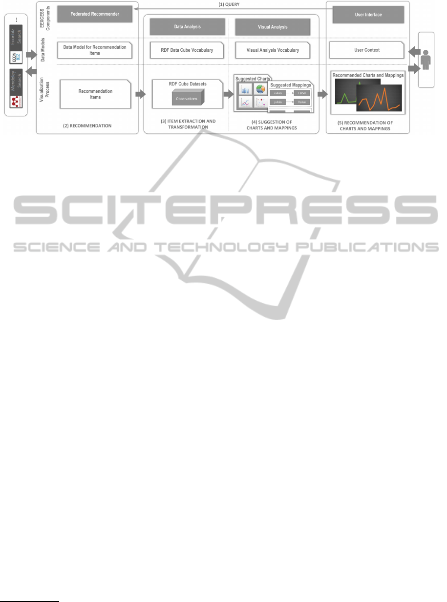
Figure 1: Visual recommender Workflow: workflow to generate visualizations from a recommendation list.
2 RELATED WORK
For a recommender system, presentation influences
the user experience (Konstan and Riedl, 2012), and
the overall effectiveness of a recommendation or a
list thereof (Swearingen and Sinha, 2001; Ricci et al.,
2011). The items in a large list of recommendations
will have a broadset of characteristics relating them to
the user model and expectations(Kagie et al., 2011).
Visualization provides a useful overview and interac-
tive method to explore the recommendation space.
Suggesting or recommending visualizations is a
relatively new research topic. Much as recom-
mender systems, visualization has grown as a re-
search field addressing the information overload prob-
lem, grounded on semiotics (Bertin, 1983), visual per-
ception (Mackinlay, 1986) and general visual encod-
ing principles (Munzner, 2011). The guidelines con-
tained in this broad body of research are mostly tar-
geted towards a visualization expert. However, sev-
eral systems, such as Caleydo (Lex et al., 2012) in-
clude aids for users to choose visualizations for their
data. Our approach differs in that it automatically sug-
gest visualizations for heterogeneous datasets, even
for datasets such as a recommendation lists, that the
user can then personalize.
To aid users in choosing a visualization for their
data, Mackinlay et al. present ShowMe (Mackinlay
et al., 2007), an integrated set of user interface com-
mands and functions aiming to automatically present
visualizations in Tableau
2
. The basic idea behind
ShowMe is to support the user by searching for graph-
ical presentations that may address her task. To do so,
the system takes advantages of an algebraic specifi-
cation language, VizQL, describing the structure of a
graphical representation and the queries to match the
data with this structure. The user interface commands
2
Tableau homepage:http://www.tableausoftware.com/
use VizQL to build views including small multiple
displays. The selection of the appropriate visualiza-
tion is based on the data properties, such as datatype
(text, date, time, numeric, boolean), data role (mea-
sure or dimension) and data interpretation (discrete or
continuous). Selected visualizations are ranked based
on conditions they met, regardingthe data models cat-
egorical and quantitative. Our method follows a sim-
ilar approach to automate the selection of visualiza-
tions based on data type and data role but, in contrast,
it does not rank selected visualizations in these terms.
Alternatively, we propose a method to rank visualiza-
tions based on user preferences and so generate per-
sonalized visualization recommendations.
Nazemi et al. (Nazemi et al., 2013) describe a sys-
tem which suggests and adapts a set of applicable vi-
sualizations types based on data type and user’s be-
havior. The user behavior is investigated in a canon-
ical user model defined by analyzing of user’s inter-
actions with visualizations. The system includes a set
of seven visualization algorithm and the selection of
the appropriate algorithm is based on the user’s data.
In contrast, we integrate different visualization types,
from graph visualization to geographical visualiza-
tions, using our ontology, and utilize one particular
algorithm to select the appropriate ones. We currently
consider only the data properties to generate the sug-
gestions while Nazemi et al. take a bottom-up ap-
proach, analyzing user interaction with visualization
to describe user behavior. Instead, we propose to in-
vestigate top-down methods to elicit user preferences,
e.g., by rating or collecting items. These methods
are complementary and can be deployed together with
user behaviour analytics.
3 VISUAL RECOMMENDER
Figure 1 shows the recommender workflow with em-
VisualRecommendationsforScientificandCulturalContent
257

phasis on the visualization path. Based on a given
user query, a Federated Recommender (FR) compiles
recommendations from a number of associated ser-
vice providers(e.g., Mendeley, Europeana and ZBW).
The query comprises the current interests of the user
(e.g., actual query, requests) as well as a user context
collected by the UI (e.g., visited page, interests). The
FR reverts with a list of items relevant to the query, al-
beit without details as to how items relate to the query
or amonst themselves. In part, visualizations should
help users establish this connection. A first step is
to perform data analysis on the recommendation list,
collecting statistics and extracting data attributes. To
automatically suggest the right visualization, the vi-
sual recommender, based on visual perception and vi-
sual encoding guidelines, matches data attributes to
visual components of a visualization.
Each stage depends on one or more data models to
summarize, transform or enrich the recommendation
list and to create alternative (visual) representations
of it. We employ semantic technologies to describe
expressive data models, and build upon them the pro-
cesses to suggest visualizations.
Recommended Items. Associated providers of sci-
entific, educational and cultural content collect and
index various kinds of documents, such as confer-
ence publications, books, journals, lectures, images,
and events. Each provider defines and organizes its
repositories according to a (often closed) proprietary
data model. The data model describes attributes that
are used to match user queries. They also recommend
items in terms of the attributes in their data model.
The FR establishes a unified representation for rec-
ommended items in an extended version of the public
Europeana metamodel. In spite of the rich represen-
tation the metamodel supports, the FR only shares the
minimal relevant attributes common to all involved
repositories. Such minimalistic approach, presents
the client with a list of items and mostly categorical
fields describing properties and no numerical values.
RDF Data Cube Vocabulary. A recommended item
describes a single resource according to the plain data
model described previously. A recommendation list
is nothing else than a sequence (possibly ordered by
ranking) of such items. To figure out how to graph-
ically represent the recommendation list and items
thereof, we need a model that describes the properties
of the data they contain that we can later match to ap-
propriate visual components. Hereby, a recommenda-
tion list needs to be represented as an n-dimensional
data cube, identifying data dimensions and their se-
mantics. For this purpose, we chose the RDF Data
Cube Vocabulary (RDF-DCV
3
) semantic web stan-
3
RDF Data Cube Vocabulary: www.w3.org/TR/vocab-data-cube/
dard, developed by the W3C to define concrete data
models for arbitrary measurements (e.g., statistical
data). The RDF-DCV defines a collection of so called
observations, each consisting of a set of dimensions
and measures. Dimensions identify the observations
as categorical data, whereas measures are related to
concrete values. Both types of components are de-
fined as generic elements of RDF so that complex
structures can be constructed out of primitive RDF
data types. A preprocessing stage analyses the rec-
ommendation list and generates a description of data
attributes in RDF-DCV.
Visual Analytics Vocabulary. We developed a Vi-
sual Analytics Vocabulary (Mutlu et al., 2014) to se-
mantically describe visualizations. We used RDF to
this end because: (1) it provides a common persis-
tence model for representing visualizations that can
be used by various visualization technologies, and
(2) it allows to query existing visualizations enriched
with data. The model strictly focuses on describing
the visual encoding process. Hence we represent vi-
sualizations in terms of their visual channels (Bertin,
1983). However, instead of pursuing a thorough spec-
ification encompassing all known facts about visual
perception (as in (Voigt et al., 2012)), we concen-
trate on pragmatic, simple facts that will aid the sen-
sible mapping (e.g. (Mackinlay, 1986)), extending
the description to many different types of visualiza-
tions. The VA Vocabulary consists of two parts: (1)
the model of an abstract visualization capturing com-
monalities shared between all concrete visualizations,
and (2) the model of a concrete visualization captur-
ing specific information. The abstract visualization
model specifies structural components that any con-
crete visualization may have, such as: (a) name (b)
visual channels (encoding some attributes of the data,
e.g axes of a visualization), (c) description. Concrete
visualizations refine the abstract visualization model
depending on their type by reification of the visual
channels. Hence, visual channels are characterized
by: (i) datatype: set of primitive datatypes that a vi-
sual channel supports, (ii) occurrence: cardinality,
i.e. how many instances are allowed for the visual
channel, (3) persistence: whether a visual channel is
mandatory for the concrete visualization.
3.1 Suggesting Visualizations
There are two stages to generically suggesting visual-
izations for a recommendation list: extraction of data
attributes (Block 2 in Figure 1), and the actual map-
ping of those attributes to visual channels of a visual-
ization (Block 3 in Figure 1).
Extraction of data attributes involves expressing
IVAPP2015-InternationalConferenceonInformationVisualizationTheoryandApplications
258

recommended items in a form of quantitatively ob-
servable data. To do so, recommended items are col-
lected and organized according to the attributes they
expose. Some data attributes can be inferred, e.g.
from a metamodel. For others, we build a distribu-
tion of items over attributes, i.e., data attributes and
items are put in relation so as to derive the various
options to express the recommendation space graph-
ically. For example, we count recommended items
for a particular attribute such as provider (Mendeley,
Econbiz, etc.), or determine if a field is a category
and how many dimensions it has. This new repre-
sentation, meets two important objectives. First, the
aforementioneddistributioncan be presented visually.
Second, its attributes can be used as a means to an-
alyze results – to filter or rank items. We use the
RDF-DCV to represent all these elements: measures
express the quantity of items, or quantity of attribute
values. Dimensions represent categorical values only
(strings, numbers, date, etc.).
The next stage consists of mapping dimensions
and measures of RDF-DCV observations to the visual
channels of visualizations, in semantic terms, a rela-
tion from dimensions and measures to visual chan-
nels. However, there are caveats to building such a
relation. For example, dimensions and measures are
strongly typed in the RDF-DCV. Thus, their datatypes
must comply with those of the related visual chan-
nels. Also instances of RDF-DCV may consist of
arbitrary number of dimensions (recommended items
could have arbitrary number of fields). But its struc-
ture must comply with the structure of the visualiza-
tion. A prerequisite that is complicated because some
visualizations have optional visual channels, so that
many mapping combinations are possible. To iden-
tify appropriate visualizations for a semantically en-
riched recommendation list, our mapping algorithm
inspects the vocabularies describing data and visual-
izations according to two criteria: (a) data types of
involved dimensions, measures and visual channels,
and (b) the structure of instances in both vocabular-
ies (the concrete recommended items, and concrete
visualizations such as time visualization, bar chart,
etc.). The semantic representation of both recom-
mended items and visualizations has the benefit that
powerful queries can be easily built to find particular
instances and compare their semantics.
The result of the mapping is a list of visualiza-
tions including all possible mapping combinations for
their visual channels that have satisfied both criteria
above. Visualizations are then reified in the user in-
terface for visual analysis of recommendations (e.g.
using Google Charts, D3).
3.2 Usage Scenario
Consider the following scenario: Jane studies an ar-
ticle in Wikipedia about women in the workforce.
When highlighting a sentence in the article the re-
comender delivers relevant documents represented in
a list. The list contains documents of different kinds
(scientific papers, pictures, articles etc.). To navigate
the results and determine the relevant content for her
study, the user starts the visual recommender(see Fig-
ure 2).
Jane wants to see scientific publications from the
last three years written in English. She selects a time-
line, which allows her to filter recommendations by
creation year, provider, and language. The semantic
description of the timeline has three visual channels,
x-axis
,
y-axis
, and
color
. Data analysis identi-
fied that both language and provider are categorical.
Hence, the mapping algorithm identifies the follow-
ing mapping combinations: year to
x-axis
, language
and provider to either
y-axis
or
color
. Choosing the
first mapping, the
y-axis
is divided in two for {en,
de}, and color encodes the discrete set {mendeley,
ZBW, Europeana}. The mapping can be used to high-
light results: clicking on a provider now dims all non-
related items both in the visualization and in the list.
To see which provider has more documents on the
topic in the last three years, she swaps the
y-axis
to
provider, the visual recommender adjusts accordingly
mapping language to color. The visualization clearly
shows the contributions of provider each year. Jane
can now highlight items by language clicking on the
corresponding color label.
4 USER PREFERENCES
As described up-to this stage, the visual recommender
suggests visualizations solely on general encoding
guidelines for data attributes. But, often users would
rather use a particular chart to analyze a certain as-
pect of the data. The question in general is how to
accommodate for these kinds of user preferences. In
this context we investigate two top-down approaches,
designed to apply collaborative filtering to refine the
suggestion of charts coming from the mapping algo-
rithm and also to enrich the recommendation list.
As the mapping algorithm produces a list of us-
able visualizations and for each a list of possible map-
pings, we apply collaborative filtering to refine those
lists giving a rating to the mappings and suggesting
first the highly ranked visualizations. The algorighm
to do so requires ratings from users for the visual-
izations. As the literature on recommender systems
VisualRecommendationsforScientificandCulturalContent
259
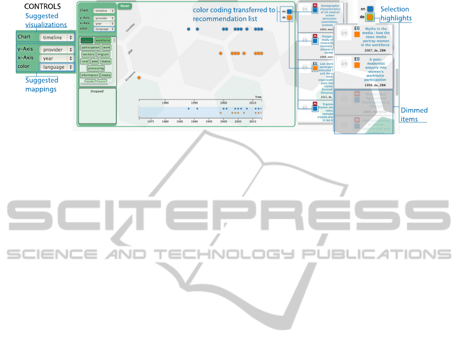
Figure 2: Visual recommender tool: exemplary visualization and mapping suggestions for recommendations.
points out, ratings can be multidimensional. We have
designed a rating based on scales pertaining the per-
ceived usefulness and also visual organization of a
visualization. The usefulness of a visualization de-
pends, of course, on the task and information needs
of the user. The challenge is to elicit preferences on
these terms: which visualization is useful for particu-
lar information needs. To do so, we are investigating
through a crowdsourced study, what information peo-
ple extract from visualizations and their rating. The
future version of the visual recommender will inte-
grate ratings and preferences elicited from the study
as an optimization measure.
The second top-down approach to elicit prefer-
ences is to analyse the items that users collect. One
feature of the proposed visual recommender is that it
allows users to create collections of items. A collec-
tion consists of a topic title and a list of items and
an optional description. We are currently investigat-
ing methods to rank the items in a collection using
lightweight information extraction methods to match
keywords to the topic or description. The ranking
of items as well as their belonging to particular col-
lections will be used to enrich the recommendation
list. To refine the visual recommendation, we in-
tend to store meaningful visualizations in collections,
thus complementing the preferences for a visualiza-
tion with collections associated.
5 DISCUSSION
One strength of the proposed method is that the visual
channels are used to directly influence the interaction.
The front-end defines an interactivesystem based on a
model-view controller API, which allows connecting
the output of the interaction with charts to different
views on the data. For example, when filtering items
in a chart, a list is automatically updated (dimming
unselected items). Similarly, the list can be used to
define the focus and context in the chart.
The workflow and use-case involves several
choices of charts to explore the data. One shortcom-
ing of the current approach is that chart suggestions
are based on the mappings which, although concep-
tually correct, at times show junk charts. We found
that this is often due to the generalization leading to
poor information about data attributes (e.g.,what are
the intervals and distributions). We are investigating
optimizations based on user preferences, for example
following methods in Section 4. The methods for elic-
itation of preferences require a critical mass of users
and ratings for visualizations and items. Our cur-
rent work investigates methods to acquire these initial
preferences.
6 CONCLUSION
This paper introduces a visual recommender tool that
suggests visualizations for recommendations in the
scientific, cultural and educational domain. The main
power of these generic visualizations is that only
those that can actually represent the data are sug-
gested. If the items in the recommendation list do
not contain dates, timelines cannot be reified and will
not be suggested. The current implementation of the
visual recommender tools support nine conventional
charts. Our tool has been deployed in the frame of
EEXCESS, but it is not constrained to the cultural
domain. It can actually suggest visualizations for
any recommendation list expressed in the suggested
format. This is because we defined semantically-
enriched data models for visualizations and recom-
mendations. Thereby, powerful queries quickly ex-
plore a semantic space consisting of a huge number
of recommendations and link them to visualizations.
The current visualization suggestion consists of a
list of different visualizations with a lot of possible
mapping combinations. Our future goal is to explore
IVAPP2015-InternationalConferenceonInformationVisualizationTheoryandApplications
260

ways to narrow down the choices relying on user be-
havior, context building towards content-based rec-
ommendation of visualizations. We have briefly de-
scribed two methods that are currently under investi-
gation to elicit user preferences and context for visu-
alizations and that will help suggest meaningful visu-
alizations for the information needs of the user.
ACKNOWLEDGEMENTS
This work is funded by the EC 7th Framework
project EEXCESS (grant 600601). The Know-Center
GmbH is funded within the Austrian COMET Pro-
gram - managed by the Austrian Research Promotion
Agency (FFG).
REFERENCES
Bertin, J. (1983). Semiology of graphics. University of Wis-
consin Press.
Granitzer, M., Seifert, C., Russegger, S., and Tochtermann,
K. (2013). Unfolding cultural, educational and sci-
entific long-tail content in the web. In UMAP Work-
shops.
Kagie, M., van Wezel, M. C., and Groenen, P. J. F. (2011).
Map based visualization of product catalogs. In Ricci,
F., Rokach, L., Shapira, B., and Kantor, P. B., ed-
itors, Recommender Systems Handbook, pages 547–
576. Springer.
Konstan, J. A. and Riedl, J. (2012). Recommender systems:
From algorithms to user experience. User Modeling
and User-Adapted Interaction, 22(1-2):101–123.
Lex, A., Streit, M., Schulz, H., Partl, C., Schmalstieg, D.,
Park, P. J., and Gehlenborg, N. (2012). StratomeX: vi-
sual analysis of Large-Scale heterogeneous genomics
data for cancer subtype characterization. Computer
Graphics Forum (EuroVis ’12), 31(3):1175–1184.
Mackinlay, J. (1986). Automating the design of graphical
presentations of relational information. ACM Trans.
Graph., 5(2):110–141.
Mackinlay, J., Hanrahan, P., and Stolte, C. (2007). Show
me: Automatic presentation for visual analysis. IEEE
Transactions on Visualization and Computer Graph-
ics, 13(6):1137–1144.
Munzner, T. (2011). Applying information visualization
principles to biological network displays. volume
7865, pages 78650D–78650D–13.
Mutlu, B., Hoefler, P., Tschinkel, G., Veas, E., Sabol, V.,
Stegmaier, F., and Granitzer, M. (2014). Suggesting
visualizations for published data. In Proceedings of
the 5th International Conference on Information Visu-
alization Theory and Applications, IVAPP.
Nazemi, K., Retz, R., Bernard, J., Kohlhammer, J., and
Fellner, D. (2013). Adaptive semantic visualization
for bibliographic entries. In Bebis, G., Boyle, R.,
Parvin, B., Koracin, D., Li, B., Porikli, F., Zordan,
V., Klosowski, J., Coquillart, S., Luo, X., Chen, M.,
and Gotz, D., editors, Advances in Visual Computing,
volume 8034 of Lecture Notes in Computer Science,
pages 13–24. Springer Berlin Heidelberg.
Ricci, F., Rokach, L., Shapira, B., and Kantor, P. B.
(2011). Introduction to Recommender Systems Hand-
book, pages 1–35. Springer US.
Schl¨otterer, J., Seifert, C., and Granitzer, M. (2014). Web-
based just-in-time retrieval for cultural content. In
PATCH ’14: Proceedings of the 7th International
ACM Workshop on Personalized Access to Cultural
Heritage.
Swearingen, K. and Sinha, R. (2001). Beyond algorithms:
An hci perspective on recommender systems. In ACM
SIGIR. Workshop on Recommender Systems, volume
Vol. 13, Numbers 5-6, pages 393–408.
Voigt, M. et al. (2012). Context-aware recommendation of
visulization components. In The Fourth International
Conference on Information, Process, and Knowldege
Management.
VisualRecommendationsforScientificandCulturalContent
261
