
User Interaction Design for
Mobile Product Recommender Systems
B
´
eatrice Lamche, Nada
˘
Sahinagi
´
c and Wolfgang W
¨
orndl
Institute of Applied Informatics - Cooperative Systems, TU M
¨
unchen, Boltzmannstr. 3, 85748, Garching, Germany
Keywords:
Mobile Recommender Systems, User Interaction, Interface Design, User Study, Product Recommender
Systems.
Abstract:
In this work we present the user interaction design process conducted for a mobile product recommender sys-
tem that takes the user’s critiques into account. The main focus hereby lies on products, where the appearance
is important. Smartphones reveal additional characteristics compared to desktop systems being devices that
have smaller screens, a direct touch input method and can collect information about the current environment.
The interaction model on which the work builds upon is focused on three key interaction activities between
the user and the system: the initial preference elicitation process, the presentation of the resulting recommen-
dations set and the preference feedback process. We conduct an interaction design process, involving work
on establishing requirements, designing solutions that meet these requirements, producing an interactive pro-
totype of the solution and finally, evaluating it in a two-step process. In total eleven designed alternatives,
divided into three groups according to the interaction activities, were evaluated within a user study, showing
the advantages and disadvantages of each interaction method.
1 INTRODUCTION
Product recommender systems are web-based tools
constructed to ease the process of searching and
browsing for items in the vastness of the internet. Cri-
tiquing recommender systems allow the user to criti-
cize the suggested items at every recommendation cy-
cle and have proven as an effective approach to elicit
the user’s preferences and thus to improve person-
alized recommendations (Lamche et al., 2014). Be-
sides focusing on accuracy in critique-based recom-
mender systems research, the user experience of rec-
ommender systems is getting more and more impor-
tant nowadays (Konstan and Riedl, 2012). A common
factor that supports a smooth user experience includes
transparency and control management, while also en-
suring that the level of cognitive and interaction effort
is kept to a minimum (McGinty and Reilly, 2011).
Previous product recommender systems compar-
ing different interaction strategies have heavily fo-
cused on conventional desktop-based environments,
as in (Pu et al., 2011b) and mostly ignored mobile de-
vices. Although some of the interaction techniques
offered on desktop-based systems might be also ap-
plicable to smartphones, there are three main chal-
lenges to face that do not encounter when designing
for desktop systems. First of all, user interaction in
smartphones takes place by using specific touch ges-
tures. Second, screen capabilities are drastically re-
duced, offering not much space for information and
navigation possibilities. Finally, since the user is on
the move, connectivity problems might occur and the
user’s attention span is limited as well. This leads to
the conclusion that simply overtaking interaction de-
sign guidelines evaluated for a desktop system for a
smartphone is a rather undesirable approach.
This work will therefore depict several interaction
and interface designs for a mobile product recom-
mender system on a smartphone. Since some authors
have already investigated interaction design guide-
lines for shopping products where technical features
are important, e.g. (Pu et al., 2011b), our focus lies
on products, where the appearance of the item plays
an important role. As application scenario therefore
serves a mobile shopping recommender system for
clothing items. We will also examine the question
whether users’ interaction preferences stay the same
in all circumstances or if they rather change when
in a different contextual situation. We will evalu-
ate eleven design alternatives regarding a smooth and
pleasing user experience in mobile recommender sys-
tems within an online survey and a user study.
575
Lamche B., Šahinagic N. and Wörndl W..
User Interaction Design for Mobile Product Recommender Systems.
DOI: 10.5220/0005404705750585
In Proceedings of the 11th International Conference on Web Information Systems and Technologies (WEBIST-2015), pages 575-585
ISBN: 978-989-758-106-9
Copyright
c
2015 SCITEPRESS (Science and Technology Publications, Lda.)
The rest of the paper is organized as follows: We
first provide a brief overview of related work and in-
troduce important foundations. We then depict the in-
teraction design process and explain the development
of our low- and higher-fidelity prototypes. The fol-
lowing section displays methodology and results of
the two-step evaluation. We close by presenting fu-
ture directions this research topic could take.
2 BACKGROUND
This chapter lays the foundations for the development
of an interaction design prototype by explaining basic
concepts and summarizing related work.
2.1 Interaction Design for
Preference-Based Recommender
Systems
Finding a specific item in a large collection of avail-
able products can become a demanding task for the
user. Preference-based recommender systems elicit
the user’s preferences and suggest items whose at-
tributes match these preferences. By supporting
the user in the process of describing, identifying
and selecting a user-tailored product to purchase,
preference-based recommender systems are not just
assisting the process of search, but also the process
of decision making. Their main task is to provide ef-
fective search and navigation mechanism in guiding
users to find their preferred products in e-commerce
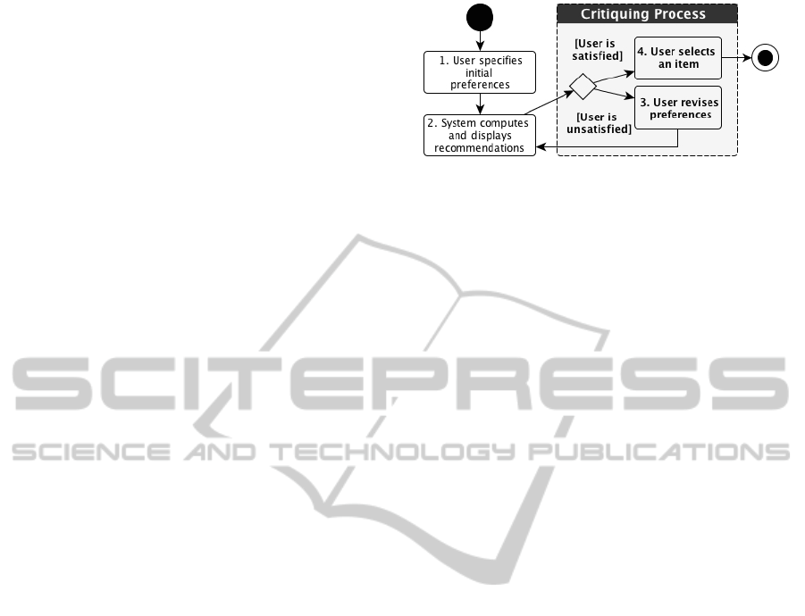
based on explicitly stated preferences. Figure 1
demonstrates the interaction model of preference-
based recommender systems dispensed in three key
activities: The interaction starts with the user de-
scribing the item to the system in the form of pref-
erences. Next, the system filters all available options
and presents a recommendation set to the user accord-
ing to these preferences. The user can then revise the
preference model by giving feedback on an item in
the form of “I like this item, but cheaper” or by rat-
ing items that have already been experienced (step 3
of figure 1) as long as the user finds a satisfying item
which results in a successful termination of the pro-
cess (step 4) (Pu et al., 2011b). This style of feed-
back is called critiques, and the recommender system
class using it critiquing-based recommender systems
(McGinty and Reilly, 2011).
The interaction design process of preference-
based recommender systems involves work on estab-
lishing requirements, designing solutions that meet
those requirements, producing a (interactive) version
Figure 1: The critiquing process of a preference-based rec-
ommender system.
of the solution, and evaluating it. These activities in-
form one another and are repeated. Evaluating means
including users in the design process, e.g. by develop-
ing simple or more comprehensive prototypes which
can than be tested by a target group (Rogers et al.,
2011).
2.2 Related Work
Although disciplines regarding interaction design,
such as interface, usability or user experience, are es-
sential parts of the recommender system, there are
not many sources in the literature that investigate the
mobile interaction design process for product recom-
mender systems. The majority of researches con-
ducted focus on desktop-based platforms, with cri-
tiquing as its feedback strategy. Because of the al-
ready mentioned limitations and challenges of mobile
systems, only few desktop-based recommender sys-
tems are adjusted for mobile use.
McGinty and Reilly delivered a comprehensive
outline of previous work on interface considerations
across critiquing platforms which focuses on scal-
ing to alternate platforms, manipulation interfaces,
explanations, visualization and multi-cultural usabil-
ity differences (McGinty and Reilly, 2011). They
denote that “different domain and platform char-
acteristics present recommender interface designers
with very different technical and usability challenges”
(McGinty and Reilly, 2011, pp. 438).
Pu et al. (Pu et al., 2011b) established a set of
eleven usability-guidelines found on the interaction
model. They include, among others, how and in
which order to elicit the initial set of preferences, how
many and which recommended items to present, what
to do in case there are no items in the items which
match the user’s preferences, and so on.
Each of the described works did not focus on the
mobile environment. It remains unfamiliar how users
would interact on a device with much smaller screen
sizes and less keypad functionality in a context-
changing environment.
CritiqueShop (Zhang et al., 2008; McGinty and
WEBIST2015-11thInternationalConferenceonWebInformationSystemsandTechnologies
576

Reilly, 2011) is an experimental study conducted both
in a desktop and mobile environment. The desk-
top interface has been scaled down to a smartphone.
The key considerations aimed at the limited screen
area and direct user manipulation via touch-sensitive
user interfaces. Their study demonstrated that users
are more likely to perform critiques via meaningful
icons than via text-based representations, by also re-
ducing the interaction times of a critiquing session
(Zhang et al., 2008; McGinty and Reilly, 2011). Cri-
tiqueShop was developed to examine critique-based
recommender systems on a smartphone, but restricts
its feedback strategy to solely critiquing and lacks the
context knowledge.
TIP (Hinze and Buchanan, 2005) is a mobile sys-
tem that delivers information about sights (informa-
tion objects) based on the user’s context: location,
travel history and personal profiles describing interest
in sight groups and topics. Recommendations are also
given based on user feedback and profiles. The paper
presents several challenges in the user interface and
interaction design. For example, to distinguish be-
tween sights that are close and sights that are distant
to the user’s location and accordingly apply different
color schemes (Hinze and Buchanan, 2005). TIP fo-
cuses on the calculation of accurate recommendations
for a tourist scenario rather than on evaluating differ-
ent aspects of the user interaction design of mobile
product recommender systems.
Focal (Garcin et al., 2014) is a personalized mo-
bile news reader that explores new design ideas to
present news stories to the users. News are shown as
nodes in a graph and allow the user to quickly deter-
mine the freshness, popularity and relevance of a story
by varying the thickness of the graphs, transparency
and largeness of the nodes (Garcin et al., 2014). A
user study that compares this new design alternative
to a classical list-view in order to prove its benefits
has not yet been conducted.
3 Interaction Design Process
Each of the following subsections describes one step
in the interaction design process (introduced in sub-
section 2.1), excluding the evaluation, which is par-
ticularly described in section 4.
3.1 Requirements Establishment
Based on the interaction model of preference-based
recommender systems described in subsection 2.1, we
can now make rough functional and data requirements
to provide high usability and best user experience for
each interaction activity.
1. For the task of setting initial preferences, the user
can either explicitly specify its preferences or al-
ternatively allow the system to automatically col-
lect the user’s preferences (e.g. based on the user’s
browsing and clicking behavior). In this implicit
way, no user interaction is required.
2. In the second step, the user should be presented
one or several items matching the elicited prefer-
ences, accompanied by information why this item
was elected.
3. The user should be able to select an item from
the presented step and either mark it as her final
choice, or provide some kind of feedback on the
item and/or its attribute values in order to revise
her preferences and receive a new set of recom-
mended items.
3.2 Designing Alternatives
Designing alternatives is the core activity of the inter-
action design: actually suggesting ideas, which meet
the requirements. On the one hand, we will hark back
to classical interaction techniques that have already
been offered on desktop recommender systems to see
if they can also be applied on smartphones, on the
other hand we will come up with new interaction de-
sign ideas.
3.2.1 Setting Initial Preferences
When designing alternatives for setting the users’ ini-
tial preferences regarding an item, we distinguish be-
tween two different preference elicitation techniques:
Stating preferences by assigning values to several
clothing item features and stating a reference prod-
uct that is being searched. Design alternatives that
cope with the initial elicitation of preferences were
developed according to these two techniques: First,
manually setting the feature values. Second, taking a
picture of an item or uploading an existing one. The
system should then recognize some properties of the
covered item or find items similar to it based on an
image search. A third technique would be an implicit
preference determination. Table 1 presents the alter-
natives with an overview of their properties.
3.2.2 Presentation
As response to the user’s initial set of preferences
from step one, the system has to show either one or
several recommended items fitting these preferences.
Additionally, if the system returns multiple items, the
UserInteractionDesignforMobileProductRecommenderSystems
577
Table 1: ’Setting preferences’ alternatives.
Acquisition Application Mobile
Process Domain
Visible
Module
Used
Take System: No, only in Camera
Picture Image
recognition
overview
Upload System: No, only in Internet
Picture Image
recognition
overview Access
Manually
Set
Explicitly
user: List of
attributes
No -
Answer
Ques-
tions
Explicitly
user: One
screen per
question
No, only in
revision
-
Implicitly System:
User-model
No Internet
Access
questions to be answered are how much items to show
and how to lay them out? A Comparison presen-
tation interface was in the design stage imagined as
an additional feature to directly compare two recom-
mended items. However, it can also serve to present
the two best-ranked items to the user. Table 2 gives an
overview of the designed and presented alternatives.
Table 2: ’Presentation of items’ alternatives.
Number of
Items Fitting
on Screen
Image
Size
Visibility of
Item Details
Single
Item
1 Big Complete
description
List
View
Multiple
(≈ 6)
Small Most of the
description
Grid
View
Multiple
(≈ 3x3)
Small 1 - 2 item
attributes
Map Multiple Small Most of the
description
Com-
parison
2 Small List: attribute
-value pairs
3.2.3 Giving Feedback
User feedback (also known as preference revision) is
a vital component of most recommender systems, al-
lowing a system to make better suggestions by adapt-
ing its current understanding of users’ requirements
(McGinty and Reilly, 2011). In order to achieve
this, several feedback strategies have been devel-
oped. Older strategies include ratings-based feed-
back, while changing one or more desired characteris-
tics of a product is the subject of more recent research
(McGinty and Reilly, 2011). This kind of feedback
is referred to hereinafter as critiquing. The goal of
this step is to investigate which strategy is favorable
in the case of a mobile product recommender sys-
tem. Therefore, the designed alternatives in Table 3
incorporate the different feedback strategies and de-
pict how they have been handled in this work.
Table 3: ’Giving feedback’ alternatives.
Strategy Description of Strategy
Rating
Stars
Rating Item/features get a rating
between 1 (horrible) and 5
(excellent) stars.
Like/
Dislike
Rating Item/features get a ’like’
or ’dislike’. Users can
’like’ an item and still
’dislike’ a feature of it.
Positive/
Nega-
tive
Rating,
Prefer-
ence
If the item is rated posi-
tive/negative, features can
also only be rated same.
Criti-
quing
Direc-
tional or
Replace-
ment
Critiques
Directional: Attribute
is in- or decreased (e.g.
price); Replacement:
Attribute is replaced with
another value (e.g. color).
System No The system shows alterna-
Alter-
natives
explicit
feedback
tive items, differing in one
or several feature values.
3.2.4 Considering Context
Another main goal of this work is to examine whether
context-changes such as location, timestamp, budget,
weather, companion and so on can influence the user’s
opinion about a certain interaction and change her fa-
vorite way.
3.3 Prototypes
Interaction design involves designing interactive
products. Before deploying a final version, these
products have to be reviewed, graded and maybe im-
proved, which can be achieved through prototyping.
3.3.1 Low-Fidelity Prototype
At this level of prototyping, the focus is on the prod-
uct concept and general implementation, not on de-
tails. Low-fidelity prototypes developed in this work
are hand-sketched and mainly have the purpose to
eliminate the least attractive design alternative in each
WEBIST2015-11thInternationalConferenceonWebInformationSystemsandTechnologies
578
interaction step with an online survey which will be
described in section 4.1. We implemented each of
the selected prototypes from the survey as a higher-
fidelity prototype to investigate it in the final evalua-
tion test. This way the design idea was distinguished
from implementation issues that could have arise.
3.3.2 Higher-Fidelity Prototype
After designing the low-fidelity prototypes and their
evaluation, a clear idea of the basic design and a fairly
comprehensive list of features should be available for
the development process of higher-fidelity prototypes.
The prototypes are implemented as an iPhone 4S ap-
plication that does not have a running recommender
algorithm in the background, nor an image recogni-
tion process. The complete interaction takes place
with mocked data. We use eleven features to describe
a clothing item: Gender, Item, Price, Style, Brand,
Color, Size, Fabric, Pattern, Sleeve Type and Length.
The Item value changes when alternating the gender
value.
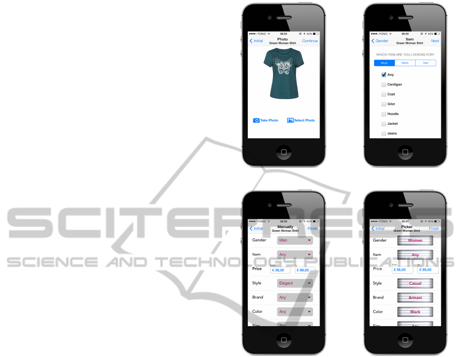
Setting Preferences. Four designs are implemented
as higher-fidelity prototypes for the step of stating ini-
tial preferences: Take or Use Image, Answer Ques-
tions, Manually Combobox and Manually Picker (see
figure 2). In the form of higher-fidelity prototypes,
the alternatives Take Picture and Upload a Picture
are merged and act as one acquisition strategy. That
way, the user can either take a “live” image or upload
an existing picture from one of the mobile phone’s
photo albums. The process continues with the system
recognizing features from the picture and presenting
them to the user in an overview list. The user can
either change features that got a wrong value in the
image recognition, give a value to features that were
not recognized or finish the elicitation process. The
Answer Questions strategy consists of twelve sepa-
rate screens: one for each product feature and the
last one as a static overview of stated values. The
remaining two designs, Manually - Combobox and
Manually - Picker are founded on the same layout
idea, but differ in the domain visibility. When select-
ing a feature cell in the Combobox prototype, a new
screen containing all feature values appears. By pick-
ing a value, the screen automatically disappears and
the cell’s combobox gets the chosen value. Within
the Picker screen, a swipe action on the picker view,
right-to-left, reveals a new value and hides the previ-
ous by pushing it to the invisible left. Thus the whole
interaction takes place within a single window.
Presentation. Concerning the presentation of rec-
ommended items, the design alternatives Single Item,
List and Grid are given the form of a higher-fidelity
(a) Take or Use a Picture (b) Answer Questions
(c) Manually-Combobox (d) Manually-Picker
Figure 2: ’Setting preferences’ interaction steps.
prototype (see figure 3 a-c). Each of the presentation
views contains a shop-button, which conducts the user
to the shop’s web page containing a more detailed de-
scription and multiple images of the item from various
perspectives.
Giving Feedback. The designs Rating Stars,
Like/Dislike, Positive/Negative and Replacement are
developed as higher-fidelity prototypes to represent
the different feedback strategies. Examples for the
presentation views can be seen in figure 4. Rat-
ing Stars allows submitting a grading from 1 to 5 to
the item overall, but also to its single feature values.
Like/Dislike is identical to Rating Stars concerning its
logic, with the only difference in the rating method
which here is binary. In the Positive/Negative screen,
the user selects either a plus for rating the item pos-
itively or minus otherwise. In the Replacement de-
sign, the user can replace each attribute with another
explicit value (e.g. changing the brand of the item).
UserInteractionDesignforMobileProductRecommenderSystems
579
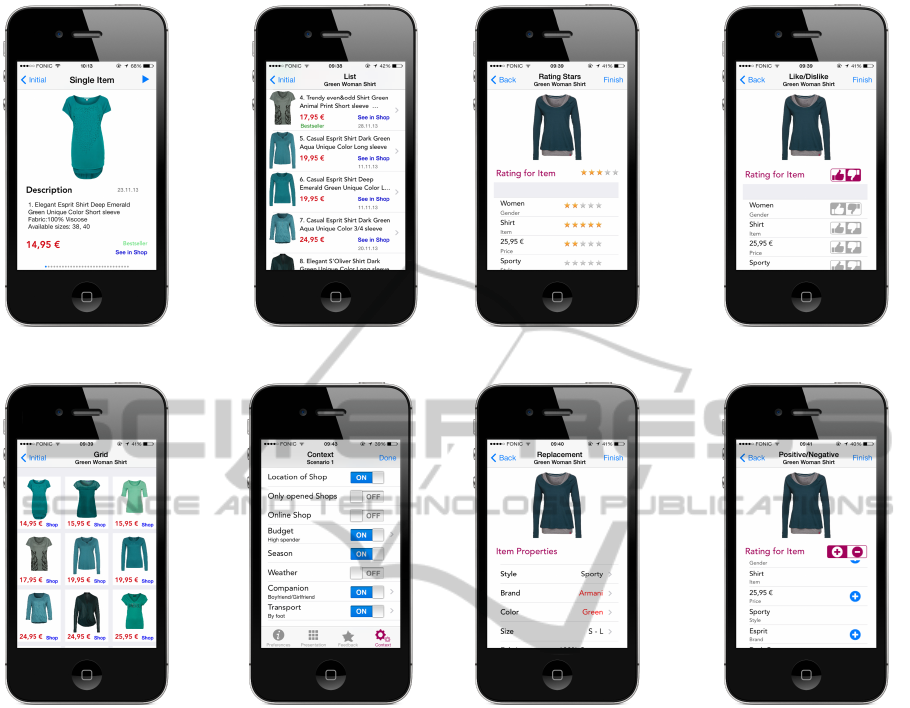
(a) Single Item (b) List
(c) Grid (d) Context Selection
Figure 3: ’Presentation of items’ and ’context selection’ in-
terfaces.
Context. The context screen shows different con-
text information (such as Location of Shops, Cur-
rently Opened Shops, Availability of Online Shop,
Budget, Season, Weather, Companion and Transport)
that can be included in the recommendation process
when selected from the user. The idea behind the
Context screen lies in figure 3 d, with the user explic-
itly stating the important context information, which
should be included in the recommendation process in
a certain situation. Our contextual testing approach
is derived from (Baltrunas et al., 2012) and aims at
finding out whether users prefer different methods of
interaction depending on the current contextual situa-
tion. In our prototype, the user sets the values for the
contextual factors Budget, Companion and Transport,
the remaining factors are obtained by the system. The
weather is measured by environmental sensors such as
barometers and GPS sensors determine the user’s cur-
rent location. Within our user study we want to find
(a) Rating stars (b) Like/Dislike
(c) Replacement (d) Positive/Negative
Figure 4: ’Giving feedback’ interaction steps.
out if particularly the user’s budget, means of trans-
port and available time influence the preferred inter-
action technique. In a real recommender system this
context information could then be implicitly obtained
by motion sensors that measure acceleration- and ro-
tational forces along three axes (this is already em-
bedded in recent iPhone and Android devices) and by
accessing the user’s mobile calendar and online bank-
ing account. However, trust and privacy aspects have
always be taken into account.
4 Evaluation
Evaluating what has been built is very much at the
heart of the interaction design. Its focus lies on ensur-
ing that the product is appropriate, usually seeking to
involve users throughout the design process. We first
WEBIST2015-11thInternationalConferenceonWebInformationSystemsandTechnologies
580

carry out an online survey to narrow down the design
alternatives and reduce subject fatigue in the follow-
ing user study. The main two goals of the evaluation
are:
1. To find out which interaction and interface possi-
bilities provide the best usability and user experi-
ence in supporting the interaction model steps (see
section 2.1)
2. To conclude whether contextual change implies
changes on the users’ preferences about their fa-
vorite interaction and interface options for a mo-
bile recommender system.
Despite the fact that this paper evaluates only the in-
teraction design, without providing a working recom-
mender system in the background, its aim still tar-
gets the usability and user experience domain of mo-
bile recommender systems. Consequently, method-
ologies examining both recommender systems and
mobile systems will be depicted.
4.1 Online Survey
The survey had the simple task of asking people what
their preferences are regarding interfaces and which
interaction functionalities they would value as im-
portant in a mobile shopping recommender system.
The survey’s goal was to collect fast user opinion
on the developed paper prototypes (see subsection
3.3.1). The survey questionnaire disposed a total of
38 questions, divided into four blocks. Besides de-
mographic questions, users were asked about prefer-
ences for eliciting item preferences, presenting rec-
ommended items and critiquing/giving feedback on
an item. In total 46 people participated, 27 males and
19 females. The participants were 26.7 years old in
average, ranging from 20 to 57. Based on the results
of the online survey we included the most favorite in-
terfaces and functionalities regarding a mobile shop-
ping recommender system in the higher-fidelity proto-
type. Its evaluation will be described in the following.
4.2 User Study
Based on the results of the online survey, the devel-
oped higher-fidelity prototype described in 3.3.2 was
judged within a user study with respect to the usabil-
ity and user experience. A one-on-one usability study
can quickly provide a great amount of information on
how a product will be used.
4.2.1 Study Design
The study consisted of collecting data from three cate-
gories. First, the study data was logged by the higher-
fidelity application during its execution. Thus, one
is able to collect interaction data (e.g. the time users
needed to finish the given task with an interface or
the currently set preferences) in order to analyze and
understand the user behavior (Rogers et al., 2011).
Second, during the entire time of the user study, the
examiner took notes on the users’ comments (Think
Aloud method). Third, a usability questionnaire col-
lected general data about the person and the imprint-
ing on the interfaces. During this study, the user was
set up with three distinct tasks, one for each step in
the product recommender interaction model. The ap-
plication was made to act as a mobile clothing shop,
a commonly known domain. Each developed design
ran twice: first for a green women’s T-shirt and after-
wards for beige men’s trousers. The questionnaires
examined the differences in the subjective satisfac-
tion with the user-friendliness of the designs. An-
other questionnaire collected demographic data and
the level of shopping experience of individual trial
participants. As the underlying base for the devel-
opment of the questionnaire, the framework ResQue
was used. ResQue consists of 13 constructs and a to-
tal of 60 questions, divided into four main dimensions
(Pu et al., 2011a). The following perceived qualities
of recommender systems were conducted within our
questionnaire: Ease of Use, Interaction Adequacy, In-
terface Adequacy, Control, Attitude/Overall Satisfac-
tion. With all questions not being suited for each de-
veloped design, the setup was slightly different for
distinct interaction activities. Participants stated their
opinion with a 7-Likert scale; from (3) strongly agree
to (-3) strongly disagree with (0) being neutral.
The developed designs were evaluated in a lab-
based study, which lasted for about an hour. As a
recommender system has a wide audience, no spe-
cific user group was targeted. Each of the total eleven
interfaces that were examined had an accompanying
video on the interaction possibilities, shown before
the start of every interface design. After the task com-
pletion for both items, users were asked to fill out a
questionnaire about the design’s usability in relation
to ease of use, interaction and overall satisfaction. It
should be mentioned that we encouraged participants
to evaluate the pure interaction technique and to ne-
glect the visual design used in this study. When all
tasks associated with one interaction step were per-
formed, the user was asked to choose her favorite and
least favorite interface design from that group. The or-
der in which the interfaces were presented to the sub-
jects was randomly allocated, however staying within
the interaction step. By changing the order, learning
effects were avoided and each interface could be ob-
jectively evaluated.
UserInteractionDesignforMobileProductRecommenderSystems
581

The first group of interfaces served the user to ex-
plicitly describe the item having in mind to the system
with a feature-value list consisting of eleven semantic
features. The second interface group included inter-
faces presenting an initial set of recommended items.
A set of 30 items for each initial item was mocked,
acting as the recommended items. The set was sorted
by the items’ prices because participants expressed
this feature as being the most important one in the
previously conducted online survey. The user’s task
was to lookup for the item most likely similar to the
item described in step one. For the final interaction
step, a random item was shown to the user that had to
be compared to the one looking for by rating prefer-
ences or replacing attribute values.
In order to examine context influence on the pro-
cess of decision-making, the participant was asked to
imagine herself in two certain context situations, as in
(Baltrunas et al., 2012), and to determine which con-
text factors are of high importance to her in that spe-
cific case and activate those factors within the con-
text screen. The participant was asked once more
to choose her favorite designs from each interaction
step, but now according to the imagined context.
4.2.2 Results
The random sample included 21 evaluators, aged be-
tween 19 and 39 years with an average age of 26.5
years. We focused on average app users, however it
should be noted that people with visual impairment
or elderly might have evaluated the interfaces differ-
ently. The gender distribution was rather balanced
with 52.4% of users being male and 47.6% being fe-
male. The means of the measured values, as well as
the standard deviation σ of the examined interfaces
are shown in the corresponding tables.
Setting Preferences. The first task included de-
scribing an item to the system. Figure 2 shows
the corresponding interface designs. By tracking the
time from the beginning that occurs with the green
shirt item to the end of describing the beige trousers
item, the task could have been completed in around
2 minutes for the three interfaces Take Or Use Pic-
ture, Combobox and Picker, while Answer Questions
needed almost 6 minutes (see table 4 for exact val-
ues).
When asked about the ease of interaction to de-
scribe an item to the system (on a 7-Likert scale, 3
the best, -3 the worst rating), the participants’ aver-
age rating was very similar among the three systems
Answer Questions, Combobox and Take or Use Pic-
ture. Participants expressed much less satisfaction for
Table 4: A comparison of the user study’s results concern-
ing the preference elicitation strategies.
Ques-
tions
Combo-
box
Picker Take/Use
Image
Time 5.9min 2min 2.5min 1.9min
σ=2.58 σ=1.07 σ=0.82 σ=0.73
Ease 2.1 2.57 0.38 2.29
of Use σ=1.12 σ=0.73 σ=1.76 σ=0.76
Ade- 1.43 2.24 -0.10 2.10
quacy σ=1.29 σ=1.02 σ=1.92 σ=0.75
Control 1.52 2.38 1.19 2.10
σ=1.33 σ=0.79 σ=1.18 σ=1.07
Error- 1.57 2.29 0.67 1.43
Free σ=1.53 σ=1.03 σ=1.81 σ=1.14
Satis- 1.48 2.33 -0.05 2.10
faction σ=0.14 σ=0.94 σ=1.76 σ=0.81
the Picker alternative. Concluding from the partici-
pants’ comments besides being complicated to inter-
act with, Picker provided no visibility of the applica-
tion domain what was perceived as bothersome.
When asked whether the design presents an ade-
quate way to express preferences, almost all ratings
for Answer Questions, Combobox and Take or Use
Image were above zero. Picker was the only alter-
native rated negative on average. These results are
almost mapped to the issue of whether the design of-
fers an adequate way to summarize preferences. In
this context, some participants stated that they wished
a dynamic overview design, i.e. to be able to jump to
a certain question when a preference is selected in the
overview.
Looking at the rating distributions on the level of
control participants perceived when telling the system
what an item they want, as well as whether they can
paint a longtime interface-usage without errors, no in-
terface has fallen into negative space of ratings. Com-
bobox provided the highest feeling of control, Picker
the lowest.
When asked what the overall impression of the
system was, participants expressed high sympathies
for Combobox and Take or Use Picture, while Picker
was rated worst (due to the concerns already men-
tioned above).
Result 1: ’Combobox’ is in our study the favorite
preference elicitation strategy and ’Picker’ the worst
concerning ease of use, adequacy, control, accuracy
and satisfaction. ’Take/Use Picture’ is in our eval-
uation always second place and ’Answer Questions’
third, with the exception of the accuracy category. It
is worth mentioning that ’Answer Questions’ needed
almost the triple of time compared to the other pref-
erence elicitation strategies.
WEBIST2015-11thInternationalConferenceonWebInformationSystemsandTechnologies
582

Table 5: A comparison of the user study’s results concern-
ing the different presentation interfaces.
Grid List Single Item
Time 1.1min 1.3min 1.5min
σ=0.89 σ=0.59 σ=0.65
Ease of Use 1.95 2.42 1.6
σ=1.50 σ=1.09 σ=1.74
Adequacy 1.33 2.05 0.9
σ=1.61 σ=0.90 σ=1.89
Sufficient 0.71 1.86 1.6
Information σ=1.72 σ=1.32 σ=1.2
Scroll- 10.89 15.61 -
Downs σ=5.63 σ=12.65 -
Satisfaction 1.24 1.76 0.15
σ=1.6 σ=0.92 σ=2.03
Presentation. We evaluated three different presen-
tational interface designs (see figure 3). By look-
ing at the average time of choosing the best suited
item for each design alternative, there is only a subtle
difference with participants completing their session
(around 1.3 minutes). Table 5 shows exact time val-
ues.
When asked if it was easy to use the interface, List
performed best on average, followed by Grid (second
place) and Single Item. This rank order also reflects
the overall satisfaction perceived measurement. Here,
the span of ratings for Single Item was larger than in
List and Grid, including high positives, but also high
negatives and reaches last place.
Things change when looking which design alter-
native has the most adequate interface as well as if
the interface provides sufficient information. As ex-
pected, Grid drops down to last place when asked if
it provides sufficient information and is second when
asked about the layout’s adequacy. List is rated best
in both categories, while Single Item is considered as
least adequate but second concerning the information
content.
As already expected, participants scrolled more
often in order to find and select the most appropriate
item when using the List interface compared to the
Grid interface.
Result 2: In this study, users favored the presenta-
tion of items in a ’List’ view, while the ’Grid’ view
was ranked second and the ’Single Item’ view worst
in relation to ease of use, adequacy and satisfaction.
However, ’Grid’ is regarded as not giving sufficient
information compared to the other two designs.
Giving Feedback. We implemented four different
feedback strategies within our higher-fidelity proto-
type (see figure 4). Regarding the time measurement,
the Positive/Negative way of feedback scored best fol-
lowed by Replacement, Like/ Dislike and Rating Stars
Table 6: A comparison of the user study’s results concern-
ing the feedback method.
Like/
Dislike
Positive/
Negative
Rating
Stars
Replace-
ment
Time 1.3min 1.2min 1.4min 1.3min
σ=0.54 σ=0.73 σ=0.56 σ=0.35
Ease 1.71 1.67 2.19 2.38
of Use σ=1.55 σ=1.64 σ=1.1 σ=0.79
Ade- 0.38 0 1.14 2.05
quacy σ=1.94 σ=2.14 σ=1.52 σ=1.25
Satis- 0.48 0 1.33 2
faction σ=1.47 σ=1.66 σ=1.49 σ=0.87
(which is the most time consuming feedback strat-
egy). However, the difference is almost impercepti-
ble (see table 6 for exact values of the time measure-
ment).
Participants were asked to evaluate the ease to use
the interface. The Positive/Negative design needed
extra explanations for its logic after showing the intro-
duction video. This reflects in the ratings participants
have given (see table 6). Participants complained
mostly on the restriction to positive- or negative-
only ratings, while the main point of criticism of the
Like/Dislike interface was its lack of a default, neutral
rating option.
Continuing, participants were asked to consider
the interaction adequacy of revising preferences with
each feedback strategy. The Replacement design
achieved first place, Positive/Negative was elected
worst. In between are Like/Dislike and Rating Stars.
The overall satisfaction maps the interaction ade-
quacy almost one-to-one.
Result 3: Regarding the ratings for ease of use,
adequacy and satisfaction, the ’Replacement’ cri-
tiquing strategy is ranked best in our user study, fol-
lowed by ’Rating Stars’, ’Like/Dislike’ and ’Posi-
tive/Negative’, being the least favorite strategy. How-
ever, ’Positive/Negative’ is the most efficient cri-
tiquing approach in terms of time.
Context. The participants were also asked to imag-
ine themselves in two distinct context situations, de-
note the important contextual factors and pick a fa-
vorite from the evaluated variants, but now according
to the situations. This context evaluation approach
already produced good results in (Baltrunas et al.,
2012). The two scenarios were described as follows:
Scenario #1: You have an important meeting in 30
minutes, but you just spilled coffee all over your shirt.
You are in panic looking to buy a new one. You don’t
care about money; you just need a new white shirt,
fast. While walking around the neighborhood to find
a shop, you are using the recommender app to find
you a perfect match nearby.
UserInteractionDesignforMobileProductRecommenderSystems
583

Scenario #2: You are at home, surfing the space of in-
ternet to buy your mom a present for Christmas which
is in two weeks. You are looking for a nice white
woolen sweater, winter-appropriate. Your budget is
unfortunately very limited.
While under pressure and having a reference prod-
uct, almost all participants would either Take an Im-
age of an item or describe it with the Combobox de-
sign. However, without the pressure factor and with
the lack of a reference product (context 2), the num-
ber of favorite votes for the Take or Use Image design
drops down to zero. On the other hand, Combobox in-
creases its advantage, with the Answer Questions de-
sign following. This means that, when asked about fa-
vorites according to context, 81% parted with a 48:33
ratio between participants that changed their favorite
vote for one context scenario and for both.
Looking at the item’s presentation, the ratio in fa-
vor of List and Grid changes. For the first situation,
Grid has slightly more votes (11 vs. 8), while in the
second situation; List has 10 votes and 3 more than
Grid. In the terms of change, 19% of participants did
not change anything, 43% changed at least one, while
38% changed both of their favorites.
Not much changed regarding the overall rating of
the favorite feedback strategy. Replacement is the
participants’ favorite revision option. However, only
a quarter of participants stood up to their previously
rated favorite design: 48% changed in both context
scenarios, and 29% in one of them.
Result 4: Only when under pressure, ’Take or Use a
Picture’ is a very popular preference elicitation strat-
egy among smartphone users according to the results
of our user study. Also the participants’ favorite pre-
sentation interface as well as favorite method to pro-
vide feedback depends on the context situations.
5 CONCLUSIONS AND FUTURE
WORK
This work described an accomplished interaction de-
sign process regarding mobile product recommender
systems using critiquing to elicit the user’s prefer-
ences. We focused on items whose appearance plays
an important role instead of technical features and
therefore selected a mobile clothing recommender
system as application scenario. The process resulted
in developing eleven interaction design alternatives
on an iPhone, categorized into three interaction ac-
tivities: the initial preference elicitation process, the
presentation of the resulting recommendations set and
the preference feedback process. As a result of an ex-
ecuted user study evaluating the implemented interac-
tive designs, we could inter alia show that the Com-
bobox preference elicitation strategy, the List view,
as well as the Replacement feedback strategy are the
most preferred design alternatives of a mobile prod-
uct recommender system concerning ease of use, ade-
quacy and overall satisfaction. The study also showed
that contextual change heavily influences the partic-
ipants’ choice of favorites. Iti developers of mobile
product recommender systems should automatically
obtain the context situation and adapt the interfaces
accordingly. We have to note that the most suitable
interaction technique often depends on the recom-
mendation algorithm, type of users, data, context, de-
vice and recommendation task. However, the results
should be taken into account by developers of mobile
shopping recommender systems using critiquing as
primary feedback strategy. We assume that the result-
ing interaction techniques can be applied to all mobile
scenarios where the item’s appearance matters. We
therefore already started working on a mobile recipe
and restaurant recommender system to find out if our
results can be generalized. We will also evaluate the
most preferred designs in combination, since in a real
system, a user will interact with only one sequence of
the three identified interaction steps. Future develop-
ment also includes the integration of a recommenda-
tion algorithm with a large dataset evaluating the final
design, also with a larger number of evaluators and
different display sizes. Beyond explicit, interesting
will be to examine how an implicit form of feedback
would perform in terms of usability and user experi-
ence.
REFERENCES
Baltrunas, L., Ludwig, B., s. Peer, and Ricci, F. (2012).
Context relevance assessment and exploitation in mo-
bile recommender systems. Personal Ubiquitous
Comput., 16(5):507–526.
Garcin, F., Galle, F., and Faltings, B. (2014). Focal: a per-
sonalized mobile news reader. In Proceedings of the
8th ACM Conference on Recommender systems, pages
369–370. ACM.
Hinze, A. and Buchanan, G. (2005). Context-awareness
in mobile tourist information systems: challenges for
user interaction.
Konstan, J. A. and Riedl, J. (2012). Recommender systems:
from algorithms to user experience. User Modeling
and User-Adapted Interaction, 22(1-2):101–123.
Lamche, B., Trottmann, U., and W
¨
orndl, W. (2014). Active
Learning Strategies for Exploratory Mobile Recom-
mender Systems. In CaRR workshop, ECIR, Amster-
dam.
WEBIST2015-11thInternationalConferenceonWebInformationSystemsandTechnologies
584

McGinty, L. and Reilly, J. (2011). On the evolution of
critiquing recommenders. In Ricci, F., Rokach, L.,
Shapira, B., and Kantor, P. B., editors, Recommender
Systems Handbook, pages 419–453. Springer US.
Pu, P., Chen, L., and Hu, R. (2011a). A user-centric evalu-
ation framework for recommender systems. In Pro-
ceedings of the Fifth ACM Conference on Recom-
mender Systems, RecSys ’11, pages 157–164, New
York, NY, USA. ACM.
Pu, P., Faltings, B., Chen, L., Zhang, J., and Viappi-
ani, P. (2011b). Usability guidelines for product
recommenders based on example critiquing research.
In Ricci, F., Rokach, L., Shapira, B., and Kan-
tor, P. B., editors, Recommender Systems Handbook,
pages 511–545. Springer US.
Rogers, Y., Sharp, H., and Preece, J. (2011). Interaction
Design: Beyond Human - Computer Interaction. In-
teraction Design: Beyond Human-computer Interac-
tion. Wiley.
Zhang, J., Jones, N., and Pu, P. (2008). A visual inter-
face for critiquing-based recommender systems. In
Proceedings of the 9th ACM conference on Electronic
commerce, pages 230–239. ACM.
UserInteractionDesignforMobileProductRecommenderSystems
585
