
A Visual Technique to Assess the Quality of Datasets
Understanding the Structure and Detecting Errors and Missing Values in Open
Data CSV Files
Paulo Carvalho
1
, Patrik Hitzelberger
1
, Fatma Bouali
2
and Gilles Venturini
2
1
Environmental Research and Innovation Department, Luxembourg Institute of Science and Technology,
5 Avenue des Hauts-Fourneaux, L-4362 Esch/Alzette, Luxembourg
2
Polytech’Tours - Dpt Informatique, University Franc¸ois Rabelais of Tours, Tours, France
Keywords:
Data Quality, Missing Values, Open Data, CSV.
Abstract:
Nowadays, more and more information is flowing in and is provided on the Web. Large datasets are made
available covering many fields and sectors. Open Data (OD) plays an important role in this field. Thanks to
the volumes and the variety of the released datasets, OD brings high societal and business potential. In order to
realize this potential, the reuse of the datasets (e.g. in internal business processes) becomes primordial. How-
ever, if the aim is to reuse OD, it is also necessary to be able of assessing its quality. This paper demonstrates
how Information Visualization may help on this task and presents Stacktab chart - a new chart to analyse and
assess CSV files in order to understand their structure, identify the location of relevant information and detect
possible problems in the datasets.
1 INTRODUCTION
More and more information sources are contributing
to the growing amount of available information on the
Internet every day. Social Networks and Media (e.g.
Twitter, Facebook), Blogs, Scientific Data, commer-
cial data, and Open Data (OD) are some of them. OD
covers many sectors, such as economy, health, cul-
ture, environment, etc. There is a growing demand
and pressure by governments worldwide for private
and public entities to publish their datasets over the
Internet. Because of the wide availability and variety
of datasets published by OD movement, their poten-
tial is high. OD reuse can generate value, be it from
a political, social, economic, operational or technical
point of view (M. Janssen and Zuiderwijk, 2012). The
economic value of OD has been estimated at 40 bil-
lion, per year, in Europe alone (European Commis-
sion, 2011b). However, there are several potential
barriers at different levels (e.g technical, legislation,
political, etc.) to the realization of this potential. Be-
sides the necessary access to the data, it is also manda-
tory to be able to understand them, if the data shall be
of any use for their potential users. Furthermore, it
is essential to be able to evaluate the quality of the
analysed datasets: working with information of du-
bious quality may lead to negative impacts and un-
predictable results (A. Haug and Liempd, 2011). In
this paper, we analyse the problematic of understand-
ing OD datasets focusing on CSV files - the reason of
this choice is explained in a later section. Some of the
major problems existing in the OD field are described.
Since we support the idea that Information Visualiza-
tion is an excellent candidate to support the process
of understanding the structure of CSV files and to as-
sess their quality, a new solution - Stacktab chart is
presented.
2 OPEN DATA VALUE,
CONSTRAINTS AND KNOWN
PROBLEMS
The tendency of opening information on the Inter-
net coming from both the public (Public Sector In-
formation - PSI) and the private sector has gained im-
portance worldwide in recent years (S. Hunnius and
Schuppan, 2014). The OD movement has received
substantial attention from many countries and orga-
nizations. Different initiatives have contributed to
increase the amount of public and private informa-
tion made available to everyone, and without costs
(or small fees). Governments worldwide have cre-
134
Da Silva Carvalho P., Hitzelberger P., Bouali F. and Venturini G..
A Visual Technique to Assess the Quality of Datasets - Understanding the Structure and Detecting Errors and Missing Values in Open Data CSV Files.
DOI: 10.5220/0005496601340141
In Proceedings of 4th International Conference on Data Management Technologies and Applications (DATA-2015), pages 134-141
ISBN: 978-989-758-103-8
Copyright
c
2015 SCITEPRESS (Science and Technology Publications, Lda.)
ated OGD (Open Government Data) portals to share
their data (e.g. (Data.gov, 2009), (UK Government,
2009);(data.gouv.fr, 2011)). However, looking at the
actual initiatives and platforms, OD is not without is-
sues.
For instance, there exist several and different OD
policies, meaning that the rules for opening differ
from country to country, and sometimes even within
national borders. Australia e.g. developed its own
OD policy (Australian government, 2008), the main
idea of which is to create new public value, encour-
aging the public to create and innovate. The United
Kingdom opted for another OD policy (UK Govern-
ment, 2013) with more emphasis on the role of citi-
zens in the society and to promote transparency. Eu-
rope adopted another strategy (European Commis-
sion, 2011a) focused on the possible economic gains
of OD. Furthermore, some barriers concern the access
and the publication of OD. Organizations still fear the
potential loss of control of their data and they feel
reluctant to open their datasets (Moore and Lopes,
2014).
Another important constraint regarding OD usage
is related with how the data is published and, directly
linked with this aspect, the doubt existing upon OD
quality. When talking about OD, we are not only fo-
cusing on datasets, but as well on the format used to
publish them, the accuracy of the data and so on. An-
other major aspect to take into account is the metadata
used to describe these datasets in order to turn them
searchable and findable. There is no common stan-
dard used by all OD initiatives to build and publish
datasets. Many times in the field of OD, no infor-
mation regarding the data quality is provided, even in
cases where the data quality and exactitude inserted
by the user in the dataset(s) is debatable (M. Janssen
and Zuiderwijk, 2012). OD datasets may be released
with a lack of accuracy of their information, which
may be incomplete, unclear, incorrect and non-valid.
Having access to OD files is important, but it is use-
less if we are not able to read and process them
(Kitchin, 2014). Metadata, which is crucial for mak-
ing datasets searchable and findable, may or may not
be delivered although. Providing considerable meta-
data will support and stimulate OD usage (A. Zuider-
wijk and Janssen, 2012).
3 CSV FORMAT AND TABULAR
DATA ANALYSIS
We have focused our work on a specific format: CSV
files. Our choice is based on the fact that CSV is
an open and machine-readable format and it is one
of the most spread OD formats: in the Netherlands, a
study of the OD policy of seven countries (Zuiderwijk
and Janssen, 2014) has shown that standard formats,
and in particular CSV, are used most of the time. In
2014, a benchmark proposal regarding OD available
in the United States OD portal has been presented
(Hoffman and Grinstein, 2012). In this study, it has
been concluded that most of the OD datasets were
available as CSV, XLS and PDF files (N. Veljkovi
´
c
and Stoimenov, 2014). Finally, a recent study regard-
ing the OD policies applied in five different countries
(United States, United Kingdom, Netherlands, Kenya
and Indonesia) has confirmed that CSV is used in all
involved countries except Indonesia, where datasets
are only available as PDF files (Nugroho, 2013). The
simplicity, however, comes with a trade-off: the se-
mantic and syntactic interpretation of CSV files can
be difficult. Getting an overview of the structure
and/or the content of a CSV file is only weakly sup-
ported, and the means are not standardized. The un-
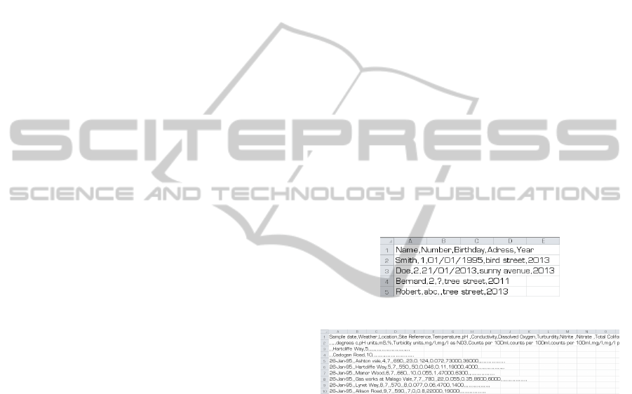
derstanding of a short CSV file is normally simple.
The same is not always true when the size of the CSV
file grows. The number of columns and rows can be
very big making the understanding more difficult.
Figure 1: Simple CSV file.
Figure 2: More complex CSV file.
Methods to analyse tabular data already exists.
For instance, Table Lens is a technique to visualize
and understand the meaning of large tables using a
fisheye approach. The idea of the Fisheye method-
ology is based on a visual distortion where the cen-
tre of the visual perception is zoomed-in while the
other regions displayed are zoomed-out (Sundarara-
jan et al., 2011). This property turns Table Lens more
appropriate for the analysis of precise and small re-
gions of a table. Tableplot Graphics (W. A. Malik
and Gribov, 2010), is used to represent graphically
the cell values of a tabular dataset. It does not anal-
yse and show the type of data analysed. Another re-
lated work on this subject is: Sopan at al. Explor-
ing Distributions - Design and Evaluation (A. Sopan,
M. Freire, M. TaiebMaimon, J. Golbeck, B. Shnei-
derman and Ben. Shneiderman, 2010). However, in
this work, data types were not taken into account ei-
AVisualTechniquetoAssesstheQualityofDatasets-UnderstandingtheStructureandDetectingErrorsandMissing
ValuesinOpenDataCSVFiles
135
ther. InfoZoom is a general tool for visualization of
tabular databases. The main idea of InfoZoom is to
compress large tables reducing column width until all
columns fit on the screen. To achieve this goal, cate-
gorical or quantitative values are aggregated (Spenke
and Beilken, 2003). Despite the value of these tech-
niques, they have limitations that we want to over-
come with our solution.
Based on these premises, our approach is based
on the assumption that a new visualization solution to
analyse tabular data is necessary, or could be at least
extremely helpful in terms of Open Data exploitation.
With our work invested in the development of the
Stacktab chart, we intend to provide a solution with
which the user should be able to:
• Get a visual understanding of the entire structure
of a table. The area used by the chart should
be ideally reduced in order to minimize the time
needed to understand the dataset structure;
• Be able to estimate intuitively the size of the anal-
ysed dataset determining the number of rows and
columns;
• Identify the data types of every cell;
• View the value of each dataset cell;
• Detect possible errors in the dataset in order to
have the possibility to correct or complete it.
Table 1: Solutions summary.
Global structure
visualization
Data
types
Reduced
Screen
Area
Table
Lens
(+) ⇒more ap-
propriate for the
analysis of a pre-
cise region of the
table
(+) (-)
Tableplot
Graphics
(+) (-) (-)
Exploring
distribu-
tions
(+) (-) (-)
Infozoom (-) ⇒displays
database relations
(-) (+)
4 STACKTAB CHART
In this section, the Stacktab chart is described along
with its advantages and limitations.
4.1 Area Needed Minimization
Tabular data is arranged in rows and columns. CSV
files are a file format of tabular data. Many times,
rows of such files have the same data types in each
cell. Based on this fact, and in order to minimize
the screen area needed to represent visually the en-
tire structure of a CSV dataset, Stacktab chart applies
an algorithm to group rows and columns cells of the
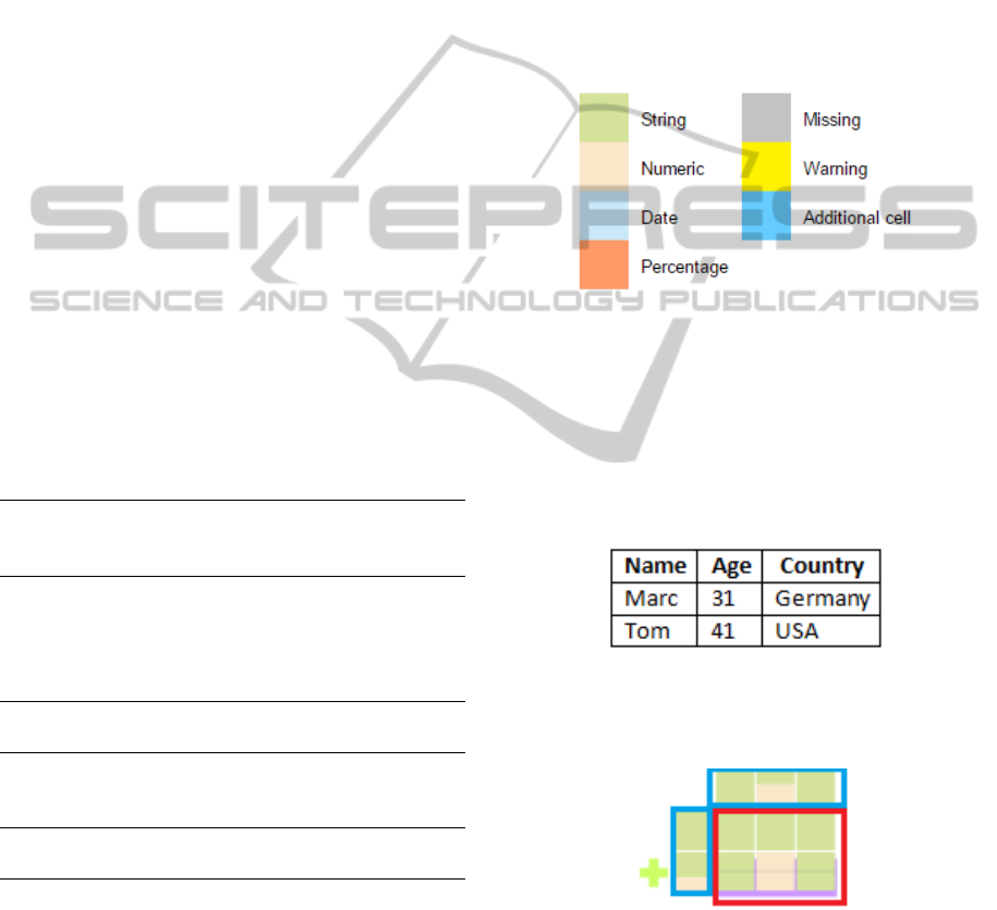
same type. As of now, four different data types are
supported and a colour code is used in order to repre-
sent each of these data types. In our examples, we use
the colour code below.
Figure 3: Colour code used.
The Stacktab algorithm checks, for every row and
every column, each cell data type. Then, for each cell,
if its neighbour is from the same type, the algorithm
groups them into a single row or column. In the fol-
lowing example, we present a simple CSV file with
three columns (Name, Age and Country) and three
rows (headers and data of two different rows).
Figure 4: Simple CSV file example.
Its Stacktab representation can be viewed on the
figure 5.
Figure 5: Simple Stacktab example.
The blue regions will be described in a section be-
low. The red-signalized region is the part which rep-
resents the structure of the CSV file. In this region, it
is possible to detect two different types of rows:
• One row with only green cells - meaning that in
this row, only String values are present in every
DATA2015-4thInternationalConferenceonDataManagementTechnologiesandApplications
136
cell. This row represents the header line of the
CSV file;
• One row composed by one String cell, followed
by one Numeric cell and finally by another String
cell. This row corresponds to the other rows of the
CSV files which have exactly the same structure
(same types of data cells).
This example is too small in order to demon-
strate the particular strengths of the Stacktab chart,
but shows the general principles of the approach. The
chart represents the whole CSV file structure using
the smallest needed screen area. It is evident that the
bigger the files are, the more the user benefits from
this space optimization.
4.1.1 Group/Ungroup Rows and Columns
It is possible to group and ungroup rows and columns
in order to view in detail their structure and values. If
the user wants to ungroup a row or a column, he or
she has two different choices:
• Click on the yellow cross next to the row or col-
umn to be deployed;
• Click on the coloured layer behind the row or col-
umn to be deployed.
The figure 6 shows, on the left, the Stacktab
representation of another CSV file. This file has two
groups of rows (with two rows each), two groups
of columns (with two columns each) and two more
columns with a different structure. If the user clicks
on the cross next to the first row, this grouped-row is
expanded in order to show its complete content.
Figure 6: Expanding a row.
If the user wants to regroup the rows, he or she
just needs to click on the yellow minus symbol (blue-
signalized). Then, the Stacktab will take its initial
form.
The same type of behaviour may be applied to the
columns.
4.1.2 Size Estimation
Stacktab chart provides an intuitive and efficient man-
ner to quickly estimate the size of the analysed CSV
file.
Figure 7: Stacktab CSV size estimation.
Having a quick view over the figure 7, the user is
able to see that:
• There is no grouped column so the CSV file has
exactly five columns;
• The file is composed by two simple rows and one
grouped row. Each cell composing the grouped
row is divided into three equal sections by two
horizontal lines. It means that the grouped row
is composed by three rows.
After this simple analysis, the user is able to con-
clude that the CSV file is composed by five columns
and five rows (25 cells). Again, this simple example
has only been given in order to explain the idea be-
hind the Stacktab chart. Such functionality becomes
more useful when working with more complex and
bigger CSV files. Another manner to obtain the ex-
act number of rows/columns composing a grouped
row/column is to move the mouse over the layer be-
hind the grouping object. A popup appears with the
relevant information. This simple comfort is particu-
larly interesting and important when a large number
of rows or columns are involved by the grouping ob-
ject, making the counting of lines exhausting and dif-
ficult.
Figure 8: Number of rows popup.
4.2 Detailed Information
The aim of Stacktab chart is not only to analyse the
structure of CSV files. Its purpose is also to provide
a tool for the visualization and the assessment of the
content of one (or many) CSV file(s). If the user in-
tends to see the value in a given cell of the file, he only
has to pass the mouse over it. A popup with the value
in the cell appears.
AVisualTechniquetoAssesstheQualityofDatasets-UnderstandingtheStructureandDetectingErrorsandMissing
ValuesinOpenDataCSVFiles
137
Figure 9: Cell detailed information.
This functionality is only possible in cells of rows
or columns which are not grouped. In a grouped
row/column, since a cell represents in fact a group of
cells, this is not applicable.
4.2.1 Statistical Information
Additional information about the structure of the CSV
file is given is both a vertical and a horizontal lines
added for this purpose.
Figure 10: Statistical information.
Both horizontal and vertical lines with statistical
information are indicated in red in the figure 10. They
are used to give a quick idea of the content of each
row/column to the user. Each cell of these lines is di-
vided according to the number of cells with the related
type contained in the file. With this kind of visualiza-
tion, the user may quantify quickly how many cells of
each type are present in a row or column. The exact
number of each data type may also be viewed by a
simple mouse move over the wanted data type colour
region as shown in the figure below.
Figure 11: Statistical information popup.
4.3 Data Quality
Stacktab chart may also be used as a tool to assess the
quality of CSV files. In addition to provide support to
understand the structure of a CSV and view its con-
tent, one of the most important feature of the Stacktab
chart is its ability to detect potential problems existing
in the CSV dataset and also missing values. For each
cell of the dataset, Stacktab’s algorithm computes the
expected data type to be set on it. If the data type in
the cell is not the expected one, the chart explicitly
warns users about this issue, setting the cell colour to
yellow. On the other hand, missing elements are visu-
alized in the grey colour.
Figure 12: Warning example.
By having a quick look at the chart specified in
the figure 12, the user can easily determine that the
dataset has a potential problem. This is shown by the
yellow cell in the 2nd column. By analysing carefully
the chart, a user can easily conclude that every row
of the 2nd column should have a numeric value (ex-
cept the first row which corresponds to the CSV file
header). Since the cell is marked as yellow, it means
that its value is not of numeric type. Just moving
the mouse over the cell, the user is capable of veri-
fying the content of cells and check if there is really
a problem (figure 13). Finally, the user has the choice
to correct the problem before processing the dataset
avoiding the use of incorrect data which could lead to
unexpected or wrong results.
Figure 13: Warning detail.
4.4 File Comparison
In OD, datasets are often published periodically (e.g.
annual expenses, monthly reports, etc.) (South West
DATA2015-4thInternationalConferenceonDataManagementTechnologiesandApplications
138
London and St George’s Mental Health NHS Trust,
2014a) (South West London and St George’s Mental
Health NHS Trust, 2014b). Comparing the structure
and content of different files can be a useful function-
ality in this particular context. When two different
datasets are compared, two different scenarios may
occur:
• Datasets have the same or nearly the same struc-
ture based on a predefined percentage (e.g. 90%
of the structure is the same - the way how this per-
centage is computed is explained in section 4.6.1):
a unique Stacktab chart is generated. Beyond the
concept of stacked-rows and stacked-columns, ex-
ists the idea of stacked-file: both file structures are
grouped into one. An additional layer appears be-
hind the Stacktab chart that shows that datasets
have the same or, at least, a similar structure. The
user also has the opportunity to ungroup the layer
so the detailed information of each file may be
viewed;
• Datasets have significantly different structures:
each dataset is represented by a Stacktab chart re-
spectively.
The figure below (figure 14) shows two CSV files
with exactly the same structure except in one cell (4rd
row/2nd column of the second file) where there is a
missing value.
Figure 14: CVS files with same structure.
Comparing both files using Stacktab chart will
give a unique chart because they have differences in
only 5% of their structure.
Figure 15: Stacktab CVS files comparison.
The user can than intuitively detect where the dif-
ferences, in terms of structure and data types, between
both files are located. In this example, it is possible to
see that the difference between the files is located in
one of the last two rows and in the 2nd column: one
file has a number while the other file has a missing
element (according to the colour code used).
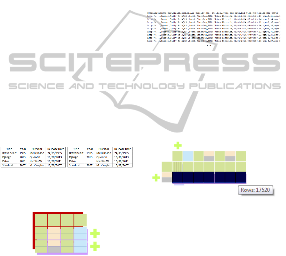
5 REAL CASE STUDY
In this section, we analyse a real case study: the anal-
yse of the dataset containing the data related with air
pollution data for nitrogen dioxide (NO2) and partic-
ulate matter (PM10) concentrations in Barnet during
the year of 2014 (London Borough of Barnet, 2014).
It is a dataset with a relatively simple and regular
structure of 11 columns but a large amount of rows
(17521). A sample of this dataset is showed in the
figure 16.
Figure 16: Barnet Air Quality Monitoring (2014) sample.
Because of its size, it is a good example to show
the benefits of using the Stacktab chart in order to
minimize the area needed to visualize and acquire a
perception of its entire structure. Since this file does
not have a large number of columns and they are quite
well identifiable just looking directly to the CSV file,
in this scenario, the Stacktab chart is more useful to
help the user to understand the data itself like for ex-
ample, detect data types, missing values and potential
problems.
Figure 17: Barnet Air Quality Monitoring (2014).
Because the analysed dataset owns a regular struc-
ture, its related Stacktab chart has a reduced size. This
feature turns the analysis process quicker and more ef-
ficient. Looking to the chart, the user can quickly es-
timate the number of columns and rows of the dataset,
and may also determine the data types present on the
file (in this case, dates, numbers and strings). Another
major feature provided by the chart is the possibility
to quickly detect that the file has missing elements.
This information is crucial for the user to decide if
missing elements are mandatory and should be com-
pleted before using the dataset. In this case, and be-
cause the proportion of missing elements in several
rows and columns is elevated (around 50%), this sit-
uation may be considerated normal or can be consid-
AVisualTechniquetoAssesstheQualityofDatasets-UnderstandingtheStructureandDetectingErrorsandMissing
ValuesinOpenDataCSVFiles
139
erated critical because of the amount of missing val-
ues that should be completed before reusing dataset.
Finally, it is easy for the user to conclude that no po-
tential errors are present in the datasets because there
is no yellow cell. We can also notice that the last row
of the chart presented in the figure 17 is darker. This
is due to the high density of horizontal lines shown -
there is 17519 hotizontal lines drawed. All the 17520
lines of the dataset (except the header) has the same
kind of structure, so they are all grouped into one. The
user has the possibility to deactivate the visualization
of these horizontal lines. However, in order to en-
hance the amount of grouped rows, we have choosen
to maintain them. In this case, the benefits related
with the space gained to represent the structure of the
dataset using the Stacktab chart are high: The entire
structure of a dataset with 11 columns and more than
17000 rows is represented by a chart with only two
rows and 7 columns.
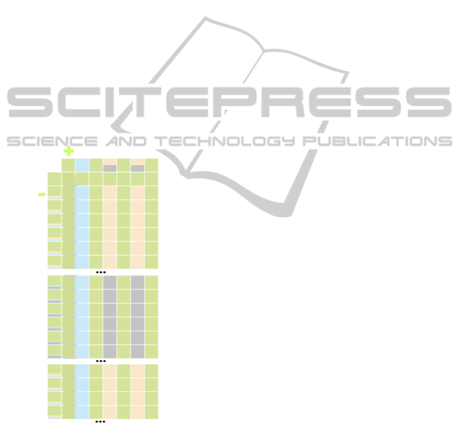
In order to see more detailed information about
the grouped rows/columns, the user can obviously ex-
pand them.
Figure 18: Portions of the Barnet Air Quality Monitoring
(2014) dataset expanded.
6 CONCLUSIONS AND FURTHER
WORK
Governments worldwide are encouraging organiza-
tions to publish their data on the Internet. Public and
private entities are investing time and money to do so.
The potential of OD is huge. However, even though
OD movement has already started a few years ago,
there are some issues that still must be overcome.
There is no common standard used in order to pub-
lish OD datasets. This fact complicates the OD reuse.
Some issues related with the data quality still exist.
Even if the access to OD datasets is possible, it does
not mean that the information can be reused. Before
reusing datasets, it is mandatory to understand their
structure in order to know where meaningful infor-
mation is located. Stacktab chart has been presented
as a solution for the understanding of the structure of
OD CSV files. It provides a visual approach in order
to view the complete structure of a CSV dataset using
the minimal screen area needed. This concept turns
the analysis area smaller and improves the analysis
efficiency. Additionally, Stacktab chart brings also
a mechanism in order to detect missing values and
potential problems in the datasets. The user has the
opportunity to correct them avoiding the use of erro-
neous data. Finally, Stacktab chart may also be used
to compare CSV files generated over time which is es-
pecially useful in the OD context. Stacktab is not only
a solution to understand the structure of CSV files but
it can also be used in order to assess the quality of
those files. Until now, Stacktab has only been tested
with files having a maximum of 9000 lines and 16
columns (144000 cells). The amount of information
kept in memory is important and increases with the
size of analysed datasets. Performance are currently
acceptable but dealing with larger datasets may have
a significant impact on the time processing needed.
Scalability is a problem the solution can be faced
with. A solution implementing a clustering method to
group similar cells structures can be implemented to
improve performance. Another solution would be to
show the structure of the datasets only taking into ac-
count missing elements and warnings. The data type
of each cell would not be differentiated but should
continue to be viewed (for example, using stacked
cells) - the size of the Stacktab chart would dramati-
cally decrease, more rows/columns would be grouped
causing an important performance raise. Currently,
Stacktab is only able to detect four different data
types: String; Numeric; Date and Percentage. It could
be improved in order to support the recognition of
more data types (e.g. email format; phone numbers;
etc.). Stacktab does not yet take into account metadata
provided with the datasets. Metadata, when delivered
with the datasets, is of high importance for searching
and filtering the datasets. Our future work will focus
on this objective: to be able to visually select datasets
DATA2015-4thInternationalConferenceonDataManagementTechnologiesandApplications
140

obeying to a set of properties (defined by their meta-
data). Then, after obtaining a subset of datasets, fur-
nish a visual solution that supports the selection of the
wanted columns, rows and cells in order to use them
or insert them into another type of data source (e.g.
a relational database). The entire chain of searching,
selecting datasets and cells to integrate will be cov-
ered.
REFERENCES
A. Haug, F. Z. and Liempd, D. V. (2011). The costs of poor
data quality. Journal of Industrial Engineering and
Management, 4(2):168–193.
A. Sopan, M. Freire, M. TaiebMaimon, J. Golbeck, B.
Shneiderman and Ben. Shneiderman (2010). Explor-
ing distributions: design and evaluation. University
of Maryland, Human-Computer Interaction Lab Tech
Report HCIL-2010-01.
A. Zuiderwijk, K. J. and Janssen, M. (2012). The potential
of metadata for linked open data and its value for users
and publishers. Journal of e-Democracy and Open
Government, 4(2):222–244.
Australian government (2008). Declaration of open gov-
ernment. http://www.finance.gov.au/e-government/
strategy-and-governance/gov2/declaration-of-open-
government.html. Last accessed on January 27, 2015.
data.gouv.fr (2011). Plateforme ouverte des donn
´
ees
publiques franc¸aises. https://www.data.gouv.fr/fr/.
Last accessed on January 27, 2015.
Data.gov (2009). The home of the u.s. government’s open
data. http://www.data.gov/. Last accessed on January
27, 2015.
European Commission (2011a). Digital agenda: Com-
mission
´
s open data strategy, questions & an-
swers. http://europa.eu/rapid/press-release MEMO-
11-891
en.htm?locale=en. Last accessed on January
27, 2015.
European Commission (2011b). Digital agenda: Turn-
ing government data into gold. http://europa.eu/rapid/
press-release IP-11-1524 en.htm. Last accessed on
January 26, 2015.
Hoffman, P. and Grinstein, G. (2012). The home of the u.s.
government’s open data. https://www.data.gov/. Last
accessed on January 26, 2015.
Kitchin, R. (2014). The data revolution: Big data, open
data, data infrastructures and their consequences.
Sage.
London Borough of Barnet (2014). Air quality moni-
toring - 2014. http://data.gov.uk/dataset/air-quality-
monitoring-2014. Last accessed on April 13, 2015.
M. Janssen, Y. C. and Zuiderwijk, A. (2012). Bene-
fits, adoption barriers and myths of open data and
open government. Information Systems Management,
29(4):258–268.
Moore, R. and Lopes, J. (2014). Barriers to open data re-
lease: A view from the top.
N. Veljkovi
´
c, S. B.-D. and Stoimenov, L. (2014). Bench-
marking open government: An open data perspective.
Government Information Quarterly, 31(2):278–290.
Nugroho, R. P. (2013). A comparison of open data policies
in different countries.
S. Hunnius, B. K. and Schuppan, T. (2014). Providing,
guarding, shielding: Open government data in spain
and germany. In 2014 EGPA Annual Conference, 10-
12 September 2014 in Speyer, Germany.
South West London and St George’s Mental Health
NHS Trust (2014a). Finance expenditure august
2014. http://data.gov.uk/dataset/finance-expenditure-
august-2014. Last accessed on Ferbruary 2, 2015.
South West London and St George’s Mental Health
NHS Trust (2014b). Finance expenditure september
2014. http://data.gov.uk/dataset/finance-expenditure-
september-2014. Last accessed on Ferbruary 2, 2015.
Spenke, M. and Beilken, C. (2003). Visualization of trees
as highly compressed tables with infozoom. In Pro-
ceedings of the IEEE Symposium on Information Vi-
sualization, pages 122–123. Citeseer.
Sundararajan, P. K., Mengshoel, O. J., and Selker, T.
(2011). Multi-fisheye for interactive visualization of
large graphs. In Scalable Integration of Analytics and
Visualization.
UK Government (2009). Opening up government. http://
data.gov.uk/. Last accessed on January 27, 2015.
UK Government (2013). Open data charter. https://
www.gov.uk/government/publications/open-data-
charter. Last accessed on January 27, 2015.
W. A. Malik, A. U. and Gribov, A. (2010). An interactive
graphical system for visualizing data quality–tableplot
graphics. In Classification as a Tool for Research,
pages 331–339. Springer.
Zuiderwijk, A. and Janssen, M. (2014). Open data poli-
cies, their implementation and impact: A framework
for comparison. Government Information Quarterly,
31(1):17–29.
AVisualTechniquetoAssesstheQualityofDatasets-UnderstandingtheStructureandDetectingErrorsandMissing
ValuesinOpenDataCSVFiles
141
