
The Eye-tracking Study of the Line Charts in Dashboards Design
Pavel A. Orlov
1,2
, Tatiana Ermolova
1
, Vladimir Laptev
1
, Alexey Mitrofanov
1
and Vladimir Ivanov
1
1
Department of Engineering Graphics and Design, Peter the Great St. Petersburg Polytechnic University,
Polytechnicheskaya 29, St. Petersburg, 195251, Russia
2
School of Computing, University of Eastern Finland, PO Box 111, FI-80101, Joensuu, Finland
Keywords:
Eye Tracking, Eye Movement, Dashboards, Information Graphics, Line Graphs.
Abstract:
Dashboards are an important field for an investigation as they are the visual part of the management informa-
tion systems. Our study aimed to find out the effects of the changes in the types and numbers of line graphs
that can be displayed on a single screen simultaneously. Two laboratory experiments were conducted using an
eye-tracker to find out how subjects’ perception of line graphs on dashboards changes with increase in graph
numbers, changes in sizes and increase of the overall area taken up by the graphs on the screen. We show that
if the graphs take up the same area, the subjects perceive the line graphs displayed simultaneously in a similar
manner. If the subjects are shown an increasing number of graphs of the same size, the subjects take longer to
respond to tasks and have higher fixation count per each stimuli. The study revealed that there is no correlation
between graph’s slope (trend) and subjects’ perception.
1 INTRODUCTION
Dashboards (sometimes referred to as instrument pan-
els, control panels) are a tool for data visualisation.
Dashboards are a vital part of everyday life, for exam-
ple for NASDAQ traders (American/Canadian stock
exchange traders). One faces a considerable amount
of information both during work and during leisure.
For working with large amounts of data, especially if
managing companies, it is vital to have all the data,
trends and correlations ’at the finger tips’. Visualis-
ing all the required data on a single computer screen
poses a challenge for both programmers and design-
ers.
Providing effective data visualisation is critical to
dashboard design. There are many ways of visualis-
ing the same information. There are, however, rela-
tively few studies on how the number of graphs dis-
played at the same time affects the person working
with the dashboard. In our study, we will test the ef-
fects of the amount of graphs displayed on the screen
simultaneously on the subjects’ perception of the in-
formation. Because the same number of graphs can be
displayed on the screen differently, we will also test
the effect of the graphs’ size on the subjects’ percep-
tion. This research is important for dashboard design
as it presents the basics of any design, which is often
neglected during dashboard development. Instead of
using scientifically proven methods for designing the
dashboards, designers sometimes opt for trial and er-
ror method, which is a tedious process that may not
yield any results.
With this in mind, it is difficult to address all the
challenges that are presented before the dashboard de-
signers. They can be, however, addressed separately.
This process of deconstructing dashboards into differ-
ent design aspects and starting from the more simple
ones, would give more solid grounds for further, more
complicated work. This approach would also limit the
amount of variables that are being studied at one time.
In our case, line graphs were studied. After all, they
are the most frequently used basic way to visualise
a considerable amount of comparable information on
websites, user interfaces and dashboards.
This paper aims to start the process of system-
atic analysis of different aspects of dashboards design.
This will give a clearer picture about the perception
of information (which contributes to the scientific do-
main of information perception studies) and help to
develop recommendations on better ways of informa-
tion visualisation not only on dashboards, but also on
websites and on other types of user interfaces.
The study was carried out on the effect of the
graph sizes and graph count on immediate reactions
and answers of the users. Many dashboards are de-
signed and used for quick and easy perception of in-
formation. Usually this information requires imme-
diate action. The dashboards also have to visualise a
Orlov, P., Ermolova, T., Laptev, V., Mitrofanov, A. and Ivanov, V.
The Eye-tracking Study of the Line Charts in Dashboards Design.
DOI: 10.5220/0005692102030211
In Proceedings of the 11th Joint Conference on Computer Vision, Imaging and Computer Graphics Theory and Applications (VISIGRAPP 2016) - Volume 2: IVAPP, pages 205-213
ISBN: 978-989-758-175-5
Copyright
c
2016 by SCITEPRESS – Science and Technology Publications, Lda. All rights reserved
205

considerable amount of information. The tasks given
to the subjects during our study were designed to be
quick, easy and yielding the quickest responses in or-
der to model a simplified dashboard environment.
2 BACKGROUND RESEARCH
2.1 Information Graphics
Two of the most popular graph types of information
graphics (graphs) are line and bar graphs. Line graphs
are used to display data or information that changes
over time, thus they are used for conveying data trends
and distributions. Researchers and designers for a
number of reasons often criticize line graphs. Nev-
ertheless, they remain the most popular tool for data
visualisation due to their simplicity.
(Cleveland and McGill, 1985) pointed out that
”today graphs are a vital part of communication in
science and technology, business, education, and the
mass media” (p. 530). Even though William Playfair
introduced graphs nearly 200 years ago, there remain
many questions about their proper use, design and ef-
fects on data perception. There are many studies of
information graphs (e.g. Tufte, 1983), but a limited
amount of scientific data exists on the subject.
Studies had been carried out in order to determine
graph perception. A number of researchers addressed
the problem of finding the best task- or person-
orientated visualisations (Newman and Scholl, 2012).
Small multiples is a term introduced by Edward
Tufte in 1983 to describe similar graphs and charts
with the same axes and scales that can be compared
easily. As Tufte puts it: ”for a wide range of problems
in data presentation, small multiples are the best de-
sign solution.” (Tufte, Envisioning Information, 1990,
p. 67) It was found that small multiples allow users
to compare all different alternatives available to them
and to choose the one that interests them (van den
Elzen and van Wijk, 2013). This means that the best
way to develop a task that consists of finding the right
graph among other graphs would be to use small mul-
tiples.
Small multiples are often used during dashboard
design. Theoretically, however, small multiples have
to be placed in a logical order (Tufte, 1983), which is
a very hard task, especially if the dashboard is set to
display varying information that changes over time.
2.2 Modern Dashboard Design
Challenges
Dashboards are visual displays and the information
on a dashboard is presented visually, combining text
and graphic (Few, 2006). The idea of digital dash-
boards was devised in the mi ddle of 1970s. When
the dashboards gained popularity in 2000s, each com-
pany took care of their own dashboards. Development
and popularity of the web technology now permits the
companies to buy dashboards from third-party com-
panies.
There are several definitions of the word ”dash-
board”. Dashboard is a tool that helps to identify
trends, patterns and anomalies for effective decision-
making (Brath and Peters, 2004). This tool is in-
tuitive, flexible and easy to use (Harel and Sitko,
2003). Designed for rapid monitoring, dashboards
display the most important information on a single
screen (Brath and Peters, 2004).
There is a number of recommendations on dash-
board design. However, as (Few, 2006) puts it, the
process of dashboard design is made too complicated
due to the lack of solid design recommendations.
Dundas Data Visualization suggests several char-
acteristics of a good dashboard (2013): ”[a dash-
board] communicates with clarity; quickly, and com-
pellingly [...] it applies the latest understanding of
human visual perception to the visual presentation of
information”.
There is a question about how many different el-
ements and what amount of vital information can be
displayed on the same screen simultaneously. Few
suggests that ”across the entire dashboard, non-data
pixels- any pixels that are not used to display data, ex-
cluding a blank background – should be reduced to a
reasonable minimum” (Few, 2006) (p 97). This corre-
sponds with Edward Tufte’s (1983) ’Data Ink Ratio’:
”A large share of ink on a graphic should present data-
information, the ink changing as the data changes”
(p.96).
Following the Data Ink Ratio allows designers to
create effective single information graphs. Neverthe-
less, what is a ”reasonable minimum” and how much
information can be displayed on the same screen
without the user having problems with data percep-
tion (Few, 2006). When the data displayed to the sub-
ject is greater than subject’s working memory a cog-
nitive overload occurs (Mayer, 1989) and the user ex-
periences problems with decision-making and fails to
respond adequately to the data.
Completion and accuracy of a task may indicate
the degree of graph effectiveness; however, a more
in-depth study is required (Goldberg and Helfman,
IVAPP 2016 - International Conference on Information Visualization Theory and Applications
206

2010). One of the tools used to understand how the
subject perceives graphs is an eye-tracking technol-
ogy.
There had been a number of discussions on
whether graph trends also affect the information per-
ception. This idea is important to consider whilst
studying the graph’s effects on the subjects. (Newman
and Scholl, 2012) tested the above assumption and
determined that there are indeed some differences in
how rising and declining graphs are perceived by the
subjects. The above research indicated that subjects
tend to regard the rising graphs in a positive manner,
whilst the declining graphs are seen in a highly nega-
tive manner. That is to say, the graph trends affect the
subjects’ perception.
2.3 Eye-tracking
Eye tracking is used to understand the eye movements
and gaze positions (Orlov et al., 2014). Based on the
eye movements, eye-tracking can be used to deter-
mine whether the type of diagram affects how the sub-
ject reads it (Goldberg and Helfman, 2010) or whether
the subject experiences a cognitive overload whilst
working with a distracting dashboard (Bera, 2014).
Two metrics are commonly used in eye tracking:
eye fixations and eye saccades (Jacob and Karn, 2003;
Duchowski, 2007). The human eye scans the scene by
rapid eye movements (called saccades), followed by
fixations (relatively stable movements). During sac-
cades, the vision is essentially suppressed.
During fixations, eyes remain almost motionless.
A fixation lasts typically for about 200-300 millisec-
onds (Yarbus, 1965) and is considered to show where
viewer’s attention is directed (Rayner, 2009). Fixa-
tion count is a value revealing the level of cognitive
processing of a subject (Bridgeman et al., 1994; Jacob
and Karn, 2003). Some studies show that a dashboard
with excessive information increases the overall fixa-
tion time and count (Bera, 2014).
3 EXPERIMENT 1
3.1 Method
Hypothesis: The number of graphs simultaneously
displayed on the screen and their type (rising, declin-
ing and stable) affects the process of obtaining visual
information. From our hypothesis, we formed 6 re-
search questions:
• RQ 1. Will the number of graphs influence the
fixation duration?
• RQ 2. Will the number of graphs influence the
task solving time?
• RQ 3. Will the number of graphs influence the
number of fixations?
• RQ 4. Will the type of graphs influence the fixa-
tion duration?
• RQ 5. Will the type of graphs influence the task
solving time?
• RQ 6. Will the type of graphs influence the num-
ber of fixations?
Rising, declining and stable line graphs were used
(Figure 1) as stimuli. To eliminate the human fac-
tor from data generation, a Python script was writ-
ten to generate graph values procedurally. The values
were synthetically generated on purpose, as using real
data would have brought certain difficulties and extra
variables into our experiments. Even, if a consider-
able amount of required data were obtained, it would
still generate uneven graphs that would not have clear
trends. Using specific data would also mean that we
would limit the effects of line graphs to a specific do-
main. All the data used for graph generation did not
carry any specific information, such as house prices,
or food prices, so that the subjects would pay atten-
tion to the trends, rather than what effects those trends
would have on them in this specific domain.
According to Cleveland’s theory, graphs, display-
ing slow processes (such as wind speed, water temper-
ature etc.) should follow the banking 45
◦
rule (Cleve-
land and McGill, 1987). Our graphs were generated
in accordance with this rule. The generated values
varied, but the difference between sequential values
was strictly limited to no bigger than three. The stim-
uli graphs were even and controlled with no fluctua-
tion.
All the graphs were given the same basic title.
The graphs were generated in a way similar to that
of (van den Elzen and van Wijk, 2013): the small
multiples were generated using the same parameters
for all instances except one single variable (van den
Elzen and van Wijk, 2013). Small multiples are of-
ten used in dashboards. However, they limit the way
the graphs have to be displayed: theoretically, small
multiples must be placed in a logical order. For our
study, we will adopt the small multiple principle, but
we will deal with a more complicated scheme. The
graphs will be virtually identical but for one variable,
but they will have a random order on the screen. Our
experiment does not aim to test the benefits of small
multiples. Instead, we look at information perception
in a simplified dashboard environment.
Yost pointed out a number of different actions sub-
jects can carry out whilst examining information dis-
The Eye-tracking Study of the Line Charts in Dashboards Design
207
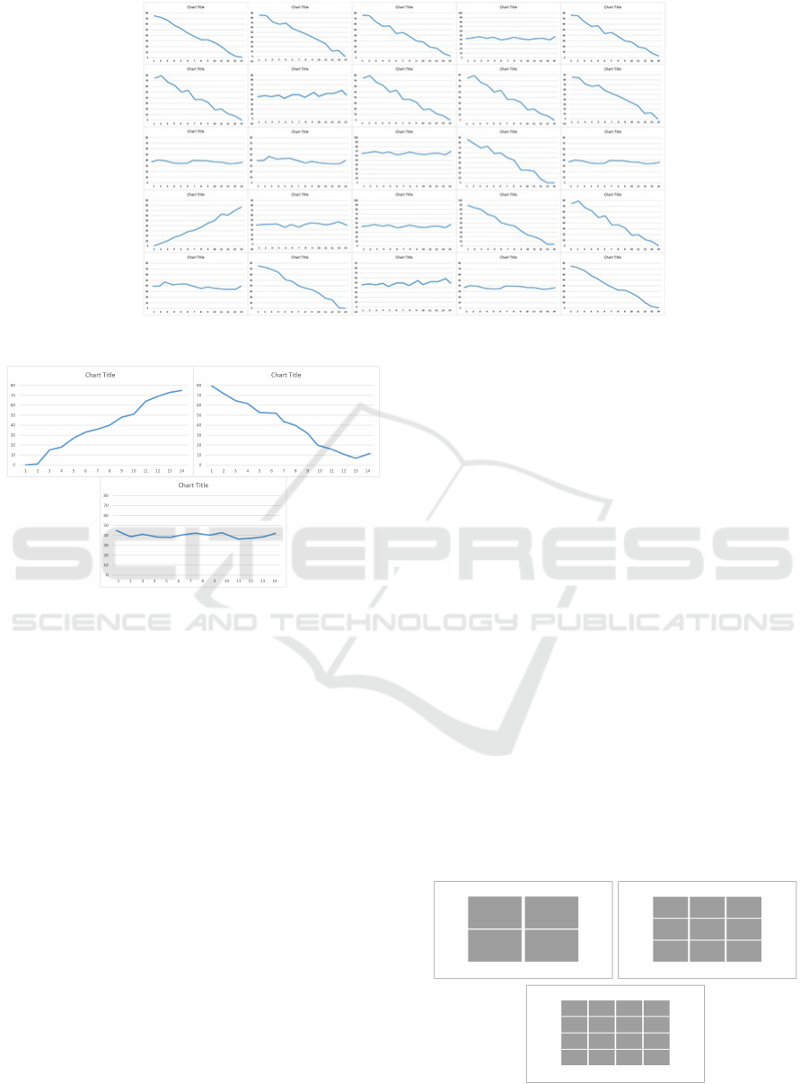
Figure 2: An example of a 5x5 line graph grid.
Figure 1: Rising, declining and stable graph visualizations
used in the tutorial.
played on the small multiples: identifying, exploring,
comparing and even clustering information (Yost and
North, 2006). This, however, requires keeping the
graphs constant during the entire experiment. How-
ever, in order to answer all the research questions
listed above, we would have to change two important
variables (graphs sizes and active area sizes). For re-
sults that are more reliable only one process (a process
of identifying a particular graph type) can be intro-
duced.
The graphs were placed side by side forming a
grid. The subjects were shown a 2x2, 3x3, 4x4 and,
finally graph 5x5 grid for each task. The 5x5 grid was
chosen as a reasonable maximum number of graphs
(25), see Figure 2.
For each set, the subjects were given a task of find-
ing one type of graph (either rising, declining or stable
graph). The process was split into two parts: subjects
were first shown line graphs and, once they found the
correct answer, they switched to the next screen where
the graph grid was copied using grey rectangles. On
the second screen, the subjects were told to click on
the place, where the correct answer to their task was
on the previous screen. This method separated the
data about the subjects’ fixations and the action of tar-
get click.
Before the experiment, all the subjects were
shown a tutorial, where they were told what kinds of
graphs they would be shown and what task they need
to carry out (the task of finding one particular graph
type in each set of tasks was explained using images
and examples).
After the subjects clicked on their answer on the
screen with grey rectangles, an image of an animal
was displayed. This powerful semiotic image dis-
tracted the subjects. This break introduced a new area
of interest, so the subjects would not have to carry out
the next task, while focusing on the last.
Before carrying out the experiment, a test exper-
iment was performed in order to check our method
against real results and determine any difficulties the
subjects may experience during the experiment. For
this experiment, the graph grid took up the same area
on each screen. The number of graphs for each set
of graphs gradually grew (4, 9, 16 and 25 graphs on
a single screen). As the number of graphs grew, the
graphs became smaller. The subjects were asked to
Figure 3: A layout for the 2x2, 3x3 and 4x4 grid for Exper-
iment 1.
IVAPP 2016 - International Conference on Information Visualization Theory and Applications
208
find one particular type of graph in each set of graphs
(at first they looked for rising graphs, then declining,
then stable). After carrying out the test experiment,
some minor changes were introduced, such as a more
detailed explanation of the tasks in the tutorial.
3.2 Apparatus
The stimulus was presented on a PC with Intel(R)
Core(TM) 2 Duo CPU E8400 @ 3.00G Hz, 3.25GB
memory and the Microsoft Windows XP operating
system. The graphics system consisted of High-
performance monitor BENQ XL2411 24” (53cm x
30cm), 1920 x 1080px with 144Hz. Eye movements
were registered with an eye tracking system SMI
RED250 on a different computer. Fixation detection
was done by SMI iViewX software. The eye track-
ing system was calibrated to the subject’s eyes, using
five points on a display. The SMI iViewX software
saves the coordinates of the points and all the follow-
ing calculations were done based on the calibration
data (Orlov et al., 2014).
3.3 Procedure
37 subjects were given a task of finding a certain
type of graph in three sets of graphs. The age of
the subjects varied from 18 to 26 years. The sub-
jects were both undergraduate and postgraduate stu-
dents. We did not perform any vision tests on the sub-
jects. We did however ask the subjects about their
eye-sight. All the subjects reported having normal
vision or wore lenses/glasses, thus making their vi-
sion normal. None of the subjects reported colour-
blindness or any other vision defects. All the students
were designers/studying design, so any vision defects
would have been well known to them and their tutors.
Graphs within the grid were randomized for each
subject; as a result, the answer to the task was ran-
domly positioned within the grid. This allowed us to
eliminate the effects of the graph positioning on graph
perception, as each subject had to look for the correct
answer in a randomized point on the screen.
Regardless of the tutorial, the subjects still took
time to adjust to the task, so, consequently, they re-
quired more time to go through the first set of graphs.
To eliminate this delay in our study, we randomized
tasks. Unlike the test experiment, rise-decline-stable
task sequence was no longer retained and each sub-
ject had a different sequence of tasks (i.e. decline-
rise-stable, stable-decline-rise etc.).
3.4 Results
In our study, eye movement data was recorded: fixa-
tion duration, number of fixations per stimuli and total
duration. We also noted whether the answer given by
the subject was correct. The task was simple, so none
of the subject made any mistakes during the experi-
ment.
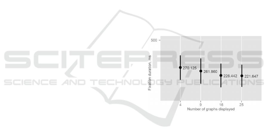
The number of graphs simultaneously displayed
was determined to have an effect on the fixation dura-
tions (Kruskal-Wallis rank sum test (for none normal
distributed data, like fixations duration (Duchowski,
2007)): p − value = .000 < .05; chi − squared =
21.163). The increase in graph count resulted in a
decrease in fixation durations. From Figure 4 we can
determine that when subjects looked at four graphs,
they had longer fixations, compared to that of the av-
erage length of the fixation for 16 graphs.
However, no correlation between the number of
graphs displayed on the screen and the number of
fixations per stimuli (p − value = .69 > .05;chi −
squared = 1.465) was found. On average, the sub-
jects made around 10 fixations per stimuli.
Figure 4: Experiment 1. Total fixation duration.
Surprisingly, the response time (total duration of
task solving) is not affected by the number of graphs
displayed (p − value = .44 > .05;chi − squared =
2.702).
The data was analysed in order to determine
whether the type (rising, declining and stable) of
graph the subjects were looking for affected the per-
ception of data. The determined that the type of graph
does not affect the number of fixations (F(2, 80) =
.65, p = .524) and the overall time for task solv-
ing (F(1, 81) = .932, p = .337) .The Kruskal-Wallis
rank sum test determined that the type of graph does
not affect the fixation duration (p − value = .265 >
.05;chi − squared = 2.654). None of these differ-
ences was statistically significant.
The Eye-tracking Study of the Line Charts in Dashboards Design
209

3.5 Discussion
The first set of questions is aimed to determine the
influence of the number of graphs on perception. It
was found that this factor influences the fixation du-
ration (RQ1). We can conclude that our findings
(see Figure 4) correspond with concepts of attention
landscapes by (Velichkovsky, 2006). Longer fixa-
tions (with shorter saccades) used for the answering
the What question corresponds with the time for ob-
taining the meaning of the visual zone. An oppo-
site happens with shorter fixations (with longer sac-
cades). Shorter fixations are typically used for the
searching tasks (the Where question) (Burgert et al.,
2007). From this we can conclude, that subjects’ vi-
sual searching strategy switched when the number of
graphs reached 16.
No correlation between the number of graphs and
the number of fixations (RQ 3) was found. In our
research, no influence of graph types was determined
(RQ 4, RQ 5 and RQ 6). This result may be explained
by the fact that subjects perceive different graph types
in a similar manner.
The number of graphs does not influence the task
solving duration (RQ2). This might be explained by
the fact that the physical size of the graphs was dif-
ferent: the smaller the number of graphs, the bigger
size of the each graph. In order to exclude the size
factor from the experiment conditions the second ex-
periment was conducted.
4 EXPERIMENT 2
4.1 Procedure
38 undergraduate and postgraduate students took part
in the second experiment. In order to eliminate the
bias of learning, new subjects were introduced into
the experiment. The subjects were from 18 to 28 years
of age. The subjects reported about their vision and
vision defects. The subjects, who did not have 20/20
vision, were asked to wear their prescribed glasses
and lenses. This means that in experiments one and
two all the subjects had normal vision without any
strong or evident vision defects.
The same Method and Hypothesis was used. We
kept the idea of graph randomization and task se-
quence randomization. The basic set up of the exper-
iment was the same as for the first experiment. This
time, however, we took a different approach to how
the graphs were displayed on the screen. Unlike the
previous experiment, the size of the graphs remained
constant (256x153 px), consequently the area taken
up the graphs on the screen changed noticeably (from
512x306 px for the 2x2 grid up to 1280x765 px for
the 5x5 grid), see Figure 5.
Figure 5: A layout for the 2x2, 3x3 and 4x4 grid for Exper-
iment 2.
4.2 Results
We found that the number of graphs affects the num-
ber of fixations (ANOVA: F(1, 774) = 126.38, p =
.000). Figure 6 (left) provides the mean of the fixa-
tion numbers. Generally, a smaller number of graphs
had a smaller number of fixations.
Further analysis showed that the time required for
task completion is also influenced by the number of
graphs (ANOVA: F(1, 94) = 11.024, p = .001). Fig-
ure 6 (right) shows the positive correlation between
the number of graphs and the total task solving time.
We did not determine the effect of the number of
graphs on the fixation duration (The Kruskal-Wallis
rank sum test: p − value = .07 > .05; chi −squared =
7.047).
The overall fixation duration, however, almost
doubled during the second experiment, going from
the mean of 13.317 for the 2x2 grid to 21.72 for the
5x5 grid.
It was determined that there was no correlation be-
tween the types of graphs the subjects were tasked
to find on the screen and fixation duration (The
Kruskal-Wallis rank sum test: p − value = .829 >
.05;chi − squared = 0.375), fixation count (ANOVA:
F(2, 93) = .419, p = .659) and time for task comple-
tion (ANOVA: F(2, 93) = .635, p = .532).
4.3 Discussion
This experiment was designed in order to determine
the importance of the graph count and type in dash-
board design. We found that the number of graphs
influences the number of fixations. The number of
graphs (RQ 2, RQ 3) also influences the total task
solving time. The number of graphs (RQ 1) does not
affect the fixation durations.
IVAPP 2016 - International Conference on Information Visualization Theory and Applications
210
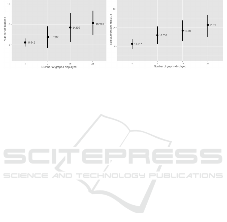
Figure 6: Experiment 2. Left: Number of fixations per each graph grid type. Right: Total time required for the subjects to
respond to the task.
When compared to the Experiment 1, we can con-
clude that the fixation durations are affected greatly
by the graph sizes. There are several possible ex-
planations for this result. It could be because when
a greater amount of details was available to the sub-
jects, subjects spent more time studying the details on
the graph rather than solving the task. This could also
be explained by considering that, during perception,
each graph’s importance and the amount of informa-
tion it displays for the user depends heavily on the
area it occupies on the screen.
Unlike the first experiment with no significant
change in fixation count, during the second experi-
ment mean fixation count almost doubled from 5.542
fixations per 2x2 stimuli to 10.292 fixation for 5x5
stimuli during the second experiment.
The second group of research questions focuses
on the graph’s type. As in an Experiment 1, here we
also did not find any influences of this factor on the
fixation duration, task solving time and the number of
fixations (RQ 4, RQ 5, and RQ 6).
5 GENERAL DISCUSSION
The results display an evident difference between the
effects of the two possible approaches to line graph
distributions on the screen.
Subjects studied bigger graphs with longer fixa-
tions. When working with a graph that takes up a
relatively big area on the screen, the subjects stud-
ied it in more detail. For the smaller graphs, the sub-
jects opted for a ’glancing over’. In the first experi-
ment, the subjects perceived a graph grid of four line
graphs and a grid of 25 graphs with the same speed.
In the second experiment, when the graphs were all
of the same size, four graphs were perceived faster
than 25. This means that the useful area of the screen
(not the graph count) correlates to the time required
to solve the task. During dashboard design, the de-
signers should consider this finding: the size of the
graph depends heavily on the level of detail that is
needed for a specific task. The information for imme-
diate reaction and quick overall assessment should be
displayed on a small area relative to the screen.
Our study shows that if four graphs are being dis-
played, their total size is recommended to be 16% of
the total active screen and 36% of the screen for 9
graphs. Graphs that convey a more in-depth infor-
mation have to be larger, as larger graphs are always
studied in more detail.
It is not necessary to fill the screen with large
graphs. Designers have to sacrifice the useful screen
area in order to increase the speed of problem solv-
ing and information assessment. Nevertheless, it is
important that the rest of the available space must re-
main empty, as adding images and other graphics to
the dashboard results in so called ”distracting dash-
board” (Bera, 2014).
It was determined that the graph type does not af-
fect the subjects’ perception. There is no evidence
showing that the subjects perceive more ’positive’ ris-
ing graphs better than the declining graphs, or find
stable graphs more readily. This remains true for both
experiment setups. (Goldberg and Helfman, 2010)
determined that line graphs do not promote left to
right scanning of the graph’s body, instead the sub-
jects opt for a ’back and forth’ approach. This be-
haviour supports our results: if the subject studies the
graph using a back and forth eye movement, there
should be no actual preference to which graph types
the subject finds faster. If the graphs were to be
scanned from left to right, declining graphs would
have been easier to detect, as their lines start at the
upper left corner of the axis.
On the other hand, the study by (Newman and
Scholl, 2012) shows that the rising and declining
graphs, in his case bar graphs, are still perceived in
The Eye-tracking Study of the Line Charts in Dashboards Design
211

a different manner: rising graphs are seen by the sub-
jects to be more optimistic than they really are, while
the subjects interpret a declining graph in a nega-
tive manner. As our subjects were not questioned on
whether they found it easier to find a certain graph
type, we cannot conclude whether the graph types
have absolutely no effect on users in terms of positive
or negative perception and correct decision-making.
6 CONCLUSION
Our findings can be applied to a whole number of
different domains e.g. web design. While not be-
ing classic dashboards, web pages, as well as other
user interfaces, often carry out the same tasks as dash-
boards (display information graphs, allow users to
make immediate decisions, convey important infor-
mation). The paper could be used as one of the guide-
lines for both web and dashboard designers, when
making choices about graph placements and graph
sizes relative to the screen. Many websites could ben-
efit from the idea that the amount of graphs that is
being displayed simultaneously is not as important as
the size of those graphs (or any other images, text-
blocks or information).
When designing the dashboard (or a dashboard
screen) designers should note that the graphs that oc-
cupy a relatively small amount of the active screen
convey information quicker than larger ones.
It also important to note that during the first ex-
periment a change in a visual searching strategy by
the subjects was noted. This is an interesting concept
that can be explored further in future works.
The paper deals with the idea of whether bigger
graphs are better for perception speed and whether
a greater number of graphs makes information per-
ception difficult. Our findings showed that the useful
screen area corresponds to the speed of the problem
solving. This means that dashboard designers should
sacrifice screen area, use smaller graphs and leave
empty spaces if the dashboard (dashboard screen they
are designing) is used for basic immediate assess-
ment. If a more in-depth assessment is required,
larger graphs are recommended.
The paper also contributes to the studies of infor-
mation perception in terms of both user interfaces and
infographics. The paper may serve as the base for a
more in-depth study of information perception. As
a follow-up of the experiments, an eye-tracking study
should be carried out on other types of graphs, such as
bar graphs or pie charts, in order to find out whether
our conclusions are true for other types of information
graphs. Adding graphs that are more complicated or
information from a specific domain, greater distract-
ing points of interest or longer and more demanding
tasks (such as exploring, concluding, comparing and
clustering (Yost and North, 2006)) could also be in-
troduced. This would help to understand how design-
ers should act, when their dashboard needs to convey
more information (not just help to identify a graph
with the correct trend relative to the task) or when
only brief and immediate information needs to be dis-
played.
REFERENCES
Bera, P. (2014). Do Distracting Dashboards Matter? Ev-
idence from an Eye Tracking Study. In Information
Systems: Education, Applications, Research, pages
65–74. Springer.
Brath, R. and Peters, M. (2004). Dashboard Design: Why
Design is Important. Data Mining Review/Data Min-
ing Direct, (October).
Bridgeman, B., Van der Heijden, A. H. C., and
Velichkovsky, B. M. (1994). A theory of visual sta-
bility across saccadic eye movements. Behavioral and
Brain Sciences, 17(02):247–258.
Burgert, O.,
¨
Orn, V., Velichkovsky, B. M., Gessat, M.,
Joos, M., Strauss, G., Tietjen, C., Preim, B., and Her-
tel, I. (2007). Evaluation of Perception Performance
in Neck Dissection Planning using Eye Tracking and
Attention Landscapes. In Jiang, Y. and Sahiner, B.,
editors, SPIE Proceedings, page 9 pages. Society of
Photo-Optical Instrumentation Engineers.
Cleveland, W. S. and McGill, R. (1985). Graphical per-
ception and graphical methods for analyzing scientific
data. Science, 229(4716):828–833.
Cleveland, W. S. and McGill, R. (1987). Graphical per-
ception: The visual decoding of quantitative infor-
mation on graphical displays of data. Journal of the
Royal Statistical Society. Series A (General), pages
192–229.
Duchowski, A. (2007). Eye Tracking Methodology.
Springer Science+Business Media, London.
Few, S. (2006). Information dashboard design. O’Reilly.
Goldberg, J. H. and Helfman, J. I. (2010). Comparing In-
formation Graphics: A Critical Look at Eye Tracking.
In 3rd BELIV’10 Workshop: Beyond time and errors:
Novel evaluation methods for information visualiza-
tion., pages 71–78. ACM.
Harel, E. C. and Sitko, T. D. (2003). Driving Higher Edu-
cation Decisions. Research Bulletin, 1(19):2–10.
Jacob, R. J. K. and Karn, K. S. (2003). Eye tracking in
HumanComputer interaction and usability research:
Ready to deliver the promises. The Mind’s Eye:
Cognitive and Applied Aspects of Eye Movement Re-
search, pages 573–605.
Newman, G. E. and Scholl, B. J. (2012). Bar graphs de-
picting averages are perceptually misinterpreted: The
IVAPP 2016 - International Conference on Information Visualization Theory and Applications
212

within-the-bar bias. Psychonomic Bulletin & Review,
19(4):601–607.
Orlov, P. A., Laptev, V. V., and Ivanov, V. M. (2014).
For the question about eye-tracking applying. St. Pe-
tersburg State Polytechnical University Journal. Com-
puter Science. Telecommunication and Control Sys-
tems., 5(205):84–94.
Rayner, K. (2009). Eye movements and attention in reading,
scene perception, and visual search. Quarterly journal
of experimental psychology (2006), 62(8):1457–1506.
van den Elzen, S. and van Wijk, J. J. (2013). Small multi-
ples, large singles: A new approach for visual data ex-
ploration. In Computer Graphics Forum, volume 32,
pages 191–200. Wiley Online Library.
Velichkovsky, B. M. (2006). Cognitive Science: Founda-
tions of epistemic psychology. [Kognitivnaya nauka :
Osnovy psihologii poznaniya], volume 2. Smusl: Pub-
lisher center Akademia, Moscow.
Yarbus, A. L. (1965). Eye movements and vision [Rol dvi-
jenyi glaz v procecce zrenia]. ”Nauka”, Moscow.
Yost, B. and North, C. (2006). The perceptual scalability
of visualization. IEEE Transactions on Visualization
and Computer Graphics, 12(5):837–844.
The Eye-tracking Study of the Line Charts in Dashboards Design
213
