
Flow Map of Products Transported among Warehouses and
Supermarkets
Evgheni Polisciuc, Pedro Cruz, Hugo Amaro, Catarina Mac¸
˜
as and Penousal Machado
CISUC, Department of Informatics Engineering, University of Coimbra, Coimbra, Portugal
Keywords:
Flow Map, Origin-Destination Map, Thematic Map, Flow Visualization, Geovisualization, Big Data.
Abstract:
Representing large amounts of data using flow maps involves dealing with the reduction of visual clutter-
ing. This article presents a method for generating flow maps and visualizing products being transported from
warehouse to supermarkets in a major retail company in Portugal. Our approach uses a swarm-based sys-
tem to reduce visual clutter, bundling edges in an organic fashion and improving clarity. Additionally, the
Dorling cartograms technique is applied to reduce overlapping of graphical elements that render locations
in geographic space. Finally, different design decisions enable a multi-perspective visualization of the same
dataset.
1 INTRODUCTION
Flow maps are a technique used to show the move-
ment of objects from one location to another, such as
people migration, the amount of goods being traded,
amounts of products being transported from ware-
houses to supermarkets, etc. Flow maps say little
or nothing about the pathway, but include the infor-
mation about what is flowing (moving, migrating,
etc.), the direction of flow, and how much is being
transferred. In most cases, the data is represented
using line width, line color and spatial properties.
Flow maps are advantageous in what regards to vi-
sual clarity and ease of visual communication. This
is achieved by merging edges that share similar des-
tinations, or in some cases by tracing them through a
similar path. However, this technique often fails when
applied on large amounts of flow data. The visualiza-
tion might become cluttered, making the map difficult
to read, and difficult to distinguish the grouped indi-
vidual streams.
In this work we describe a method for the genera-
tion of flow maps that is able to depict large amounts
of transitions from one location to another (further
expressed as Origin-Destination or simply OD). This
method uses a customized swarming system to trace
edges in an intuitive and organic fashion, and to re-
duce visual clutter. Our method employs graphic de-
sign decisions to promote clarity of visual commu-
nication in a high density environment. In order to
improve clarity of representation of geographic lo-
cations, a technique, known as Dorling cartograms
(Dorling, 1996), was applied. With this technique,
overlapped points were separated retaining some de-
gree of spatial relationship. Finally, our technique
supports mixed types of points – geo-referenced data
points and those that have no fixed position in space.
This work tackles the issue of depicting large
amounts of products being transported from ware-
houses to hyper and supermarkets of a major retail
company in Portugal. Our dataset has approximately
15 to 90 millions of warehouse-to-supermarket transi-
tions per day over a time span of 6 months. The loca-
tions consist of approximately 60 warehouses, major
part of which are located outside Portugal, 1039 su-
permarkets in Portugal and 230 supermarkets outside
the Portugal, including the geo localization of 680 su-
permarkets.
In the following sections our approach is de-
scribed in more details. Section 3 presents the un-
derlying idea and the method in detail. Section 4 de-
scribes an application of this technique on the given
dataset. Finally, section 5 presents a comparison of
the results obtained by our approach and the existing
one.
2 RELATED WORK
Direct visualization of large amounts of Origin-
Destination transitions can generate high degrees of
visual clutter. In these cases a reduction strategy
Polisciuc, E., Cruz, P., Amaro, H., Maçãs, C. and Machado, P.
Flow Map of Products Transported among Warehouses and Supermarkets.
DOI: 10.5220/0005787301770186
In Proceedings of the 11th Joint Conference on Computer Vision, Imaging and Computer Graphics Theory and Applications (VISIGRAPP 2016) - Volume 2: IVAPP, pages 179-188
ISBN: 978-989-758-175-5
Copyright
c
2016 by SCITEPRESS – Science and Technology Publications, Lda. All rights reserved
179
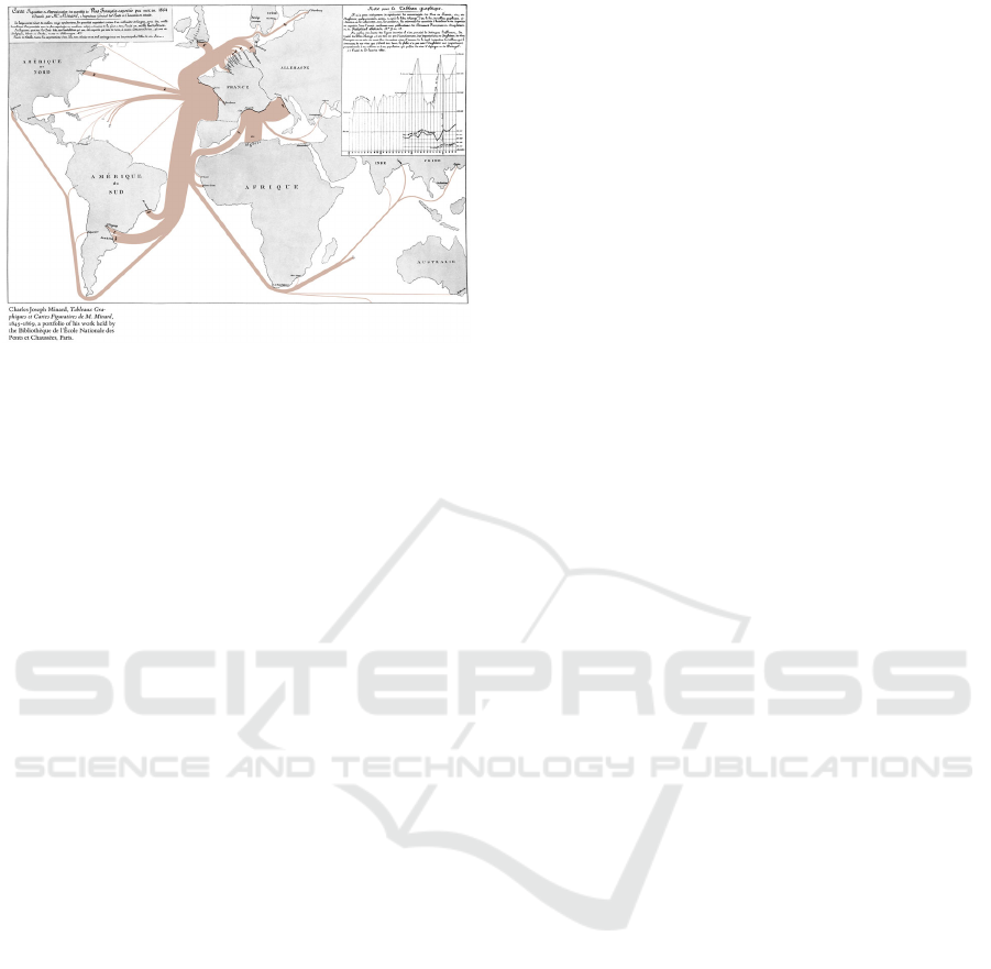
Figure 1: Export of French wine by Charles Minard, 1864.
known as edge bundling can be applied. This is
characterized not only by graph simplification, but
also by the revelation of the principal streams of
flow. Holten introduced edge bundling for com-
pound graphs (Holten, 2006). His work consisted in
routing edges through a hierarchical layout using B-
Splines. Nowadays, there are several variations of
edge bundling such as force-directed edge bundling
(Holten and van Wijk, 2009), or sophisticated ker-
nel density estimation strategies (Hurter et al., 2012).
Generally, edge bundling consists of drawing similar
edges on the same path, i.e. edges that are related
in geometry and direction are routed along the same
path.
In the geographic context an Origin-Destination
representation, as a rule, refers to the flow visual-
ization (also known as flow maps), which is deeply
rooted in the history of information visualization.
Early examples, such as wine exports from France,
produced by Minard (Tufte, 1983, page: 25), repre-
sent quantity as well as direction of wine exports en-
coded by the thickness of the corresponding edges,
which disjoin from the parent edge (see Figure 1).
The work of Phan et al. (2005) presents an automated
approach to generate flow maps using a hierarchical
clustering algorithm, given a series of nodes and flow
data. Generally, in geographic context, a flow map de-
picts quantities of any type of objects that move from
one location to another – e.g. migrations, transporta-
tion of goods, etc. The advantage of flow maps is that
they reduce visual clutter by merging edges. How-
ever, when representing large amounts of data this
technique presents a series of problems, such as poor
perception regarding the directionality of flow, high
degrees of visual clutter, overlapping of graphical el-
ements that represent locations.
Another important characteristic of this work is
the focus on nature-inspired approaches. The under-
lying idea is based on self-organizing system, and
more precisely on the phenomenon of emergence in
such systems. As the term indicates self-organization
is a process in complex systems, in which the struc-
ture or organization appears without any explicit in-
terference from outside. Self-organizing processes
often result in the occurrence of emergent phenom-
ena. More precisely, when the complex structure or
behavior appear due to the interaction of a collective
of individuals, which were not programmed for that
(Di Marzo Serugendo et al., 2011). In the field of data
visualization, there are techniques of graphical repre-
sentation that are based on such systems. For instance
Geoboids (Macgill and Openshaw, 1998) employs a
method to reveal patterns in spatial data through the
use of customized flocking system. In this system,
each, so called geoboid explores geographic space in
accordance with the simple rules of interaction with
other geoboids and the data found nearby. The vi-
sualization, which emerges from this simple process,
shows areas containing interesting information. An-
other series of works by Vande Moere exploit self-
organization and emergence in information visualiza-
tion. He introduces the idea of infoticle, which desig-
nates a particle that responds to data values and static
forces in a particle system (Vande Moere et al., 2004).
The visual output portrays the Internet file usage of a
medium-sized company over time, conveying the pat-
terns of file downloads. Another nature-inspired ap-
proach is the information flocking visualization (Mo-
ere, 2004). In this work, Vande Moere uses an artifi-
cial flocking system, originally proposed by Reynolds
(1987), where the forces of attraction and repulsion
are modified proportionally to the similarity between
the data objects that each boid encodes. The emer-
gent patterns analyzed in a higher-level, where each
composition portrays short-term and long-term data
tendencies in time-varying dataset, conveying mean-
ingful changes over time.
3 FLOW MAP FLOCKING
MODEL
In order to reflect the flowing nature of the data we
resort to a flocking system. The underlying model to
construct our flow map shares common characteris-
tics with the work of Polisciuc et al. (2015). The vi-
sualization itself can be seen as a directed graph com-
posed by nodes and edges. The system consists of
artificial agents (further referred to as boids) each one
tracing an individual Origin-Destination edge. A boid
is characterized by its position in space, direction and
speed. During the simulation each boid leaves per-
IVAPP 2016 - International Conference on Information Visualization Theory and Applications
180
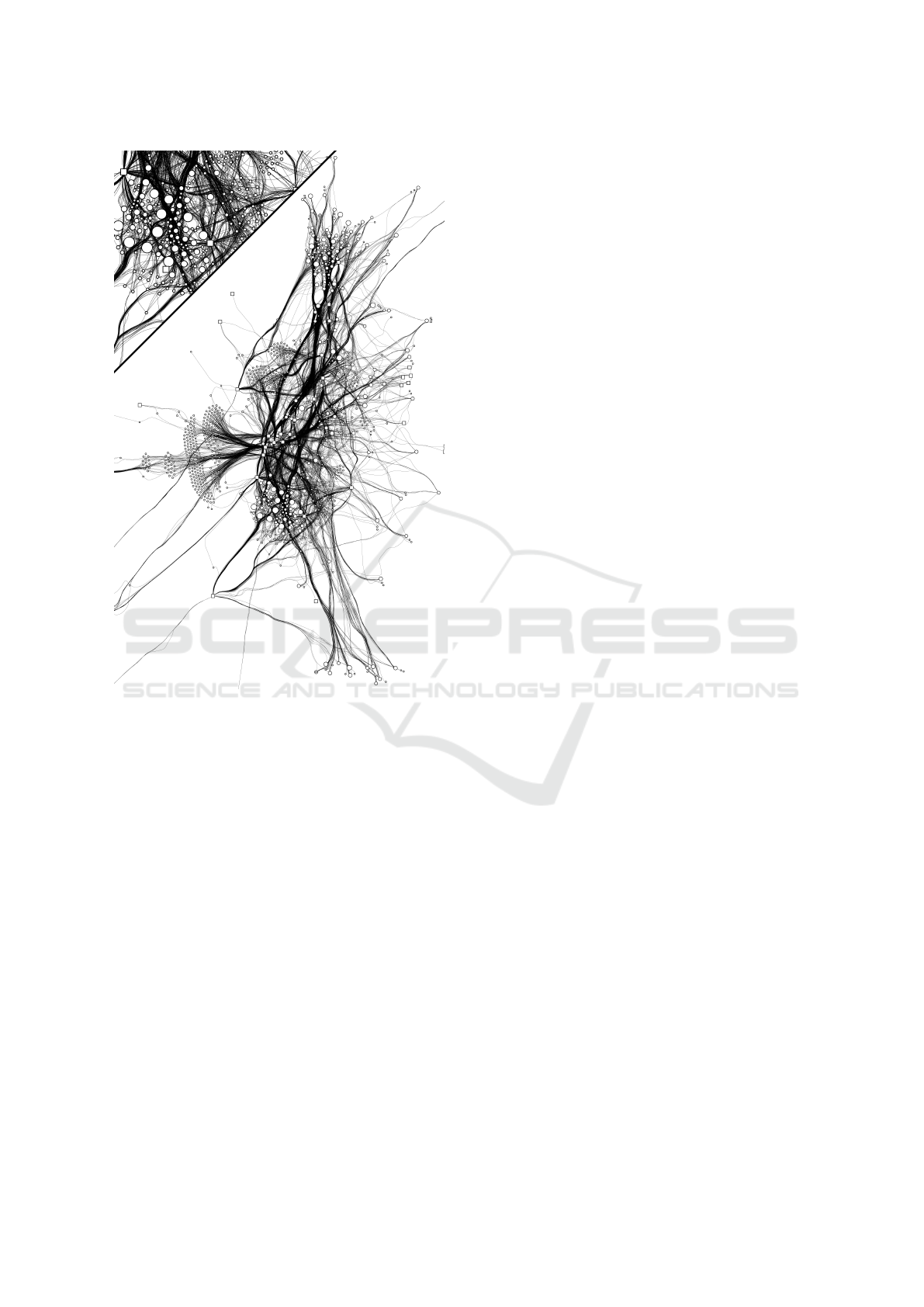
Figure 2: Visual output from the system after 5 full cycles,
image at the bottom. Detail of the computed traces in black,
image at the top. The rectangular and circular nodes repre-
sent origin and destination of the flow, respectively.
sistent traces, further referenced as ghosts, which in-
herit the location at each simulation instance, direc-
tion and the edge being encoded. Since the process
is asynchronous, i.e. each trace is computed sepa-
rately, the boids in the system interact only with the
ghosts instead of other boids. While interacting with
the ghosts, each boid follows simple rules: attract
to friendly ghosts; repel from the unfriendly ones;
and avoid static points, which are the nodes of the
graph. In order to determine the relationship between
the boids and the ghosts we used a pairwise similarity
measures between edges, including geometric proper-
ties and weight of edges. The output of the system is
shown in Figure 2.
In this section we describe our flocking system;
our similarity metrics; implementation and optimiza-
tion considerations; and the graphical variables used
in this flow map.
3.1 Model
As previously mentioned, our model consists of a set
of boids characterized by location in space, direc-
tion, speed and the field of vision. The boids move
in space reacting to the presence and characteristics
of other neighboring boids. A pairwise interaction
between boids and ghosts determines their behavior.
If the agents encode similar edges, they are consid-
ered friendly. If the agents encode dissimilar edges,
they are considered unfriendly. Otherwise, they ig-
nore each other. The degree of similarity, which is
described in the following sub section, affects the
force of attraction or repulsion between agents and
ghosts. Therefore, friendly agents advance together as
a group and unfriendly agents repel from each other
avoiding collisions.
Each trace is computed individually, starting at the
origin node and finishing at the destination node. The
computation of each trace only starts when the previ-
ous one has finished, and so forth for all the traces.
In each iteration the boid’s paths are updated accord-
ing to the current state of the system. More precisely,
during the execution cycle each boid interacts with
the ghosts left by other boids and never with their
own ghosts. The process repeats until the visual result
is acceptable and the user decides to stop it. During
the computation of each trace the acceleration vector
and the speed of the boid B with position ~p
B
is deter-
mined by the characteristics of each ghost G within
the field of vision V F
B
. The acceleration vector is
computed as following: i) compute a vector relative
to the ghosts; ii) compute a vector relative to the static
points; iii) compute a normalized vector pointing to-
wards the destination (see section 3.3 for implemen-
tation details). Having all the three vectors computed,
they are weighted, and then added to the acceleration
vector; the acceleration is added to the speed vector;
and the speed is limited to the predefined maximum
and is added to the current location. The maximum
defined speed reflects on the visual output resulting in
high and low curvature of edges for speed limited to
1 and 5 (in relative spatial units), respectively.
3.2 Edge Similarity
Edge similarity (further referred to as similarity score
or simply score) is calculated on the input graph tak-
ing into account geometric properties of edges. The
output from pairwise calculation is then stored in nxn
matrix, where n is the number of edges. The score
consists of the following three components:
Angle. The boids implement different behaviors
and the angle between
~
OD vectors dictates whether
Flow Map of Products Transported among Warehouses and Supermarkets
181

boids are friendly or not. The angle α ∈ [0, π] that
the two vectors make is linearly mapped to the range
[−1,1]. The sign translates directly into the direction
of the force during the interaction between boids.
Distance. Determining the minimum Euclidean
distance between two line segments is a typical prob-
lem in areas dealing with geometric data. We used an
algorithm proposed by Lumelsky (1985), which takes
as input the coordinates of the end points of the two
segments and outputs the distance. This algorithm is
efficient, since the distance is not computed until the
endpoints do not satisfy certain condition. This is,
the endpoints are not the closest points and the seg-
ments do not intersect. In order to translate the dis-
tance to the range [0, 1] the following function was
used: k/(d + k), where d is the distance and k is a
constant, in our case empirically defined as 10.
Length difference. The similarity between edges is
proportional to the absolute difference between their
lengths. In other words, the edges that have equal
lengths are considered similar and vice versa. In the
end, the values are normalized in order to equalize
scaling. Formally, let l and p be the lengths of the
pairs of edges, we calculate 1 − (|l − p|/max(l, p)).
In order to calculate the final score as a mea-
sure of similarity, we apply the following function:
(distanceScore + lengthScore) × angleScore. As can
be seen, the angle score is prioritized, again because
of the behavior. In other words, if two edges are paral-
lel and pointing towards the same direction, the length
and the distance scores come into calculation. In this
case, if the lengths are similar and the distance be-
tween segments is small the boids that encode these
edges have high attraction forces and route the traces
through similar paths.
3.3 Implementation and Optimization
This sub-section describes each step of the compu-
tation of the acceleration vector of a boid in detail
provided in pseudo-code. First, a vector for a boid
B relative to the ghosts is computed as following:
Integer c = 0
for each G in VF:
Float s = similarity value for G
if s >= 0:
Vector bg = vector from B towards G
end if
if s < 0:
Vector bg = perpendicular to direction of B
// left or right perpendicular depends
// on the position of G in relation of B
end if
normalize bg
multiply bg by s
add bg to v
c = c + |s|
end for each
divide v by c
return v
Second, a vector for a boid B relative to the static
points is computed as following:
Integer c = 0
for each static point SP:
Float dd = radius of SP
Float d = distance from B to SP
if d < dd:
Vector spb = vector from SP to B
normalize spb
multiply by (dd - d)
add spb to v
c = c + 1
end if
end for each
divide v by c
return v
Finally, when the boid approximates its destina-
tion, all the forces, except the destination force, are
ignored and the speed is limited to 1. This restriction
ensures that each boid reaches its destination.
In order to reduce the computation cost we ap-
plied a hierarchical structure of spatial data – more
precisely – a quadtree. This type of structures is based
on the principle of recursive decomposition and smart
subdivision of spatial data (Samet, 1984). This hierar-
chical representation is useful because it focus on in-
teresting subsets of data, and is efficient in execution
times and performance of getting and setting opera-
tions. We used the quadtree to store and access ghosts
of boids.
In our implementation, the get operation is
straight-forward. At execution time, we access ghosts
that are inside the region that is defined from the field
of vision of the boid being computed. Then we only
iterate over the elements that are within this field. The
set operation is conditional and is performed as fol-
lowing: first, check if in a certain range there are no
existing ghosts; if this condition is true, then update
their positions and the direction vectors; otherwise,
add a newly created ghost to the quadtree.
Finally, each ghost is updated taking into account
the data value they encode. The idea is the following:
the ghosts that encode large values have greater im-
pact over the ones that encode smaller values. There-
fore, making the traces that have less impact fol-
low the ones that have bigger impact. The following
IVAPP 2016 - International Conference on Information Visualization Theory and Applications
182

pseudo-code exemplifies the function that updates the
existing ghosts:
Float dv = normalized data value of G0
for each G in VF of G0:
// update position
Vector gg0 = vector from G to G0
normalize gg0
divide gg0 by count G in VF of G0
multiply gg0 by dv
add gg0 to position of G
// update direction vector
Vector v = direction vector of G0
multiply v by dv
add direction vector of G to v
normalize v
set v to direction vector of G
end for each
4 APPLICATION
In this section we describe a visualization application
of our method for the flow map. We apply this tech-
nique to visualize the flow of products among ware-
houses and supermarkets. In other words, the visual-
ization depicts movements of stocks of products in-
side a major retail company in Portugal.
4.1 Data Description
Our dataset consists of approximately 15 to 90
millions of warehouse-to-supermarket transitions of
product per day over a time span of 6 months. Each
transition has the following attributes: product id,
quantity of products in transit (further referenced as
stock in transit or SIT), quantity of products deliv-
ered (further referenced as stock on hand or SOH),
warehouse id, supermarket id, and the date of transi-
tion. The locations consist of approximately 60 ware-
houses, some of which are located outside the Por-
tugal, 1039 supermarkets in Portugal and 230 super-
markets outside the Portugal, including the geo local-
ization of 680 supermarkets (see also (Polisciuc et al.,
2015; Mac¸
˜
as et al., 2015a,b)).
In order to get a graph representation of the data
we proceeded to the calculation phase. First, the
data were aggregated by days. Each day sums-up
SIT quantities by aggregating pairs of warehouse-
supermarket locations, which constitute the edges and
the nodes of the graph. Finally, the total of SOH quan-
tities per supermarket is calculated. Therefore, we get
a weighted directed graph whose edges are directed
from warehouse to supermarket nodes and weighted
by SIT quantities. The nodes that represent supermar-
kets have assigned SOH quantity, while the nodes that
represent warehouse have none.
4.2 Flow of Products Visualization
This visualization depicts amounts of products that
have been transported and the amounts of products
that have been delivered during one day. It is impor-
tant to describe the process to get a readable layout
of mixed graph. There are two challenges to visu-
alize this particular graph: not all the locations have
a geographical positions; but, the ones that do have,
can overlap. The first issue was solved by fixing the
nodes that have a geographical location, and by using
force-directed graph layout algorithm (Fruchterman
and Reingold, 1991) to compute the location of other
ones. This algorithm is efficient in what concerns
about the graph topology, since it considers clusters
of nodes and not individual nodes. The second issue
was solved by applying Dorling cartogram technique
over the precomputed layout. The beauty of this al-
gorithm is that it preserves original relative position-
ing of geo-referenced elements. This enables the map
of Portugal to be recognizable, making the locations
distinguishable and increasing visual clarity (see Fig-
ure 3).
In the visualization each trace represents the quan-
tity of products in transit from warehouse to super-
market. These quantities are encoded by two means –
color and line thickness. The two graphical elements
are complimentary and make use of different map-
pings. The color uses a linear mapping. The values
are mapped to a pale yellow-purple-dark blue gradi-
ent, being pale yellow and dark blue for lowest and
highest values, respectively. The thickness variable,
on the other hand, uses an exponential scale, empha-
sizing high values. Finally, we use an arrow, which is
rendered at the end of a trace and scaled proportion-
ally to the thickness of the line, in order to represent
the direction of the flow (see Figure 3). The orienta-
tion of the arrow is determined in three steps. First,
the length l and the with w of the arrow is computed.
The w and l are equal to the 2x and 3x thickness, re-
spectively. Second, the last vertex v of a trace that is
located at the minimum distance from location of the
node c plus its radius and the l is determined. Third,
the arrow orientation is defined by the vector pointing
from v to c.
In order to represent different types of nodes we
use different graphical elements – squares and cir-
cles to represent warehouses and supermarkets, re-
spectively. The nodes are colored according to coun-
try they represent. Since our data contains a high
number of countries, the color could become ineffec-
Flow Map of Products Transported among Warehouses and Supermarkets
183
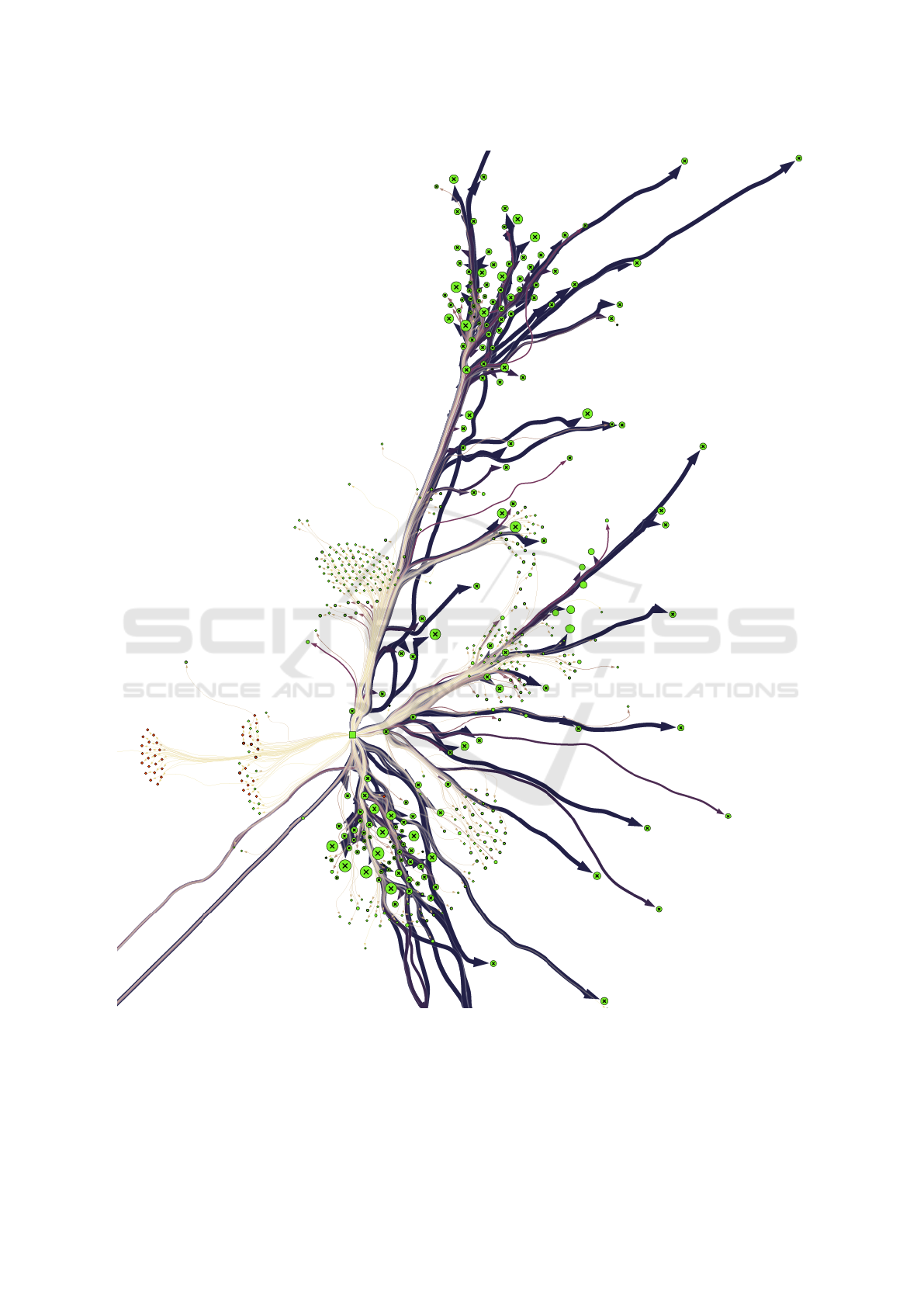
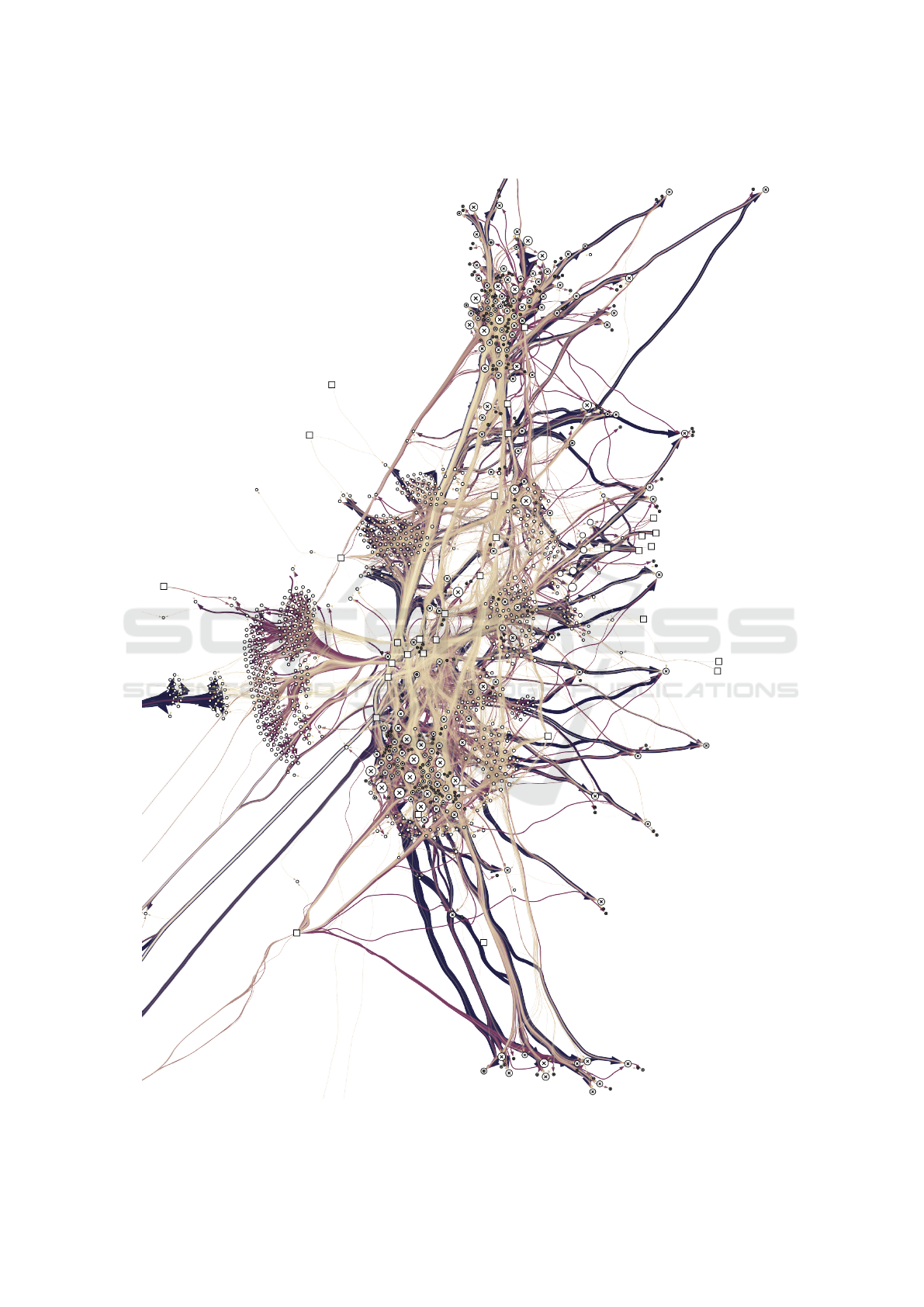
Figure 3: For the sake of simplicity this image shows only transitions from one warehouse. The whole graph can be seen in
the Figure 7.
tive. In this case, we calculate the total number of
locations, aggregating by country, sort the countries
in descendant order, and consider only the first two
countries, which are Portugal and Spain, and treat the
others as an unique instance. The colors used was
green, red and blue for Portugal, Spain and others,
IVAPP 2016 - International Conference on Information Visualization Theory and Applications
184
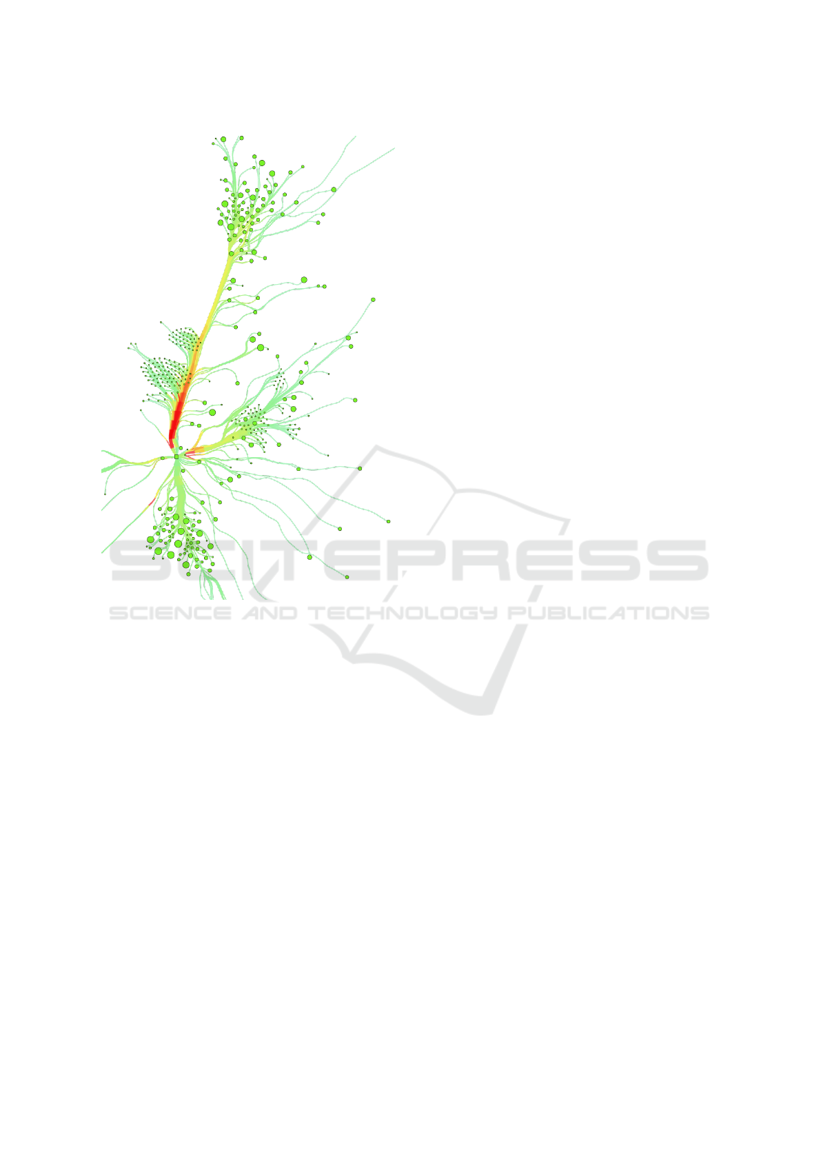
Figure 4: A visualization of edge overlapping. The number
of overlapped edges is represented with the color from pale
green to intensive red. This image shows only the transi-
tions from a selected warehouse.
respectively. Finally, the nodes that have geographic
reference were rendered with the graphical shape of
an X in the center of the node (see Figure 3).
Due to the high degree of traces overlapping, it
is hard to identify main streams. For that reason, we
proceed with a color-temperature visualization of the
flow map. Using the same graph we apply different
graphical elements. In this visualization the traces are
colored according to the total number of overlapping
elements. More precisely, we compute the number of
overlapped segments that build-up the traces located
within a defined range. Then at the render instance
this value is mapped to a color scale from intensive
red to a pale green, where red and green mean high
and low degrees of overlaps. This representation is
useful to get another perspective of such complex vi-
sualization (see Figure 4).
5 RESULTS
The visualizations shown in this section depicts our
data. All the visualizations that we generated use the
technique described in section 4, except in the line
thickness. To facilitate the comparison in this small
scale we reduced visual complexity: lines with con-
stant thickness; no arrows at the end of the traces;
nodes colored in white.
The very first comparison reveals the efficiency of
visual clutter reduction. As can be observed, the force
directed edge bundling (FDEB) method (see Figure 5,
image in the middle) generates less visual clutter in
comparison with our approach. When using swarms,
main streams of flow are visually distinct from each
other leaving enough space for the ones with less im-
pact. In addition our approach considers edge weight,
therefore, resulting in meaningful representation of
data being visualized (see Figure 5).
In our approach each boid attempts to avoid the
boids with opposite directions, as such the traces are
never routed through the same trail. This enables sep-
aration of streams that encode opposite directions. In
contrast, this is not the case when using the FDEB.
This type of algorithms does not take into account the
directionality of streams, which is an emergent char-
acteristic of the swarm-based approach. Finally, since
the boids in the system attempt to avoid static points,
the nodes are clearly visible and do not visually inter-
fere with the lines (see Figure 5, image on the left).
As previously mentioned, our method is sensible
to the parameters of maximum speed and the field of
vision of boids. The bigger the field of vision the less
bundled the edges. Also, main streams tend to ag-
gregate more edges comparing to the lower values.
Maximum speed, on the other hand, translate into the
“waviness” of traces. Using bigger values boids tends
to draw traces in a more organic manner. However,
there is a loss in detail of trace and overall visual-
ization. Figure 6 (image in the middle) displays the
visual output using maximum speed 5 and radius of
vision field equal to 50 degrees.
Finally, our approach gives diverse perspectives
over the same dataset. Depending on the sorting or-
der the visualization can emphasize streams that rep-
resent low or high values (see Figure 6, image on the
left). Additionally, our approach enables a visualiza-
tion of the density of streams by applying an appro-
priate color scheme described in section 4.
Flow Map of Products Transported among Warehouses and Supermarkets
185
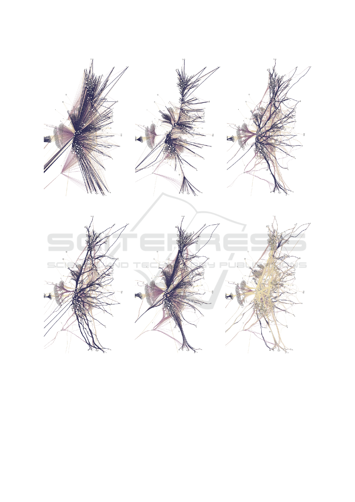
Figure 5: Comparison between the techniques straight lines (left), FDEB generated using 5 cycles, 50 iterations and stiffness
10 (image in the middle), our approach using SIT quantities in calculations (right).
Figure 6: Flow map generated by our method without considering SIT quantities (left), parameters of maximum speed set to
5 and vision field set to 50 degrees (image in the middle), inverse sorting order (right).
6 CONCLUSIONS
As previously mentioned, applying the flow map on a
large amount of data is challenging, since it involves
dealing with high degrees of visual clutter. In this ar-
ticle we presented a method for generating flow maps
that overcomes the cluttering issue in visualization.
Our approach relies on a nature-inspired algorithm
resulting in emergent visual patterns. Ultimately, re-
sulting in edge bundling to reduce visual clutter and
to promote visual clarity in the representation. In ad-
dition, we explored different graphical languages ap-
plied on the generated graph to give diverse perspec-
tives over the same dataset.
IVAPP 2016 - International Conference on Information Visualization Theory and Applications
186

Our method consists of a set of boids that trace a
path to represent each edge in the graph. Each sin-
gle boid follows simple rules through the interaction
with the neighboring trails. The similarity between
the edges, which belongs to the range [-2, 2], deter-
mines whether boids are friendly or not. This makes
the boids to attract or repel from each other. Further-
more, in cases when the similarity is zero, the boids
ignore each other. In addition, the boids that represent
more products have higher impact on other members
of the system. Finally, every boid attempts to avoid
static points, which are the nodes of the graph.
We described two types of graphical representa-
tion. We presented the main visualization, which
depicts transitions of products from warehouses to
supermarkets. The total amounts of products being
transported are represented with color and line thick-
ness. The directionality of movement is indicated by
an arrow at the end of each trace. The nodes use color
to show different countries, while the shape of each
node indicate either its is a warehouse or a supermar-
ket. Finally, the fixed nodes are marked with an “X”
in the center of the node. Additionally, the sorting or-
der of the edges reflects the emphasis on low or high
values. Then, we presented a graphical approach to
distinguish main streams of flow. This is achieved by
coloring the edges by their degree of overlapping. In
this case, the red and green colors represent high and
low number of overlapped traces, giving a visual rep-
resentation of the complexity of the graph.
ACKNOWLEDGEMENTS
This project is partially funded by SONAE: Sonae Viz
– Big Data Visualization for retail, and by Fundac¸
˜
ao
para a Ci
ˆ
encia e Tecnologia (FCT), Portugal, under
the grant SFRH/BD/109745/2015.
REFERENCES
Di Marzo Serugendo, G., Gleizes, M.-P., and Karageorgos,
A. (2011). Self-organising systems. In Di Marzo Seru-
gendo, G., Gleizes, M.-P., and Karageorgos, A., edi-
tors, Self-organising Software, Natural Computing Se-
ries, pages 7–32. Springer Berlin Heidelberg.
Dorling, D. (1996). Area Cartograms: Their Use and Cre-
ation, volume 59 of Concepts and Techniques in Mod-
ern Geography. University of East Anglia: Environ-
mental Publications.
Fruchterman, T. M. and Reingold, E. M. (1991). Graph
drawing by force-directed placement. Softw., Pract.
Exper., 21(11):1129–1164.
Holten, D. (2006). Hierarchical edge bundles: Visualiza-
tion of adjacency relations in hierarchical data. IEEE
Trans. Vis. Comput. Graph., 12(5):741–748.
Holten, D. and van Wijk, J. J. (2009). Force-directed edge
bundling for graph visualization. Comput. Graph. Fo-
rum, 28(3):983–990.
Hurter, C., Ersoy, O., and Telea, A. (2012). Graph bundling
by kernel density estimation. Comput. Graph. Forum,
31(3):865–874.
Lumelsky, V. J. (1985). On fast computation of distance be-
tween line segments. Information Processing Letters,
21(2):55–61.
Mac¸
˜
as, C., Cruz, P., Amaro, H., Polisciuc, E., Carvalho,
T., Santos, F., and Machado, P. (2015a). Time-series
application on big data visualization of consump-
tion in supermarkets. In IVAPP 2015 Proceedings of
the 6th International Conference on Information Visu-
alization Theory and Applications, Berlin, Germany,
11-14 March, 2015., pages 239–246. SciTePress.
Mac¸
˜
as, C., Cruz, P., Martins, P., and Machado, P. (2015b).
Swarm systems in the visualization of consumption
patterns. In Proceedings of the Twenty-Fourth Interna-
tional Joint Conference on Artificial Intelligence, IJ-
CAI 2015, Buenos Aires, Argentina, July 25-31, 2015,
pages 2466–2472. AAAI Press.
Macgill, J. and Openshaw, S. (1998). The use of flocks to
drive a geographic analysis machine. In International
Conference on GeoComputation.
Moere, A. V. (2004). Time-varying data visualization us-
ing information flocking boids. In Ward, M. O. and
Munzner, T., editors, 10th IEEE Symposium on In-
formation Visualization (InfoVis 2004), 10-12 Octo-
ber 2004, Austin, TX, USA, pages 97–104. IEEE Com-
puter Society.
Phan, D., Xiao, L., Yeh, R. B., Hanrahan, P., and Winograd,
T. (2005). Flow map layout. In Stasko, J. T. and Ward,
M. O., editors, IEEE Symposium on Information Vi-
sualization (InfoVis 2005), 23-25 October 2005, Min-
neapolis, MN, USA, page 29. IEEE Computer Society.
Polisciuc, E., Cruz, P., Amaro, H., Mac¸
˜
as, C., Carvalho, T.,
Santos, F., and Machado, P. (2015). Arc and swarm-
based representations of customer’s flows among su-
permarkets. In Proceedings of the 6th International
Conference on Information Visualization Theory and
Applications, pages 300–306.
Reynolds, C. W. (1987). Flocks, herds and schools: A
distributed behavioral model. In Stone, M. C., ed-
itor, Proceedings of the 14th Annual Conference on
Computer Graphics and Interactive Techniques, SIG-
GRAPH 1987, pages 25–34. ACM.
Samet, H. (1984). The quadtree and related hierarchical
data structures. ACM Comput. Surv., 16(2):187–260.
Tufte, E. R. (1983). The visual display of quantitative in-
formation, volume 2. Graphics press Cheshire, CT.
Vande Moere, A., Mieusset, K. H., and Gross, M. (2004).
Visualizing abstract information using motion prop-
erties of data-driven infoticles. In SPIE proceedings
series, pages 33–44.
Flow Map of Products Transported among Warehouses and Supermarkets
187
APPENDIX
Figure 7: Final render of whole graph with the focus on the continental part of Portugal.
IVAPP 2016 - International Conference on Information Visualization Theory and Applications
188
