
A Big Data Analysis System for Use in Vehicular Outdoor
Advertising
Emmanuel Kayode Akinshola Ogunshile
Department of Computer Science, University of the West of England, Bristol, U.K.
Keywords: Big Data Analytics, Outdoor Advertising, Visual Analytics, GPS Analysis, Javascript, Query Algorithm
Optimisation.
Abstract: Outdoor advertising is an old industry and the only reliably growing advertising sector other than online
advertising. However, for it to sustain this growth, media providers must supply a comparable means of
tracking an advertisement’s effectiveness to online advertising. The problem is a continual and emerging area
of research for large outdoor advertising corporations, and as a result of this, smaller companies looking to
join the market miss out on providing clients with valuable metrics due to a lack of resources. In this paper,
we discuss the processes undertaken to develop software to be used as a means of better understanding the
potential effectiveness of a fleet of private car, taxi or bus advertisements. Each of the steps present unique
challenges including big data visualisation, performance data aggregation and the inherent inconsistencies
and unreliabilities produced by tracking fleets using GPS. We cover how we increased the metric aggregation
algorithm performance by roughly 20x, built an algorithm and process to render data heat maps on the server
side and how we built an algorithm to clean unwanted GPS ‘jitter’.
1 INTRODUCTION
Advertising has evolved hugely over the past decade
due to the amount of people that have moved online.
It has become easy to trial different forms of digital
advertising and find a best fit. As a result of this,
advertising has become reliant upon metrics. Through
platforms such as Facebook Adverts and Google
Adwords, advertisers can track the performance and
return on investment (ROI) of their advertisements.
This is not to say that advertisers do not see the value
in outdoor advertising, however their intuition will
lead them to question its accountability.
Through online advertising, advertisers can
monitor their potential gain through metrics such as
impressions (the number of browsers the advert has
been loaded into) and the number of clicks.
As highlighted in a survey carried out on 3000
business executives by MIT Sloan Management
Review and IBM Institute for Business Value it was
discovered that over half said that “improvement of
information and analytics was a top priority in their
organizations” (LaValle et al, 2010). Furthermore,
“more than one in five said they were under intense
or significant pressure to adopt advanced information
and analytics approaches” (LaValle et al, 2010).
Vehicular advertising is a popular and effective
form of outdoor advertising. Throughout this paper,
we discuss how we built a platform and system that
enables advertisers to gain similar metrics as online
advertising, as well as other relevant information
about their fleet of adverts. We combine connected
car (the act of connecting cars to the Internet of
Things) and scalable web application technologies to
produce a web app for use in vehicular advertising.
1.1 Objectives
Advertisers have little means of calculating any form
of ROI when using outdoor advertising, in this case,
car, taxi or bus advertising. We aim to solve this by
building a platform for advertisers to track and
manage their campaigns.
This paper aims to tackle three core areas; firstly
big data visualization – due to the fact that vehicular
advertising requires geographic analysis we focus on
representing the data as a heatmap. Secondly we
cover how we leveraging MongoDB’s aggregation
functionality to return useful metrics without
dramatically reducing the application’s performance
Ogunshile, E.
A Big Data Analysis System for Use in Vehicular Outdoor Advertising.
In Proceedings of the 6th International Conference on Cloud Computing and Services Science (CLOSER 2016) - Volume 2, pages 319-328
ISBN: 978-989-758-182-3
Copyright
c
2016 by SCITEPRESS – Science and Technology Publications, Lda. All rights reserved
319

at scale. The challenge is in allowing the client to
generate reports ‘on-the-fly’ for millions of
geographic data points. Finally we discuss a simple
yet effective way of reducing GPS ‘jitter’ from large
datasets.
1.2 Contributions
The resultant contributions of this paper are as
follows:
Fleet Tracking System: The core of all of the
system’s features is the ability to track a fleet of
drivers concurrently using GPS and various web
technologies.
Big Data Metrics Aggregation: We needed a
way of gaining metrics on a large data set of GPS
points and so we built a scalable algorithm using a
native MongoDB method which allows advertisers to
gain metrics on-the-fly.
Geographic Targeting: In speaking to
advertisers they specified that gaining metrics of
specified geographic areas is highly important. As a
result of this we built a way for advertisers to draw
areas on a geographic map and gain metrics in a
negligible time.
Heat Map Rendering Algorithm and Server:
Having run into performance issues whilst rendering
heat maps on the client-side using the Google Maps
API, we realised that we would need to deploy a
service that would take a set of GPS points and save
rendered heat map tiles. We built and designed the
algorithm that generates the ‘heat’ effect, renders the
data visualisation as images and leverages Base 64
encoding to save the images as strings in a database.
GPS ‘Jitter’ Cleaning: We were unaware prior
to the project of the amount of ‘jitter’ that average
GPS devices produce - as a result we implemented a
service that systematically cleans the GPS dataset.
We leveraged the Google’s ‘Snap-to-Roads’ API,
some simple business logic and linear interpolation to
counteract the problem.
GPS Data Storage Algorithm: The GPS solution
we implemented meant that the system was receiving
GPS points every 10 seconds from each tracker - we
needed a way of reducing the quantity of points saved
to the database without neglecting precision. We
ended up with a simple algorithm that deciphered
whether the car was on a trip or parked, and also
counted for periods of time when it had no signal.
1.3 Paper Organisation
The rest of this paper is organized as follows.
Background and related work in advertising are
presented in Section 2 including a look into the
technology platforms used in the implementation.
Section 3 covers the implementation of the system
and is split into 4 main sub-sections; firstly we discuss
how we managed to reduce the overall dataset by
producing a simple GPS grouping algorithm.
Secondly we cover how we benchmarked and built an
optimized algorithm for GPS metric aggregation. The
following subsection covers how we implemented a
system to render heatmaps using Node.js on the
server. Finaly section 3.4 covers how we
systematically clean the GPS data set of anomalies.
2 BACKGROUND LITERATURE
REVIEW
2.1 Advertising
2.1.1 Why do Advertisers Need to Track
Their Advertisement’s Effectiveness?
Kotler defines advertising as “any paid form of non-
personal presentation and promotion of ideas, goods
and services through mass media such as newspapers,
magazines, television or radio by an identified
sponsor” (Kotler, 1984). Advertising involves
targeting the appropriate message to the relevant end
consumer. For example, an advertiser will place an
advert for a computer in a computing magazine,
rather than in a health and beauty publication. This
process is simple enough in digital or print
advertising, as the profile of the consumer is often
known to the advertiser or advertising platform.
However, in outdoor advertising, advertisers have
little means of planning based on a demographic. This
is why the scientific analysis lies in the tracking
process and less in the planning process. “When the
economic environment becomes difficult, marketers
demand proof of advertising’s effectiveness,
preferably in numerical form.” (Wright-Isak et al,
1997). They wish to compare and contrast different
formats to optimise a campaign, where a campaign
might be a wide spread range of advertising instances,
geographically and/or across different platforms or
mediums. According to Wright-Isak “To understand
effectiveness in a real-world context we need to have
some systematic collection of the facts that tell us the
probability that the intended audience saw the
campaign, what intervening phenomena affected the
campaign’s impact, and the net impact of those
phenomena and the campaign on purchase behaviour.
Combining this collection of facts with data about
specific ad effects may help us understand the
CLOSER 2016 - 6th International Conference on Cloud Computing and Services Science
320

performance of the campaigns, as well as contribute
to theory development.” (Wright-Isak et al, 1997).
Within the context of vehicular advertising, by
knowing the neighbourhood in which an
advertisement has spent the majority of its time or a
road it’s traveled frequently, will allow the advertiser
to better understand how the effectiveness of the
campaign may have been supplemented by their fleet
of drivers.
2.1.2 How is an Advertisement’s
Effectiveness Quantified?
Bill Dean highlights that “understanding and
quantifying the benefits of advertising is a problem as
old as advertising itself. The problem stems from the
many purposes advertising serves: building
awareness of products, creating brand equity and
generating sales. Each of these objectives is not easily
measured or related to the advertising that may have
affected it.” (Dean, 2006). It seems that directly
quantifying an outdoor advert’s number of views or
impressions is less of the problem, and more that
gaining an understanding of the demographic that
may have seen the branding. Thus a qualitative
understanding is often perceived as more important
than a quantitive understanding. In the context of our
system, providing metrics and visual representations
of the data not directly applied to the context of
advertising and rather the context of the world, towns
or neighbourhoods, i.e providing driving data
visualised on a heat map rather than a prediction of
total impressions.
2.1.3 CPM – Advertising’s Benchmark
Cost per mille (CPM) is the common metric used to
benchmark advertising campaigns in a quantitive
manner. It equates to the financial cost per thousand
impressions of an advert, where an impression is a
potential sighting of the advert. Impressions can often
be confused with views, a good way of differentiating
is in digital outdoor advertising where impressions
can be tracked by using infra-red to determine the
presence of a person and potential viewer. However
eye-ball tracking can be used to determine whether or
not that person has looked at the given advert (view).
Without the use of infra-red, calculating impressions
in outdoor advertising is an approximate projected
calculation using a formula that has been developed
by several outdoor advertising research bodies.
Although outside the scope of this paper we will use
the formula in Listing 1 for providing a planning tool
for advertisers.
1:dailyCirculation = 0.46 *averageAnnualDailyFlow
2: totalDailyCirculation = dailyCirculation *
mediaSpace
3: Impressions = totalDailyCirculation *
campaignDays
4: CPM = Price / (Impressions / 1000)
Listing 1: Outdoor advertising media math (OAAA,
2006)
The formula broken down into its separate
components is as follows:
Average Annual Daily Flow (AADF) - AADF is the
average amount of cars that travel down a road (or set
of roads) each day. The government makes this data
freely available via their website – we take the
average for each city and town rather than down to
road or street level.
Constant (0.46) - This constant is an industry
standard ‘illumination factor’. It is used to take into
consideration whether or not the advertisement is
illuminated (lit up, and so visible at night) and for
how long, 0.46 represents advertisements that are un-
illuminated and thus assumed visible from 6am —
6pm.
Media Space - Media space is the quantity of
advertisements within the campaign. The common
unit of measurement is ‘sheets’, the most common
sizing is a six sheet (1800 mm x 1200 mm). One
car/taxi advertisement roughly equates to two six
sheets.
Campaign Days - This figure is simply the amount
of days the campaign runs for.
CPM (Cost Per Mille) - Cost (in currency) per
thousand impressions.
2.1.4 Route Research
With tracking campaign effectiveness being a well
established challenge in outdoor advertising; it has
become an attractive area of research for large
advertising corporations, notably a London based
company called Route Research. Taken from their
home page - ‘Route is an entirely independent
research organisation, providing audience estimates
to the out-of-home industry in Britain’ (Route
Research, no date). They manage independency by
selling their data to the few large outdoor advertising
corporations for an annual fee. Each of the
subscribers have independent implementations of the
data, however all with the goal of allowing media
planners to effectively calculate the potential
performance of any given outdoor billboard site; as
A Big Data Analysis System for Use in Vehicular Outdoor Advertising
321

opposed to track the effectiveness of their own
existing campaigns.
2.2 Technology
2.2.1 System Technology
We chose the MEAN stack for the implementation of
the proposed system and in this section, we discuss
the how it is mostly a perfect fit for handeling
performance data-driven web services. The MEAN
stack is heavily focused around JavaScript and well
suited for data driven, responsive web applications.
Node.js brings JavaScript to server-side applications
and away from just being a client-side browser
language. Due to JavaScript operating with non-
blocking I/O it results in generally faster applications
that are easily scalable. MEAN is a relatively new
stack but is the go-to platform for most modern web
applications due to its seamlessly integrated layers,
passing data in JSON format from one to the other. It
keeps business logic and large computations to the
back-end server-side code and the Model-view-
controller (MVC) architecture on the front-end. It
comprises of the following layers:
MongoDB - is a NoSQL database that stores its data
in ‘collections’ of JSON formatted ‘documents’ as
opposed to ‘tables’ of ‘rows’. This often means that
the structure is in a more logical format and is less
restrictive.
Express - is a framework for Node.js with a wealth
of Hypertext Transfer Protocol (HTTP) functionality
making it perfect for building Representational State
Transfer (REST)ful application program interface
(API)s. It will be useful for processing requests from
the front-end client, and data sent from the GPS
tracking solution.
AngularJS - is a front-end MVC framework, great
for building powerful data driven Single Page
Applications - ideal for our data dashboard.
Node.js - is a platform that enables network
applications to be built with JavaScript on Google’s
V8 runtime engine. Node.js can be used for a variety
of different purposes, from background processes,
networking, all the way to building APIs.
The MEAN stack has its weaknesses and so in the
following section we cover where exactly the
technology may strike performance issues.
2.2.2 JavaScript
There are a number of distinguishing points that make
JavaScript a perfect fit. The features include non-
blocking IO, one single thread and its primary data
structure is JSON; each of which we define within
this section.
2.2.3 MongoDB
MongoDB is a noSQL (i.e. doesn’t use the common
query language - SQL), schema-less database that
stores its data in a binary representation of JavaScript
Object Notation (JSON), known as BSON. This is
great as it is the primary data structure used in
JavaScript (i.e. Node.js and Angular.js), and so there
is no need to parse any data as it’s returned from
database queries; thus speeding up the development
process and system performance. Being a document
and schema-less based database, it is structurally a lot
more flexible than table based databases such as
MySql. ‘Documents’ are stored in ‘collections’,
whereas in table based databases, ‘rows’ are stored in
‘tables’. As a result of this each document in the
database can take a different form than the next,
meaning that the system can conditionally add or
remove fields throughout its lifecycle. Each
document can comprise of nested documents,
meaning that there is no risk of ending up with a
database with multiple tables to cater for one-to-one
relationships.
Shema-less databases do however have their
drawbacks, if you are able to simply store any JSON
document in a collection it may end up with zero
coherence and as the database scales maintainability
will become a larger challenge. For this reason we
implement a Node.js middleware package called
Mongoose. Mongoose provides a foundation and all
the necessary tools for creating shema/models for
collections. It is a layer between managing data on the
server and the database. Every time a collection is
queried the Mongoose middleware will construct
objects with each of the database records using the
matched Schema. MongoDB also comes with a range
of useful query methods. Each query is made using a
JSON object and completes without blocking - thanks
to Node.js. MongoDB provides a powerful Geo
Query API that allows searching GeoSpatial indexes
relative to a given point or polygon. Queries can be
formed, for example, to search for all coordinates
within five kilometres of a given point, or to find all
points within a given polygon.
As a means of gathering data and querying based
on a matching set of results, MongoDB provides its
aggregation method. It allows you to query a
collection and produce a report of metrics on the
results of the query. As an example, if one wanted to
calculate the average age of males in the user base
stored in a database, an aggregation query can be
CLOSER 2016 - 6th International Conference on Cloud Computing and Services Science
322

formed to:
Find all males.
Add all ages.
Increment query total.
Divide ageTotal by queryTotal.
As queries are non-blocking, these potentially
expensive calculations can be offloaded to the
database without blocking the callstack and thus other
requests to the RESTful service. Furthermore, the
queries in MongoDB are made in its native driver by
searching the binary representation, so the speed of
filtering results will likely be dramatically improved.
Due to the demanding computational task of
gathering metrics of driver activity it seems that this
might be a perfect solution, due to the fact it is non-
blocking and queries natively rather than in a
blocking server side algorithm.
3 IMPLEMENTATION
3.1 GPS Data Grouping
Figure 1: UML Activity diagram representing algorithm
used to group inbound GPS data points.
GPS data will be transmitted by each device every ten
seconds and so would result in a maximum of 8,640
data points per car per day. The collection would
quickly grow to an excessive size and so the system
will need to implement an algorithm to reduce the
resultant data size. Arrays of coordinates are
dispatched from the GPS gateway to the end point at
the web app that stores them in the database. At this
endpoint the controller will leverage the following
algorithm, represented using a UML Activity
Diagram:
This logic results in incrementing a ‘weighting’
integer property to a given coordinate. For every ten
seconds spent within the same area (using an arbitrary
radius), the weighting is incremented and thus
assumes it is parked in the same spot. As a result the
total amount of documents in the collection will be
roughly the same as total seconds driving divided by
ten, as opposed to the total seconds in the day divided
by ten.
3.2 Implementing a Metrics
Aggregation Algorithm
Providing statistics on large data sets is an area of
concern in which may have to fallback onto a
background process and saved periodically to the
database, as opposed to being produced on-the-fly by
the client. However our initial thought is that there are
three potential solutions for aggregating the required
metrics. We will compare them by benchmarking
against each other. The required outcomes to the
algorithm are as follows:
For each target/defined polygon/closed array of
coordinates, including a target containing the entire
UK:
Driving time
o Return as a total
o Return as a total per day
Total time parked
o Return as a total
o Return as a total per day
Driving distance
Average driving speed
The above metrics will be aggregated from the
following input data.
For each coordinate (plotted at 10 second
intervals):
Time
Speed
Coordinate
3.2.1 Benchmarking
In order to test the three solutions we gather a months
worth of test data from a GPS tracker and repeat insert
the collection 60 times, resulting in the equivalent of
running a campaign of 20 cars for three months. We
then repeat the process four times, and thus test with
60 car months, 120 car months, 180 car months, 240
car months and 300 car months. This will hopefully
result in evidence for whether or not each solution
could potentially scale beyond these numbers, for
example, 1000 car months (100 cars for ten months).
For each increase in ‘car months’ we run the test ten
times and take an average. We run the tests from the
AWS instance to cater for the performance difference
between our machine/internet connection and the
hosted application.
A Big Data Analysis System for Use in Vehicular Outdoor Advertising
323
Solution One – Simple Server Side Algorithm.
Perhaps the most simple solution, and a good starting
point, is to run the algorithm on results returned from
the database in one go on the main cloud instance. It
is likely that this solution will have poor performance
when taking into account that it will also block all
other requests to the service, but will allow us to
benchmark solutions two and three. It is also worth
considering that this solution could be used in a
background task so that the main API instance can
remain unblocked and simply add this algorithm to an
asynchronous task queue.
Solution Two – Server Side Algorithm with
Database Streaming.
For this test we compare the
difference in performance when streaming the data
from the database and running the algorithm
alongside the stream of results, rather than waiting to
receive the data and only then running the algorithm.
By running the algorithm in parallel to the streaming
data, we hope for a dramatic performance increase.
Solution Three – MongoDB Aggregation
Method.
The final solution will leverage
MongoDB’s native aggregation method. This already
has three major positives over solutions one and two;
firstly that it remains asynchronous and won’t block
any other requests made to the service, secondly that
it runs the algorithm on the binary representation of
JSON, and thus geo spatial queries will be much
faster. Finally that the amount of code required is
much less, at the same time as being much more
readable/maintainable.
Results.
Below are the results of the test,
interestingly streaming the data from the database had
by far the worst performance with roughly 20x the
time of solution three - the aggregation method. It is
also useful to know that each of the methods increase
in time taken linearly, so we can expect around eight
seconds for 1,000,000 points, which would roughly
equate to 480 car months or for example 40 cars on a
single campaign for one year.
Table 1: Results of three data aggregation methods.
TOTAL
POINTS/
COORDI
NATES
CAR
MONTHS
ONE
(TIME IN
MILLISE
CONDS)
TWO
(TIME IN
MILLISE
CONDS)
THREE
(TIME IN
MILLISE
CONDS)
0 0 0 0 0
125,872 60 3,425.8 21,701.9 919.9
251,744 120 6,817.8 44,468.5 2,036.7
377,616 180 11,232.7 67,446.8 3,233.9
503,488 240 14,480 89,690.4 4,072
629,360 300 17,560.3 106,418.2 5,299.1
3.3 Heat Map Rendering and Big Data
Visualisation
Google Maps provide an easy to use API for
rendering heat map overlays to their maps for
representing datasets, however having scaled the
dataset size and run some tests we realised that the
total time to return the dataset and render on the map
was unfeasible at the scale in which the system will
produce. Having run the system for four weeks on one
car the app saved 8,782 data points and thus for
example would produce 439,100 points for 50 cars
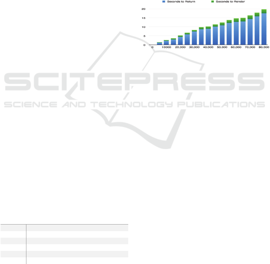
per month. The following graph shows the results of
our test, we measured both the time taken to return
from the API and the time to render.
Figure 2: Graph showing time taken to return and render the
heat map on the client side.
The results show that it is unfeasible to scale the
process of rendering a heat map on the client side.
One way around this could be to aggregate the
heat points and group coordinates if they are within a
small distance of each other, and add weighting
accordingly. The problem with this method however
is that the layer would be more ‘blotchy’ when
zoomed in than normal. Furthermore the results to the
tests show that the major lag in performance is in
returning the results from the server to the client and
so to increase the overall performance a solution is to
render the heat map on the server and return only the
heat map images. Tiles can be rendered on a
scheduled process and the images can be saved in the
database. We predict two main reasons why this is a
preferable solution:
Since the data being returned from the
database is standardised and uniform, the
speed in which the tiles are returned is not
increased with the amount of data points in
the database. The background process
performance will decrease, likely at the
same rate as when rendering client side,
however since they will be rendered on a
background process in a separate
environment, the task won’t block any web
requests to the main web application.
CLOSER 2016 - 6th International Conference on Cloud Computing and Services Science
324

Using this solution there is no other
need for exposing an end point for the API
that returns driving data, so security is
dramatically improved. Although the API
uses authorisation it is important that the
data is as secure as possible and only
managed and analysed within the trusted
network. The worst that could happen is that
an intruder gets hold of the heat map images,
although they would still need to somehow
get past the API’s authorisation.
3.3.1 Map Tiling and Projections
Mapping the world for use on the web follows three
standards; projecting the spherical surface to whats
know as a Mercator projection, splitting the resultant
flat representation of the world into square ‘tiles’ of
dimensions 256px by 256px and finally creating
different tiles for each level of zoom. Since each of
the tiles will be mapped onto a Google Map (which
uses Mercator projection) we can build tiles as if they
are segments of a spherical map. Each tile will have
bounding box coordinates so that we can use the
Google Maps Overlay API to accurately map the
generated tiles onto the projection.
3.3.2 Rendering Images with Node.Js and
WebGL
Although Node.js is perhaps not the go-to language
for server side image manipulation and rendering, for
example most would use a language like Java or
Python. There have been some useful open sourced
projects that have resulted in a suitable and
competitive solution for generating images. The two
dependancies that the system will rely on are Cairo
and Node Canvas. Node Canvas is an implementation
of the HTML5 Canvas element for the server side
which enables access to webGL - a 3D rendering API
for the web. Furthermore, not only does it meet the
standards for image manipulation found in languages
such as Java and Python but it is well documented and
easy to use as it provides the exact same interface as
when rendering images on the client side with the
Canvas element. Each of the tiles will use this
package to render the PNG images and encode as a
base 64 string to be saved in the database along with
meta data including bounding coordinates, zoom
level and heat map identifier.
3.3.3 High Level Tiling Algorithm
At the most abstract level, the process with follow
theses steps for each campaign to build its heat map:
Get all data points for the campaign from the
database.
For each zoom level produce a tile grid to
cover the array of point’s Minimum
Bounding Box. The closer the zoom the
smaller the representation of the tile, i.e.
there will be more tiles the closer the zoom.
For each point and for each heat map/zoom
level find which tile the point falls in.
o In order to optimise this, for each
point, the algorithm checks with
the tile in which the previous point
fell within as well as the one just
after and before it, due to the points
being in order and will most likely
fall close to one and other. Thus
saving the algorithm from
searching each tile (on the nearest
zoom level that makes up 125,824
tiles) for each point, and more often
than not just searching 3 tiles for
each point.
For each point represented in a tile; find its
relative pixel position.
o Get distance in meters between
south west coordinate of tile’s
bounding box and the given data
point.
o Get angle of given data point from
bounding box’s south west
coordinate.
o Use angle and distance to calculate
percentage of tile north and east
using Pythagorus’ theorem.
o Use percentage north and south to
get pixel x and y position by getting
percentages of 256 (width and
height of tile in pixels).
Render white radial gradient on tile, at the
radius of the preset zoom levels radius
constant.
For each tile loop through each pixel
o If the opacity is greater than the
threshold constant.
Convert the opacity level
to a hue/colour level on an
‘hsl’ (hue, saturation and
lightness) colour wheel. 0
or 360 is red, 120 is green
and 240 is blue, and thus
mapping an opacity level
from an RGBA colour
wheel (‘A’ represents
alpha/opacity) as created
A Big Data Analysis System for Use in Vehicular Outdoor Advertising
325
by the canvas pixels.
o Encode the PNG image as a base 64
string and save in the database
along with meta data.
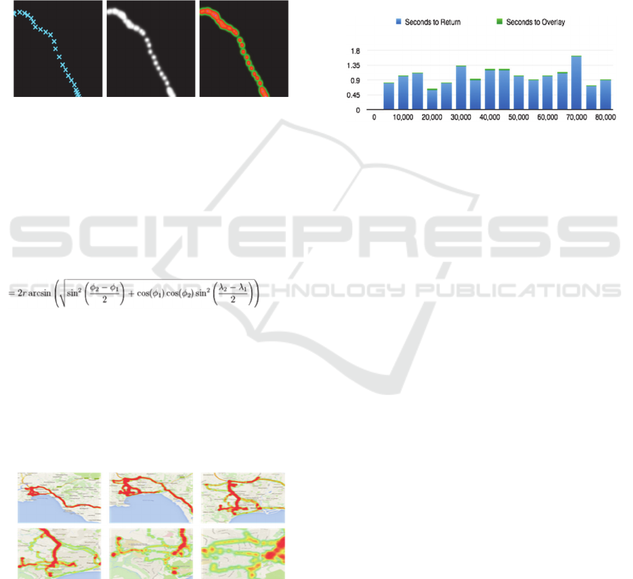
These three images show how a single tile will
evolve through the algorithm. The reason why the
‘heat’ is applied in white to begin with is so that
intensity is built up where lots of data points fall in
the same place. Each white point has a 50% opacity
from the middle and so as they overlap, the level of
opacity will increase, until it is completely white, and
the whiter the more intense the red colour.
Figure 3: Example of the condition of an individual heat
map tile at each stage of the algorithm.
Haversine Formula
An integral part of the algorithm is to be able to
calculate the distance and angle between two points;
for both of these calculations the system will
implement the Haversine formula (Bell et al, 2011).
The following is used to find the distance between
two points on a sphere.
(1)
The algorithm and process result in a solution that
matches the visual appearance of producing the heat
map using the Google API, as seen below. Although
the process is cumbersome, it has plenty of room to
scale as it has no effect on the end user’s experience
and the size of the image in bytes is not dramatically
increased by the quantity of data points. The
following show the resultant heat map at 6 different
zoom levels.
Figure 4: Visual results of test data plotted using the server-
side heat map algorithm at 6 zoom levels.
Having met the visual requirements we will run a test
on its performance, we expect that the greatest factor
in reducing the performance is the quantity of tiles.
Thus if the drivers travel all over the country there
will likely be a decrease in performance due the the
fact there is more tiles/images. In order to benchmark
against the Google maps solution we simply increase
the amount of data points and calculate the time taken
to retrieve and overlay the images onto the map. As a
means of optimising this solution we only load the
tiles required for the map bounds and the mmediate
surrounding area, and use Google Map’s ‘drag’ and
‘zoom’ event for loading in the new map tiles as the
map is zoomed and dragged. Below are the results of
the test, each of the tests were run at zoom level 11
(half way).
Figure 5: Graph showing the time in seconds to return the
heat map tiles from the server and overlay on a map.
The results show that there is no correlation between
the total data points and the time to render the heat
map and thus proving this is the best solution of the
two, given the quantity of the data. It is also worth
noting that the time taken to render the heat map on
the server for all of the 22 zoom levels, save to the
database and delete the previous map is on average
around one minute, which for the test data results in
around 400 base 64 encoded 256px by 256px images.
3.4 GPS Data Cleaning
GPS ‘jitter’ is a very common problem with GPS
trackers, it is where the data that is produced by the
tracker contains anomalies and slight deviations from
where the actual device has traveled. Stated in a paper
written by R. Zito et al. “Field data collection under
“ideal” GPS conditions indicated that accurate speed
and position data were readily obtained from the GPS.
Under less favourable conditions (e.g. in downtown
networks), data accuracy decreased but useful
information could still be obtained” (Zito et al, 1995).
Having tested the off-the-shelf OBD GPS devices and
mapped all the coordinates onto a map we noticed that
the device produced a number of anomalies both
extreme and small. The larger anomalies will need to
be removed completely from the visualised data,
however the smaller anomalies need to be refined.
Below are examples of both large and small
anomalies.
CLOSER 2016 - 6th International Conference on Cloud Computing and Services Science
326

Extreme anomalies
You can see here that
the GPS has had jitter
causing GPS points to
be displayed as far as
the Netherlands, whilst
the Car has traveled
only as far east as West
London.
Small anomalies
Shown here is a small
amount of deviation
from the road going
from top to bottom of
the image. Points are
grouped around the
road and when zoomed
out, these
imperfections are not
noticeable.
Figure 6: Two classification of GPS ‘jitter’.
The proposed system will need to implement an
algorithm to clean these two classes of anomalies.
The main purpose of the heat map data is to
represent an overall impression of where the fleet of
cars has traveled and spent more of its time. Therefore
maintaining accuracy as to exactly where individual
cars have been remains a secondary requirement and
rather displaying a well presented dataset that gives
the advertiser an understanding of where their advert
has spent most of it’s time is a key requirement.
The algorithm comprises the following three
steps:
Snap groups of points to their nearest road
using Google’s ‘snap-to-road’ API.
Loop all snapped points:
o If the distance between the current
and next is small or large (example:
less than 10 meters or greater than
200) – simply add the point to the
resultant dataset.
o If it does not meet the above criteria
linearly interpolate the points at an
interval dictated by the calculated
travelining speed.
The algorithm comprises of three arbitrary values
that have come as a result of tweaking the algorithm
to best represent the given data set. Notably it says
that if the distance between the current point in the
loop and the next is in between ten and 200 meters
then interpolate at three meter intervals linearly. The
hope is that by using the Google Roads API the larger
anomalies will naturally be removed as it will see that
there is no justifiable way that the journey could jump
from a ‘clean’ point to an anomaly.
Linear interpolation can be achived by running the
following:
newLatitude = startPoint.latitude * (1 -
distance) + destinationPoint.latitude *
distance;
newLongitude = startPoint.longitude * (1
- distance) + destinationPoint.longitude
* distance;
Listing 3: Linear interpolation logic.
3.4.1 Results
Figure 7: Results at each stage of the cleaning algorithm.
The results to the algorithm are very positive and as a
result produce a dramatically improved
representation of the data set. The first image shows
the raw data, the second is after the points have been
returned from Google’s snap-to-road API and the
third is after the points have been conditionally
interpolated.
3.5 Implementation Summary
Within this section we’ve discussed the main
challenges faced and overcome in the build phase of
the system. We overcame an array performance based
challenges and have ended with a system that meets
the set out requirements of this project.
It is clear that introducing GPS based systems
incur, in general, a vast amount of boundaries to
building a system such as this. Most of these
challenges however were most definitely not clear
from the outset.
4 CONCLUSIONS
In this paper, we investigated how modern web
technologies can be leveraged to assist in producing
high performance big data analysis systems. Along
with this establishing a foundation to what will be an
ever growing area of research as outdoor advertising
seeks to persist a firm foothold in the advertising
industry. We have designed and implemented a
system that provides a means analysing the potential
A Big Data Analysis System for Use in Vehicular Outdoor Advertising
327

effectiveness of an outdoor vehicular advertising
campaign.
The system produces the expected and required
results in a scalable way. Initially we expected that
the data aggregation would be able to run from
Node’s single thread however it was not feasible with
the quantity of data that was needed to be processed.
Thus we implemented MongoDB’s native
aggregation method and increased performance by
300% meaning that the application can be scaled and
return the metrics on-the-fly for the campaign. It’s
clear that if data is structured well – MongoDB
provides the fundamental building blocks to building
big-data analytics systems.
On a similar theme, visualising the required
quantity of data was not completed in a reasonable
time if processed on the client side and thus we moved
the processed to a scheduled worker that renders map
tiles and saves to the database. Each of the tiles are
then efficiently loaded into the client, based on the
current map zoom level and bounds. The major
benefit of this solution is that the performance on the
client side is not effected by an increase in GPS data
points.
REFERENCES
LaValle, S. Lesser, E. Shockley, E. Hopkins, N. and
Kruschwitz, N. (2010) Big Data, Analytics and the Path
From Insights to Value [blog]. 21 December. Available
from: http://sloanreview.mit.edu/article/big-data-analy
tics-and-the-path-from-insights-to-value/ (Accessed 13
November 2014).
Kotler P. (1984) Marketing Essentials. Northwestern
University: Prentice-Hall.
Wright-Isak, C., Faber,R., and Horner, L. (1997) Measuring
Advertising Effectiveness. Psychology Press.
Dean, B. (2006) Online Exclusive: Quantifying
Advertising's Impact on Business Results. Direct
Marketing News [blog]. 30 January. Available from:
http://www.dmnews.com/online-exclusive-quantifying
-advertisings-impact-on-business-results/article/90091
/(Accessed 13 December 2014).
OAAA, Outdoor Media Math Formulas (2006).
Bell, J. E., Griffis, S. E. Cunningham, W. J., Eberlan, J.
(2011) Location Optimization of strategic alert sites for
homeland defense. Omega, The International Journal
of Management Science, 2011, 39(2), 151-158.
R. Zito, G. D'Este, M.A.P. Taylor. (1995) Big Data,
Analytics and the Path From Insights to Value, p. 1.
CLOSER 2016 - 6th International Conference on Cloud Computing and Services Science
328
