
The Flightschedule Profiler: An Attempt to Synthetise Visually an
Airport’s Flight Offer in Time and Space
Jean-Yves Blaise and Iwona Dudek
UMR CNRS/MCC 3495 MAP, Campus CNRS Joseph Aiguier, 31 chemin J. Aiguier, 13402, Marseille, France
Keywords: Information Visualisation, Time-oriented Data, Transport.
Abstract: Online route planners and travel reservations systems have become in the past years part of our everyday
lives. Such sites, originating from the airlines themselves or oriented on “search and compare” tasks, do
provide valuable services. But the very nature of the queries users formulate (ultimate result: one flight)
limits the type of information one can expect to retrieve, and in particular does not allow to get an overall
view of an airport’s flight offer over time and in space. In this contribution we introduce a proof-of-concept
visualisation that sums up in a synthetic way the [where to, when to] profile of an airport, its realm of
possibilities. The visualisation acts as an upstream service, independently of any actual reservation loop: its
main role is to help unveiling significant spatio-temporal patterns (densities and continuity over time for
instance). The prototype is implemented on a real life data set: the winter 2013/2014 schedule of the airport
in Nice. Ultimately, beyond a discussion on the issue, on the pluses and minuses of the prototype, this
position paper questions the way travel data is presented, and as such can promote debates over the potential
impact of information visualisation solutions in that context.
1 INTRODUCTION
Air transport has become in the last decades
something quite common: 842 million passengers in
the EU in 2013, according to Eurostat. The
following statement can be found in an Opinion of
the European Economic and Social Committee: “Air
transport has developed from a luxury to a mode of
mass transport” (EEC 2004). As a consequence,
along with a growing numbers of travellers, we have
witnessed the emergence of new flight routes, new
flight schedules, new airports, new airlines. Hence
one could assume that with this move came a need
to renew the way information about flights can be
communicated and visualised, that innovative
solutions have been introduced in order to allow
travellers to compare in a synthetic way alternative
routes and schedules, and to allow airport authorities
to post their offers in a readable, clear-cut manner.
To the best of our knowledge, however, visual
and comprehensive presentations of an airport’s
flight schedule (in time and space) are simply not
available at end-user level. There definitely is a lot
of information available on the net through for
instance airlines reservation systems, airports
destination maps, airline route maps, etc. But is that
space + time information really synthetic, easy to
read, efficiently presented? Would applying
information visualisation (Infovis) principles help
designing solutions that can help users get a global
view of what an airport can offer?
The above mentioned existing solutions, often
either form-based or map-based, hit three major
limits: (a) they do not allow for a consistent context
+ focus presentation of the information, (b) they do
not allow for a time + space visualisation of the
information, (c) they are stuck in a discrete time
model that is inherently space consuming in terms of
visualisation.
In this position paper we introduce a proof-of-
concept visualisation that sums up in a synthetic way
an airport‘s flight offer. The visualisation combines
spatial and temporal information, and thereby helps
unveiling spatio-temporal patterns by summarising
visually parameters such as destination, frequency,
schedule, seasonality (operating periods). It is
primarily used in a context view, in order to profile
the airport’s offer globally, thereby summing up
visually its specific “to and fro” profile in time, and
space. But the visualisation also allows for focus
views (day-by day reading, destination per
destination, etc.). Finally, it allows users to switch
from a visualisation in ordinal time (only the order is
known, not the exact time) where temporal densities
Blaise, J-Y. and Dudek, I.
The Flightschedule Profiler: An Attempt to Synthetise Visually an Airport’s Flight Offer in Time and Space.
DOI: 10.5220/0006081804070412
In Proceedings of the 8th International Joint Conference on Knowledge Discovery, Knowledge Engineering and Knowledge Management (IC3K 2016) - Volume 1: KDIR, pages 407-412
ISBN: 978-989-758-203-5
Copyright
c
2016 by SCITEPRESS – Science and Technology Publications, Lda. All rights reserved
407

are assessed in a clear-cut manner to a visualisation
in discrete time where the exact time schedule of
each flight can be read.
The approach is tested on data concerning the
airport in Nice, the second largest in France (over 12
million passengers in 2015, according to the airport
authorities). Initially developed as a static graphic it
is now an online web prototype (Figure 1).
Figure 1: A screenshot of the online prototype, showing
(top) densities of flight per half-day over the week, (left)
user options, (centre) flight directions and densities in
ordinal time, (right) flight details and a cartography
(OSM).
It has to be said straightaway that what we are
presenting in this paper is closer to an experiment
than to a fully operational system: hence no claim
will be made on the potential impact of our
contribution. Yet beyond this limitation, and others
to be mentioned in the paper’s last sections, we think
the issue is worth discussing. The preliminary results
(and method) we report can act as food for thinking
(and this beyond Air transport as such - railway
transport for instance faces the same challenges).
The paper is structured as follows: section 2
narrows the questions this position paper wishes to
address. In section 3 we comment on pre-computer
era or contemporary designs that we consider as
inspiring. Section 4 presents our proof-of-concept
experiment in details, while section 5 summarises
the approach’s potential benefits, as well as its
limitations. Finally, section 6 sums up what we think
can be considered as fruitful feedbacks from this
study, and potential perspectives of development.
2 THE ISSUE
Flight reservations are today commonly done on the
Internet – 67% of the EU air passengers booked
online according to a 2016 Eurostat report (Eurostat
2016). A significant number of travel planning and
reservations systems have emerged in the past years
(either these of the airlines themselves, or of third
parties). They indeed provide a most valuable
service for users, but the very nature of the query
one fires on such systems (typically “find flights
from A to B on day D, order them by price / duration
etc.”) strongly impacts the type of information the
users will retrieve, and the way it will be displayed.
Shortly said, such queries end up on:
sequential data series (one flight after the other,
page per page)
verbose presentations (time slots and routes are
given as textual indications, temporal densities
are not clearly assessed)
focus views (details on one flight at a time)
the time parameter is present (departure and
arrival time, durations) but the space parameter
is limited to a textual list of airports.
Naturally this short list is an over-simplification
of the current offer: a number of flight planners do
propose significant improvements (including by
proposing alternative modes of transportation). The
introduction in a number of reservation systems of
services such as “show all week” or “find
neighbouring airports” shows the above issues are
taken into consideration. But because they are
included as an add-on in a sequential querying
process these new services are little more than a
band-aid solution if wanting to get a global overview
of a given airport’s flight offer profile.
The flightSchedule profiler prototype clearly
does not aim at replacing reservation systems, but
rather provides an upstream service : the possibility
to get a quick, visual, space + time overview of the
availability of flights to and from an airport, and
consequently to map visually its specific realm of
possibilities. So on what legacy, on what existing
solutions can one base on when wanting to achieve
this goal? In the next section we underline the
largely untapped potential of some examples
stemming from the history of Infovis.
3 RELATED WORKS
M. Friendly’ s research highlights how visualisation
has emerged over the years (over the centuries, in
fact) as a major challenge in fostering insight on data
sets. He mentions two major legacies - cartography
and statistics - that he considers as rooting the
development of data and information visualisation
(Friendly, 2006). And indeed a full range of
stunning examples can be quoted in the specific
context of “travel data”. E. J Marey’s 1885 train
KDIR 2016 - 8th International Conference on Knowledge Discovery and Information Retrieval
408
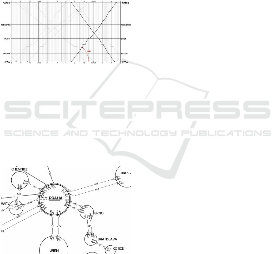
schedule (see Tufte, 2006) proposes a still
unchallenged context+focus visualisation of
relations between two railway stations (Figure 2). It
offers a global view, on a 24 hour slot, of all trains
from Paris to Lyon (and back), assessing not only
departure / arrival times but also speed on each
segment of the travel or duration of stopovers at a
glance. Although focusing on time (and cyclic time
in fact) a spatial information is present: distances
between stopovers on the graphic is proportional to
the real distances.
Figure 2: E.J. Marey’s train schedule (redrawn and
simplified). Time runs horizontally from left to right (24
hour slot, starting 6AM), stations are distributed vertically.
Oblique lines corresponds to trains connecting Paris to
Lyon and vice-versa. The angle (a) represents the speed of
train (the duration of the travel in fact). Note for instance
that it is straightforward to see that the two fastest trains,
highlighted in black, depart at the same time.
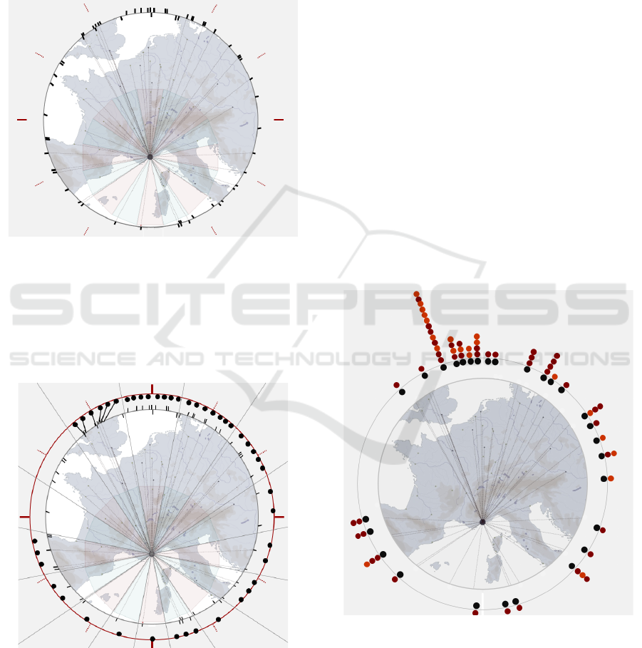
The 1933 map + schedule visualisation of the
Czechoslovakia Air Transport Company (Tufte,
2001) is another inspiring example: it combines in
one unique visualisation space (position of cities)
and time - departure / arrival times (Figure 3).
Figure 3: An extract of the 1933 Czech Airlines map and
schedule (redrawn from Tufte, 2001). Each circle
corresponds to a location in space, departure and arrival
times are shown inside the circles, lines with flight code
connect airports (the presence of an arrow differentiates
inbound from outbound flights).
But with the above examples what we basically wish
to pinpoint is there definitely is room for graphic
creativity in the context of travel data. The
omnipresence of reservation systems may have
introduced a de-facto standardisation (including of
expectations) that we think can be questioned. In
parallel, an emphasis is now often put at research
level on issues regarding the handling of massive
movement data sets like in (Klein et al., 2014) – our
concern in this paper is not about visualising
trajectories, or trails, but basically about synthetizing
end-user level information.
A broad look at time-oriented data visualisation
shows there are today indeed promising research
paths: the overview proposed by (Aigner et al.,
2011) introduces some inspiring solutions more or
less mixing time, space and quantities (ring maps,
flow maps, space-time cube, space-time Path, etc.).
In that context, the flightSchedule profiler prototype
we experiment aims at investigating the way travel
data can be displayed visually in a space + time
combination. It bases on three major choices:
ordinal time model – in order to minimize the
amount of space needed to display all the infor-
mation. This model of time is used in visual
solutions like sparklines (Tufte, 2006b) or in
historical data sets (Blaise and Dudek 2012).
a somehow stylized cartography that only
shows the essential: origin-destination vectors.
This choice is in line with for instance the
“Global map for accessibility” proposed in
(Nelson, 2008).
a “details on demand” design, in line with the
Visual Information-Seeking Mantra, as worded
by (Shneiderman, 1996).
4 THE PROTOTYPE
In this section we first present, one by one, the main
information layers that are combined in the
visualisation. Specific information on one flight or
on one destination airport is available in the
visualisation through user-side interaction – we do
not detail that aspect at all since it is far from being a
breakthrough.
4.1 The Geographic Layer
Cartography is used as a background – a sort of
“mental image” in the sense of (Spence, 2001) – on
which we position origin-destination vectors
between Nice Airport and the airports it is connected
to. In other words, the visualisation underlines the
The Flightschedule Profiler: An Attempt to Synthetise Visually an Airport’s Flight Offer in Time and Space
409
orientation information, and highlights in which
geographic sectors the density of destinations is the
biggest. For the destination airports that are close
enough from Nice to be present on the map and
those that are beyond the map’s limits, the origin-
destination vector connects the origin point (Nice) to
a destination point projected on a circle that marks
the limits of the map (Figure 4).
Figure 4: The cartography shows vectors connecting Nice
to a destination point (represented here by small black
lines) along a circle marking the map’s limit.
Naturally, as can be observed on Figure 4, some
of the origin-destination vectors almost overlap one
another (typically, the vectors connecting Nice to the
various airports in London).
Figure 5: Dealing with overlapping vectors: -
redistribution of the destination points inside 16
geographic sectors (see top left lines connecting the
interior and external circles). Note that the visual
comparison of densities is preserved, with an
overwhelming proportion of northbound flights.
As an answer, we draw a second, larger, circle
and redistribute all destination points regularly
inside 16 geographic sectors: the solution still
assesses visually densities in the various sectors, but
a clear differentiation of each destination is made
(Figure 5). User-side interaction is then added that
allows the retrieval of additional pieces of
information (name / code of airport, country, etc.). A
filtering of national/international flights is also
possible, and the retrieval of a “real” geographic
map (online version - OpenStreetMap layer).
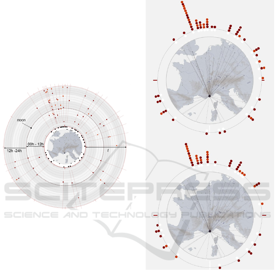
4.2 The Ordinal Time Layer
Once each destination airport is represented as a dot
on the external circle we switch from a representa-
tion of space to a representation of time. To each
black dot (i.e. destination airport) we attach one or
several coloured dots that each represent a flight
from Nice to that destination airport, in ordinal time.
Noticeably the information delivered corresponds to
one specific day inside a week. Flights that occur on
a regular basis (everyday monday over the period)
are differentiated from flights that are occasional, or
do not operate throughout the whole 6 months
period (Figure 6).
Figure 6: The ordinal time layer (Monday flights): each
coloured dot corresponds to one flight. Dark red dots -
flights that occur on a regular basis, light orange dots -
seasonal or occasional flights. Note the varying
proportion of non-regular flights between those heading
north-west and others. User-side interaction triggers the
displaying of textual and visual information about cities,
airport codes, plane types, departure and arrival times,
operating periods etc.
KDIR 2016 - 8th International Conference on Knowledge Discovery and Information Retrieval
410
4.3 The Discrete Time Layer
The prototype was initially designed, as shown in
Figure 6, in order to highlight densities in ordinal
time. However we did test a solution based on the
discrete time model, inspired by (Blaise and Dudek
2011). The result is shown on Figure 7: densities of
flights, hour per hour, and destination per
destination, are assessed visually – yet the usability
of such a visualisation does require further
investigation, and indeed a robust evaluation effort.
Figure 7: The discrete time layer (Monday flights):
concentric circles correspond to hours of a day (time runs
outwards). Each dot corresponds to a given flight, with the
same colour codes as in the ordinal time layer.
5 BENEFITS AND LIMITATIONS
The prototype was intended to allow for a visual
assessment of an airport’s flight offer. At this stage
what can be said is that it does help unveiling some
significant spatio-temporal patterns such as a
northbound flights trend, the predominance of non-
regular flights in that geographic area, and in
particular for UK flights, a majority of flights
operating after midday, a significant variability in
the number of flights depending on the day and on
the destination, etc.
The visualisation can be used to investigate the
offer for a given day, but also to allow for
comparative or cumulative reading of the data, as
illustrated in figure 8.
Figure 8: Allowing for comparisons: Monday flights (top):
vs. Tuesday flights (bottom). Note differences in
destinations, overall number of flights, and type of flights.
Yet, although we consider the result as providing
a somehow valuable service, the visualisation at this
stage has clear limitations:
scalability: what can be seen as a credible
option for a middle size airport like Nice would
be irrelevant in the case of major hubs (or at
least would require severe data filtering steps
prior to the visualisation itself).
Updating: at this stage the data is stored in an
RDBMS and the visualisation produced on the
fly – but no automatic feeding of the applica-
tion is implemented.
The Flightschedule Profiler: An Attempt to Synthetise Visually an Airport’s Flight Offer in Time and Space
411

Connecting flights could be visualised but this
feature is not implemented at this stage.
The discrete time visualisation is relatively
arduous to read: further development is needed
in order to embed more user-side interaction
(typically, brushing data items).
Cumulative visualisations (several days shown
in one same space) are rather dense, in
particular in discrete time – yet they are useful
to compare the flight offer on one day to
possibilities on other days. This would require
a specific visual encoding effort.
Furthermore, we did conduct an informal round
of evaluation with a group of six testers – who were
only asked to decode the information - but are fully
aware that a robust evaluation effort remains to be
done both in terms of readability of the visualisation,
and of added-value. In short, what we present should
definitely be understood as an early proof-of-
concept prototype: we do acknowledge that there are
at this stage significant limitations that minor its
potential impact.
6 CONCLUSIONS
Online planners and travel reservations systems play
today a prominent role in the everyday life of
travellers, yet the very nature of the queries users
formulate (ultimate result: one flight) limits the type
of information one can expect to retrieve. We
introduce a proof-of-concept visualisation that sums
up in a synthetic way an airport’s [where to, when
to] profile and thereby allows users to get an overall
view of its flight offer over time and in space.
The visualisation’s role is not to replace the
above mentioned reservation systems, but provides
an upstream service, helping to unveil significant
spatio-temporal patterns in relation with a given
airport. It is implemented on a real life data set: the
winter 2013/2014 schedule of the airport in Nice
(circ. 200 flights per week). At this stage the
development still leaves a lot of room for
improvement, yet it already underlines the potential
benefit of a context + focus information visualisation
solution in renewing the way users portray an
airport’s flight offer. This experiment now needs to
be questioned through a robust evaluation effort, and
in terms of genericity (other transportation modes
for instance). Future works will primarily focus on
added-value assessment, user-side interaction and
visual encoding issues, but at the end of the day we
view this specific visualisation as one in many: it can
be seen as one element of a toolbox to come that
would include alternative solutions, suited to major
hubs, including isochrones, etc.
REFERENCES
EEC 2004. Opinion of the European Economic and Social
Committee on the Proposal for a Directive of the
European Parliament and of the Council amending
Council Directive 91/440/EEC on the development of
the Community's railways (COM(2004) 139.
Eurostat 2016. Eurostat press release 96/2016 May 2016
http://ec.europa.eu/eurostat/documents/2995521/7302
086/4-17052016-BP-FR.pdf/70a33a43-7e56-4fee-9ae2
-3d090a77dcd7.
Friendly, M. 2006. “A brief history of data visualization”.
In Handbook of computational statistics: data
visualization edited by C. Chen W. Hardle A. Unwin,
15-56. Heidelberg: Springer-Verlag.
Tufte, E.R., 2006. The visual display of quantitative
information. Graphics Press: Cheshire.
Tufte, E.R., 2001. Envisioning information. Graphics
Press: Cheshire.
Aigner, W., Miksch, S., Schumann, H., Tominski, C.,
2011. Visualization of Time-Oriented Data. Human-
Computer Interaction Series Springer-Verlag: London.
Friendly, M. 2002. “Visions and Re-visions of Charles
Joseph Minard”, Journal of Educational and
Behavioral Statistics, Vol. 27, No. 1, 31-51.
Kraak, M.J. 2003 “Geovisualization illustrated” In ISPRS
Journal of Photogrammetry & Remote Sensing 57
390– 399.
Klein, T., van der Zwan, M., Telea, A., 2014. “Dynamic
Multiscale Visualization of Flight Data.” In Proc. of
the Computer Vision Theory and Applications 2014
International Conference (VISAPP), SCITEPRESS.
Tufte, E.R., 2006b. Beautiful evidence. Graphics Press:
Cheshire.
Blaise, J. Y., Dudek, I., 2012. “Analyzing Alternative
Scenarios of Evolution in Heritage Architecture:
Modelling and Visualization Challenges.” In Journal
of Multimedia Processing and Technologies, Vol. 3,
no. 1: 29-48.
Nelson, A., 2008. Travel Time to Major Cities: A Global
Map of Accessibility. Office for Official Publications
of the European Communities, Luxembourg.
Shneiderman, B., 1996. “The Eyes Have It: A Task by
Data Type Taxonomy for Information Visualizations.”
In Proceedings of the IEEE Symposium on Visual
Languages, 336-343, IEEE Computer Society Press.
Spence, R., 2001. Information Visualization. Pearson
Addison-Wesley ACM Press: Harlow.
Blaise, J. Y., and Dudek, I., 2011 “Concentric Time:
Enabling Context+Focus Visual Analysis of
Architectural changes” In Foundations of Intelligent
Systems, edited by M. Kryszkiewicz, H. Rybinski, A.
Skowron, W. Raś, 632-641, LNCS, Berlin,
Heidelberg: Springer-Verlag.
KDIR 2016 - 8th International Conference on Knowledge Discovery and Information Retrieval
412
