
Parallel Coordinate Plots for Neighbor Retrieval
Jaakko Peltonen
1,2
and Ziyuan Lin
1,2
1
Helsinki Institute for Information Technology HIIT, Department of Computer Science, Aalto University, Espoo, Finland
2
School of Information Sciences, University of Tampere, Tampere, Finland
Keywords:
Parallel Coordinates, Visualization, Machine Learning, Dimensionality Reduction.
Abstract:
Parallel Coordinate Plots (PCPs) are a prominent approach to visualize the full feature set of high-dimensional
vectorial data, either standalone or complementing other visualizations like scatter plots. Optimization of
PCPs has concentrated on ordering and positioning of the coordinate axes based on various statistical criteria.
We introduce a new method to construct PCPs that are directly optimized to support a common data analysis
task: analyzing neighborhood relationships of data items within each coordinate axis and across the axes. We
optimize PCPs on 1D lines or 2D planes for accurate viewing of neighborhood relationships among data items,
measured as an information retrieval task. Both the similarity measurement between axes and the axis positions
are directly optimized for accurate neighbor retrieval. The resulting method, called Parallel Coordinate Plots
for Neighbor Retrieval (PCP-NR), achieves better information retrieval performance than traditional PCPs in
experiments.
1 INTRODUCTION
Exploration of high-dimensional data is challeng-
ing and numerous tools have been developed, in-
cluding summarization approaches like clustering and
component analysis, and numerous visualization ap-
proaches. Visualization of high-dimensional data lets
experts visually confirm, reject or modify hypotheses
generated by analysts or automated methods; com-
municate information about data in a compact visual
way; and interactively explore data and features and
give feedback about models of data.
Scatter plots are a common visualization for mul-
tivariate data, but traditional plots are usually lim-
ited to 2D or 3D. For higher dimensional data each
plot must show a small subset of features (some-
times several plots are collected in a scatter plot ma-
trix) or a few new features computed by transforming
original features. Such transformed features can be
found by linear and nonlinear dimensionality reduc-
tion (Wism
¨
uller et al., 2010).
We concentrate on visualization by the Parallel
Coordinate Plot (PCP) (Inselberg, 2009; Heinrich and
Weiskopf, 2013), prominent in data mining. In a PCP,
data axes are ordered vertical lines and each data point
corresponds to a piecewise linear path across the data
axes; sometimes interpolated curves are used in place
of piecewise linear paths. Axes are placed in par-
allel horizontally or vertically—alternative organiza-
tions include circular layouts. By representing each
data item as a line path, PCPs show all coordinates
(feature values) of all items, which helps gain a com-
prehensive view of data. Feature values are shown in
their original form, not needing dimensionality reduc-
tion or other transformation, helping interpretability if
features have intuitive meanings. PCP can be used as
standalone visualizations for high-dimensional data;
also, PCPs and scatter plots are often provided as al-
ternative complementary views of data in visualiza-
tion tools.
Ordering of PCP Axes. A main drawback of
PCPs is that the order of data axes greatly affects visu-
alization quality. In a traditional PCP axes are placed
onto a line (a 1D ordering) where each axis has at
most two neighbors: the order determines which axes
are neighbors. Any axis order shows all data coor-
dinates, but relationships between coordinates along
different axes are easiest to see between neighbor-
ing axes; the ability to see multi-dimensional struc-
ture such as grouping of data over several coordi-
nates depends on the axis order. It is hard and time-
consuming to get an overview of data and feature re-
lationships from an unorganized PCP with many di-
mensions. Some approaches aim to show all pairwise
relationships by paths over multiple copies of axes,
but often it is desired to show each axis only once; To
40
Peltonen J. and Lin Z.
Parallel Coordinate Plots for Neighbor Retrieval.
DOI: 10.5220/0006097400400051
In Proceedings of the 12th International Joint Conference on Computer Vision, Imaging and Computer Graphics Theory and Applications (VISIGRAPP 2017), pages 40-51
ISBN: 978-989-758-228-8
Copyright
c
2017 by SCITEPRESS – Science and Technology Publications, Lda. All rights reserved

get good visual quality for PCPs of high-dimensional
data, optimizing the order is thus necessary. A further
generalization optimizes both the order of axes and
their relative axis positions onto a 1D line (yielding a
2D PCP) or a 2D plane (yielding a 3D PCP).
Coloring of Line Paths for Data Items. The abil-
ity to detect data relationships among PCP axes de-
pends not only on order and positioning of axes but
also on the ability of analysts to follow data lines
across axes. To help in this, lines of different data
items should be made easily distinguishable from one
another, especially when not only the data density but
also individual data items are important to analyze.
Typically line style, marker style, and in particular
color are used to distinguish line paths of different
data items.
Our Contribution: PCPs Directly Optimized
for a Low-level Analysis Task. In this paper we pro-
pose a PCP construction approach where data-space
criteria are used in a unified fashion for three aspects
of the PCP: axis ordering, axis positioning, and data
line coloring, and the construction is directly opti-
mized for a prominent data analysis task not well sup-
ported by previous orderings: analysis of neighbors.
We formulate this visualization task as a rigorous
information retrieval task. Our approach, called Par-
allel Coordinate Plots for Neighbor Retrieval (PCP-
NR), finds an optimized layout for the parallel coor-
dinate axes onto a 1D line or 2D plane. Our solution
is based on a simple principle: axes containing simi-
lar information about data neighborhoods should be
close-by on the display. Our approach yields a well-
defined task for constructing parallel coordinate plots,
where success of each construction stage can be quan-
titatively measured and optimized.
• Given a high-dimensional data set, the first stage
in our approach is to measure similarity between
axes. We evaluate similarity of two axes by an
information retrieval approach, that is, by differ-
ences in neighborhood information between axes:
two axes are similar if they show similar neighbor-
hoods between data items. We quantify the simi-
larity as an information retrieval cost of retrieving
neighbors seen in one axis from the other axis.
• The second stage is to use the similarities to po-
sition axes onto the PCP: for a traditional 2D
PCP this means positioning the axes onto a one-
dimensional line; for a 3D PCP this means po-
sitioning the axes onto a 2D plane. We again
optimize this stage for an analysis task: relating
feature axes by finding similar “neighbor” axes
for each axis. We again take an information re-
trieval approach and optimize positioning of axes
so that a user looking at the PCP can easily iden-
tify which axes are similar.
• The third stage is to pick which axes to connect by
line paths of data points. In a traditional 2D PCP
we naturally connect adjacent axes; in a 3D PCP
we use a minimum spanning tree approach in the
obtained axis layout.
• The fourth stage is to set colors to data items and
draw their line paths. We optimize colors to de-
note overall data similarity, as an information re-
trieval task of relating data items: items get sim-
ilar colors if their coordinates are overall similar
across all dimensions. A user can retrieve data
with similar overall features by retrieving lines of
similar color from the PCP.
In summary, we contribute, based on an informa-
tion retrieval approach, 1) a formalization of PCP con-
struction optimized for a low-level analysis task of
relating data items by retrieving their neighbors; 2)
a data-driven divergence measure between coordinate
axes; 3) a method to arrange axes onto a 2D or 3D
PCP, optimized for retrieval of related axes; 4) a data-
driven method to optimize line colors for data items,
optimized for retrieval of overall similar data items.
Our solution outperforms baselines in experiments.
To our knowledge, this is the first paper to pro-
pose a PCP construction method fully optimized for
an analysis task. All construction stages, from eval-
uating axis similarity to positioning axes and color-
ing data lines, are optimized for the task of relating
data items to their neighbors. Unlike previous order-
ing approaches suited for correlation analysis, clus-
tering data or features, and outlier detection, the task
of analyzing neighborhood relationships has not been
well supported although it is a common need in data
analysis.
In the following, Section 2 discusses related work,
Section 3 introduces our information retrieval ap-
proach to construct the PCP-NR, Sections 4 describes
experiments that illustrate the method, compares it to
previous ones, quantifies its advantage, and shows a
case study. Section 5 concludes.
2 BACKGROUND
We discuss user tasks in exploratory data analysis,
and previous work on PCPs and nonlinear dimension-
ality reduction.
User Tasks. Shneiderman (1996) created a tax-
onomy of tasks and data types that appear in visual
data analysis. He listed several tasks that users may
wish to perform during analysis: 1) overview–gain an
overview of the entire data collection; 2) zoom–zoom
Parallel Coordinate Plots for Neighbor Retrieval
41

in on items of interest; 3) filter–filter out uninteresting
items; 4) details-on-demand–select an item or group
and get details when needed; 5) relate–view relation-
ships among items; 6) history–keep a history of ac-
tions to support, undo, replay, and progressive refine-
ment; 7) extract–allow extraction of sub-collections
and of query parameters. Most exploratory data anal-
ysis systems aim to provide facilities for each of these
tasks in some manner through the interface, how-
ever, typically it is not attempted to optimize individ-
ual data visualizations within a system to serve these
tasks although sometimes design choices (types of vi-
sualizations to be shown, etc.) may be motivated by
needs of such tasks. In this work we aim to directly
optimize a visualization of high-dimensional data for
an analysis task: we focus on creating PCPs opti-
mized for the fifth task–viewing relationships among
data items. We formalize this task as optimizing PCPs
for information retrieval of related (neighboring) data
items from the PCP.
Previous Work on PCPs. PCP research includes
methods for arrangement of axes, interpolating and
bundling data lines, presenting density functions, and
interactivity approaches (Inselberg, 2009; Heinrich
and Weiskopf, 2013); PCPs and related approaches
have been integrated in visualization systems to show
relationships between multiple plots; for example,
Claessen and van Wijk (2011) integrate scatter plots,
PCPs, and histograms in regular arrangements, Viau
and McGuffin (2012) connect multivariate charts by
curves showing relations between feature tuples, and
scatter plots are sometimes shown between adjacent
PCP axes (Heinrich and Weiskopf, 2013). For brevity
we focus on methods for axis ordering and position-
ing.
Previous Work on Ordering PCP Axes. For R
axes there are R(R − 1)/2 symmetric pairwise rela-
tionships which cannot all be shown in a single or-
der of axes. Some approaches aim to show all (or
most) pairwise relationships by paths through multi-
ple copies of different axes, shown e.g. as a paral-
lel coordinate matrix (Heinrich et al., 2012); Insel-
berg (2009) notes dR/2e permutations of axes suffice
to visualize all pairwise relationships. But even if a
good set of permutations was easy to find the num-
ber of permutations needed could become excessive
for high-dimensional data; often a single PCP (or at
most a few) is desired, and we focus on methods to
find a single order where each axis is shown once. To
get good visual quality for PCPs of high-dimensional
data, optimizing the order is needed.
Brute-force optimization of axis ordering for some
order-dependent cost function would need O(R!) cost
evaluations to find the global optimum, where R is
the number of axes, thus more advanced optimiza-
tion methods are often used (Fua et al., 1999; Peng
et al., 2004; Makwana et al., 2012); see Heinrich and
Weiskopf (2013) for a review. Orderings are often
grouped into data-space and image-space approaches;
the former are based on data statistics and the latter
evaluate visual aspects of the PCP. Analysis tasks sup-
ported by current ordering approaches include corre-
lation analysis, clustering of data or dimensions, and
outlier detection (Heinrich and Weiskopf, 2013).
In traditional PCPs axes may be ordered in a data-
space approach by a statistical property such as skew-
ness (Schloerke et al., 2014) which evaluates each
axis alone rather than evaluating similarity of axes.
Such approaches might notice “interesting” feature
axes but may not be able to organize which interest-
ing features are similar. A basic measure to compare
similarity of axes is the correlation coefficient of coor-
dinates between axis pairs: a highly positive or highly
negative coefficient indicates the two axes are related.
We use the correlation coefficient as a baseline sim-
ilarity measure as it is well understood and widely
used, and compare our proposed PCP construction to
a method using the correlation coefficient measure.
Our method gets better results than the baseline in the
experiments of Section 4. Our approach is also well
justified—the similarity measure is directly optimized
for the low-level analysis task of analyzing neighbors,
which is not well served by simple correlation.
In this first paper on information retrieval per-
spective to PCPs, we do not aim at a comprehensive
comparison among PCP ordering approaches, and fo-
cus on showing good performance with respect to the
well-understood baseline. As noted above, some ap-
proaches can be interpreted to support tasks like cor-
relation analysis, clustering, or outlier detection, but
to our knowledge none aim at analysis of neighbor-
hood relationships whereas our approach is directly
mathematically optimized for it. On some data sets, a
similarity measure not designed for a particular analy-
sis task might perform reasonably, but without a clear
connection to an analysis task it is hard for analysts
to choose an appropriate similarity. Our method pro-
vides a clear, optimized choice for analysts focusing
on neighbor relationships.
Generalizations of the Ordering Task. A gener-
alization of the axis ordering task is to optimize not
only the order of axes but also their relative positions:
intuitively, axes that show similar relationships be-
tween data items can be placed close to each other,
and axes showing very different relationships can be
placed farther off. Axis positions can indicate to the
analyst the overall axis similarities whereas data lines
provide the details; close-by positions of very similar
IVAPP 2017 - International Conference on Information Visualization Theory and Applications
42

axes could even suggest the analyst only needs to in-
spect one from each group of similar axes. The linear
arrangement problem has been shown to be NP-hard
(Ankerst et al., 1998). Guo (2003) has found linear ar-
rangements using a spanning tree based heuristic. A
further generalization is arrangement of axes not only
onto a 1D line but onto a 2D plane, yielding a 3D
PCP where axes are drawn along the third dimension.
Such 3D versions have been discussed for example
by Wegenkittl et al. (1997), and related constructions
have been suggested (Fanea et al., 2005; Johansson
et al., 2006). A recent work called 3DPC-tree plot
(Achtert et al., 2013) creates a 3D plot by positioning
axes onto a 2D plane based on the minimum spanning
tree of a user-chosen pairwise similarity measure be-
tween axes.
The choice of similarity measure affects similarity
based axis layouts. Similarities unrelated to the data
analysis task might yield misleading layouts; similari-
ties should be directly optimized for the analysis task,
which our method accomplishes for the neighborhood
analysis task.
Coloring of Line Paths for Data Items. Distin-
guishing lines of different data items is important both
for analyzing statistical relationships of data density
between axes and when individual data items are im-
portant to analyze. If two items have different val-
ues along the left-hand axes of a PCP, but have a very
similar coordinate along an axis midway through the
PCP, their line paths cross at the axis, and it is easy
to lose track which continuation of the line path be-
longs to which data item, sometimes called the line
tracing or linking problem. The goodness of axis or-
dering and visual presentation of data lines both affect
the line tracing. Typically line style, marker style, and
in particular color are used to distinguish line paths of
different items, so that each item uses a single color
for its line path. Color may be based on annotation
such as classes or outputs of a clustering algorithm
(Heinrich and Weiskopf, 2013); more generally find-
ing a coloring for a large high-dimensional data set is
challenging. For large data assigning clearly separate
colors to all data items is not feasible but well-done
optimization can still assign similar colors to similar
items; our solution accomplishes this. Successful col-
oring can be combined with, e.g., bundling to further
help line tracing; we focus on coloring.
Information Retrieval based Visualization.
Nonlinear dimensionality reduction for scatter plot vi-
sualization has recently been formalized as an infor-
mation retrieval task (Venna et al., 2010), which has
yielded an information retrieval perspective to exist-
ing non-linear dimensionality reduction methods and
new well-performing methods (Venna et al., 2010;
Peltonen and Kaski, 2011; Yang et al., 2013). These
methods yield only dimensionality-reduced versions
of data; the resulting coordinates are not in any easy
way relatable to original data coordinates and there
is no obvious applicability of these methods to PCPs
of original data coordinates. (If original variables are
not desired, output coordinates after any dimension-
ality reduction mapping can be shown in a PCP.)
A recent extension considers “meta-visualization”
where individual scatter plots are arranged onto a
display (Peltonen and Lin, 2015); the technique in-
volves evaluating neighborhood similarity between
plots similarly to how we evaluate similarity between
PCP axes. However, there are several differences: 1)
The domain is entirely different, their work consid-
ers arrangement of several scatter plots onto a display
only, whereas our work constructs a single PCP of
a data set, including its axis locations and the color-
ing of its data lines. 2) Even setting aside domain
differences, their work considers pairwise differences
between scatter plots only, whereas in a PCP it is cru-
cial to support two different retrieval tasks: retrieval
of neighboring axes showing similar data (thus sup-
porting retrieval of neighbors across adjacent pairs of
axes) and retrieval of neighboring data items accord-
ing to overall similarity across all axes. Their work
does not involve anything analogous to the latter task
and is unsuitable for it. Our work solves this dual
information retrieval need by both optimizing an ar-
rangement of axes and optimizing a coloring for data
lines. 3) Their work only places scatter plots onto
a display separately, and does not create connections
among them, whereas in a PCP connecting axes by
data lines is crucial; we both organize PCP axes and
create their connections, in the 2D case by adjacency
of axis positions and in the 3D case by a spanning tree
approach. The connections, shown as data lines, vi-
sualize overall data item similarity by optimized col-
oring. Additionally, their evaluation of visualization
quality does not consider connections between plots
whereas we measure quality of visualization across
connected axes as is suitable for PCPs.
Our work in this paper is the first approach tak-
ing an information retrieval perspective to optimiza-
tion of parallel coordinate plots, and is also the first
neighbor embedding method organizing axes onto a
parallel coordinate plot.
3 PCP-NR: THE METHOD
We optimize PCPs for analysts who want to explore
data, and in particular want to perform the subtask
where they wish to relate data items. For example, in
Parallel Coordinate Plots for Neighbor Retrieval
43

a bioinformatics study data items can be tissue sam-
ples from patients described by features that are ac-
tivities of numerous genes; in financial analysis items
can be companies described by financial indicators
like liquidity; in an educational study items can be
students described by performance in various courses.
We assume the analyst is studying data through neigh-
borhood relationships, and wishes to relate data items
by finding their neighbors (similar other samples). We
model the analysis as two visual information retrieval
tasks:
Task 1: Retrieval of Neighboring Data Items
Across Axes. Suppose the analyst inspects an axis
of interest, showing particular similarity relationships
(neighborhoods) among data items along the axis.
The analyst may want to find similar axes, that is,
axes showing similar relationships among the data.
We optimize the axis placement so the analyst can
easily retrieve similar axes as neighbors in the PCP.
In detail, from any axis the analyst can visually re-
trieve neighborhoods of data items: given an item of
interest, the analyst can see which other items have
similar values in the axis and can pick (retrieve) the
most similar (neighboring) items. Next, given many
axes in a PCP, the analyst can visually retrieve which
axes show similar neighborhoods as an axis she is in-
terested in, vs. which axes show different information.
In a well-organized PCP axes showing similar infor-
mation should be placed nearby, to make them easy
to retrieve. We quantify and optimize the PCP for this
retrieval task.
Task 2: Retrieval of Neighboring Data Items
based on the Whole PCP. Given all axes in a PCP, the
analyst may want to visually quickly retrieve which
data items are overall similar (neighbors) based on
their coordinates in all axes. To do this based on
shapes of data lines would require the analyst to
assess all data in all axes at once, which is time-
consuming, as data items may not be similar enough
to form clear bundles of lines across all axes. In-
stead, we support the task by optimized coloring: we
quantify neighborhoods of data items by their high-
dimensional coordinates, and optimize a coloring for
data lines so that similar data items get similar colors.
Retrieving overall similar data items is then simple for
the analyst and reduces to picking lines with similar
colors. We quantify the retrieval by comparing neigh-
borhoods in the high-dimensional original space and
in the color space, and optimize colors to minimize
retrieval errors.
Comparing Axes. In visual information retrieval
an analyst may look at a PCP axis and visually
retrieve neighbors for each data point of interest.
The analyst can visually compare neighborhoods be-
tween several axes: two axes showing similar neigh-
borhoods yield findings supporting each other; axes
showing different neighborhoods reveal different nov-
elties in data.
Neighborhoods of Data Items. Let {x
i
}
N
i=1
be a
set of R-dimensional input data samples (data items).
There are then R different axes in the PCP, and sam-
ples have positions {x
r,i
}
N
i=1
along the rth axis. Each
feature axis shows a different configuration of the data
along the axis, thus each axis shows different neigh-
borhood relationships between data.
In the rth axis, we define a probabilistic neigh-
borhood for each data item i, as a distribution p
i
r
=
{p
r
( j|i)} over the neighbors j 6= i. p
r
( j|i) is the prob-
ability that an analyst inspecting data item i on the
axis would retrieve item j as an interesting neighbor
for further study, so that samples j close to i on the
axis are more likely to be retrieved. We set
p
r
( j|i) =
exp(−(x
r,i
− x
r, j
)
2
/σ
2
r,i
)
∑
k6=i
exp(−(x
r,i
− x
r,k
)
2
/σ
2
r,i
)
. (1)
Intuitively, Eq. (1) says that the closest neighbors j
(whose values x
r, j
are closest to x
r,i
) have the greatest
chance to be picked for inspection next, but further-
away neighbors also have a chance to be picked. Eq.
(1) fits our requirements of probabilistic neighbor-
hood: 1. it is normalized and thus a distribution; 2.
the numerator is a decreasing function of distance.
We allow the falloff rate of p
r
( j|i) be flexibly con-
trolled by σ
r,i
. The σ
r,i
can be set in a data-driven
way to make the p
i
r
have entropy logk for a desired
rough number of relevant neighbors k as in Hinton
and Roweis (2002); Venna et al. (2010); we use an
even simpler choice and set σ
r,i
to 1/10 of the max-
imum pairwise Euclidean distance between points in
axis r which works well in experiments.
Comparing Two Axes. Consider an analyst who
moves from studying axis r to studying another axis
r
0
. The analyst previously picked out the neighboring
items for a particular item i from r, and now tries to
pick out the same items from r
0
. The data have differ-
ent values along the two axes, and two kinds of differ-
ences happen. Some points j were neighbors of i in
axis r (high probability p
r
( j|i)) but are far off in axis
r
0
(low p
r
0
( j|i)) and are missed when neighbors are
retrieved from r
0
. On the other hand, some points j
that were far from i in axis r (low p
r
( j|i)) look like
neighbors in r
0
(high p
r
0
( j|i)) and are novel neigh-
bors when neighbors are retrieved from r
0
. Misses
and novel neighbors are symmetric so that if a neigh-
bor from axis r is missed in r
0
, it is a novel neighbor
in r compared to r
0
. Figure 1 illustrates the setup for
simple hard neighborhoods where each data item is or
is not a neighbor to i; we generalize this to soft prob-
abilistic neighborhoods.
IVAPP 2017 - International Conference on Information Visualization Theory and Applications
44

missed
neighbor
novel
neighbor
missed
neighbor
Axis 1 Axis 2
i
P
i
1
P
i
2
Figure 1: Differences in visual information retrieval for
query point i, when neighbors in one parallel coordinate
plot axis (left) are retrieved from a second axis (right). At
left, the query point is shown as a large black circle, neigh-
bors of the query point are shown as green circles, and non-
neighbors are shown as red stars; the portion of the axis
where neighbors reside is also indicated with light green
background and portion of non-neighbors with light red
background. P
i
1
denotes the set of points with high neigh-
borhood probability p
1
( j|i) in the first axis, and P
i
2
denotes
points with high p
2
( j|i) in the second axis. Missed neigh-
bors have high p
1
( j|i) but low p
2
( j|i); an analyst looking
at the second axis would miss them. Novel neighbors have
low p
1
( j|i) but high p
2
( j|i); they were not apparent in the
first axis.
Recent work in neighbor embedding (Venna et al.,
2010) has shown comparisons of neighborhoods can
be quantified by the information retrieval measures
precision and recall which can be expressed as
Kullback-Leibler (KL) divergences between proba-
bilistic neighbor distributions. We use a similar in-
sight between axes: for query item i the amount of
differences in neighbor retrieval between axes r and
r
0
can be generalized as the KL divergence
D
KL
(p
i
r
, p
i
r
0
) =
∑
j6=i
p
r
( j|i)log
p
r
( j|i)
p
r
0
( j|i)
(2)
where in the case of hard neighborhoods the diver-
gence is proportional (proof equivalent to Appendix
A of Venna et al. (2010)) to the number of missed
neighbors from r to r
0
(recall from r to r
0
), or equiv-
alently, the number of novel neighbors from r
0
to r
(precision from r
0
to r). To compare full axes r and r
0
we sum over the query points, yielding
D
r,r
0
=
∑
i
D
KL
(p
i
r
, p
i
r
0
) =
∑
i
∑
j6=i
p
r
( j | i) log
p
r
( j | i)
p
r
0
( j | i)
,
(3)
which is proportional to the average amount of misses
if retrieving neighbors based on axis r from axis r
0
, or
the average amount of novel neighbors if retrieving
neighbors based on axis r
0
from axis r due to symme-
try. Intuitively, D
r,r
0
will be small if axes have similar
overall trends or high-level clusters, but also if data
are similar at the local level; our experiments show
we detect neighborhood similarities even when large
global changes take place between axes.
Optimizing the Axis Layout. Given the differ-
ence measure (3) for comparing any two axes, we ex-
tend the concept of neighborhood to neighborhoods
of the whole axes themselves. Much like the data item
neighborhoods in (1), we define a probabilistic neigh-
borhood for axis r as
u(r
0
| r) =
exp
−D
r,r
0
/σ
2
r
∑
˜r6=r
exp(−D
r,˜r
/σ
2
r
)
(4)
where D
r,r
0
is the difference measure (3) and u(r
0
|
r) denotes the probability that an analyst who had
carefully studied data neighborhoods among the axes
would, after inspecting axis r, pick axis r
0
to inspect
next. In a good PCP, this neighborhood of a careful
analyst should match as well as possible with the ap-
parent neighborhood of axes based on their physical
locations on the PCP, which we define analogously as
v(r
0
| r) =
exp
−kz
r
− z
r
0
k
2
/σ
2
r
∑
˜r6=r
exp(−kz
r
− z
˜r
k
2
/σ
2
r
)
(5)
where z
r
is the on-screen location for axis r. Based on
the distributions u
r
= {u(r
0
| r)}, v
r
= {v(r
0
| r)}, we
optimize the locations z
r
to minimize the information
retrieval differences in retrieval of neighboring axes;
that is, we minimize the sum of Kullback-Leibler di-
vergences
E = λ
∑
r
D
KL
(u
r
,v
r
) + (1 − λ)
∑
r
D
KL
(v
r
,u
r
) (6)
with respect to axis locations z
r
with a nonlinear opti-
mization algorithm, here conjugate gradient, to obtain
the optimized axis layout. We set λ = 0.5, emphasiz-
ing misses and novel neighbors equally in retrieval of
neighboring axes.
Creating Lines for Data Points. With the axis
layout done, we draw piecewise linear paths between
axes for data points. When axes are placed on a
1D line (as a 2D PCP) we connect neighboring axes;
when placed on a 2D plane (as a 3D PCP), we connect
at most O(d) axes as the traditional PCP does, fol-
lowing a minimum spanning tree (MST) idea (Achtert
et al., 2013), but with W = (w
rr
0
)
d×d
,w
rr
0
= kz
r
−z
r
0
k
as the edge weight matrix.
Optimizing the Data Line Colors. The axis lay-
out was optimized to show pairwise similarities be-
tween axes. We optimize colors of data lines to show
overall similarity of data items, as a neighbor retrieval
task. We define neighborhoods p
i
all
= {p
all
( j|i)} of
data i and neighbors j by overall similarity of the co-
ordinates x
i
, corresponding to a careful analyst study-
ing the whole PCP, as
p
all
( j|i) =
exp(−kx
i
− x
j
)
2
k/σ
2
all,i
)
∑
k6=i
exp(−kx
i
− x
k
k
2
/σ
2
all,i
)
, (7)
Parallel Coordinate Plots for Neighbor Retrieval
45

and define color similarity of data lines as neighbor-
hoods q
i
color
= {q
color
( j|i)} based on color coordi-
nates c
i
as
q
color
( j|i) =
exp(−kc
i
− c
j
k
2
/σ
2
all,i
)
∑
k6=i
exp(−kc
i
− c
k
k
2
/σ
2
all,i
)
(8)
and the falloff σ
2
all,i
are set as in Venna et al. (2010).
The amount of differences is again quantified by
divergences as
∑
i
D
KL
(p
i
all
,q
i
color
) + D
KL
(q
i
color
, p
i
all
)
which is proportional to the sum of missed neighbors
and novel neighbors in the color space compared to
the original; we minimize both differences with re-
spect to the c
i
by conjugate gradient optimization.
Our experiments show this works well, and can reveal
interesting patterns of the data.
4 EXPERIMENTS
Comparison on Artificial Data. We demonstrate
our PCP-NR on 2D and 3D PCPs on an artificial
data set. In the 2D version, we compare to the PCP
implementation ggparcoord in R package GGally
(Schloerke et al., 2014), using Skewed as the dimen-
sion order option (similar results would be obtained
with other options). In the 3D version, we com-
pare to an implementation of 3DPC-tree plot (Achtert
et al., 2013), which creates an MST and connects tree
edges based on distances 1 −|ρ
r,r
0
| between axes r and
r
0
, where ρ
r,r
0
is the Pearson correlation coefficient,
and places axes on a 2D plane with a balloon lay-
out (Herman et al., 2000). The artificial data matrix
M = (m
i j
)
160×15
is created as follows. We divide the
15 features evenly into 3 consecutive feature groups.
For each group of 5 features, we uniformly sample a
“group means” matrix G = (g
i j
)
8×5
from U[0,1]
8×5
,
and randomly assign each of the 160 data point to one
of the 8 data groups. Assume in the feature group
k (k = 1,2, or 3), m
i j
(5(k − 1) ≤ j ≤ 5k) is assigned
to l ∈ {1,·· · ,8}, we then set m
i j
= g
lm
+ε (5(k−1) ≤
j ≤ 5k,m = j − 5(k − 1)) where ε ∼ U[0,0.05]. Fea-
ture groups with such multimodal densities are diffi-
cult for correlation based methods to find. Figure 2
shows PCP-NR correctly places features in the same
group close-by, while the ggparcoord implementa-
tion or the 3DPC-tree plot fail to do so.
We quantitatively measure visualization quality in
the 3D version by average ratio of “sum of within-
group pairwise distances between axis positions” to
“sum of cross-group pairwise distances between axis
positions”. A good layout should yield a low ratio,
meaning well grouped features. We repeat PCP-NR
for 50 times with different randomizations, yielding a
ratio 0.1385 ± 0.0048. 3DPC-tree plot yields a ratio
0.4376, significantly worse than PCP-NR.
The coloring of data lines is also better in PCP-
NR for data analysis: while the simple hue mapping
of mean coordinates in the baseline is bright and col-
orful, it fails to reveal several different groups in data
(only a few groups are visible), whereas our coloring
clearly shows the large number of groups of samples
each behaving overall similarly. Note that the overall
similarity used for PCP-NR coloring is based on all
axes: data items that behave similarly in most dimen-
sions will get similar colors, but will still show some
color variation if they differ along some dimensions.
Comparison on Real Data Sets. We show
the performance of PCP-NR on several data
sets on UCI Machine Learning Repository (Lich-
man, 2013): Breast Cancer Wisconsin (Diagnos-
tic),Cardiotocography,Parkinsons,QSAR biodegrada-
tion,Leaf,and Wine.We separate features and labels in
the data sets, and create PCPs only from data features,
labels are left for quantitative evaluation.
To measure the performance of the proposed
method on the real data sets, we assume the analyst
does retrieval of axes from the visualization: when the
analyst inspects one dimension, he then retrieves its
neighbors based on graph distances between vertices
in the MST. We quantify ground truth distances of di-
mensions by “differences” between k-nearest neigh-
bor predictions from individual dimensions: for the
data set X and its any dimension s, we create a matrix
K
s
∈ R
n×C
, with n the number of data points and C the
number of categories in the data set. We let K
s
ic
be the
k-NN prediction probability of category c for x
i
, given
the values only from dimension s, and kK
s
− K
s
0
k
F
be
the ground truth distance between dimension s and s
0
.
We stress the distance defined in this way does not
have bias towards our method, as we do not use label
information to create the PCP.
The performance in this information retrieval task
(retrieval of axes) is then naturally measured by the
precision-recall curve, a well-understood information
retrieval quality measure. The curve from a method
with better retrieval performance should be located
at the top-right in the figure, meaning the method
can achieve both better precision and recall. We set
k = 20 in the evaluations and again compare PCP-
NR with 3DPC-tree plot + balloon layout. Figure 3
and Figure 5 show the results, from 3D PCPs and 2D
PCPs, respectively. Figure 4 shows the 3-dimensional
PCP and 2-dimensional PCP for the Wine data set
we used. We also report the AUCs as summariza-
tions of the precision-recall curves, as shown in Table
1 and Table 2. The relative surplus is calculated as
(AUC
PCP−NR
− AUC
Baseline
)/AUC
Baseline
.
IVAPP 2017 - International Conference on Information Visualization Theory and Applications
46
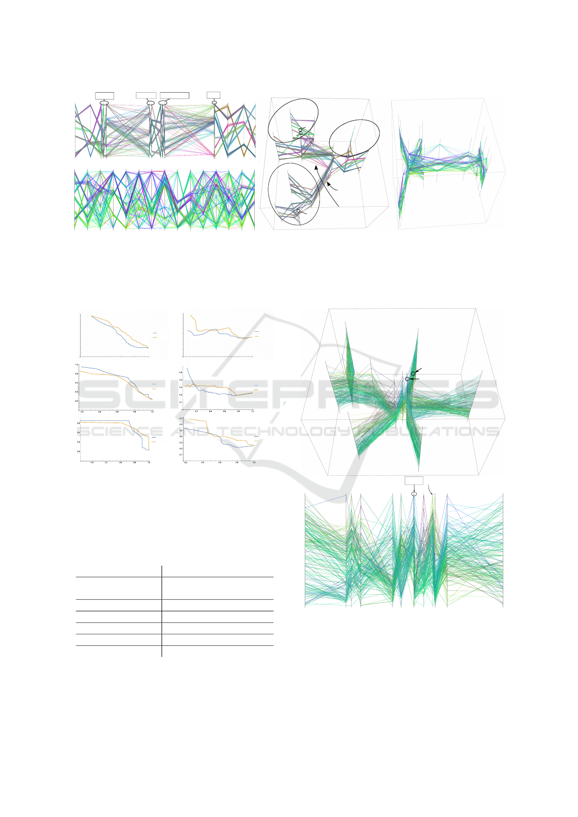
10
8
9
6
7
1
2
3
4
5
11
14
12
15
13
Cross-group
connections that
do not preserve
neighborhood
relations are
placed far off
1
10
4
12
3
14
7
11
8
6
2
15
5
13
9
10
9
6 7 8
11 14
12 15 13
1
3
4
2 5
13 11 8 3 4 15 9 5 7 6 14 10 12 1 2
Figure 2: Results of the toy data set. Top left: 2D PCP-NR; bottom left: ggparcoord implementation; middle: 3D PCP-
NR; right: 3DPC-tree plot + Balloon layout. The feature groups are dimension 1–5, 6–10, and 11–15. In the 2D version,
PCP-NR arranges the features positions so that the feature groups are at the left, center, and right respectively. In the 3D
version, we highlight the groups by black ellipses. Meanwhile in the baseline methods, the connections between features do
not reflect the ground-truth grouping. Also, our coloring correctly shows the 8 groupings in the data points in most of the
case. High-resolution versions of this and other figures are available online at https://github.com/pcpnr/icdm16.
B
reast
C
ancer
W
isconsin
(D
ia
g
nostic
)
1.0
0.8
0.6
0.4
0.2
0.2 0.4 0.6 0.8 1.0
Baseline
PCP- NR
Precision
Recall
Brease Cancer Wisconsin (Diagnostic)
Baseline
PCP-NR
C
ardiotocography
0.5
0.4
0.3
- Baseline
- PCP- NR
0.2
0.1
0.2
0.4
0.6 0 .8 1.0
Recall
Precision
Precision
Recall
Cardiotocography
Baseline
PCP-NR
Recall
Precision
Precision
Recall
Parkinsons
Baseline
PCP-NR
Recall
recision
Precision
Recall
QSAR Biodegradation
Baseline
PCP-NR
Recall
Precision
Precision
Recall
Leaf
Baseline
PCP-NR
Recall
Precision
Precision
Recall
Wine
Baseline
PCP-NR
Figure 3: 3D PCP: the precision-recall curves from differ-
ent data sets, compared with the baseline 3DPC-tree plot +
balloon layout. In most of the data sets, the curves from our
method lie top-right to the curves from the baseline, indi-
cating better retrieval performance.
Table 1: AUCs of precision-recall curves in Figure 3. PCP-
NR outperforms on 4 of 6 data sets. When the baseline
outperforms, the relative surplus is not large.
PCP-NR Baseline Rel. sur.
Breast Cancer
Wisconsin (Diagnostic)
0.523 0.440 19.0%
Cardiotocography 0.290 0.265 9.56%
Parkinsons 0.536 0.570 -5.96%
QSAR biodegradation 0.273 0.233 17.3%
Leaf 0.560 0.561 -0.332%
Wine 0.349 0.301 15.2%
Case Study. We apply PCP-NR onto a human
gene expression collection from the ArrayExpress
database (Parkinson et al., 2009) for visual analy-
12
7
6
9
8
2
1
13
3
4
5
11
10
12
7 6 9 2
11
3 10
5
1
13
4
8
Figure 4: 3D PCP and 2D PCP for Wine data from PCP-NR.
sis. The data set contains D = 105 experiment re-
sults (gene expression activities) from comparisons
between healthy and diseased subjects. Additional la-
bels about the relevant diseases are available for each
experiment, which are “cancer”, “cancer-related”,
“malaria”, “HIV”, “cardiomyopathy”, or “other”. We
Parallel Coordinate Plots for Neighbor Retrieval
47
Precision
Recall
Baseline
PCP-NR
Breast Cancer Wisconsin (Diagnostic)
Recall
Precision
Baseline
PCP-NR
Precision
Recall
Cardiotocography
Recall
Precision
Precision
Recall
Parkinsons
Baseline
PCP-NR
Recall
Precision
QSAR Biodegradation
Baseline
PCP-NR
Recall
Precision
Precision
Recall
Leaf
Baseline
PCP-NR
Recall
Precision
Precision
Recall
Wine
Baseline
PCP-NR
Figure 5: 2D PCP: the precision-recall curves from different
data sets, compared with the baseline PCP implementation
ggparcoord from R package GGally. In most of the data
sets, the curves from our method lie top-right to the curves
from the baseline, indicating better retrieval performance.
Table 2: AUCs of the precision-recall curves in Figure 5.
PCP-NR outperforms 4 out of 6 data sets. When the base-
line outperforms, the relative surplus is not large.
PCP-NR Baseline Rel. sur.
Breast Cancer
Wisconsin (Diagnostic)
0.530 0.214 147%
Cardiotocography 0.240 0.242 -1.06%
Parkinsons 0.508 0.279 81.8%
QSAR biodegradation 0.201 0.250 -17.9%
Leaf 0.600 0.254 134%
Wine 0.336 0.201 63.6%
are interested in how the connection between the dif-
ference of the involved diseases and the activities from
different sets of gene pathways is reflected in the visu-
alization with PCP.
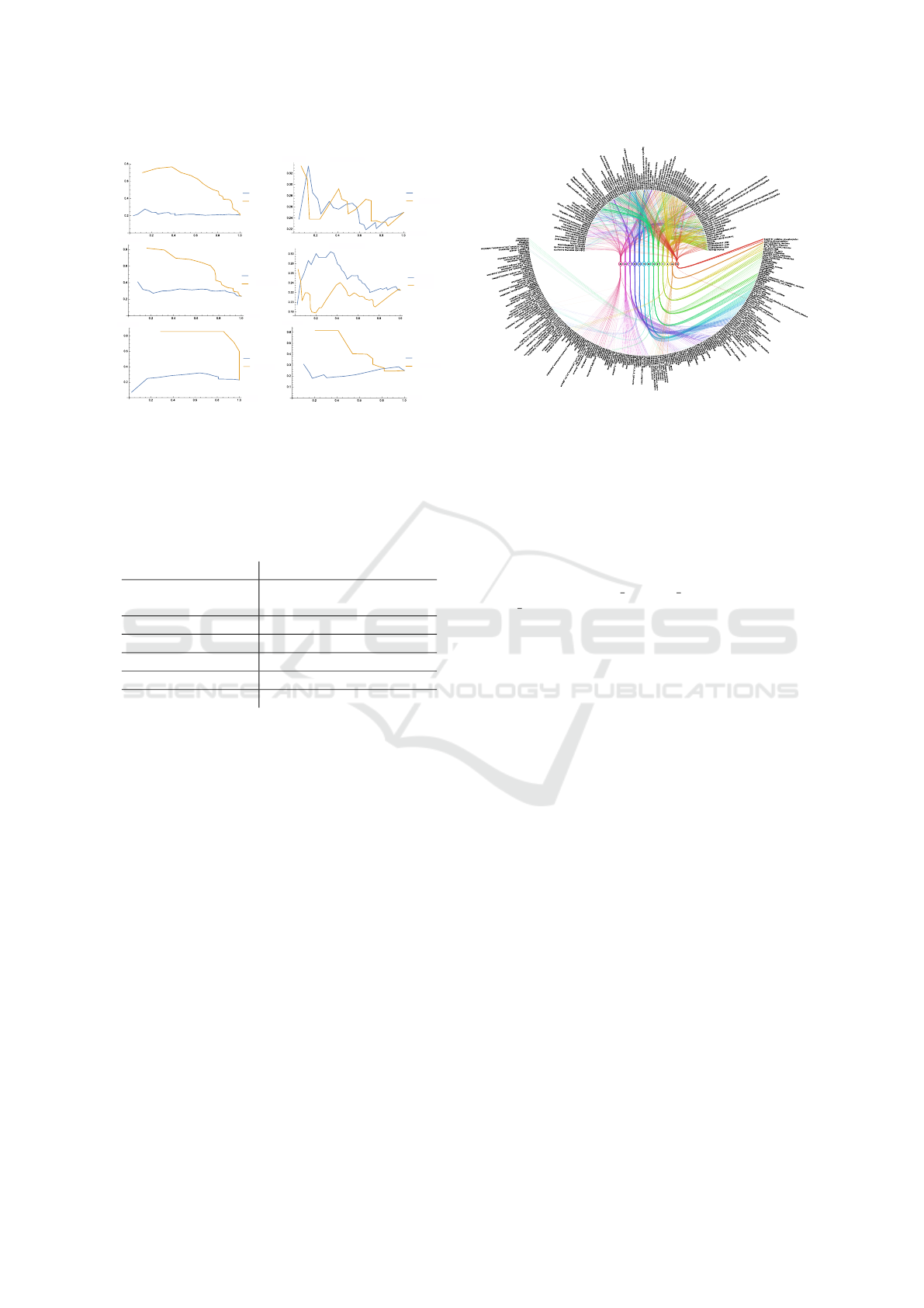
We preprocess the data set as in Caldas et al.
(2009): first use gene set enrichment analysis (GSEA)
to measure W = 385 activities of known gene path-
ways, then train a topic model from the “experiment–
pathway activity” matrix with L = 50 topics, each of
which corresponds to a subset of pathways. It was
shown that the obtained topics act as different aspects
of biological activity across the experiments (Caldas
et al., 2009). See Figure 6 for an illustration of 13 se-
lected topics. We create an axis from each topic, with
50 axes in total as follows.
Let Y ∈ R
D×W
be the “experiment–pathway ac-
tivity” matrix, and Z ∈ R
L×W
be the “topic–pathway
activity” matrix derived from the topic model, with
z
s
the s-th row of Z, corresponding to the pathway
activities in topic s. For each topic s, we select W
s
pathways from Y with the largest activities in z
s
to
form a D ×W
s
matrix Y
s
, where W
s
is determined by
Figure 6: An illustration of 13 selected topics in the topic
model inferred from the “experiment–pathway activity”
matrix. The serial numbers of the selected topics are shown
in the small circles at the center. The top part lists the
experiments, and the bottom part lists the pathways. The
curves show the experiments-topics-pathways connection
in a way that the topics are active in the experiments they
link to, and the pathways are active in the topics they link
to. The curve widths correspond to the topic activities. The
revealed hidden structure is highlighted by the curve col-
oring. As an example, topic 50 is active in experiments
like “stk3 overexpression”, “aco1 overexpression”, etc. and
pathways like “hsa00190 oxidative phosphorylation”, “ox-
idative phosphorylation”, etc are active in this topic 50.
the discriminative power of the selected features: we
choose W
s
to be the smallest number that reaches the
highest leave-one-out accuracy of k-nearest neighbor
classification over k and the number of the most active
features. With the constructed Y
s
, we create the s-th
axis as v
s
= Y
s
r
s
, with r
s
the one-dimensional linear
discriminant projection from the disease labels. After
juxtaposing the v
s
into V ∈ R
D×L
, we create the PCP
from PCP-NR for V , shown in Figure 7.
We focus our analysis on group A, B, and C
marked in Figure 7, because either the axes within
are closer, or there are axes of large degree in the tree.
The top pathways are listed in Figure 7 (bottom).
Group A is related to apoptosis. Besides the top
3 pathways in the group, the relation between NK
cells and apoptosis was also studied (Warren and
Smyth, 1999). In the large group B, it is known that
Aminoacyl-tRNA synthetases involve ATP (Rapaport
et al., 1987), and glycan degradation plays an impor-
tant role in the starch utilization system (Koropatkin
et al., 2012), which produces ATP. On the other hand,
TCR (T-cell receptor) and BCR (B-cell receptor) are
part of the immunity system, so we can say these two
pathways form a subgroup. Finally, group C is on
cell cycle: mTOR is related to cell growth (Laplante
and Sabatini, 2012); the enrichment of RACCYCD in
cell cycle was recently reported (Sanchez-Diaz et al.,
IVAPP 2017 - International Conference on Information Visualization Theory and Applications
48
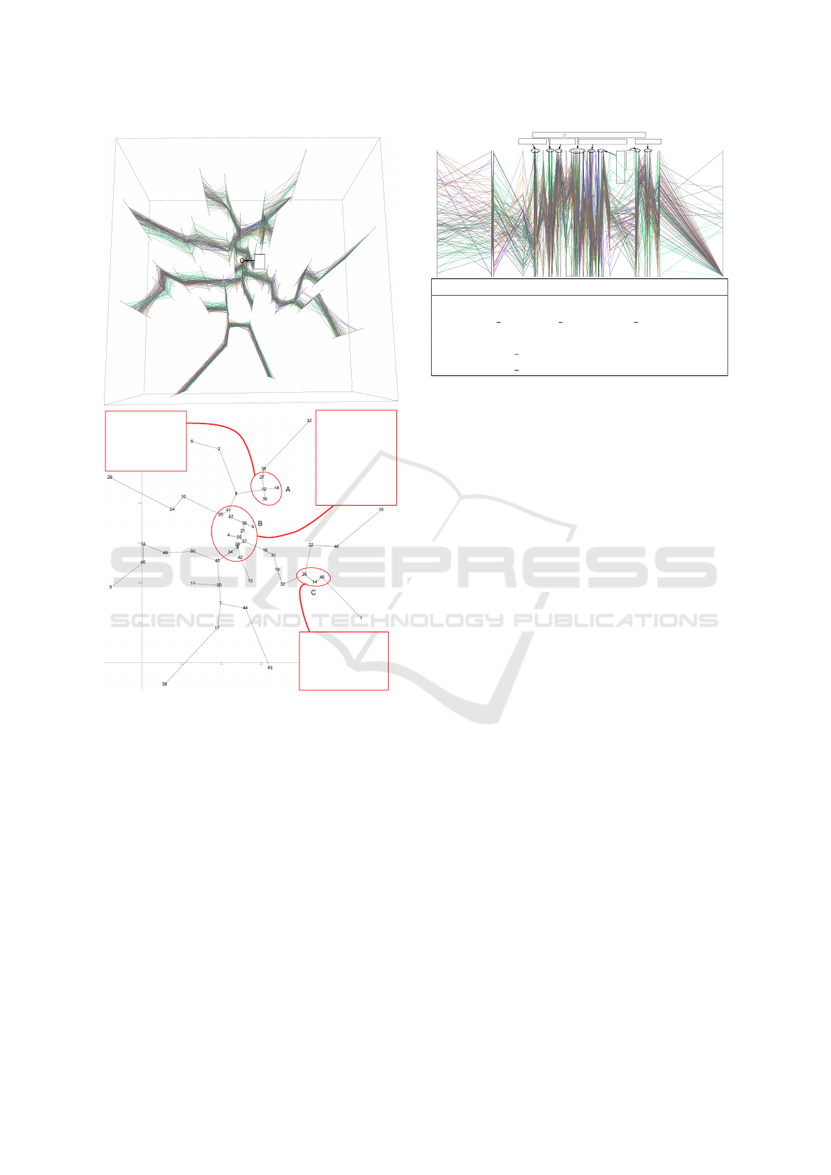
6
2
32
38
27
18
12
36
9
41
47
25
39
3
21
23
28
8
37
10
24
16
31
19
22
33
26
14
48
4
34
13
46
42
45
29
15
1
50
49
35
40
5
20
11
7
44
17
30
43
Cluster A top pathways:
APOPTOSIS
APOPTOSIS_KEGG
APOPTOSIS_GENMAPP
NKCELLSPATHWAY
TH1TH2PATHWAY
Cluster C top pathways:
MTORPATHWAY
RACCYCDPATHWAY
FMLPPATHWAY
P38MAPKPATHWAY
HCMVPATHWAY
Cluster B top pathways:
AMINOACYL_TRNA_
BIOSYNTHESIS
HSA00500_STARCH_
AND_SUCROSE_
METABOLISM
HSA01032_GLYCAN_
STRUCTURES_
DEGRADATION
TCRPATHWAY
SIG_BCR_SIGNALING_
PATHWAY
Figure 7: Top: the 3D PCP from the derived feature ma-
trix V for the 105 experiments created by PCP-NR. The nu-
meric labels are topic serial numbers. We focus our analysis
on 1) the central part with more short links, and 2) the axes
with larger degrees in the MST, which potentially reveals
more relations between the axes or topics. We can also
notice some blue lines between axes differentiating them-
selves from other green-ish lines in majority. Those lines
may suggest label information about the experiment that are
not used in the creation of the PCP according to our color-
ing algorithm. Bottom: the top view of the axes, with the
groups marked by red circles, which are analyzed in the case
study. For each group, we list the top 5 pathways: we sort
pathways by their activity levels, then choose 5 from the top
if pathways appear in at least two topics (axes) in the group.
2013); p38 MAPK pathway, together with other path-
ways in MAPK families, regulates different stages of
cell cycle (Rubinfeld and Seger, 2005); and HCMV is
a pathogen that induces disease by affecting cell cycle
in different ways (Salvant et al., 1998).
30
17 43
7
38 6 27 2
25
36 20 9 10
28
50
12 45 41
31
39 21 47 3 8 23 44 42 16 34
37 19 4 33 26 14
1
22
15
46
13
48
32
5 40
18
11
24
29 49 35
Top pathways
APOPTOSIS
HSA00562 INOSITOL PHOSPHATE METABOLISM
AT1RPATHWAY
APOPTOSIS KEGG
APOPTOSIS GENMAPP
Figure 8: Top: The 2D PCP from the derived feature matrix
V for the 105 experiments created by PCP-NR. The numeric
labels are topic serial numbers. Topic 32 and topic 30 are
positioned at the two ends of the PCP, which suggests the
neighbor relationship (neighbor distributions on each query
data point) is very different on those two axes. The unusual
neighbor relationship can be visually checked at topic 32,
where a majority of data points concentrates on or near one
single value. The positioning of the two outliers are consis-
tent with Figure 7, in the sense that they are also leaves in
the MST. We focus on the smaller group at the right half of
the plot in the case study. Bottom: The top 5 pathways in
the smaller group at the right half of the figure, extracted in
the same way as described in Figure 7 (bottom).
A similar analysis can be conducted on the 2D
version of PCP-NR. Figure 8 shows the PCP. We fo-
cus the case study on the smaller group standing out
at the right half of the plot; the bottom of the figure
lists the top 5 pathways. Again we can see pathways
are apoptosis-related: besides the pathway relation al-
ready suggested by the pathway names, AT1R was re-
ported to have connection with breast cancer (Zhao
et al., 2010), and inositol (hexa)phosphate can help
cancer inhibition (Vucenik and Shamsuddin, 2006).
Thus these two pathways are related with apoptosis.
5 CONCLUSIONS
We presented Parallel Coordinate Plots for Neighbor
Retrieval (PCP-NR), a method for constructing paral-
lel coordinate plots (PCPs), either 2D or 3D PCPs,
where each design step is directly optimized for a
low-level component task of exploratory data analy-
sis. To our knowledge this is the first method to di-
rectly optimize PCP construction for a quantifiable
low-level data analysis task.
In particular we optimize the PCP for the task of
relating data items, specifically for retrieving neigh-
Parallel Coordinate Plots for Neighbor Retrieval
49

borhood relationships between data items. All con-
struction stages are optimized for this task: 1) similar-
ity of feature axes is evaluated by similarity of neigh-
borhood relationships shown in each axis; 2) axis
placement is optimized so that similar axes (showing
similar neighbor relationships) are placed nearby in
the PCP, allowing the user to retrieve similar axes eas-
ily from looking at the PCP; 3) coloring of data lines
is optimized to show overall neighbor relationships
of data items across all features, allowing the user to
track relationships of similar data items over all axes.
We do not claim neighbor retrieval is the only task
PCPs should be optimized for—relating data items
(to neighbors) is one of the component tasks in ex-
ploratory data analysis, and methods can be created
to optimize PCPs for other component tasks. Fu-
ture work could find theoretical connections describ-
ing earlier PCP works (such as axis ordering meth-
ods) as approximate optimization of other component
tasks of exploratory data analysis. In this sense, our
work is the first in a research direction of optimizing
PCPs for subtasks of exploratory data analysis.
Our construction method is general and applicable
both to 2D and 3D PCPs. Resulting PCPs have a sim-
ilar form as traditional 2D and 3D PCPs, but the new
PCPs are optimized for an analysis task; the PCPs are
directly pluggable into visualization systems featur-
ing PCPs, potentially improving their ability to serve
data analysts. For reasonably-sized data construction
of the plots is already fast; for very large data sets
recent work in speedup of scatter plot optimizations
(Yang et al., 2013) may be adapted to PCP optimiza-
tion. As other further work, it is easy to add prefer-
ences about layouts as penalties to Eq. (6), such as a
repulsion term (Peltonen and Lin, 2015) keeping axes
a desired minimum apart if needed for readability.
ACKNOWLEDGEMENTS
We acknowledge the computational resources pro-
vided by the Aalto Science-IT project. Authors be-
long to the Finnish CoE in Computational Inference
Research COIN. The work was supported in part by
TEKES (Re:Know project). The work was also sup-
ported in part by the Academy of Finland, decision
numbers 252845, 256233, and 295694.
REFERENCES
Achtert, E., Kriegel, H.-P., Schubert, E., and Zimek, A.
(2013). Interactive data mining with 3d-parallel-
coordinate-trees. In SIGMOD, pages 1009–1012,
New York, NY, USA. ACM.
Ankerst, M., Berchtold, S., and Keim, D. A. (1998). Simi-
larity clustering of dimensions for an enhanced visual-
ization of multidimensional data. In INFOVIS, pages
52–60.
Caldas, J., Gehlenborg, N., Faisal, A., Brazma, A., and
Kaski, S. (2009). Probabilistic retrieval and visualiza-
tion of biologically relevant microarray experiments.
Bioinformatics, 25:i145–i153.
Claessen, J. and van Wijk, J. (2011). Flexible Linked Axes
for Multivariate Data Visualization. IEEE T. Vis. Com-
put. Gr., 17:2310–2316.
Fanea, E., Carpendale, S., and Isenberg, T. (2005). An in-
teractive 3d integration of parallel coordinates and star
glyphs. In INFOVIS, pages 149–156. IEEE.
Fua, Y.-H., Ward, M. O., and Rundensteiner, E. A. (1999).
Hierarchical parallel coordinates for exploration of
large datasets. In VIS, pages 43–50. IEEE Computer
Society Press.
Guo, D. (2003). Coordinating computational and visual ap-
proaches for interactive feature selection and multi-
variate clustering. Inform. Vis., 2:232–246.
Heinrich, J., Stasko, J., and Weiskoph, D. (2012). The par-
allel coordinates matrix. In Eurovis, pages 37–41.
Heinrich, J. and Weiskopf, D. (2013). State of the Art of
Parallel Coordinates. In EG2013 - STARs. The Euro-
graphics Association.
Herman, I., , Melanc¸on, G., and Marshall, M. S. (2000).
Graph visualization and navigation in information vi-
sualization: a survey. IEEE T. Vis. Comput. Gr., 6:24–
43.
Hinton, G. E. and Roweis, S. T. (2002). Stochastic neighbor
embedding. In NIPS, pages 833–840.
Inselberg, A. (2009). Parallel Coordinates: Visual Multidi-
mensional Geometry and Its Applications. Springer.
Johansson, J., Ljung, P., Jern, M., and Cooper, M. (2006).
Revealing structure in visualizations of dense 2d and
3d parallel coordinates. Inform. Vis., 5:125–136.
Koropatkin, N. M., Cameron, E. A., and Martens, E. C.
(2012). How glycan metabolism shapes the human
gut microbiota. Nat. Rev. Microbiol., 10:323–335.
Laplante, M. and Sabatini, D. M. (2012). mTOR signaling
in growth control and disease. Cell, 149:274–293.
Lichman, M. (2013). UCI machine learning repository.
Makwana, H., Tanwani, S., and Jain, S. (2012). Axes re-
ordering in parallel coordinate for pattern optimiza-
tion. Int. J. Comput. Appl., 40:43–48.
Parkinson, H. E. et al. (2009). Arrayexpress update - from
an archive of functional genomics experiments to the
atlas of gene expression. Nucleic Acids Res., 37:868–
872.
Peltonen, J. and Kaski, S. (2011). Generative modeling for
maximizing precision and recall in information visual-
ization. In AISTATS 2011, volume 15, pages 597–587.
JMLR W&CP.
Peltonen, J. and Lin, Z. (2015). Information retrieval ap-
proach to meta-visualization. Mach. Learn., 99:189–
229.
IVAPP 2017 - International Conference on Information Visualization Theory and Applications
50

Peng, W., Ward, M., and Rundensteiner, E. (2004). Clut-
ter Reduction in Multi-Dimensional Data Visualiza-
tion Using Dimension Reordering. In INFOVIS, pages
89–96.
Rapaport, E., Remy, P., Kleinkauf, H., Vater, J., and Za-
mecnik, P. C. (1987). Aminoacyl-tRNA synthetases
catalyze AMP—-ADP—-ATP exchange reactions, in-
dicating labile covalent enzyme-amino-acid interme-
diates. P. Natl. Acad. Sci. USA, 84:7891–7895.
Rubinfeld, H. and Seger, R. (2005). The ERK cascade. Mol.
Biotechnol., 31:151–174.
Salvant, B. S., Fortunato, E. A., and Spector, D. H. (1998).
Cell cycle dysregulation by human cytomegalovirus:
influence of the cell cycle phase at the time of in-
fection and effects on cyclin transcription. J. Virol.,
72:3729–3741.
Sanchez-Diaz, P. C. et al. (2013). De-regulated micrornas
in pediatric cancer stem cells target pathways involved
in cell proliferation, cell cycle and development. PLoS
ONE, 8:1–10.
Schloerke, B. et al. (2014). GGally: Extension to ggplot2.
R package version 0.5.0.
Shneiderman, B. (1996). The eyes have it: A task by
data type taxonomy for information visualizations. In
IEEE Symp. on Visual Languages, pages 336–343.
IEEE Computer Society Press.
Venna, J., Peltonen, J., Nybo, K., Aidos, H., and Kaski, S.
(2010). Information retrieval perspective to nonlin-
ear dimensionality reduction for data visualization. J.
Mach. Learn. Res., 11:451–490.
Viau, C. and McGuffin, M. J. (2012). ConnectedCharts:
Explicit visualization of relationships between data
graphics. Comput. Graph. Forum, 31:1285–1294.
Vucenik, I. and Shamsuddin, A. M. (2006). Protection
against cancer by dietary IP6 and inositol. Nutr. Can-
cer, 55:109–125.
Warren, H. S. and Smyth, M. J. (1999). Nk cells and apop-
tosis. Immunol Cell Biol, 77:64–75.
Wegenkittl, R., L
¨
offelmann, H., and Gr
¨
oller, E. (1997). Vi-
sualizing the behaviour of higher dimensional dynam-
ical systems. In VIS, pages 119–125. IEEE.
Wism
¨
uller, A., Verleysen, M., Aupetit, M., and Lee, J. A.
(2010). Recent advances in nonlinear dimensional-
ity reduction, manifold and topological learning. In
ESANN. d-side.
Yang, Z., Peltonen, J., and Kaski, S. (2013). Scalable opti-
mization of neighbor embedding for visualization. In
ICML, pages 127–135.
Zhao, Y. et al. (2010). Angiotensin II/angiotensin II type
I receptor (AT1R) signaling promotes MCF-7 breast
cancer cells survival via PI3-kinase/Akt pathway. J.
Cell. Physiol., 225:168–173.
Parallel Coordinate Plots for Neighbor Retrieval
51
