
On Visual Stability and Visual Consistency for Progressive Visual
Analytics
Marco Angelini and Giuseppe Santucci
University of Rome ”La Sapienza”, Rome, Italy
Keywords:
Progressive Visual Analytics, Incremental Visualization, Stability, Consistency, Quality Metrics, Evaluation.
Abstract:
The emerging field of Progressive Visual Analytics (PVA in what follows) deals with the objective of pro-
gressively create the final visualization through a series of intermediate visual results, affected by a degree of
uncertainty and, in some cases, a non monotonic behaviour. According to that, it is a critical issue providing
the user with no confusing visualization and that results in a novel point of view on stability and consistency.
This position paper deals with the novel and challenging issues that PVA poses in term of visual stability and
consistency, providing a preliminary framework in which this problem can be contextualized, measured, and
formalized. In particular, the framework proposes a set of metrics, able to explore both data and visual chan-
ges; a preliminary case study demonstrates their applicability and advantages in adequately representing data
changes in a visualization.
1 INTRODUCTION
Visual Analytics is a well established research field
allowing a user to get insights on the data, domina-
ting both its cardinality and dimensionality. In today
scenarios data collection is a standard practice con-
ducted by many different actors, from research cen-
ters to small enterprises; the development of fields
like Internet of Things is additionally leading to a
sheer amount of devices that produce data at very fast
rates, making the problem of visualizing these data
even more actual.
In order to cope with the vast amount of produced
data, and to provide the user with a timely visualiza-
tion, a new field called ”Progressive Visual Analytics”
(PVA in the following) is emerging, with the objective
of progressively create the final visualization through
a series of intermediate visual results, affected by a
degree of uncertainty.
A main concept in data representation and visua-
lization is managing the chosen visual paradigm, in
order to convey as better as possible the data charac-
teristics. In this scenario, two aspects are really im-
portant. The first one is the representation of the data
itself, in a given moment: in this case the focus is on
the selected visual paradigm and the associated analy-
tical tasks that are in charge of producing a good and
informative representation of the data. The second as-
pect is the representation of the changes in the data:
in this case, even a well chosen visual paradigm for
a static dataset could result problematic in capturing
such changes.
The conveyance of the changes in a dataset en-
compasses different aspects, ranging from the trace-
ability of the change for the user to an adequate re-
presentation of the visual change in order to be in ac-
cordance with the data change, to the stability of the
visualization itself.
Differently from the case of a data streaming,
where new data are processed and visualized at the
time in which they are produced, making the actual
visualization a correct representation of the data state,
in PVA an intermediate visual results could be a parti-
cular arrangements of data that does not represent any
existing situation.
In this case the problem of maintaining a visual
consistency should be led by the goal of allowing the
user to understand the way in which the visualization
is constructed and to identify areas with more certain
results from areas still affected by too much uncer-
tainty to make a decision.
The contribution of this paper is to provide an ini-
tial reasoning on how to measure and analyze visual
stability and visual consistency in the field of PVA,
providing a preliminary framework in which this pro-
blem can be contextualized and formalized; a case
study demonstrates its applicability and advantages in
adequately representing data changes in a visualiza-
Angelini M. and Santucci G.
On Visual Stability and Visual Consistency for Progressive Visual Analytics.
DOI: 10.5220/0006269703350341
In Proceedings of the 12th International Joint Conference on Computer Vision, Imaging and Computer Graphics Theory and Applications (VISIGRAPP 2017), pages 335-341
ISBN: 978-989-758-228-8
Copyright
c
2017 by SCITEPRESS – Science and Technology Publications, Lda. All rights reserved
335

tion.
The paper is structured as follows: in Section 2
presents the related work, Section 3 introduces the
actual framework, and Section 4 deals with a demon-
strative use case. Finally, conclusions and future work
are discussed in Section 5.
2 RELATED WORK
Progressive visual analytics (PVA) is an emerging
field of research, with recent contributions proposing
different approaches to the topic (Schulz et al., 2016;
Stolper et al., 2014; Turkay et al., 2017; Fekete and
Primet, 2016). In its general formulation, PVA pro-
vides partial results from long-running analysis ope-
rations generated by a stepped algorithm (e.g., a re-
cursive algorithm), whose steps lead to the availabi-
lity of partial results. Going through the literature, it
appears that a number of seemingly disjoint visuali-
zation approaches can be understood as Progressive
Visual Analytics, ranging from Streaming data visu-
alization (Wong et al., 2004; Cottam, 2011), Layered
visualization (Piringer et al., 2009), out-of-core visu-
alization (Cottam et al., 2014; Joy, 2009) that chun-
kes the dataset when its size exceeds the available
memory space, parallel visualization (Ahrens et al.,
2007; Vo et al., 2011), computational steering (inte-
ractive control over a computational process during
execution) (Mulder et al., 1999), to Progressive visu-
alization (Angelini and Santucci, 2013; Rosenbaum
and Schumann, 2009; Glueck et al., 2014; Frey et al.,
2014; Fisher et al., 2012).
This paper proposes to study visual stability and
consistency for PVA from three perspectives: data
space, visualization space, and perception space. Re-
levant propsals have been studied and reported accor-
ding to this task. The first step consists in analyzing
the data. Many studies aimed at dataset classification
are present in literature. In (Forman, 2003) Forman
uses several metrics to classify text files. These me-
trics are based on the cardinality of the words and
characters repetition. Regarding visual quality me-
trics, in (Tufte and Graves-Morris, 1983) is pointed
out the need to have intrinsic metrics to define vi-
sualization quality for the top 10 unsolved Informa-
tion Visualization problems. A classification of visual
quality metrics is proposed in (Bertini and Santucci,
2006b). The classification divides metrics in three dif-
ferent classes: Size metrics (screen occupation, data
density) purely based on cardinality; Visual Effecti-
veness Metrics, encompassing metrics that evaluate
visual quality with respect to degradation, collision,
and occlusion of image points, and Feature Preser-
vation Metrics, that evaluate a visualization based on
how correctly an image represents data characteris-
tics. In (Bertini and Santucci, 2004), a quality me-
tric is defined studying the pixels overlapping in a
scatterplot representing a big amount of data and dri-
ving a non uniform sampling algorithm. An accu-
rate study is proposed in (Bederson et al., 2002), in
which different and correlated metrics useful to evalu-
ate consistency and stability of a visualization are pre-
sented; however, it is limited to the Treemap layout.
Tufte and Graves-Morris in (Tufte and Graves-Morris,
1983) propose a study on static images, analysing data
points and image points and defining level of quality
accordingly. In (Zheng et al., 2007) a study on the
visual position of represented data is conducted. In
this case visual consistency depends on the positions
of the elements in a web page.
Human perception is an important factor to evaluate
a visual metric. A thorough study is made in (Ware,
2012), where thresholds are proposed to compute size
metrics taking into account human perception. An ex-
perimental study is presented in (Tatu et al., 2010)
where numerical metrics computed statistically on
2D scatterplots are compared with human percepti-
ons on the same 2D scatterplots. The results show
that despite metrics are good to evaluate visual data,
human perceptions do not confirm this theory. Heer
et al. in (Heer and Robertson, 2007) present a study
on how animations can be helpful in graphical per-
ception when a user must follow data in chart transi-
tions. Harryson in (Harrison et al., 2014) try to study
and classify how perception of correlation in different
representations can be modelled using Webers Law.
On the same topic, in (Rensink and Baldridge, 2010)
Rensink and Baldridge propose a study on the human
perception of the correlation in scatterplot represen-
tations, while in (Bertini and Santucci, 2006a) a size
metric is integrated with numerical perceptual studies
that provide a more precise misure of the visual ef-
fectiveness of 2D scatterplots. Finally, in (Szafir et al.,
2016) several visual statistical metrics are computed
on different data representations. It shows that at per-
ception level the same computed metrics can appear
in different way.
3 ANALYZING VISUAL
CONSISTENCY AND
STABILITY
One of the contributions of this paper is to provide
a preliminary conceptual framework able to quantify
the visual consistency of a PVA solution.
IVAPP 2017 - International Conference on Information Visualization Theory and Applications
336
We define as visual consistency the property of a
visualization to follow visually the behaviour of the
underlying data.
The first step is the identification of dimensions
on which visual consistency will be evaluated. In this
sense the following dimensions of analysis have been
identified:
• Data space: regarding the characterization of an
update in the data space
• Visualization space: regarding the characteriza-
tion of an update in the visual space
• Perceptual space: regarding the characterization
of an update in the perceptual space
The second step is to define metrics on data and on
visualization spaces to evaluate how much a data re-
presentation is coherent with the corresponding data
values and updates. The results obtained in data and
visualization spaces will be compared in order to eva-
luate the visual consistency.
A third component needed to correctly evaluate
the visual consistency is the human perception. In
fact, sometimes data are represented in a coherent
way, but there are some aspects that can appear im-
perceptible or distorted.
We define as visual stability the property of a visu-
alization to remain stable or to provide visually trace-
able changes during the process of data visualization.
Differently from the visual consistency, for visual
stability is desirable the minimization of the changes
happening in the visual representation; this characte-
ristic is really important in the case of visualization
applied to frequently updating data, and in the par-
ticular case of PVA, where the intermediate results
come from situations that are dictated by the actual
implementation of the progressive analysis (e.g., task
based, time based) and that are not real states of the
whole process, as it is the case while considering a
data stream. In this scenario if the visual consistency
will be completely respected the resulting visual re-
sult would be affected by many changes, making dif-
ficult for the user to interpret the data and neglecting
one of the advantages of PVA that is the ability to see
how the visualization is shaping in order to support
decision making. On the other hand, if the visualiza-
tion is completely stable it will not capture the enti-
rety of the changes and updates happening in the un-
derlying data, resulting in a less visually consistent
visualization. The user will be able to better interpret
and trace data changes, but at the cost of not consi-
dering a part of them or having a visual change less
consistent with the data change. The trade-off bet-
ween visual stability and visual consistency has to be
governed by the PVA solution, and in order to do so
both these metrics has to be evaluated.
Visual consistency is measured when a change
happens in the dataset, and the visualization changes
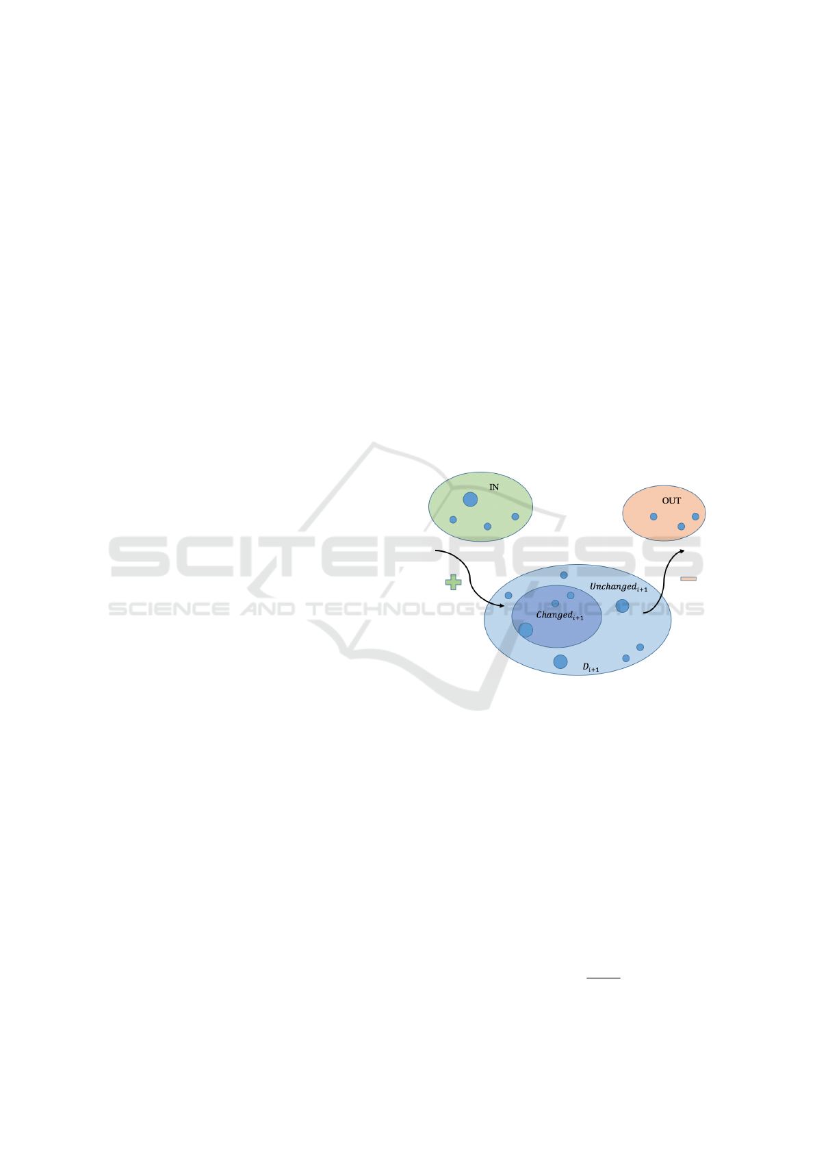
accordingly. Given a dataset D, we model its evolu-
tion as follows:
D
i+1
= Changed
i+1
∪Unchanged
i+1
∪ In
i+1
− Out
i+1
(1)
where D represents the dataset, i = 1..n represents
the time instants, Unchanged is a set formed by all
the elements of D that are not changed from i to i+1.
Changed (or UPDATE) is the set containing the ele-
ments of D that are changed from i to i+1. In is the
set containing new elements not previously contained
in D and Out represents all the elements that were in
D
i
but not in D
i+1
. A graphical example of the dataset
structure is showed in Figure 1.
Figure 1: General structure of a dataset at a time instant i:
new data are inserted (IN) and old data are removed (OUT)
from the dataset. Additionally, a subset of the original data
can or can not be changed from a time instant to the next.
3.1 Data Metrics
Computing metrics on the data is the first step to con-
duct in this analysis. To fulfill this task, general for-
mulas valid for any dataset are taken into account.
3.1.1 Size Metrics
A set of metrics valid on a generic dataset, indepen-
dent from its structure and dimensionality, is based on
size. The first metric, DeltaSize, is defined as:
DeltaSize =
|D
i+1
|
|D
i
|
(2)
On Visual Stability and Visual Consistency for Progressive Visual Analytics
337

The computation of DeltaSize provides a numeri-
cal value on the size change of the dataset, but no in-
formation about the number of analysed entering and
exiting elements. We define DeltaSizeUpdate metric
as follows:
DeltaSizeU pdate =
|Changed
i+1
|
|D
i
|
(3)
This metric represents the contribution of upda-
ted data over time. To study a dataset from the point
of view of new entering elements, another metric is
computed:
DeltaSizeIn =
|In
i+1
|
|D
i
|
(4)
It gives a numerical value that shows the set gro-
wth. DeltaSizeOut gives an estimation about the num-
ber of exiting elements from the dataset.
DeltaSizeOut =
|Out
i+1
|
|D
i
|
(5)
3.1.2 Magnitudo Metrics
Magnitudo metrics can be obtained as function of a
single attribute or multiple attributes coming from the
dataset tuples (forming an aggregated value represen-
ted as agg).
We define DeltaValue as:
DeltaValue(agg
j
) =
∑
n
id=1
agg
id, j,D
i+1
∑
n
0
id=1
agg
id, j,D
i
(6)
DeltaValue is computed on a generic attribute J
( j = 1..k) and is defined as the ratio between sum of
attributes value for every element (id) included in D
at time i + 1, and the same sum calculated at time i.
Its value gives an idea on how dataset grows quan-
titatively. The same approach followed for size me-
trics is applied for the magnitudo ones. The rationale
in splitting the original dataset into the UPDATE, IN
and OUT subsets allows for a specific analysis of sta-
bility and consistency on the more active (UPDATE)
or more new (IN and OUT) elements of the dataset.
The main contribution of magnitudo metrics should
be to conduct an analysis based on the dimensionality
of the dataset (down to the single features).
3.1.3 Distribution Metrics
Distribution metrics are useful to analyse data featu-
res from a statistical point of view. The definition of
a generic distribution metric is:
DeltaSV =
SV (D
i+1
)
SV (D
i
)
(7)
where SV (Statistical Value) represents a statistic
to compute on the argument set; as example we could
have:
DeltaMax =
max(D
i+1
)
max(D
i
)
(8)
This metric gives the ratio between the maximum
value at time i + 1 and the maximum value at the pre-
cedent time instant. Many SV can be considered: max
value, min value, average, variance, percentile. As
seen before, also for Distribution metrics the compu-
tation should be implemented for the UPDATE, IN
and OUT subsets.
3.1.4 Change Metrics
To conclude the discussion about the data metrics, a
last metric of evaluation for a dataset can be based
on the observation of the overall change in the data.
To define a value able to describe the overall change
in the dataset, we first consider the aggregation of all
change contributions as:
allChanges =
n
∑
id=1
AggChange
id,i+1
+
n
∑
id=1
AggIN
id,i+1
+
n
∑
id=1
AggOU T
id,i+1
(9)
Then we define:
DeltaChangeValue =
allChanges
∑
n
id=1
AttD
id,i
(10)
3.2 Visual Metrics
Once metrics on the data are defined, the attention
shifts toward visual metrics. The lower level fea-
ture on which can be defined a visual metrics is the
pixel space. Other measures can be based on geome-
tric distances, density or visual overlapping. Also for
the visual metrics we take into account Size, Magni-
tudo,Distribution and Change concepts.
3.2.1 Size Visual Metrics
We define DeltaSizeVisual as:
DeltaSizeVisual =
px(|D
i+1
|)
px(|D
i
|)
(11)
where px represent “number of pixel” and |D| is
the cardinality of D. This metric is able to show if the
IVAPP 2017 - International Conference on Information Visualization Theory and Applications
338

dataset growth is proportional to the increased num-
ber of pixels needed to represent it.
Accordingly to what has been defined for data
space, we have:
DeltaSizeU pdateVisual =
px(|UP
i+1
|)
px(|D
i
|)
(12)
DeltaSizeInVisual =
px(|IN
i+1
|)
px(|D
i
|)
(13)
DeltaSizeOutVisual =
px(|OUT
i+1
|)
px(|D
i
|)
(14)
3.2.2 Magnitudo Visual Metrics
This family of metrics allows to evaluate a visualiza-
tion on how it represents data values and not only on
dataset cardinality. The first Visual Metrics defined
to measure how well are represented the variations of
elements of D during their updates is DeltaValueVi-
sual:
DeltaValueVisual(agg
j
) =
px(
∑
n
id=1
agg
id, j,D
i+1
)
px(
∑
n
id=1
agg
id, j,D
i
)
(15)
DeltaValueUpdateVisual is a more specific metric
to analyse how data updates are reflected on the visu-
alization; we define DeltaValueU pdateVisual(agg
j
)
as:
∑
n
id=1
px(agg
id, j,UP
i+1
)
px(agg
id, j,D
i
(16)
It is easy to note that this metric represents how upda-
tes in data are reflected in visual representation instant
by instant. The same approach followed for magni-
tudo metrics is applied for the magnitudo visual ones,
splitting the original dataset into the UPDATE, IN and
OUT subsets.
3.2.3 Distribution Visual Metrics
Also for the visualization is helpful to have a set of
metrics to evaluate the statistical behaviour of the da-
taset directly on the visual representation. To have an
idea of visual features under statistic terms, it is pos-
sible to compute the number of pixels needed to draw
the maximum data value, the number of pixels needed
to draw the minimum data value, the average of pixels
needed to represent the dataset. Indicating SV as the
statistic to compute on the argument set, is possible to
define DeltaSVVisual as:
DeltaSVVisual =
px(SV (D
i+1
))
px(SV (D
i
))
(17)
To evaluate the contribution of the UPDATE sub-
set, it is applicable DeltaSVU pdateVisual, defined
as:
DeltaSVU pdateVisual =
px(SV (U P
i+1
))
px(SV (D
i
))
(18)
3.2.4 Change Visual Metrics
To evaluate the overall visual change of the dataset
representation, as done in the data spaces, aggregation
formulas are needed; a proposal based on aggregation
of data values is defined as:
n
∑
id=1
px(agg)UP
id,i+1
+
n
∑
id=1
px(agg)IN
id,i+1
+
n
∑
id=1
px(agg)OUT
id,i+1
+
n
∑
id=1
px(agg)D
id,i
(19)
3.3 Perception
Third component to consider in visual consistency
evaluation is the human perception. So, to evaluate
visual consistency, it is needed to have an idea of what
are the elements in a data visualization that can gene-
rate problems of trace-ability when a user is observing
a visual representation of data updates. It is not the
goal of this paper to cope with the definition of new
metrics for evaluating perceptual issues; nevertheless
we point out that perception has a big role in evalua-
ting visual stability and consistency for PVA, where a
clear conveyance of intermediate results and a general
stability of the visualization are desirable characteris-
tics.
4 USE CASE
Preliminary experiments using the framework have
been conducted on the “Last.fm” dataset, represen-
ting a proof-of-concept on the kind of considerations
that can be made from the application of the frame-
work. Last.fm is a social internet radio that allows
users to share songs and create play-lists based on the
users’ preferences. The dataset contains the results of
“getTop500Artist()” method on the entire collection
at different time instants. The selected visual repre-
sentation is a bar-chart, with inherent constraints co-
ming from this choice in the form of rescaling factors
On Visual Stability and Visual Consistency for Progressive Visual Analytics
339
(when new data get added) and order of results (based
on frequency or alphanumerical order).
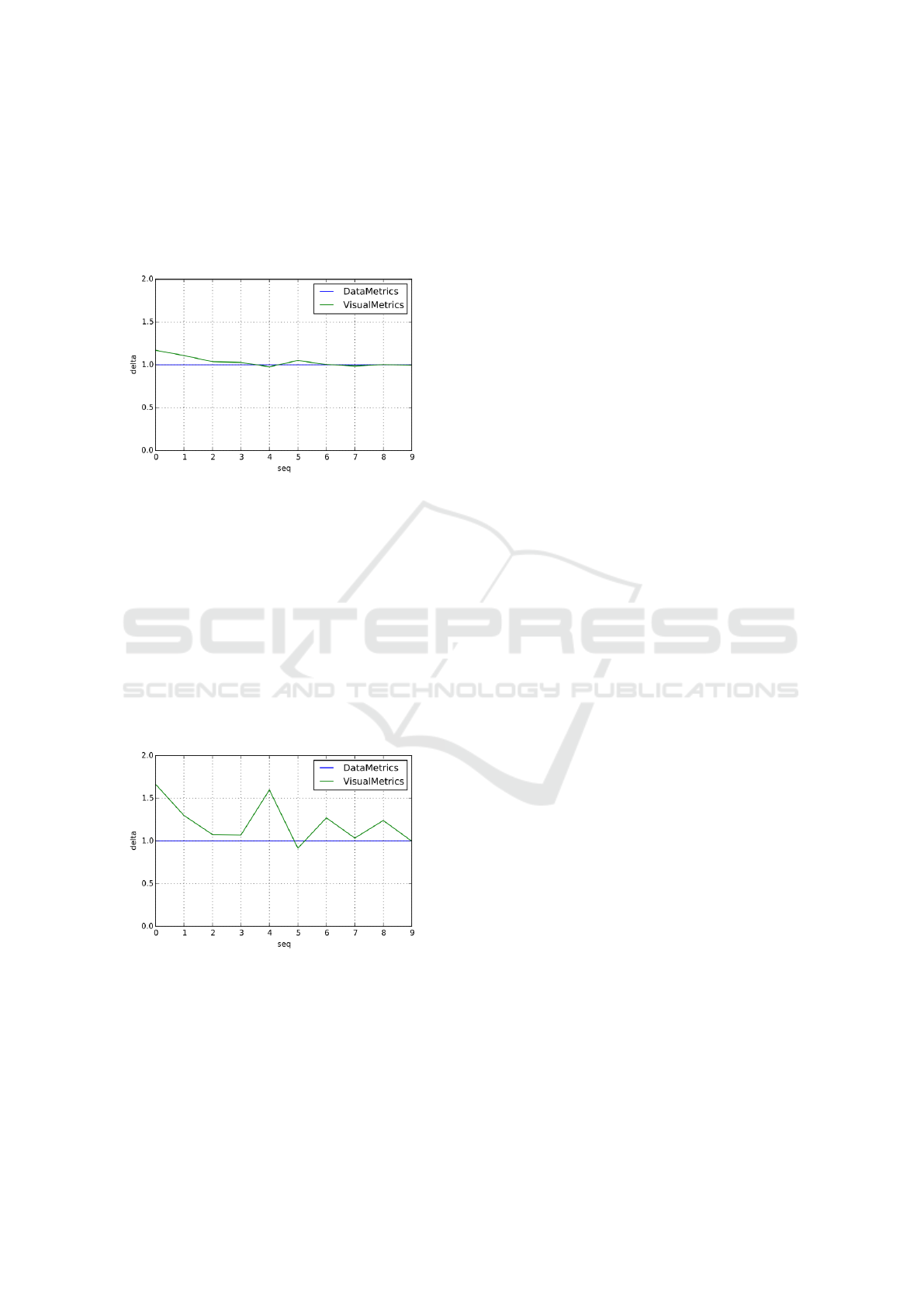
Figure 2 presents the comparison between the data
and visual cardinality (size metrics and size visual
metrics) when the bar-chart representing data is set
to alphanumerical order:
Figure 2: Comparison between data metrics and visual me-
trics using a bar-chart representation ordered alphanume-
rically. This ordering privileges stability and visual consis-
tency, providing less fluctuations in the values of the metrics
and converging values.
This ordering privileges stability and visual con-
sistency, providing less fluctuations in the values of
the metrics and converging values. Additionally it
also gives to the user a perception of the cardinality
similar to the real one.
The second experiments on Last.fm is based on
the same calculations but applied on a bar-chart set on
a frequency order, more useful in user tasks because
it orders data according to their frequency.
Figure 3: Comparison between data metrics and visual me-
trics using a bar-chart representation ordered based on fre-
quency. This ordering have as effect an high fluctuation
among metrics values and a non convergent trends among
them.
Figure 3 shows that the perceived cardinality is
distorted with respect to the data cardinality, given the
number of swaps among the elements (bars) in order
to obtain the new ordered set.
So, while the alphanumerical ordering tends to
convey better the changes, making the visualization
more stable (can be seen by the low variations in the
metrics scores in Figure 2), the frequency order tends
instead to confuse more the user in appreciating the
changes, having both high variations in metrics sco-
res and really low correspondence between data and
visualization metrics (see Figure 3). Additional study
is needed in order to better formalize these results.
5 CONCLUSION & FUTURE
WORK
This paper proposed general principles for coping
with visual stability and consistency in the case of
Progressive Visual Analytics. A preliminary fra-
mework of analysis, based on metrics computed on
data space and visualization space has been propo-
sed. Considerations regarding the perception space
and properties of the used visual representation have
been introduced, coming from initial experimentation
based on bar-charts.
In order to refine and validate such general prin-
ciples, the authors will conduct a more robust expe-
rimentation phase, with the goal of identifying pro-
perties of visual representations that characterize how
suited they are for a PVA approach. The authors fore-
see also a user study regarding perceptual issues and
validation of the proposed analytical approach.
ACKNOWLEDGEMENTS
The authors would like to thank Danyel Fisher for the
useful conversations and suggestions.
REFERENCES
Ahrens, J. P., Desai, N., McCormick, P. S., Martin, K., and
Woodring, J. (2007). A modular extensible visuali-
zation system architecture for culled prioritized data
streaming. In VDA’07, page 64950I. SPIE.
Angelini, M. and Santucci, G. (2013). Modeling incremen-
tal visualizations. In Proc. of the EuroVis Workshop
on Visual Analytics (EuroVA13), pages 13–17.
Bederson, B. B., Shneiderman, B., and Wattenberg, M.
(2002). Ordered and quantum treemaps: Making ef-
fective use of 2d space to display hierarchies. AcM
Transactions on Graphics (TOG), 21(4):833–854.
Bertini, E. and Santucci, G. (2004). By chance is not
enough: Preserving relative density through non uni-
form sampling. In Proceedings of the eighth Inter-
national Conference on Information Visualization, IV
IVAPP 2017 - International Conference on Information Visualization Theory and Applications
340

2004, volume 8, pages 622–629. Institute of Electrical
and Electronics Engineers Inc.
Bertini, E. and Santucci, G. (2006a). Give chance a
chance: modeling density to enhance scatter plot qua-
lity through random data sampling. Information Visu-
alization, 5(2):95–110.
Bertini, E. and Santucci, G. (2006b). Visual quality metrics.
In Proceedings of the 2006 AVI workshop on BEyond
time and errors: novel evaluation methods for infor-
mation visualization, pages 1–5. ACM.
Cottam, J. A. (2011). Design and implementation of a
stream-based visualization language. PhD thesis, In-
diana University.
Cottam, J. A., Lumsdaine, A., and Wang, P. (2014). Ab-
stract rendering: Out-of-core rendering for informa-
tion visualization. In Wong, P. C., Kao, D. L., Hao,
M. C., and Chen, C., editors, Conference on Visuali-
zation and Data Analysis, page 90170K. SPIE.
Fekete, J.-D. and Primet, R. (2016). Progressive analytics:
A computation paradigm for exploratory data analy-
sis. arXiv preprint arXiv:1607.05162.
Fisher, D., Popov, I., Drucker, S., et al. (2012). Trust me,
i’m partially right: incremental visualization lets ana-
lysts explore large datasets faster. In Proceedings of
the SIGCHI Conference on Human Factors in Com-
puting Systems, pages 1673–1682. ACM.
Forman, G. (2003). An extensive empirical study of fea-
ture selection metrics for text classification. Journal
of machine learning research, 3(Mar):1289–1305.
Frey, S., Sadlo, F., Ma, K.-L., and Ertl, T. (2014). Inte-
ractive progressive visualization with space-time error
control. IEEE TVCG, 20(12):2397–2406.
Glueck, M., Khan, A., and Wigdor, D. (2014). Dive in!
Enabling progressive loading for real-time navigation
of data visualizations. In CHI’14, pages 561–570.
ACM.
Harrison, L., Yang, F., Franconeri, S., and Chang, R.
(2014). Ranking visualizations of correlation using
weber’s law. IEEE transactions on visualization and
computer graphics, 20(12):1943–1952.
Heer, J. and Robertson, G. (2007). Animated transitions in
statistical data graphics. IEEE transactions on visua-
lization and computer graphics, 13(6):1240–1247.
Joy, K. I. (2009). Massive data visualization: A survey. In
M
¨
oller, T., Hamann, B., and Russel, R. D., editors,
Mathematical Foundations of Scientific Visualization,
Computer Graphics, and Massive Data Exploration,
pages 285–302. Springer.
Mulder, J. D., van Wijk, J. J., and van Liere, R. (1999). A
survey of computational steering environments. Fu-
ture Generation Computer Systems, 15(1):119–129.
Piringer, H., Tominski, C., Muigg, P., and Berger, W.
(2009). A multi-threading architecture to support inte-
ractive visual exploration. IEEE TVCG, 15(6):1113–
1120.
Rensink, R. A. and Baldridge, G. (2010). The perception
of correlation in scatterplots. In Computer Graphics
Forum, volume 29, pages 1203–1210. Wiley Online
Library.
Rosenbaum, R. and Schumann, H. (2009). Progressive re-
finement: More than a means to overcome limited
bandwidth. In VDA’09, page 72430I. SPIE.
Schulz, H.-J., Angelini, M., Santucci, G., and Schumann,
H. (2016). An enhanced visualization process mo-
del for incremental visualization. IEEE transactions
on visualization and computer graphics, 22(7):1830–
1842.
Stolper, C. D., Perer, A., and Gotz, D. (2014). Progressive
visual analytics: User-driven visual exploration of in-
progress analytics. IEEE TVCG, 20(12):1653–1662.
Szafir, D. A., Haroz, S., Gleicher, M., and Franconeri, S.
(2016). Four types of ensemble coding in data visua-
lizations. Journal of Vision, 16(5):11.
Tatu, A., Bak, P., Bertini, E., Keim, D., and Schneidewind,
J. (2010). Visual quality metrics and human percep-
tion: an initial study on 2d projections of large multi-
dimensional data. In Proceedings of the International
Conference on Advanced Visual Interfaces, pages 49–
56. ACM.
Tufte, E. R. and Graves-Morris, P. (1983). The visual dis-
play of quantitative information, volume 2. Graphics
press Cheshire, CT.
Turkay, C., Kaya, E., Balcisoy, S., and Hauser, H. (2017).
Designing progressive and interactive analytics pro-
cesses for high-dimensional data analysis. IEEE Tran-
sactions on Visualization and Computer Graphics,
23(1):131–140.
Vo, H. T., Comba, J. L. D., Geveci, B., and Silva, C. T.
(2011). Streaming-enabled parallel data flow frame-
work in the Visualization ToolKit. IEEE Computing
in Science and Engineering, 13(5):72–83.
Ware, C. (2012). Information visualization: perception for
design. Elsevier.
Wong, P. C., Foote, H., Adams, D., Cowley, W., Leung,
L. R., and Thomas, J. (2004). Visualizing data stre-
ams. In Kovalerchuk, B. and Schwing, J., editors,
Visual and Spatial Analysis: Advances in Data Mi-
ning, Reasoning, and Problem Solving, pages 265–
291. Springer.
Zheng, S., Song, R., and Wen, J.-R. (2007). Template-
independent news extraction based on visual consis-
tency. In Proceedings of the National Conference on
Artificial Intelligence, volume 22, page 1507. Menlo
Park, CA; Cambridge, MA; London; AAAI Press;
MIT Press; 1999.
On Visual Stability and Visual Consistency for Progressive Visual Analytics
341
