
Big Data Visualization Tools: A Survey
The New Paradigms, Methodologies and Tools for Large Data Sets Visualization
Enrico G. Caldarola
1,2
and Antonio M. Rinaldi
1,3
1
Department of Electrical Engineering and Information Technologies, University of Naples Federico II, Napoli, Italy
2
Institute of Industrial Technologies and Automation, National Research Council, Bari, Italy
3
IKNOS-LAB Intelligent and Knowledge Systems, University of Naples Federico II, 80134 via Toledo, 402, Napoli, Italy
Keywords:
Big Data, Big Data Visualization, Graph Visualization, Information Visualization, Big Data Analytics, Visual
Analytics.
Abstract:
In the era of Big Data, a great attention deserves the visualization of large data sets. Among the main phases
of the data management’s life cycle, i.e., storage, analytics and visualization, the last one is the most strategic
since it is close to the human perspective. The huge mine of data becomes a gold mine only if tricky and
wise analytics algorithms are executed over the data deluge and, at the same time, the analytic process results
are visualized in an effective, efficient and why not impressive way. Not surprisingly, a plethora of tools and
techniques have emerged in the last years for Big Data visualization, both as part of Data Management Systems
or as software or plugins specifically devoted to the data visualization. Starting from these considerations, this
paper provides a survey of the most used and spread visualization tools and techniques for large data sets,
eventually presenting a synoptic of the main functional and non-functional characteristics of the surveyed
tools.
1 INTRODUCTION
The rate of data growth over years is amazing: ac-
cording to ScienceDaily, a full 90% of all the data in
the world has been generated over the last two years
(Dragland, 2013). All of this represents a real tsunami
and requires a paradigmatic shift respect to the past as
for theories, technologies or approaches in data man-
agement and more attention to survive it (Caldarola
et al., 2014). In order to effectively spot, at the same
time, this explosion of data and the spreading inno-
vative technological solutions able to cope with this
huge volume of data, a new term has been coined,
i.e., Big Data, which is receiving a lot of buzz in the
recent years (Franks, 2012). In fact, a look at Google
Trends shows that, starting from 2011 until today, the
term Big Data has been increasingly growing in pop-
ularity over time (Weinberg et al., 2013). Depending
on the different perspectives from which the problem
of managing large data sets is seen, we can define Big
Data in several ways. From a technological perspec-
tive, Big Data represents “data sets whose size is be-
yond the ability of typical database software tools to
capture, store, manage and analyse” (Manyika et al.,
2011). It may also refers to “data which exceeds the
reach of commonly used hardware environments and
software tools to capture, manage, and process it
within a tolerable elapsed time for its user” (Merv,
2011). ¿From a marketers point of view, Big Data
is an organizational and decision problem rather than
a technology problem (Weinberg et al., 2013). Fi-
nally, from a user point of view, Big Data can be
understood as new exciting, advanced software tools
which replace the existing ones. Perspectives aside,
the authors define Big Data as a new time-variant
paradigm in data management whose raison d’
ˆ
etre
comes from the enormous availability of data in ev-
ery human activity that needs to be acknowledged
according to different points of view: technologi-
cal, economical, scientific and so on. With the ad-
vent of the Big Data paradigm, data scientists do not
need to construct a complex model nor to describe
all its rules through complex logic-based languages,
but, they only need to properly tune statistical analysis
or machine learning techniques over large corpus of
data in order to get more insights from them, and very
quickly. Recently, this new approach in taming the
giant wave of available data is tempting several orga-
nizations and individuals due to its real effectiveness
in knowledge discovery. By knowing people’s prefer-
296
Caldarola, E. and Rinaldi, A.
Big Data Visualization Tools: A Survey - The New Paradigms, Methodologies and Tools for Large Data Sets Visualization.
DOI: 10.5220/0006484102960305
In Proceedings of the 6th International Conference on Data Science, Technology and Applications (DATA 2017), pages 296-305
ISBN: 978-989-758-255-4
Copyright © 2017 by SCITEPRESS – Science and Technology Publications, Lda. All rights reserved
ences and opinions, for example, modern enterprises
may gain a competitive advantage over competitors,
while analysing sensor data from the workshop may
helps manufacturers to improve their processes and
their performances thus reducing costs and increasing
revenue. A study by the Economic Times suggests
that large organizations using Big Data analytics out-
perform competitors, who do not utilize this (Bhanu,
2013). The enthusiasm for the Big Data technolo-
gies and the interest of entrepreneurs or researches for
such solutions has concerned the complete paramount
of tools and frameworks used in the different phases
of data life cycle: from the storage to their analysis,
cleaning or integration and, of course, their visual-
ization. About this latter, in particular, Data and In-
formation Visualization is becoming strategic for the
exploration and explanation of large data sets due to
the great impact that data have from a human per-
spective. In fact, the visualization is the closer phase
to the users within the data life cycle’s phases, thus,
an effective, efficient and impressive representation of
the analyzed data may result as important as the an-
alytic process itself. Not by chance, many visualiza-
tion tools available in the literature, are actually an-
alytics tools whose visualization component become
increasingly important. The challenges that the Big
Data imperative (Caldarola et al., 2015a) imposes to
data management severely impact on data visualiza-
tion. The “bigness” of large data sets and their com-
plexity in term of heterogeneity contribute to compli-
cate the representation of data (Caldarola et al., 2016;
Caldarola et al., 2015b), making the drawing algo-
rithms quite complex: just to make an example, let
us consider the popular social network Facebook, in
which the nodes represent people and the links rep-
resent interpersonal connections; we note that nodes
may be accompanied by information such as age, gen-
der, and identity, and links may also have different
types, such as colleague relationships, classmate re-
lationships, and family relationships. The effective
representation of all the information at the same time
is really challenging. The availability of large data
coming from human activities, exploration and exper-
iments, together with the investigationsof new and ef-
ficiently ways of visualizing them, open new perspec-
tives from which to view the world we live in and to
make business. The Infographics become Infonomic,
a composite term between the term Information and
Economics that wield information as a real asset, a
real opportunity to make business and to discover the
world (Caldarola and Rinaldi, 2016).
Taking into account the live interest for Big Data
analytics and visualization tools from entrepreneurs
and researches, this work goes in the direction of
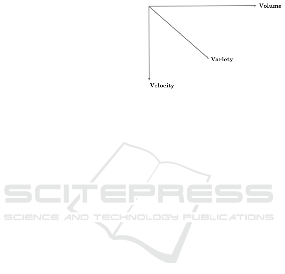
Figure 1: The Big Data Dimensions.
helping the latter in finding the right tool to use for vi-
sualizing large data sets, by characterizing at a general
level the Big Data problem and its technological chal-
lenges and, then, by surveying the most popular and
spread Big Data visualization and visual analytics so-
lutions existing in the literature. This work originates
from a similar work by the authors (Caldarola and Ri-
naldi, 2015), in which a framework from the qualita-
tive analysis of Big Data solutions was proposed. In
that case, software solutions to store Big Data were
surveyed, while here a similar approach is used for
data and information visualization tools.
The remainder of this paper is structured as fol-
lows. The second section presents the typical model
characterizing the dimensions of Big Data and the
technological solution with a focus on the visualiza-
tion issue. The third section introduces the evalua-
tion framework adopted for the comparison of the Big
Data visualization solutions, whereas the fourth sec-
tion illustrates the results of the comparison carried
out on the most widespread existing tools, based on
the predefined criteria. Finally, the last section draws
the conclusions, summarizing the major findings, and
opens new directions for further researches in future
works.
2 BIG DATA DIMENSIONS AND
THE DATA VISUALIZATION
The concept of Big Data has different dimensions
since the term Big does not refer only to the quantity
of data but also to the heterogeneity of data sources
and to the velocity in analyzing data. A widely spread
model to characterize Big Data is that of the 3Vs (Mo-
hanty et al., 2013; Jagadish et al., 2014), depicted
in Figure 1, which shows the three fundamental di-
mensions of Big Data: Volume, Velocity and Variety.
Big Data Visualization Tools: A Survey - The New Paradigms, Methodologies and Tools for Large Data Sets Visualization
297

Each of the above dimensions make traditional opera-
tions in data management more complicated. For ex-
ample, if the volume increases, the extraction and the
storage of data becomes challenging as well as data
processing (cleansing, analysis, etc.). Both storage
systems and analytics algorithms must be scalable in
order to cope with the augmented volume of data in
common scenario. In addition, the variety dimension
complicates data storage and analysis because of the
integration of data with different structures. Figure 2
focuses on two operations in data life cycle, namely,
the analysis and the visualization of data, and tries
to sketches the different types of software solutions
existing in the literature (together with some exam-
ples), along the volume and variety dimensions. The
velocity is not taken into consideration here because
is out of the scope of this work and it is likely not
to affect significantly the visualization task. The fig-
ure also provides some sub-concepts and paradigms
in Data and Information Visualization that deserves
some explanations. If the main goal of Data Visu-
alization is to communicate information clearly and
efficiently to users, involving the creation and study
of the visual representation of data – i.e., “informa-
tion that has been abstracted in some schematic form,
including attributes or variables for the units of infor-
mation” (Friendly and Denis, 2001) – the Information
Visualization main task is the study of (interactive)
visual representations of abstract data to reinforce hu-
man cognition. The abstract data may include both
numerical and non-numerical data, such as text and
geographic information. Additionally, the figure in-
troduces Scientific Visualization. According to (Mun-
zner, 2008), it is possible to distinguish Information
Visualization (InfoVis), when the spatial representa-
tion is chosen, from Scientific Visualization (SciVis)
when the spatial representation is given due to the in-
trinsic spatial layout of data (e.g., a flow simulation in
3D space, the navigation tools provided by the Sloan
Digital Sky Surveys project described later (Eisen-
stein et al., 2011)). Coming back to the Figure 2, it is
possible to distinguish two areas corresponding to the
semi-planes of analytics tools and that of visualization
tools. Each semi-plane is divided into two regions in
turn according to the emphasis given to the dimension
of volume or variety of data, this way having four re-
gions corresponding respectively to big data tools for
the analysis of large data set, the business intelligent
tools for data mining of heterogeneous data, data visu-
alization tools used for visualization exploration and,
finally, information visualization tools used for the in-
teractive visual exploration of data. Undoubtedly, all
the regions have overlapping zones, particularly the
analytics and visualization areas along both the vol-
ume and the variety axes. This is not surprisingly,
due to the widespread tools that combine the analyt-
ics functionalities with visualization capabilities. In
this regard, along the volume dimension it is possi-
ble to cite, on the one hand software environments
for numerical and statistical computing and graphics
(e.g., Matlab, R, etc.), mostly devoted to analysis and
data processing tasks, and, on the other hand, data vi-
sualization tools equipped with connectors to main-
stream computing environments (e.g., RNeo4J, Stat-
net, etc.). With respect to the variety axis, to the over-
lapping zone depicted in figure 2 belong all such Busi-
ness Intelligent tools, which aim at adopting sophisti-
cated pictorial solutions in order to reinforce the hu-
man cognition and make analytics via graphical wid-
gets (Visual analytics). With the depicted schema in
mind, in the following section technical and non tech-
nical criteria used for comparing the surveyed tools,
one in its own category, have been individuated and
further discussed.
3 THE SURVEY OF THE
ANALYSED SOLUTIONS
Having described the main categories characterizing
the existing tools for large data visualization, this sec-
tion reports a survey of the most spread solutions with
a description of the evaluation criteria listed as follow,
each of them trying to answer to a specific question:
1. Scope. It informs about the usage or the scope of
the tool, in other words it tries to answer the fol-
lowing question: Is the tool for presentation or de-
veloper (or both). Among the surveyed solutions
we distinguish two main categories, i.e., presen-
tation tools, mostly used for presentation purpose
through desktop (stand-alone) or web-based ap-
plication, and development tools, mostly software
libraries (APIs) or programming language mod-
ules (e.g., Python or Java module), mostly used
for extending an application by using methods and
routines provided ad hoc by the library;
2. Software Category. It represents the typology of
the analysed solution. It distinguishes between
desktop application (stand-alone app without any
mechanism for extending it), Web-based applica-
tion or services, software library (e.g., Javascript
library for the web), software framework (i.e.,
a complex software application with a plugin or
add-ons based mechanism to extend it in order
to connect the framework to existing solution for
data storage or analytics);
3. Visualization structure. It answers the question:
KomIS 2017 - Special Session on Knowledge Discovery meets Information Systems: Applications of Big Data Analytics and BI -
methodologies, techniques and tools
298
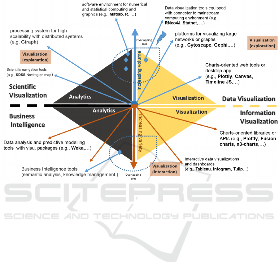
Figure 2: The Big Data Visualization Solutions.
What kind of graphical object the tool is cut out
for? Thus, it informs about the main graphical
object or widget supported by the tool. Many so-
lutions are not limited to a single graphical object
but generally, there is one or more the one widgets
the tool is cut off. For example, Plottly is cut off
for chart widgets, while Polymaps for maps;
4. Operating System, O.S. The operating system
(e.g., Linux, Windows, Mac OS X) on which the
tool runs, or if it is web-based;
5. License. This informs about the license of the so-
lution: commercial and open source under various
licenses (Apache License, GNU GPL, etc.);
6. Scalability. This criterion is about the mecha-
nisms for horizontally scaling the tools in order to
support very large data set. Some of the solutions
concern, for example, the possibility to connect
the software to an Hadoop instance running over
a large dataset or using the cloud according to the
pay-as-you formula;
7. Extendibility. This criterion is about the mecha-
nisms for extending the tool throughout add-ons
or plugins mechanism, and also the possibility to
connect it to existing storage solution. For ex-
ample, Plottly can be connected to Matlab, R, by
means of specific client connectors, while by us-
ing the Javascript APIs, it can be programmati-
cally extended in different ways;
8. Latest Release version and Date. It tries to figure
out if the solution is up to dated or not. If the
latest release date is not recent, the product may
no longer be supported.
All the information above have been extracted
from the official websites of each solution surveyed, if
immediately available from the website sections, oth-
erwise they are omitted. Table 1 reports the evalua-
tion criteria for 36 software tools for data visualiza-
tion, each of them has been briefly described in the
next sub section.
3.1 The Surveyed Tools
The software tools collected in this survey have
been grouped into four subsections according to the
schema depicted in figure 2 and described as follows.
3.1.1 Information Visualization Tools
To the South East region of figure 2 belong interac-
tive visualization tools and dashboards together with
Big Data Visualization Tools: A Survey - The New Paradigms, Methodologies and Tools for Large Data Sets Visualization
299

charts-oriented libraries or APIs, categorized as Infor-
mation Visualization tools or modules. In the follow-
ing paragraphs the surveyed tools belonging to this
category are briefly outlined.
Tableau
1
is the big data visualization tool for cor-
porate, which allows to create charts, graphs, maps
and many other graphics. It is cut off for charts and
is based on a desktop application available for visual
analytics. Along with the Desktop edition, a server
solution lets the user to visualize reports online and
on mobile app. In this case a cloud hosted service is
also an option, which allows the customer to install
the solution on premises.
Infogram
2
offers several interactive charts and
numerous maps to help user in visualizing data in a
pleasant way. The tools is cut off for charts objects
including column, bar, pie, or word cloud. It belongs
to Infographic software category since the user can
even add a map to her infographic creating impres-
sive report. Infogram supports team accounts for me-
dia publishers and for journalists, branded designs for
companies and classroom accounts for educational
projects.
ChartBlocks
3
ChartBlocks is an online tool that
requires no coding, and builds visualizations from
spreadsheets, databases and live feeds. Chart are
created under the hood in HTML5 by using the
JavaScript library D3.js. Being web-based this tools
creates charts and widgets compatible with any screen
size and device. It is also possible to embed charts in
any web page and share it on Twitter and Facebook.
To this category also belong libraries or modules
for creating chart or graphical widgets mostly inside
web applications using Javascript objects and func-
tions such as:
Plottly
4
, which is a tool for creating sharp and
slick chart starting from a simple spreadsheet. Var-
ious important comapanies use Plottly, for example,
Google and also the U.S. Air Force, Goji and The
New York University. Plottly is mainly a web tool
but offers an API for different languages that include
JavaScript and Python.
D3.js
5
is a JavaScript library for manipulating
documents based on data. D3 helps users to encapsu-
late data in HTML, SVG, and CSS files. D3s empha-
sis on web standards gives the user the full capabili-
ties of modern browsers without using a proprietary
framework, combining powerful visualization com-
ponents and a data-driven approach to DOM manipu-
1
https://www.tableau.com/products
2
https://infogr.am/
3
http://www.chartblocks.com/en/
4
https://plot.ly/
5
https://d3js.org/
lation.
Ember Charts
6
is based on the Ember.js frame-
work and uses D3.js under the hood. Ember Charts
features time series, bar, pie and scatter charts. It can
be easily extended, provides best practices and inter-
activity and is robust when fed bad data.
Google charts
7
Google Charts is a Java library
running on HTML5 and SVG and aims at Android,
iOS and total cross-browser compatibility, including
older Internet Explorer versions supported via VML.
All the charts created are interactive and some are
even zoomable. Google Charts is very user friendly
and their site features a really nice and comprehensive
gallery where users can see the kind of visualizations
and interactions they need.
FusionCharts
8
the most comprehensive
JavaScript charting library, and includes over 90
charts and 900 maps. FusionCharts integrates easily
with libraries like jQuery, frameworks like AngularJS
and React, and languages like ASP.NET and PHP.
FusionCharts supports JSON and XML data, and is
able to export charts in a multitude of formats: PNG,
JPEG, SVG and PDF.
chart.js
9
, is an open source, tiny, fast, easy to use,
library supporting six chart types: doughnut, pie, po-
lar, line, bar and radar. Chart.js uses HTML5 Canvas
and ships with polyfills for IE6/7 support.
Leaflet
10
, is an open-source and light-weight
Javascript library cut off for maps, which leverages
OpenStreetMap data and adds HTML5/CSS3 visu-
alizations and interactivity on top to ensure every-
thing is responsive and mobile ready. It is possible to
use their extensive plugin repository to add heatmaps,
masks and animated markers.
Chartist.js
11
is a JavaScript charting libraries,
which leverages Sass and styles customizable Chartist
provides a separation of concerns between CSS styles
and JavaScript functions, and its SVG output is re-
sponsive, media query based and DPI independent.
Chartist.js can be integrated easily with AngularJS,
React, Meteor, Ember and WordPress through a wide
range of wrapper libraries.
n3-charts
12
, is a Java script library for data visual-
ization built on D3.js. It offers simple and interactive
charts,
Sigma JS
13
is a library that offers interactiv-
6
http://addepar.github.io/ember-charts/
7
https://developers.google.com/chart/
8
http://www.fusioncharts.com/
9
http://www.chartjs.org/
10
http://leafletjs.com/
11
https://gionkunz.github.io/chartist-js/
12
https://github.com/n3-charts
13
http://sigmajs.org/
KomIS 2017 - Special Session on Knowledge Discovery meets Information Systems: Applications of Big Data Analytics and BI -
methodologies, techniques and tools
300

ity with mouse and touch support, refreshing and
rescaling, and renders on WebGL by default with an
HTML5 Canvas fallback. The two data formats of
choice are JSON and GEXF. Their plugin assortment
for interactivity is massive. Sigma JS is a rendering
engine specialized on drawing networks and graphs
on web pages with a high customizability. Is scales
well by supporting Big Data network.
Polymaps
14
, is a Javascript library for visualizing
maps. Polymaps uses SVG to represent geographi-
cal data from country-wide level all the way down
to local street. the user can use CSS rules to style
her visualization and data can be easily interpreted by
Polymaps via the GeoJSON standard. This tool is par-
ticularly interesting when creating heatmaps. All the
maps can be interactive and it is possible to visualize
cartography from OpenStreetMap, CloudMade, Bing
and many other maps providers.
Processing.js
15
, is a JavaScript library that sits on
top of the Processing visual programming language.
As every JavaSript library is, Processing.js is web ori-
ented and lets the user bring the Processing power
to her web pages. It requires an HTML5-compatible
browser.
dygraphs
16
is a fast, flexible open source
JavaScript charting library. It allows users to explore
and interpret dense data sets. All the charts are inter-
active: it can be used mouse over to highlight individ-
ual values, or click and drag to zoom. It is possible
to change the number and hit enter to adjust the aver-
aging period. Dygraphs handles huge data sets: plots
millions of points without getting bogged down.
3.1.2 Data Visualization Tools
Within the North East region of figure 2, have been
collected charts-oriented web tools or desktop ap-
plications together with platforms for visualizing
large networks or graphs and data visualization tools
equipped with connectors for interfacing them to the
mainstream computing environments such as Matlab
or R. To this category also belong Plottly already de-
scribed and the following surveyed tools:
Timeline
17
, is an open-source tool that enables
anyone to build visually rich, interactive timelines. It
is possible to create a timeline using nothing more
than a Google spreadsheet. Experts can use their
JSON skills to create custom installations, while
keeping TimelineJS’s core functionality.
14
http://polymaps.org/
15
http://processingjs.org/
16
http://dygraphs.com/
17
http://timeline.knightlab.com/
Canvas
18
, is a Javascript charting library with a
simple API design and comes with a bunch of themes.
It is a lot faster than the conventional SVG or Flash
charts. It also comes with a responsive design so that
it can run on various devices like Android, iPhone,
Tablets, Windows, Mac etc. The chart gallery con-
sists of 24 different types of charts. Canvas can render
100000 data points in just 100 milliseconds. There-
fore, it represents a high-performancejavascript chart,
between the other libraries existing in the literature.
This tool is free for non-commercial usage.
Commetrix
19
, is a Software Framework for Dy-
namic Network Visualization and Analysis that sup-
ports Community Moderators, Members, and Net-
work Researchers. Commetrix is an exploratory anal-
ysis tool for dynamic network data. Its connectors can
conveniently read all sources of accessible network
data, like co-authorship or business process networks.
Still, the focus is on analyzing evolving patterns of
electronic communication, including e-mail, discus-
sions, voice over IP, and instant messaging.
Specifically concerning the graphs or networks
representation the list of surveyed tools is the follow-
ing:
Cuttlefish
20
, is a network workbench application
that visualizes the networks with some of the best
known layout algorithms. It allows detailed visual-
izations of the network data, interactive manipulation
of the layout, graph edition and process visualization
as well as different input methods and outputs in TeX
using Tikz and PSTricks. It can be downloaded as jar
archive and can used with Gephi too.
Cytoscape
21
(Shannon et al., 2003), is an open
source software platform for visualizing molecular in-
teraction networks and biological pathways and inte-
grating these networks with annotations, gene expres-
sion profiles and other state data. Although Cytoscape
was originally designed for biological research, now
it is a general platform for complex network analy-
sis and visualization. Its core distribution provides
a basic set of features for data integration, analysis,
and visualization. Additional features are available
as Apps (formerly called Plugins) making Cytoscape
easily extendible. Apps are available for network and
molecular profiling analyses, new layouts, additional
file format support, scripting, and connection with
databases. Most of the Apps are freely available from
Cytoscape App Store.
Gephi
22
(Bastian et al., 2009) is an interactive vi-
18
http://canvasjs.com/
19
http://www.commetrix.de/
20
http://cuttlefish.sourceforge.net/
21
http://www.cytoscape.org
22
https://gephi.org/
Big Data Visualization Tools: A Survey - The New Paradigms, Methodologies and Tools for Large Data Sets Visualization
301

sualization and exploration platform for all kinds of
networks and complex systems, dynamic and hierar-
chical graphs. Runs on Windows, Linux and Mac OS
X and is open-source and free. Gephi is a tool for
people that have to explore and understand graphs.
Like Photoshop but for data, the user interacts with
the representation, manipulate the structures, shapes
and colors to reveal hidden properties.
Graph-tool
23
(Peixoto, 2014), is an efficient
Python module for manipulation and statistical anal-
ysis of graphs (a.k.a. networks). Contrary to most
other python modules with similar functionality, the
core data structures and algorithms are implemented
in C++, making extensive use of template meta-
programming, based heavily on the Boost Graph Li-
brary. Graph-tool has its own layout algorithms and
versatile, interactive drawing routines based on cairo
and GTK+, but it can also work as a very comfortable
interface to the excellent graphviz package.
Graphviz
24
(Gansner and North, 2000), is an
open source graph visualization software used for rep-
resenting structural information as diagrams of ab-
stract graphs and networks. The Graphviz layout pro-
grams take descriptions of graphs in a simple text lan-
guage, and make diagrams in useful formats, such as
images and SVG for web pages, PDF or Postscript
for inclusion in other documents; or display in an in-
teractive graph browser. Graphviz has many useful
features for concrete diagrams, such as options for
colors, fonts, tabular node layouts, line styles, hyper-
links, and custom shapes.
JUNG
25
(Java Universal Network/Graph Frame-
work) (O’Madadhain et al., 2005) is a software li-
brary that provides a common and extensible lan-
guage for the modelling, analysis, and visualization
of data that can be represented as a graph or network.
The JUNG architecture is designed to support a va-
riety of representations of entities and their relations,
such as directed and undirected graphs, multi-modal
graphs, graphs with parallel edges, and hypergraphs.
It provides a mechanism for annotating graphs, enti-
ties, and relations with metadata.
Keynetiq
26
, is a platform for Organizational Net-
work Analysis. It is cut off to design maps, visualize
and analyze networks of people and relations between
them, revealing how organizations really operate in
day-to-day business. It provide a complete range of
services ranging from the analysis of your objectives
and the design of an ONA study, implementation of
the Keynetiq tool, coordination of data gathering and
23
https://graph-tool.skewed.de/
24
http://graphviz.org/
25
http://jung.sourceforge.net/
26
https://www.keynetiq.com/
administration of the platform, right up to a full anal-
ysis of your organizational network and a detailed re-
port complete with an action plan.
Netlytic
27
, is a cloud-based text and social net-
works analyzer that can automatically summarize
large volumes of text and discover social networks
from online conversations on social media sites such
as Twitter, Youtube, blogs, online forums and chats.
Multi-tier subscription including free version.
NetMiner
28
(Ghim et al., 2014) is an application
software for exploratory analysis and visualization of
large network data based on SNA. It has embed inter-
nal Python-based script engine which equipped with
the automatic Script Generator. NetMiner 4 license
for coursework is provided to students and teachers.
Network Workbench
29
, is a Large-Scale Net-
work Analysis, Modeling and Visualization Toolkit
for Biomedical, Social Science and Physics Research.
This project will design, evaluate, and operate a dis-
tributed, shared resources environment for large-scale
network analysis, modeling, and visualization, named
Network Workbench (NWB).
NodeXL
30
(Smith et al., 2009), is a free, open-
source template for Microsoft Excel that makes it easy
to explore network graphs. With NodeXL, users can
enter a network edge list in a worksheet, click a but-
ton and see a graph, all in the environment of the Ex-
cel window. It provides flexible import and export
graphs in GraphML, Pajek, UCINet, and matrix for-
mats. Furthermore, it allows direct connections to So-
cial Networks such as Twitter, YouTube, Flickr,etc.,
and, by using one of several available plug-ins, it is
able to import networks from Facebook, Exchange,
Wikis and WWW hyperlinks.
Pajek
31
(Smith et al., 2009) is a software, for
Windows, based on the motivation that there exist
several sources of large networks that are already in
machine-readable form. Pajek provides tools for anal-
ysis and visualization of such networks: collaboration
networks, organic molecule in chemistry, protein re-
ceptor interaction networks, genealogies, Internet net-
works, citation networks, diffusion (AIDS, news, in-
novations)networks, data-mining (2-mode networks),
etc. It is extensively used in academic research.
Statnet
32
(Handcocket al., 2008) is a suite of soft-
ware packages in R for network analysis of the statis-
tical modeling of networks. The analytic framework
is based on Exponential family Random Graph Mod-
27
https://netlytic.org/home/
28
http://www.netminer.com/main/main-read.do
29
http://nwb.cns.iu.edu/
30
http://nodexl.codeplex.com/
31
http://mrvar.fdv.uni-lj.si/pajek/
32
http://statnetproject.org/
KomIS 2017 - Special Session on Knowledge Discovery meets Information Systems: Applications of Big Data Analytics and BI -
methodologies, techniques and tools
302

els (ergm). It provides a comprehensive framework
for ergm-based network modelling, including tools
for model estimation, model evaluation, model-based
network simulation, and network visualization. This
broad functionality is powered by a central Markov
chain Monte Carlo (MCMC) algorithm.
Tulip
33
(Auber, 2004) is an information visualisa-
tion framework dedicated to the analysis and visuali-
sation of relational data. It aims to provide the devel-
oper with a complete library, supporting the design
of interactive information visualisation. Written in
C++ the framework enables the development of algo-
rithms, visual encodings, interaction techniques, data
models, and domain-specific visualisations. One of
the goal of Tulip is to facilitate the reuse of compo-
nents and allows the developers to focus on program-
ming their application. This development pipeline
makes the framework efficient for research prototyp-
ing as well as the development of end-user applica-
tions.
Visone
34
(Baur et al., 2001) is a software for the
visual creation, transformation, exploration, analysis,
and representation of network data, jointly developed
at the University of Konstanz and the Karlsruhe Insti-
tute of Technology The main purpose of the Visone
software is to empower researchers in the social sci-
ences to analyze and visualize network data in an inte-
grated fashion. Potential applications range from so-
ciometry to bibliometrics and web analysis.
3.1.3 Scientific Visualization Tools
Within the North West region of figure 2, have been
collected the tools for Scientific Visualization such
as processing system for high scalability with dis-
tributed systems (e.g., Giraph) and other specific sci-
entific tools like the SDSS Navigation map from the
SDSS project. This category has been added in this
work for the sake of completeness but it is beyond the
scope of this survey, because Scientific Visualization
tools (like SDSS Navigation map) are created ad hoc
within scientific research projects to address specific
needs inside the researchers community, while the fo-
cus of this survey is on the general purpose tools land-
scape. For this reason, this section does not provide
any tools other than the already mentioned ones.
3.1.4 Business Intelligent and Visualization
Tools
Within the South West area of figure 2, have been col-
lected the tools for business Intelligent and visualiza-
33
http://tulip.labri.fr/TulipDrupal/
34
http://visone.info/html/demo.html
tion, for data analysis and predictive modelling with
visualization packages such as Weka and the follow-
ing
SocNetV
35
(Social Networks Visualizer) (Kala-
maras, 2014) is a cross-platform, user-friendly tool
for the analysis and visualization of Social Networks.
It lets the user to construct networks (mathematical
graphs) on a virtual canvas, or load networks of vari-
ous formats (GraphML, GraphViz, Adjacency, Pajek,
UCINET, etc). Also, SocNetV enables you to modify
the social networks, analyse their social and mathe-
matical properties and apply visualization layouts.
Sentinel Visualizer
36
is used for Advanced Link
Analysis, Data Visualization, Geospatial Mapping,
and SNA. Its database driven data visualization plat-
form lets the user quickly see multi-level links among
entities and model different relationship types. Ad-
vanced drawing and redrawing features generate opti-
mized views to highlight the most important entities.
4 CONCLUSIONS
This work has provided a first evaluation of the most
spread solutions existing in the Big Data visualization
landscape. As shown in the previous sections, a great
number of solutions are open-source projects demon-
strating the great interest that the community of devel-
opers has in such topics. At the same time, the work
has highlighted the flexibility of the most part of tools
that are generally multi-platform or programming lan-
guage agnostic as they are provided with HTTP Rest-
full APIs which allow clients to easily access them.
In other cases, the great availability of APIs writ-
ten in the most popular programming languages (in
most cases developed by third parties as depending
or separate projects) contribute yet to ease the inter-
operability between the client tools and the back-end
store database or mainstream analytics and comput-
ing tools. Future works can be directed to different
objectives. On the one hand, it can be improved the
evaluation framework by adding other criteria not yet
considered in this work, like the security and trusti-
ness of data, and a quantitative analysis over the scal-
ability performances. These criteria will be useful to
choose one solution over another. On the other hand,
new but complementary study can be approached by
surveying the technological solutions existing to deal
with other challenges of Big Data, such as: analytics,
heterogeneity, timeliness, integration and transfer.
35
http://socnetv.org/
36
http://www.fmsasg.com/
Big Data Visualization Tools: A Survey - The New Paradigms, Methodologies and Tools for Large Data Sets Visualization
303

REFERENCES
Auber, D. (2004). Tulip : A huge graph visualisation
framework. In Mutzel, P. and Junger, M., editors,
Graph Drawing Software, Mathematics and Visual-
ization, pages 105–126. Springer Berlin Heidelberg.
Bastian, M., Heymann, S., Jacomy, M., et al. (2009). Gephi:
an open source software for exploring and manipulat-
ing networks. ICWSM, 8:361–362.
Baur, M., Benkert, M., Brandes, U., Cornelsen, S., Gaertler,
M., K¨opf, B., Lerner, J., and Wagner, D. (2001). Vi-
sone software for visual social network analysis. In
International Symposium on Graph Drawing, pages
463–464. Springer.
Bhanu, S. (2013). Companies adopting big data analytics to
deal with challenges. The Economic Times.
Caldarola, E. G., Picariello, A., and Castelluccia, D.
(2015a). Modern enterprises in the bubble: Why big
data matters. ACM SIGSOFT Software Engineering
Notes, 40(1):1–4.
Caldarola, E. G., Picariello, A., and Rinaldi, A. M. (2015b).
Experiences in wordnet visualization with labeled
graph databases. In International Joint Conference on
Knowledge Discovery, Knowledge Engineering, and
Knowledge Management, pages 80–99. Springer.
Caldarola, E. G., Picariello, A., Rinaldi, A. M., and Sacco,
M. (2016). Exploration and visualization of big graphs
- the dbpedia case study. In Proceedings of the 8th
International Joint Conference on Knowledge Discov-
ery, Knowledge Engineering and Knowledge Manage-
ment - Volume 1: KDIR, (IC3K 2016), pages 257–264.
Caldarola, E. G. and Rinaldi, A. M. (2015). Big data:
A survey - the new paradigms, methodologies and
tools. In Proceedings of 4th International Conference
on Data Management Technologies and Applications,
pages 362–370.
Caldarola, E. G. and Rinaldi, A. M. (2016). Improving
the visualization of wordnet large lexical database
through semantic tag clouds. In Big Data (BigData
Congress), 2016 IEEE International Congress on,
pages 34–41. IEEE.
Caldarola, E. G., Sacco, M., and Terkaj, W. (2014). Big
data: The current wave front of the tsunami. ACS Ap-
plied Computer Science, 10(4):7–18.
Dragland,
˚
A. (2013). Big data ? for better or worse. Sci-
enceDaily.
Eisenstein, D. J., Weinberg, D. H., Agol, E., Aihara, H., Pri-
eto, C. A., Anderson, S. F., Arns, J. A., Aubourg,
´
E.,
Bailey, S., Balbinot, E., et al. (2011). Sdss-iii: Mas-
sive spectroscopic surveys of the distant universe, the
milky way, and extra-solar planetary systems. The As-
tronomical Journal, 142(3):72.
Franks, B. (2012). Taming the big data tidal wave: Find-
ing opportunities in huge data streams with advanced
analytics, volume 56. John Wiley & Sons.
Friendly, M. and Denis, D. J. (2001). Milestones
in the history of thematic cartography, statis-
tical graphics, and data visualization. URL
http://www.datavis.ca/milestones.
Gansner, E. R. and North, S. C. (2000). An open graph
visualization system and its applications to software
engineering. SOFTWARE - PRACTICE AND EXPE-
RIENCE, 30(11):1203–1233.
Ghim, G. H., Cho, N., and Seo, J. (2014). Netminer. En-
cyclopedia of Social Network Analysis and Mining,
pages 1025–1037.
Handcock, M. S., Hunter, D. R., Butts, C. T., Goodreau,
S. M., and Morris, M. (2008). statnet: Software tools
for the representation, visualization, analysis and sim-
ulation of network data. Journal of statistical soft-
ware, 24(1):1548.
Jagadish, H., Gehrke, J., Labrinidis, A., Papakonstantinou,
Y., Patel, J. M., Ramakrishnan, R., and Shahabi, C.
(2014). Big data and its technical challenges. Com-
munications of the ACM, 57(7):86–94.
Kalamaras, D. (2014). The socnetv manual. Social Network
Visualize SocNetV.
Manyika, J., Chui, M., Brown, B., Bughin, J., Dobbs,
R., Roxburgh, C., Byers, A. H., and Institute, M. G.
(2011). Big data: The next frontier for innovation,
competition, and productivity.
Merv, A. (2011). Big data. Teradata Magazine Online, Q1.
Mohanty, S., Jagadeesh, M., and Srivatsa, H.
(2013). Big Data Imperatives: Enterprise ?Big
Data?Warehouse,?BI?Implementations and Analyt-
ics. Apress.
Munzner, T. (2008). Process and pitfalls in writing infor-
mation visualization research papers. In Information
visualization, pages 134–153. Springer.
O’Madadhain, J., Fisher, D., Smyth, P., White, S., and
Boey, Y.-B. (2005). Analysis and visualization of net-
work data using jung. Journal of Statistical Software,
10(2):1–35.
Peixoto, T. P. (2014). The graph-tool python library.
figshare.
Shannon, P., Markiel, A., Ozier, O., Baliga, N. S., Wang,
J. T., Ramage, D., Amin, N., Schwikowski, B., and
Ideker, T. (2003). Cytoscape: a software environment
for integrated models of biomolecular interaction net-
works. Genome research, 13(11):2498–2504.
Smith, M. A., Shneiderman, B., Milic-Frayling, N.,
Mendes Rodrigues, E., Barash, V., Dunne, C.,
Capone, T., Perer, A., and Gleave, E. (2009). Analyz-
ing (social media) networks with nodexl. In Proceed-
ings of the Fourth International Conference on Com-
munities and Technologies, C&T ’09, pages 255–
264, New York, NY, USA. ACM.
Weinberg, B. D., Davis, L., and Berger, P. D. (2013). Per-
spectives on big data. Journal of Marketing Analytics,
1(4):187–201.
KomIS 2017 - Special Session on Knowledge Discovery meets Information Systems: Applications of Big Data Analytics and BI -
methodologies, techniques and tools
304

Table 1: Evaluation synopsis of selected technical and non-technical features for the surveyed visualization tools.
Name Usage Software cat-
egory
Visualization
structure
O.S. Licence Scalability Extensibility Latest version
(date)
Tableau Presentation Desktop App.,
cloud hosted
Charts, graphs,
maps, etc
Windows 7
or later, OSX
10.10 or later
Commercial
and Academic
license
Hadoop,
etc.
DBs Drivers 10.2 (Apr 12,
2017)
Infogram Presentation Desktop App.,
cloud hosted
charts, map,
images and
even videos
Windows 7
or later, OSX
10.10 or later
Commercial
and educa-
tional license
- - -
ChartBlocks Presentation JavaScript
library
charts (bar,
line, pie, etc.)
All web-based Commercial
(pay as you
go)
- - -
Plottly Presentation
and devel-
opers
Web tool,
JavaScript and
Python library
charts, plot,
maps
All web-based Commercial
and Commu-
nity
Cloud API for Mat-
lab, R, Python
and Javascript
-
D3.js Developers JavaScript
library
charts, plot,
maps
All web-based Open-source Cloud Javascript 4.8.0 (-)
Ember-charts Developers JavaScript
library
charts All web-based Open-source Cloud - 1.2.1 (Mar,
2017)
Google charts Developers JavaScript
library
charts,tree
map, timeline,
gauge
All web-based Open-source Cloud e Chart Tools
Datasource
protocol
45 (September
12, 2016)
Fusion
Charts
Developers JavaScript
library
charts All web-based Commercial - jQuery,
ASP.NET,
PHP
-
Chart.js Developers JavaScript
library
chart All web-based Open source - -
Leaflet Developers JavaScript
library
map All web-based open source - Extensive plu-
gin repository
-
Chartist.js Developers JavaScript
library
chart pie gauge All web-based open source - -
n3-charts Developers JavaScript
library
charts All web-based open source - -
Sigma JS Developers JavaScript
library
graphs, net-
works
All web-based open source - public API 1.2.0 (Nov 3,
2016)
Polymaps Developers JavaScript
library
maps All web-based open source - - 2.5.1 (April
10, 2011)
Processing.js Developers JavaScript
library
images All web-based open source - - 1.4.8 (March
25, 2014)
Dygraphs Developers JavaScript
library
charts All web-based open source - - 2.0.0 (June,
2015)
Timeline JS Developers Web applica-
tion
timeline All web-based open source - - -
Canvas Developers Web applica-
tion
chart Web-based,
Android, iOS
Commercial - Spring MVC,
Asp.net, PHP
1.9.8
Commetrix Presentation Software
framework
graph, net-
work
Windows Commercial - - 2.3
Cuttlefish Presentation Software
framework
graph, net-
work
JVM-based
multiplatform
Open source - - -
Cytoscape Presentation Software
framework
graph, net-
work
Mac OS X
Windows
64bit, Linux
Open source Cytoscape
as a Ser-
vice
Cytoscape
open APIs for
plugins
3.5.1 (March,
2017)
Gephi Presentation Software
framework
graph, net-
work
Windows,
Mac OS X and
Linux
Open source - Gephi Plugins
and APIs
0.9.1 (Feb,
2016)
graph-tool Developer Python mod-
ule
graph, net-
work
Windows,
Mac OS X and
Linux
Open source - APIs 2.22
Graphviz Presenter Desktop
Application
graph, net-
work
JVM-based
multiplatform
Open source - - 2.38
JUNG Developer Java library graph, net-
work
JVM-based
multiplatform
Open source - - 2.0.1 (Jan,
2010)
Keynetiq Presentation Software
framework
graph, net-
work
- Commercial - - -
Netlytic Presentation Software
framework
graph, net-
work
- Commercial - - -
NetMiner Presentation Desktop
Application
graph, net-
work (seman-
tic networks)
Windows 32-
64 bit
Commercial Huge
License
- -
Network
Workbench
Presentation Desktop
Application
graph, net-
work
Windows 32-
64 bit
Commercial - - 1.0.0 (Sep 15,
2009)
NodeXL Presentation Template for
Microsoft
Excel
graph, net-
work
Windows 32-
64 bit
open-source - - 2014 (Jan,
2014)
Pajek Presentation Desktop
Application
graph, net-
work
Windows 32-
64 bit
open-source - - 5.01 (Feb,
2017)
SocNetV Presentation Desktop
Application
graph, net-
work
Cross-
Platform
Free and Open
source
- - 2.2 (Jan, 2017)
Sentinel Visu-
alizer
Presentation Desktop
Application
network,
graph, charts,
3D disp.
Cross-
Platform
Commercial - Add-ons 7.3 (Feb,
2017)
Statnet Presentation Desktop
Application
network,
graph
Cross-
Platform
Free, open
source
- - (2017)
Tulip Presentation Software
framework
relational data Windows Free, open
source
- Tulip Python
module
4.10.0
Visone Presentation Desktop
Application
network,
graph
Windows,
Linux, and
MacOS
Commercial
free for aca-
demic
- - 2.17 (Feb,
2017)
Big Data Visualization Tools: A Survey - The New Paradigms, Methodologies and Tools for Large Data Sets Visualization
305
