
Visualizing Text Data in Space and Time to Augment a Political News
Broadcast on a Second Screen
Christina Niederer
1
, Kerstin Blumenstein
1
, Markus Wagner
1
, Štefan Emrich
2
and Wolfgang Aigner
1
1
Institute of Creative\Media/Technologies, St. Pölten University of Applied Sciences, St. Pölten, Austria
2
drahtwarenhandlung - Landsiedl Popper OG, Wien, Austria
Keywords:
Mobile, Information Visualization, Second Screen, Non-experts, TV, Map, Time-oriented, Text Data.
Abstract:
While second screen scenarios – that is, simultaneously using a phone, tablet or laptop while watching TV or
a recorded broadcast - are finding their ways into the homes of millions of people, our understanding of how
to properly design them is still very limited. We envision this design space and investigate how interactive
data visualization can be leveraged in a second screen context. In this paper, we present the design process of
a tablet application visualizing content from the stenographic minutes of the Austrian National Council.
1 INTRODUCTION
In recent years, watching TV has changed based
on the significantly higher usage of mobile de-
vices (Courtois and D’heer, 2012). Traditionally, me-
dia content was consumed with one device. TV view-
ing habits are changing: Viewers are increasingly
using several mobile devices in addition to the TV
screen. Watching TV and using a second screen (2
nd
screen) device (e.g., tablet, smartphone, or laptop)
has great potential in enhancing the user experience
of viewers (Geerts et al., 2014). The study of Buse-
mann and Tippelt (2014) depicts the rapid increase
of such settings and the potential for 2
nd
screen ap-
plications. However, so far 2
nd
screen applications
have not had significant economic success (Poggi,
2014). Hence, research is still needed to gain a better
understanding of successful 2
nd
screen viewing set-
tings. Current studies show that the application of
2
nd
screen settings (Kusumoto et al., 2014, Murphy
and Hughes, 2014, Van Cauwenberge et al., 2014)
changes TV viewing experiences into a personal and
social-interactive engagement. De Meulenaere et al.
(2015) focus particularly on how 2
nd
screen applica-
tions are expected to fit into the viewer’s everyday
life.
TV broadcasts (e.g., documentaries or magazine
broadcasts) are generally based on an extensive re-
search generating a vast amount of data. Due to the
restricted broadcasting time, this data cannot be fully
integrated into the program. Yet, the utilization of in-
teractive data visualization in regular TV formats is
relatively uncommon apart from classical infograph-
ics and maps visualizations in news programs and
weather shows. Most of the visualizations exhibit a
relatively low information density (Boria, 2016). It
is our aim to bring in the perspective of Information
Visualization (InfoVis), the interactive visual explo-
ration and communication of data, to the realm of 2
nd
screen systems.
Even though 2
nd
screen applications have been
documented in the research literature (e.g., (Centieiro
et al., 2014, Cesar et al., 2008, Eversman et al., 2015,
Geerts et al., 2014, Murray et al., 2012, Vanatten-
hoven and Geerts, 2017)), only a few of them inte-
grate InfoVis. The companion app for the drama se-
ries “Justified” contains a network graph (Nandaku-
mar and Murray, 2014) for visualizing character rela-
tionships. Nandakumar and Murray’s (2014) has been
continued by Silva et al. (2015), who tried to visualize
the characters as an extended pie chart version.
We contribute a design concept for visualizing
text data in space and time to augment a political
news broadcast “Hohes Haus” (ORF, 2017) on a 2
nd
screen. We decided to target our interface designs
on tablet devices following the survey of Blumen-
stein et al. (2016) which shows that visualization on
mobile devices is more common on tablets than on
smartphones. In the paper at hand, we describe our
three-stage-design process: (1) definition of design
requirements based on literature research, (2) design
of high-fidelity concept screens, and (3) small-scale
192
Niederer, C., Aigner, W., Blumenstein, K., Emrich, Š. and Wagner, M.
Visualizing Text Data in Space and Time to Augment a Political News Broadcast on a Second Screen.
In Proceedings of the 13th International Joint Conference on Computer Vision, Imaging and Computer Graphics Theory and Applications (VISIGRAPP 2018) - Volume 3: IVAPP, pages
192-199
ISBN: 978-989-758-289-9
Copyright © 2018 by SCITEPRESS – Science and Technology Publications, Lda. All rights reserved

heuristic evaluation. In the following sections, the
design requirements (see Section 2.1), the data basis
(see Section 2.2), and the interface design (see Sec-
tion 2.3) will be described in detail. Afterwards, we
come up with a presentation and exploration work-
flow (see Section 2.4) and evaluate our concept with
a small-scale heuristic evaluation (see Section 2.5).
2 DESIGN PROCESS
The design of the 2
nd
screen InfoVis concept for the
political TV program “Hohes Haus” follows design
requirements defined as main aims for the developed
tablet 2
nd
screen application.
2.1 Design Requirements
Studies (Holz et al., 2015, De Meulenaere et al., 2015)
show that viewers use 2
nd
screen applications for dif-
ferent practices: 1) to complement the first screen
by filling in the gaps necessary to fully comprehend
the first screen narrative; 2) to retrieve information
that extends the first screen; 3) to diversify the con-
tent within the broader narrative; and 4) to provide
the means to interact with the content, the content
provider, and/or remote others. We designed a con-
cept for parallel usage during the broadcast as well as
for stand-alone exploration to allow for deeper data
analysis. The visualization tool focuses on the loca-
tion and context-oriented aspects of the data (topics of
the minutes and the corresponding locations). Thus,
the main aim is to show the connection between the
topic of a particular minute and the corresponding lo-
cation on a map over time. With this aspect of the
data, we aim to establish a connection to the viewer’s
location, thereby allowing them to relate parliamen-
tary topics to their respective immediate environment.
The presented design requirements to visualize tex-
tual time-oriented and spatial data are based on litera-
ture research in the field of 2
nd
screen and InfoVis, as
well as an analysis of the stenographic minutes data.
D1: App for tablets: The application (app) should
be designed for tablets, considering the given
problems for touch interfaces such as “occlusion”
or the “fat finger problem” (Siek et al., 2005).
D2: Synchronization: The 2
nd
screen app has to
support viewers via an intelligent synchronization
between TV and interactive visualization (Blu-
menstein et al., 2015). By filtering the data of a
particular topic of the broadcast, we aim to reduce
the cognitive load for the user (Geerts et al., 2014,
Van Cauwenberge et al., 2014).
D3: Time-oriented and spatial data: We visualize
the given topics of the stenographic minutes in re-
lation to the corresponding location over time on
a map. The type of map we selected for visu-
alization allows non-expert audiences to explore
the data (Blumenstein et al., 2015, Geerts et al.,
2014).
D4: Overview and details on demand: To provide
areas for overview and details on demand, the in-
terface should be designed to follow the visual in-
formation seeking mantra (Shneiderman, 1996).
D5: Filter always visible: Used filter widgets should
constantly be available to users by positioning
them on the top of the main view (Johnson, 2014).
D6: Parliament magazine “Hohes Haus”: The po-
litical news broadcast discussing topics of the
Austrian National Council is broadcast every Sun-
day on the Austrian TV station “ORF 2”. The tool
should be designed to be used in parallel during
a broadcast, but also as a stand-alone exploration
tool.
2.2 Data
Data Pre-Processing: The used data is publicly avail-
able from the Austrian Parliament (Parlament.gv.at,
2017). In a pre-processing step, the stenographic
minutes of all plenary meetings since 1996 have been
downloaded from the website and fed into a database.
Meta-data from the minutes (e.g., who was speaking,
at which time, were there interjections and by whom,
calls to order) were extracted and saved accordingly.
Further information on the politicians (affiliations to
parties over time, role within parliament - i.e., gov-
ernment or opposition) were added to the database to
broaden the query-spectrum.
Natural Language Processing: To extract and
analyze the data, natural language processing (NLP)
was applied (Bird et al., 2009). Due to the large
amount of ready to use NLP-libraries in Python,
it has been chosen for the DB-queries and anal-
ysis algorithm implementation. When applying
NLP-libraries, we encountered a major obstacle: as
they are primarily aimed at English text-corpora,
publicly available German corpora are too small for
reasonable training. Therefore, the first step was to
reduce the complexity of the NLP-queries. Second,
the largest available German corpus (IDS Mannheim,
2017) was tested. This corpus is freely available
for academic research purposes. The following
data is used for the conceptual approach for a 2
nd
screen tablet application: legislative period, date of
Visualizing Text Data in Space and Time to Augment a Political News Broadcast on a Second Screen
193
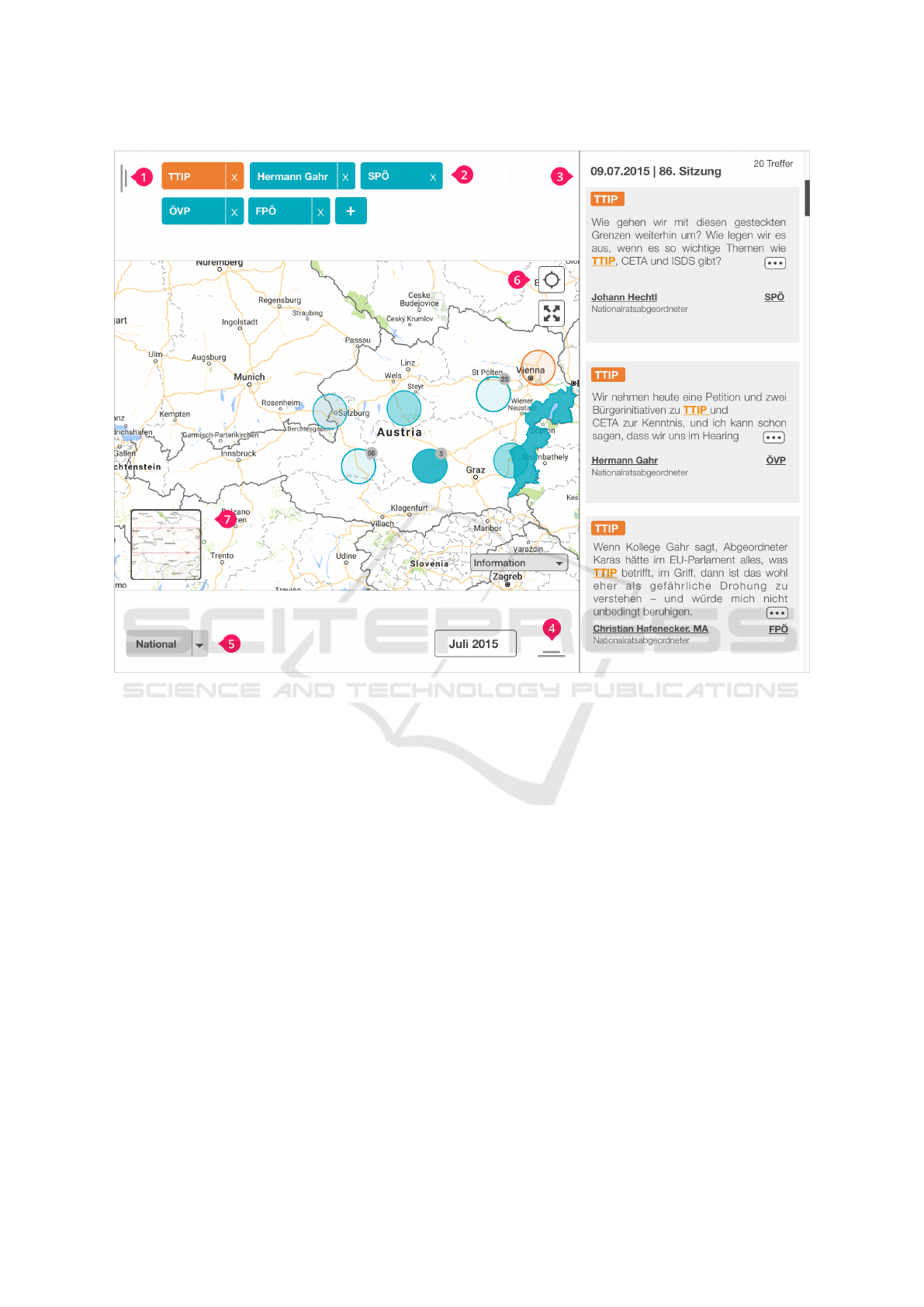
Figure 1: Main Screen as starting point out of a broadcast, showing the highlighting concept of a particular topic on the
visualization. 1) filter for topic, person and institution 2) selected filter properties 3) detail area showing stenographic minutes
of the Austrian National Council 4) filter for time component 5) drop down selection for predefined region 6) button for "my
location" and "zoom out for entire map" 7) overview map.
the session, locations or areas, topic, and person.
Information on institutional affiliation, professional
function, and a photo are also extracted from the DB.
2.3 Interface Design
For the entire tablet application (addressing design re-
quirement D1) we use a collection of well-established
visualization methods and interaction concepts for
the target group of non-experts.
Layout & Interface: As shown in Figure 1, the inter-
face of the tablet application is split into two areas to
provide a structured layout and to separate visualiza-
tion from the reading area. First, the “main area” with
the map visualization on the left and second, the “de-
tail area” on the right (Figure 1 (3)), showing excerpts
of the stenographic minutes depending on the infor-
mation given in the main view (addressing D2 and
D4). The user can open the filter sidebar on the left
(Figure 1 (1)) and below (Figure 1 (4)) by using the
handle elements. As seen in Figure 2, the filters are
bundled in a hidden sidebar to provide enough space
for the exploration of the data so as not to overwhelm
the user.
In the upper part, currently filtered topics, mem-
bers of the National Council, and institutions out of
the broadcast are shown, designed along the common
concept of tagging (Toxboe, 2017) (see Figure 1 (2),
addressing D5). The user can delete a filter by tap-
ping the “x” or opening the filter sidebar by tapping
the tag element. The filter sidebar contains a tab-bar
navigation through the different sections (i.e., “top-
ics”, “persons”, and “institutions”), a full-text search,
and a list with check boxes as filter results, seen in
Figure 2. The filter results are sorted by frequency
of occurrence. The sorting concept is implemented to
show relevant elements to the viewer and guide them
to relevant information based on the data. The rele-
vance of information is based on the frequency with
IVAPP 2018 - International Conference on Information Visualization Theory and Applications
194
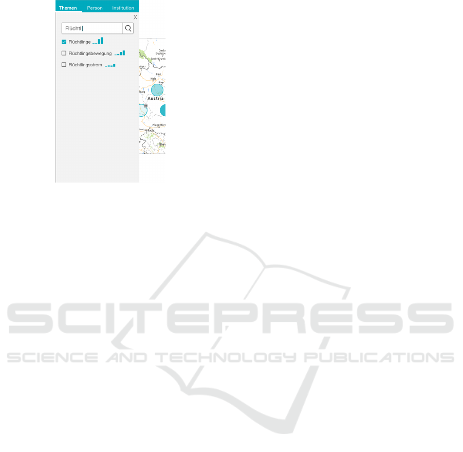
Figure 2: Filter Sidebar: Representation of the filter with
the integrated sparklines showing the relevance of the re-
sults, calculated by the frequency of the topics incidence,
people or institutions over the selected legislative period.
which a topic is addressed over time.
Additionally, the filter results are supported by
sparklines (Tufte, 2006) to show the relevance of
the results calculated by the frequency of the topics
incidence, people, or institutions over the selected
legislative period. Selected list elements are pinned
on top to give the user selection feedback. A range
slider is used to allow DB filtering by the user
during a given legislative period by years. To make
it easier to use, a snapping effect per month is applied.
Main Area: The main view is a map visualization rep-
resenting the topics of the stenographic minutes with
regard to the respective location, which is circled on
the map (addressing D3). The transparency of the cir-
cles varies in order to provide the user with informa-
tion on the frequencies of the topics at a certain loca-
tion. We use circles instead of the common “pinning”
icon for indicating a certain location on a map (un-
like Google Maps). The circle symbol makes it easier
to show a bundle of multiple locations on the map.
We try to use a common metaphor for frequency rep-
resentation by mapping the frequencies of topics to
the transparency. The location circles represent both
end-points and clusters of locations. By tapping on an
end-point location, a zoom-in action is triggered and
the user gets a detailed location view on the map. By
tapping on a region cluster, it dissolves into the indi-
vidual locations displayed as new circle elements on
the map.
Two additional buttons for “my location” and
“zoom out for entire map” (Figure 1 6) as well as
a mini map (Figure 1 7) complete the map visual-
ization. A drop down menu provides a selection of
“national,” “international,” and “European Union
(EU)” for an easier selection of countries and regions
on the map.
Detail Area: The detail view contains excerpts of the
stenographic minutes. The selection adapts automat-
ically (Neil, 2014) depending on the filtered element
and the zoom-in state of the map (main view). One
excerpt contains the clipping of the transcript, the
member of the National Council related to the tran-
script, and the institutions. By tapping on a topic tag
within the excerpt, all relevant circles in the map and
filter tags are highlighted (see Figure 1). The user
thus receives a focused view on a particular topic. By
tapping on the “...” button, the users get a detailed
view of the particular transcript as an overlay (see Fig-
ure 3), so they can read the details of the transcript. A
portrait of the speaker is integrated into the layout.
2.4 Presentation & Exploration
Workflow
Interactive information visualization systems of-
ten follow the visual information seeking mantra
overview first, zoom and filter, details-on-demand
by Shneiderman (1996). Thereby, the user first re-
ceives an overview of the provided visualizations con-
taining all loaded data. Using the system’s mecha-
nisms (e.g., filtering, zooming, selecting) the user has
the possibility to interactively explore and analyze the
data and search for patterns of interest. As a result, the
data is visualized in detail. In case of a 2
nd
screen ap-
plication, the seeking mantra is provided by two dif-
ferent instances: 1) the overview first, zoom and filter
related TV content provided by the journalist; 2) the
generated details-on-demand are then presented to the
viewer as starting point for further exploration. Thus,
the application layout and information on the map are
structured around three main levels:
Present the related: The user starts the exploration
with pre-filtered information on topics of the
broadcast.
Provide the context: Excerpts of the particular
stenographic minutes are integrated on the right
to provide information on a deeper level to the
user.
Self-organized exploration: Enable deep data anal-
ysis by filtering data of interest (topics, people,
institutions, and time) to the user.
To allow fully self-controlled exploration of the pro-
vided data, the concept also supports reverse ex-
ploration based on the three levels described above
Visualizing Text Data in Space and Time to Augment a Political News Broadcast on a Second Screen
195
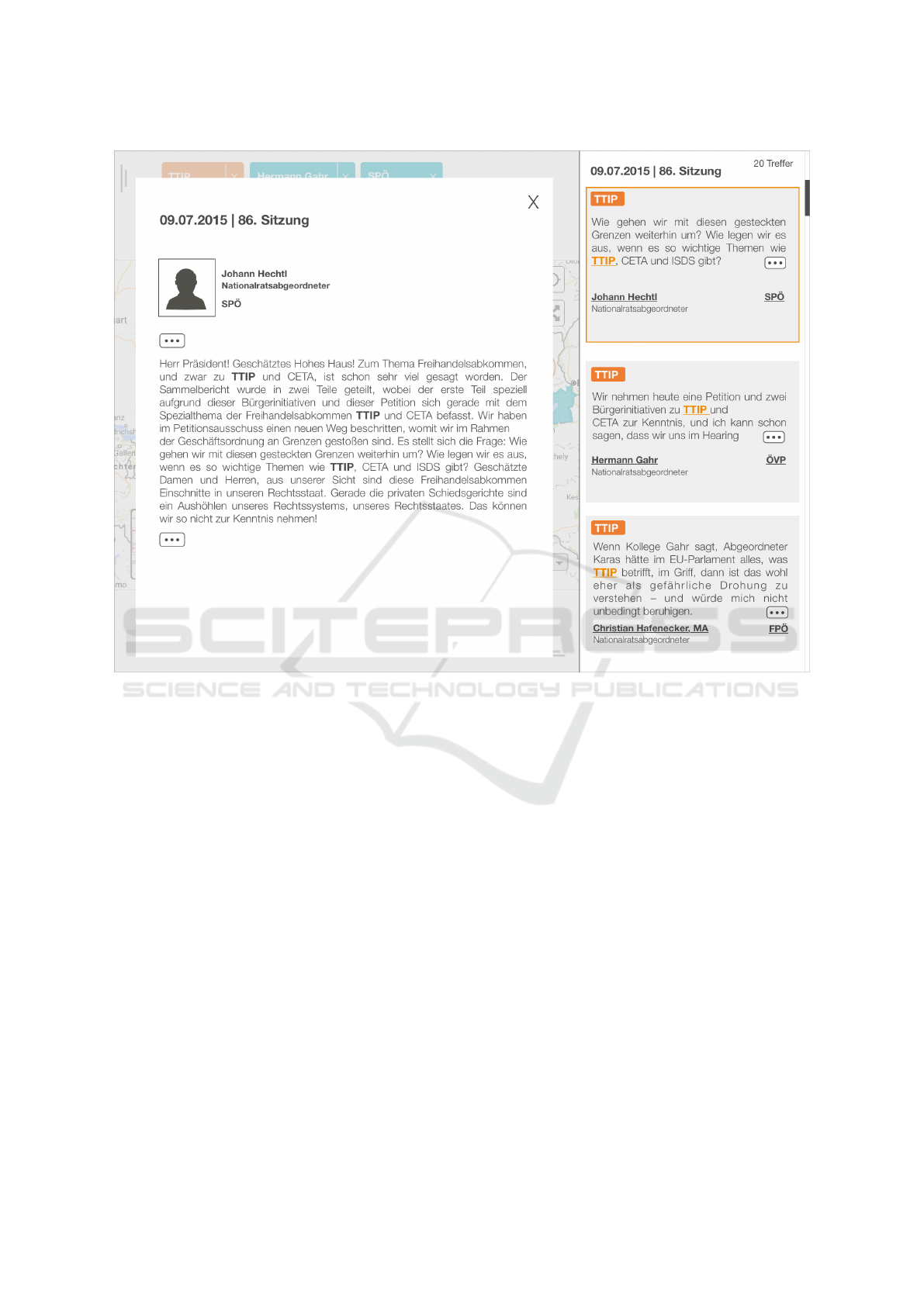
Figure 3: Detailed View: By selecting an excerpt, the detailed view is shown as an overlay with details of the transcript, name,
function, and portrait of the speaker.
(Present the related ⇒ Provide the context ⇒ Self-
organized exploration). By starting within the de-
tailed view and going from the map to concentrating
on the dataset filtering on one specific aspect of the
data, reverse exploration is achieved.
2.5 Heuristic Evaluation & Results
To get feedback in an early design phase, we de-
cided to conduct a heuristic evaluation (Nielsen and
Molich, 1990) with two experts. In this section, we
describe the evaluation process and discuss the results
in detail.
2.5.1 Heuristics
Experts have evaluated the paper prototypes with
adapted heuristics conceptually grounded on the
“principles for information visualization” by Forsell
and Johansson (2010) and the “10 Usability Heuris-
tic” by Nielsen and Molich (1990). We chose the par-
ticular heuristics by complementing these two heuris-
tic sets to cover the overall usability of the system.
The following heuristics constitute the basis for the
evaluation:
• Information coding (Forsell and Johansson, 2010)
• Minimal actions (Forsell and Johansson, 2010)
• Flexibility (Forsell and Johansson, 2010)
• Orientation and help (Forsell and Johansson,
2010, Nielsen and Molich, 1990)
• Spatial organization (Forsell and Johansson,
2010)
• Consistency (Forsell and Johansson, 2010,
Nielsen and Molich, 1990)
• Recognition rather than recall (Forsell and Jo-
hansson, 2010)
• Aesthetic and minimal design (Nielsen and
Molich, 1990)
• Data set reduction (Forsell and Johansson, 2010)
IVAPP 2018 - International Conference on Information Visualization Theory and Applications
196
Table 1: Findings of the heuristic evaluation and suggested solutions to mitigate shortcomings.
Heuristic (Rating) Issue Solution
Information
Coding &
Consistency
(2) Unclear visual representation of
clusters on the map. Participants
misinterpret the number indicating
the number of grouped locations to
the circle element. Also the deter-
mination of a cluster element and
locations constitutes as problem.
Further research is required to explore the best representation of
the cluster elements on the map. Adapt the circle element show-
ing the number of grouped locations in the middle of the circle.
This representation corresponds to the actual state-of-the-art in
the visualization of clusters on a map. It can therefore be as-
sumed that the problem is not solved and the connection between
the number and the density of the topics will be reinforced. Fur-
ther research is required to explore the best representation of the
cluster elements on the map.
Consistency (2) Handle element opening side-
bars is unused and unclear. During
the observation the subjects do not
use the handle elements to open the
sidebars, indicating that they do not
recognize the element.
Remove the handle elements, because the user can open the side-
bars in different ways by tapping a filter-tag and the date-element
at the bottom.
Information
Coding
(3) The sparklines in the filter side-
bar are unclear due to missing axis
descriptions.
Rearrange the filter list in the following way: checkbox, sparkline
and the name of the result. Implement an interaction possibility to
tap on the sparkline, zoom in and show axis description. Instead
of the bar chart, a line chart can be integrated with an arrow at
the end, indicating the trend. A user test can indicate which type
of visualization technique is better understandable for the target
group.
Flexibility,
Consistency,
Recognition
rather recall
(1) “more”- button in the excerpt
section was interpreted in different
ways. They all guess the meaning
of the “more”-button.
Instead of the button, implement a link called ”more information”
to prevent false interpretations. Further, also provide a possibility
opening detailed information by tapping on the excerpt.
2.5.2 Study Design
Based on the heuristics described above, two experts
reviewed the paper prototypes. The participants had
more than 3 years expertise in the field of usability
and visualization. The male participants were aged
28 and 33 years. During the evaluation, we used the
high-fidelity mock-ups and for the observation, hand-
written notes and video recordings were taken. Each
participant was asked to imagine a realistic TV setting
in combination with the 2
nd
screen application.
2.5.3 Results
The identified issues were rated according to
Nielsen’s severity rating: 1) cosmetic problem only;
2) minor usability problem; 3) major usability prob-
lem; 4) usability catastrophe (Nielsen, 2010).
Table 1 provides detailed information about the is-
sues of the interface. Overall, the participants sug-
gested improvements concerning consistency and in-
formation coding. Only one issue was ranked by the
experts as a “major usability problem” (Issue 3). Re-
flecting the findings of the performed heuristically
based expert reviews, the provided visualization tech-
niques and gestures were ranked as known.
3 CONCLUSION & FUTURE
WORK
The contribution of the paper at hand is the design of
a 2
nd
screen app on a tablet device for visualizing tex-
tual data in time and space while watching the politi-
cal news broadcast “Hohes Haus”. In this context, the
viewer receives additional information with regard to
the presented topics of the broadcast.
The concept allows for two kinds of data explo-
ration: 1) obtaining information that is adapted to the
TV broadcasting process (parallel usage); 2) interac-
tive data exploration and analysis at their own discre-
tion (stand-alone exploration).
During the design development, we identified a
usage pattern in the context of a TV broadcast pro-
cess: Present the related – Provide the context – Self-
organized exploration. This differs from the process
of user-driven interactive data visualization and ex-
ploration, which can be described by the mantra of
Shneiderman (1996): “Overview first, zoom and filter,
then details-on-demand”.
Future research possibilities might include identi-
fying how users of 2
nd
screen apps could be guided
during data exploration in relation to the context of
Visualizing Text Data in Space and Time to Augment a Political News Broadcast on a Second Screen
197

the TV broadcast and how they could be motivated to
perform data exploration which goes beyond the cor-
responding context. It might be necessary, for exam-
ple, to provide not only the TV broadcast related data
but also the data used for story creation. Additionally,
further research is needed to validate the appropriate-
ness and usability of established InfoVis concepts a as
well as the design and evaluation of novel concepts in
relation to 2
nd
screen approaches based on large-scale
usability studies with the target group.
ACKNOWLEDGEMENTS
This work was supported by the Austrian
Wirtschaftsservice (aws), the Austrian Ministry
for Transport, Innovation and Technology (BMVIT)
under the ICT of the future program via the VALiD
project (no. 845598), the Austrian Science Fund
(FWF) via the KAVA-Time project (no. P25489), the
Austrian Federal Ministry of Science, Research and
Economy under the FFG COIN program (MEETeUX
project, no. 7209770), and a PhD scholarship (no.
1587) by the Internet Foundation Austria (IPA).
Many thanks to S. Größbacher for her support and
feedback to our manuscript.
REFERENCES
Bird, S., Klein, E., and Loper, E. (2009). Natural Language
Processing with Python: Analyzing Text with the Nat-
ural Language Toolkit. O‘Reilly, 1 edition.
Blumenstein, K., Niederer, C., Wagner, M., Schmiedl, G.,
Rind, A., and Aigner, W. (2016). Evaluating informa-
tion visualization on mobile devices: Gaps and chal-
lenges in the empirical evaluation design space. In
Proceedings of the Workshop on Beyond Time And Er-
rors, pages 125–132. ACM.
Blumenstein, K., Wagner, M., Aigner, W., von Suess, R.,
Prochaska, H., Püringer, J., Zeppelzauer, M., and
Sedlmair, M. (2015). Interactive Data Visualization
for Second Screen Applications: State of the Art and
Technical Challenges. In Proceedings of International
Summer School on Visual Computing, pages 35–48.
Frauenhoferverlag.
Boria, A. (2016). Analysis and creation process of infor-
mation visualizations for TV productions. Diploma
Thesis, St. Pölten University of Applied Sciences.
Busemann, K. and Tippelt, F. (2014). Second Screen: Par-
allelnutzung von Fernsehen und Internet. Media Per-
spektiven, 7-8:408–416.
Centieiro, P., Romao, T., and Dias, A. E. (2014). From
the Lab to the World: Studying Real-time Second
Screen Interaction with Live Sports. In Proceedings of
Conference on Advances in Computer Entertainment
Technology, pages 14:1–14:10. ACM.
Cesar, P., Bulterman, D. C. A., and Jansen, A. J. (2008). Us-
ages of the secondary screen in an interactive televi-
sion environment: Control, enrich, share, and transfer
television content. In Tscheligi, M., Obrist, M., and
Lugmayr, A., editors, Proceedings of Changing Tele-
vision Environments. EuroITV 2008, pages 168–177.
Springer.
Courtois, C. and D’heer, E. (2012). Second Screen Appli-
cations and Tablet Users: Constellation, Awareness,
Experience, and Interest. In Proceedings of the Euro-
pean Conference on Interactive TV and Video, pages
153–156. ACM.
De Meulenaere, J., Bleumers, L., and Van den Broeck, W.
(2015). An audience perspective on the second screen
phenomenon. Journal of Media Innovations, 2(2):6–
22.
Eversman, D., Major, T., Tople, M., Schaffer, L., and Mur-
ray, J. (2015). United Universe: A Second Screen
Transmedia Experience. In Proceedings of Interna-
tional Conference on Interactive Experiences for TV
and Online Video, pages 173–178. ACM.
Forsell, C. and Johansson, J. (2010). An heuristic set
for evaluation in information visualization. In Pro-
ceedings of International Working Conference on Ad-
vanced Visual Interfaces, pages 199–206. ACM.
Geerts, D., Leenheer, R., De Grooff, D., Negenman, J.,
and Heijstraten, S. (2014). In Front of and Behind
the Second Screen: Viewer and Producer Perspectives
on a Companion App. In Proceedings of Interna-
tional Conference on Interactive Experiences for TV
and Online Video, pages 95–102. ACM.
Holz, C., Bentley, F., Church, K., and Patel, M. (2015).
"I’M Just on My Phone and They’Re Watching
TV": Quantifying Mobile Device Use While Watch-
ing Television. In Proceedings of International Con-
ference on Interactive Experiences for TV and Online
Video, pages 93–102. ACM.
IDS Mannheim (2017). Corpus Search, Management and
Analysis System. Retrieved March 02, 2017, from
http://www.ids-mannheim.de/cosmas2.
Johnson, J. (2014). Designing with the Mind in Mind: Sim-
ple Guide to Understanding User Interface Design
Guidelines. Morgan Kaufmann, 2. auflage. edition.
Kusumoto, K., Kinnunen, T., Kätsyri, J., Lindroos, H., and
Oittinen, P. (2014). Media experience of complemen-
tary information and tweets on a second screen. In
Proceedings of International Conference on Multime-
dia, pages 437–446. ACM.
Murphy, N. and Hughes, K. (2014). The multi-screen expe-
rience. Irish Academy of Management Conference.
Murray, J., Goldenberg, S., Agarwal, K., Chakravorty, T.,
Cutrell, J., Doris-Down, A., and Kothandaraman, H.
(2012). Story-map: Ipad companion for long form
tv narratives. In Proceedings of the European Con-
ference on Interactive TV and Video, pages 223–226.
ACM.
Nandakumar, A. and Murray, J. (2014). Companion Apps
for Long Arc TV Series: Supporting New Viewers
in Complex Storyworlds with Tightly Synchronized
Context-sensitive Annotations. In Proceedings of In-
IVAPP 2018 - International Conference on Information Visualization Theory and Applications
198

ternational Conference on Interactive Experiences for
TV and Online Video, pages 3–10. ACM.
Neil, T. (2014). Mobile Design Pattern Gallery - UI Pat-
terns for Smartphone Apps. O’Reilly, 2nd edition edi-
tion.
Nielsen, J. (2010). Usability engineering. Morgan Kauf-
mann, nachdr. edition. OCLC: 760142137.
Nielsen, J. and Molich, R. (1990). Heuristic evaluation of
user interfaces. In Proceedings of the SIGCHI Confer-
ence on Human Factors in Computing Systems, pages
249–256. ACM.
ORF (2017). Hohes Haus - Parlamentmagazin.
Retrieved February 23, 2017, from http:
//der.orf.at/unternehmen/programmangebote/
fernsehen/sendungen/sendungen-h-k/
hohes-haus100.html.
Parlament.gv.at (2017). Parlamentsreden. Retrieved March
02, 2017, from https://www.parlament.gv.at/
PAKT/PLENAR/.
Poggi, J. (2014). Finding There Were Too Many Apps
for That Second-Screen Startups Try Plan B. Re-
trieved April 24, 2017, from http://ui-patterns.
com/patterns/Tag.
Shneiderman, B. (1996). The eyes have it: a task by data
type taxonomy for information visualizations. In Pro-
ceedings of IEEE Symposium on Visual Languages,
pages 336–343.
Siek, K. A., Rogers, Y., and Connelly, K. H. (2005). Fat
Finger Worries: How Older and Younger Users Phys-
ically Interact with PDAs. In Human-Computer Inter-
action - INTERACT 2005, number 3585, pages 267–
280. Springer.
Silva, P., Amer, Y., Tsikerdanos, W., Shedd, J., Restrepo, I.,
and Murray, J. (2015). A Game of Thrones Compan-
ion: Orienting Viewers to Complex Storyworlds via
Synchronized Visualizations. In Proceedings of In-
ternational Conference on Interactive Experiences for
TV and Online Video, pages 167–172. ACM.
Toxboe, A. (2017). Tagging Design Pattern. Retrieved
February 13, 2017, from http://ui-patterns.
com/patterns/Tag.
Tufte, E. R. (2006). Beautiful Evidence. Graphics Pr, 1st
edition edition edition.
Van Cauwenberge, A., Schaap, G., and Van Roy, R. (2014).
"TV no longer commands our full attention": Effects
of second-screen viewing and task relevance on cog-
nitive load and learning from news. Computers in Hu-
man Behavior, 38:100–109.
Vanattenhoven, J. and Geerts, D. (2017). Social expe-
riences within the home using second screen TV
applications. Multimedia Tools and Applications,
76(4):5661–5689.
Visualizing Text Data in Space and Time to Augment a Political News Broadcast on a Second Screen
199
