
Area Preserving Dynamic Geospatial Visualization on Physical Globe
Shima Dadkhahfard, Katayoon Etemad, John Brosz and Faramarz Samavati
Department of Computer Science University of Calgary, Calgary, Canada
Keywords:
Geo-visualization, Dynamic Visualization.
Abstract:
We present a methodology for creating dynamic visualization of geospatial data on physical globe. To achieve
this goal, we use a piecewise curved-display and multi-projector setup. The curved-display is a physical
representation of the globe and provides closer approximation of the Earth and reduce distortions. In our
method, we use a Discrete Grid Global System (DGGS) for discretizing the Earth to hierarchical cells in
different resolutions. This DGGS employs an area preserving projection for on the fly integration of geospatial
datasets. There is a one-to-one correspondence between pieces of our curved-display and DGGS cells in a
specific resolution. We use 3D printing technology for fabricating of each piece of the display. For controlling
the projection, we developed software that takes data from DGGS, warp it and then feeds it to the projectors.
The fabrication of the cells and the generation of projection feed follow the same structure of DGGS. We
demonstrate the flexibility of our construction with several example setups and apply them to visualize multiple
datasets, including time-varying geospatial data.
1 INTRODUCTION
As the only livable planet for human beings, the
Earth is important and knowing different aspects of
this huge and live organism helps us in our critical
decision-making. Since the recent advancement of
geospatial sensors has resulted in several technologies
for collecting data (e.g. satellites, smart phones, me-
teorological instruments, and LIDAR), today we are
faced with the explosion of the volume and variabil-
ity of geospatial data. An important challenge is how
to integrate and process this huge dynamic dataset.
This challenge has been tackled by GIS and recently
Digital Earth systems (Mahdavi-Amiri et al., 2015a).
However, another important challenge, is visualizing
this large and dynamic dataset to help the general pub-
lic understand and analyse our live planet and make
decisions about the Earth.
The common approach for geospatial visualiza-
tion in GIS is to project Earth-related dataset onto 2D
display screens using projection methods like Merca-
tor (Grafarend, 1995). However, projecting geospatial
information from the surface of the Earth to 2D maps
creates some issues. Problems such as unwanted dis-
tortion of 2D maps, misinterpretation of the size of the
areas (e.g. countries), and relative positions are just
few of the challenges (Mahdavi-Amiri et al., 2015a;
Zolfagharifard, 2014; Snyder, 1997). In section 4 we
will demonstrate the misinterpretation in visual analy-
sis resulting from the area distortion of Mercator map-
ping (See Figure 16).
In Digital Earth systems (e.g. Google Earth),
geospatial datasets are mapped on a 3D globe which
can conceptually reduce distortions (See Figure 17).
Well-thought interactive interfaces could provide
users with a better understanding of a 3D globe re-
sulting from an exploratory experience. However, to
create the 3D globe, it is necessary to define a map-
ping (commonly Mercator) from 2D domain to the
surface of the Earth. In addition to perspective distor-
tion, this mapping also creates some kind of distortion
(i.e. area, shape and distance).
One possible solution for reducing the map distor-
tions is to use a 3D physical globe, as a medium for
presenting geospatial datasets (Meng, 2003; Hruby
et al., 2008). The idea of physical visualization
of geospatial datasets has been recently explored in
(Djavaherpour et al., 2017). The physical globe can
prevent some misconceptions and inaccuracies com-
monly found in 2D maps. Unfortunately, in this sce-
nario the data and globe are physically fixed and the
visualization is static; it would be much better if it
was possible to present vividly dynamic and live data
on this physical model. Inspired by spherical dis-
plays (Vega et al., 2014), we introduce a flexible and
scalable method for accurate (i.e. area preserving)
projection of static or dynamic geospatial datasets. In
our method, we use a hierarchical grid system for dis-
Dadkhahfard, S., Etemad, K., Brosz, J. and Samavati, F.
Area Preserving Dynamic Geospatial Visualization on Physical Globe.
DOI: 10.5220/0006627303090318
In Proceedings of the 13th International Joint Conference on Computer Vision, Imaging and Computer Graphics Theory and Applications (VISIGRAPP 2018) - Volume 3: IVAPP, pages
309-318
ISBN: 978-989-758-289-9
Copyright © 2018 by SCITEPRESS – Science and Technology Publications, Lda. All rights reserved
309
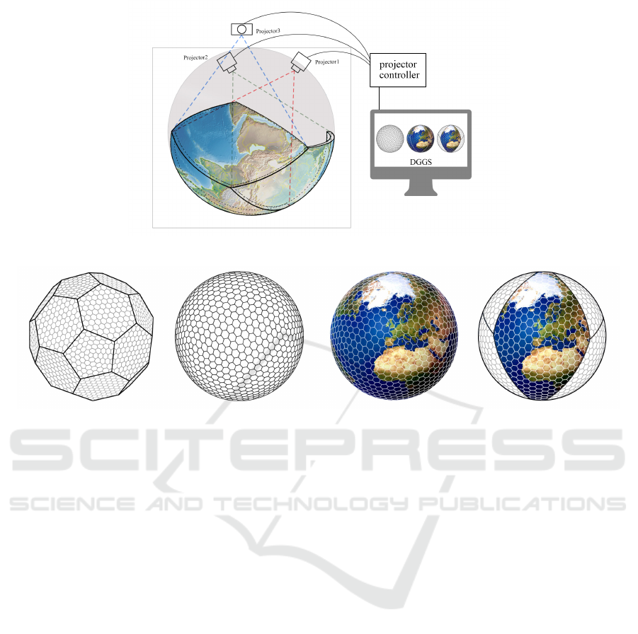
Figure 1: Area-preserving dynamic geospatial visualization on curved display.
Figure 2: The resulting flat cells are then mapped to a sphere/ellipsoid using the inverse of a projection.
cretizing the Earth surface to regular (i.e. size and
shape) cells. We use the geometry of these curved
cells for creating a curved display panel (See Fig-
ure 1). Further, we use multiple projectors to feed
live geospatial data to the curved display. The associ-
ated dataset for each cell is rendered as an image and
carefully projected on the surface of our curved dis-
play. To do this, we developed a projector controller
which takes the geometry of curved cells, the associ-
ated data images and the projector (device’s) param-
eters. Based on this information, the projector con-
troller prepares and adjusts the input data images for
the projector device.
Using curved-displays, we can achieve a better ap-
proximation of the Earth that reduces the area and
shape distortions necessary on standard 2D displays.
To create the curved-display and projector setup, it
is important to define an accurate correspondence be-
tween regions on the Earth and areas on the curved-
display. For example, to have an accurate analysis
on the global warming issue on a region close to the
north pole, the average and projected temperatures of
that region must be mapped to an area on the curved-
display which has a proportionally right location with
the same area.
To accurately represent data within our model we
rely on a discretization of the surface of the Earth
into cells. The size of cells should be defined accord-
ing to the desired scale and accuracy of the curved-
display. By making use of a hierarchical tessellation
of the Earth, such as a Discrete Global Grid System
(DGGS) method (Mahdavi-Amiri et al., 2015a; Purss
et al., 2016; Sahr et al., 2003; Xie et al., 2013; Randall
et al., 2002), transitions between scales and accuracy
can be easily achieved. In DGGS, the Earth’s surface
is approximated by a convex polyhedron. Depending
on the desired accuracy, each face of the polyhedron is
refined to generate a hierarchy of regular flat cells on
each face. The resulting flat cells are then mapped to
a sphere/ellipsoid using inverse of projections, prefer-
ably area preserving (see Figure 2). The resulting hi-
erarchical cells are indexed and used for addressing
geospatial datasets. There are several active DGGSs
used for creating Digital Earth systems (Mahdavi-
Amiri et al., 2015a). In these systems, large amounts
of live geospatial datasets are assigned to the DGGS
cells. The current version of Google Earth also uses
DGGS, but unfortunately, its projection is not area
preserving.
For this work, we use Pyxis’ (Mahdavi-Amiri
et al., 2015b; Peterson, 2006; Sherlock et al., 2016)
Digital Earth system. The system is based on Aper-
ture 3 hexagonal grid system and the Snyder area pre-
serving projection (Snyder, 1992). For the purposes
of data exchange and transmission, hexagons are ag-
gregated and converted to rhombus cells (see Fig-
IVAPP 2018 - International Conference on Information Visualization Theory and Applications
310

ure 2). We use these rhombus cells for constructing
our curved-display.
In our method (see Figure 1), we visualize geospa-
tial DGGS on a piecewise curved-display. The idea is
to use multiple projectors, each of which is dedicated
to one or more rhombus cells. To use the indexed
data on DGGS, we use the same cell structure for con-
structing the curved-display. We have constructed this
piecewise curved-display by 3D printing the DGGS
model’s rhombus cells, and present our technique for
this entire work-flow.
Figure 3: Each panel represents one tenth of the surface of
the globe. Left: resolution zero (coarsest resolution). Right:
resolution one (one level of refinement).
The main contribution of this paper is introducing
a method for accurate (area preserving) visualization
of dynamic geospatial datasets through a framework
for constructing curved-display. Our method is based
on DGGS which provides great flexibility and scala-
bility which is not not available in the spherical dis-
play proposed previously. For example, with our ap-
proach we can have an installation with one or multi-
ple panels at any desired resolution and size, each of
which is associated to a physical place on the Earth.
Using 3D printers, we can easily fabricate a frame for
each panel and then attach them to form curved pan-
els, which are covered by projection paper. Panels
can be used in assembled form or disjointed form, to
compare distant regions of the Earth, side by side (See
Section 4).
The remainder of this paper is structured as fol-
lows. In Section 2, we provide a short review of works
related to visualization of geospatial data and curved-
display projection. Section 3 is dedicated to the
methodology of the introduced framework, which is
organized into three sections: curved-display screen,
setup of the installation, and projection onto the Earth
model. Further, we present some results of the in-
stallation in Section 4. We then discuss the possible
directions that this framework can go as future works
in Section 5.
2 RELATED WORK
In addition to the related papers discussed in the in-
troduction, in this section, some of the related pa-
pers in the the areas of geospatial visualization and
curved/spherical displays are reviewed.
Using 2D maps for geospatial visualization is a
well studied area with a long history (Snyder, 1997).
The main focus of map projection techniques is how
to create a flat instance of the Earth while controlling
and reducing map distortions.
Recently, perhaps due to easier perception, physi-
cal visualization of data has received more attention.
Djavaherpour et.al (Djavaherpour et al., 2017) created
a physical model of Digital Earth and provided sev-
eral printed datasets that can be attached or detached
on top of the physical model to study and for educa-
tional purposes. The main limitation of this work is
how to use it for live and dynamic datasets.
Our work is primarily relevant to the visualization
of Digital Earth datasets, which use a virtual 3D globe
as the medium (Mahdavi-Amiri et al., 2015a). Vega
et.al (Vega et al., 2014) present the main challenges
and benefits of geospatial visualization on a spherical
display. They discussed the benefits of spherical dis-
plays installations including educational applications.
National Oceanic and Atmospheric Administration
”NOAA” (NOAA, 2014) designed a system called
“SOS” or Science On a Sphere (Schollaert Uz et al.,
2014; SOS, 2004), which is a room sized global dis-
play system that projects four high resolution videos
onto a six foot diameter sphere. The set up is designed
to project videos from outside the globe, and the pro-
jection is spherical which may cause misconception
of area and positions. Also, there are other com-
mercialized large spherical displays such as Omin-
isphere (Murphy, 2009) and Hard-Ball (Vega et al.,
2014).
Generally, in these works, spherical mapping is
used to wrap 2D input images/videos on the spherical
displays. However, there is extreme distortion when
we use spherical mapping (particularly near the North
pole and the South pole), and wrap 2D images on 3D
displays. There is a large list of map-projection tech-
niques for reducing or controlling the resulting dis-
tortion (Snyder, 1997). When we map a flat 2D im-
age onto a curved surface, some amount of distortion
(e.g. area, direction, shape) is unavoidable (Snyder,
1997; Gruen, 2012; Sahr et al., 2003; Peterson, 2006).
Depending on the application, the particular mapping
may be used. For example, the famous Mercator map
projection preserves the direction and therefore it is
good when the main purpose of the map is naviga-
tion. However, area is extremely distorted in this type
Area Preserving Dynamic Geospatial Visualization on Physical Globe
311

Figure 4: Various sizes and resolutions of cell-panels. (a) Resolution zero, final globe with 1 meter diameter and cell-panel
size around 50×50. (b) Resolution zero, final globe with 20 centimetre diameter and cell-panel around 11×11. (c) Resolution
2, final globe more than 8 meter diameter and cell-panel size around 60 × 60.
Figure 5: (a) DGGS hexagonal griding model. (b) Imported mesh from DGGS. (c) Designed a frame based on DGGS mesh.
(d) Designing two by two structure inside the frame to enhance curvature. (e) Designing three by three structure inside the
frame to better approximate curvature.
of map, greatly expanding areas near the pole relative
to areas near the equator. Alternatively, map projec-
tions such as Azimuthal area preserving works well
for the purpose of analysis when making comparisons
between sizes of areas on the map.
One approach to reducing distortion is to employ
multiple 2D domains instead of a single domain. For
example, one can better approximate the sphere with
a cube (six flat 2D domains) instead of only one sin-
gle plane. Certainly this can be extended providing
even better approximations if we use a spherical poly-
hedron with more cells than the cube model (Snyder,
1992; Mahdavi-Amiri et al., 2015a). Discrete Grid
Globe Systems use an initial polyhedron for approxi-
mating the Earth’s surface. DGGS are considered as a
“distributed global information system” that provides
an on the fly integration of geospatial datasets (Purss
et al., 2016). HEALPIX (Gorski et al., 2005), SCEN-
ZGrid (SCENZGrid, 2010), HSDS (Goodchild and
Shiren, 1992) and Pyxis’ Digital Earth (Peterson,
2006) are examples of DGGS.
Although, we have used Pyxis system for this
work, our methodology is general and independent
from underlying DGGS.
3 METHODOLOGY
The goal of this paper is to provide the means for pre-
senting dynamic visualization of geospatial data on
a curved-display. We use Pyxis’ DGGS (Peterson,
2006) for discretizing the Earth into several rhom-
bus cells. The cells of Pyxis DGGS are based on
hexagons and higher resolution cells are constructed
through a 1-to-3 refinement (Mahdavi-Amiri et al.,
2015a). The initial polyhedron is a truncated icosa-
hedron (see Figure 2). However, for the purpose
of inter-operability and data transmission a collec-
tion of hexagonal cells are transformed to rhombuses,
using grid conversion (Mahdavi-Amiri et al., 2016).
The resulting rhombuses are also hierarchical. The
first resolution (i.e., resolution zero) is constructed
from a spherical icosahedron where each rhombus is
a pair of triangles (see Figure 3 Left). The refine-
ment for creating the multiresolution is a 1-to-9 re-
finement (Mahdavi-Amiri et al., 2015a) (see Figure 3
Right) (i.e. a 3D mesh).
Using Pyxis DGGS (Peterson, 2006), we can cre-
ate the geometry of the cell and also have access to
geospatial data associated with that cell. Therefore,
if we build our curved-display based on the rhombus
cells, we will have access to a huge amount of data in-
cluding dynamic sets, that can be mapped accurately
to the corresponding rhombus on the display.
3.1 Curved-display Screen
We built our curved-display through 3D printing. We
fabricated a piecewise display where each piece cor-
responds to a DGGS cell at a specific resolution. We
call these printed pieces cell-panels. For printing
IVAPP 2018 - International Conference on Information Visualization Theory and Applications
312

Figure 6: Different thickness tested when designing the frame of the cell-panels.
Figure 7: When cell-panels are too large, the projection pa-
per is not able to smoothly adapt to the cell’s curvature.
these cell-panels, we need to first determine the size
and resolution of the physical globe. The size and
resolution of the globe defines the display cell-panel
size. For example, if we use the resolution zero, ten
cells will cover the entire globe (See Figure 3, left).
To produce a globe with one meter diameter, the size
of the cell-panels is around 50 × 50 centimetres (Fig-
ure 4-a), whereas for a globe with a 20 centimetre di-
ameter, the size of the cell-panel would be 11 × 11
centimetres (Figure 4-b). For a globe with an eight
meter diameter, the cell size at resolution two (810
cells) is approximately 60×60 centimetres (Figure 4-
c).
For our installation, we chose a one-meter diam-
eter for the entire globe at resolution zero. Conse-
quently, our final display made up of cell-panels, each
sized at 50 × 50 centimetres. When fabricating each
cell-panel, we use Pyxis Digital Earth to export the
geometry of the cell as a 3D mesh (Figure 5 a, b). We
only print edges of each cell (Figure 5 c), and in or-
der to make these cell-panels work as screen we will
obtain better image quality if they are covered in a
proper rear-projection screen material. The projection
paper is glued onto the 3D printed frame.
When designing the frame we tested several thick-
nesses as shown in Figure 6. To minimize shadows
and seams in the image, it is optimal to keep these
frames as thin as possible. With our PLA printing
material we found that two millimeters was sufficient
to provide strength and durability with minimal thick-
ness.
As is shown in Figure 7 our cell-panel size of ap-
proximately 50 × 50 centimeters has too much cur-
vature over the surface of the rhombus to be cov-
ered smoothly with the rear projection paper. Con-
sequently we created an internal structure to support
and guide the paper. First, we tested a two by two
internal structure (Figure 5, d) and after covering it
with paper we observed that the problem still exists.
In the next iteration, we tested using three by three el-
ements as the internal structure (Figure 5, e) and the
result was acceptably smooth. Figure 8, (a,c) shows
the final result. We also designed and printed clips for
connecting cell-panels as well as stands for stabilizing
and orienting the final curved-display (Figure 8 b,d).
For fabricating these cell-panels, we have used
the MakerGear M2 desktop 3D printer. Each internal
structure unit takes around 2 hours to print and uses
less than 2-meters of clear-filament (USA, 2014).
3.2 Projector Setup
To setup projector devices, we could either use rear or
front projection. The problem with front projection is
the shadows of viewers on the globe. Therefore, we
decided to use rear projection. We have done our ex-
periments with three projector devices available in our
lab. Each projector can feed one, two or more panels.
This panel per projector factor, P can be determined
according to the size of the display and also the pro-
jector specs (i.e. brightness, image size and throw ra-
tio). Our small projector
1
can easily feed two 50 ×50
display panels. Figure 9 shows different projector se-
tups which we have experimented.
We put each projector in front of its cell-panel in a
way that the center of each projector was perpendicu-
lar to the center of its cell-panel (see Figure 1).
3.3 Projector controller
Naturally, if we point a projector at a piecewise
curved surface, we will have to carefully adjust the
image sent by the projector in order to be sure it is
aligned with the surface and that, particularly because
these surfaces are curved and often not perpendicu-
lar to the projector’s beam (Figure 10). The projector
controller software that accomplishes this was written
in WebGL. The reminder of this section The describes
techniques which this software uses to adjust the im-
age.
1
Dell: M110 Ultra-Portable Projector HDMI 1280x800
300 ANSI Lumens 10000:1.
Area Preserving Dynamic Geospatial Visualization on Physical Globe
313
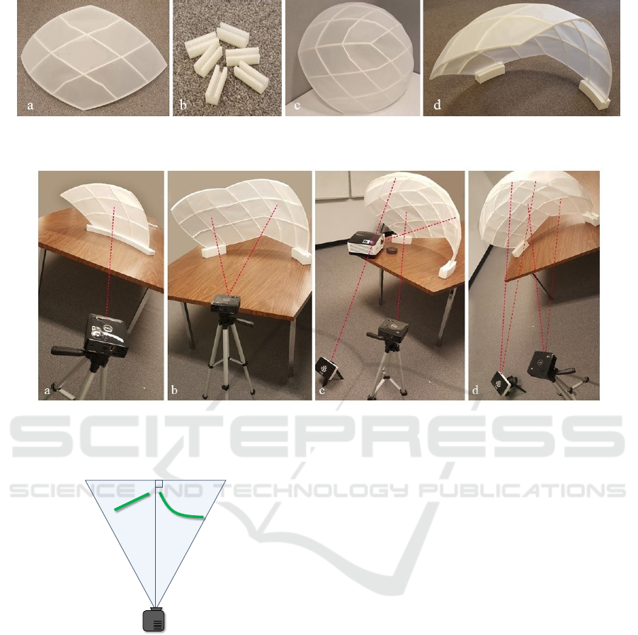
Figure 8: (a) Cell-panel with a three by three internal structure, covered with paper (b) Clips for attaching cell-panels (c) Final
curved-display after attaching cell-panels. (d) Final display surface with a stand.
Figure 9: Different projector / panel setups. (a) One projector on one panel covering 10% of the globe. (b) One projector on
two panels covering 20% of the globe. (c) Three projectors on three panels covering 30% of the globe. (d) Two projectors on
four panels covering 40% of the globe.
a
projector
b
Figure 10: Projecting onto an angled (a) or curved (b) sur-
face will cause the projected imagery to appear distorted.
To prevent distortion, we use the geometry of
curved cells (i.e. rhombus), as well as measurements
of the projector’s projection to adjust the imagery
(representing the data associated to the cell) before it
is projected. So that it will be positioned correctly on
the model. Sending the image without any wrapping
to compensate the curvature of the display, to the pro-
jector device could create extreme distortion on the
curved display. Therefore, we first need to warp the
image to cancel out the curvature of the display. The
geometry of the cell’s 3D model is the main tool for
finding the warp. To do this, we exactly recreate our
cell’s 3D model as well as the projector’s perspective
projection and the relative positions and orientations
of these two objects in a 3D rendering environment
(in our case, OpenGL). The rendered 2D image will
then, once projected onto the model, display the im-
agery correctly on the surface of the cell’s 3D model.
3.3.1 Modelling the Projection
We start from the assumption that our projector casts
imagery along a frustum. This may not precisely be
the case, particularly when at short distances from
short throw projectors utilizing wide angle lenses, but
in our experience it has been close enough to approx-
imately match the display surface well.
To recreate this frustum within a virtual environ-
ment we need to identify the projector’s projection pa-
rameters. We do this by measuring points on its frus-
tum. Ultimately, given that we work within OpenGL,
we need the following parameters: near plane top n
t
,
near plane bottom n
b
, near plane left n
l
, near plane
right n
r
, and the near plane distance D
n
from the cen-
ter of projection. We assume that the center of the
projection is the origin of our coordinate space.
To find these parameters we first ensure the pro-
IVAPP 2018 - International Conference on Information Visualization Theory and Applications
314
W
2
W
1
D
1
D
2
K
z
x
O
H
D
y
z
Figure 11: Top-down and side views of measuring a projec-
tor’s projection parameters.
jector is level perpendicular to a flat surface. We mea-
sure the distance from the front of the projector to the
surface D
1
and the width W
1
and height H
1
. The pro-
jectors we used cast their image above the projector
so we also measured the offset between an imaginary
vector perpendicular from the projector to the wall
and the bottom of the image O
1
(Figure 11). Then we
move the projector further from the wall and measure
these parameters again (D
2
,W
2
,H
2
,O
2
), D
2
> D
1
.
The main challenge at this point is that we do not
know the distance of each of these two planes from
the center of projection as this distance (let’s label
these d
1
and d
2
) will be somewhat different than D
1
,
and D
2
as within the projector neither the lens nor its
light source provide a clear singular, measurable cen-
tral point of projection.
So, we can calculate d
1
and d
2
using similar trian-
gles. That is, if we let k = D
2
− D
1
= d
2
− d
1
(Figure
11) then:
W
1
d
1
=
W
2
d
2
=
W
2
(d
1
+ k)
and solving for d
1
yields: d
1
=
kW
1
(W
2
−W
1
)
and d
2
= d
1
+
k.
When measuring, we choose D
1
and D
2
as rela-
tively large and far from the projector (i.e., 1-2 me-
tres) so our measurements would be as accurate as
possible. However in our virtual setting we want d
n
to
be much smaller than D
1
to avoid potential near clip-
ping in the 3D scene and so we chose a value roughly
d
n
=
1
10
D
1
. With a value for d
n
picked then by similar
triangles the near width W
n
, near height H
n
, and near
offset O
n
are:
W
n
=
d
n
W
1
d
1
H
n
=
d
n
H
1
d
1
O
n
=
d
n
O
1
d
1
.
So the frustum is defined by
(n
l
,n
r
,n
b
,n
t
,d
n
) = (−W
n
/2,W
n
/2,O
n
,O
n
+ H
n
,d
n
).
As we make use of three projectors, one for each
tile, if the projectors are different models, the above
parameters will have to be measured and calculated
separately for each projector.
3.3.2 Aligning the Virtual and Physical Models
The remaining challenge is to place the virtual surface
model in OpenGL to match the alignment of the pro-
jector and the cell-panel in the real world. In our set-
up, to minimize shadows created by the frame within
the Earth surface model we aim to place cell-panel
so that the center of each rhombus is as close as pos-
sible to being orthogonal to the center of projection.
Consequently, our initial alignment in the virtual en-
vironment is orthogonal to the center of projection.
Our software interface provides translation, scal-
ing as well as yaw, pitch, and roll controls to adjust
the virtual environment until a good match is found
with the physical environment.
Our alignment procedure is to place the physical
model and projectors such that the projected image
covers the entire rhombus and that the path between
the projector and cell-panel is not obscured by the
other projectors. Then the virtual model is adjusted;
first scale, translation, and roll so that the corners of
the projected imagery roughly align with the corners
of the cell-panel. Then pitch and yaw are modified
to exactly align the virtual shape with the physical.
Often some final fine-tuning of the scale and transla-
tion will be necessary to complete the alignment. This
procedure is independently repeated for each projec-
tor and corresponding rhombus.
4 RESULTS AND DISCUSSION
As proof of concept, we have created several setups,
each with multiple cell-panels. After fabricating each
cell-panel, we set up our curved-display and projec-
tors; for displaying our static and dynamic datasets
on each cell-panel. In each setup, we may need to at-
tach cell-panels (using clips see Figure 8, b). Then,
using the projector controller software, we align the
projected image with each cell panel. This normally
takes less than five minutes for each configuration
(see Figure 9). Notice that the first time setup may
take longer as determining the relative positions of
projectors and cell-panels usually needs some trial
and error.
Our first results are from a setup of three pro-
jectors and three panels (see Figure 9, c). Using
this setup we visualize a static dataset of elevation
data shown in Figure 12 a,. Also, a dynamic dataset
(i.e. the global temperature change from 2015 to
2050) (Pyxis, 2017) is presented in Figure 12 b. In
Figure 12 b, we have tried to capture details of the
setup from both outside and inside the curved-display.
This particular dataset is useful in examining potential
Area Preserving Dynamic Geospatial Visualization on Physical Globe
315
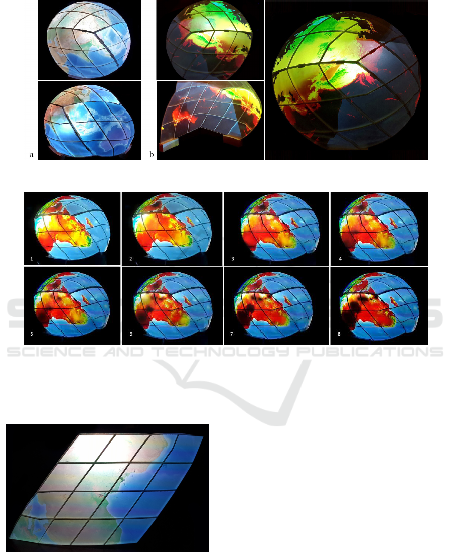
Figure 12: Representing various static and dynamic data sets on curved-display. (a) Elevation data. (b) global temperature
from 2015 to 2050.
Figure 13: Animation of dynamic visualization of Global temperature from 2015 to 2050 for Africa.
climate change effects and together with our display
installation allows an analyst (or a group of 3 − 4 an-
alysts) to study this dataset over 30% of the Earth’s
surface.
Figure 14: Data projection on one cell in resolution one,
showing elevation dataset.
Obviously, we can use each individual panel for
display dataset for each rhombus cell which covers
10% of the globe. Figure 13 shows the animation
that presents dynamic visualization of global warm-
ing frame by frame on one panel for Africa. This is
proof of the concept that the introduced framework
is useful for dynamic data visualization on curved-
displays.
Our second setup is two projectors and four cell-
panels (Figure 9, d). With this setup we can project
a dynamic geospatial dataset on 40% of the globe us-
ing two projectors. This setup can be extended to five
projectors and ten panels and cover the whole globe.
We have used this setup to visualize the global precip-
itation change (see supplementary video).
Further, we have fabricated cell-panels for larger
globe. Figure 14, shows the results of projecting data
on a cell-panel at resolution 2 (see Figure 2). This
cell presents 1/90 of the entire Earth. As it is shown
in this figure, the panel is more flat than the cells in
resolution zero.
Using our cell-based approach, it is possible to
compare far regions of the globe (e.g. Brazil and
India) side by side (see Figure 15). However, this
comparison is tedious for spherical displays such as
SOS (SOS, 2004).
IVAPP 2018 - International Conference on Information Visualization Theory and Applications
316
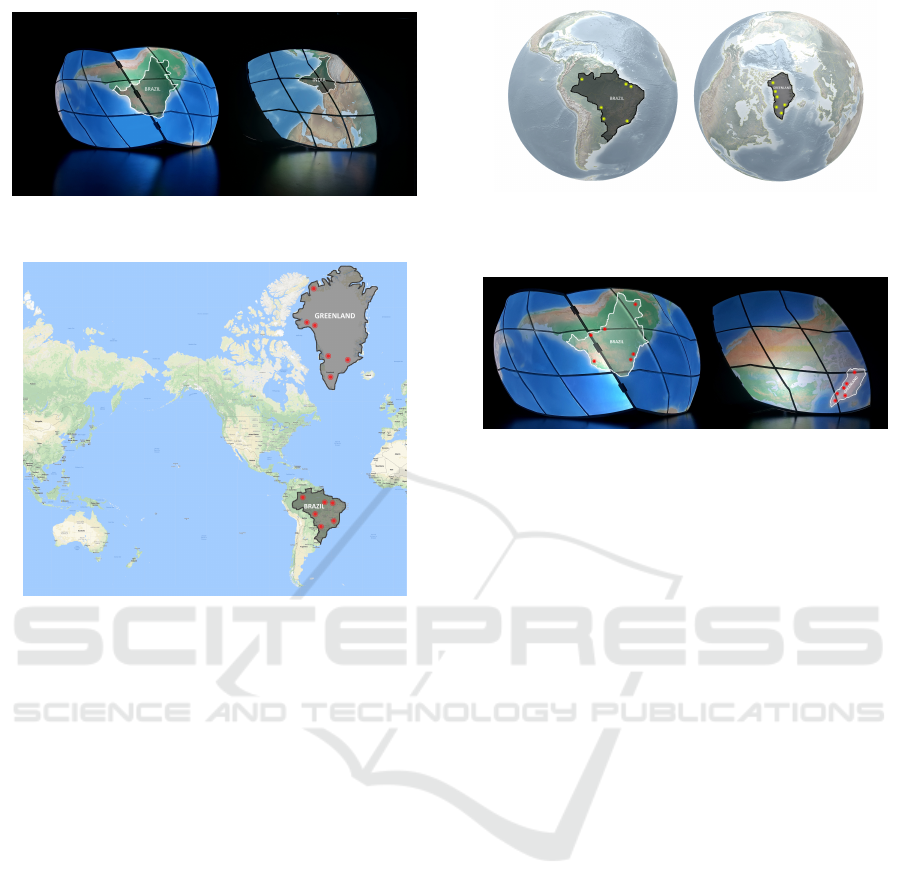
Figure 15: Using the piecewise nature of our framework,
we can compare India and Brazil side by side.
Figure 16: Visualizing earthquake incidents in Brazil and
Greenland on the world 2D Google map.
As mentioned in the Introduction, one of the
unique features of our method is the use of area pre-
serving projection. Projecting from the surface of the
Earth to 2D maps could create extreme area distor-
tion. Figure 16 shows an example of Mercator maps
used in common map software. In this Figure, Green-
land and Brazil are highlighted. Although in this map
Brazil seems smaller than Greenland, in reality it is
four times larger than this island (see Figure 17).
This area distortion creates misinterpretation and
potentially wrong visual analysis. For example if we
visualize the number and locations of recent earth-
quakes, it seems, that Greenland has a lower risk of
earthquakes, which is not correct. Figure 18 shows
the visualization of earthquake incidents in Greenland
and Brazil projected on one of our setups.
5 CONCLUSION AND FUTURE
WORKS
In this paper we introduced a DIY method for creat-
ing physical globe a a curved-display for projecting
geospatial dataset. Our method is flexible and relies
on off-the-shelf tools with easy installation process.
Figure 17: Visualizing earthquake incidents in Brazil and
Greenland on a digital model of the globe from Pyxis World
View Studio.
Figure 18: projecting Brazil and Greenland on the curved
display with more realistic sizes. Earthquake incidents vi-
sualizations have been.
We employ DGGS (Pyxis) for decomposing the Earth
to the uniformly sized cells. This system is also used
for access many geospatial datasets. Finally, we de-
veloped a projector controller that takes the geometry
and data of cells and adjusts it for the projector.
There are several directions to extend this work.
One natural direction is to create a setup for entire
globe. Also, improving the design of cell-panels such
that the shadow effect could be reduced.
ACKNOWLEDGEMENT
This work was supported in part by the Natural Sci-
ences and Engineering Research Council of Canada
(NSERC) and PYXIS Innovation. Also, we would
like to thank Mark Sherlock for his help in preparing
dynamic datasets for this project.
REFERENCES
Djavaherpour, H., Mahdavi-Amiri, A., and Samavati,
F. F. (2017). Physical visualization of geospatial
datasets. IEEE Computer Graphics and Applications,
38(3):61–69.
Goodchild, M. F. and Shiren, Y. (1992). A hierarchical spa-
tial data structure for global geographic information
systems. CVGIP: Graphical Models and Image Pro-
cessing, 54(1):31–44.
Gorski, K. M., Hivon, E., Banday, A., Wandelt, B. D.,
Hansen, F. K., Reinecke, M., and Bartelmann, M.
Area Preserving Dynamic Geospatial Visualization on Physical Globe
317

(2005). Healpix: a framework for high-resolution dis-
cretization and fast analysis of data distributed on the
sphere. The Astrophysical Journal, 622(2):759.
Grafarend, E. (1995). The optimal universal transverse mer-
cator projection. In Geodetic Theory Today, pages 51–
51. Springer.
Gruen, A. (2012). Satellite versus aerial images–not always
a matter of choice. GEOInformatics, The Netherlands,
15:44.
Hruby, F., Kristen, J., and Riedl, A. (2008). Global sto-
ries on tactile hyperglobes–visualizing global change
research for global change actors. Proceedings, Digi-
tal Earth Summit on Geoinformatics: Tools for Global
Change Research, Potsdam, Germany.
Mahdavi-Amiri, A., Alderson, T., and Samavati, F. (2015a).
A survey of digital earth. Computers & Graphics, 53,
Part B:95 – 117.
Mahdavi-Amiri, A., Harrison, E., and Samavati, F. (2016).
Hierarchical grid conversion. Computer-Aided De-
sign, 79:12 – 26.
Mahdavi-Amiri, A., Samavati, F., and Peterson, P. (2015b).
Categorization and conversions for indexing methods
of discrete global grid systems. ISPRS International
Journal of Geo-Information, 4(1):320–336.
Meng, L. (2003). Missing theories and methods in digital
cartography. In 21st International Cartographic Con-
ference, pages 1887–18.
Murphy, D. (2009). Software: Omnisphere. ID (New York,
NY), 56(3):87.
NOAA (2014). National oceanic and atmospheric adminis-
tration. http://www.noaa.gov/.
Peterson, P. (2006). Close-packed, uniformly adjacent,
multiresolutional, overlapping spatial data ordering.
http://www.google.com/patents/EP1654707A1?cl=en.
EP Patent App. EP20040761671.
Purss, M. B., Gibb, R., Samavati, F., Peterson,
P., and Ben, J. (2016). The ogc
R
dis-
crete global grid system core standard: A
framework for rapid geospatial integration.
http://www.opengeospatial.org/projects/groups/dggsswg.
Pyxis (2017). the pyxis innovation inc.
https://www.pyxisinnovation.com/Products/Studio.
Randall, D. A., Ringler, T. D., Heikes, R. P., Jones, P.,
and Baumgardner, J. (2002). Climate modeling with
spherical geodesic grids. Computing in Science & En-
gineering, 4(5):32–41.
Sahr, K., White, D., and Kimerling, A. J. (2003). Geodesic
discrete global grid systems. Cartography and Geo-
graphic Information Science, 30(2):121–134.
SCENZGrid (2010). Solid earth and environment grid.
https://www.seegrid.csiro.au/wiki/SCENZGrid/WebHome.
Schollaert Uz, S., Ackerman, W., O’Leary, J., Culbertson,
B., Rowley, P., and Arkin, P. A. (2014). The effective-
ness of science on a sphere stories to improve climate
literacy among the general public. Journal of Geo-
science Education, 62(3):485–494.
Sherlock, M., Hasan, M., and Samavati, F. (2016). Inter-
active data styling and multifocal visualization for a
view-aware digital earth. Technical report, University
of Calgary.
Snyder, J. P. (1992). An equal-area map projection for
polyhedral globes. Cartographica: The International
Journal for Geographic Information and Geovisual-
ization, 29(1):10–21.
Snyder, J. P. (1997). Flattening the earth: two thousand
years of map projections. University of Chicago Press.
SOS (2004). Science on a Sphere.
https://sos.noaa.gov/What-is-SOS/.
USA, B. (2014). Bumat clear pla filament 1.75mm / 2.2
lbs. http://www.bumatusa.com/products/bumat-clear-
pla-filament-1-75mm-2-2-lbs/.
Vega, K., Wernert, E., Beard, P., Gniady, C., Reagan,
D., Boyles, M., and Eller, C. (2014). Visualization
on spherical displays: Challenges and opportunities.
Proceedings of the IEEE VIS Arts Program (VISAP),
pages 108–116.
Xie, J., Yu, H., and Ma, K.-L. (2013). Interactive ray cast-
ing of geodesic grids. In Computer Graphics Forum,
volume 32, pages 481–490. Wiley Online Library.
Zolfagharifard, E. (2014). Why every world map you’re
looking at is wrong: Africa, china and india are dis-
torted despite access to accurate satellite data.
IVAPP 2018 - International Conference on Information Visualization Theory and Applications
318
