
Mirroring Sankey Diagrams for Visual Comparison Tasks
Zana Vosough
1
, Dietrich Kammer
2
, Mandy Keck
2
and Rainer Groh
2
1
SAP SE, Germany
2
Technische Universit
¨
at Dresden, Germany
Keywords:
Information Visualization, Interaction Techniques, Sankey Diagrams, Comparison Tasks, Product Costing.
Abstract:
Complex data sets require suitable information visualizations. With the rapidly increasing amount and com-
plexity of data, the need for suitable interaction techniques to perform various data analyzing tasks is also
growing. Flow diagrams are a powerful tool to understand the structure in hierarchical data sets. In many ap-
plication scenarios, there is a need to quickly understand all facets in the data and compare different versions
to make executive decisions. In order to illustrate our concepts, we selected Product Lifecycle Costing as
application domain in which comparison tasks play an important role. On the one hand, an effective compar-
ison of different versions needs to be visually presented to the user. On the other hand, different dimensions
of the components need to be considered. We propose a mirroring method with the appropriate interaction
techniques based on Sankey diagrams that address both issues.
1 INTRODUCTION
Many real data sets have hierarchical structures.
There has been a large amount of research on dif-
ferent ways to visualize hierarchical data. While in-
formation visualization tools are used widely for un-
derstanding single hierarchies, they are also used for
comparison of two or multiple tree structures. Infor-
mation visualization is crucial for comparison tasks
that are relevant in many domains such as biology,
software systems, medicine, or social science (Mun-
zner et al., 2003; Holten and Van Wijk, 2008; Vrot-
sou et al., 2009; Procter et al., 2010). However, most
research on comparison solutions only provides spe-
cific strategies that can be applied to individual prob-
lems. Especially for varying data sets with different
sizes and complexities, existing solutions can not be
re-used and new general tools for comparison tasks
are needed.
The presented research is part of a project at SAP
SE with the purpose of finding new data visualizations
for SAP Product Lifecycle Costing (PLC), which is
a standard business intelligence (BI) solution. Simi-
lar to other BI applications, the user interface of the
application is a spreadsheet environment. Although
numerous visualization tools have been built helping
analysts to extract meaning and understand relation-
ships in their data sets, there is still a lack of research
in the visual presentation. The available visualization
methods do not possess the expressive power needed
to match the complexity of current data and analytic
questions in BI applications.
This shows the demand to introduce visualizations
that support these analyses by providing an interactive
graphical access to those aspects of lifecycle costing
that can hardly be captured in a tabular display, such
as costing dependencies, the hierarchical compound-
ing of costs, or version comparison tasks.
Comparison of two individual hierarchies or com-
parison of multivariate or dynamic graphs (Andrews
et al., 2009) are critical tasks for users. This paper
proposes a solution that can be used for comparing a
graph using two different structures or a graph from
two points in time. We first describe the research con-
text and the problem domain. Next, the visualization
concept that can be applied to two task types from
the problem domain is presented. Lastly, we conclude
with a set of guidelines for future research directions.
2 RELATED WORK
Different taxonomies are suggested for comparison
solutions, for instance, Graham and Kennedy inves-
tigated suitable task areas for different tree visualiza-
tions, varying from single trees to pair trees and mul-
tiple trees (Graham and Kennedy, 2010). Pang et al.
reported the importance of comparative visualization
for fluid dynamics data and some possible solutions
Vosough, Z., Kammer, D., Keck, M. and Groh, R.
Mirroring Sankey Diagrams for Visual Comparison Tasks.
DOI: 10.5220/0006651203490355
In Proceedings of the 13th International Joint Conference on Computer Vision, Imaging and Computer Graphics Theory and Applications (VISIGRAPP 2018) - Volume 3: IVAPP, pages
349-355
ISBN: 978-989-758-289-9
Copyright © 2018 by SCITEPRESS – Science and Technology Publications, Lda. All rights reserved
349

(Verma and Pang, 2004). Gleicher et al. propose a
general taxonomy based on a design strategy for vi-
sual comparison that categorizes all designs of com-
parative visualization in three basic categories, which
can also be combined (Gleicher et al., 2011). Our
focus in this paper is on the comparison of two hier-
archical information structures using a juxtaposition
approach.
There are three common ways to represent tree
structures: explicit representations such as node-link
representations (Battista et al., 1998), Radial trees
(Battista et al., 1998), or Sankey Diagrams (Schmidt,
2008) that represent relations between nodes by lines
or ribbons connecting them. Implicit or space-filling
representations use parent nodes enclosing their child
nodes such as TreeMap (Johnson and Shneiderman,
1991) or Icicle Plot (Kruskal and Landwehr, 1983).
Finally, hybrid approaches combine explicit and im-
plicit representations like Elastic hierarchies (Zhao
et al., 2005) or SHriMP (Storey and Muller, 1995).
Some of the above mentioned visualization solu-
tions are used in different ways for comparing hier-
archical structures. The task of comparing multiple
trees has been solved either by using these common
tree representations and extending them in a way that
they can be used not only for exploration tasks but
also for comparing two or more tree structures or by
designing completely new visualizations for specific
scenarios like ActiviTree (Vrotsou et al., 2009) and
Multiple Trees through DAG Representations (Gra-
ham and Kennedy, 2007).
There are different visualization solutions avail-
able to extend the explicit presentations of trees, for
instance, Contrast Treemaps (Tu and Shen, 2007) or
Generalized Treemaps (Vliegen et al., 2006) extend
Treemaps for visual comparison tasks. Furthermore,
other approaches are designed with implicit represen-
tations such as Hierarchical Edge Bundles that show
the relationships between trees by extending Icicle
Plots (Holten, 2006).
In this paper, we propose a new solution to extend
another explicit representation, Sankey Diagrams for
comparison of two tree structures.
3 SCENARIOS
In this section, we describe the research context and
select two comparison tasks that are addressed in this
contribution.
3.1 Background
SAP Product Lifecycle Costing (PLC) for SAP S/4
HANA is a solution to calculate costs for new prod-
ucts and generate quotations. The software helps
to quickly identify cost drivers and to easily simu-
late and compare alternatives. PLC was developed in
close collaboration with more than 30 co-innovation
customers over a period of four years. A research
project at SAP SE seeks to find new data visualiza-
tions for this standard BI solution (Vosough et al.,
2017a). The current interface is a spreadsheet en-
vironment, which is typical for conducting lifecycle
cost analyses in business intelligence applications.
Different user studies on current visualization
practices, customer visualization tasks, and character-
istics of the visualized data were conducted to under-
stand the user requirements for a new data visualiza-
tion. After two rounds of group discussions with 30
customers from 16 companies, four main tasks were
prioritized.
• T1: Recognition of deviation between calculation
and defined cost target and identification of as-
semblies that are above or below target cost.
• T2: Identification of the main cost drivers by
comparing multiple cost calculations with each
other.
• T3: Determination of incomplete or inconsistent
cost calculations.
• T4: Assessment of the reliability of the overall
cost calculated from price sources with different
confidence levels.
During the requirement engineering phase, two
data visualizations were introduced to support these
tasks: Treemaps and Sankey diagrams. Both pro-
totypes were evaluated in an informal setting at two
customer workshops and Sankey diagrams were pre-
ferred by customers of the project (see (Vosough
et al., 2017a)). Building upon this work, this re-
search extends Sankey diagrams to solve more com-
plex tasks. The proposed mirroring techniques ad-
dress T1 and T2 while T3 and T4 are the concern of
further research.
3.2 Problem Statement
As described in the previous section, one of the chal-
lenges that customers of the project are dealing with,
is to find the main cost drivers by comparing multiple
cost calculations with each other. Users need to gauge
the impact of adding or removing individual items or
IVAPP 2018 - International Conference on Information Visualization Theory and Applications
350
Table 1: Industrial pump with different dimensions of components.
Structure 1 Structure 2
Level Item Name Cost Country Company Code
1 Pump P-100 20.200 - -
2 Casing 8000 - -
3 TCD (setup) 826 USA #CC2
3 TCD (machine) 1888 USA #CC1
3 Slug for casing 921 Germany #CC11
2 Pick-pick list 1496 - -
3 Turn shaft-specification 621 USA #CC2
assemblies on the overall costs. This challenge con-
cerning the costing data can be addressed by two in-
dividual tasks.
3.2.1 Structure Comparison (T1)
The costing data structure is hierarchical and multi-
dimensional, since the overall product cost is the sum
of the sub-part costs, raw materials, and associated ac-
tivities. In addition, the total cost can be broken down
based on different dimensions such as cost component
split, material types, countries of origin, maturity lev-
els, cost centers, plans, or weight. Table 1 shows se-
lected data from an industrial pump and its different
dimensions such as component split and country of
origin.
Complete data sets also provide company codes
for each country and cannot be handled appropriately
by the current spreadsheet user interface. Showing
the cost impacts of each company code or country
along with the whole data structure is not possible,
but would be extremely helpful for customers in or-
der to leverage the information contained in their data
structures.
3.2.2 Version Comparison (T2)
One product calculation consists of several versions.
These calculation versions (CV) are used to take dif-
ferent scenarios into account, so that the cost devel-
opment of a product can be projected into the fu-
ture and factored into the analysis. Cost of an item
changes over time for different reasons, such as im-
pact of learning curves, currency fluctuation, gover-
nance laws, commodity price changes, or inflation
rates. Table 2 shows the same example from Table 1
with the first structure, but from two different points
in time. It represents how the cost of casing and pick-
pick list in the second level change based on the cost
of their sub-items. Moreover, new items might be
added or removed from the cost structure.
The next section describes our visualization con-
cept that supports end-users to perceive and under-
Table 2: Two versions and associated costs of an industrial
pump.
Version 1 Version 2
Level Item Name Cost Cost
1 Pump P-100 20.200 19.400
2 Casing 8000 7.300
3 TCD (setup) 826 826
3 TCD (machine) 1888 1188
3 Slug for casing 921 921
2 Pick-pick list 1496 1596
3 Mill groove - 190
stand these two characteristics of the costing data
more effectively.
4 VISUALIZATION DESIGN
Based on the customer feedback reported above, our
research focuses on using Sankey diagrams to visual-
ize costing data. Sankey diagrams are flow diagrams
that emphasize quantities in a data set (Riehmann
et al., 2005). The thickness of the links (flows) be-
tween the items (rectangular nodes) shows their quan-
tity, which corresponds to the cost of a component in
our solution. Hence, on the very right side, singular
components are displayed and their cost is subsumed
in component groups to the left. Sankey diagrams
can be created with multiple levels of connections and
facilitate finding items that dominantly contribute to
the total product cost. Sankey diagrams are particu-
larly suitable for understanding how a data structure
is composed and for understanding relationships be-
tween elements (Schmidt, 2008).
In order to solve the two main user tasks out-
lined earlier, we considered different comparison so-
lutions that leverage the strength of Sankey diagrams
to show many-to-many mappings between two do-
mains or multiple paths through a set of stages. Our
solution is designed to keep the parent nodes or the
leaf nodes of two costing structures in the middle and
then visualize the complete structures on both sides.
Mirroring Sankey Diagrams for Visual Comparison Tasks
351
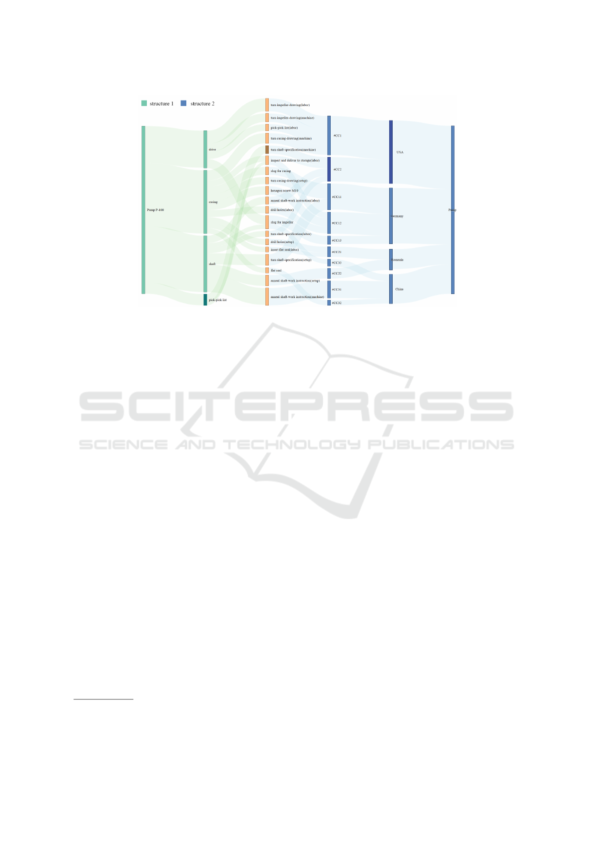
Figure 1: Visualizing a costing data structure with two facades with Sankey diagrams. The data is structured on left side
(green) based on cost component split and on the right side (blue) based on location. Parents node of the selected component
are shown by highlighted bars.
In the following, we explain each solution in more de-
tails. All visualization prototypes were implemented
in JavaScript using jQuery
1
and the visualization li-
brary D3
2
and the color of choice for dimensions are
from the ColorBrewer website (Harrower and Brewer,
2003).
4.1 Structure Comparison Task (T1)
The first task addresses the problem that each cost cal-
culation can be composed based on different criteria,
which results in different hierarchical data structures.
In the typically used spreadsheets, hidden relation-
ships between different structures can not be captured.
The challenge is to find a visualization that can help
with extracting this information.
Finding an appropriate visualization for a single
hierarchical graph is not an easy task, however, when
comparing two graphs this task becomes even more
difficult. One problem is that users need to per-
ceive the relationship both within one graph and be-
tween two graphs. Gleicher describes three main tax-
onomies of visual design for comparison: juxtaposi-
tion, superposition and explicit encoding. Also, the
three designs can be combined to create hybrid solu-
tions that benefit from features of two solutions (Gle-
icher et al., 2011). Juxtaposition is a simple solu-
tion that puts different objects next to each other. It
is a simple approach but not always efficient as it re-
1
https://jquery.com/, retrieved on 13.03.2017
2
https://d3js.org/, retrieved on 13.03.2017
quires more space and relies on the user’s memory to
build the connection between objects. Superposition
works by overlaying objects on top of each other, and
explicit encoding computes and directly shows rela-
tionships between objects.
Superposition is not a practical solution for
Sankey diagrams, since the data structures are totally
different for each scenario and overlaying prevents
users from seeing relationship both within and be-
tween two graphs. A solution to avoid visual clutter-
ing is to show only differences between two super-
imposed diagrams, however, showing the hierarchy
is important for costing data and with this approach
information is lost. Moreover, the leaf nodes on the
costing graphs stay consistent and only the items in
the middle levels and subsequently the parent node
change.
We designed a Sankey diagram that keeps the
leaf nodes in the middle and placed two structures
on both sides (mirroring around leaf items). With
this solution, both the tree structures and the rela-
tionship between different items are preserved. How-
ever, we save space by visualizing the leaf nodes that
are the dominant items in the costing data structure
only once. In addition, the problem of too much in-
formation to remember for users is mitigated, since
the items have connections and recognizing relation-
ships between them becomes easier. This is further
facilitated by adding supportive interaction methods.
Figure 1 shows one example of an industrial pump
that has two dimensions, cost component split and lo-
cation. The leaf nodes are represented in the middle
IVAPP 2018 - International Conference on Information Visualization Theory and Applications
352
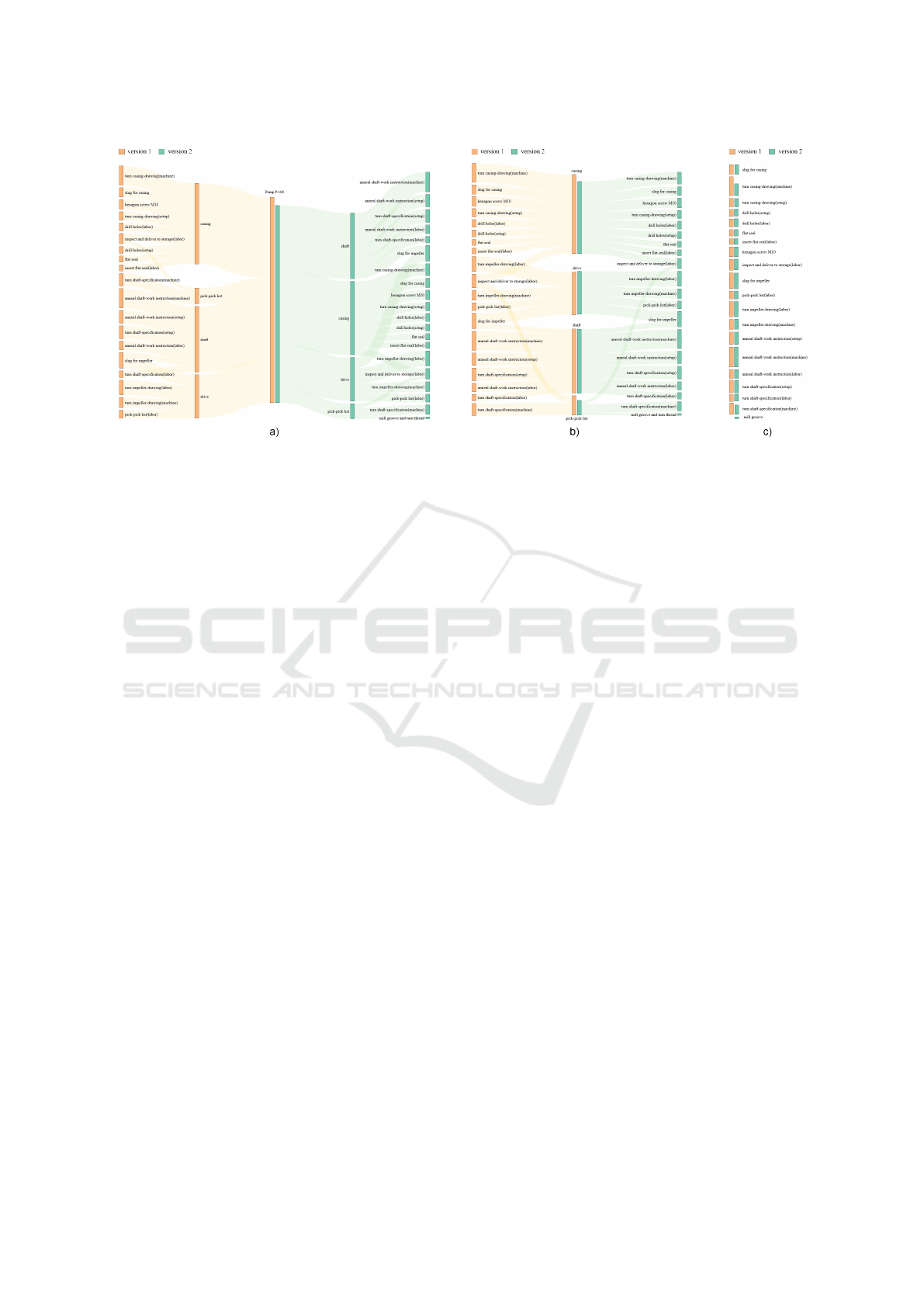
Figure 2: Visualizing two cost calculation versions with Sankey diagrams. Version 1 is shown on the left side (orange), and
version 2 on the right side (green). It shows a comparison between the items on, a) the first level, b) the second level, and c)
the third level, close to each other along with their sub-items.
with a different color (orange) in order to better distin-
guish between component split structures on the left
(green) and location on the right (blue).
Interaction techniques are a pivotal tool to en-
hance visual comparison. One common solution in
the domain of information visualization is visual fil-
tering using highlighting, described by Becker et al.
as brushing with a special color to paint an object
(Becker and Cleveland, 1987). In order to assist the
comparison task, we use common brushing interac-
tion to establish connections between related compo-
nents. By hovering an item with the mouse, the cor-
responding parents are highlighted and it is easily ob-
servable to which components this item belongs and
where it originates. Furthermore, the relationships be-
tween the middle levels can be inspected by hovering
with the mouse. For instance, when hovering the cas-
ing item (second level left), the companies and coun-
tries that this component mainly originates from are
highlighted. These interaction techniques play an im-
portant role to enhance the visual understanding of
hidden relationships in costing data.
4.2 Version Comparison Task (T2)
As described in the ”Problem Statement”, the sec-
ond task is about analyzing the changes in structure
within the costing data over time. This comparison
task has different data characteristics. In this task,
two changes can occur, the data structure stays con-
sistent and the item costs change slightly or few items
can be added or removed in the data structures. Beck
et al. distinguish between animation and timeline for
dynamic graph visualization techniques (Beck et al.,
2014). Within the timeline category, juxtaposed, su-
perimposed and integrated approaches can be consid-
ered for node-link structures. In the integrated ap-
proaches, the graphs are interlinked and cannot be
separated, which is not a suitable solution for our
problem. First, superimposing for comparing two
calculated versions was considered. The structures
of two version were stacked on top of each other
with different color codes. From the result we con-
cluded that superposition is not suitable for ribbon
flows, since the visualization becomes extremely clut-
tered and unintelligible. Another possible solution is
switching between two versions of the same diagram.
A fast prototype was implemented to switch in a cer-
tain interval between two images of Sankey diagrams.
The arrangement of the items proved to be a problem
in this approach. Sankey diagrams use different tech-
niques to arrange the items. For instance, in our solu-
tion items are arranged based on their size (cost), but
this can change in different versions as the item val-
ues change. Although research shows that timeline
approaches provide better analysis instead of anima-
tions (Tversky et al., 2002).
Finally, the solution was designed by placing two
data structures (versions) next to each other, since
juxtaposition was the preferred solution. In contrast
to the structure comparison task, the parent item is
placed in the middle and the sub-items of both struc-
tures are arranged around them (mirroring around par-
ent items). The rationale behind this design is that
users usually want to identify the differences between
the total costs at the first glance. By putting the par-
ent nodes (bars) close to each other, this comparison
becomes easier (see Figure 2).
Mirroring Sankey Diagrams for Visual Comparison Tasks
353

As the values of other items cannot be easily com-
pared, especially when the differences are small, ap-
plying proper data abstraction is necessary. There are
different solutions available to visualize comparison
of complex data that decrease the complexity by ab-
stracting the data (Amenta and Klingner, 2002). In
this work, for a more accurate comparison, the levels
of interest can be clicked and thus placed next to each
other. The resulting image is similar to a simple bar
chart containing two bars, which is easier and faster to
interpret. By double clicking on the levels in the mid-
dle, the graph is unfolded and switches to the initial
view. Although this strategy follows the juxtaposi-
tion strategy, due to the interaction with the different
views, it still conveys the feeling that the images are
overlaid (Roberts, 2004).
Figure 2 shows an example of two versions of a
cost calculation for an industrial pump from different
points in time. The first version represents the items
on the left side in orange and the second version on
the right side in green. In the first picture (a) all items
are presented and it can be immediately seen that the
total cost decreases over time. By hovering each item
with the mouse, additional information such as the ex-
act price and relative price are shown in a tooltip. By
clicking on any item on the second level, the graph is
folded and items on the second level are moved next
to each other (b). Subsequently, by clicking on any
item from the third level, those items are moved next
to each other (c). By double clicking anywhere on
the screen, the visualization switches back to the first
view and shows all items again (a).
4.3 Discussion and Limitations
Although the concepts and design decisions have
been made based on customer interviews and work-
shops, the presented mirroring techniques have not
yet been evaluated in a formal setting. Since the
presented research is still work-in-progress, different
variations could be compared for their effectiveness in
a user study. There are some limitations with regard
to the readability of the labels on the nodes when the
number of components becomes exceedingly high.
In that case, zooming or details-on-demand could be
used.
Another key challenge in comparison tasks is
dealing with scalability. It involves both the complex-
ity of the tree and the number of trees to be compared.
These could be considered as one of the limitation
of our current solution to represent complex trees or
more than two hierarchy structures.
5 CONCLUSIONS AND FUTURE
WORK
In this paper, we presented two Sankey based visu-
alizations along with an interaction concept to facil-
itate two specific comparison tasks. Both visualiza-
tions are based on a juxtaposition approach and con-
nect two Sankey diagrams by putting either the parent
or leaf nodes in the center of the visualization.
We focused on methods to compare two complex
graphs, but this work can be extended to multiple
graphs, since both scenarios contain more than two di-
mensions. One approach would be connecting many
Sankey diagrams on the horizontal axis and pan left
and right to see the different versions. Another idea
to enhance the visual perception is to add more vi-
sual components to make the comparison tasks easier.
For instance, one approach is to use color codes to
indicate the changes in the data structure over time.
When item costs increase, this can be indicated by
a red color and when it decreases by green to help
the user with processing the positive and negative
changes. This visual feature can be applied both on
ribbon flows or bars in Sankey diagrams (Vosough
et al., 2016; Vosough et al., 2017b).
ACKNOWLEDGEMENTS
We thank all members and customers of SAP Product
Lifecycle Costing for contributing their experiences
and sharing input on different parts of this research
with us.
REFERENCES
Amenta, N. and Klingner, J. (2002). Case study: Visual-
izing sets of evolutionary trees. In Information Visu-
alization, 2002. INFOVIS 2002. IEEE Symposium on,
pages 71–74. IEEE.
Andrews, K., Wohlfahrt, M., and Wurzinger, G. (2009).
Visual graph comparison. In Information Visualisa-
tion, 2009 13th International Conference, pages 62–
67. IEEE.
Battista, G. D., Eades, P., Tamassia, R., and Tollis, I. G.
(1998). Graph drawing: algorithms for the visualiza-
tion of graphs. Prentice Hall PTR.
Beck, F., Burch, M., Diehl, S., and Weiskopf, D. (2014).
The state of the art in visualizing dynamic graphs. Eu-
roVis STAR, 2.
Becker, R. A. and Cleveland, W. S. (1987). Brushing scat-
terplots. Technometrics, 29(2):127–142.
Gleicher, M., Albers, D., Walker, R., Jusufi, I., Hansen,
C. D., and Roberts, J. C. (2011). Visual comparison
IVAPP 2018 - International Conference on Information Visualization Theory and Applications
354

for information visualization. Information Visualiza-
tion, 10(4):289–309.
Graham, M. and Kennedy, J. (2007). Exploring multiple
trees through dag representations. IEEE transactions
on visualization and computer graphics, 13(6):1294–
1301.
Graham, M. and Kennedy, J. (2010). A survey of mul-
tiple tree visualisation. Information Visualization,
9(4):235–252.
Harrower, M. A. and Brewer, C. A. (2003). Col-
orBrewer.org: An online tool for selecting color
schemes for maps. The Cartographic Journal,
40(1):27–37.
Holten, D. (2006). Hierarchical edge bundles: Visualiza-
tion of adjacency relations in hierarchical data. IEEE
Transactions on visualization and computer graphics,
12(5):741–748.
Holten, D. and Van Wijk, J. J. (2008). Visual comparison
of hierarchically organized data. In Computer Graph-
ics Forum, volume 27, pages 759–766. Wiley Online
Library.
Johnson, B. and Shneiderman, B. (1991). Tree-Maps: A
space-filling approach to the visualization of hierar-
chical information structures. In Nielson, G. M. and
Rosenblum, L., editors, Proceedings of the IEEE Con-
ference on Visualization, pages 284–291. IEEE.
Kruskal, J. B. and Landwehr, J. M. (1983). Icicle plots: Bet-
ter displays for hierarchical clustering. The American
Statistician, 37(2):162–168.
Munzner, T., Guimbreti
`
ere, F., Tasiran, S., Zhang, L., and
Zhou, Y. (2003). Treejuxtaposer: scalable tree com-
parison using focus+ context with guaranteed visibil-
ity. In ACM Transactions on Graphics (TOG), vol-
ume 22, pages 453–462. ACM.
Procter, J. B., Thompson, J., Letunic, I., Creevey, C.,
Jossinet, F., and Barton, G. J. (2010). Visualization
of multiple alignments, phylogenies and gene family
evolution. Nature methods, 7:S16–S25.
Riehmann, P., Hanfler, M., and Froehlich, B. (2005). In-
teractive Sankey diagrams. In Stasko, J. and Ward,
M. O., editors, Proceedings of the IEEE Symposium
on Information Visualization, pages 233–240. IEEE.
Roberts, J. C. (2004). Exploratory visualization with multi-
ple linked views.
Schmidt, M. (2008). The sankey diagram in energy and ma-
terial flow management. Journal of industrial ecology,
12(1):82–94.
Storey, M.-A. and Muller, H. A. (1995). Manipulating and
documenting software structures using shrimp views.
In Software Maintenance, 1995. Proceedings., Inter-
national Conference on, pages 275–284. IEEE.
Tu, Y. and Shen, H.-W. (2007). Visualizing changes of hi-
erarchical data using treemaps. IEEE Transactions on
Visualization and Computer Graphics, 13(6):1286–
1293.
Tversky, B., Morrison, J. B., and Betrancourt, M. (2002).
Animation: can it facilitate? International journal of
human-computer studies, 57(4):247–262.
Verma, V. and Pang, A. (2004). Comparative flow visual-
ization. IEEE Transactions on Visualization and Com-
puter Graphics, 10(6):609–624.
Vliegen, R., Van Wijk, J. J., and van der Linden, E.-J.
(2006). Visualizing business data with generalized
treemaps. IEEE Transactions on visualization and
computer graphics, 12(5):789–796.
Vosough, Z., Groh, R., and Schulz, H.-J. (2017a). On es-
tablishing visualization requirements: A case study in
product costing. In Eurographics Conference on Vi-
sualization (EuroVis) : Short Papers, page to appear.
The Eurographics Association.
Vosough, Z., Kammer, D., Keck, M., and Groh, R. (2017b).
Visualizing uncertainty in flow diagrams: a case study
in product costing. In Proceedings of the 10th Inter-
national Symposium on Visual Information Communi-
cation and Interaction, pages 1–8. ACM.
Vosough, Z., Walther, M., Rode, J., Hesse, S., and Groh, R.
(2016). Having fun with customers: Lessons learned
from an agile development of a business software.
In Stakeholder Involvement in Agile Development -
Workshop at ACM NordiCHI 2016, NordiChi. ACM.
Vrotsou, K., Johansson, J., and Cooper, M. (2009). Ac-
tivitree: interactive visual exploration of sequences
in event-based data using graph similarity. IEEE
Transactions on Visualization and Computer Graph-
ics, 15(6):945–952.
Zhao, S., McGuffin, M. J., and Chignell, M. H. (2005).
Elastic hierarchies: Combining treemaps and node-
link diagrams. In Information Visualization, 2005.
INFOVIS 2005. IEEE Symposium on, pages 57–64.
IEEE.
Mirroring Sankey Diagrams for Visual Comparison Tasks
355
