
ONKOVIS, Co-designed Oncology Follow-up Visualisation Tool
Mikel Garmendia
1
,
Gorka Epelde
1
, Beñat Zabala
1
, Aurora Sucre
1
, Arantxa Etxeberria
2
,
Gerardo Cajaraville
2
, Jon Belloso
2
, José Fernando Luengo
3
and Soraya Camarero
3
1
Vicomtech, Mikeletegi Pasealekua, 57, 20009, Donostia-San Sebastian, Spain
2
Onkologikoa Foundation, Doctor Begiristain Pasealekua, 121, 20014, Donostia-San Sebastián, Spain
3
Dominion, Ibáñez de Bilbao Kalea, 28, 48009 Bilbao, Spain
{maetxeberria, gcajaraville, jbelloso}@onkologikoa.org, {fernando.luengo, soraya.camarero}@dominion-global.com
Keywords: Co-design, Medical Oncology, Aligned Visualisation, Heterogeneous Data Sources.
Abstract: This paper presents a medical oncology follow-up visualisation tool developed following a co-design
approach. The co-design and development of the solution has succeed involving a team of end-users
(oncologists and nurses), UX and design experts and technology development experts. As a result, a medical
oncology follow-up visualisation solution has been developed showing temporally aligned heterogeneous
health data. The outcome of the co-design process has been to develop the solution in four different
aggregation level views; (1) General timeline overview, (2) Medication treatment cycle view, (3) Detailed
patient reported outcome / bloodwork’s’ view and (4) Medical image analysis focussed view.
1 INTRODUCTION
In recent years, the practice of medical oncology has
evolved with new treatments and technology that
have improved the prognosis of patients. However, as
a result of different factors as for example the aging
of the population or an increasingly earlier detection,
the number of total cases has not only remained but
increased for certain types of cancer. As a
consequence, the assistance pressure for oncologists
has been augmented.
The follow-up information on the patient’s
evolution handled by oncologists can be classified
into four categories: Diagnostic, toxicological effects
of the treatment, symptoms and treatment
information. In general, they do not have an integral
vision of the case, since these data come from
different information sources. Furthermore, the
information on symptoms and toxicology is
incomplete and is based on the patient’s testimony
over a long period of time. Neither is adherence
information available if the treatment is done at home.
Time is another issue to take into consideration for
oncologists, as the time available for appointments
with their patients is in fact limited. In addition,
patients can be treated by another oncologist due to
the unavailability of their usual doctor. These factors,
coupled with an increasing assistance pressure and
the complexity and variability of the cases, make the
practice of medical oncology hard to deal with.
In this context, we have developed a medical
oncology follow-up visualisation tool called
ONKOVIS which provides an integral view of
temporally aligned heterogeneous health data to
oncologists. Considering the amount of data to master
and the limited time available per each follow-up
session, we have opted to follow a co- design
approach for its development.
In this paper, we first briefly explain the existing
work related to our contribution in section 2. Section
3 details the project context where ONKOVIS was
developed and the followed co-design methodology.
In section 4, we describe the implementation of the
oncology follow-up visualisation tool and the
implementation technologies. In Section 5 we
summarise the paper and present our conclusions.
2 RELATED WORK
2.1 Oncology Tools
In recent years, different ICT applications have been
developed in the oncology field (Ando, 2014; Bender
et al., 2013; Evans et al., 2014; Giunti et al., 2018;
Limkin et al., 2017). These are usually targeted to
190
Garmendia, M., Epelde, G., Zabala, B., Sucre, A., Etxeberria, A., Cajaraville, G., Belloso, J., Luengo, J. and Camarero, S.
ONKOVIS, Co-designed Oncology Follow-up Visualisation Tool.
DOI: 10.5220/0007250101900198
In Proceedings of the 12th International Joint Conference on Biomedical Engineering Systems and Technologies (BIOSTEC 2019), pages 190-198
ISBN: 978-989-758-353-7
Copyright
c
2019 by SCITEPRESS – Science and Technology Publications, Lda. All rights reserved

either the hospital environment (Ando, 2014; Evans
et al., 2014; Limkin et al., 2017), patient follow-up or
patient support (Bender et al., 2013; Giunti et al.,
2018).
Hospital environment applications are mainly
focussed on visual follow-up through medical images
or treatment (GE Healthcare, 2018; Limkin et al.,
2017; Varian Medical Systems, 2018) but none of
them offer a visual follow-up solution combining
both levels.
Regarding patient follow-up apps, the vast
majority are smartphone or smartwatch apps aimed at
capturing the patient reported outcome or self-helping
with theoretical information. Nevertheless, few of the
questionnaires provide symptom-centred questions
and some of them do not even offer an interaction
with the doctor (Bender et al., 2013).
We have not found referent applications with such
a complete system, targeted at the clinician, as the one
pursued in this study. Therefore, there is an
acceptable niche to develop this solution and achieve
an aligned visualisation app of heterogeneous sources
of health in the field of medical oncology follow-up.
2.2 Medical Events Visualisation Tools
There is a growing research on the use of
visualisations approaches to support clinical research
(Hu et al., 2016) and patient care (Klimov et al., 2010;
Perer and Sun, 2012; Plaisant et al., 1998;
Wongsuphasawat et al., 2011).
Related to the temporally aligned heterogeneous
health data visualisation aimed at this contribution,
the main related projects are: Lifelines (Plaisant et al.,
1998), which represents temporally aligned
heterogeneous data for a specific patient, showing
each set of data in a separate timeline placed
vertically; LifeFlow (Wongsuphasawat et al., 2011),
which is focussed on summarizing and representing
temporal spacing of the events within sequences for a
patient; and MatrixFlow (Perer and Sun, 2012), which
rather focuses on visualizing event networks of a
patient population based on event co-occurrence.
Despite Lifelines (Plaisant et al., 1998) has a similar
goal to ours, it does not support the visualisation of
heterogeneous health data within the same timeline.
Additionally, it only proposes a single-entry view
approach (despite it loads medical images upon
interaction), which can be quite limited for scenarios
where different level of detail in patient’s case
history, or incremental learning of patient’s case is
seek.
3 THE ONKO PROJECT
The ONKO project aims to develop an application
that provides an agile and integral view of the
patient´s follow-up, including all the information
available through the different treatment cycles such
as the clinical events, objective tests,
symptomatology or toxicological effects. This project
comprises three independent but related modules that
allow the developers to achieve their objectives: (1)
the ONKOVIS visualization app, (2) the information
system and (3) the patient mobile app.
The ONKOVIS app defines a follow-up
visualisation tool showing temporally aligned
heterogeneous health data such as medical images,
bloodwork results and patient reported outcome. The
main objective from the clinical point of view, is to
help the clinicians when making decisions, offering
the most complete and accessible set of information,
making them able to assess with greater facility and
efficiency the efficacy-vs-toxicity balance in each
case. It is willing to maximise the interaction time in
appointments, by optimising the presentation of the
information to the oncologist. In order to do so, the
application displays the data in a timeline-based
system that allows a clear visualisation of the
evolution of different parameters and aspects.
In addition, an information system has been set for
the collection, organisation, storage and
communication of all information that is needed for
all the ONKO operations.
Regarding the state of the patient, the tumour
evolution is visualised by means of series of medical
images. In order to do so, the medical image
connector software was developed as a submodule
within the information system module, to select and
display the most relevant medical images that had
been previously marked as key objects and saved in
the hospital´s PACS by the radiologist. This solution
provides a clear way to visualise and compare
different studies.
Another matter of interest is that the most
appropriate treatment not only depends on the
approved therapies. To a large degree, the specific
situation and characteristics of each patient are taken
into consideration to improve both the decision
making and the treatment. To that end, a mobile app
to carry out a remote follow-up of the evolution of the
symptoms and toxicological effects has been
developed. The patient can download the app in the
mobile and fill the symptoms forms.
The architecture associated to the ONKO project
is described in the figure 1.
ONKOVIS, Co-designed Oncology Follow-up Visualisation Tool
191
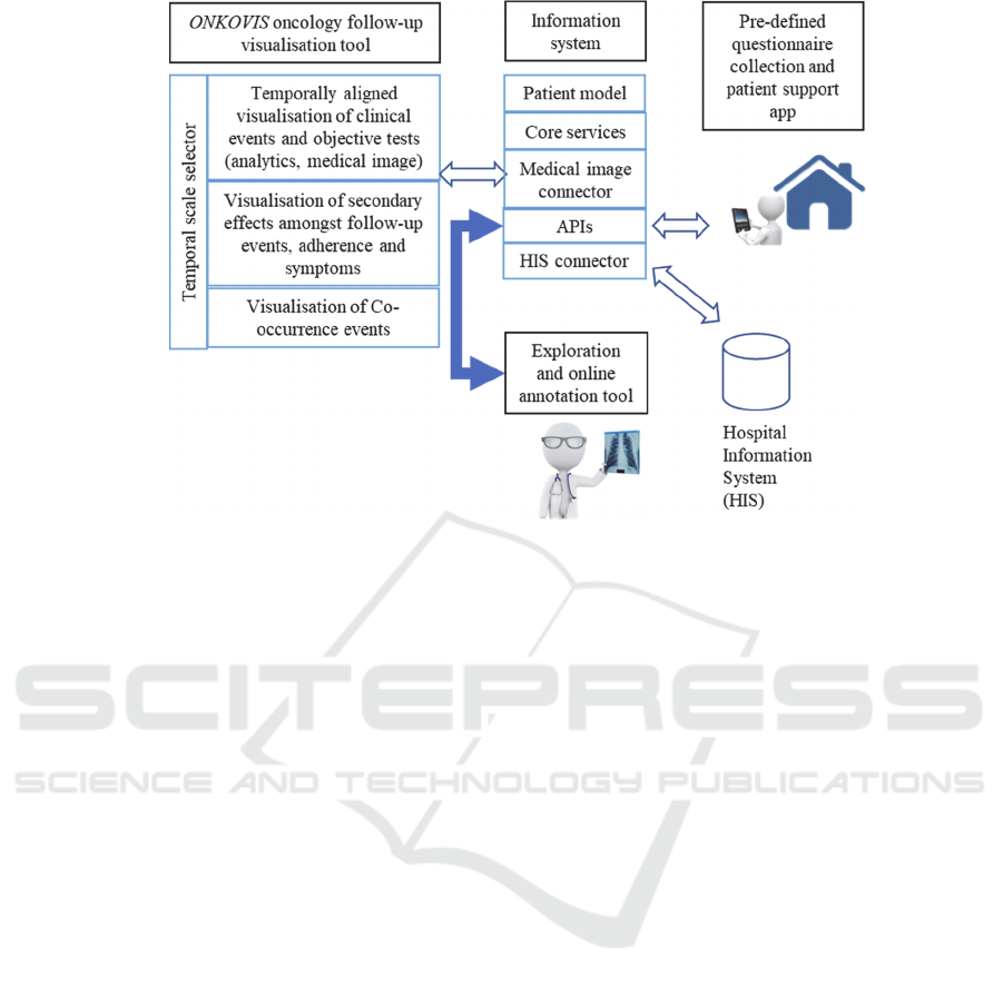
Figure 1: The ONKO Project.
3.1 Co-design Methodology
Co-design methodologies aim to engage users more
actively in all stages of the design process, to provide
the design process with their experience and
knowledge (Rizzo, 2011). Benefits of these
methodologies are not limited to creating solutions
that better fit users, but also to organisations creativity
and to services efficiency (Steen et al., 2011).
The co-design and development of the solution
has succeed involving a team of end-users
(oncologists and nurses), UX and design experts, and
technology development experts. The co-design team
involved two persons of each profile, all of them
participating in the different meetings.
The chosen methodology started with a face-to-
face meeting where a storytelling tool was used to
gather and formulate a common background. End-
users introduced the problematic and the way they
work with the currently available tools, so the co-
design team was able to detect the main necessities in
the area. Within this meeting, the design and
development team also had the opportunity to
understand the terminology and context, as they
worked side-by-side with the end-user’s IT team.
The main issue detected in this first meeting was
the non-existence of a visualization tool where
heterogeneous data from multiple sources could be
intuitively displayed and managed. Consequently, the
creation of a tool solving this issue became the main
goal of the ONKO project. The team also defined that
this tool should offer different aggregation level
views, so a larger amount of data and data types can
be analysed within the same application. The need of
a comprehensive visualization tool was mainly
motivated by the limited time that is available in the
hospital to attend each patient, the heterogeneity of
patients they treat, and the limited time available to
analyse and understand the per-patient disease
history.
Furthermore, initial visual drafts were
collaboratively drawn with limited detail using a co-
design sketching tool. These visual drafts helped the
team to define the main needed functionalities, apart
from defining the appearance of the application.
Next, iteratively and based on the previous
sketches, partially-interactive digital mock-ups were
built by the design team and were discussed with the
whole co-design team using an online meeting
software. These digital mock-ups were developed
using both HTML editor and graphic editors to reflect
the outcome of all the co-design discussions. The
mock-up was refined through seven sessions of
remote online meetings, and one extra face-to-face
meeting, where the partially-interactive digital mock-
up was contrasted with oncologists that were not
involved in the co-design team, to obtain their
feedback.
Figure 2 shows some initial paper-based drafts,
while figure 3 shows the final version of the partially-
interactive digital mock-ups.
HEALTHINF 2019 - 12th International Conference on Health Informatics
192
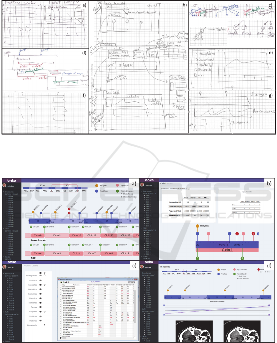
Figure 2: Paper-based drafts. a) Initial multi-entry level visualisation discussed; b) Final individual view-based multi-level
entries to visualisation tool; c) Discussions on combining colours, same-date multiple events, usage of text / number on
timeline events; d) General timeline overview entry point design discussion; e) Detailed patient report outcome / bloodwork’s
view prototype; f) Initial medical image analysis focussed view mock-up; g) Final medical image analysis focussed view
mock-up.
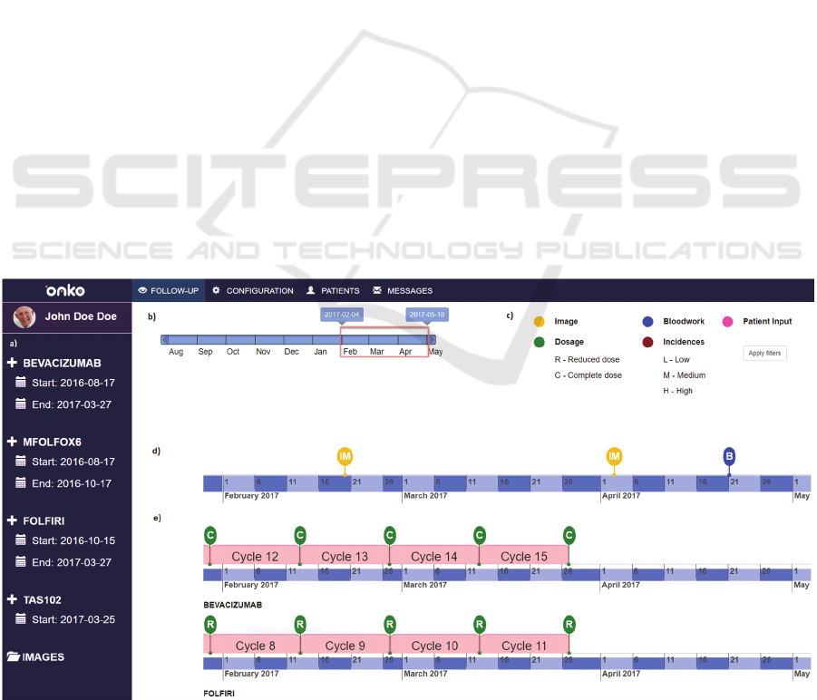
Figure 3: Final version of (partially-interactive) digital mock-up. a) General timeline overview entry point digital mock-up;
b) Medication cycle view mock-up; c) Detailed patient report outcome / bloodwork’s view mock-up; d) Medical image
analysis focussed view mock-up. Check the implementation figures for further details on each image (Figures 4, 5, 6, 7
respectively).
ONKOVIS, Co-designed Oncology Follow-up Visualisation Tool
193
4 ONKOVIS
The ONKOVIS solution has been developed in four
different aggregation level views: (1) General
timeline overview, (2) Medication treatment cycle
view, (3) Detailed patient reported outcome /
bloodwork’s’ view and (4) Medical image analysis
focussed view.
In the following subsections, each view is
explained in detail. Additionally, in a last subsection
the technologies used in the implementation are
described.
4.1 General Timeline Overview
The purpose of this view is to show the complete
medical record of the patient in the clearest way
possible.
It is the main page of the visualisation tool. The
time range to be visualised is selected in a range slider
placed in the top left of the window. The information
is displayed in a timeline-based system where all the
clinical events are shown in their respective dates.
These timelines are classified into two categories:
the general timeline and medication timelines (figure
4). Regarding the general timeline, information
related to blood tests, patient reported outcome,
incidences and medical images is visualised by
different colour pin markers, making them easy to
distinguish. On the other hand, a medication timeline
is displayed for each treatment scheme prescribed to
the patient. In these timelines, the type of
administration (reduced or complete), the name of the
main drug compound associated to that timeline and
the scheme cycles (i.e. the time period between one
administration and the next one) are visualised.
All the timelines are temporally aligned, and the
oncologist is able not only to move them using a
slider, but also to choose or hide the clinical events
that are displayed on them (by interacting with the
colour legend area on the top right of the window).
Moreover, the tool provides a detailed view of
each cycle of the timeline (detailed in section 4.2) by
selecting them in the left sidebar of the page.
4.2 Medication Cycle View
This view provides the most significant results of the
bloodwork and patient reported outcome that
correspond to the chosen cycle, along with a detailed
timeline view of the cycle selected by the oncologist.
The page is displayed when the oncologist selects
any cycle from the side bar, and it offers an
intermediate level of information. Two tables are
visualised, showing a summary of the most
significant variables and values of both blood tests
and patient reported outcomes. The exposed variables
are the ones that had out-of-range values in the most
recent test and, additionally in the bloodwork table,
the variables identified as tumour markers. Along
with these values, previous tests’ values are displayed
to compare and observe the evolution of the variables.
Figure 4: General timeline overview page. a) Sidebar cycle list; b) Time range slider; c) Filtering legend; d) General timeline;
e) Medication timelines.
HEALTHINF 2019 - 12th International Conference on Health Informatics
194

These tables are clickable, offering a detailed view of
the whole bloodwork results and patient reported
outcomes data (detailed in section 4.3).
At the bottom of the window a timeline is
displayed, where all the events that have been carried
out from the beginning to the end of the selected cycle
are shown. On the top of the window, the user can
select the number of cycles to display in this timeline.
This view is illustrated in figure 5.
4.3 Detailed Patient Report Outcome /
Bloodwork’s View
This view provides a detailed and clear view of results
of blood tests and patient reported outcome
questionnaires filled-out in different tools, following
the same approach.
Both pages are quite similar and they have the
same options available. On the right side, all the
variables and values are displayed in a table, so the
oncologist is able to compare different registered
results along time. Out-of-range values are marked in
red, making them easier to be distinguish.
On the left side, there is a second table where the
user can perform several operations. The user can
select or hide the desired variable that is going to be
shown in the previously described right-side table by
clicking on an eye icon. There is also an option to
personalise the variables that are displayed in the
Medication cycle view tables (introduced in section
4.2) by clicking in the star icon. By default, this star
is activated only for the out-of-range variables and
tumour marker variables.
Furthermore, the oncologist has the option to plot
each selected variable in a chart to provide a graphical
view of the chosen variable evolution, as it can be
seen in figure 6.
The patient reported outcome data is assessed in
the ONKO’s patient mobile app, based on the
Functional Assessment of Cancer Therapy - General
(FACT-G) questionnaire. FACT-G is a patient-
reported outcome questionnaire used to assess health-
related quality of life in patients undergoing cancer
therapy. The survey assesses the impacts of cancer
therapy in four domains: i.e. in the physical,
social/family, emotional, and functional domains. All
these data is summarized in the patient reported
outcome view.
4.4 Medical Image Analysis Focussed
View
This view offers a follow-up view of the tumour,
guided by medical images and tumour markers.
This page displays a timeline focussed on medical
image events, as it only shows the events associated
with medical image captures (see figure 7). In
addition, the type of medical image that has been
taken is also specified in the timeline (e.g. CT, MRI,
or RX type medical images).
Subsequently, the evolution of the tumour
markers is shown by means of a chart, where the user
has the possibility to choose the desired markers to be
inspected.
Lastly, the most significant medical images (as
defined by the radiologist) that correspond to the
medical image events shown in the timeline are
displayed at the bottom of the window. Also, the
oncologist is able to select in the timeline the medical
image events they are interested on, and those will be
shown beneath the timeline (Users are able to choose
three capture events at most). Thereby, the specialist
has the option to visualise in parallel key images from
different capture events so that the inspection
becomes more complete.
4.5 Implementation Technologies
For the implementation of the visualisation tool, the
Angular IO web application framework was chosen
due to its multiple conveniences when programming
and its growing community (Angular IO, 2018).
Regarding web development libraries, Bootstrap
(Bootstrap, 2018) has been used as core for the
responsive web development library for the user
interface development; Vis.js has been used for the
timelines creation (vis.js, 2018); Charts.js has been
used for the visualisation of charts (Chart.js, 2018);
and jQRangeSlider has been used for data range
selection (jQRangeSlider, 2018).
5 DISCUSSION
In this paper we proposed a medical oncology follow-
up visualisation tool along with the co-design
approach that was followed, to provide an integral
view of the patient´s follow-up data to the oncologist.
After having analysed different oncology and
visualisation tools, we did not find any existing
application that provided full follow-up information
displayed within a timeline-based system. As a result,
the ONKO project has developed a medical oncology
follow-up visualisation tool of temporally aligned
heterogeneous health data.
Concurrently, the co-design process has been
explained with the outcome of developing the
solution in four different aggregation level views.
ONKOVIS, Co-designed Oncology Follow-up Visualisation Tool
195
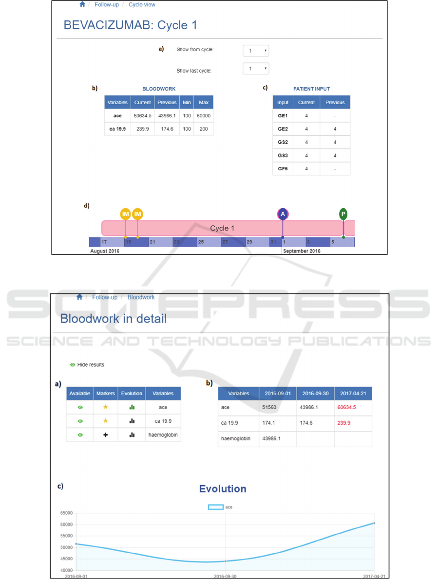
Figure 5: Medication cycle view (Navigations and side bars excluded). a) Cycles selector; b) Bloodwork table; c) Patient
reported outcome tables; d) Cycle timeline.
Figure 6: Detailed patient report outcome / bloodwork’s view (Navigations and side bars excluded). a) Operations table; b)
data table; c) Data evolution chart.
HEALTHINF 2019 - 12th International Conference on Health Informatics
196
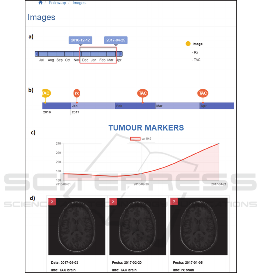
Figure 7: Medical image analysis focussed view (Navigations and side bars excluded). a) Time range slider; b) Images
timeline; c) Tumour markers evolution chart; d) Most relevant/chosen images.
6 CONCLUSIONS
The chosen methodology allow the ONKO team to
successfully capture the end-user necessities and co-
develop a solution that appears to be accepted and
appreciated by the end-user. Nevertheless, the project
is currently on its validation phase, and further
feedback from end-users not involved in the project
will be captured on this phase.
The feedback that has been given so far by end-
users involved in the project has been positive, yet
some minor improvements have been identified.
Besides including the suggested minor changes,
the future work associated to the ONKO project will
be focused in three areas: Development of predictive
models enriched rule-based alarms for nurses and
doctors for early identification of deterioration and
prompt action, creation of a tool for treatment and
ONKOVIS, Co-designed Oncology Follow-up Visualisation Tool
197

appointment handling based on the data collected in
the ONKO mobile app, and offering a population-
based visualization tool where the data associated to
multiple patients can be observed and analysed at the
same time, providing a global insight and a
comparative visualization tool.
REFERENCES
Ando, Y., 2014. Oncology Information System, in: Tsujii,
H., Kamada, T., Shirai, T., Noda, K., Tsuji, H.,
Karasawa, K. (Eds.), Carbon-Ion Radiotherapy:
Principles, Practices, and Treatment Planning. Springer
Japan, Tokyo, pp. 113–117.
https://doi.org/10.1007/978-4-431-54457-9_13.
Angular IO, 2018. Angular web framework [WWW
Document]. URL https://angular.io/ (accessed 6.12.18).
Bender, J.L., Yue, R.Y.K., To, M.J., Deacken, L., Jadad,
A.R., 2013. A lot of action, but not in the right direction:
systematic review and content analysis of smartphone
applications for the prevention, detection, and
management of cancer. J. Med. Internet Res. 15, e287.
https://doi.org/10.2196/jmir.2661.
Bootstrap, 2018. Bootstrap [WWW Document]. URL
https://getbootstrap.com/ (accessed 6.12.18).
Chart.js, 2018. Chart.js | Open source HTML5 Charts for
your website [WWW Document]. URL
http://www.chartjs.org/ (accessed 6.12.18).
Evans, W.K., Ashbury, F.D., Hogue, G.L., Smith, A., Pun,
J., 2014. Implementing a regional oncology information
system: approach and lessons learned. Curr Oncol 21,
224–233. https://doi.org/10.3747/co.21.1923.
GE Healthcare, 2018. OncoQuant - Advanced Visualization
- Products [WWW Document]. URL
http://www3.gehealthcare.com/en/products/categories/
advanced_visualization/applications/oncoquant
(accessed 6.12.18).
Giunti, G., Giunta, D.H., Guisado-Fernandez, E., Bender,
J.L., Fernandez-Luque, L., 2018. A biopsy of Breast
Cancer mobile applications: state of the practice
review. International Journal of Medical Informatics
110, 1–9.
https://doi.org/10.1016/j.ijmedinf.2017.10.022.
Hu, J., Perer, A., Wang, F., 2016. Data Driven Analytics for
Personalized Healthcare, in: Healthcare Information
Management Systems, Health Informatics. Springer,
Cham, pp. 529–554. https://doi.org/10.1007/978-3-
319-20765-0_31.
jQRangeSlider, 2018. jQRangeSlider: jQuery plugin for
range sliders [WWW Document]. URL
http://ghusse.github.io/jQRangeSlider/ (accessed
6.12.18).
Klimov, D., Shahar, Y., Taieb-Maimon, M., 2010.
Intelligent visualization and exploration of time-
oriented data of multiple patients. Artificial Intelligence
in Medicine 49, 11–31.
https://doi.org/10.1016/j.artmed.2010.02.001.
Limkin, E.J., Sun, R., Dercle, L., Zacharaki, E.I., Robert,
C., Reuzé, S., Schernberg, A., Paragios, N., Deutsch,
E., Ferté, C., 2017. Promises and challenges for the
implementation of computational medical imaging
(radiomics) in oncology. Ann Oncol 28, 1191–1206.
https://doi.org/10.1093/annonc/mdx034.
Perer, A., Sun, J., 2012. MatrixFlow: Temporal Network
Visual Analytics to Track Symptom Evolution during
Disease Progression. AMIA Annu Symp Proc 2012,
716–725.
Plaisant, C., Mushlin, R., Snyder, A., Li, J., Heller, D.,
Shneiderman, B., 1998. LifeLines: using visualization
to enhance navigation and analysis of patient records.
Proc AMIA Symp 76–80.
Rizzo, F., 2011. Co-design versus User Centred Design:
Framing the differences, in: Guerrini, L. (Ed.), Notes on
Doctoral Research in Design. Contributions from the
Politecnico Di Milano: Contributions from the
Politecnico Di Milano. pp. 125–132.
Steen, M., Manschot, M., De Koning, N., 2011. Benefits of
co-design in service design projects. International
Journal of Design 5, 53–60.
Varian Medical Systems, 2018. Aria Oncology Information
System Medical Oncology - Certified for Meaningful
Use. Varian Medical Systems [WWW Document].
URL
https://www.varian.com/sites/default/files/resource_att
achments/ARIAMedOncProductBrief.pdf (accessed
6.12.18).
vis.js, 2018. vis.js - A dynamic, browser based visualization
library. [WWW Document]. URL http://visjs.org/
(accessed 6.12.18).
Wongsuphasawat, K., Guerra Gómez, J.A., Plaisant, C.,
Wang, T.D., Taieb-Maimon, M., Shneiderman, B.,
2011. LifeFlow: Visualizing an Overview of Event
Sequences, in: Proceedings of the SIGCHI Conference
on Human Factors in Computing Systems, CHI ’11.
ACM, New York, NY, USA, pp. 1747–1756.
https://doi.org/10.1145/1978942.1979196.
HEALTHINF 2019 - 12th International Conference on Health Informatics
198
