
Breaking the Curse of Visual Data Exploration: Improving Analyses by
Building Bridges between Data World and Real World
Matthias Kraus, Niklas Weiler, Thorsten Breitkreutz, Daniel A. Keim and Manuel Stein
Data Analysis and Visualization, University of Konstanz, Germany
Keywords:
Visualization Theory, Uncertainty, Validation, Visual Analytics.
Abstract:
Visual data exploration is a useful means to extract relevant information from large sets of data. The visual
analytics pipeline processes data recorded from the real world to extract knowledge from gathered data.
Subsequently, the resulting knowledge is associated with the real world and applied to it. However, the
considered data for the analysis is usually only a small fraction of the actual real-world data and lacks above all
in context information. It can easily happen that crucial context information is disregarded, leading to false
conclusions about the real world. Therefore, conclusions and reasoning based on the analysis of this data
pertain to the world represented by the data, and may not be valid for the real world. The purpose of this paper
is to raise awareness of this discrepancy between the data world and the real world which has a high impact on
the validity of analysis results in the real world. We propose two strategies which help to identify and remove
specific differences between the data world and the real world. The usefulness and applicability of our strategies
are demonstrated via several use cases.
1 INTRODUCTION
Nowadays, large amounts of data are generated and
collected within mere seconds. As a result, constantly
increasing amounts of information are available and
subject to an increasing number of analytical data ac-
quisitions and new technological possibilities with re-
gard to gathering, storing and distributing data. Many
people are interested in gaining knowledge from this
data, for example, by using data mining algorithms or
visual analytics (Keim et al., 2008) methods. After-
wards, the generated knowledge is applied on the real
world where the used data originate from. However,
there is a flaw inherent in our everyday analytical rea-
soning: The collected data is no perfect representation
of the real world. Many facets of our surroundings can-
not be measured with the necessary precision, if at all.
Also, there likely exist factors influencing the analysis
that we are not yet aware of and therefore do not mea-
sure. Since performing an analysis on incomplete and
noisy data cannot lead to fully complete and correct
results, we claim that data is always wrong to some
extent. Consequently, the analysis might not generate
valid real-world knowledge, but instead knowledge
that is valid in the world represented by the data. For
example, when measuring the speed of cars in a rally
race, the collected data is necessarily rounded to a cer-
tain degree. Also additional factors, such as vertical
accelerations might be neglected. Therefore, results of
the analysis based on this data, such as the maximum
speed or the average acceleration of cars, only deliver
answers to the abstracted data on the rally race, not the
rally race itself.
In this paper, we draw attention to this important
problem to which we further refer to as the curse of
visual data exploration. Without a doubt, for some
domains and tasks, the considered data can be suf-
ficient to lead to similar results as if the entire real
world would have been taken into account for the re-
spective analysis. Still, each diversion in the data from
the real world leads to a slightly less optimal result,
and it is often hard to tell how much the data diverts
from the real world. This issue has already been rec-
ognized and been part of researcher discussions all
around the world, e.g., in the panel discussion of the
2017 IEEE Symposium on Visualization in Data Sci-
ence (VDS). The related topic of uncertainty analysis
is mainly concerned with the data gathering process
and the validation of gathered data. Often, however,
the problem does not lay in the data itself (e.g., faulty
or missing data), but in the scope of the measured data
(e.g., parameters not considered for analysis), which
is usually not addressed by uncertainty analysis.
To raise awareness and foster discussion, we exam-
ine the curse of visual data exploration (Sect. 3) and
provide possible strategies to break the curse (Sect. 4)
Kraus, M., Weiler, N., Breitkreutz, T., Keim, D. and Stein, M.
Breaking the Curse of Visual Data Exploration: Improving Analyses by Building Bridges between Data World and Real World.
DOI: 10.5220/0007257400190027
In Proceedings of the 14th International Joint Conference on Computer Vision, Imaging and Computer Graphics Theory and Applications (VISIGRAPP 2019), pages 19-27
ISBN: 978-989-758-354-4
Copyright
c
2019 by SCITEPRESS – Science and Technology Publications, Lda. All rights reserved
19

by focusing on projecting data and analysis results
back into a more comprehensive real-world context.
If the real world is not sufficiently described by our
data, we are able to identify this by inspecting the re-
sulting visualizations in the overall context of the real
world and evaluate if all necessary data is considered
in the analysis. We elaborate on the general useful-
ness of our proposed strategies and provide several
examples of projects (Sect. 5) in which we applied our
proposed recommendations, even though they cannot
yet be applied to every analytical use case (Sect. 6).
2 RELATED WORK
To identify the curse of visual data exploration, we
studied published Visual Analytics pipelines in the lit-
erature and recognized a missing connection between
the generated knowledge and the real world. Through
all stages, different sources modify the data in a way
that the data no longer fully corresponds to the real
world. We first discuss related work in uncertainty
analysis (Sect. 2.1) followed by an overview about data
validation (Sect. 2.2). We position our work within the
aforementioned works in Sect. 2.3.
2.1 Uncertainty
As uncertainty occurs in almost every field of research,
one important challenge is to find a generalized def-
inition of uncertainty that can be applied to various
domains. MacEachren et al. (MacEachren et al., 2005)
recognized early on that uncertainty is a complex con-
cept which needs to be subdivided into different com-
ponents. Subsequently, suitable methods for the rep-
resentation and processing of uncertainty are needed.
Skeels et al. (Skeels et al., 2010) surveyed the state-
of-the-art and introduced a model identifying com-
ponents of uncertainty in various fields of research
such as information visualization. Their model divides
uncertainty into three levels with increasing abstrac-
tion. Measurement precision, completeness, and infer-
ences. Measurement precision deals with imprecise
measurements of sensors which could be identified
by confidence intervals. One level above is the com-
pleteness which describes the loss of information by
using projections or sampling techniques. The highest
abstraction reflects the inferences. Inferences describe
the uncertainty of predictions of future values based
on current data. Here, one challenge is that prediction
models cannot predict a value if the underlying data
has no similar data points. All levels are covered by
an additional component (Credibility) which describes
the trustfulness of the data source as well as potential
disagreements when comparing among other sources.
Gershon et al. (Gershon, 1998) describes the chal-
lenges of visualizations in an imperfect world. In their
taxonomy, they illustrate and summarize the different
challenges that arise when gathering data from the real
world. The resulting taxonomy is divided into two
parts, on the one hand, the imperfection (uncertainty)
during data acquisition. On the other hand, falsely
represented data, for example, an overplotted visual-
izations or the use of an inappropriate device.
2.2 Data Validation in Visual Analytics
Several definitions of data validation exist in differ-
ent domains, e.g., in the Unece glossary in statistical
data editing (UNDP, 2018) it is described as an action
to verify if a value matches an allowed set of values.
Also, Wills and Roecker(Wills and Roecker, 2017)
describe data validation as the ability of a model to
detect variance in the data including, for example, the
recognition of missing values and outliers. Over the
years, a variety of outlier detection techniques such
as anomaly detection (Chandola et al., 2009), noise
detection (Rehm et al., 2007) or novelty detection in
time series (Dasgupta and Forrest, 1996) have been
proposed. Hodge and Austin discuss several outlier de-
tection techniques in their survey (Hodge and Austin,
2004) and identify three types of how outliers can be
found based on different knowledge about the data. In
the first type, there is no knowledge about which data
points belong to the outliers. Consequently, outlier de-
tection is based on a statistical distribution to classify
whether a point belongs to a specific distribution or not.
For the second type, each data point requires a label
to indicate whether it is an outlier or not. Subsequent,
classifiers are trained by using these labels to predict
if a new data point is an outlier or not. This involves
the generation of a classifier for detecting normal data
points and abnormal data points. Type three again uses
pre-labeled data like in type two with the difference
that these classifiers trained only on the data points
which do not belong to the outlier class. This can be
used to determine whether a new data point belongs
to the set of valid data points based on the training
dataset. However, data points which do not belong to
this set are not necessarily outliers. This approach for
type three is similar to algorithms for semi-supervised
recognition or detection tasks.
2.3 Positioning of our Work
Approaches handling data manipulation, for example,
in a visual analytics workflow are mainly concerned
about stages between data collection and knowledge
IVAPP 2019 - 10th International Conference on Information Visualization Theory and Applications
20
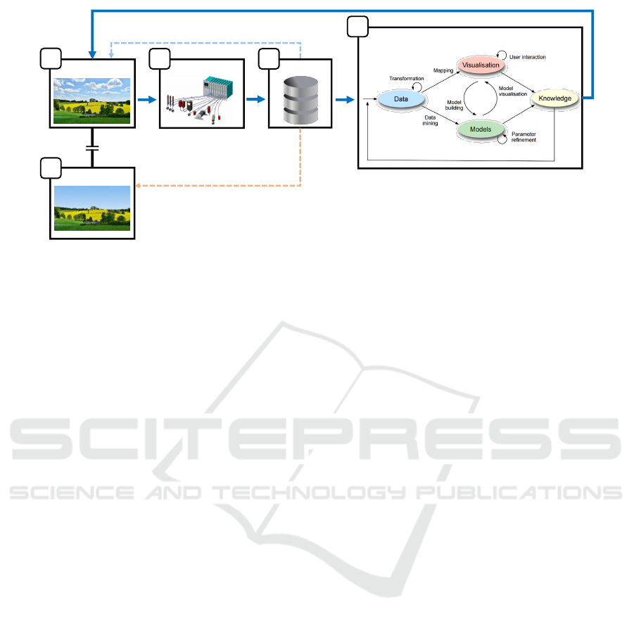
Data Analysis
Data World
Implicitly assumed content of the data
Data
Real World
Sensors
Knowledge application on the real world
Actual content of the data
A
E
B C
D
Figure 1: The curse of visual data exploration displayed in an extended visual analytics model. In common data analytics tasks,
the procedure starts in the real world (A) where information is collected using sensor technology (B) and stored (C). Afterward,
the gathered data is analyzed as described in various proposed visual analytics models. This process is here depicted in (D) at
the example of the Visual Analytics pipeline by Keim et al. (Keim et al., 2010). The knowledge generated by these models is
often assumed to be correct in the real world implying that the gathered data represents a complete and correct copy of the real
world. However, as the gathered data only contains a subset of aspects (the data world (E)) that can have an influence on the
analysis process, the generated knowledge may not be complete or even invalid in the real world.
generation. Our model differentiates from the current
state-of-the-art by introducing a new validation step en-
abling the validation of whether extracted knowledge
applies to the real world.
3 THE CURSE OF VISUAL DATA
EXPLORATION
“The cost of bad data is the illusion of knowledge” (Tun-
guz, 2018). At the beginning of the data analysis pro-
cess it is important to consider the quality of the col-
lected data. Research nowadays is mainly concerned
with improving the results of an analysis, both regard-
ing performance and quality. Unfortunately, the quality
of the data used for this analysis is often not ensured to
be adequate for a given task. If the quality of the data
lacks in detail, is faulty or incomplete, conclusions
drawn from the analysis might only be referable to the
data but not to the actual real world the data was taken
from. Therefore, generated knowledge would proba-
bly not apply to the investigated research question as
intended.
A broader framework for common analytical work-
flows such as visual analytics can be seen in Fig. 1.
The collection of data is the starting point where data
is obtained from the real world (Fig. 1 A) using, for
example, sensor technology (Fig. 1 B). We refer to the
real world as the world we want to analyze. Usually,
this is the physical world around us, but it could also
be a conceptual world like a stock market. Sensors
capture properties and discretize continuous signals to
digitalize real-world information (e.g., video record-
ings). There are various types of sensors, for instance,
thermometers, pressure sensors or cameras. Gathered
data is merged and stored digitally as discrete values,
abstracted to bits and bytes (Fig. 1 C). Stored data
is typically the starting point for common analytical
workflows such as visual analytics (Wang et al., 2016).
In Fig. 1 D, we inserted the Visual Data-
Exploration Pipeline by Keim et al. (Keim et al., 2008)
as an example for arbitrary visual analytics pipelines.
Any other analytical workflow might be inserted here
as long as the following two conditions are met:
1.
They start with digital data as basis for the analysis.
2.
Their goal is to generate knowledge about the real
world (basis from which the data was collected).
Finally, the output of the analysis (knowledge) is at-
tributed back to the real world from which the data
was extracted from. The generated knowledge is nat-
urally assumed to be valid in the real world since all
the input data came from the real world. In Fig. 1, this
assumption is depicted by a blue arrow going from the
extracted knowledge to the real world. The fact that
knowledge is valid in the data world does not mean
that it is not valid in the real world as well. Some
information from the real world is more important to
the analysis than other, and usually, most of the real
world information is not relevant for a given analy-
sis task. Therefore, the validity of the knowledge in
the real world strongly depends on how accurate and
complete all important information sources have been
measured. In some cases, analysts might be aware of
Breaking the Curse of Visual Data Exploration: Improving Analyses by Building Bridges between Data World and Real World
21

missing aspects in the data that are hard or even impos-
sible to capture. However, in general, the real world
is a complex construct that is impossible to capture
completely and correctly. Due to this fact, analysts
have to assume that the data world and the real world
are similar enough to transfer generated knowledge to
the real world. This is what we call the curse of visual
data exploration.
In detail, we refer to the curse of visual data explo-
ration as the natural condition of incomplete or faulty
data as a basis for analytical workflows, leading to a
wrong association of generated knowledge to the real
world. This association of knowledge would only be
legitimate if the gathered data would completely, cor-
rectly and exclusively represent the real world. How-
ever, knowledge would also be transferable, if the data
used for the analysis contains all information influenc-
ing generated knowledge. I.e., in practice it would be
sufficient if all analysis relevant information would
have been considered throughout the analysis. Factors
that do not influence the analysis results (irrelevant
real-world data) can be neglected. Whenever data is
collected, there is a high chance that some important
information is neglected that would impact the anal-
ysis process and therefore the generated knowledge.
This loss of important real-world information can oc-
cur in several ways. Sensors may produce systematic
or random errors, sample insufficiently or create some-
what unwanted biases in the data. Besides, the analyst
may not be aware of factors that are not yet considered
in the analysis (missing sensors). In statistics, such
factors are also referred to as lurking variables (Brase
and Brase, 2011). Faulty data could also be introduced
through abstracting procedures during the gathering
process (e.g., aggregating, binning, sampling, digitaliz-
ing, discretizing). These complications throughout the
gathering process lead to a discrepancy between the
real world and the collected data. The world described
by the data is, therefore, not perfectly representative
of the real world (faulty, incomplete). In the following,
we refer to the entirety of the gathered data as the data
world (Fig. 1 E). The analysis is conducted in the data
world and, therefore, it is only ensured that generated
knowledge is valid in the data world.
4 BREAKING THE CURSE
In this section, we propose two strategies that aim at
minimizing the chance to be affected by the curse of
visual data exploration. The goal of these strategies is
to make sure that the generated knowledge is not only
valid in the data world but also in the real world. Both
strategies follow the same principle of going back to
the real world to validate the data or the results.
To break the curse, we aim to minimize or remove
the gap between the real world and the data world.
Since the analysis results are valid for the data world,
they would also be valid in the real world if both
are equal to each other. More precisely, it would be
enough if both worlds were equal concerning all in-
formation that affects the analysis as the results would
then be the same. In the following, we refer to this
information as analysis relevant information.
Since the data world cannot realistically be an exact
copy of the real world, the data world usually contains
a subset of the information available in the real world.
To ensure a valid analysis procedure and to allow infer-
ence of results to the real world scenario, the following
conditions have to be true:
S1
Information contained in the data world is correct,
i.e., it is not contradicting to real-world data.
S2
Dimensions (attributes) contained in the data world
are also present in the real world, i.e., the data
world is a subset of real world.
S3
Dimensions contained in the data world cover all
the analysis relevant information of the real world.
In general, it is impossible to guarantee that all
conditions (
S1-S3
) are fulfilled, e.g., due to imperfect
measurement accuracy or the deployment of derived
dimensions (artificial dimensions that do not directly
reflect properties of the real world). However, it is de-
sirable to optimize
S1
,
S2
and
S3
as much as possible.
S1
ensures that the collected data is correct and
therefore not negatively impacting the analysis. Com-
mon causes for violations against
S1
are random or
systematic errors in measurement devices.
S1
can be
ensured by comparing each value present in the data
world with its corresponding value in the real world.
This procedure can be time-consuming if the data set
is sufficiently large and sometimes even impossible if
the measurement cannot be repeated.
S2
ensures that
no additional data exists in the data world that does
not describe the real world. This could happen if the
dataset is a composition of multiple sources of which
some are valid sources describing the real world and
others are not. Validating
S2
can be done by checking
if every individual dimension of the data world can
be found in the real world.
S3
ensures that no analy-
sis relevant data is missing. If analysis relevant data
would be missing, the analysis can end up at faulty
results as crucial information would have been ne-
glected for the examination of the real world. Usually,
the examined real world is complex, hampering the
validation process and making automatic validation
impossible. Therefore, user involvement is required.
An analyst can apply their real-world knowledge to
IVAPP 2019 - 10th International Conference on Information Visualization Theory and Applications
22
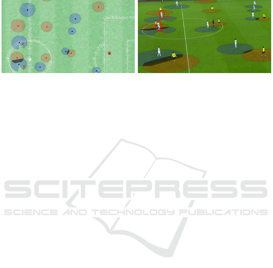
(a) Interaction Spaces visualized on an abstract soccer pitch
(b) Interaction Spaces superimposed on the original video
recording
Figure 2: Calculating interaction spaces for the same scene in a soccer match once visualized on an abstracted soccer pitch
(left) and once superimposed on the original video recording (right). Interaction spaces are used to calculate the region each
player is able to control until the ball reaches him or her, therefore, a player’s orientation is important during calculation. The
available data consists of x- and y-coordinates for each player. In this scene, the annotated players
A
and
B
are moving upwards
which influences their respective interaction spaces. By projecting the same visualization into the original video recording
(right), we notice that the players are not running forwards, but sideways which is currently not captured by the data gathering
process. Figure 2 (b) is extracted from a television match recording from the German Bundesliga being broadcasted on the Sky
Sport TV channel operated by Sky UK Telecommunications (Sky, 2018) and enhanced by the superimposed interaction spaces.
identify dimensions that likely influence the current
analysis task. For example, if the task is to predict crop
growth, the analyst would likely identify dimensions
like solar radiation and rainfall as important. However,
it is challenging to recall all possible variables influenc-
ing a process, especially if the analyst is not reminded
of their existence in some way. This makes
S3
the
hardest of the statements to verify. In the following,
we propose two exemplary strategies to verify
S1
-
S3
with the aid of visualization. Currently, our strategies
are limited to suited data and use-cases. For exam-
ple, very abstract data such as multivariate results of
questionnaires might not be optimal for the presented
approaches as they have no spatial, temporal, volume
or similar context that could be visualized easily.
4.1 Reconstructing the Real World
Since validating
S1
-
S3
can be rather complex and time-
consuming, we propose a strategy for how their valid-
ity can be checked using visualization. During the
analysis step, complex information is often abstracted
and visualized making it easier to comprehend. We
propose a similar strategy to check the validity of
S1
-
S3
. While we usually collect data from the real world
and create data representations, it is also possible to go
the other way around and use the data contained in the
data world to reconstruct a subset of the real world.
If
S1
-
S3
hold true, this recreation should contain
each aspect of the real world that is thought to be rel-
evant for the analysis process. Comparing the visual
representation of the reconstruction to the real world
can help to reveal differences between the two such
as missing or faulty properties. The visual representa-
tion should aid the user in spotting differences which
would be hard to notice by just looking at the abstract
data. With the aid of this reconstruction, the user can
make use of knowledge about the real world to check
the validity of
S1
-
S3
by checking the reconstruction
for inconsistencies or the absence of analysis relevant
information. If there is anything in the reconstruc-
tion which is not present in the real world or differs
from it, then either
S1
or
S2
is violated. Since visual
representations help to understand a large amount of
information quickly, this process is assumed to be a lot
more efficient than validating every value in the data
against its real-world counterpart as described earlier.
Still, identifiable missing data can be of even higher
interest. For instance, sports analysts examining soc-
cer matches are interested in analyzing regions their
players can control (Interaction spaces (Stein et al.,
2016); see Figure 2). The orientation of players is an
important factor in calculating these interaction spaces,
as players need to turn around to control the ball if it is
behind them. This takes time and, therefore, decreases
the area they can control behind them. Accordingly,
when an analyst annotates the interaction space of a
player manually while watching a video stream of a
soccer match, the shown orientation of the players
is subconsciously used in the analysts mental model.
Consequently, if the company collecting the data does
not include the information about player orientation
in the computer-assisted data gathering and analysis
process
S3
is violated. Looking just at the data as sin-
gle x- and y-coordinates as it is saved in the database,
it is hard to realize that this attribute is missing. At
this point, the reconstruction of the real world could
improve the analysis process. In a three dimensional
Breaking the Curse of Visual Data Exploration: Improving Analyses by Building Bridges between Data World and Real World
23

reconstruction based on the collected data, players
have no eyes or other indication of their orientation
on the soccer field. Additionally, players would never
be running back- or sidewards. We assume that ana-
lysts realize that this data is missing since their mental
model is not confirming the missing input. After iden-
tifying a dimension that is missing in the data world
(in this example, player orientation), the respective
data can be added to repeat the whole process until no
more flaws are discovered.
4.2 Projecting Results Back into the
Real World
Our second proposed strategy does not aim to validate
the data world directly but instead confirms analysis
results by projecting them back into the real world.
In analytical workflows such as visual analytics, gen-
erated knowledge is often presented via abstract vi-
sualizations like parallel coordinates (Inselberg and
Dimsdale, 1987) or glyph visualizations (Fuchs et al.,
2017; Wickham et al., 2012). These visualizations are
useful to explain analysis results to humans, but they
often include little context information about the real
world. This creates a gap between the data world and
the real world, even though the goal is usually to con-
nect the generated knowledge to the real world. This
separation makes it hard to judge whether the analysis
results fit into the context of the real world. We argue
that by projecting the analysis results into a space that
is closer to the real world, users are enabled to reveal
contradictions that would go unnoticed otherwise. Af-
terward, it must be ensured that the identified aspects
are included in the data (
S3
) as well as measured cor-
rectly (
S1
). This proposed strategy has the additional
advantage that problems within the analysis itself can
also be spotted.
Going back to the previously introduced soccer
example, automatically determined interaction spaces
of players are calculated based on players’ speed, dis-
tance to the ball and running direction. Afterward,
interaction spaces are visualized as circles or circular
sectors on an abstracted soccer pitch as can be seen
in Fig. 2 (a). However, a players movement direction
does not necessarily reflect his or her body orientation.
If the same visualization is projected into a video of the
real world soccer match, as shown in Fig. 2 (b), it has
reportedly been easier to spot that there is a problem
with the used data for this analysis. In several expert
studies performed in recent work (Stein et al., 2018),
several invited soccer analysts repeatedly reported that
“[. . . ] they became more aware of a visualization’s
limitations and possibilities for improvement in the
future. As, for example, soccer players were not repre-
sented by moving dots on an abstract pitch anymore
but with the real persons, the experts noticed that the
body pose is currently not always reflected correctly
in the calculation of interaction spaces. If a player
is running forwards or backwards, the resulting inter-
action spaces are identical. This exemplary problem
could not attract attention outside of the video visual-
ization as no data about the body poses are collected.”
(quoting (Stein et al., 2018))
5 USE CASES
To demonstrate the applicability of either reconstruct-
ing the real world (Sect. 4.1) or projecting the results
into the real world (Sect. 4.2), we present a detailed
use case for each of them. By the example of collective
behavior analysis, we show how the data world can be
reconstructed and verified. Afterward, we consider the
use case of a criminal investigation, showing how the
extracted analysis results can be projected back into
the real world to verify the data basis for the analysis.
5.1 Collective Behavior
The first use case deals with the calculation of ther-
mal spirals from tracked bird movement data. For
this purpose, students from the University of Konstanz
reconstructed a part of the real world based on the
available data to validate if some features are miss-
ing as described in Sect. 4.1. The movement data of
the birds are provided by an online database called
Movebank (Wikelski and Kays, 2014) managed by
the Max Planck Institute for Ornithology (MaxPlanck,
2018). Each bird is equipped with a GPS receiver to
record the current position, direction and altitude. Re-
searchers use this data to identify characteristics to see
whether individual birds communicate to the swarm
where thermal spirals are located. The integration of
satellite images and elevation data into the virtual envi-
ronment helps to investigate the external influences of
thermal spirals better. During the analysis, the experts
noticed that individual birds moved away a few meters
from the swarm within a second. In the beginning, it
could not be explained why the birds behave this way
and how this influences the collective behavior. After
integrating weather data as another data source into
the virtual world, they noticed that a gust of wind has
caught the birds and dragged them a few meters. This
was only possible by representing the wind with the
help of cloud movements. Seeing the clouds move
in the same direction as the birds made it easier for
the analyst to create this connection as compared to
just looking at the numbers in the dataset. In Fig. 3,
IVAPP 2019 - 10th International Conference on Information Visualization Theory and Applications
24

Figure 3: The GPS coordinates of tracked birds were projected into a virtual environment to analyze their behavior in a thermal
spiral. From the eyes of a bird, you can see how other birds use the thermal spiral to move upwards in a circle. Also, the data is
enriched by providing the surrounding landscape to recognize further factors which influence the behavior of birds. Using this
visualization, it was possible to detect that specific winds, represented by cloud movement, could be responsible for a certain
pattern in bird movement, which was previously not explainable.
you can see a part of the virtual environment out of
the eyes of a bird. The current satellite image which
matches the GPS position of the bird is located at the
bottom so that users can always see the exact surround-
ings. This includes information like the height of the
mountains as well as the land usages. The reason for
displaying satellite images and elevation data is that
thermal spirals behave differently, whether they occur
over mountains or flat areas. The projection into a sim-
ulation enables experts to recognize missing features
like the weather information.
5.2 Criminal Investigation
When investigating a crime scene, context information
is undoubtedly crucial. Many side factors are overseen
if only considering the fraction of the real-world data
that is at first glance the most important data. For ex-
ample, during a rampage in a city, the data available
to law enforcement agents could consist of video ma-
terial of surveillance cameras or pedestrians, mobile
cell connections as well as email conversations of the
suspects, reports of eyewitnesses, GPS locations of the
suspects and much more. Still, it is impossible to con-
sider all data available. Many dimensions of the real
world that seem irrelevant would naturally have to be
neglected to avoid processing overload (e.g., weather
data, news data, traffic data or twitter data).
Algorithms might be able to extract features from
video frames, analyze them and present condensed
information to the analyst. This could, for instance, be
achieved as follows: the algorithm searches in video
frames for objects using deep neural networks and
collects for each object all frames the object appears
in. The result is a set of objects with corresponding
trajectories of the objects. Subsequent visual analytic
procedures could be deployed to analyze those tra-
jectories. Knowledge deducted from this analysis is
ascribed to the actual procedure of events throughout
the incident.
Our strategy suggests projecting the extracted in-
formation back into the original footage. For instance,
by marking matched objects in the video, or even by
plotting the trajectories in a 3D reconstruction of the
part of the city where the incident took place. This
would create a geo-context that reflects the real world
even more than video footage. Additional information
such as weather or traffic information could be visu-
alized as well. The original recordings could then be
placed within this 3D world and be adjusted in time
Breaking the Curse of Visual Data Exploration: Improving Analyses by Building Bridges between Data World and Real World
25

and space. Investigators could then walk through the
actual crime scene, navigate in space and time and
view recordings of interest.
Hereby, faulty or missing data might become appar-
ent quickly. Analysts might detect objects in the video
footage that were not detected by the neural network
or classified wrongly. For instance, two objects with
trajectories running along next to each other which are
separated by a river in between could have wrongly be
identified as a group by the algorithm. The additional
geo-context given in the 3D reconstruction makes this
error visible. The analyst learns that the algorithm did
not consider geo-characteristics for the grouping of
objects and is able to adapt the algorithm or at least
consider its impact on the interpretation of remaining
results.
6 DISCUSSION
With our work, we want to rise awareness that the
applicability of analysis results is highly dependent
on the quality and completeness of the collected data.
We discussed why collected data is not a perfect repre-
sentation of the real world and introduced the concept
of a data world in Fig. 1. We elaborated that the dis-
crepancy between the data world and the real world
can affect the validity of analysis results and called
this problem the curse of visual data exploration. Two
strategies were introduced which can reduce the extent
at which this curse occurs. We consider our proposed
strategies as a step towards more sophisticated solu-
tions to detect invalid or missing data measurements
by using the concept of bringing back the collected
data and generated knowledge into the real world. Of
course, this concept has its limitations. Projecting data
into a visual space that is closer to the real world is
challenging as each scenario has to be handled appli-
cation specific. Some data may not have a straightfor-
ward representation in the real world at all, especially
if data describe a concept that is not visible in the real
world. By allowing the user to incorporate real-world
knowledge, this concept allows to detect data problems
or missing data that would otherwise be hard to find.
We present two strategies in our work, one which
reconstructs the real world from the collected data
(Sect. 4.1) and one which projects the generated knowl-
edge back into the real world (Sect. 4.2). While the
strategies are similar to each other, they can lead to dif-
ferent results. Reconstructing the real world from data
can highlight data dimensions which are not present in
the real world as described by
S2
in Sect. 4. For exam-
ple, it could be that the data set has been manipulated
by adding a dimension which does not exist in the real
world. Recreating the real world from this data would
result in a representation of this additional dimension
which is visible in the recreation. Using the visual rep-
resentation of the reconstruction as well as real-world
knowledge, it might be easier to spot this additional
data compared to just looking at the data set. Find-
ing these problems with the other strategy is harder,
as the projection of the analysis results into the real
world would not contain this additional dimension any-
more. On the other hand, the reconstruction strategy
cannot identify problems introduced by the analysis
concept which can be found using the projection strat-
egy. Whether one of the strategies is superior to the
other in specific cases is subject to future research.
In general, our introduced model can be applied to
other domains which focus on the extraction of knowl-
edge from data. For example, the Knowledge Discov-
ery in Databases pipeline from Fayyad et al. (Fayyad
et al., 1996). In future work, we want to investigate
how far back into the real world the knowledge should
be projected to find most data quality problems. In the
soccer example shown in Fig. 2, one could go back
to images, to videos or even to a reproduction of the
match with real players. Our assumption is that going
back this far is counterproductive as it could make it
too complex to project the data into the real world.
7 CONCLUSION
To overcome the illusion of knowledge generated by
invalid or incomplete data, we extend current visual
analytic pipelines with a validation step to detect data
measurement errors (errors in the data world - i.e., in
the data that is considered in the analysis). Our con-
cepts are based on the idea that the extracted knowl-
edge is projected to a representation of the real world
to test if the knowledge fits to the real world. We
discussed this generic problem and two exemplary spe-
cific solutions. It is notable that they are not generic
and applicable for any kind of data.
ACKNOWLEDGEMENTS
This work has received funding from the European
Unions Horizon 2020 research and innovation pro-
gramme under grant agreement No 740754 and by the
Federal Ministry of Education and Research (BMBF,
Germany) in the project FLORIDA (project number
13N14253).
IVAPP 2019 - 10th International Conference on Information Visualization Theory and Applications
26

REFERENCES
Brase, C. H. and Brase, C. P. (2011). Understandable statis-
tics: Concepts and methods. Cengage Learning.
Chandola, V., Banerjee, A., and Kumar, V. (2009). Anomaly
detection: A survey. AMC Computing Surveys (CSUR),
41(3):15.
Dasgupta, D. and Forrest, S. (1996). Novelty detection in
time series data using ideas from immunology. In Pro-
ceedings of the International Conference on Intelligent
Systems, pages 82–87.
Fayyad, U., Piatetsky-Shapiro, G., and Smyth, P. (1996).
From data mining to knowledge discovery in databases.
AI Magazine, 17(3):37.
Fuchs, J., Isenberg, P., Bezerianos, A., and Keim, D. (2017).
A systematic review of experimental studies on data
glyphs. IEEE Transactions on Visualization and Com-
puter Graphics, 23(7):1863–1879.
Gershon, N. (1998). Visualization of an imperfect world.
IEEE Computer Graphics and Applications, 18(4):43–
45.
Hodge, V. and Austin, J. (2004). A survey of outlier de-
tection methodologies. Artificial Intelligence Review,
22(2):85–126.
Inselberg, A. and Dimsdale, B. (1987). Parallel coordinates
for visualizing multi-dimensional geometry. In Com-
puter Graphics 1987, pages 25–44. Springer.
Keim, D., Andrienko, G., Fekete, J.-D., G
¨
org, C., Kohlham-
mer, J., and Melan
c¸
on, G. (2008). Visual analytics:
Definition, process, and challenges. In Information
Visualization, pages 154–175. Springer.
Keim, D., Kohlhammer, J., Ellis, G., and Mansmann, F.
(2010). Mastering The Information Age – Solving
Problems with Visual Analytics. Eurographics Associa-
tion.
MacEachren, A. M., Robinson, A., Hopper, S., Gardner,
S., Murray, R., Gahegan, M., and Hetzler, E. (2005).
Visualizing geospatial information uncertainty: What
we know and what we need to know. Cartography and
Geographic Information Science, 32(3):139–160.
MaxPlanck (2018). Max Planck Institute for Ornithology.
Movebank.
https://www.movebank.org/
. [Online;
accessed 30-November-2018].
Rehm, F., Klawonn, F., and Kruse, R. (2007). A novel
approach to noise clustering for outlier detection. Soft
Computing, 11(5):489–494.
Skeels, M., Lee, B., Smith, G., and Robertson, G. G. (2010).
Revealing uncertainty for information visualization.
Information Visualization, 9(1):70–81.
Sky (2018). Sky Go - Moenchengladbach vs Dortmund.
http://www.skygo.sky.de/
. [Online; accessed 30-
November-2018].
Stein, M., Janetzko, H., Breitkreutz, T., Seebacher, D.,
Schreck, T., Grossniklaus, M., Couzin, I. D., and Keim,
D. A. (2016). Director’s cut: Analysis and annota-
tion of soccer matches. IEEE Computer Graphics and
Applications, 36(5):50–60.
Stein, M., Janetzko, H., Lamprecht, A., Breitkreutz, T., Zim-
mermann, P., Goldl
¨
ucke, B., Schreck, T., Andrienko,
G., Grossniklaus, M., and Keim, D. A. (2018). Bring
it to the pitch: Combining video and movement data
to enhance team sport analysis. IEEE Transactions on
Visualization and Computer Graphics, 24(1):13–22.
Tunguz, T. (2018). The Cost Of Bad Data Is The Illu-
sion Of Knowledge.
http://tomtunguz.com/cost-
of-bad-data-1-10-100/
. [Online; accessed 30-
November-2018].
UNDP (2018). United Nations Statistical Commission
and Economic Commission for Europe glossary of
terms on statistical data editing.
https://webgate.
ec.europa.eu/fpfis/mwikis/essvalidserv/
images/3/37/UN_editing_glossary.pdf
. [On-
line; accessed 30-November-2018].
Wang, X.-M., Zhang, T.-Y., Ma, Y.-X., Xia, J., and Chen, W.
(2016). A survey of visual analytic pipelines. Journal
of Computer Science and Technology, 31(4):787–804.
Wickham, H., Hofmann, H., Wickham, C., and Cook, D.
(2012). Glyph-maps for visually exploring temporal
patterns in climate data and models. Environmetrics,
23(5):382–393.
Wikelski, M. and Kays, R. (2014). Movebank: archive,
analysis and sharing of animal movement data. Hosted
by the Max Planck Institute for Ornithology. World
Wide Web Electronic Publication.
Wills, S. and Roecker, S. (2017). Statistics for Soil
Survey.
http://ncss-tech.github.io/stats_
for_soil_survey/chapters/9_uncertainty/
Uncert_val.html#1_introduction
. [Online;
accessed 30-November-2018].
Breaking the Curse of Visual Data Exploration: Improving Analyses by Building Bridges between Data World and Real World
27
