
Combining Interactive Hierarchy Visualizations
in a Web-based Application
Michael Burch, Willem Aerts, Daan Bon, Sean McCarren,
Laurent Rothuizen, Olivier Smet and Daan W
¨
oltgens
Eindhoven University of Technology, The Netherlands
Keywords:
Hierarchy Visualization, Web-based Application.
Abstract:
In this paper we describe a web-based tool combining several hierarchy visualization techniques. Those run in
a browser and support the communication of hierarchy data that is omnipresent in many application fields like
biology, software engineering, sports, or in algorithmic approaches like hierarchical clustering. To this end
we provide node-link diagrams, Pythagoras trees, circular, as well as 3D treemaps also called 3D step-trees to
give several visual perspectives on the same data and to improve data exploration tasks. The visualizations are
interactive and linked, while the tool is available online, making it easily accessible for people all around the
world without installing extra software or relying on additional libraries and frameworks. Hierarchy datasets
can be uploaded to a server and shared with others. The visualizations were primarily implemented using
JavaScript, and more specifically, rendered using the D3.js library. We illustrate the usefulness of the interac-
tive visualization by applying them to the NCBI taxonomy and the Influenza dataset.
1 INTRODUCTION
In this paper we describe a visualization tool capa-
ble of producing several data visualizations for hi-
erarchical data, implemented such that users can in-
teract with them online. For reasons of better visual
communication we implemented four different visu-
alizations to show a dataset in several perspectives,
as only one may provide a limited view. All visual-
izations are linked, which is especially practical for
comparing datasets. Moreover, the tool can easily be
extended by extra hierarchy visualizations.
To this end we support node-link diagrams (Rein-
gold and Tilford, 1981; Burch et al., 2011), Pythago-
ras trees (Beck et al., 2014a), circular treemaps (Zhao
and Lu, 2015; Hlawatsch et al., 2014) as well as 3D
step-trees (Bladh et al., 2004) (see Figure 1) based on
the general concept of treemaps (Shneiderman, 1992).
All of the provided visualizations have their strengths
when it comes to visual communication and hierarchy
data exploration tasks. For example, node-link dia-
grams give a detailed overview of the whole dataset
and can be particularly useful if the dataset is rel-
atively small because then all connections and rela-
tionships can be seen easily and clearly. The circular
treemap on the other hand can give a more global pic-
ture of the structure of a dataset, and can be useful if
individual connections are not of major importance.
The Pythagoras tree gives an aesthetical overview of
a dataset, especially when using an appropriate color-
ing. Lastly, the 3D step-tree shows the data in a 3D
visualization, giving the possibility to rotate around
360 degrees and interact with the data dynamically.
Moreover, due to their similarities to trees in nature
and color codings, Pythagoras trees and 3D step-trees
might be considered aesthetically appealing which is
an important criterion for effective visual communi-
cation (Brath et al., 2005).
All of these visualizations are interactive in order
to support dynamic visual communication and hence,
to make them even more useful in trying to learn
about the data. The user is given the possibility to
zoom, pan, hover, and rotate the visualizations and
clicking the nodes of the visualizations helps to im-
port or export data. Another aspect of dynamic com-
munication is user friendliness, hence we provide our
techniques online in a web browser avoiding the chal-
lenges of installing extra software. Users can upload
their own hierarchy data to a web server that can then
be shared with all the other users to explore some
other unfamiliar datasets for example. Snapshots of
the visualizations can be produced easily allowing the
data to be visually presented and disseminated, for ex-
ample in a scientific publication or when giving an
Burch, M., Aerts, W., Bon, D., McCarren, S., Rothuizen, L., Smet, O. and Wöltgens, D.
Combining Interactive Hierarchy Visualizations in a Web-based Application.
DOI: 10.5220/0007307701910198
In Proceedings of the 14th International Joint Conference on Computer Vision, Imaging and Computer Graphics Theory and Applications (VISIGRAPP 2019), pages 191-198
ISBN: 978-989-758-354-4
Copyright
c
2019 by SCITEPRESS – Science and Technology Publications, Lda. All rights reserved
191
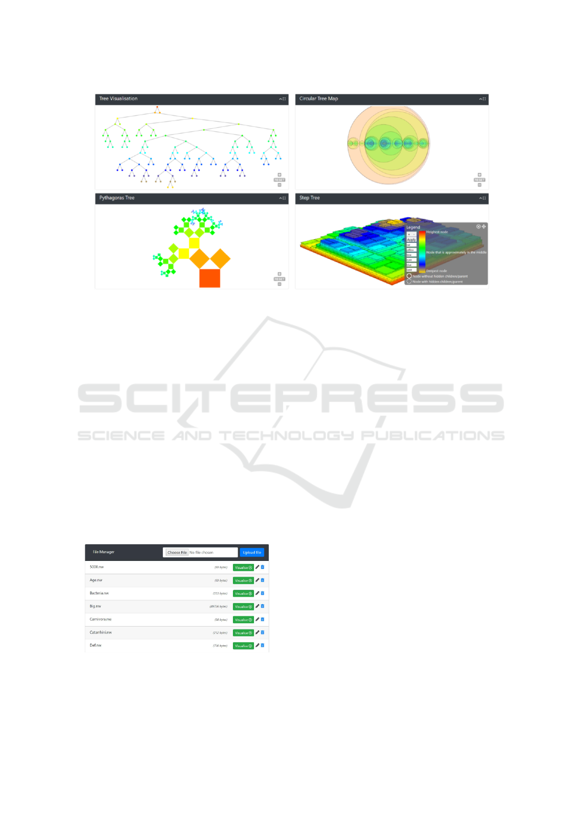
Figure 1: A screenshot of the default view of our visualization tool with a dataset about carnivores, nodes colored according
to depth. Each card can be repositioned, collapsed/expanded, and set to full-screen mode. In the legend the meaning of the
colors is described which can also be changed interactively and adapted to the dataset scenario at hand.
oral presentation to a larger audience.
The visualizations were implemented in
JavaScript, more specifically by using the D3.js
library. To test our tool, we let it run on a couple
of example datasets, from relatively small to rela-
tively large sizes. The largest of these datasets, the
NCBI taxonomy dataset, consists of over 300,000
hierarchical elements that describe species living on
earth having a total depth of 42. Although this tool
is not primarily built for data analysis, but more for
communicating hierarchical structures in different
visual perspectives, we are aware of the fact that
it might be extended to a data analytics tool if,
for example, more algorithmic concepts like tree
comparison (Beck et al., 2014b), tree restructuring,
or automatic filtering were integrated.
Figure 2: An overview of the file manager. In the top bar
users can upload new files, underneath an alphabetically or-
dered list of uploaded files is shown. To the right, options
are provided to delete, rename, or visualize each file, and
furthermore, the size of each file is also shown.
2 RELATED WORK
The field of data visualization is one that has a long
history and where a lot of research is still being
conducted. Because of this, a large variety of vi-
sualization techniques were developed, and are still
being developed. A lot of examples of hierarchi-
cal data visualizations can be found in (J
¨
urgensmann
and Schulz, 2010; Schulz, 2011). The most well-
known types of hierarchical visualizations are node-
link (Reingold and Tilford, 1981; Burch et al., 2011;
Eades, 1992), stacking (Kruskal and Landwehr, 1983;
Stasko and Zhang, 2000), nesting (Shneiderman,
1992; Nocaj and Brandes, 2012), and indentation
techniques (Burch et al., 2010; Burch et al., 2012).
There are also combinations of these forms, usually
called hybrid forms, that try to exploit the benefits
from several, but at least two, approaches (Nguyen
and Huang, 2005).
An example of a node-link diagram is the well-
known tree visualization (Wetherell and Shannon,
1979). The advantage is that, at a quick glance, in-
dividual relations between nodes of the data can be
seen, so they offer a lot of detail. However, this comes
with a drawback as the drawing of these trees, more
specifically ’tidy’ drawing of trees, is not something
trivial. Especially, when the trees become larger, then
this results in a big challenge (Supowit and Reingold,
1982). Several different solutions exist for drawing
tidy trees, as in (Wetherell and Shannon, 1979) and
the Reingold-Tilford algorithm (Reingold and Til-
ford, 1981). The latter serves as the base for our
IVAPP 2019 - 10th International Conference on Information Visualization Theory and Applications
192

implementations, as the D3.js library uses a modified
version of this algorithm.
Another problem with visualizing trees is that
when the dataset is large, the visualization tends to
use a lot of space to be drawn, or becomes clut-
tered (Rosenholtz et al., 2005). Many overlapping
nodes make it nearly impossible to understand the
data on a communicative basis. Other approaches,
like nesting, are more space-efficient when working
with large data sets. The circular treemap, which we
used in our implementation, is an example of a nested
visualization (Zhao and Lu, 2015). In these types of
visualizations details are less apparent, but they give
a better overall view of the structure of the data. If
larger datasets are used with circular treemaps, they
look more structured and tidier than, for example, a
node-link diagram, however, details can get lost, be-
cause each subsequent level is drawn in a smaller way.
Another advantage is that they use a fixed amount of
space, as the circles representing the data are recur-
sively drawn smaller for each new level. This means
that drawing them is more space-efficient than draw-
ing trees, which tend to take up more space when
the dataset becomes bigger (McGuffin and Robert,
2009). Therefore these visualizations are sometimes
preferred over node-link diagrams.
An example of a more hybrid form of visualiza-
tions is the ’Elastic hierarchy’ (Zhao et al., 2005),
combining both node-link and nesting properties into
a hybrid visualization. In this example it is clearly
visible that these hybrid visualizations have advan-
tages over, for instance, the node-link visualizations.
In this case, the visualization is more space-efficient
than a tree visualization, and the screen does not get
cluttered that easily when compared to the tree visual-
ization. This leads to the effect that these types of vi-
sualizations are sometimes preferred over other types,
because of the greater efficiency in terms of space and
clarity. If only limited space is available, for example,
on a website with a small window for the visualiza-
tion, it might even be necessary to use a visualization
like this.
3 VISUALIZATION TOOL
The visualization tool runs online in a web browser
making it easily accessible to anyone all over the
world. Users can also switch easily between differ-
ent datasets and visualizations, to make the tool as
user-friendly as possible.
3.1 Graphical User Interface
The file manager provides a view on all files shared
on the server while new files can be added (see Fig-
ure 2). At the top there is a file selection button, next
to which is another button to submit the selected file
for uploading. Below is a list of all files which have
been uploaded so far to the server. For each file, there
is a link to visualize the dataset and two extra options
to either rename or delete the file. For each dataset the
file size is also displayed, which can give the users
some indication of how long they have to expect to
wait until the dataset is loaded or how complex a hi-
erarchy visualization might look like in case they plan
to quickly show some figures for illustration purposes.
The visualizer page is where the visualizations are
displayed. The layout (see Figure 1) consists of three
main sections, the visualizations themselves, the set-
tings bar, and the legend. The settings bar is collapsi-
ble, which allows for the full width of the page to be
used for the visualization. Within the settings bar,
there are many options to apply to the visualization.
With these settings the user can select the file being
displayed, select the coloring that is applied to the vi-
sualization, change the effect of left and right clicking
on a node, and the depth limitation for the drawing of
the tree. There are also two buttons to collapse and ex-
pand the subtrees, to make it easier to apply these ac-
tions. There is also a button to make the 3D step-tree
and Pythagoras tree dependent on the branch weight
of the tree, and a setting to adjust the minimum weight
for all nodes. Some datasets may have a branch length
attached to the parent-child relationships, which gets
incorporated in these visualizations if this option is
selected. This might be important for biologists or
bioinformatics researchers.
When starting the visualization tool, the legend
will be shown in the bottom right of the screen (see
Figure 1). To ensure easy usage of the legend, the
user can position it anywhere on screen as to not ob-
struct and occlude the visualizations.
The visualization panel consists of four cards,
each with a different visualization (see Figure 1).
These cards each have a tab at the top, with a name at
the top left, and on the right, options to make the visu-
alization cover the full page, and an option to collapse
or expand the card. The cards can also be dragged by
grabbing these tabs, in case a certain order or layout
is preferred.
3.2 Interaction Techniques
Under the tab we can see the major view of the visu-
alizations. Each one has zoom buttons in the bottom-
Combining Interactive Hierarchy Visualizations in a Web-based Application
193
(a) (b)
(c) (d)
Figure 3: The visualization supports node-link diagrams (a), circular treemaps (b), Pythagoras trees (c), and 3D treemaps (d).
right corner, and a button to reset the zoom and pan to
the default settings. Each visualization can be panned
around using the left click and also zooming is sup-
ported. The 3D step-tree visualization can be rotated
around using the left click, and panned around using
the right click. Also in each visualization, if a node is
hovered over, details about that node are shown. This
data includes the name, number of children, depth,
height, color, and weight of the node. This is dis-
played in a grey balloon to make it easier to read, as
otherwise the colors of the visualization might inter-
fere with the readability of the text.
In all of the visualizations if a node is hovered
over, the path to that node from the root becomes
highlighted. In the tree visualization this is accom-
plished by increasing the size of the nodes and thick-
ness of the connecting lines in the path, while in
the circular treemap and Pythagoras tree visualiza-
tion this is shown by increasing the thickness of the
border of the circles/rectangles in the path. In the
step-tree every node in the path is colored red. Ev-
ery node’s subtree can be expanded and collapsed by
left-clicking the node, or the tree will be rerooted to
that node depending on the left-clicking mode that is
set in the settings menu. A right-click on a node will
either collapse or expand the whole subtree that the
node is connected to, depending on the mode set in
the settings. When it is the case that the user collapsed
parts of a subtree with multiple left-clicks, expanding
the root of this subtree with a left-click will result in
the subtree expanding nodes without expanding pre-
viously collapsed subtrees of these nodes. If the user
had performed right-click expanding instead, it would
have expanded the entire subtree, including those pre-
viously collapsed subtrees of child nodes.
3.3 Visualization Techniques
The major visualization technique is a traditional
node-link diagram since it is easy to understand and
serves as a navigation aid but negatively, it suffers
from visual scalability problems (see Figure 3 (a)).
Drawing a tree is done by using the D3.js function
.tree(). It is an implementation of the Reingold-
Tilford algorithm (Reingold and Tilford, 1981). This
assigns x- and y-coordinates to each node, such that
each node is centered over its children, has a non-
overlapping subtree, and is as evenly spaced as possi-
ble with respect to its siblings.
Another visualization (see Figure 3 (b)) is the cir-
cular treemap. This is a variation of the traditional
treemap. D3.js also provides an implementation for
this type of map, by using the .packed() function. Its
algorithm can be described as the continuous opti-
mization of disk packing (Zhao and Lu, 2015). A
good disk packing algorithm is much harder to im-
IVAPP 2019 - 10th International Conference on Information Visualization Theory and Applications
194

plement by ourselves than, say, the Reingold-Tilford
algorithm, which is why we are lucky D3.js also pro-
vides a function for this. If we were to use an even
better and more complex disk packing algorithm, we
should fear losing the relatively good performance we
are achieving now.
The third visualization is a Pythagoras tree (see
Figure 3 (c)), a method in which each node is rep-
resented by a rectangle. Our implementation of this
visualization is based on the work by (Beck et al.,
2014a). In this paper a generalized recursive algo-
rithm was given for the calculation of the positions of
each node. We implemented an iterative version of
this algorithm in JavaScript, using the D3.js library.
First, the tree is passed through the D3.js function .hi-
erarchy(), so that children of the nodes are easier to be
called in JavaScript. Then, the angles for the spread-
ing of the squares are calculated and the length of the
side of each node is computed.
The fourth visualization is a 3D treemap, also
called 3D step-tree (Bladh et al., 2004) (see Figure 3
(d)). A step-tree is an extension of a treemap to the
third dimension. This visualization may provide a lot
of insights into (large) datasets which may have no
emergent characteristics in two dimensions. To draw
3D objects, we used the well-known three.js library.
Starting from our hierarchical data, we use D3.js to
obtain a treemap of it using .treemap(). Then, we do
some arithmetic in finding suitable height attributes
for each object depending on whether the option is set
to use the branch length properties or not, assuming it
is provided in the input file, of course. If the option
is set to incorporate branch lengths, then the height
of a node is scaled relative to the branch lengths of
that node and its parent. We also add black lines
to stress what the bounding box of a node is, which
could have been hard to see with some colorings and
large datasets. We have added the options for sev-
eral colorings of the dataset. The absolute depth col-
oring is based on the depth of the nodes. For each
node, we look at its depth and add a relative amount
to the hue of the node. This amount is scaled by the
maximum depth of the dataset, hence the name ab-
solute. How the colors change from the root to the
leaves can be chosen by the user by interacting with
the legend. When using this coloring, nodes with the
same depth will have the same color. It may be noted
that the legend has two purposes, i.e., informing about
the graphical primitives and the visual variables while
also serving as means for adapting parameters and vi-
sual encodings.
When displaying multiple visualizations on the
same page, the exact same data is displayed, but in
a different visualization like in multiple coordinated
views. This is achieved by using only one data ob-
ject, and when necessary updating only that data ob-
ject and then every visualization is required to fit that
data object. Another technique we use to increase per-
formance, is to limit the depth of the original data we
plot such that we plot at most 3,000 nodes in the ini-
tial plot. Of course the user will be able to plot all
data, although the tool will not do this from the start.
We do load all the data into the data object, however,
expanding beyond the initial depth is no problem.
Finally, to enhance performance, we also only up-
date the visible visualizations, so if a card is col-
lapsed, then its visualization is not updated. If the
user, at a later point, decides to reopen the card, then
the pending changes are applied immediately. This
feature is useful to reduce the runtime for layouting
and rendering the dataset.
3.4 Implementation Details
Our website’s user interface was written in PHP,
HTML, CSS, and JavaScript. We chose PHP for our
file manager back-ends because it allows for file ma-
nipulations at the server side and we used HTML,
CSS, and JavaScript because they are the de facto lan-
guages in the development of web applications.
We used the Bootstrap framework to create the
user interface of our visualization tool, to ensure that
the page would look roughly the same on all devices
and that the page would be appropriately scaled. To
create our four-visualization card layout, we used the
Bootstrap cards design to which we added the drag-
ging, expanding/collapsing, and full-screening func-
tionalities using the Lobicard library. As the Lobi-
card library was developed for the 4.0 beta version of
Bootstrap and we have used the Bootstrap v4.1.1 re-
lease version, the Lobicard library did not work cor-
rectly at first. We have had to adapt the library to
work correctly with the Bootstrap v4.1.1 cards and
furthermore, we have had to extend the functionality
of the Lobicard library, using jQuery to make sure it
also scaled the visualization cards correctly to fill the
whole screen. We chose to use jQuery because it al-
lows for easy manipulation of DOM elements.
Tether was also used, as it is a dependency for
the Lobicard library, which allows for easier abso-
lute positioning of DOM elements without messing
up the rest of the layout. Our settings bar and leg-
end were custom-built using Bootstrap components as
a base, which we then extended using our own CSS
and jQuery code to make them function correctly. Fi-
nally, we used the Font Awesome library to create
good looking and easy-to-interpret icons in the user
interface of our visualization tool.
Combining Interactive Hierarchy Visualizations in a Web-based Application
195
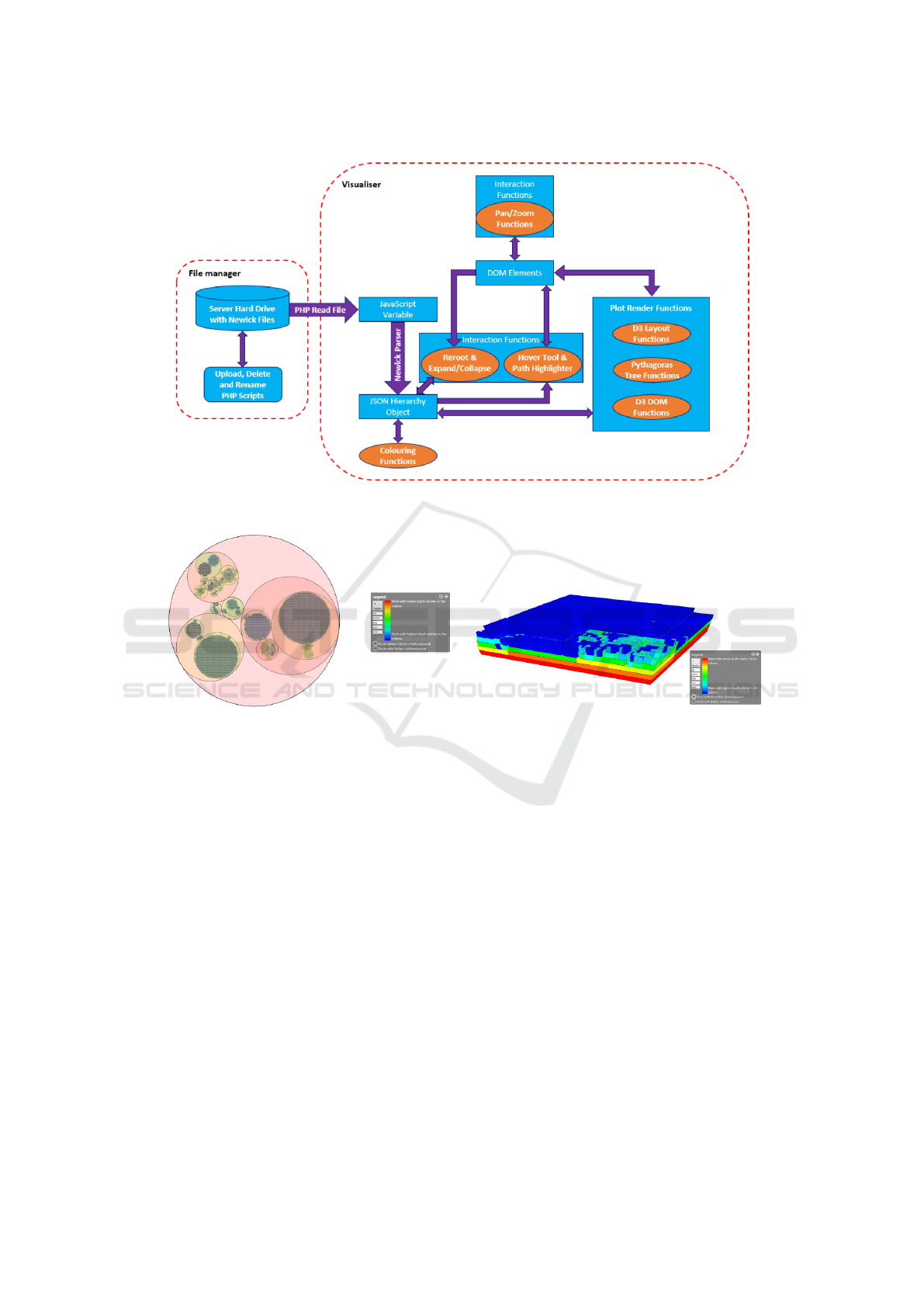
Figure 4: A UML diagram showing the connections of data and visualization components.
(a) (b)
Figure 5: The NCBI taxonomy shown as a circular (a) and a 3D (b) treemap.
Our visualizations were implemented using the
D3.js JavaScript library, therefore, all of the visualiz-
ing aspects are processed at the client side. The work
flow is visualized in Figure 4.
4 APPLICATION EXAMPLE
We illustrate our visualization tool by applying it to
the NCBI taxonomy and a smaller hierarchical dataset
referred to as Influenza.
4.1 NCBI Taxonomy
Suppose a user or company has a hierarchical dataset
and wants to visualize the data when, e.g., giving a
presentation to a customer. This visualization has to
be unambiguous and informative. Visualizations of
larger datasets often get cluttered easily and may lead
to misinterpretations, hence in our first case, we de-
cide to use the circular treemap and the step-tree. In
this first application example, we will use the NCBI
taxonomy dataset, since this is quite a large dataset
and therefore, a real stress test. To get an image which
gives a rather clear structure, we set the depth limit to
4 and afterwards expanded some nodes. This visual-
ization can be seen in Figure 5 (a).
In this circular treemap, we see the general struc-
ture of the dataset. The size of a circle gives the rel-
ative size of the subtree rooted at this node. We can
hover over the different circles to see which taxa have
most children or sub-taxa. Also, when a certain circle
is crowded with smaller circles, we know that there
is a large number of children for this specific node.
When we zoom in we will see that some of these chil-
dren still have subtrees that are collapsed. If the user
desires to look at the more specific structure of the
data, it is possible to expand these subtrees. This ex-
IVAPP 2019 - 10th International Conference on Information Visualization Theory and Applications
196
(a) (b)
Figure 6: The influenza dataset shown as a circular (a) and a 3D (b) treemap.
pansion was applied to a couple of children for the
step-tree (see Figure 5 (b)).
Due to the fact that not all nodes are expanded
and the maximal depth of the tree is higher than
40, we cannot see the structure of the whole dataset,
which might be misleading. Nevertheless, to see the
structure of specific nodes (think of the amount of
children), you get a good overview, which makes
the choice of this visualization applicable on large
datasets. In the step-tree, we expanded some nodes
that had a collapsed subtree. This can, for example,
be done when these nodes are of particular interest,
like when researching a specific branch of species.
We now clearly see that a lot of nodes are already
leaves because they are colored in blue. We also see
there are still some nodes that have a collapsed sub-
tree, for example in the left corner, because they are
not colored in blue. These nodes were, however, pur-
posefully left collapsed. If the user wanted to get a
more detailed view of a subtree, then the user could
also reroot to the corresponding subtree in order to
get a more detailed view on this part of the dataset,
excluding the rest of the dataset. This can be particu-
larly useful when the user is for instance particularly
interested in a specific taxon, for example the king-
dom of Animalia.
4.2 Influenza
In the second case we want to graphically depict an
arbitrary dataset we found online which is named In-
fluenza. Its size is not very small, but definitely not as
big as the NCBI taxonomy dataset. It has 1,373 nodes,
spread over 56 levels, against the 324,276 nodes over
42 levels of the NCBI dataset. We have uploaded it to
our website, so you can interact with it. Clicking the
visualize button from the file manager brings us to the
visualization page.
From the circular treemap, we can immediately
infer it is a binary tree (see Figure 6 (a)). We know
this because all circles have its center on the horizon-
tal axis, which means every parent has precisely two
children. Notice that the coloring we use here, which
is explained in the legend, does not produce an aes-
thetically looking visualization. Perhaps choosing a
color scale with only two colors would look better.
Looking at the step-tree, we find that there is a
sort-of-pyramid structure, with attached to it some
small stacks of nodes on the steps of the pyramid. The
pyramid has one peak which is colored gold. From
this, we can infer that the tree was created around a
central path on which small subtrees were attached.
Hovering over one of the peak nodes, we can find the
maximum depth of the tree (see Figure 6 (b)). In this
case, we find that the maximum depth of the tree is 56.
Looking at the regular treemap we see that the tree
seems to be relatively deep for the amount of nodes
it has. Its depth is greater than the one of the NCBI
dataset, while the amount of nodes is less than a hun-
dredth of it. This enables for a nice interaction with
the Pythagoras tree as we can keep on zooming in on
this longest path to fully enjoy the recursive structure.
Notice the nodes colored red in Figure 6 (b) are the
path from the root to the selected node. Also, notice
a text box with information about the selected node
is displayed above the selected node. Because of the
medium size of this dataset, we are perfectly able to
interact with it in all visualizations. If we explore fur-
ther by hovering over more nodes, we can see a gen-
eral structure in the names given to the nodes. Also,
enabling branch lengths shows that the branch length
value seems to be determined by the size of the sub-
tree, although if this is actually the case remains un-
known as it does not seem to hold for all nodes.
Combining Interactive Hierarchy Visualizations in a Web-based Application
197

5 CONCLUSION AND FUTURE
WORK
To achieve the goal of this project we set up a web
page using Bootstrap, HTML, PHP, and CSS. We cre-
ated visualizations using D3.js. By using four differ-
ent visualizations and by making these visualizations
interactive in a variety of ways, we have achieved a
tool that can be used to visually communicate hier-
archy data. By making the layout adjustable to the
user’s needs and by using industry-standard icons we
have tried to give the user a great and hassle-free ex-
perience. There are still some things that we would
have wanted to implement. Some aesthetic aspects
have room for improvement, for instance the circular
treemap could be made to have opaque nodes, such
that the coloring corresponds better to the color scale
depicted in the legend. Furthermore, we would have
liked to implement some sort of search function, so
that users can easily find nodes. Moreover, we think
that adapting our tool such that it can edit, extend, and
export datasets would add a whole new dimension of
practical uses for our website. Also a user evaluation
by applying eye tracking techniques (Blascheck et al.,
2015) might be an option for future work.
REFERENCES
Beck, F., Burch, M., Munz, T., Silvestro, L. D., and
Weiskopf, D. (2014a). Generalized Pythagoras trees:
A fractal approach to hierarchy visualization. In Com-
puter Vision, Imaging and Computer Graphics - The-
ory and Applications, pages 115–135.
Beck, F., Wiszniewsky, F., Burch, M., Diehl, S., and
Weiskopf, D. (2014b). Asymmetric visual hierarchy
comparison with nested icicle plots. In Joint Proc. of
the Workshop on Euler Diagrams and the Workshop
on Graph Visualization in Practice, pages 53–62.
Bladh, T., Carr, D. A., and Scholl, J. (2004). Extending tree-
maps to three dimensions: A comparative study. In
Proc. of the 6th Asia-Pacific Conference on Computer-
Human Interaction, pages 50–59. Springer Verlag.
Blascheck, T., Burch, M., Raschke, M., and Weiskopf,
D. (2015). Challenges and perspectives in big eye-
movement data visual analytics. In Proc. of Sympo-
sium on Big Data Visual Analytics, BDVA, pages 17–
24.
Brath, R., Peters, M., and Senior, R. (2005). Visualization
for communication: The importance of aesthetic siz-
zle. In 9th International Conference on Information
Visualisation, IV, pages 724–729.
Burch, M., Konevtsova, N., Heinrich, J., H
¨
oferlin, M., and
Weiskopf, D. (2011). Evaluation of traditional, or-
thogonal, and radial tree diagrams by an eye tracking
study. IEEE Transactions on Visualization and Com-
puter Graphics, 17(12):2440–2448.
Burch, M., Raschke, M., Greis, M., and Weiskopf, D.
(2012). Enriching indented pixel tree plots with node-
oriented quantitative, categorical, relational, and time-
series data. In Proc. of Diagrams, pages 102–116.
Burch, M., Raschke, M., and Weiskopf, D. (2010). Indented
Pixel Tree Plots. In Proc. of International Symposium
on Visual Computing, pages 338–349.
Eades, P. (1992). Drawing free trees. Bulletin of the Institute
for Combinatorics and its Applications, 5:10–36.
Hlawatsch, M., Burch, M., and Weiskopf, D. (2014). Bub-
ble hierarchies. In Proc. of the Workshop on Compu-
tational Aesthetics, pages 77–80.
J
¨
urgensmann, S. and Schulz, H.-J. (2010). A visual survey
of tree visualization. IEEE Visweek 2010 Posters.
Kruskal, J. and Landwehr, J. (1983). Icicle plots: Better dis-
plays for hierarchical clustering. The American Statis-
tician, 37(2):162–168.
McGuffin, M. and Robert, J. (2009). Quantifying the space-
efficiency of 2D graphical representations of trees. In-
formation Visualization, 9(2):115–140.
Nguyen, Q. V. and Huang, M. L. (2005). EncCon: an
approach to constructing interactive visualization of
large hierarchical data. Information Visualization,
4(1):1–21.
Nocaj, A. and Brandes, U. (2012). Computing
voronoi treemaps: Faster, simpler, and resolution-
independent. Computer Graphics Forum, 31(3):855–
864.
Reingold, E. and Tilford, J. (1981). Tidier drawings of trees.
IEEE Transactions on Software Engineering, 7:223–
228.
Rosenholtz, R., Li, Y., Mansfield, J., and Jin, Z. (2005).
Feature congestion: a measure of display clutter. In
Proc. of Conference on Human Factors in Computing
Systems (CHI), pages 761–770.
Schulz, H.-J. (2011). Treevis.net: A tree visualization ref-
erence. IEEE Computer Graphics and Applications,
31(6):11–15.
Shneiderman, B. (1992). Tree visualization with tree-maps:
2-D space-filling approach. ACM Transactions on
Graphics, 11(1):92–99.
Stasko, J. T. and Zhang, E. (2000). Focus+context display
and navigation techniques for enhancing radial, space-
filling hierarchy visualizations. In Proc. of the IEEE
Symposium on Information Visualization, pages 57–
65.
Supowit, K. J. and Reingold, E. M. (1982). The complexity
of drawing trees nicely. Acta Informatica, 18:377–
392.
Wetherell, C. and Shannon, A. (1979). Tidy drawings of
trees. IEEE Transactions on Software Engineering,
5(5):514–520.
Zhao, H. and Lu, L. (2015). Variational circular treemaps
for interactive visualization of hierarchical data. In
Proc. of IEEE Pacific Visualization Symposium, pages
81–85.
Zhao, S., McGuffin, M. J., and Chignell, M. H. (2005).
Elastic hierarchies: Combining treemaps and node-
link diagrams. In Proc. of IEEE Symposium on In-
formation Visualization, page 8.
IVAPP 2019 - 10th International Conference on Information Visualization Theory and Applications
198
