
A Hybrid Approach based on Parallel Coordinates and Star Plot
Kang Xie and Bijaya B. Karki
School of Electrical Engineering and Computer Science, Louisiana State University, Baton Rouge 70803, U.S.A.
Keywords: Information Visualization, Parallel Coordinates, Star Plot, Multivariate Data, High-dimensional Data.
Abstract: Multivariate data visualization has to accommodate all dimensions/variables of a given dataset in the same
display so that the data items can be rendered with respect to these variables. We propose a hybrid approach
based on the combination of the standard parallel coordinates and star plot techniques by implementing a
focus + context scheme. The focus area displays the parallel coordinates plot of the data with respect to few
selected dimensions by mapping them as vertical parallel axes sufficiently wide to provide a clear view of the
variables and data. The context area then maps the rest of the variables as tightly packed radial axes forming
one or two partial star plots. We design multiple layouts of combining the parallel and star axes. Each layout
maintains the data continuity between the focus and context displays. Our tests show that the proposed hybrid
axes plot can manage a large number of variables (even exceeding one hundred) to support effective
visualization of ultra-high dimensional datasets.
1 INTRODUCTION
One of the major challenges in multivariate data
visualization is to map all relevant dimensions
(variables or attributes) in a finite 2D space in an
unambiguous way (e.g., Johansson and Forsell,
2016). This mapping is critical to our ability in
viewing how data values are distributed along
individual variables and across all variables to extract
useful information and gain insight. As such, the
visualization can help us reveal clusters, correlations,
and patterns contained in the data.
While there exist many techniques for
visualization of multidimensional data, the parallel
coordinates and star plot are the ones which aim to
treat all variables on equal footing and visually
represent the data items/samples/observations with
respect to them (Chambers et al., 1983; Inselberg,
2009). Both techniques map each dimension as a
straight line (i.e., an axis), however, resulting in
different overall axes layouts. The parallel
coordinates plot (PCP) maps all k dimensions as
evenly placed k vertical parallel axes. The plot area
usually extends in the horizontal direction more than
in the vertical direction taking an advantage of the
rectangular shape of computer screen. On the other
hand, the star plot maps all variables as uniformly
radiating axes from a common point. The star axes
may be viewed as a circular layout of parallel
coordinates, providing more compaction in a square
display area. Each axis represents one dimension in
the dataset and the coordinate on each axis is the value
of the corresponding attribute. Line segments are
drawn to connect successive dimensions for each data
item. The data polylines run from the left to right in
the PCP plot. Comparing the data values on the
vertical axes and following their data lines between
the axes is easier as long as visual clutter is not too
much (Inselberg, 1997). In the star plot, the line
segments connecting successive radial axes form
closed loops, which usually form recognizable star
shapes (that is, star glyphs). This helps in comparing
data samples and also in identifying dominating
variables (Chambers et al., 1983; Shaw et al., 1999).
The parallel coordinates and star plots work well
when the number of dimensions is low, say, below
one dozen. In today’s data/information-rich world,
one can find many situations of high dimensionality,
especially when all types of relevant variables
(categorical and numerical) are considered (e.g.,
Inselberg, 2009; Sansen et al., 2017). When the
number of dimensions is arbitrarily large, the parallel
or radial axes are too closely spaced. So, the
visualization process becomes incomprehensible. We
are then compelled to select a few dimensions and
visualize the data with respect to the chosen
dimension-subset using the parallel coordinates or
star plot (e.g., Yang et al., 2003; Forsdosi and
Xie, K. and Karki, B.
A Hybrid Approach based on Parallel Coordinates and Star Plot.
DOI: 10.5220/0007375502670274
In Proceedings of the 14th International Joint Conference on Computer Vision, Imaging and Computer Graphics Theory and Applications (VISIGRAPP 2019), pages 267-274
ISBN: 978-989-758-354-4
Copyright
c
2019 by SCITEPRESS – Science and Technology Publications, Lda. All rights reserved
267

Roerdink, 2011). Several subsets of dimensions
perhaps may need to be examined, one at a time, to
go over the whole dataset.
However, it is desirable to visualize the dataset on
its entirety so that full information is contained in the
same display. This can be done using a bifocal
display, which consists of a focus view of a few
selected dimensions and a context view of the rest of
the dimensions. Here, we propose a hybrid approach
based on the combination of the standard parallel
coordinates and star plot techniques by implementing
a focus + context scheme. We explore various hybrid
axes layouts and present analysis for selecting
appropriate layout for a given high-dimensional
dataset.
2 RELATED WORK
Visualization of high dimensional (multivariate) data
has long been a subject of extensive investigation.
Many visualization techniques are available. Here we
talk about the parallel coordinates plot (PCP) and star
plot because of their direct relevance to our proposed
hybrid axes approach. PCP is widely used to visualize
multivariate data as well as high-dimensional
geometries (Inselberg, 2009; Heinrich and Weiskopf,
2013). The star plot is generally included in most
visual data analysis packages as radial or web chart.
Both plots are highly effective in judging multivariate
relations, clustering, outlier detection, etc. when the
number of dimensions or variables is small
(Chambers et al. 1983; Inselberg, 1997). Multivariate
visualization becomes overwhelming for datasets
containing multiple dozens of variables simply
because the axes packing becomes too compact.
To overcome the issues associated with high-
dimensionality, various approaches were previously
proposed for axes management. Variable dimension
spacing approach allows to tweak the default uniform
axial gap to accommodate more axes while presenting
a clear view of the selected axes (Yang et al., 2003).
For instance, similar variables or less important
variables can be mapped as tightly axes. Collapsing a
subset of axes and zooming in/out of axes can be
applied to adjust the dimension space of concerning
axes (Brodbeck and Girardin, 2003). This idea was
further implemented for a bifocal display consisting
of focus and context parts (Novotny and Hauser,
2006; Kaur and Karki, 2018). The focus part renders
the data with respect to few selected variables and the
context part tightly packs the rest of the axes.
Dimension reduction approach tends to discard less
important variables from the plot (Johansson and
Johansson, 2009) and can be based on principal
component analysis (Jolliffe, 1986; Mead, 1992).
Similar dimensions can be merged to one
representative dimension. An interactive approach is
to select a subset of variables to be displayed in the
main PCP view at a time, while keeping the rest in an
overview plot or in a repository area (Riehmann et al.,
2012; Gruendl et al., 2016). In these approaches, the
information is either lost from or not fully available
in the display.
To manage arbitrarily large number of
dimensions, a multilevel plot scheme has been
previously proposed. Such plot provides a stacked
view containing two or more PCPs, each consisting
of many variables, whose count is roughly the same
between the levels (Kaur and Karki, 2018). In the
case of star plot, the dimensions are divided into
multiple groups, which are mapped to different
concentric circular regions or rings (Sangli et al.,
2016). The outer the ring, the larger the dimension
group mapped. For example, a three-level star plot
contains three sub-star icons for each data sample.
The multilevel plots are particularly helpful in
providing the context while focusing on few
important dimensions. However, different-level PCPs
or star plots are disjoint, and the data polylines
become discontinuous (Sangli et al., 2016; Kaur and
Karki, 2018). Such discontinuity is also an issue with
the double PCP view approaches (Riehmann et al.,
2012; Gruendl et al., 2016).
Integration of parallel coordinates and star plot
techniques has been previously performed to design
parallel glyphs (Fanea et al., 2005). To the best of our
knowledge, no systematic study has been carried in
addressing the problem of mapping ultra-large
number of dimensions/variables. Our proposed
hybrid approach combines the vertical parallel axes
and the radial star axes to support a bifocal display of
multivariate data.
3 HYBRID AXES PLOTS
We design the layouts of the combining parallel and
radial axes to enable a focus + context visualization
of multivariate data. The display space is partitioned
into two or more parts. One part provides a focus
view, which supports parallel coordinates plot (PCP)
of the data with respect a few selected dimensions.
The number of such high priority variables is kept
small (below ten), so the corresponding parallel axes
are spaced sufficiently wide. The other parts together
provide a context view, which tightly packs the
remaining variables either as radial axes or both as
IVAPP 2019 - 10th International Conference on Information Visualization Theory and Applications
268
radial and parallel axes. The context axial spacing can
be arbitrarily small as the number of dimensions that
are included in the context display can be arbitrarily
large.
Let X and Y be the horizontal and vertical extents,
respectively, of the display area used to visualize a
given multivariate dataset consisting of k dimensions.
We consider a rectangular display with X ~ 2Y as
shown in Figure 1. Note that the aspect ratio 2:1 is not
a constraint in our design of hybrid axes layout. If the
focus display of width X
F
maps k
F
dimensions, the
axial spacing is given by X
F
= X
F
/(k
F
-1). The size of
focus area is determined by fixing either X
F
or X
F
.
For instance, we take X
F
= Y so the focus display is
one half of the overall display. The parallel axes come
closer as k
F
increases. If the axial spacing hits some
user-defined minimum threshold (X
F0
), we then
widen the focus part according to X
F
=
(k
F
-1)X
F0
.
The angular spacing between the k
C
radial axes in
the context display is given by
=
/(k
C
-1)
(1)
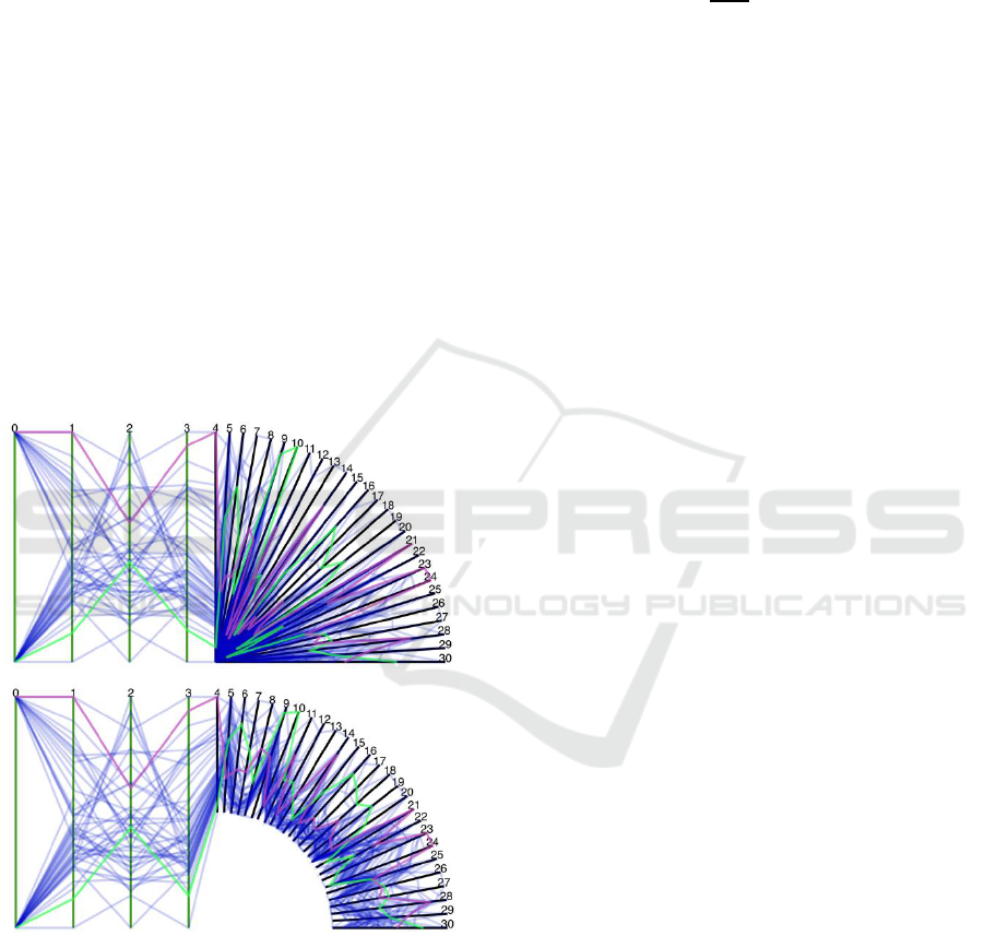
Figure 1: The hybrid axes layout 1 for a 31-dimensional
dataset. The focus area displays PCP with respect to four
variables (labelled 0, 1, 2 and 3) and the context area shows
a quarter star mapping 27 variables with no origin shift
(upper) and with shift 0.5l (lower). Two data polylines, one
from each category value of dimension 0, are highlighted.
where
is the total angular span of all parts
supporting the content display and 𝑘
C
= 𝑘 − 𝑘
F
k
C
.
For a full star plot,
= 360
o
. The length (l) of the
parallel and radial axes is Y (or Y/2) for the 2:1
display. In the context view, we also apply an offset
(l
o
) so the radial axes do not start from one common
origin thereby opening a finite axial gap at their lower
ends. The value of l
o
can be calculated as:
𝑙
o
= min(
∆𝜃
th
∆𝜃
,0.5)𝑙
(2)
Here ∆𝜃
th
represents the threshold axial angle
assigned by the user (the default value is set at 5
o
), ∆𝜃
is the angle between successive axes in the context
star plot under consideration given by Eq. 1, and l is
the axial length when the radial axes start from the
single common origin. A bigger shift (up to 0.5l) can
be helpful in reading the data lines when the axes
contain dense small values.
Next, we present different layouts of our proposed
hybrid parallel-radial axes plot. They mainly differ in
the number and size of context parts used. For
illustration, we use the breast cancer dataset
containing 31 dimensions (Wolberg et al., 1994; Dua
and Karra Taniskidou, 2017). We have k = 31, k
F
= 4,
and k
C
= 27. Note that the numerical labels on the
axes in the plots represent the variables (Figure 1).
For the four focus axes considered, 0:
malignant/benign cancer, 1: mean radius of mass, 2:
standard error of radius, and 3: largest radius. The
origin shift l
o
evaluated using the Eq. 2 is applied to
the context axes.
3.1 Layout 1
The overall display is vertically split into two equal
parts (Figure 1). The left side of the display maps k
F
axes at the spacing Y/(k
F
-1) for a 2:1 display space.
The remaining axes are mapped to the other part as
one quadrant of star plot. The positions of the focus
and context parts can be switched in layout 1. The
angular spacing is given by
= 90
o
/(k
C
-1). For the
example data, ∆𝜃 = 3.5
o
and the plot gives a highly
cluttered display (Figure 1, upper). Using Eq. 2, we
have l
o
= 0.5l assuming 5
o
threshold angular spacing.
With this high shift applied, we can now trace the data
polylines (Figure 1, lower). We can see that two
highlighted samples, one for each cancer type
(dimension 0), take different values for focus axes (1
and 3) as well as for most context axes.
3.2 Layout 2
To increase the angular spacing, we use a half star
plot for the context display by reducing the axial
length to half as shown in Figure 2. So,
=
180
o
/(k
C
–1). The focus display in layout 2 can be
A Hybrid Approach based on Parallel Coordinates and Star Plot
269
widened because the context display gets narrower.
For the example data with k
C
= 27, we have now
angular spacing of about 7
o
. The axial origin shift l
o
=
0.36l, according to Eq. 2 with ∆𝜃
th
= 5
𝑜
. The focus
PCP clearly reveals that the malignant cancer samples
tend to be bigger than the benign cancer samples
(with respect to both variables 1 and 3).
Figure 2: The hybrid axes layout 2 for a 31-dimensonal
dataset. The focus area displays PCP with respect to four
variables and the context area shows a half star mapping 27
variables. For the dimension 0, two categories are shown by
red lines (malignant cancer) and blue lines (benign cancer).
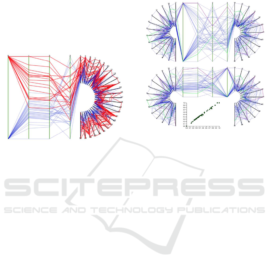
3.3 Layout 3a and 3b
To maintain a reasonable angular spacing for large k,
we can divide the display into three parts (Figure 3).
The middle part provides the PCP focus display
which is the same as in the previous two layouts. In
layout 3a, the context display is split between two
sides, each containing a half-star plot. The length of
radial axis is the same as in layout 2, but the angular
spacing improves further because of total 360
o
span.
The context dimensions are split between the left
half-star (k
CL
axes) and the right half-star (k
CR
axes),
not necessarily equally, that is, k
CL
and k
CR
can be
different. The corresponding angular spacings are
given by 180
o
/(k
CL
-1) and 180
o
/(k
CR
-1). For the
example data, we have an average angular spacing of
about 14
o
, with the left and right half-stars
accommodating 14 and 13 context axes, respectively
(Figure 3). The origin shift is l
o
= 0.18l, according to
Eq. 2 with ∆𝜃
th
= 5
𝑜
.
While the selected dimensions are widely spaced
out for a focus view, PCP alone may not provide the
data visualization to a desired level. The focused
visualization may need supplementary plots such as
scattered plot or may benefit from showing the data
table with selected entries. For this, we compress the
focus PCP vertically to the upper half space to make
the lower half space available for additional display
Figure 3: Two variants of the hybrid axes (layout 3a and 3b)
for a 31-dimensonal dataset. The context display contains
left and right half stars. The focus area displays PCP with
respect to four variables. The lower layout divides the focus
area into compressed PCP and a scatter plot between the
first axes pair.
(Figure 3, lower). This layout 3b does not affect the
length and angle for the context axes. In Figure 3
(lower), the scatter plot confirms strong positive
correlation between the variables 1 and 3.
3.4 Layout 4
For large k, the number of context axes also becomes
large because the number of focus axes remains
relatively small. We can have two three-quarter
(3/4
th
) star plots, also using the space below
compressed PCP (Figure 4, upper). The overall
context display represents total one and half star plots
so the total angular span is 540
o
. The angular spacings
on the left and right three-quarter stars are given by
270
o
/(k
CL
-1) and 270
o
/(k
CR
-1), respectively. For the
example data, we have a much wider angular spacing
(about 21
o
) and a much smaller origin shift (0.12l).
Such a wide context view may not be needed for this
dataset as the context axes are too widely spaced out.
3.5 Layout 5
Instead of converting each half-star to a 3/4
th
star, we
can actually bridge the left and right half-star plots by
tightly packing the context axes as parallel axes in the
space below the focus PCP (Figure 4, lower). The
context display thus consists of three parts: left
IVAPP 2019 - 10th International Conference on Information Visualization Theory and Applications
270
half-star plot, right half-star plot, and middle PCP, each
mapping approximately the same number of the
context axes. Note that the context PCP axes are
packed much more tightly and somewhat shorter than
the focus PCP axes. The angular spacing for the star
axes is close to that of layout 4. The major difference
of this layout from all other layouts is that the data
polylines form closed loops, each consisting of a focus
PCP portion, two half-star portions, and a context PCP
portion.
4 IMPLEMENTATION AND
ANALYSIS
The choice of a hybrid axis layout depends on the total
number of variables of the dataset under consideration
and the desired axial spacing in the context display. We
implemented the proposed hybrid axes plot system
using D3.js for data rendering and vue.js for user
interface. For each axis, we define one end (which is a
lower end for the focus axis or an origin-closer end for
the context axis) as the normalized attribute value of
zero and the other end as the normalized value of 1. So,
all data attributes are normalized to the range 0 to 1.
Figure 4: The hybrid axes layout 4 (upper) and 5 (lower) for
a 31-dimensonal dataset showing all data points. The focus
area displays PCP with respect to four variables and the
context area displays 27 variables. The data lines are
colored for the cancer type: red (malignant) and blue
(benign).
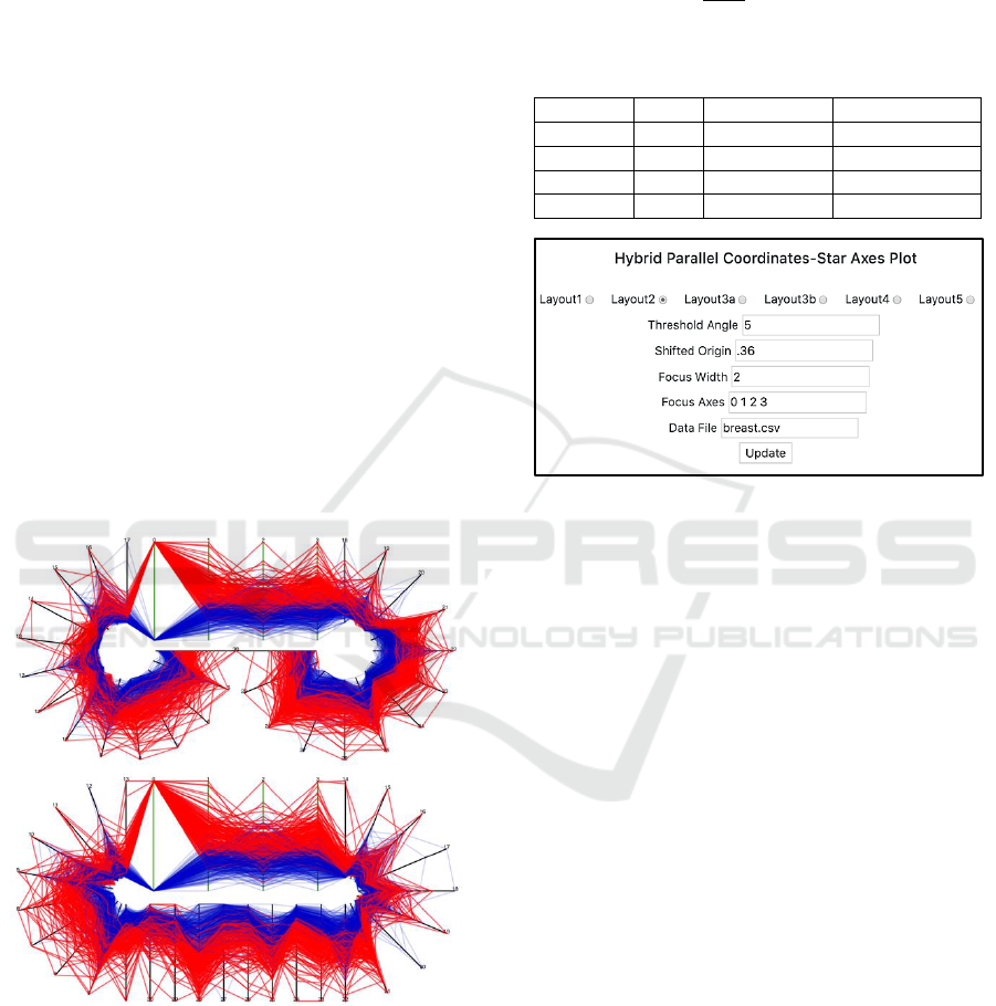
Our system finds an appropriate layout for a given
dataset of k dimensions (Figure 5). Using the default
5
o
(or a user-specified value) for the threshold angle
∆𝜃
th
, it estimates the maximum number of the context
axes each layout can accommodate according to the
following relation:
𝑘
C
=
𝜃
∆𝜃
𝑡ℎ
+ 1
(3)
The calculated numbers of the context axes for
different layouts are given below:
𝜃
k
C
(∆𝜃
th
= 5
o
)
k
C
(∆𝜃
th
= 10
o
)
Layout 1
90
o
19
10
Layout 2
180
o
37
19
Layout 3
360
o
73
37
Layout 4
540
o
109
55
Figure 5: A simple user-interface supporting the hybrid-
axes plot system.
There must be, at least, two axes to have a focus PCP.
So, all layouts with k
C
k - 2 are acceptable, and the
system chooses the one with angular requirement
minimally met. The user then visualizes the data
using the system-selected layout irrespective of the
number of focus axes. However, the user can switch
to any other layout and also adjust the origin shift in
an interactive manner. Note that layout 5 has similar
angular spacing as layout 4, and the choice between
two is left up to the user. For the 31-dimensional
example data, the system assigns layout 2 for the
default angular threshold (5
o
) and layout 3a if the user
specifies a wider angular spacing of 10
o
. The origin
shift is 0.36l in each case. It is important to note that
in each layout, the data polylines are always
continuous between the focus and context displays
(for example, two highlighted data lines in Figures 1
and 3).
We now consider the example of ultra-high
dimensional dataset. The Libras movement dataset
consists of 91 variables describing the movements of
hand for the sign language (Dias et al., 2009; Dua and
Karra Taniskidou, 2017). With the default spacing
∆𝜃
th
= 5
o
, the system assigns layout 4, which can
accommodate up to 109 axes, exceeding k-2 = 89. If
a wider angular threshold of 10
o
is applied, none of
A Hybrid Approach based on Parallel Coordinates and Star Plot
271
the layouts meets the requirement and the system
assigns the layout with highest k
C
value, that is, layout
4. Again, the user can select layout 5, which can
accommodate the same number of context axes.
Assuming that 4 dimensions are used for the focus
display, we have 87 variables to be incorporated for
the context display for the dataset. The axial angle
and origin shift l
o
take the following values for
different layouts:
layout 1:
= 90
o
/86 = 1.1
o
, l
o
= 0.5l
layout 2:
= 180
o
/86 = 2.1
o
, l
o
= 0.5l
layout 3a, b:
= 360
o
/86 = 4.2
o
, l
o
= 0.5l
layout 4:
= 540
o
/86 = 6.3
o
, l
o
= 0.38l
layout 5:
= 360
o
/56 = 6.4
o
, l
o
= 0.38l
The angular spacing is too small for layout 1 and 2 so
both layouts are not appropriate (not shown here).
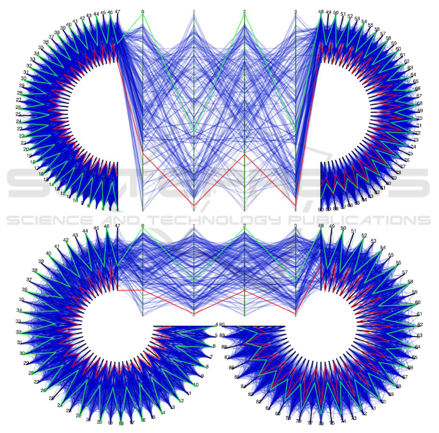
Figure 6: Hybrid axes plot of 91-dimensional dataset using layout 3a (upper) and layout 4 (lower). The focus PCP area shows
four variables (label 0 and 1: x- and y-coordinates of the first point, label 2 and 3: x- and y-coordinates of the second point).
The context areas display 87 variables together in the left and right stars. A couple of data lines are highlighted in red and
green.
IVAPP 2019 - 10th International Conference on Information Visualization Theory and Applications
272
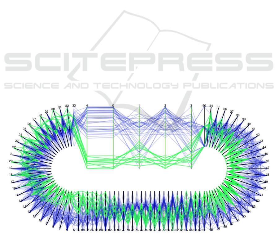
The context stars in layout 3a appear to be too tight as
well (Figure 6, upper). The best options are layout 4
and 5, which give the widest angular spacing (~ 6.3
o
)
as shown in Figures 6 (lower) and 7. We can choose
the minimum threshold for the angular spacing such
that the context axes are visually traceable. This
appears to be the case with a few degrees like 5
o
. For
such angular spacing, the hybrid axes layouts 4 and 6
can allow the visualization of a dataset consisting of
over 110 variables. We can improve the axial spacing
at the ends closer to the origin to some extent by
increasing the offset l
o
.
Multidimensional visualization is generally prone
to visual clutter. This is even more so for the proposed
hybrid PC-star axes plots when they try to
accommodate many data lines (Figure 4) and many
dimensions as possible (Figure 6). Appropriate ways
of interacting with the axes themselves and with the
data polylines are critical to the effectiveness of the
resulting visualization (Siirtola and Raiha, 2006;
Turkay et al., 2011). Since the goal of this work is to
design the axes layout, we support a minimal
interactivity. There are options to select the desired
layout and adjust the origin shift and focus area width
(Figure 5). We can move the axes between the focus
and context areas by selecting the concerned axes. We
can highlight single or group of data polylines, so
they can be traced not only in the focus display but
also in all parts of the context display. Figure 7
displays two groups of data points, which differ not
only with respect to focus axes, but also differ with
respect to the most context axes. Their values are
reversed for certain variables such as 20, 22, 24, 26,
and 28. An interesting way to change focus
dimensions in layout 5 is to scroll them like a carousel
(Figure 7).
5 CONCLUSIONS
We propose a hybrid approach based on the parallel
coordinates and star plot techniques to visualize
datasets containing ultra-high number of
dimensions/variables/attributes. In essence, our
approach integrates the ideas of these two plots into a
hybrid plot consisting of parallel and radial axes. A few
selected dimensions are mapped as parallel vertical
axes to support a focus view while all the remaining
axes are mapped tightly as radial star axes to support a
context view. We explore various hybrid axes layouts,
which differ in the way the context axes are represented
as quarter, half, or three-quarter star. It is important to
note that all axes layouts maintain the data continuity
between the focus and context regions. We also present
a rationale for selecting appropriate layout for a given
number of variables by working with a couple of high-
dimensional datasets. More work is needed on several
fronts to further demonstrate the applicability and
effectiveness of the proposed hybrid techniques in
high-dimensional data visualization. Some possible
actions to be taken can deal with user evaluation,
intelligent set of interactions and visual clutter
reduction.
Figure 7: Hybrid axes plot of 91-dimensional dataset using layout 5 showing only 50 data points. The focus area displays
PCP with respect to 5 variables (label 0, 1, 2, 3, and 4). The context display contains two half-stars and PCP, each mapping
25 variables. The data lines with low and high values with respect to focus axes are shown in green and blue, respectively.
A Hybrid Approach based on Parallel Coordinates and Star Plot
273

REFERENCES
Dua, D. and Karra Taniskidou, E. (2017). UCI Machine
Learning Repository. Irvine CA: University of
California, School of Information and Computer
Science. http://archive.ics.uci.edu/ml
Brodbeck, D. and Giradin, L. (2003). Design study: Using
multiple coordinated views to analyze geo-referenced
high-dimensional datasets. International Conference
on Coordinated and Multiple Views in Exploratory
Visualization, pages 104-111.
Chambers, J. M., Cleveland, W. S., Tukey, P. A., and
Kleiner, B. (1983). Graphical Methods for Data
Analysis.
Dias, D. B., Madeo, R. C. B., Rocha, T., Biscaro, H. H., and
Peres, S. M. (2009). Hand movement recognition for
Brazilian sign language: A study using distance-based
neural networks. International Joint Conference on
Neural Networks, pages 697-704.
Fanea, E., Carpendale, S., and Isenberg, T. (2005). An
interactive 3D integration of parallel coordinates and
star glyphs. IEEE Symposium on Information
Visualization (INFOVIS 2005), pages 149–156.
Ferdosi, B. and Roerdink, J. B. T. (2011). Visualizing high-
dimensional structures by dimension ordering and
filtering using subspace analysis. Computer Graphics
Forum, 30: 1121-1130.
Gruendl, H., Riehmann, P., Pausch, Y., and Froehlich, B.
(2016). Time-series plots integrated in parallel
coordinates displays. Eurographics/IEEE VGTC
Conference on Visualization, pages 321-330.
Heinrich, J. and Weiskopf, D. (2013). State of the art of
parallel coordinates. In STAR Proceedings of
Eurographics, pages 95–116.
Inselberg, A. (1997). Multidimensional detective. IEEE
Symposium on Information Visualization (INFOVIS
1997), pages 100-107.
Inselberg, A. (2009). Parallel coordinates: visual
multidimensional geometry and its application.
Springer, New York.
Johansson, J. and Forsell, F. (2016). Evaluation of parallel
coordinates” Overview, categorization and guidelines
for future research. IEEE Transactions on Visualization
and Computer Graphics, 22, 579-588.
Johansson, S. and Johansson, S. (2009). Interactive
dimensionality reduction through user-defined
combinations of quality metrics. IEEE Transactions on
Visualization and Computer Graphics, 15: 993–1000.
Jolliffe, J. (1986). Principal component analysis. Springer
Verlag.
Kaur, G. and Karki, B.B. (2018). Bifocal parallel
coordinates plot for multivariate data visualization. In
Int’l Joint Conf. on Computer Vision, Imaging and
Computer Graphics Theory and Applications
(VISIGRAPP 2018), pages 176-183.
Mead, Al. (1992). Review of the development of
multidimensional scaling methods. The Statistician,
33:27-35.
Novotny, M. and Hauser, H. (2006). Outlier-preserving
focus + context visualization in parallel coordinates.
IEEE Transactions on Visualization and Computer
Graphics, 12:893-900.
Riehmann, P., Opolka, J., and Froehlich, B. (2012). The
product explorer: Decision making with ease.
International Working Conference on Advanced Visual
Interfaces, pages 423-432.
Sangli, S.S., Kaur, G., Karki, B.B. (2016). Star plot
visualization of ultrahigh dimensional multivariate
data, Int'l Conf. on Advances in Big Data Analytics
(ABDA'16), pages 91-97
Sansen, J., Richer, G., Jourde, T., Lalanne, F., Auber, D.,
and Bourqui, R. (2017). Visual exploration of large
multidimensional data using parallel coordinates on big
data infrastructure. Informatics, 4: 21.
Shaw, C. D., Hall, J. A., Blahut, C., Erbert, D. S. and
Roberts, D. A. (1999). Using shape to visualize
multivariate data. Workshop on New Paradigms in
Information Visualization and Manipulation, ACM
Press, New York, pages 17-20.
Siirtola, H., Raiha, K. (2006). Interacting with parallel
coordinates. Interacting with Computers, 18:1278-
1309.
Turkay, C., Filzmoser, P., and Hauser, H. (2011). Brushing
dimensions: a dual visual analysis model for high
dimensional data. IEEE Transactions on Visualization
and Computer Graphics, 17:2591-2599.
Wolberg, W. H., Street, and W. N., Mangasarian, O. L.
(1994). Machine learning techniques to diagnose breast
cancer from fine-needle aspirates. Cancer Letters
77:163-171
Yang, J., Peng, W., Ward, M. O., and Rundensteiner, E. A.
(2003). Interactive hierarchical dimension ordering,
spacing and filtering for exploration of high
dimensional datasets. IEEE Symposium on Information
Visualization (INFOVIS 2003), pages 105-112.
IVAPP 2019 - 10th International Conference on Information Visualization Theory and Applications
274
