
Visual Analytics of Bibliographical Data for Strategic Decision Support
of University Leaders: A Design Study
Paul Rosenthal
1
, Nicholas H. M
¨
uller
2
and Fabian Bolte
3
1
Institute of Computer Science, University of Rostock, Rostock, Germany
2
Faculty of Computer Science and Business Information Systems, University of Applied Sciences W
¨
urzburg-Schweinfurt,
W
¨
urzburg, Germany
3
Department of Informatics, University of Bergen, Bergen, Norway
Keywords:
Bibliographical Data, Stream Graph, Decision Support, Design Study.
Abstract:
As responsibilities about documentation of work in conjunction with an increase in third-party-funding for
universities have been shifting over the last decade, new tools for the inspection and reporting of data are
increasingly requested for strategic decision making. Therefore, we present a design study that aims to craft
a stream visualization for the easy to use and easy to understand display of publications across university
institutions. A formal design process was performed and led to a web-based visualization prototype of the
available university data sets. The used visualization techniques, counting methodology, highlighting prac-
tices, and interaction paradigms are discussed and presented in detail. The design study was completed by
an informal evaluation procedure within the ranks of strategic decision making staff. It turned out, that the
developed expert tool allows to identify connections for future projects. In addition, it enables management to
recognize promising departments or to apply support where it is needed.
1 INTRODUCTION
The societal role of universities as institutions to
gather and distribute knowledge has begun to change
over the last decade. Whereas scientific research is
still a very relevant attribute, the importance of mone-
tary funding has increased dramatically. Stating this,
also the role of publications in academia is about to
change from a method of communication and recog-
nition into an instrument of academic steering for
the measurement of academic success. In addition,
a promising publication record is not just relevant
for tenured professors but it is increasingly becom-
ing relevant as an entry-criteria into academia in gen-
eral (Riegraf, 2018).
Although this has been true for decades already,
the questions of university decision makers have be-
come much more complex. At the beginning, it was
sufficient to count publications or probably distin-
guish between monographs, journal articles, and con-
tributions to proceedings. Nowadays, questions in-
clude much more complex dimensions. Here, it typ-
ically not only suffices to include impact measure-
ments of the publication venue but also university-
specific dimensions have to be considered, like an in-
terdisciplinary set of authors or the inclusion of exter-
nal authors.
Compared to financial data and independent from
the scientific discipline, publications are usually the
best maintained parts of any department’s website,
getting refreshed as soon as the contribution is pub-
lished. In addition, these numbers are in most cases
also available in a multitude of public repositories like
Google Scholar or other discipline-specific deriva-
tives.This does not only allow for an adequate as-
sessment of the raw publication potential, but also
indicates ongoing and developing connections across
interdisciplinary boundaries. By assessing the au-
thors of the publications, any university administra-
tion could easily identify connections to other univer-
sities, countries, or even connections to industry part-
ners. An easy to use, easy to interpret visualization of
these aspects when looking at publication data, could
be key to generate new cooperations.
Rosenthal, P., Müller, N. and Bolte, F.
Visual Analytics of Bibliographical Data for Strategic Decision Support of University Leaders: A Design Study.
DOI: 10.5220/0007396302970305
In Proceedings of the 14th International Joint Conference on Computer Vision, Imaging and Computer Graphics Theory and Applications (VISIGRAPP 2019), pages 297-305
ISBN: 978-989-758-354-4
Copyright
c
2019 by SCITEPRESS – Science and Technology Publications, Lda. All rights reserved
297

2 USE CASE
In the following, we present a design study that
specifically deals with this general challenge and in-
troduces an easy to use solution for a practical use
case. The work has emerged as part of the strategic
readjustment of a medium-sized university of about
10,000 students and around 2,000 staff members in
relation to the ongoing challenges of academic poli-
tics in Germany. The respective university consists of
eight faculties with nearly 200 research departments.
In order to maintain viable information about pub-
lications, the university’s library runs an internal data
base of all university publications. To update this
list of publications is mandatory for all departments
and is being collected since 2008. The collection cur-
rently consists of significantly more than 20,000 pub-
lications. For each publication, the following relevant
data are collected:
• title
• author names and affiliation
• type of publication
• name of journal, book, or proceedings
• year of publication.
The data base is supported by an ontology of the
university bodies, structuring the authors and research
groups to the different institutes and departments.
Here it is important to note, that research groups may
belong to several institutes or even two or more de-
partments.
Since such data is collected in a majority of uni-
versities around the world and similar questions re-
garding the importance of publications arise, the tack-
led use case and the further considerations can be
generalized. This is even true for use cases outside
academia, where a holistic overview over publications
data is needed for steering strategic decisions.
Main stakeholders in our tackled use case are the
university’s strategic deciders, specifically the presi-
dent, the vice presidents, the deans, and the managing
employees. The main objective of the project was to
develop a prototype with the following communicated
features:
• It relies on the internally collected bibliographic
data and the incorporated university structure.
• The prototype provides an instant visual output
and allows for intuitive interaction through non
computer specialists.
• University’s decision makers can utilize the pro-
totype to gain operational insights and support
strategic decisions.
• The prototype should be implemented as a web
service with minimal requirements and can easily
be transferred in the future into a service parallel
to the web-based bibliographic data base.
3 REQUIREMENTS ANALYSIS
Relying on the aforementioned project definition, a
team of three researchers began the design study by
analyzing the design requirements. The team con-
sisted of a senior researcher in media psychology, a
senior researcher with background in requirements
analysis and visual analytics design, and a junior re-
searcher in the field of interactive visualization and
data processing.
In a first phase, a group of six permanent contact
persons, representing all relevant stakeholders, was
recruited and agreed to support the project throughout
the different phases. The members of this core-user
group were individually interviewed on how to inter-
pret the project objectives in a semi-structured way.
Our main goal of this approach was to extract the key
features, the users wanted to inspect, how these relate
to each other, and how these contribute to the strate-
gic decisions. Additionally, key features of the future
prototype and show stoppers had to be identified.
In summary it turned out, that the core users had
the following very similar requirements:
R1: Besides the pure number of publications, users
need to inspect fractions of certain types (journal
article, book,. . . ) of publications.
R2: Users need to quantify the publications with re-
spect to interdisciplinarity and involvement of ex-
ternal partners.
R3: The users need to quantify the publication data
in development over the time dimension.
R4: The users need to compare all data with respect
to the university structure (departments, institutes,
research groups).
R5: The tool, its navigation, and all used visual en-
codings need to be intuitively understandable for
the core users without any form of instruction
manual or a training period.
4 STATE OF THE ART
Professionally establishing their own bibliographic
data base is not a new approach for universities. Still,
this is not common for most academic institutions.
Even less common is the strategic analysis of such
IVAPP 2019 - 10th International Conference on Information Visualization Theory and Applications
298

data for the long-term steering of resources - a novel
idea for the academic institution we chose for our ap-
plied research. Instead, most of the time the publica-
tion data is merely used as a pledge in financial nego-
tiations with the state.
Informal and non-representative investigations
among international university decision makers have
revealed that this is also true for many other uni-
versities. If such bibliographic data bases exist and
a strategic analysis is desired, universities currently
have to rely on standard tools since no specialized
visualization software is readily available. In most
cases, this is done by manual analysis, using tools
ranging from pure spreadsheets to sophisticated vi-
sualization suites. Although these tools offer a wide
range of feature richness, their common drawback
is that they are not made for the instantaneous us-
age by novices. Even visualization experts are often
initially overwhelmed by the huge amount of visual-
ization possibilities, making a spontaneous inspection
session with deciders impossible.
5 RELATED WORK
Nowadays, there exist plenty of general collections of
bibliographic data. Even topic-specific and curated
collections, like Vispubdata.org for the IEEE Visual-
ization publications (Isenberg et al., 2017), rise more
and more. In addition, the analysis of such data col-
lections gets increasingly more comfortable with the
growing number of analysis tools, like for example
SurVis (Beck et al., 2016).
Apart from such general-purpose techniques,
many different approaches have been presented for
specific use cases. For example, Van Eck and Walt-
mann (van Eck and Waltman, 2014b; van Eck and
Waltman, 2014a) visualize bibliometric networks on
the author level. Although the presented CitNetEx-
plorer allows for detailed inspection of author con-
nections, it seems to be not so easy to incorporate the
special meta structures of universities and answer the
relevant questions. This also applies to several other
graph-based approaches for visualizing bibliometric
data (Bornmann and Haunschild, 2016; Brandes and
Pich, 2011; Newman, 2004; Sallaberry et al., 2016).
On the meta level, Fung et al. (Fung et al., 2016)
investigate the effectiveness of three different biblio-
graphic network visualization techniques and reveal
the weaknesses and strengths of node-link diagrams,
adjacency matrices, as well as botanical tree visual-
izations. This work concentrates on the individual de-
velopment of each researcher, including the individ-
ual publication network. Comparisons between sev-
eral different researchers are hard to obtain.
Concentrating more on the chronological aspect,
Heimerl et al. (Heimerl et al., 2016) visualize publi-
cations in a stream graph. The presented visualiza-
tion is enriched by an excerpt of the content and de-
tailed bibliographical information. Similarly, J
¨
anicke
et al. (J
¨
anicke et al., 2016) visualize specific data of
the life of musicians. The authors incorporate several
additional dimensions like life events, connections, or
confession into a stream graph.
On the other hand, Wu et al. (Wu et al., 2013)
present a novel visualization technique for analyz-
ing the individual career paths of academic persons.
The visualization includes a stream graph representa-
tion of the publications, superimposed with specific
events in the respective scientific path ways. Fol-
lowing these lines, Wang et al. (Wang et al., 2018)
present the tool ImpactVis to visualize the impact of
researchers through bibliographic data. The authors
concentrate on the in-depth analysis of the individual
literature records of researchers and their detailed ci-
tation connections to other researchers.
In consequence, this development of new visual-
ization techniques has also brought up a huge amount
of literature surveys. For example, Mascarenhas et
al. (Mascarenhas et al., 2018) perform an extensive
literature review on university-industry cooperations
and their effectiveness for promoting innovation in in-
dustry and research.
Comprehensive surveys over the field of visualiz-
ing bibliographic data were recently presented by Liu
et al. (Liu et al., 2018) and Federico et al. (Federico
et al., 2017). Although there are many interesting
ideas to help with the challenges of our tackled use
case, none of the presented approaches is out-of-the-
box suited for fulfilling the compiled requirements.
6 DESIGN PROCESS
Since none of the inspected related approaches or ex-
isting tools was matching the design criteria, the de-
sign of a new expert tool was desired. As proof of
concept, the development of the prototype was pur-
sued on basis of a dump of the original data base for
the time period 2009–2014.
6.1 Data Preprocessing
Initially, the existing data was investigated in terms
of data quality. It turned out, that also a profession-
ally maintained data set contained the same problems
which all manually entered data sets have. Most of
Visual Analytics of Bibliographical Data for Strategic Decision Support of University Leaders: A Design Study
299

the problems could be broken down to missing or in-
correct values as well as spelling errors. As a pre-
processing step for this design study, all singular or
oddly appearing values were manually inspected and,
if needed, corrected by inspecting the publication.
Also, duplicates were semi-automatically discovered
and manually removed from the pool.
On basis of the, now reliably “cleaned”, data set,
it was time to investigate whether or not all the re-
quirements from Section 3 could be reliably backed
by data. The requirement R1 should be easy to ob-
tain, since the needed data is directly included in the
data set. This also applies to R3 and R4. Since R5
forms no requirement in terms of the data, it also has
no consequences for the preprocessing step. In terms
of R2, some preprocessing was involved to obtain the
needed data. In an automated process, all authors of
each publication were categorized with respect to the
university structure. Afterwards, a publication was
additionally marked in the following way as:
institute internal, if only authors from the same in-
stitute contributed to the publication.
department internal, if all authors of the publica-
tion belong to the same department, but at least
two different institutes are involved.
interdisciplinary, if authors of at least two different
departments are involved but no external authors.
external, if the publication features at least one ex-
ternal author.
For the strategic thoughts of the investigated core
users, this intersection-free partition was important
and explicitly desired. However, this can differ if
other focus points are tackled in the related use cases.
It is also important to note, that in the structure of
the investigated university, research groups may be-
long to different institutes or even two or more depart-
ments. With respect to this structural feature, publi-
cations were for example marked as interdisciplinary
if authors from at least two research groups were in-
volved and one research group belonged to at least
one department the other research group did not be-
long to.
6.2 General Procedure
In general, the user-centered part of the design study
was performed in an iterative fashion on basis of rapid
prototyping. The six members of the stakeholder
group were initially confronted with simple sketches
of design ideas. Feedback was steadily integrated into
the development of new prototypes, leading to a flow
of artifacts with increasing complexity, functionality,
and closeness to the practical working prototype.
Although the communication with the users was
mainly based on digital artifacts, initial sketches were
done with pen and paper in sketching sessions (Green-
berg et al., 2011; Walny et al., 2015), allowing for
more freedom and creativity. This changed over time
for more preciseness to digital pictures and pseudo-
animations. In the late iterations, web-based mock-
ups and prototypes were used, implemented on ba-
sis of Data-driven Documents (D3) (Bostock et al.,
2011), as also the final prototype.
6.3 Layout
All experts agreed that the final tool should rely on
keyboard and mouse as interaction mechanisms and
should use standard monitors as display devices (R5).
Still, we also tried to keep in mind mobile friendli-
ness, should future requirements arise in this direc-
tion. However, this also heavily influenced our deci-
sion for a standard two-dimensional and rectangular
layout of the desired design.
Since the two main dimensions for nearly all prac-
tical questions and usage scenarios are the number
of publications and the time dimension (R3), these
two also emerged in the design process as dimensions
to map to the two-dimensional design space. Hav-
ing fixed this setting, there still do exist many differ-
ent visualization methods for time-oriented discrete
data. A survey was recently presented by Brehmer et
al. (Brehmer et al., 2017). However, after very short
discussion it was clear, that the optimal setting was
to put the time dimension from left to right, the nat-
ural dextrograde process flow for Europeans, and the
number of publications to the vertical axis.
This design decision and a thorough review of vi-
sualization methods for time-oriented data (Aigner
et al., 2007; Aigner et al., 2011) let to the concept
of visualizing the amount of publications in a stream
graph (R1, R3), as proposed by Havre et al. (Havre
et al., 2000; Byron and Wattenberg, 2008). With this
concept there are at least two additional degrees of
freedom involved, the type of interpolation between
the discrete years and the the interpolation with re-
spect to the publications axis. Interpolating the time
axis is basically trading accuracy for visual appeal. A
comparison of the three supported approaches (con-
stant, linear, and polygonal interpolation) is presented
in Figure 1. Since none of the approaches is optimal
for all different usage scenarios, the prototype allows
for switching between them, with polygonal interpo-
lation being the default setting.
Also for visualizing the publications axis, there
are several different possibilities, from which we have
identified three possibilities that have their eligibility
IVAPP 2019 - 10th International Conference on Information Visualization Theory and Applications
300
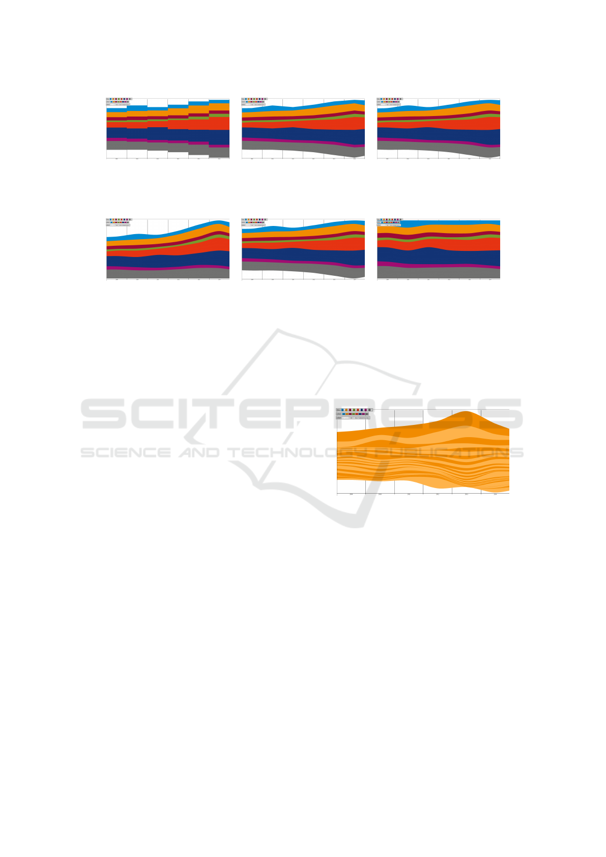
Constant Interpolation Linear Interpolation Polygonal Interpolation
Figure 1: Different types of interpolation between the number of publications per year. While the constant interpolation gives
the most correct representation of the discrete data set, the polygonal interpolation produces the most pleasing visualization.
In most cases, the linear interpolation was favored as a good balance between both extrema.
Bottom Baseline Centered Baseline Filled Space
Figure 2: Different types of visual indication of the number of publications.
for the different questions to answer. Figure 2 shows
the three different types. Putting the baseline at the
bottom of the screen and scaling the number of publi-
cations constantly over the years allows for the most
precise judgment of the overall number of publica-
tions and its development. In contrast, centering the
number of publications for each year at the middle
of the screen, minimizes distortions of the boundary
streams and makes inspection of individual streams
easier. From our core users this visualization was
also rated the most pleasing and in most cases useful.
Consequently, it was set as the default representation.
When only questions of relative comparisons over the
years have to be answered, it is also possible to stretch
the whole set of publications per year over the full de-
sign space, resulting in a relative stream graph.
6.4 Colors
Apart from the placement in space, color and bright-
ness denote the most visible visual cues in a visual-
ization. Consequently, the discussion of colors was a
long phase of the design process. Although there are
several surveys on the different color maps and their
special features (Silva et al., 2011; Zhou and Hansen,
2016), it was very hard to profit from these insights
in terms of our use case. As part of the university’s
corporate identity, all departments were given individ-
ual and specifically defined colors. So it was not un-
expected when all deciders unanimously agreed that
these colors had to be used throughout the whole visu-
alization for publications belonging to the respective
departments (R4).
Under these restrictions, the only color features
left to change and use for other visualization purposes
were the saturation and transparency. Since it was
stated that saturation should, again thanks to corpo-
rate identity, only be changed in small portions, we
chose to use this visual cue to deduct different re-
search groups or institutions within a department from
each other. An example visualization is shown in Fig-
ure 3.
Figure 3: Using alternating saturation for indicating the dif-
ferent research groups of a department.
Changing transparency on the other hand gives the
chance of encoding continuous values in addition to
the already provided time dimension and number of
publications. This is a feature, the core users very
much liked in our feedback rounds. In our design,
we provide the possibility to encode all different frac-
tions, like the fraction of interdisciplinary papers, to
the transparency value of each stream (R1). This gives
the user an instant relativization of the number of pub-
lications, as illustrated in Figure 4.
All other visual encodings like additional sym-
bols, hatching, shadows, or three-dimensional effects
were refused by the core users as too complicated, too
cluttering, or not being self-explanatory enough.
Visual Analytics of Bibliographical Data for Strategic Decision Support of University Leaders: A Design Study
301
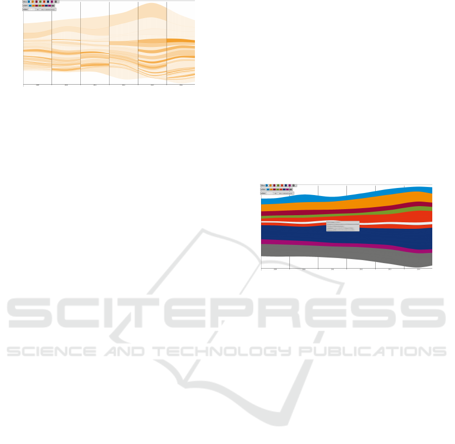
Figure 4: Mapping a third value, ideally a fraction percent-
age to the transparency, allows for generating insights just
within one glance.
6.5 Counting
In terms of the different color codings, one challenge
came into play, which is often occurring if data is not
uniquely assignable. Each publication may include
several and a different number of authors, institutes,
or departments. Consequently, the question arises
how to count this one publication with respect to the
different structural entities. This aspect is discussed
in great detail by Perianes-Rodriguez et al. (Perianes-
Rodriguez et al., 2016).
After long discussions of strategic goals and their
match to this question, the users decided to count each
publication once per author, such that a publication
with six university authors is represented six times
in the visualization. This procedure specifically pro-
motes publications with multiple authors, postulating
that all authors also really contributed to the publi-
cation. In addition, the fractions of external authors
were added to the parts of the university authors to
not penalize such publications.
In terms of institutes and departments, the same
strategy was applied. If a publication has two au-
thors from one department and three from another
one, the departments got the respective share of two
and three publication counts. In the case of research
groups belonging to multiple structural organizations,
these contributions were equally split among the de-
partments or institutes.
6.6 Interaction
The last very important step in our design process was
the interaction. An early inclusion of interaction into
the design process was achieved by constructing fake
interactions already on the pen-and-paper level. Hav-
ing said this, most of the desired interactions were al-
ready defined at very early stages of the design pro-
cess. Since the core users were very conservative in-
terface users and the final tool had to be very intu-
itive (R5), the interaction possibilities turned out to
be quite conservative as well.
As first interaction method, the movement and
zooming of the visualization is operated by the well-
known mouse operation (click and move, moving the
mouse wheel). An even more important feature was
the possibility for detailed inspection and exploration
of the data. This was ensured with a mouse-over func-
tionality of the prototype. Once the mouse is hover-
ing over a research group at a specific point in time,
all available data is indicated in a tool tip, as illus-
trated in Figure 5. In addition, the respective stream of
the research group is highlighted in the stream graph
(R3). Switching the different modes of coloring and
superimposing the data with characteristic fractions
was implemented using simple menus with descrip-
tive symbols and text.
Figure 5: The presented tool features a mouse-over effect.
For each research group the mouse pointer is currently over,
all available data at the respective point in time is indicated
in a tool tip and the stream of this research group is high-
lighted in the visualization.
Another, but also very important feature for the
core users, was the ability to interactively sort and fil-
ter the data (R1). For this interaction function, dif-
ferent interaction techniques were desired and im-
plemented. Clicking at specific streams in the vi-
sualization selects or deselects them. An interactive
list shows the IDs of the currently selected research
groups. In addition, a selection or deselection is also
possible by manually entering the IDs. This feature
was specifically asked by the deans who know their
department IDs very well. However, also in the uni-
versity administration this feature was rated as being
very handy if a speedy analysis of a specific univer-
sity consortium is desired. Once the selection is final,
the visualization can be filtered down to the selection
by pressing the ENTER-key or the right mouse but-
ton. An illustration of the filtering is shown in Fig-
ure 6. The same keys also switch off the filter again.
Clicking on empty screen space or hitting the ESC-
key clears the current filter list.
Regarding the filtering, it was also explicitly de-
sired to implement short cuts for the most important
filters, like the departments. These are implemented
as buttons in the top left corner of the tool and al-
low for instant filtering of a set of departments or the
instant selection of the research groups of whole de-
IVAPP 2019 - 10th International Conference on Information Visualization Theory and Applications
302
Figure 6: The presented tool features the filtering up to in-
dividual research groups. In the shown visualization, three
research groups from different departments were selected.
partments. Using an additional click at the top of the
respective time column it is also possible to sort the
currently visible streams with respect to the absolute
number of publications in this year. An illustration of
this feature is given in Figure 7.
2011 2012
Figure 7: Illustration of the sorting feature. Clicking the
column of a specific year, allows to sort the visible streams
with respect to the number of publications in this year.
As keyboard and mouse interaction might in the
future be replaced by other techniques, it was impor-
tant to keep the chosen metaphors as open as possible.
In the specific case it is clear that a switch to a touch
interface would be instantly possible without major
changes to the interaction concept.
7 EVALUATION
The following describes our preliminary evaluation
of the visualization prototype for detailed publica-
tion data inspection across faculties and departments.
We used the aforementioned method of visualized
publications to allow for a detailed inspection with
one German university and discussed the outcome
with different departments and the general university
administration. Since third-party funding is getting
more important to keep universities afloat, the gen-
eral feedback to our publication overview during our
ongoing informal interviews is that of great interest in
the various methods of visual analysis.
Especially in the case of decision making and
strategic guidance, the comparison of different as-
pects of the publication data allowed for a more intu-
itive and reliable interpretation of which department
would benefit from strategic intervention in the case
of producing research requests or to acquire other
forms of project funding. Since many insights are
closely coupled to additional data and have to be seen
in much broader context, it was hard to extract de-
scriptive examples.
One very impressive example was given by a dean
during the evaluation sessions. The dean discovered
during the interaction sessions just on his own the vi-
sualization depicted in Figure 8. Having this compari-
son of all research groups over time with total number
of publications and additional encoding of interdisci-
plinarity of the publication enabled him to generate
an in-depth insight into the publication behavior of
his department at a single glance.
During the evaluation phase, there were several
other of these light-bulb moments among all partic-
ipating deciders. In addition it was observed, that the
display of external publications provides a novel form
of easily and readily being able to identify persons to
contact in the case of other research and development
projects. In summary, they all agreed that the proto-
type allowed for insights that were previously barely
possible or just with significant extra efforts. In con-
sequence, the project was recommended to be further
pursued and developed to a usable standard tool.
8 CONCLUSIONS
In this design study, we have analyzed the use case
of visualizing bibliographic data to support univer-
sity decision makers. The use case was researched
in detail, following a rigorous requirements analysis.
A visualization design on basis of the requirements
was created in an iterative process, resulting in a new
form of visualization for publications at universities.
Compared to only analyzing financial data, the con-
structed interactive tool gives valuable additional in-
sights and allows for in-depth inspection through de-
cision makers. This leads to new opportunities for
strategic decision-making at universities, since inter-
disciplinary work as well as internal and external re-
search connections are readily available and easy to
identify when using our tool. This fact was confirmed
by an informal user study with real expert users.
The findings of the requirements analysis, the de-
sign process and the evaluation can be generalized to
other similar use cases. At the moment, our visualiza-
Visual Analytics of Bibliographical Data for Strategic Decision Support of University Leaders: A Design Study
303
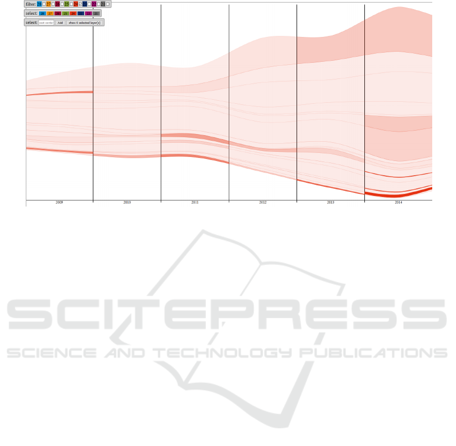
Figure 8: Visualization of all research groups of one individual department. For each research group, the transparency is
chosen to represent the fraction of interdisciplinary papers.
tion is based on internal publication data. However,
due to its ability to rework many other forms of input
data, it can be easily extended to other sources of lit-
erature repositories. Furthermore, an additional layer
of significance could be added by integrating impact
factors, publication venues, and other dimensions into
the representation.
REFERENCES
Aigner, W., Miksch, S., M
¨
uller, W., Schumann, H.,
and Tominski, C. (2007). Visualizing time-oriented
data - A systematic view. Computers & Graphics,
31(3):401–409.
Aigner, W., Miksch, S., Schumann, H., and Tominski,
C. (2011). Visualization of Time-Oriented Data.
Springer.
Beck, F., Koch, S., and Weiskopf, D. (2016). Visual anal-
ysis and dissemination of scientific literature collec-
tions with survis. IEEE Transactions on Visualization
and Computer Graphics, 22(1):180–189.
Bornmann, L. and Haunschild, R. (2016). Overlay maps
based on mendeley data: The use of altmetrics for
readership networks. Journal of the Association for
Information Science and Technology, 67(12):3064–
3072.
Bostock, M., Ogievetsky, V., and Heer, J. (2011). D
3
data-
driven documents. IEEE Transactions on Visualiza-
tion and Computer Graphics, 17(12):2301–2309.
Brandes, U. and Pich, C. (2011). Explorative visualization
of citation patterns in social network research. Journal
of Social Structure, 12(8):1–19.
Brehmer, M., Lee, B., Bach, B., Riche, N. H., and Mun-
zner, T. (2017). Timelines revisited: A design space
and considerations for expressive storytelling. IEEE
Transactions on Visualization and Computer Graph-
ics, 23(9):2151–2164.
Byron, L. and Wattenberg, M. (2008). Stacked graphs -
geometry & aesthetics. IEEE Transactions on Visual-
ization and Computer Graphics, 14(6):1245–1252.
Federico, P., Heimerl, F., Koch, S., and Miksch, S. (2017).
A survey on visual approaches for analyzing scientific
literature and patents. IEEE Transactions on Visual-
ization and Computer Graphics, 23(9):2179–2198.
Fung, T.-L., Chou, J.-K., and Ma, K.-L. (2016). A design
study of personal bibliographic data visualization. In
Proceedings of the IEEE Pacific Visualization Sympo-
sium, pages 244–248.
Greenberg, S., Carpendale, S., Marquardt, N., and Buxton,
B. (2011). Sketching User Experiences: The Work-
book. Morgan Kaufmann Publishers Inc., San Fran-
cisco, CA, USA.
Havre, S., Hetzler, B., and Nowell, L. (2000). ThemeRiver:
visualizing theme changes over time. In Proceedings
of the IEEE Symposium on Information Visualization,
pages 115–123.
Heimerl, F., Han, Q., Koch, S., and Ertl, T. (2016). Ci-
teRivers: Visual analytics of citation patterns. IEEE
Transactions on Visualization and Computer Graph-
ics, 22(1):190–199.
Isenberg, P., Heimerl, F., Koch, S., Isenberg, T., Xu, P.,
Stolper, C. D., Sedlmair, M., Chen, J., M
¨
oller, T.,
and Stasko, J. (2017). Vispubdata.org: A metadata
collection about IEEE Visualization (VIS) publica-
tions. IEEE Transactions on Visualization and Com-
puter Graphics, 23(9):2199–2206.
J
¨
anicke, S., Focht, J., and Scheuermann, G. (2016). Interac-
tive visual profiling of musicians. IEEE Transactions
on Visualization and Computer Graphics, 22(1):200–
209.
Liu, J., Tang, T., Wang, W., Xu, B., Kong, X., and Xia, F.
(2018). A survey of scholarly data visualization. IEEE
Access, 6:19205–19221.
IVAPP 2019 - 10th International Conference on Information Visualization Theory and Applications
304

Mascarenhas, C., Ferreira, J. J., and Marques, C. (2018).
Universityindustry cooperation: A systematic litera-
ture review and research agenda. Science and Public
Policy, pages 1–11.
Newman, M. E. J. (2004). Coauthorship networks and pat-
terns of scientific collaboration. Proceedings of the
National Academy of Sciences, 101:5200–5205.
Perianes-Rodriguez, A., Waltman, L., and van Eck, N. J.
(2016). Constructing bibliometric networks: A com-
parison between full and fractional counting. Journal
of Informetrics, 10(4):1178–1195.
Riegraf, B. (2018). Zwischen Exzellenz und Prekarit
¨
at.
¨
Uber den Wettbewerb und die bedingte
¨
Offnung der
Universit
¨
aten f
¨
ur Wissenschaftlerinnen, pages 241–
256. Springer Fachmedien, Wiesbaden, Germany.
Sallaberry, A., Fu, Y.-C., Ho, H.-C., and Ma, K.-L. (2016).
Contact trees: Network visualization beyond nodes
and edges. PLOS ONE, 11(1):1–23.
Silva, S., Santos, B. S., and Madeira, J. (2011). Using color
in visualization: A survey. Computers & Graphics,
35(2):320–333.
van Eck, N. J. and Waltman, L. (2014a). CitNetExplorer: A
new software tool for analyzing and visualizing cita-
tion networks. Journal of Informetrics, 8(4):802–823.
van Eck, N. J. and Waltman, L. (2014b). Visualizing Bib-
liometric Networks, pages 285–320. Springer Interna-
tional Publishing.
Walny, J., Huron, S., and Carpendale, S. (2015). An ex-
ploratory study of data sketching for visual represen-
tation. Computer Graphics Forum, pages 231–240.
Wang, Y., Shi, C., Li, L., Tong, H., and Qu, H. (2018).
Visualizing research impact through citation data.
ACM Transactions on Interactive Intelligent Systems,
8(1):5:1–5:24.
Wu, M. Q. Y., Faris, R., and Ma, K.-L. (2013). Visual ex-
ploration of academic career paths. In Proceedings of
the IEEE/ACM International Conference on Advances
in Social Networks Analysis and Mining, pages 779–
786.
Zhou, L. and Hansen, C. D. (2016). A survey of colormaps
in visualization. IEEE Transactions on Visualization
and Computer Graphics, 22(8):2051–2069.
Visual Analytics of Bibliographical Data for Strategic Decision Support of University Leaders: A Design Study
305
