
Developing Enterprise-wide Provider Analytics
James P. McGlothlin, Hari Srinivasan and Ilija Stojic
Fusion Consulting Inc, Irving, TX, U.S.A.
Keywords: Business Intelligence, Data Warehousing, Analytics, Patient Quality, Patient Safety, Patient Outcomes.
Abstract: In recent years, the growth of electronic medical records for hospitals has exponentially increased the quantity
of healthcare data available for analysis and performance improvement. However, the general consumption
of this data by providers has still been limited to analysts and power users. Most data is delivered via static
reports which serve only a single purpose. This paper describes a project to deliver a vast quantity of data in
a simple and secure manner to all hospital physicians and administrative leaders. This includes clinical,
operational and cost information. The delivery is with versatile and intuitive interactive dashboards which are
integrated into the EMR yet come from many different sources. This allows physicians to look at their
performance and compare it to their peers. Executives are able to identify improvement opportunities across
the system and directors are able to identify improvement opportunities within their service. Quality and
performance improvement specialists can perform data analysis without having to generate report requests
and wait for delivery. This allows them to target specific initiatives and patient populations, and to tailor
improvement programs to the needs of the organization. These analytics and dashboards are designed to
facilitate quality improvement, efficiency, treatment standardization and cost reduction.
1 INTRODUCTION
Hospitals are under constant pressure to reduce cost
of care and improve outcomes. This includes
reducing length of stay, readmissions, resource
utilization, complications, hospital-acquired
infections, and mortality while increasing patient
experience and satisfaction. Generally, the methods
to improve these key performance indicators (KPIs)
involve changing provider behaviour or changing
hospital processes. However, it is not readily apparent
to most providers where the opportunities for
improvement are and often providers do not think
they have any issues. Furthermore, holding providers
accountable is difficult.
The use of advanced electronic medical records
(EMRs) for hospitals has grown exponentially in the
past decade. Many hospitals have developed
enterprise data warehouses specifically designed to
support advanced reporting and analytics.
Technologies to integrate data from auxiliary systems
have become common. At this hospital, auxiliary
systems exist for the catherization lab, imaging,
interventional radiology, laboratory, pathology, risk
management, infection control, cost accounting,
supply chain, human resources, time and attendance,
decision support, pharmacy acquisition, and more. As
we continue to bring in these outside sources and
continuously optimize and advance our EMR and
data warehouse, the amount of data available
continues to grow at an astronomical pace.
There are many challenges to delivering this
information to a provider in a meaningful way.
Physicians are trained in medicine not in computer
science and are extremely busy, so it is unrealistic to
ask them to learn new, complex technology. Also,
there is so much data available, it is challenging to
determine which information to deliver to a specific
provider. This is further exacerbated by strict privacy
laws that make it essential that providers do not get
access to patient information for patients they do not
treat. Additionally, there are laws limiting the
financial, referral and utilization information users
can see in order to prevent collusion or market
interference. (Office of Inspector General, 2018)
Currently, we have thousands of reports but they
are each directed towards a limited scope and
audience. Most of our reports are primarily static
where they look at specific orders or diseases or
medications, but do not allow you to change these
parameters. They are created in response to user
requests, so the requirements were generated by users
McGlothlin, J., Srinivasan, H. and Stojic, I.
Developing Enterprise-wide Provider Analytics.
DOI: 10.5220/0007568601350146
In Proceedings of the 12th International Joint Conference on Biomedical Engineering Systems and Technologies (BIOSTEC 2019), pages 135-146
ISBN: 978-989-758-353-7
Copyright
c
2019 by SCITEPRESS – Science and Technology Publications, Lda. All rights reserved
135

who already had an idea what they wanted to analyse
or change and how.
We have also had great success in the past with
targeted initiatives to optimize specific type of
utilization such as red blood cells (McGlothlin at al.,
2017), imaging (Wyatt et al., 2018), broad spectrum
anti-biotics, opioids and metabolic panels (Wyatt et
al., 2018). However these were specific programs
targeting particular types of utilization and made
available to specific users in relevant situations.
Furthermore, development of each of these projects
incurred significant level of effort. The goal of this
project is to provide general analytics that can be
utilized to evaluate all types of encounters, diseases
and resources, and will be available to the large
audience of all hospital physicians and leadership.
One of the most effective ways to drive
performance improvement is to target quality
initiatives and clinical decision support to specific
acute diseases. Our own experience (McGlothlin,
2016) and previous research (Kitchiner et al., 1996)
demonstrates the effectiveness of these programs.
The Joint Commission has established clinical
pathways as a fundamental approach to improving
healthcare performance (Joint Commission on
Accreditation of Healthcare Organizations 1996).
Studies have consistently shown that clinical
pathways reduce length of stay and cost (Stephen et
al., 2003) (Pearson et al., 2001) (Wazeka et al., 2001).
The care path can encourage providers to use specific
medications, images and labs and to utilize them at
specific times. This not only gives the opportunity to
choose the lower cost option when there are multiple
equally appropriate alternatives, it also gives the
hospital an opportunity to make treatment and
utilization more predictable. This can be very
important. If we can predict how many images will be
ordered, we can optimize our equipment, resources
and schedules. If we can predict utilization of
medications, then we can better manage inventory
and negotiate acquisition costs. If we can predict
length of stay, then we can improve bed assignment
and staff scheduling.” However, each disease
program requires 12-20 weeks of effort to build
(McGlothlin, 2018). Also, it can be challenging to
evaluate the effectiveness of each program in a
standardized manner. A common set of metrics and
shared analytics tool can provide this evaluation.
Analytics are needed for hospitals to intelligently
choose which diseases to target. Furthermore, it is not
realistic to build pathways for every disease. There
are over a thousand diagnosis related groups (DRGs),
68,000 ICD-10 disease codes and more than 10,000
research papers proposing specific care paths
(Vanhaecht et al., 2006) (Rotter et al., 2007).
Therefore, the goal of this project is to both provide
leadership insight into which disease programs can
provide the most benefit, and to provide some
meaningful information for every disease treated at
the hospital.
For the remainder of this paper we will describe
our challenges, how we overcame each, and our
solution and results.
2 ATTRIBUTION AND SECURITY
As previously discussed, one of the most important
aspects of our project is to only show users data
related to them and to secure our system so no user
sees patient data unless they are authorized.
We achieve this by attributing metrics to the
correct provider, attributing the provider to the
correct service, and then applying security using the
provider and service information.
2.1 Provider Attribution
We allocate providers differently depending on the
role that is responsible for the metrics in the chart. So
far we have identified five roles:
Discharge provider
Admitting provider
Emergency department provider
Authorizing provider
Surgeon
The discharge provider is assigned at the grain of the
hospital visit- i.e. each hospital visit has exactly one
discharge provider. The discharge provider is
attributed to the hospital visit based on who signed
the discharge summary. Discharge provider is used
for readmission and mortality metrics and for metrics
related to discharge efficiency.
The admitting provider is assigned also at the
grain of the hospital visit based on the provider who
authorized the admitting order. The admitting
provider is used primarily for metrics around
admissions efficiency.
The emergency department (ED) provider is
assigned also at the grain of hospital visit based on the
provider who chose the emergency department
disposition. The ED provider is primarily used for the
metrics around ED efficiency.
The authorizing provider is assigned at the grain
of an order. The authorizing provider is the provider
HEALTHINF 2019 - 12th International Conference on Health Informatics
136

who authorized the order. This provider is used for
metrics around order utilization and cost.
The surgeon is assigned at the grain of surgery.
The surgeon is currently used only for surgical site
infections.
2.2 Service Attribution
Service attribution was one of our greatest challenges.
Our data warehouse assigns service at all points
during the patient stay in a patient movement table.
However, extensive data profiling and validation
determined this value was often incorrect due to the
current workflow and the large number of users who
have the ability to change this value in the EMR.
For this reason, we chose to attribute the service
based on the provider we already attributed in the last
section. In other words, the discharge metrics are
attributed to a service because the provider who
discharged the patients was in that service. However,
we determined that our provider records were
insufficient to accurately assign the service. As an
example, we have providers credentialed in
anesthesiology yet performing the role of surgical
intensivist (service of SICU) or neurosurgery
attending provider. This provider role information is
not available in any system we have available.
Therefore, we determined to assign the providers
manually. This problem was further exacerbated
because many of the providers perform multiple
roles. Some examples are providers who serve
internal medicine in the adult hospital and also act as
pediatrics providers in the children’s hospital,
providers who work in obstetrics and gynecology,
provider who work in the SICU and acute care
surgery, providers who work in the NICU and the
emergency department. Therefore, we had to develop
options that allow the service to vary based on:
The patient’s hospital
The patient’s level of care
Whether the event happened during a
surgical episode
Whether the event happened in an outpatient
setting
The patient’s unit
The patient’s service in patient movement
Which values we use for the identifiers depends again
on the type of metrics. For discharge metrics we use
last value, for admission metrics we use first value
and for cost and order utilization metrics we use
values based on the time of the order. Figure 1 shows
our methodology for service attribution of orders and
costs based on authorizing provider and patient
location at the time of the order. Provider attribution
for discharges and admits is similar but simpler since
anesthesiologists and gastroenterologists do not
discharge patient.
Additionally, there are some metrics where we
want to attribute service but not provider. For census,
we use the service at the time according to our patient
movement table. For hospital-acquired infections, we
manually attribute the service during our infection
control process. For patient experience data, we
assign service based on the discharge provider but we
then aggregate the data only at the service level.
2.3 Service Attribution and Security
Forms
There are over 800 providers in our hospital who have
discharged patients in the last three years, and over
1800 who have authorized orders. Certainly, the
analytics team cannot accurately assign the service(s)
for each of these providers. In our initial attempt, we
allowed the quality department leadership to fill these
values in an Excel spreadsheet. However, we found
that not only was this very time consuming, it also
was prone to errors and inconsistencies which then
had to be manually resolved by the analytics team. It
also presented challenges for incremental updates.
For this reason, we have now developed a set of
custom secured forms for the operation. There are
five forms that drive our security. All of the person
columns in these forms (provider, director, executive,
support team) allow the user to search and select the
person using their name based on the network
security data and our software finds their identifying
information.
1. Service Form
We want to group some of our services together. For
example the set of providers for liver transplant and
kidney transplant are the same, so we want these
services to rollup to the service of “transplant”. Our
service form simply gives the user the opportunity to
specify the “service rollup” from a drop down list for
each service in the system. The services are
prepopulated from two sources. We acquire all the
services from the EMR in our patient movement
table. Additionally, because some of our critical care
services are not assigned in patient movement, we
have a set of inferred ICU services based on unit,
level of care and service. We populate this table with
those services as well.
Developing Enterprise-wide Provider Analytics
137
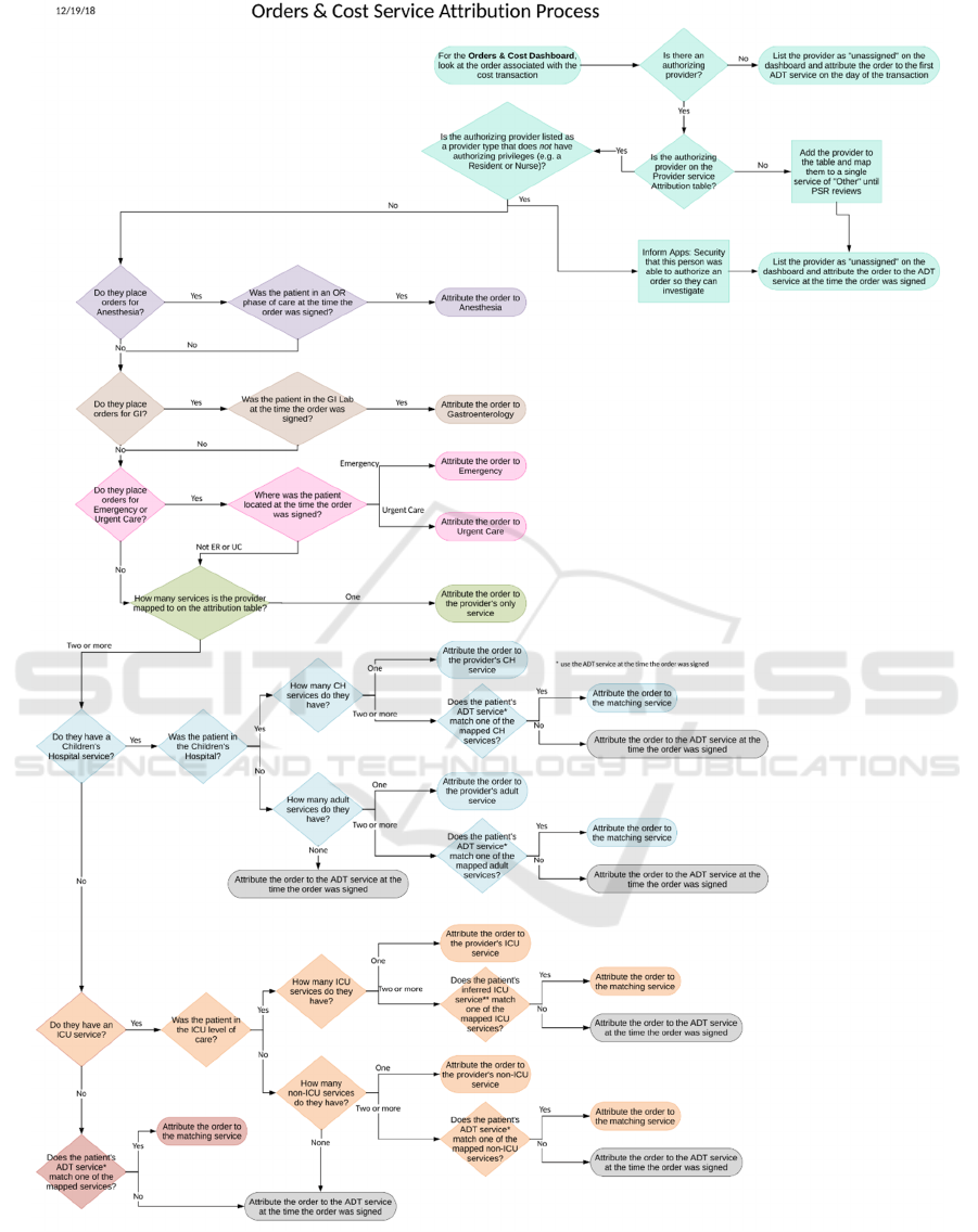
Figure 1: Service attribution for orders and cost.
HEALTHINF 2019 - 12th International Conference on Health Informatics
138

2. Service Rollup Form
We assign our attribution at the grain of service
rollup. The user can create new “service rollups”
which will then be available in drop-down lists within
the service form and the provider and director forms.
They can also specify the abbreviation the dashboard
will use for this category. The key fields they
populate for each service rollup is a set of yes/no
fields:
a. Adult? Is this an adult service?
b. Children’s Hospital? Is this service in the
children’s hospital?
c. Surgical? Is this a surgical service?
d. ICU? Is this a critical care service?
e. Other? For each of dashboards should this
service be shown on the dashboard or
bucketed in “other”.
These values are used both to determine what
executives are allowed to see, and to populate drop
down boxes for the provider form. Figure 2 shows the
entry form for service rollups.
Figure 2: Entry form.
3. Provider Form
We allow the user to add a provider based on a look
up into the system. Then they can attribute the
patient’s service based on the diagram in Figure 1.
They can choose any service rollup from the drop
down as the provider’s single service, or they can
choose any adult service rollup (from the service
rollup form) as their service when the patient is in an
adult hospital, or any ICU service rollup as their
service when the patient is in the ICU level of care,
etc. The form insures they choose only valid services
and rules which are not contradictory.
Additionally, our provider service attribution
form has four check boxes specific to service
attribution for orders and cost. There is an
anesthiology check box which says this provider
should be attributed to anesthesiology only for orders
which they place during a surgical episode and there
are ED and urgent care flags and gastroenterology
which say this provider should be attributed to that
service only for orders placed while the patient is in
that unt.
4. Director Form
This form allows the user to assign one or more users
as “directors” for specific services.
5. Executive Form
This form allows the users to assign executives. The
executive are grouped based on the options in the
service rollup form. So an executive can be assigned
as an executive only for surgical services or
children’s services, as examples.
All of our forms are secured. The director and
executive forms can only be updated by analytics or
leadership within the Patient Safety and Reliability
department. However, directors can add providers
who are attributed to their service. In this way, we
have distributed the maintenance effort for the service
attribution without reducing the security.
2.4 Security
We have three different types of dashboards:
executive, director and provider. In this section, we
will describe the security for each type of dashboard.
2.4.1 Executive Dashboards
Executive dashboards include charts which compare
performance across different services. This is only
true for executive dashboards. Each user is limited to
services which they have access to based on the
executive form described in the last section.
Executive users can see patient data for all encounters
in the services they can access. Executive dashboards
can drill down into director dashboards.
2.4.2 Director Dashboards
Director dashboards show metrics and performance
within a service but cannot compare services. They
can however compare providers within their service.
If a user has access to multiple director service
dashboards, they can still only look at one service at
a time. All data will be limited to that service. All
patient information is available.
Developing Enterprise-wide Provider Analytics
139

2.4.3 Provider Dashboards
Provider dashboards are our most important
dashboards for mass consumption and user adoption.
Within a provider dashboard, the provider sees
performance for himself compared only to his
service. He can see patient information for his
encounters but not for the other encounters in his
service. He can compare himself with his peers but
the other provider names are redacted and replaced
with numbers. Figure 3 shows an example of length
of stay (LOS) provider comparison chart with redact
names. It shows this provider has the second highest
LOS in his service. The provider’s metrics are
calculated using the provider attribution described
earlier. When the user opens the dashboard we
acquire their system login and use this to
automatically filter to their encounters and the
redacted information for other encounters only in this
service.
Figure 3: LOS by provider.
2.5 Support Users
We frequently find the need to emulate other users for
support and testing purposes. For example, to test that
the dashboard correctly works for a provider with
both adult and pediatric services, we need to emulate
such a provider. Additionally, a provider may call us
with questions and we want to reproduce what he
sees. Our visualization tool does not have this feature
built in. Since none of our analytics developers or
quality analysts actually treat patients, we would
never be able to see data in the provider dashboard.
To solve this problem we created one more form,
the support users form. This form allows any user on
the support team, whether from analytics or from
business departments such as the Patient Safety and
Reliability department or the finance department, to
login and alias themselves to specific provider.
Our visualization tool, Tableau, does support
“live” data providers versus extracted data. We have
set just this one query as live. What this means is that
we can alias ourselves, press save on the form, refresh
the dashboard in the browser and immediately see the
dashboard as though we were that provider.
3 IMPLEMENTATION
Our solution is developed in our enterprise data
warehouse. This primarily sources from our EMR
data warehouse. We have created more than 70
extension facts from previous projects and we have
created a set of data warehouse foundation tables
which model the business and our rules rather than
showing the specific implementation details of the
EMR. For example, our EMR sets the inpatient
admission time based on the planned admission time
for planned post-op admits, but we have calculated
the true inpatient admission time. Our EMR defines
discharge provider based on the discharge order, but
we are instead using the hospital bill as the source for
discharge provider who signed the discharge
summary. This gives us a single version of the truth.
Our solution requires several outside sources to
acquire cost data, hospital acquired infection data and
patient experience data. We integrate these sources
into our data warehouse using data virtualization
techniques as described in (McGlothlin et al., 2017).
Our visualizations are written in Tableau and user
row level security based on the user() function. They
are secured and published to the provider via
Microsoft Sharepoint and integrated into the EMR via
the EMR’s integration techniques. The users do not
have database access to data warehouse, only access
to the Tableau dashboards.
4 METRICS AND DASHBOARDS
4.1 Common Features
All of our dashboards have the features below which
have reduced the learning curve for users and allowed
us to achieve user adoption.
4.1.1 Filters
All of our dashboards include standard filters such as
date range, primary diagnosis, diagnosis-related
group (DRG), payor, benefit plan, admitting and
discharging departments, location and services, and
HEALTHINF 2019 - 12th International Conference on Health Informatics
140
admission type (elective vs urgent). This allows a user
to choose any disease based on diagnosis or DRG and
see how they are performing for that specific patient
cohort. This allows us to target disease populations
globally rather than only through specific custom
analytics dashboards. All of our filters are dynamic
and cascading. As an example, this means if you filter
to a specific DRG, the discharge service filter will
now only show those services which discharged
patients with that DRG.
4.1.2 Drill Down
When the user has access to the patient information,
all relevant data is available for the drill down include
encounter, patient, and order information. Even when
the user does not have access to the patient
information, all information used in the metric
calculations and filters is available in drill down. This
increases the user’s trust in our data. This has also
enabled the users to look at specific events and
encounters in order to do root cause analysis and learn
how to improve.
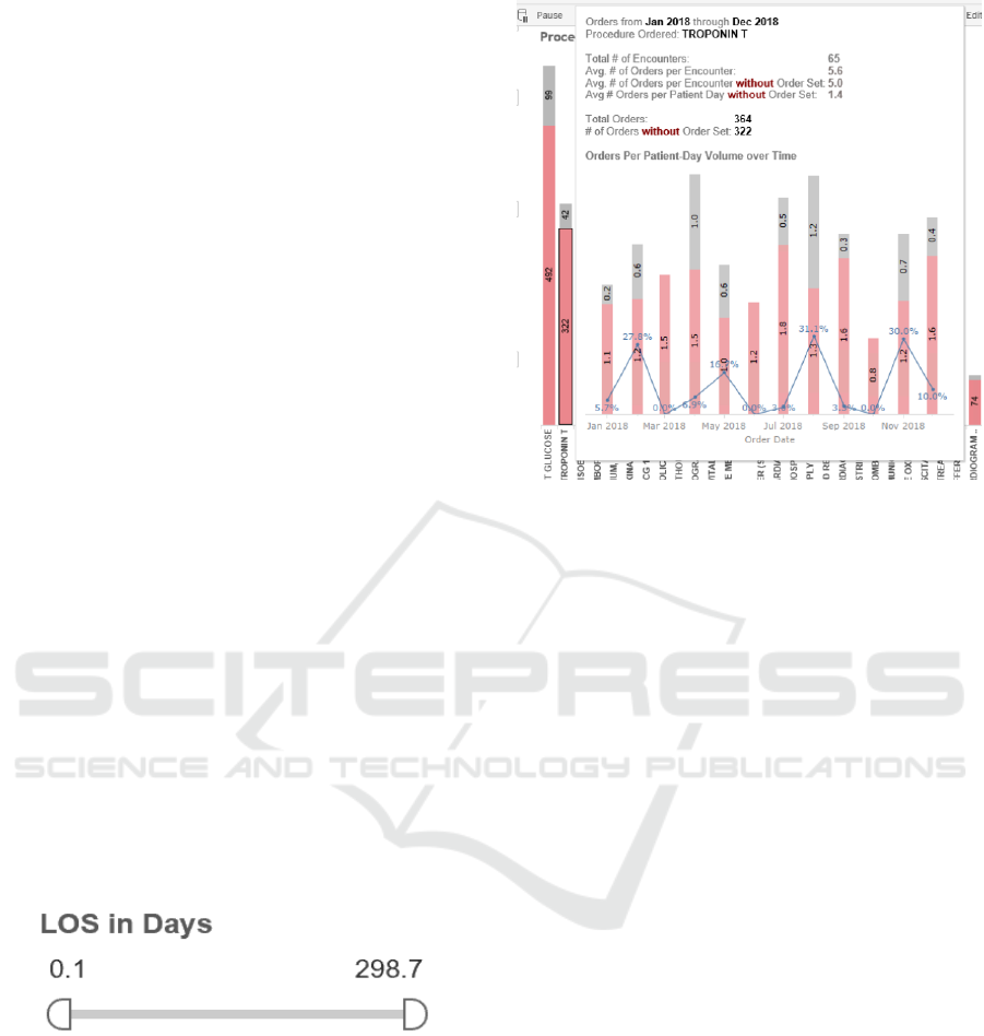
4.1.3 Outlier Rulers
A small number of encounters can drastically
influence some calculations such as averages. We
provide rulers for user’s to filter out outliers. Figure 4
shows an outlier ruler for the length of stay chart. As
an example, the user could move the ruler to 2 and 30
to only look at patients who were in the hospital at
least 2 days and less than 30 days. Alternatively, the
same ruler can be used to investigate outliers, perhaps
by looking only at those encounters under 1 day or
over 30 days.
Figure 4: LOS outlier ruler.
4.1.4 Hover Information
Throughout our dashboards you can hover over any
point in a chart to get additional information. This is
especially useful to tell the user the volume of
encounters. Many of our hovers even include
additional charts specific to the portion of data that is
being selected. Figure 5 shows an example of
utilization information available by hovering over
one specific procedure.
Figure 5: Hover information.
4.1.5 Interactive Charts
All of our charts are clickable and interactive.
Clicking a specific bar in bar graph will filter all other
charts to that value. For example, if the dashboard is
displaying cost by service and by procedure, clicking
on the service will show what procedures cost the
most in that service, or clicking on the procedure will
show what services use that procedure the most.
4.1.6 Dashboard Companions
We have created dashboard companions in PDF for
each dashboard. On every tab of every dashboard we
have added a question mark icon that opens that
section of the dashboard companion. These
documents explain how to use the dashboard, what
the charts represent and how the data points are
calculated. We also are developing a searchable data
dictionary.
4.2 Length of Stay
One of the most important metrics is how long the
patient stayed in the hospital. Length of stay is one of
the most important outcomes and can be used as a
valid surrogate for hospital cost (Kitchiner et al.,
1996). Unlike government LOS measures, we count
length of stay for every hour and present it as a real
number instead of a whole number of days. Every
hour a patient remains at the hospital requires nursing
support, occupies a bed another patient could utilize
and decreases patient experience.
Developing Enterprise-wide Provider Analytics
141
At the provider level we show both length of stay
and CMI (case mix index) adjusted length of stay for
the provider. Adjusting length of stay using CMI
allows us to adjust for when the provider simply
treated sicker or less sick patients. We compare the
provider to benchmark length of stay information
from CMS, our state public health insurance, the
Children’s Hospital Association and benchmark
vendors. We also compare the provider to their
service and rank them against their peers as shown in
Figure 3
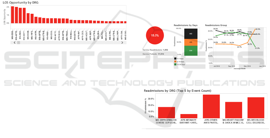
At the executive level, we compare length of stay
across services and we look for length of stay
opportunity: (length of stay – benchmark) * volume.
The diseases with the greatest length of stay
opportunity represent patient cohorts and workflows
we want to target with performance improvement
initiatives. Figure 6 shows LOS opportunities.
Figure 6: LOS opportunity by DRG.
4.3 Outcomes
In this category we focus on the metrics of
readmissions, mortality and discharge disposition.
Our metrics are as follows:
1. Encounter Disposition
2. Inpatient unplanned readmissions
a. 7 day
b. 14 day
c. 30 day
3. ED readmissions
a. 7 day
b. 14 day
c. 30 day
4. In-hospital mortality
We additionally stratify readmissions by disposition.
The goal is to maximize discharges to home and to
reduce readmissions and mortality.
At the provider level, the provider sees metrics for
encounters they discharged compared to their service
and their redacted peers. Readmissions and mortality
are also stratified over time based on discharge date
and compared to their service over the same time
frame. At the director level, the director sees the
metrics for their service and comparisons for each
metric by discharging provider. At the executive
level, all metrics are shown for the system and then
stratified both by service and DRG. When it is
stratified by DRG it is sorted both by highest % (who
readmitted the highest % of patients) and by highest
volume (who readmitted the most patients even if the
percentage was lower).
Literature shows that providers have the greatest
impact on seven day readmissions. Therefore we
focus on opportunities to improve seven day
readmission rates. Unlike CMS specifications, we
allow readmissions to also be indexes. We also
include the DRG and diagnosis of the readmit
encounter. This allows us to filter on any disease and
see how often they are coming back and why.
Figure 7 shows an example of charts analyzing
readmission by days. Figure 8 shows an example
readmission chart stratified by index DRG.
Figure 7: Readmission by readmit days example.
Figure 8: Readmission by index DRG.
4.4 Discharge Efficiency
For discharge efficiency, the goal is to discharge the
patients as early as possible. This saves resources and,
as we are a very full institution, allows us to put
another patient in that bed. We look at when the
discharge order was written and when the patient
departed. We measure both percentage of discharge
orders written by 10am and noon. Providers have
more control over when the discharge order is written
than when the discharge occurs so this is the primary
provider and service-based metric.
Additionally, we have a goal of departure by noon
and discharge order to departure in under two hours
HEALTHINF 2019 - 12th International Conference on Health Informatics
142
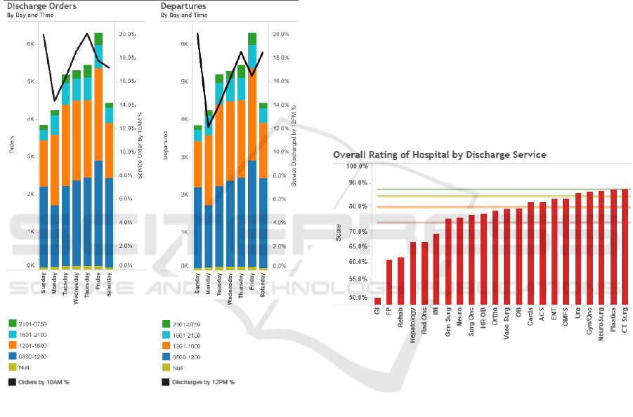
so we track both of these metrics. These metrics are
tracked primarily by unit as the unit staff has more
influence over this measure than the discharging
provider. On the provider dashboard, these values
are still shown only for patient’s the provider
discharged.
Finally we stratify both metrics by time and day
of the week to look for opportunities for
improvement. Figure 9 shows this chart. This is an
example of a metric than can improve length of stay
and cost without requiring us to target specific
diseases.
Figure 9: Discharge efficiency by day of week.
4.5 ED and Admissions Efficiency
For these metrics, we track ED length of stay, time
from decision to admit to admit order and time from
admit order to the patient departing the ED. The
attributed provider is the admitting provider though
stratification for the director and executive
dashboards includes the ED providers for ED length
of stay. The provider is compared against their service
for decision to admit to admit order. The time from
admit order to ED departure is stratified by the
inpatient unit the patient was moved to.
4.6 Patient Experience
We have a third party vendor who surveys the patient
experience of our hospital patients. The set of
questions is different for adults and children. We have
set up a secure FTP location to receive and import
these results monthly. We are attributing them to the
encounter information so that filters by hospital,
discharging service and DRG can still be supported.
However, we do not attribute them to providers as the
sample size is too small and we do not allow any users
to see the actual patient name or encounter number.
Provider and directors both see the responses to each
set of questions, and the percentile compared to other
hospitals. The executives are also able to compare the
patient experience scores across the services. The
results are benchmarked based on percentiles from
other hospitals through our vendor. We are bringing
this data in from the vendor through secure FTP.
Figure 10 shows an example of patient experience
information.
Figure 10: Patient experience by service.
4.7 Bed Blocks and Room Turnaround
Time
There are many reasons a bed can be blocked.
Because our hospital doesn’t have private rooms, it
can be because the other patient in the room has an
infectious disease, is a VIP or is considered
dangerous. It can also be from mechanical or staffing
issues. We have created metrics and dashboards
which allow the user to see volume of bed blocks by
day, stratified by type of block, unit or time. This
allows us to analyse issues effecting occupancy,
patient movement efficiency and timeliness of care.
Room turnaround time shows the average or
median time from when a patient leaves a bed until it
is cleaned and the average or median time from when
it is cleaned until when it is occupied.
Developing Enterprise-wide Provider Analytics
143

These metrics allows the user to analyse issues
effecting occupancy, patient movement efficiency
and timeliness of care.
Neither of these metrics is directly influenced by
services so they are both stratified by unit, and all
users can see this data. There is no patient
information.
4.8 Orders Utilization
For orders utilization, we calculate how many
procedure or medications are ordered, stratified by
authorizing provider, service and what was ordered.
We also show what % of the orders used an orderset.
These metrics are calculated four ways: total (for the
time period), per encounter, per patient day (for each
day the patient was in hospital), per service day (for
each day the provider ordered anything for that
patient). For the provider they can only see patient
information for patients they wrote an order on, and
they can only see any information for patients a
provider in their service wrote an order on. They
cannot see orders outside of their service even for the
patients they wrote orders for.
For a provider, this is primarily useful for them to
see what they are ordering most for different diseases
and how their utilization compares to their peers. For
a director, they can look across their providers and see
who are utilizing more orders per patient day than
others for the same disease and attempt to adjust
practice.
At the executive level, the executive can look at
order sets and see which items are being used most,
and they can look at diseases and see which orders
outside of the orderset are being ordered. This allows
for orderset optimization. They can also compare
orders across services or providers to drive
performance improvement.
4.9 Cost
For all cost besides medications, we integrated data
from our hospital’s decision support system to
acquire cost per unit and location based on revenue
code and used that to calculate cost for every single
hospital billing transaction including fixed direct,
variable direct, and indirect cost. We added an extra
calculation that applies current cost to past
transactions. As an example if a chest x-ray’s cost
increased 10% but we were able to decrease
utilization 5%, this allows us to apply today’s cost to
the old transactions and thus demonstrate the savings
created by the 5% reduction, rather than losing the
ability to quantify this return on investment (ROI) due
to price fluctuations.
The finance department was unable to give us
accurate unit cost for medications. This becomes
challenging because some medications are single use.
For example, if a patient only has albuterol once from
an inhaler, the entire inhaler is still utilized. For now,
the best surrogate we were able to do was to reverse
the markup applies to the pharmaceutical charge as a
surrogate for cost. We did special logic to adjust this
for 340-B medications (Health Resources and
Services Administration, 2018). This is an accurate
surrogate for cost with a consistent bias, but it does
not allow us to provide current costing to past
transactions.
78% of our costs are associated with an order. If
the order is attached, we attribute the cost to the
provider and the provider’s service attribution. In the
event the provider is not attributed or is a resident, we
utilize the service at the time of the order using our
patient movement data. Similarly, if there is no
associated order, we use the first service on that
service date. In these instances, the provider is
unassigned but the service is still assigned.
Similar to orders, we calculate cost in our
dashboards in total, per encounter, per patient day and
per service day. For the provider dashboard a
provider is allowed to see their direct costs over time
compared to their service. The greatest opportunity
for provider improvement is in labs, images, and
medications. Therefore we break these three
categories out and bucket all remaining costs into one
category. The provider dashboard does not show
indirect costs as the provider cannot affect these
values. Within lab, imaging, medication and other the
provider can see their cost and their services cost by
the procedure or medication that was ordered.
At the director level, the director can compare
providers in their service by their cost in each
category. At the executive level they can look at all
revenue groups, compare cost by service and look at
indirect costs as well. Moreover, the executive can
compare analyse total cost by disease in each
category. At the executive level we have also created
separate charts for room and board cost and ICU cost.
Executives can also look across the entire system for
the highest cost medications and procedures and
investigate opportunities to use a more economical
option. Additionally, quality experts can look at the
cost related to specific disease cohorts, ordersets and
care paths to optimize the ordersets to minimize cost.
Furthermore, this cost data provides valuable
feedback to know which quality and performance
HEALTHINF 2019 - 12th International Conference on Health Informatics
144
initiatives are delivering financial return on
investment.
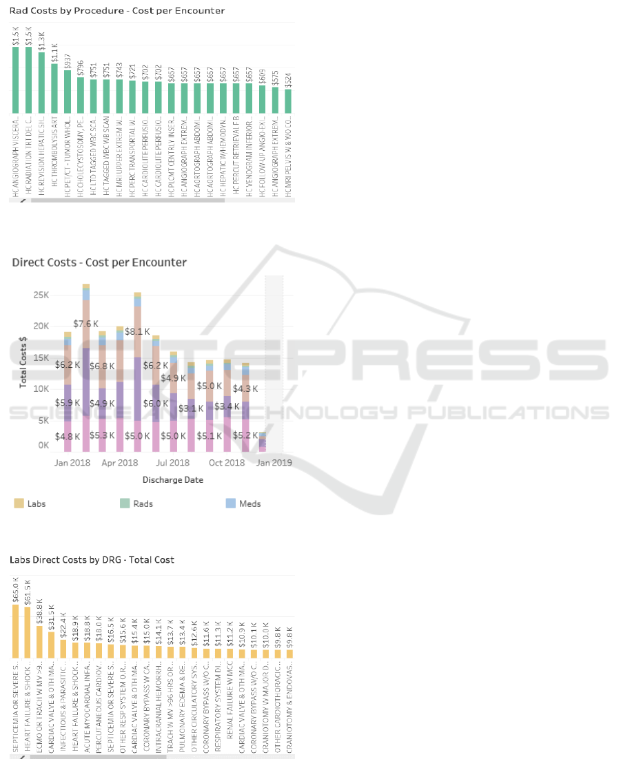
Figures 11, 12 and 13 show some examples of
cost charts.
Figure 11: Imaging cost by procedure.
Figure 12: Direct cost per encounter by category.
Figure 13: Total lab costs by DRG.
4.10 Complications
For hospital-acquired infections such as catheter-
associated urinary tract infection (CAUTI), central
line-associated blood stream infection (CLABSI) and
methicillin-resistant Staphylococcus aureus (MRSA),
the hospital documents and attributes the infection in
an Excel spreadsheet. We import this spreadsheet
daily using a shared drive and checking for updates.
For complications such as falls, the incidents are
reported in the risk management software. We import
this data programmatically. For surgical site
infections (SSI), we acquire this data from the web
registry used to report it.
All of these metrics are associated to services and
sometimes departments. We show the volumes with
the ability to drill down to the details to enable
performance improvement. Additionally, we adjust
and standardize the rate and compare it to
benchmarks. All of this is done with outside reporting
registry and risk management software, and then
integrated into our data warehouse.
5 RESULTS
We have delivered 14 dashboards with 46 tabs for this
project. We currently have over 500 users, over 300
who have viewed dashboards in the last month, and
over 10,000 distinct views. All of this is accessed
from a single location with a common look and feel.
Since going live 5 months ago, we have been able
to reduce length of stay by 4.3% and the number of
days over benchmark (length of stay – benchmark) by
12%. Readmissions have been reduced by 6.4%.
Room turnaround time has been reduced by 51%. Our
cost phase went live only this month so we do not
have sufficient data to analyse results yet.
We used the information from the executive
dashboard to choose disease to design programs
around. So far, we have developed care paths for
sickle cell anemia, heart failure, pediatric sepsis and
acute coronary syndrome (ACS). We are currently
developing solutions for pre-eclampsia, adult sepsis
and asthma. All of these show in the top 5 for either
volume, length of stay opportunity, cost or
readmissions. Early results for heart failure show a
savings of over 1.5 days in the length of stay when the
care path was utilized. Additionally, we were able to
identify high cost unnecessary orders (compound
narcotics urinary analysis was second highest cost)
and variations in care (two providers averaged almost
two chest x-rays per visit while most averaged only
one). For ACS, we have demonstrated statistically
Developing Enterprise-wide Provider Analytics
145

significant and consistent reduction of 51.6% in
emergency department length of stay since
development of the care path.
6 FUTURE WORK
We plan to analyse our results more after we have
been in production for a full year. Our infection and
complications phase is still in final development. We
have planned future phases including productivity,
additional complications, surgical efficiency, boarder
time in ICU and PACU, supply cost details, waste,
and appropriate utilization. Additionally, we plan to
develop many more care paths for specific diseases
with high opportunity. We plan to evaluate cost
savings from each of these care paths. Finally, we
plan to integrate additional benchmarks to measure
hospital performance versus our peers.
7 CONCLUSIONS
We have developed a set of simple, meaningful, easy
to use and secure dashboards for enterprise-wide
consumption by providers and service lines across
multiple types of devices. We have demonstrated the
ability to create performance improvement utilizing
these dashboards. Early user adoption has been good.
We have a framework for continued expansion and a
set of secure configuration and attribution forms for
simplified maintenance. We can continue to develop
care paths based on these analytics, and create
meaningful changes, outcome improvement and cost
reduction.
ACKNOWLEDGEMENTS
The project was implemented at Loma Linda
University Health System. We would like to thank the
Loma Linda team for their leadership, work effort and
insights which made this project successful. We
would like to especially thank Dr. Ihab Dorotta and
Brenda Bruneau for their leadership and direction.
REFERENCES
Office of the Inspector General, 2018. A Roadmap for New
Physicians: Fraud & Abuse Laws. Viewed November
2018. https://oig.hhs.gov/compliance/physician-educa
tion/01laws.asp.
Kitchiner, D., Davidson, C and Bundred, P., 1996.
Integrated Care Pathways: effective tools for
continuous evaluation of clinical practice. Journal of
Evaluation in Clinical Practice, vol. 2, no. 1, pp. 65–
69, 1996.
Joint Commission on Accreditation of Healthcare
Organizations, 1996. An Integrated Approach to
Medical Staff Performance Improvement.
Stephen, A.E. and Berger, D.L., 2003. Shortened length of
stay and hospital cost reduction with implementation of
an accelerated clinical care pathway after elective colon
resection. In Surgery, vol. 133, no. 3, pp. 277–282.
Pearson, S., Kleefield, S., Soukop, J., Cook, E., Lee, T.,
2001. Critical pathways intervention to reduce length of
hospital stay. In American Journal of Medicine.
Wazeka,A., Valacer, D., Cooper, M., Caplan, D.W., and
Dimaio, M., 2001. Impact of a pediatric asthma clinical
pathway on hospital cost and length of stay. In Pediatric
Pulmonology, vol. 32, no. 3, pp. 211–216.
Rotter, T., Koch, R., Kugler, J., Gothe, H.,Kinsman, L. and
James, E., 2007.Clinical pathways: effects on
professional practice, patient outcomes, length of stay
and hospital costs. In Cochrane Database of Systematic
Reviews.
Vanhaecht, K., Bollmann, M., Bower, K., Gallagher,C.
Gardini, A., Guezo, J., Jansen, U., Massoud, R.,
Moody, K., Sermeus, W., Zelm, R.V., Whittle, C.,
Yazbeck, A.-M., Zander, K. and Panella, M., 2006.
Prevalence and use of clinical pathways in 23 countries
- an international survey by the European Pathway
Association. In International Journal of Care
Pathways, vol. 10, no. 1, pp. 28–34, Jan. 2006.
McGlothlin, J. P. Madugula, A., and Stojic, I., 2017. The
Virtual Enterprise Data Warehouse for Healthcare. In
Proceedings of the 10th International Joint Conference
on Biomedical Engineering Systems and Technologies.
Health Resources and Services Administration, 2018. 340B
Pricing Program. Viewed November 2018.
https://www.hrsa.gov/opa/index.html.
McGlothlin, J.P., Crawford, E., Srinivasan, H., Cianci, C.,
and Dorotta, I, 2017. Reducing Red Blood Cell
Transfusions. In ITBAM.
Wyatt, J., Vaks, Y., Moretti, A., Pappas, J., Wilson, M.,
Samayoa, C., McGlothlin, J., Lopez, M., 2018. The
Future of Healthcare: Avoiding Pain, Unnecessary
Interventions and Reducing Cost in the PICU. In
Critical Care Medicine, vol 46, issue 1.
McGlothlin, J..P., Vedire, S., Crawford, E, Pappas, J.,
Bruneau, B., and Obregon, L., 2016. Improving Patient
Care Through Analytics. In ISCBI.
McGlothlin, J.P., 2018. Accelerating Analytics for Clinical
Pathways to Drive Cost Reduction and Quality
Improvement. In IEEE International Conference on
Information Reuse and Integration.
HEALTHINF 2019 - 12th International Conference on Health Informatics
146
