
Software Engineering Projects Analysis using Interactive Multimodal
Graph Explorer – IMiGEr
Lukas Holy, Petr Picha, Richard Lipka and Premek Brada
NTIS – New Technologies for the Information Society, European Centre of Excellence, Faculty of Applied Sciences,
University of West Bohemia, Univerzitni 8, Pilsen, Czech Republic
Keywords:
Graph Visualization, Visual Clutter, Large Graphs, Software Engineering.
Abstract:
This paper describes a visualization technique designed to help work with complex diagrams containing mul-
tiple types of nodes and edges, by using a combination of visual clutter reduction and graph exploration
techniques. We show its application, including preliminary evaluation, on software engineering projects data
gathered from various tools and repositories used for software development. An online tool implementing the
technique and plans for its extension by a connected view of time perspective data are briefly presented.
1 INTRODUCTION
Software development projects become more com-
plex and their content includes more types of dedi-
cated roles, artifacts and activities. Thus, getting in-
sights and understanding the relations among these el-
ements is more and more difficult. Often the informa-
tion is tracked in multiple unconnected or loosely con-
nected systems. There are several challenges when it
comes to full understanding of a project such as being
able to easily find out:
• status of activities and artifacts,
• overall difference of artifacts since last check,
• health of the project from the process point of
view (e.g., if there are any anti-patterns occur-
ring),
• balance of effort spent by various team members,
• find out the artifacts related to a group of items
(e.g., tickets a in sprint)
• each team member performing activities appropri-
ate to role(s) assigned to him/her,
The above-mentioned topics are just a few of dif-
ferent phenomena one could need to find out about
the project as there are many anti-patterns identified.
Besides that there are many problems remaining un-
covered.
We address the above-mentioned challenges by
the new approach using software process anti-pattern
detector and novel interactive visualization. This pa-
per mainly focuses on the visualization part of the ap-
proach. Its novel visualization techniques will be used
for understanding the software development process.
We use the software engineering project data repre-
sented as large graphs consisting of large number of
nodes and edges. These are in its nature of various
types. It is difficult to explore the structure of such
graphs, create a mental model of the whole graph and
find its relevant parts.
The approach presented in this paper attempts
to reconcile the contradictory requirements to show
large graphs while being able to see enough details
needed for understanding. Advanced visualization
techniques used in our approach helps the process of
understanding. It describes possible ways of address-
ing some of the challenges by providing the ability
of fast understanding element relations and mental
model creation. Understanding such relations could
lead to lowering of time wasted on its analysis and
improvements design. In this paper, we present gen-
eralized concepts of node-edge graph exploration on
domain of software engineering project elements (and
their relations). We are designing the solution to be
able to work with data from other domains as well.
Currently, we implemented part of the overall
concept of project exploration. Currently researched
parts are described in Section 5. Such concept could
then help understanding various aspects by interac-
tive visualization of static relations visualization and
interconnected Time-line.
330
Holy, L., Picha, P., Lipka, R. and Brada, P.
Software Engineering Projects Analysis using Interactive Multimodal Graph Explorer – IMiGEr.
DOI: 10.5220/0007579803300337
In Proceedings of the 14th International Joint Conference on Computer Vision, Imaging and Computer Graphics Theory and Applications (VISIGRAPP 2019), pages 330-337
ISBN: 978-989-758-354-4
Copyright
c
2019 by SCITEPRESS – Science and Technology Publications, Lda. All rights reserved

1.1 Structure of the Paper
The remainder of the paper is structured into follow-
ing sections. Section 2 provides overview of the re-
lated work. Section 2.1 describes the SPADe tool
used for repositories mining and analysis. Section 3
describes our experimental notation, the IMiGEr tool
and relevant parts for visualization. Technical infor-
mation related to implementation and availability are
described in Section 4. Section 5 presents the work
in progress and improvements planned. Finally, Sec-
tion 6 concludes the paper with the summary of find-
ings.
2 RELATED WORK
For the related work, we are focusing on visualization
domain as we mainly present such approach in this
paper. Our focus is on various techniques to reduce
the complexity of visualized information.
Visual clutter in large node-edge diagrams
can be reduced by many techniques, such as
bundling (Holten and Van Wijk, 2009), sam-
pling (Rafiei, 2005), clustering (Chen and Liu, 2003),
etc. From the well-developed taxonomy of these tech-
niques described by Ellis and Dix (Ellis and Dix,
2007) the following ones are primarily relevant for
our work. An example of such clutter is illustrated
in Figure 1 that shows relations between software en-
gineering artifacts in 5 months software development
projects done by 4 members teams.
Firstly, visual clutter caused by the lines is often
reduced by edge bundling (Holten, 2006). Although
this approach reduces the clutter, it makes it difficult
to trace the dependencies between connected nodes
leading through the edge bundles. Secondly, the clus-
tering of components (nodes) so that multiple compo-
nents are visually represented by one node can also
reduce visual clutter. Thus, the number of nodes in
the whole diagram is reduced, though the connections
among components are usually still present. Clus-
ters can either be marked manually, in an automated
way (Chiricota et al., 2003; Mancoridis et al., 1998)
or by a combination of those approaches. Lastly, the
chosen layout algorithm is an influencing factor since
it can ease orientation in both clustered graphs (Feng,
1997) and the non-clustered ones (Hachul and Jnger,
2007).
Previously, we verified some of the concepts de-
scribed in this paper on a user-study (Holy et al.,
2015) , but limiting the approach only to one type of
node and one type of edge visualizing only the do-
main of the Java software call graphs. There are many
available tools for graph visualization such as Gephi
1
or NodeXL
2
. Currently visualized data are in its na-
ture multimodal graphs (Ghani et al., 2012), (Srini-
vasan and Stasko, 2018) because the nodes and re-
lations belong to different types. For nodes, we are
showing for instance authors, commits, wiki pages
etc. Edges then captures various types of relations
among nodes, such as authorship, commit to ticket
connections etc.
2.1 SPADe
To be able to address above-mentioned challenges
we need a way of collecting the software engineer-
ing data from various tools. Software Process Anti-
pattern Detector (SPADe) is an experimental tool col-
lecting software project development data from repos-
itories in various Application Lifecycle Management
(ALM) tools. The overall architecture of SPADe is
shown in Figure 2. SPADe stores data in a metamodel
(Picha and Brada, 2016) capable of capturing project
data irrespective of the source tool and process model
used by any particular project. The main purpose of
SPADe is to detect software process and project man-
agement bad practices, a.k.a. anti-patterns. Other
uses include compliance check of the project and a
given process model or analyses specifically aimed
on a certain aspect of the project, for example, the
role of an architect (Picha et al., 2017) . The research
topic attached to SPADe then focuses on investigating
the relation (if there is any) between these phenomena
and projects success and/or product quality.
Along with storing data in the database, SPADe
produces several outputs to be used in other tools for
specialized analysis. One of those is a JSON file
with relevant project data to be visualized in IMiGEr.
These include people active in the project, artifacts
(files, wiki pages, etc.), tickets from issue-tracking
systems, repository commits and general changes per-
formed on the tickets or artifacts. The SPADe JSON
file also includes relations between these elements,
for instance authorship, ticket assignments, explicit
ticket relations, commit-ticket traceability links, arti-
facts attached to tickets and/or wiki pages, etc. When
visualized in IMiGEr, this data provides an insight
into the structure of the projects and personnel activi-
ties.
1
https://gephi.org/
2
https://archive.codeplex.com/
Software Engineering Projects Analysis using Interactive Multimodal Graph Explorer – IMiGEr
331
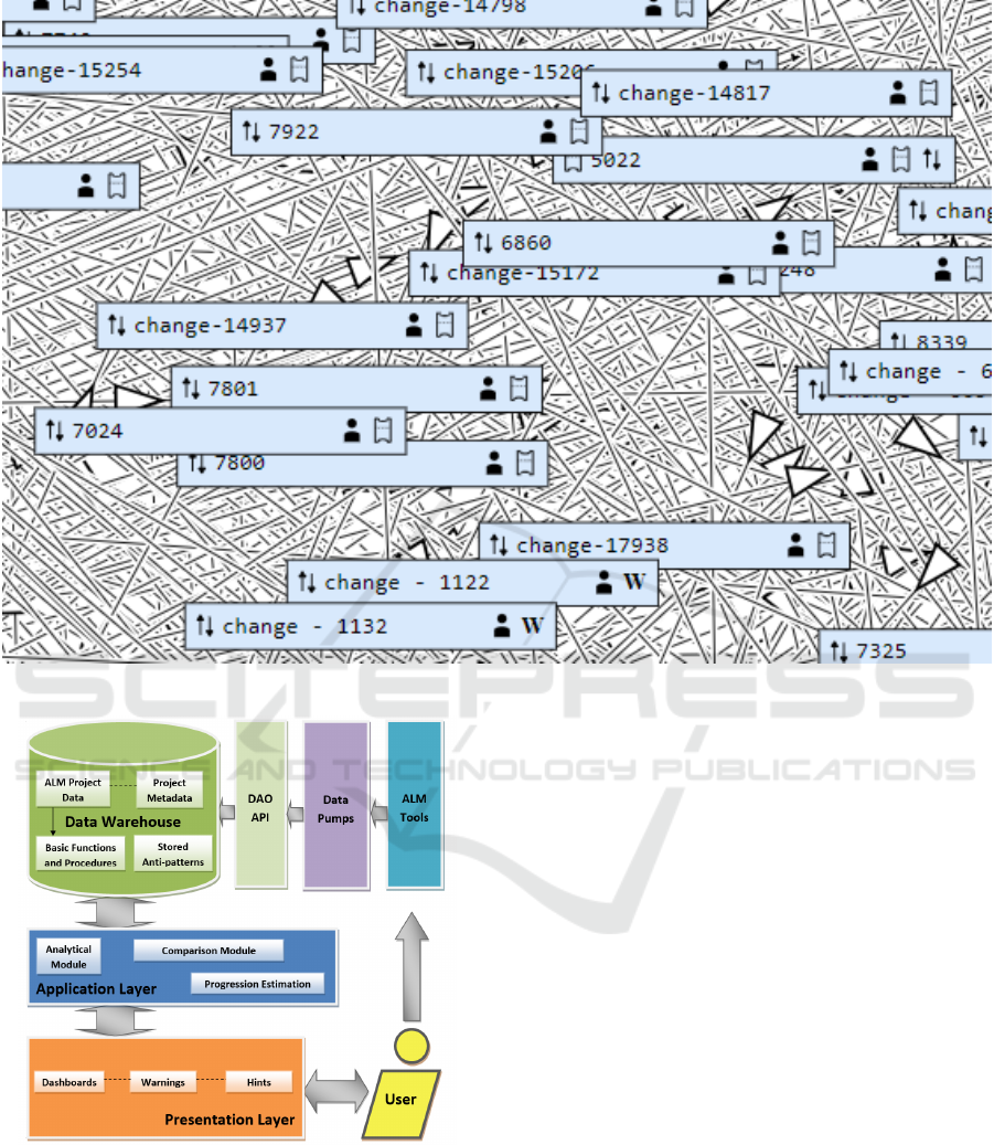
Figure 1: Visual clutter caused by large number of nodes and edges.
Figure 2: Overall SPADe architecture.
3 INTERACTIVE MULTIMODAL
GRAPH EXPLORATION
The aim to described approach is to be able to find out
desired information quickly. When we speak about
software engineering project data, in most of the cases
we will be working with data containing at least hun-
dreds or rather thousands of elements (nodes). While
exploring such number of elements in a graphical way
shown all on one canvas we will see lot of visual
clutter. We are facing the contradictory requirements
of not seeing useful information when showing the
whole graph and not seeing the context of elements
when showing enough details about particular nodes.
Additionally, in software projects domain we have
multiple types of both nodes and edges, which creates
additional complexity to the information visualized.
While for single type of node and edge user can easily
understand the line between two nodes as connection,
for multiple types of edges simply showing single line
does not provide detailed information. Similarly, the
nodes visualization should reflect its type in way that
is effective.
As an outcome of above-mentioned challenges,
we designed the visualization to use interactivity and
details on demand principle to make the work with the
graph effective. One of the key aspects is to use infor-
mation hiding principle to reduce the number of nodes
in the graph to enable the mental model creation.
The approach described in this paper is able to dis-
play various types of data, which is enabled by gen-
eralized input graph structure. It is able to handle
IVAPP 2019 - 10th International Conference on Information Visualization Theory and Applications
332
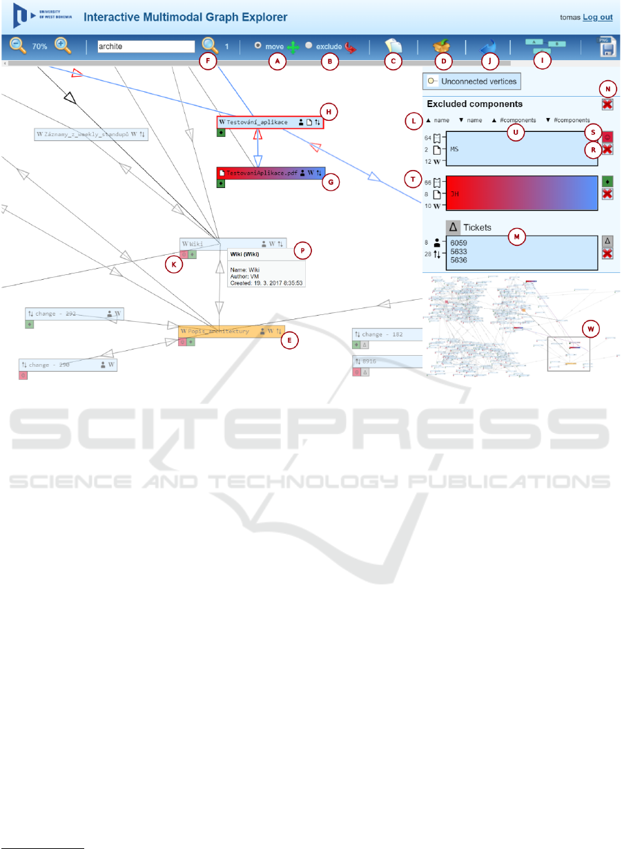
Figure 3: Complex node Application Explorer tool demonstration.
multiple types of both nodes and edges. Thus, it can
suite to any graph data which could be converted to
given generalized structure (e.g., software engineer-
ing projects, intelligence agencies analysis, historical
data, computer networks, social networks).
To be able to verify techniques presented in this
paper we have created their implementation. It is
called Interactive Multimodal Graph Exploration ab-
breviated as IMiGEr. It is able to show the software
engineering data represented as a graph in the web
page. The demonstration of the IMiGEr’s GUI is
shown in Figure 3. It shows the tool interface on a
node diagram of a software engineering project. Fig-
ure 3 shows one instance of generalized graph struc-
ture (multiple types of nodes and edges) on depen-
dency graph showing relations among software engi-
neering project artifacts, people involved and tickets
created during software development project. These
data were collected by the SPADe (Picha and Brada,
2016) project data mining tool
3
from various data
sources, for instance Git, JIRA, Bugzilla. These data
were collected from 5 months software development
projects done by 4 members teams.
3
https://github.com/ReliSA/SPADe
3.1 Visualization Overview
The visualization consists of interactive graph area,
side area and toolbar. In the interactive graph area,
nodes are shown including their type, for instance
”wiki page”. Details like artifact authorship are hid-
den to reduce the visual clutter and provided on de-
mand by selecting individual edge (cf. the grey pop-
up). In such case the connected nodes and the edge
itself are highlighted, rest of the nodes are suppressed
using transparency.
The side area is showing nodes excluded from the
graph. For such nodes, there are no edges shown to
reduce a visual clutter in the graph area in first place,
but they could be shown on demand. Another option
is to use so called proxy symbols instead. These sym-
bols indicate connection between node in side area
and node in graph area, as shown near each node.
For further visual clutter reduction and graph sim-
plification, the concept of groups is used. These
are created in the side area for representing multi-
ple nodes as one while providing aggregate informa-
tion on connections. Each group can also be shown
back in the graph area as one node. The toolbar al-
lows to perform search, trigger force-directed layout,
and other standard operations (such as panning and
zooming). For easier navigation in the diagram the
minimap is shown in the right panel.
Software Engineering Projects Analysis using Interactive Multimodal Graph Explorer – IMiGEr
333

3.2 Interactivity Features
The approach we have proposed reduces the visual
clutter by multiple visualization techniques. In this
section we will focus on their explanation.
As we use removing of the nodes from the main
graph area to the SeNoA area as visual clutter re-
duction technique, we need two modes of manipulat-
ing the nodes. Its switching is done with appropriate
icons in the toolbar. First mode is for moving nodes
(A) where the user can manually adjust the layout of
the diagram. Second mode (B) serves for removing
nodes from the diagram area to the SeNoA area sim-
ply by clicking on the desired nodes, which should be
removed.
Last two icons in the toolbar serve for the auto-
matic removal of a configured number of nodes from
the diagram to the SeNoA area. The tool is currently
configured to remove most connected node, but more
sophisticated algorithms are subject of a future work.
The icon (C) is used for removing such node and
adding it to the SeNoA area as individual item. The
next icon (D) creates one group for all of them. These
techniques helps user to quickly reduce the initial vi-
sual clutter of the graph by removing the most con-
nected nodes. As in most of the graphs are very likely
present nodes having much higher number of edges
compared to other ones.
From our observations, we know that after remov-
ing most connected nodes, users usually focus on the
items they are interested in. For such cases a simple
search could be used. In Figure 3, one can see the
search result for a string “archite”. Two nodes in the
diagram contain this word as indicated by the number
(F). Nodes matching the search are highlighted by an
orange color (E).
3.3 The Separated Nodes Area
SeNoA (sidebar) is used for removing nodes with
a large number of connections from the main dia-
gram into a so called separated nodes area (abbre-
viated as SeNoA) placed on the border of a window
(the right sidebar in Figure 3). When a user moves
components from the main diagram to this area, the
lines between these components and remaining com-
ponents are elided. This essentially marks a compo-
nent as a “familiar one”. Once component removed,
the user may continue getting familiar with the rest
of the system. Often, a particular node (such as per-
son) is connected to large number of other ones. Such
nodes are good candidates to be place to SeNoA (U).
Then, graph’s visual clutter is usually considerably
decreased. One of the cases may be a node showing
person. Such a node is probably connected to most of
nodes in the system and its displacement reduces the
graph complexity.
We measured several projects lasting 5 months,
which were done by 4 people team. The results of
clutter reduction are shown in Table 1. Columns
Nodes and Edges represent the number of nodes and
edges created in the graph by the SPADe data collec-
tion and analysis. In the column Nodes Moved we
capture the number of nodes removed from the graph
area to the SeNoA. Finally, the column Edges Hid-
den shows the percentage of the edges reduced from
the graph area by moving the described number of
nodes to SeNoA. It shows that by using the proposed
technique, a significant visual clutter reduction may
be achieved.
Table 1: Several Systems with the Number of Components
and Connections.
Project Nodes Edges
Nodes
Moved
Edges
Hidden
Prj 1 304 1775 5 36%
Prj 2 1236 9393 4 27%
Prj 3 1347 11095 6 19%
SeNoA consists of a list of items. Each item con-
sists of interfaces (indicated with the mark (T) in Fig-
ure 3), nodes (U) and one corresponding symbol (S).
Interfaces are clustered into sets (T) according to the
opposite node type. Numbers beside the clustered
connections denote the number of elements clustered
in the respective symbol.
It is also possible to remove all nodes from SeNoA
area back to the diagram area by using the red cross
icon (N). Which will allow user to analyze clusters
in the graph area step-by-step rather then get con-
fused by the clutter. There is also a possibility to sort
the nodes shown in SeNoA (L). Currently, there is a
possibility to sort nodes by their names or number of
nodes contained in a group. Both mentioned sorting
possibilities could be ascending or descending. This
allows the user to find the nodes faster in the SeNoA
as the list could easily become long.
The purpose of symbols (S) is to create a clear
and easily recognizable key, which uniquely identi-
fies items within SeNoA. These symbols can be used
in the diagram area to represent connections between
a given node and the corresponding item placed in
SeNoA. They are shown as small rectangles neigh-
boring to the displayed nodes (K) and containing the
symbol, which corresponds to the connected item (S).
One can also see a group consisting of three nodes
(M). These symbols have graphics, which may hu-
mans easily remember, to help build a mental model.
IVAPP 2019 - 10th International Conference on Information Visualization Theory and Applications
334

Figure 4: Adding nodes from diagram to SeNoA groups.
The symbols allow user to be able to understand that
there is a connection between particular nodes, but not
clutter the graph by using a line.
If one clicks to the connection icons (T) of a node
in SeNoA , its connections and connected nodes be-
come highlighted by blue or red color. For the outgo-
ing connections, a blue color is used for highlighting,
red one for the opposite ones. It can be seen between
outgoing of the JH node in SeNoA (T) and node (H)
in the diagram area. Each individual node shown in
SeNoA has its own button (R) to remove it back to
its original position in the diagram area. That is use-
ful when user already understands the diagram in the
main graph area and wants to for instance identify an-
other cluster.
There could be additional information associated
with a node. We apply details on demand principle
and hide such information by default. For showing
details, the tool offers grey tool-tip (P) when explor-
ing elements.
Identifying groups of nodes represent one of the
ways of graph simplification. Thus, their easy iden-
tification is important for process of getting familiar
with the diagram. There is a possibility to add desired
nodes from diagram area to existing items in SeNoA
by a context menu, as shown in Figure 4. The con-
text menu will appear after a right mouse click on any
nodes in the diagram area. It contains symbols and
colors of all items included in SeNoA. After adding a
node to an item, the group is created. Users are usu-
ally creating multiple groups mainly for two reasons.
First because the nodes belong to the same seman-
tic entity such as Sprint, Release or Team. Second,
they want to just eliminate the visual clutter of nodes
added, as they are not relevant for them. A group
could be shown both in SeNoA and in graph area. So
while having multiple nodes in one group user can
still see its relations with other nodes directly in the
graph area.
4 CURRENT STATUS OF THE
TECHNIQUE
IMPLEMENTATION
We have implemented described techniques in the
web application to enable anyone to analyze data from
any domain. The tool is running on a public URL
4
and available for general use. The source code is
available from a GitHub repository
5
.
IMiGEr uses servlets from the enterprise Java
technology as the back-end technology. Servlets are
used mainly because of the Java implementation of
the SPaDe tool. The front-end is based on HTML5
and JavaScript. Canvas and SVG elements from
HTML5 are used to represent the nodes of the dia-
gram. We also tested several graphical frameworks,
but we concluded that their customization would be
difficult because most of our present and future fea-
tures require custom implementation. That is the rea-
son why we implemented the GUI from scratch.
5 WORK IN PROGRESS
The graphs showing static relations among nodes
shown are in most of the cases growing quite rapidly
along with size and duration of a project. We are
currently working on various concepts of manual and
automated filtering of relevant data. We try to apply
principles of showing details on demand and provide
different perspectives to the same data such as time
perspective. We believe such principles will help to
reduce the number of elements in the graph area to
the relevant ones only and thus dramatically reduce
visual clutter and speed-up understanding of the data
shown.
Main part of current work is dedicated to addi-
tional connected view representing the Time-line of
all collected project events. So that the user can easily
analyze the data from the time perspective and filter,
the static relations in the graph area below only to rel-
evant time window selected. Our previous experience
shows that the Time-line based visualization, com-
bined with the relations among displayed events helps
users in orientation in complex data (Lipka, 2016) .
Our implementation of the Time-line allows dis-
playing events with required duration or only points
in time. The granularity of the time may range from
minutes to years, so it can serve both for a high level
overview or for the detailed analysis of the events in
some particular part of the project. The visualization
4
http://relisa-dev.kiv.zcu.cz:8085/imiger/
5
https://github.com/ReliSA/IMiGEr
Software Engineering Projects Analysis using Interactive Multimodal Graph Explorer – IMiGEr
335
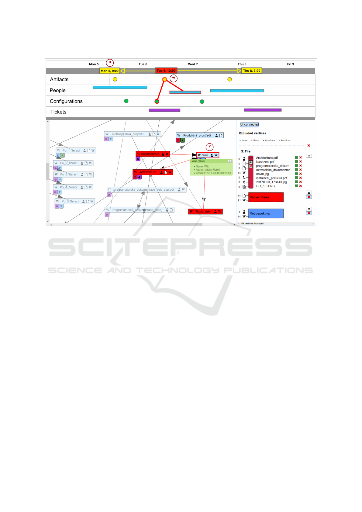
Figure 5: Connected views between static relations and Time-line visualization proposal.
also supports various event renderers, allowing rec-
ognizing different types of events. When required,
relations between events can be displayed within the
Time-line, for example to indicate the authorship of
the artifacts or inclusion into a configuration. The
Time-line also allows dividing the space into so called
”swim-lanes”, in order to separate nodes types.
In the proposed visualization, Time-line is placed
above the relations graph. It contains four swim-
lanes as SPADe meta-model is classifying the soft-
ware projects elements into four categories. These are
Artifacts, People, Configurations and Tickets. Each
such element can be positioned in time when appro-
priate rules are used. For example the developer can
be displayed in the People swim-lane, for the duration
of his or her involvement in the project, the configu-
ration can be displayed as a point in time when it was
specified.
Both Time-line and static relations graph show
the requested details on demand. For instance, if
user clicks on the node Wiki in the graph area (Y)
(in Figure 5) its static relations in the graph area as
well as the corresponding records (W) (in Figure 5)
in the Time-line area will be highlighted. The same
principle applies in opposite direction, once selecting
any record on Time-line items are highlighted in the
graph area. Additionally, as was mentioned before,
the Time-line is able to show the relations of selected
record directly in the Time-line itself.
To be able to better understand static relations in
larger project one could benefit from viewing some
limited time frame of the underlying data. Viewing
whole project could easily contain thousands of nodes
and edges in the graph. For instance, project manager
is very often interested in current sprint or iteration.
For such cases, the Time-line should be able to easily
use start and end date filter for nodes and edges in the
static relations graph. Such principle is illustrated in
5 by yellow time positions (marked by (Q)).
We will also continue work on automated clus-
tering techniques, which will group suitable sets of
nodes into the groups. For instance, all nodes con-
nected only to particular node could be represented as
one group (e.g., wiki pages created by one author).
Another planned visual clutter reduction tech-
nique will show them people directly in the SeNoA
after the diagram is loaded and thus reduce the num-
ber of edges in the diagram area. As people are usu-
ally representing the most connected nodes (in soft-
ware engineering projects).
We have chosen force-directed algorithms to be
used in the application after a short survey. These
features should let the user get the insight faster by
showing most connected nodes in the center of the
diagram. We also plan to evaluate above-mentioned
ideas by a case or user study. Layout reflecting the
IVAPP 2019 - 10th International Conference on Information Visualization Theory and Applications
336

node types into position calculations will be also in-
vestigated. We are now considering circular tree lay-
outs separating sorting the nodes on the circle based
on the nodes type.
In addition, providing software process anti-
pattern visualization is currently being researched.
Anti-pattern can be detected by SPADe and the visu-
alization can be then used to provide the exploration
of the related data. The visualization challenge in this
topic is finding the proper way of visual representa-
tion of found patterns, as they are not only referring
to the static structure or time perspective.
6 CONCLUSION
In this paper, we addressed the problem of better un-
derstanding of complex structures, events and rela-
tions in software engineering projects. There are usu-
ally thousands of elements in the such projects thus
their visualization easily becomes hardly comprehen-
sible.
We propose several closely tied visualization tech-
niques which help dealing with complexity. These are
based on the details on demand principle, information
hiding and interactivity, and are manifested as a side-
bar used for node and edge reductions, cluster iden-
tification and hiding, edge elimination and interactive
highlighting.
We have implemented a toolchain which is able
to collect, transform and visualize data from software
engineering project repositories. The user is dealing
mainly with the interactive visualization part. It is
useful in the project analysis process when the user is
interactively getting familiar with a relations among
artifacts and people. It helps with creating the mental
model by easing the process of clusters creation.
While the data mining process is delegated to the
SPADe tool in the toolchain, IMiGEr presented here
concerns with a user interaction when analyzing a
project and getting familiar with its structure. Pre-
liminary evaluation shows that the presented ideas are
helpful in a large graph visualization, where one suf-
fers from visual clutter caused by the large number
of connection lines. The future work is to bring ad-
ditional point of view in the form of time perspective
and its interaction with existing approach. It should
bring the possibility of advanced filtering and includ-
ing its automated ways.
REFERENCES
Chen, K. and Liu, L. (2003). A visual framework invites
human into the clustering process. In Scientific and
Statistical Database Management, 2003. 15th Inter-
national Conference on, pages 97 – 106.
Chiricota, Y., Jourdan, F., and Melanc¸on, G. (2003). Soft-
ware components capture using graph clustering. In
Proceedings of the 11th IEEE International Workshop
on Program Comprehension, IWPC ’03, pages 217–.
IEEE Computer Society.
Ellis, G. and Dix, A. (2007). A taxonomy of clutter
reduction for information visualisation. Visualiza-
tion and Computer Graphics, IEEE Transactions on,
13(6):1216 –1223.
Feng, Q. (1997). Algorithms for drawing clustered graphs.
Ghani, S., Elmqvist, N., and Ebert, D. S. (2012).
MultiNode-Explorer: A Visual Analytics Framework
for Generating Web-based Multimodal Graph Visual-
izations. In Matkovic, K. and Santucci, G., editors,
EuroVA 2012: International Workshop on Visual An-
alytics. The Eurographics Association.
Hachul, S. and Jnger, M. (2007). Large-graph lay-
out algorithms at work: An experimental study.
http://jgaa.info/ vol. 11, no. 2, pp. 345369.
Holten, D. (2006). Hierarchical edge bundles: Visualiza-
tion of adjacency relations in hierarchical data. IEEE
Transactions on Visualization and Computer Graph-
ics, 12(5):741–748.
Holten, D. and Van Wijk, J. J. (2009). Force-directed edge
bundling for graph visualization. Computer Graphics
Forum, 28(3):983–990.
Holy, L., Maly, I., Cmolik, L., Jezek, K., and Brada, P.
(2015). An interactive uml-like visualization for large
software diagrams. Research Journal of Applied Sci-
ences, Engineering and Technology, 11:355–371.
Lipka, R. (2016). Scalable timeline visualization. In 2016
9th International Conference on Human System Inter-
actions (HSI), pages 150–156.
Mancoridis, S., Mitchell, B. S., and Rorres, C. (1998). Us-
ing automatic clustering to produce high-level system
organizations of source code. In In Proc. 6th Intl.
Workshop on Program Comprehension, pages 45–53.
Picha, P. and Brada, P. (2016). Alm tool data usage in soft-
ware process metamodeling. In 2016 42th Euromicro
Conference on Software Engineering and Advanced
Applications (SEAA), pages 1–8.
Picha, P., Brada, P., Ramsauer, R., and Mauerer, W. (2017).
Towards architects activity detection through a com-
mon model for project pattern analysis. In 2017
IEEE International Conference on Software Architec-
ture Workshops (ICSAW), pages 175–178.
Rafiei, D. (2005). Effectively visualizing large networks
through sampling. In Visualization, 2005. VIS 05.
IEEE, pages 375 – 382.
Srinivasan, A. and Stasko, J. T. (2018). Orko: Facilitat-
ing multimodal interaction for visual exploration and
analysis of networks. IEEE Transactions on Visual-
ization and Computer Graphics, 24:511–521.
Software Engineering Projects Analysis using Interactive Multimodal Graph Explorer – IMiGEr
337
