
Assessment User Interface: Supporting the Decision-making Process in
Participatory Processes
Lars Schütz
1,2
and Korinna Bade
1
1
Department of Computer Science and Languages, Anhalt University of Applied Sciences, 06366 Köthen, Germany
2
Faculty of Computer Science, Otto von Guericke University, 39106 Magdeburg, Germany
Keywords:
Decision Support System, User Interface, Participatory Process, Assessment Process, User Study.
Abstract:
We introduce a novel intelligent user interface for assessing contributions submitted in participatory planning
and decision processes. It assists public administrations in decision making by recommending ranked contri-
butions that are similar to a reference contribution based on their textual content. This allows the user to group
contributions in order to treat them consistently which is crucial in this domain. Presently, the assessment pro-
cess is done manually with no sophisticated computer-aided support. The assessment user interface provides
a two-column layout with a basic list of contributions in the left column and a list of similar contributions in
the right column. We present results of a user study that we conducted with 21 public administration workers
to evaluate the proposed interface. We found that the assessment user interface is well suited to the assessment
task and the related decision-making process. But there are also unclear elements in the ranking visualization
as well as some distrust in the ranked contributions or intelligent methods among the participants.
1 INTRODUCTION
Presently, ICT-supported forms of planning and de-
cision processes (Pahl-Weber and Henckel, 2008;
Blotevogel et al., 2014) play an important role in the
e-participation domain that is part of the more broadly
defined e-government field. These participatory pro-
cesses allow people to engage in various areas such as
politics, landscape planning or city budgeting (Brias-
soulis, 1997). In contrast to traditional or non-digital
participatory planning and decision processes, con-
sidering their time and space constraints, a potentially
larger group of people can be reached when online
software platforms are used for conducting these pro-
cesses. This is needed because more and more peo-
ple want to have a say in decision making and deter-
mine their environment; they want to represent var-
ious interests and needs. Of course, a larger group
of participants could also lead to more diverse opin-
ions and conflicts making it difficult to reach a con-
sensus. However, and more importantly, digital plan-
ning and decision processes enlarge and possibly en-
rich the collected process data.
At first glance, the above-mentioned facts are very
promising regarding the support and strengthening of
e-participation but they also entail major challenges.
That is, the complexity of the process data is a key is-
sue that mainly refers to the diversity and the connect-
edness of the data. For example, participatory pro-
cesses typically involve a lot of natural language text
data, e. g., written opinions, ideas, or complaints, and
parts of the data refer to each other. This leads to chal-
lenges concerning the high cognitive demands needed
for understanding the provided data of the planning
and decision process. It is challenging to explore the
space of plain process information, i. e., making sense
of it is complicated, and relating data to each other
is difficult. Besides this, knowledge discovery is de-
manding and time-consuming because participatory
contributions are mainly analyzed in a manual way
without further advanced mining of hidden or not ex-
plicitly given information. The big picture and com-
mon structures, e. g., different or same opinions of
participants, are difficult to acquire.
The previously mentioned challenges especially
concern public administrations that conduct partici-
patory planning and decision processes. In particu-
lar, they assess contributions submitted by citizens or
public agencies among others. Public administrations
make decisions on what to incorporate into future de-
velopments. They are interested in finding similar or
conflicting contributions. For this very common and
complex analysis task, they need intelligent system
support in judging formal statements and aggregat-
398
Schütz, L. and Bade, K.
Assessment User Interface: Supporting the Decision-making Process in Participatory Processes.
DOI: 10.5220/0007719603980409
In Proceedings of the 21st International Conference on Enterprise Information Systems (ICEIS 2019), pages 398-409
ISBN: 978-989-758-372-8
Copyright
c
2019 by SCITEPRESS – Science and Technology Publications, Lda. All rights reserved

ing ideas or proposals. Currently, they laboriously ar-
range the contributions and assessments side by side
in huge tables. In contrast, we propose the assessment
user interface. It assists public administration work-
ers by recommending and ranking similar contribu-
tions in the assessment process. The recommendation
method for supporting the decision-making process in
participatory processes is a novel contribution. In this
context, the paper also investigates the fundamental
acceptance and interpretation of learning algorithms
in the e-participation domain. This is another novel
contribution. We also show results of a user study
we conducted to test the assessment user interface,
i. e., we examined whether the user interface leads to
an efficient assessment process with correct results.
We found that this user interface is well suited to the
assessment task. But we also identified unclear ele-
ments in the ranking visualization as well as distrust
in the recommendation of similar contributions.
2 RELATED WORK
A large variety of research in e-participation orig-
inates from its adjacent or superordinated disci-
plines such as e-governance, e-democracy and e-
voting (Rose and Sanford, 2007). Various sciences,
e. g., sociology, political science, and social philos-
ophy, search for answers to different research ques-
tions. For example, there is a huge focus on how to
engage citizens to participate at all, e. g., by the inte-
gration of gamification methods (Thiel et al., 2016),
by using mobile technologies (Wimmer et al., 2013),
by applying augmented reality methods (Goudarz-
nia et al., 2017) or by analyzing perceived trust and
its influencing factors in e-participation (Santamaría-
Philco and Wimmer, 2018). We acknowledge this
research, but, at the same time, we argue that other
groups of participants are often not considered al-
though they play a very important role and carry a lot
of responsibilities. In this regard, we especially refer
to public administrations that decide about contribu-
tions submitted by citizens or public agencies.
On the one hand, a lot of Web-based software ap-
plications and information systems exist in the pub-
lic sector for conducting digital participatory planning
and decision processes (Tambouris et al., 2007). On
the other hand, collected process data will grow in
terms of volume and complexity (Al-Sai and Abuali-
gah, 2017). However, to fully understand and use the
process data, intelligent user interfaces and informa-
tion systems will play an important role in the future.
Of course, the need for sophisticated user in-
terfaces in this domain has already been recog-
nized (Nazemi et al., 2016; Schütz et al., 2016). Es-
pecially computer science and some of its related
numerous research fields, e. g., information visual-
ization, machine learning, text mining, and human-
computer interaction, offer many insights, funda-
mental research and applications for domain-specific
tasks that can be related to some aspects of planning
and decision processes such as social media analy-
sis (Batrinca and Treleaven, 2015), text summariza-
tion (Allahyari et al., 2017), topic exploration (Kim
et al., 2017), conversation visualization (Hoque and
Carenini, 2016) and sentiment analysis and senti-
ment visualization (Nazemi et al., 2015; Bader et al.,
2017). There is also visual analytics, a research field
that unites the aforementioned special research fields
among others. It focuses on deriving knowledge,
gaining insight from complex datasets, and analyt-
ical reasoning supported by interactive visual inter-
faces (Wong and Thomas, 2004; Thomas and Cook,
2006). It has been shown how the visual analytics
process model (Keim et al., 2010; Kohlhammer et al.,
2011) can guide the analysis and decision making in
participatory planning and decision processes (Schütz
et al., 2017). But this was only done conceptually.
Overall, a huge variety of sophisticated tech-
niques, information systems, and user interfaces have
already been developed for different tasks related to
the exploration and analysis of data originating from
related domains. More and more ideas are now being
applied to the e-participation field. Although we see
a large potential from the other domains, the transfer
of the existing methods to special fields such as par-
ticipatory planning and decision processes is difficult.
We argue that many novel intelligent information sys-
tems and user interfaces are often not suitable because
the target group and the use in everyday work are not
taken into account correctly. We observe a large va-
riety of intelligent information systems and user in-
terfaces created only for computer experts. Instead,
we target public administration workers that are typi-
cally not computer experts, i. e., they have no idea of
sophisticated methods such as machine learning al-
gorithms. This makes the interpretation of analysis
results more difficult because they and the involved
intelligent methods are often not transparent. Conse-
quently, the acceptance of these tools is questionable.
For all we know, there is no sophisticated contribution
assessment support for the public administrations.
3 USER INTERFACE
We present a user interface for the exploration and
analysis of contributions submitted in a participation
Assessment User Interface: Supporting the Decision-making Process in Participatory Processes
399

phase. It assists the public administrations in assess-
ing the contributions submitted by citizens or public
agencies. The user interface is part of a larger modu-
lar application that allows the creation and configura-
tion of participatory processes including the compo-
sition of multiple participation phases, the creation of
planning documents, and the submission of contribu-
tions. In this paper, we only focus on the assessment
user interface for the contribution analysis.
3.1 Overall Layout and Contributions
The assessment user interface follows a two-column
layout. The left column displays all contributions
arranged in a vertical list and sorted chronologi-
cally (basic list). The right column also displays a
set of contributions in a vertical list (similarity list),
but these contributions are recommended by the sys-
tem based on their similarity to a selected contribution
found in the left column. This recommendation com-
ponent is further described in the subsequent sections.
Each column is horizontally split into a filter section
and the list of contributions described above. Regard-
ing the filter section, each list of contributions can be
altered based on the assessment status of the contri-
butions. Currently, the filter option can be set to “all”,
“not assessed”, or “assessed”. This affects the num-
ber of displayed contributions per list. The overall
layout is depicted in Figure 1. We choose this design
because public administration workers typically have
to relate assessed and not yet assessed contributions
to each other in order to make decisions consistently.
Two contribution lists allow a side-by-side compari-
son and a broader overview. The filters help keeping
track of the overall progress.
Each contribution exposes the following basic
metadata: the author’s name, the timestamp of the
creation, and the internal id number. The textual con-
tent is displayed below the metadata. A third area
contains buttons that refer to executable actions. Ini-
tially, two actions can be performed: showing more or
less of the content and creating an assessment for the
contribution. By reducing the height of the content
box, the user can get an overview of all contributions
currently displayed in the viewport; especially when
a lot of contributions are shown or when one contri-
bution contains a lot of text. Only the first parts of
the content are displayed by default, i. e., a contribu-
tion has a fixed height at first. A single contribution
in its initial state is shown in Figure 1 at the top of the
right column. The creation of an assessment toggles
the display of a form below the contribution. This
form contains two radio buttons for decision making,
e. g., the user can either accept or reject the contribu-
tion. Additionally, the user can enter a text in order
to explain or justify the decision about to be made be-
cause a justification is sometimes needed due to legal
reasons. Finally, these settings can either be saved or
the creation can be canceled. A contribution can be
assessed in both lists.
When a contribution has been assessed, the list of
initially available buttons or performable actions is al-
tered. In this case, the button for creating an assess-
ment is removed and the following buttons or actions
are added: showing or hiding the assessment, editing
the assessment, and deleting the assessment. This ap-
plies to contributions in both lists. The button for tog-
gling the visibility of the assessment also reflects the
decision the user made, i. e., the result of the assess-
ment is mapped to a color. A green button represents
an accepted contribution and a red button indicates
a rejected contribution. By doing so, we make sure
that the user is always informed about the assessment
result of the contribution. Simultaneously, the user
can easily compare the assessment results of multi-
ple contributions at once. One contribution and the
assessment editing form are shown in Figure 2.
3.2 Analytics
The assessment user interface assists the user in as-
sessing contributions one by one. It integrates a rec-
ommendation component that is able to retrieve a
ranked list of similar contributions for a selected con-
tribution. Currently, the similarity measure is solely
based on the content of the contribution. We im-
plemented a straightforward pipeline for the compu-
tation of the similarities between all contributions.
For now, we integrate two basic text pre-processing
steps: tokenization and stop word removal. Then
the pre-processed contributions are transformed to
their respective term frequency–inverse document fre-
quency (TF–IDF) vector representations. After that,
the cosine similarities between the TF–IDF vector
representations of all contributions are computed.
Finally, the resulting similarities are stored in a
database. These steps are illustrated in Figure 3.
The visualization of the similarity list is similar to
traditional ranked lists of Web pages commonly used
in Internet search engines as shown in Figure 1. The
contributions are sorted in descending order by their
similarity. The list is empty when no similar contri-
butions exist. We favoured this simple and common
design because the target group of public adminis-
tration workers are not computer experts and mainly
use word processing applications, spreadsheet pro-
grams, and Internet browsers for their common work
tasks including the assessment of contributions. The
ICEIS 2019 - 21st International Conference on Enterprise Information Systems
400
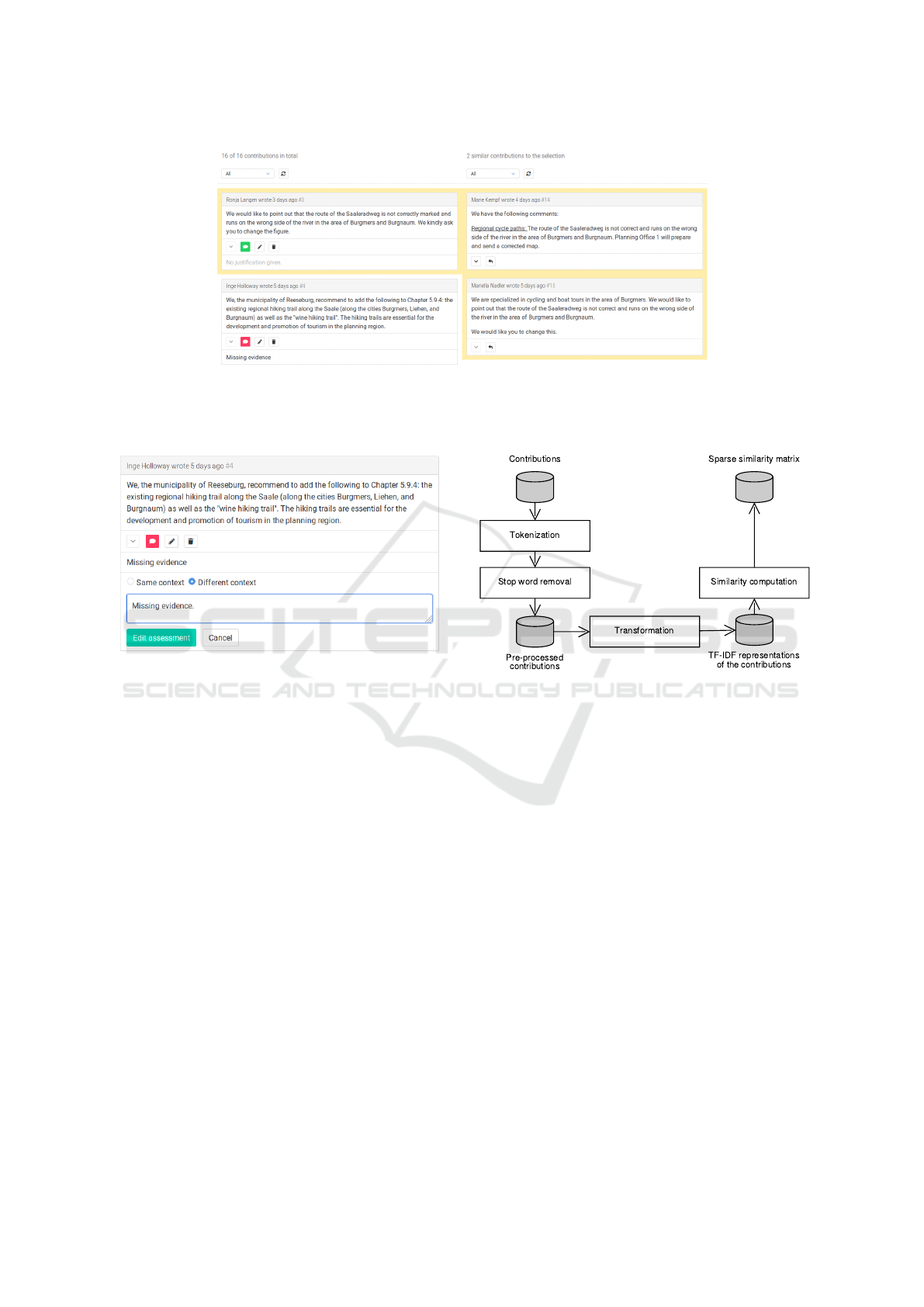
Figure 1: Screenshot of the overall layout of the assessment user interface (excerpt). The left column shows the basic list of
contributions, and the right column displays the list of contributions recommended by the system based on their similarity to a
selected contribution found in the left column. A colored frame is displayed around the selection and the similar contributions
to indicate their affiliation.
Figure 2: Screenshot of one contribution in its editing state.
It displays a form for editing the current assessment. A user
can see the current reasoning and assessment status. A user
can also change the assessment status and edit the reasoning
in the input field. The assessment can also be deleted.
recommendation component displays a colored frame
around the selected contribution and the similarity list
in order to represent their association.
We choose a simple interaction method for query-
ing the recommendation component. The user only
needs to select a contribution to submit a query. No
search terms have to be entered. This means that if
a user clicks on a contribution, the recommendation
component retrieves a ranked list of similar contribu-
tions to the selection made. If a user clicks on it again,
the selection is removed and the list of similar con-
tributions is cleared. The user can easily submit new
queries by selecting different contributions iteratively.
Besides the described ranking approach, we in-
tegrated other intelligent methods or analytical tasks
to provide further analytical results to the user in
the future. We integrated different types of cluster-
ing algorithms (Xu and Tian, 2015), e. g., hierarchi-
cal, density-based, and prototype-based algorithms,
as well as topic modeling (Blei et al., 2003; Blei and
Figure 3: Pipeline for computing similarities between all
contributions. Tokenization and stop word removal steps
pre-process the contributions. The results are mapped to
term frequency–inverse document frequency (TF–IDF) vec-
tor representations. Finally, the cosine similarities between
all TF–IDF vectors are computed and stored in a database.
Lafferty, 2006; Blei, 2012). But in this paper, we do
not want to focus on their usage and applications. In-
stead, we focus on the assessment user interface in
terms of general usage and acceptance of the recom-
mended contributions.
4 EXPERIMENTS
Regarding the experiments, we evaluated the appro-
priateness of the assessment user interface for assess-
ing received contributions. In particular, we examined
the usefulness and the type of usage of the recommen-
dation component, i. e., we measured its effect on the
participant’s work task performance, and we exam-
ined the comprehensibility and the acceptance of the
component. For this, we tested two slightly different
system configurations of the assessment user inter-
Assessment User Interface: Supporting the Decision-making Process in Participatory Processes
401

face. One configuration included the recommendation
component and display of similar contributions, and
the other configuration did not. The experiment fol-
lowed a within-subject design. The independent vari-
able of the experiment was the configuration of the
system in use. We randomized and counter-balanced
the order of the presented system configurations.
Both system configurations represent the assess-
ment user interface described above, but one sys-
tem configuration s
SL
contained the recommendation
component and similarity list while the other sys-
tem configuration s
BL
acted as the baseline and did
not. Consequently, s
BL
followed a one-column layout
while s
SL
followed a two-column layout, i. e., both
systems integrated the basic list of contributions in
the first column while only s
SL
integrated the similar-
ity list in the second column. Additionally, only s
SL
added the query support of the recommendation com-
ponent to the contributions of the first column. When
excluding that, both systems were exactly the same.
This also means that both system configurations of
the assessment user interface provided the same func-
tionalities for assessing a contribution.
The experiments were run on a moderate lap-
top computer connected to a 24-inch monitor with a
display resolution of 1920×1080, external computer
keyboard and computer mouse as input devices. The
system was implemented as a locally running Web ap-
plication. The participants accessed the application
using the Mozilla Firefox browser (version 58.0) in
full screen mode. The application logged the mouse
position at 2-second intervals and all of the following
actions performed by the participant: user interface
button clicks and general mouse button clicks. The fi-
nal user-made assessments were stored in a database.
4.1 Participants
We asked several institutions from our region via
email if they would like to take part in the user
study. In the end, a total of 21 participants (twelve fe-
male, nine male) from five institutions from different
cities in Saxony-Anhalt could be recruited for the user
study. They reported their age in the post-experiment
questionnaire within the following age range groups:
One test person was 18–21 years old, two were 21–
30 years old, two were 31–40 years old, eight were
41–50 years old, seven were 51–60 years old, and one
was 61–70 years old. We also asked what their pro-
fessions were: Eight participants were city planners
including one person in a leading function, three were
specialists in urban development planning, three were
administrators in regional planning, two were engi-
neers in civil engineering, two were administrative
economists, one was a student of public administra-
tion, one was a student of geography, and one was
a graduate geographer. The subjects also had to rate
their experience as computer users: No one was sup-
posedly unexperienced, one person was said to be a
beginner, 16 persons had average experience in using
computers, and four persons were allegedly advanced
computer users. We conducted the user study at the
institution of each participant.
4.2 Task and Datasets
The participants had to complete one simulated work
task. The work task scenario and its reasoning were:
“You are using a system for assessing collected con-
tributions of a finished planning and decision pro-
cess. In order to be able to assess similar contribu-
tions equally, you should find two groups of contribu-
tions first: one group with all the contributions in the
same context as the first contribution and the other
group with all the other contributions”. The related
task was: “Find and select as many contributions as
possible within the same context as the contribution
marked as number 1”. The following sub-steps were
included: (1) Mark each contribution as “same con-
text” or “different context”, (2) give a short explana-
tion for your decision, and (3) save the assessment for
each contribution. Such a structuring of contributions
based on only a single reference contribution is a sim-
plified subprocess of the real decision-making pro-
cess. In contrast to our experiments, there is no fixed
reference contribution in the real assessment process.
Nonetheless, this task is still very close to it. Oth-
erwise, the task would have been too complex for a
user study. A real assessment process can last several
days, weeks, or months depending on the number and
size of the contributions.
To avoid the participants becoming too famil-
iar with the contributions, we used two different
datasets from different domains. The first dataset D
1
was about tourism and recreation, and the second
dataset D
2
was about cycling and hiking trails. These
datasets originated from a completed actual formal
planning and decision process. We anonymized and
numbered all contributions. We also exchanged lo-
cation names with fictitious names. Furthermore,
we significantly truncated the text of the contribu-
tions. Otherwise, the participants would have spent
too much time reading the texts instead of focusing on
the individual task. A contribution’s size varies in real
participatory processes. It can contain only a few sen-
tences as in our experiments up to hundreds of pages
of content. We left the use of language unchanged
in order to maintain authenticity. Each dataset con-
ICEIS 2019 - 21st International Conference on Enterprise Information Systems
402

Table 1: Dataset characteristics. Two datasets D
1
, D
2
, and
a tutorial dataset T were used.
Measure D
1
D
2
T
No. of contributions 16 16 10
No. of sentences 51 45 22
No. of words 1296 1056 371
Sentences / contribution 3.19 2.81 2.20
Words / contribution 81.00 66.00 37.10
Words / sentence 25.41 23.47 16.86
sisted of 16 contributions. In real participatory pro-
cesses, the number of contributions varies from a few
tens to several hundreds. We also thought up an artifi-
cial dataset T for the tutorial. Some characteristics of
D
1
, D
2
and T are listed in Table 1.
We created the similarities between the contribu-
tions by hand instead of relying on automatic pre-
computations which we described earlier, i. e., we did
not want to rely on the quality of the analytical meth-
ods for conducting the contribution pre-processing,
the transformation and the computation of all similar-
ities. One expert created the similarities and another
one checked them. No disagreements were reported.
4.3 Design and Procedure
In the beginning (phase 1), we explained the purpose
of the experiment, the scenario, and the task to the
participants. The participants were informed that they
will perform two tests using two different system con-
figurations but always follow the same task. They
received a handout in order to possibly review this
information. The participants did not know that the
similarities were created by hand.
After phase 1, the participants followed a guided
tutorial on the system they would be using and the
tutorial dataset (phase 2), i. e., the participants tested
each function of the assessment user interface based
on the instructions given by the instructor. The par-
ticipants always went step-by-step through all graph-
ical and functional elements as well as the related ac-
tions: browsing the list of all contributions, showing
less or more content of a single contribution, mark-
ing the contribution as in the same or as in a different
context, writing a short justification, saving an assess-
ment, editing an assessment, deleting an assessment,
and using the provided filters. When the participants
had to test system s
SL
, they also selected and dese-
lected contributions in order to post queries to the rec-
ommendation component. In addition, they received
instructions to assess a contribution in the second col-
umn which works exactly as it does in the left one.
Then the actual experiment started (phase 3). The
participants performed the task described above in a
maximum of twelve minutes. The participants were
allowed to stop the experiment early after they had
assessed all contributions.
After the actual experiment, the participants an-
swered a questionnaire, and they checked control
statements (phase 4). Both were about the system
configuration they had just used. With the control
statements, we wanted to find out whether the par-
ticipants understood the visual elements and their
layout used in the proposed assessment user inter-
face. Therefore, we showed the participants a printed
screenshot of the system configuration that they had
just used and the four related statements that could
only be checked with a “yes” (true) or a “no” (false).
Each of the two screenshots depicted a typical scene
of the assessment process. We did not impose any
time limits for phase 4. Then the test cycle was
repeated, i. e., the participants again went through
phases 2, 3, and 4, but they used the other system con-
figuration and dataset.
After the two test cycles, we interviewed the par-
ticipants in a semi-structured form, i. e., we asked the
participants about their opinions and personal impres-
sions. With this, we wanted to identify and ques-
tion individual preferences, the appropriateness of the
overall concept, missing features for the assessment
task, and possibly existing trust-related issues. Fi-
nally, the participants completed the questionnaire on
personal data. In total, an experiment with one partic-
ipant took about 75 minutes on average.
4.4 Research Questions and Measures
On the one hand, the user study focused on the as-
sessment process. We investigated whether this pro-
cess could be supported by a different user interface
that includes the integration of intelligent, analytical
methods. We specified the following research ques-
tions: Does the assessment user interface generally
assist users in assessing process contributions? Does
the user understand the visual components of the as-
sessment user interface? Does the recommendation
component affect the user’s workflow? Does the user
trust the automatic recommendations? On the other
hand, the user study focused on the assessment out-
come. We examined whether the new user interface
lead to a correct assessment result and how much time
had to be invested. We defined the following research
questions: Does the assessment user interface gener-
ally lead to correct results? Does the recommenda-
tion component lead to improved results? How much
time does the user need to create the results using the
two system configurations of the assessment user in-
Assessment User Interface: Supporting the Decision-making Process in Participatory Processes
403

terface?
We defined the following measures for the assess-
ment process: Contribution exploration: How much
time is spent exploring contributions in the similar-
ity list compared to the basic list. Click interaction:
How much time is spent interacting with the assess-
ment user interface in the left column compared to
the right column. Assessment creation: How much
time is spent assessing contributions in the similar-
ity list compared to the basic list. Usage patterns:
How many users match the expected distinct patterns
when using the basic list and the list of similar con-
tributions. Control statements: Numbers of correct
and wrong answers to either true or false statements
about visual elements and their meaning of the assess-
ment user interface. Furthermore, we defined the fol-
lowing measures for the assessment outcome: Assess-
ment quality: Different measures to evaluate the cor-
rectness of the assessments made by the participants
in comparison to the decisions made by the experts.
Task time: How much time is needed to finish the task
by using the similarity list compared to the basic list.
Finally, we specified another measure that fits to both
the assessment process and assessment outcome: Per-
sonal preference: How convenient is the assessment
user interface in general, and how helpful and trust-
worthy is the recommendation component.
5 RESULTS
In the following, we present and discuss the user study
results based on the presented measures.
5.1 Exploration and Click Interaction
We recorded mouse positions from all 21 participants
at 2-second intervals. A scatter plot of these positions
is shown in Figure 4 (top). Participants using the first
system configuration without the list of similar con-
tributions spent 91.29% of time exploring the basic
list of contributions. In contrast, participants using
the second system configuration with the recommen-
dation component spent 69.66% of time exploring the
basic list of contributions and the remaining 30.34%
of time exploring the contributions of the similarity
list. Consequently, more time was spent over the basic
list than over the similarity list. This is partly due to
the fact that the reference contribution #1 was initially
available in the top of the basic list. Additionally, sim-
ilar contributions can only be queried from the basic
list, i. e., participants need to interact with contribu-
tions in the basic list at first in order to be able to
explore similar contributions. Nonetheless, the par-
Figure 4: Scatter plots of the mouse position ticks (top) and
clicks (bottom) in screen coordinates from 21 participants
over the baseline (left) and the system configuration with
the similarity list (right).
ticipants spent a large portion of time exploring the
similarity list when it was available.
Recorded mouse positions of every mouse but-
ton click were available from all 21 participants.
A scatter plot of these positions is shown in Fig-
ure 4 (bottom). Participants who used the first sys-
tem configuration interacted 1542 times (98.97%,
73.4 times on average per participant) with contribu-
tions and filters of the basic list. In comparison, par-
ticipants using the second system configuration inter-
acted 1346 times (72.99%, 64.1 times on average per
participant) with contributions and filters of the basic
list, and 498 times (27.01%, 23.7 times on average
per participant) with contributions and filters of the
similarity list. In this case, the same reasons of the
contribution exploration results apply.
5.2 Assessment Creation
We collected information describing in which list
the participants’ assessments were created. Figure 5
shows the results. The participants using the first sys-
tem configuration created 278 assessments (13.2 on
average per participant) in the basic list. In compar-
ison, the participants using the second system con-
figuration created 271 assessments (12.9 on average
per participant), of which 70.5% of the assessments
(9.1 on average per participant) were created in the
basic list and 29.5% of the assessments (3.8 on aver-
age per participant) were created in the list of similar
contributions. The participants prefer the basic list
ICEIS 2019 - 21st International Conference on Enterprise Information Systems
404
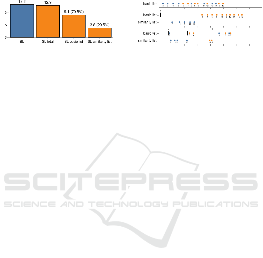
Figure 5: Assessment creation. The numbers are the
amounts of created assessments on average over all partic-
ipants for the baseline (BL) and the system configuration
with the similarity list (SL). For SL, we provide the amounts
of assessments created in the basic list and the similarity list,
and we report their relative percentages, respectively.
for the assessment creation but also tend to create as-
sessments in the similarity list. This preference may
have been reinforced because the contributions of the
basic list are permanently visible, i. e., they can be
assessed directly without intermediate queries of the
recommendation component.
5.3 Usage Patterns
We also searched for specific patterns in the user in-
teractions related to the usage of the similarity list and
the creation of assessments. Figure 6 shows represen-
tatives of three patterns we expected to find. First pat-
tern (top): The user assesses the contributions chrono-
logically from contribution #2 to contribution #16.
Second pattern (middle): The user retrieves contri-
butions similar to contribution #1. Then the user as-
sesses these as in the same context as contribution #1.
The remaining contributions are assessed as in a dif-
ferent context. Third pattern (bottom): The user as-
sesses the contribution #2. Then contributions similar
to contribution #2 are assessed identically. This is re-
peated multiple times for the remaining contributions
in a transitive way.
Using the first system configuration without the
similarity list, twelve participants assessed the contri-
butions exactly as in the first pattern, six participants
skipped one contribution, and the remaining three par-
ticipants skipped two, three, and five contributions re-
spectively. Overall, there is indeed a chronological
approach when using the first system configuration.
We expected different patterns for the second sys-
tem configuration with the similarity list as described
above. Four participants assessed the contributions
as in the second pattern, i. e., they completely trusted
the recommendations. Three participants assessed the
contributions as in the third pattern, i. e., they agreed
with the recommendations based on their own initial
assessment. Seven participants assessed the contribu-
tion as in a mixture of the second and third patterns.
We also found other patterns we did not expect at first.
Figure 6: Expected usage patterns for the system configu-
ration with the basic list (top) and the system configuration
with the similarity list (middle, bottom). The x-axis repre-
sents the time elapsed. The y-axis shows the list in which
an assessment was created. The numbers represent contri-
bution ids. The colors of the dots symbolize the assessment
decision made. A vertical line represents a contribution se-
lection, i. e., similar contributions were queried at that point
in time, and a vertical line with no number shows that the
similarity list was cleared. We expected a chronological us-
age pattern (top), a usage pattern with one query (middle),
and a usage pattern with multiple queries (bottom).
Three participants assessed the contributions on their
own and used the recommendation component only
at the end to check their results. This is still posi-
tive. But we also found that three participants did not
use the recommendation component at all, and one
participant only tried out some queries in the begin-
ning without a relatable assessment of a single con-
tribution. They may not have understood how to use
the recommendation component. However, that only
seems to apply to a clear minority.
5.4 Quality and Time
We investigated the quality or correctness of the as-
sessment results. Table 2 displays the results for
different measures. On average, the participants
achieved the best results with the system configura-
tion that includes the similarity list. On the one hand,
when using the system configuration with the simi-
larity list, the average recall score 0.857 for finding
contributions that are in the same context as contribu-
tion #1 (group 1) is undoubtedly higher than the av-
erage recall score 0.657 for finding contributions that
are in a different context as contribution #1 (group 2).
Additionally, the difference between the average re-
call scores 0.686 and 0.857 for finding group 1 is sta-
tistically significant at significance level α = 0.1 (p-
value = 0.051 computed with the Wilcoxon matched-
pairs signed rank test). Overall, actual similar contri-
butions to contribution #1 were most often correctly
identified as such when using the second system con-
figuration. On the other hand, the average precision
scores 0.872 and 0.918 for finding group 2 are higher
than the average precision scores 0.643 and 0.782 for
finding group 1 regardless of the system configura-
tion used. Generally, the average precision scores
Assessment User Interface: Supporting the Decision-making Process in Participatory Processes
405

Table 2: Assessment quality. Sample mean (M) and
standard error of the sample mean (SE) for the classi-
fication measures accuracy, precision per group (G with
1 b= same context and 2 b= different context), recall per
group, F
1
-score per group, and Matthews correlation co-
efficient (MCC) for the baseline s
BL
and the system con-
figuration with the similarity list s
SL
. The p-value of the
difference was computed with the Wilcoxon matched-pairs
signed rank test. The better score is in bold.
s
BL
s
SL
Measure G M (SE) M (SE) p
Accuracy - 0.66 (0.07) 0.72 (0.06) 0.390
Recall 1 0.69 (0.07) 0.86 (0.05) 0.051
2 0.64 (0.08) 0.66 (0.08) 0.778
Precision 1 0.64 (0.08) 0.78 (0.05) 0.266
2 0.87 (0.06) 0.92 (0.05) 0.370
F
1
1 0.64 (0.07) 0.80 (0.05) 0.100
2 0.71 (0.07) 0.73 (0.07) 0.588
MCC - 0.48 (0.10) 0.63 (0.08) 0.218
for finding group 2 are high and the best among all
scores. The difference between the average precision
scores per system configuration is not statistically sig-
nificant at significance level α = 0.05 or α = 0.1 (p-
value = 0.370 computed with the Wilcoxon matched-
pairs signed rank test).
The participants spent 10 min 50.3 s on average
with 23.0 s standard error of the sample mean (SE) us-
ing system configuration s
BL
. In comparison, the par-
ticipants spent 11 min 8.0 s on average with 19.7 s SE
using system configuration s
SL
. The p-value com-
puted with the Wilcoxon matched-pairs signed rank
test is 0.583, i. e., there is no statistical significance at
significance level α = 0.05.
5.5 Control Statements
Table 3 lists the control statements and the re-
lated number of correct answers. The control state-
ments c
BL,i
are only related to the system with the
basic list, and the control statements c
SL,i
focus on
the understanding of visual elements displayed in the
system with the similarity list. Generally, they all test
specific layout and design elements of the assessment
user interface.
The control statement c
BL,1
checks the fact that
vertically arranged contributions in the basic list are
not ranked or sorted by textual similarity. The basic
list is sorted by contribution ids. 17 (81.0%) partici-
pants answered correctly.
The control statement c
BL,2
examines whether
participants can tell the difference between an as-
Table 3: Control statements. Number n and percentage of
correct answers for the i-th control statement c
s,i
of system
configuration s: baseline (BL) and similarity list (SL).
c
s,i
Statement n %
c
BL,1
Because of their positions in the
list, the contributions #1 and #2
are more similar to each other
than the contributions #1 and #3
17 81.0
c
BL,2
All contributions are assessed 18 85.7
c
BL,3
Four contributions have been
submitted to the participation
process
11 52.4
c
BL,4
The contribution #3 is in the same
context as the contribution #1
21 100.0
c
SL,1
The contribution #4 is selected 21 100.0
c
SL,2
The contribution #8 is more
similar to the contribution #3 than
the contribution #5
6 28.6
c
SL,3
The system suggests three similar
contributions referring to the
selected contribution
18 85.7
c
SL,4
For contribution #8, the system
found only contribution #3 as a
similar contribution
19 90.5
sessed contribution and a non-assessed contribution.
The difference is indicated by an icon that is either
visible or hidden. The majority, 18 (85.7%) partici-
pants, answered correctly.
The assessment user interface represents the num-
ber of submitted contributions in a label at the top of
the interface. Control statement c
BL,3
checks whether
this is recognized. Only eleven (52.4%) participants
answered correctly. Although this information is not
very important for assessing contributions correctly, it
informs about the initial workload.
The control statement c
BL,4
tests whether partici-
pants recognize the contribution’s context based on its
assessment. The context is indicated by a color. All
21 participants answered correctly. Thus, they recog-
nize the binary-encoded assessment decision made.
The list of similar contributions in the right col-
umn is updated depending on the selected contribu-
tion in the left column. The recommendation compo-
nent displays a colored frame around the selected con-
tribution. The control statement c
SL,1
tests whether
participants can identify this selected contribution.
All 21 participants answered correctly.
The recommendation component of the assess-
ment user interface ranks the similar contributions in
ICEIS 2019 - 21st International Conference on Enterprise Information Systems
406
descending order according to their computed simi-
larities. The control statement c
SL,2
checks whether
this is recognized. Surprisingly, only six (28.6%) par-
ticipants answered correctly. It seems that the partici-
pants do not understand the mapping of the similarity
to the position in the similarity list, which is crucial
for distinguishing between more similar and less sim-
ilar contributions.
The number of similar contributions found by the
recommendation component is displayed at the top
of the assessment user interface. The control state-
ment c
SL,3
tests whether participants recognize this.
18 (85.7%) participants answered correctly.
Only the contributions in the list of similar contri-
butions of the right column are similar to one selected
contribution in the basic list of the left column and
not the other way around. The control statement c
SL,4
checks whether the participants understood this rela-
tion between the two lists. 19 (90.5%) participants
answered correctly.
5.6 Personal Preference
We examined the overall personal preference with a
questionnaire. The answers are listed in Table 4. The
two system configurations received good to very good
scores on average, i. e., the assessment user interface
is generally rated as being satisfactory. This espe-
cially relates to the confidence in using the system and
to the wish to use the system more often for assessing
contributions. Additionally, the participants found it
easier on average to find contributions in the same
context as contribution #1 when using the similarity
list, but this effect is not statistically significant at sig-
nificance level α = 0.05 (p-value = 0.317 computed
with the Wilcoxon matched-pairs signed rank test).
Furthermore, when using the system configuration
with the similarity list, the participants spent less time
reading the contributions before they started assessing
contributions. They possibly trusted the recommen-
dations. This described effect is statistically signifi-
cant at significance level α = 0.05 (p-value = 0.027
computed with the Wilcoxon matched-pairs signed
rank test).
Furthermore, we conducted a semi-structured in-
terview at the end of a single experiment. We asked
each participant the same questions that refer to the
following three issues.
(1) Layout preference: Do you prefer a single-
column view or a double-column view? Why? Fig-
ure 7 shows the distribution of the submitted an-
swers. 16 (76.19%) participants favored a two-
column layout. The related main reason reported
was a larger workspace area or a better usage of the
whole screen area that allowed a side-by-side compar-
ison of the contributions to some extent. In contrast,
three (14.29%) participants preferred a one-column
view. They where overwhelmed by the textual con-
tent displayed at once. In addition, they said it was
quite exhausting to jump back and forth between two
columns. Two (9.52%) participants were undecided.
Figure 7: Layout preference. The numbers show how many
users prefer which layout configuration.
(2) Usefulness of the recommendations: Do you find
the list of similar contributions useful? Why? The
results are displayed in Figure 8. 17 (80.95%) par-
ticipants considered the recommendation component
useful. Some used it to check their own analysis at the
end of the experiment. Generally, they said that it al-
lowed a faster and easier assessment because the same
reasoning could be used for multiple (similar) contri-
butions at once. In comparison, one (4.76%) partici-
pant did not find the recommendation component use-
ful and three (14.29%) participants were undecided.
These four participants found that the whole recom-
mendation component was too complex and too over-
loaded. They thought that they did not need it.
Figure 8: Usefulness of the recommendations. The numbers
show how many users consider the recommendations useful
or not.
(3) Trust in the recommendations: Did you trust the
list of similar contributions? Why? Figure 9 depicts
the supplied answers. Only one (4.76%) participant
trusted the recommendations. Four (19.05%) partici-
pants were undecided. The majority, 16 (76.19%) par-
ticipants, did not (solely) trust the recommendations.
There are two major reasons for this. On the one hand,
almost all participants reported that they have to read
every contribution carefully anyway before deciding
on the final assessment. This is partly conditioned
by legal requirements. They are just used to making
their own decisions for years, and they do not want to
give up on this either. That is why they have funda-
mental doubts. On the other hand, many participants
reported that they did not understand how the recom-
Assessment User Interface: Supporting the Decision-making Process in Participatory Processes
407
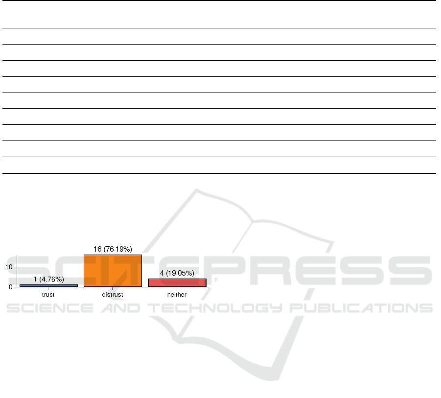
Table 4: Post-task questionnaires. The numbers are the sample mean (M) and standard error of the sample mean (SE) of the
agreement scores on a 1–5 Likert scale (lower b= higher agreement). The p-value of the difference was computed with the
Wilcoxon matched-pairs signed rank test. The better score for each question is in bold.
s
BL
s
SL
Question M (SE) M (SE) p
I became familiar with the statements of all contributions very quickly. 1.95 (0.20) 1.81 (0.19) 0.672
I could easily use the filters to determine the displayed contributions. 1.90 (0.24) 1.62 (0.18) 0.371
I could easily provide the reasoning for the contribution assessment. 2.00 (0.20) 1.90 (0.19) 0.883
I had to read a lot before I could start assessing the contributions. 2.38 (0.30) 2.95 (0.28) 0.027
I found it easy to find contributions in the same context as contribution #1. 2.14 (0.23) 1.81 (0.16) 0.317
The labels / keywords / information provided by the system are clear. 1.33 (0.11) 1.43 (0.13) 0.727
The list layout of the contributions is appropriate. 1.48 (0.13) 1.62 (0.19) 0.781
I think I would use the system more often for assessing contributions. 1.86 (0.14) 1.86 (0.17) 1.000
I felt very confident using the system. 1.67 (0.14) 1.62 (0.18) 0.984
mendations were created because the similarities be-
tween the contributions were not visually apparent.
However, some participants were very curious about
it.
Figure 9: Trust in the recommendations. The numbers show
how many users trust the recommendations or not.
6 CONCLUSIONS
The assessment user interface is able to support the
assessment process, i. e., the user can explore contri-
butions, and the user can create and edit assessments.
The two-column layout of the basic list and the sim-
ilarity list is appropriate and favored by the partici-
pants. The basic list is more frequently explored and
preferred for the creation of assessments. The user’s
chronological workflow changes when the similarity
list is available, but only when the user seems to trust
this list. There are still some participants that do not
know how to utilize the intelligent recommendations,
and, simultaneously, there are some general doubts
about these intelligent methods. The impression is
mixed. This seems to be related to the difficulties of
understanding or interpreting the similarity list that
most participants had. The related challenges exist on
at least two levels. First, the ranking of the similar
contributions is not sufficiently transparent, i. e., the
mapping of the computed similarity value of a con-
tribution to the position in the similarity list is not
sufficient or just poorly communicated. Second, the
recommendation component of the assessment user
interface does not explain why it considers the rec-
ommended contributions to be similar. Nonetheless,
the similarity list leads to high-quality assessment re-
sults. It helps in finding actual similar contributions.
The assessment outcome is acceptable. We hypothe-
size that the effect would be greater with even more
or longer contributions.
One of the biggest issues are the users’ fundamen-
tal doubts about intelligent analysis methods. This
should be addressed in future work. We argue that
improved visualizations of the sophisticated methods
or their outcomes will increase trust and understand-
ing. Generally, we think that the intelligent methods
involved must become more accessible for users that
are not computer experts. This should be resolved
first. Then the quality of the intelligent analysis meth-
ods should be improved further. Overall, the proper
bridging of machine learning, information visualiza-
tion and human-computer interaction remains a very
challenging endeavor but also a very promising one
that goes beyond the e-participation domain.
ACKNOWLEDGEMENTS
This work has been funded by the German Federal
Ministry of Education and Research (BMBF), grant
identifier 03FH011PX4. The responsibility for the
content of this publication rests with the authors.
ICEIS 2019 - 21st International Conference on Enterprise Information Systems
408

REFERENCES
Al-Sai, Z. A. and Abualigah, L. M. (2017). Big data and
e-government: A review. In Proc. of the 8th Intl. Con-
ference on Information Technology, pages 580–587,
Los Alamitos, CA, USA. IEEE Computer Society.
Allahyari, M., Pouriyeh, S., Assefi, M., Safaei, S., Trippe,
E. D., Gutierrez, J. B., and Kochut, K. (2017).
Text summarization techniques: A brief survey.
arXiv:1707.02268 [cs.CL]. Retrieved March 7, 2018
from https://arxiv.org/abs/1707.02268.
Bader, N., Mokryn, O., and Lanir, J. (2017). Exploring
emotions in online movie reviews for online browsing.
In Proc. of the 22nd Intl. Conference on Intelligent
User Interfaces Companion, pages 35–38, New York,
NY, USA. ACM.
Batrinca, B. and Treleaven, P. C. (2015). Social media ana-
lytics: a survey of techniques, tools and platforms. AI
& SOCIETY, 30(1):89–116.
Blei, D. M. (2012). Probabilistic topic models. Communi-
cations of the ACM, 55(4):77–84.
Blei, D. M. and Lafferty, J. D. (2006). Dynamic topic
models. In Proc. of the 23rd Intl. Conference on Ma-
chine Learning, pages 113–120, New York, NY, USA.
ACM.
Blei, D. M., Ng, A. Y., and Jordan, M. I. (2003). Latent
dirichlet allocation. Journal of Machine Learning Re-
search, 3:993–1022.
Blotevogel, H. H., Danielzyk, R., and Münter, A. (2014).
Spatial planning in germany. In Reimer, M., Getimis,
P., and Blotevogel, H. H., editors, Spatial Planning
Systems and Practices in Europe. Routledge Taylor &
Francis Group, London, UK and New York, NY, USA.
Briassoulis, H. (1997). How the others plan: Exploring
the shape and forms of informal planning. Journal
of Planning Education and Research, 17(2):105–117.
Goudarznia, T., Pietsch, M., and Krug, R. (2017). Test-
ing the effectiveness of augmented reality in the pub-
lic participation process: A case study in the city of
bernburg. In Journal of Digital Landscape Architec-
ture, volume 2, pages 244–251, Berlin, Offenbach,
DE. Herbert Wichmann Verlag, VDE Verlag GmbH.
Hoque, E. and Carenini, G. (2016). Multiconvis: A vi-
sual text analytics system for exploring a collection
of online conversations. In Proc. of the 21st Intl. Con-
ference on Intelligent User Interfaces, pages 96–107,
New York, NY, USA. ACM.
Keim, D. A., Kohlhammer, J., Mansmann, F., May, T., and
Wanner, F. (2010). Mastering The Information Age
– Solving Problems with Visual Analytics, chapter Vi-
sual Analytics, pages 7–18. Eurographics Associa-
tion, Goslar, DE.
Kim, M., Kang, K., Park, D., Choo, J., and Elmqvist, N.
(2017). Topiclens: Efficient multi-level visual topic
exploration of large-scale document collections. IEEE
Transactions on Visualization and Computer Graph-
ics, 23(1):151–160.
Kohlhammer, J., Keim, D. A., Pohl, M., Santucci, G., and
Andrienko, G. (2011). Solving problems with visual
analytics. Procedia Computer Science, 7:117–120.
Nazemi, K., Burkhardt, D., Ginters, E., and Kohlhammer,
J. (2015). Semantics visualization – definition, ap-
proaches and challenges. Procedia Computer Science,
75:75–83.
Nazemi, K., Steiger, M., Burkhardt, D., and Kohlhammer,
J. (2016). Information visualization and policy mod-
eling. In Big Data: Concepts, Methodologies, Tools,
and Applications, pages 139–189. IGI Global, Her-
shey, PA, USA.
Pahl-Weber, E. and Henckel, D., editors (2008). The
Planning System and Planning Terms in Germany.
Academy for Spatial Research and Planning, Hanover,
DE.
Rose, J. and Sanford, C. (2007). Mapping eparticipation
research: Four central challenges. Communication of
the Association for Information Systems, 20(55):909–
943.
Santamaría-Philco, A. and Wimmer, M. A. (2018). Trust
in e-participation: An empirical research on the in-
fluencing factors. In Proc. of the 19th Annual Intl.
Conference on Digital Government Research: Gover-
nance in the Data Age, pages 1–10, New York, NY,
USA. ACM.
Schütz, L., Helbig, D., Bade, K., Pietsch, M., Nürnberger,
A., and Richter, A. (2016). Interaction with inter-
connected data in participatory processes. In Proc.
of 21st Intl. Conference on Urban Development, Re-
gional Planning and Information Society, pages 401–
410, Vienna, AT. CORP – Competence Center of Ur-
ban and Regional Planning.
Schütz, L., Raabe, S., Bade, K., and Pietsch, M. (2017).
Using visual analytics for decision making. In Journal
of Digital Landscape Architecture, volume 2, pages
94–101, Berlin, Offenbach, DE. Herbert Wichmann
Verlag, VDE Verlag GmbH.
Tambouris, E., Liotas, N., and Tarabanis, K. (2007). A
framework for assessing eparticipation projects and
tools. In Proc. of the 40th Hawaii Intl. Conference
on System Sciences, pages 1–10, Los Alamitos, CA,
USA. IEEE Computer Society.
Thiel, S.-K., Reisinger, M., Röderer, K., and Fröhlich, P.
(2016). Playing (with) democracy: A review of gam-
ified participation approaches. eJournal of eDemoc-
racy and Open Government, 8(3):32–60.
Thomas, J. J. and Cook, K. A. (2006). A visual analytics
agenda. IEEE Computer Graphics and Applications,
26(1):10–13.
Wimmer, M. A., Grimm, R., Jahn, N., and Hampe, J. F.
(2013). Mobile participation: Exploring mobile tools
in e-participation. In Electronic Participation, pages
1–13, Berlin, Heidelberg, DE. Springer.
Wong, P. C. and Thomas, J. J. (2004). Visual analyt-
ics. IEEE Computer Graphics and Applications,
24(5):20–21.
Xu, D. and Tian, Y. (2015). A comprehensive survey
of clustering algorithms. Annals of Data Science,
2(2):165–193.
Assessment User Interface: Supporting the Decision-making Process in Participatory Processes
409
