
RADIAL EDGE SPLATTING FOR VISUALIZING DYNAMIC
DIRECTED GRAPHS
Michael Burch
1
, Fabian Beck
2
and Daniel Weiskopf
1
1
VISUS, University of Stuttgart, Stuttgart, Germany
2
University of Trier, Trier, Germany
Keywords:
Graph Visualization, Node-link Diagrams, Radial Layout, Splatting.
Abstract:
We describe and discuss a novel radial version of a scalable dynamic graph visualization. The radial layout
encodes dynamic directed graphs on narrow rings of a circle. The temporal evolution of the graph is mapped to
rings that grow outward from the center of the circle. Graph vertices are placed equidistantly at the borderlines
of each ring. Graph edges are displayed as curved lines starting from a source on the inner borderline of the
ring and pointing to a target on the outer borderline. To better perceive link directions and structures of large
datasets, visual clutter is reduced by exploiting an edge splatting approach that generates density fields of the
displayed edges. The radial layout emphasizes newer graphs, displayed in the larger, outer parts of the circle.
As a benefit, edge lengths are reduced in comparison to the non-radial visualization. Moreover, the radial
layout guarantees the symmetry of the visualization under shifting of vertices. We illustrate the usefulness of
the diagrams by applying them to call graph data of the open source software project Cobertura.
1 INTRODUCTION
Dynamic graph data occurs in various areas of appli-
cation. For example, social networks express relation-
ships among people. Those networks may evolve over
time, i.e., new people come into the network or rela-
tionships change. In another example, distances be-
tween elements of dynamic systems can be modeled
as dense graph structures and also these may change
over time. In the area of software development, call
graphs changing from release to release show which
software constructs call each other.
Those graph datasets are often too large for a man-
ual exploration of the raw data. When we have a clear
and specific question, we may apply algorithmic ap-
proaches. But in many applications, neither we know
such a question beforehand nor the problem can be re-
duced to a single question—some kind of visual rep-
resentation of this dynamic data is required that helps
us efficiently explore the dataset.
Creating such a visualization of dynamic directed
and weighted graphs is challenging due to the many
visual dimensions to be represented in a scalable way:
First of all, many nodes could be part of the graph.
Moreover, the graph could be dense; in other words,
many edges connect the nodes of the graph. Fi-
nally, the graph may evolve in a significant number
of changes over a long period of time.
Animation can be used to visualize the dynamic
changes in a node-link diagram (Diehl and G
¨
org,
2002; Frishman and Tal, 2008). However, animation
largely fails to provide an overview of the time dimen-
sion of the dataset; the cognitive issues of animated
visualization are discussed by (Tversky et al., 2002).
A better overview is provided if the time dimension
is mapped onto a (spatial) time line and the dynamic
graph is visualized in a single static image. Such
an approach that particularly focuses on the scalable
representation of dynamic graphs was presented by
(Burch et al., 2011b). It displays snapshots of the dy-
namic graph side-by-side in narrow vertical stripes.
Techniques like arranging the nodes onto parallel axes
and applying edge splatting (representing edges in a
density field) are used to increase the scalability of
the single graph diagrams.
In our work, we introduce a radial version of par-
allel edge splatting (Burch et al., 2011b) to represent
dynamic directed and weighted graphs. The radial
layout shows the following beneficial characteristics:
• It avoids long links pointing from the top to ver-
tices at the bottom and guarantees the symmetry
of the visualization if vertices are shifted.
• It puts emphasis on newer graphs displayed at
outer parts of the representation.
After discussing related work, we present the vi-
sualization technique in detail. The implemented vi-
sualization tool supports several interactive features
603
Burch M., Beck F. and Weiskopf D..
RADIAL EDGE SPLATTING FOR VISUALIZING DYNAMIC DIRECTED GRAPHS.
DOI: 10.5220/0003828506030612
In Proceedings of the International Conference on Computer Graphics Theory and Applications (IVAPP-2012), pages 603-612
ISBN: 978-989-8565-02-0
Copyright
c
2012 SCITEPRESS (Science and Technology Publications, Lda.)

such as filtering functions, aggregations in both time
and vertex dimensions, and details-on-demand. We
demonstrate the usefulness and the aesthetics of the
radial diagrams by applying it to call graph data from
the open source software project Cobertura. Finally,
we discuss the benefits and drawbacks of the radial
visualization in comparison to its non-radial counter-
part.
2 RELATED WORK
Graphs are usually visualized as nodes connected by
graphical links. If not carefully laid out, visual clut-
ter, often caused by many link crossings, makes the
diagram hard to read. While (Rosenholtz et al., 2005)
provide a measure for such visual clutter, (Purchase
et al., 1996; Purchase et al., 2001; Purchase et al.,
2002) evaluate aesthetic criteria for node-link dia-
grams. The minimization of link crossings is ranked
very high, but also the maximization of symmetries
and the maximization of angles at crossing points is
of interest for good layout strategies. (Beck et al.,
2009) discuss a set of aesthetic criteria extended for
designing dynamic graph visualizations.
Animated node-link diagrams represent dynamic
graphs (Diehl and G
¨
org, 2002; Frishman and Tal,
2008): A node-link diagram is shown to the viewer
and is then smoothly animated and transformed into
the next diagram. The layout algorithms try to keep
the layout of the graph as stable as possible while con-
currently presenting a readable layout in each single
diagram. By doing this, cognitive efforts are reduced
and the mental map of the viewer is preserved (Misue
et al., 1995).
In general, layout algorithms for node-link di-
agrams can be very complex and time-consuming.
Even elaborate approaches fail to produce nice lay-
outs for large graphs due to many link crossings. The
situation is even worse if a graph is not static but
changes in an animation. While changes in one step
can be observed by the user, animation cannot pro-
vide an overview of the time dimension. These prob-
lems led to the development of dynamic graph visual-
ization that shows the graph—including its temporal
changes—in a single static image.
A simple idea is to represent snapshots of the dy-
namically changing graph side-by-side on a time axis.
Doing this leads to a better overview with respect to
time but introduces also new problems like the much
smaller screen space assigned to each diagram and the
difficulty in tracking particular nodes across the se-
quence of diagrams. (Greilich et al., 2009) proposed
a tool called TimeArcTrees, where the vertices are pl-
aced on 1D vertical lines so that it is easy to track
the nodes. Edges are drawn as curved arcs. Al-
though an advanced layout is used for these arcs,
the visualization quickly becomes cluttered for dense
graphs. A more scalable approach applies an edge
splatting technique to compute density fields for the
graph edges (Burch et al., 2011b). The visualization
approach presented in this paper is a radial version of
the technique by (Burch et al., 2011b).
An alternative solution for representing a dy-
namic graph in a single image is the radial Time-
RadarTrees visualization technique (Burch and Diehl,
2008), where no edge crossings occur at all. Snap-
shots are still shown side-by-side, but matrix-like
representations and color coding are used to depict
graph edges. In the layered TimeRadarTrees ap-
proach (Burch et al., 2011a), this idea is enhanced to
obtain a scalable version of the visualization.
Recently, matrices have been used to depict a dy-
namic graph in a static image where edges are repre-
sented as colored cells of a matrix (Brandes and Nick,
2011; Gove et al., 2011; Stein et al., 2010; Yi et al.,
2010). For instance, (Stein et al., 2010) split each cell
of the matrix into subcells and use these to depict the
changing edge weights on a folded time line. (Bran-
des and Nick, 2011) follow a similar approach relying
on a different, yet more elaborate representation of
dynamic information in the cells of the matrix. The
main advantage of adjacency matrices is that they can
easily handle dense graphs. When using the cells of
the matrix to represent the dynamic information, each
cell, however, requires a significant amount of screen
space, which leads to a decreased scalability with re-
spect to the number of nodes.
There are further approaches to represent dynamic
relational data that are, among other graph visual-
ization techniques, surveyed by (von Landesberger
et al., 2011). A survey of radial visualizations is
provided by (Draper et al., 2009). The evaluation
paper by (Diehl et al., 2010) analyzes strengths and
weaknesses of radial representations. It was found
out that non-radial representations outperformed ra-
dial ones with respect to memorizing positions of col-
ored boxes. We adopt the discussion of radial vs. non-
radial visualizations in Section 5, focusing on the par-
ticular cases of edge splatting of graph data.
3 VISUALIZATION TECHNIQUE
We introduce a novel visualization technique for dis-
playing dynamic directed and weighted graphs in a
single static diagram. We exploit the node-link visual
metaphor and map the graph vertices equidistantly to
IVAPP 2012 - International Conference on Information Visualization Theory and Applications
604

v
1
v
2
v
3
v
4
v
5
v
1
v
2
v
3
v
4
v
5
v
1
v
2
v
3
v
4
v
5
v
1
v
4
v
5
v
2
v
3
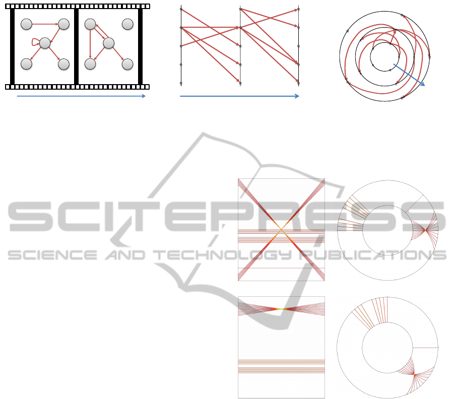
(a) (b) (c)
Figure 1: Visual encoding of graph data as node-link layouts: (a) Traditional 2D layout. (b) Mapping the vertices equidistantly
to vertical parallel axes in the same order and drawing the direct links inside the resulting narrow stripe as proposed by (Burch
et al., 2011b). (c) Drawing the vertices equidistantly along the borderlines of an annulus in the same order and representing
the edges as curved links pointing from the inside to the outside.
circular rings and edges as curved lines inside the nar-
row annuli (circle rings) pointing from an inner to
an outer annulus. For better visual perception of the
many edges in cluttered regions, we use an edge splat-
ting technique to derive density fields and to allow
users to explore edge directions and structures.
3.1 Data Model
In the context of this work, we model a directed and
weighted graph in the graph-theoretic sense as
G = (V, E)
where V denotes the set of vertices and E ⊆ V × V
the set of directed edges. Each edge e ∈ E is attached
with a weight w
e
.
A dynamic graph of length n is a sequence of n
single graphs and can be modeled as
G := (G
1
, . . . , G
n
)
where G
i
= (V
i
, E
i
), 1 ≤ i ≤ n.
3.2 Single Graph Representation
Typically, node-link graph diagrams are laid out in
the 2D plane, following several aesthetic criteria for
graph drawing such as minimization of link crossings,
maximization of angles at intersections, or maximiza-
tion of symmetries if those exist in a graph. Since
our focus is on dynamic graph visualization by static
diagrams, we need a more compact representation
that supports exploring and comparing a number of
graphs in a side-by-side view to easily uncover trends
and countertrends. We employ a visual mapping of
the graph vertices equidistantly to 1D vertical paral-
lel lines as demonstrated in the work of (Burch et al.,
2011b), a concept that is similar to parallel-coordinate
plots (Inselberg and Dimsdale, 1990). In the follow-
ing, we demonstrate how a single directed graph is
represented as a traditional 2D drawing, as a Cartesian
1D drawing as in the work of (Burch et al., 2011b),
and as a novel radial 1D drawing; see Figures 1 (a),
(b), and (c).
In Figure 1 (a), one graph with five vertices and
five edges is displayed by applying a graph layout al-
gorithm that generates a planar drawing in this case.
In Figure 1 (b), the graph vertices are mapped equidis-
tantly to a vertical axis. The vertex set is copied and
mapped in the same order to a second parallel verti-
cal axis. The directed graph edges are displayed in-
side the resulting narrow stripe, starting at the vertical
node position on the left axis and heading to the verti-
cal position of its target vertex on the axis at the right
hand side. Please note that arrow heads indicate the
direction of the links in the figures. The arrow heads
are for illustration purposes only and will be left out
in the actual graph visualizations.
In Figure 1 (c), the novel radial technique is il-
lustrated. To transform the Cartesian diagram into
a radial one, we connect the endpoints of the nar-
row stripe and obtain an annulus representation with
the links in between pointing from the inner border
to the outer border of the annulus. To prevent links
from leaving the annulus region, we transform the
straight links of the Cartesian diagram into curved
links, approximated by piecewise linear polygonal
curves. Such a curve is specified by the sequence of
n + 1 points
P := (P
0
, P
1
, P
2
, . . . , P
n
)
where
P
i
:=
r
1
+
i · (r
2
− r
1
)
n
·
cos(ϑ +
iϕ
n
)
sin(ϑ +
iϕ
n
)
and 0 ≤ i ≤ n.
The parameter r
1
is the radius of the inner border
of the annulus and r
2
the radius of the outer border of
RADIAL EDGE SPLATTING FOR VISUALIZING DYNAMIC DIRECTED GRAPHS
605

v
1
v
l
v
m
v
1
v
k
v
m
v
l
v
1
v
k
v
m
r
1
r
2
ϑ
ϕ
(a) (b)
Figure 2: Mapping of a single directed graph edge: (a) Left
to right mapping between two vertical parallel axes as a
straight link. (b) Mapping to an annulus from the inside
to the outside as a curved link.
the annulus. The angle ϑ is the angular position of the
start vertex, whereas ϕ is the angle that is needed to
point to the target vertex, i.e., the shifting angle.
The mapping of a single edge to a straight and a
curved line is illustrated in Figures 2 (a) and (b), re-
spectively. In Figure 2 (a), a directed edge leads from
node v
l
to another node v
k
among m nodes v
1
, . . . , v
m
.
The start vertex is displayed on the left axis and the
target vertex is displayed at the corresponding posi-
tion on the right axis. The directed edge is indicated
by a red colored straight line between the two corre-
sponding nodes. In the radial representation in Fig-
ure 2 (b), the same edge is shown. Now, the vertices
are mapped to the borderlines of the annulus and the
edge is displayed as a curved link running from the
inside to the outside.
Figures 3 (a) and (b) demonstrate how long links
in the Cartesian diagram are shortened by using a ra-
dial representation. In Figure 3 (a), a straight link
points from node v
0
l
to node v
0
k
. This link crosses a
large part of the display in a diagonal fashion and has
a high probability to lead to link crossings. In the
radial representation like illustrated in Figure 3 (b),
there are two possibilities to render the curved link.
Our edge layout algorithm minimizes link lengths by
always picking the shorter of the two options. Hence,
the dashed link in Figure 3 (b) will be avoided.
3.3 Dynamic Graph Representation
For representing a dynamic directed graph, we fol-
low the same principle as for the Cartesian diagram
of (Burch et al., 2011b). In their work, all graphs
are mapped to subsequent narrow stripes from left to
right. In our work, we map each graph to an annulus
and the whole graph sequence to many annuli starting
in the circle center with the oldest graph and ending
with the newest graph at the outside. By doing this,
we put emphasis on newer graphs by mapping them
to a larger display space, which is an intuitive concept
v
1
v
l'
v
m
v
1
v
k'
v
m
v
l'
v
1
v
k'
v
m
r
1
r
2
ϑ'
ϕ'
(a) (b)
Figure 3: Reduction of link length by switching the orienta-
tion: (a) A directed straight link crossing a large part of the
display. (b) A mapping to an annulus representation allows
two possible directions of the curved link—clockwise and
counter clockwise. Our edge layout algorithm minimizes
link length by picking the shorter of the two potential links.
Hence, it avoids the dashed link as illustrated.
for time-series data visualization.
Figures 4 (a), (b), and (c) demonstrate how a se-
quence of two directed graphs is visualized as an
animated node-link diagram (a), as a 1D node-link
representation to parallel vertical axes (b), and as a
sequence of annuli with curved links pointing from
the inside to the outside (c). Please note that we do
not distinguish between removed vertices and vertices
that are not adjacent to any other vertex.
3.4 Edge Splatting
A negative consequence of node-link diagrams is the
occurrence of visual clutter caused by many link
crossings. By mapping the graph to 1D vertical axes
and the edges as straight or curved links in between,
we gain a lot of space to display the dynamics of the
graph on the positive side, but we also increase the
problem of visual clutter on the negative side.
To alleviate the problem, we apply the concept of
edge splatting as it is also used in the work of (Burch
et al., 2011b). By computing density fields for the
edges, the link directions and structures become visi-
ble again.
3.5 Benefits of Radial Edge Routing
The technique has the benefit that formerly long links
become shorter by only allowing a maximal link
length l ∈ [r
1
· π, r
2
· π] where r
1
and r
2
are the radii
of the inner and outer borders of the respective annu-
lus. In our case we use a curved link representation
style that exactly generates links of length π ·
r
1
+r
2
2
.
Figure 5 (a) and (b) illustrate the minimization of link
length for an example dataset. In Figure 5 (a), there is
an X-pattern leading to visual clutter caused by cross-
ings with the parallel horizontal lines, which is re-
IVAPP 2012 - International Conference on Information Visualization Theory and Applications
606
v
1
v
2
v
3
v
4
v
5
v
1
v
2
v
4
v
5
time (animation)
v
3
v
1
v
2
v
3
v
4
v
5
v
2
v
3
v
4
v
5
v
1
time
v
1
v
4
v
5
v
2
v
3
time
(a) (b) (c)
Figure 4: A sequence of two directed graphs can be represented in different styles: (a) Animated node-link diagrams. (b)
Sequence of node-link diagrams mapped to 1D parallel vertical axes. (c) Sequence of annuli starting in the circle center and
ending with the newest graph at the outside.
solved in Figure 5 (b) by just connecting the upper
and lower endpoints of the Cartesian representation.
The radial version transforms the finite and bounded
vertical axes of the Cartesian diagram to cyclic annuli
(i.e., without bounding the angle position of vertices).
Another consequence of routing the edges in a ra-
dial fashion is that the visualization becomes invari-
ant under shifting of vertices. In Figure 5 (c) and (d)
we shifted the vertex positions of Figure 5 (a) and
(b) by 10 positions. In the Cartesian version, this
results in a visualization that looks significantly dif-
ferent from the original non-shifted version because
the vertices that created the dominating X-pattern are
no longer split by the borders of the stripe. In con-
trast, the shifted radial visualization only changes
marginally—it is only rotated by a small angle.
3.6 Interactive Features
Since we follow the Visual Information Seeking
Mantra introduced by (Shneiderman, 1996), we first
generate an overview representation of the graph se-
quence that serves as a starting point for an explo-
ration process. Apart from the static overview, the vi-
sualization supports the following interactive features
such as aggregation in the vertex and time dimension
and several filtering functions. Also graph-specific
tasks such as shortest path detection can be solved
algorithmically and their evolution over time can be
displayed visually.
• Selection of Time Intervals. Representing many
timesteps results in very narrow radial annuli and
consequently, each graph of a displayed sequence
is difficult to interpret. For this reason, the user is
supported by selecting a specific time interval and
only the graphs which belong to this interval are
represented.
• Graph Aggregation. In many cases, a stability
pattern occurs in the graph sequence, i.e., there are
(a) (b)
(c) (d)
Figure 5: Beneficial characteristics of radial edge routing:
(a) Cartesian representation with links crossing the whole
display. (b) The radial version with shorter links. (c) A
shifted Cartesian visualization, which results in major vi-
sual changes. (d) The equivalent shifted radial visualization,
which only results in minor visual changes.
only a few changes between subsequent graphs.
It makes sense to aggregate all those graphs to
have more display space for graphs that frequently
change.
• Vertex Aggregation. Neighbored vertices can be
aggregated to also increase scalability in the ver-
tex dimension. If a hierarchical organization of
the vertices exists, this can be used to collapse or
expand vertex groups.
• Edge Weight Filtering. Edges can be filtered by
selecting a weight interval. Only those edges with
RADIAL EDGE SPLATTING FOR VISUALIZING DYNAMIC DIRECTED GRAPHS
607

a weight contained inside the defined interval are
represented on screen. All the others are either
grayed out or not drawn on screen at all. Another
filtering can be applied to the values of the edge
density field generated by our edge splatting ap-
proach.
• Added and Removed Edges. We allow two ad-
ditional operations for the edges. Added and re-
moved relations between two subsequent graphs
in the sequence can be computed and only those
edges are displayed by the tool. This feature
helps to analyse the differences between subse-
quent graphs even if the graphs are very dense.
• Textual Search. The tool allows to search for
substrings in the set of descriptive informations
for the vertices, i.e., for substrings in labels.
• Path Tracking. By specifying a start and a target
vertex, the shortest path between these vertices is
computed and highlighted on screen in all of the
displayed graphs. This feature can be used to ob-
tain an overview about the evolution of a graph-
specific property.
• Color Coding. The tool supports different color
schemes that can be applied to the visualization.
By doing this, a viewer can analyze the data on
different levels of weight granularity.
• Details-on-Demand. We also support details-on-
demand to analyze the corresponding meta infor-
mation of the dataset, e.g., the timestamp, the re-
lease number, or the labeling information of the
vertices.
The tool supports many more interactive features that
cannot be mentioned all in this paper and many more
will be implemented in future.
4 CASE STUDY: CALL GRAPH
VISUALIZATION
In this case study, we want to illustrate how the tool
can be applied in practice. We decided to visualize the
method calls of a software project that change from
release to release. Such a graph does not only ex-
plain the design of a single version, but also how this
design evolves over the versions. Visualizing such
a dynamic graph, however, is challenging since al-
ready small software projects may consist of hundreds
or thousands of methods. We chose the open source
project Cobertura
1
as a comprehensive example to be
analyzed.
1
http://cobertura.sourceforge.net/
4.1 Cobertura
Cobertura is a software engineering tool for retrieving
the test coverage of Java programs. It instruments the
Java bytecode of the program, runs the test cases, and
finally generates a report on test coverage. Cobertura
itself is written in Java and released as open source.
In the latest analyzed version (version 1.9.4), it con-
sists of 99 classes and 18 packages. Since version 1.0
was released in 2005, 13 stable update releases have
followed quite regularly up to version 1.9.4.
We downloaded these 14 stable versions of Cober-
tura, analyzed the bytecode using the tool Dependen-
cyFinder
2
, and extracted the method call graph of the
project. This dynamic graph is described by a se-
quence of 14 graphs (versions of Cobertura). In to-
tal, the static graphs consist of 4,812 individual nodes
(methods) and 27,208 edges (method calls). Figure 6
(a) shows the call graph by radial edge splatting. To
highlight the changes in the graph, we also computed
the method calls that were added or removed be-
tween two consecutive versions. Figure 6 (b) depicts
the added method calls while Figure 6 (c) illustrates
which ones were removed.
4.2 Observations
A first observation in Figure 6 (a) is that the project
in terms of the number of method calls is growing,
however, more stepwise than continuously. The two
steps that come along with the most significant modi-
fications are version 1.8 and version 1.9.3. They refer
to the javancss package, which is first introduced
in version 1.8 and heavily extended in version 1.9.3.
These abrupt modifications suggest that this package
was not developed stepwise as a part of the Cober-
tura project, but imported from somewhere else. A
web search confirmed this assumption: javaNCSS
3
is
a command line tool for computing software metrics.
Different versions of javaNCSS seem to relate to the
observed changes.
An interesting information that the visualization
indicates is the similar visual pattern that repeatedly
appears in javaNCSS in versions 1.9.3 and 1.9.4 of
Cobertura. This pattern is repeated four times in both
versions, whereas two of the repetitions are smaller
than the other two. A detailed analysis revealed that
each of the repeated patterns is related to a Java parser.
There are four parsers integrated into javaNCSS be-
cause two versions of Java are supported and for both
versions also a debug parser exists. In version 1.8 up
to version 1.9.2 of Cobertura, there is only one parser
2
http://depfind.sourceforge.net/
3
http://javancss.codehaus.org
IVAPP 2012 - International Conference on Information Visualization Theory and Applications
608
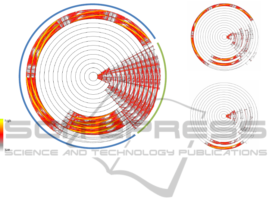
javancss
1.0
1.1
1.2
1.3
1.4
1.5
1.6
1.7
1.8
1.9
1.9.1
1.9.2
1.9.3
1.9.4
core
(a)
(b)
(c)
Figure 6: Visualizing the call graph of methods in Cobertura over different releases. (a) All method calls. (b) Added method
calls. (c) Removed method calls.
version, which creates a similar visual pattern. Al-
though this single pattern does not seem to change
significantly, Figures 6 (b) and (c) reveal that there
were some significant changes in version 1.9.1.
The rest of the system beside the javancss pack-
age is what we labeled as the core of Cobertura in Fig-
ure 6 (a). In contrast to javaNCSS, the development
takes place much more steadily in this part. While
in the first three versions the graph structure is quite
volatile, it forms a stable corpus from version 1.4 on-
wards. However, still significant changes are made in
the subsequent versions as the number of added edges
tell in Figure 6 (b). This development continues up
to version 1.9—the following versions seem to be in-
deed only minor releases as already indicated by the
version number.
5 DISCUSSION
Many visualization approaches are based on a radial
layout (Draper et al., 2009). But often, it would have
been possible to implement the same approach in a
non-radial fashion. Besides the often aesthetically
pleasing appearance of the radial visualizations, it is
not clear whether this design decision in favor of a
radial is also justified by increased readability.
For instance, pie charts are radial versions of bar
charts. While pie charts seem to be very popular
in practice, information visualization researchers of-
ten complain about their frequent usage. The effec-
tiveness of both types of diagrams was empirically
evaluated in comparative experiments (Cleveland and
McGill, 1986; Schonlau and Peters, 2008; Spence and
Lewandowsky, 1991). These experiments, however,
do not come to a consistent conclusion. Other types of
radial visualization approaches were also compared
to their non-radial counterparts (Andrews and Kasan-
icka, 2007; Burch et al., 2008; Kobsa, 2004; Stasko
et al., 2000). But it would be questionable to gener-
alize the results retrieved for those specialized visual-
izations and directly apply these to the visualization
presented in the current work.
(Diehl et al., 2010) compared radial and non-
radial layouts choosing a more generic visualization
and task. They analyzed how users are able to memo-
rize positions in radial and Cartesian (non-radial) co-
ordinate systems. The general trend was that users
made more mistakes and needed more time remem-
bering the positions in the radial visualizations. But
looking at the details of the study, there were also ad-
vantages of radial visualizations: Participants could
memorize circle sectors much better than circle rings,
and also than rows or columns in the Cartesian coor-
dinate system. In the following, we discuss the new
RADIAL EDGE SPLATTING FOR VISUALIZING DYNAMIC DIRECTED GRAPHS
609
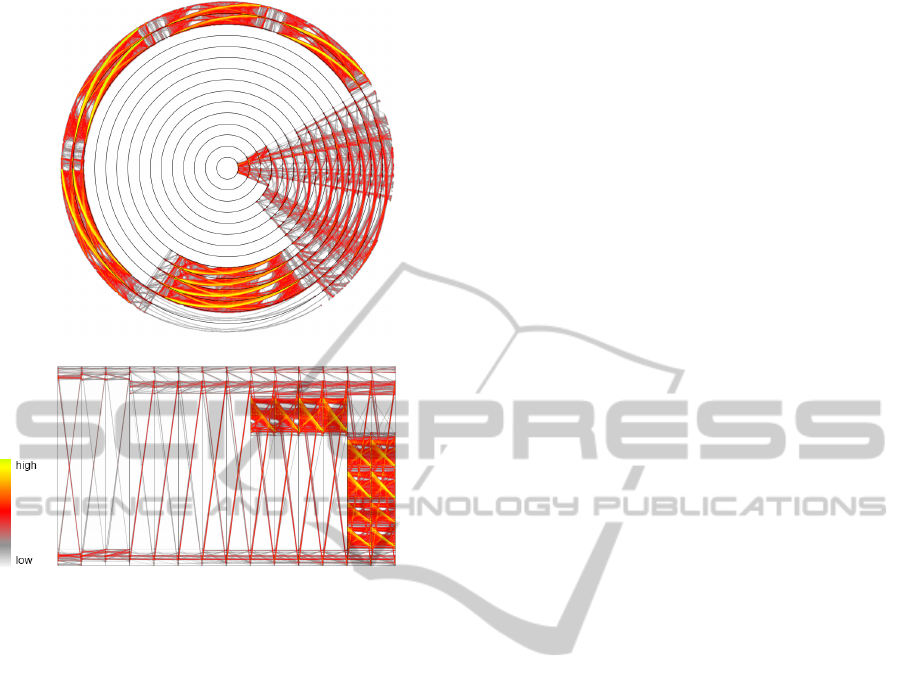
(a)
(b)
Figure 7: Comparing the radial visualization to its Carte-
sian counterpart based on the Cobertura call graph: (a) The
radial diagram. (b) The Cartesian diagram.
radial visualization in the light of these empirical re-
sults and theoretical considerations.
Figure 7 compares our radial visualization (a) to
its Cartesian counterpart (b) following the approach
of (Burch et al., 2011b). Both parts show the Cober-
tura dataset presented in the case study. They serve as
an example for discussing the benefits and drawbacks
of the radial version.
5.1 Traceability of Edges
The technique of our new visualization has the benefit
that some formerly very long links become shorter be-
cause now there are two ways to come from a source
to a target: clockwise and counter-clockwise. The
edge routing algorithm chooses the shorter one as dis-
cussed in Section 3.5. This could have a significant
impact on the visualizations: The example of Fig-
ure 7 (b) shows a quite dominating x-pattern consis-
tent over all versions of Cobertura, which, however, is
only a visual artifact. In contrast, the radial version in
Figure 7 (a) shows no such exaggerated artifact.
Moreover, in the radial visualization formerly
straight links become curved. Our first subjective im-
pression was that these curved lines are harder to fol-
low. This could be related to the observation that the
positions of rings are hard to memorize (Diehl et al.,
2010) because, especially when learning the position
relative to another position, following circular lines
would be required. This research question is also re-
lated to whether curved links in node-link diagrams
are beneficial in general—some empirical evidence
suggests that they are not (Holten et al., 2011). But
to finally judge whether the curved links are a draw-
back of the radial visualization, the impact of this ef-
fect needs to be empirically evaluated for our radial
visualization.
5.2 Space Efficiency
The radial visualization provides an inherent focus-
and-context mechanism. The outer rings of a ra-
dial layout cover more space than the inner rings.
This automatically focuses the outer graphs in the se-
quence of graphs, which are the newer ones when
the time line starts at the circle center. Depending
on the application, this can be a valuable benefit: In
many applications we are interested most in the re-
cent development—the longer history just provides a
context. Analyzing the evolution of software projects
as demonstrated in the case study is an example for
that. In applications where the focus should not be
fixed, inverting, rotating, or reordering the time line
may switch the focus appropriately. Nevertheless, de-
activating the inherent focus is not possible.
Comparing the single stripes (annuli) in the radial
visualization to the stripes of the Cartesian version,
the stripes are longer, but even narrower in the radial
version. Although it is not clear what the ideal aspect
ratio of these stripes should be, it seems that the radial
stripes might be too narrow. Hence, interactively fo-
cusing and enlarging a stripe is more important in the
radial visualization.
Computer screens usually have a rectangular for-
mat. This format better fits a Cartesian coordinate
system. In a radial visualization some space in the
corners of the screen cannot be directly used by the
visualization. Nevertheless, often the spare screen
space can be used for displaying additional informa-
tion like a legend or some interactive controls.
5.3 Visual Patterns
Different visual patterns that could help to inter-
pret the visualization are discussed by (Burch et al.,
2011b). These patterns show also up in the radial ver-
sion of the visualization. But here, they are somewhat
harder to detect since they occur not only in scaled
IVAPP 2012 - International Conference on Information Visualization Theory and Applications
610

and transposed versions, but could also be rotated. An
advantage of the radial version, however, could be that
the direction of the edges is better expressed through
the growing size of the annuli—incoming edges can
only hardly be mistaken for outgoing edges.
Reordering the vertices may change the look of
the visual patterns significantly, both in the radial as
well as in the Cartesian visualization. When, how-
ever, only shifting a set of vertices, the radial visual-
ization guarantees stable patterns among the shifted
vertices. In contrast, those patterns are obscured in
the Cartesian visualization when moving the set of
vertices across the upper or lower border of the di-
agram. The advantage of the radial diagram is that
those borders do not exist as each strip forms a ring
(Section 3.5).
6 CONCLUSIONS AND FUTURE
WORK
We have introduced and discussed a novel radial vi-
sualization technique for displaying dynamic directed
and weighted graphs in a static diagram. The visual-
ization is a radial version of the parallel edge splatting
approach (Burch et al., 2011b). It employs a 1D map-
ping of the graph vertices to circle circumferences.
The resulting annuli are used to draw the graph edges
from the inside to the outside in a curved style. To
support a viewer with the difficult task of tracing links
in large and dense graph structures, the visualization
is based on the concept of edge splatting, which color
codes the edge density. We illustrate the usefulness of
the technique by applying it to a dataset of evolving
call graphs extracted from an open source software
project.
By using a radial representation, we achieve
shorter links than in the Cartesian counterpart; in ad-
dition, the visualization is invariant under shifting the
positions of all vertices, which is not the case in the
Cartesian counterpart. Furthermore, we put emphasis
on newer graphs in the evolution that are mapped to
the outer annuli covering more screen space. A major
drawback of the radial technique could be the curved
links that seem to be harder to follow.
Whether the advantages outweigh the drawbacks
of choosing a radial layout is not clear, but it proba-
bly depends on the particular application. Perform-
ing a thorough empirical study with different tasks
and datasets to evaluate this is part of possible fu-
ture work. Another unanswered question and a quite
challenging task is to generate an optimal vertex or-
dering with the goal to further reduce link crossings.
Since this belongs to the class of NP-hard problems
and is related to the optimal linear arrangement prob-
lem (Garey and Johnson, 1979), we would have to ap-
ply some heuristic approach to find a good solution.
REFERENCES
Andrews, K. and Kasanicka, J. (2007). A Comparative
Study of Four Hierarchy Browsers Using the Hierar-
chical Visualisation Testing Environment (HVTE). In
Proceedings of International Conference on Informa-
tion Visualization (IV), pages 81–86. IEEE Computer
Society Press.
Beck, F., Burch, M., and Diehl, S. (2009). Towards an
Aesthetic Dimensions Framework for Dynamic Graph
Visualisations. In Proceedings of International Con-
ference on Information Visualization (IV), pages 592–
597. IEEE Computer Society Press.
Brandes, U. and Nick, B. (2011). Asymmetric Relations in
Longitudinal Social Networks. IEEE Transactions on
Visualization and Computer Graphics, 17(12):2283–
2290.
Burch, M., Bott, F., Beck, F., and Diehl, S. (2008). Carte-
sian vs. Radial — A Comparative Evaluation of Two
Visualization Tools. In Proceedings of International
Symposium on Visual Computing (ISVC), pages 151–
160.
Burch, M. and Diehl, S. (2008). TimeRadarTrees: Visualiz-
ing Dynamic Compound Digraphs. Computer Graph-
ics Forum, 27(3):823–830.
Burch, M., H
¨
oferlin, M., and Weiskopf, D. (2011a). Lay-
ered TimeRadarTrees. In Proceedings of International
Conference on Information Visualization (IV), pages
18–25. IEEE Computer Society Press.
Burch, M., Vehlow, C., Beck, F., Diehl, S., and Weiskopf,
D. (2011b). Parallel Edge Splatting for Scalable Dy-
namic Graph Visualization. IEEE Transactions on
Visualization and Computer Graphics, 17(12):2344–
2353.
Cleveland, W. S. and McGill, R. (1986). An Experiment in
Graphical Perception. International Journal of Man-
Machine Studies, 25(5):491–501.
Diehl, S., Beck, F., and Burch, M. (2010). Uncovering
Strengths and Weaknesses of Radial Visualizations—
an Empirical Approach. IEEE Transactions on Visu-
alization and Computer Graphics, 16(6):935–942.
Diehl, S. and G
¨
org, C. (2002). Graphs, They Are Changing.
In Proceedings of International Symposium on Graph
Drawing, pages 23–30. Springer.
Draper, G., Livnat, Y., and Riesenfeld, R. (2009). A Sur-
vey of Radial Methods for Information Visualization.
IEEE Transactions on Visualization and Computer
Graphics, 15(5):759–776.
Frishman, Y. and Tal, A. (2008). Online Dynamic Graph
Drawing. IEEE Transactions on Visualization and
Computer Graphics, 14(4):727–740.
Garey, M. R. and Johnson, D. S. (1979). Computers
and Intractability: A Guide to the Theory of NP-
RADIAL EDGE SPLATTING FOR VISUALIZING DYNAMIC DIRECTED GRAPHS
611

Completeness. W. H. Freeman & Co., New York, NY,
USA.
Gove, R., Gramsky, N., Kirby, R., Sefer, E., Sopan, A.,
Dunne, C., Shneiderman, B., and Taieb-Maimon, M.
(2011). NetVisia: Heat Map and Matrix Visualization
of Dynamic Social Network Statistics and Content. In
Proceedings of IEEE Conference on Social Comput-
ing. IEEE Press.
Greilich, M., Burch, M., and Diehl, S. (2009). Visualizing
the Evolution of Compound Digraphs with TimeArc-
Trees. Computer Graphics Forum, 28(3):975–982.
Holten, D., Isenberg, P., van Wijk, J. J., and Fekete, J.-D.
(2011). An Extended Evaluation of the Readability of
Tapered, Animated, and Textured Directed-Edge Rep-
resentations in Node-Link Graphs. In Proceedings of
the Pacific Symposium on Visualization, pages 195–
202.
Inselberg, A. and Dimsdale, B. (1990). Parallel Coordi-
nates: A Tool for Visualizing Multi-Dimensional Ge-
ometry. In Proceedings of IEEE Visualization, pages
361–378.
Kobsa, A. (2004). User Experiments with Tree Visualiza-
tion Systems. In IEEE Symposium on Information Vi-
sualization, pages 9–16. IEEE Computer Society.
Misue, K., Eades, P., Lai, W., and Sugiyama, K. (1995).
Layout Adjustment and the Mental Map. Journal of
Visual Languages and Computing, 6(2):183–210.
Purchase, H. C., Carrington, D., and Allder, J.-A. (2002).
Empirical Evaluation of Aesthetics-Based Graph Lay-
out. Empirical Software Engineering, 7(3):233–255.
Purchase, H. C., Cohen, R. F., and James, M. (1996). Val-
idating Graph Drawing Aesthetics. In Proceedings of
International Symposium on Graph Drawing, pages
435–446.
Purchase, H. C., McGill, M., Colpoys, L., and Carrington,
D. (2001). Graph Drawing Aesthetics and the Com-
prehension of UML Class Diagrams: An Empirical
Study. In Proceedings of the Asia-Pacific Symposium
on Information Visualisation, pages 129–137.
Rosenholtz, R., Li, Y., Mansfield, J., and Jin, Z. (2005).
Feature Congestion: A Measure of Display Clutter. In
Proceedings of SIGCHI Conference on Human Fac-
tors in Computing Systems, pages 761–770.
Schonlau, M. and Peters, E. (2008). Graph Comprehension:
An Experiment in Displaying Data as Bar Charts, Pie
Charts and Tables With and Without the Gratuitous
3rd Dimension. Social Science Research Network
Working Paper Series.
Shneiderman, B. (1996). The Eyes Have It: A Task
by Data Type Taxonomy for Information Visualiza-
tions. In Proceedings of IEEE Symposium on Visual
Languages, pages 336–343. IEEE Computer Society
Press.
Spence, I. and Lewandowsky, S. (1991). Displaying Pro-
portions and Percentages. Cognitive Psychology,
5(1):61–77.
Stasko, J., Catrambone, R., Guzdial, M., and McDonald, K.
(2000). An Evaluation of Space-Filling Information
Visualizations for Depicting Hierarchical Structures.
International Journal of Human-Computer Studies,
53(5):663–694.
Stein, K., Wegener, R., and Schlieder, C. (2010). Pixel-
Oriented Visualization of Change in Social Networks.
In Proceedings of the International Conference on Ad-
vances in Social Networks Analysis and Mining, pages
233–240. IEEE Computer Society.
Tversky, B., Morrison, J. B., and B
´
etrancourt, M. (2002).
Animation: can it facilitate? International Journal on
Human-Computer Studies, 57(4):247–262.
von Landesberger, T., Kuijper, A., Schreck, T., Kohlham-
mer, J., van Wijk, J. J., Fekete, J.-D., and Fellner,
D. W. (2011). Visual Analysis of Large Graphs: State-
of-the-Art and Future Research Challenges. Computer
Graphics Forum, 30(6):1719–1749.
Yi, J. S., Elmqvist, N., and Lee, S. (2010). TimeMatrix: An-
alyzing Temporal Social Networks Using Interactive
Matrix-Based Visualizations. International Journal of
Human-Computer Interaction, 26(11):1031–1051.
IVAPP 2012 - International Conference on Information Visualization Theory and Applications
612
