
An Interactive Platform for Multilingual Linguistic Resource
Enrichment
Ahmed Tawfik, Fausto Giunchiglia and Francesco Bux
Department of Information Engineering and Computer Science,
Faculty of Computer Science, University of Trento, Povo, Trento, Italy
Keywords: Knowledge Representation, Knowledge Development and Maintenance, Knowledge Diversity, Multilingual
Resources, User Interfaces.
Abstract: The world is extremely diverse and its diversity is obvious in the cultural differences and the large number
of spoken languages being used all over the world. In this sense, we need to collect and organize a huge
amount of knowledge obtained from multiple resources differing from one another in many aspects. A
possible approach for doing that is to think of designing effective tools for construction and maintenance of
linguistic resources based on well-defined knowledge representation methodologies capable of dealing with
diversity and the continuous evolvement of human knowledge. In this paper, we present a linguistic
resource management platform which allows for knowledge organization in a language-independent manner
and provides the appropriate mapping from a language independent concept to one or more language
specific lexicalization. The paper explains the knowledge representation methodology used in constructing
the platform together with the iterative process followed in designing and implementing the first version of
the platform, named UKC-1 and the updated refined version, named UKC-2.
1 INTRODUCTION
Nowadays, with the establishment of the internet
technology in our daily life and the wish to obtain
new knowledge from the huge amount of data, a
new open data environment has been created. In this
setting, public organizations, public entities and
companies are the actors opening the huge archives
of data, aiming to have tools to convert these data
into useful knowledge. Among the set of open
problems related to the management of this data,
there is the one regarding the provenance of the
entries, in particular, by being produced by actors
coming from different countries around the world,
the data are affected by the culture whose producer
belongs to. This multicultural, hereinafter,
multilingual environments, brings a matching
problem, or an aggregation one (depending on the
direction), coming from the fact that even if one
entry has the same semantic meaning, each producer
might represent it according to his own culture and
language. Therefore, a solution to this problem
would be the creation of a tool capable of mapping a
piece of knowledge, or a semantic entry, in how this
is represented according to a given language. This
can be achieved by working at idiom level, namely
by providing a mapping between the different entries
of the languages themselves. Furthermore, the
access to this linguistic network should be provided
by an efficient application that should be flexible,
cross-language and user friendly.
The Universal Knowledge Core, also referred to
as UKC, is a framework designed and implemented
by our research group which defines a methodology
for organizing knowledge obtained from multiple
languages into three main levels: (1) Natural
language level, (2) Formal Language Level (3)
knowledge level (Giunchiglia, F. et el. 2012a and
Giunchiglia, F. et el. 2012b). Our main
contribution in this paper is a web platform capable
of providing linguistic analysis, enrichment and
maintenance based on the UKC framework
methodologies. Our main goal is to provide an
efficient multilingual linguistic resource tool that
facilitates the management of diversity across
cultures and development of localized domain
ontologies [Ganbold, A., Farazi, F. and Giunchiglia,
F. (2014)]. The application was designed and
implemented by following an iterative approach
started by implementing a UKC WordNet
195
Tawfik A., Giunchiglia F. and Bux F..
An Interactive Platform for Multilingual Linguistic Resource Enrichment.
DOI: 10.5220/0005037001950206
In Proceedings of the International Conference on Knowledge Engineering and Ontology Development (KEOD-2014), pages 195-206
ISBN: 978-989-758-049-9
Copyright
c
2014 SCITEPRESS (Science and Technology Publications, Lda.)

application accessing the UKC together with the
initial version of the application, named UKC-1.
Then we conducted a comparative evaluation
between UKC WordNet and the initial version
UKC-1 in order to come up with a refined version of
the application, named UKC-2.
The rest of this paper is organized as follows;
Section 2 provides an overview of the UKC
framework. Section 3 presents the UKC Wordnet
View application, an application that resembles the
famous WordNet application but has been designed
and implemented internally by our research group.
Section 4 presents the UKC-1 application, an
application for accessing and manipulating the
linguistic data stored in the UKC. Section 5 presents
a comparative evaluation between UKC WordNet
View and UKC-1 application. Section 6 presents the
UKC-2 application, a refined version of UKC-1
based on the results of the comparative evaluation
between UKC Wordnet View and UKC-1. Section 7
summarizes the related work with main focus on
applications and user interfaces designed for
construction and maintenance of linguistic
resources. Section 8 concludes the paper and points
out to the future work.
2 UNIVERSAL KNOWLEDGE
CORE
WordNet [Fellbaum, C. (1998) and Miller, George
A. (1995)] is a plain old standard, thus is affected by
the cultural and social environment in which its
development took place. Namely, the data present in
WordNet belongs to one language only, British
English, and the nature of the described entities
reflects the British society and culture. Thus, in a
multilingual and multicultural environment, it does
not bring a real competitive advantage. On the other
hand, the UKC provides a mapping between word
forms (coming from different languages) and word
meanings, indeed it is possible, given a concept, to
see how this concept is expressed in different
languages, or which synonymous sets are used to
express that meaning in each language. A part from
this lexical mapping, the UKC manages also
semantic relations, which insist on more than one
concept a part from the language. The semantic
relations might vary on the base of the language -
read culture - the concepts belong to. UKC is made
up by different cores, but in this paper we are
focusing only on the Natural Language Core and
Concept Core, they represent the methodology
behind the multilingual linguistic resource platform
explained in this paper.
2.1 Natural Language Core
Natural languages are mainly composed of words.
Each word in a natural language must have a distinct
meaning, known as word sense, which refers to the
context where the word is usually being used.
One possible approach for modeling a natural
language could be as a container of words sorted
alphabetically. This approach might be useful for
human beings interested in looking up the meaning
of a specific word but for digital computers more
information about words with similar or related
meanings is needed in order to build efficient
semantic aware and natural language processing
applications.
The natural language core models a language as
a huge container of synsets and lexical gaps. A
synset is a set of words associated to the same word
sense. A synset, in addition to being a set of
synonym words, is also characterized by having a
natural language gloss and a part of Speech (POS).
The part of speech indicates whether a word is either
noun, adjective, verb, or adverb. Figure-1 gives an
example of the English word “kind” which has two
different synsets. The first synset is associated with
three senses (form, sort, and kind) which correspond
to the meaning of “Category of things”. The second
synset is associated with one sense (kind) which
corresponds to the meaning of “Someone having or
showing tender or helpful nature”. In the same figure
the Italian word “Gentile”, the translation of word
kind, has one word sense and one corresponding
synset. Every synset is associated with one
language-independent concept. It may happen that a
language-independent concept has a corresponding
synset in one language and a gap in another
language, formally called a lexical gap.
The relation between word senses is known as
lexical relations. Natural language core defines 12
different types of lexical relations. Two of the most
common types of lexical relations are: Synonymy
and Antonym. A Synonymy is a symmetric relation
connecting two senses having the same Part of
Speech and sharing the same meaning, i.e. early is a
synonym of soon. On the other hand, an antonym is
another symmetric relation connecting two senses
having the same Part of Speech but having an
opposite meaning, i.e. early is an antonym of late.
KEOD2014-InternationalConferenceonKnowledgeEngineeringandOntologyDevelopment
196

Figure 1: The relation between the English word “Kind”,
its word senses, and synsets and the Italian word
“Gentile”, and its word senses, and synsets.
2.2 Concept Core
The Concept Core codifies information about
language-independent concepts and relations
between them. Every synset in a natural language is
associated with exactly one language-independent
concept. Each concept has a concept Id as a unique
identifier and a concept label as a descriptive word
obtained from the first language-dependent synset
defined and associated with the concept.
Concepts are related to other concepts through
semantic relations. There are two main types of
semantic relations that may exist between concepts:
hierarchical relations and associative relations.
Hierarchical relations are those relations which
are transitive and asymmetric. The Concept core
defines 5 different types of hierarchical relations.
We explain briefly one of the most common
hierarchical relations as an example, the is-a
relation. The is-a relation is a specialization relation
between two concepts that indicates the necessity of
specialization, i.e. minivan is-a car. On the other
hand, associative relations are those relations which
connect concepts in different hierarchies in the
Concept Core. The Concept core defines 7 different
types of associative relations. We explain briefly one
of the most common associative relations as an
example, the has-member relation. The has-member
relation is a relation between concepts where the
source denotes a set and the target is one of its
members. i.e.car has-member automobile engine.
Figure-2 gives an example of associating language-
independent concepts to language-dependent
Figure 2: The relation between the English word “Kind”
and Italian word “Gentile” and their words senses, synsets
and mappings to the same language independent concept.
synsets, together with the corresponding semantic
relations between concepts.
3 UKC WORDNET VIEW
UKC WordNet View application (Figure-3) is a web
application providing access to the linguistic data
stored in the UKC framework. An online demo is
available at:
http://uk.disi.unitn.it:8089/ukcui/wordnetview.ht
m.
The application has been designed to resemble
the original user interface of WordNet
(http://wordnetweb.princeton.edu/perl/webwn) after
taking permission from the WordNet team; we
sincerely thank them for that. The main idea behind
designing an application that resembles the original
WordNet is to fulfil the following goals: (1) Allow
users who are familiar with WordNet to start
accessing the UKC and rapidly get to know about its
contents and main features. (2) Conduct a
comparative evaluation between our UKC
application and WordNet application while both
accessing the same linguistic data source. The UKC
WordNet View differs from the original WordNet in
being a multilingual linguistic resource. For each
word in a specific language, the application retrieves
the synsets for the word from the natural language
core together with the associated language-
independent concepts from the concept core.
Although, we have mapped the semantic and lexical
relation names to the same relation names being
used by the original WordNet application in order to
AnInteractivePlatformforMultilingualLinguisticResourceEnrichment
197
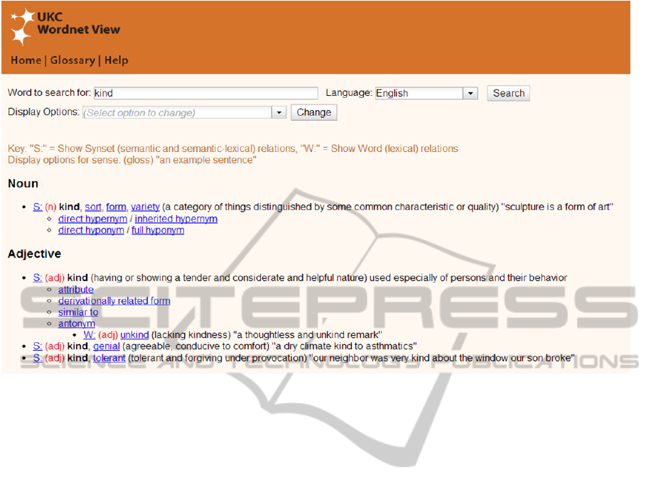
Figure 3: UKC WordNet View application.
maintain consistency with the original design.
The application was also implemented following
web 2.0 architecture so it’s characterized by having
interactive features like auto-completion and instant
responsive behavior.
Figure-3 shows the application user interface.
The user can start a new search by typing a word and
choosing the desired language. The application then
retrieves the set of synsets organized by their part of
speech (Noun, Adjective, Verb, and Adverb) and
sorted by their synset rank. The user may interact
with the retrieved synsets by clicking on the letter
“S” next to the synset to show either semantic
relations with the language-independent concept or
semantic-lexical relations with language dependent
synset. On the other hands, clicking on the letter
“W” shows lexical relations with words. The user
can modify the visual display for the displayed
synsets by updating the display options. For each
synset, it’s possible to show or hide the: gloss,
example sentences, synset provenance details, or the
language-independent concept identifier for the
concept associated with the synset.
4 UKC-1 PLATFORM
UKC-1 platform is a web application for accessing
and manipulating the linguistic data stored in the
UKC. An online demo is available at
http://uk.disi.unitn.it:8089/ukcui/ukc.htm.
The application was designed and implemented
as a rich client internet application having the same
instant responsive behavior, look and feel of desktop
applications. In the next subsections, we explain
briefly the application overall architecture and user
interface design.
4.1 Overall Architecture
The overall architecture is a conceptual model that
represents the main system components and data
transfer between them. The overall architecture in
Figure-4 was designed as a multi-layer (Model-
View-Controller) architecture, commonly known as
MVC pattern, a software design pattern for
implementing user interfaces.
The MVC architecture is divided into three main
interconnected components in order to separate the
application information and business logic how the
information is presented to the user.
In Figure-4, the client side is the user’s browser
environment. We have implemented two main
components that run on the client side: View
Component and Ajax Engine. The View component
is responsible for data presentation. The
technologies used in data presentation are: Hypertext
KEOD2014-InternationalConferenceonKnowledgeEngineeringandOntologyDevelopment
198

Figure 4: UKC-1 Overall Architecture.
Markup Language (HTML), the standard language
for creating web pages, and Cascading Style Sheets
(CSS), a style sheet language for formatting web
pages. On the other hand, the Ajax Engine is the
core of the web application which implements the
application logic using Javscript as a web
programming language and JavaScript Object
Notation (JSON) as a lightweight data-exchange
format between the client and server. The Ajax
Engine runs within the user’s browser to ensure
prompt responses to the user requests. The added
engine eliminates the ‘click and wait’ nature of the
classic web applications and responds instantly to
the user actions by exchanging data with the server
behind the scenes without refreshing the web page.
In Figure-4, the server side is composed of two
main components; the web controller and the
application data mode, both components are using
Java as a programming language. The web controller
is responsible for handling communication with the
client side through the Ajax Engine and submitting
commands to the application data model for reading
or updating application data. On the other hand, the
application data model is the central location for
application core data, business logic, and functions
accessing the linguistic database.
4.2 User Interface Design
Figure-5 shows the application user interface. The
user interface is divided into 5 main regions: (1)
search panel (2) natural language core, named
synsets panel (3) concepts core panel (4) expandable
drawer used as linguistic reference panel, and (5)
color legend at the bottom to differentiate between
working and reference languages.
The top region where the user can start a new
search by typing a word and choosing the desired
working and reference languages respectively. The
working language is the default language, when the
user performs a search or an update operation; the
system applies the changes based on the selected
working language. The reference language is mainly
for multilingual support in order to view the working
language synset in another language or a lexical gap
if there is no corresponding synset. The set of color
legends at the bottom of the screen is used to
differentiate between working language synsets
(black font), reference language synsets (blue font).
Another possible case is when the language
independent concept label is obtained from another
language different from both working and reference
languages. In this case, the concept label will be
also retrieved and highlighted as a label from
another language (red font).
The synsets panel displays the content retrieved
from the natural language core; the word synsets and
their lexical and semantic lexical relations. The user
can interact with the natural language core contents
through the following user interface components:
Toolbar at the top for manipulating synsets by
performing Create-Update-Delete operations on
synsets and their relations.
Display manager for updating the visual display
of the displayed synsets. For each synset, it’s
possible to show or hide the: synset gloss,
example sentences, the language-independent
concept identifier, or the corresponding sysnet
in the reference language.
Synset filtration capability for the displayed
synsets, it’s possible to filter synsets by part of
speech or type of lexical relation.
Viewing lexical and semantic relations from
parent to child (sub-relations) or from child to
parent (super-relations).
Contextual (right-click) menu for providing
handy way to retrieve synsets for synonym
words and performing create/update/delete
operations on synsets.
The concepts panel displays the content retrieved
from the concept core; the language-independent
concepts and their semantic relations. The user can
interact with the concept core contents in a way
which has been designed to be as similar as to the
synsets panel display. In particular there are the
following user interface components:
Toolbar at the top for defining new synset or
lexical gap in the working or the reference
language for the selected concept.
Display manager for updating the visual display
of the displayed concepts. For each concept, it’s
possible to show or hide the language-
independent concept identifier.
AnInteractivePlatformforMultilingualLinguisticResourceEnrichment
199
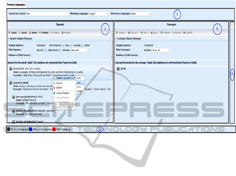
Figure 5: UKC-1 User Interface Design.
Concept filtration capability for the displayed
concepts, it’s possible to filter concepts by
relation type.
Viewing semantic-lexical relations from parent
to child (sub-relations) or from child to parent
(super-relations).
Contextual (right-click) menu for providing
handy way to create or delete synsets and
lexical gaps and performing create/update/delete
operations on semantic relations between
concepts
A dynamic synchronization between the synsets
panel and concepts panel regions takes place when
the user selects any synset from the left region, the
system automatically display the corresponding
concept in the right region.
The expandable drawer on the right is used as a
(read-only) linguistics reference panel. The purpose
of this panel is to assist users while working on the
main synsets and concepts panels in retrieving other
sysnets or concepts and use them as a reference
without the need to erase the contents of the main
panels. The reference panel also assists user in
creating new lexical and semantic relations through
a drag and drop facility. For instance (Figure-6), a
new lexical relation can be created by dragging a
reference synset from the reference panel and
dropping it over another synset from the main
synsets panel.
Using the main and reference panels accompanied
by toolbars and contextual menus together with the
provided full control over the displayed information
through the display managers, we should end up
having an elegant linguistic analysis and
manipulation tool which allows linguistic experts to
enrich the available linguistic resources with
minimal effort.
5 UKC-1 VS. WORDNET VIEW
In order to improve the usability of the UKC view
and knowing that the WordNet view is considered as
the de-facto standard, we started by performing a
comparative analysis between the two interfaces in
order to elicit the usability problems on the view of
the UKC.
By being a comparative evaluation, it should be
kept in mind that the two systems should share some
meanings, some operation. In this case, even if the
UKC view has been designed as a full Create-
Retrieve-Update-Delete (hereinafter CRUD), while
the WordNet view is a simple knowledge retrieval
interface. Took this into account, the designed tasks
for the evaluation, like the rest of the work, were
built only around the retrieval features of the two
interfaces.
KEOD2014-InternationalConferenceonKnowledgeEngineeringandOntologyDevelopment
200
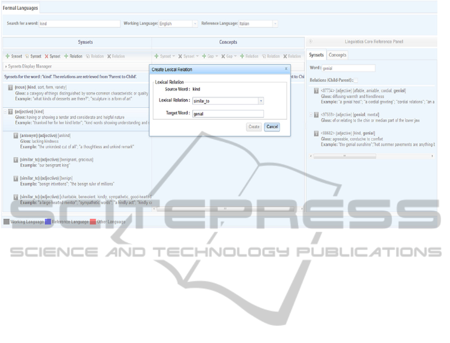
Figure 6: Linguistic Reference Panel provides drag and drop facility for creating lexical and semantic relations. The new
lexical relation dialog popped up after dragging [genial, mental] synset from the reference panel and dropping it over the
[kind] synset on the synsets panel.
5.1 Quantitative Work
On the base of these assumptions, and following the
directives of Bodker [Bodker, S. (2000)], a
quantitative analysis has been conducted to
investigate how, in general, the user react to both
views. For the quantitative work, the main key
points were three: tasks, questionnaires and
measures.
The main tasks that have been proposed to the
testers were the following:
Perform a search for an arbitrary word in an
arbitrary language.
Search for an arbitrary lemma in multiple
idioms.
Filter the results of a search process on the base
of their Part Of Speech (POS) tag.
Retrieve semantic relations on a given concept.
5.2 Task Platform Work
The entire process of comparative analysis was
supported by a custom-made platform capable of
switching the two views shown to the user in order
to allow for performing each task on both of them.
Along with this capability, the platform was entitled
to keep track of the time spent to perform each task,
to submit questionnaires, after each group of tasks,
and collect their results. The time spent and the
results of the questionnaire were used to perform
analysis and plot graphs. This tool was tested with
two pilot runs. The two testers involved in this case
were a developer and a PhD in Human-Computer-
Interaction, which gave important suggestions about
the usability of the platform itself.
5.3 Results
In this paragraph the results of the comparative
evaluation are reported. Before proceeding with the
results it is important to state the nature of the test
subjects. The selection criteria was based on the fact
that they were users of the WordNet interface, thus
they can be as considered domain experts. The
number of involved test subjects was 8, of those, 5
were PhD, 2 post-doc and a software engineer.
Their answers in the form of Yes, No, or I don’t
know (IDK) were analyzed and plotted as bar
graphs.
Results display: the WordNet way of displaying
results has been judged not easy to read and
interpret. In particular, users have preferred the
UKC way of displaying these in a table, using
each single column to display a part of the result
(gloss, example, concept Id, synset...). In this
way, each element is easily identifiable.
AnInteractivePlatformforMultilingualLinguisticResourceEnrichment
201

UKC Tabular View, is it intuitive?
Results aggregation: with respect to the UKC,
the WordNet view performs results aggregation
over the data. In particular results are grouped
according to their part of speech tag (POS). The
UKC view includes all the results in the same
table, thus the only way the user have to identify
their type is to look at the POS-tag field or filter
by POS or relation type. Indeed, more space that
can be saved.
UKC DisplayManager, is it useful?
Results relations: another important point
involved in the analysis is the relation retrieval
feature. By being a linguistic resource, the
interface should provide the user access to the
relations insisting on a concept in a way to easy
the navigation among them. Under this point of
view, the users have preferred the way the UKC
interface manages relations retrieval and
displaying. In particular the capability of
filtering and interact with these, with respect to
the fixed and link-based of WordNet, has been
proven to be more flexible to the user needs.
Is UKC relation retrieval approach more complete?
Multilingual Results: the UKC has been proven
to be more productive when it comes to
mapping results in different languages with
respect to WordNet. In particular, the former is
able to retrieve the mapping of a results in each
selected language, while the latter allows the
user to retrieve results just in one language,
namely losing the mapping implicit function.
Multilingual WordNet, is it difficult?
Missing history: beside these quantitative
results, another important point got from some
qualitative interviews, is the fact that both the
interfaces do not keep track of the user’s
actions. Even though there was no task about it,
users have reported this missing feature.
6 UKC-2 PLATFORM
After the analysis reported in the previous section,
the UKC design was refined in terms of user
interactions and overall layout. The chosen approach
is the one of a desktop environment in which
multiple windows might be used at time. Each
window is associated to an action, like a group of
results of a search. Furthermore each window can be
associated to a kind, which resembles the concept of
sections of the previous interfaces. This choice was
KEOD2014-InternationalConferenceonKnowledgeEngineeringandOntologyDevelopment
202

by two main reasons: (1) Having a multiple window
layout helps in task in which more than one entity is
needed, like in the case of comparisons or relations
management. (2) Being able to minimize windows,
the user can implicitly keep track of its actions, or
can put in pause a task and continue with another
one. The will allow to build a section-less system.
As stated in the previous paragraph, the UKC-1 is
divided into regions, each one assigned to a
particular nature of given results, or to a kind of
those. This approach has been demonstrated, by the
analysis, to be distracting for the users. Indeed they
usually have been losing the context when switching
from one to another, in order to retrieve a given
results. Other three main points that have
contributed to the redesign of the user interface:
Consistency of the representations: assign to
each entity involved in the system a unique way
of visualizing it, in order to maintain the
consistency of the entities in different sections or
scenarios of the application.
Modularity of the interface: the system should
adapt itself to what are the user's needs. By being
able to modularize it, it would be possible for the
user to customize it, in order to better fit his
needs. It would also allow to fit particular
scenarios of interaction by configuring it.
Achievement of graphical methods for
knowledge interaction: a part from the current
interface, based on textual components like
tables, snippets, tooltips and buttons, a second
method of interaction would be based on shapes
and colors, thus graphics. This is needed in a
multilingual context like the one in which the
UKC is set.
The new web client pursues the co-existence of two
different kinds of interactions, textual and graphical
on the same content pane, however in this paper
only the textual one is discussed.
The Textual User Interface was designed to
resemble the current implementation of the UKC UI,
proposing methods of interaction based on text input
and forms. The TUI overall architecture (Figure-7)
is composed of two different managers:
Window Manager: this module is responsible of
the creating and handling the different windows
present in the interface. By using a modal
windows based system, the users might interact
with multiple entities at times, shown in different
windows, each one customizable by the manager,
on the base of the user needs. For example,
displaying multiple results at once, or comparing
two similar elements.
Perspective Manager: this component is used to
provide transformation in data shown. The
perspective is used to translate an entity between
the four different available perspectives: natural
language, formal language, E-Types and
domains. The change of perspective is then made
dynamic and applicable to each result (namely
window) separately, such that the user will be
aware of how a piece of knowledge changes in
each point of view. Furthermore this will prevent
the user to lose the context in which he is
currently working. An example of change of
perspective is given by the natural and formal
language windows. In the first one, the concept is
shown in relation with the synsets that lexicalize
it in one or more given languages, while in the
formal perspective (realized in the corresponding
window) the same concept is shown in relation
with other concepts (language independent).
UKC Web API Interface: this module manages
the communications between the front-end web
client (running on the browser) and the data
source available through a JSON API.
Figure 7: UKC-2 Overall Architecture.
Other two main points in the new interface are the
usage of a window system and the usage of colors to
guide the user. The window choice is motivated by
the will to provide the capability to perform multiple
operations at time on the same dashboard, or in
general, operations that involve multiple entities,
like comparisons. Another point that can be elicited
from Figure-8 above is the use of colors to indicate
messages and sections. Each window, by being
associated to a kind (natural, formal or eType) is
displayed with a different color in the header. In this
way the interface can implicitly guide the user
through its sections without using labels.
Furthermore, each window kind, in the new
interface, represents a perspective. A perspective is a
type of view over the data, and can be transformed
from one to another. By doing this, the user does not
lose the context while changing from a section to
another.
In the new interface, colors are also used to
AnInteractivePlatformforMultilingualLinguisticResourceEnrichment
203
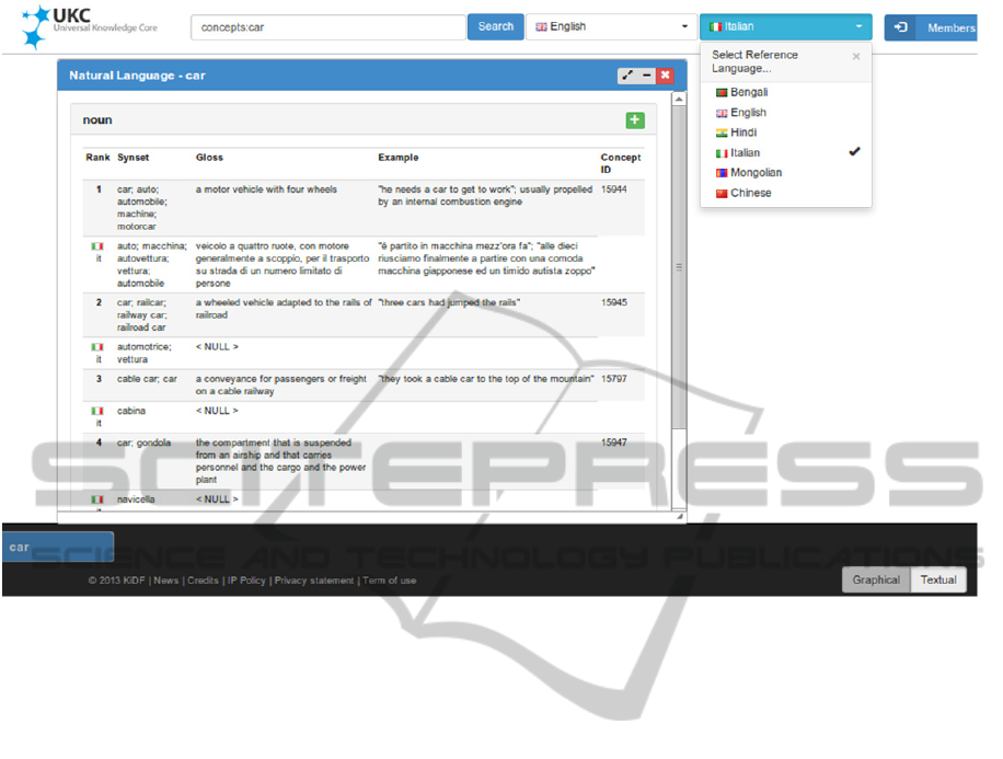
Figure: 8 UKC-2 User Interface.
communicate to the end user particular messages,
like success, errors or warnings. A working demo of
this new interface can be found at the address
http://uk.disi.unitn.it:3003.
7 RELATED WORK
There are a small number of linguistic resources and
lexical databases that exist today having web user
interface. WordNet is a famous electronic lexical
database of English nouns, verbs, adverbs, and
adjectives grouped into a set of cognitive synonyms
called synsets. WordNet lexical database was
constructed and organized based on
psycholinguistic principles related to theories of
human mind lexical organizations. It was developed
manually by a group of knowledge experts which
was the main reason for its accuracy.
MultiWordNet (http://multiwordnet.fbk.eu) and
EuroWordNet (
http://www.illc.uva.nl/EuroWordNet)
are multilingual lexical databases aligned with
WordNet and structured in the same way as
WordNet. They are considered as an extension to
WordNet which resolve its multilingual drawback.
Both of these multilingual resources provide synsets
which are strictly aligned with the WordNet English
synsets and their semantic relations were imported
from WordNet and preserved for the translated
synsets.
BabelNet (Navigli, R. and Ponzetto, SP. (2010))
is a multilingual semantic network constructed
automatically following a methodology that
integrates lexicographic and encyclopedic
knowledge from WordNet and Wikipedia. Its
multilingual support was automatically constructed
using machine translations in order to enrich their
lexical representations. BabelNet wasn’t constructed
based on a formal representation. BabelNet provides
a graphical user interface, known as
BabelNetXplorer (Navigli, R. and Ponzetto, SP.
(2012)). BabelNetXplorer allows the users to
visually explore the knowledge repository but
maintaining and enriching the linguistic resource is
not supported.
FrameNet (Baker, Collin F. et el. 1998 and
Baker, Collin F. 2003) is lexical database of English
has more than 10,000 word senses. It’s machine-
readable database, based on providing annotated
examples of how words are used in actual texts.
FrameNet is constructed based on a theory called
Frame Semantics which assigns a semantic frame to
each concept, i.e. a description explains the usage of
the concept and its relations with other concept.
FrameNet has been constructed manually by
defining language independent frames and annotated
KEOD2014-InternationalConferenceonKnowledgeEngineeringandOntologyDevelopment
204
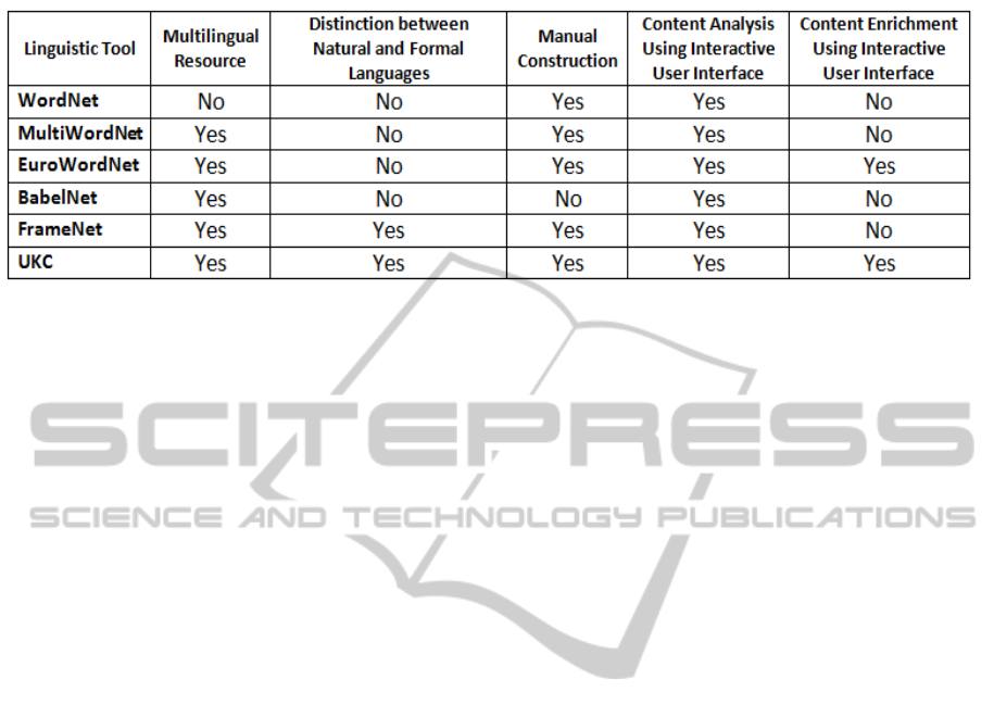
Table 1: Comparison between UKC and the commonly used linguistic tools.
examples. The multilingual lexicalization was done
as separate projects. To the best of our knowledge,
none of these tools has been built on a methodology
for organizing knowledge obtained from multiple
languages into natural language level and formal
language level in order to facilitate extensibility and
multicultural environment support. We could not
also find a tool that has an advanced and user
friendly interface that provides interactive and
modular features for maintaining and enriching the
knowledge base as UKC does. Table-1 summarizes
the set of basic feature supported by the existing and
commonly used linguistic resources.
8 CONCLUSION
The UKC web platform is an effective linguistic
resource management tool that allows for knowledge
organization in language-independent manner. The
product shown in this paper has been a work in
which the guidelines for an ideal/usable system have
been set, along with its architecture, but the features
yet to be implemented are considered as a part of the
future work. Among these, the most important ones
are described in the following paragraphs.
The Entity-Type and Domain perspectives which
are entitled of displaying information about entity
types (representation of real world phenomena) and
how they are grouped to represent each of the
different fields of the human knowledge. The pure
Graphical User Interface that can be considered as
one of the biggest expansion, since more than one
perspective should be implemented in the form of
interactions with a graphical representation of the
knowledge base. This work would require a deep
study of usability, involving users also in the design
phase (i.e. participatory design).
ACKNOWLEDGEMENTS
The research leading to these results has received
partially funding from the European Community's
Seventh Framework Programme (FP7/2007-2013)
under grant agreement n. 287704 CUBRIK:
"Human-enhanced time-aware multimedia search.
We also would like to thank Maltese Vincenzo
for all the contributions he made in the form of
review, design suggestions and defect detection.
REFERENCES
Baader, F., Calvanese, D., McGuinness, D. and Nardi, D.
(2003). The description logic handbook: Theory,
implementation and applications.
Baker, Collin F., Charles J. Fillmore, and Beau
Cronin. (2003). The Structure of the FrameNet
Database. International Journal of Lexicography 16
(3), 281-296, 149.
Baker, Collin F., Charles J. Fillmore, and John B. Lowe
(1998). The Berkeley FrameNet project. COLING-
ACL '98: Proceedings of the Conference. Montreal,
Canada 1998. 86-90.
Bodker, S. (2000). Scenarios in User-Centered Design -
Setting the Stage for Reflection and Action.
Proceedings of the 32nd Annual Hawaii International
Conference on Systems Sciences.
Dutta, B., Giunchiglia, F. and Maltese, V. (2012). A
facet-based methodology for geo-spatial modelling.
Journal on Data Semantics May 2012, Volume 1,
Issue 1, pp 57-73.
Eckle-Kohler, J., Gurevych, I., Hartmann, S., Matuschek
M., and M. Meyer, C. (2012).UBY-LMF –A Uniform
Format for Standardizing Heterogeneous Lexical-
Semantic Resources in ISO-LMF. In Proceedings of
the 8
th
International Conference on Language
Resources and Evaluation (LREC).
Fellbaum, C. (1998). WordNet: An Electronic Lexical
Database. Cambridge, MA: MIT Press.
AnInteractivePlatformforMultilingualLinguisticResourceEnrichment
205

Ganbold, A., Farazi, F. and Giunchiglia, F. (2014). An
Experiment in Managing Language Diversity Across
Cultures. The Sixth International Conference on
Information, Process, and Knowledge Management.
Giunchiglia, F. and Dutta, B. (2011). DERA: A Faceted
Knowledge Organization Framework. International
Conference on Theory and Practice of Digital
Libraries.
Giunchiglia, F., Dutta, B. and Maltese, V. and Farazi, F.
(2012a). A facet-based methodology for the
construction of large-scale geospatial ontology.
Journal on Data Semantics (JoDS), Vol. 1, Issue 1
(2012), pp. 57-73.
Giunchiglia, F., Marchese, M. and Zaihrayeu, I.
(2005).Towards a theory of formal classification.
Journal on Data Semantics VIII Lecture Notes in
Computer Science Volume 4380, 2007, pp 57-81.
Giunchiglia, F., Maltese, V., B. Dutta (2012b). Domains
and Context: First steps towards managing diversity in
knowledge. Journal of Web Semantics (JWS) Vol 12 -
13 (2012): Special Issue: Reasoning with Context in
the Semantic Web.
Giunchiglia, F., Maltese, V., Farazi, F. and Dutta, B.
(2010). GeoWordNet: a resource for geo-spatial
applications. Proceedings of the 7th Extended
Semantic Web (ESWC).
Gonzalez-Agirre, A., Laparra E., and Rigau G. (2012).
Multilingual central repository version 3.0. In
Proceedings of the 8
th
International Conference on
Language Resources and Evaluation (LREC), pages
2525–2529.
Gutiérrez, Y and Orquín, A. (2011). Enriching the
Integration of Semantic Resources based on WordNet.
Procesamiento del Lenguaje Natural, vol. 47, pp. 249-
257.
Katifori, A., Halatsis, C., Lepouras, G., Vassilakis, C. and
Giannopolou E. (2007). Ontology visualization
methods - a survey. Journal on ACM Computing
Surveys (CSUR) Surveys Homepage archive. Volume
39 Issue 4, Article No. 10.
Koeva, S., Mihov, S. and Tinchev, T. (2004). Bulgarian
Wordnet - structure and validation. Romanian Journal
of Information Science and Technology 7(1-2) (2004)
61-78.
Miller, George A. (1995). WordNet: A Lexical Database
for English. Communications of the ACM Vol. 38, No.
11: 39-41.
Navigli, R. and Ponzetto, SP. (2010) BabelNet: Building a
very large multilingual semantic network. Proceedings
of the 48th Annual Meeting of the Association for
Computational Linguistics, Uppsala, Sweden, 11–16
July 2010, pp. 216–225.
Navigli, R. and Ponzetto, SP. (2012) BabelNetXplorer: A
Platform for Multilingual Lexical Knowledge Base
Access and Exploration. Proceedings of International
World Wide Web Conference (IW3C2),Lyon,France,
16-20 April 2012.
KEOD2014-InternationalConferenceonKnowledgeEngineeringandOntologyDevelopment
206
