Mobile App Usability Index (MAUI) for Improving Mobile Banking
Adoption
Lalit Mohan
1,2
, Neeraj Mathur
1
and Y. Raghu Reddy
1
1
Software Engineering Research Center, International Institute of Information Technology, Hyderabad (IIIT-H), India
2
Institute for Development & Research in Banking Technology (IDRBT), Hyderabad, India
Keywords: Mobile App Usability, Mobile Banking in India, Usability, Error Handling.
Abstract: India has 790+ million active mobile connections and 80.57 million smartphone users. However, as per
Reserve Bank of India, the number of transactions performed using smartphone based mobile banking
applicationsis less than 12% of the overall banking transactions. One of the major reasons for such low
numbers is the usability of the mobile banking app. In this paper, we focus on usability issues related
tomobile banking apps and propose a Mobile App Usability Index (MAUI) for enhancing the usability of a
mobile banking app. The proposed Index has been validatedwith mobile banking channel managers, chief
information security officers, etc.
1 INTRODUCTION
India has 1.26+ Billion people and about 70% of
them are mobile users(Conn. B, 2014). The
smartphone adoption is approximately 22% of
overall mobile phones in India. With the rapid
growth rate of 186% the market share of
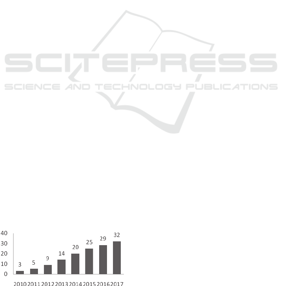
smartphones is expected to be at 32% by the year
2017 as shown in Figure 1(Statista, 2014). From a
general market perspective, decreasing smartphone
prices, growing younger population in India and
improving technology awareness are some of the
reasons for the growth of smartphone adoption. With
240+ million (Conn. B, 2014)Internet users in India,
it is estimated that 60% of them access Internet over
mobile devices.
Figure 1: Share of smartphone usage in India (Statista,
2014).
The increasing usage of Internet on smartphones
provides opportunities to banks for improved
adoption of mobile banking. In India, about 89
banks provide mobile app banking services to their
customers(List of Banks permitted to provide
Mobile Banking, 2014). A report published by the
Reserve Bank of India (RBI) suggests that a mobile
banking transaction costs just 2% of the cost of a
branch transaction, one-tenth of the cost of an ATM
transaction and half the cost of Internet banking
transaction. In other words, the transaction cost of
mobile banking is much lower than any other
delivery channel in the bank(R.Khan, 2012). This
indicates that there are huge opportunities for
improved adoption of mobile app banking of banks
in India. Customers perform mobile banking using
mobile apps, browsers on the mobile devices,
Unstructured Supplementary Service Data (USSD),
Short Message Service (SMS), Near Field
Communication (NFC), mobile wallets, etc. Mobile
banking usingmobile apps compared to mobile
websites.Mobile banking is relatively easy to use for
frequent and repeated transaction as the navigation
can be menu driven. This conclusion can be
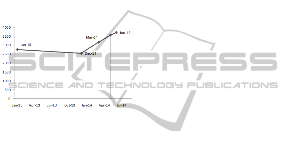
intuitively made from increasing transaction count
shown in figure 2.The number of mobile banking
transactions in Jan’13 was about 9.5 million with an
average transaction amount of INR 2,758 whereas
the number of transactions in Jun’14 was about 10.7
million with an average transaction amount of INR
3,715 (Banks wise volumes in ECS/NEFT/RTGS/
313
Mohan L., Mathur N. and Reddy Y..
Mobile App Usability Index (MAUI) for Improving Mobile Banking Adoption.
DOI: 10.5220/0005363003130320
In Proceedings of the 10th International Conference on Evaluation of Novel Approaches to Software Engineering (ENASE-2015), pages 313-320
ISBN: 978-989-758-100-7
Copyright
c
2015 SCITEPRESS (Science and Technology Publications, Lda.)
Mobile Transaction, 2014).
Although there is an increase in the average
transaction amount, there are opportunities for
improving the adoption of mobile app banking.
Currently, the number of mobile banking app
transactions is only about 1.3 transactions per
smartphone per month. It has to be noted from the
various RBI reports that there are some
large/medium sized public sector banks having
millions of customers with less than 100 mobile
banking transactions per month (Banks wise
volumes in ECS/NEFT/RTGS/ Mobile Transaction,
2014).
Figure 2: Improved Adoption.
If the number of transactions grows to 3 per
smartphone-per month for paying utility bills,
mobile top-ups, card payments and other regular
monthly usage needs, it can decrease the transaction
cost for banks, thereby aiding banks in redirecting
investments in other requisite areas. Also, the small
cooperative banks (Banks wise volumes in
ECS/NEFT/RTGS/ Mobile Transaction, 2014),
eager to expand business are directly adopting
mobile banking instead of starting with traditional
Internet banking portals for desktops.
The major reasonsfor lesser adoption of mobile
banking appscan be listed as: Information security,
Network connectivity and Usability. With improving
data connectivity (3G and 4G), and with stricter
banking security guidelinesissued by RBI, Network
connectivity and Information Security are currently
being addressed at various levels. However,
usability parametersfor mobile app based banking is
not given due importance either by the RBI or by the
Bureau of Indian Standards (BIS). BIS is the
national standards body of the government of India
and responsible for standardization efforts.
In this paper, we propose usability parameters
specific to mobile banking applications. We
performed a thorough study of the various issues
concerning the usability aspects and proposed
parameters that can potentially beadopted by the
BIS.
The major contributions of this paper are:
An index named Mobile App Usability Index
(MAUI) that can guide banks to improve
usability of their mobile banking apps thereby
increasing adoption rates.
Fine-grained parameters based on the broad
factors like time taken to complete a task, user
interface display, and error handling.
Validation of the proposed parameters and
index with mobile banking channel managers
(business and IT), chief information security
officers and also with the mobile app customer
base.
2 MOBILE BANKING APP
USABILITY CHALLENGES
A survey with a sample of 1434 participants with
diverse backgrounds (Chief Information Security
Officers of the banks, Mobile Banking Channel
Managers and smartphone users - working women
and men from Information Technology (IT) and
Non-IT companies, homemakers, retired staff of
public sector firms, etc.) was conducted using
WhatsApp, Facebook, LinkedIn, emails and face-to-
face interactions to understand the usability related
challenges of mobile banking. The participants of
the survey were aware that the authorswere
involvedin banking technology research and hence
gave feedback with an expectation for improvement
of mobile banking adoption. Additionally, a total of
26,131 comments posted by mobile banking app
users on Google play store since Jan 2014
wereanalysed.
We used Google playstore’s public API to fetch
comments of major mobile banking apps
(public/private).We performedsentiments analysis of
the user comments to understand theirsatisfaction
level with mobile banking apps. We used
RapidMiner tool for sentimental analysis initially
but realized that it was a “golden hammer” and not
necessary for the type of analysis we needed. We
later resorted to using a simple likert scale (1 to 4)
and assessed the positive and negative sentiments of
the users.
The typical usability challenges in mobile
banking apps can be summarized by some of the
comments received during the survey:
“Simplify apps with inbuilt tamper free security
ENASE2015-10thInternationalConferenceonEvaluationofNovelSoftwareApproachestoSoftwareEngineering
314

rather answering questions start use of digital
signatures assigned to individuals”
“User friendly app which would not be difficult to
navigate even when network speed is not great”
“Taking least and only required inputs.. For any
operation on mobile banking app..Building trust in
users to adopt mobile banking/marketing providing
security pin generator token/device..even to
farmers..and rest of the banking should be carried
out with dtmf/sms based inputs..as these are the
easiest to use.. any person can easily adopt
it..Separate/dedicated communication channels via
service providers should be opened with highest
security measures”
Some common comments from Google play
store were:
“Screen flickering and UI goes blank sometime”
“Application tends to take much more time then
compared to other competitive bank, on 2G it tends
to hang does not show proper error messages.”
“Screen with poor UI and color combinations. Less
user friendly.”
From the survey and user comments analysis,
there was a clear correlation perceived by the users
between usability issues and reliability. For
example, if the app had difficult activation process,
customers lost interest in the app and stated that the
mobile banking app was not reliable. On the
contrary some other mobile banking apps had a
strong positive sentiment and customers were
satisfied with the app. The survey results concur
with our supposition that better usability leads to
better adoption and in turn better revenues for the
banks.
3 USABILITY MEASUREMENT
Usability is captured as a set of non-functional
requirements in software engineering practices. The
user interface designer develops wireframes and
mock-ups based on the requirements and available
organization standards. In our interaction with the
Indian banks’ mobile banking teams, werealized that
most of them do not have specific personnel playing
the role of user interface designers. Business Analyst
or technology teams develop mock-ups or screen
designs. In some cases, the interfaces were
developed directly without business team/user
involvement.
To understand the usability requirements and
factors to measure usability, some of the widely
adopted mobile banking apps of major banks (Wells
Fargo, Bank of America, Barclays Bank, Citi Bank,
and JP Morgan Chase Bank) and Mobile Wallets
(Square, Starbucks, PayPal, mPay, etc.) were
installed and the usability factors were studied.
As there are no BIS guidelines or assessment
factorson usability of mobile applications,the
Human Computer Interface and the User experience
guidelines for mobile devices available from Apple
for iOS(iOS Human Interface Guidelines,2014),
Google for Android (Mobile App Design from
Android,2014) and Microsoft for Windows
Mobile(Usability Guidelines,2014)were
studied.Majority of banking apps run on these
platforms, hence it covered the entire gamut of
mobile banking apps. Also, the usability models
suggested by Nielsen and Norman group (Mobile
website and application usability) and, People at the
Centre of Mobile Application Development
(PACMAD) model (Harrison, R Flood and Duce
D,2013; Bostr F, 2008 and Seongil L, 2008)were
studied. In addition, the five human computer
interface laws were analysed:(1) Miller's law of
STM (short term memory)(Miller, 1965), (2) Fitts'
Law(Fitts. P, 1954), (3) Hick Hyman Law(Rosati L,
2013), (4) Power law of practice(Newell A and
Rosenbloom P S, 1993), and (5) Zipf law(Apitz, G.,
Guimbretière, F. and Zhai, S.,2008). The main
reason to study these laws was to get a grasp of the
human aspects of remembrance, time taken to make
a decision based on the available choices and user
expectations on keeping most frequently used as the
first option as they have an impact on user
perception on usability.
The ISO 9241 manual on “Ergonomics of
Human System Interaction – Guidance on World
Wide User Interfaces”(Ergonomics of Human
System Interaction)was studied. However, the
guidelines proposed were generic to web
applications rather than mobile apps interfaces.
Like most other non-functional requirements,
measuring usability is challenging. In our work,
usability is measured based on the following factors:
(1) Time taken to complete task. Intuitively this
can be a measure as the number of clicks.
(2) User interface display parameters. This refers to
the font, colours, etc.
(3) Error handling. This focuses on the error
messages and the techniques to handle them.
The authors are associated with banking technology
arm of RBI and have a working relationship with
several mobile banking channel managers and
MobileAppUsabilityIndex(MAUI)forImprovingMobileBankingAdoption
315
information security officers of the banks. The
suggested parameters and index has been validated
via a survey of the mobile banking channel
managers, information security officers of the banks,
some user interface designers and importantly
mobile app banking users.
A thorough validation of the parameters can be
done after the mobile banking apps are developed
using the proposed parameters. This can be done via
usability testing of the developed mobile banking
apps. Instead ofwaiting for the development of the
apps, we have chosen heuristic approach in this
paper to validate the proposed parameters. Our
thought stems from the recommendations provided
by the Nielsen Norman group (NN/g) (Mobile
Website and Application Usability), a leading
organization that specializes in usability research on
heuristics based approach for validating the usability
parameters.
4 RECOMMENDATIONS FOR
IMPROVING USABILITY
Several researchers and organizations have provided
usability recommendations for web applications.
Some of the banks,westudied seemed to use these
recommendations for developing their mobile
banking applications. It is imperative that banks did
not develop the user interface of mobile banking
apps similar to internet banking sites as the display
screens, network connection and user attention span
are all different from a desktop/laptop usage. The
user interfaces of smartphones vary from 2” to 7”,
this adds to the challenges of developing user
interfaces for consistent usability experience.
As the saying goes, “what gets measured gets
managed”. After the adoption of the proposed
parameters, a lab can be set-up for usability testing
of mobile apps using Userzoom, Loop, Magitest, etc.
for testing.
We recommend a heuristic based evaluation
method that computes an index score called MAUI
(Mobile AppUsability Index). MAUI can be used
for measuring the effectiveness of implementation
of Usability parameters for bank’s mobile app. The
parameters mentioned in this paper are for the
following factors:
(1) Time taken to complete task
(2) User interface display
(3) Error handling
4.1 Time Taken to Complete Task
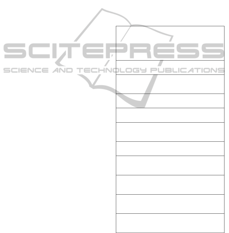
Table 1 mentions the usability parameters for time
taken to complete a specific task. A task is
considered as specific action that needs to be
completed to satisfy certain set of requirements. For
example, adding beneficiary account, performing
money transfer, making chequebook request,
navigating through the screens, etc. are tasks that
need to be completed. The time taken to complete
the task is measured using specific number of clicks
needed on the mobile phone to complete it.
Table 1: Time taken to complete task.
A1 - Account summary (using SIM, IMEI and other device
information without disclosing any Personally identifiable
information), nearest ATM/Branch, and contact
information of call centre (with option of click to call)
should be available without login using account number
and password
A2 - Maximum five fields should be sought from the
customers while completing a form in the screen
A3 - Screen navigation should start with more familiar
fields(amount to transfer/deposit, deposit period,
beneficiary name, account number, IFSC code, etc.)
A4 - Based on user’s previous actions, there should be an
option to set user/default favorites
A5- Breadcrumbs should be available to keep users
informed on the navigation
A6 - Labels of the fields should be in layman languageand
unambiguous for customer rather using bank specific
terminology
A7 - The option for “Select All” or “Delete All” should be
removed
A8 - Banking operation that started on a desktop, branch or
ATM should continue over the mobile app without keying
in data again
A9 - Mobile app registration should not require going to
bank branch and can be loaded from authorized app stores.
The registration should be free of any SMS charges
A10 - Sensitive information as date of birth, customer
account number that are already known should not be
requested in the app
A11 - Related fields should be grouped together(for
example, beneficiary, user account details, etc.).
Alsoknown fields should be pre-populated
4.2 User Interface Display Parameters
The font size/type, display colours, controls size and
ENASE2015-10thInternationalConferenceonEvaluationofNovelSoftwareApproachestoSoftwareEngineering
316
labels can change the user perception on the app.
Though each individual has their own liking for a
colour, font and other display parameters, the
implementation of suggested parameterscan enrich
user experience with respect to the interface of the
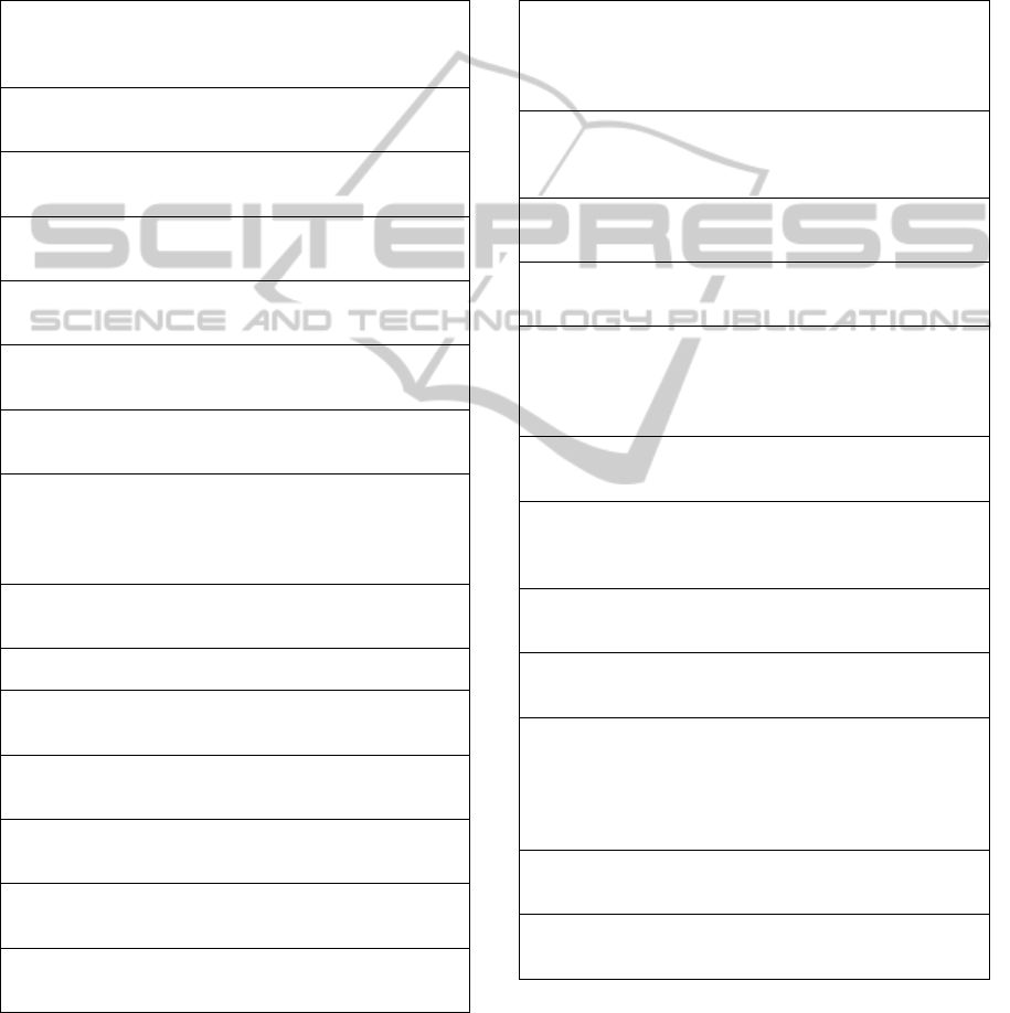
mobile banking app. Table 2 provides the
parameters for user interface display.
Table 2: User interface display parameters.
B1 - Colour combination in foreground and background
should be consistent across screens and contrasting
without any gradient/progressing colours
B2 - Text information should be in mixed/sentence case
instead of upper case
B3 - Avoid pagination, vertical scrolling and horizontal
scrolling
B4 - Text in text boxes should be in single line and not
spread across multiple lines
B5 - Measures for size of button, textbox and other
controls relative to screen size instead of pixels
B6 - There should be bank logo, title page and frame on
every screen
B7 - White spacing between fields should be sufficient
to view labels without overlapping
B8 - Language used should be simple and consistent
with no long sentences and paragraphs in the screens.
Having local languages based on user preference would
be highly beneficial for users
B9 - There should be clear character spacing avoiding
any overlaps
B10 - Bold text should be used sparingly
B11 - The alignment of fields (left for text fields and
right for numbers) should be consistent
B12 - There should be left navigation available for
moving between menu options
B13 - There should not be any drag and drop based
features
B14 - The image icons should be tested for varying
resolutions (ldpi, mdpi, etc) and different OS
B15 - Apps should be built using HTML5 for
consistent look
4.3 Error Handling
As the mobile phone screens are smaller in size than
desktops and the user attention for detail on smaller
screens is difficult. It is important that apps are more
thoroughly tested for various screens and device
types and performance for various connectivity
options. It is important that appropriate error
messages are informed early rather later and thus
reducing the call or other modes of escalationsto
bank’s operations team.
Table 3: Error handling.
C1 - System messages should be classified as
Information (with text in Green/Blue color), Warning
(with text in Yellow color) and Error (with text in Red
color)
C2 - If a particular mobile device is not supported, an
error message should be displayed instead of allowing
the user to install and then showing an error message
C3 - Error messages while filling a form should be
displayed next to the fields and button
C4 - The message should provide the reason for error
and suggests the next possible action
C5 - Application should maintain user action
persistence and recovery from abrupt exits (network
connection lost, session timeout, battery down, memory
shortage, etc.)
C6 - System messages should be configurable values
rather hardcoded for change at a later point of time
C7 - Language of the error message should be in
layman languageand easy to understand and avoid
displaying any bank specific error messages
C8 - Error messages while loading a page should be at
the top of the screen
C9 - The help icon should always be available and
contextual to the screen
C10 - The app should be tested for varying network
bandwidth, device models (make and screen size),
flip/bump, back button and other buttons on the device,
stylus, trackball/pad, swipe operations, screen rotation,
Mobile Keys, Battery consumption and memory usage
C11 - The app should have an option for user to report
the error
C12 - The version updates should be done on regular
basis and ensured to keep past favorites intact
4.4 Evaluating Usability Parameters
Implementation
Some of the usability parameters listed are
applicable for web banking applications as well.
MobileAppUsabilityIndex(MAUI)forImprovingMobileBankingAdoption
317
Parameters A2-A6 and A11 suggested for “time
taken to complete task”, B2 suggested for “user
interface display” and C1, C3, C4 and C6-C9
suggested for “error handling” are more relevant for
mobile banking interfaces.
Based on the response to the recommendations,
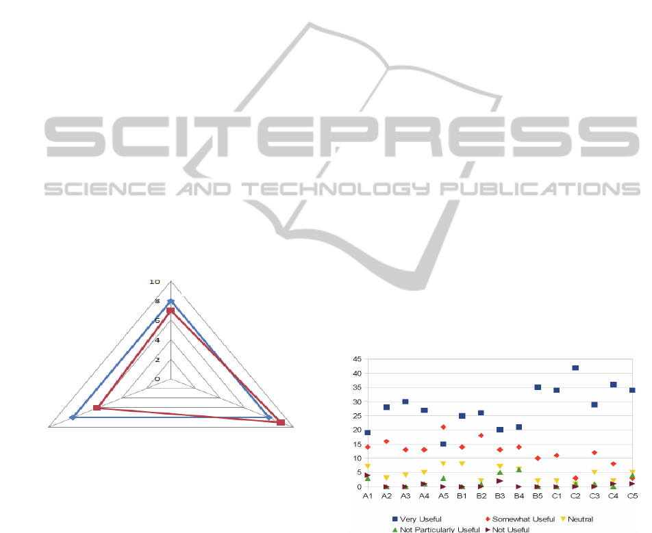
the banks should scale the implementation of
usability parametersusing the spider diagram as
shown in Figure 3. In the figure the darker line
represents a reference benchmark and grey line is
the MAUI values of a banking app. MAUI value can
be computed as:
MAUI = (P
c
/P
n
) * scale
(1)
where P
c
is the number of conformed parameters, P
n
is the total number of parameters used for assessing
usability. In our paper, for sake of simplicity, MAUI
is measured on a scale of 1-10, 10 being the highest
and 1 being the least. Since the goal is to provide a
basis for standardizing usability rather than measure
the relative importance of one parameter over
another, each recommendation parameter is treated
equally by assigning one point each (at times this
may be context driven and relative weights may be
assigned to each parameter) and measured against a
scaling factor.
Figure 3: MAUI parameters.
For example, if there are 15 parameters and about 11
parameters are met by the bank, the index can be
calculated as (11/15) * 10 giving a value of 7.3. The
score on time taken to complete task, user interface
display parameters and error handling are plotted on
a spider diagram shown in Figure 3.
The figure shows a benchmark/desirable score
for each of the axis as 8.0. We believe that a
threshold value of 8.0 provides a reasonable
assurance that the mobile banking app provides good
to very good user experience. Precise benchmark
values and assessment agencies/organizations to
assess the conformance can be established once the
rate of adoption of mobile banking apps shows a
steady increase. In addition, conformance of
parameters can also be further broken down into
multiple levels rather than the binary value of “Yes”
or “No” shown in this paper.
5 APPLICABILITY OF
RECOMMENDATIONS
The applicability of MAUI is validated through a
survey conducted (Google report on the Mobile App
Usability survey, 2014) with Chief Information
Security officers to ensure that the suggested
usability parameters have reasonable security.
Mobile banking channel managers having
responsibility of running mobile banking business,
technology managers from the banks and IT services
industry involved in the development of mobile apps
for the banks also participated in the survey. As the
survey participants consisted ofsenior decision-
making personnelin the banks and other relevant
organizations, a detailed survey could have taken
away their interest to participate. Hence a short
survey for first five key parameters from Table 1, 2
and 3 for each of the focus areas (time taken to
complete task, display parameters and error
handling) was conducted.There were 51 respondents
in total. The responses of the survey are shown in
Figure 4.
Figure 4: Responses to MAUI survey.
We used Likert scale (Very Useful - 5, Somewhat
Useful - 4, Neutral - 3, Not Particularly Useful - 2
and Not Useful - 1) to capture the response on the
various parameters. The average score is 4.39/5, the
lowest scores are 3.87 and 3.94 and the highest are
4.83 and 4.7. The summary of responses is shown in
Figure 6 and the detailed view of results is available
at (Google report on the Mobile App Usability
Error handling
User interface
display
Time taken to
complete task
ENASE2015-10thInternationalConferenceonEvaluationofNovelSoftwareApproachestoSoftwareEngineering
318

survey, 2014).
Following were some of the comments from
respondents.
“it will be really helpful as some of the banks have
really good mobile banking apps, while others don't
have that good apps. So if it is standardized then
user experience will be good”
“These will definitely increase the user experience.
Consistency in colors and font will increase
usability.”
“This Mobile Banking App Usability parameters if
adopted ,it will be very useful for the users. All these
parameters are really very useful & helpful for
mobile banking users in terms of saving time and
ease of operations.”
“Yes these would be very useful. Especially some
sort of intelligence from the app with regards to
error handling and saving the favourite activities of
the user.”
“These features may provide ease of operation to
customers. Uniformity across all banks would also
be helpful for customers.”
“Good initiative to improve mobile banking”
Some additional comments to enhance/modify the
suggested parameters were also provided:
“Vertical scrolling is good but not the horizontal
scrolling”
“The first question: ‘Account summary without
login’ may not be good idea”
Overall, the survey respondents seemed to agree the
need for such parameters. Some of the comments
specifically seemed to point out that the parameters
can in fact be applied to most Human Computer
Interfaces. Also, there were some comments from
respondents to ensure security was not compromised
while improving mobile banking app usability.
6 CONCLUSIONS
MAUI guides banks to improve usability and
thereby increase adoption rates. Banks could use
MAUI for baselining the currently deployed app and
increase the adoption with an improved MAUI and
perform the cost benefit analysis. These parameters
will be shared with RBI and BIS for establishing
usability standards for mobile apps. The MAUI will
further be refined to take the following aspects into
consideration:
Rather than binary conformance value,
levels of conformance will be introduced.
International leading mobile banking
applications will be studied and an
appropriate threshold MAUI value will be
established.
By further refining MAUI, we plan to build asemi-
automated tool to measure MAUI.
The accessibility requirements for different age
groups and differently abled people would also be
part of the future scope for further improving mobile
banking apps adoption.Improving usability is a
constant journey with changing customer
experiences and technology innovation, hence, it is
recommended for banks to review the usability
requirements on a yearly basis monitoring the
feedback on app stores and the customer queries
being handled by bank operations team. The MAUI
could be extended to apps that banks are planning to
deploy for internal stakeholders and also for any
organization building mobile apps for enterprise
needs. Better usability of mobile apps improves
customer loyalty and hence customer stickiness to
the bank.
ACKNOWLEDGEMENTS
We thank Mobile Banking users, the mobile channel
managers and chief information security officers for
responding to the survey and providing their views
on the usability parameters.
REFERENCES
Apitz, G., Guimbretière, F. and Zhai, S.
(2008).Foundations for designing and evaluating user
interfaces based on the crossing paradigm. ACM
Transactions on Computer Human Interaction, 17(2).
Bostr, F. (2008). Capricorn - an intelligent user interface
for mobile widgets. In: 10th international conference
on Human computer interaction with mobile devices
and services. ACM.
Conn, B. (2014). The evolution of Mobile Marketing in
India: Current Trends and Best Practices. IAMAI
Mobile Marketing Summit report.
Developer.apple.com, (2014). iOS Human Interface
Guidelines: Designing for iOS. (online) Available at:
https://developer.apple.com/library/ios/documentation/
userexperience/conceptual/mobilehig/ (Accessed: 28
Nov. 2014).
Developer.android.com, (2014). Mobile App Design from
Android. (online) Available at: https://developer.
android.com/design/material/index.html (Accessed: 28
MobileAppUsabilityIndex(MAUI)forImprovingMobileBankingAdoption
319

Nov. 2014).
Docs.google.com, (2014). Google report on the Mobile
App Usability survey. (online) Available at:
https://docs.google.com/forms/d/1ZYAOQF2sAAEw
YR26bbp8B3_vCZaJMtaKVUaWQK3ULZU/viewan
alytics (Accessed: 28 Nov. 2014).
Ergonomics of Human System Interaction – Guidance on
World Wide User Interfaces. (2011). ISO 9241-151:
ISO/TC 159/SC.
Fitts, P. (1954). The information capacity of the human
motor system in controlling the amplitude of
movement. Journal of Experimental Psychology,
47(6), pp.381-391.
Harrison, R., Flood, D. and Duce, D. (2013). Usability of
mobile applications: literature review and rationale for
a new usability model. J Interact Sci, 1(1), p.1.
Miller, G. (1965). The magical number seven, plus or
minus two.Psychological Review 63 (2): 81-97, 1956.
Msdn.microsoft.com, (2014). Usability Guidelines.
(online) Available at: http://msdn.microsoft.com/en-
us/library/bb158578.aspx (Accessed: 28 Nov. 2014).
Newell, A., and Rosenbloom, P. S. (1993). Mechanisms of
skill acquisition and the law of practice.In J. R.
Anderson (Ed.), Cognitive skills and their acquisition
(pp. 1-55). Hillsdale, NJ: Erlbaum.
Nielsen Norman Group. Mobile Website and Application
Usability | Nielsen Norman Group Report.
R. Khan, H. (2012). Customizing mobile banking in India:
issues & challenges. In: FICCI-IBA (FIBAC) 2012
Conference on-“Sustainable excellence through
customer engagement, employee engagement and right
use of technology”.
RBI, (October 2014)List of Banks permitted to provide
Mobile Banking Service in India - Report from
Reserve Bank of India (2014) (Online) available
at:http://www.rbi.org.in/scripts/bs_viewcontent.aspx?I
d=2463 (Accessed: 28 Nov. 2014).
Banks wise volumes in
ECS/NEFT/RTGS/MobileTransaction- Report from
Reserve Bank of India (2014). (Online) Available
at:http://www.rbi.org.in/scripts/NEFTView.aspx
(Accessed: 28 Nov. 2014).
Rosati, L (2013). How to design interfaces for choice:
Hick- Hyman law and classification for information
architecture. In Slavic, A.; Salah, A.; Davies, C.
Classification and visualization: interfaces to
knowledge: proceedings of the International UDC
Seminar. The Hague, The Netherlands. pp. 125–138,
Seongil, L. (2009). Mobile Internet Services from
Consumers’ Perspectives. International Journal of
Human- Computer Interaction, 25(5).
Statista, (2014). India: mobile phone internet user
penetration 2012-2018 | Statistic. (online) Available
at: http://www.statista.com/statistics/309019/india-
mobile-phone-internet-user-penetration/ (Accessed: 28
Nov. 2014).
ENASE2015-10thInternationalConferenceonEvaluationofNovelSoftwareApproachestoSoftwareEngineering
320
