
Time-series Application on Big Data
Visualization of Consumption in Supermarkets
Catarina Mac¸
˜
as
1
, Pedro Cruz
1
, Hugo Amaro
1
, Evgheni Polisciuc
1
, Tiago Carvalho
2
,
Frederico Santos
2
and Penousal Machado
1
1
CISUC, Department of Informatics Engineering, University of Coimbra, Coimbra, Portugal
2
Sonae, Maia, Portugal
Keywords:
Small Multiples, Time Series, Clustering, Consumption Analysis, Big Data, Visualization.
Abstract:
The evolution of technology is changing how people work within organizations. Information about customer
consumption leads to a new era of business intelligence, wherein Big Data is analyzed to improve business.
In this project we apply information visualization in the context of Big Data for product’s consumption. The
aim of this project is to visualize the evolution of consumption, to detect typical and periodic behaviors and
emphasize the atypical ones. In this article we present our workflow—from finding periodic behaviors to
create a final visualization using time-series and small-multiples techniques. With the final visualization we
are able to show consumption behaviors and highlight the deviations from typical consumption days.
1 INTRODUCTION
With the advance of technology, and the burst of in-
formation, the age of Big Data emerged and enabled
the access to unprecedented amounts of data in new
contexts (Zhang et al., 2013; Berkovich and Liao,
2012). Consequently, Big Data is changing how peo-
ple work within organizations and intensifying the
ability to make decisions based on data (Rajpurohit,
2013). Information visualization enables people who
work on business intelligence to present, synthesize,
and interpret this complex amounts of information
(Keim et al., 2013). Visualization also provides a
powerful way to make sense of data by mapping its
attributes to visual properties such as position, size,
shape, and color (Fisher et al., 2014). The main goal
for this project is to: (i) visually explore the consump-
tion evolution over time; (ii) detect periodic behav-
iors; (iii) emphasize the atypical behaviors caused by
temporal events, such as Christmas; and (iv) create a
visualization that enables the comparison of different
days. This visualization uses efficiently the display
space, maximizing data density and minimizing the
use of ink (Tufte, 1991).
In this article we describe an application of the
time-series visualization technique in a Big Data con-
text. The data refers to the consumption values in 729
hypermarkets and supermarkets, with every transac-
tion from May of 2012 to April of 2014 (the dataset is
detailed in section 3). Our time-series application vi-
sualizes the deviations in relation to typical consump-
tion values across several product categories. To at-
tain this, we extract the baseline that represents the
typical week across several product categories (the
approach is detailed in section 4). In addition, we use
the small-multiples technique to enhance the compar-
ison among consumption days while providing at the
same time a general overview of the annual behaviors.
2 TIME-SERIES
Analyzing quantitative data involves focusing on one
or more relationships between values. In this project,
we are interested in examining how a set of value
changes through time. Time-series are a special
case of the broader dependent-independent variable
category, in which time is the independent vari-
able (Cleveland, 1985). Time-series charts represent
time, where the dependent value can assume different
shapes such as lines, dots, bars, or areas that fluctu-
ate over time. There are many examples of this tech-
nique, such as the Horizon-Graphs (Heer et al., 2009),
and History Flow (Vi
´
egas et al., 2004), and many oth-
ers can be found in Visualization of Time-Oriented
239
Maçãs C., Cruz P., Amaro H., Polisciuc E., Carvalho T., Santos F. and Machado P..
Time-series Application on Big Data - Visualization of Consumption in Supermarkets.
DOI: 10.5220/0005307702390246
In Proceedings of the 6th International Conference on Information Visualization Theory and Applications (IVAPP-2015), pages 239-246
ISBN: 978-989-758-088-8
Copyright
c
2015 SCITEPRESS (Science and Technology Publications, Lda.)
Data by Aigner et al. (2011). The first known time-
series using economic data was published in 1786
in William Playfair’s book, The Commercial Politi-
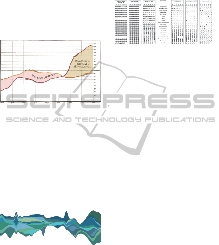
cal Atlas. In one of his charts (Figure 1) it is repre-
sented the balance of trade using the difference be-
tween the import and export time-series (Tufte and
Graves-Morris, 1983).
Figure 1: William Playfair’s time-series of Exports and Im-
ports of Denmark and Norway, published in his Commercial
and Political Atlas, 1786 (Tufte and Graves-Morris, 1983).
Another notable example of time-series is the
Streamgraph (Byron and Wattenberg, 2008) that
stacks areas to represent changes over time for dif-
ferent categories while conveying total volumes. Its
layout emphasizes legibility of individual layers, ar-
ranging them in a distinctively organic form. How-
ever, this type of graph has some problems that we
intend to avoid. First, since there is no space between
the stacked areas, the changes in one area influence
the shape of the surrounding areas, leading to a miss
interpretations of the variations. Furthermore, when
the number of areas to represent increases, the read-
ability of the heights of each area and the discernibil-
ity among others tends to be extremely difficult (Fig-
ure 2).
Figure 2: Streamgraph generated with a total of 20 layers it
is difficult to compare the different values through time.
Another form to create a time-series visualization
is through the use of small-multiples. Small-multiples
are small illustrations of postage-stamp size, indexed
by category that can be ordered by a variable not used
in the single image itself (Tufte, 1991).
One example of small-multiples can be seen in
Figure 3 that shows the frequency-of-repair for au-
Figure 3: Consumer Reports, 47 (April 1982). This graph
makes a comparison between manufacturers and types of
cars, year and trouble spots.
tomobiles during 6 years (Tufte and Graves-Morris,
1983). In this visualization each table represents a
car, each column represents a year and each row rep-
resents the evaluation of the typical trouble spots in
a car. Each circle is representative of an evaluation
that goes from Much better than average (white cir-
cle) to Much worse than average (black circle). With
this visualization, we can compare and distinguish vi-
sually which car had more problems and how these
problems evolved over time.
Small-multiples enforce visually the reader to im-
mediately, and in parallel, compare the differences
among objects, relying on an active eye to select and
make contrasts rather than on bygone memories of
images from different pages (Tufte, 1991). More ex-
amples of this type of visualization can be found, such
as the Flowstrates (Boyandin et al., 2011) and the cal-
endar based visualization of Van Wijk and Van Selow
1999. In this work it is used a clustering technique to
identity patterns and trends on multiple time scales.
To detect monthly patterns, Van Wijk and Van Selow
mark each day of the calendar with the color of the
cluster that most characterizes it.
3 DATA
The dataset of this project has o total of 278 GB for
2.86 billions of transactions in 729 hypermarkets and
supermarkets, from May 2012 to April 2014. A trans-
action represents a product acquired on a store, hav-
ing the following attributes: the date and time, the
product, store, and customer identifications, price and
quantity.
A transaction is directly associated to a customer
trough a unique customer card used in the transaction.
The cards can be shared among family members and
hence do not directly imply one customer per card.
The dataset refers to a total of 6.6 million unique cus-
tomer cards. In Figure 4 we can perceive that almost
one-third of the cards made less than 100 transactions
in the two years.
IVAPP2015-InternationalConferenceonInformationVisualizationTheoryandApplications
240
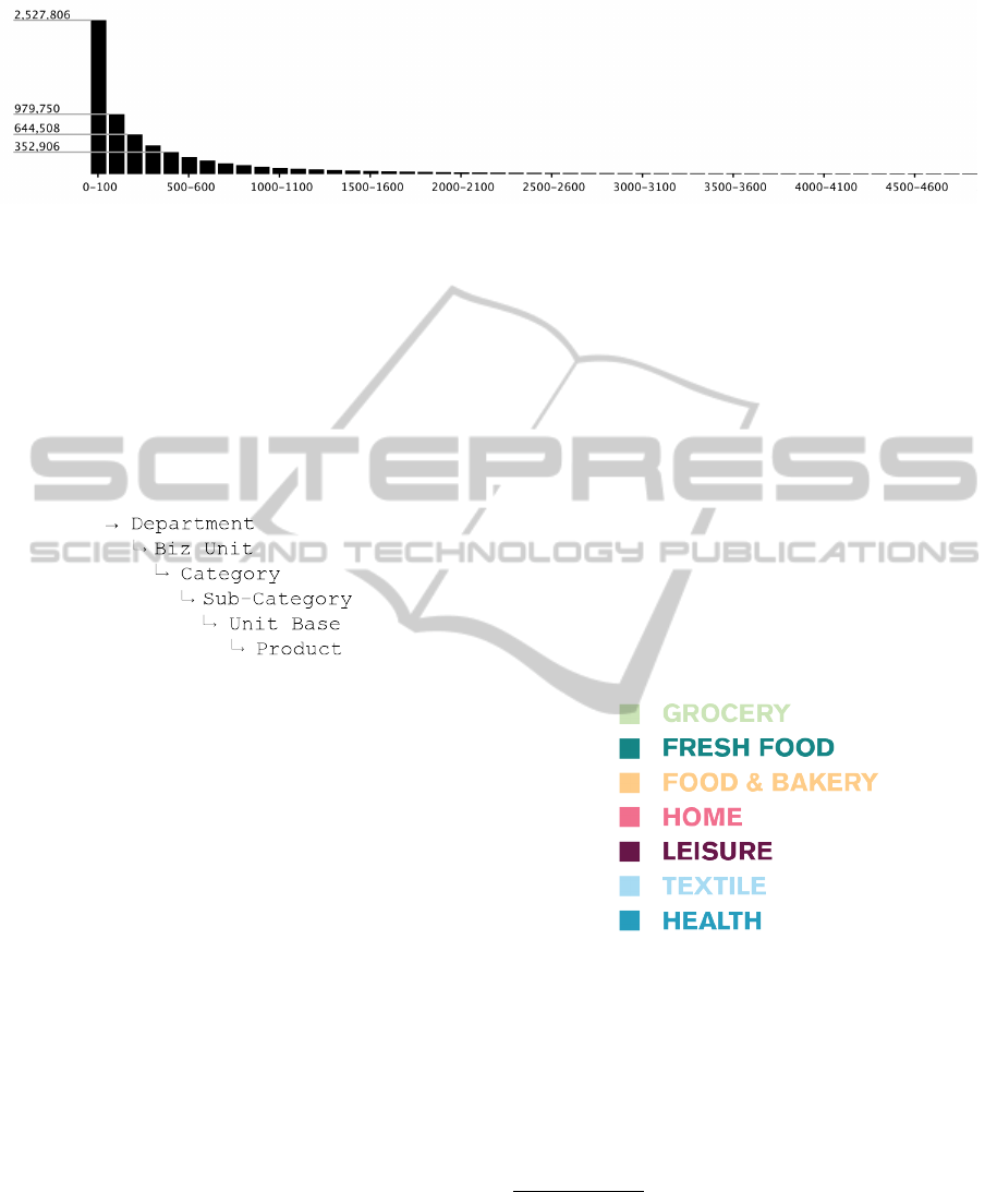
Figure 4: Part of the histogram of the number of customer cards (vertical axis) and the total of transactions (horizontal axis).
In this histogram we can see that approximately 2,5 millions of customer cards had made from 0 to 100 transactions in the
two years range. The histogram ends with a single card with approximately 19150 transactions.
The product identification is well defined within a
hierarchy of product categories with 6 levels, ranging
from the product itself, to the Department, as illus-
trated in Figure 5. For this application we are focus-
ing on the visualization of Departments and Business
Units, having a total of 7 Departments and 31 Busi-
ness Units.
Figure 5: Scheme of the product hierarchy.
4 DATA VISUALIZATION
The first step to create Big Data visualizations is of-
ten to preprocess and transform the data in order to
extract meaningful units (Keim et al., 2008). There-
fore, in order to process such amounts of data, we ag-
gregated each transaction per Business Unit and per
hour.
Initially we created a simple graph per Depart-
ment with all the consumption values sorted by time.
By doing this, we were able to extract important clues
of how the data behaves along time. Subsequently,
we created another visualization model so it could
be possible to see the deviations from a typical con-
sumption behavior. To do so, we defined a weekly
baseline, to which the deviations are visualized. We
extracted the baselines, first, based on averages, and,
after, based on the clustering of patterns. Our final
visualization applies the small multiples technique to
better compare the deviations of each day from the
baseline along time, enabling the detection of weekly
and yearly patterns.
4.1 Initial Approaches
As previously mentioned, our first approach dis-
plays the consumption values along time individu-
ally per each Department. There are a total of 7
different departments in the dataset: Grocery (bis-
cuits, cereals, frozen foods, hygiene and cleaning
products); Fresh Food (fresh meat, fish, vegetables
and fruits); Food&Bakery (bread, cakes and coffee);
Home (household essentials); Leisure (books, office
supplies, pet care and bricolage); Textile (clothing);
and Health (with products from nutrition to beauty).
Each category is identified by a color accordingly
with Figure 6.
Figure 6: Color identification of each Department. This
identification method is used to distinguish the different De-
partments.
We use Catmull-Rom splines
1
(Catmull and Rom,
1974) to represent the continuity of time in the data,
and to represent values across time-intervals, circum-
venting the discrete nature of bar charts.
Additionally, in order to efficiently explore the
1
Catmull-Rom splines are smooth parametric curves
that interpolate between a set of points, and are widely used
in computer graphics. This method does not require the def-
inition of additional control points for the curves since the
original set of points also makes up the control vertices for
the curve. When the control points are at regular intervals,
such as we use them, they do not generate cusps or self-
intersections.
Time-seriesApplicationonBigData-VisualizationofConsumptioninSupermarkets
241
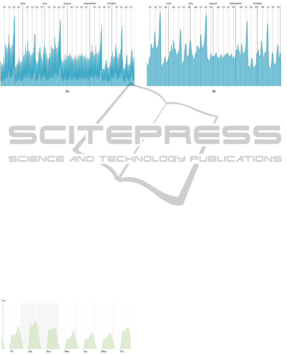
Figure 7: Visualization of the Health Department, from May of 2012 to October of 2014. In (A) we have an aggregation of
transactions at every one hour and in (B) the aggregation is by every 3 hours.
data, we implemented the following interactive fea-
tures for the initial graphs: the navigation through
time; and the possibility to expand or compress the
visualization time-window. In order to smooth the
high density of spikes (Figure 7), we made possible
to choose between several time aggregations: 1, 3, 6,
12 and 24 hours. Hence, we diminished the graphi-
cal noise, which better clarifies the representation of
general patterns.
After an initial analysis we can perceive a recur-
rent weekly behavior during most of the weeks. Cus-
tomers tend to consume less from Monday to Thurs-
day, and on Friday through Saturday consumptions
have a weekly maximum, beginning to drop during
Sunday. We found out that this weekly behavior is
generalized across all the Business Units. When look-
ing into shorter periods of time, such as a day (Fig-
ure 8), we also see that, in general, customers tend to
consume more in the end of the evening, from 16:00
to 20:00. Taking into account this periodic behavior,
it was necessary to create a mechanism to emphasize
atypical days. To determine an atypical day, first we
must define what is a typical day, and then visualize
the deviations from it.
Figure 8: Visualization of the Grocery Department, on the
first week of June of 2012, with an aggregation of transac-
tions at every 3 hours. With this visualization, easily we
can see that the customers tend to buy more at the lunch
time and in the evening.
4.2 Baselines
To visualize the deviations from typical consumption
we extracted a week-based baseline, for the time span
of the dataset using two methods: the average, and the
clustering of similar patterns. With this week-based
baseline, we can represent the deviation of a certain
hour in relation to the same hour of the same day
of the week of the week-based baseline. The base-
lines represent hourly data aggregations and hence the
week baseline has 168 points. The baselines were
computed for each Department and Business Unit.
The week baseline using the average is extracted
by distinguishing the hours for each day of the week,
for its 168 hours (Figure 9). Different Business Units
have differences among them. For example, in Frozen
Food, during the week people tend to buy more on the
evening, from 17:00 to 20:00, but during weekends,
the sales are higher in the beginning of the day. The
Coffee Shop is the Business Unit which differs more
from the others. In this Business Unit, we can see that,
unlike others, we have three main consumption mo-
ments, one in the morning, from 9:00 to 11:00, other
in the middle of the day, from 13:00 to 15:00, and
the third on the evening, from 17:00 to 19:00. Ev-
ery week-based baseline of a Department or Business
Unit is normalized from its minimum consumption
in an hour to its maximum consumption in an hour,
across all the dataset.
Considering that each week has abrupt differences
in consumption profiles through the dataset time span,
it would be naive to rely only on averages to ex-
tract accurate baselines. That way, we further ex-
tracted baselines based on clustering of the most fre-
quent consumption patterns. Like in averages, we
extracted clustered week baselines for each Depart-
ment and Business Unit. Considering the previous
IVAPP2015-InternationalConferenceonInformationVisualizationTheoryandApplications
242
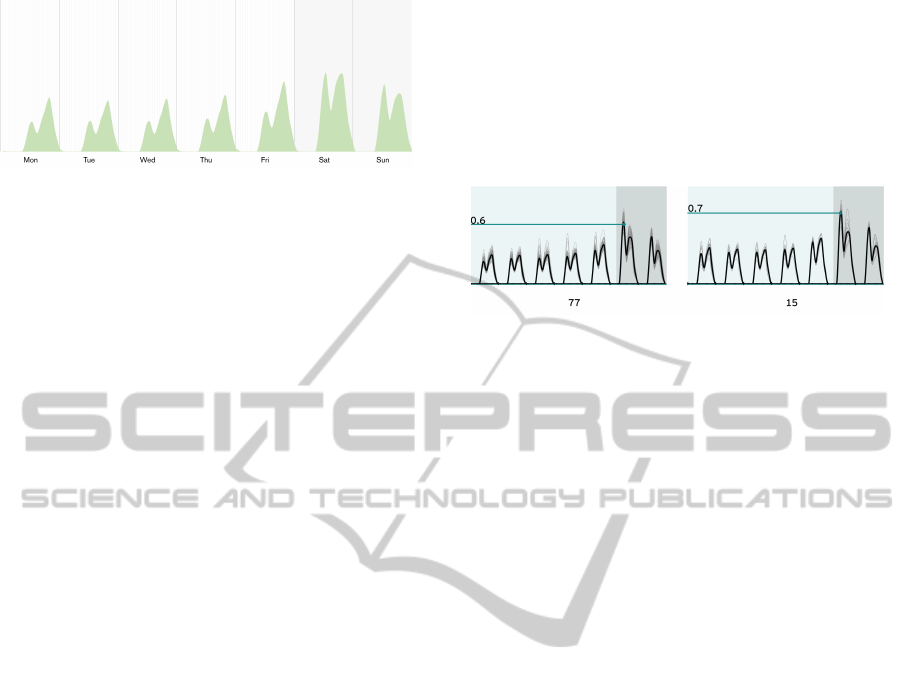
Figure 9: Visualization of the week-based baseline of the
Frozen Food Business Unit of Grocery Department. This
was created through average.
time aggregation (per hour) each individual week is
represented by a sequence of 168 values. The values
are normalized as mentioned before. The clustering
problem then reduces to comparing those sequences
among themselves, and grouping similar sequences to
determine clusters of week. Having two sets A and B,
our measure of similarity s=1−d, where d is the Eu-
clidean distance.
Two sets are considered similar if d is less than
a certain threshold. Our clustering approach is a
centroid-based algorithm that assigns points to a clus-
ter accordingly with their distances to the cluster’s
centroid. S is the set of every day or every week in
consumption values in the dataset. A sequence S
i
∈
S is then a sequence of n=24 values for a day or a
sequence of n=168 values for a week. If O
j
is the
set of all the j-th values of the sequences in S , then
the centroid of S is the sequence (
¯
O
j
)
n
j=1
, where
¯
O
j
is the arithmetic mean of the values in a set O
j
.
Given a set S and a threshold eps, our algorithm
computes a list of clusters as follows:
CLUSTER(S, eps)
create list C
for each set p in collection S
lastDist = 1
ct = null
for each cluster c in C
d = dist(p, c.centroid)
if d < eps and d < lastDist
lastDist = d
ct = c
if ct != null
add p to ct
compute centroid for ct
else
create cluster nc with p
add nc to C
return C
When running the algorithm for every week of
each Business Unit and Department, the baseline is
defined by the centroid of the cluster with more el-
ements, meaning, the representation of the most fre-
quent type of pattern.
In Figure 10 we have a small multiples visualiza-
tion of the first two clusters of the week-based base-
lines of Fruits and Vegetables. As we can see, the
typical week represent 73% of the 105 weeks. The
clusters are sorted by number of individuals, going
from the cluster with more individuals, to the cluster
with less individuals. In this example, we can see that
the highest consumption moments tend to occur on
the weekends.
Figure 10: Small multiples visualization model applied to
the week-based baseline. The weekends are marked with
a darker color. Here we present two clusters of Fruits and
Vegetables of Fresh Food Department. The values are nor-
malized by the highest consumption value of the Business
Unit in all dataset.
Having two algorithms to detect the week-based
baseline, we compared the results obtained by both.
To do so, we calculated the deviation between each
baseline in all dataset (Figure 11). Comparing the
baselines of the two methods, the cluster baseline has
the lowest deviations. When grouping weeks we are
able to determine main clusters which centroids are
more balanced to the dataset that its simple average.
4.3 Time-series and Small Multiples
With the week-based baselines determined for every
Department and Business Unit, we created a variation
of the previous visual approach to emphasize the de-
viations.
By subtracting the values of each period of time
to the baseline’s values in the same period, we get the
deviation length from the baseline in that period of
time. Having the baselines represented as a straight
line on the graph, we placed each resulting value of
the previous calculation above or below that line, de-
pending if the value is bigger or smaller then the base-
line value (Figure 12). This way we represent which
period of times is above or below the baseline and
how much it distances itself. It is important to notice
that this visualization is only representing how a day
is more or less different from the typical one.
We applied this visualization approach to every
Business Unit using the week-based baselines. For
example, the deviations from the typical consump-
tion for Culture are represented in Figure 13 were
consumptions were very high from August to Octo-
ber and also in December, probably caused, respec-
tively, by the beginning of school and the Christmas
Time-seriesApplicationonBigData-VisualizationofConsumptioninSupermarkets
243
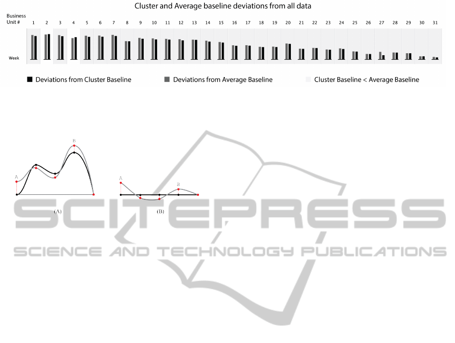
Figure 11: In this graph it is represented the average deviation from the week-based baselines created through the simply
average and the clustering methods with all dataset. Each column represents one of the 31 Business Units. When the cluster
baseline’s deviation is lower then the average baseline the corresponding area is filled with light grey.
Figure 12: On the left schematic we can see the baseline,
in black, and the consumption line, in grey. Here a set of
points are marked and the distance between them are the
deviations of the consumption values to the baseline. On
the right schematic, these deviations are translated to the
new visualization approach.
holidays. We can also see a drop of consumptions
between the days 24 and 29, which matches with the
Christmas period. With this visualization model we
managed to eliminate the periodic repetition, and em-
phasize moments of greater or lesser importance. Be-
sides the deviations are really clear and we can easily
understand what is above or bellow the baseline, it’s
difficult to compare the values.
To get a general overview of the deviations from
the baselines for the whole dataset we developed a
calendar view that improves the comparison among
deviations as well as better highlight the temporal mo-
ments when certain deviation pattern occurs. Since
this calendar view displays the overall consumption
in a day, we generated new week-based baselines
through clustering, where the consumptions are ag-
gregated by day.
In this calendar view, each month is positioned
from left to right, and the days of the week are po-
sitioned from top to bottom, from Monday to Sunday,
respectively. Each day of the month is placed on the
corresponding row, so, all week days in the visualiza-
tion are horizontally aligned. Each day is represented
by a rectangle (Figure 14). The top and bottom edges
of the rectangles represent, respectively, the lower and
higher consumption value of the represented Business
Unit or Department in all dataset. The baseline is
a black horizontal line positioned over the rectangle.
Since we are using a week-based baseline, for each
row of the visualization (from Monday to Sunday) the
line will be positioned at different positions, accord-
ingly to the baseline’s value for the corresponding day
of the week. From each baseline, we draw a rectan-
gle, with a height corresponding to the deviation in
consumption for the respective day, coloring it red, if
it is positive, and Persian green one, if it is negative.
With this method, we can represent all deviations in
a calendar view, emphasizing temporal patterns in the
deviations. With this visualization we can have two
levels of information: (i) a general overview of all
days where it is possible to see the highest deviations
among the different days, and (ii) a more local view to
compare how much the consumption of one day have
deviated from the baseline.
An example of this method can be seen on Fig-
ure 15, where we represent the consumption values
of the Business Unit Drinks for the 730 days, by us-
ing a week-based baseline created with the cluster-
ing method. We can say that the consumption in this
Business Unit does not have many atypical days. In
the two years we can see the same behavior: from
July to September and in December the sales tend to
be higher than the usual, probably due the summer va-
cations and Christmas. The calendar views were gen-
erated for each Department and Business Unit, but it
is our intent to generate more specific views for cat-
egories in the product hierarchy. With this last vi-
sualization model we can have a qualitative analysis
about the consumptions through time and understand
behaviors that tend to repeat through months and even
through years. It is easy to understand when the con-
sumption is a higher or lower value, and how the de-
viations tend to evolve.
5 RESULTS AND CONCLUSION
Big Data intensifies the ability to make decisions
within organizations, to discover new sales opportu-
nities and to improve the understanding of profitabil-
IVAPP2015-InternationalConferenceonInformationVisualizationTheoryandApplications
244
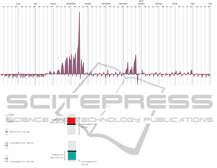
Figure 13: Visualization of the Business Unit Culture of Leisure, from June of 2012 to April of 2013, with an aggregation of
transactions at every 24 hours. If the baseline is more on the bottom of the graphic, it means that the deviations are higher
on the positive side. It is visible the people tendency to buy more on this Business Unit in December and on September,
coinciding with the beginning of school.
Figure 14: Scheme of the representation of a day in the Cal-
endar visualization.
ity across products and customers (Rajpurohit, 2013).
People who work on business intelligence started to
make use of visualizations to be capable of interpret
this complex amount of data (Keim et al., 2013). By
mapping data attributes to visual properties such as
position, size, shape, and color, visualization design-
ers leverage perceptual skills to help users discern and
interpret patterns in data.
For this project we applied information visualiza-
tion in the context of Big Data for product’s consump-
tions. We processed 2.86 billions of transactions for
730 days, generating representations of consumption
along time for 7 Departments and 31 Business Units.
Our objectives are: visually explore the consumption
behaviors over time; detect periodic patterns; empha-
size the atypical behaviors; and create a visualization
that enables the comparison of different days. This
visualization uses efficiently the display space, max-
imizing data density and minimizing the use of ink
(Tufte, 1991). First, we created a visualization capa-
ble to represent the general behavior of consumption
over time. The data had an elementary time aggrega-
tion, so it was possible to see the consumptions varia-
tion in a large time span. After an initial analysis, we
detected the repetition of a weekly behavior for most
of the weeks.
Having this periodic behavior, it was necessary to
create a mechanism to emphasize atypical days. To do
so, we created a weekly baseline, first with a simple
average, and then through clustering. With these two
techniques we concluded that the average baselines
tend to have higher values than the ones extracted
through clustering. This can be explained by the fact
that the simple average is more influenced by atypical
days than the clustering technique. We also calculated
the average deviation for the two techniques to all the
dataset and concluded that for week-based baselines
clustering shows lower deviations. Besides those dif-
ferences the two approaches displayed the same be-
havior through days and weeks, in general, consump-
tions were higher at lunch time and in the evening,
from 16:00 to 20:00.
We explored several approaches to visualize time-
series for consumption and culminated in a calendar
view that uses small-multiples for days. This calen-
dar view highlights the deviations from the baselines
along time, eliminating the periodic repetition, and
emphasizing moments of greater importance, while
enabling the comparison between days.
In the future it is our intent to create a tool that
highlights the products with higher deviations and en-
ables the user to browse through the calendar visual-
izations.
Time-seriesApplicationonBigData-VisualizationofConsumptioninSupermarkets
245
Figure 15: Visualization of the Business Unit Drinks of Grocery, from May of 2012 to April of 2014. With all 730 days being
visualized we can perceive some annual behavior. In December the consumptions tend to rise, specially in the end of the
month, and between July and September, they also tend to be higher then the week-based baseline.
ACKNOWLEDGEMENTS
This research is partially funded by: iCIS project
(CENTRO-07-ST24-FEDER-002003). which is co-
financed by QREN, in the scope of the Mais Centro
Program and European Union’s FEDER; Sonae Viz
— Big Data Visualization for retail.
REFERENCES
Berkovich, S. and Liao, D. (2012). On clusterization of
big data streams. In Proceedings of the 3rd Interna-
tional Conference on Computing for Geospatial Re-
search and Applications, page 26. ACM.
Boyandin, I., Bertini, E., Bak, P., and Lalanne, D. (2011).
Flowstrates: An approach for visual exploration of
temporal origin-destination data. In Computer Graph-
ics Forum, volume 30, pages 971–980. Wiley Online
Library.
Byron, L. and Wattenberg, M. (2008). Stacked graphs-
geometry & aesthetics. IEEE Trans. Vis. Comput.
Graph., 14(6):1245–1252.
Catmull, E. and Rom, R. (1974). A class of local inter-
polating splines. Computer aided geometric design,
74:317–326.
Cleveland, W. S. (1985). The elements of graphing data.
Wadsworth Advanced Books and Software Monterey,
CA.
Fisher, D., Drucker, S., and Czerwinski, M. (2014). Busi-
ness intelligence analytics. Computer Graphics and
Applications, IEEE, 34(5):22–24.
Heer, J., Kong, N., and Agrawala, M. (2009). Sizing
the horizon: the effects of chart size and layering
on the graphical perception of time series visualiza-
tions. In Proceedings of the SIGCHI Conference on
Human Factors in Computing Systems, pages 1303–
1312. ACM.
Keim, D., Qu, H., and Ma, K.-L. (2013). Big-data visual-
ization. Computer Graphics and Applications, IEEE,
33(4):20–21.
Keim, D. A., Mansmann, F., Schneidewind, J., Thomas, J.,
and Ziegler, H. (2008). Visual analytics: Scope and
challenges. Springer.
Rajpurohit, A. (2013). Big data for business managers—
bridging the gap between potential and value. In Big
Data, 2013 IEEE International Conference on, pages
29–31. IEEE.
Tufte, E. R. (1991). Envisioning information. Optometry &
Vision Science, 68(4):322–324.
Tufte, E. R. and Graves-Morris, P. (1983). The visual dis-
play of quantitative information, volume 2. Graphics
press Cheshire, CT.
Vi
´
egas, F. B., Wattenberg, M., and Dave, K. (2004). Study-
ing cooperation and conflict between authors with
history flow visualizations. In Proceedings of the
SIGCHI conference on Human factors in computing
systems, pages 575–582. ACM.
Zhang, J., Chen, Y., and Li, T. (2013). Opportunities of
innovation under challenges of big data. In Fuzzy Sys-
tems and Knowledge Discovery (FSKD), 2013 10th
International Conference on, pages 669–673. IEEE.
IVAPP2015-InternationalConferenceonInformationVisualizationTheoryandApplications
246
