
Inside Mall: Visual Analytics of Customer Behavior and Activities
Jens Opolka
3
, Patrick Riehmann
1
, Heiko Peter
2
and Bernd Froehlich
1
1
Virtual Reality and Visualization Research Group, Bauhaus-Universit
¨
at Weimar, Bauhausstraße 11, Weimar, Germany
2
Favendo GmbH, Goethestraße 3b, Jena, Germany
3
Fraunhofer IAIS, Schloss Birlinghoven, Germany
Keywords:
Embedded Flow Visualization, Customer Behavior Visualization, Customer Tracking, Floor Plan Visualiza-
tion, Indoor Map Visualization.
Abstract:
This paper presents a coordinated multi-view system consisting of visualizations for displaying customer be-
havior and activities in a shopping center environment based on indoor tracking information gathered by Blue-
tooth beacons. Different perspectives to find structures and hidden patterns within the data set are supported
including different customer flow visualization methods based on actual floor plans as well as abstract flow
graphs. These are linked and coordinated with Parallel Sets to gain insight into the specifics of the customer
base and with different time-oriented visualizations to show and to compare the different periods of customer
presence.
1 INTRODUCTION
The rise of the Bluetooth beacon technology has dra-
matically evolved indoor tracking. This cheap tech-
nology equips shopping centers with the ability to
track customer smartphones throughout the mall and
to enable location-based services indoors via smart-
phones. The data collected by the beacons, as well
as by the accompanying smartphone app, consists of
thousands of customers and hundreds of thousands of
customer events. The customer events reflect the in-
teraction of an individual with a shopping center. Size
and complexity of the data present a challenge to mar-
ket research. Furthermore, there are different parties
with various interests to consider. For instance, a store
owner (in a mall) might be interested in the activity of
his own store during a specific time of day. The man-
ager of a mall, on the other hand, might be more in-
terested in the pathing of all customers throughout the
mall. In the discussion with our industry partner, we
gathered a set of typical tasks and related information
needs such as
• Location planning for venues in order to draw cus-
tomers to less active areas: which areas of a floor
are the most active?
• Positional planning for advertisements (e.g. bill-
boards): what are the most prominent routes
through the shopping center?
• Identification of competing businesses or poten-
tial partners for cooperation: which venues attract
an equal group of customers?
• Staff and stock planning: when is the most active
time or season for a venue?
• Identification of potential times to run a campaign
in order to increase the number of customers:
when is the least active time or season?
• Creation of personalized offers for spe-
cific customer groups: what are the
specifics/characteristics of the customer base
of a venue?
• Evaluation of the success of campaigns: do
behavioral patterns exist for certain customer
groups?
• Identification of the possible need to improve cus-
tomer loyalty: how many customers visit a venue
more than once?
Our coordinated multi-view system for analyzing
customer behavior contributes genuine flow visualiza-
tions, particularly designed for different analytic sce-
narios, either embedded in floor plans as a directed
flow visualization for expressing consumer flows be-
tween selected shops or as routed flow visualizations
for investigating consumer traffic of multiple venues
in a vicinity or on an entire mall floor.
Additionally, we utilize abstract (non-embedded)
flow displays for finding relationships between shops
Opolka, J., Riehmann, P., Peter, H. and Froehlich, B.
Inside Mall: Visual Analytics of Customer Behavior and Activities.
DOI: 10.5220/0007284901830190
In Proceedings of the 14th International Joint Conference on Computer Vision, Imaging and Computer Graphics Theory and Applications (VISIGRAPP 2019), pages 183-190
ISBN: 978-989-758-354-4
Copyright
c
2019 by SCITEPRESS – Science and Technology Publications, Lda. All rights reserved
183
that are neither adjacent nor in the same vicinity, but
share the same consumer base. These novel visual-
izations are accompanied by established ones such
as Parallel Sets and calendar views for covering set-
based and temporal aspects.
2 RELATED WORK
Customer tracking is important in retail analysis
(Blattberg and Deighton, 1991). The ubiquity of
smart phones made tracking of individuals cheaper.
Despite that, indoor flow visualization has only been
discussed occasionally in a scientific context. Moi-
seeva (Moiseeva and Timmermans, 2010) gave a good
overview of approaches used for pedestrian model-
ing and the technologies used for data gathering. A
previous method for monitoring indoor movement of
pedestrians (Liebig and Xu, 2012) used special sen-
sors to capture pedestrian quantities, frequencies, and
paths. Cell-Phones (You et al., 2011) are an alterna-
tive for tracking shopping activities as well as the ac-
tual time spent shopping and the money thereby spent.
These efforts were expanded (You et al., 2014) for
collecting and analyzing data for entire retail trade ar-
eas. Chao et al. (Chao et al., 2013) specifically focus
on consumer flows embedded in a mall floor plan but
only with a limited number of stores (nine) with ar-
tificially generated data. A heatmap is offered but it
needs a switch between the two views. Berry (Berry,
2007) applied common approaches from GIS (geo-
graphic information system) to a single store by visu-
alizing movement patterns regarding spatial locations
of different product categories also with a heatmap.
Traditional flow map visualizations as presented
by Tobler in 1987 (Tobler, 1987) or more recently by
Phan et al. (Phan et al., 2005) show the outgo-
ing/incoming flow of a resource or a group of people
from/to a place of origin encoded as thickness of the
flow line, but only for simple and direct routings.
3 THE DATA SET
The data set was provided by our industry partner.
It contains two parts: First, the static, non-temporal
part of the data set that includes all objects needed
to model the shopping center itself and its customers;
nearly 200 different venues (stores, eateries, and fa-
cilities) and more than 170.000 customers. The sec-
ond part consists of the event database of all dynamic
aspects. It contains all customer related events which
represent customer activity connected to the shopping
center as well as the mobile app. It can be considered
as a stream of time-series data (timestamps) produced
by the user of the app (the actual customers) as well
as by the indoor beacons.
Besides the static/dynamic parts, we differentiate
(as orthogonal dimension) location-based data (e.g.
venues or venue related customer events) and non-
spatial objects (e.g. customers or categories). A
location-based object always includes specific coor-
dinates (latitude and longitude). Furthermore, the
data set contains several different kinds of object at-
tributes. Here we distinguish between continuous
data (e.g. timestamps), discrete, categorical data (e.g.
gender), and pseudo categorical / quantized data ( e.g.
age).
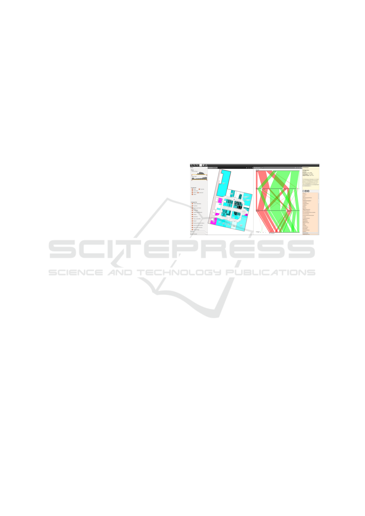
Figure 1: InsideMall with filter/option pane (left), the view
area (center) and info/selection pane (right).
4 GENERAL USER INTERFACE
The interface consists of the main area in the center,
the filter menu on the left, and the information pane to
the right (see Figure 1). The main area features a co-
ordinated multi-view setup in order to create multiple
views for looking at and comparing different visual-
izations and settings (e.g. different time windows) si-
multaneously. Each view can be split horizontally or
vertically to create a new viewport. A controlbar aids
in splitting, closing, and linking a view or switching
between the different visualizations.
On the left side, several filter options are offered,
mostly as scented widgets (Willett et al., 2007). For
instance, the scented histogram sliders are used to
restrict temporal maximum and minimum values in-
stantly in order to filter events in all visualizations
sensitive to it. Thus, we can observe and restrict the
temporal distributions at different granularity; for in-
stance, at day level (a Gaussian distribution with its
peak at 3 o’clock) and week level (weekends contain
more events than the work days).
The customer filters beneath are used to filter cus-
tomers by gender, mobile device, and age. Exfiltrat-
ing a customer will also filter out events triggered by
IVAPP 2019 - 10th International Conference on Information Visualization Theory and Applications
184
that customer. Additionally, we offer filters for the
different categories and venue types.
On the right is a typical info/selection pane con-
sisting of an info box to show additional information
for selected objects (description and frequencies of
customers for a venue) on top and a venue list used
to select different venues beneath it. The venue list
shows all stores and eateries. Venues of different cat-
egories and floors are colored differently to represent
the type of business. Selections in the list influence
the active visualizations.
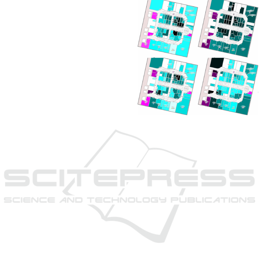
5 EMBEDDED FLOW
VISUALIZATION
The floor plan visualization (see Figure 2) is based on
the actual layout of the shopping center. The over-
all assumption is that the more customers enter the
area connected to a venue the more popular the venue
is. Of course one must consider appropriate dwell
times and time differences between the entry/exit area
events of persons simply passing through an area.
Stores are displayed in cyan and eateries in ma-
genta. Different data can be mapped on intensity (be-
ing sensitive to filtering the events in the filter bar)
such as the total number of visits for a venue. This
gives an indication of the overall activity or the aver-
age number of visits per customer (the total number
of visits divided by the number of customers that ever
visited the store) which is related to customer loyalty.
The dwell time mode maps the total amount of time
customers spend in a zone within a certain time period
(adjustable in the left filter bar) or the average time a
customer spends in a venue. Additional labels show
the respective absolute numbers related to the current
mapping mode. Some interesting examples of typical
findings are shown in Figure 2.
In order to gain more insight into the movement
of customers (for instance, to follow a path of a group
of customers along a sequence of way points given
by the floor plan), a complex graph-like model with
one or many origins (the venues) is required. Some of
these way points may even be visited more than once
along the path, creating loops.
Direct Flow. In a shop-centered view the graph can
be separated with respect to the origin venues. Each
level of the subgraph may include nodes for each
venue in a shopping center. The level i of the sub-
graph shows all venues visited i venues after the ori-
gin venue (root node). The direct flow visualizes the
outgoing (or incoming) flow from a single venue to
Figure 2: The floor visualization can express the total num-
ber of visits (top left), average number of visits per customer
(top right), total dwell time (bottom left), and average dwell
time per customer (bottom right). The total number of visits
displays that the activity of customers is higher for venues
near the entrance of the floor to the right. However, the av-
erage visits of customers for each venue (bottom right) in-
dicates a better distribution of visits across the whole floor.
For the total dwell time of customers (bottom left), we can
see a similar distribution to the total number of visits. It’s
not surprising that venues that are visited more often also
show higher dwell times. Furthermore average dwell times
per customer (bottom right) show that customers tend to
spend more time in larger venues covering a bigger area.
We can also observe high dwell times for restaurants and
coffee shops.
the next (previous) venue. In Figure 3 we can see the
first level of the outgoing flow from a selected store
to all subsequent stores visited by different groups of
customers. The line thickness maps the number of
customer transitions between the given shop to one
of the next shops. This allows analysts to get an
overview of where customers that frequent a partic-
ular venue are most likely to go afterwards.
However, if we want to display more levels in or-
der to show the second, third, or subsequent venues
being visited after the initial venue, the visualiza-
tion becomes increasingly difficult to read since the
straight flow lines cover not only a lot of the floor
plan underneath but also produce a lot of crossings
with each other. This makes it very difficult to follow
a specific path of the flow.
Using color gradients for expressing the direction
improves the situation but if more than two levels of
the flow layout are displayed even these gradients do
not help to overcome the visual problems caused by
the massive overplotting of the flow lines.
Reducing the number of levels would mitigate the
Inside Mall: Visual Analytics of Customer Behavior and Activities
185
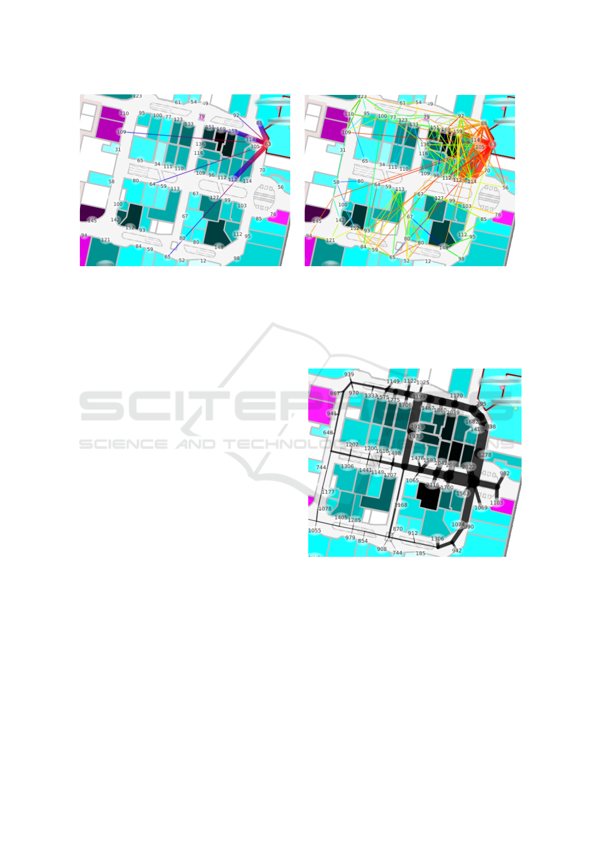
Figure 3: Direct outgoing flow for a selected store, comparing the flow for one level (left) and 20 level (right).
effects of overplotting but does not entirely solve the
problem. We offer several filters in the left filter pane
such as an area duration threshold filter. This de-
creases the number of events that contribute to the
flow lines. We can also use a tree filter in order to fil-
ter paths traversed by a limited number of customers
in favor of dominant flow strands.
Routed Flow. A routed flow aids in avoiding over-
plotting of the flow lines and not obscuring the venues
in the floor plan by creating the flow lines along a
predefined path which follows the real corridors of a
shopping center and thus approximates the actual path
a customer would take (see Figure 4). An individual
path depicts a possible unique path through the shop-
ping center. The width or weight of an edge between
two nodes represents the number of customers who
have taken this path. The underlying graph structure
is created upon nodes for each store and additional
dummy nodes along the aisles (see Figure 5). The
number of customer events at consecutive venues are
encoded by the width of the edges .
Each edge of the graph is initialized with zero,
meaning that no customer has taken this path. In
order to update the edge weights, we iterate over
each customer mall visit and increase all edges of
the shortest paths between the consecutively visited
venues by one (considering appropriate dwell or du-
ration times at the venues). By doing so we create
a binning/summarization of the approximated paths
customers in the mall have taken which reveals the
predominant routes throughout the mall.
Pairwise Flow. The pairwise flow layout was in-
spired (Chao et al., 2013) and shows a straight flow
line for each pair of venues. The thicker a flow line is
drawn, the more often customers have been in either
venue after visiting the other one (a transition from
one venue of a pair to the other exists). Even though
this seems to work very well in the setting described
in the original paper, it does not work in a bigger mall
setting where stores are not arranged strictly opposite
of each other (as in Chao’s paper).
Figure 4: Routed flow for a selected store (top right).
One might argue that a curved drawing of the flow
lines could enhance the legibility of this approach but
even then crossings cannot be avoided (see Figure 6
left). As with the direct flow, reducing the number
of lines by filtering helps (see Figure 6 right); for in-
stance, drawing only lines for pairs with a minimum
number of transitions or filtering the events by the
time a customer spends in an area.
Comparison. The direct flow layout shows the tran-
sitions from one selected venue to the next for a subset
of customers. Multiple customers with the same tran-
IVAPP 2019 - 10th International Conference on Information Visualization Theory and Applications
186
sition are bundled into one flow line. For each origin
venue it is possible to follow the sequence of venues
visited by a group of customers.
Figure 5: Routed flow with underlying graph structure.
Venue nodes are shown in red, dummy nodes are blue.
In the routed flow variant, routes represent bins
that are incremented when a customer follows a spe-
cific path to another venue. Given the line width it
is quite obvious which routes/directions were mostly
taken after visiting a particular venue, but the infor-
mation about the actual sequence of venues cannot
be shown. For example, for an origin store it is no
longer possible to discern how many customers vis-
ited a target store directly after visiting the origin
venue compared to the number of customers who vis-
ited the target store two venues later. In the routed
flow variant the overall path is the focus (and not the
order in which stores are traversed). Interestingly, the
quality/precision of the visualization increases with a
lower area duration threshold setting because, with a
lower threshold, more area events are taken into con-
sideration which allows for a better tracking of the
actual path taken by a customer. In contrast, for the
direct flow variant where the direct transition between
stores is the focus and the actual path between two
stores is not important, the quality of the layout im-
proves with a higher area duration threshold because
the actual transition from one venue of interest (a
venue which is not only passed by a customer but ac-
tively visited) to the next venue of interest is shown.
Figure 6: Pairwise flow unfiltered (left) and filtered showing
the 50 biggest transitions between venues (right).
6 ABSTRACT FLOW
VISUALIZATION
The previously described flow methods aid in pre-
serving the mental map, but such an underlying plan
can be inflexible (for example, for showing the cus-
tomer flow across different floors). For instance, what
attracts customers after entering the shopping center
or a floor? Was the venue approached directly after
entering or was it approached only after visiting sev-
eral other stores? Such detailed information across all
floors is very hard to come by in the floor plan based
variants.
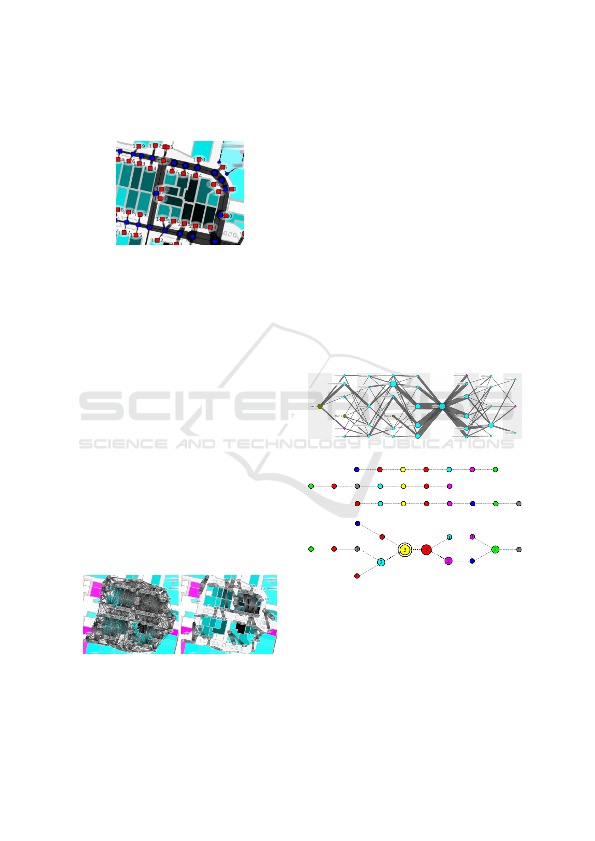
We propose a layered flow visualization where the
root node (focus node) for the origin venue is placed
at the center layer. To the right of the root node the
outgoing flow is depicted whereas to the left the in-
coming flow is shown. Each venue is represented as
a circle; its radius depending on the number of visits.
Edge thicknesses represent the number of customers
who visited the first venue in the current layer and a
second venue in the next one. Crossing minimization
is done after (Sugiyama et al., 1981).
Figure 7: Flow graph for a store.
Figure 8: Aligned event chains for 3 customers (top). Each
color represents a different venue. Weighted flow graph cre-
ated from event chains (bottom).
The possibility of showing both incoming and out-
going flow for the focus venue at the same time is an-
other advantage over the floor plan flow where it is
barely possible to show both flow directions distinc-
tively (especially if color coding is already used to
express the node distance in the directed embedded
flow, see Figure 3).
To create the non-embedded graph, first we align
all customer event chains to the first occurrence of the
Inside Mall: Visual Analytics of Customer Behavior and Activities
187
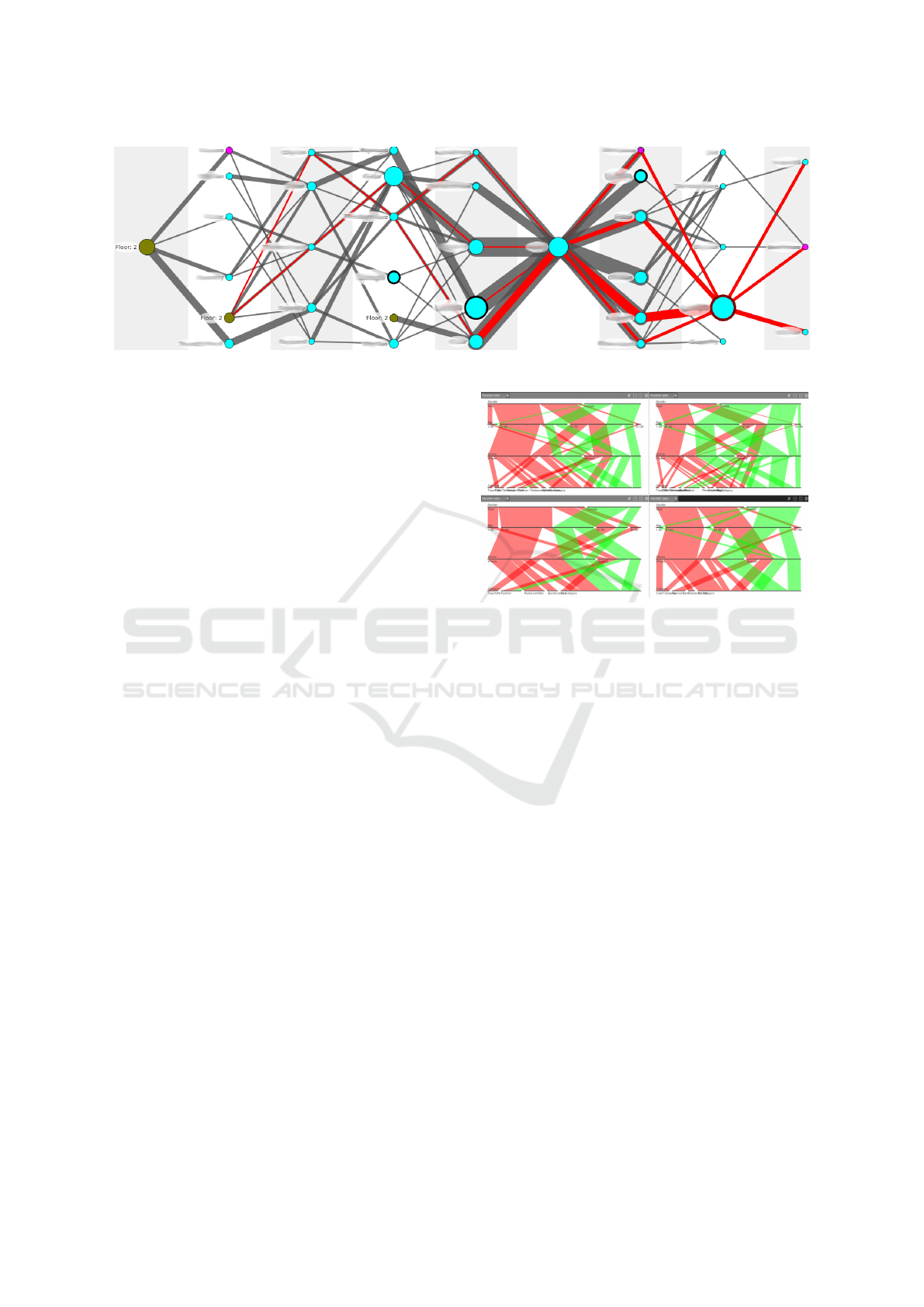
Figure 9: The flow through a store on the third layer is highlighted.
focus venue (shown in yellow, see Figure 8). Across
all chains, events of the same venue are combined
into one node The weight of the resulting node corre-
sponds to the number of occurrences of events for that
venue in that level. Events prior to the focus node are
used to create the incoming flow and following events
are used to create the outgoing one. The weight for an
edge connecting two nodes depends on the number of
equal consecutive event pairs with respective venues;
both at the correct layers.
The flow can be restricted by numbers of layers
which are shown for the incoming and outgoing flow,
by a maximum number of edges leaving a node, or
by a minimum number of events per node. The ini-
tial display is already restricted to emphasize the most
prominent flows since most users are not interested in
a path only a few customers took.
Apart from those global filter options, direct in-
teraction is still crucial. The incoming and outgoing
flow for any node highlighted by the mouse is traced
across all layers as previously proposed (Riehmann
et al., 2005) by highlighting the fraction of each edge
respective to the number of customers that also visited
the marked venue sometime in their event chain aside
from the focus venue (Figure 9). Double-clicking a
node will move it into focus and rebuild the graph.
A focus node can also be changed by selecting a
different venue in the sidepane or in the floor plan.
Horizontal zoom is implemented by increasing the
maximum number of layers shown at the same time.
Zooming in will decrease the number of layers shown
and vice versa.
7 PARALLEL SETS
The flow visualizations focus on customer movement
and activity. Parallel Sets (Bendix et al., 2005) were
integrated for analyzing the categorical specifics of
customer base.
Figure 10: Parallel Sets comparing the customer base for
two separate stores (top row) and for the same store week-
days (bottom left) and weekends (bottom right). Store A
has more male than female customers (top axis) and two
major age groups: 21-40 and 41-60. The younger group
consists of more men than women, whereas the older group
is balanced. Store B, to the right, has slightly more female
than male customers and at a younger age. The third axis,
showing the mobile devices, may indicate a higher budget
(iPhone users tend to have a higher income (Hixon, 2014)).
On the bottom row we can see two visualizations compar-
ing two different time ranges for Store A; weekdays left and
weekends right. Gender distribution is similar but age dis-
tribution is not. Weekdays two-third of the customers are
under 40. On weekends the customers tend to be older,
more between 41 and 60 years of age. The younger group
also consists of significantly more men than women as com-
pared to weekdays.
If no venue is selected, the visualization shows
the customer base for the whole shopping center by
default. Once a floor, store, or eatery has been se-
lected, the display is updated to show only those cus-
tomers who have visited the selected venues. This
way the customer base can be compared across dif-
ferent venues. An analyst can, for example, easily
use Parallel Sets to see whether the customer base of
a certain store includes more men or women and can
even compare these values for different time spans or
in comparison to other stores. The comparison of dif-
ferent sets of customers (e.g. for different stores) is
IVAPP 2019 - 10th International Conference on Information Visualization Theory and Applications
188
facilitated by the multi-view setup of the application.
This is simply done by opening a second viewport
showing the Parallel Set plot with the desired filtering
applied. By using this method an arbitrary number of
settings can be compared to each other (only limited
by the available screen space). Figure 10 shows two
Parallel Sets (top row) comparing the customer base
for two separate stores from the category ’Fashion’.
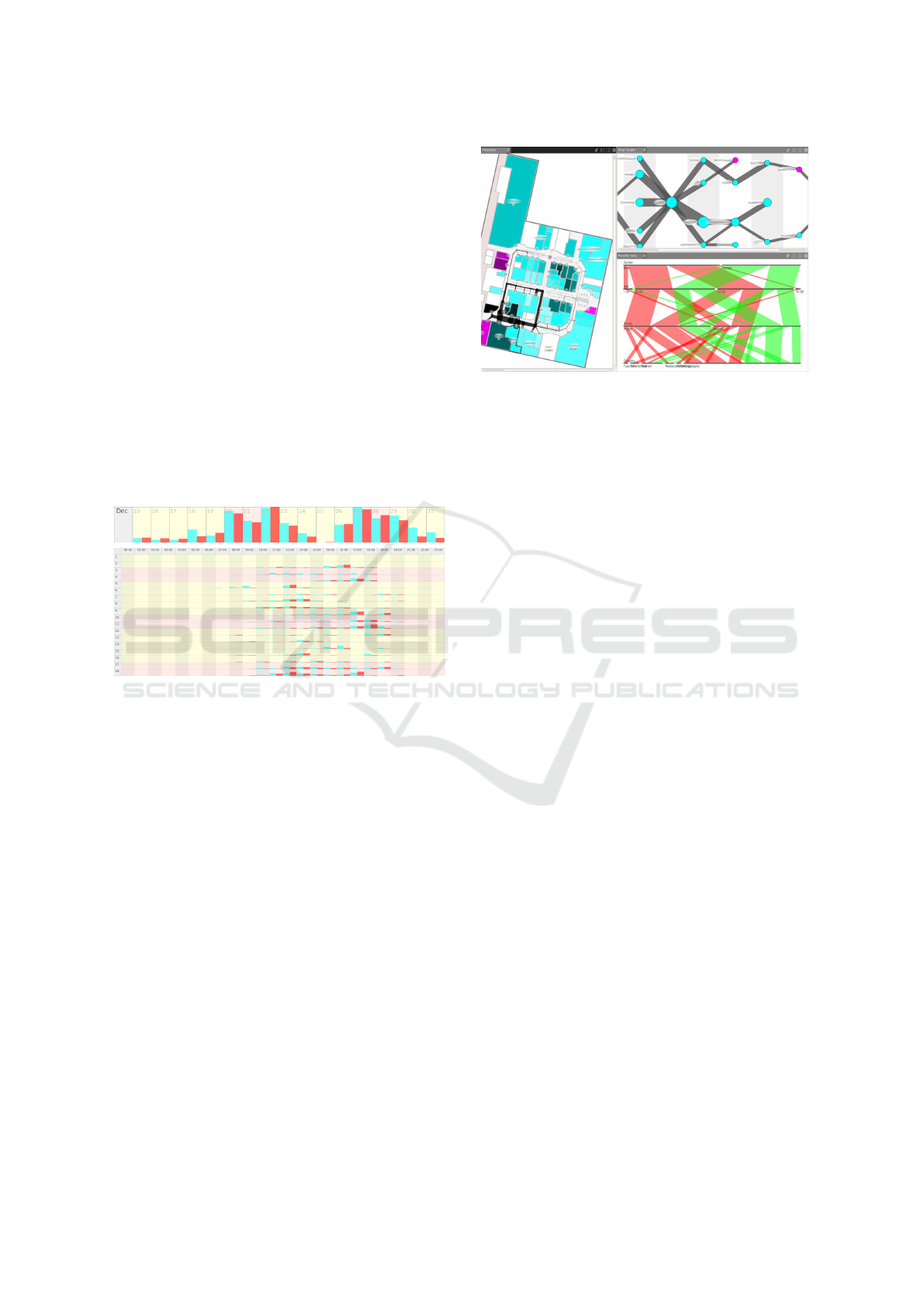
8 EVENTS AND TIME
We depict user events in a calendar representation
which is easy to understand and interpret, even for
novice users. We use simple bar charts to indicate
the frequencies of customers (red) and events (cyan).
In Figure 11 (top) we can observe activity peaks be-
fore Christmas and for the time between Christmas
and New Year’s.
Figure 11: Overview row for end of December 2014,
showing increased activity around Christmas (top). Daily
overview for January 2015 (bottom).
The more detailed calendar view (see Figure 11,
bottom) consists of a row for each day subdivided by
the hours of the day. Weekends are highlighted in a
different color. We can see that the active times of the
mall range from about 8:00 to 20:00. Increased activ-
ity patterns around 18:00 can be observed on week-
ends while on weekdays 12:00 is the most active time.
Weekends are usually the most active days.
9 VIEW COORDINATION
Due to the variety of data types and their many differ-
ent aspects (time-dependent, location based, stream-
ing data, continuous- and categorical data) a single
visualization does not suffice. Our coordinated multi-
view approach provides a personalized viewing setup
by creating multiple views of the same data set. By al-
lowing the user to link views together, interactions in
one viewport will automatically affect the other linked
viewports.
Figure 12: Multi-view setup showing the floor plan (left),
the flow graph (upper right) and the parallel sets visualiza-
tion (bottom right).
Both are possible: exploring the same data con-
figuration with different visualizations and comparing
different data using the same visualization. Thus we
introduced viewport-linking. For example, selecting a
store in the floor plan (or the venue list) should restrict
the presented data in the Parallel Sets visualization to
those customers who have visited that store, restrict
the events evaluated for the calendar visualization to
those events connected to that store, and set the focus
node for the flow graph visualization to the same store
without having to activate each visualization individ-
ually and select the desired store manually. We enable
this functionality by linking any number of viewports
to the active viewport (dark control bar) by pressing
the chain-button in its control bar.
Once a viewport is linked, all performed interac-
tions in the active view are propagated to each linked
view. Views that are not linked keep their own set of
filters. In this regard we differentiate between high-
lighting and selecting an object. Highlighting an ob-
ject will only affect the current visualization. Select-
ing one or many objects (for example, a venue in the
floor plan or a node in the Flow Graph) will propagate
the selection to all linked views. If a venue is selected
this way, customers and events are filtered to show a
sub set of the data for that venue.
10 CONCLUSION & FUTURE
WORK
In this paper we presented a coordinated multi-view
system aimed at analyzing customer behavior in an
indoor environment. The floor plan visualization pro-
vides overview of activity, attractiveness, and loy-
alty of customers. It aids the user’s mental map by
presenting the data in context of the spatial layout
Inside Mall: Visual Analytics of Customer Behavior and Activities
189

of the mall and showing the flow from one store to
the next (direct flow) or revealing predominant routes
(routed flow) within the shopping center. The ab-
stract flow graph offers a detailed analysis of the flow
for non-adjacent venues. They are complemented
by a calendar view for revealing temporal customer
patterns and by Parallel Sets for analyzing customer
specifics. Our visualization system can be used by
non-expert users but still offers a lot of potential for
information extraction by domain experts.
More precise tracking data would entail a more
precise visualization with less need of route approx-
imation. Additional tracking within a venue would
further improve the resulting visualization. We see
potential for improving the appeal and legibility of
the floor plan flow. Harmonizing the color schemes
and mappings across the different views would lead
to a more appealing visualization and might be more
comprehensible to the users. Furthermore, distorting
the floor plan to increase the space between venues
(the corridors) would reduce visual clutter without
changing the adjacencies of the venues and thus pre-
serve the known spatial context. The increased spaces
between venues also gives room to present more ad-
vanced flow visualizations. Edge bundling of the flow
lines could help regarding the legibility (for instance,
routings around obstacles (venues) or changes of the
flow direction). For the direct flow approach it would
help to reduce the areas obscured by the edges. How-
ever, this could hamper identifying the direct connec-
tions between shops.
The calendar views could be enriched to com-
pare patterns across months and seasons for different
years. We also propose a manual aggregation of time
spans by the user; for example by the possibility to
aggregate multiple weeks or days.
At a certain stage of development the question
about a 3D view arose from our industry partner. Nat-
urally, most malls do not consist of only a single floor.
While our abstract flow visualizations can deal with
flow across floors, a map-based solution to investigate
floor-to-floor statistics in detail remains future work.
ACKNOWLEDGEMENTS
This work was supported in part by the German Fed-
eral Ministry of Education and Research (BMBF) un-
der grant 03IP704 (project Intelligentes Lernen) and
grant 03IPT704X (project Big Data Analytics).
REFERENCES
Bendix, F., Kosara, R., and Hauser, H. (2005). Parallel sets:
Visual analysis of categorical data. In Information Vi-
sualization, 2005. INFOVIS 2005. IEEE Symposium
on, pages 133–140.
Berry, J. K. (2007). Map Analysis: Understanding Spatial
Patterns and Relationships. GeoTec Media.
Blattberg, R. C. and Deighton, J. (1991). Interactive mar-
keting: Exploiting the age of addressability. MITSloan
Management Review, 33(1).
Chao, T., Du, R., Gluck, J., Maidasani, H., and Wills,
K. (2013). C-flow: Visualizing foot traffic and
profit data to make informative decisions. Tech-
nical report, University of Maryland. Online:
http://duruofei.com/Dev/c-flow [last accessed January
2019].
Hixon, T. (2014). What kind of per-
son prefers an iphone? Online:
http://www.forbes.com/sites/toddhixon/2014/04/10/
what-kind-of-person-prefers-an-iphone/ [last ac-
cessed January 2019].
Liebig, T. and Xu, Z. (2012). Pedestrian monitoring system
for indoor billboard evaluation. Journal of Applied
Operational Research, 4:28–36.
Moiseeva, A. and Timmermans, H. (2010). Imputing rel-
evant information from multi-day gps tracers for re-
tail planning and management using data fusion and
context-sensitive learning. Journal of Retailing and
Consumer Services, 17(3):189–199.
Phan, D., Xiao, L., Yeh, R., Hanrahan, P., and Winograd, T.
(2005). Flow map layout. In Proceedings of the Pro-
ceedings of the 2005 IEEE Symposium on Information
Visualization, INFOVIS ’05, pages 219–224.
Riehmann, P., Hanfler, M., and Froehlich, B. (2005). Inter-
active sankey diagrams. In IEEE Symposium on In-
formation Visualization, 2005. INFOVIS 2005, pages
233–240.
Sugiyama, K., Tagawa, S., and Toda, M. (1981). Methods
for visual understanding of hierarchical system struc-
tures. Systems, Man and Cybernetics, IEEE Transac-
tions on, 11(2):109–125.
Tobler, W. R. (1987). Experiments in migration mapping by
computer. The American Cartographer, 14(2):155–
163.
Willett, W., Heer, J., and Agrawala, M. (2007). Scented
widgets: Improving navigation cues with embedded
visualizations. IEEE Transactions on Visualization
and Computer Graphics, 13(6):1129–1136.
You, C.-W., Kao, H.-L., Ho, B.-J., Chen, Y.-H., Wang, W.-
F., Bei, L.-T., Chu, H.-H., and Chen, M.-S. (2014).
Convenienceprobe: A phone-based system for re-
tail trade-area analysis. Pervasive Computing, IEEE,
13(1):64–71.
You, C.-W., Wei, C.-C., Chen, Y.-L., Chu, H.-H., and Chen,
M.-S. (2011). Using mobile phones to monitor shop-
ping time at physical stores. Pervasive Computing,
IEEE, 10(2):37–43.
IVAPP 2019 - 10th International Conference on Information Visualization Theory and Applications
190
