
Segmentation of Dashboard Screen Images: Preparation of Inputs for
Object-based Metrics of UI Quality
Ji
ˇ
r
´
ı Hynek and Tom
´
a
ˇ
s Hru
ˇ
ska
Brno University of Technology, Faculty of Information Technology, IT4Innovations Centre of Excellence,
Bo
ˇ
zet
ˇ
echova 1/2, Brno, Czech Republic
Keywords:
Dashboard, Page Segmentation, Object-based Metric.
Abstract:
Using object-based metrics to analyze design aspects of user interfaces (UI) is a suitable approach for the
quantitative evaluation of the visual quality of user interfaces. Balance or Symmetry are examples of such
metrics. On the other hand, we need to deal with the problem of a detection of objects within a user interface
screen which represent the inputs for the object-based metrics. Today’s user interfaces (e. g., dashboards) are
complex. They consist of several color layers, and it is complicated to segment them by well-known page
segmentation methods which are usually used for the segmentation of printed documents. We also need to
consider the subjective perception of users and principles of objects grouping (as Gestalt laws). Users usually
group simple objects (graphical elements and shapes) into coherent visually dominant objects. We analyzed
the experience of 251 users manually segmenting dashboard screens and designed a novel method for the
automatic segmentation of dashboard screen images. The method initially focuses on the reduction of image
colors which represents image layers. Then, it detects the primitives which makes a screen layout. Finally,
the method processes the screen layout using the combination of the top-down and bottom-up segmentation
strategy and detects visually dominant regions.
1 INTRODUCTION
Dashboard is a frequently used term connected with
business intelligence and management information
systems. Malik (2005) defines it as ‘a rich computer
interface with charts, reports, visual indicators, and
alert mechanisms that are consolidated into a dyna-
mic and relevant information platform.’ According
to Few (2006), dashboard should visualize only ‘the
most important information needed to achieve one or
more objectives; consolidated and arranged on a sin-
gle screen so the information can be monitored at
a glance.’ Dashboards are a favorite tools used by
many organizations to comprehensively present their
key performance indicators which help to evaluate the
progress and benefit of business activities (Eckerson,
2010). Since dashboards support decision-making,
they have become popular among a wide range of
users for the management of personal activities and
analysis of personal data.
The rising diversity of dashboards has led UI de-
signers and researchers to think about the principles
of high-quality dashboard design. For instance, Few
(2006) provided design heuristics based on the know-
ledge of famous books regarding design and graphics
e. g. (Tufte, 2001; Ware, 2012). Their application,
however, usually requires presence of specialist in UI
design. For this reason, researchers try design quan-
titative metrics measuring UI characteristics which
play role during the application of design heuristics.
For example, Hynek and Hru
ˇ
ska (2016) measured co-
lorfulness of UI to distinguish highly colorful and dis-
tracting dashboards. Such measuring can be perfor-
med automatically during the design phase. On the
other hand, these metrics are usually simple. They fo-
cus on simple visual UI attributes. They do not con-
sider screen in such level as a human would perceive
it.
One possible step in making the metric-based eva-
luation more reliable is to process a screen similarly
as it is perceived by human brain – not as a matrix
of pixels but as a group of objects within a scene as
described by Baker et al. (2009). Then, we evaluate
the objects in a screen (widgets) and their properties
(e. g., size or position) as described by Charfi et al.
(2014). We can measure advanced characteristics of
a screen as the characteristics connected with layouts.
For instance, Ngo et al. (2003) have published 13 ad-
vanced object-based metrics measuring aesthetic as-
Hynek, J. and Hruška, T.
Segmentation of Dashboard Screen Images: Preparation of Inputs for Object-based Metrics of UI Quality.
DOI: 10.5220/0007312301990207
In Proceedings of the 14th International Joint Conference on Computer Vision, Imaging and Computer Graphics Theory and Applications (VISIGRAPP 2019), pages 199-207
ISBN: 978-989-758-354-4
Copyright
c
2019 by SCITEPRESS – Science and Technology Publications, Lda. All rights reserved
199
I
II
III
IV
2016
100
200
I
II
III
IV
2017
Statistics of customers
Europe
North America
Asia
Australia
Africa
100
200
South America
Balance = 0.80
Symmetry = 0.75
...
UI
segmentation
regions
measuring
UI attributes
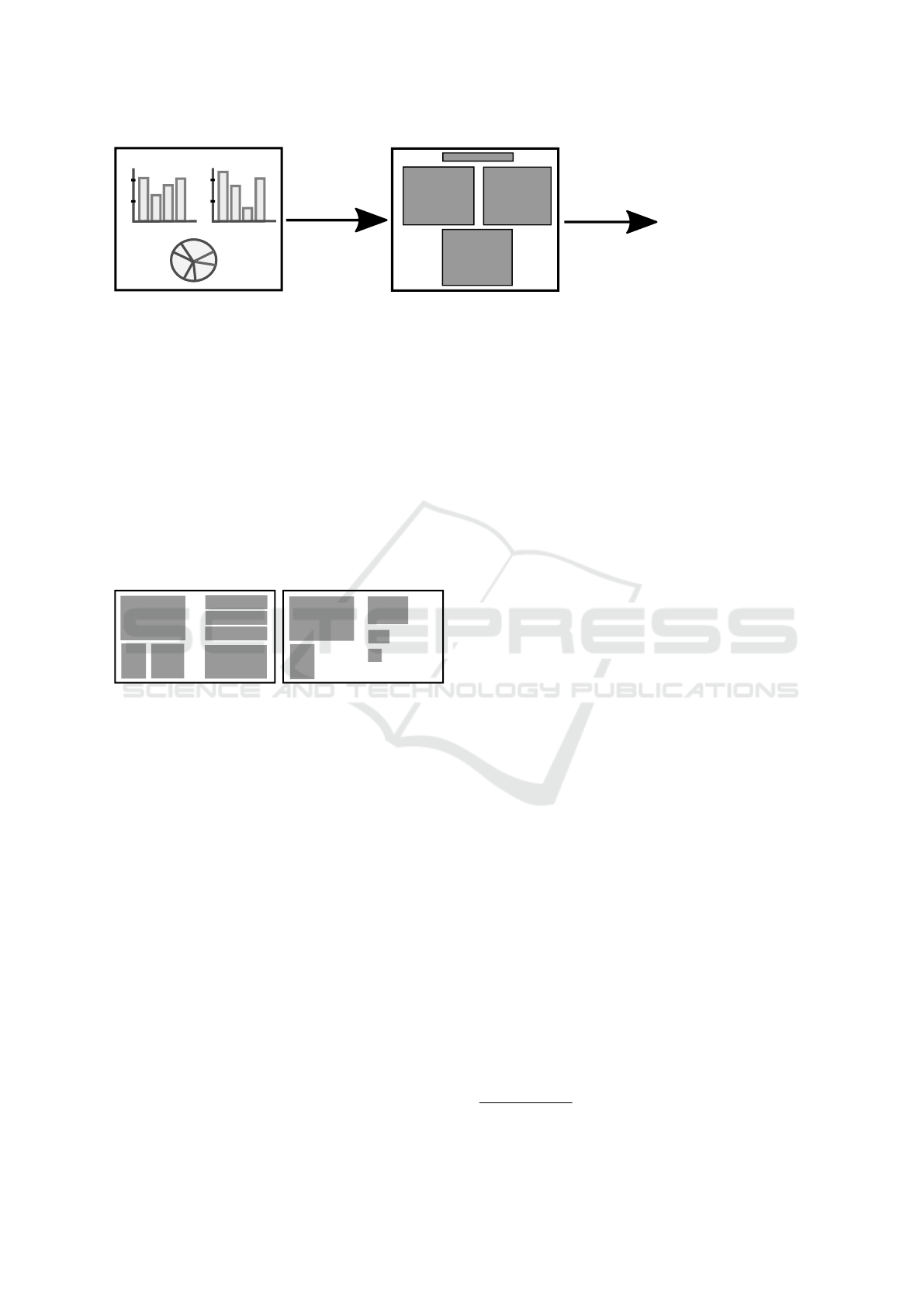
Figure 1: In the beginning, we have a screenshot of a user interface. We need to find a suitable segmentation method to specify
regions representing the visually dominant objects corresponding with the user perception. Then, we can use these regions as
inputs for object-based metrics measuring characteristics of the user interface.
pects of a screen. Figure 2 demonstrates an example
of the Balance metric which measures the distribution
of optical weight in a picture. An example of practi-
cal application of Ngo’s metrics is the tool QUESTIM
designed by Zen and Vanderdonckt (2014). Users can
use the tool without special knowledge of UI design.
They manually specify object regions according to
their visual perception, and the tool calculates the va-
lues of Ngo’s metrics using dimensions of the regions
(Figure 1).
Figure 2: Example of two screens which can be compared
using the Balance metric. The left screen is balanced since
the weight of the regions is uniformly distributed among
screen sides. The right screen is unbalanced due to the gre-
ater weight of its left side.
The weakness of the object-based metrics is the
ambiguous definition of objects. The tool QUESTIM
depends on the user’s subjective perception of objects.
Two users will most likely specify object regions in a
slightly different way which may lead to ambiguous
results. Moreover, dashboards are complex user in-
terfaces with emphasis on graphical presentation of
data. They consist of several layers (e. g., toolbars
or menus). Their complexity makes it more difficult
to design a segmentation algorithm which would re-
flect the average user perception (Hynek and Hru
ˇ
ska,
2018). We cannot easily segment them into back-
ground and foreground which means, we cannot use
common segmentation methods, e. g., methods used
for the segmentation of printed documents.
This paper focuses on the problem of segmenta-
tion of dashboard into regions which we can use as in-
puts for object-based metrics. It provides a brief state
of the art regarding visual perception of objects and
existing page segmentation methods. Then, it descri-
bes an experiment analyzing user perception of the
visually dominant objects (represented by their boun-
daries – regions). We use the knowledge to design an
algorithm for the dashboards segmentation. Finally,
we compare the results of the experiment with the re-
sults of the segmentation algorithm and suggest im-
provements.
We work with raster screenshots of dashboards.
We focus more on the way the UI is presented to users
than how the UI is implemented (e. g., web-page).
Our goal is to analyze and understand what is actu-
ally seen by users on the screen. In contrast to the
standard page segmentation algorithms, users are not
able to process all graphical elements of the screen at
once. They preattentively cluster simple elements into
larger coherent parts as it is explained by Gestalt laws
(Wertheimer, 1938). Information about the segmen-
tation using structural description of UI can be found
in (Burget, 2016; Feng et al., 2016).
2 PERCEPTION OF OBJECTS
The visual receptors of eyes – rods and cones – detect
light and send it as electrical impulses via neurons to
the brain which constructs an image of the perceived
view (recognition of objects such as points, edges, or
patterns and the comparison thereof) (Gibson, 1950).
The initial construction of the image is done preatten-
tively without the user’s attention (in less than 200 ms
(Healey et al., 1996)). After the initial recognition of
objects, the brain tries to comprehend the recognized
objects, organize them and add meaning to them. Ba-
ker et al. (2009) call it sensemaking. Only a fraction
of what the viewer focuses on is also the object of the
viewer’s attention (Few, 2006). This fact corresponds
with the limited
1
capacity of a brain’s short-term me-
mory which stores the objects of the actual focus of
1
3 - 9 items (Few, 2006), 3 - 5 items (Johnson, 2013)
IVAPP 2019 - 10th International Conference on Information Visualization Theory and Applications
200

attention.
Since the viewers can focus on a limited number
of objects, they preattentively cluster simple graphi-
cal objects into a larger visual group. The problem of
object ordering and grouping was described by Ge-
stalt psychology in the early 20th century (Werthei-
mer, 1938). It provides several laws – e. g., the law
of proximity, similarity, enclosure, closure, and con-
tinuity (Figure 3). We expect that we should consider
these laws in the segmentation of screen. However, a
missing mathematical model of Gestalt laws compli-
cates the conversion of the laws into computer algo-
rithms which would automatically predict how a user
perceives the displayed screen. The problem of quan-
titative description of Gestalt laws is still the aim of
researchers (J
¨
akel et al., 2016).
We also need to consider the subjective percep-
tion. Every viewer can process a different number
of items at the same time. Orlov et al. (2016) per-
formed an eye tracking study to analyze the effect of
change of a number of objects in a dashboard on the
perception of the dashboard. Also, every viewer has a
different experience which also affects the visual per-
ception (Johnson, 2013).
Figure 3: An example of the Gestalt laws of proximity, si-
milarity and continuity. Readers will most likely cluster the
rectangles and recognize the digits.
Finally, visually emphasized objects together with
background elements (larger-scale, solid surfaces and
structures) make a scene of visual representation
(Henderson and Hollingworth, 1999). Every object
within the scene can be described by its visual cha-
racteristics (Baker et al., 2009). We can analyze and
evaluate the suitability of these characteristics after a
successful and objective segmentation of the screen.
3 PAGE SEGMENTATION
Researches have developed many different segmenta-
tion methods for the purpose of computer processing
and archiving of printed documents. Mao and Ka-
nungo (2001); Shafait et al. (2006) provide a metho-
dology for performance comparison of segmentation
methods, and they compare the most famous ones.
Kise (2014) classifies segmentation methods accor-
ding to page layout, objects of analysis, primitives of
analysis and strategy of analysis.
Page Layout can contain non-overlapping and
overlapping page elements. The overlapping layout
analysis is significantly more difficult. It uses the ex-
traction of features and classification of page compo-
nents based on unsupervised or supervised learning
(Jain and Zhong, 1996; Etemad et al., 1997). There
exist dashboards with overlapping elements (Figure
5-a). The reason might be the need to fit data into one
screen or just exaggerated creativity of the designer.
However, it is not common, and dashboards usually
contain elements arranged in simple non-overlapping
rectangular or Manhattan layout.
Objects of Analysis specify whether we analyze
the background or foreground of the page. Printed
documents usually consist of black foreground (e. g.,
text) and white background which can be separated by
image thresholding (Sezgin and Sankur, 2004; Russ,
2016). On the other hand, dashboards often consist of
hierarchically arranged frames, and the background
is represented by multiple colors or color gradients
(Figure 5-a). Minaee and Wang (2016) presented an
example of the advanced method for separation of fo-
reground and background.
Primitives of Analysis represent elements of the
page foreground or background processed by the seg-
mentation analysis. We can consider single pixels as
primitives, but common segmentation methods usu-
ally work with larger groups – e. g., connected com-
ponents or projection profiles of the page image (Kise,
2014). This research works with the group of same
color pixels represented by their rectangular bounda-
ries (regions). We use heuristics to organize the regi-
ons in a tree structure representing the page layout.
The page layout consists of a hierarchy of page
primitives. There are two strategies of the layout
processing – the top-down and bottom-up strategy.
The top-down strategy starts with a page and divides
it into page primitives representing leaves of the la-
yout tree, e. g. Recursive XY-cut (Nagy and Seth,
1984; Ha et al., 1995). On the contrary, the reversed
bottom-up strategy starts with simple primitives of the
page (e. g., groups of pixels) and join them into larger
coherent groups, e. g. connected components-based
methods (Simon et al., 1997).
We can assume that the dashboard screenshots can
be captured in high quality if needed. However, whe-
reas printed documents are usually very similar, the
appearance of dashboards varies in many visual as-
pects. There exist various dashboard templates using
different layouts, widgets, colors, and styles which
complicates to design a universal segmentation algo-
rithm.
Segmentation of Dashboard Screen Images: Preparation of Inputs for Object-based Metrics of UI Quality
201
4 ANALYSIS OF HUMAN
PERCEPTION
The first part of the research was focused on the user
perception of visually dominant objects. We perfor-
med an experiment to understand the principles of ob-
jects grouping and ambiguity of user perception. We
gathered 130 image samples of various dashboards
and divided them into 13 groups of 20 samples (every
sample was contained in two groups). Then, we uni-
formly distributed the groups among users who provi-
ded us with descriptions of regions representing their
subjective perception of the objects within a dashbo-
ard (user description).
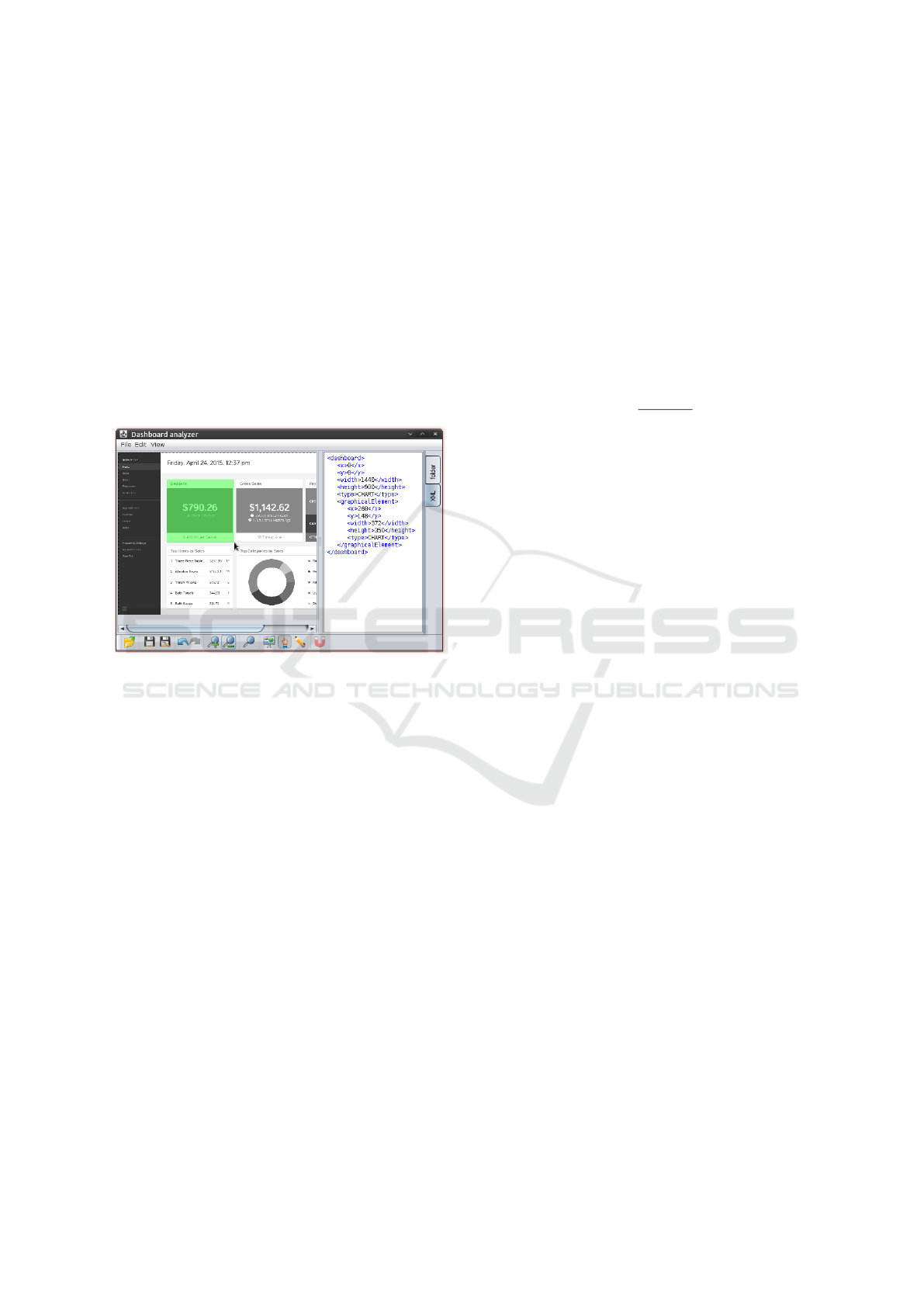
Figure 4: An example of the specification of regions using
the Java application. The green area represents a selection
of a visual region drawn by a user. The XML description
presented on the right is re-generated with every change
of regions in the canvas. It contains a specification of the
dashboard and one region.
We selected the users among third-year students
(∼ 20 years old) of the Information Systems course at
the Brno University of Technology, Faculty of Infor-
mation Technology. We dedicated one lecture to fa-
miliarizing the students with the term dashboard and
fundamental principles of data visualization and vi-
sual perception. Then, they used a simple Java appli-
cation to load a dashboard, draw the perceived regions
and generate the XML description of the specified re-
gions (Figure 4). The application did not allow them
to specify regions hierarchically (regions within regi-
ons) since we focused only on the top-level objects.
251 of 361 students decided to participate. They pro-
vided us with 5,020 user descriptions of regions in
total (∼ 39 user descriptions for every dashboard).
Then, we took the gathered user descriptions
of the same dashboard and combined them into
one average description representing the probabilities
p
i
∈ h0, 1i of region occurrences in every pixel i of the
dashboard. Figure 5-b shows a visualization of such
an average description in the grayscale color space.
We used these graphical representations to observe si-
milarities and differences of the users’ perceptions.
Then, we compared the average description with
the user descriptions. We calculated the difference
δ
(u)
i
∈ h0, 1i between p
i
and logical value v
(u)
i
= {0, 1}
representing the occurrence of a region in a user des-
cription provided by a user u for the every pixel i of a
dashboard d:
δ
(u)
i
=| p
i
− v
(u)
i
| (1)
and the average difference δ
(u)
d
∈ h0, 1i of all pixels in
the dashboard d:
δ
(u)
d
=
∑
n
i=0
δ
(u)
i
n
(2)
We used the values δ
(u)
d
for their later comparisons
with the value δ
(alg)
d
of the segmentation descriptions
made by the segmentation method (Section 6).
4.1 Conclusions of Experiment
The detailed results of the experiment including all
user and average descriptions are available in Appen-
dix. The average descriptions indicated that the users
segmented the dashboard screens similarly. We obser-
ved a strong influence of the Gestalt law of enclosure.
The users tend to group the screen elements which
are explicitly grouped by visually emphasizing frame.
These frames are usually represented by borderlines
or a different background, and they form a rectangu-
lar boundary of the widgets. Few (2006) showed that
designers could avoid to use these boundaries because
viewers will group the widget parts since they are usu-
ally close together (the Gestalt law of proximity). We
can confirm this fact since our samples contain wid-
gets without borders as well and the users grouped
them. We used the knowledge during the design of
the segmentation method (Section 5).
On the other hand, the users specified objects dif-
ferently in the management areas (toolbars or headers;
the left and upper part of Figure 5-b). Some users con-
sidered these areas as solid regions. Other users split
them into smaller coherent regions (such as buttons or
labels). It means that the segmentation algorithm does
not need to be so strict with the segmentation of these
areas. However, it the should try to make the value
δ
(alg)
d
lower than the values δ
(u)
d
. After the dashbo-
ard segmentation, we should use sufficiently robust
object-based metrics which are able to consider cer-
tain differences caused by the subjective perception
of users or imprecision of the segmentation.
IVAPP 2019 - 10th International Conference on Information Visualization Theory and Applications
202
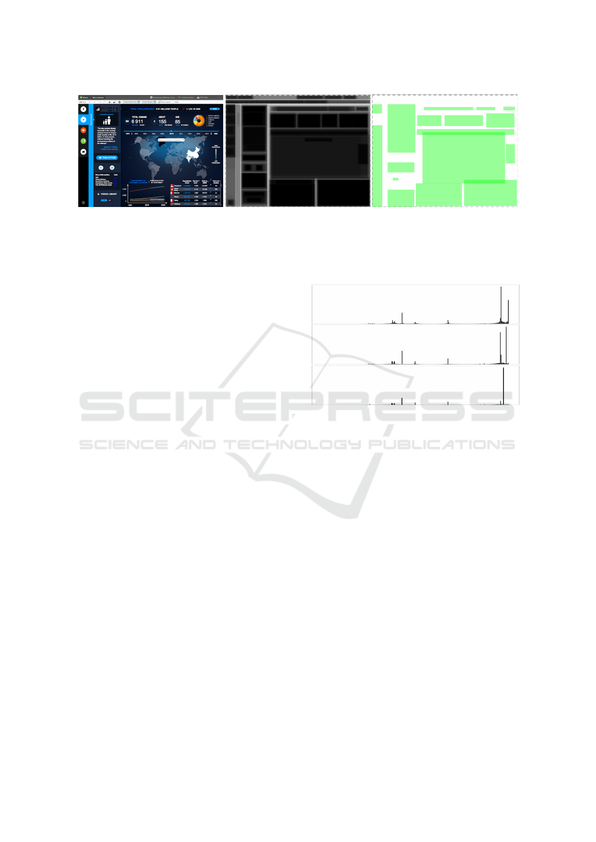
(a) Dashboard image
(b) Average perception
(c) Segmentation
Figure 5: Figure (a) presents an example of colorful dashboard containing overlapping objects. Figure (b) presents the
average description of probabilities of region occurrence. The higher color intensity represents a higher probability of the
region occurrence. Figure (c) presents the result of the segmentation algorithm. Readers can notice segmentation problems –
e. g., insufficient recognition of widgets in the header. Source of dashboard: softwareadvice.com.
5 THE METHOD FOR
SEGMENTATION OF
DASHBOARDS
The method for the segmentation of dashboards con-
sists of seven phases (Figure 7). The following sub-
sections briefly describe the phases. Readers of this
paper can evaluate the phases using the source code
which is available online (see Appendix). We imple-
mented the segmentation method in Java language as
a part of the tool for analysis of dashboard quality
shown in Figure 4.
5.1 Image Preprocessing
In the beginning, we convert the dashboard bitmap
into the 8-bit grayscale color space representing color
intensity to reduce the number of colors to 256. Then,
we locate the areas represented by color gradients and
replace the values of all the pixels of the area by the
average grayscale value of the area. We search the
areas by using a flood-fill-based algorithm. We add a
neighboring pixel into the flood-fill queue if the diffe-
rence between the color values of neighboring pixels
is lower than a threshold t. We determine the opti-
mal threshold t heuristically by analysis of the color
histogram of the bitmap (Figure 6).
Finally, we posterize the image from the 8-bit to
the [4 to 6]-bit color space. We search the optimal pa-
rameter of the posterization by analysis of color his-
tograms similarly as the threshold t.
5.2 Selection of Color Layers
Then, we take the preprocessed bitmap and select the
most frequently used colors of the bitmap. We do the
selection iteratively. We sort all colors according to
t = 1
t = 0
t = 2
Figure 6: We iteratively increase the value t and analyze
changes of the histogram indicating a possible loss of im-
portant information. The first histogram contains two do-
minant colors represented by the two highest bars. The re-
duction of color gradients using the threshold t = 1 keeps
the areas using the dominant colors distinguished. Howe-
ver, using t = 2 reduces the two colors into one (there is a
possibility that visually different areas were joined). Hence,
we use the threshold t = 1 in this case.
their frequency of occurrence and process colors from
the most frequently used one. We are adding colors to
a list of the most frequently colors until the occur-
rence of i-th color is higher than a heuristically cho-
sen limit l
1
(0.1%, 5%, or 10% of the screen area) and
summarized occurrence of all pixels in the list is lo-
wer than a limit l
2
(50%, 60%, or 70% of the area,
respectively to l
1
).
If the bitmap contains only one dominant color we
can easily separate background and foreground (we
replace the dominant color with the white color repre-
senting the background, the values of the remaining
pixels are changed to the black color representing the
foreground).
If the bitmap contains more than one dominant co-
lor (usually up to 10), the bitmap most likely contains
more layers (e. g., widget frames). We sort the domi-
nant colors according to their frequency (from the hig-
Segmentation of Dashboard Screen Images: Preparation of Inputs for Object-based Metrics of UI Quality
203
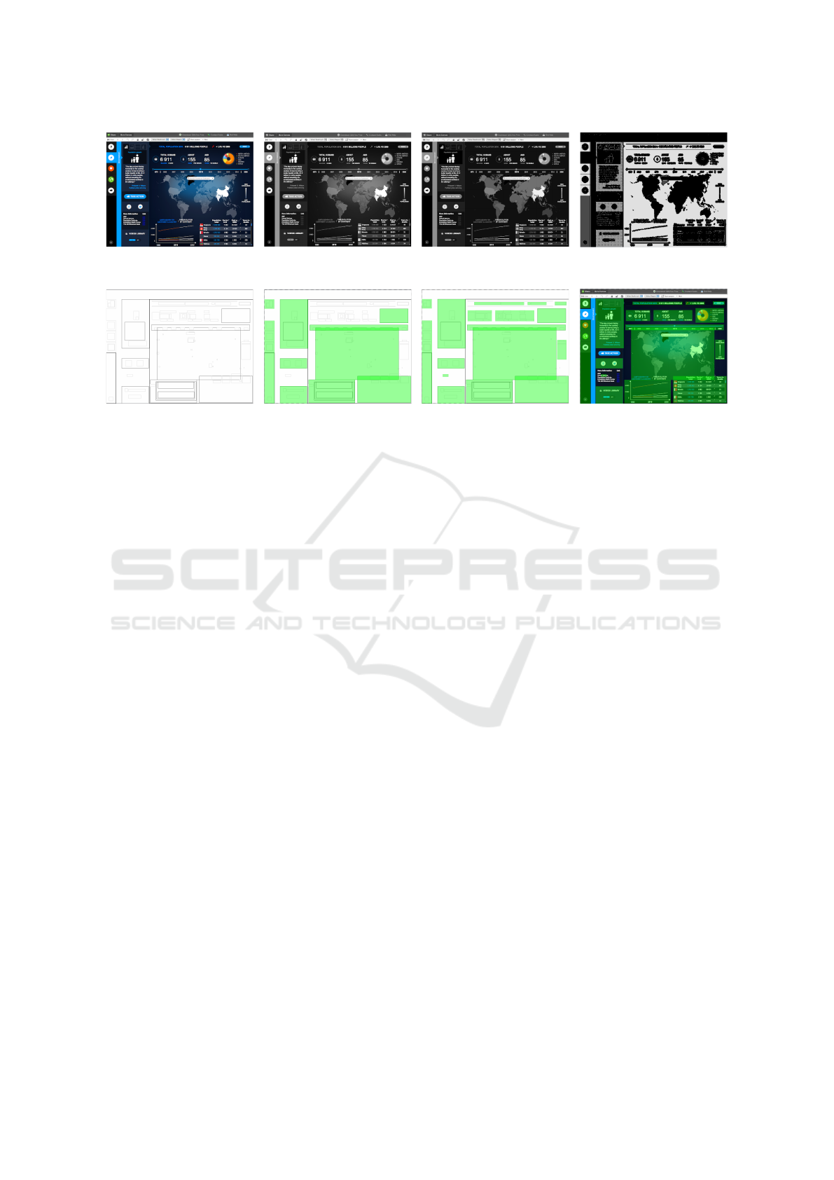
Dashboard image
Grayscale image (phase 1)
Posterized image
withhout colour gradients (ph. 1)
Detection of layers (ph. 2)
Detection of primitives (ph. 3)
and construction of layout (ph. 4)
Top-down layout analysis (ph. 5)
Bottom-up layout analysis (ph. 7)
Final selection of regions
Figure 7: An example of the segmentation of a colorful dashboard containing overlapping regions. Firstly, we preprocess the
image, reduce the number of colors and detect color layers. Then, we construct layout and find the visually dominant regions
(represented by green rectangles). Readers can notice that the method ignores some widgets, especially in management areas.
Phase 6 is not shown since the method did not detect any highly overlapping regions.
hest to the lowest) and append a virtual color repre-
senting all the remaining colors to the end of the sor-
ted list. Then, we map the list of n colors to the range
of n uniformly distributed grayscale values (from the
white color to the black color).
The result of the phase is a bitmap represented in
the number of dominant colors + 1. The grayscale co-
lors represent the layers of the bitmap which are suit-
able to detect page primitives and construct the page
layout.
5.3 Detection of Page Primitives
The third phase detects page primitives in the bit-
map. Firstly, we use a flood-fill-based algorithm to se-
lect the areas of pixels represented by the same color
(layer). Then, we convert the areas into a set of regi-
ons representing rectangular boundaries of the areas.
We keep the information about the layers as attribu-
tes of the regions. Also, we measure the share of the
number of pixels within its boundary and keep the va-
lue as another region’s attribute. We store these attri-
butes for the heuristics in selection of dominant regi-
ons (Section 5.5). Finally, we filter tiny regions.
5.4 Construction of Layout
The fourth phase converts the set of regions into a tree
structure representing the page layout. In the begin-
ning, we initialize the tree by creating the root node
representing the area of the dashboard (the top-level
region). Then, we go through the set of regions and
append the regions into the tree according to the fol-
lowing rules.
(1) If a region r
1
is located within r
2
represented
by a node n
2
, we compare r
1
with the children of n
2
.
(2) If r
2
is located within r
1
, we create a node n
1
re-
presenting r
1
, attach n
1
to the same parent as n
2
and
reattach n
2
to n
1
. (3) If r
1
intersects r
2
or there is
no region in actual scope, we create a node n
1
repre-
senting r
1
and attach n
1
to the parent node of actual
scope.
The final tree contains hierarchically organized
regions (from the top-level region representing a
dashboard to the leaves representing small objects).
Note that one region can be represented by more than
one node in the tree (overlapping layout).
5.5 Top-down Layout Analysis
The next phase takes the tree of regions and searches
the visually dominant regions which correspond with
the user perception. We start with the top-level node
and look for a sidebar and header which are frequently
occurred regions in dashboards. Then, we continue
with the largest region representing the body of the
dashboard and analyze its children. We sort the child-
ren according to their size and analyze their attribu-
tes gathered during the detection of primitives. Small
data regions (usually represented by the foreground
layer) are filtered. Very large regions which occupy
IVAPP 2019 - 10th International Conference on Information Visualization Theory and Applications
204
the majority of the screen area are segmented (we ana-
lyze their children). Remaining medium-size regions
are considered as visually dominant regions.
Since we focus only on the large regions represen-
ting widget frames, the strategy works well with the
dashboards which consist of the widgets surrounded
by an explicit boundary. The body of such a dashbo-
ard contains a small number of large regions which
are detected by top-down analysis. The users tend
to recognize these regions similarly since there is a
strong influence of the Gestalt law of enclosure.
On the second hand, if a dashboard contains the
widgets without explicit specification of their boun-
daries, the body of such a dashboard consists of a
large number of small regions representing parts of
widgets. Users tend to cluster these regions with cor-
respondence to the Gestalt law of proximity. Our top-
down analysis ignores these regions because the regi-
ons are too small. Hence, we keep the tree of regions
for the phase 5.7, which uses the reversed bottom-up
strategy to cluster small regions located in the remai-
ning area of the dashboard.
5.6 Analysis of Overlapping Regions
Since there are dashboards with non-rectangular la-
youts, it is possible that the result of the previous
phase could contain overlapping regions. We detect
all intersections and compare the area of every inter-
section with the areas of the intersected regions. If the
area of the intersection represents most of the area of
one region (e. g., a region within another region or
2 highly overlapping regions, usually 33%), we join
such regions into one region. Else, we ignore the in-
tersection. The result of the phase is a list of visually
dominant regions with a reduced number of intersecti-
ons.
5.7 Bottom-up Layout Analysis
The last phase focuses on the areas of the dashboard
which does not contain any visually dominant region
recognized in the previous phases. These areas might
contain small regions which together creates larger re-
gions perceived by users with correspondence to the
Gestalt law of proximity.
We take the tree of regions representing the layout
of the dashboard and analyze it by using the bottom-
up strategy. We measure vertical and horizontal gaps
between the small regions and join the regions if the
gaps are smaller than a heuristically chosen threshold.
The regions detected in this phase together with regi-
ons detected in the previous phases represent the re-
sult of the dashboard segmentation.
6 EVALUATION AND RESULTS
Readers can find all results in Appendix.
6.1 Visual Analysis
Firstly, we compared the segmentation results with
the average descriptions visually to understand the
main problems caused by the computer segmentation.
We usually inaccurately segmented the dashboards re-
presented in low resolution or skewed by image com-
pression. The algorithm also had occasional problems
with the segmentation of management areas (e. g.,
toolbars and headers) which were ambiguously per-
ceived by users. Sometimes, the method incorrectly
clustered small regions into larger, so the result insuf-
ficiently reflected the Gestalt law of proximity. Rea-
ders can notice these problems in Figure 5-c.
Our method works well with the dashboards
which contain widgets surrounded by an explicit bor-
der. We successfully reduced the number of colors
and detected layout primitives in most of the cases.
6.2 Comparison with User Perception
Then, we used the data gathered in the experiment
analyzing the user perception (Section 4). Firstly, we
segmented all 130 dashboard samples using the seg-
mentation method and measured 130 values δ
(alg)
d
as
described in Section 4. Then, we compared these va-
lues with the values δ
(u)
d
representing differences bet-
ween average description and user descriptions.
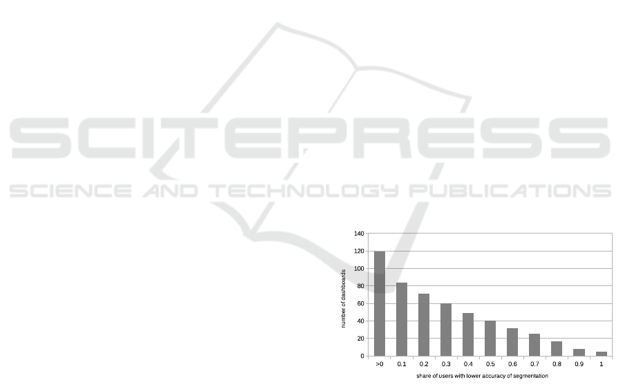
Figure 8: The numbers of dashboards where δ
(alg)
d
≤ δ
(u)
d
for
particular share of users u. Vertical axis shows the number
of dashboards. Horizontal axis represents the share of users
for which δ
(alg)
d
≤ δ
(u)
d
.
The segmentation descriptions created by the seg-
mentation method are at least as close to the average
descriptions (δ
(alg)
d
≤ δ
(u)
d
) as 33.90% of 5,020 des-
criptions provided by users. Figure 8 shows that 119
of 130 dashboards were segmented at least as close to
the average description as they were segmented at le-
ast by one user. The closer to the average description
Segmentation of Dashboard Screen Images: Preparation of Inputs for Object-based Metrics of UI Quality
205

the segmentation description is the better it averages
perception of users.
6.3 Measuring Balance
Finally, we used the descriptions of regions to mea-
sure Balance (BM) of the 130 dashboards according
to the formula designed by Ngo et al. (2003). We cal-
culated 130 average values BM
(users)
d
using the user
descriptions, and 130 BM
(alg)
d
using the segmentation
descriptions. Average distance between those values
δ
(users,alg)
BM
is 0.100 (σ = 0.086). We can consider this
value as low compared to the range of BM ∈ h0, 1i.
However, we should not neglect this deviation.
We also calculated the standard deviation for
every value BM
(users)
d
. Average value of these 130
standard deviations is 0.119 (σ = 0.051) which is si-
milar to the value δ
(users,alg)
BM
. This means that there
is an unneglectable deviation between the values of
BM based on different user descriptions. Hynek and
Hru
ˇ
ska (2018) discuss this problem in detail.
7 LIMITATIONS
We integrated the designed method into the existing
tool for analysis of dashboard user interfaces presen-
ted in Figure 4. We assume that the method could
be applied to other tools using object-based metrics
(e. g., QUESTIM designed by Zen and Vanderdonckt
(2014)). Users can use it for the initial detection of
regions. Then, they can arrange possible inaccuracies
in the selections of regions manually. There is also a
possibility to train parameters of segmentation accor-
ding to the users’ further corrections of regions.
The readers should, however, consider the follo-
wing limitations. Firstly, we used the limited num-
ber of dashboard samples for the experiment of user
perception and evaluation of the segmentation results.
We should consider other samples (not only dashbo-
ards) to improve the segmentation method. Secondly,
the results also depend on the limited group of users
who provided us with the subjective description of re-
gions. The group consisted of similar users (techni-
cal students). We assume that a higher diversity of
users (e. g., art-skilled users) might provide us with a
more objective view regarding visual perception. Fi-
nally, we should evaluate the results of the segmenta-
tion method with other metrics than Balance.
There are several possible improvements to the
segmentation method which we suggest to do in
the future. We could improve the image prepro-
cessing. The heuristics analyzing image histograms
could be replaced with more advanced machine le-
arning techniques using the histograms or dashboard
samples as the training set. We should also improve
the heuristics used in the top-down and bottom-up
analysis of dashboard layout and improve the corre-
lation between the segmentation and Gestalt laws (es-
pecially the law of proximity). Finally, we should fo-
cus more on the overlapping layouts and low-quality
image samples.
8 CONCLUSIONS
This paper dealt with the problem of segmentation of
user interfaces into regions which can be used as in-
puts for object-based metrics of UI quality. We fo-
cused on dashboards which usually contain complex
widgets and charts which makes dashboards difficult
to segment. In contrast to printed documents, dashbo-
ards consist of a hierarchy of frames using different
colors. The widgets often overlap each other. It is also
much more challenging to consider the principles of
human perception (e. g., Gestalt laws).
We performed the experiment analyzing the user
perception of visually dominant regions in dashbo-
ards. We used this knowledge to design the method
for the dashboard segmentation. The method consists
of several phases. In the beginning, we preprocess
a dashboard image, select dominant colors to distin-
guish dashboard layers and detect the layout primiti-
ves – regions. Then, we use the regions to construct
the dashboard layout. Finally, we process the layout
to find visually dominant regions. We process the la-
yout two times. The top-down strategy selects large
widgets explicitly surrounded by frames (the Gestalt
law of enclosure). The bottom-up strategy clusters
small regions into remaining visually dominant wid-
gets (the Gestalt law of proximity).
We used the method to segment 130 dashboards
and compared the results with the average description
of regions provided by the users. Most of the sam-
ples were segmented similarly to the average descrip-
tions. There were samples which were more difficult
to segment (e. g., Figure 5). However, the goal of the
research was to present the influence of user percep-
tion in the segmentation of user interfaces. Also, we
wanted to design and implement a prototype of the
segmentation method. We successfully integrated the
method in the existing tool for the analysis of dashbo-
ards. In the future, we would like to improve the heu-
ristics used for image preprocessing and analysis of
dashboard layout and extend the method applicability
to other kinds of user interfaces.
IVAPP 2019 - 10th International Conference on Information Visualization Theory and Applications
206

ACKNOWLEDGEMENTS
This work was supported by The Ministry of Educa-
tion, Youth and Sports from the National Programme
of Sustainability (NPU II) project “IT4Innovations
excellence in science – LQ1602”.
REFERENCES
Baker, J., Jones, D., and Burkman, J. (2009). Using vi-
sual representations of data to enhance sensemaking
in data exploration tasks. Journal of the Association
for Information Systems, 10(7):2.
Burget, R. (2016). Information extraction from the web by
matching visual presentation patterns. In Internatio-
nal Semantic Web Conference, pages 10–26. Springer.
Charfi, S., Trabelsi, A., Ezzedine, H., and Kolski, C. (2014).
Widgets dedicated to user interface evaluation. In-
ternational Journal of Human-Computer Interaction,
30(5):408–421.
Eckerson, W. W. (2010). Performance dashboards: measu-
ring, monitoring, and managing your business. John
Wiley & Sons.
Etemad, K., Doermann, D., and Chellappa, R. (1997). Mul-
tiscale segmentation of unstructured document pages
using soft decision integration. IEEE Transactions on
Pattern Analysis and Machine Intelligence, 19(1):92–
96.
Feng, H., Zhang, W., Wu, H., and Wang, C.-J. (2016).
Web page segmentation and its application for web
information crawling. In Tools with Artificial Intel-
ligence (ICTAI), 2016 IEEE 28th International Con-
ference on, pages 598–605. IEEE.
Few, S. (2006). Information dashboard design. O’Reilly
Sebastopol, CA.
Gibson, J. J. (1950). The perception of the visual world.
Ha, J., Haralick, R. M., and Phillips, I. T. (1995). Recursive
xy cut using bounding boxes of connected compo-
nents. In Document Analysis and Recognition, 1995.,
Proceedings of the Third International Conference on,
volume 2, pages 952–955. IEEE.
Healey, C. G., Booth, K. S., and Enns, J. T. (1996). High-
speed visual estimation using preattentive processing.
ACM Transactions on Computer-Human Interaction
(TOCHI), 3(2):107–135.
Henderson, J. M. and Hollingworth, A. (1999). High-
level scene perception. Annual review of psychology,
50(1):243–271.
Hynek, J. and Hru
ˇ
ska, T. (2016). Pixel-based analysis of
information dashboard attributes. In East European
Conference on Advances in Databases and Informa-
tion Systems, pages 29–36. Springer.
Hynek, J. and Hru
ˇ
ska, T. (2018). Application of
object-based metrics for recognition of well-designed
dashboards. International Journal of Human–
Computer Interaction, pages 1–13.
Jain, A. K. and Zhong, Y. (1996). Page segmentation using
texture analysis. Pattern recognition, 29(5):743–770.
J
¨
akel, F., Singh, M., Wichmann, F. A., and Herzog, M. H.
(2016). An overview of quantitative approaches in ge-
stalt perception. Vision research, 126:3–8.
Johnson, J. (2013). Designing with the mind in mind: sim-
ple guide to understanding user interface design gui-
delines. Elsevier.
Kise, K. (2014). Page segmentation techniques in document
analysis. In Handbook of Document Image Processing
and Recognition, pages 135–175. Springer.
Malik, S. (2005). Enterprise dashboards: design and best
practices for IT. John Wiley & Sons.
Mao, S. and Kanungo, T. (2001). Empirical performance
evaluation methodology and its application to page
segmentation algorithms. IEEE Transactions on Pat-
tern Analysis and Machine Intelligence, 23(3):242–
256.
Minaee, S. and Wang, Y. (2016). Screen content image seg-
mentation using sparse decomposition and total varia-
tion minimization. arXiv preprint arXiv:1602.02434.
Nagy, G. and Seth, S. (1984). Hierarchical representation
of optically scanned documents.
Ngo, D. C. L., Teo, L. S., and Byrne, J. G. (2003). Mo-
delling interface aesthetics. Information Sciences,
152:25–46.
Orlov, P. A., Ermolova, T., Laptev, V., Mitrofanov, A.,
and Ivanov, V. (2016). The eye-tracking study of the
line charts in dashboards design. In VISIGRAPP (2:
IVAPP), pages 205–213.
Russ, J. C. (2016). The image processing handbook. CRC
press.
Sezgin, M. and Sankur, B. (2004). Survey over image thres-
holding techniques and quantitative performance eva-
luation. Journal of Electronic imaging, 13(1):146–
166.
Shafait, F., Keysers, D., and Breuel, T. M. (2006). Per-
formance comparison of six algorithms for page seg-
mentation. In International Workshop on Document
Analysis Systems, pages 368–379. Springer.
Simon, A., Pret, J.-C., and Johnson, A. P. (1997). A fast
algorithm for bottom-up document layout analysis.
IEEE Transactions on Pattern Analysis and Machine
Intelligence, 19(3):273–277.
Tufte, E. R. (2001). The Visual Display of Quantitative In-
formation. Graphic Press.
Ware, C. (2012). Information visualization: perception for
design. Elsevier.
Wertheimer, M. (1938). Laws of organization in perceptual
forms.
Zen, M. and Vanderdonckt, J. (2014). Towards an eva-
luation of graphical user interfaces aesthetics based
on metrics. In Research Challenges in Information
Science (RCIS), 2014 IEEE Eighth International Con-
ference on, pages 1–12. IEEE.
APPENDIX
Attachments are available at: http://www.fit.vut.cz/
∼
ihynek/dashboards/visigrapp-2019
Segmentation of Dashboard Screen Images: Preparation of Inputs for Object-based Metrics of UI Quality
207
