
Effective Visual Exploration of Variables and Relationships in
Parallel Coordinates Layout
Gurminder Kaur and Bijaya B. Karki
School of Electrical Engineering and Computer Science, Louisiana State University, Baton Rouge, 70803, U.S.A.
Keywords: Parallel Coordinates, Multivariate Data Visualization, Frequency Distribution, Correlations.
Abstract: We present two innovative ways of enhancing parallel coordinates axes to better understand all variables
and their interrelationships in high-dimensional datasets. Histogram and circle/ellipse plots based on
uniform (linear) and non-uniform frequency/density mappings are adopted to visualize distributions of
numerical and categorical data values. These plots are, particularly, helpful in emphasizing data values of
low frequencies as well as those with similar frequencies. Color-mapped axis stripes are designed to
visually connect numerical variables irrespective of their locations (adjacent or nonadjacent axes) in the
parallel coordinates layout so that correlations can be fully realized in the same display. Distribution plots
and axis stripes are integrated to further facilitate exploratory analysis of multivariate data with respect to a
complete variable set.
1 INTRODUCTION
An important step in all data-intensive analyses is to
summarize main characteristics of dataset and to
uncover its hidden patterns. Data analysts use visual
exploration techniques to learn about data
distributions, outliers, missing values, etc. They also
want to identify variable correlations, which
measure the nature and extent to which the variables
are related to each other. There exist numerous
techniques including histogram, pie chart, scatter
plot, star plot, parallel coordinates to understand the
variables themselves and the relationships among
them. However, these techniques become less
effective for multivariate data, specially when the
number of data items/samples and the number of
dimensions become large.
Parallel coordinates technique is widely used to
visualize high-dimensional datasets (e.g., Wegman,
1990; Inselberg, 1997; Few, 2006; Heinrich and
Weiskopf, 2013; Janetzko et al., 2016). The main
strength of this technique is that it treats all variables
essential and on equal footing by mapping them as
vertical parallel axes and then graphically represents
all data samples/observations with respect to these
axes (Inselberg, 2009). Full information is thus
rendered thereby enabling us to view all variables
and compare them with each other. However,
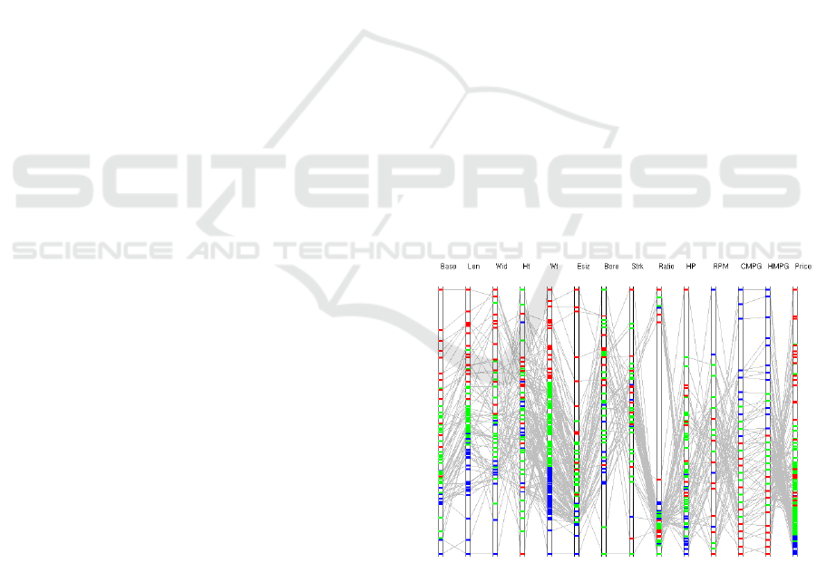
parallel coordinates plot becomes visually cluttered
for large high-dimensional dataset (Figure 1). The
axes are tightly packed and the data polylines cross
and overlap with each other a lot. This leads to
serious readability limitation along the axes and
between the axes. Interactive techniques like
brushing (Fua, 2000; Siirtola and Raiha, 2006) and
interval pick (Inselberg, 2009) can improve the
situation. The axes overlays (Hauser et al., 2002)
such as box and circle plots can be added to
understand data distributions on per variable basis
(Figure 1). The order of axes in parallel coordinates
plot allows to directly observe the relationships
between variables mapped to the adjacent axes.
Judging the relationships among the distant axes is
difficult as one has to follow the data lines. One may
eventually identify all correlations by trying out
many different axis layouts (Heinrich et al., 2012;
Lu et al., 2016).
To facilitate visual exploration of variables and
their interrelationships in high-dimensional datasets,
we present the ways of enhancing numerical and
categorical axes in the parallel coordinates setting.
The first goal is to understand each of many
variables (attributes or dimensions) of the data. To
explore how dense or scattered data points are on
each axis, we further improve the histogram- and
circle-based distribution plots using non-uniform
frequency/density mapping techniques. The second
goal is to reveal correlations among all variables,
including nonadjacent axes pairs. We create a spe-
Kaur, G. and Karki, B.
Effective Visual Exploration of Variables and Relationships in Parallel Coordinates Layout.
DOI: 10.5220/0007354602410249
In Proceedings of the 14th International Joint Conference on Computer Vision, Imaging and Computer Graphics Theory and Applications (VISIGRAPP 2019), pages 241-249
ISBN: 978-989-758-354-4
Copyright
c
2019 by SCITEPRESS – Science and Technology Publications, Lda. All rights reserved
241
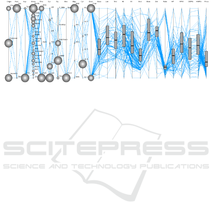
Figure 1: Parallel coordinates plot of the automobile dataset containing 25 variables. The circles and box plots are shown on
categorical and numerical axes, respectively.
cific color order on one numerical axis and then
follow how this pattern is carried over to all other
axes. This way allows us to visually compare the
color patterns of any two axis stripes irrespective
their relative positions so that all correlations can be
identified from the same display.
2 RELATED WORK
The parallel coordinates plot (PCP) is a two-
dimensional graphical mapping technique for
multivariate data and high-dimensional geometry
(Inselberg, 2009). Over several years, many
improvements have been made related to its layout,
data/information representation, and interaction
(Johansson and Forsell, 2016). Histograms are
attached to parallel coordinates axes to visualize the
distributions of data samples for numerical variables
(Hauser et al., 2002; Ericson et al., 2005; Geng et
al., 2011). The frequency-based representations can
solve the issue of overlapping due to similar or
identical values (Dang et al., 2010). Similarly, one
can use circles or bubbles for categorical values to
summarize each variable (Andrienko and
Andrienko, 2004; Few, 2006; Tuor et al., 2018).
Axes reordering is an essential part of PCP to
explore the correlations. One tries different
permutations of the axes to perform all pairwise
comparisons (Ferdosi and Roerdink, 2011; Lu et al.,
2016; Peltonen and Lin, 2017). Parallel coordinates
matrix uses multiple axis-layouts to cover all
adjacent pairs (Heinrich et al., 2012). Axes order can
be selected on the basis of network-based interface
(Zhang et al., 2012) or with Hamiltonian cycles
(Hurley and Oldford, 2010).
Due to a two-dimensional layout, PCP can be
used for other purposes besides finding the
correlations and clustering. It was used as a user
interface to explore different parameters for data
visualization (Tory et al., 2005). Similarly, it was
used as a product explorer based on parallel
coordinates to narrow down the product search to a
small subset by visualizing all attributes (Riehmann,
2012). In scientific visualization, PCP can help in
setting parameters to generate different 3D views of
the selected surface (Gillmann et al., 2018).
In this paper, we enhance parallel coordinates
axes based on some of the above-mentioned ideas to
facilitate visual exploration of all types of variables
(ordinal, nominal, and continuous numerical) and
their interrelationships. We demonstrate the essence
and effectiveness of our proposed schemes by
working with the automobile dataset consisting of 25
variables (Dua and Karra Taniskidou, 2017).
3 ENHANCED DISTRIBUTION
PLOTS ON AXES
All k dimensions (variables, irrespective of their
types) are laid out as vertically parallel axes. The n
data items in a dataset manifests as n polylines,
which traverse a series of connected points along the
k axes. Two or more observations with the same
value or very similar values are mapped to the same
location on the corresponding axis. Moreover, their
polylines may hide beneath the crowdedness created
by other polylines. It is difficult to read all data
values and data ranges/sub-ranges on the axes and
IVAPP 2019 - 10th International Conference on Information Visualization Theory and Applications
242
their polylines in the inter-axial regions.
Distributions of data samples on per-dimension basis
are important to effective visualization and
quantitative analysis of the entire dataset. In this
section, we describe the design of the frequency
(density) distribution plots based on the linear and
non-uniform mappings. These plots are composited
with the parallel axes to examine variables
individually and collectively.
3.1 Histograms for Numerical
Variables
We adopt histogram technique for numerical data to
understand the distribution features like normal
distribution, skewness, multimodality, outliers,
missing values, etc (e.g., Ericson et al., 2005). Let
and
be the horizontal and vertical extents of
the parallel coordinates plot/display area for
mapping k dimensions and rendering n data
polylines. The uniform axial spacing is:
. To draw histogram, we split the
continuous data into equal intervals (referred to as
bins) and count the data points falling in respective
bins. Histogram bars are then drawn perpendicular
to the corresponding axis so they extend horizontally
in the inter-axial space on one side or symmetrically
on both sides of the axis. Having too many bins can
cause a lot of noise whereas having too few bins can
hide important details (e.g., localities) about the
distribution. Appropriate numbers of bins lie in
the10-100 range. Moreover, these bars must be
accommodated within the space between axes.
Figure 2: Different frequency mapping schemes for
histograms. The bars are drawn for two low values (5 and
10) and two high values (85 and 90) of binned frequency f,
taking the highest frequency of 100. In the bi-scale
mapping, the bars for high f values are split into left (L)
and right (R) parts, each using half range (0.5∆X
D
).
Data points which fall into a bin determine the
length of the corresponding horizontal bar attached
to the concerned axis (Figure 2). We make the bar
length vary linearly with the binned frequency (or
density) in the range 0 to
:
(1)
where f
ij
is the number of data values belonging to
the i
th
bin (i.e., the bin count) and
is the
highest frequency for the dimension j. We can apply
global scaling for the histogram bars taking
as
the highest overall frequency (i.e., the maximum bin
count considering all numerical axes).
All continuous numerical variables are displayed
with the histogram bars, which visually encode data
value distributions on these variables on the same
display. If the number of data items becomes large,
f
max,j
can become large too. Bins containing
relatively few data items may not result in visible
bars, and it is also difficult to discern small
differences between the bars (Figure 2). To
overcome these issues of the linear mapping (Eq. 1),
we adopt three non-uniform mapping schemes. The
first approach is to vary the bar length as a square
root of the binned frequency:
(2)
For extreme situations, a logarithmic mapping can
be used as follows:
(3)
These non-linear mappings magnify the differences
between the low frequency bins but suppress the
differences between long bars (Figure 2).
Another approach is a bi-scale mapping, which
divides the horizontal range into two linear regimes,
the first encoding low bin count and the second
encoding the rest of high bin count. If the binned
frequency is below the threshold (defined as
,
where t lies in the 0-1 range and can be adjusted
interactively), we evaluate the bar length using:
(4)
The histogram bars are drawn attached to the right
side of the axis, as shown in Figure 2 for f = 5 and
10. When t = 0.1, the two bars show clearly differing
lengths. If the bin count is larger than the threshold,
the bar is split into two parts (left, L and right, R)
Effective Visual Exploration of Variables and Relationships in Parallel Coordinates Layout
243
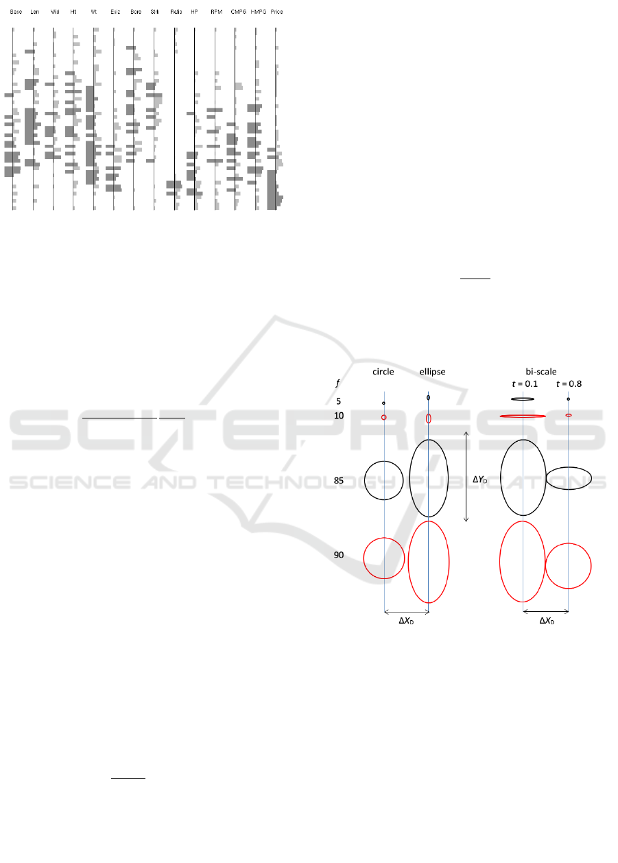
Figure 3: Histograms showing density distributions of
continuous numerical values of the automobile dataset
based on bi-scale frequency mapping. The right bars
attached the axes display binned frequencies smaller than
the threshold (t = 0.25). The bars extend to both sides of
the axes for higher frequencies; the left bars for threshold
value and the right bars representing the remainders.
about the axis. For the left portion,
for
all cases. The remaining value of the binned
frequency is mapped to the right portion of the bar:
(5)
Thus, the left and right extents of the bar together
encode the frequency of the i
th
bin of variable j when
. In Figure 2, for f = 85 and 90, the left-
side bars have the same length, but the right-side
bars show clear difference for t = 0.8, which is not
the case with other mappings. We display bi-scale
histogram bars for 14 numerical variables of the
automobile dataset (Figure 3).
3.2 Circles and Ellipses for Categorical
Variables
Circles (bubbles) at specific locations on the axes
are used to display the relative sizes of different
categorical values (Few, 2006; Tuor et al., 2018).
The diameter d of the circle is proportional to the
number of data items (i.e., the frequency f)
belonging to a particular categorical value. A linear
mapping can be expressed as
(6)
Here, d
ij
is the diameter of circle which encodes the
frequency (f
ij
) of categorical value i on dimension j.
We can take f
max,j
as the largest frequency among all
categorical values belonging to the variable j. This is
considered as local scaling. Alternative option is to
define it with respect to all categorical variables
(global scaling).
Generally, categorical variables take few values,
which are sparsely mapped on the respective axes.
For c
j
categorical values for dimension j, the average
spacing between the data locations on the axis is:
, where Y
D
is the length of the
axis taken to be the same as the vertical extent of the
display area. For the high-dimensional data, we
expect
. To take the advantage of the
extra space available in the vertical direction, we
transform circles to ellipses or ovals (Andrienko and
Andrienko, 2004) by determining the horizontal and
vertical extents as follows:
and
(7)
It perhaps makes more sense to use the same vertical
range
for all categorical dimensions so we take
as an average of all
values.
Figure 4: Uniform and bi-scale frequency mappings for
categorical variables. Circles and ellipses for low values (5
and 10) are much smaller than those for high values (85
and 90) of frequency f, taking the highest frequency of
100. In the bi-scale mapping, the low f values encoded by
horizontal extent become visually contrasting for small
threshold (t = 0.1). High f values are split into horizontal
extent (full ∆X
D
) and vertical extent with respect to ∆Y
D
(different vertical extents for t = 0.8).
The linear mapping based on circles or ellipses
(Eq. 6 and 7) helps visually discern the relative
frequencies of different categorical values on the
same axis or among different axes (Figure 4). It
supports the notion that the bigger the circle or
IVAPP 2019 - 10th International Conference on Information Visualization Theory and Applications
244
ellipse, the larger the frequency (size) of the
corresponding categorical value. By design, neither
circles nor ellipses intersect between adjacent axes
as their horizontal extent cannot exceed
symmetrically about the axis. The overlays,
however, may overlap in the vertical direction (on
the same axis).
For a large dataset, categorical values likely
show wide frequency ranges, very small to very
large. The uniform mapping described by Eq. 6 and
7 may not be effective in assessing the relative sizes
of categorical values; specially when some
frequencies are very small (see the cases f = 5 and 10
in Figure 4). In order to enhance contrasts, we
propose a non-uniform mapping consisting of two
linear regimes, one for low values and the other for
high values. The frequency values up to some user-
defined threshold (
, where t lies in the 0 to 1
range) are mapped to the horizontal extent:
(8)
If the frequency is larger than the threshold, we take
. The remaining value of the frequency is
encoded in the vertical extent:
(9)
Figure 5: Bi-scale distributions of data samples for
categorical values of the automobile dataset. The low
frequency categorical values are encoded in horizontally
stretched thin ellipses. The frequencies larger than than
threshold (t = 0.25) are shown by ellipses whose
horizontal extents represent the equal threshold parts of all
frequencies and vertical extents represent the remainders.
Thus, the horizontal and vertical extents of the
overlay together encode the size of the concerned
categorical value. If the threshold is chosen to be
small, say t = 0.1, low frequency values are scaled
up and can be compared with respect to horizontal
extents of thin ellipses (Figure 4, f = 5 and 10). If the
threshold is large, say t = 0.8, high frequency
categorical values can be compared by viewing
vertical extents of ellipses (all of which are
horizontally
wide) as illustrated in Figure 4 for f
= 85 and 90. We display bi-scale ellipses for 11
categorical variables of the automobile dataset using
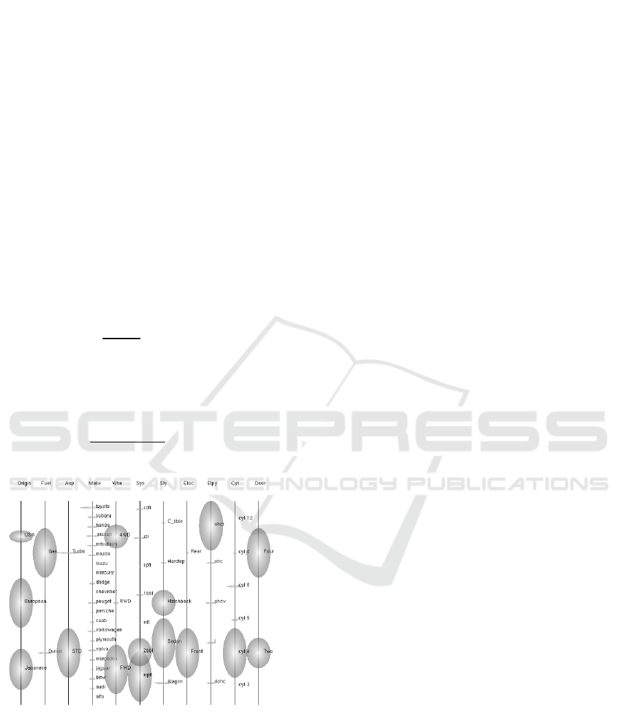
Eq. 8 and 9 for t = 0.25 in Figure 5. Note that
ellipses either horizontally stretched (for low-
frequency values such as those for make variable) or
vertically stretched (for high-frequency values for
such as door variable).
Some categorical variable may contain too many
values or low-frequency values. In such situations,
two or more values can be merged to create a new
categorical value, thereby reducing the number of
circles/ellipses and also making them bigger. For
example, the make variable consists of many
categorical values and correspondingly many circles
or ellipses on the axis. We can merge the make
values into three values (USA, Japan, and Europe)
by their originality regions and then call it a new
origin variable (Figure 5). This can be represented in
parallel coordinates plot as a new axis. Another
example is the cylinder variable which contains too
small values. We can merge 8 and 12-cylinder cars
together, and 3 and 5-cylinder cars together.
3.3 Axes Layout
For dataset containing many variables of different
types, the layout of the axes in parallel coordinates
plot can influence the effectiveness of visualization.
The nominal data values are first mapped to metrics
scale on their respective axes, which are placed
together in one part of the plot (the left side).
Similarly, we map all ordinal (pseudo-continuous)
variables to the axes group, which is placed next to
the nominal axes group. The continuous numerical
variables which are usually visualized to understand
multivariate relations are placed together on the right
part. The axes layout thus contains the nominal,
ordinal and continuous variables from the left to
right (Figure 1). The nominal axes plot can rather
serve as a visual query interface. The information
perceivable from such layout is visually clear. The
distributions of data values on categorical axes differ
from those on continuous numerical axes as
discussed earlier. Also, the polylines connecting data
Effective Visual Exploration of Variables and Relationships in Parallel Coordinates Layout
245
values on successive axes show different order,
orientation, and spread in between the categorical
axes than those in between the numerical axes. The
axes overlays and axis enhancement are designed to
explore data distributions and correlations associated
with many variables considering their types.
4 COLOR MAPPED AXIS
STRIPES
In the parallel coordinates plot, the relationships
between neighbouring dimensions are easy to
perceive by observing data lines which directly
connect the adjacent axes. However, judging
correlations among non-adjacent axes is difficult.
Multiple axes layouts or interactive axes reordering
or direct data lines drawing between the non-
adjacent axes can be helpful (Heinrich et al. 2012;
Lu et al., 2016; Kaur and Karki, 2018). However,
these approaches involve repetitive tasks, specially
when there are many variables of interest. Here we
present an approach based on axes enhancement to
find multivariate correlations without requiring such
extra actions. In essence, our approach builds a
recognizable color order on one numerical
dimension and then propagates this color pattern to
all other dimensions. The result is a parallel
coordinates display containing colorful axes, which
one glances to quickly identify similar or dissimilar
axes irrespective of their locations.
The first step is to select a reference axis from
among several numerical continuous variables under
consideration. A variable with uniform distribution
of data values is a good choice and it can be visually
identified from the histogram plot. The dataset is
then partitioned into groups corresponding to
multiple equal segments or sub-ranges of the
reference axis. These subsets follow the specific
order (increasing or decreasing value) of the
reference dimension and they are assigned distinct
colors. For instance, we divide the weight axis into
three equal segments representing low, mid, and
high values displaying them in blue, green and red,
respectively (Figure 6). The segments can be also
displayed using single color with different intensities
(e.g., gray scale). The reference axis must be divided
into, at least, two parts (lower half and upper half)
for this approach to work. Using too many segments
and, hence, too many distinct colors makes
deciphering pattern difficult.
Our axis enhancement approach mainly focuses
on colouring the axes instead of data polylines. To
improve visibility, we convert vertical axis lines into
vertical axis stripes. Each data value is drawn on the
reference axis stripe with the color of its belonging
segment. For the reference weight variable, the stripe
contains blue shades in the low-section, green shades
in the mid-section, and red shades in the high-section.
The result is thus a colourful stripe in a blue-green-red
sequence (Figure 6). The data items are assigned the
colors of their belonging segments on the reference
axis and displayed with the same colors on any other
axis. For instance, the data items with high weight
values appear in red on all other axis stripes. One can
easily locate any axis stripes with the same blue-
green-red order. The corresponding variables are
positively correlated with the reference variable and
with each other as well.
There is no need to shuffle the axes around as one
layout encodes relevant information for all
correlations on the axis stripes themselves. We
inspect the color patterns on different axis stripes as
they provide visual connections between variables.
The data polylines in the interaxial space are either
suppressed or shown in gray so as to minimize the
user distraction away from the colourful stripes
(Figure 6). If two axis stripes have similar color
patterns, the corresponding dimensions must be
positively correlated. If the patterns compare in an
opposite sense, the two dimensions are negatively
correlated. Two unrelated axes stripes do not show
any discernable similarity.
Figure 6: Color-mapped axis stripes designed for
numerical variables for the automobile dataset. The
reference weight (Wt) axis is split into a blue-green-red se-
quence from the low to high-value end. The data polylines
are shown in gray to provide context.
We further discuss the visual exploration of
correlations in the automobile data using weight as
the reference axis (Figure 6). Any other axis which
IVAPP 2019 - 10th International Conference on Information Visualization Theory and Applications
246
has blue-green-red sequence from the low end to the
high end has a positive correlation with the weight
axis. A glance at the display reveals that multiple
variables including base, length, width, engine size,
horsepower, and price show positive correlations
with weight. For instance, the heavy cars tend to be
costly and large. Any axis which carries the red-
green-blue sequence from the bottom to top is
negatively correlated with the weight axis. The
variables city mpg and highway mpg are related to
weight negatively. As expected, heavy cars tend to
give low mileage per gallon. The colourful axis
stripes for bore, stroke, ratio, and rpm are not
comparable with the reference or any other axis
stripe. So, they appear to be random variables in the
automobile dataset. We can also compare an axis
with any other non-reference axis (Figure 6). For
instance, the axis stripes for city mpg and highway
mpg show very similar color pattern, confirming
their strong positive relationship. Both mileage
variables are negatively correlated with price and
horsepower. Thus, we are not limited to compare
only two specific axes at a time. We can compare
many more axes at a glance to the parallel
coordinates display.
Our approach also helps assess the strength of
the correlation. In order to verify the visually
detected correlations in the automobile data, we
calculate the Pearson correlation coefficients for all
axis pairs. The coefficients calculated with respect to
weight are 0.78, 0.88, 0.87, 0.86, 0.76 and 0.84 for
base, length, width, engine size, horsepower and
price, respectively, thus confirming our finding of
positive correlations. The variables city mpg and
highway mpg take the coefficients of -0.78 and -
0.82, respectively, with respect to weight
(confirming observed negative correlation). The
coefficient is 0.97 between two mpg variables. This
strong positive correlation is consistent with the
color similarity between the two axis stripes and
nearly parallel data lines connecting them (Figure 6).
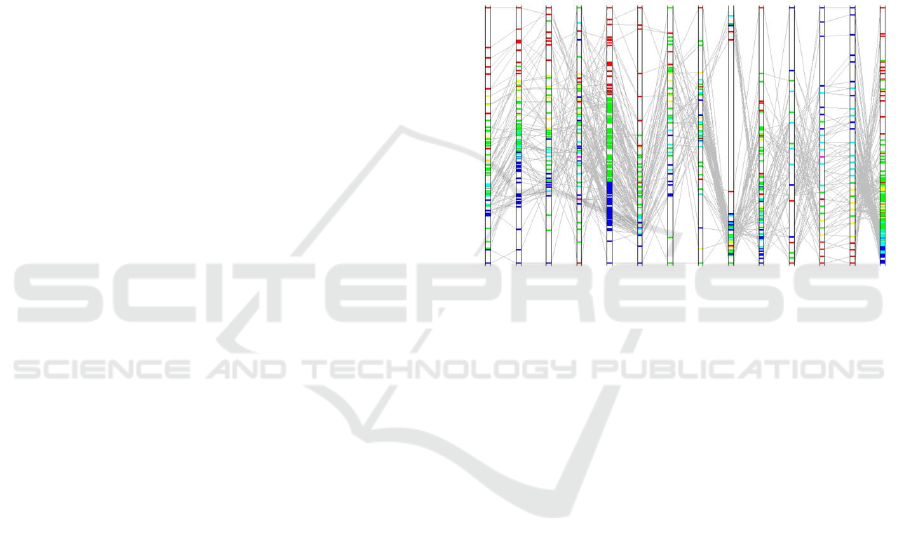
However, a substantial color mix or overlap on
the non-reference axes means that correlations are
either weak or random. It is difficult to correctly
detect such color mix-up because the data point
drawn last determines the final color at a particular
location. For instance, the price axis shows the blue
segment at the lower end, which is squeezed a lot
and appears to have some mix-up with green
segment when compared to the reference weight
axis. This means that most price values are low
(blue data points) and some of them are overwritten
by the green data points. In order to reveal such
overlapping, we blend the colors of two or three data
values mapping to the same location on the axis
stripe (Figure 7). For the three-color reference
sequence considered here, we now see more colors
on the non-reference axes. The lower end of price
axis appears in blue (corresponding to low weight
data points) and then changes to cyan, representing
overlap between low (blue) and mid (color) weight
data points. The price axis stripe shows a nearly
blue-cyan-green-yellow-red sequence (expect some
scattered colors out of the sequence). The reference
color pattern is mostly followed by the price axis
except some overlap occurring between successive
color sections. The inference of correlations thus
remains mostly valid.
Figure 7: Color-mapped axis stripes with color blending.
Cyan, yellow and magenta colors appear for overlapping
data points of different reference colors.
5 COMBINING AXIS STRIPES
AND DISTRIBUTION PLOTS
In the color-mapped axis enhancement scheme, we
focus on how the data items from multiple subsets
defined with respect to the reference variable appear
on all numerical axes. Each data item is tagged with
its subset color. Since many data points may fall into
the same location, displaying the color of the last data
item or blending the colors of all belonging data items
does not show information on data frequency or
density for that location. It is important to explore
how these data subsets are scattered along each axis
and how this distribution influences the assessment of
inter-dimensional relationships. For this, we combine
the histogram and colourful axes layout.
We first make the axis stripes
wide in order
to accommodate histogram bars. Each bar is divided
into the same number of sections (with the same color
sequence assigned) as done for the reference axis.
Thus, we have color-stacked bars within the axis
stripe (Figure 8). For the automobile example, each
Effective Visual Exploration of Variables and Relationships in Parallel Coordinates Layout
247
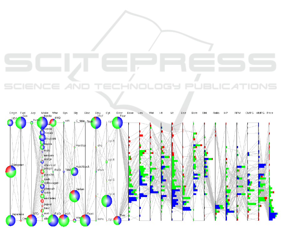
bar contains up to three colors in the blue-green-red
sequence from the left to right. The total bar length is
determined by the frequency (total bin count)
according to the linear mapping method presented in
section 3.1. The extents of blue, green and red
portions depend on the bin counts for their respective
subsets. If the bin count for a section is zero, the
corresponding color will not appear in the bar. If all
three bin counts are non-zero, we will have a stacked
bar consisting of blue, green and red regions. The
stacked view thus allows comparison of data points in
the bin across different subsets. Let’s examine stacked
histogram in the lowermost part of the price axis.
Most of the blue data points (low weight values) are
confined to the lowest price range suggesting that
light cars are very cheap. The red data points (high-
weight values) are quite spread over the price axis.
Nevertheless, the heavy cars are more expensive than
almost all light cars and also more expensive than the
majority medium-weight cars. With stacked bars
embedded in the axis stripes, correlation trends can be
visually realized while additional details are available
for further assessment and relevance.
It is also interesting to explore how the data
subsets with respect to the reference numerical axis
are shared/distributed among different categorical
values for each categorical axis. For instance, one
might want to know the origin of light cars (low
weight values) or cheap cars (low price values). For
this, we visualize data distributions on categorical
variables using pie chart (Figure 8). We slice each
circle/ellipse (encoding the frequency of a particular
categorical value) into multiple parts whose number
and colors are the same as for the segments created on
the reference axis. For the automobile example, each
circle contains up to three parts in the blue-green-red
clockwise order. The size of a color section is
proportional to the count of data items belonging to its
subset for the categorical value the circle or ellipse
represents. From Figure 8, one can infer that the
heavy cars (corresponding to the red color section of
the weight axis) are costly, spacious, two-door
European cars, but they tend to give low mileages.
Similarly, very cheap cars (blue histograms at the low
end of the price axis) have 4-cylinder, low
horsepower engine and are relatively small and light
thereby giving high mileages. These cars are mostly
of Japanese and American origin.
6 CONCLUSIONS
To facilitate visual exploration of variables
themselves and multivariate correlations contained
in data, we have presented two ways of enhancing
parallel coordinates axes. First, all axes are enriched
with the frequency distribution plots based on the
linear and non-uniform frequency mapping schemes,
which allow us to visually discern low frequencies
and also similar frequencies of data values. They are
implemented as histogram bars for numerical
variables and as circles/ellipses for categorical
variables. Second, all numerical axes are converted to
color-mapped axis stripes to display recognizable
color patterns on them. Relationships can be judged
Figure 8: All axes parallel coordinates plot using pie charts for 11 categorical variables and stacked bars for 14 numerical
variables of the automobile dataset. The reference blue-green-red color is defined with respect to the weight (Wt) axis. A pie
chart or histogram bar may show up to three color sections, the size of each section encoding the share of its belonging
subset (low-, mid- or high-weight). Also, the data polylines are shown in gray for the context.
IVAPP 2019 - 10th International Conference on Information Visualization Theory and Applications
248

among all variables by viewing these stripes in the
same parallel coordinates layout. These colors are
also propagated to histograms as stacked bars and
categorical values as pie charts to further facilitate
data exploration. By using the automobile dataset
example consisting of 25 variables of three types
(ordinal, nominal and continuous numerical), we have
demonstrated the essence of the proposed axis
enhancement schemes. More works are needed in
regard to user evaluation, application to more
datasets, and interactive visualization.
REFERENCES
Andrienko, G. and Andrienko, N. V. (2004). Parallel
coordinates for exploring properties of subsets. Int’l
Con. On Coordinated and Multiple Views in
Exploratory Visualization, 93-104.
Dua, D. and Karra Taniskidou, E. (2017). UCI Machine
Learning Repository. Irvine CA: University of
California, School of Information and Computer
Science. http://archive.ics.uci.edu/ml
Dang T. N., Wilkinson L., and Anand A. (2010). Stacking
graphic elements to avoid over-plotting. IEEE
Transactions on Visualization and Computer
Graphics, pages 1044-1052.
Ericson, D., Johansson, J., Cooper, M., 2005. Visual data
analysis using tracked statistical measures within the
parallel coordinates representations. Int’l Con. On
Coordinated and Multiple Views in Exploratory
Visualization, 42-53.
Few, S. (2006). Multivariate analysis using parallel
coordinates. Perceptual Edge.
Ferdosi, B. and Roerdink, J. B. T. (2011). Visualizing
high-dimensional structures by dimension ordering
and filtering using subspace analysis. Computer
Graphics Forum, 30:1121-1130.
Fua Y., Ward M. O., and Rundensteiner E. A. (2000).
Structure-based brushes: A mechanism for
navigating hierarchically organized data and
information spaces. IEEE Transactions on
Visualization and Computer Graphics, 6:150-159.
Geng Z., Peng Z., Laramee R., Walker R., and Roberts J.
(2011). Angular histograms: Frequency-based
visualizations for large, high dimensional data. IEEE
Transactions on Visualization and Computer
Graphics, 17:2572-2580.
Gillmann C., Wischgoll T., Hamann B., and Hagen H.,
(2018). Accurate and reliable extraction of surfaces
from image data using a multi-dimensional
uncertainty Model. Graphical Models, 99:13-21
Hauser H., Ledermann F., and Doleisch H. (2002).
Angular brushing of extended parallel coordinates. IEEE
Symposium on Information Visualization, pages 127-
131.
Heinrich J., Stasko J., and Weiskopf D. (2012). The
parallel coordinates matrix. In EuroVis, pages 37-41.
Heinrich, J. and Weiskopf, D. (2013). State of the art of
parallel coordinates. Eurographics, pages 95–116.
Hurley C. B. and Oldford R. W. (2010). Pairwise display
of high-dimensional information via Eulerian tours
and Hamiltonian decompositions. Journal of
Computational and Graphical Statistics,19: 861-886.
Inselberg, A. (1997). Multidimensional detective. IEEE
Symposium on Information Visualization, pages 100-
107.
Inselberg, A. (2009). Parallel coordinates: visual
multidimensional geometry and its application.
Springer, New York.
Janetzko H., Stein M., Sacha D., and Schreck T. (2016).
Enhancing parallel coordinates: Statistical
visualizations for analyzing soccer data. IS&T
Electronic Imaging Conference on Visualization and
Data Analysis, San Francisco, CA, USA.
Johansson, J. and Forsell, F. (2016). Evaluation of parallel
coordinates” Overview, categorization and
guidelines for future research. IEEE Transactions on
Visualization and Computer Graphics, 22:579-588.
Kaur, G. and Karki, B.B. (2018). Bifocal parallel
coordinates plot for multivariate data visualization.
Computer Vision, Imaging and Computer Graphics
Theory and Applications (VISIGRAPP 2017), pages
176-183.
Lu, L. F., Huang, M. L., and Zhang, J. (2016). Two axes
re-ordering methods in parallel coordinates plots. In
Journal of Visual Languages & Computing, 33: 3–
12.
Peltonen, J. and Lin, Z. (2017). Parallel coordinates plots
for neighbour retrieval. Computer Vision, Imaging
and Computer Graphics Theory and Applications
(VISIGRAPP 2017), pages 40-51.
Riehmann, P., Opolka, J., and Froehlich, B. (2012). The
product explorer: Decision making with ease.
International Working Conference on Advanced
Visual Interfaces, pages 423-432.
Siirtola, H. and Raiha, K. (2006). Interacting with parallel
coordinates. Interacting with Computers, 18:1278-
1309.
Tory M., Potts S., and Möller T. (2005). A parallel
coordinates style interface for exploratory volume
visualization. IEEE Transactions on Visualization
and Computer Graphics, pages 71-80.
Tuor R., Evéquoz F., and Lalanne D. (2018). Parallel
bubbles: categorical data visualization in parallel
coordinates. Computer Vision, Imaging and
Computer Graphics Theory and Applications
(VISGRAPP 2018), pages 299-306.
Wegman E. J. (1990). Hyperdimensional Data analysis
using parallel coordinates. Journal of the American
Statistical Association, pages 664-675.
Zhang Z., McDonnell K., and Mueller K. (2012). A
network-based interface for the exploration high-
dimensional data spaces. IEEE Pacific Visualization
Symposium, pages 17-24.
Effective Visual Exploration of Variables and Relationships in Parallel Coordinates Layout
249
