
Visual Exploration Tools for Ensemble Clustering Analysis
Sonia Fiol-Gonz
´
alez
1
, Cassio F. P. Almeida
1,2
, Ariane M. B. Rodrigues
1
, Simone D. J. Barbosa
1
and H
´
elio Lopes
1
1
Departamento de Inform
´
atica, Pontif
´
ıcia Universidade Cat
´
olica do Rio de Janeiro, Bazil
2
ENCE - Instituto Brasileiro de Geografia e Estat
´
ıstica, Rio de Janeiro, Brazil
Keywords:
Clustering, Ensemble Methods, Ensemble Visualization, Uncertainty Visualization, Co-association Matrix.
Abstract:
Uncertainty Analysis is essential to support decisions, and it has been gaining attention in both visualization
and machine learning communities —in the latter case, mainly because ensemble methods are becoming a
robust approach in several applications. In particular, for unsupervised learning, there are several ensemble
clustering methods that generate a co-association matrix, i.e., a matrix whose element (i, j) represents the
estimated probability that the given sample pair is on the same cluster. This work studies the following
decision problem: “Given a similarity function, which groups of elements of a set form robust clusters?”
Robust here means that all elements of each cluster are connected with a probability within a given interval.
Our main contribution is a prototype that helps decision makers, through visual exploration, to have insights to
solve this task. To do so, we provide visual tools for ensemble clustering analysis. Such tools are grounded in
the co-association matrix generated by the ensemble. With these tools we are better equipped to recommend
the group of elements that form each cluster, considering the uncertainty generated by ensemble clustering
methods.
1 INTRODUCTION
Uncertainty Analysis is an active area of research:
it helps decision makers through the quantification
of uncertainties in relevant variables (Ghanem et al.,
2017). One way to perform this quantification is
to randomly generate an ensemble of possible out-
comes of the given decision problem. Nowadays, the
large amount of computer resources available makes
such ensemble generation possible (Cunha Jr et al.,
2014). The visual analysis of the generated en-
sembles emerges as an important visualization chal-
lenge (Obermaier et al., 2014). This paper deals with
uncertainty visualization in the context of ensemble
clustering analysis.
It is now common to have ensemble classifiers in
supervised learning. They combine the outputs of
multiple classifiers with the purpose of improving the
classification accuracy (Dietterich, 2000). Likewise,
ensemble clustering methods in unsupervised learn-
ing combine multiple partitions to provide better clus-
tering of the data set (Vega-Pons and Ruiz-Shulcloper,
2011). Several ensemble clustering methods generate
a co-association matrix, which is a matrix where each
(i, j) element represents the estimated probability that
the given sample pair is on the same cluster (Fred and
Jain, 2005). These methods can also generate a stan-
dard deviation for each pair, which also represents an
estimated uncertainty.
Objective and Contributions. This work aims to
help decision makers to obtain insights to answer
the following question: “Given a similarity function,
which groups of elements of a dataset form robust
clusters?” By robust we mean that all elements of
each cluster are connected with a probability in a
given interval.
To achieve our goal, we provide a visual tool for
ensemble clustering analysis. Grounded in the co-
association matrix generated by the ensemble, such
tool supports us in recommending the group of ele-
ments that form each cluster, considering the uncer-
tainty generated by ensemble clustering methods. The
tool includes: variations over heatmaps to visualize
the co-association matrices, violin plots of the silhou-
ette of each group in the final partition, network and
edge bundling to visualize the relationships between
datapoints, a scatter plot of a 2D projection, and a
map, when the data is georeferenced.
Paper Outline. The paper is structured as follows:
Section 2 briefly describes related works on ensemble
clustering visualization; Section 3 presents the char-
acteristics of the visual exploration tool of ensemble
Fiol-González, S., Almeida, C., Rodrigues, A., Barbosa, S. and Lopes, H.
Visual Exploration Tools for Ensemble Clustering Analysis.
DOI: 10.5220/0007366302590266
In Proceedings of the 14th International Joint Conference on Computer Vision, Imaging and Computer Graphics Theory and Applications (VISIGRAPP 2019), pages 259-266
ISBN: 978-989-758-354-4
Copyright
c
2019 by SCITEPRESS – Science and Technology Publications, Lda. All rights reserved
259

results; Section 4 describes some analyses of a real-
world use case with the tool and conclusions are given
in Section 5.
2 RELATED WORK
Ensemble Clustering. Ensemble clustering com-
bines multiple clustering results from the same dataset
into a final partition (Vega-Pons and Ruiz-Shulcloper,
2011; Xu and Tian, 2015; Huang et al., 2015). It is
considered a difficult task because cluster labels are
symbolic, so it is also necessary to solve a correspon-
dence problem.
Among the most popular clustering ensemble
techniques we find methods based on co-association
matrices. Iam-On et al. present two new similarity
matrices, which are empirically evaluated and com-
pared against the standard co-association matrix on
six datasets using four different combination meth-
ods and six clustering validity criteria (Iam-On et al.,
2008). The Evidence Accumulation matrix (EAC)
method (Fred and Jain, 2005) is based on a co-
association technique for extracting a consensus clus-
tering from a clustering ensemble. An extension of
EAC is the Weighted Evidence Accumulation matrix
(WEAC) (Huang et al., 2015), which includes weights
to penalize low quality clustering and agglomera-
tive methods to obtain the consensus partition. An-
other option is the Probability Accumulation (PA)
method (Wang et al., 2009), a clustering aggregation
scheme that uses a correlation matrix based on clus-
ter size. The Ensemble Clustering Matrix Completion
(ECMC) method, proposed by (Yi et al., 2012), is ro-
bust to uncertainties in the data. The Robust Spectral
Ensemble Clustering (RSEC) learns a robust repre-
sentation for the co-association matrix through low-
rank constraint, which reveals the cluster structure of
a co-association matrix and captures various noises in
it (Tao et al., 2016).
The recent Locally Weighted Ensemble Clus-
tering method is an ensemble clustering approach
based on ensemble-driven cluster uncertainty estima-
tion and local weighting co-association matrix strat-
egy; it applies two novel consensus functions to con-
struct the final partitions (Huang et al., 2018). An-
other example is a novel committee-based cluster-
ing method composed of three stages (Fiol-Gonzalez
et al., 2018): (i) generating the clustering ensemble by
combining feature selection strategies and clustering
methods varying the number of clusters to generate
multiple scenarios; (ii) combining the results of the
multiple clustering scenarios generated to produce a
co-association matrix; and (iii) creating sets of parti-
tions using the co-association matrix and then select-
ing the final partition based on the best performance
using the silhouette coefficient.
Visual Analysis of Ensembles. Due to their com-
plexity and size, ensembles provide challenges in data
management, analysis, and visualization (Potter et al.,
2009). Wang et al. reported a survey on visualiza-
tion techniques and analytic tasks involving ensemble
data (Wang et al., 2018). They organize ensemble vi-
sualization techniques research into a pipeline, where
ensemble data go to through a statistical aggregation
step before visualization, a visual composition step
after visualization, or a combination of both. In other
words, these visualization techniques can be applied
to get an overview of the entire ensemble or to com-
pare the relationships between a small number of sce-
narios.
There are some tools to help visualize ensemble
data. Ensemble-Vis links views built from means and
standard deviations, using color and overlaid contours
to view the complete ensemble dataset (Potter et al.,
2009). IPFViewer combines small multiples views at
multiple hierarchical levels to analyze hierarchical en-
semble data (Thurau et al., 2014). Hao et al. apply
ensemble visualization techniques in a network secu-
rity analysis environment to produce a network en-
semble visualization system (Hao et al., 2015). These
techniques can cluster traffic with similar behavior
and identify traffic with unusual patterns, facilitating
the analysis of relationships between alerts and traffic
flow.
Inspired by the related work and by the fact that
it is possible to combine clustering results to improve
the final partition, we want to visualize this final parti-
tion to understand its internal structure. We therefore
address the following research questions:
• RQ1: How to visualize the final partition of a
combination of clustering results?
• RQ2: Given a final partition, how to visualize its
internal structure?
• RQ3: How to visualize the co-association matrix
and uncertainty matrix from which the final parti-
tion was generated?
• RQ4: How to visually identify whether the pat-
terns detected in the co-association matrix con-
form to the groups in the final partition?
• RQ5: How is it possible to identify the probabil-
ity of obtaining connected components that agree
with the final partition groups?
• RQ6: How to compare the final partition with
other possible solutions (clusterings)?
IVAPP 2019 - 10th International Conference on Information Visualization Theory and Applications
260

3 VISUAL EXPLORATION TOOL
OF ENSEMBLE RESULTS
This section proposes some visual exploration tools of
the co-association matrix, to facilitate the understand-
ing of the ensemble clustering result. There are sev-
eral ensemble methods to construct the co-association
matrix (Berikov, 2016; Lin et al., 2017; Fiol-Gonzalez
et al., 2018). Among these, we selected Fiol et al.’s
committee-based clustering method to generate the
ensemble, because their algorithm generates as out-
put the following matrices (see Section 2):
• Co-association matrix (CM), where the position
(i, j) contains the probability that elements i and
j are in the same cluster.
• Partitions Silhouette matrix (PSM), where the po-
sition (i, j) contains a tuple with the silhouette
value and the cluster id (< sil,cl
id >) for element
i in partition j. The final partition is identified by
an index f , where 0 ≤ f ≤ ncol(PSM).
The algorithm also generates a third matrix based
on the CM to complement the uncertainty information
in the overview task:
• Standard Deviation matrix (STD CM), where the
position (i, j) contains the uncertainty (std) asso-
ciated to the same element in the co-association
matrix.
We propose to use some visualization techniques
to assist in analytic tasks involving ensemble cluster-
ing data. Wang et al. reported six visual analytic tasks
that cover most of the ensemble visualization litera-
ture, from which we chose three, as follows:
1. Overview: visual summary of ensemble data and
overall uncertainty information.
2. Comparison: visual identification of the differ-
ence between two members.
3. Clustering: grouping of members or ensemble ob-
jects by similarity.
Based on these analytic tasks we defined three design
goals for our visual exploration tool. We had to ex-
trapolate the tasks from ensemble data members or
object dimensions to ensemble clustering dimensions.
The three main design goals are:
G1: Provide a visual representation of ensemble
clustering (clustering task).
G2: Provide a visual summary of the final parti-
tion and uncertainty information (overview task).
G3: Support a visual identification of the differ-
ences between groups (comparison task).
In the next subsections we explain in detail the so-
lutions proposed for each design goal.
The tool was developed using the R script
language (R Core Team, 2018) and the
shiny (Chang et al., 2018), plotly (Sievert, 2018),
leaflet (Cheng et al., 2018), visNetwork (Almende
B.V. et al., 2018), edgebundleR (Tarr et al., 2016)
packages. We chose R because we wanted to test
quickly and easily different possibilities of visualiza-
tions and different datasets. We are already working
on the development of the solutions presented here in
a more robust tool using Python (Van Rossum and
Drake, 2003).
Our design consists of coordinated multiple
views (Scherr, 2008), where views are displayed side-
by-side and changes in one view affect the others. In
fact, this solution is preferable when compared to sin-
gle view because it can display different facets of the
clustering ensemble information while avoiding vi-
sual clutter. Basically, the interaction area of the tool
consists of three linked parts (Figure 1): A) confi-
dence filtering; B) CM and related information; and
C) group relationship, connections, 2D data points
representation, and geospatial information.
The threshold in region A is a pair < min, max >
(0 ≤ min ≤ max ≤ 1) of parameters the user can de-
fine. This filtering acts directly on the other parts (B
and C), producing a clearer representation of the de-
sired data and a better definition of patterns in the CM.
The histogram next to the threshold represents the dis-
tribution of the CM. By manipulating the threshold, it
is possible to identify the percentage of binds (< i, j >
pairs) that would remain after filtering.
By using the ensemble method results, we can use
the confidence interval of the probability of each bind
to propose three new approaches for filtering connec-
tions, as follows:
• Traditional Interval Filter: Takes into account
the estimated probability of the bind. We accept
the connection of the pair as true if the probability
that the pair is on the same cluster is within the
interval threshold.
• Weak Interval Filter: Verifies whether the confi-
dence interval intersects the given threshold inter-
val.
• Strong Interval Filter: Only accepts a pair as
connected if the entire confidence interval of the
bind is included in the threshold interval.
The confidence interval was constructed using the
Gaussian probability distribution with significance
level α (CM
i, j
±z
α
2
ST D
i, j
/
√
n, where n is the num-
ber of scenarios in the ensemble). These intervals
are related to uncertainty and they represent the range
of potential values of the true connection probability.
Using the strong filter, we only select binds with con-
Visual Exploration Tools for Ensemble Clustering Analysis
261
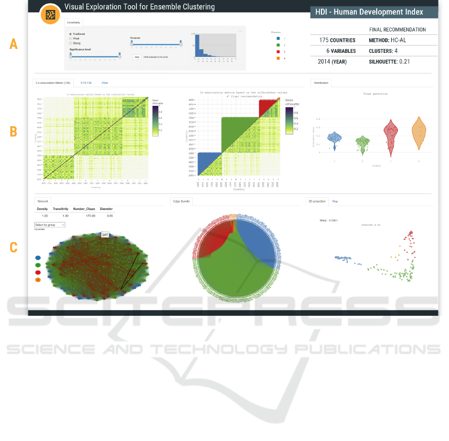
Figure 1: Visualization components of the tool.
fidence intervals within thresholds. In other words,
there is a very small chance that the threshold does
not contain the actual bind value. In the weak case, it
is sufficient that the chance that the threshold contain-
ing the actual bind value is greater than zero.
We use colors to represent clusters. They serve as
a visual aid to relate the different views, except for the
heat map visualizations, which have their own color
scale. The right-hand side of region A displays some
information about the dataset and the final partition.
Region B is divided into two parts. The left-hand
side groups in tabs the four co-association matrices
and the silhouette value of all possible recommenda-
tions. The right-hand side shows the probability den-
sity of the silhouette of each group.
Region C includes four views: (i) a network com-
ponent to visualize how each data point connects with
the others; (ii) an edge bundling component that al-
lows to view each network connection separately;
(iii) the 2D spatial projection of each data point; and
(iv) the map component to identify how each group is
organized geographically (if applicable).
To achieve G1 (visual representation of an ensem-
ble clustering), we chose three ways to visually rep-
resent clusters: cluster colors across all groups, a 2D
projection through scatter plots, and a map.
2D Projection. To represent the similarity degree
of the data points and the final partition, we use
a Multidimensional Scaling (MDS) projection tech-
nique (Kruskal and Wish, 1978). We project each
data point in two dimensions using scatter plots. To
evaluate the quality of the projection, we inform the
measure of the stress (see Figure 1, region C).
Each point of the 2D projection represents a mem-
ber of the final partition and can be recognized by
the color corresponding to its cluster. In this way, we
can visualize a representation of the dispersion of the
points inside and between clusters, allowing to evalu-
ate the quality of the final partition.
Map. Georeferenced objects, such as neighborhoods,
cities, and countries, are visualized in a map to easily
analyze whether adjacent elements belong to the same
cluster. When one clicks on a region, it shows a pop-
up with the region name and the cluster number. This
allows domain experts to recognize whether the final
partition is in line with their experience.
Together, the 2D projection and map representa-
tions answer RQ1 (How to visualize the final partition
of a combination of clustering results?).
To achieve G2 (visual summary of the final par-
IVAPP 2019 - 10th International Conference on Information Visualization Theory and Applications
262

tition and overall uncertainty information), we chose
heat maps, because they convey an overview of the
behavior of datapoints. We represent four types of
matrices in heat maps. Associated with them, the
graph and the edge bundling provide an overview of
the relationship between the datapoints.
Heat Map. We used the heat map to represent the CM
in its traditional form (Wilkinson and Friendly, 2009),
and the uncertainty matrix, adapted with scatter plots.
This visualization compacts large amounts of infor-
mation into a small space to bring out coherent pat-
terns in the data. Each matrix has its symmetric and
lower triangular variation. The data are sorted using
the cluster numbers from the final partition in order to
form the patterns corresponding with the clusters in
the heat map.
When representing the CM as a heat map it is pos-
sible to notice that all the values in the main diagonal
are 1 (dark color), i.e., representing the probability of
the element being in the same cluster as itself. Con-
versely, pairs with value 0 (light color) mean that the
two elements have no binds, i.e., they never appear
in the same cluster. By hovering over each cell of
the matrix, a tooltip with information about the pair
of binds appears: the pair’s name, relationship value,
group, and standard deviation (in the case of the un-
certainty matrix).
Symmetric Co-association Matrix: There are spe-
cific patterns with rectangular shape (henceforth
blocks) formed around the main diagonal in the heat
map, containing the elements belonging to the same
cluster. Visualizing the data in this way (see Figure 1-
B) allows users to find darker regions, have an idea of
the cohesion of groups, identify and count the blocks
in the result. In Figure 1-B one can see three blocks.
We can see the same pattern in all four representations
of the matrix, but it is more evident here.
Lower Triangular Co-association Matrix: The
lower part of this matrix represents the same infor-
mation as the previous one. At the upper part, we
map the clusters according to the final partition (see
Figure 1-B). It is helpful when we cannot find well-
defined patterns in the symmetric matrix (e.g., the red
cluster in Figure 1-B). This feature helps us answer
RQ4 (How to visually identify whether the patterns
detected in the co-association matrix conform to the
groups in the final partition?).
STD CMs: In this view, instead of painting the entire
matrix cell, we use circles whose size is proportional
to the standard deviation value. The smaller the circle
size, the lower the uncertainty associated with the pair
of binds. The color remains the same as in the other
heatmaps.
The set of matrices provides an overview of the
aggregate ensemble, allowing to analyze the proba-
bility of two data points falling in the same cluster
in the multiple combinations and to know the uncer-
tainty associated with that probability. This allows us
to answer RQ3 (How to visualize the co-association
matrix and uncertainty matrix from which the final
partition was generated?).
Graph. To visualize the CM in a graph, one can de-
fine a complete undirected weighted graph as G <
V,E > where V are the elements of the dataset and
E are the edges connecting each two elements. The
weight of an edge is equal to the probability with
which the two elements are together in the explored
scenarios. Visually, the size of each node corresponds
to its degree (number of nodes with which it is con-
nected). When an edge is selected, the tool shows the
probability associated with its pair of nodes.
This third section (see Figure 1-C) shares the
threshold of the previous sections: setting a thresh-
old range disables the edges with weights outside of
the range, allowing to decompose the fully connected
graph in separate connected components. This visual-
ization enhances the study of components containing
elements of different clusters, allowing users to no-
tice the nodes which tend to be isolated even with low
thresholds, to analyze the articulation points (repre-
sented with a thicker border) of the graph in depth;
and to obtain an overview of some graph statistics,
such as diameter, density, transitivity, and the number
of cliques. In addition, the edges of the diameter in
each connected component are presented in a differ-
ent way, e.g., edge in red color (see Figure 1-C).
Hierarchical Edge Bundling. Hierarchical edge
bundling is a flexible and generic method that can
be used in conjunction with existing tree visualiza-
tion techniques. Low bundling strength mainly pro-
vides low-level, node-to-node connectivity informa-
tion, whereas high bundling strength provides high-
level information (Holten, 2006).
At first glance, it allows identifying the number
of items per group. If an item is selected, we may
quickly see the related items (i.e., items that share an
edge with the selected one) and whether they are in
the same group or not. If all the elements linked to
it are in the same group (i.e., represented in the same
color), the group is very cohesive.
As we modify the threshold, we can see the con-
nections increasing or decreasing (both in the graph
and in the edge bundling), which allows us to iden-
tify values in which related components are formed.
This way we can answer RQ5 (How is it possible to
identify the probability of obtaining connected com-
ponents that agree with the final partition groups?).
Finally, to achieve G3 (visual identification of dif-
Visual Exploration Tools for Ensemble Clustering Analysis
263

ferences between groups), we use violin plots super-
imposed by a dot chart for each group, placed side
by side. Violin plots summarize density shapes into
a single plot of the data within each group, allow-
ing comparison between groups (Hintze and Nelson,
1998). Inside each violin it is possible to identify the
amount of data points per group. Hovering over each
violin shows a tooltip with the interquartile informa-
tion. This way we can answer RQ2 (Given a final
partition, how to visualize its internal structure?)
Scatter Plot for PSM shows the silhouette values for
each possible partition, as well as the final partition.
The triangle markings shows the silhouette value in
the final partition: an upward triangle indicating that
the silhouette value is above the average for that data
point, and the downward triangle otherwise. This al-
lows us to answer RQ6 (How to compare final parti-
tion with other possible solutions (clusterings)?).
4 USE CASE
The publicly available Human Development Index
(HDI)
1
was createdas part of the United Nations pro-
gram, among other objectives, to compare and char-
acterize the countries according to their development
level. The online data are organized by year, and for
each year it contains a set of features to compute the
index. The 175 countries are classified in four groups:
very high, high, medium, and low, but we only use this
information to verify our clustering. We used the fol-
lowing variables to build the dataset: Infant mortality
rate (per 1,000 live births) - 2013, Gross national in-
come (GNI) per capita (2011 PPP$) - 2014, Labour
force participation rate (% ages 15 and older) - 2013,
Mean years of schooling - 2014, Expected years of
schooling - 2014 and Life expectancy at birth - 2014.
The goal is to obtain a final partition using the en-
semble method. We use the following parameters:
K varying from 2 to 28; Sequential Forward Selec-
tion and Sequential Backward Selection as feature se-
lection methods; and K-means, K-medoids and Hi-
erarchical Clustering with Average Link (HC-AL) as
clustering methods to create the ensemble. To obtain
the final partition we used the K-medoids and HC-AL
methods. We used α = 0.05 to create the confidence
interval.
Results. The method proposed 4 clusters with a sil-
houette around 0.21 and using HC-AL. Figure 1 B-2
shows the CM generated from the aggregate ensemble
and the final partition of the method.
1
Human Development Index: https://goo.gl/so6LpE last
visited in September, 2018
The orange cluster contains the very high coun-
tries, such as QAT (Qatar), ARE (United Arab
Emirates), KWT (Kuwait), SGP (Singapore), BRN
(Brunei Darussalam), but with the highest GNI. The
other very high countries are located in the red clus-
ter. The high countries are in the green cluster and the
poor countries are in the blue cluster. The countries
with medium development are mixed in the green and
blue clusters. We can see the clusters in the world
map (Figure 1C-3).
In the symmetric representation of CM (Figure
1B-1), we have four well defined blocks. The fourth
cluster (in orange) is the smallest one, with only 5
data points. We can see it most clearly in Figure
1B-2. These blocks are filled with green dots, while
the connection with the elements in other blocks are
mostly in yellow, so the connection within the clus-
ter is stronger than outside it. In order to highlight
this fact, the threshold was set to 0.30 with traditional
filter. This configuration results in 8.2% of all con-
nections.
In the final partition, the blue group and the green
group have the smallest ranges of the silhouette values
(see Figure 1 B-3), while the red group has the largest
range, which matches the variation in the CM (see
Figure 1 B-1).
With a 0.40 threshold and weak filter, the groups
have more intra-connections, as well as some connec-
tions between the groups, mixing different groups in
the same connected component (see Figure 2b, dot-
ted outline). This configuration results in 5.0% of all
connections. The selected connected component (in
red, green and blue) has 103 countries represented on
the map (see Figure 4a). The countries in blue are
IND (India), NAM (Namibia), and STP (Sao Tome
and Principe), and they have a medium HDI. This case
is less restrictive, with more heterogeneous countries
and a range of HDI from 0.51 to 0.94.
With a 0.40 threshold and traditional filter (figure
omitted for brevity), the elements looks sparse, but
the green and red dots are still joined by an articu-
lation point (node POL-Poland in red). Most of the
countries in the green subgroup (see Figure 4b) have
a high HDI. This configuration results in 3.8% of all
connections, i.e., 1.2% fewer than when filtered with
the weak filter. The selected connected component (in
red and green) has 50 countries.
With a 0.40 threshold and strong filter, the graph
looks more cohesive (see Figure 3). This configura-
tion results in 3.0% of all connections, i.e., 2.0% and
0.8% fewer than when filtered with the weak and tra-
ditional filters, respectively. The selected connected
component (in red) has 33 countries, and all of them
have very high HDI ranging from 0.82 to 0.94. Strong
IVAPP 2019 - 10th International Conference on Information Visualization Theory and Applications
264
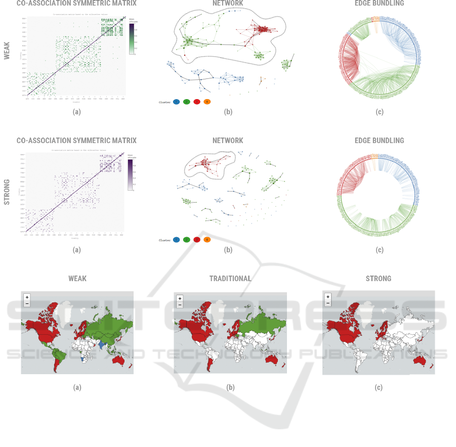
Figure 2: Visualization of the final partition for the HDI dataset with a threshold of [0.40;1] and weak filter.
Figure 3: Visualization of the final partition for the HDI dataset with a threshold of [0.40;1] and strong filter.
Figure 4: Visualization of the selected connected components for the HDI dataset with a threshold of [0.40;1].
filters are good to identify more cohesive groups.
5 CONCLUSIONS
This work proposed a visual tool prototype that sup-
ports the exploration of different aspects of a dataset.
It is a useful tool to deeply analyze the connection
between the elements, characterize the instances, and
locate them on a map. This is an interesting approach
for spatial analysis, where the number of elements is
reduced. With all the results, the proposed research
goals were accomplished. Although we tested the ap-
proach with different datasets, we could only present
here one of them.
Our first step in this work was to explore different
types of visualizations to assist in the analysis of the
final partition. Our next step is to evaluate our tool
in an empirical study to identify: (i) different insights
that analysts gain when interacting with the visualiza-
tions; (ii) possible interaction design enhancements
of the tool; and (iii) new features that could allow a
deeper and more comprehensive analysis.
ACKNOWLEDGEMENTS
We thank Conselho Nacional de Desenvolvimento
Cient
´
ıfico e Tecnol
´
ogico (CNPq) for partially financ-
ing this research.
REFERENCES
Almende B.V., Thieurmel, B., and Robert, T. (2018). vis-
Network: Network Visualization using ’vis.js’ Li-
Visual Exploration Tools for Ensemble Clustering Analysis
265

brary. R package version 2.0.3.
Berikov, V. (2016). Cluster ensemble with averaged co-
association matrix maximizing the expected margin.
In DOOR (Supplement), pages 489–500.
Chang, W., Cheng, J., Allaire, J., Xie, Y., and McPherson,
J. (2018). shiny: Web Application Framework for R.
R package version 1.1.0.
Cheng, J., Karambelkar, B., and Xie, Y. (2018). leaflet:
Create Interactive Web Maps with the JavaScript
’Leaflet’ Library. R package version 2.0.1.
Cunha Jr, A., Nasser, R., Sampaio, R., Lopes, H., and
Breitman, K. (2014). Uncertainty quantification
through the monte carlo method in a cloud com-
puting setting. Computer Physics Communications,
185(5):1355–1363.
Dietterich, T. G. (2000). Ensemble methods in machine
learning. In International workshop on multiple clas-
sifier systems, pages 1–15. Springer.
Fiol-Gonzalez, S., Almeida, C., Barbosa, S., and Lopes, H.
(2018). A novel committee–based clustering method.
In International Conference on Big Data Analytics
and Knowledge Discovery, pages 126–136. Springer.
Fred, A. L. and Jain, A. K. (2005). Combining multiple
clusterings using evidence accumulation. IEEE Trans-
actions on Pattern Analysis & Machine Intelligence,
(6):835–850.
Ghanem, R., Higdon, D., and Owhadi, H. (2017). Hand-
book of uncertainty quantification. Springer.
Hao, L., Healey, C. G., and Hutchinson, S. E. (2015). En-
semble visualization for cyber situation awareness of
network security data. In 2015 IEEE Symposium on
Visualization for Cyber Security (VizSec), pages 1–8.
IEEE.
Hintze, J. L. and Nelson, R. D. (1998). Violin plots: a box
plot-density trace synergism. The American Statisti-
cian, 52(2):181–184.
Holten, D. (2006). Hierarchical edge bundles: Visualiza-
tion of adjacency relations in hierarchical data. IEEE
Transactions on visualization and computer graphics,
12(5):741–748.
Huang, D., Lai, J.-H., and Wang, C.-D. (2015). Combining
multiple clusterings via crowd agreement estimation
and multi-granularity link analysis. Neurocomputing,
170:240–250.
Huang, D., Wang, C.-D., and Lai, J.-H. (2018). Locally
weighted ensemble clustering. IEEE transactions on
cybernetics, 48(5):1460–1473.
Iam-On, N., Boongoen, T., and Garrett, S. (2008). Refining
pairwise similarity matrix for cluster ensemble prob-
lem with cluster relations. In International Confer-
ence on Discovery Science, pages 222–233. Springer.
Kruskal, J. B. and Wish, M. (1978). Multidimensional Scal-
ing, volume 31.
Lin, Z., Yang, F., Lai, Y., Gao, X., and Wang, T. (2017).
A scalable approach of co-association cluster ensem-
ble using representative points. In Automation (YAC),
2017 32nd Youth Academic Annual Conference of
Chinese Association of, pages 1194–1199. IEEE.
Obermaier, H., Joy, K. I., et al. (2014). Future challenges
for ensemble visualization. IEEE Computer Graphics
and Applications, 34(3):8–11.
Potter, K., Wilson, A., Bremer, P.-T., Williams, D., Dou-
triaux, C., Pascucci, V., and Johnson, C. R. (2009).
Ensemble-vis: A framework for the statistical visual-
ization of ensemble data. In Data Mining Workshops,
2009. ICDMW’09. IEEE International Conference on,
pages 233–240. IEEE.
R Core Team (2018). R: A Language and Environment for
Statistical Computing. R Foundation for Statistical
Computing, Vienna, Austria.
Scherr, M. (2008). Multiple and coordinated views in in-
formation visualization. Trends in Information Visu-
alization, 38:1–8.
Sievert, C. (2018). plotly for R.
Tao, Z., Liu, H., Li, S., and Fu, Y. (2016). Robust spec-
tral ensemble clustering. In Proceedings of the 25th
ACM International on Conference on Information and
Knowledge Management, pages 367–376. ACM.
Tarr, G., Bostock, M., and Patrick, E. (2016). edgebundleR:
Circle Plot with Bundled Edges. R package version
0.1.5.
Thurau, M., Buck, C., and Luther, W. (2014). Ipfviewer a
visual analysis system for hierarchical ensemble data.
In Information Visualization Theory and Applications
(IVAPP), 2014 International Conference on, pages
259–266. IEEE.
Van Rossum, G. and Drake, F. L. (2003). Python language
reference manual. Network Theory United Kingdom.
Vega-Pons, S. and Ruiz-Shulcloper, J. (2011). A survey of
clustering ensemble algorithms. International Jour-
nal of Pattern Recognition and Artificial Intelligence,
25(03):337–372.
Wang, J., Hazarika, S., Li, C., and Shen, H.-W. (2018). Vi-
sualization and visual analysis of ensemble data: A
survey. IEEE transactions on visualization and com-
puter graphics.
Wang, X., Yang, C., and Zhou, J. (2009). Clustering aggre-
gation by probability accumulation. Pattern Recogni-
tion, 42(5):668–675.
Wilkinson, L. and Friendly, M. (2009). The history of
the cluster heat map. The American Statistician,
63(2):179–184.
Xu, D. and Tian, Y. (2015). A comprehensive survey
of clustering algorithms. Annals of Data Science,
2(2):165–193.
Yi, J., Yang, T., Jin, R., Jain, A. K., and Mahdavi, M.
(2012). Robust ensemble clustering by matrix com-
pletion. In 2012 IEEE 12th International Conference
on Data Mining, pages 1176–1181. IEEE.
IVAPP 2019 - 10th International Conference on Information Visualization Theory and Applications
266
