
TypeVis: Visualization of Keystrokes and Typing Patterns based on Time
Series Analysis
Kinga Enyedi and Roland Kunkli
Faculty of Informatics, University of Debrecen, Debrecen, Hungary
Keywords:
Typing Pattern, Time Series, Typing Style, Keystrokes.
Abstract:
In recent decades, people spend more and more time in front of their computers; therefore, instead of writing
on a paper, it is more common to type on a keyboard. In the case of handwriting, there are personal traits
implicitly left with the written text since people do not write the same way. Since how one writes on a paper
using a writing tool results in a different outlook of the written text for each person, one may question whether
the process of typing on a keyboard involves any specific personality traits or not. It can be proven that several
particular properties exist in the case of keyboard usage too. One of the most typical properties is based on
differences in time with respect to pressing and releasing keys on the keyboard. In this paper, we present a
visualization method for representing the typing styles of people, based on differences in when they press and
release each key on the keyboard over time. Using time differences of keystrokes for visualization purposes
allows to create a visible image about an individual’s personal typing habits.
1 INTRODUCTION
In our digitized world, handwriting is a little less po-
pular than before. With handwriting, personal traits
like the shape of the letters or the space among them
can clearly be seen in the written text. However, when
typing on a keyboard, we cannot see such traits di-
rectly in the typed text, while it is straightforward that
the way how people type is not the same at all: many
factors that determine the typing style is different for
each person (Baker and Redfern, 2007), (Longi et al.,
2015). For example, force and pressure used to press
a key, or the velocity of the key after pressing it are
usually different, just like the number of fingers used
to type or the position where eyes look while typing.
It is clear that such properties can be specific for indi-
viduals.
Based on the way how these traits can be measu-
red, we can categorize them into two groups: there are
properties just like the amount of pressure on the keys
that would require special hardware to measure, and
there are ones that can be measured based on time,
that means they can be captured by using an ordinary
keyboard. In this work, we will use time differences
based typing properties to distinguish and visualize
individuals’ typing styles.
Many studies exist that have already used time-
based personal typing characteristics for specific pur-
poses proving the effectiveness of using an indivi-
dual’s typing style as the base of user authentication
and identification (Karnan et al., 2011). Using key-
stroke dynamics, there is a personal identity verifica-
tion method presented with a false alarm rate of less
than 5% (Gunetti and Picardi, 2005) and less than 4%
(Bergadano et al., 2002). In another paper, time se-
ries analytics was used as well in connection with
typing behavior, establishing an approach to recog-
nize users by their keyboard usage with an accuracy
of 98% (Alshehri et al., 2016). Besides that, duration
of keystrokes and the time passed between keypresses
were used to get to know specific people’s typing pat-
terns to create a system using passwords hardened by
personal typing dynamics (Monrose et al., 2001).
Many studies prove that keyboard usage charac-
teristics are personal enough to use them as the base
of authentication when creating an additional layer of
security. When such methods work with these cha-
racteristics, they determine if two patterns match by
calculating how identical they are; that means they
show the matching rate in percentage as a result. Ho-
wever, this value does not show in which parts the ty-
ping characteristics differ in the patterns, and why that
specific matching rate was calculated. To try to reveal
these differences and similarities in the patterns, we
introduce a visualization method that displays indi-
viduals’ typing styles and shows how specific typing
346
Enyedi, K. and Kunkli, R.
TypeVis: Visualization of Keystrokes and Typing Patterns based on Time Series Analysis.
DOI: 10.5220/0007584103460353
In Proceedings of the 14th International Joint Conference on Computer Vision, Imaging and Computer Graphics Theory and Applications (VISIGRAPP 2019), pages 346-353
ISBN: 978-989-758-354-4
Copyright
c
2019 by SCITEPRESS – Science and Technology Publications, Lda. All rights reserved

characteristics differ among people. By making these
traits visible, we could see in what properties two ty-
ping patterns differ from each other.
2 RELATED WORK
Though many studies use keystroke dynamics as the
source of user authentication, typing characteristics
were presented in a form of visualization as well. In
one study, researchers created a system called Key-
Strokes, which personalizes the typed text based on
such typing characteristics and creates personalized
e-cards (Neumann et al., 2007). Within this system,
handwriting-like personality traits are present in the
case of electronic letters as well. A visualization
method was introduced by the authors by creating a
keyboard-like mapping from some keys, and specific
key pairs were connected with bubble-like figures if
they were pressed consecutively. The thickness of the
figure was determined by the amount of time passed
between the keypresses. Other properties, like the fre-
quency of pressing a key, or the correction of a misty-
ped letter are presented in the background, too. With
all these connected items and represented properties,
the created visualization enriches the typed text that
would be sent on the e-card with personality traits.
There are other kinds of visualization techniques
for characterizing connections among data, too. For
example, using heatmaps is a great idea to present
properties of related items. In a paper, for instance,
a social network visualization system called NetVi-
sia was designed by using heatmaps to display node-
link data (Gove et al., 2011). In another work, the
authors introduced a technique called gesture heat-
maps to aid researchers during gesture analysis (Va-
tavu et al., 2014). Even the already mentioned eye
movement property was visualized using an exten-
sion of the heatmap based technique in another arti-
cle (
ˇ
Spakov and Miniotas, 2007). In our work, first
we tried some visualization methods that are discus-
sed in the next chapter, but our proposed method for
typing visualization also uses heatmap-like visualiza-
tion technology, as discussed in later chapters.
3 OUR FIRST APPROACHES
3.1 KeyStrokes-like Visualization
In our work, we wanted to create a visualization met-
hod that is capable of representing an individual’s ty-
ping style. At first, we created an application based on
the ideas of KeyStrokes, trying to extend its features
for our purpose.
Since our goal is to visualize typing styles, in our
application the quantity of the typed text was not limi-
ted, so users could type as much as they wanted. We
noticed that this visualization method is not capable
of showing someone’s typing style, since overlapping
items start to appear on the canvas when the number
of characters starts to grow, making it impossible to
distinguish connections among key pairs (see Figure
1). To overcome this issue, we tried to arrange keys
circularly and also tried to interactively differentiate
connections using colors, but neither of these worka-
rounds helped to create a more comprehensible visu-
alization.
Figure 1: The KeyStrokes-like visualization gets harder to
interpret when the text gets longer. More character means
more connection to draw, which results in a visualization
containing many items that overlap each other.
3.2 Circos-like Visualization
There is a popular genome-based visualization tool
called Circos (Krzywinski et al., 2009) and its web-
based table data visualization tool called Circos Ta-
ble Viewer (Krzywinski, 2008), which works for big-
ger data sets as well. Circos arranges header data of
the table onto a circle and uses ribbons with different
widths to represent the magnitude of the value in the
intersecting cell. If we treat all the keystrokes as a
series of key pairs, then we can group this sequence
by key pairs and represent the data specific to each
of them. This way visualization items do not over-
lap each other, but it turns out there is another kind
of problem here. Since only those key pairs appear
in the visualization that are present in the typed text,
therefore widths of the ribbons are influenced by the
number of different key pair combinations. Besides,
if all possible key pair combinations would be shown
at once, then all ribbons would be too thin, and thus
no information could be extracted from the visualiza-
tion (see Figure 2).
TypeVis: Visualization of Keystrokes and Typing Patterns based on Time Series Analysis
347
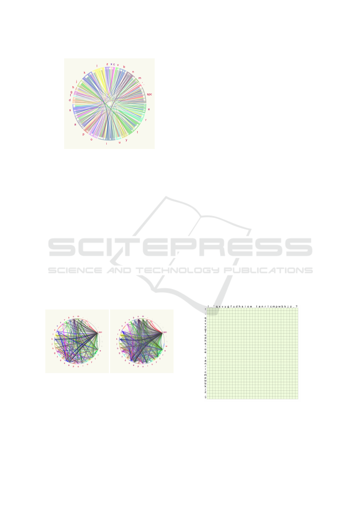
Figure 2: Circos-like visualization. Connecting ribbons in-
dicate the time passed between each keypress. This method
cannot be used in our context as we need the ability to glo-
bally compare values independently from the number of key
pairs occurring in the text.
3.3 Visualization with B
´
ezier Curves
Based on our previous visualization attempt using the
idea of Circos, we worked with the same scheme as
we aligned the examined characters in a circle, and
the connection between a character pair held informa-
tion about that keystroke pair. However, this time we
use B
´
ezier curves as connections instead of ribbons.
More time means higher curvature of the curve at the
point calculated for parameter 0.5 and vice versa. As
can be seen in Figure 3, this results in a visualization
that looks more tense when the user needed less time
to type specific characters and a bit looser if more.
However, this method involves too much overlap of
the items too, which means it is hard to examine each
element.
(a) Pattern of a faster typer (b) Pattern of a slower typer
Figure 3: Typing pattern of two people visualized with
B
´
ezier curves. It can be noticed that items overlap each
other resulting in a crowded diagram.
4 HEATMAP-LIKE
VISUALIZATION
Since in our previous methods, our main problem ba-
sically consisted of the overlapping items, in this kind
of visualization we decided to create space for all pos-
sible key combinations, making a heatmap based re-
presentation. Just like in the case of the Circos-like
method, we treat the typed text as a series of key-
stroke pairs, so we composed a table-like shape that
has all the keys taken into consideration in its row
and column headings, thus the cells are able to re-
present each combination of the keys (see Figure 4).
List of examined characters consists of the letters in
the used language, glyphs, and the space character.
The order of the characters was based on the number
of their occurrences in the selected language, which
means that the alignment of the examined characters
in the visualization is based on their frequency in ge-
neral (Solso and King, 1976). First, we collected the
more frequently appearing characters into the top-left
corner, which means their frequency was decreasing
from left to right and from top to bottom. Then, we
decided to create a rather centralized alignment of the
keys where the more frequently used characters are
placed in the middle of the table. The space charac-
ter is considered as the most frequent one, thus it is
the first one occurring in this order, while glyphs are
placed at the end of the list.
By building up the table this way, each cell can in-
form us about the key pair composed of the character
appearing in the row and the column of the cell. For
example, information about the character pair ’ke’ can
be seen in the intersection of row ’k’ and column ’e’.
Figure 4: Central alignment of the examined keys. General
frequency of the characters determine their position in the
table. The more frequent ones appear in the middle, and
when approaching the edges of the table, we encounter less
and less frequent ones. Here, the space is considered as the
most frequent one and glyphs as the least frequent ones.
IVAPP 2019 - 10th International Conference on Information Visualization Theory and Applications
348
4.1 Examined Typing Characteristics
There are many personal typing characteristics that
are specific to each individual. In this paper, we
only take keystroke dynamics based on time differen-
ces into consideration, which means that no additio-
nal hardware is required to extract these features ex-
cept a regular keyboard that users usually use. In this
section, each typing characteristics that we examine
will be detailed, and we show how they are represen-
ted in the visualization individually. To make it look
clearer, we present them on a smaller table that only
has the first 9 characters of the frequency based list.
4.1.1 Flight Time
The most dominant keystroke dynamics we take into
account is the flight time. The flight time is the
amount of time passing between the release of the first
and the pressing of the second key in a key pair typed
consecutively, that means this is the time amount be-
tween consecutive keystrokes while no key is being
pressed at all. The amount of flight time can vary in
an interval we defined. By default, we set the bounda-
ries of this interval to 0 and 2000 milliseconds, which
means more than two seconds of flight time will be
considered as a cease in typing and will not be trea-
ted as flight time in the visualization. The value of
the flight time is coded with colors from a color scale
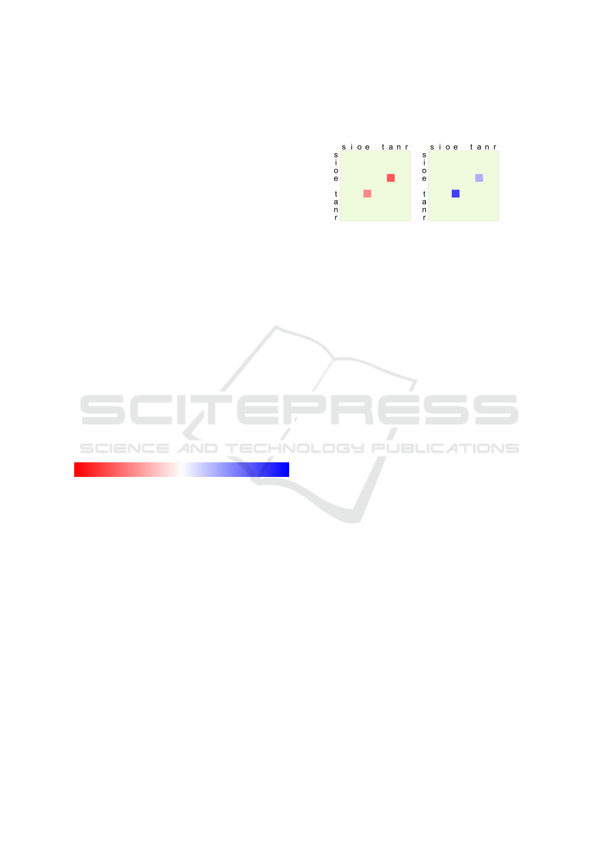
seen in Figure 5.
Figure 5: Possible colors of flight time. Lower boundary of
flight time interval is marked with red and upper boundary
with blue.
It is possible that the interval we set as the default
one for flight time is not the most appropriate one for
an individual’s typing style. One may need more time
than 2 seconds between keystrokes, or it is unneces-
sary to examine time on such a wide interval because
they type a lot faster than that. Therefore, we added
an option to set this interval manually to fit the typing
style of the user, which will be referenced as sensiti-
vity in the followings.
Flight time between consecutive keystrokes is
showed as a square appearing in the corresponding
cells, filled with a color defined above. Using this
kind of color-coding, higher intensity color shades
mean closer values to the interval boundaries, and as
we can see in Figure 6, red color shades mean shorter
while blue ones mean longer flight time values to in-
dicate the speed and the rhythm of typing with warm
and cold colors. Since users can modify this interval
by setting the above-mentioned sensitivity of the ap-
plication, very similar time amounts can be compared
visually as well.
(a) Shorter flight times (b) Longer flight times
Figure 6: Representing flight times when the user typed the
word ’tea’. Color shades reveal that in (a) flight times were
shorter than in (b), which means the word was typed a little
faster. We also can see in (a) that the character pair ’ea’ was
typed slightly faster than ’te’, since red intensity is a little
higher, and in the case of (b), higher blue intensity of the
character pair ’te’ also indicates that it took more time to
type that than pair ’ea’.
4.1.2 Steadiness of Typing
Steadiness of typing means how much duration values
fluctuate over typing. Since our visualization is based
on averaged values, the extent of how regularly a user
presses and releases specific key combinations is not
visible. With this in mind, we interpret steadiness of
typing as the actual standard deviation of flight times.
Since this property is based on flight time values, we
illustrate it by setting the size of the colored squares in
each cell. The bigger the standard deviation of flight
times is for a specific key combination, the smaller
the square will be, which indicates more vacillation
of flight times thus less steady values (see Figure 7).
4.1.3 Negative Flight Time
It can occur that the keyboard user presses a key while
the previously pressed one has not been released yet,
that means there is no flight time between consecu-
tive keystrokes. In this case, there are more keys held
down for a specific time. We call this duration as ne-
gative flight time and visualize its presence and mag-
nitude in the background of each cell with the shades
of gray color, which means that we actually create
a grayscale frame for each cell and the darkness of
its color determines the amount of the negative flight
time. Frame with a color of white means the lack of
negative flight time, while darker shades mean more
and more time up to 200 milliseconds, which is repre-
sented with black color (see Figure 8).
TypeVis: Visualization of Keystrokes and Typing Patterns based on Time Series Analysis
349
(a) (b)
Figure 7: Representation of typing the word ’tea’ five ti-
mes separated with spaces. Since these character pairs were
typed multiple times, the average of the flight times is re-
presented in the corresponding cells. It can be seen from
the figure that some squares are smaller than others, which
means that the user typed those key pairs with higher fluc-
tuation, i.e. higher standard deviation. In (a), flight times
were closer to the average in the case of the ’te’ key pair,
while values were more scattered in the case of typing letter
’a’ and space. In (b), all flight time value are less vacilla-
ting.
(a) (b)
Figure 8: Representing negative flight times appearing
when the user typed once the word ’tea’. It can be seen
that in (a) when typing ’te’ an ’ea’ key pairs, the first key of
the pair was not released when the second one has already
been pressed, which means some amount of time passed
while both keys were pressed simultaneously. As we can
see from the darkness of the frames, this time amount was
bigger in the case of ’te’ pair and less for ’ea’. Since the
user only typed once this word and negative flight times ap-
peared, there was no flight time in this case. This also can
be seen as red colors have full intensity. In contrast, in (b),
key pairs have no flight time at all, thus they have no colored
frame.
4.1.4 Duration Time
Similarly to flight time, duration of consecutive key-
strokes can also be measured. Duration time means
the time amount beginning from the moment of pres-
sing the first key of the key pair to the moment of
releasing the second key. That means duration time
is the actual flight time appearing at the key pair and
the hold times of the two keys in total. The way of
representing duration time is the same as representing
flight time: colors of the squares show the duration of
the keystroke pair, and the size of the square reveals
the steadiness of duration times occurring by the key
pair. Difference between showing the visualization
with duration and flight times can be seen in Figure
9. This figure reveals that this property seems to be
a little more stable than flight time is, as values are
more steady and less vacillating. We experienced this
stability effect to be present in typing styles of most
of our users. In the case of showing duration times,
size and color of the cells reveal that values are a little
bigger than flight times are, as they basically mean
more time amount taken into consideration.
(a) (b)
Figure 9: Showing the visualization with flight and duration
times. The user typed the word ’tea’ multiple times. In (a),
flight times and in (b), duration times are presented. The
first thing we notice is that flight times are smaller thus they
have warmer colors while duration times last a little longer
as they contain the hold times of the corresponding keys
too.
4.1.5 Typos
It can be questioned if the taken mistakes through ty-
ping could be considered as a personal trait or not. To
examine whether this is an individual trait, we will
display this property on the visualization too. For
now, we assume that when users mistype, they make
a correction using backspace only on the keyboard.
We take into account two things: what was the target
character that the user originally wanted to press, and
what key was accidentally typed instead. We record
the quantity of the target characters and the mistyped
ones, and show them relatively to each other using
bars on the edges of the table. The rate of each tar-
get character can be seen on the bottom of the table
with blue bars, and similarly, the rate for each misty-
ped character is represented with red bars on the right
side of the table, as it can be seen in Figure 10.
We experienced, that it can happen that someone
has a regular typo at a specific character, but mainly
when people mistype, with a few exceptions they usu-
ally do it with the same dispersion by any character.
Many times they notice the typo after typing a whole
word, which means the space character will be deleted
slightly more most of the time. Besides, this property
depends rather on the text typed by the users, so we
cannot rely on this factor too much. We asked more
people to type the prologue of Shakespeare - Romeo
and Juliet to detect if there is any specific habit in con-
IVAPP 2019 - 10th International Conference on Information Visualization Theory and Applications
350

nection with mistyping, but we could not notice such
a trait. This is presented in Figure 10.
(a) (b)
Figure 10: Typing patterns of the same user. The user typed
the prologue of Shakespeare - Romeo and Juliet two times,
both are presented in the subfigures. Patterns look very si-
milar, so we can guess they are from the same person. The
number of typos, however, is different. We could not notice
any regularity in when and where the user mistyped.
4.2 Unused Cell Elimination
In our heatmap-like visualization method, all possible
key pair combinations examined by us have separated
space, even if no information is present in a cell. In
most of the cases, not all character pairs appear in the
text that the user types, which means many cells re-
main empty when visualizing the typing style of the
user. Since the alignment of the examined characters
is based on their frequency in the used language, va-
lues will not be scattered away too much from each
other but rather appear on a specific part of the table.
As seen in Figure 11, even after typing a long text,
only about half of the visualization area is filled with
valuable, non-empty cells. We introduced a method
that eliminates most of the empty spaces. We moved
some of the cells that contain any information into
another position.
If we work with the central alignment of exami-
ned keys, we push each element from all four sides:
from right, up, left, and bottom, alternately. The goal
is to push elements one column and one row closer
to the center in each iteration till we get a row or
column where there is no more empty space, which
means that cells can no longer be pushed one po-
sition further. After applying this process, it is not
clear which key pair belongs to which cell exactly,
but the character frequency based structure still re-
mains because mainly the cells on the edges will be
pushed closer to each other because they appear less
frequently. In contrast, there is more density in the
middle, and those cells cannot be pushed away too
much. This means the process does not violate the
frequency-based structure too much and does not mix
up all the cells. The result of this process can be
seen in Figure 12, where there is a little difference
between the more and the less frequently typed cha-
racters. The process emphasizes non-empty cells by
increasing their size and pushing them closer to ot-
her cells, making them neighboring with cells having
about the same frequency level that they have. Besi-
des, we do not show the mistyping rate for each key
here, since, as discussed above, it is not sure that they
contain properties which are personal enough. After
using this process, a comparison of two different ty-
ping patterns is demonstrated in Figure 13.
5 VALIDATION
For testing the effectiveness of our method, we cre-
ated a survey that involved the help of some volun-
teers. We collected the typing styles of 7 users who
consented to use their patterns for validation purpo-
ses. Everyone had to type the same text consisting
of about 4 500 characters. These patterns were split,
and the first and the second halves of them were vi-
sualized separately. In the survey, we presented some
patterns at once that were randomly chosen before,
and we asked the users to pair the patterns that they
think to originate from the same person. All the pe-
ople got the same questionnaire containing the same
patterns. There were 15 questions in the survey. One
type of the questions was about creating two pairs of
four typing patterns presented, and the other kind of
questions were about finding the matching pair of the
presented pattern. A small portion of this survey is
visible in Figure 14. 16 people participated in filling
out this form. They were not the same people whose
typing style was presented in the test, and in fact, they
never heard earlier about the existence of the typing
styles of people so both the concept and the presen-
tation method were new for them. Overall, they gave
answers with a correct state rate of 92.08%, showing
that it may be possible to distinguish individuals’ ty-
ping patterns visualized by our method.
6 CONCLUSIONS
We presented a method to visualize individuals’ ty-
ping styles so that personal typing habits can be visi-
ble. In our work, we used time-based keystroke dy-
namics to extract and show the typing patterns of a
person. Since we only rely on time-based properties,
no additional hardware is required except a regular
keyboard when using our software. We experienced
that using time differences of keystroke pairs as the
base of the visualization can result in an individual
TypeVis: Visualization of Keystrokes and Typing Patterns based on Time Series Analysis
351
(a) (b)
Figure 11: Typing style of one person visualized after typing a part of Nathaniel Hawthorne - The Scarlet Letter. The length
of the typed text consisted of about 7 000 characters. In (a), the pattern is presented using flight times and in (b) using duration
times. As we can see from the color intensity difference between the central part and the outer parts of the table, there is a
little difference between typing more and less frequently appearing characters. This pattern is built after typing a long text
that probably has the most of the possible character combinations appearing in the language. However, we can see that about
half of the area has empty cells as those key combinations did not appear in the text typed by the user.
(a) (b)
Figure 12: The same typing style presented before and after
the unused cell elimination process. The user typed a text
in Hungarian, hence Hungarian key mapping is used here.
In (b), with several unused cells removed, we get a more
compact presentation of this typing style.
(a) (b)
Figure 13: Two typing patterns of two different users pre-
sented with flight times, same sensitivity, and unused cell
elimination process. It can be seen in the figures that main
difference between the two patterns is that in (b), there are
a little longer flight time values than in (a).
and quite distinguishable representation of typing sty-
les of people. Our proposed visualization method is a
heatmap-like technique. We evaluated the results by
creating a validation survey that 16 people filled out.
They gave correct answers in 92.08% in total.
In the future, some factors should be examined. In
this work, we treated the typed text as a series of key
pairs. However, an examination could be useful to try
using the typing time of three, four, or even more con-
secutive keystrokes, so we might face less vacillation
in time values. Examining how steady the attributes
that we took into account can be useful too, as it is still
unproven whether the typing style of a person chan-
ges over a longer period of time. In addition, we want
to examine if there are any environmental effects that
influence how a specific person types. People may
not type the same way when they are tired or nervous
compared to the state when they feel fine. We want to
determine if any of these effects affect the way of ty-
ping, and if they do, how they do it. Checking whether
our proposed visualization method is capable of dis-
playing this kind of factors or not would be relevant.
To ascertain if it is possible for people to detect if so-
meone has such changes by looking at their visualized
typing style would be promising, too.
IVAPP 2019 - 10th International Conference on Information Visualization Theory and Applications
352
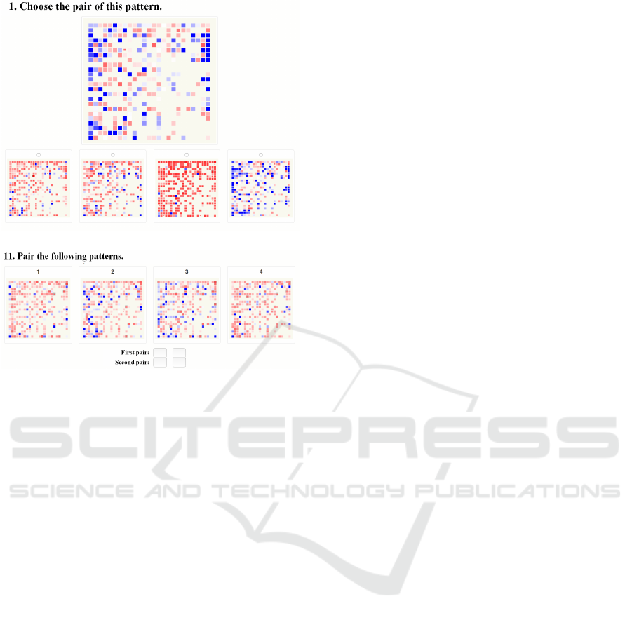
(a)
(b)
Figure 14: Two questions taken from the survey. In (a), we
can see a question type where the user had to choose the
corresponding pair. In (b), users had to pair the presented
typing patterns.
ACKNOWLEDGEMENTS
This work was supported by the construction EFOP-
3.6.3-VEKOP-16-2017-00002. The project was sup-
ported by the European Union, co-financed by the Eu-
ropean Social Fund.
REFERENCES
Alshehri, A., Coenen, F., and Bollegala, D. (2016). Keybo-
ard Usage Authentication Using Time Series Analy-
sis. In Big Data Analytics and Knowledge Discovery,
pages 239–252. Springer, Cham.
Baker, N. A. and Redfern, M. S. (2007). The Association
between Computer Typing Style and Typing Speeds.
Proceedings of the Human Factors and Ergonomics
Society Annual Meeting, 51(15):869–873.
Bergadano, F., Gunetti, D., and Picardi, C. (2002). User
authentication through keystroke dynamics. ACM T.
Inform. Syst. Se., 5(4):367–397.
Gove, R., Gramsky, N., Kirby, R., Sefer, E., Sopan, A.,
Dunne, C., Shneiderman, B., and Taieb-Maimon, M.
(2011). NetVisia: Heat Map & Matrix Visualization
of Dynamic Social Network Statistics & Content. In
2011 IEEE Third International Conference on Pri-
vacy, Security, Risk and Trust and 2011 IEEE Third
International Conference on Social Computing, pages
19–26. IEEE.
Gunetti, D. and Picardi, C. (2005). Keystroke analysis of
free text. ACM T. Inform. Syst. Se., 8(3):312–347.
Karnan, M., Akila, M., and Krishnaraj, N. (2011). Biome-
tric personal authentication using keystroke dynamics:
A review. Appl. Soft. Comput., 11(2):1565–1573.
Krzywinski, M. (2008). Visualization of tabular data.
http://circos.ca/presentations/articles/
vis_tables1/#vistabular. Access date: Septem-
ber 4, 2017.
Krzywinski, M., Schein, J., Birol,
˙
I., Connors, J., Gas-
coyne, R., Horsman, D., Jones, S. J., and Marra, M. A.
(2009). Circos: an information aesthetic for compara-
tive genomics. Genome Res., 19(9):1639–1645.
Longi, K., Leinonen, J., Nygren, H., Salmi, J., Klami, A.,
and Vihavainen, A. (2015). Identification of program-
mers from typing patterns. In Koli Calling ’15 Procee-
dings of the 15th Koli Calling Conference on Compu-
ting Education Research, pages 60–67. Koli, Finland.
Monrose, F., Reiter, M. K., and Wetzel, S. (2001). Password
hardening based on keystroke dynamics. Int. J. Inf.
Secur., 1(2):69–83.
Neumann, P., Tat, A., Zuk, T., and Carpendale, S. (2007).
KeyStrokes: Personalizing Typed Text with Visua-
lization. In EuroVis07: Joint Eurographics, IEEE-
VGTC Symposium on Visualization, pages 43–50.
Norrk
¨
oping, Sweden.
Solso, R. L. and King, J. F. (1976). Frequency and versa-
tility of letters in the English language. Behav. Res.
Meth. Instr., 8(3):283–286.
Vatavu, R.-D., Anthony, L., and Wobbrock, J. O. (2014).
Gesture Heatmaps: Understanding Gesture Perfor-
mance with Colorful Visualizations. In Proceedings of
the 16th International Conference on Multimodal In-
teraction, ICMI ’14, pages 172–179, New York, NY,
USA. ACM.
ˇ
Spakov, O. and Miniotas, D. (2007). Visualization of Eye
Gaze Data using Heat Maps. Elektron. Elektrotech.,
74(2):55–58.
TypeVis: Visualization of Keystrokes and Typing Patterns based on Time Series Analysis
353
