
Usage of Visualization Techniques in Data Science Workflows
Johanna Schmidt
a
VRVis Zentrum f
¨
ur Virtual Reality und Visualisierung Forschungs-GmbH, Vienna, Austria
Keywords:
Visualization, Visual Data Science, Applied Computing.
Abstract:
The increasing interest in data science and data analytics lead to a growing interest in data visualization and
exploratory visual data analysis. However, there is still a clear gap between new developments in visualization
research, and the visualization techniques currently applied in data analytics workflows. Most of the com-
monly used tools provide basic charting options, but more advanced visualization techniques have hardly been
integrated as features yet. This especially applies for interactive exploratory data analysis, which has already
been addressed as the ’Interactive Visualization Gap’ in the literature. In this paper we present a study on the
usage of visualization techniques in common data science tools. The results of the study confirm that the gap
still exists. For example, we hardly found support for advanced techniques for temporal data visualization or
radial visualizations in the evaluated tools and applications. On the contrary, interviews with professional data
analysts confirm strong interest in learning and applying new tools and techniques. Users are especially inter-
ested in techniques that can support their exploratory analysis workflow. Based on these findings and our own
experience with data science projects, we present suggestions and considerations towards a better integration
of visualization techniques in current data science workflows.
1 INTRODUCTION
Visualization researchers were very successful within
the last decades, generating a lot of different novel
techniques for the visual representation of data. These
techniques range from approaches for the efficient
representation of data (e.g., parallel coordinates) to
proposed interaction and user guidance workflows
(e.g., overview-first, details-on-demand). Current sur-
veys show the large variety of visualization tech-
niques. A survey of survey papers in information vi-
sualization by McNabb and Laramee (McNabb and
Laramee, 2017) classified already over 80 survey pa-
pers describing relevant state-of-the-art techniques,
and a more recent survey of books in information
visualization revealed a similar quantitiy and vari-
ety (Rees and Laramee, 2019).
In parallel to visualization research, the growing
interest in data science and data analytics lead to more
and more software applications being developed, both
open source (e.g., Python Plotly
1
) and commercial
(e.g., Tableau
2
). A survey by Barlas et al. (Bar-
las et al., 2015) of open source data science tools
a
https://orcid.org/0000-0002-9638-6344
1
https://plot.ly/python/
2
https://www.tableau.com
identified over 70 data science tools and applications
commonly used by data scientists. Not all of these
tools and applications offer data visualization, some
of them are specifically targeted towards efficient data
storage and access (e.g., for Big Data applications),
data wrangling (i.e., mapping data to another format),
or automated analysis approaches like machine and
deep learning. For these tools and applications that
also offer data visualization, only very little overlap
between the recent developments in visualization re-
search and the features offered by the tools and appli-
cations can be found.
Most of the tools and applications feature basic
charts and plots (e.g., scatter plots, bar charts, bubble
charts, radar charts), but more advanced visualization
techniques (e.g., chord diagrams, horizon graphs) can
hardly be found, and recent developments in visual-
ization rarely make their way into the tools as new
features or updates (Chapman, 2019). We conducted
a new survey on the usage of prominent visualization
techniques in 13 open source and 6 commercial tools,
and could confirm that this problem still exists.
On the contrary, interviews with data scientists re-
veal a strong interest in applying new visualization
techniques (Meeks, 2019), and great interest in trying
out alternatives (Liu et al., 2019). As the main obsta-
cles why new visualization techniques are not applied
Schmidt, J.
Usage of Visualization Techniques in Data Science Workflows.
DOI: 10.5220/0009181903090316
In Proceedings of the 15th International Joint Conference on Computer Vision, Imaging and Computer Graphics Theory and Applications (VISIGRAPP 2020) - Volume 3: IVAPP, pages
309-316
ISBN: 978-989-758-402-2; ISSN: 2184-4321
Copyright
c
2022 by SCITEPRESS – Science and Technology Publications, Lda. All rights reserved
309

in their workflows, data scientists named not having
enough time to learn and get familiar with these tech-
niques, missing documentation and support, and the
lack of integration of the techniques in the established
data science environments.
The exchange with data analysts and data scien-
tists (often referred to as data workers) is essential
for visualization research. Data workers can give
valuable feedback on techniques and applications to
further improve the proposed research results. Data
workers can also provide visualization researchers
with new interesting datasets and application ideas,
with new tasks, and new directions for further re-
search. We therefore advocate for strategies towards a
better integration of visualization techniques in com-
monly used data science tools. In this paper we
present a study on the current usage of visualization
techniques in data science applications. We further
summarize findings from recent studies and investiga-
tions to deduce suggestions to improve the exchange
between those two fields of research.
2 VISUALIZATION IN DATA
SCIENCE
Data science has been established as an important
emergent scientific field. Data science is defined
as a ”concept to unify statistics, data analysis, ma-
chine learning and their related methods” in order
to ”understand and analyze actual phenomena with
data” (Hayashi, 1998). As such, data science com-
prises more than pure statistical data analytics, but the
interdisciplinary integration of techniques from math-
ematics, statistics, computer science, and information
science (Parsons et al., 2011). Data science also in-
volves the consideration of domain knowledge for the
analysis and the interpretation of the data and the re-
sults (Blei and Smyth, 2017).
In this highly data-driven research field, data sci-
entists also make use of data visualization for a visual
interpretation of the data and the results. The rise in
data science has lead to a multitude of new data vi-
sualization tools and libraries being developed (Liu
et al., 2018). The tasks that data scientists have to
solve and the integration of visual methods in the data
science workflow poses interesting challenges for the
field of visualization.
2.1 Data Science Requirements
Several studies were conducted within the last years
to better understand the tasks and requirements of
data scientists. The survey by Harris et al. (Har-
ris et al., 2013) among different data workers from
different disciplines provides a very comprehensive
overview of the different tasks data scientists have
to solve and the different fields they are working in.
Kim et al. (Kim et al., 2018) analyzed the role of
data scientists within software development teams. In
the visualization community several studies were con-
ducted to better understand the role of visualization
in data science processes. Kandel et al. (Kandel et al.,
2012) conducted semi-structured interviews with data
workers from different organizations, including com-
panies from healthcare, retail, marketing, and finance.
Alspaugh et al. (Alspaugh et al., 2019) focused on in-
terviews with data workers and asked them about their
descriptions of exploratory activities and tool usage
in these activities. Liu et al. (Liu et al., 2019) studied
how, why and to what extent data scientists consider
alternatives in their workflows.
The workflow of data scientists can be summa-
rized into five high-level categories (Kandel et al.,
2012). First, data workers usually search for suit-
able datasets, either by locating them in databases,
or online, or by asking colleagues (Discover). Espe-
cially within large organizations, finding and under-
standing relevant data is often considered as a signifi-
cant bottleneck in the work process. When available,
the datasets need to be brought into a desired format
(Wrangle). Data wrangling involves parsing files, ma-
nipulating data layouts, and also integrating multiple
heterogeneous data sources. After being available in
the desired format, the quality of the data has to be
verified, and the suitability for the analysis has to be
estimated (Profile). Datasets very often contain severe
flaws, including missing data, outlier, erroneous val-
ues, and other problems. Understanding the structure
of the data is therefore considered an important task
in data science. Afterwards, another important and
interesting part of the data science workflow is to use
the datasets as training sets to train prediction models
(Model). All analysis results usually need to be re-
ported to external people, which might be colleagues,
or customers (Report).
All steps in the workflow contain circular pro-
cesses where data scientists have to rethink actions
they made and restart analysis processes from scratch.
Due to this highly interactive and undirected work-
flow, no tools or applications can cover the whole
data science workflow. Data scientists are therefore
required to use a combination of different sets of tools
to achieve their goals. Depending on their skills, data
scientists prefer to use either programming interfaces
or fully-featured applications (Liu et al., 2019).
IVAPP 2020 - 11th International Conference on Information Visualization Theory and Applications
310

2.2 Usage of Visualization
In all stages of the workflow data scientists could be
supported by the use of visual tools. Interestingly, vi-
sualization techniques are currently mostly applied in
the Report stage, at the very end of the data science
workflow. This stands in contrast to the fact that in-
teractive data exploration workflows are strongly pro-
moted by visualization research. This has been iden-
tified as the ”Interactive Visualization Gap” by Batch
and Elmquist (Batch and Elmqvist, 2018). To bet-
ter quantify this gap, the usage of visualization tech-
niques was subject of several studies within the last
years within the visualization community.
2.2.1 Background
The interest in visualization usage lead to the initia-
tion of online surveys collecting information on prac-
tical visualization application examples. The Chart-
maker Directory (Kirk, 2019) creates and regularuly
updates a catalogue for the usage of charts in different
visualization tools. On their website From Data To
Viz (Holtz and Healy, 2017) Holtz and Healy present
recent examples for the usage of visualization in data
science projects.
Other studies concentrated on quantifying, evalu-
ating, and ranking tools and applications that are used
by data workers. Harger and Crossno (Harger and
Crossno, 2012) evaluated the feature richness of open
source toolkits for visual analytics. They evaluated
the toolkits used for the study based on which basic
chart types (e.g., bar charts, line charts), which types
of graph visualization (e.g., circular or force-directed
layouts), and which types of geo-spatial visualization
techniques (e.g., choropleth maps, cartograms) they
feature. They concluded that some toolkits are more
targeted towards analytics, and some are more tar-
geted towards visualization. The study by Harger and
Crossno together with a study by Zhang et al. (Zhang
et al., 2012) both concentrate on specific visualiza-
tion techniques, and evaluate their usage in common
tools. While Harger and Crossno concentrate on open
source tools, Zhang et al. evaluated and compared
commercial business analytics tools.
Based on the collected data, tools and applica-
tions can be compared and ranked based on classifica-
tions according to feature richness, flexibility, learn-
ing curve, and tasks (e.g., for analysis or presenta-
tion). Charlotte Rost (Rost, 2016) divided tools and
applications into either being apps (fully-features ap-
plications) or charting libraries (programming toolk-
its), and compared these two classes according to
certain features. She concluded that tools classified
as apps are generally targeted towards the presenta-
tion of findings, and that tools classified as charting
libraries better support exploratory analysis and are
therefore more targeted towards data exploration and
analysis (with exceptions on both sides).
A very impactful comparison, called Gartner’s
Magic Quadrants, is published every year by Gart-
ner (Gartner, 2019). In this yearly study Gartner
compares 21 business intelligence applications that
are considered most significant in the marketplace.
The applications are evaluated and placed in one of
four quadrants, rating the applications as either be-
ing challengers, leaders, visionaires, or niche play-
ers. The study gives very valuable information, es-
pecially due to the fact that it is updated every year,
but, on the other hand, only covers commercial busi-
ness intelligence tools. In the visualization commu-
nity Behrisch et al. (Behrisch et al., 2018) conducted
an exhaustive survey on commercial visual analytics
tools, evaluating them according to which degree they
feature data handling, visualization, and automated
analysis. They also classified the applications accord-
ing to whether they are more suited for presentation
(all of them), or exploratory analysis (only 50%).
2.2.2 Survey
We conducted a survey on commonly used tools
and applications and evaluated the visualization tech-
niques they feature. The survey setting was very sim-
ilar to Harger and Crossno’s (Harger and Crossno,
2012) and Zhang et al.’s (Zhang et al., 2012) ap-
proach. We specifically concentrated on visualization
techniques rather than on derived attributes (e.g., fea-
ture richness).
In our study we included more recent advances
in visualization research, and considered open source
tools as well as commercial applications to produce
a more complete picture of visualization techniques
usage. We concentrated on 2D information visualiza-
tion techniques, as these techniques are more relevant
for data science and data analytics, and disregarded
spatial techniques like 3D volume rendering.
We then selected 19 tools and applications com-
monly used in data science, 13 of them being open
source, and 28 visualization techniques from infor-
mation visualization, 7 of them which have not been
investigated in previous studies yet. The selected vi-
sualization techniques are divided into the following
categories:
• Basic Charts: scatter plot, line plot, area plot,
bubble chart, bar chart, pie chart, donut chart
• Multi-dimensional Data: parallel coordi-
nates (Inselberg, 2009), radar chart (Chambers
Usage of Visualization Techniques in Data Science Workflows
311
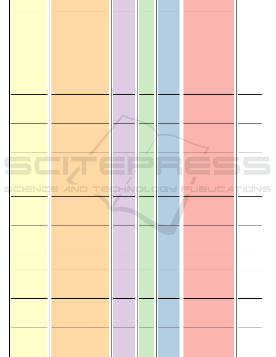
Table 1: Featured visualization techniques. This table illustrates which visualization techniques are currently featured by the
evaluated tools and applications. A Y in a table cell shows that the corresponding tool or application features this technique.
E means that the technique is featured via an extension or plugin.
Python
Plotly
Python
Sea-
born
R GG-
Plot2
Vega-
Lite
D3 Google
Charts
Chart-
.js
Apex-
charts
dy-
graphs
Bokeh RAW-
Graphs
.Net
Live-
Charts
Qt
Charts
Micro-
soft
Power-
BI
Tabl-
eau
SAS
Visual
Ana-
lytics
High-
charts
Quadr-
igram
Matlab
scatter plot Y Y Y Y Y Y Y Y Y Y Y Y Y Y Y Y Y Y Y
line plot Y Y Y Y Y Y Y Y Y Y Y Y Y Y Y Y Y Y Y
area plot Y Y Y Y Y Y Y Y Y Y Y Y Y Y Y Y Y Y
bubble chart Y Y Y Y Y Y Y Y Y Y Y Y Y Y
bar chart Y Y Y Y Y Y Y Y Y Y Y Y Y Y Y Y Y Y
pie chart Y Y Y Y Y Y Y Y Y Y Y Y Y Y Y Y Y Y
Basic charts
donut chart Y Y Y Y Y Y Y Y Y Y Y Y Y Y
parallel coordinates Y Y Y Y Y Y Y Y Y
radar chart Y E Y Y Y Y Y Y Y Y Y
Multi-d.
scatter plot matrix Y E Y Y Y Y Y
Sankey diagram Y Y Y Y Y Y Y Y E
Flow
Alluvial diagram Y Y E Y Y Y Y Y E
chord diagram Y Y Y Y E
heatmap Y Y Y Y Y Y Y Y Y Y Y Y Y
Matrix
arc diagram E Y
polar area diagram Y Y Y Y Y Y Y Y Y Y Y
Gantt chart Y Y Y Y Y
circle view
theme river Y E Y Y Y Y Y Y Y
data vases
horizon graphs E Y Y Y
time nets
Temporal data
people garden
tree diagram Y E Y Y Y Y Y Y
sunburst chart Y E Y Y Y Y
treemap Y E Y Y Y Y Y Y Y Y
contour plot Y Y Y Y Y Y Y
Hierarchical
crop circles Y Y
IVAPP 2020 - 11th International Conference on Information Visualization Theory and Applications
312

et al., 1983), scatter plot matrix (Hartigan, 1975)
• Flow Charts: Sankey diagram (Riehmann et al.,
2005), Alluvial diagram (Rosvall and Bergstrom,
2010)
• Matrix Data: chord diagram (Telea and Ersoy,
2010), heatmap (Wilkinson and Friendly, 2009),
arc diagram (Wattenberg, 2002)
• Temporal Data: polar area diagram, Gantt chart,
circle view (Keim et al., 2004), theme river (Havre
et al., 2002), data vases (Thakur and Rhyne,
2009), horizon graphs (Heer et al., 2009), time
nets (Kim et al., 2010), people garden (Xiong and
Donath, 1999)
• Hierarchical Data: tree diagram, sunburst
chart (Stasko et al., 2000), treemap (Shneiderman,
1992), contour plot (Kubota et al., 2007), crop cir-
cles (Wang and Parsia, 2006)
We selected the following tools and applications for
our study:
• Open Source: Python Plotly
3
, Python Seaborn
4
,
R GGPlot2
5
, Vega-Lite
6
, D3
7
, Google Charts
8
,
Chart.js
9
, Apexcharts
10
, dygraphs
11
, Bokeh
12
,
RAWGraphs
13
, .Net LiveCharts
14
, Qt Charts
15
• Commercial: Microsoft PowerBI
16
, Tableau
17
,
SAS Visual Analytics
18
, Highcharts
19
, Quadri-
gram
20
, Matlab
21
Together with computer science students attend-
ing a course on visualization in data science we evalu-
ated the usage of the selected techniques in the differ-
ent tools and applications. As a result of our study, we
were able to create a matrix of tools and applications
and selected visualization techniques, with marked
3
https://plot.ly/python/
4
https://seaborn.pydata.org/
5
https://ggplot2.tidyverse.org/
6
https://vega.github.io/vega-lite/
7
https://d3js.org/
8
https://developers.google.com/chart/
9
https://www.chartjs.org/
10
https://apexcharts.com/
11
http://dygraphs.com/
12
https://bokeh.pydata.org/en/latest/
13
https://rawgraphs.io/
14
https://lvcharts.net/
15
https://doc.qt.io/qt-5/qtcharts-index.html
16
https://powerbi.microsoft.com/
17
https://www.tableau.com/
18
https://www.sas.com
19
https://www.highcharts.com/
20
http://www.quadrigram.com/
21
https://www.mathworks.com/products/matlab.html
cells if a tool or application features the specific vi-
sualization technique. The results of the study can be
seen in Table 1. In this table the selected visualization
techniques are listed as rows. If a tool or applica-
tion, listed as columns, features a visualization tech-
nique, the corresponding cell is marked with an Y (for
”yes”). A visualization technique is considered to be
featured if it has been included in the basic functional-
ities of the tool or application. For example, a scatter
plot matrix could also be created by placing several
scatter plots side-by-side, but we only consider the
technique to be featured if there exists a core func-
tionality creating this visualization. If a visualization
technique is provided via extensions or plugins, we
placed an E (for ”extension”) in the table cell.
Not surprisingly, basic chart types like scatter
plots and bar charts are highly supported by all eval-
uated tools and applications. From the more ad-
vanced visualization techniques, multi-dimensional
techniques like parallel coordinates and radar charts
are already widely used and known, and therefore in-
cluded in many of the tools. The same applies for
scatter plot matrices and heatmaps. Techniques for
hierarchical data are also well supported, especially
by the open source tools that were evaluated in the
study.
Visualization techniques for temporal data are not
available in the majority of the tools and applications.
This is most probably due to the fact that temporal
data (e.g., time-series data) is a very specific data type
which is used only for specific tasks. Users usually
use their own tools for these purposes. Therefore,
techniques for temporal data have not been included
yet in common tools and applications, as these tools
usually try to address a broader range of data scien-
tists and data analysts. There are some visualization
techniques which have not been integrated into any
tool or application yet, like time nets, data vases, or
people garden.
From a tools and applications point of view,
Python Plotly and D3 notable provide the most fea-
tures among all the tested open source tools. There are
other tools that are targeted towards very special func-
tionalities, like dygraphs for scientific plots, which
therefore only feature a very limited range of visual-
ization techniques. Other libraries which are intended
to be used in web-based applications (e.g., Chart.js or
Google Charts) feature only visualization techniques
that will most likely be needed in a web-based con-
text.
Open source tools, especially R GGPlot2, benefit
a lot from input from the community, since many ad-
vanced visualization techniques are only featured via
extensions. In the group of commercial tools it can be
Usage of Visualization Techniques in Data Science Workflows
313

depicted that Tableau, Microsoft Power BI, and High-
charts feature most of the hereby evaluated visualiza-
tion techniques.
3 LEARNED LESSIONS
We consider further exchange with the field of data
science as a valuable and important goal for the visu-
alization community. Previous research efforts and
our own study on the usage of visualization tech-
niques in data science revealed that the gap between
new developments in visualization research and their
application ”in the wild” still exists. We therefore
identified the following suggestions towards a better
integration of visualization in data science workflows:
• Consider the Programming Environments
Currently in Use in Data Science. Data scien-
tists use tools they already know and that have
proved useful in their workflows. Depending on
the existing skills, either programming tools or
fully-featured applications are preferred. How-
ever, interview studies revealed that data scien-
tists are very interested in exploring and integrat-
ing alternatives in their workflow. The visual-
ization community should seize this opportunity,
and should also make the changes as easy as pos-
sible. This requires to provide new visualiza-
tion techniques in the programming environments
currently used by data scientists. Such an inte-
gration can involve providing extensions to well-
known visualization packages, or by providing
command-line support for existing environments.
A better integration of interactive visualization
tools will especially be helpful for the Wrangle
and Profile stages of the data science workflow.
• Document and Report the Benefits for using
New Tools. Data scientists stated in interviews
that one of the main obstacles for not consider-
ing new visualization techniques is that they do
not have enough time to get familiar with new
tools. The easier it is to access new tools (e.g.,
by providing them in well-known programming
environments), the easier it is for data scientists
to try these new opportunities. Documenting
the benefits for using new tools also includes a
proper documentation of the features, user guides,
getting-started-guides, and example datasets and
galleries.
• Integrate Provenance in Visualization. Espe-
cially exploratory data analysis (the Profile stage
of the data science workflow) is an undirected pro-
cess that very often requires to start from scratch
again. In this process data scientists need to
keep track of their findings and steps they al-
ready tried out. We therefore consider the inte-
gration of provenance mechanisms in visualiza-
tion applications as an important goal. In many
cases data scientists use notebook-style environ-
ments (e.g., Jupyter
22
) to keep track of their deci-
sions and actions. The integration of visualiza-
tion techniques in existing notebook-style envi-
ronments will therefore also push their usage in
data exploration.
• Support for Collaboration Similar to the need
for keeping track of recent activities, data sci-
entists need to communicate results and analysis
stages to stakeholders, colleagues from other busi-
ness units, customers, and other data scientists.
This needs to be considered when creating new
tools and applications. Data scientists need to be
able to capture current states of an analysis (e.g.,
by storing the current state), so that they can later
catch up on their current work, or pass on the re-
sults.
• Provide Guidance in Visualization. Data sci-
entists will also benefit from guidelines suggest-
ing suitable visualizations to be applied for cer-
tain data types or to solve certain tasks. Some
suggestions for the usage of charts have been pro-
posed outside the visualization community. Sup-
port for natural language queries has already been
included in some data analysis tools (e.g., ”Ask
Data” by Tableau
23
). Findings from studies on
color and shape perception have already been
considered by many data science applications.
Proposing certain visualization techniques during
the analysis supports data scientists in their Profile
and Report workflow stages. We therefore con-
sider further research for the interpretation and us-
age of visualization techniques, and for a better
understanding of phenomena like visual compari-
son or visual clutter an important goal.
• Consider the Data Science Workflow Stages.
The workflow of data scientists can be catego-
rized into the five stages of Discover, Wrangle,
Profile, Model, and Report. When designing new
visualization techniques, reflect upon in which
stage of the workflow the visualization technique
should be primarily used. Every stage required
different types of visualizations. For example,
data wrangling in the Wrangle stage requires to
focus on data flaws like missing data or out-
22
https://jupyter.org/
23
https://www.tableau.com/products/new-features/ask-
data
IVAPP 2020 - 11th International Conference on Information Visualization Theory and Applications
314

liers, while Model requires visualizations to un-
derstand the created models. Both stages are not
supported by the available visualizations in cur-
rent data science tools yet. The most demand-
ing stage in terms of visualization design is the
Profile stage, where data scientists need to ex-
plore the data to understand its structure. For
this stage current data science tools mostly lack
to provide suitable visualizations. The data ex-
ploration process also requires high degree of in-
teractivity and inter-connectivity between differ-
ent visualizations, which is not supported by all
data science tools yet. In the Report stage mostly
simple and easy-to-understand visualizations are
needed, since here the results of the data analysis
stage have to be presented to a broader audience.
The use cases in this stage can be mostly covered
by employing basic charts, which are already well
supported by current data science tools.
4 CONCLUSION
This paper advocates for a better exchange between
the two research fields of data science and visualiza-
tion. Visual interfaces can provide substantial support
for users working with data. However, the ”Inter-
active Visualization Gap” for exploratory data anal-
ysis still exists. This has also been revealed by our
study presented in this paper on the usage of visual-
ization techniques in common data science tools. On
the other hand, interviews with data scientists reveal
a great interest in applying new techniques to get new
insights into their datasets. We therefore suggest dif-
ferent strategies for a better integration of visualiza-
tion techniques in common data science workflows.
ACKNOWLEDGEMENTS
VRVis is funded by BMVIT, BMDW, Styria, SFG
and Vienna Business Agency in the scope of COMET
– Competence Centers for Excellent Technologies
(854174) which is managed by FFG.
REFERENCES
Alspaugh, S., Zokaei, N., Liu, A., Jin, C., and Hearst,
M. A. (2019). Futzing and Moseying: Interviews
with Professional Data Analysts on Exploration Prac-
tices. IEEE Transactions on Visualization and Com-
puter Graphics, 25(1):22–31.
Barlas, P., Lanning, I., and Heavey, C. (2015). A survey of
open source data science tools. International Journal
of Intelligent Computing and Cybernetics, 8:232–261.
Batch, A. and Elmqvist, N. (2018). The Interactive Vi-
sualization Gap in Initial Exploratory Data Analy-
sis. IEEE Transactions on Visualization and Com-
puter Graphics, 24(1):278–287.
Behrisch, M., Streeb, D., Stoffel, F., Seebacher, D., Mate-
jek, B., Weber, S. H., Mittelstaedt, S., Pfister, H.,
and Keim, D. (2018). Commercial Visual Analytics
Systems-Advances in the Big Data Analytics Field.
IEEE Transactions on Visualization and Computer
Graphics.
Blei, D. M. and Smyth, P. (2017). Science and Data Sci-
ence. Proceedings of the National Academy of Sci-
ences, 114(33):8689–8692.
Chambers, J., Cleveland, W., Kleiner, B., and Tukey,
P. (1983). Graphical Methods for Data Analysis.
Wadsworth.
Chapman, C. (2019). A Complete Overview of the Best
Data Visualization Tools. https://www.toptal.com/
designers/data-visualization/data-visualization-tools.
[accessed 2019-07-10].
Gartner (2019). Magic Quadrant for Analytics and Business
Intelligence Platforms. https://solutionsreview.com/
business-intelligence/thoughtspot-magic-quadrant-
for-analytics-and-business-intelligence-platforms/.
[accessed 2019-07-09].
Harger, J. R. and Crossno, P. J. (2012). Comparison of
Open Source Visual Analytics Toolkits. Proceedings
of SPIE - The International Society for Optical Engi-
neering, 8294.
Harris, H. D., Murphy, S. P., and Vaisman, M. (2013). Ana-
lyzing the Analyzers: An Introspective Survey of Data
Scientists and Their Work. O’Reilly Media.
Hartigan, J. A. (1975). Printer graphics for clustering.
Journal of Statistical Computation and Simulation,
4(3):187–273.
Havre, S., Hetzler, E., Whitney, P., and Nowell, L. (2002).
Themeriver: visualizing thematic changes in large
document collections. IEEE Transactions on Visual-
ization and Computer Graphics, 8(1):9–20.
Hayashi, C. (1998). What is Data Science ? Fundamen-
tal Concepts and a Heuristic Example. In Data Sci-
ence, Classification, and Related Methods, pages 40–
51. Springer Japan.
Heer, J., Kong, N., and Agrawala, M. (2009). Sizing the
Horizon: The Effects of Chart Size and Layering
on the Graphical Perception of Time Series Visual-
izations. In Proceedings of the SIGCHI Conference
on Human Factors in Computing Systems, CHI ’09,
pages 1303–1312, Boston, MA, USA. ACM.
Holtz, Y. and Healy, C. (2017). The Chartmaker Directory -
Data Story. https://www.data-to-viz.com/#story. [ac-
cessed 2019-10-25].
Inselberg, A. (2009). Parallel Coordinates: Visual Multidi-
mensional Geometry and Its Applications. Springer-
Verlag, Berlin, Heidelberg.
Kandel, S., Paepcke, A., Hellerstein, J. M., and Heer, J.
(2012). Enterprise Data Analysis and Visualization:
Usage of Visualization Techniques in Data Science Workflows
315

An Interview Study. IEEE Transactions on Visualiza-
tion and Computer Graphics, 18(12):2917–2926.
Keim, D. A., Schneidewind, J., and Sips, M. (2004). Circle-
View: A New Approach for Visualizing Time-related
Multidimensional Data Sets. In Proceedings of the
Working Conference on Advanced Visual Interfaces,
AVI ’04, pages 179–182, Gallipoli, Italy. ACM.
Kim, M., Zimmermann, T., DeLine, R., and Begel, A.
(2018). Data Scientists in Software Teams: State of
the Art and Challenges. IEEE Transactions on Soft-
ware Engineering, 44(11):1024–1038.
Kim, N. W., Card, S. K., and Heer, J. (2010). Tracing Ge-
nealogical Data with TimeNets. In Proceedings of the
International Conference on Advanced Visual Inter-
faces, AVI ’10, pages 241–248, Roma, Italy. ACM.
Kirk, A. (2019). The Chartmaker Directory. http://
chartmaker.visualisingdata.com/. [accessed 2019-08-
13].
Kubota, H., Nishida, T., and Sumi, Y. (2007). Visualization
of Contents Archive by Contour Map Representation.
In New Frontiers in Artificial Intelligence, pages 19–
32, Berlin, Heidelberg. Springer Berlin Heidelberg.
Liu, J., Boukhelifa, N., and Eagan, J. R. (2019). Under-
standing the Role of Alternatives in Data Analysis
Practices. IEEE Transactions on Visualization and
Computer Graphics (Early Access).
Liu, J., Tang, T., Wang, W., Xu, B., Kong, X., and Xia, F.
(2018). A survey of scholarly data visualization. IEEE
Access, 6:19205–19221.
McNabb, L. and Laramee, R. S. (2017). Survey of Sur-
veys (SoS) - Mapping The Landscape of Survey Pa-
pers in Information Visualization. Computer Graphics
Forum, 36:589–617.
Meeks, E. (2019). 2019 Annual Data Visualization
Survey Results. https://medium.com/nightingale/
2019-annual-data-visualization-survey-results-
334d3523073f. [accessed 2019-11-05].
Parsons, M. A., Øystein Godøy, LeDrew, E., de Bruin, T. F.,
Danis, B., Tomlinson, S., and Carlson, D. (2011). A
conceptual framework for managing very diverse data
for complex, interdisciplinary science. Journal of In-
formation Science, 37(6):555–569.
Rees, D. and Laramee, R. S. (2019). A Survey of Informa-
tion Visualization Books. Computer Graphics Forum,
38(1):610–646.
Riehmann, P., Hanfler, M., and Froehlich, B. (2005). Inter-
active Sankey Diagrams. In Proceedings of the Pro-
ceedings of the IEEE Symposium on Information Vi-
sualization, INFOVIS ’05, pages 31–, Minneapolis,
MN, USA.
Rost, L. C. (2016). What I Learned Recreating One Chart
Using 24 Tools. https://source.opennews.org/articles/
what-i-learned-recreating-one-chart-using-24-tools/.
[accessed 2019-07-05].
Rosvall, M. and Bergstrom, C. T. (2010). Mapping Change
in Large Networks. PLOS ONE, 5(1):1–7.
Shneiderman, B. (1992). Tree Visualization with Tree-
maps: 2-d Space-filling Approach. ACM Transactions
on Graphics, 11(1):92–99.
Stasko, J., Catrambone, R., Guzdial, M., and McDonald, K.
(2000). An Evaluation of Space-filling Information
Visualizations for Depicting Hierarchical Structures.
International Journal of Human-Computer Studies -
Empirical evaluation of information visualizations,
53(5):663–694.
Telea, A. C. and Ersoy, O. (2010). Image-based Edge Bun-
dles: Simplified Visualization of Large Graphs. In
Proceedings of the 12th Eurographics / IEEE - VGTC
Conference on Visualization, EuroVis ’10, pages 843–
852, Bordeaux, France.
Thakur, S. and Rhyne, T.-M. (2009). Data Vases: 2D and
3D Plots for Visualizing Multiple Time Series. In Ad-
vances in Visual Computing, pages 929–938, Berlin,
Heidelberg. Springer Berlin Heidelberg.
Wang, T. D. and Parsia, B. (2006). CropCircles: Topology
Sensitive Visualization of OWL Class Hierarchies.
In In Proceedings of The Semantic Web, ISWC ’06,
pages 695–708. Springer Berlin Heidelberg.
Wattenberg, M. M. (2002). Arc diagrams: visualizing struc-
ture in strings. In Proceedings of the IEEE Sym-
posium on Information Visualization, INFOVIS ’02,
pages 110–116, Boston, MA, USA.
Wilkinson, L. and Friendly, M. (2009). The History of
the Cluster Heat Map. The American Statistician,
63(2):179–184.
Xiong, R. and Donath, J. (1999). PeopleGarden: Creating
Data Portraits for Users. In Proceedings of the 12th
Annual ACM Symposium on User Interface Software
and Technology, UIST ’99, pages 37–44, Asheville,
NC, USA. ACM.
Zhang, L., Stoffel, A., Behrisch, M., Mittelstadt, S.,
Schreck, T., Pompl, R., Weber, S. H., Last, H., and
Keim, D. (2012). Visual analytics for the big data era
– A comparative review of state-of-the-art commercial
systems. In In Proceedings of the IEEE Conference on
Visual Analytics Science and Technology, VAST ’12,
pages 173–182, Seattle, WA, USA.
IVAPP 2020 - 11th International Conference on Information Visualization Theory and Applications
316
