
The Power of Information Visualization for Understanding the
Impact of Digital Media Projects
Mónica Silva
1a
, Lersi Duran
1b
, Sofia Bermudez
1
, Fábio Ferreira
2c
, Oksana Tymoshchuk
1d
,
Lídia Oliveira
1e
and Nelson Zagalo
1f
1
Department of Communication and Art, University of Aveiro, Portugal
2
Information and Communication Technology Services (STIC), University of Aveiro, Portugal
Keywords: InfoVis, Business Intelligence, Projects’ Dashboard, Students@DigiMedia.
Abstract: This study aims to understand the most effective way to present the results and impacts of research projects
in the field of Digital Media collected by the Digital Media Observatory. The focus is developing dashboards
using InfoVis tools and Business Intelligence to showcase a large volume of collected data, with a team of
Students@DigiMedia. Takes an exploratory approach with three main phases: researching available InfoVis
tools, creating sample dashboards using InfoVis tools, and implementing project dashboards using Power BI.
The team of students has developed dashboards that provide a clear, structured view of the project,
aggregating the following information: title, logo, objectives, keywords, funding, human resources, partners,
methodological procedures, scientific and technological products, publications, dissemination, recognition,
and SDGs. These dashboards provide interactive reports and visualisations to help researchers analyse, and
communicate project results. This study can help to improve the overall data presentation experience,
simplifying the analysis and knowledge-sharing process within the digital media research community.
1 INTRODUCTION
This article is part of Students@DigiMedia
1
, an
initiative created by the DigiMedia Research Centre
at the University of Aveiro to encourage student
participation in scientific research activities. This
study aimed to assist the Digital Media Observatory
(DigitalOBS) team at this Research Centre in
presenting the extensive data collected from 40
scientific projects conducted by the centre's
researchers over the past five years engagingly and
dynamically. The intention was to develop an
interactive and visually appealing platform that
would effectively showcase the wealth of knowledge
and discoveries generated by these projects.
Given the substantial information associated with
research projects, Information Visualization
a
https://orcid.org/0000-0002-5094-7281
b
https://orcid.org/0000-0002-6931-2577
c
https://orcid.org/0009-0009-4119-2567
d
https://orcid.org/0000-0001-8054-8014
e
https://orcid.org/0000-0002-3278-0326
f
https://orcid.org/0000-0002-5478-0650
1
https://digimedia.web.ua.pt/archives/14971
techniques were proposed to generate a graphical
dashboard model, to present a comprehensive set of
information effectively.
By utilizing a Performance Assessment Model
(PAM) (Tymoshchuk et al., 2024), the team were able
to identify the most relevant data for presentation and
aggregation of information. Selecting the data that
would best represent the project graphically within
each category of inputs, outputs, and impacts was
crucial.
By incrementing the model developed, we were
able to produce a standard model for presenting the
associated projects, assuming a visual report for each
one. This approach involved creating several
dashboards using various software applications
throughout development. Ultimately, a model was
developed and is currently being implemented on the
172
Silva, M., Duran, L., Bermudez, S., Ferreira, F., Tymoshchuk, O., Oliveira, L. and Zagalo, N.
The Power of Information Visualization for Understanding the Impact of Digital Media Projects.
DOI: 10.5220/0012545800003690
Paper published under CC license (CC BY-NC-ND 4.0)
In Proceedings of the 26th International Conference on Enterprise Information Systems (ICEIS 2024) - Volume 1, pages 172-179
ISBN: 978-989-758-692-7; ISSN: 2184-4992
Proceedings Copyright © 2024 by SCITEPRESS – Science and Technology Publications, Lda.

DigitalOBS website to present the results of scientific
projects.
2 THEORETICAL FRAMEWORK
In recent decades, funding for scientific research
projects has increased to promote innovation,
knowledge transfer, and the achievement of the
Sustainable Development Goals (Santos, 2022).
These projects aim to address complex social
problems through collaboration between different
fields and develop various technological and
scientific products. However, challenges arise in
evaluating and managing these projects, particularly
in terms of accountability and rigorous evaluation.
Traditional bibliometric indicators are being
questioned, and there is a need for qualitative
approaches to assess research quality. It is also
important to consider the temporal phases and the
long-term impact of research (Saenen, et al., 2019;
Santos, 2022).
The international scientific community proposes
fairer evaluation models that combine quantitative and
qualitative approaches. As research becomes more
collaborative and interdisciplinary, new evaluation
methods are necessary to capture the full impact and
value of scientific contributions. This includes practi-
ces such as data sharing, open science, and considera-
tion of societal impact (Djenontin & Meadow, 2018;
Frey & Widmer, 2009; Patrício et al., 2018).
Effective communication plays a crucial role in
fostering comprehension and advancement,
particularly within the academic sphere, while also
exerting influence on the corporate and business
sectors. Within the realm of the corporate and
business sector (Ansari, Barati & Martin, 2022;
Horttanainen & Virrantaus, 2004; Hepworth, 2016).
Data visualization refers to a collection of
methodologies that extract pertinent information
from extensive quantities of unorganized or diverse
data (Shneiderman, 1996; Plaisant & Shneiderman,
2022). Adopting information visualization techniques
facilitates the transformation of intricate data into a
more easily understandable format.
Applying efficient communication techniques faci-
litates the dissemination of research outcomes compre-
hensibly and easily accessible to the broader public
(Bacic & Fadlalla, 2016; Binder & Blettner, 2015).
From a developmental perspective, variants and
subtypes are generated through data and scientific
visualization techniques, such as cartographic
visualization, or within the realm of knowledge, such
as statistical visualization. Information Visualization,
(InfoVis), is a technique that facilitates and enhances
the examination of extensive datasets (Jiang, Hou &
Yang, 2023). The objective of this endeavour was to
facilitate users in researching, comprehending, and
scrutinizing data through a gradual and repetitive
approach to visual exploration (Sorapure, 2019;
Wolff et al., 2016).
The effective use of data visualization in a
proficient manner enables a complete evaluation of
research centre initiatives, facilitating the
communication of results in a visually captivating and
instructive manner. This phenomenon can potentially
enhance decision-making processes, optimize resource
allocation, and foster increased transparency among
both domestic and global players (Pinto, Raposo &
Ramos, 2012). Illustrate the collaborative associations
among researchers, internally inside the centre and
externally with external partners (Zhu et al., 2020).
InfoVis enables the presentation of performance
measurements using conventional visual
representations, such as line graphs, scatter plots, or
stacked bar charts. Data visualization techniques
facilitate the identification of trends, patterns, and
impacts within research project data (Andrienko et
al., 2021; Shirato, Andrienko & Andrienki, 2023).
The accessibility of visualized data to various
stakeholders is facilitated by utilizing online
platforms or software tools, which in turn allows for
secure data sharing and collaborative engagement
among academics (Lima, 2011).
The application of Artificial Intelligence (AI) and
Business Intelligence (BI) tools can facilitate
understanding the vast amount of data generated in
research projects, providing a comprehensive and up-
to-date view of the research's scope, influence, and
relevance (Khatuwal & Puri, 2022). Business data
visualisation is primarily used for communication,
information seeking, analysis, and decision
assistance, in contrast to other visualisation kinds and
uses (Zheng, 2018).
Microsoft Power BI is a BI platform that offers its
users a package of tools for aggregating, analysing,
and visualising large amounts of data from one or
more sources, allowing them to obtain relevant
insights from this data and thus help with decision-
making (Becker and Gould, 2019). Power BI has an
accessible and intuitive interface that allows users,
regardless of their knowledge of programming or
visualisation, to create interactive reports and
dashboards that can then be shared with other users or
published on the web. It also supports real-time data
updating, ensuring that the visualisations presented
show the most up-to-date information (Orts, 2004).
The Power of Information Visualization for Understanding the Impact of Digital Media Projects
173

Therefore, applying BI tools, such as Power BI
can help Research Centres understand the complex
results generated by various scientific projects,
facilitate data-based decision-making for future
projects and improve work efficiency.
3 METHOD
This study was conducted as part of the DigitalOBS,
which aims to monitor and analyse trends in digital
media, provide valuable information on the social
impact of media, and serve as a collaboration
platform for researchers, policymakers, and
stakeholders in the field of digital media.
The DigitalOBS team analysed the results and
impacts of research projects conducted by DigiMedia
researchers over the past five years to help define this
research centre's development strategies. To achieve
this, the DigitalOBS team created an analysis model
that examines crucial aspects such as funding
evolution, human resource composition, research
methodologies, scientific and technological results,
and dissemination of research findings (Tymoshchuk
et al., 2024).
This model provides a structured approach for
evaluating scientific projects in Digital Media,
focusing on three main dimensions: input,
output, and impact.
The “Input” dimension analyses the resources
allocated to the project, including funding,
human resources, new infrastructures,
collaborations, and characteristics of the
scientific area.
The "Output" dimension consists of four main
sub-dimensions: methodologies, scientific and
technological products, publications, and
dissemination of activities.
The third dimension, "Impact," focuses on the
long-term consequences of a project,
considering economic, social, cultural,
environmental, political, and recognizable
impacts (Tymoshchuk et al., 2024).
This dimension aims to understand the variability of
the results of applied research. This model has been
developed to incorporate data analysis and
visualization tools, enabling researchers to present
data quickly and easily through interactive reports
and dashboards.
Due to the large volume of results generated by
the projects, the decision was made to explore the
potential of BI tools to analyse and visualize this data.
Therefore, the main goal of this study is to develop
dashboards that effectively present the key results of
research projects, integrating advanced BI
technology. These panels can help researchers
analyse, interpret, and communicate the results of
their projects interactively, engagingly, and quickly.
The study followed an exploratory approach that
encompasses three main phases:
i) Analysis of available InfoVis tools, evaluating
their characteristics, functionalities, and
suitability for the specific requirements of the
research centre.
ii) Construction of dashboard examples using
InfoVis tools (Figma), categorizing and
organizing the results and impacts of research
projects according to the developed analysis
model.
iii) Implementing project dashboards using BI
tools (Power BI), aims to help researchers
create and share interactive reports and
dashboards, simplifying the analysis and
communication of knowledge and improving
the overall data presentation experience.
This study significantly improves the overall data
presentation experience by integrating robust data
analysis and visualization tools, simplifying the
analysis and communication of knowledge within the
digital media research community.
4 RESULTS
4.1 InfoVis Tools – Analysis and
Selection
The first step involved clearly defining what
information must be communicated through InfoVis.
In this case, the goal was to effectively visualize the
results of DigiMedia research projects, thus providing
a valuable resource for the team and stakeholders.
The Observatory team had already surveyed 40
research projects conducted at this Research Centre
using the developed evaluation model. Therefore,
there was a strong need to present this information in
a clear, appealing, and interactive manner.
Considering the large amount of data and the project's
time constraints, it was decided to find an InfoVis tool
that would enable us to present this data quickly and
effectively.
The team went through an extensive evaluation
process, examining a wide range of tools and their
capabilities (Table 1).
ICEIS 2024 - 26th International Conference on Enterprise Information Systems
174
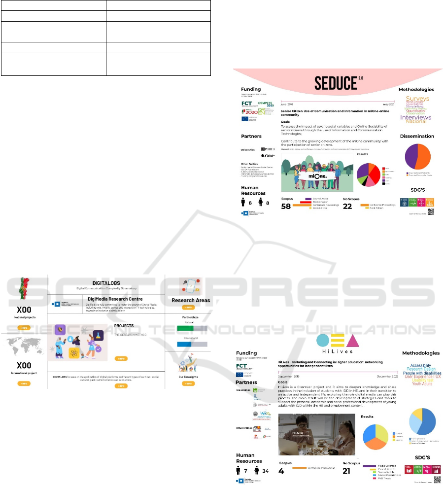
Table 1: Criteria by existing InfoVis tools and literature.
Cate
g
or
y
Tools
Deskto
p
software tools Power BI, QlikView
Libraries and programming
framework tools
D3.js, Matplotlib (Python),
gg
p
lot2 (R)
Online tools Flourish, Plotl
y
, Geniall
y
Design tools Figma, Canva, Infogram,
Visme
The team then categorized the tools analyzed into
four distinct categories to facilitate the comparison
and selection process, allowing the team to make an
informed decision on the most suitable tool for the
project. This categorization was based on a
combination of existing literature on InfoVis tools,
and the subjective criteria established by the team,
(Table 1). According to the tools found, the next step
was the selection process. The work team decided to
use the online tool Genially, because it is
customizable, offers predefined templates and has a
free version available.
4.2 Dashboard Model Development
The initial drafts of the project dashboard were
created using Genially, as shown in Figure 1.
Figure 1: Drafts of dashboards created using Genially.
These drafts were carefully reviewed and
approved by the DigitalOBS team. However, while
creating the interactive prototypes, the researchers of
Students@DigiMedia realized that the free version of
Genially had some limitations. These included a
minimum number of allowed changes and the
absence of certain graphic and interactive features.
As a result, the team of Students decided to switch
to using the Figma tool instead. Figma is an intuitive
vector graphic design editor that provides a wide
range of image optimization capabilities. Using
Figma, the team successfully created interactive
panels for two noteworthy projects: Seduce 2.0 and
HiLives. It was important for the team to ensure that
these dashboards possessed a consistent visual
identity across both projects. The team chose this
deliberate approach to facilitate a quicker and more
effective comprehension of each project.
After conducting a comprehensive review and
adaptation exercise, the team identified the visual
models that were most suitable for effectively
communicating DigiMedia projects (see Figure 2 –
Seduce and Figure 3 - HiLives).
Figure 2: Visual model created using Figma, Seduce
project.
After careful consideration, the dashboard
displayed in Figure 3 was ultimately chosen as the
final model for presenting the data from the collected
projects. This designed dashboard was implemented
in Power BI, ensuring a practical and visually
appealing representation of the project data.
Figure 3: Visual model created using Figma, HiLives
project.
The dashboard prominently showcases the project's
title, objectives, and logo. The remaining information
is visually organized into three distinct blocks: inputs,
outputs, and impact. This arrangement allows for
highlighting key milestones and moments within each
project. As a result, stakeholders can easily monitor
and assess the progress and effectiveness of the
The Power of Information Visualization for Understanding the Impact of Digital Media Projects
175
projects. The input block provides detailed data
regarding the resources that have been invested, such
as funding, human resources, and partners. The
outputs block focuses on the services and results
achieved, such as the scientific-technological
products developed, methodological procedures
implemented, publications, dissemination activities
and sustainable development objectives achieved.
Lastly, the impact block measures the long-term
effects and benefits of the projects, such as
improvements in society, the economy, or the
environment and acknowledgement.
4.3 Implementation by BI Tools –
Power BI
Within the scope of this work, Power BI was used to
develop a multi-page report focussing on crucial
aspects of the various projects developed by
DigitalOBS researchers, including details of the
projects carried out, human resources involved,
collaborations between institutions, methodologies
applied, and resulting publications. Each of these
pages is organised as a dashboard offering an
immediate summary of the data under analysis (Orts,
2004). Initially, the various DigiMedia labelled
projects' technical sheets were analysed to detect
patterns and define a structure for the file that would
feed the Power BI report. This source file consists of
an Excel file published online via SharePoint and
shared between DigiMedia members who have
permission to update it whenever new projects or
changes to existing ones appear.
Figure 4: Page structure of the report developed in Power
BI with the project's data.
Their structure is identical and in the majority of
cases is divided into three sections: a top bar
identifying the various pages of the report as well the
indication of which one is currently selected (A), a
small area with various filter options that allow to
segment the data presented (B) and finally a larger
area with various related visual elements that allow to
interact and gain insight from the data presented (C).
The report, developed in Power BI, consists of 11
pages in total. The first page is an aggregation of the
main numbers related to the various projects
developed by DigiMedia researchers. It is possible to
analyse in detail the origin of the number in question
by navigating to the page where it is desiccated.
It is also possible to create a dashboard that
displays the most critical information for each
project. This page was created using the project
presentation template developed in the previous
phase. Figure 5 shows the page summarizing the main
project numbers.
Figure 5: Summary page of the main projects.
The Power BI report effectively combines and
aggregates all the essential project data, providing a
comprehensive overview. It is a centralized hub,
allowing researchers and stakeholders to access
crucial information immediately. The remaining
pages are the following: Projects; Human Resources;
Collaborations; Scientific Area; Applied
Methodologies; Products; Publications;
Dissemination Activities; and Researchers.
Figure 6: Pages created by Power BI with the Project’s data.
Each Power BI dashboard provides a visual
representation of project data, national or
international level, based on the type of partnership.
The partners' locations are displayed on a map,
illustrating their geographical distribution through
dots (Figure 6).
ICEIS 2024 - 26th International Conference on Enterprise Information Systems
176
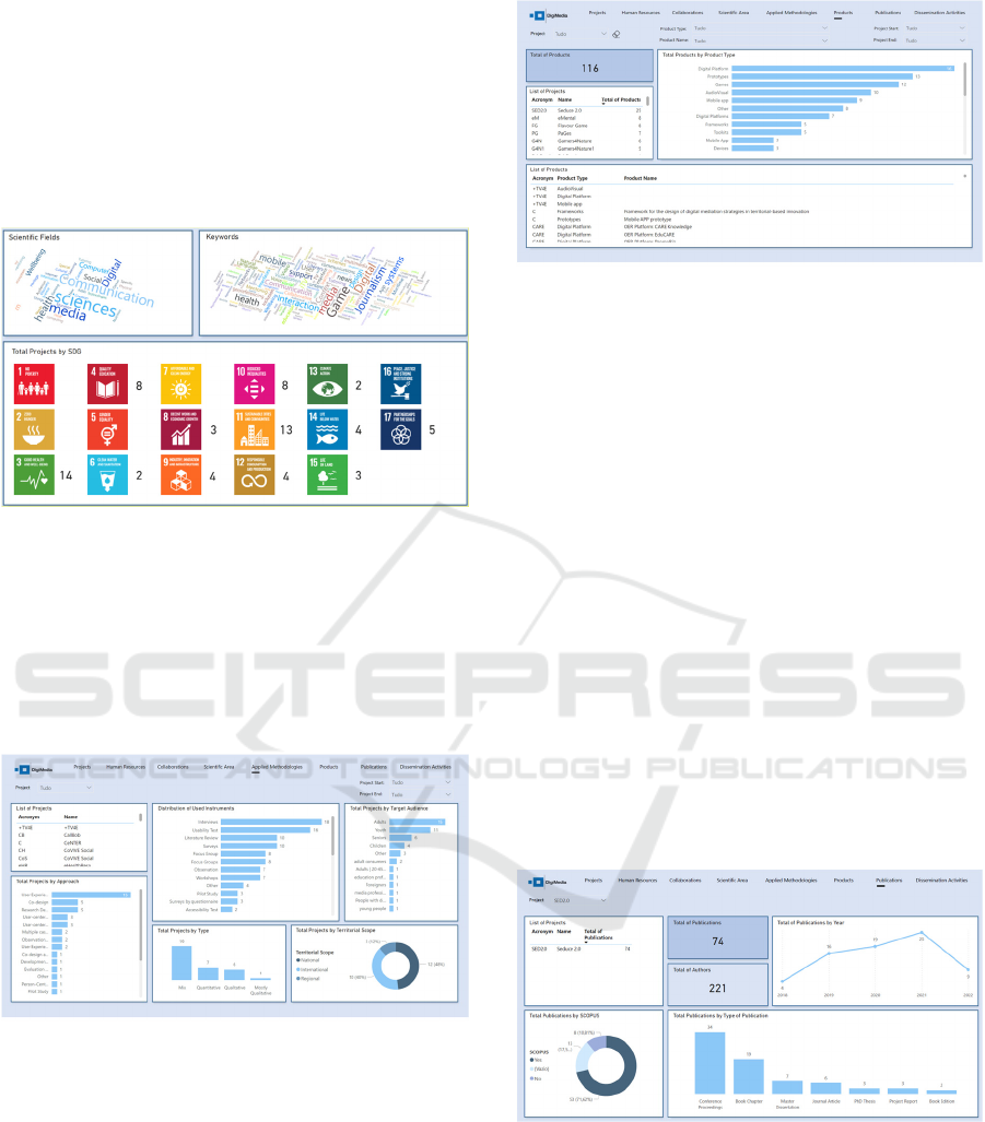
Regarding the scientific domain, word clouds are
useful for efficiently summarising material and
identifying the most prominent concepts within
scientific fields and keywords. Additionally, each
project is assigned a specific number of Sustainable
Development Goals (Figure 7), which enables the
team to have a more comprehensive understanding of
the primary focus areas.
Figure 7: Pages created by Power BI with Scientific Areas
data and SDG’s.
In Figure 8 we can see a more detailed table of the
methodologies applied in the projects, such as the
type of scientific research, the type of approach taken,
the instruments applied, the target audience and at
what geographical level the projects were
implemented.
Figure 8: Pages created by Power BI with Applied
Methodologies data.
Digital media projects, whether national or
international, typically involve developing diverse
scientific and technological products. Hence, the
team has recognised the significance of categorising
the product menu based on the type of product. This
can be visualised either through a horizontal bar
graph or a project-specific list (Figure 9).
Figure 9: Pages created by Power BI with product data.
Scientific publications play a crucial role in the
success and progress of research centre projects in
terms of being the primary means of disseminating
research findings to the wider scientific community.
They allow researchers to share their discoveries,
methodologies, and insights with other experts in the
field. Peer-reviewed publications enhance the
credibility and reliability of research (Figure 10). So,
publications contribute significantly to the academic
recognition of researchers and the research centre
itself. The number and impact of publications are
often used to indicate the research centre's
productivity and reputation within the scientific
community. Collaborations and partnerships often
arise from shared research interests and
complementary expertise demonstrated through
published work. Therefore, published research can
lead to the development of new technologies or
applications. This knowledge transfer from academia
to industry can result in innovations that benefit
society and contribute to the research centre’s impact.
Figure 10: Representation of Seduce2.0 project
publications created using Power BI.
Dissemination Activities serve to enable the
transmission of knowledge from the research centre
to diverse stakeholders, encompassing other
researchers, policymakers, industry experts, and the
general public. This guarantees that the research
findings are readily available and practical for a wider
The Power of Information Visualization for Understanding the Impact of Digital Media Projects
177
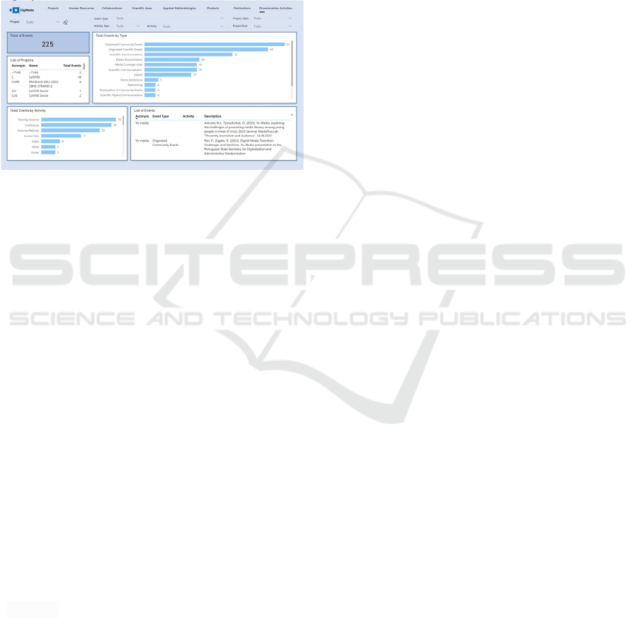
audience beyond the academic community. Research
centres can foster and enhance connections with other
research institutions, universities, and organisations
by disseminating research outputs through
conferences, workshops, and publications (Figure
11). Networking is crucial for cultivating a
cooperative research environment. Additionally, they
enhance the enduring significance and influence of
research findings by assuring their ongoing relevance.
It contributes to ensuring the creation of a sustainable
legacy for the research centre.
Figure 11: Pages created by Power BI with Dissemination
Activities data.
Furthermore, efforts have been made to ensure the
accessibility and responsiveness of the platform,
making it compatible with various devices and screen
sizes. Users can easily click on any topic of interest
to dive deeper and explore more detailed information.
Additionally, the dashboards offer indicators side by
side, facilitating data-driven decision-making.
The quality of data directly impacts the excellence
of study findings. Accurate, dependable, and correct
data are essential for producing strong discoveries,
publications, and contributions to the scientific
community. Research centres focus heavily on data-
driven decision-making. Accurate and relevant data is
essential to make informed and evidence-based
decisions, whether it's for planning future initiatives,
allocating resources, or developing strategies. Data
enables research centres to establish a baseline for
their discoveries by comparing them to current
knowledge and evaluating their findings
concerning previous studies.
Data play a crucial role in the scientific method,
exerting influence over research’s calibre, rigour, and
significance. This study is in line with other studies
(Szołtysik, 2017; Zheng, 2018) that reveal the
importance of applying visualisation information
with BI tools, where is possible to convert
unprocessed data into valuable and practical
information for human consumption.
5 CONCLUSIONS
This study focuses on developing dashboards using
InfoVis and BI tools to effectively present research
project results and impacts.
The DigitalOBS team collaborated with students
from the Department of Communication and Art,
participating in the Students@DigiMedia initiative.
The students' involvement not only provided them
with valuable hands-on experience in data
visualization but also brought fresh perspectives and
innovative ideas to the project. Overall, this
collaboration between the DigitalOBS team and the
Students@DigiMedia initiative demonstrated the
power of interdisciplinary collaboration in research
investigation.
Together, the team created a graphic model using
InfoVis techniques to effectively communicate a
comprehensive set of information related to the
results of scientific projects. The integration of
InfoVis tools and AI technology has greatly enhanced
the presentation of data and can facilitate knowledge-
sharing and decision-making processes.
This study developed a Power BI report, each
dedicated to a specific aspect of the research projects.
By providing researchers with intuitive and visually
appealing tools to present their project results, this
study has the potential to enhance collaboration,
facilitate data-driven decision-making, and accelerate
the advancement of research in the digital media field.
The findings of this study not only benefit
DigitalOBS by allowing analysis of the research
project's outcomes but also showcase the potential of
InfoVis and AI tools in the academic and research
context.
ACKNOWLEDGEMENTS
This work is financially supported by national funds
through FCT – Foundation for Science and
Technology, I.P., under the project
UIDB/05460/2020.
REFERENCES
Andrienko, N., Andrienko, G., Miksch, S., Schumann, H.,
Wrobel, S. (2021). A theoretical model for pattern
discovery in visual analytics. Visual Informatics, 5, 23-
42.
Ansari, B., Barati, M., Martin, E.G. (2022). Enhancing the
usability and usefulness of open government data: A
comprehensive review of the state of open government
ICEIS 2024 - 26th International Conference on Enterprise Information Systems
178

data visualization research. Government Information
Quartely, 39(1), 1-15.
Bacic, D., Fadlalla, A. (2016). Business information
visualization intellectual contributions: An integrative
framework of visualization capabilities and dimensions
of visual intelligence. Decision Support Systems, 89,
77–86.
Becker, L. T., Gould, E. M. (2019). Microsoft power BI:
Extending excel to manipulate, analyze, and visualize
diverse data. Serials Review, 45(3), 184-188.
Binder, H., Blettner, M. (2015). Big data in medical
science--a biostatistical view. Dtsch Arztebl Int.,
112(9), 137-142.
Djenontin, I. N. S., Meadow, A. M. (2018). The art of co-
production of knowledge in environmental sciences and
management: lesson from international practice.
Environmental Management, 61, 885-903.
https://doi.org/10.1007/s00267-018-1028-3
Frey, K., Widmer, T., (2009). The role of efficiency
analysis in legislative reforms in Switzerland. In 5th
ECPR General Conference, Potsdam, Germany
https://www.zora.uzh.ch/id/eprint/26718/8/Frey1.pdf
Hepworth, K. (2016). Big Data Visualization: Promises &
Pitfalls. Communication Design Quarterly, 4(4), 7-19.
Horttanainen, P., Virrantaus, K. (2004). Uncertainty
evaluation of military terrain analysis results by
simulation and visualization. In Proc. 12th Int. Conf. on
Geoinformatics, 474-480.
Jiang, T., Hou, Y., Yang, J. (2023). Literature Review on
the Development of Visualization Studies (2012–
2022). In The 3rd IEEE International Conference on
Electronic Communications, Engineering Proceedings,
38(1), 1-10.
Khatuwal, V. S., Puri, D. (2022, April). Business
Intelligence Tools for Dashboard Development.
In 2022 3rd International Conference on Intelligent
Engineering and Management (ICIEM) (pp. 128-131).
IEEE.
Lima, M. (2011). Visual Complexity – Mapping Patterns of
Information. Princeton Architectural Press.
Orts, D. (2004). Dashboard development and deployment.
Bellevue: Noetix Corporation.
Patrício, M. T., Alves, J. E., Alves, E., Mourato, J., Santos,
P., Valente, R. P. (2018). Avaliação do desempenho da
investigação aplicada no ensino superior politécnico:
Construção de um modelo. Sociologia, Problemas e
Práticas, (86), 69-89. https://journals.openedition.org/
spp/4053
Pinto, M., Raposo, R., Ramos, F. (2012). Comparison of
Emerging Information Visualization Tools for Higher
Education. In 16
th
International Conference on
Information Visualization, 100-105.
Plaisant, C., Shneiderman, B. (2022). Lightning and
Thunder: The Early Days of Interactive Information
Visualization at the University of Maryland. In IEEE
Computer Graphics and Applications, 42(4), 103–113.
Saenen, B., Morais, R., Gaillard, V., Borrell-Damián, L.
(2019). Research Assessment in the Transition to Open
Science: 2019 EUA Open Science and Access Survey
Results. European University Association.
Santos, J. (2022). On the role and assessment of research at
European Universities of Applied Sciences. Journal of
Higher Education Theory and Practice, 22(14).
Shirato, G., Andrienko, N., Andrienko, G. (2023).
Identifying, exploring, and interpreting time series
shapes in multivariate time intervals. Visual
Informatics, 7, 77-91.
Shneiderman, B. (1996). The eyes have it: a task by data
type taxonomy for information visualizations. In
Proceedings of IEEE Symposium on Visual Languages,
336–343.
Sorapure, M. (2019). Text, Image, Data, Interaction:
Understand Information Visualization. Computers and
Composition, 54, 1-16.
Szołtysik, M. (2017). Processes of Creating Infographics
for Data Visualization. In: Goluchowski, J.,
Pankowska, M., Linger, H., Barry, C., Lang, M.,
Schneider, C. (eds) Complexity in Information Systems
Development. Lecture Notes in Information Systems
and Organisation, vol 22. Springer, Cham.
https://doi.org/10.1007/978-3-319-52593-8_11
Tymoshchuk, O., Silva, M., Oliveira, L., Zagalo, N. (2024).
From Data to Insights: Research Centre Performance
Assessment Model (PAM). In Proc. 26
th
International
Conference on Enterprise Information Systems. (in
press).
Wolff, A., Gooch, D., Cavero Montaner, J. J., Rashid, U.,
Kortuem, G. (2016). Creating an Understanding of Data
Literacy for a Data-driven Society. The Journal of
Community Informatics, 12(3), 9-26.
Zheng, J. G. (2018). Data Visualization for Business
Intelligence. In Munoz, J. M. (ed.), Global Business
Intelligence, Chapter 6. Taylor & Francis.
Zhu, S., Sun, G., Jiang, Q., Zha, M., Liang, R. (2020). A
survey on automatic infographics and visualization
recommendations. Visual Informatics, 4, 24-40.
The Power of Information Visualization for Understanding the Impact of Digital Media Projects
179
