
Supporting User-Centered Requirements Elicitation from Lean
Personas: A UX Data Visualization-Based Approach
Maylon Macedo
a
, Gabriel V. Teixeira
b
, Ariel E. S. Campos
c
and Luciana Zaina
d
Federal University of S
˜
ao Carlos (UFSCar), S
˜
ao Paulo, Brazil
Keywords:
Lean Personas, User Experience, UX, UX Data, Requirement Elicitation, Information Visualization.
Abstract:
The interest in exploring User Experience (UX) data to support the requirement elicitation of interactive sys-
tems is not new. Although the literature discusses traditional methods to gather UX data (e.g., interviews and
surveys), personas have arisen as a more user-centered technique that presents information about users’ needs,
preferences, and characteristics about the application domain. Nonetheless, persona data is often represented
from qualitative data in textual format, which can insert difficulties in browsing and exploring a set of per-
sonas. This paper aims to present visualizations designed using Information Visualization (InfoVis) principles
that support the navigation and search-out UX data in a persona dataset. To aid in eliciting UX-related require-
ments, our visualizations are based on a funnel perspective that guides designers and developers to examine
data from an overview first, then zoom and filter, to achieve the qualitative data in detail finally. We evaluated
with 20 participants concerning the interpretation of the visualizations. The results revealed that the partici-
pants, even those with little experience in requirement elicitation, could interpret and find relevant UX data
from the visualizations.
1 INTRODUCTION
User experience (UX) is an important aspect of soft-
ware quality that affects software acceptance by users
(Kashfi et al., 2019). Although the literature provides
different definitions of UX, most of them state that
UX encompasses both the software functionalities
and its quality characteristics that are perceived by
end-users (Hassenzahl, 2018). Studies have discussed
the importance of including the discussion of UX
from the software conceptualization stages (i.e., re-
quirement elicitation, software ideation) (Kashfi et al.,
2019; Choma et al., 2022). Different requirements
elicitation techniques have emerged in the literature
(e.g., personas, user stories) (Faily and Lyle, 2013)
and the personas technique has been recognized as a
more focused user-centered approach to explore data
from end-users (Pinheiro et al., 2019). By creat-
ing fictional characters that represent different groups
of end-users, the personas provide designers and de-
velopers with users’ data about their needs, experi-
ences, behaviors, and goals, hereinafter called UX
a
https://orcid.org/0000-0002-2686-1103
b
https://orcid.org/0000-0001-7589-3622
c
https://orcid.org/0000-0003-0857-4570
d
https://orcid.org/0000-0002-1736-544X
data (Billestrup et al., 2014; Pinheiro et al., 2019).
UX data contains information that allows mapping
users’ decisions and interactions with a product, en-
abling measurements and statements about the causes
and results of implementations in interactive systems
(Luther et al., 2020).
Personas often provide a rich amount of qualita-
tive UX data (Gothelf, 2012). Nonetheless, the tradi-
tional persona demands time and effort in user data
collection which becomes an expensive technique
(Billestrup et al., 2014). As an alternative, Gothelf
proposed the proto-persona also called lean persona,
an agile approach that allows designers/developers to
create concise personas based on their prior knowl-
edge about the target audience (Gothelf, 2012; Pin-
heiro et al., 2019).
On the one hand, designers and developers rec-
ognize the qualitative UX data from lean personas as
useful to elicit users’ needs and preferences in their
interaction (Isherwood, 2020). On the other hand,
they struggle to identify and extract meaningful in-
sights about UX from qualitative data in textual for-
mat which turns the elicitation of UX-related require-
ments into a complex task (Ye Lim Rhie and Yun,
2017). The extraction of requirements involving text
interpretation requires defining meanings to provide
Macedo, M., Teixeira, G., Campos, A. and Zaina, L.
Supporting User-Centered Requirements Elicitation from Lean Personas: A UX Data Visualization-Based Approach.
DOI: 10.5220/0012567400003690
Paper published under CC license (CC BY-NC-ND 4.0)
In Proceedings of the 26th International Conference on Enterprise Information Systems (ICEIS 2024) - Volume 2, pages 461-472
ISBN: 978-989-758-692-7; ISSN: 2184-4992
Proceedings Copyright © 2024 by SCITEPRESS – Science and Technology Publications, Lda.
461

different values to the raw data (Ye Lim Rhie and
Yun, 2017). Without defining meanings, the analysis
depends on the judgment of each researcher, and the
result may vary in relation to knowledge and experi-
ence about UX (Ye Lim Rhie and Yun, 2017; Desai,
2019).
Visual data representations can guide designers
and developers during the requirement elicitation
(Kashfi et al., 2019) on the exploration of textual data
which reduces the effort to obtain information based
on patterns and emergent data (Desai, 2019). Con-
sidering the problem of browsing and exploring the
textual UX data provided by lean personas, this pa-
per presents three visualizations that deliver UX data
that are obtained from lean personas previously elab-
orated. These visualizations lead designers and devel-
opers to explore the lean persona data gradually rang-
ing from the data overview to data in detail taking into
account Shneiderman’s mantra (Shneiderman, 1996).
This paper is organized as follows. section 2
presents the fundamental background that underlies
the design and development of the visualizations and
the related work. We explain all activities made in
our systematic process to design the visualizations,
including the visualizations’ rationale and character-
istics, in section 3. In subsection 3.1 we explain the
dataset used as a baseline to design the visualiza-
tions. We discuss the study validity and present the
planning, execution, and analysis of the visualizations
evaluation in section 4. The analysis of the evalua-
tion results and our findings about the use of visual-
izations to get information by UX data are presented
in section 5. In section 6 we presented conclusions
and suggestions for future work.
2 BACKGROUND
2.1 Requirements Elicitation and
Personas
Software professionals have a common understand-
ing that a good process of requirements elicitation
promotes support for defining requirements (Orme
˜
no
and Panach, 2013). Software requirements have two
main classifications which are named functional and
non-functional. Quality requirements like UX re-
quirements fit into the definition of non-functional
and involve understanding system tasks, user expecta-
tions, ease of use, and user satisfaction (Orme
˜
no and
Panach, 2013).
As mentioned before (see Section 1), personas
have been used as an artifact to support UX-related
requirements elicitation due to the details about users’
needs and characteristics these artifacts provide to de-
velopers and designers (Faily and Lyle, 2013; Teix-
eira. and Zaina., 2022). However, the construction
of traditional personas requires efforts of time and
a great amount of data collection (Billestrup et al.,
2014). Lean personas is a technique that impresses
more agility to the personas creation process by con-
sidering the prior knowledge of the software practi-
tioners about the target audience (Gothelf, 2012).
Pinheiro et al. (2019) extended Gothelf’s lean
persona and proposed a four-quadrant template that
contained guideline questions to guide the lean per-
sona artifact construction. The four quadrants orga-
nize the lean persona information as follows: Q1 -
Demographic data; Q2 - Objectives and needs; Q3 -
Behaviors and preferences; and Q4 - Difficulties. The
four quadrants of the template and the guideline ques-
tions enhance the description of users’ information
while keeping the characteristic of being a lean ar-
tifact (Teixeira. and Zaina., 2022). To automatize the
creation of lean personas based on the four-quadrant
template, Teixeira. and Zaina. (2022) developed the
Lean Persona+ tool.
The results about the effectiveness and efficiency
of adopting personas artifacts during requirements
identification were presented by Salminen et al.
(2020). The authors compared the use of personas
with requirements elicitation conducted using data
from an analytics tool (Salminen et al., 2020). The
results revealed that the developers spent more time
identifying the requirements that were caused by the
need to interpret a great amount of data from the an-
alytics tool. On the other hand, the personas artifacts
presented end-user data in a straight way which makes
the developers work faster (Salminen et al., 2020).
2.2 UX Data Visualization
Techniques such as lean persona produce qualitative
data about user characteristics, needs, preferences,
and experiences (Gothelf, 2012). This qualitative UX
data can aid designers and developers in setting prior-
ities for designing a better user experience during the
requirement elicitation process (Luther et al., 2020).
Besides, it can bring insights about why users need
some software features, what software features are
suitable to fulfill users’ needs and preferences, and
how users can interact with the features (Hassenzahl,
2018). However, the alignment on the meaning of
UX can insert difficulties in using the UX qualitative
data to requirement elicitation (Choma et al., 2022;
Ye Lim Rhie and Yun, 2017).
Different UX definitions are found in the litera-
ture. Hassenzahl provides a content-model definition
ICEIS 2024 - 26th International Conference on Enterprise Information Systems
462

that categorizes UX into three levels based on inter-
action action (Hassenzahl, 2018). The why level en-
compasses the motivations and needs that lead an in-
dividual to use the product. The what level refers to
product features that fulfill users’ needs. The how
level is about user activity on the product to inter-
act with the functionalities. When the user reaches
their goal (i.e., why level) through successful use of
the concrete actions (i.e., how level) of product func-
tions (i.e., what level) a feeling of wellbeing is awak-
ened (Hassenzahl, 2018). Hassenzahl’s content model
provides a perspective of the UX information linked
to users’ interaction with the product (what and how
levels) and with the motivations and needs for having
these interactions (why levels). Each level of Hassen-
zahl’s content model focuses on information related
to UX which facilitates the levels of association with
UX qualitative data (Zaina et al., 2021).
Nonetheless, qualitative data provided from lean
personas are based on text data which turns the data
exploration for requirement elicitation harder (Slone,
2009). The visualization of data in plain text for-
mat does not assist users to infer patterns and find
trends or outliers (Ware, 2012). The adoption of vi-
sual representations can assist the navigation of quali-
tative data guiding professionals to explore and inter-
pret UX data instead of relying on statements of indi-
viduals that analyzed the results (Slone, 2009; Ware,
2012).
The elaboration of visual representations can be
supported by Information Visualization (i.e., InfoVis)
techniques (Munzner, 2014; Ware, 2012). InfoVis of-
fers methods and techniques to enhance human per-
ception in the recognition and interpretation of data
(Ware, 2012). Concerning Human-Computer Interac-
tion (HCI), InfoVis aims to build visualizations that
are more adherent to the needs of a target audience
and prevent users from employing excessive efforts
to interpret data (Ware, 2012; Munzner, 2014).
2.3 Related Work
As far as we know, there is no previous work that pro-
poses visualizations to support the use of data from
personas. The work of personas related to require-
ment elicitation mostly discusses the potential of un-
covering user-centered data available from the per-
sonas (Pinheiro et al., 2019). Lean Persona+ tool de-
veloped by Teixeira. and Zaina. (2022) allows the
visualization of personas data; however, the visual-
ization is available from its template format. Consid-
ering that our approach is based on visual representa-
tions, we explored studies that provide contributions
to the visualizing UX data.
M
´
oro et al. (2014) proposed a bar chart view for
visualizing gaze-tracking data focused on testing dy-
namic web applications. An assessment of the us-
ability of the visualization showed that users want to
visualize the data in other formats, for instance heat
map graphs. To view website navigation data, four
visualizations (i.e., Arc Diagram, Word Tree, Sankey
Diagram, and Node-Link) were proposed by Buono
et al. (2020) to support novice evaluators in usabil-
ity testing. An evaluation by applying the System
Usability Scale questionnaire (SUS) with fifteen par-
ticipants revealed that the Sankey Diagram was the
visualization most appreciated by the evaluators for
showing navigation data quickly and objectively. To
support the analysis of the results of usability and
UX assessments based on user tasks, Bernhaupt et al.
(2020) has created three visualizations. These visu-
alizations were built by applying the Shneiderman’s
mantra (1996) (i.e., overview first, then zoom and fil-
ter, details on-demand) with two levels of granularity:
overview and detailed.
Considering visualizations of qualitative data,
Bakiu and Guzman (2017) proposed an approach to
automatically detect software feature issues, usabil-
ity, and UX dimensions (e.g., satisfaction, comfort,
and motivation), and sentiment polarities (i.e., pos-
itive, negative, or neutral) according to user ratings
in apps reviews. Similar to Bernhaupt et al. (2020)
work, Shneiderman’s mantra (1996) was applied in
building the views, visualizing the results at two lev-
els of granularity: overview and detailed. The authors
do not report an assessment of the visualizations.
3 UX DATA VISUALIZATION
DESIGN
To design the visualizations, we followed two ap-
proaches: the Design Activity framework and the
Nested Model for Visualization Design proposed by
McKenna et al. (2014) and Munzner (2014), respec-
tively. Design Activity Framework (DAF) encom-
passes a process of four activities to support the de-
sign of visualizations: Understand - encourage de-
signers to adopt a user-centered design thinking about
requirements, goals, and opportunities of visualiza-
tions; Ideate - motivate the brainstorm of ideas and
thus the selection of one that best fulfills the needs
discovered in the understand activity; Make - proto-
type the selected idea in a visualization (or a set of
visualizations), and Deploy - deploy an effective visu-
alization system which can be explored and evaluated
by end-users (McKenna et al., 2014).
Nested Model for Visualization Design (i.e., in
Supporting User-Centered Requirements Elicitation from Lean Personas: A UX Data Visualization-Based Approach
463
short, named Nested Model) is a well-known ap-
proach to support the evaluation and design of visual
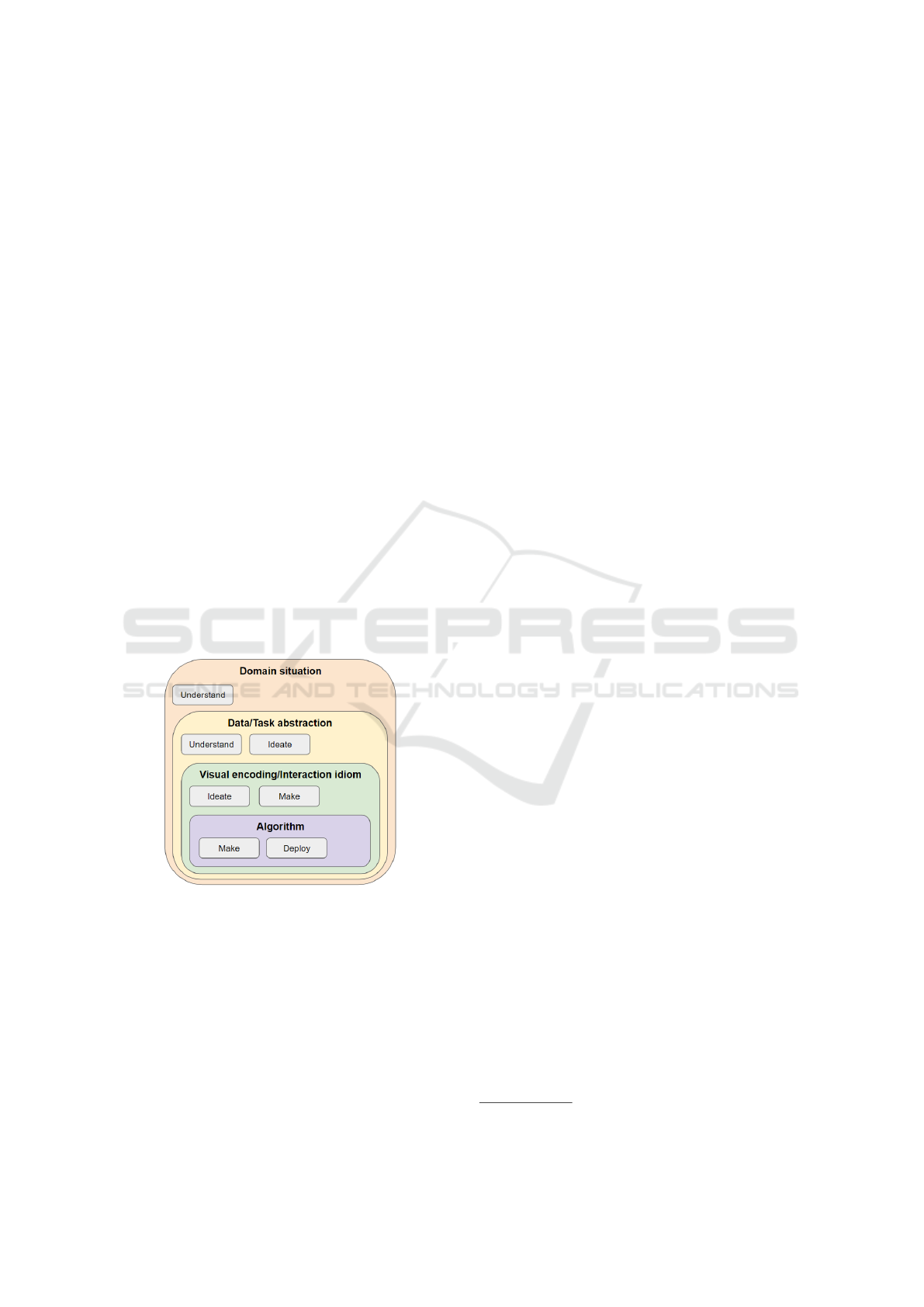
representations (Munzner, 2014). It contains four lev-
els that cover (see Figure 1): (i) Domain Situation -
which guides designers in understanding the proposal
of the visualization; (ii) Data/task abstraction – which
helps designers find which data and its formats are
used to do a task; (iii) Visual encoding/Interaction id-
iom – encourage designers to consider the visual rep-
resentations and approaches to show the data for users
(i.e., idiom of visualization); and (iv) Algorithm – de-
velop the visualization (Munzner, 2014). The idiom
of visualization can be perceived by chart models, in-
teraction features (e.g., zoom and pinch), and visual-
ization systems with the information presented in dif-
ferent degrees of granularity (Munzner, 2014).
We decided to adopt both approaches because
they present a complementary perspective (see Fig-
ure 1). Design Activity Framework (McKenna et al.,
2014) supporting us in applying the good practices
presented in the Nested Model for creating the visu-
alizations. We applied this complementary view for
each visualization we have proposed. Taking into ac-
count the complementary view of the approaches, we
proceeded to design the visualizations based on two
steps, i.e., preparation of lean personas dataset, and
visualizations elaborations. Each step is presented in
the next sections.
Figure 1: The complementary view of DAF and Nested
Model approaches - DAF in grey boxes and the Nested
Mode in colors - adapted from (McKenna et al., 2014) and
(Munzner, 2014), respectively.
Considering the complementary view of
McKenna et al. (2014) and Munzner (2014)
model (see Figure 1), we conducted the understand
step about the domain situation, i.e., how the visual-
izations could minimize the designers and developers
efforts to browse the qualitative data of lean personas.
Taking into account the great amount of qualitative
data, we decided to adopt a funnel perspective to
visualize the UX data as used in (Bakiu and Guzman,
2017; Bernhaupt et al., 2020). In both works, the
authors applied two levels of the Shneiderman’s
mantra (1996) (i.e., overview and detailed). In our
proposal, we planned to design three visualizations
to disclose the UX data gradually throughout the
three levels (i.e., overview, zoom and filter, and
details). After that, we searched for a lean personas
dataset that could be used in the visualization con-
struction. Besides, we conducted the understand of
the data available to then ideate how this data could
support the conception of the three visualizations
(see data/task abstraction level in Figure 1) as we
described in the next section.
3.1 Lean Personas Dataset Model
Our first activity was to obtain the persona dataset.
We contacted the Lean Persona+ tool authors because
we considered they would have a dataset of virtual
data (Teixeira. and Zaina., 2022). We asked for ac-
cess to a dataset with the lean persona artifacts and
they provided a dataset containing 23 lean personas
specifications in the four quadrants template (see the
quadrants template explanation in section 2). Accord-
ing to the authors, this dataset was produced from the
studies conducted to evaluate the Lean Persona+ tool
(Teixeira. and Zaina., 2022). The dataset encom-
passed lean personas that represented the target users
of tourism mobile apps (e.g., TripAdvisor
1
). Each
lean persona is composed by quadrants, questions,
and answers which are the base elements of the lean
persona template (see an example of a persona’s data
in the Figure 2-III) (Pinheiro et al., 2019).
3.2 Labeling Lean Personas Dataset
Besides the feature of creating lean persona artifacts,
the Lean Persona+ tool provides a labeling tool. The
labeling tool allows the activity of marking chunks of
text available in the quadrant which are part of lean
personas descriptions. The labeling tool provides la-
bels based on the levels proposed by Hassenzahl (i.e.,
why, what, and how, see details in Section 2.2). With
these labels, we can conduct the labeling of chunks of
qualitative data to identify UX-relevant excerpts pre-
sented in the quadrants of lean personas. Different
labels could be assigned to the same chunks of text.
In a conversation with the authors tool, we have per-
mission to use the labeling tool to prepare the dataset
for being used in our visualization proposals. Three
experts with (i) knowledge of Hassenzahl’s content
1
https://www.tripadvisor.com.br/
ICEIS 2024 - 26th International Conference on Enterprise Information Systems
464

model; and (ii) academic and practical experience
in Human-Computer Interaction and in Requirement
Engineering participated in the labeling activity. The
profile of experts was (i) one professor with 15+ years
of experience; (ii) one PhD candidate with 5+ years of
experience in the software industry; and (iii) one ju-
nior researcher with 1+ years who also works in the
industry as a developer. After labeling 23 lean per-
sonas available in the dataset, we produced 165 labels
in total (i.e., 55 why, 77 what, 33 how).
3.3 Design the Visualizations
Taking into account the lean personas data labeled
with Hassenzahl’s content model levels, we moved to
ideate and make the visual encoding level with the
participation of the three UX experts that labeled the
lean persona dataset (see experts profile in Section
3.2). These activities were performed for each visual-
ization that was associated with the three mantra lev-
els (i.e., overview, zoom and filter, and details).
In sequence, the make and deploy activities were
carried out for each visualization creation to complete
the algorithm level (see Figure 1). To provide a func-
tional version of the visualizations, we developed a
web application. It is worth noticing that although
we used a predefined lean persona dataset, our visual-
izations proposal are extensible to other datasets that
follow the data structure presented in subsection 3.1.
Our three visualizations intend to orchestrate a
gradual navigation to the UX data of lean personas.
In this sense, the following description illustrates how
the visualizations are connected one each other. By
interacting with the overview visualization designers
and developers can first filter the dataset by choosing
one of the labels (i.e. why, what, and how) to see the
personas that have information about that selected la-
bel. With the zoom and filter visualization they see
the quantitative data related to each persona-quadrant
relationship and can select one persona to be exam-
ined in detail. Details visualization shows the text
data and the labels assigned to each lean persona that
highlight the role of that chunk of text in providing
UX-relevant information. Such information can be-
come a UX-related requirement or trigger insights to
search for other requirements.
The following sections discuss each visualization
design. For each visualization, we will provide infor-
mation about our rationale for ideation that visualiza-
tion, the visual representation format selected and its
respective characteristics, and the chart and its details
that implemented that visualization.
3.3.1 Visualization to Overview the UX Data
Considering the organization of lean persona artifacts
data described in subsection 3.1, we noticed that there
is no direct way (i.e., without performing calcula-
tions) to visualize the quantitative data about the la-
bels (i.e., UX data). Primary navigation through lean
persona artifacts is performed without an overview by
selecting a particular persona in a tabular view to see
all data.
Rationale: An overview visualization avoids the
need to open each persona to observe the existence of
labels. This type of visualization (i.e. overview) helps
users see the scope of data and choose what informa-
tion they need to see in detail (Shneiderman, 1996;
Munzner, 2014). By looking at the labeling distribu-
tion, designers and developers can concentrate their
attention on the lean personas that may contain UX
data that they want to look for guided by the label that
abstracts the meaning of the data. Developers and de-
signers can take advantage of information such as: if
there are labels; the number of labels, and what kind
of existing labels.
Visual representation characteristics: In the
Sankey chart, the line can represent a relationship be-
tween categories while the thickness of the line rep-
resents quantitative data. The objective of this visu-
alization is to get an overview of all available data to
guide users on the data exploration. Our overview vi-
sualization (see Figure 2-I) can represent: the number
of labels that were found in each quadrant (see Fig-
ure 2-I-A)); the number of labels that exist of each la-
bel type (see Figure 2-I-B)); and the number of labels
of each type is present in each quadrant (see exam-
ple in Figure 2-I-C)). The visualization interaction is
Mouse hover in left axle to show the amount of all
existing labels in that quadrant; Mouse hover in right
axle to show the amount of all occurrences of that la-
bel; Mouse click in right axle to open the zoom and
filter visualization; Mouse hover on lines to show the
amount of a given label in a given quadrant.
3.3.2 Visualization to Zoom and Filter the Data
The overview visualization (see subsubsection 3.3.1)
provides the view of the representativeness of each
type of label assigned to all the lean personas avail-
able in the dataset. Taking into account the label se-
lected (i.e., why, what, and how) previously in the
overview visualization, designers and developers can
explore the quantitative data by choosing which lean
personas have the selected label.
Rationale: Considering our objective of eliciting
requirements from UX data present in lean persona,
zoom and filter visualization aids to reduce and fo-
Supporting User-Centered Requirements Elicitation from Lean Personas: A UX Data Visualization-Based Approach
465
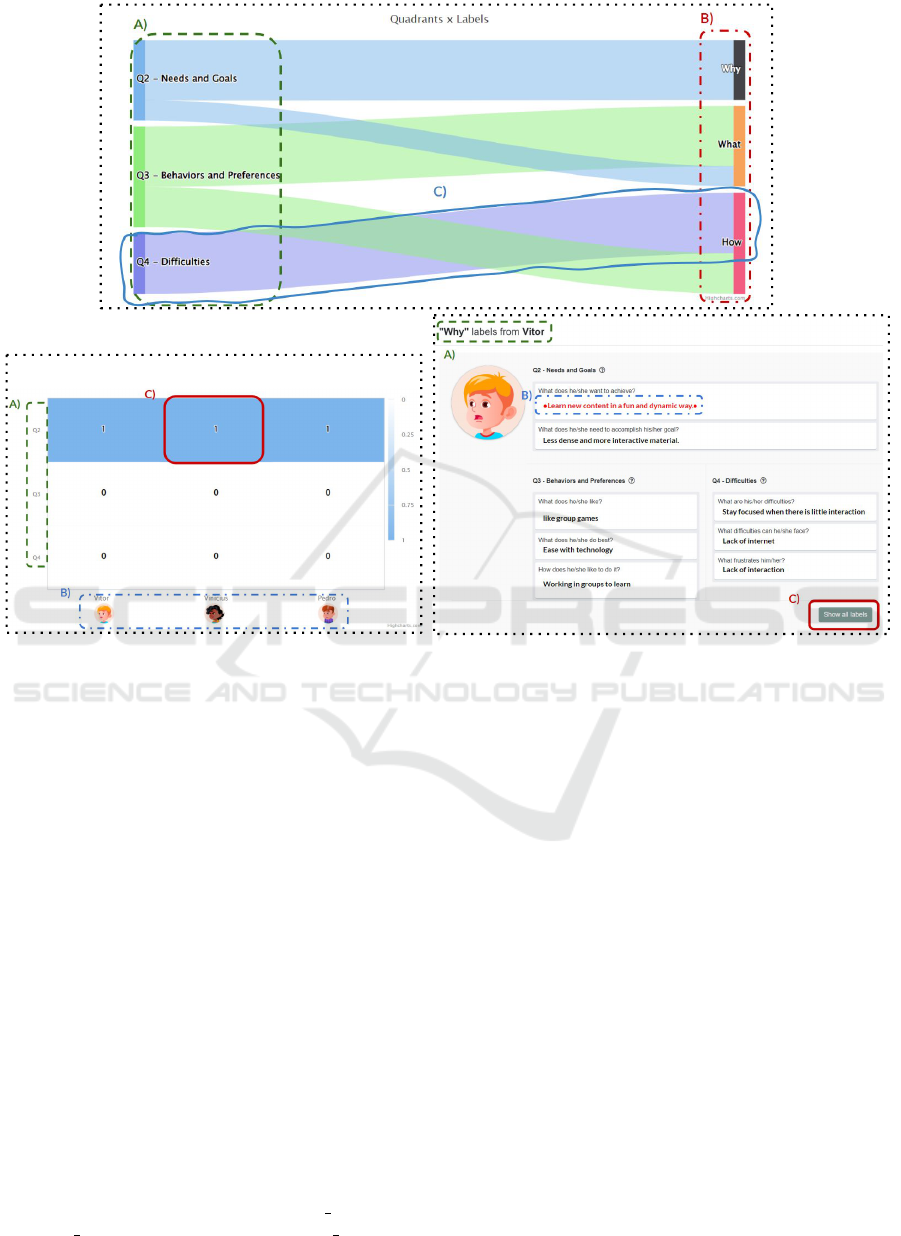
See the number of labeling of “Why” type per quadrant.
Click on the persona picture to explore the details
I)
II)
III)
Figure 2: I) Sankey visualization for overview, II) Heat Map showing the labeling distribution for zoom and filter, and III)
Card visualization to see the detail of qualitative data of the persona — High resolution PDF on Google Drive.
cus on a more detailed level of information (i.e. only
personas with the select label) achieving the goal of
presenting the data in a funnel perspective.
Visual representation characteristics: We chose
Heat Map as zoom and filter visualization because
it can show the quantitative relationship between two
categorical variables by highlighting the variation of
this relationship through colors (i.e., the color scale is
associated with the value scale). The objective of this
visualization is to show distribution of a pre-selected
label in quadrants-persona relationship. In our pro-
posal (see Figure 2-II) the title of the quadrants (see
Figure 2-II-A) that organize the lean personas infor-
mation was inserted on the Y-axis, and the identifi-
cation of the personas on the X-axis (see Figure 2-
II-B). The quantitative information presented in the
Heat Map is the number of labels that exist for each
set of quadrants and lean personas (see Figure 2-II-
C). The visualization interaction is Mouse click in x-
axis to show all information about the selected per-
sona; Mouse hover in cells to show a textual explana-
tion following the pattern: “[PERSONA NAME] has
[LABEL AMOUNT] in [QUANDRANT NAME]”.
3.3.3 Visualization to See the Detail
After selecting the cell in zoom and filter, the visual-
ization of details delivers the UX qualitative data in
the lean persona essence by showing all the quadrants
descriptions and the excerpts highlighted with labels.
Rationale: The visualization of the lean personas
detailed provides the UX data more contextualized
due to being available all the qualitative data. Card vi-
sualization presents small clusters of information, i.e.,
lean personas quadrants, which allows the delivery of
content appropriate to the domain, i.e., description of
needs and preferences from lean personas.
Visual representation characteristics: In the detail
visualization, by default, only labels that match the
selected label type on the overview visualization will
be loaded with highlights, however exists the possibil-
ity of seeing all the labels to give software practition-
ers an overview of the labeling data. The objective of
this visualization is to access all information for a pre-
selected persona. In our proposal (see Figure 2-III)
the card header (see Figure 2-III-A)) shows the label
chosen in the zoom and filter visualization. Labels are
ICEIS 2024 - 26th International Conference on Enterprise Information Systems
466
identified by colors plus a symbol. By looking at the
personas, software practitioners can clearly recognize
where the labels are placed and where they are not
(see Figure 2-III-B)). Finally, the visualization pro-
vides a function that enables the viewing of all the la-
bels that were assigned to that persona (see Figure 2-
III-C)). The visualization interaction is Mouse click
to enable/disable the display of all persona labels (i.e.,
by default only shows labels of the pre-selected type
in the Sankey chart).
4 UX DATA VISUALIZATION
EVALUATION
We conducted an experimental study with 20 partic-
ipants following the guidelines proposed by Lazar et
al. (2017) and Wohlin et al. (2012). We aimed to
evaluate the facility of interpreting the three visual-
izations. The objective of the visualizations was to
assist in extracting requirements based on the data
present in the personas, for this reason the interpre-
tation of the visualizations was analyzed. Subjects
are sampled by convenience. Our study was approved
by the ethical committee of the Federal University
of S
˜
ao Carlos (UFSCar) under the process number
68524023.0.0000.5504. The next sections present the
study details.
4.1 Apparatus
We prepared four artifacts to support our study that is
described below.
An online questionnaire was elaborated to gather
participants’ consent to use the data collected (i.e.,
Informed Consent Form and their profile data (i.e.,
demographic data, years of experience, or whether
they had no experience, position in the company, and
knowledge of information visualization and personas
techniques).
As personas descriptions are tightly associated
with the domain of the product, we prepared a sce-
nario description to explain the nature of the data that
participants will see. We got the same scenario de-
scription that the Lean Persona+ tool authors used to
produce the dataset. The scenario presents users’ in-
teraction with a tourism app: “A tourist usually uses
a mobile application (mobile, tablet, etc.) to plan and
guide their trips. The app displays places in a city or
region according to the interest and searches made by
users. These places can be hotels, monuments, muse-
ums, parks, and restaurants, among others. For each
location, the apps show details such as the location
name, photos, addresses, and feedback from other in-
dividuals that often are ranked by a score from 0 to
5. Moreover, these apps can present estimates of ex-
penses to spend in the places and also comments to
assist the user to decide and plan visits to places that
have good ratings”.
We constructed a questionnaire using Google
Forms to evaluate the interpretations of the visualiza-
tions. The questionnaire was composed of nine ques-
tions (see Table 1) and guided the participants in tasks
that encouraged the exploration of the three visualiza-
tions (i.e., overview, zoom and filter, and detail. At
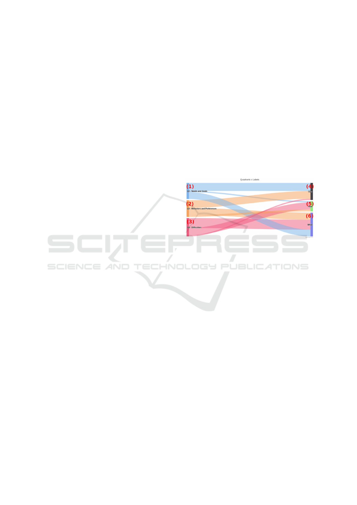
the beginning of the questionnaire, an image of the
overview visualization was presented with numerical
labels to support the participants in identifying each
part of the visualization the questions were referring
to (see Figure 3).
Figure 3: Overview visualization image with numerical la-
bels.
4.2 Data Collection
The study was carried out with 20 participants, i.e., 14
undergraduate and 6 graduate students. The subjects
were invited in the context of the “Human-Computer
Interaction - (HCI)” course that was held in Com-
puter Science at the UFSCar. The participants ac-
cepted to take part in the study voluntarily and no type
of reward was involved. Although the participants
had different levels of experience in relation to UX
and data visualization, they mostly were profession-
als with experience in software development in prac-
tice. The study was conducted by two researchers, a
senior researcher with 15+ years of experience and a
researcher with 5+ years of experience at a laboratory
at UFSCar, and lasted 3 hours.
We initially presented the concepts about data
visualization (based on (Munzner, 2014)), levels of
UX (based on (Hassenzahl, 2018)), and lean persona
(based on (Pinheiro et al., 2019)) to level off the par-
ticipants’ knowledge. After that, we asked the par-
ticipants to navigate into the visualizations to explore
their features and understand the purpose of the per-
sonas’ quadrants. During this step, the participants
could clarify doubts about the concepts and the tool.
Supporting User-Centered Requirements Elicitation from Lean Personas: A UX Data Visualization-Based Approach
467
Table 1: Questionnaire to conduct users during the visualizations evaluation - Question TQ2 is a cluster of three questions.
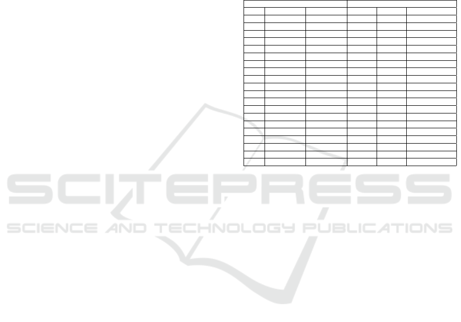
ID Visualization objective Question Answer type Evaluation purpose
TQ1 Overview Is it possible to clearly visualize the dis-
tribution of the quantities of each label
(i.e., what, why, and how) in relation to the
quadrants?
We used a four-point Likert scale
as answer options ranging from
strongly disagree to totally agree
Verify whether that visualization informs the
participants of the labels with the highest and
lowest amounts in relation to the quadrants
without the need for absolute numerical verifi-
cation
TQ2 Overview If you want to know more information
about UX data consider: [(a) application
functionality and their relationship with
the persona, (b) motivations and needs of
the persona, (c) concrete details of the
user’s interaction with the application] you
should click on:
The answers present the numbers
that are available in the overview
image in the questionnaire (see Fig-
ure 3). The participant should pro-
vide three answers, one for each
item (i.e., items a), b), and c))
Aim to verify whether the participants identified
the visualization element that provides access
to information from each label (i.e., why, what,
and how). The labels have semantic meaning
that represents the functionalities, user informa-
tion, and forms of interaction
TQ3 Overview Which quadrant has the fewest number of
labels?
Titles that identify the quadrant Identify particular information about the distri-
bution of labels presented in the visualization
TQ4 Overview Which label appears four times in the “Q4
- Difficulties” quadrant?
Name that identifies the label Evaluate the use of interactive functions to iden-
tify specific information about the number of la-
bels in a specific quadrant
TQ5 Zoom and filter Select the incorrect alternative(s): a) The
persona Helena presents information about
the needs and motivations for using the
tourism application in all quadrants; b) The
persona Jorge presents information from
the tourists’ feedback feature; c) Quadrant
“Q2 - Needs and Goals” quadrant is suit-
able to know the types of concrete actions
that can be performed during the use of
the tourism application; d) Quadrant “Q3
- Behaviors and Preferences” is suitable to
know the types of concrete actions that ex-
ist during the use of the tourism application
Multiple-choice alternatives with
the statements as options
Verify whether by interacting with the zoom and
filter and details visualizations the participants
could evaluate the information in the alterna-
tives; see the participants interpretation on the
visual elements.
TQ6 Zoom and filter and details Which persona(s) provided more labels
that can give insights about features to the
tourism app? Justify your answer
Open-question answer from which
the participants write up the per-
sonas’ name and the motivation for
choosing a persona
Verify whether by exploring the zoom and filter
and details visualizations the participants were
able to identify which personas are suitable for
getting insights of the application features
TQ7 Overview, zoom and filter,
and details
What is the persona name that displays the
information “When the post text field has
limited characters? In which quadrant is
this excerpt found? What label was used to
highlight this excerpt?”
Open-question answer to write up
the persona name, quadrant where
the information is placed, and type
of label assigned to the excerpt
Verify whether by navigating in all visualiza-
tions (i.e., overview, zoom and filter, and de-
tails) the participants could find specific infor-
mation of a persona
We then proceeded by presenting the study’s objec-
tive and after that, we asked the participants to read
and answer the Informed Consent Form that state the
agreement on the use of the data and images for aca-
demic ends. After that, the participants filled out the
profile questionnaire.
In the next step, all participants received the links
to: (i) the description of the scenario about the
tourism app; (ii) the online questionnaire that guided
the participants’ interaction with the three visualiza-
tions and evaluates the interpretation of the visualiza-
tions (see details in subsection 4.1); and (iii) the three
visualizations.
4.3 Data Analysis and Study Validity
We adopted a descriptive approach to examine the
data collected. To analyze the interpretation of the vi-
sualizations, we first split the participants’ responses
by the perspectives of overview, zoom and filter, and
details considering the arrangement of the question
presented in Table 1.
We considered the conclusion, construction, inter-
nal and external threats to discuss our study validity
according to Wohlin et al. (2012) recommendations.
To deal with the conclusion threats, three researchers
adopted the same UX levels definition to label the
data in the personas dataset which avoided the pos-
sible bias that could be introduced by different inter-
pretations of UX data meaning.
To mitigate construct problems, we provided a set
of artifacts (i.e., a scenario of the tourism apps and the
questionnaire) to support the study conduction. All
the participants interacted with the same visualiza-
tions developed with the same dataset, which prevents
different results from being due to the types of data
or visualizations. We also delivered a presentation of
the relevant concepts to the study (i.e., visualization,
levels of UX, and lean persona). A hands-on exercise
ensured the participants had some experience with the
visualizations. These two activities allowed us to mit-
igate the impact of little knowledge of the participants
about the study concepts. Moreover, these activities
benefited participants as they could clarify any doubts
about the concepts.
The internal threat related to participants’ fatigue
during the study. We proposed a lightweight set of
tasks guided by questions that stimulated the partic-
ipants to explore the visualizations. Besides, the ex-
ecution of tasks on the visualization lasted 1 hour at
most. Participation in the study was voluntary without
any financial compensation. The participants were in-
vited to freely and optionally participate in the study,
and a few chose not to participate. It is worth men-
tioning that there was no reward to the participants
ICEIS 2024 - 26th International Conference on Enterprise Information Systems
468
and the students who did not take part were not af-
fected in any way. The participants’ motivation was
due to the fact that the topics covered in the study
were popular and of interest to them. In the case
of an external threat, it commonly refers to the fact
that the study includes software developers who are
still students. However, Salman et al. provide ev-
idence of few performance differences between stu-
dents and professionals when performing new activ-
ities (Salman et al., 2015). In the case of this study,
the activity was new for all participants as none of
them had experience exploring UX data using visual-
izations.
5 RESULTS AND DISCUSSION
We present our results in three sections: (i) the partic-
ipants’ profile, (ii) the discussion about the interpre-
tation of the three visualizations, and (iii) the compar-
ison of our results with the literature.
Participants’ Profiles. The profile questionnaire re-
sults (see Table 2) reveal that 70% (14) of the par-
ticipants had a position in technology companies.
Considering the knowledge background of the par-
ticipants, 65% (13) have practical and/or theoretical
knowledge about InfoVis. On the other hand, more
than half of the participants (i.e., 60% (12)) had their
first contact with the concepts of personas and lean
personas in the HCI course. We also noticed that
the more experienced professionals (i.e., > 1 year) re-
ported having little knowledge of personas technique
before attending the HCI course.
The Interpretation of the Three Visualizations. Ta-
ble 3 shows the participants’ answers to the questions
that guided the participants’ tasks (see the questions
in Table 1). The last line of the table provides the
correct answers of the questions. In next sections, we
will present the results for each visualization individ-
ually and the use of the three visualizations together,
and an overall discussion of the results.
In the Overview visualization the participants did
not have difficulties in identifying and interpreting
quantitative data about labels to select their first step
for navigation. We saw that only two participants (one
participant for each question) did not answer correctly
questions TQ3 and TQ4 (see Table 1) about the dis-
tribution of UX labels, i.e., why, what and how. We
see that almost all participants agreed with the state-
ment on visualizing the distribution of the quantities,
i.e., 45% (9) of the participants “partially agree” and
55% (11) “strongly agree” with the statement (see
TQ1 in Table 1). We observed more than 70% suc-
cess rate in answering correctly questions on finding
Table 2: Participants marked with * were graduate students
— Participants profile - Background on InfoVis: (1) I have
no knowledge about the area; (2) I have theoretical knowl-
edge about good practices; (3) I have practical knowledge
with visualizations, but I don’t know good practices; and
(4) I have practical knowledge and theoretical knowledge
about good practices to develop visualizations. Background
on persona and lean persona: (a) My first contact with per-
sonas techniques was in the HCI course; (b) I already knew
the personas techniques but never used them in practice,
and (c) I already knew the personas technique and have also
used it in practice.
Identification Background
ID Experience Position InfoVis Persona Lean persona
1* 1 to 3 years Developer 2 c b
2* > 8 years Developer 3 b a
3 < 1 year No job 1 a a
4 < 1 year No job 1 a a
5* > 8 years Developer 2 a a
6 1 to 3 years Analyst 3 a a
7 < 1 year No job 1 b b
8* > 8 years Developer 2 b b
9 < 1 year Developer 1 a a
10 1 to 3 years Developer 3 a a
11* < 1 year Support 3 b a
12* 6 to 8 years Developer 3 a b
13 < 1 year Analyst 2 a a
14 < 1 year No job 1 a a
15 < 1 year No job 1 a a
16 < 1 year No job 3 b a
17 1 to 3 years Developer 2 a b
18 < 1 year Developer 1 c b
19 1 to 3 years Researcher 4 b b
20 1 to 3 years Analyst 2 a a
UX labels throughout the entire process of navigat-
ing into the visualizations, i.e., overview, zoom and
filter, and details (see TQ2 in Table 1 and Table 3):
(i) 85% (17) of respondents correctly identified where
what labels were placed in the visualization; (ii) 65%
(13) of respondents correctly pinpointed where why
labels could be found; and (iii) 70% (14) of respon-
dents correctly identified the how labels. These re-
sults revealed the effectiveness of the Sankey chart in
(i) clearly showing the distribution of labels between
the quadrants; and (ii) allowing navigation and data
considering a specific purpose.
We motivated the participants to interact with the
three different visual representations (i.e., overview,
zoom and filter, and details) based on statements
about the personas’ data to use filtering feature to
achieve the target information (see question TQ5 in
Table 1). We understood that TQ5 suffers the influ-
ence of previous knowledge about the UX labels. We
observed that 70% (14) of the participants could se-
lect at least one right answer (i.e., options c and d in
Table 3). Our findings suggest that participants’ per-
formance on question TQ5 was influenced by their
prior familiarity with UX labels, with 70% (14) suc-
cessfully selecting at least one correct answer from
the available options.
In question TQ6, the participants should exam-
ine the personas to find the ones that provide insights
about the features of the tourism app (see Table 1). To
Supporting User-Centered Requirements Elicitation from Lean Personas: A UX Data Visualization-Based Approach
469
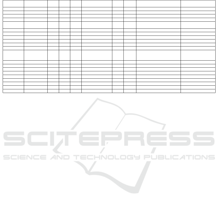
Table 3: Participants’ answers to the tasks on the three visualizations - TQ2-A to C: answers were guided by Figure 3; TQ5:
see the alternatives in Table 1; TQ7:“N/A” was assigned to participants that did not report an answer.
ID TQ1 TQ2-
A
TQ2-
B
TQ2-
C
TQ3 TQ4 TQ5 TQ6 TQ7
1 Strongly agree (6) (4) (5) Q2: Needs and Goals Why b, d Claudia, Leandro (Jana
´
ına), (Q4), (How)
2 Strongly agree (6) (4) (5) Q2: Needs and Goals Why d Leandro (Jana
´
ına), (N/A), (How)
3 Strongly agree (6) (4) (5) Q2: Needs and Goals Why b, c Leandro, Clara, Cl
´
audia (Jana
´
ına), (Q4), (How)
4 Strongly agree (6) (4) (5) Q2: Needs and Goals Why b, c Clara, Leandro, Claudia (Jana
´
ına), (Q4), (How)
5 Strongly agree (6) (2) (1) Q2: Needs and Goals Why a, c Claudia, Lucas, Luiz, Jana
´
ına,
Lyn, Elena
(Jana
´
ına), (Q4), (N/A)
6 Strongly agree (6) (4) (5) Q2: Needs and Goals Why b, c Leandro, Claudia, Clara (Jana
´
ına), (Q4), (How)
7 Partially agree (4) (6) (5) Q2: Needs and Goals Why b, c, d Clara, Leandro, Claudia (Jana
´
ına), (N/A), (How)
8 Partially agree (5) (4) (6) Q2: Needs and Goals Why b, c F
´
abio (Leandro), (Q3), (N/A)
9 Partially agree (5) (4) (6) Q2: Needs and Goals Why c F
´
abio, Francisco (Jana
´
ına), (Q4), (N/A)
10 Partially agree (6) (1) (2) Q2: Needs and Goals Why a, b, c Clara, Leandro, Claudia (Jana
´
ına), (Q4), (N/A)
11 Strongly agree (6) (4) (5) Q2: Needs and Goals Why b, c, d Clara, Leandro, Claudia (Jana
´
ına), (N/A), (How)
12 Strongly agree (6) (4) (5) Q2: Needs and Goals How b, c, d Carlos, Clara, Leandro, Claudia,
Luiz, Francisco, Jorge, Adriana,
Helena, Rog
´
erio, Patr
´
ıcia
(Jana
´
ına), (Q4), (N/A)
13 Strongly agree (6) (4) (5) Q2: Needs and Goals Why c, d Clara, Leandro, Claudia (Jana
´
ına), (Q4), (How)
14 Strongly agree (6) (4) (5) Q4 - Difficulties Why d Jorge, Adriana (Jana
´
ına), (Q4), (How)
15 Partially agree (6) (2) (5) Q2: Needs and Goals Why a, c Leandro (N/A), (Q4), (Why)
16 Partially agree (6) (4) (5) Q2: Needs and Goals Why c, d Carla, Lauren, Francisco, Jorge (Jana
´
ına), (Q4), (How)
17 Strongly agree (6) (4) (5) Q2: Needs and Goals Why a, d Ana (Jana
´
ına), (Q4), (How)
18 Partially agree (6) (1) (2) Q2: Needs and Goals Why a, b Patr
´
ıcia (Jana
´
ına), (Q4), (N/A)
19 Partially agree (6) (5) (4) Q2: Needs and Goals Why a, c F
´
abio (Jana
´
ına), (Q4), (N/A)
20 Partially agree (6) (1) (5) Q2: Needs and Goals Why c, d Leandro (N/A), (Q4), (How)
Key answers Agree (6) (4) (5) Q2: Needs and Goals Why c, d Clara, Leandro, Claudia (Jana
´
ına), (Q4), (How)
accomplish the detail visualization to explore the lean
personas information, we motivated the participants
to interact with zoom and filter and detail visualiza-
tions more than once and brought an interpretative
approach to the task. To correctly answer this ques-
tion, the participants should pinpoint three personas
(key answers: Clara, Leandro, and Claudia). Our re-
sults showed that more than half of the participants
(i.e., 11 participants - 55%) answered the question
by mentioning the three personas or at least one of
them (Table 3). Our findings indicate that the funnel-
based approach helped participants (i.e., 11 partici-
pants - 55%) to successfully address the question by
mentioning at least one of the key answers.
To get a perspective of the interpretation with the
three visualizations connected one each other, we pro-
posed question TQ7 (see Table 1). In this question,
the participants should explore the different paths in
the visualizations and browse the overview and zoom
and filter visualizations to achieve the answers avail-
able from the detail visualization to thus select the
lean persona. The results showed (see Table 3) that
(i) 85% (17) of the participants selected the right lean
persona; (ii) 80% (16) selected the right quadrant;
and (iii) 60% (12) selected the right label. From this
result, we could conclude that the elements and the
interactions provided by the three visualizations sup-
ported the search for particular UX data.
The results showed that the participants did not
have difficulties in finding specific information about
UX data (see questions TQ1, TQ3, TQ4, and TQ7
in Table 1 and their results in Table 3). Our results
revealed that all participants got at least 50% of the
questions right. We understand that the knowledge
in the UX labels could influence the use of the visu-
alizations in particular to determine which label has
the desired UX data (e.g., questions TQ2-A, TQ2-B,
TQ2-C, TQ5, and TQ6 in Table 1).
We noticed the results of the questions TQ2-A and
TQ6 were connected. In the TQ6 question the partic-
ipants should inform which persona had the informa-
tion about features. In a lean way, in TQ2-A question
they should inform where in the visualization they
had to click to access information about features (i.e.
which label). Two of the three participants who chose
the wrong answer in TQ2-A also selected the wrong
option in TQ6. This result suggests that some par-
ticipants could struggle to understand the relationship
between labels and the embedded UX data of each la-
bel. To mitigate this issue, we conducted a warm-up
to leverage the participants’ knowledge about UX la-
bels; however, we concluded that we needed to find
alternatives to present the UX label meanings in the
visualizations.
Comparison with the Related Work. We can see
three main differences in relation to the use of visual-
ization to explore personas data, the adoption of com-
plementary approaches for the conceptions of the vi-
sualizations, and the use of different chart formats to
view the data.
Firstly, we proposed three visualizations that to-
gether and connected aid developers and designers in
streamlining the search for useful UX data into lean
personas textual information. As far as we know there
is no other similar proposal that works to make eas-
ier the exploration of personal data although personas
are recognized as a proper technique for UX-related
requirement elicitation as we mentioned in (Pinheiro
et al., 2019).
We have the consciousness that there are many
ICEIS 2024 - 26th International Conference on Enterprise Information Systems
470

works that adopt the Nested Model of Munzner
(2014) to support the elaboration of visualizations.
However, we used a different approach by putting har-
monically together the good practices proposed by the
Nested Model and the systematic process of visual-
ization construction, i.e., Design Activity Framework
(DAF) of McKenna et al. (2014) (see section 3). The
complementary perspective of the approaches sup-
ported us in following a sequence of steps (DAF), ob-
serving the details of the visualizations, and clearly
specifying the elements of each one (Nested Model).
While the approaches above guided our process
of visualization elaboration, Shneiderman’s Mantra
sustained the conception of the visualizations by in-
troducing ways to gradually conduct developers and
designers to the lean personas data. Although Bern-
haupt et al. (2020) and Bakiu and Guzman (2017)
have applied Shneiderman’s Mantra, they do not use
all three levels of visualization. The visualizations
proposed by Bakiu and Guzman (2017) do not apply
zoom and filter levels. Bernhaupt et al. (2020) work
presents a close perspective of ours by applying the
mantra; however, the authors focus only on the levels
of overview and detail.
Taking into account the chart formats, we see that
Buono et al. (2020) also used the Sankey chart and
that this chart was highly accepted in the evaluations
conducted by the authors. In the work, the authors
built the Sankey chart to show the number of visits
(i.e., quantitative data) for each page (i.e., categories)
that the users navigated on the website. Similar to
the authors, we adopted the Sankey chart to show the
relationship between quantitative data (i.e., numbers
of labels) and categorical data (i.e. why, what, and
how). At the design granularity of zoom and filter,
we adopted the Heat Map to show a three-leg rela-
tionship. We associated a particular UX data with the
lean personas and the quadrants. In this visualiza-
tion, developers and designers can identify, through
the color pattern, where UX data is concentrated (i.e.,
why, what, and how). M
´
oro et al. (2014) work men-
tions the Heat Map as a visualization that is desired
by users but they do not implement it.
6 FINAL CONSIDERATIONS
In this paper, we presented a new visual approach to
UX requirements gathering from lean personas. The
three visualizations were developed to assist develop-
ers and designers in searching and exploring UX data
available in the textual descriptions of lean personas.
The visualizations are intended to guide the elicitation
of UX-related requirements following Shneiderman’s
mantra (1996), i.e. provide the overview of data first,
make available zoom and filter of the data, and ob-
serve the details. In this way, we proposed a funnel-
based approach for data exploration. By connecting
the three visualizations, we provided ways of explor-
ing the data gradually throughout the visualizations.
We labeled the lean personas descriptions by using
Hassenzahl’s UX levels. It aimed to give meaning to
the UX data available since qualitative data can intro-
duce subjectiveness to the requirement elicitation. We
evaluated the three visualizations with 20 participants
with regard to the interpretation of the visualizations.
Overall, our findings revealed that the three visu-
alizations provide easy ways of identifying and find-
ing UX data available in the lean personas. Nonethe-
less, the interpretation evaluation revealed the need to
add some kind of help that aids the better understand-
ing of the UX level which was used to provide mean-
ing to the data. The participants’ feedback showed us
that improvements on the zoom and filter features are
requested to give more flexibility to users’ search and
find information. We also presented a method contri-
bution by using Nested Model (Munzner, 2014) and
Design Activity Framework (McKenna et al., 2014)
in a complementary perspective for building the visu-
alizations. This same combination of approaches can
be replicated in other designs of the visualizations.
In future work, we intend to improve our visual-
izations to add the features suggested by the evalua-
tion participants. We also intend to conduct new stud-
ies in real scenarios (i.e., software projects with de-
signers, requirement analysts, and developers) with
different samples of lean personas. Regarding the
evaluation, we intend to analyze the usability and ef-
ficiency of the visualizations to facilitate the organi-
zation and speed up the understanding of the UX in-
formation collected through lean personas.
ACKNOWLEDGEMENTS
This study was financed in part by the Coordenac¸
˜
ao
de Aperfeic¸oamento de Pessoal de N
´
ıvel Superior
– Brasil (CAPES) – Finance Code 001 and grant
309497/2022-1 and 147915/2022-8, Consellho Na-
cional de Desenvolvimento Cient
´
ıfico e Tecnol
´
ogico
(CNPq - Brazil).
REFERENCES
Bakiu, E. and Guzman, E. (2017). Which feature is un-
usable? detecting usability and user experience is-
sues from user reviews. In 2017 IEEE 25th Inter-
Supporting User-Centered Requirements Elicitation from Lean Personas: A UX Data Visualization-Based Approach
471

national Requirements Engineering Conference Work-
shops (REW), pages 182–187.
Bernhaupt, R., Martinie, C., Palanque, P., and Wallner, G.
(2020). A generic visualization approach supporting
task-based evaluation of usability and user experience.
In Human-Centered Software Engineering, pages 24–
44. Springer.
Billestrup, J., Stage, J., Nielsen, L., and Hansen, K. S.
(2014). Persona usage in software development: Ad-
vantages and obstacles. In ACHI 2014.
Buono, P., Caivano, D., Costabile, M. F., Desolda, G., and
Lanzilotti, R. (2020). Towards the detection of ux
smells: The support of visualizations. IEEE Access,
8:6901–6914.
Choma, J., Guerra, E. M., Alvaro, A., Pereira, R., and
Zaina, L. A. M. (2022). Influences of UX factors in
the agile UX context of software startups. Inf. Softw.
Technol., 152:107041.
Desai, R. (2019). 4 ways to implement data for a better user
experience design.
Faily, S. and Lyle, J. (2013). Guidelines for integrating
personas into software engineering tools. In Proceed-
ings of the 5th ACM SIGCHI Symposium on Engineer-
ing Interactive Computing Systems, EICS ’13, page
69–74, New York, NY, USA. ACM.
Gothelf, J. (2012). Using proto-personas for executive
alignment. UX Magazine, 1.
Hassenzahl, M. (2018). The Thing and I (Summer of ’17
Remix), pages 17–31. Springer International Publish-
ing, Cham.
Isherwood, M. (2020). Guide to audience data for ux de-
sign.
Kashfi, P., Feldt, R., and Nilsson, A. (2019). Integrating
ux principles and practices into software development
organizations: A case study of influencing events. J.
Syst. Softw., 154(C):37–58.
Lazar, J., Feng, J. H., and Hochheiser, H. (2017). Research
Methods in Human Computer Interaction. Morgan
Kaufmann, Boston, NY, USA.
Luther, L., Tiberius, V., and Brem, A. (2020). User ex-
perience (ux) in business, management, and psychol-
ogy: A bibliometric mapping of the current state of
research. Multimodal Technologies and Interaction,
4(2):18.
McKenna, S., Mazur, D., Agutter, J., and Meyer, M. (2014).
Design activity framework for visualization design.
IEEE Transactions on Visualization and Computer
Graphics, 20(12):2191–2200.
M
´
oro, R., Dar
´
az, J., and Bielikov
´
a, M. (2014). Visual-
ization of gaze tracking data for ux testing on the
web. In HT (Doctoral Consortium/Late-breaking Re-
sults/Workshops).
Munzner, T. (2014). Visualization analysis and design.
A.K. Peters visualization series. A K Peters.
Orme
˜
no, Y. I. and Panach, J. I. (2013). Mapping study about
usability requirements elicitation. In Salinesi, C., Nor-
rie, M. C., and Pastor,
´
O., editors, Advanced Infor-
mation Systems Engineering, pages 672–687, Berlin,
Heidelberg. Springer Berlin Heidelberg.
Pinheiro, E. G., Lopes, L. A., Conte, T. U., and Zaina, L.
A. M. (2019). On the contributions of non-technical
stakeholders to describing ux requirements by apply-
ing proto-persona. Journal of Software Engineering
Research and Development, 7:8:1 – 8:19.
Salman, I., Misirli, A. T., and Juristo, N. (2015). Are
students representatives of professionals in software
engineering experiments? In 2015 IEEE/ACM 37th
IEEE International Conference on Software Engineer-
ing, volume 1, pages 666–676.
Salminen, J., Jung, S.-G., Chowdhury, S., Seng
¨
un, S., and
Jansen, B. J. (2020). Personas and analytics: a com-
parative user study of efficiency and effectiveness for
a user identification task. In Proceedings of the 2020
CHI Conference on Human Factors in Computing Sys-
tems, pages 1–13.
Shneiderman, B. (1996). The eyes have it: a task by data
type taxonomy for information visualizations. In Pro-
ceedings 1996 IEEE Symposium on Visual Languages,
pages 336–343.
Slone, D. J. (2009). Visualizing qualitative information. The
Qualitative Report, 14:489–497.
Teixeira., G. V. and Zaina., L. A. M. (2022). Using lean per-
sonas to the description of ux-related requirements: A
study with software startup professionals. In Proceed-
ings of the 24th International Conference on Enter-
prise Information Systems, pages 211–222. INSTICC,
SciTePress.
Ware, C. (2012). Information Visualization: perception for
design. Morgan Kaufmann Publishers Inc., San Fran-
cisco, CA, USA, 3 edition.
Wohlin, C., Runeson, P., H
¨
ost, M., Ohlsson, M. C., Reg-
nell, B., and Wessl
´
en, A. (2012). Experimentation in
software engineering. Springer Science & Business
Media.
Ye Lim Rhie, J. H. L. and Yun, M. H. (2017). Eval-
uating representativeness of qualitative text data in
identifying ux issues. International Journal of Hu-
man–Computer Interaction, 33(11):868–881.
Zaina, L. A., Sharp, H., and Barroca, L. (2021). Ux in-
formation in the daily work of an agile team: A dis-
tributed cognition analysis. International Journal of
Human-Computer Studies, 147:102574.
ICEIS 2024 - 26th International Conference on Enterprise Information Systems
472
