Dynamic Exposure Visualization of Air Quality Data with
Augmented Reality
Sylvain Renault
1a
, Ingo Feldmann
1b
, Lieven Raes
2c
, Jurgen Silence
2
and Oliver Schreer
1d
1
Fraunhofer Heinrich-Hertz-Institut, Einsteinufer 37, Berlin, Germany
2
Digitaal Vlaanderen, Havenlaan 88, 1000 Brussels Belgium
Keywords: Augmented Reality, Air Quality Data, Environmental Data, Visualization, Citizen Science.
Abstract: Increased awareness regarding air pollution and environmental conditions is more relevant than ever. Notably,
there is already widespread availability of do-it-yourself (DIY) environmental and air quality sensors across
Europe. These data are accessible to the public through various web interfaces, providing insights into current
and past environmental conditions across different regions of Europe. Augmented Reality (AR) stands out as
a promising technology to enable citizens to monitor environmental conditions in their communities and
comprehend their own impact, thus motivating behavioural changes. Nevertheless, effectively visualizing
real-time environmental data in the 3D AR space remains a challenge. Innovative visualization techniques are
necessary to present environmental data in a clear and engaging manner. In this paper, we introduce a
framework, a visualization concept, and a prototype AR application capable of providing a visual overlay of
environmental information such as air quality or traffic data. These concepts stem from the European project
H2020 COMPAIR, which involved users throughout the development process. The application will undergo
evaluation in various pilot cities and regions and will be publicly available via app stores by mid-2024.
1 INTRODUCTION
Due to the availability of affordable do-it-yourself
(DIY) environmental and air quality sensors, there is
already a good coverage of sensor data across Europe.
Similar trends are observed in other regions such as
India (EOS, 2022). These sensors are typically linked
to platforms where users can access real-time and
historical environmental data. One such established
platform is Sensor.Community, which operates a
globally-contributed sensor network generating Open
Environmental Data (Sensor.Community, 2023).
Various web interfaces facilitate data visualization
and exploration, making the information accessible to
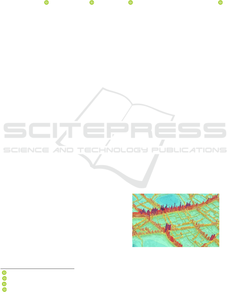
the public. Figure 1 showcases a 3D representation of
nitrogen dioxide distribution in London
(MappingLondon, 2023). Utilizing Augmented
Reality (AR) for understanding environmental
conditions offers a more intuitive approach. With just
a smartphone or tablet, users gain access to a visual
a
https://orcid.org/0000-0003-2015-2573
b
https://orcid.org/0000-0002-2595-8683
c
https://orcid.org/0000-0001-9284-462X
d
https://orcid.org/0000-0001-6900-8287
overlay displaying environmental data like air quality
or traffic conditions. This advanced visualization in
3D AR enables direct monitoring of air pollution
levels in the surrounding area. Increased awareness of
local environmental conditions can influence
behaviour, promoting alternatives such as biking or
using public transport. Such awareness may also
drive changes in local government policies, such as
Figure 1: NO2 distribution in 3D (MappingLondon, 2023).
120
Renault, S., Feldmann, I., Raes, L., Silence, J. and Schreer, O.
Dynamic Exposure Visualization of Air Quality Data with Augmented Reality.
DOI: 10.5220/0012586700003696
Paper published under CC license (CC BY-NC-ND 4.0)
In Proceedings of the 10th International Conference on Geographical Information Systems Theory, Applications and Management (GISTAM 2024), pages 120-127
ISBN: 978-989-758-694-1; ISSN: 2184-500X
Proceedings Copyright © 2024 by SCITEPRESS – Science and Technology Publications, Lda.
implementing measures to tackle high air pollution
levels near schools.
While prior attempts at developing similar AR
applications exist, many are no longer accessible on
major app stores. This paper introduces a new concept
and outlines the implementation of an AR application
designed for mobile devices. It can visualize real-time
environmental data from various Open Data
platforms. The scientific contribution lies in diverse
visualization techniques customized for distributed
spatial data within the augmented environment.
Developed within the European research project
H2020 COMPAIR (H2020 COMPAIR, 2023),
extensive user involvement throughout the
development process ensured thorough examination
of innovative visualization concepts in four pilot
cities. The resulting modules and assets were
integrated into an Air Quality (AQ) Framework.
2 STATE OF THE ART
Without a doubt, AR holds significant promise for
enhancing education and learning, a fact supported by
various surveys (Vargas 2020, Patel 2020,
Khanchandani 2021). However, the exploration of
visualizing environmental data within AR applications
remains relatively unexplored. Few published AR
applications concentrate on presenting air pollution
data for mobile devices, but with limited geographical
reach. To our knowledge, there is currently no AR
application accessible that offers augmented visuali-
zation of traffic data sourced from public open datasets.
Torres and Campbell presented an AR app (Torres
and Campbell, 2019) visualising main pollutants
from the World Air Quality Index Project (WAQI,
2019). In 2019, it was available on the App Store, but
not anymore. Mathews et al. presented AiR, which
was available for Android devices (Mathews et al.,
2021) (see Figure 2). In both applications, pollutants
are displayed with flying dots and depending on the
severity of the pollution, the number of objects
increases. Additional functionalities are provided
such as access and visualization of historical data.
The
AiR app
was designed for residents of India,
utilizing data from the country's 222 monitoring
stations, which, considering India's size, forms a
relatively sparse network. Developers said they might
create an iOS version, but this plan never
materialised. Furthermore, the last update on Google
Play was in 2020, and the last comment in 2021.
Despite a promising start (Google Play reviews,
publication in IEEE), the team behind AiR
discontinued the app. In the same year, the New York
Figure 2: AiR app (Mathews et al., 2021).
Times added an AR feature to its app that visualised air
pollution based on location (New York Times AR App,
2019). However, this app does not visualize real-time
sensor data, but visualizes microsized pollution
particles that were floating around on the worst day of
the year at your current location. The Helsinki Air
Quality AR app provides Air Quality data from Finnish
Meteorological Institute, but only for the city of
Helsinki. The last update was offered in2022. In
Campana & Dominguez, (2021), a scientific prototype
of a particulate matter visualization in AR is presented,
but the app did not yet become public.
In this paper, we present a first prototype that is
developed in the COMPAIR project. This Dynamic
Exposure Visualization App (DEVA) accesses various
servers that provide a wide range of sensor data
distributed across Europe. The primary challenge lies
in presenting a manageable amount of information in a
clear and easily understandable manner. The app
provides an alternative view of sensor data as depicted
in a 3D visualisation environment of an Urban Digital
Twin. Hence, we present a novel visualization concept
for the representation of environmental data in 3D AR
space. DEVA can run on any mobile device, either
tablet or smartphone, which has the necessary tracking
and AR visualization capabilities.
3 THE PROPOSED SYSTEM
The implementation of the application and the AQ
framework is based on Unity 2022 LTS i.e. using the
common user interface package uGUI, which allows
the rendering of the user interface in 3D space. We
also used the AR Foundation Framework, a unified
workflow to build robust apps for various AR devices
(Unity AR Foundation, 2023). To transpose geo-
localisation information between the GPS-based
sensor positions and the world coordinate system of
Dynamic Exposure Visualization of Air Quality Data with Augmented Reality
121
the AR scenery, the framework uses an external GPS
asset (Unity AR+GPS Location, 2023).
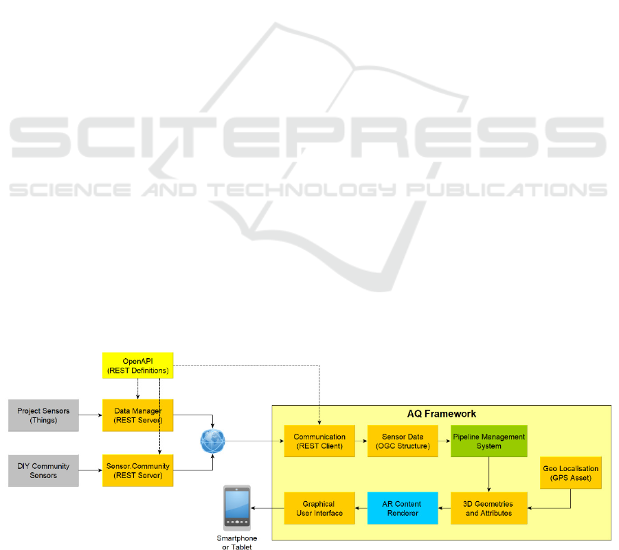
A system overview of DEVA is depicted in Figure
3. The application is able to receive sensor data from
two different sources: from project internal sensors
and DIY sensors as proposed by the
Sensor.Community (Sensor Kits, 2023). Both group
of sensors send their values via a PHP respectively
RESTful interface to the two servers supported by
COMPAIR. DEVA is then able to request all current
as well as past sensor data via the dedicated API. As
the interface definition is defined in OpenAPI
(OpenAPI, 2023), it is easy to adapt the interfaces to
the requirements of server and client.
The AQ Framework in Figure 3 shows the
processing workflow within DEVA. The
Communication module receives the sensor data via
REST requests. The data are then transformed in an
OGC compliant data structure. The Open Geospatial
Consortium (OGC) offers a standardised definition
for (i) geospatial content and location-based services;
(ii) sensor web and Internet of Things; and (iii) GIS
data processing and data sharing, as defined in the
OGC SensorThings API Part 1 (OGC, 2022).
The Pipeline Management then processes the
sensor values and their metadata and passes them to
the different Unity Engine 2D and 3D graphic
modules. A number of visualization methods are
implemented to turn the sensor data into 3D
geometries. One important issue of the app is the data
accessibility and the access to AQ sensor data from
various servers or services over the internet.
3.1 Environmental Data Servers
The COMPAIR project distributed DIY air quality
and traffic data sensors to citizens in four different
cities in Europe in order to capture a variety of
environmental data. The air quality sensors from
SODAQ (SODAQ, 2024) provide data such as CO2
(Carbon Dioxide), NO2 (Nitrogen Dioxide), BC
(Black Carbon), PM1, PM2.5 and PM10 (Particulate
Matter of size 1, 2.5 and 10 micrometres), humidity
and temperature. The traffic sensor (Telraam, 2024)
offers vehicle-counting information for individual
classes such as cars, trucks or bicycles. The
measurements of those sensors are collected and
managed in a centralized Data Manager hosted by
COMPAIR. Additionally, the app accesses the
European Sensor.Community open data server, to
include additional AQ data. Both services are auto
configured by the app, so that a user can immediately
start with exploring sensor data.
Once connected to the servers, the app requests
the data in series, from each of them. Those requests
are made for the surrounding environment of the geo-
localized user, the close area where the user interacts
with the data. When the user moves through the
streets, the app regularly updates the sensor data. To
reduce the transfer payloads, data requests can be
restricted to specific sensor types by activating a
filter.
3.2 Geo-Localisation
A proper AR visualization requires an accurate
localization and orientation of the user and its device
in space. Hence, the AQ framework contains three
geo-localization modules (GeoPose, 2023), using the
Global Navigation Satellite System (GNSS): (i) data
request depending on the GPS position of the user;
(ii) the geo-pose of the mobile device; and (iii) the
geo-localized air pollutants for visualization in the
AR/3D space.
The app observes the activity of the user while
moving to present actual 3D data. It requests new
surrounding sensor data in intervals as follows. The
current GPS position is retrieved from the device as
the user location in the world. Then, it continuously
measures the current distance from this position to the
Figure 3: System overview.
GISTAM 2024 - 10th International Conference on Geographical Information Systems Theory, Applications and Management
122
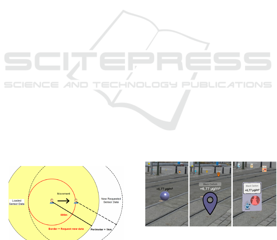
centre of the current loaded dataset. Finally, if the
distance exceeds the half of the view perimeter e.g.
500m for a maximum distance set to 1km (see Figure
4), the module starts the requests of new sensor data
from the Data Manager and Sensor.Community. This
approach limits the amount of data to be transmitted.
Once new data are downloaded, they are
transposed in the internal OGC structure, injected into
the pipeline via the container system and visualized
by the AR Content Renderer. Old containers and their
3D geometries are removed before new ones are
visualized. The Pipeline Management System takes
care of the correct 3D positioning of data as described
in the next section. The data update may require one
to many seconds, depending on the perimeter size and
the amount of loaded data.
4 AR VISUALIZATION
The main purpose of the app is to present
environmental real-time sensor data in AR to the
citizens. Past attempts on AR visualisation of
pollution information relied on quite simple
approaches, e.g. visualizing pollutants via flying balls
or rocks. The major scientific challenge is to develop
and investigate different approaches that suit best for
a meaningful representation of a large amount of 3D
data in the 3D AR space. This led to three different
approaches following the Near’n-Far concept (see
Sec. 4.2). This concept optimizes the placement of
data that are far away from the user. In collaboration
with the project partners, we are able to perform an
end users evaluation of the novel visualization
techniques. Once, sensor data are received and
accessible in the OGC format, the framework
enriches the data with graphical objects for the
rendering step. Therefore, three processes are
initiated: (i) the creation of the asset visuals from the
current selected design elements; (ii) setup of the
asset attributes corresponding to the sensor type; and
Figure 4: Update technique while the user is moving.
(iii) the placement of the objects in the AR virtual
environment in the native coordinate system used by
the render engine.
4.1 Data Visualization
The app offers various sensor visuals rendered in the
AR view. All designs are created as a Unity prefab
consisting of assets and scripts. The user can freely
select a design appropriate to the user’s level or taste.
Three classes of sensor value representations in the
AR space are implemented (see Figure 5 and 6):
a simple version uses 3D primitive meshes like
spheres, cubes or squares. They are very easy to
render because of the low complexity of the
polygon models and their material attributes;
a more complex representation combines simple
3D meshes, 2D pictograms and GUI elements,
like text fields and button canvas for values,
sensor types and meta-data;
a cloud visualization relies on particle animation
exploiting the capabilities of the Graphics
Processing Unit (GPU) of the mobile device.
One or many clouds are created depending on
the density of the sensor data, by using a
DBSCAN clustering algorithm (Density-Based
Spatial Clustering of Applications with Noise).
This algorithm observes points in space that are
close together and derives related clusters of
arbitrary shape. Per cluster, the cloud
visualization then creates one particle animation
system based on cloud/fog tiled images. Clouds
are animated by the render engine and offer a
special dynamic to the AR view, because of its
3D volume.
Once a visual was instantiated, the properties of
the prefab are set-up according the sensor type. Thus,
not all property fields are used for all objects, e.g. a
simple visual does not have a text field for the name
of the sensor or metadata. The following attributes are
Figure 5: Various visuals for the same values (simple,
complex, complex with gamification).
Dynamic Exposure Visualization of Air Quality Data with Augmented Reality
123
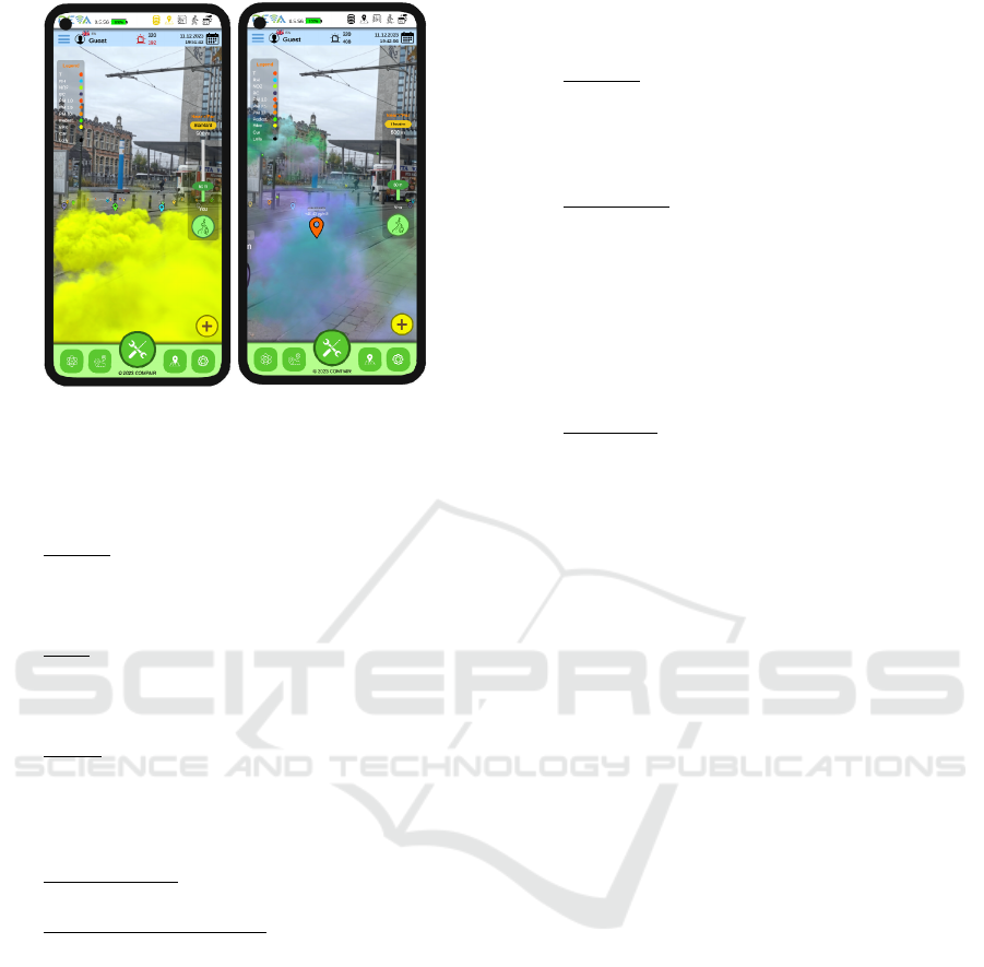
Figure 6: Cloud visualization, one colour for all sensor
types vs. multi-coloured (simulation).
implemented to setup the visual of the graphical
elements:
Colour: Each pollutant corresponds to a specific
colour and is also used in the legend. The
gradient of this colour illustrates the current
value's environmental impact.
Text: Sensor values and units are displayed in a
UI label field, utilizing a Unity text canvas. In
some cases, the sensor type and brief description
are shown in an additional field.
States: In state mode, four icons indicate (i)
active sensor, (ii) calibrated data, (iii) values
within an acceptable range, and (iv) private data.
Colours change between red-yellow-green to
indicate states.
Size (optional): Prefab size varies based on value
impact (small for normal, large for high values).
Transparency (optional): Data transparency is
used to render distant data with decreasing
opacity.
4.2 Near’n-Far Concept
In the presented AR visualization framework, we
propose a new concept to rearrange geo-located data
in the 3D AR space. The main purpose is to minimise
occlusions in dense areas with many buildings, trees
etc. and to allow the user to capture easily the
distribution of 3D data in the AR space. Hence, we
developed a new method considering the
visualisation of data in the near and far distance
separately. This render method helps avoiding some
perspective and visualisation conflicts, so that the
user is not anymore confronted with incoherent
situations and can get a better understanding of the
information in the AR space. The following issues are
addressed with the Near’n-Far concept:
Overlap: The geo-pose of sensor devices usually
does not contain the altitude. Hence, all sensor
values are located in the same height and the
overlap of data increases by the density and
values cannot be distinguished from each other.
Perspective: The framework requests data for a
perimeter surrounding the user, freely set by the
user e.g. 1km. However, in some areas, only a
few measurements are available due to sparse
distribution of sensors. Therefore, enlarging the
perimeter is an option to get more data in the AR
scene. The problem then is that data become
very small because its visibility decreases with
distance.
Occlusion: When travelling in a city, a user is
walking or driving between buildings or trees
that create potential occlusion. As the app does
not use a 3D map (e.g. Mapbox, 2023) or object
detection, objects do not occlude sensor visuals
and data remain always visible. Hence, the
perspective parallax of the real and the virtual
objects contradicts each other in the AR view.
The Near’n-Far solution is similar to a technique
named “proximity”, where the user can interact
adequately with a device at different distances (De la
Barré et al., 2009). A proximity system places objects
of interest in a main area with the possibility of
interacting with them. The other objects are placed in
an area beside, or in the background, and are
visualized in a minimized fashion. The Near’n-Far
concept relies on a double perimeter system: the inner
perimeter is dedicated to near data and the outer
perimeter to far data (see Figure 7). The initial data
container in the pipeline is split into two new ones:
(i) a near data container manages the data inside the
inner perimeter and uses the same visuals and
positions as originally;
(ii) a far data container for data with a distance
bigger than the inner perimeter using a simple
visual, e.g. small spheres, with new calculated
xyz positions and sizes.
While activating the Near’n-Far mode, the user can
change the inner perimeter in real-time and the
pipeline manager will update all active containers
accordingly. The centre point of the Near’n-Far
object is always the geo-location of the user. While
moving, the system updates all data containers. In all
modes, only the geometric formulas transforming the
positions of far containers differ. We implemented
three different Near’n-Far methods in the render
pipeline:
GISTAM 2024 - 10th International Conference on Geographical Information Systems Theory, Applications and Management
124
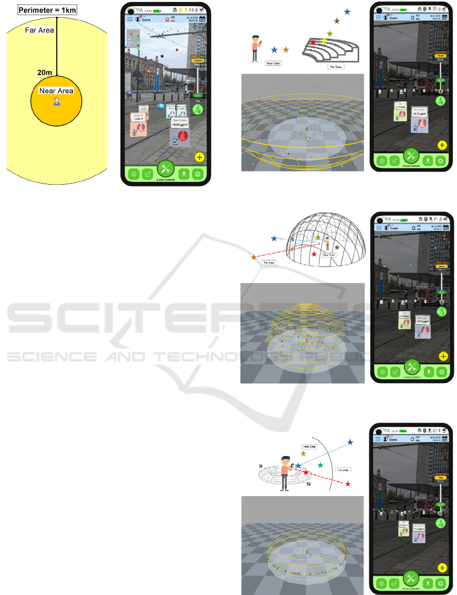
Figure 7: Near’n-Far concept.
Theatre: The first mode is an amphi-theatre like
presentation, where data are arranged in different
heights depending on their distance to the user (see
Figure 8). We reduced the intensity of the AR view in
the screen shot for better visibility of the data. Closer
data are rendered on the same level as in the near area.
Beyond, data rise up to the heaven. Hence, the user
perceives the distance of the data by its altitude and
size. This results in fewer conflicts of the far data with
the real world.
Dome: The second mode is a dome-like presentation
as depicted in Figure 9. The dome is an invisible half-
sphere around the user. The formula is based on the
one from the theatre, added with a projection of the
far data onto the dome centred to the user’s location.
Closer data are arranged in the lower part of the half-
sphere, while distant data are located higher up on the
half-sphere. All data laying on the sphere has the
same best optimal size. Depending on the
environment, the radius of the sphere should be
adapted: in a dense city location, a smaller sphere
should be more suitable (e.g. inner perimeter to 50-
100m).
Ring: A third option is a virtual ring that surrounds
the user (see Figure 10). The geometrical formula is
based on the one from the Dome with a projection of
the sensor locations onto the ring. The idea is that the
ring is close enough to the user (5m), so the user can
easily select sensor data by clicking them. A rotation
mode with a compass will facilitate the user to access
information around him, without the need to turn the
body or device. In Table 1, we compare the
capabilities of the three different visualization
methods according to the aforementioned issues. The
dome representation respects all three aspects from a
conceptual point of view.
Figure 8: Theatre: Top-left: Concept; Bottom-left:
Authoring and Bottom right: Screenshot.
Figure 9: Dome: Top: Concept; Bottom left: Authoring and
Bottom right: Screenshot.
Figure 10: Ring: Top: Concept; Bottom left: Authoring and
Bottom right: Screenshot.
Dynamic Exposure Visualization of Air Quality Data with Augmented Reality
125
However, the Near’n-Far concepts presented, are not
capable to visualize too many or too densely
distributed data. In such case, it is important that the
user filters the values by sensor types. Still, the
dynamic re-ordering of data via the Near’n-Far
approach offers the user a better visual experience, if
sensor data collide with the real world.
Table 1: Comparison of different visualization methods.
Method Overla
p
Pers
p
ective Occlusion
Theatre YES NO YES
Dome YES YES YES
Rin
g
NO YES YES
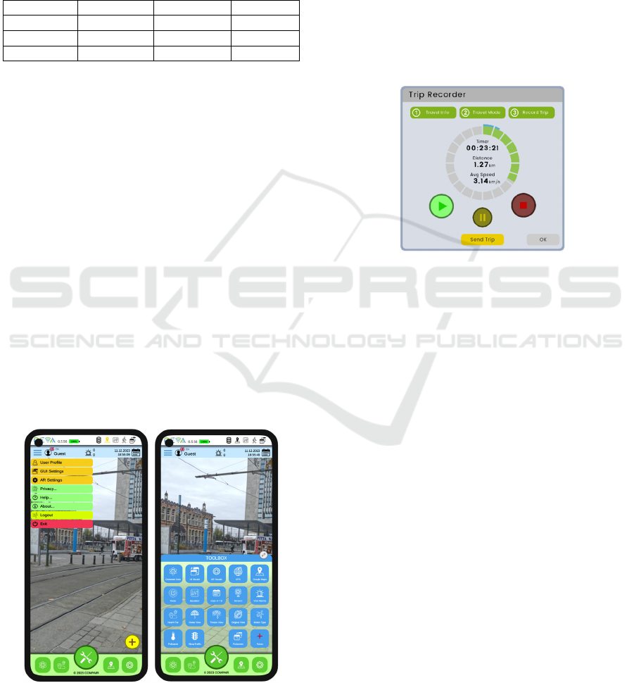
4.3 User Interface
In our app, the graphic engine Unity renders the full
screen. The 2D user interface is an overlay of the
3D/AR viewport and does not require any operation
system (OS) specific UI libraries. Our framework
offers a number of assets and reusable Unity
components allowing to adapt and extend the UI as
desired. The app supports a simple and an expert
mode, which is a result from our in-depth user
evaluation especially with school kids. We identified
that the UI should be used with minimal technical
skills, no prior knowledge, self-explanatory and
intuitive in use. By designing the 2D screen, we
respected standards such as responsive design, white
spaces, organic elements up to demonstrative
gamification of the UI, such as animations and
pictograms. The UI adapts automatically to the
orientation of the device and its screen resolution,
especially to support both, mobile phones and bigger
sized tablets (see Figure 11).
Figure 11: Main elements of the GUI: Left: Hamburger
menu and Right: Toolbox
4.4 Trip Recorder
To encourage citizen participation, we integrated a
feature known as the trip recorder (see Figure 12).
Upon activation, this tool records and saves the
current GPS position at various time intervals. Once
the trip concludes, the position and time data are
transmitted to the Data Manager for subsequent
analysis. This tool serves as the input for another
project-developed application called the Dynamic
Exposure Visualization Dashboard (DEV-D),
available for access at (DEV-D, 2024). This separate
application monitors and visualizes air quality along
the recorded trip.
Figure 12: Trip recorder.
5 USE CASES
The main objective of DEVA is to offer the wider
public the possibility to get awareness about the
environmental conditions in their local
neighbourhood. In the best case, this may change
behaviour and will have impact on political decisions
on the local level, e.g. implement low emission zones
or change rules for traffic and develop mobility plans.
In the context of the COMPARE project, a fully
citizen science (CS) based approach is performed to
involve citizens in many aspects of the project such
as installation of DIY sensors in the local
surrounding, participating in workshops, or
contribute to user testing and evaluation of various
tools developed in the project.
The close cooperation with citizens is
implemented in five different pilot cities in four
different European countries. The pilots are designed
around the following topics:
investigating air pollution over different periods
in time (weekend vs. working days),
investigating environmental conditions in
school streets,
GISTAM 2024 - 10th International Conference on Geographical Information Systems Theory, Applications and Management
126

measuring effects before and after certain
mobility plans in a neighbourhood.
Especially for the development of the presented AQ
Augmented Reality app, the CS involvement is
crucial and very helpful. We were able to receive
immediate feedback from end users in every stage of
the development, starting with the requirements, the
first prototype until the final application.
6 CONCLUSION
The presented Augmented Reality app offers for the
first time a real-time visualization of air quality and
traffic data based on publicly available environmental
DIY sensor data. The overall framework of DEVA
followed a flexible and dynamic software concept,
which can easily be extended with additional
functionality according to the user needs and the
availability of new sensor data. For example,
inclusion of gamification elements could be deployed
in future versions, to increase the attractiveness and
joy of the app, especially for the younger audience.
The main contribution of this paper is the proposition
of three different kind of visualizations for 3D data in
the 3D AR space. Thanks to the H2020 project
COMPAIR, the development of the different
prototypes was continuously accompanied by project
partners. Hence, the UI design, the necessary
functionalities are a result of in-depth testing and
evaluation thanks to the CS-based nature of the
project. The app will be made available to the public
by middle of 2024 on app stores.
ACKNOWLEDGEMENTS
The research presented in this paper has received
financial support from the European Union’s Horizon
2020 Program COMPAIR under grant agreement no.
101036563.
REFERENCES
Campana F.E. and Dominguez F.X. (2021). Proposal of a
Particulate Matter Measurement Device and an
Augmented Reality Visualization App as an
Educational Tool. 12th Int. Conf. on Education
Technology and Computers (ICETC '20). Assoc. for
Computing Machinery, New York, NY, USA, 6–11.
De la Barré, R., Chojecki, P., Leiner, U., Mühlbach, L.,
Ruschin, D., (2009), Touchless Interaction-Novel
Chances and Challenges, 13th Int. Conf. on Human-
Computer Interaction. Part II: Novel Interaction
Methods and Techniques, Berlin, Germany, Springer
Verlag, Heidelberg, Germany, pp. 161–169, July 2009,
doi: 10.1007/978-3-642-02577-8_18
DEV-D – Dynamic Exposure Visualization Dashboard
(2024): https://monitoring.wecompair.eu/ dashboards/
dev-d
EOS (2022): https://eos.org/articles/indian-cities-invest-in-
low-cost-air-quality-sensors
GeoPose (2023): https://www.geopose.org/
H2020 COMPAIR (2023): https://www.wecompair.eu/
Helsinki Air Quality AR (2021): https://play.google.com/
store/apps/details?id=net.playsign.hip
Khanchandani, K., Shah, M., Shah, K., & Panchal, V.
(2021). A Review on Augmented Reality and Virtual
Reality in Education, Int. Research Journal of
Engineering and Technology (IRJET), Vol.8, Issue 2,
February 2021, https://doi.org/10.1186/s13173019-
0084-8.
Mapbox Web Services API (2023), Mapbox Inc.,
https://docs.mapbox.com/api/
Mathews, N.S., Chimalakonda, S., & Jain, S. (2021). AiR:
An Augmented Reality Application for Visualizing Air
Pollution. 2021 IEEE Visualization Conference (VIS),
146-150.
MappingLondon (2023): https://mappinglondon.co.uk/20
18/3d-map-of-nitrogen-dioxide-pollution/
New York Times AR App: https://vrscout.com/news/nyt-
app-ar-air-pollution/
OGC (2022): OGC SensorThings API Part 1: Sensing
Version 1.1, https://docs.ogc.org/is/18-088/18-088.html
OpenAPI (2023): https://www.openapis.org/
Patel, S., Panchotiya, B., Patel, A., & Aishwariya
Budharani, S.R. (2020). A Survey: Virtual, Augmented
and Mixed Reality in Education. Int. Research Journal
of Engineering and Technology, Vol. 9, Issue 5, May
2020.
Sensor.Community (2023): https://sensor.community/en/
Sensor Kits (2023): https://sensor.community/en/sensors/
SODAQ (2024): https://sodaq.com/
Telraam (2024): https://telraam.net/
Torres, N.G., Campbell, P.E. (2019). Aire: visualize air
quality. In ACM SIGGRAPH 2019 Appy Hour
(SIGGRAPH '19). Assoc. for Computing Machinery,
New York, NY, USA, Article 1, 1–2.
https://doi.org/10.1145/3305365.3329869
Unity AR+GPS Location, Dev. by Daniel Fortes, 2023:
https://assetstore.unity.com/packages/tools/integration/
ar-gps-location-134882
Unity AR Foundation Framework, 2023: https://unity.com/
unity/features/arfoundation
Vargas, J.C.G., Fabregat, R., Carrillo-Ramos, A., Jové, T.
(2020). Survey: Using Augmented Reality to Improve
Learning Motivation in Cultural Heritage Studies.
Applied Sciences. Appl. Sci. 2020, 10, 897.
WAQI – The World Air Quality Index (2019)
https://aqicn.org/here/
WEForum (2023): https://www.weforum.org/agenda/20
16/10/air-pollution-facts/
Dynamic Exposure Visualization of Air Quality Data with Augmented Reality
127
