
6DVF: A Framework for the Development and Evaluation of Mobile
Data Visualisations
Yasmeen Anjeer Alshehhi
1 a
, Khlood Ahmad
1 b
, Mohamed Abdelrazek
1 c
and Alessio Bonti
2 d
1
Deakin University, Australia
2
IBM, Australia
yanjeeralshehhi@deakin.edu.au, k.ahmad@research.deakin.edu.au, mohamed.abdelrazek@deakin.edu.au,
Keywords:
Human-Centered Computing, Visualisation Techniques, Visualisation Design Guidelines, Visualisation
Evaluation Methods.
Abstract:
Mobile apps, in particular tracking apps, rely heavily on data visualisations to empower end-users to make
decisions about their health, sport, finance, household, and more. This has prompted app designers and devel-
opers to invest more effort in delivering quality visualisations. Many frameworks, including the Visualisation
and Design Framework and Google Material Design, have been developed to guide the creation of informative
and well-designed charts. However, our study reveals the need to incorporate additional aspects in the design
process of such data visualisations to address user characterisation and needs, the nature of data to visualise,
and the experience on small smart screens. In this paper, we introduce the Six-Dimensions Data Visualization
Framework (6DVF), specifically designed for data visualisation on mobile devices. The 6DVF encompasses
user characteristics and needs, data attributes, chart styling, interaction, and the mobile environment. We con-
ducted two evaluation studies to measure the effectiveness and practicality of our 6DVF in guiding designers,
pinpointing areas for improvement—especially in data completeness and usability for end-users.
1 INTRODUCTION
Data visualisation is a crucial aspect of many mo-
bile apps. For example, in mHealth apps data vi-
sualisations enable users to communicate effectively,
make informed decisions, and identify trends using
their health data. With the increasing use of mobile
apps and the diverse user base, there is a need for a
well-designed data visualisation framework that pri-
oritises user experience (UX) and provides accurate
and consistent visualisations on mobile devices. Ex-
isting efforts, including the Data Visualisation Cat-
alogue (Ribecca, 2019), from Data to Viz (Holtz,
2018), Data Viz project (Ferdio, 2019), IBM Design
Language (IBM, 2019), the Nested Blocks Model
(Meyer et al., 2015), (Kelleher and Wagener, 2011),
and (Cuttone et al., 2014), have provided general
guidelines for data visualisation design. While these
guidelines encompass best practices for chart design,
they primarily focus on desktop computers (Lee et al.,
a
https://orcid.org/0000-0002-9432-9477
b
https://orcid.org/0000-0002-7148-380X
c
https://orcid.org/0000-0003-3812-9785
d
https://orcid.org/0000-0003-2240-0454
2018) and do not take into account the characteris-
tics and context of non-expert users (i.e., people who
have limited to no knowledge in data visualisation
(Jena et al., 2021)). Some studies have specifically
explored data visualisation for tablet devices, offer-
ing guidelines for navigating the Roambi app
1
(Games
and Joshi, 2015). Leading organisations such as IBM
and Google have also integrated data visualisation
guidelines to support chart design on mobile devices.
However, these frameworks address general design
elements and chart interactivity but do not consider
user needs and chart functionality. In previous work,
Alshehhi et al. conducted a comprehensive review
of user feedback on mHealth apps, exploring app re-
views (Alshehhi et al., 2022a) and conducting a user
survey to identify needs and development opportu-
nities (Alshehhi et al., 2023b). Their findings high-
lighted user dissatisfaction and challenges in utilis-
ing charts for health data tracking, spanning issues
in functionality, data display, styling, adaptability for
diverse user groups, and the overall data visualisa-
1
Roambi is an app used for creating business reports,
dashboards, data visualisations, and charts (RoambiAnalyt-
ics, 2015)
Alshehhi, Y., Ahmad, K., Abdelrazek, M. and Bonti, A.
6DVF: A Framework for the Development and Evaluation of Mobile Data Visualisations.
DOI: 10.5220/0012692900003687
Paper published under CC license (CC BY-NC-ND 4.0)
In Proceedings of the 19th International Conference on Evaluation of Novel Approaches to Software Engineering (ENASE 2024), pages 555-562
ISBN: 978-989-758-696-5; ISSN: 2184-4895
Proceedings Copyright © 2024 by SCITEPRESS – Science and Technology Publications, Lda.
555

tion interface. Recognising these limitations, this pa-
per introduces the 6-Dimensions Visualisation Frame-
work (6DVF), specifically designed to address the
unique challenges faced by non-expert users in mo-
bile environments. Focused on six essential dimen-
sions, the 6DVF offers a more intuitive and effec-
tive approach, aiming to enhance user satisfaction in
mobile applications. Our contributions encompass
1) The 6DVF, a novel mobile-centric data visualisa-
tion framework that prioritises user-centric design and
tackles platform-specific challenges across six dimen-
sions. 2) A novel checklist for evaluating the frame-
work’s output based on the 3Cs: completeness, cor-
rectness, and consistency, setting a new standard for
structured and efficient evaluations in the field. 3) An
evaluation study providing insights into the practical
benefits and potential limitations of the 6DVF, shed-
ding light on its impact on design quality and the de-
sign process. Section 2 reviews existing frameworks,
identifying gaps in current approaches. Section 3 out-
lines the development process of the proposed frame-
work. Section 4 discusses the evaluation plan for as-
sessing the framework’s effectiveness. Section 4.4
presents the findings and results. Following that, Sec-
tion 6 engages in a discussion of potential framework
applications. Lastly, Section 7 concludes the paper.
2 RELATED WORK
Existing work on data visualisation frameworks and
guidelines include various aspects of the design pro-
cess. Cuttone et al.’s guidelines (Cuttone et al., 2014)
emphasise reducing cognitive load during the navi-
gation of personal information through data visuali-
sation. They advocate for interpretable data, pattern
identification, trend discovery, and enhanced interac-
tion. Munzner’s nested model (Munzner, 2009) and
Meyer et al.’s nested blocks and guidelines model
(Meyer et al., 2015) use a four-layered approach
but are process-oriented and generic, lacking a user-
centric focus. Lee et al.’s grounded theory study
(Lee et al., 2018) concentrates on user comprehen-
sion but overlooks considerations for mobile devices
and styling, crucial in the mHealth tracking domain.
Grainger et al.’s study (Grainger et al., 2016) high-
lights understanding non-expert users in data visual-
isation but lacks a comprehensive framework. Shift-
ing to industry practices, Google Material Design and
Apple’s Human Interface Guidelines provide general
advice on data visualisation design, yet limitations
persist in terms of user interaction on mobile devices.
In summary, existing frameworks and studies have
significantly contributed to the field of data visual-
isation but often fall short in addressing the unique
challenges posed by non-expert users on mobile de-
vices. The proposed framework (6DVF) builds upon
insights from previous studies, offering a structured
approach that not only characterises users but also
guides the data visualisation design process on mo-
bile devices.
3 6DVF: FRAMEWORK
DEVELOPMENT
The 6DVF is derived from extensive research (Al-
shehhi et al., 2022a), (Alshehhi et al., 2023a), (Al-
shehhi et al., 2022b), the six dimensions origi-
nated from an in-depth examination of user perspec-
tives, while identifying and categorising existing chal-
lenges. Built on user-centric concerns, the 6DVF
is designed to include essential elements for best-
practice mobile data visualisations. Tailored to users’
observed needs and challenges, this approach en-
hances the framework’s relevance and effectiveness,
supported by a designed implementation checklist.
3.1 The 6 Dimensions
The 6DVF enhances existing guidelines by incorpo-
rating additional considerations for non-expert users
and mobile app contexts. It consists of six dimen-
sions, organized into two main parts: 1) Empathize
and Needs and 2) Ideate. Empathise & Needs Di-
mensions: These dimensions focus on gaining a deep
understanding of users, identifying their needs, and
determining the appropriate mobile devices for the
visualisation. The following dimensions are taken
into account: D1: User characterisation: includes
gaining a deeper understanding of the target audience
through quantitative research methods such as market
research and user surveys. The output of this process
is a set of user personas that capture and characterise
the target audience of the mobile app (in particular
data visualisation) (Cooper et al., 2014) (Matthews
et al., 2012). D2: Users’ needs and pain points: de-
fines the problems, emotions and experiences users
encounter when using data visualisation. It is ac-
complished through a combination of quantitative re-
search methods, such as surveys and market research,
and qualitative research methods, such as interviews
and observations which help in collecting data on how
people think, feel, and interact with data visualisa-
tions. The output of this process is a user journey map
that captures users’ actions, thoughts, pain points, and
opportunities throughout the data visualisation pro-
cess (Howard, 2014). The user journey is informed
ENASE 2024 - 19th International Conference on Evaluation of Novel Approaches to Software Engineering
556

by the collected data and serves as a reference for
designing user-centred data visualisation experiences.
D3: Target platforms: involves considering various
mobile devices, including tablets, smartphones, and
wearable devices. Factors like screen size and in-
teractive capabilities are taken into account to ensure
an optimal presentation of the visualisations and ad-
dress accessibility requirements. Conducting a liter-
ature survey or market research is recommended to
gain insights into the features of the current devices.
The output of this process involves determining the
target devices’ features and operating systems (An-
droid/iOS) that need to be taken into consideration
during the design of your data visualisation. Ideate
Dimensions: These dimensions aim to capture the
details of the “what” and “how” of the data visuali-
sations to be developed including: D4: Data: focuses
on capturing relevant data to determine the most suit-
able charts and patterns for interpreting the collected
information. In order to achieve this, it is essential
to have a clear understanding of the desired insights
based on user needs. By mapping the collected data
to various chart and analysis tasks, such as identify-
ing anomalies, correlations, and periodic summaries
(Saket et al., 2018), designers can select the appropri-
ate chart types that effectively represent the data and
convey the desired insights to users. This process al-
lows designers to make sense of the data and create
meaningful visualisations. The outcome of this step
is the mapping of the collected data with the corre-
sponding charts and the creation of a list of sketched
data visualisations. This ensures that the visual rep-
resentations effectively communicate the insights de-
rived from the data. D5: Design system: encompasses
a collection of foundational user interface (UI) ele-
ments and components utilised by design and engi-
neering teams. Guidelines and best practices govern
these components (Gu et al., 2021), ensuring a con-
sistent and cohesive approach across the chart design
process. In the context of chart design, we divided
it into two main aspects. Firstly, the Look and Feel
aspect focuses on the visual design and appearance
of charts. this includes considerations such as a suit-
able colour palette, chart layout, font sizes, labelling
and types, and accessibility options symbols. Sec-
ondly, the Interactivity aspect addresses user interac-
tions with the charts and the data used to build the
charts. It also includes a range of interactions, limited
to tap, pinch, swap, gestures, and voice notes. The
outcome of this process yields a set of guidelines that
are valuable in chart design. These include 1) ensur-
ing the inclusion of essential chart elements, 2) priori-
tising accessibility, 3) ensuring a responsive chart lay-
out adaptable to various screen sizes, 4) using tooltips
for additional details, and 5) optimising the chart lay-
out for specific orientations. D6: App visualisations:
Displays the final result for data visualisation and in-
corporate all the elements identified in the previous
steps. To ensure the best possible outcome, designers
need to repeat this step for every visualisation. The re-
sult is a mobile app that presents charts tailored to the
user’s needs, ensuring accessibility, consistent layout,
and reliable data.
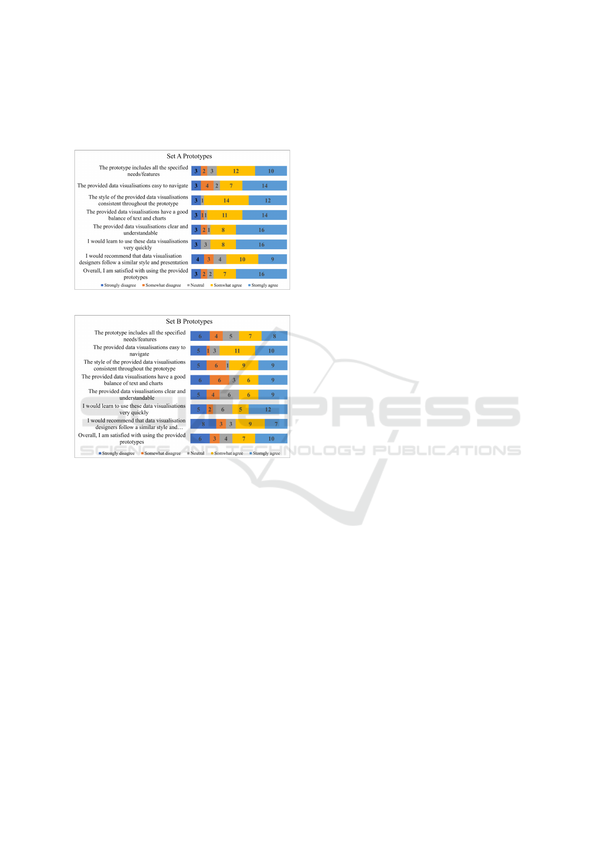
3.2 Framework Checklist
We prepared a checklist to support designers in eval-
uating the developed data visualisation. The check-
list provides an efficient measure for evaluation, as
stated in (Sawicki and Burdukiewicz, 2022). It in-
cludes the dimensions outlined in Section 3, which
include User Characterisation (D1), Users’ Require-
ments (D2), Target Platforms (D3), Data (D4), De-
sign System (Look and feel & interactivity) (D5), and
App Visualisations (D6). These dimensions are eval-
uated based on the Consistent, Complete, and Cor-
rect (3Cs) criteria, which are widely used for val-
idating software requirement specifications (Kamal-
rudin and Sidek, 2015). In the data visualisation con-
text, the 3Cs standards enable designers to deliver re-
liable charts that meet users’ needs. Table 1 illus-
trates the six dimensions and the corresponding eval-
uation statements for assessing their compliance with
the 3Cs criteria. The 3Cs criteria serve the following
purposes: 1) Completeness guarantees the inclusion
of all necessary components, 2) Consistency empha-
sizes uniformity in elements across the data visualiza-
tion interface, and 3) Correctness ensures error-free
production of components in each dimension.
4 6DVF: FRAMEWORK
EVALUATION
4.1 Part A: Designer Study
In this part, we implemented the user testing approach
to evaluate the framework in real-life scenarios. We
conducted an evaluation involving designers in build-
ing data visualisation tasks for a specific mobile app
with and without the use of our framework, followed
by a survey. We split the participating data visualisa-
tion designers into two groups:
• Group 1 (Cohort 1): Participants in this group
were introduced to the framework and a case
study for a mobile data visualisation scenario.
Each designer received a comprehensive project
6DVF: A Framework for the Development and Evaluation of Mobile Data Visualisations
557
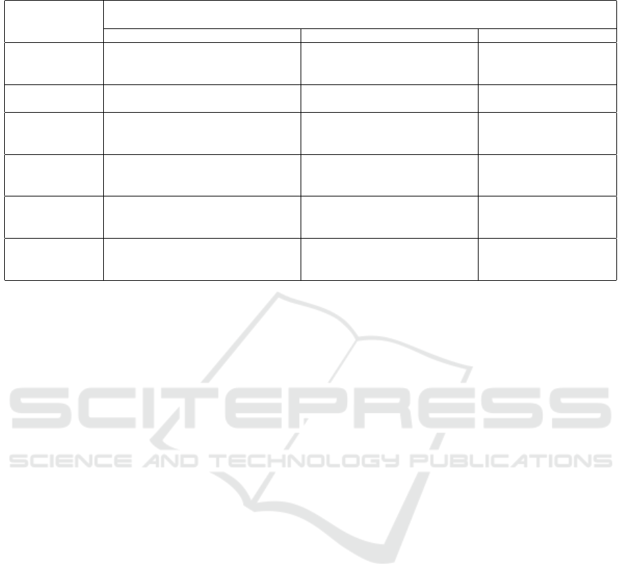
Table 1: Framework Checklist.
Visualisation Dimen-
sion
Visualisation Criteria
Complete Consistent Correct
D1: User Characteri-
sation
Do we have a complete list of the target audi-
ence’s characteristics (target users) for the data
visualisation?
Is there any conflict between the target au-
dience (users) of the data visualisation?
Do we have the correct audi-
ence?
D2: Users’ Require-
ments
Do we have a comprehensive range of users’
needs and pain points?
Is there consistency in addressing user
needs (functional requirements)?
Do we have the correct user
needs?
D3: Target Platforms Do we consider all the device and platform
capabilities, limitations, and compatibility to
present the required data visualisation
Are all the visualisations consistent with
the limitations and capabilities of the un-
derlying platform
Is the visualisation style
consistent with the user pro-
file/data/user requirements
D4: Data Do we have all the data required to achieve the
intended data visualisation
Is data consistent and can be linked – i.e.
same granularity in terms of special, tem-
poral, units of measure
Do we have the correct data for
the visualisation
D5: Design system
(Look and feel & in-
teractivity)
Do we have all the look and feel (non-
functional) requirements for the data visualisa-
tion
Do we have a consistent look and feel
throughout all the visualisation in the app
Do we use the correct look and
feel in all app visualisation
D6: App visualisa-
tions
Does a visualisation cover all (functional and
non-functional) the user requirements meant
for this specific visualisation
Is the visualisation style consistent with
the user profile / data / functional require-
ments
Are these the correct data visu-
alisation that the users need?
brief document containing project information,
the goal of constructing a meal tracker prototype
using Figma, a list of required features, and exam-
ples of issues identified in previous research stud-
ies on mHealth data visualisation (Alshehhi et al.,
2022a), (Alshehhi et al., 2023b), (Philip et al.,
2023). Subsequently, the designers were tasked
with creating a set of data visualisation prototypes
and completing a survey.
• Group 2 (Cohort 2): Participants in this group
were not familiarised with the framework at the
start of the designing process. However, they were
presented with the same case study and asked to
create a set of data visualisation prototypes with-
out the use of the framework. After completing
the task, we introduced them to the framework
and asked them to complete a survey that investi-
gates how likely they would be willing to use our
framework for their future projects.
Although this approach might introduce a bias in the
design approaches taken by the two cohorts, our goal
in following this approach was to compare the effec-
tiveness of having the 6DVF versus not having it dur-
ing the design process. Additionally, we aimed to
evaluate the practical impact of 6DVF from the de-
signers’ perspectives.
4.2 Part B: End User Study
In this section, we utilised the A/B testing approach,
providing users the opportunity to explore two ran-
dom prototypes, one from Group 1 and another from
Group 2. (The links to access the prototypes can be
found here). This approach is widely recognised as
a robust method for evaluating different iterations of
products or services (Johari et al., 2017). It holds
significant relevance in UX research, utilising user
evaluations to refine products or services, aligning
them with user expectations and needs (Young, 2014)
(King et al., 2017). The experiment’s flow is out-
lined as follows: First, each end user is tasked with
exploring a randomly assigned prototype from set A
and subsequently providing their evaluation. Subse-
quently, they navigate to a randomly assigned proto-
type from set B and proceed to complete their evalu-
ation. Finally, the end users are prompted to respond
to a comparison question. They share their opinions,
contributing valuable qualitative insights
4.3 Survey Development
Regarding part A survey questions, we developed the
survey questions based on the checklist provided ear-
lier (Table 1) in addition to a usability evaluation
questionnaire inspired by the System Usability Scale
(SUS) (Lewis, 2018). The survey questions are struc-
tured as follows:
• Demographic information: Participants provide
age, gender, professional experience, and famil-
iarity with data visualisation tools.
• Perceived effectiveness: Participants rate the
framework’s effectiveness in various design as-
pects, including data visualisation functionality,
accessibility, creation, interaction design, visual
aesthetics, and overall efficiency, using a scale
from 1 to 10 where 1 indicates ”Strongly Dis-
agree” to ”Strongly Agree”.
• Framework usability: Participants rate the usabil-
ENASE 2024 - 19th International Conference on Evaluation of Novel Approaches to Software Engineering
558

ity of the framework using nine statements cov-
ering user satisfaction, acceptance, confidence,
and recognition of limitations on a scale from
”Strongly Disagree” to ”Strongly Agree”. In ad-
dition to the quantitative assessment, open-ended
questions are included, allowing participants to
provide qualitative feedback on their experiences.
In terms of part B, we developed the evaluation ques-
tions taking inspiration from two established instru-
ments: the SUS (Lewis, 2018) and the UEQ (Schrepp
et al., 2014) and they are structured as follows:
• Demographic Information: Participants provide
details such as age, gender, education level, fa-
miliarity with mHealth tracking apps, number of
mHealth apps used, and operating system.
• Prototype Evaluation: Participants randomly ex-
plore a Figma link assigned with predefined tasks
and evaluate the prototype using a scale from
”Strongly Disagree” to ”Strongly Agree” for eight
statements. Additionally, participants provide
qualitative feedback through open-ended ques-
tions, sharing their experiences with the proto-
types.
• Comparison of Sets A & B: Participants express
their preferences among prototypes based on var-
ious metrics through single-choice questions in-
spired by the UEQ.
Before the study, ethical approvals were obtained
from the university’s research ethics committee.
Informed consent was secured from participants
through the Qualtrics platform, ensuring their aware-
ness of the study’s purpose, data collection methods,
and their rights to withdraw without consequences.
4.4 Participant Recruitment
A detailed flyer was created to attract individuals
with relevant expertise based on specific criteria. The
requirements outlined in the flyer included partici-
pants being above 18 years old, having a minimum
of one year of experience in health tracking apps, fa-
miliarity with data visualisation techniques and mo-
bile design principles, proficiency in using Figma or
Adobe XD, and a commitment of 8 hours over a
week. Strategic distribution channels, including pro-
fessional networks (e.g., Data Visualization commu-
nity, LinkedIn), industry forums (e.g., Freelancer, Up-
work), and social media platforms, were utilised to
circulate the study flyer. Interested individuals meet-
ing the criteria were encouraged to express interest
and undergo a preliminary screening. Of the initial 16
participants, two did not pass the screening. Partici-
pants were also required to share links to their design
projects or portfolios for further assessment. Fourteen
eligible participants were randomly assigned to two
cohorts of seven each, receiving compensation upon
study completion. For part B recruitment, we utilized
platforms such as Prolific and various social media
channels, chosen for their broad reach across diverse
demographics. Recruiting 30 participants, each re-
ceived a $50 AUD incentive upon completing the sur-
vey and validating their randomly assigned survey ID.
5 RESULTS
5.1 Part A: Participant Profile
The age distribution was as follows: the majority, 7
participants (78.57%), fell within the 18-30 age range,
while 2 participants (14.28%) were aged between 31-
40, and 1 participant (7.14%) was aged between 41-
50. In terms of gender, 8 participants (57.42%) iden-
tified as male, and 6 participants (42.85%) identi-
fied as female. This section details participant pro-
files, focusing on their UX design experiences and
preferred guidelines or frameworks for crafting data
visualisations. The majority of participants, 7 par-
ticipants (78.57%) were aged 18-30, while 2 partic-
ipants (14.28%) were aged between 31-40, and 1 par-
ticipant (7.14%) was aged between 41-50, with gen-
der distribution being 8 participants (57.42%) male
and 6 participants (42.85%) female. Regarding ed-
ucation, 7 participants (50%) held Master’s degrees,
6 participants (42.88%) held Bachelor’s degrees, and
1 participant (7.14%) completed post-secondary ed-
ucation. Experience levels varied, with 6 partici-
pants (42.85%) having 1-3 years of experience, 6 par-
ticipants (42.85%) having 3-5 years, and 1 partici-
pant (14.28%) having more than 7 years. Regarding
the tools used, Figma was mentioned by 42.85% (6
participants), Adobe XD by 14.2% (2 participants),
Double Diamond process by 14.2% (2 participants),
Draw.io by 7.14% (1 participant), Material Design by
7.14% (1 participant), and Tableau by 7.14% (1 par-
ticipant). This question was optional, and one partic-
ipant did not provide an answer.
5.2 Part A: 6DVF Evaluation
Both groups provided ratings for 19 statements, and
notably, Group 2 exhibited a stronger inclination to
incorporate the 6DVF in future projects. Specifically,
the mean comparison for the ”User Characterisation”
dimension was 7.57 for Group 1 and 7.71 for Group
2. Further comparisons across dimensions are illus-
6DVF: A Framework for the Development and Evaluation of Mobile Data Visualisations
559
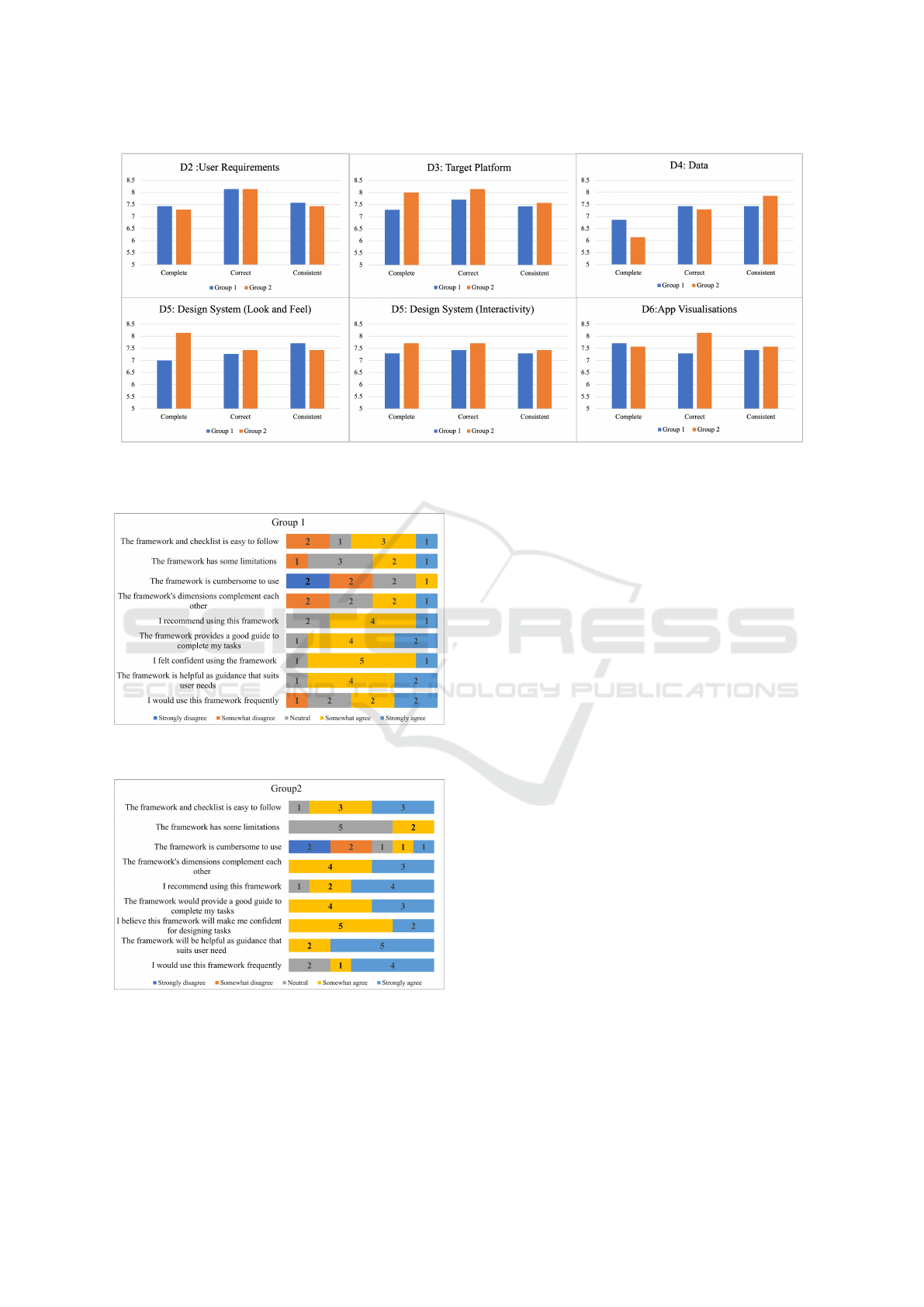
Figure 1: The chart displays mean scores for two groups of designers: Group 1, provided with the framework during prototype
design, and Group 2, given the framework after completing their designs. Scores indicate designers’ willingness to use the
framework in future projects.
Figure 2: Participant Ratings and Opinions on 6DVF:
Group 1.
Figure 3: Participant Ratings and Opinions on 6DVF:
Group 2.
trated in Figure 1. Regarding the usability evaluation
of 6DVF, Group 1 and Group 2 had mean ratings of
3.71 and 4.29, respectively. For a detailed breakdown
of participant responses for specific statements, refer
to Figures 2 and 3. In Group 2, 85.71% (6 out of 7)
designers followed other frameworks. When asked to
compare the guidelines they followed with our guide-
lines, we received 5 valid answers, all providing pos-
itive feedback.
5.3 Part B: Participant Profile
Participant demographics included: 17 (56.76%) aged
18-30, 5 (16.67%) aged 31-40, 3 (10.00%) aged 41-
50, and 5 (16.67%) aged 50 and above. Gender dis-
tribution comprised 20 males (66.67%) and 10 fe-
males (33.33%). Educational levels varied: 1 (3.33%)
completed primary education, 1 (3.33%) had lower
secondary qualifications, 9 (30.00%) had upper sec-
ondary education, 5 completed post-secondary stud-
ies, 12 (40.00%) held master’s degrees, and 2 (6.67%)
had doctoral degrees. In mHealth app experience,
43.33% (13) were basic users, 6 were intermedi-
ate, and 11 (36.67%) were advanced users with over
a year’s experience. Concerning installed apps, 11
(36.67%) had one, 18 (60.00%) had 2-5, and one par-
ticipant had more than 5 apps. Operating system pref-
erences were evenly split between Android and iOS,
each favoured by 50.00% of participants.
5.4 Part B: Prototypes Evaluation and
Preferences
While set A received positive feedback, set B showed
mixed results, as depicted in Figures 4 & 5. Set A
was preferred by 66.6% of participants for enjoyment,
look and feel completeness, and as their overall pref-
erence. Additionally, 70% found set A more user-
ENASE 2024 - 19th International Conference on Evaluation of Novel Approaches to Software Engineering
560
friendly than set B. Despite positive feedback for set
A, participants identified areas for improvement, par-
ticularly within the D4 (Data) and D5 (Look & Feel)
dimensions, based on open-ended suggestions.
Figure 4: Set A Prototype Evaluation.
Figure 5: Set B Prototype Evaluation.
6 DISCUSSION
6.1 Part A: DVF’s Effectiveness and
Usability
Comparing ratings between active users (Group 1)
and informed non-users (Group 2) of the 6DVF
framework reveals consistent positive feedback across
several dimensions. Both groups found the frame-
work effective in guiding user characterisation and
specifying target audience characteristics, as well as
in fulfilling functional requirements in data visuali-
sations. While the framework adequately addresses
considerations for mobile platforms, there is room for
improvement in ensuring consistency. Group 2 con-
sistently rated the ”Data” and ”Look and Feel” di-
mensions higher, indicating potential enhancements
for completeness and consistency in data presenta-
tion. However, positive ratings for ”Look and Feel”
demonstrate the framework’s effectiveness in guiding
designers to create visually engaging and consistent
visualisations. Participants noted the assistance of the
6DVF in incorporating interactive elements and creat-
ing accurate visualisations, although slight variations
were observed in perceived completeness and correct-
ness. Overall, the results offer valuable insights into
the effectiveness of the 6DVF across various aspects
of data visualisation, highlighting strengths and ar-
eas for improvement in data completeness, correct-
ness, and consistency. The usability and acceptance
of the 6DVF were analysed, with both groups express-
ing overall satisfaction and ease of use. Designers
from Group 2, who had experience with other frame-
works, showed higher satisfaction and confidence in
the 6DVF. Despite positive feedback, perceived us-
ability limitations were noted, prompting a commit-
ment to refinement. Feedback highlighted the effec-
tiveness of guidelines, clarity of instructions, and the
framework’s ability to meet client requirements. De-
signers expressed confidence in using the 6DVF, em-
phasising its potential to build trust and competence.
The absence of specific improvement recommenda-
tions suggests overall satisfaction or may indicate a
need for further investigation.
6.2 Part B: Prototype Evaluation and
Preferences
Participants consistently praised Set A, which incor-
porated the 6DVF, while Set B, lacking structured de-
sign principles, received diverse feedback, suggesting
potential shortcomings in meeting user expectations.
Although most participants preferred Set A, further
analysis revealed factors contributing to Set B pref-
erence, offering valuable insights for framework en-
hancement. The initial evaluation study highlights ar-
eas for improvement, particularly in Data and Look
& Feel. Plans include refining the framework before
conducting an expanded study to assess its broader
impact.
7 CONCLUSION
Addressing gaps in existing frameworks regarding
end users’ needs, we conducted a comprehensive ex-
ploration of designers’ perspectives on mobile data
visualisation challenges and expectations. The pro-
posed 6DVF, grounded in these insights, serves as
a foundational guide for implementing best prac-
tices, with a focus on customisation, accessibility,
and scalability for mobile devices. Experiment re-
sults highlighted successful framework implementa-
tion and identified areas for improvement, particularly
6DVF: A Framework for the Development and Evaluation of Mobile Data Visualisations
561

in the data dimension. To further validate observed
UI design differences and assess the checklist’s effec-
tiveness, we are planning a study involving UI design
experts. This aims to provide a detailed understand-
ing of how the checklist can effectively evaluate and
differentiate UI designs. Additionally, to enhance us-
ability, we intend to develop a Figma plug-in, seam-
lessly integrating key aspects of our framework into
designers’ workflows.
REFERENCES
Alshehhi, Y., Abdelrazek, M., and Bonti, A. (2022a). Anal-
ysis of personal data visualisation reviews on mobile
health apps. In ACHI 2022, The Fifteenth Interna-
tional Conference on Advances in Computer-Human
Interactions, pages 111–118. IARIA.
Alshehhi, Y. A., Abdelrazek, M., and Bonti, A.
(2022b). Personal data visualisation on mobile de-
vices: A systematic literature review. arXiv preprint
arXiv:2203.01374.
Alshehhi, Y. A., Abdelrazek, M., Philip, B. J., and Bonti,
A. (2023a). Understanding user perspectives on data
visualization in mhealth apps: A survey study. IEEE
Access, 11:84200–84213.
Alshehhi, Y. A., Philip, B., Abdelrazek, M., and Bonti, A.
(2023b). Needs and challenges of personal data vi-
sualisations in mobile health apps: User survey. In
2023 IEEE International Conference on Big Data and
Smart Computing (BigComp), pages 295–297. IEEE.
Cooper, A., Reimann, R., Cronin, D., and Noessel, C.
(2014). About face: the essentials of interaction de-
sign. John Wiley & Sons.
Cuttone, A., Petersen, M. K., and Larsen, J. E. (2014).
Four data visualization heuristics to facilitate reflec-
tion in personal informatics. In International Confer-
ence on Universal Access in Human-Computer Inter-
action, pages 541–552. Springer.
Ferdio (2019). Data vis project.
Games, P. S. and Joshi, A. (2015). An evaluation-guided
approach for effective data visualization on tablets. In
Visualization and Data Analysis 2015, volume 9397,
page 939704. International Society for Optics and
Photonics.
Grainger, S., Mao, F., and Buytaert, W. (2016). Environ-
mental data visualisation for non-scientific contexts:
Literature review and design framework. Environmen-
tal Modelling & Software, 85:299–318.
Gu, Q. et al. (2021). Design system as a service.
Holtz, Y. (2018). Data to viz.
Howard, T. (2014). Journey mapping: A brief overview.
Communication Design Quarterly Review, 2(3):10–
13.
IBM (2019). Ibm design language.
Jena, A., Butler, M., Dwyer, T., Ellis, K., Engelke, U.,
Kirkham, R., Marriott, K., Paris, C., and Rajaman-
ickam, V. (2021). The next billion users of visual-
ization. IEEE Computer Graphics and Applications,
41(2):8–16.
Johari, R., Koomen, P., Pekelis, L., and Walsh, D. (2017).
Peeking at a/b tests: Why it matters, and what to do
about it. In Proceedings of the 23rd ACM SIGKDD In-
ternational Conference on Knowledge Discovery and
Data Mining, pages 1517–1525.
Kamalrudin, M. and Sidek, S. (2015). A review on software
requirements validation and consistency management.
International Journal of Software Engineering and Its
Applications, 9(10):39–58.
Kelleher, C. and Wagener, T. (2011). Ten guidelines for
effective data visualization in scientific publications.
Environmental Modelling & Software, 26(6):822–827.
King, R., Churchill, E. F., and Tan, C. (2017). Designing
with data: Improving the user experience with A/B
testing. ” O’Reilly Media, Inc.”.
Lee, B., Brehmer, M., Isenberg, P., Choe, E. K., Langner,
R., and Dachselt, R. (2018). Data visualization on mo-
bile devices. In Extended Abstracts of the 2018 CHI
Conference on Human Factors in Computing Systems,
pages 1–8.
Lewis, J. R. (2018). Measuring perceived usability: The
csuq, sus, and umux. International Journal of
Human–Computer Interaction, 34(12):1148–1156.
Matthews, T., Judge, T., and Whittaker, S. (2012). How
do designers and user experience professionals actu-
ally perceive and use personas? In Proceedings of the
SIGCHI conference on human factors in computing
systems, pages 1219–1228.
Meyer, M., Sedlmair, M., Quinan, P. S., and Munzner, T.
(2015). The nested blocks and guidelines model. In-
formation Visualization, 14(3):234–249.
Munzner, T. (2009). A nested model for visualization de-
sign and validation. IEEE transactions on visualiza-
tion and computer graphics, 15(6):921–928.
Philip, B., Alshehhi, Y., Abdelrazek, M., Barnett, S.,
Bonti, A., and Grundy, J. (2023). mhealthswarm:
A unified platform for mhealth applications. In In-
ternational Conference on Evaluation of Novel Ap-
proaches to Software Engineering 2023, pages 605–
612. Scitepress.
Ribecca, S. (2019). The data visualisation catalogue.
RoambiAnalytics (2015). Roambi analytics.
Saket, B., Endert, A., and Demiralp, C¸ . (2018). Task-
based effectiveness of basic visualizations. IEEE
transactions on visualization and computer graphics,
25(7):2505–2512.
Sawicki, J. and Burdukiewicz, M. (2022). Visqualdex–the
comprehensive guide to good data visualization. arXiv
preprint arXiv:2201.08684.
Schrepp, M., Hinderks, A., and Thomaschewski, J. (2014).
Applying the user experience questionnaire (ueq) in
different evaluation scenarios. In Design, User Expe-
rience, and Usability. Theories, Methods, and Tools
for Designing the User Experience: Third Interna-
tional Conference, DUXU 2014, Held as Part of HCI
International 2014, Heraklion, Crete, Greece, June
22-27, 2014, Proceedings, Part I 3, pages 383–392.
Springer.
Young, S. W. (2014). Improving library user experience
with a/b testing: Principles and process. Weave: Jour-
nal of Library User Experience, 1(1).
ENASE 2024 - 19th International Conference on Evaluation of Novel Approaches to Software Engineering
562
