
How to Make User Interfaces More Accessible and Easier to Use for
People who Are Different from Us: Breaking the Spell of the Curse of
Knowledge
Harold Thimbleby
a
Swansea University, Wales, U.K.
Keywords:
User Interface Design, Accessibility, Formal Methods, Situational Awareness, Happy Paths.
Abstract:
When we are young most things are reasonably easy to use and we rarely think much about them — we just
get on and do things. As we get older, though, what used to be simple things become harder and harder. Since
people who are successful designers tend to be younger (and certainly not so old that things are getting difficult
to use!), they may unintentionally make things harder for older people. They also unintentionally make things
harder for busy people, such as nurses, firefighters and others with demanding jobs that leave less cognitive
resources for dealing with poor design. This article gives some examples, and makes suggestions so we can
recognize, avoid and fix or mitigate the problems.
“True ignorance is not the absence of knowledge, but the refusal to acquire it.” Karl Popper
1 INTRODUCTION
I was in a church meeting and somebody got up, went
to the door, but the door was stuck, so she came back
and sat down. A few minutes later, somebody else got
up, pushed the door and walked out.
This is a standard story of doors. The door’s han-
dles had the affordance to pull (figure 1.a), so the first
person pulled the door, but it wouldn’t open. The sec-
ond person completely ignored the door handles, and
just pushed the door directly. It opened.
The first person did not know which way the door
opened, and they were stuck because the door handle
was designed for pulling but the door did not open that
way. The second person already knew how the door
worked, and they didn’t even bother trying to use the
handles.
• A little knowledge makes things easier to use. In
this case, if you know the door is a ‘push door’
then the door is very easy to open for you. If
you don’t know this (that is, being deceived by the
door handle’s affordance to pull) makes the door
impossible for you to open.
• The learning point is this: a little knowledge
makes it very hard to design things for other peo-
ple. The person who designed the door or who put
a
https://orcid.org/0000-0003-2222-4243
a b
Figure 1: Door handles, (a) seen as triggering a poor user
experience, where a user got stuck trying to pull the door
(which doesn’t work), and (b) as seen after my fixing them
with flat plates, where the doors can now only be pushed
(when they open).
the door handles on the door knew how the door
worked. So the door was easy to use as far as they
were concerned — their knowledge of the obvi-
ous way the door worked made them ignore the
issue of door handle affordance. Yet if they had
done some user studies (or had previously learned
about affordance so they had a word to talk about
what they knew) they would have (re)designed the
door much better.
• In general, then, our knowledge biases our opin-
ions about accessibility, usability, safety, and ef-
fectiveness. If we are not very careful, the more
we know the worse designers or developers we
become. Sadly, it even becomes easy to dismiss
Thimbleby, H.
How to Make User Interfaces More Accessible and Easier to Use for People who Are Different from Us: Breaking the Spell of the Curse of Knowledge.
DOI: 10.5220/0012744300003699
Paper published under CC license (CC BY-NC-ND 4.0)
In Proceedings of the 10th International Conference on Information and Communication Technologies for Ageing Well and e-Health (ICT4AWE 2024), pages 7-20
ISBN: 978-989-758-700-9; ISSN: 2184-4984
Proceedings Copyright © 2024 by SCITEPRESS – Science and Technology Publications, Lda.
7

users’ problems as faults of their own making.
This basic door handle story illustrates a lot about
the problems of building usable, accessible, and
dependable (safe and reliable) interactive systems.
Doors are, as things go, very simple interactive sys-
tems. We used the door problem as an example to start
this paper, because it makes clear important design
points without being distracted by any of the power,
fancy features and exciting innovation of fancy digital
systems.
Our examples throughout this article will make
similar points by highlighting details of the ubiqui-
tous problematic design issues in digital systems. You
will note that none of the examples we discuss have
nice design names or concepts like ‘affordance.’ In-
evitably, designers fail to talk or think about problems
they cannot name, and hence the problems get little
attention. Worse, when there are principles and names
like ‘accessibility’ skilled designers may not realize
why these things are so important — their own ex-
perience of accessibility is different from their users
and it is hard to recognize and give these ideas proper
weight and attention.
2 THE CURSE OF KNOWLEDGE
Steven Pinker used the curse of knowledge to explain
why many people’s writing is very often unnecessar-
ily hard to understand.
When you are writing (for instance, like me writ-
ing this article) you know what you mean, and you
type or write down a sentence. The sentence makes
sense because you already know what it means!
However, for anyone else before they know what
you are trying to say, they have to read your writing.
They have to parse your sentences into their struc-
tures of meaning. If there is any ambiguity in how
any sentence is structured, understanding it becomes
very difficult. If the structure of the sentence lends
itself to multiple meanings, the reader can’t work out
the meaning until after they have parsed it and read it
successfully. But they can’t parse it reliably until they
know what it means. Bad writing creates a mess for
the reader.
Here’s a simple example to illustrate the point:
“Let’s eat Grandma!”
The person who wrote this knows Grandma has
cooked a meal, and the children are telling Grandma
they want to start eating the meal now. The sentence
makes perfect sense. But without that knowledge,
which isn’t in the sentence itself, somebody new to
the sentence might think it is a said by ghastly chil-
dren who want to eat their Grandma. Other people
don’t know what the sentence means, because they
can see both meanings.
The problem can be solved in various ways, like
writing “Let’s eat, Grandma!” or better, “Grandma!
Let’s eat!” — but thinking of ways to fix the sen-
tence misses Pinker’s point. The person writing the
sentence knows what they mean, so they don’t think
the awkward sentence needs improving. They are not
short of solutions (like commas) if they realize they
need solutions. The problem is they think the sen-
tence is clear, so that’s the end of their thinking.
If you are bored with the familiar Grandma exam-
ple, how about a news headline I read in January this
year:
Amber snow warning across country
I thought this was a warning we were going to
have amber snow (perhaps colored with dust blown
in from the Sahara?), but on reading the article below
the headline it became clear that the UK has yellow,
amber and red warnings for bad weather.
Once you know that bit of knowledge, the headline
is easy to parse as intended by the writer. The curse of
knowledge for the headline writer is they knew they
meant an amber warning, so when they read “amber
snow warning” they couldn’t see it could mean any-
thing else.
Since not everyone has the curse of knowledge in
this specialist area of weather warnings, a better news
headline would have been “Amber warning for snow
across country!” or, better I think, “Warning for snow
across country!” (that’s for people who don’t know
what amber warnings are).
The curse of knowledge is that the person who
writes a sentence knows what it means, so they only
see that meaning, but in truth sentences often have
two or more meanings. The reader doesn’t know
which, so may choose the wrong meaning, or they
will be slowed down until they’ve made a decision on
what it means.
Exactly the same happens in user interface design
— which is a lot more complicated than writing and
parsing natural language (English in the Grandma and
snow examples). The curse of knowledge, then, is that
the designer knows what everything means and does,
so it is obvious how to use and understand their de-
sign. They then accidentally under-estimate the diffi-
culties users may have, even, and often, to the extent
of not bothering with user trials because the user in-
terface is so obvious to them it doesn’t need testing.
The curse of knowledge explains the problems
with doors. The person who originally screwed the
door handles on knew how the door worked. The
ICT4AWE 2024 - 10th International Conference on Information and Communication Technologies for Ageing Well and e-Health
8

person I watched confidently going through the door
knew how the door worked. The person who got stuck
hadn’t been in thrall to the curse of knowledge. Any-
one with the curse of knowledge knows how to ‘parse’
the door.
The curse of knowledge explains one of my own
writing habits. I sit down and write an article like this
one, and I usually focus on the writing. Writing is
hard, and I am pleased I can concentrate and get it
done. But when I am writing, I can easily remember
what I mean so I am unavoidably susceptible to the
curse of knowledge. What I do, then, is do something
else for a week or so, then read my article with a view
to making it clearer. When I read and edit a week
later, I hope I have forgotten lots of the minor bits of
knowledge that made my writing seem simpler than it
was when I first wrote it. Now, rereading a week or
so later, I find lots of details to improve because now
they aren’t even clear to me!
We should do the same when building systems.
Build and debug them. Then try and use them next
week or next month, and fix the confusing or weak
features. Effectively, we become another person and
do user centered design a little better.
The curse of knowledge explains the next exam-
ple in this article. In the example the
On
key causes
confusion for a user, but the designer knows what
On
does, so — for the designer — it’s obvious that press-
ing
On
twice is counter-productive. Since the de-
signer knows what it does, and from that point of view
it is so simple, why bother testing it? Why would any-
one press
On
twice? The designer, cursed by know-
ing what
On
does, thinks it’s so easy it doesn’t even
merit a test, so they never find out that it does need
some serious user centered design . . .
3 BREAKING THE CURSE
The curse of knowledge is not knowing, in some way
that you do not have the same knowledge or skills
as the user. You don’t realize you know something
the user doesn’t; or, conversely, you don’t realize you
don’t know something the user does know (whether
the user can articulate that or not). User centered de-
sign, UCD, helps sort out knowing things you should
know, but it doesn’t sort out the serious curse of
knowledge: knowing or assuming things the user does
not know.
Here are some important solutions:
• Involve users in design
• Diversity in the design team
Figure 2: A Sony TV remote control, with 48 buttons in-
cluding a confusing on button.
• Experiment with prototypes — use iterative de-
sign cycles
• Use mathematics to help you think more clearly
• Deliberately work out how to extend this list for
your application.
4 SIMPLE TELEVISIONS?
Televisions are established, mass-market devices, so
we would expect them to be reasonably well designed
and easy to use.
My father tried to turn on his new Sony TV using
his remote control (figure 2). Nothing happened, so
he pressed the
On
button again. Still nothing hap-
pened. He told me it never worked and he was very
frustrated.
I could understand his problem. Pressing
On
turns the TV on, but the TV doesn’t appear to be
on for a few seconds, so Dad pressed the
On
button
again to make sure.
Unfortunately,
On
isn’t an
On
button as such but
an
On/Off
button (but it doesn’t say so). Pressing
On
when the TV is already on (as it was) makes it turn
off.
The obvious solution to me was to buy a simpli-
fied remote control, as widely advertised for elderly
people.
Figure 3 shows an example. Note that the
ON
on the simplified remote control really says ON —
I had simplified a bit when I talked about the origi-
nal remote control, as it actually used a green techni-
cal symbol,
O
, rather than the self-explanatory word
ON
that the simplified remote more helpfully uses.
When you get one, the new remote control of
course doesn’t know how to operate your TV since
it is a generic remote control, so you first have to train
it from your existing remote control. This is a very
complex process — a TV remote control uses infra
red signals to control the TV, so you have to point
the two remote controls at each other and press corre-
sponding buttons to train the new remote control what
the TV’s infra red commands are. There is absolutely
no feedback whether you are being successful.
An interesting side-effect of having to train each
buttons is that you can decide not to train the little
How to Make User Interfaces More Accessible and Easier to Use for People who Are Different from Us: Breaking the Spell of the Curse of
Knowledge
9

Figure 3: The Doro simplified remote control. Compare
with figure 2.
Figure 4: Apple’s different “few buttons” philosophy is a
contrast to Sony’s “one button for each function” philoso-
phy (see figure 2).
AV
button. On my father’s TV this would normally
have meant “change the audiovisual (AV) input” —
for instance to watch a DVD rather than a TV pro-
gram — but he had no other AV sources, so having a
button to change sources would have created another
problem. So I left it not doing anything at all.
When you’ve finished, you have (hopefully) a
trained remote control that can control your TV, and
with far fewer buttons it must surely be easier to use?
In fact, it is worse!
You now have a remote control with two nice large
buttons labelled
ON
and
OFF
. Each button uses the
correct infra red signal learned from the old remote
control that has a single
On
button. So what you have
done is train the new buttons to do the same thing —
now
ON
and
OFF
both switch the TV on and off!
Pressing the button
ON
will now turn the TV on, then
off, then on . . . and so on. The TV is now even more
confusing!
Apple have a different approach. Instead of a
remote control with lots of buttons (including some
you never use), it has a smaller remote control with
six buttons and a small trackpad (figure 4). Inter-
estingly, explaining why this remote control is bet-
ter and more usable is quite hard to explain. How-
ever, what is much harder to explain is how a differ-
ent corporate culture leads one company to put effort
into making user interfaces simpler, rather than taking
the easy route Sony took of providing one button for
each function they can think of. Sony’s approach just
makes the remote control more and more complex —
but is no challenge to the designers. Apple’s, in con-
trast, clearly required not just some thought but some
determination to make a simpler user interface.
The lesson is, what is easier to design is not neces-
sarily easier to use. Just because designers find some-
thing easy does not mean users will find it easy.
Let us imagine a TV manufacturer going through a
standard design process: defining tasks, personas and
scenarios, then prototyping, evaluation and iterative
design — much as the standard ISO 9241-110 Princi-
ples of the Human-Centered Approach recommends.
Such a process explores the design space, raises
basic questions, and follows a cycle of evaluation-
improvement until the design performs well.
Thinking like this: we need to be able to turn the
TV on. So the remote control needs an
On
button.
Do some evaluations. And then the crucial insight
from such user-centered design would be that the
On
button should always turn the TV on.
It seems plausible that Sony designers are so used
to how their
On
button works on their own TVs they
never bothered to put their design ideas through a de-
sign process involving a representative sample of real
users and tasks. They never asked the design ques-
tions that Apple evidently did. Put crudely, they prob-
ably thought their TV was simple, so it did not require
— and did not get — much design effort. The result
was a TV that was completely unusable for some peo-
ple, such as my “impatient” father.
5 PROBLEMS EVERYWHERE
An old man’s problems with a TV user interface
might seem like a niggle. But if this problem was
fixed, it would improve everyone’s user experience.
TVs (and remote controls) have been made for
years, so the use case we described above is not news
— it’s something that could have been fixed on the
second TV ever made, if anyone did user studies.
Modern TVs are actually computers and keep upgrad-
ing their software all the time. Continual user evalua-
tions could (if the manufacturers wished) ensure that
TVs continue to improve and become easier and more
pleasurable for everyone.
For example, instead of just updating the software,
the TV could tell you — “Did you know you never use
this feature X, so in case you find it helpful, we’ve put
it on your home screen, but you can delete it if you
don’t want to use it.” (Or whatever.) The end result is
a more usable TV, whether or not the user wants this
feature.
More worryingly, such ‘simple’ user interface
problems are everywhere, and even ‘trivial’ ones —
like the
On
button confusion — can cause serious
harm, such as patient fatalities in hospitals. No user
interface problem is trivial.
In hospitals, the user is typically a nurse. They
won’t be old, with cognitive decline, but they will be
very busy doing a complex task: the cognitive re-
sources they have available to manage a confusing
user interface are limited — and far more limited than
the technically-savvy developer sitting in their com-
ICT4AWE 2024 - 10th International Conference on Information and Communication Technologies for Ageing Well and e-Health
10

Figure 5: A BBraun Infusomat simulation, set up for start of
the interaction sequences shown in figures 6 and 7. (‘VTBI’
means volume to be infused).
fortable laboratory with a powerful PC designing cute
devices for nurses to use. The developer (unless they
try very hard) has no idea what it is like to be a busy,
hard-pressed user of their products.
Here is one example of the sorts of unnecessary
usability problems that arise. The BBraun Infusomat
is a very popular infusion pump. A nurse will select
infusion details for giving a patient a drug, perhaps
so-many milliliters of a drug over so-many hours. Al-
though figure 5 is a picture of the Infusomat, in re-
ality it will probably be one of many infusion pumps
connected to the same patient — part of the design
problem is which pump delivers which drug? (I must
emphasize the specific example explored below isn’t
the only bug I’ve found with the BBraun Infusomat,
but it’s just one of the easiest to explain.)
There are four triangle-shaped arrow keys on the
Infusomat that let you enter numbers. The idea is that
the left and right arrows (
đ
and
§
) choose a digit,
and the up and down arrow keys (
IJ
and
İ
) adjust
the chosen digit.
Figure 6 is a worked example, showing how a dis-
play of zero can be increased to 2 by pressing the
up arrow
IJ
twice. It seems very straightforward:
pressing the “up” button,
IJ
, increases the selected
digit 0 to become 1, and pressing it again increases 1
to 2. Of course, if we carry on pressing it, 2 increases
to 3, and so on, so we can easily set any digit we like.
I’ll now run through how to set a drug dose of 0.01
(perhaps mL of a drug dose for a patient) as a simple
example. Let’s see what happens, and how it goes
wrong.
We’ll start from the display showing 0, and we’ll
press the
§
key a couple of times to move the cur-
sor to the right. The number shown automatically
“expands” nicely, creating two extra 0 digits, so the
displayed number becomes 0.00, with the right-most
zero being selected. We now have the cursor selecting
the digit we want to change. To increase the 0.00 to
0.01, the nurse should press the key
IJ
, expecting,
of course, to increase the selected digit. The number
should become 0.01.
Figure 7 shows exactly what happens. The wrong
digit, not the one under the cursor, changes! The num-
ber displayed is now 0.10 not 0.01 as intended.
The infusion pump has let the user do something
that it doesn’t handle correctly. The dose the pump
is going to give the patient is now ten times higher
than what was intended, but the pump doesn’t warn
the user that anything unexpected has happened. It’s
possible that the Infusomat can’t physically deliver
such a small dose, so it’s just made the number larger.
That’s a possible explanation, but it isn’t an excuse for
silently changing the dose by a factor of ten — it’s a
serious bug.
An overdose ten times out could harm the patient,
and the nurse may then possibly face prosecution for
the harm done to the patient — perhaps a fatality. In
court, the Infusomat’s log might be used as evidence.
The log will show the court what the Infusomat did —
namely overdose the patient. The court will conclude:
that’s what the nurse did. In fact, the nurse gave the
correct dose, but the user interface has a bug. The In-
fusomat recorded what it did, not what the nurse told
it to do. If the court believes the Infusomat’s evidence,
the nurse is guilty of negligence she did not commit.
Bad user interface designs can be much worse than
just hard to use.
6 GETTING THINGS RIGHT
If you read almost any book on engineering, there will
be a lot of mathematics. Programming, though, de-
spite being engineering, is very different. There is
very little mathematics in most books and instruc-
tional programming material. It is as if the culture
around programming is that it is easy, and it is just a
matter of “learn a language, like Python, and then just
start programming.” Even children can program, we
are told, so you’ll find it easy.
I have never heard anybody say even children can
do brain surgery. They can, of course, but it obvi-
ously would not be safe. The point to make from that
analogy is that, of course children can program, but
the programs they write will not be safe. Fun but not
safe.
The Appendix makes a thorough argument that
quality user interface design requires mathematics,
and it also argues that needing serious maths is not
surprising. Quality engineering everywhere needs
maths, and to argue — as many do — that computer
programming is a skill that doesn’t need maths is un-
fortunate. It leads to the problems we have described.
Good programming is hard, and mathematics helps.
It’s the curse of knowledge again. I know how
How to Make User Interfaces More Accessible and Easier to Use for People who Are Different from Us: Breaking the Spell of the Curse of
Knowledge
11
If the display is showing:
0 .
You can press
IJ
to increase the selected digit 0 to be 1 . . .
1 .
Then you can press
IJ
again to increase the selected digit 1 to be 2 . . .
2 .
Figure 6: Increasing a selected digit, here increasing it by 2. (The whole device is shown in figure 5).
If the display is showing:
0 . 0 0
Then you should be able to press
IJ
to increase the selected digit 0 to be 1 . . .
0 . 1 0
. . . but the wrong digit changes!
Figure 7: A critical bug, increasing the wrong digit to increase in value 10 times more than the intended one.
my program works, so why do I need to use maths to
work out how it works?
The counter argument is you think you know how
your program works, but that is the curse of knowl-
edge. Very likely your program has bugs that you
haven’t noticed. The curse is you think your program
is right, but you are wrong. That’s why maths and
code review and other techniques help!
Let’s make an explicit comparison, which is elab-
orated in more detail in the Appendix:
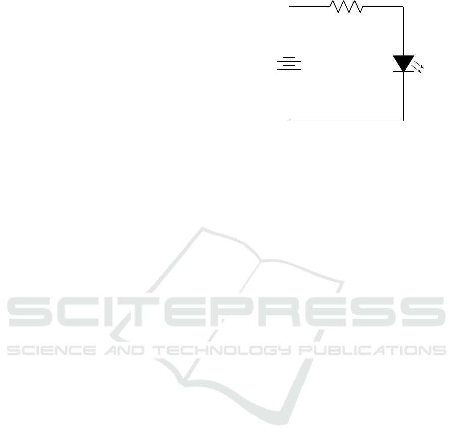
1. Suppose we want a simple LED to light up. We
will need to work out the value of components
in a circuit. That will need maths. For more
complex circuits, we would need to rely on a lot
more maths, use theories like Kirchoff’s Laws and
more. The Appendix gives an example of the
maths that’s needed.
The point is, in basic engineering like elec-
tronics using maths is both necessary and ex-
pected. Indeed, when you move on to design-
ing something like a microwave cooker, the maths
gets more important — and, incidentally, much
harder.
2. Suppose we want a simple program to work, per-
haps a user interface feature. We need to work out
how to do it, and to do that we need maths too —
and we are fooling ourselves if we think we can
get away without maths. The Appendix gives an
example.
To suppose programmers can “just tinker and
things will work” is to deny the real complexity of
programming, and denying the mathematical skills
that are required to ensure programs work as intended
and are usable.
I admit that the Appendix, which justifies these
points, is an appendix because I didn’t want mathe-
matics to put readers off. But consider: when have
you ever seen much maths in programming books
or training websites for programmers? (There are
some books and webpages that do get mathematical,
of course, but they are relatively well hidden!)
Now consider writing the program code for a TV
remote control, as discussed in section 4. The TV
code will be a lot harder than the little bit of exam-
ple code we explore in the Appendix. Chances are,
though, that the programmer just wrote the remote
control code without thinking it through carefully, let
alone thinking it through mathematically. The re-
sult was bugs they hadn’t thought about and hadn’t
avoided, causing the
On
button fiasco. The Appendix
shows some maths that could have cut through these
TV interaction problems and allowed the developers
to think about the design issues more clearly.
7 SITUATIONAL AWARENESS
Situational awareness, SA for short, is being aware of
your wider situation, being aware of more than just
ICT4AWE 2024 - 10th International Conference on Information and Communication Technologies for Ageing Well and e-Health
12

what you are concentrating on doing. As we grow
in skill, SA becomes easier, but demanding tasks (es-
pecially emergencies) mean we have to focus on what
we are trying to do — and then we probably lose sight
of all the other stuff. Often losing SA does not mat-
ter, but if (when driving a car) a child runs into the
road, it is really critical we see them. If we are drunk,
our SA shrinks, and our awareness of the shrinking
SA shrinks (our confidence grows despite us becom-
ing less able), so we may not be aware of that child.
That’s why drunk driving is illegal — it undermines
both SA and our awareness of SA.
In programming, a large part of what should be in
our SA is the needs of users. Ironically, the nicer the
code we write, and the prouder we are of it, the less
likely we are to be taking account of what users need.
I once wrote a complex program that needed to
display three sorts of numbers. Writing the code, it
was natural for me to choose red, green, and blue col-
ors to do this, since the program already used RGB
(red, green, blue) color codes. To highlight the num-
bers, then, I put the colored numbers each on a dif-
ferent colored background. So I put R on a G back-
ground, G on a B background, and B on an R back-
ground. Of course I’d avoided the silly mistake of
trying to show R on R, G on G, or B on B! For
foreground color f you obviously need a background
color b ‰ f . Easy. I was pleased with the result. It
worked.
I showed off my program to a friend, who asked
me why I had mixed red and blue, two awkward col-
ors that have poor contrast, particularly for red/blue
color blind people. I then suddenly realized I had cho-
sen the color mixes because I was thinking through
the lens of RGB color codes as a programmer, not as
a user interface designer aware of color contrasts and
color blindness, and so on. In my enthusiasm for RGB
tricks I had lost SA — and until my friend pointed it
out — I was unaware I had even lost my SA.
8 YOUTHFUL DESIGNERS
If the complexity of design causes failures in SA, and
hence often a loss of user-centered concerns, things
get worse when the demographics of designers and
users diverge. Inevitably, most people who design
systems are younger than older users. For instance,
a high proportion of older users are retired, and there-
fore would not be employed as designers.
It follows that most designers have not and are
not personally experiencing the problems of old age.
They are therefore less likely to be aware of older peo-
ple’s design issues (such as needing larger text), and
their SA will be biased towards issues that are salient
to them, that is younger, more healthy, more agile,
better-sighted, better hearing, less arthritic, people —
thus reducing the attention to these issues that become
a priority to older people.
9 HAPPY PATHS
Since mistakes and errors do happen, it is important
to test that our designs work correctly.
The phrase “happy paths” is a brilliant way to de-
scribe a really important problem.
When we test things, we test they work as we ex-
pect they should. We test all the things we planned
for our gadget to do, and (hopefully) it does them as
we expect. These, though, are the happy paths. What
about the “unhappy paths?” Does the gadget handle
sad and bad input sensibly?
A happy path for testing a remote control is, yes,
the
O
button works; it switches the TV on and off
as we expect.
An unhappy path question is, does the emphatic
pressing
ON ON
switch the TV on, as a user would
almost certainly expect? No, it doesn’t. And, remem-
ber, there are many more unhappy paths than just this
one to check! (A standard technique is to test code
using random user input, probably simulated, so you
don’t just check the happy things you expect to work.)
10 THE DESIGN OF DESIGN
So, the user interface might be badly designed; the
program code might be badly designed. Behind that,
the programming language itself is likely to be badly
designed.
An extreme, but widely used example, of a badly
designed language is Microsoft Excel. Almost any-
thing done in Excel is unreliable.
1
Other examples of badly designed languages are
C, C++, and JavaScript. Like Excel, these are wildly
popular (and have done enormous good), but unfortu-
nately that doesn’t stop them having traps and defects
in the ways they are designed. So the programmer
may make mistakes, but the language they are using
may add its own mistakes . . . and ensure these mis-
takes are much harder to spot.
1
If you add up a column of numbers using SUM but
mistype any number so it has two decimal points, Excel
will not point out the error, but the number will be silently
treated as zero with no warning, even if it looks like a mil-
lion 1.000.000
How to Make User Interfaces More Accessible and Easier to Use for People who Are Different from Us: Breaking the Spell of the Curse of
Knowledge
13

11 DUNNING-KRUGER
The Dunning-Kruger effect is named after the two au-
thors of the paper that introduced the idea; their paper
has a self-explanatory title: “Unskilled and Unaware
of It: How Difficulties in Recognizing One’s Own In-
competence Lead to Inflated Self-Assessments.” That
is, people who are not very competent are not compe-
tent enough to recognize their own incompetence, so
they generally think they are better than they actually
are.
It is likely if we confronted designers of TVs or
infusion pumps, they — or most of them — would
think they are more competent at their job than we
do. In other words, trying to help improve the quality
of user interfaces by talking to existing practitioners
is likely to fail — bad designers and developers think
they are better than they really are.
Dunning and Kruger’s suggestion to get out of the
dilemma is to educate. When you get qualifications
(or fail to get them!), you get a more objective assess-
ment of your own skills. Furthermore, your interview-
ers and employers also get a better idea because there
are facts on your application. In a word, education
calibrates us.
The implication is that we need qualifications in
user interface design, and in design for safety.
While the implication of Dunning-Kruger is that
people who are unskilled often don’t recognize their
limitations, the opposite problem, which afflicts us
all designers and developers regardless of our skill,
is the curse of knowledge (which we introduced in
section 2).
12 SOLUTIONS
This paper has, I hope, demonstrated that designers
and developers could learn and do things that would
improve the usability of their products. Basic knowl-
edge can be used to improve user interfaces, and ap-
plying it would make a huge difference to busy people
(like nurses) and people with cognitive or physical de-
cline (like some of the elderly).
Behind the lack of knowledge is a systemic prob-
lem. Our current qualifications (like degrees in com-
puter science, psychology, design, or HCI) do not es-
tablish or prove competence.
For example, I have a degree in physics, so I
have a qualification that shows I understand electricity
(check out my electronics example in the Appendix!).
But understanding electricity is very different from
being a competent electrician. Indeed, in the UK, I do
not have the legally-required qualifications and cer-
tificates to prove I am competent to wire up a house.
From a graduate physicist’s point of view, wiring up a
house is completely trivial. From a professional elec-
trician’s point of view, however, it is very complex
and requires professional skills, specialist tools, in-
surance, up to date certificates, and lots more. Know-
ing the principles of how a multifunction tester works
(as I do) is very different from being able to use one
safely and competently. My degree qualification does
not make me into a safe electrician; for instance, my
qualifications in physics covered none of the laws,
regulations, and standards electricians are legally re-
quired to know and to follow to be safe.
It is the same with programming, HCI and the
other disciplines that are needed for designing and
building quality, easy to use interactive products.
The fact that people understand something (even if
they have the qualifications) does not mean they are
any good doing it. Nor does it mean their compe-
tence is up to date — for instance, laws on electrical
wiring standards have changed since I got a degree
in physics, so even if my degree had covered profes-
sional wiring, my knowledge would not be legal to-
day.
If electricians are required to have professional
certificates to work, tell me why programmers or user
interface designers who build tools electricians rely
on for safety testing need no electrical qualifications
or supervision? When an electrician presses a button,
who knows what will happen if an incompetent de-
signer or programmer built it.
Similarly, why don’t designers of infusion pumps
need professional competence qualifications — their
programs are doing medical activities (like giving pa-
tients drugs) that doctors and nurses legally require
years to learn how to do safely. It is crazy that a nurse
needs to be registered and qualified before they can
press a button on an infusion pump, but what that but-
ton does to the patient is anyone’s guess because it
can be implemented by an unqualified programmer!
13 BIGGER SOLUTIONS
This article has focused on ‘little’ interaction prob-
lems, because they are easier to explain and clearly
introduce the principles. Bigger problems are gener-
ally more intricate and harder to understand, let alone
avoid. Unfortunately explaining and understanding
the bigger problems compromises our SA and we are
less likely to see the good design processes.
When a fire truck goes to an emergency, like a car
accident, everyone gets heavily involved. The rescue
may be complicated and urgent, and if so people will
ICT4AWE 2024 - 10th International Conference on Information and Communication Technologies for Ageing Well and e-Health
14

lose SA. It is therefore standard practice that a des-
ignated person — often the driver — has the job of
only checking SA for everyone else. Is there any traf-
fic coming? Is there fuel running across the road? If
you are busy getting a casualty out of a car, you may
not notice these critical factors.
Likewise, when building complex systems assign
a designated person whose only job is to ensure no-
body loses sight of user interface design, nobody loses
sight of the needs of users. And that is all that desig-
nated person should do. The designated person’s SA
is precious, and should not be cursed by getting too
involved in the technicalities of the design.
14 WHAT DOES THE USER
WANT?
UCD, User Centred Design is supposed to be user-
centered. What does the user want? What are the
user’s tasks? What empowers the user? What engages
users into flow? What does the user enjoy?
Often, these questions are most important but
hardest to answer when the user does not have the ca-
pacity to explain them. For example, my father did
not complain about the TV, he simply felt cross, and
cross with himself. It takes a detailed non-user cen-
tered analysis to trace the frustration back to technical
design decisions, though of course my analysis was
motivated by being user-centered.
Or a nurse using a badly-designed infusion pump.
The problem is, the user is generally unaware of (or
unable to explain) the design errors that cause their
problems. In fact, if one performed a user centered
analysis of nurses and infusion pumps, a significant
bias would be the “impossible error” problem. The
nurses who have had direct experience of errors have
lost their jobs, and can no longer be present for focus
groups or other user studies.
Often we design for users in organizations. Who
wants to admit their own problems in a competitive
environment, or where promotions are not guaranteed
and jobs are not secure? Many users adopt work-
arounds to help make their work more efficient, and
often these work-arounds cannot be seen by the com-
puter systems. Soon there is a vicious cycle of provid-
ing what the computer wants, because the computer
feeds management with the fruits of work-arounds
rather than honest information.
Many computer systems are specified by man-
agers and people ‘at the top.’ But these people with
the money and power to specify new computer sys-
tems don’t know how their workers work — iron-
ically, the worse the existing systems are the more
work-arounds are needed just to get things done, and
the more disconnected the managers become from
what is actually done.
15 CONCLUSIONS
It is time to professionalize user interface design and
construction. Employers and users need to know that
the people who design, build and maintain the sys-
tems they want to buy and use are competent.
This paper gave examples of how and why today’s
designers, interface developers, and engineers are of-
ten not competent, do not built easy to user systems
(especially for people unlike themselves, like the el-
derly) and, certainly, are not safe to build critical sys-
tems that people depend on.
Steven Pinker’s curse of knowledge is a core idea,
the significance of which has been belabored in this
article. But Steven Pinker did not think of all the ways
of being cursed by knowledge:
• If the designer knows too much then they know
‘secrets’ about how the design works, so they
under-estimate its difficulty for the user who may
not know these secrets. In particular, if the de-
signer knows too much relative to the user, for
instance if the user has disabilities or impair-
ments not shared by the designer, then the curse
of knowledge is a given.
• Conversely, if the designer knows too little then
they will under-estimate the difficulty and prob-
lems of the design for the user. We often think
maths is difficult, but it is difficult because it helps
us do difficult things. If we avoid maths, we en-
force our own ignorance, and do not see or ana-
lyze difficult problems that may make problems
for users. We are unable to fix problems we do
not know about.
• Thirdly, the knowledge cursing us may be wrong.
For example in the TV example, calling the button
On
gave us the incorrect knowledge that the
On
button turned the TV on. It doesn’t; this is wrong
knowledge.
PS please read the Appendix and its conclusions.
How to Make User Interfaces More Accessible and Easier to Use for People who Are Different from Us: Breaking the Spell of the Curse of
Knowledge
15
APPENDIX
Why We Need Maths
Maths in Electronics
Let’s design a very simple electronic circuit, like a
circuit to light up a LED. That is about as simple as
you can get and still do something useful. It could be
a child’s flashlight or torch, for instance.
In this circuit (figure 8), we have got the right
components, nicely connected. But what values do
they need to be?
If we start with a 9 volt battery, and look up the
voltage and current of our LED, we can start to work
things out. Then we will need to work out what the
value of the resistor is before anything is going to
work.
We can use Ohm’s Law: R “ V {I to work out the
resistance R.
The voltage V across the resistor will be V “
V
b
´ V
d
“ 9 ´ 2.1 which is 6.9. So R “ 6.9{0.01,
which is 690, or more precisely 690 Ω. It turns out
that 690 Ω is not an off-the-shelf resistor value, so
we pick 680 Ω, which is readily available (it’s an E6
value, so also in the common E12 and E24 series of
values). Now we need to work out the power dissipa-
tion of the resistor, W “ I
2
R, so we can calculate the
wattage is 0.01
2
ˆ 690 “ 0.069. We can safely use a
standard 0.125 W resistor for 0.069 watts. Job done.
This is about the simplest interesting electronic
circuit you can build, just a little LED that lights up.
And we needed to do some maths to get it right.
And, of course, we still need the practical skills of
being able to wire it up and solder it all together. If
we got the LED or battery the wrong way round, for
instance, it won’t work (notice that we turned the bat-
tery around to be correct in the second circuit). While
batteries come with little + and – signs on them, LEDs
don’t so we need to know the lead out pattern of the
LED we are using. Details matter.
Maths in Programming
Now compare that basic electronics experience with
programming.
To get programs right we also need to do some
maths. But most of the time programmers get away
with doing no maths, so “most” of the time their pro-
grams work by chance, and some of the time their
programs fail. Bugs, in other words.
Another thing good programmers need to do is
called code review. If I’ve made a mistake in my
maths above, did you notice? Did I notice? The idea
Figure 8: A simple circuit to light a LED.
of code review is that as we don’t notice our own mis-
takes (I wouldn’t make mistakes if I noticed them!),
then we need other people to review our work, and ask
us questions. “Are you sure? . . . Why are you sure?”
they’ll ask. Without code review, we cannot be sure
we are right.
As we did with the LED electronics example, let’s
write down a very simple program and then show how
to check the details are right. Let’s say we want to be
able to add up the numbers in an array of numbers
A in the programming language Python. In normal
programming, we would usually want to do some-
thing far more complicated — this example is try-
ing to show that doing even ‘simple’ programming
requires mathematics, in exactly the same way that
doing even simple electronics does. The difference is
that electronic engineers expect maths, but program-
mers don’t — and therefore many programs are more
buggy than they need be.
Here’s how we start. Most programmers can just
write this down (like most electronics enthusiasts can
just draw the LED circuit).
def sum( A ):
tot al = 0
for i in range(len( A )) :
tot al = t ota l + A [ i]
return t ota l
My first job as a programmer was working at the
Hammersmith Hospital cyclotron unit. Staff wore
dosimeters, to record how much radiation they had
been exposed to working around the cyclotron. My
job was to make some modifications to the program
that added up daily doses of radiation, to check that
the staff member had not had too much radiation over
the day, the week, the month or the year. It also identi-
fied staff who had had a low dose, and might therefore
be able to do more work safely. So the program had
several loops that added up numbers, much like the
Python above, although (given this was the 1970s) the
code was written in FORTRAN.
What I noticed was that the original code was in-
correct. It added up the weekly radiation dose for 52
ICT4AWE 2024 - 10th International Conference on Information and Communication Technologies for Ageing Well and e-Health
16
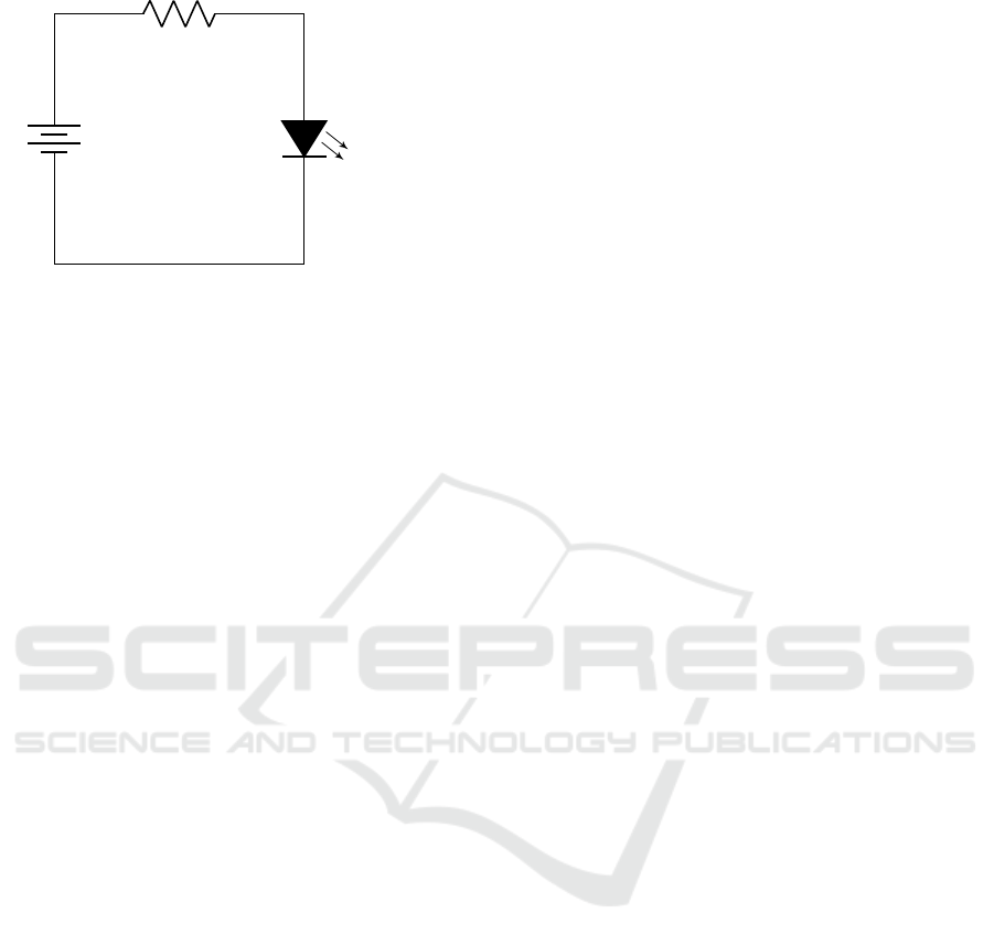
V
b
“ 9 V
`
´
R “ 680 Ω
V
d
“ 2.1 V
I
d
“ 10 mA
Figure 9: More details are needed for a simple circuit to
light a LED. (There are still many missing details, such as
whether the wiring is insulated, and how the components
are connected — soldered? twisted?)
weeks, to get a yearly dose. Unfortunately, weeks are
7 days, and 52 weeks of 7 days each adds up to 364
days, so that leaves one or two days unaccounted for
(depending on whether it’s a leap year). Where does
the program put those extra one or two days — adding
to this year’s total, or next year’s total? Are the regu-
lations per year or per 52 weeks?
These are the sorts of question that have to be
asked, and they arise because being really clear math-
ematically about what code is doing is critical to the
code being safe (and in this case, legal).
Most people, programmers anyway, would just
write that down Python code to add up some num-
bers without much thought — they’ve done this sort
of thing lots of times before. Well, not all loops are
the same (as the dosimeter example showed), so here
in this article we will go through the process as if we
are doing it properly.
First off, we ought to check that sum() works for
a few cases; so we check (showing just one exam-
ple) print( sum([1,2,3]) ) certainly prints 6, which
is 1 `2`3, which is correct. But will the code be cor-
rect for all sorts of numbers in A? What about special
cases like A=[]?
For anyone not too familiar with Python,
the expression range(a) means the integers
0, 1, 2, 3, . . . , a ´ 1. The for loop starts at 0, and
takes i successively through 1, 2, 3, . . . , to the length
of the array A minus one. The first element of the
array is A[0] and the last element is A[len(A)-1].
Somewhat confusingly, when an array starts at zero,
if it has len elements, then its last element will be
len-1.
Instead of Python, we’ll use the standard math-
ematical notation, where ra..bs means the set of in-
tegers i where a ď i ď b, so it is inclusive of both
a and b (assuming a and b are integers). Hence
Python’s range(n) means r0..n ´ 1s, and the reason
Python seems idiosyncratic is because, defined like
this, range better suits array subscripts that start at 0
rather than 1.
Hence, using this notation, the Python for i in
range(len(A)) used above means take the values in
sequence from i “ r0 : lenpAq ´ 1s.
It’s convenient to generalize the standard r..s no-
tation to allow A[0..i-1] to mean the ordered set of
values of the array A, at indices 0 to i ´ 1 inclusive.
Note that the sum of A[0..-1] is zero, because the set
r0.. ´1s is empty, as there is no i such that 0 ď i ď ´1.
Rather than Ohm’s Law, we need to use a law
called the loop invariant. We took Ohm’s Law as a
bit of magic and didn’t explain it, but the invariant
that’s needed here is straight forward.
When the loop terminates, we want total “
ř
Ar0..len(A)-1s so the function returns the sum of
all elements in A, and this equation will inspire the
exact form of loop invariant we need.
The Python for loop takes i over the values 0 to
len(A) ´ 1, so on the last iteration we want to finish
with total “
ř
Ar0..is. For each iteration, then, if
we ensure total “
ř
Ar0..is is true at the end of the
loop body, we will finish with the correct total sum.
Since this equation is (supposed to be) true every time
through the loop, it is called an invariant.
total “
ÿ
Ar0..is
In Python, the loop variable (here, i) remains de-
fined after the loop has terminated, so the invariant
will (or should!) be true all way from the loop to the
return statement, where the truth of the invariant is re-
lied on so that the function returns the correct value,
namely the sum of the elements of A.
Each iteration of the loop starts with the previous
value of total, so the assignment total = total +
A[i] inside the loop ensures the invariant is made true
just before the end of each iteration of the loop.
All we need to do now is ensure the invariant is
true the first time around the loop, when i “ 0. To do
that, we simply set total = 0. You can think of that
as establishing the invariant total “
ř
Ar0..is for i “
´1, since Ar0.. ´ 1s is empty, so
ř
Ar0..is “ 0.
Therefore the code is correct, at least if the invari-
ant is correct — and assuming our reasoning is cor-
rect.
The maths showed our Python code was correct,
and correctly added up the values in the array as we
wanted.
But we know that when you do something com-
plicated, there is a danger of losing SA. Furthermore
by using maths (or even just by using programming)
you now know more details than the user — there is a
real danger of the curse of knowledge.
How to Make User Interfaces More Accessible and Easier to Use for People who Are Different from Us: Breaking the Spell of the Curse of
Knowledge
17

So we, or our SA helper, must check what the user
wants and needs, and ensure we are also taking steps
to design for the user and their task — however satis-
fying may be just to use our nice correct code!
Loss of SA or otherwise, thinking about all that
mathematics might have distracted us from an ar-
guably better, certainly neater, solution to the prob-
lem. Indeed, as you read the stuff about invariants,
did you ask yourself whether this was the best way to
solve the problem?
Specifically, we focused on i, the index of A[i]
rather than the value of elements of A, so we missed
considering this (potentially) better solution:
def sum( A ):
tot al = 0
for ai in A :
tot al += ai
return t ota l
This solution doesn’t have subscripts (like A[i])
nor does it need to have an explicit expression len(A)
for the length of the array. The invariant, by the way,
is identical to the previous one we used, with the pro-
viso that (thanks to renaming the loop variable) we
just need to assert
ai
this code
“ A[i]
previous code
Sharp-eyed readers may notice that the font used
for Python was a fixed width font but the font used
for maths was Times italic (mostly). What does this
mean? The point is mathematical variables have one
value and they mean just one thing, namely their
value. If you see i in an equation and you know i “ 0,
you can replace i with 0 and the equation will still be
correct, or at least as correct as it was before.
Not so with programming variables. For example,
what is the value of total? It changes all the time;
in fact, that was the point of total, to keep a run-
ning total. Programming does not work like maths, so
we tried to help by using different fonts. So, this is
programming and this is maths.
It was hard to get all the font details right, and I
skipped the standard way of doing it correctly. Ide-
ally, you would use a notation called emphatic brack-
ets to indicate the transition from code to maths. For
example, rrtotalssp is the mathematical value of the
program variable total at point p in the program.
Unfortunately to define the environment and state
p would take us too far beyond the scope of this paper
(and too far into the inner details of Python). But it
shows, again, that to get things right, details mat-
ter. And, conversely, if you don’t get these ‘little’
details right, the user interfaces will have ‘little’ user
interface bugs.
Maths in UIs
Mathematics in user interfaces is typically associated
with Fitts Law (and other ways to compare timings of
different designs), but maths can also do a lot with the
meaning of interaction.
How would we analyze the TV’s confusing
On
key example from section 4, say?
One of the problems with user interfaces is that
they are usually side-effects of running programs. So
the sort of analysis we did for the Python sum tells you
what the program does, but it doesn’t tell you about
the things the program does interacting with the user
(it printed the sum of some numbers). In fact, the
problem is as tricky as the distinction between mathe-
matics and programming we briefly discussed above.
In the short space we have here, we will take the
On
button and some variations and show how we can
reason about them. How this reasoning is connected
to program code and might help us improve the code
is “an exercise left for the reader.” (It’s easy, espe-
cially if we use formal methods tools, but it is a bit
tedious to explain.)
First, let’s say all that the user is interested in is
that the TV is on, or that the TV is off, and for the
sake of argument that is all we need to be interested
in here. The TV cannot be both on and off, and it
cannot be neither on nor off.
Everything of interest in this TV can thus be rep-
resented by two states, on and off, both of which can
be represented in a state vector which has values we
can name, on “
`
1 0
˘
and off “
`
0 1
˘
.
State machines (e.g., finite state machines, FSMs)
can be turned into mathematics by using state tran-
sition matrices, and in fact they are often taught this
way. To understand our TV, we will treat each button
on the remote control like a little state machine, each
with its own transition matrix.
2
The TV’s original
On
button behaves like a fi-
nite state machine defined by the state transition ma-
trix
ˆ
0 1
1 0
˙
; in fact if we wanted to be pedantic, we
would write
rr
On
ss “
ˆ
0 1
1 0
˙
(This is using the same rr ss notation we introduced
when discussing Python above.)
Here, I’m just stating this as a fact, but it can be
worked out from scratch. For example, if somebody
2
If we now worked out the matrices for all the other
buttons, they would all be I, the identity matrix — because
all the other buttons leave the TV on, or leave it off if it is
already off.
ICT4AWE 2024 - 10th International Conference on Information and Communication Technologies for Ageing Well and e-Health
18

had already built the TV, the matrix can be worked
out by simply running a program on the TV — we
can either use the matrix to describe what a TV al-
ready does, or we could have used the matrix to spec-
ify what the TV should do.
However we choose to do it, given that button ma-
trix for
On
, we can work out what it does in arbitrary
situations. For instance, consider this example:
off
On
= off
ˆ
0 1
1 0
˙
=
`
0 1
˘
ˆ
0 1
1 0
˙
=
`
1 0
˘
= on
This is just doing matrix multiplication; that is,
given a state and a matrix representing a button, then
state ˆ matrix will be the next state after the button is
pressed.
Let’s now work out what
On
does when the TV
is already on:
on
On
= on
ˆ
0 1
1 0
˙
=
`
1 0
˘
ˆ
0 1
1 0
˙
=
`
0 1
˘
= off
So when we press
On
, if the TV is on, it is
switched off, and if it is off, it is switched on. Sounds
like we should have called the button
On/Off
so the
user isn’t confused.
So what does
On On
do, that is when it’s pressed
twice in succession?
We could work out what
On On
does for all pos-
sible states, as we demonstrated testing
On
pressed
once for each of the two cases on and off above. In
general it would be tedious to do this for all possible
states (for a more realistic example); instead, lets use
maths to work out what
On On
does for any state re-
gardless of the number of states we are dealing with,
thus:
On On
“
ˆ
0 1
1 0
˙ˆ
0 1
1 0
˙
“
ˆ
1 0
0 1
˙
We may recognize this matrix as I, the identity
matrix; in other words
On On
“ I.
Since pressing
On
twice gets the identity matrix
I, it does nothing (that is the definition of identity).
It is now easy to see that pressing
On
three times
is the same as pressing it once:
we worked out above that:
On On
“ I
so post-multiplying
3
both sides by
On
we get
3
Since all the matrices here are the same, post-
multiplying is the same as multiplying in any order, but I
On On On
“ I
On
but I times any matrix is the same value, and here
that matrix is
On
, so finally we have
On On On
“
On
We conclude that pressing
On
three times in a
row is equal to pressing it once. In general, it is easy
to prove that pressing
On
an even number of times
does nothing (is equivalent to I), and pressing it an
odd number of times is the same as pressing it exactly
once.
You could summarize our findings elegantly:
On
2n
“ I
and (although it is a trivial consequence of that)
On
2n`1
“
On
If doing the mathematics hasn’t been too distract-
ing, what we have discovered, for a key
On
as defined
for this the TV case study, then pressing it twice in
succession doesn’t make the TV more likely to be on.
As my father discovered, pressing the button twice,
four times, six times . . . does nothing; on the other
hand, pressing it once, three times, five times . . . does
switch the TV on.
In other words if you press the button enthusiasti-
cally, pressing it numerous times, there is only a 50%
chance you will switch the TV on. But it gets worse:
if you have switched the TV on but you really want
it to come on, you have to wait. If you don’t wait
long enough (however long that is) and you press
On
again thinking you will finally switch the TV on, you
will definitely switch the TV off. Sigh.
A 2 ˆ 2 matrix is trivial, and almost all user inter-
faces are obviously going to be much more complex.
The question is: do matrices scale up?
There are two answers: we can use block matrices,
and anyway (if we use computers to do the sums) we
don’t need to see the matrices themselves.
Suppose the device can do all sorts of things when
it is on; perhaps a 100 things. We could represent all
the on possibilities with a state vector like this
`
S 0
˘
where S is a block (here, with 100 elements) inside the
vector. It turns out the matrix algebra will work out as
before, but hiding all the details. Previously we said
`
1 0
˘
was ‘on’ because 1 was how we represented
on in the state vector; now we are saying
`
S 0
˘
is on
and, more specifically, on in some state represented
inside S. Note that we will also have to change the
emphasized post-multiplying to remind us that the last key
pressed should be on the right, ensuring the order of multi-
plication is the same as the order of pressing.
How to Make User Interfaces More Accessible and Easier to Use for People who Are Different from Us: Breaking the Spell of the Curse of
Knowledge
19

matrix for
On
since we have to decide (inside that
matrix) what specific state the TV will come on in.
Or we could just use other methods of course —
there are many in the formal methods area to choose
from.
Appendix Conclusions
The LED circuit, the Python program and the
On
but-
ton maths were all absolutely trivial as things go. Yet
we showed that to understand these designs, and get
them right we needed to use mathematics.
While engineers take it for granted that electronics
requires maths, for some reason programmers and UI
designers hardly ever use mathematics. That dislike
of mathematics and careful reasoning goes a long way
to explain all the bugs and user interface fiascos we all
experience with poorly designed programs.
It’s worth emphasizing maths has many more ben-
efits. For example, with a bit of routine work (sadly
beyond the scope of this article) we can explore and
prove and understand why Apple’s simple TV re-
mote (figure 4) control was much harder to design
than Sony’s huge remote control (figure 2). Once we
understand that, we can start using the insights else-
where to help improve other user interface designs.
ICT4AWE 2024 - 10th International Conference on Information and Communication Technologies for Ageing Well and e-Health
20
