
Pulsating Uncertainties: Visualization and Highlighting of Uncertainty in
3D Data Using Animated 2D Transfer Functions
Viktor Leonhardt
1 a
, Tobias Neeb
2 b
, Christoph Garth
1 c
and Alexander Wiebel
2 d
1
Scientific Visualization Lab, Department of Computer Science, RPTU Kaiserslautern, Kaiserslautern, Germany
2
UX-Vis group and ZTT, Hochschule Worms University of Applied Sciences, Worms, Germany
Keywords:
Highlighting, Uncertainty Visualization, Direct Volume Rendering, Animated Transfer Function.
Abstract:
While data with uncertainties arises in many scientific domains and engineering applications, the visualization
of such data remains challenging as uncertainty information must be included in an accessible and compre-
hensible manner.In this paper we present pulsating uncertainties as a novel way to highlight uncertainties by
animated two-dimensional transfer functions (2DTF) for uncertain scalar data sets. It allows for a flexible
classification by 2DTFs and an effective and pre-attentive highlighting of uncertainty by animating the 2DTFs
while enabling users to simultaneously explore the 3D scene.In addition, we present the isosurface variability
widget to highlight the variability of isosurfaces for data with uncertainty.We demonstrate the characteristics
of the new approach by experiments using climate simulation and medical data.
1 INTRODUCTION
Direct volume rendering (DVR) is a common visu-
alization method to explore and visualize volumetric
data sets emerging in medicine, engineering and nat-
ural sciences. Due to a lack of precise measurements,
a lack of prediction accuracy, a lack of completeness,
to name only a few examples (Kamal et al., 2021),
such data can be affected by uncertainty. Thus, almost
all types of visualization methods, among them DVR,
have been adapted or extended to be able to deal with
uncertainty (e.g. (Athawale et al., 2021; Sakhaee and
Entezari, 2017; Liu et al., 2012)) or to allow visualiz-
ing the uncertainty in the data to some extent (Pang
et al., 1997; Bonneau et al., 2014; H
¨
agele et al.,
2022). The latter is especially important for those
users who want to understand, analyze or at least con-
sider the uncertainty in the data they are working with.
In this paper, we present pulsating uncertainties, a
novel DVR approach combining animation and two-
dimensional transfer functions (2DTFs) in order to
pre-attentively highlight more uncertain areas in the
dataset and to automate the exploration and illustra-
tion of these areas. This deliberately contrasts with
a
https://orcid.org/0000-0002-3888-6156
b
https://orcid.org/0009-0005-3032-8677
c
https://orcid.org/0000-0003-1669-8549
d
https://orcid.org/0000-0002-6583-3092
numerous state-of-the-art methods that employ trans-
parency to illustrate uncertainty and thus rather hide
data points with higher uncertainty instead of high-
lighting them.
Our approach addresses and solves four tasks
(H
i
) focus on highlighting the uncertainty and two
tasks (I
i
) focus on assisting users in the interactive ex-
ploration in the context of DVR-based visualization
of uncertainty in 3D scalar fields which have not been
addressed in previous work: H
1
As uncertainties in
the data often require special attention, regions with
higher uncertainty should be highlighted to enable
their intuitive and pre-attentive identification. H
2
Iso-
surfaces are one of the prevalent visualization meth-
ods for 3D scalar data, and prior research has explored
their application in uncertain datasets (P
¨
othkow and
Hege, 2011; P
¨
othkow et al., 2011; Pfaffelmoser et al.,
2011). As the position of the surfaces is unsure, their
possible distributions should be illustrated in a way
that allows to be recognized pre-attentively. I
1
The
pre-attentive highlighting of the uncertainty should
be retained, while allowing users to manually explore
the three-dimensional scene by manipulating the view
(rotate, pan, scale). I
2
Allow for an automated ex-
ploration of the data values (e.g. mean) for specific
uncertainty ranges, while allowing users to manually
explore the three-dimensional scene. Pulsating un-
certainties support these tasks using a combination of
2DTFs, animations and a specific 2DTF widget which
Leonhardt, V., Neeb, T., Garth, C. and Wiebel, A.
Pulsating Uncertainties: Visualization and Highlighting of Uncertainty in 3D Data Using Animated 2D Transfer Functions.
DOI: 10.5220/0013088500003912
Paper published under CC license (CC BY-NC-ND 4.0)
In Proceedings of the 20th International Joint Conference on Computer Vision, Imaging and Computer Graphics Theory and Applications (VISIGRAPP 2025) - Volume 1: GRAPP, HUCAPP
and IVAPP, pages 799-806
ISBN: 978-989-758-728-3; ISSN: 2184-4321
Proceedings Copyright © 2025 by SCITEPRESS – Science and Technology Publications, Lda.
799

we call isosurface variability widget (IVW).
We do not aim to replace well-established DVR-
based uncertainty visualization techniques by pul-
sating uncertainties, but rather see our approach as
a complementary technique in cases where existing
techniques are tedious to use or do not sufficiently
guide the attention of the users to the uncertainty in
the data. We note that our method is aimed at uncer-
tainty present in the data itself (data uncertainty (Ka-
mal et al., 2021)) and does not treat uncertainty re-
sulting from the visualization process or being propa-
gated through the pipeline (visualization uncertainty).
2 RELATED WORK
As mentioned above, many methods for the visual-
ization of uncertainty have been proposed in the last
decades. Surveys by Kamal et al. (Kamal et al.,
2021), Pang et al. (Pang et al., 1997) and Bonneau
et al. (Bonneau et al., 2014) summarize this work.
While past work includes techniques for many differ-
ent types of data, we concentrate on methods dealing
with scalar fields. More specifically, our method is
related to work in the three areas:
a) visualization of scalar fields with uncertainty,
b) direct volume rendering and transfer functions (es-
pecially two-dimensional transfer functions), and
c) visualizations employing animations.
In the following, we summarize the related work
in sections considering different combinations of the
above listed areas.
Visualization of Uncertainty of Scalar Fields In-
cluding DVR and transfer functions (TFs). [a+b]
One of the earlier works regarding the visualization
of uncertainty in scalar fields using DVR has been
presented by Djurcilov et al. (Djurcilov et al., 2002).
While Djurcilov et al. use predefined colored regions
on a scatter plot to specify a 2DTF for the volume ren-
dering, the approach we propose uses an interactive
2DTF editor with different widgets and color-scales to
classify regions of interest. Other work, e.g. Sakhaee
et al. (Sakhaee and Entezari, 2017) and Athawale et
al. (Athawale et al., 2021), included the uncertainty
into the volume rendering process itself, allowing to
explore volumetric data with uncertainty using prob-
ability density functions (PDFs) and non-parametric
representations. None of these works however con-
siders the effect of animations applied to 2DTF clas-
sification widgets in the context of uncertainty visual-
ization of scalar fields.
Visualization of Uncertainty of Scalar Fields Us-
ing Animations. [a+c] Gershon (Gershon, 1992)
proposed one of the few approaches to visualize un-
certainty, here fuzziness, using animation. Later,
Ehlschlaeger et al. (Ehlschlaeger et al., 1997) look
into the visualization of positional uncertainty in el-
evation models using an animation-based sequence of
possible surface realizations. Brown (Brown, 2004)
introduced a new approach for visualizing uncertainty
using animated visual vibrations through oscillation
functions.
Our approach follows these works in targeting hu-
man motion perception to highlight areas with higher
uncertainty using DVR and pulsating 2DTFs to visu-
alize the volume data directly while integrating uncer-
tainty information into the rendering.
Visualization with DVR and TFs Including Ani-
mations. [b+c] Correa et al. (Correa and Silver, 2005)
present a method for data set traversal by moving a
region in which a TF is applied along a pre-specified
skeleton path in order to provide focus-plus-context
(F+C) views. Another F+C visualization approach
has been introduced by Woodring et al. (Woodring
and Shen, 2007), proposing the concept of animat-
ing TFs to incorporate animations in volume render-
ing. Yet another work presenting F+C visualization
has been presented by Sikachev et al. (Sikachev et al.,
2010) extending towards a dynamic F+C approach
that highlights features during user interaction. Akiba
et al. (Akiba et al., 2010) presented AniViz, an anima-
tion tool which allows a user to turn the results of data
exploration and visualization into an animation.
While the aforementioned works give insights
about the application of animations in a volume ren-
dering context, this article uses animations of 2DTFs
to investigate their effect with regard to the visualiza-
tion of uncertainty in a spatial data set.
Visualization of Uncertainty with DVR and TFs
Including Animations. [a+b+c] The work of Lund-
str
¨
om et al. (Lundstr
¨
om et al., 2007) is the only one
found related to the investigation of uncertainty (a)
using animations (c) with DVR and TFs (b). In their
approach, they address the uncertainty in the classi-
fication of a TF by interpreting overlapping classifi-
cations to be uncertain. These fuzzy classifications
are presented as an animated rendering of the mapped
color/opacity. In comparison to Lundstr
¨
om et al. who
investigate the visualization of uncertainty stemming
from the classification, our approach focuses on the
uncertainty in the scalar data using animated 2DTFs
for DVR thus resulting in a different presentations and
implementations.
Others. While not directly related to our approach,
P
¨
othkow et al. (P
¨
othkow and Hege, 2011) and Pfaf-
felmoser et al. (Pfaffelmoser et al., 2011) presented
approaches to visualize the positional variability of
IVAPP 2025 - 16th International Conference on Information Visualization Theory and Applications
800

isosurfaces in uncertain scalar fields, to which we
achieve comparable results with a special application
case based on task H
2
.
Other authors aimed to incorporate the data un-
certainty into the pipeline stages of DVR (Athawale
et al., 2021; Sakhaee and Entezari, 2017; Liu et al.,
2012). This allows them to preserve the classical,
non-uncertain TF while uncertain data is present. In
contrast to our work, this approach yields visualiza-
tions in which it is impossible to discern the extent
of accumulated uncertainty in the resulting visualiza-
tion. In other words, the uncertainty of the data is
not mapped directly to visual properties which allow
identifying areas of high uncertainty.
3 WIDGETS, MAPS &
ANIMATIONS FOR 2DTFs FOR
UNCERTAINTY
The approach for uncertainty visualization proposed
in this article is based on a set of visualization-related
features that are applied in the context of a 2DTF-
editor. These features are: (i) the use of different
shapes for classification widgets; (ii) color and opac-
ity maps applied to classification widgets; and (iii)
widget animations inside the 2DTF-editor.
The combination of the features in different ways
results in the ability to create visualizations of scalar
volume data with uncertainty enabling the fulfillment
of the tasks presented in the introduction of this arti-
cle. However, the combination of these features im-
ply issues, which we address in separate subsections.
The baseline of our approach lies in the integration
of Djurcilov et al. (Djurcilov et al., 2002) concept of
using 2DTFs for uncertainty visualization into a ba-
sic 2DTF-editor like the one presented by Kniss et
al. (Kniss et al., 2002) and animate the widgets to cre-
ate a highlighting mechanism.
Let a scalar field with uncertainty X be given in
R
3
with the data at each point i being modeled by
a Gaussian normal distribution X
i
∼ N (µ
i
, σ
2
i
) with
mean µ
i
and variance σ
2
i
. A 2DTF-setup that presents
the baseline can be seen in Figure 1 where mean µ and
standard deviation σ are used for the two dimensions
of the 2D-histogram, which depicts the frequency of
value pairs in the data set. The x-axis (horizontal) of
the histogram represents the value range of the mean
values, while the range of standard deviation values
are presented on the y-axis (vertical). Due to this
setup, classification widgets in the editor, like the red
widget in Figure 1, can be used to facilitate a clas-
sification of data with uncertainty. The advantage of
Figure 1: Left: Approximation of an isosurface using a rect-
angular widget. Right: Classification of the isosurface vari-
ability using a triangular IVW. While the left 2DTF in-
cludes only value pairs that are very close to the isovalue,
the IVW includes value pairs that are further away but might
be close to the isovalue due to uncertainty. Two horizontal
bars (in blue or green) exemplify the value range of two
points (white cross) with a different standard deviation.
this setup is the implicit interpolation of Gaussian dis-
tributions using the Gaussian PDF interpolation in
which the mean and the standard deviation are inter-
polated separately (P
¨
othkow and Hege, 2011).
The combined application of the features listed
above present a toolkit for visualizing the uncertainty
in spatially distributed scalar data. The following sub-
sections discuss the possible effects which each of
these features has on the final visualization.
3.1 Classification and Widgets
In the context of 2DTF editors, classifications are
achieved by manipulating widgets inside the GUI. Al-
though other widget shapes could be easily added to
our implementation, we use only two basic widget
shapes for uncertainty visualization: rectangles and
triangles (see Figure 1). Complex classifications can
be composed of multiple of these basic widgets.
Isosurface Variability Widget (IVW). As the di-
mension in our 2DTFs represent the mean and the
uncertainty an upside-down isosceles triangle widget
can be used to show the variability of an isosurface.
We call this an isosurface variability widget (IVW).
An example of the IVW is shown in Figure 1 (right).
Here, the isovalue is defined by the apex of the tri-
angle and thus by its center. Since points higher in
the 2D histogram have a higher uncertainty, the IVW
effectively includes more value pairs that have a cer-
tain probability to actually exhibit the isovalue. This
is illustrated in Figure 1 for two points represented as
white crosses. The standard deviations of these points
are represented by the green and the blue bar. Kniss
et al. use a similar widget for isosurface visualiza-
tion (Kniss et al., 2002).
Pulsating Uncertainties: Visualization and Highlighting of Uncertainty in 3D Data Using Animated 2D Transfer Functions
801

Figure 2: Widgets using global and local colormapping.
We can define the width w(σ) of the IVW using a
confidence interval γ. For Gaussian distributed vari-
ables the probability γ, that a value θ is within the
interval of z times the standard deviation σ around the
mean µ is as follows:
γ = P(µ −zσ ≤ θ ≤ µ + zσ) = er f
z
√
2
, (1)
while er f (x) is the error function. We can solve Equa-
tion 1 for the z times of a standard deviation in order
to identify the width w of the IVW:
z(γ) =
√
2 er f
−1
(γ), (2)
where er f
−1
is the inverse of the error function. Now,
we can adjust the width w
γ
(σ) = 2z(γ)σ of the IVW,
based on the standard deviation σ to ensure that γ% of
the possible positions of the isosurface are visualized.
The linearity of w
γ
(σ) with respect to σ shows that
the triangle with its straight edges is the perfect shape
for the IVW.
3.2 Colormapping
To apply color maps and opacity maps to enable the
differentiation of values inside scalar data is a com-
mon practice in the field of data visualization. Opac-
ity as a visual variable has also been used in the
context of 2DTFs (Djurcilov et al., 2002) and 2DTF
editors (Kniss et al., 2002). In our approach we
apply color maps with different orientations (Fig. 2
vs. Fig. 6) to classification widgets in a 2DTF-editor
to enable the differentiation of values of either the
scalar field or the uncertainty field in the 2DTF-setup.
To enhance visual distinctness in the rendering,
we employ two mapping states for widgets: global
and local mapping, as illustrated in Figure 2. Global
mapping uses the entire value range of the dataset
for color assignment, while local mapping limits the
color map to the value range classified by the wid-
get’s dimensions, improving clarity for specific value
ranges of interest. Unlike global mapping, local map-
ping is influenced by widget size changes and anima-
tions, which are discussed further in the next section.
3.3 Animation
As mentioned, DVR animations have been used for
exploratory tasks and focus+context views of features
in scalar volume data (Woodring and Shen, 2007),
and animating possible surface realizations (Brown,
2004; Ehlschlaeger et al., 1997) has been used for un-
certainty visualization. Going beyond these works,
we integrate animations into the process of uncer-
tainty visualization of volume data by animating the
2DTF-classification itself. More specifically, we ap-
ply scaling animations to differently shaped and col-
ormapped classification widgets in a 2DTF-editor.
Some of the possible advantages of scaling widget an-
imations with regard to uncertainty visualization in-
clude: a) Automated exploration (no manual interac-
tion necessary), b) increased comprehensibility of the
connection between rendering and 2DTF, c) visual-
ization of change in the data domain, d) focus+context
highlighting views with animated and static classifica-
tion widgets and e) fading in and out of more uncer-
tain or certain regions.
Using 2DTFs editors typically requires manual fo-
cus on creating classifications with widgets. Intro-
ducing widget animations enables automated data ex-
ploration with consistent speed, overcoming the im-
precision of manual exploration. For scaling ani-
mations, this facilitates automated exploration of the
scalar field represented by the x or y axis in the scat-
ter plot. Figure 3 illustrates how scaling animations
progressively include or exclude value pairs based on
metrics like mean or standard deviation, rendering ar-
eas with higher uncertainty increasingly transparent
and invisible.
Animations enable the perception of data domain
changes linked to the direction of scaling, such as
large volume regions becoming transparent or visible,
highlighting the frequency of specific value pairs. Ad-
ditionally, widget animations aid in forming a seman-
tic connection between the 2DTF classification and
the visualization (Kniss et al., 2002).
As mentioned, we defined two colormapping
states for the widgets. While global mapping directly
leads to expected results when applying animations to
colormapped widgets, local mapping is not straight-
forward in the context of animations. This is due to
the fact, that for local colormapping, the color scale is
applied based on the size of the widget. To avoid un-
intended color/opacity changes in the rendering, we
introduce an anchoring mechanism. With this, when a
colormapped widget using local mapping is animated,
the color scale is always applied to the initial size of
the widget (Figure 2 and Figure 3).
IVAPP 2025 - 16th International Conference on Information Visualization Theory and Applications
802

3.4 Implementation
Naive approaches to animated TFs involved updating
and uploading the 2D TF texture to the GPU, causing
performance issues. To address this, we extended the
2D TF texture into a 3D texture, using the third di-
mension to store animation steps. This allows GPU-
based DVR animation through simple frame look-
ups, with Θ as the total frames and T as the animation
duration. A slice θ ∈ [0, Θ −1] of the 3D texture rep-
resents the state of the animation at time t(θ) =
T
Θ
θ.
Figure 4 illustrates this approach for the animation in
Figure 3. Each horizontal, semitransparent slice of the
3D texture is shown separately for the first half of the
cyclic bouncing animation. Please note, in this fig-
ure, white areas represent a material color with zero
opacity and the start frame is the most bottom one.
4 RESULTS
To showcase our uncertainty visualization approach,
we applied it using various 2DTF setups to address
previously outlined tasks. The approach was proto-
typed in an open-source tool with modules for DVR,
extended to support colormapping and widget anima-
tions. All renderings and accompanying videos were
produced on a system with an AMD Ryzen 7 3700X
CPU and NVIDIA GeForce RTX 4060 Ti GPU.
4.1 Data Sets
Here, we introduce the data sets we use to illustrate
our results for the different tasks. If not noted other-
wise, the data is given on a regular grid and the val-
ues at the points are defined as Gaussian random vari-
ables. At first, to achieve a more analytically compre-
hensible visualizations we use the well known tangle
function (Knoll et al., 2009) (see also Figure 5). Simi-
lar to Athawale et al. (Athawale et al., 2021) the tangle
function is mixed with noise to generate an ensemble
representing uncertain data using a resolution of 512
3
.
To demonstrate the effects of our approach on
medical data, we use CT data taken from the CHAOS
(combined [CT-MR] healthy abdominal organ seg-
mentation) challenge (Kavur et al., 2019). We used
Figure 3: Frames of scaling animation applied a col-
ormapped widget. When the top of the widget moves down
samples with higher uncertainty are rendered transparent.
µ
θ
σ
Figure 4: Illustration of the 3D texture of the first half of
the cyclic bouncing animation. Each frame θ is shown as a
semitransparent 2D slice.
the registered CT data of 20 patients to compute the
weighted mean and variance. The resulting three-
dimensional scalar field with uncertainty has a reso-
lution of 256 ×256 ×81. Due to physical differences
of patients in this data set, we have to weight the first
patient 20 times more than the other 19 patients. Oth-
erwise, the mean and variance of the created scalar
field with uncertainty would not look valid.
We also demonstrate the use of animated
2DTFs on the climate ensemble of the DEMETER
project (Palmer et al., 2004). This ensemble contains
the daily average hindcast for the temperature for
February 20
th
, 2000. The data is generated by seven
climate models, where each model produced nine sets
with distinct simulation parameters. We used mean
and variance of the 63 ensemble members to model
the scalar field with uncertainty (144 ×73 ×4).
4.2 User Interaction and Highlighting
(Task I
1
)
In our first experiment, we address task I
1
to explore
the uncertainty of the tangle function. Figure 5 shows
DVR and 2DTF for three frames, where scaling down
the 2DTF progressively excludes points with higher
uncertainty, leaving only those with low mean and
low standard deviation. This simple example high-
lights automated uncertainty exploration for a fixed
mean range, enabling users to interactively examine
3D structures while benefiting from the automation.
4.3 Automated Exploration of Mean for
an Uncertainty Range (Task I
2
)
Our second experiment addresses task I
2
for the tan-
gle data, focusing on exploring regions with low un-
certainty. Using the 2DTF setup in Fig. 6, animating
the widget to narrow its width highlights low-valued
points. This automated exploration allows users to
investigate features by rotating the visualization or
zooming into interesting regions, as shown in Fig. 6.
Pulsating Uncertainties: Visualization and Highlighting of Uncertainty in 3D Data Using Animated 2D Transfer Functions
803

Figure 5: Using color map and animation: basic visualization of increasingly hiding more uncertain areas in the data. This
leads to the highlighting of uncertainty while allowing manipulating the view for manual exploration as described by task I
1
.
Figure 6: Frames of an animation where the values of the mean field are explored for a specific uncertainty range (Task I
2
).
The 2DTF-setup uses a rectangular widget with a local colormap in x-direction to enable visual differentiation of the selected
mean values. From left to right the renderings vary in the width of 2DTF widget. Additionally, the later renderings were
interactively rotated during the animation process. Note that between the left and the middle rendering only small changes
occur, but the related 2DTF classification widget is already at half its initial size. This illustrated the distribution or rate of
change of mean values throughout the volume dataset..
4.4 Pre-Attentive Highlighting of
Uncertainty (Task H
1
)
This experiment demonstrates the application of pul-
sating animations of the CT data set in order to high-
light regions with higher uncertainty. The pulsation
allows the intuitive and pre-attentive identification of
the uncertainties in the data. The used 2DTF setup
is shown in the insets in Figure 7 alongside with the
resulting rendering. To create a static context, a gray
rectangle widget is used to show points in a narrow
range of mean values with comparatively low uncer-
tainty. An additional rectangle widget colored in ma-
genta is used to show points with higher uncertainties.
This leads to an initial rendering, where more certain
values are rendered gray, while areas of higher uncer-
tainty are prominently visualized using magenta. To
repeatedly fade the uncertain areas in and out, a scal-
ing animation is applied to the widget, so that its top
moves down. The effect of this is visible in the frames
shown in Fig. 7. Due to the fading of uncertain areas
viewers are increasingly presented with more certain
areas defined by the initial 2DTF-setup. Areas with
highly uncertain values are highlighted by the pulsat-
ing animation and can be pre-attentively identified.
In this case, when comparing the left and the right
rendering, it can be seen that most areas belonging to
the rib cage possess a higher uncertainty as they are
close to invisible in the right rendering showing the
more certain areas. Djurcilov et al. (Djurcilov et al.,
2002) used opacity in this way to highlight uncertain
areas. However, this prevents opacity from being used
as a way to create feature related contexts in the clas-
sification step of the DVR pipeline. For this reason,
we use color as the primary visual variable and ani-
mation as supporting visual cue to convey uncertainty
to the viewer while using opacity to reduce occlusion.
This can also be seen in the renderings of Figure 7,
where due to a lower opacity of the static context vi-
sualization it is possible to perceive areas with higher
uncertainty that lie inside the shown context regions.
4.5 Visualizing the Variability of an
Isosurface (Task H
2
)
To address task H
2
we animate the IVW (Section 3)
and thus continuously fade (in/out) the less probable
isosurface realizations. Figure 8 shows this approach
applied to the climate data set. The initial 2DTF-setup
and rendering can be seen on the left, while the other
renderings and 2DTFs present a progressed state of
the animation horizontally collapsing the IVW. Here,
the mean isovalue of 273.15 K (0° C) has been used.
The entire animation cycle, which also expands the
IVW, can be seen in the video accompanying this ar-
ticle. The effect of this widget animation is a progres-
sive elimination of positions that are most uncertain
to actually be part of the isosurface. Thus, initially,
the visualized region represents potential realizations
of the isosurface for 0° C. Later, e.g. in the third ren-
dering, only more probable realizations are shown.
Note that the thickness of the rendered region at
a specific location can be an indicator of the uncer-
tainty or the gradient magnitude of the data. High un-
certainty results in a thicker ”surface” because points
with very different mean values can be part of the iso-
surface; lower gradient magnitude results in a thicker
”surface” because similar mean values are spread out
over a larger area. In Figure 8, this is most apparent in
IVAPP 2025 - 16th International Conference on Information Visualization Theory and Applications
804
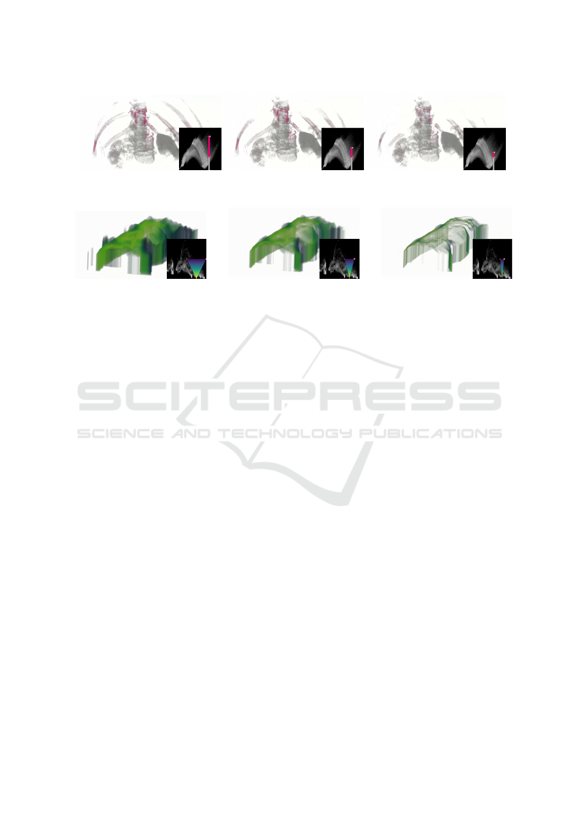
Figure 7: Frames of a 2DTF-animation for CT dataset. The 2DTF-setup enables fading in/out of areas with higher uncertainty,
while also maintaining a static visualization of the more certain structural context represented by the grayish areas. This results
in an example of how task H
1
can be performed regarding the visualization of uncertainty in the respective dataset.
Figure 8: DVRs and their respective 2DTFs of an animation of the IVW in the context of the climate dataset. While the initial
rendering (left) presents a region of many possible isosurface realizations based on a wide IVW, the other renderings show
later animation states, where the less probable areas are continuously faded out. Additionally, the thickness of the region at a
position is an indicator of the uncertainty in this area. This can especially be seen on the left vertical part of the renderings.
the change of thickness on the left side of the image,
where in the beginning the vertical area is far wider
than in the last rendering. In addition to this, the col-
ors used in the visualization show the local amount of
uncertainty. The blue and teal areas in the last ren-
dering are the ones where it is the most uncertain that
they actually have a value of approximately 0 °C.
P
¨
othkow and Hege (P
¨
othkow and Hege, 2011)
created a static visualization of the isosurface vari-
ability for the same data and isovalue. Their visualiza-
tion is comparable to the initial rendering of Figure 8.
The advantage of an animation of the isosurface vari-
ability, is that one is able to see the change between
the more and less certain surface realizations.
5 LIMITATIONS
The presented approach exploits the high sensitiv-
ity of the visual perception to oscillating visual fea-
tures which is captured in the temporal contrast sensi-
tivity function (Ramamurthy and Lakshminarayanan,
2015). While humans are capable of identifying that
two animations differ in speed, it is not possible to
quantify the frequency of an animation. Thus, ani-
mations are not a suitable visual channel to support
comparison tasks (Brown, 2004). Using animations to
highlight time-dependent datasets is impractical, as it
is impossible to distinguish between changes caused
by unsteadiness or by the animation itself.
The observation that animation of the DVR can
cause visual fatigue (Lundstr
¨
om et al., 2007) limits
the time the new method can be used effectively. This,
however, does not impede a central goal of the new
approach, i.e. providing a quick overview with a pre-
attentive highlighting of regions with uncertainty.
Simple DVR performance optimization tech-
niques like progressively resolution during user inac-
tivity (Meyer-Spradow et al., 2009) can not be com-
bined with pulsating uncertainties. The animation
continually alters the content that needs to be ren-
dered. A solution could be to extend such techniques
by pre-computing high resolution renderings of ani-
mation frames as soon as the user interactions stops.
6 CONCLUSION AND FUTURE
WORK
In this article, we presented animated two-
dimensional transfer function widgets as an un-
certainty highlighting mechanism for scalar fields
with uncertainty. In addition to the highlighting, the
animation serves as a means to automatically explore
the data and its uncertainty while users can focus on
the spatial exploration by manually interacting (e.g.
rotating) with the scene. The constant speed of the
animated TF additionally allows judging the rate of
change of uncertainty between different areas in the
rendered scene. One of the introduced TF widgets,
the isosurface variability widget, enables users to
inspect the variability of isosurfaces. Until now this
has been solved by the literature as specializations of
contouring and volume rendering algorithms for data
Pulsating Uncertainties: Visualization and Highlighting of Uncertainty in 3D Data Using Animated 2D Transfer Functions
805

with uncertainty. As the method is not limited to data
from a certain domain, we were able to demonstrate
its expressiveness on data from diverse domains.
Animated 2DTFs open many avenues for fu-
ture work in uncertainty visualization. Instead of
the standard deviation the level-crossing probability
(LCP) (P
¨
othkow and Hege, 2011) could be used for
the y-axis of the 2DTF. The advantage of the LCP is
its capability to deal with non-parametric models of
uncertainty. The interpretation of the animation and
visualization would be a challenge for this research.
We present only a limited amount of widgets for an-
imation. Further widget designs and animation types
(scale, rotate, translate) could be used to explore the
complex data sets with uncertainty in other meaning-
ful ways. It is obvious that animation works well for
highlighting, nevertheless analyzing which animation
speed is most effective could be interesting.
REFERENCES
Akiba, H., Wang, C., and Ma, K.-L. (2010). Aniviz: A
template-based animation tool for volume visualiza-
tion. IEEE CG&A, 30(5):61–71.
Athawale, T. M., Ma, B., Sakhaee, E., Johnson, C. R., and
Entezari, A. (2021). Direct volume rendering with
nonparametric models of uncertainty. IEEE TVCG,
27(2):1797–1807.
Bonneau, G.-P., Hege, H.-C., Johnson, C. R., Oliveira,
M. M., Potter, K., Rheingans, P., and Schultz, T.
(2014). Overview and state-of-the-art of uncertainty
visualization. In Mathematics and Visualization,
pages 3–27. Springer London.
Brown, R. (2004). Animated visual vibrations as an uncer-
tainty visualisation technique. In Proc. of the 2nd Int.
Conf. on Compu. Graphics and Interactive Techniques
in Australasia and South East Asia, GRAPHITE ’04,
page 84–89, New York, NY, USA. ACM.
Correa, C. and Silver, D. (2005). Dataset traversal with
motion-controlled transfer functions. In VIS 05. IEEE
Visualization, 2005., pages 359–366.
Djurcilov, S., Kim, K., Lermusiaux, P., and Pang, A. (2002).
Visualizing scalar volumetric data with uncertainty.
Computers & Graphics, 26(2):239–248.
Ehlschlaeger, C. R., Shortridge, A. M., and Goodchild,
M. F. (1997). Visualizing spatial data uncertainty us-
ing animation. Comp. i. GeoSciences, 23(4):387–395.
Gershon, N. (1992). Visualization of fuzzy data using gen-
eralized animation. In Proc. Visu. ’92, pages 268–273.
H
¨
agele, D., Schulz, C., Beschle, C., Booth, H., Butt, M.,
Barth, A., Deussen, O., and Weiskopf, D. (2022). Un-
certainty visualization: Fundamentals and recent de-
velopments. it - Information Techn., 64(4-5):121–132.
Kamal, A., Dhakal, P., Javaid, A. Y., Devabhaktuni, V. K.,
Kaur, D., Zaientz, J., and Marinier, R. (2021). Recent
advances and challenges in uncertainty visualization:
a survey. Journal of Visualization, 24(5):861–890.
Kavur, A. E., Selver, M. A., Dicle, O., Barıs¸, M., and Gezer,
N. S. (2019). CHAOS - Combined (CT-MR) Healthy
Abdominal Organ Segmentation Challenge Data.
Kniss, J., Kindlmann, G., and Hansen, C. (2002). Multi-
dimensional transfer functions for interactive volume
rendering. IEEE TVCG, 8(3):270–285.
Knoll, A., Hijazi, Y., Kensler, A., Schott, M., Hansen, C.,
and Hagen, H. (2009). Fast ray tracing of arbitrary
implicit surfaces with interval and affine arithmetic.
Computer Graphics Forum, 28(1):26–40.
Liu, S., Levine, J. A., Bremer, P.-T., and Pascucci, V.
(2012). Gaussian mixture model based volume visu-
alization. In IEEE LDAV, pages 73–77.
Lundstr
¨
om, C., Ljung, P., Persson, A., and Ynnerman, A.
(2007). Uncertainty visualization in medical volume
rendering using probabilistic animation. IEEE TVCG,
13(6):1648–1655.
Meyer-Spradow, J., Ropinski, T., Mensmann, J., and Hin-
richs, K. (2009). Voreen: A rapid-prototyping envi-
ronment for ray-casting-based volume visualizations.
IEEE CG&A, 29(6):6–13.
Palmer, T. N., Alessandri, A., and et al. (2004).
DEVELOPMENT OF A EUROPEAN MULTI-
MODEL ENSEMBLE SYSTEM FOR SEASONAL-
TO-INTERANNUAL PREDICTION (DEMETER).
Bulletin of the Am. Meteorolog. Soc., 85(6):853–872.
Pang, A. T., Wittenbrink, C. M., and Lodha, S. K. (1997).
Approaches to uncertainty visualization. The Visual
Computer, 8(13):370–390.
Pfaffelmoser, T., Reitinger, M., and Westermann, R. (2011).
Visualizing the positional and geometrical variability
of isosurfaces in uncertain scalar fields. Computer
Graphics Forum, 30(3):951–960.
P
¨
othkow, K., Weber, B., and Hege, H.-C. (2011). Proba-
bilistic marching cubes. Computer Graphics Forum,
30(3):931–940.
P
¨
othkow, K. and Hege, H.-C. (2011). Positional uncertainty
of isocontours: Condition analysis and probabilistic
measures. IEEE TVCG, 17(10):1393–1406.
Ramamurthy, M. and Lakshminarayanan, V. (2015). Hu-
man Vision and Perception, page 1–23. Springer In-
ternational Publishing.
Sakhaee, E. and Entezari, A. (2017). A statistical direct
volume rendering framework for visualization of un-
certain data. IEEE TVCG, 23(12):2509–2520.
Sikachev, P., Rautek, P., Bruckner, S., and Gr
¨
oller, M. E.
(2010). Dynamic focus+context for volume rendering.
Vision, Modeling and Visualization, pages 331–338.
Woodring, J. and Shen, H.-W. (2007). Incorporating high-
lighting animations into static visualizations. In Visu-
alization and Data Analysis 2007, volume 6495, page
649503. Int. Soc. for Optics and Photonics, SPIE.
IVAPP 2025 - 16th International Conference on Information Visualization Theory and Applications
806
