
Empowering Facility Managers: Multimodal Location-Based
Visualization for Smart Sanitizer Dispensers Management
Victor-Adriel De-Jesus-Oliveira
1 a
, Thomas Bigler
2
, Florian Grassinger
1 b
, Michael Zauchinger
1
,
Albert Treytl
2 c
and Wolfgang Aigner
1 d
1
Sankt Poelten University of Applied Sciences, Austria
2
University for Continuing Education Krems, Austria
{victor.oliveira, florian.grassinger, michael.zauchinger, wolfgang.aigner}@fhstp.ac.at,
Keywords:
Internet of Things, Data Visualization, Proof-of-Concept Application.
Abstract:
Facility management employees are in charge of maintaining a safe and operational infrastructure. Even a
seemingly simple task, such as maintaining disinfectant dispensers that need to be operational and constantly
refilled, can become costly as the number of units and the distance between them increases. In this context,
the deployment of wireless sensor networks allows not only scaling data collection but also for optimizing
otherwise mundane tasks and improving response times. Location-based and situated data representations are
then presented as powerful tools to visualize and assess data in relation to its physical referent. In this paper,
we report a proof-of-concept study on the implementation of sensor-powered disinfectant dispensers deployed
on a university campus. We present the design of different location-based visualization dashboards to explore
and monitor dispenser status including a traditional web dashboard with list and map views, as well as an
augmented reality (AR) app displaying embedded data representations. Interviews with facility management
employees are conducted to review their impressions, discuss how such dashboards could be incorporated into
their workflow, and explore potential improvements to better support their work.
1 INTRODUCTION
Internet of Things (IoT) allows for smart solutions
that speed up data collection and problem resolution.
In the context of facility management, IoT devices can
be used to monitor and control various systems. Sen-
sors can, for instance, detect occupancy levels and
adjust heating or cooling accordingly, saving energy
and reducing costs. Using data and information vi-
sualization tools is reported to significantly improve
the decision-making process (Golparvar-Fard et al.,
2013). In addition, augmented reality (AR) tech-
nology can further improve information sharing and
decision-making regarding the worksite (Chung et al.,
2021). However, previous literature does not address
how such technologies can be incorporated into the
facility manager’s workflows, especially the integra-
tion of location-based visualizations.
a
https://orcid.org/0000-0002-8477-0453
b
https://orcid.org/0000-0003-4409-788X
c
https://orcid.org/0000-0001-5383-0348
d
https://orcid.org/0000-0001-5762-1869
This paper reports on a use case that comes from a
demand to manage over 70 disinfection dispensers at
the facilities of the Danube University Krems, in Aus-
tria, during the COVID pandemic. These dispensers
are battery-operated and contain a bag of 1000 ml
holding the disinfectant liquid. Constantly checking
and refilling these devices means a significant ad-
ditional effort for facility management. Therefore,
the devices were powered by wireless sensors to give
them more intelligence to reduce administrative effort
and allow them to have quick reaction times in case of
empty batteries or liquid containers. For that, differ-
ent visualization alternatives are presented, including
list and map views on a conventional dashboard and
embedded visualizations rendered in an Augmented
Reality (AR) app (see Figure 1).
The main contributions of this paper are:
• The demonstration of a smart solution to support
facility managers.
• The design of location-based visualizations.
• The insights of how such visualizations can be in-
corporated into facility managers’ workflow.
De-Jesus-Oliveira, V.-A., Bigler, T., Grassinger, F., Zauchinger, M., Treytl, A. and Aigner, W.
Empowering Facility Managers: Multimodal Location-Based Visualization for Smart Sanitizer Dispensers Management.
DOI: 10.5220/0013105200003912
Paper published under CC license (CC BY-NC-ND 4.0)
In Proceedings of the 20th International Joint Conference on Computer Vision, Imaging and Computer Graphics Theory and Applications (VISIGRAPP 2025) - Volume 1: GRAPP, HUCAPP
and IVAPP, pages 815-822
ISBN: 978-989-758-728-3; ISSN: 2184-4321
Proceedings Copyright © 2025 by SCITEPRESS – Science and Technology Publications, Lda.
815
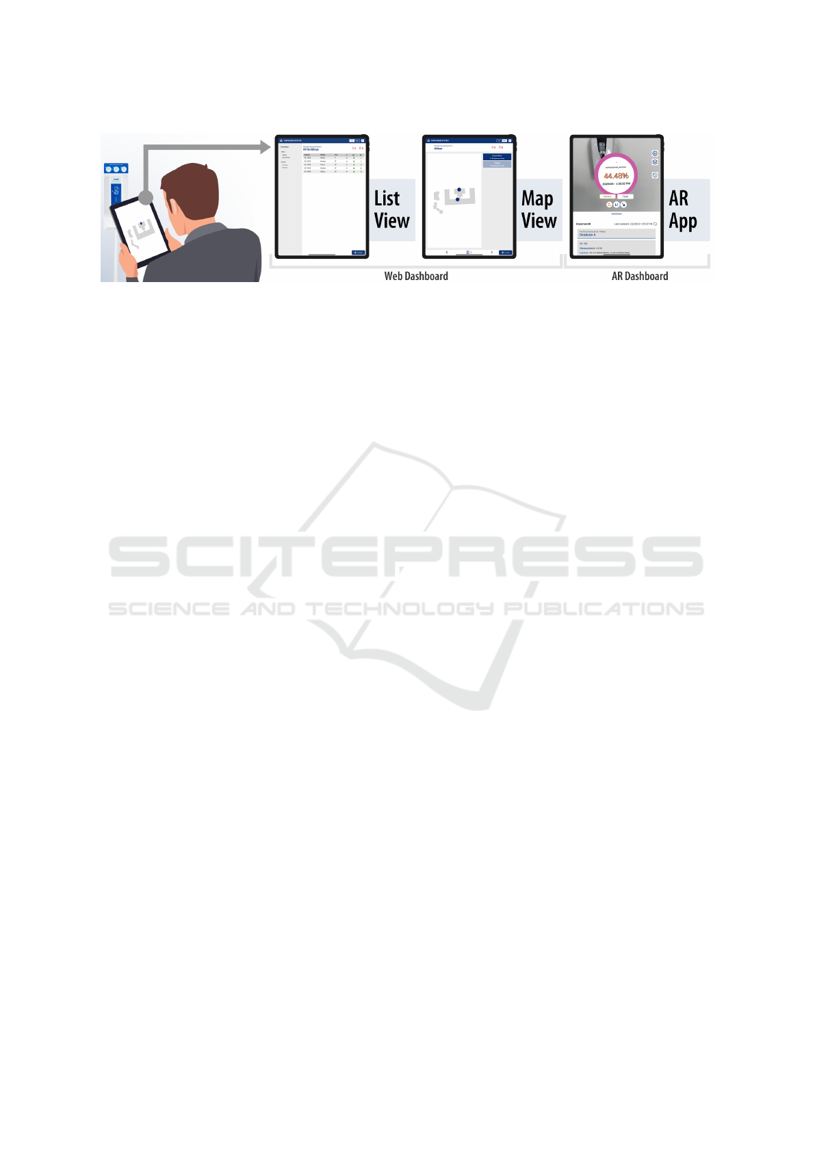
Figure 1: Visualization of location-based sensor data from disinfectant dispensers. A Web and an Augmented Reality (AR)
dashboard provide a way for facility managers to inspect, monitor, and localize dispensers. Data from liquid and battery levels
are displayed in a list view, map view, and in embedded visualizations using the AR app.
2 RELATED WORK
This work presents an IoT solution in which sensors
are added to a non-smart device in order to facilitate
data collection and monitoring by facility managers.
To achieve such a solution, we took advantage of two
main technical fields: the deployment of wireless sen-
sor networks and data visualization.
2.1 IoT Solutions
Previous works are proposed to leverage the use of
sensor technology to improve the efficiency of facil-
ity management. Udrea et al. (Udrea et al., 2021), for
instance, describe how IoT solutions have been used
to support facility management and propose a proof
of concept using passive infrared sensors and ambi-
ent light sensors to collect data about the use of space
in a building. Motivated by new pandemic restric-
tions, Seghezzi et al. (Seghezzi et al., 2021) also pro-
posed a system to collect data about the use of space
using cameras. More complex solutions (Kazado
et al., 2019; Moreno et al., 2022) deploy environ-
mental sensors to feed otherwise static building infor-
mation models (BIM). Such models represent a vir-
tual equivalent of the actual building in order to bet-
ter support data exchange, management, and commu-
nication. Such studies demonstrate how BIM-sensor
integration can lead to more responsive building man-
agement and operation. In our application, however,
we focus on a more simple solution with just one type
of sensor related to objects located inside the facility.
When it comes to the development of smart dis-
pensers, a few similar works are also proposed.
Loong et al. (Wen Loong et al., 2020) present a hand-
hygiene monitoring and reminder system designed
to improve hand hygiene compliance among health-
care workers. The system consists of a dispenser
equipped with low-energy Bluetooth technology and
a mobile application that provides location awareness
to track the proximity of healthcare workers to the dis-
penser. Abubeker and Baskar (Abubeker and Baskar,
2023) present an alcohol-based hand hygiene system
in hospitals, where communication is achieved using
a combination of Bluetooth and LoRaWAN technol-
ogy. A wearable Bluetooth Low Energy device used
by hospital personnel and patients then monitored and
tracked the hygiene activities in ICUs, elevators, pa-
tient rooms, and other hospital facilities. O’Brien et
al. (OBrien et al., 2021) researched the deployment of
hand sanitizer stations across a university campus. In
that study, the strategic deployment of hand sanitizer
stations across Clemson University was modeled to
help determine the optimal number of stations to be
placed while also minimizing the total cost. However,
in this case, no sensors were deployed to support the
maintenance of the devices. In our solution, we addi-
tionally provide dashboards to support visual analysis
of the collected data.
2.2 Location-Based Visualizations
For decision-makers, it is essential to rapidly extract
relevant information from the flood of data promoted
by IoT solutions (Keim et al., 2008). Visual analytics
is described as the science of analytical reasoning fa-
cilitated by interactive visual interfaces (Thomas and
Cook, 2006). It aids users to obtain insights that
directly support situation assessment, planning, and
decision-making. Understanding and monitoring the
context and situations related to the assessed data are
fundamental to the analytical process.
Situated visualizations further allow users to make
sense of data by displaying data representations in co-
ordination with the physical environment and mean-
ingful spatial referents. White and Feiner (White and
Feiner, 2009) showed how to leverage Augmented
Reality (AR) and spatial interaction to support in-situ
analytic tasks by registering multidimensional infor-
mation with the surrounding environment. Later on,
IVAPP 2025 - 16th International Conference on Information Visualization Theory and Applications
816
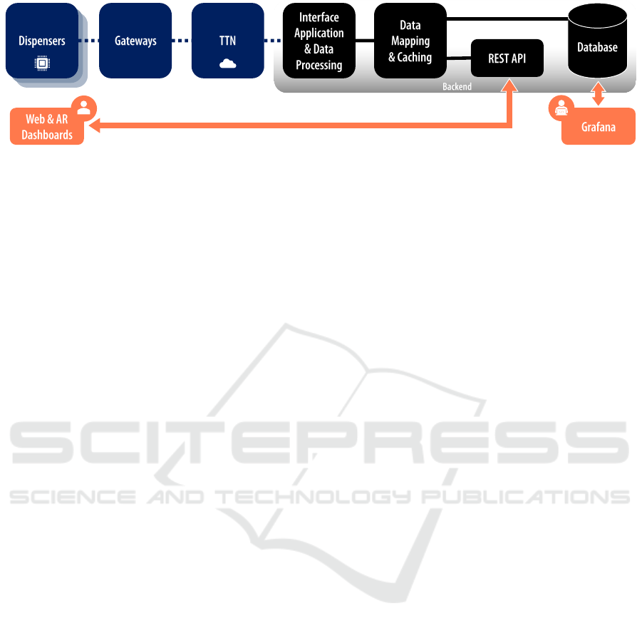
Figure 2: Simplified architectural representation of how the data is transmitted from the dispensers via LoRaWAN and the The
Things Network (TTN) server to the back end. In the back end, data is processed and made available to various applications.
In addition, a data mapping block is responsible for translating data structures between the services. On the front end, Grafana
is used by developers to see the data saved in the database, while end users can navigate data through the Web and AR
applications.
ElSayed et al. (ElSayed et al., 2015) proposed to use
AR to provide the user with contextual information in
real-time, and proposed Situated Analytics as an area
at the intersection of visual analytics and AR. Build-
ing upon their work, Willett et al. (Willett et al., 2017)
further introduced embedded data representations as
visual and physical representations of data that are not
only located near their physical referent but deeply
integrated with the physical spaces, objects, and enti-
ties which the data refers to. This paper uses Willett
et al.’s definition to differentiate between situated and
embedded data representations.
There have been numerous attempts to visualize
data generated by IoT. Dashboards are the most com-
monly utilized to monitor IoT deployments on desk-
top environments (Shrestha and Drozdenko, 2019).
For in situ visualization, both AR headsets (Jakl et al.,
2018) and handheld AR technology have been em-
ployed (Veas et al., 2013; Whitlock et al., 2019). The
most common visualization techniques used in such
applications are maps and billboards showing glyphs,
texts, and 2D representations such as line and bar
charts. In our study, we also implement both a con-
ventional dashboard and an AR app for in-situ data
analysis. However, we implement conventional 2D
representations for our dashboard and explore non-
conventional 2D and 3D representations in our AR
application.
3 SENSOR IMPLEMENTATION
The installed dispensers originally only had an LED
to indicate unit states, such as low battery or empty
fluid. To utilize the existing floating magnet in the liq-
uid container as a measure of liquid level, we mounted
an additional Hall effect sensor (which detects mag-
netic fields) on the exterior of the housing. A printed
circuit board (PCB) was tailored to the housing. A
split adapter was connected to the battery pack to
power the PCB and monitor the voltage. Since all
dispensers were indoors or near buildings, LoRaWAN
was chosen for connectivity. For collecting and trans-
mitting measurement data, an ESP32-based module
with an integrated LoRaWAN transceiver was used.
A simplified illustration of the backend architec-
ture is shown in Figure 2, outlining the communica-
tion path from the dispensers to the backend.
To enable low-power operation, we actively poll
the status of the sensors at regular intervals. Data
transmitted from the dispenser is received by the Lo-
RaWAN gateways, which then forward valid mes-
sages to The Things Network (TTN) server. The in-
terface application on the backend subscribes to the
specific backend application via the Message Queu-
ing Telemetry Transport (MQTT) protocol, receiv-
ing valid messages with additional metadata, such as
LoRaWAN-specific transmission parameters. These
messages are processed and inserted into the database
through a data mapping and caching layer.
The mapping and caching layer serve two pur-
poses: 1) adapting parameter names and values (e.g.,
converting from string format to value types like in-
tegers or floats) from the LoRaWAN messages and
formatting them appropriately for the database en-
gine protocol, and 2) caching the most recent data and
requests in memory, reducing the computational ex-
pense of database access.
The backend server offers a REST Application
Programming Interface (API) for requesting current
and historical dispenser statuses, as well as other
metadata like network and connectivity parameters.
This interface is directly utilized by the web applica-
tion (refer to Section 4.1), which is also hosted on the
backend servers. Grafana also permits data analysis
directly on the raw database content, while end users
can access the data via our proposed dashboards (as
shown in Figure 2).
Empowering Facility Managers: Multimodal Location-Based Visualization for Smart Sanitizer Dispensers Management
817
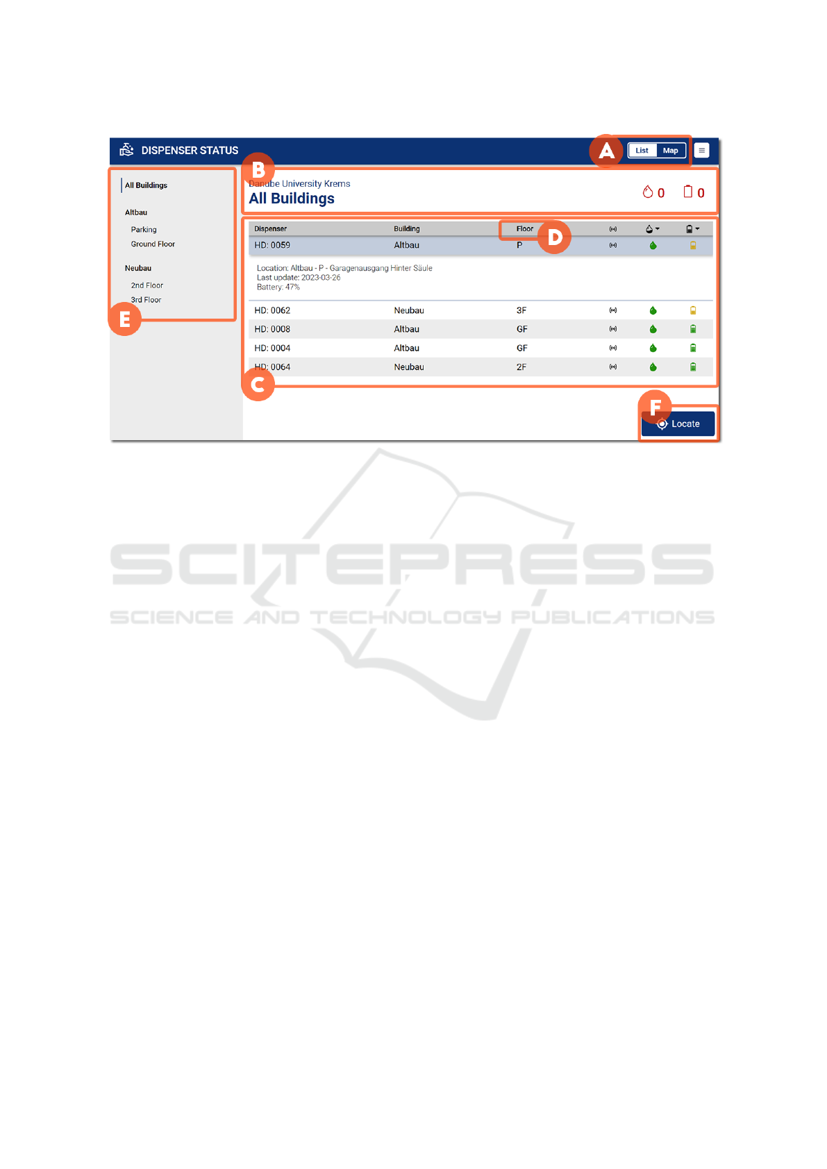
Figure 3: The Web dashboard’s List View includes a switch (A) to navigate between map and list, a heading (B) with informa-
tion about the current location and the devices on that location in need of maintenance. It also shows a tabular representation
of the devices (C), with their identification, location, and status. The tabular representation could be reordered through their
heading (D), and details from a device could be opened through a double click. The view also includes a navigation bar (E)
to select buildings and a location button (F) to select the building corresponding to the user’s current position.
4 VISUALIZATION
DASHBOARDS
Once the smart dispensers were implemented, we
worked on how to navigate the collected data, which
includes the status of the device (battery and liquid
levels), the status of the sensor (time of measurement
and connection status), the location of the device (co-
ordinates, building, and floor), and its identifier.
We first performed a structured interview with fa-
cility management employees to address their needs.
We interviewed two employees of the Danube Uni-
versity Krems, Austria, who are responsible for facil-
ity management. The interviewed employees reported
that issues with the dispensers are mostly done by
chance. One of them explained that “every dispenser
has a visible ID, and people can report by phone or
e-mail that a dispenser has a fault. In the best case,
these people state the ID of the dispenser. Otherwise,
we have to ask where the dispenser is located”. He
continues by saying, “the dispenser also emits light
signals that indicate a possible malfunction. Some-
times people from our department see this, then we
can prevent a malfunction ahead of time”.
To avoid those malfunctioning units going unno-
ticed, we designed different views to provide alterna-
tive data representations to convey:
• R1. Overview of dispenser status (e.g., through
color-coded glyphs), showing which devices need
immediate attention based on their status.
• R2. Details on demand about each unit (e.g., as
additional pop-ups to avoid context switch).
• R3. Location of devices in the building (e.g., on
a list, on a map, and in first-person by embedding
the information on the scene with AR).
• R4. Location of devices around the user’s current
location (e.g., situated through GPS).
The different views focus on various aspects of
the data and include non-situated visualizations (Web
Dashboard) and a situated solution (AR app). The
Web dashboard offers a List View (Figure 3) to fo-
cus on information about the devices and a Map View
(Figure 4) with a focus on their location. The AR app
(Figure 5) provides a situated view in which the data
representation is embedded into the scene and ren-
dered close to the actual dispensers.
4.1 Location-Based Web Dashboard
The web application that serves as a dashboard for
monitoring the dispenser status was written in Re-
act (Platforms, 2023) and D3.js (Bostock, 2023). The
application is mainly divided into two views. The first
view, which the user sees immediately when the page
IVAPP 2025 - 16th International Conference on Information Visualization Theory and Applications
818
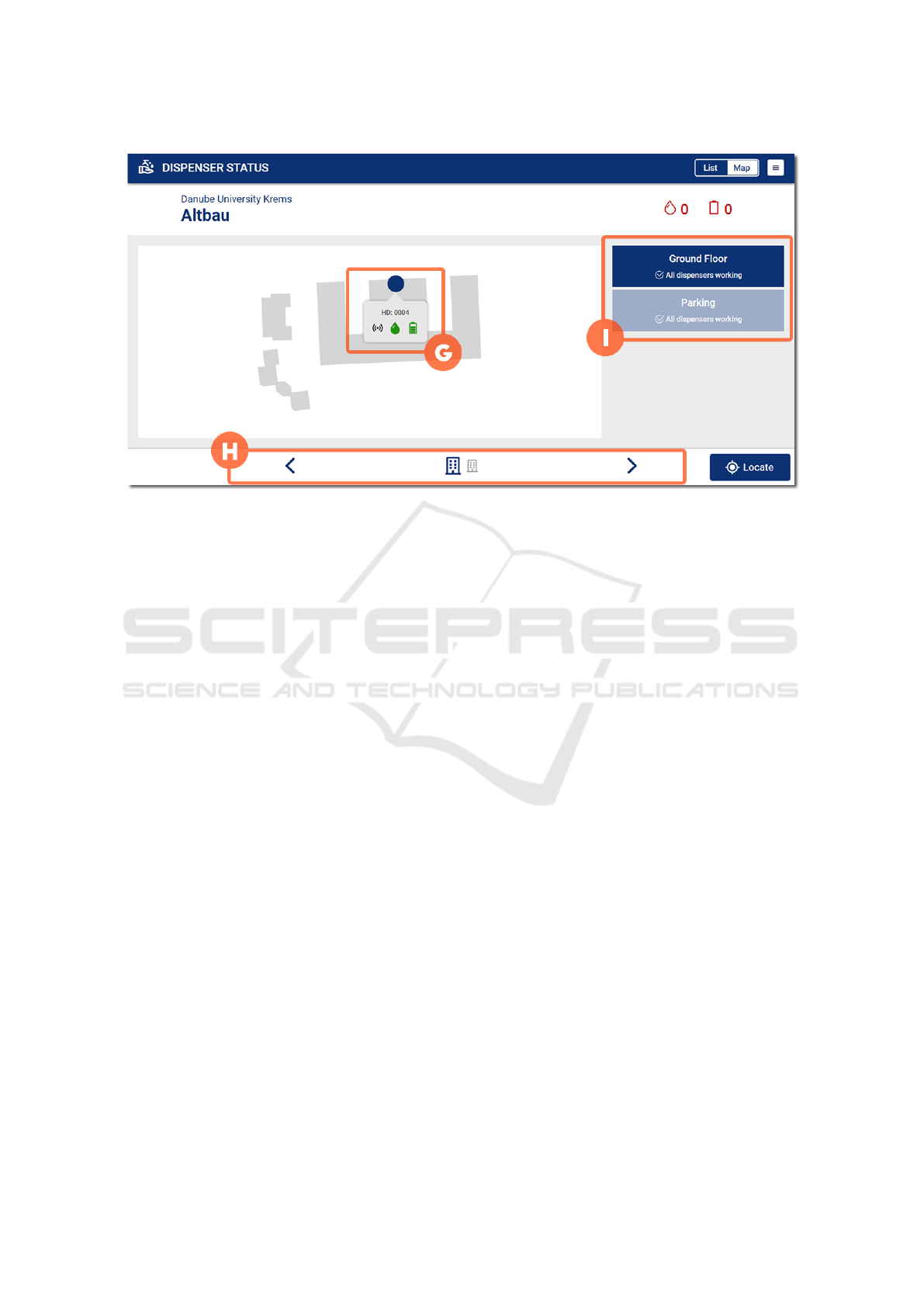
Figure 4: The Map View includes many of the same elements as the list view. However, the focus here is on the location
of the devices, which are represented by dots over the outline of the building they are located (G). Hovering over them
reveals a tooltip with detailed information. The navigation is now moved to the bottom (H) and includes the selection of the
corresponding floor level (I).
is opened, is the List View for an overview of the sen-
sor status (R1) and the second is the Map View. In
both views, there is the possibility to hover a data
point to see more detailed information, such as for
the battery the exact percentage of charge (R2). The
buildings where the sensors are deployed are listed
in both views with their respective floors and the dis-
pensers located there (R3). Finally, both views can
be updated depending on the user’s position with the
“Locate” button (R4).
4.2 Situated Augmented Reality App
Although the Web dashboard could provide informa-
tion about the devices and their location, situated vi-
sualization could provide an alternative for data moni-
toring and analysis by displaying embedded data rep-
resentations where the sensor-based devices are de-
ployed. Therefore, we created another view through
an AR app. Unity Engine (Unity Technologies, 2023)
was used to create a situated AR application for mo-
bile devices. With such an app, users can view data
collected in their surroundings, currently visualized
in the form of dots, bubbles, or bars. The appli-
cation is written in C# and AR functionality is pro-
vided by Unity’s AR Foundation and Mapbox’ Maps
SDK (Mapbox, 2023).
With the AR app (see Figure 5), data points are
placed in the scene based on their latitude and lon-
gitude (R1,R3,R4). Controls are always visible on
the camera portion to interact with the data, to further
calibrate the AR scene, or to load other projects. To
select different data attributes and visualization types,
a user interface is provided below the camera portion.
A collapsible information card at the bottom displays
details about a data point once the user taps on the
point or swipes up the card (R2). This data can also
be made temporarily visible by hovering over a data
point with a small reticle on the screen.
4.2.1 Visualization Alternatives
Data representations are created from scratch instead
of using a library or framework. Each one of the avail-
able visualizations can be configured beforehand to a
certain degree through the backend. One or more of
the available data representations can be enabled for
a given data attribute. Therefore, different attributes
may have different visualizations. For the tested use
case, three visualizations were available:
• Dots. Each data point is represented by a flat cir-
cle facing the camera. The value of the selected
attribute (or measurement) is displayed, includ-
ing its identifier and timestamp. The circle is dis-
played at the eye level. A border is color-coded
to represent the circle state, whether it is currently
selected. When a data point is selected, the card
portion of the app displays information about that
point. That visualization works as an immersive
scatter plot, in which points are rendered at their
corresponding geographical position.
Empowering Facility Managers: Multimodal Location-Based Visualization for Smart Sanitizer Dispensers Management
819
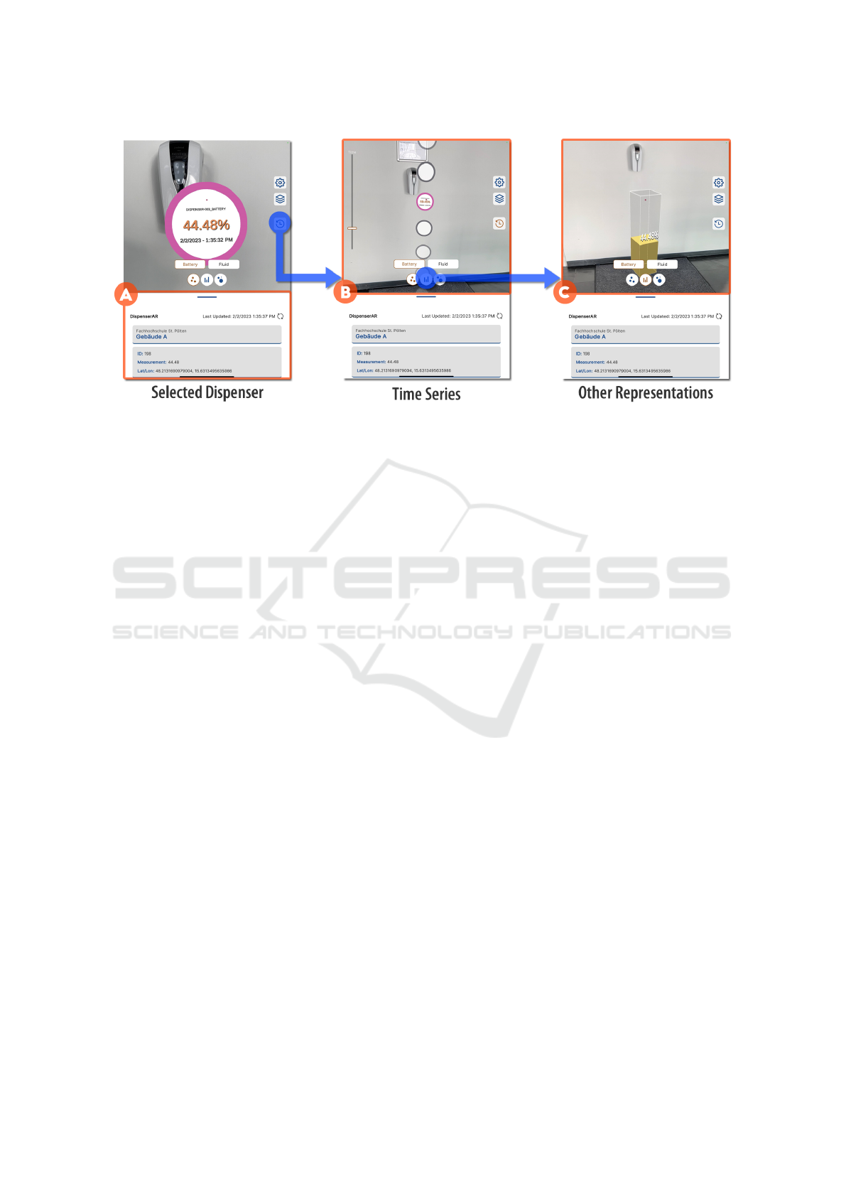
Figure 5: The AR app provides embedded visualizations in which data representations are rendered near its data source. In
the camera portion of the screen, the user can find controls for the app and data. Further information about the data point
as well as metadata is placed on the card portion of the screen (A). The card can be collapsed to provide more space for
the camera. Once a data point is selected through gaze or by directly tapping on it, the card is automatically expanded to
display information about the corresponding data point. History can also be toggled to display time series (B). The data
can be explored by swiping along the y-axis, which encodes time. Multivariate data representations are not available. Data
representations for each attribute include dots, bubbles, and bars (C).
• Bubbles. Each data point is also represented by
a flat circle facing the camera. Differently from
the dot visualization, the size of the bubble also
encodes the value of the measurement. The bigger
the value, the bigger the size of the circle, which is
parametrized according to the range of the current
selected data points.
• Bars. Each data point is represented by a rectan-
gular column. Columns are then displayed from
the floor up to eye level.
Additionally, a time series visualization is in-
cluded based on the Space-Time-Cube proposed by
H
¨
agerstrand (Fisher et al., 2005) in which time repre-
sents the third dimension vertically.
5 USER STUDY AND RESULTS
Once again, we interviewed the same employees of
the Danube University Krems who are responsible for
facility management. E1 is employed at the Facility
Management with E2, the latter is also responsible for
Occupational health and safety at the Campus. The
session was planned as a semi-structured interview,
in which a few tasks were planned, but with space for
new questions to be made.
We conducted the interview at their office, begin-
ning by opening the List View of the Web dashboard
on their computer and asking E1 to locate the sta-
tus of the dispensers and identify any devices requir-
ing maintenance. Following this initial question, E1
emphasized that crucial information for them should
include the device’s location, encompassing device
identification, building name, and room number. Re-
garding identifying devices in need of maintenance,
they suggested that integrating our application into
their ticket system would be more effective. Based on
this feedback, we delved deeper into E1’s workflow.
Our findings are summarized in Figure 6.
We identified five main steps followed by them:
1. Identify Problem. An issue can be casually dis-
covered by a facility manager or other employees.
2. Register Ticket. When an issue is identified, the
person needs to email the Facility Management
department to automatically generate an entry in
their ticket system.
3. Assign to Responsible. When a ticket arrives, it
goes to the top of their backlog, to be categorized.
Categorization implies defining the type of the re-
ported issue as well as who is the person respon-
sible for dealing with it.
4. Resolve Problem. Once a responsible person is
assigned to a ticket, the person tries to understand
the problem and follow the appropriate measures
to solve it.
5. Document and Report. Before, during, and after
solving an issue, the relevant data about the pro-
cedure is documented directly in the ticket sys-
tem. That documentation supports reporting to
IVAPP 2025 - 16th International Conference on Information Visualization Theory and Applications
820
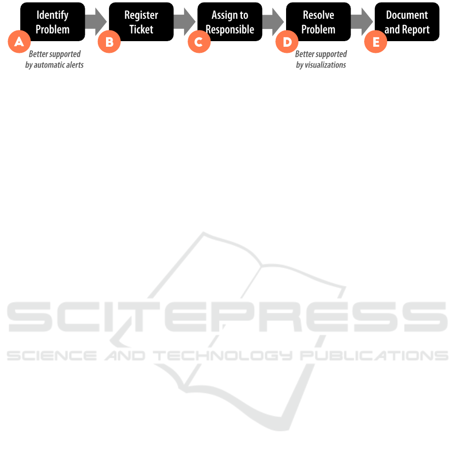
Figure 6: Facility management workflow derived from interviews. After identifying a problem (A), a ticket is created manually
or by email (B). Such tickets represent a new entry on the backlog, which is classified and assigned to a responsible person (C).
This person will then understand and resolve the problem (D). Finally, the process and results are documented and reported
(E). Results show that although the visualization dashboards were created to support identifying problems (A), they were
actually mentioned to better support understanding and locating the problem (D).
other interested stakeholders. In addition, before,
during, and after solving an issue, other depart-
ments are communicated about the issue, such as
other facility management sectors, the Campus
spokesperson, fire workers, etc.
Not being able to identify an issue in time can be
costly. E1 and E2 reported that an undetected wa-
ter leakage during the weekend caused serious flood
damage, which was expensive to fix. They also report
that an undetected malfunction on a fridge can make
them lose vaccines. Although the maintenance of
the disinfectant dispensers does not impose the same
urgency, IoT solutions can prevent issues from go-
ing unnoticed. However, E1 said a dashboard is not
the best way to achieve that. He reported that being
warned automatically by the device is more important
than the visualization of the device’s status. For that
step in their workflow, the sensor-based device could
trigger an SMS, a mobile notification, or a ticket entry
reporting any issue as soon as they occur. In addition,
it could provide a summary every morning about the
status of all sensors. It could also include information
about not working or offline sensors.
E2 mentioned that, even with an automatic con-
nection between devices and their ticket system, the
dashboard, with the information of all sensors, would
make sense as a next step after receiving a notification
about a malfunctioning device. A person could then
monitor the status of the sensors with the dashboard
and check where to find them. E2 then mentioned that
the dashboard becomes particularly important when
the number of sensors is big. ”Depend on how many
sensors are in a room”.
Concerning the Map View, E1 noted that as long
as the textual description is available on the list, the
map is only a nice feature that is not needed. In our
Web dashboard, the room number was missing, which
was relevant to finding the device. That information
would make the List View enough to navigate the list
of devices and find the reported issue. Regarding the
color coding and the semaphore metaphor (i.e., col-
ored points according to their detected status), they
argued that it would not make sense for more urgent
issues that need to be dealt with as soon as possible.
Lastly, they tested the AR View. We exited their
office and approached one of the dispensers. Using
a tablet, we launched the AR app and aimed it at a
QR code linked to the dispenser, promptly display-
ing data about its battery and liquid status. The QR
code also facilitates calibrating coordinates, enhanc-
ing AR registration indoors. Upon seeing the dis-
penser data, E1 exclaimed it was ”genius” and very
cool. Being a visual person, he recognized the ben-
efit of visualizing data directly over the device. He
expressed a desire for the AR view to be seamlessly
integrated with the Web views. E2 agreed that us-
ing the AR view to inspect devices on-site would be
practical. We acknowledged that while the visualiza-
tion options we presented might not be as useful as
automatic warnings for identifying new issues (Fig-
ure 6.A), our interviewees found the visualizations
valuable during problem resolution (Figure 6.D), en-
abling them to search for additional device informa-
tion and accurately locate them.
6 CONCLUSION
Overall, data visualization provides facility managers
with a powerful tool for understanding the perfor-
mance of devices and equipment in real time. By
using these techniques, managers should be able
to quickly locate malfunctioning devices, prioritize
maintenance and repairs, and optimize the perfor-
mance of the facility. However, by interviewing facil-
ity management workers, new needs were identified.
When it comes to locating malfunctioning devices,
this task is mostly distributed in a way that anyone
can actually report a problem. Only when a problem
is identified, and registered, then analytical tools help
solve the problem.
A list view was reported to be already used to get
information about devices and their location and pre-
ferred over a map view. On the other hand, there was
explicit excitement from the users towards the AR so-
lution, which also displays data points near their phys-
Empowering Facility Managers: Multimodal Location-Based Visualization for Smart Sanitizer Dispensers Management
821

ical location, this time from an egocentric frame of
reference. Reasons for the acceptance of the AR so-
lution over the map representation could include the
novelty of the technology or the fact that the AR app
reveals on-demand data measured by a device right
in front of the user. The potential it created when di-
rectly inspecting the data source can play a factor in
the received feedback.
This study addresses one use case, in which a de-
vice was adapted to attend to the needs of workers
from a specific location. Cultural factors related to
the context of use and internal protocols should be
considered. Yet, the description of their processes
should support creating visualizations that are better
integrated into the workflow of facility management
workers. The next steps include the assessment of the
AR app, which is available as an open-source plat-
form for situated visualization of sensor data ( St.
P
¨
olten University of Applied Sciences, 2024).
ACKNOWLEDGEMENTS
This paper is the result of the research project
DATASKOP funded by Amt der N
¨
O Lan-
desregierung, FTI program.
REFERENCES
St. P
¨
olten University of Applied Sciences (2024). Dataskop.
Accessed: 2024-12-20.
Abubeker, K. M. and Baskar, S. (2023). A Hand Hy-
giene Tracking System with LoRaWAN Network for
the Abolition of Hospital-Acquired Infections. IEEE
Sensors Journal, pages 1–1.
Bostock, M. (2023). D3.js. Accessed: 2023-03-22.
Chung, S., Cho, C.-S., Song, J., Lee, K., Lee, S., and Kwon,
S. (2021). Smart facility management system based on
open BIM and augmented reality technology. Applied
Sciences, 11(21):10283.
ElSayed, N. A., Thomas, B. H., Smith, R. T., Marriott, K.,
and Piantadosi, J. (2015). Using augmented reality
to support situated analytics. In 2015 IEEE Virtual
Reality (VR), pages 175–176. IEEE.
Fisher, P. F., Kraak, M.-J., and Koussoulakou, A. (2005). A
visualization environment for the space-time-cube. In
Developments in Spatial Data Handling: 11 th Inter-
national Symposium on Spatial Data Handling, pages
189–200. Springer.
Golparvar-Fard, M., Tang, P., Cho, Y. K., and Siddiqui,
M. K. (2013). Grand challenges in data and infor-
mation visualization for the architecture, engineering,
construction, and facility management industries. In
Computing in Civil Engineering (2013), pages 849–
856.
Jakl, A., Sch
¨
offer, L., Husinsky, M., and Wagner, M.
(2018). Augmented reality for industry 4.0: Archi-
tecture and user experience. In FMT, pages 38–42.
Kazado, D., Kavgic, M., and Eskicioglu, R. (2019). In-
tegrating building information modeling (BIM) and
sensor technology for facility management. Journal
of Information Technology in Construction (ITcon),
24(23):440–458.
Keim, D. A., Mansmann, F., Schneidewind, J., Thomas,
J., and Ziegler, H. (2008). Visual analytics: Scope
and challenges. In Visual data mining, pages 76–90.
Springer.
Mapbox (2023). Mapbox Maps SDK. Accessed: 2023-03-
22.
Moreno, J. V., Machete, R., Falc
˜
ao, A. P., Gonc¸alves, A. B.,
and Bento, R. (2022). Dynamic data feeding into bim
for facility management: A prototype application to a
university building. Buildings, 12(5):645.
OBrien, T., Foster, S., Tucker, E. L., and Hegde, S. (2021).
COVID Response: A Blended Approach to Studying
Sanitizer Station Deployment at a Large Public Uni-
versity. In 2021 Resilience Week (RWS), pages 1–7.
Platforms, M. (2023). React. Accessed: 2023-03-22.
Seghezzi, E., Locatelli, M., Pellegrini, L., Pattini, G.,
Di Giuda, G. M., Tagliabue, L. C., and Boella, G.
(2021). Towards an occupancy-oriented digital twin
for facility management: Test campaign and sensors
assessment. Applied Sciences, 11(7):3108.
Shrestha, S. and Drozdenko, B. (2019). Smart rural frame-
work using IoT devices and cloud computing. In 2019
IEEE Green Technologies Conference (GreenTech),
pages 1–4. IEEE.
Thomas, J. J. and Cook, K. A. (2006). A visual analytics
agenda. IEEE computer graphics and applications,
26(1):10–13.
Udrea, I., Kraus, V. F., and Popescu-Cuta, A. (2021). Im-
proving workplace services using a facility manage-
ment platform sensors monitoring. Journal of Human
Resources Management Research, Volume 2021:15.
Unity Technologies (2023). Unity Engine. Accessed: 2023-
03-22.
Veas, E., Grasset, R., Ferencik, I., Gr
¨
unewald, T., and
Schmalstieg, D. (2013). Mobile augmented reality for
environmental monitoring. Personal and ubiquitous
computing, 17:1515–1531.
Wen Loong, J., Leong Chan, C., Venkatarayalu, N., and
Lee, J. S. (2020). A Smart Location-Aware Hand
Sanitizer Dispenser System. In 2020 IEEE Region 10
Conference (TENCON), pages 642–646.
White, S. and Feiner, S. (2009). SiteLens: situated visual-
ization techniques for urban site visits. In Proceedings
of the 27th international conference on Human factors
in computing systems - CHI 09, page 1117, Boston,
MA, USA. ACM Press.
Whitlock, M., Wu, K., and Szafir, D. A. (2019). Design-
ing for mobile and immersive visual analytics in the
field. IEEE transactions on visualization and com-
puter graphics, 26(1):503–513.
Willett, W., Jansen, Y., and Dragicevic, P. (2017). Embed-
ded Data Representations. IEEE Transactions on Vi-
sualization and Computer Graphics, 23(1):461–470.
Conference Name: IEEE Transactions on Visualiza-
tion and Computer Graphics.
IVAPP 2025 - 16th International Conference on Information Visualization Theory and Applications
822
