
Reflections on the Uses and Available Choices of Categorical
Colorschemes
Sara Di Bartolomeo
1 a
, Raphael Buchm
¨
uller
2 b
, Alexander Frings
2 c
,
Johannes Fuchs
2 d
and Daniel Keim
2 e
,
1
TU Wien, Vienna, Austria
2
Universit
¨
at Konstanz, Konstanz, Germany
Keywords:
Colorschemes.
Abstract:
Categorical colorschemes must respect a number of criteria — mainly, they need to incorporate a number of
easily distinguishable colors, and they need to avoid giving to the reader the impression that the colors in the
visualization have particular relationships. Crafting these palettes requires careful attention to the distribution
of colors; thus, for a long time, visualization designers have been relying on a limited choice of readily
available palettes. Although such palettes have been proven practical and functional, our own experience with
designing visualizations had us struggle repeatedly with the limited choice, the feeling of repetitiveness in
seeing the same colors in visualization papers, and a number of other limitations that we discuss in the paper.
In this document, we discuss some properties of the most common categorical colorschemes, and propose a
method to generate new palettes that are comparable in properties to the existing ones.
1 INTRODUCTION
Colorschemes can be classified in a few categories:
the main ones are continuous (either diverging, cycli-
cal, sequential) and categorical. The choice on which
type to use is entirely based on the type of data that
one has to deal with, and the tasks and objectives of
the resulting visualization, but in this paper we are go-
ing to take a particularly close look at the categorical
type of colorscheme.
A categorical colorscheme is used in data visual-
ization to represent discrete categories of data. Un-
like continuous colorschemes, which display a gradi-
ent of colors to represent a range of values, categorical
colorschemes use distinctly different colors to differ-
entiate between discrete groups or categories. This
makes them particularly useful for visualizing nomi-
nal or categorical data, where each category is unre-
lated to the others and does not imply a specific order.
Categorical colorschemes must have the following
characteristics:
• Each color in a categorical scheme is chosen to
stand out from the others to make each category
a
https://orcid.org/0000-0001-9517-3526
b
https://orcid.org/0000-0002-0612-8828
c
https://orcid.org/0009-0009-1718-2967
d
https://orcid.org/0000-0001-5474-4214
e
https://orcid.org/0000-0001-7966-9740
distinguishable at a glance.
• The colors do not imply any numerical or ordi-
nal relationship between the categories they rep-
resent. For example, using red, blue, and green to
represent different species of animals implies no
inherent order or classification among them.
• They aim for balance in color perception,
avoiding bright or dull colors unless visualization
has a specific requirement to emphasize certain
categories.
One of the most popular options for finding cate-
gorical palettes is colorbrewer (Harrower and Brewer,
2003). At the time of writing, the 2003 paper that
accompanies the widely used website has 1508 cita-
tions, and the count excludes all the papers and vi-
sualization designs that use it without citing it. Col-
orbrewer is often widely recommended because the
palettes it offers are claimed to be perceptually bal-
anced and robust to various conditions such as color-
blindness, viewing in grayscale, and printing. Color-
brewer palettes are included in other software pack-
ages, such as Chroma.js (Aisch, nd), or visualization
packages such as Seaborn (Waskom, 2021).
Another popular choice among visualization
designers is to explore the selection of color palettes
included as part of d3 (Bostock et al., 2011) (table 1)
— indeed, as d3 is the library of choice for many
visualization designers, picking directly from the
library’s offerings is speedy and comfortable. D3 of-
Di Bartolomeo, S., Buchmüller, R., Frings, A., Fuchs, J. and Keim, D.
Reflections on the Uses and Available Choices of Categorical Colorschemes.
DOI: 10.5220/0013109400003912
Paper published under CC license (CC BY-NC-ND 4.0)
In Proceedings of the 20th International Joint Conference on Computer Vision, Imaging and Computer Graphics Theory and Applications (VISIGRAPP 2025) - Volume 1: GRAPP, HUCAPP
and IVAPP, pages 843-850
ISBN: 978-989-758-728-3; ISSN: 2184-4321
Proceedings Copyright © 2025 by SCITEPRESS – Science and Technology Publications, Lda.
843

fers 10 palettes — however, it should be noted that 8
of these palettes are taken directly from colorbrewer.
The remaining two are tableau10 and category10,
both palettes coming from tableau software and
designed by their own designers, as explained in their
blog post (Stone, 2016) detailing how the palettes
were created. Very recently, a new one, observable10,
was included to replace tableau10 as a default in
observable (Pettiross, 2014).
Harrower and Brewer, in their paper on color-
brewer (Harrower and Brewer, 2003), describe the
design process of the colorschemes they offer as such:
The sets of color schemes in ColorBrewer
were designed using both experience and trial
and error.
From this paper, we draw the conclusion that the
palettes were the product of a design process based on
experience and intuition, and not an algorithmically
precise distribution of the colors uniformly in a col-
orspace. This might be considered a possible source
of errors, accompanied with the fact that, in the same
paper, the colorschemes were not tested with a user
study. Additionally, the authors designed the tool
with geographical maps in mind — as proven by the
fact that the paper is published in a geography journal
and that the only sample visualization presented is
a map. This can lead to overlooking the specific
properties and needs of other types of visualizations.
Moreover, the shorter palettes introduced in the tool
are just a sliced version of the longer ones.
Countless visualization papers have validated
most of the potential issues by using these palettes and
testing their readability and overall practicality. Nev-
ertheless, one persistent problem remains: the limited
range of choices. The same palettes are repeatedly
used in visualization research, causing a repetitive-
ness in vis papers that abuse the same colorschemes.
Any creative attempts to develop new colorschemes
must be (rightfully) justified. The choice is even more
limited when we consider that not even all the palettes
proposed are designed for uniform colorschemes (see,
for instance, Accent in Table 1). This limitation can
hinder the creative process, and we ourselves have
struggled over and over in finding appropriate cate-
gorical palettes.
We want to argue for openness to a more creative
process in the ability to select colorschemes, and more
freedom in picking colors. Indeed, if the initial de-
sign of the colorbrewer palettes was obtained through
trial and error, then it is in the realm of possibilities
that we do the same with newly formulated palettes.
The same free, intuitive design process was used for
the Tableau colorschemes. The research around pro-
grammatically formulating colorschemes is ample —
as we discuss in Section 2. However, in our experi-
ence, none of these produces satisfying results out of
the box, and there always seem to be something miss-
ing — a creative eye, disconnected from entirely log-
ical formulations. Perhaps, the need for human input
is proven by the fact that all the palettes offered as de-
faults in d3 are the results of an intuitive design sense
rather than exclusively programmatically generated.
In this paper, we discuss some properties of these
default palettes, then go on to propose methods to
formulate new ones (in part, programmatically) or
validate new proposals. We validate the charac-
teristics of the palettes in part through computing
distances between colors in the CIELAB colorspace
— to ensure that the colors are easily distinguishable
— and in part through testing the colorschemes on
actual visualizations.
2 RELATED WORK
A lot of diverse research has been conducted about
color. Experiments have shown the importance of
considering the size and shape of colored marks
for an accurate perception of the data (Stone, 2012;
Szafir, 2018). Also, the layout and the number
of marks influence how well colors can be per-
ceived (Gramazio et al., 2017). This is especially true
if the stimuli are adjacent. Techniques to compensate
for contrast effects have been introduced (Mittelst
¨
adt
et al., 2014) to mitigate negative effects on perceiving
neighboring marks.
However, the literature does not focus only on the
perception of data values with color. Color naming
models were introduced to improve the interaction of
analysts with colors (Heer and Stone, 2012). Also,
studies have investigated the affect being communi-
cated with colors (Bartram et al., 2017). Independent
of the research agenda, it is known that the cultural
background (Kim et al., 2019) and the age (Lee et al.,
2009) both have an influence on color perception. In
our paper, we are not considering the semantics of
colors like names or any other confounding factors
like age or cultural background.
Based on this aforementioned research, several
tools have been proposed to support designers and
practitioners in selecting appropriate color ramps to
create effective and accessible visual representations:
The ColorCat tool, developed by Mittelst
¨
adt et al.
(Mittelst
¨
adt et al., 2015), guides users in the design
of colormaps suitable for combined analysis tasks by
suggesting colorschemes that accommodate both cat-
egorical and continuous data. The Color Thief tool by
Dhakar (Dhakar, nd) extracts dominant colors from
IVAPP 2025 - 16th International Conference on Information Visualization Theory and Applications
844
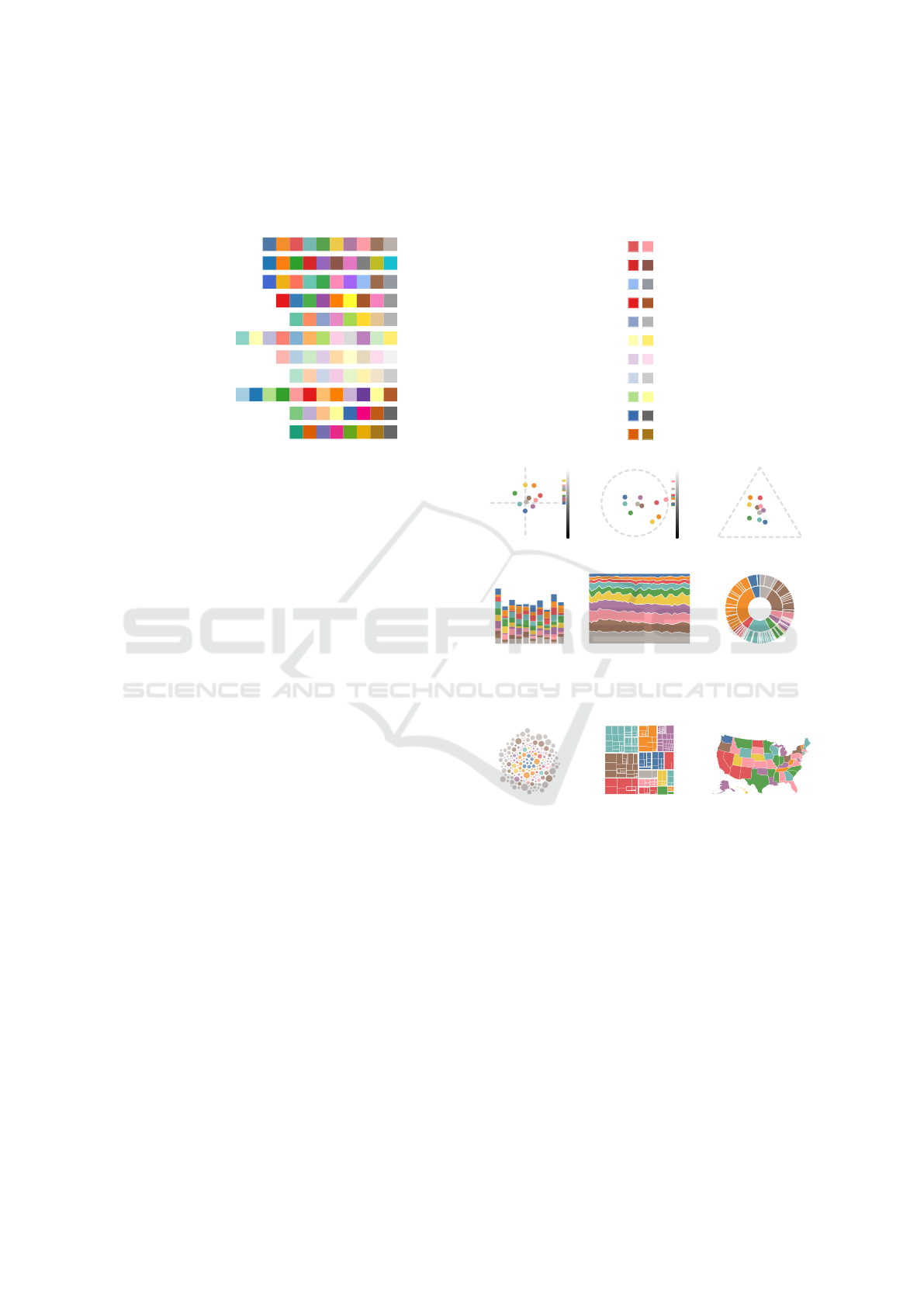
Table 1: Palettes included as defaults in d3. The ”Total” and ”Mean” are distances computed on all the pairwise colors.
We report on the mean because, as different palettes have a different number of entries, the total sum of distances can’t be
compared. The last column, ”Min”, reports the colors with the minimum distance. Some of the palettes, such as Pastel1 and
Pastel2, include colors that are very close together, and would be difficult to distinguish in a visualization.
Name Total Mean Min
Tableau10 298.2 29.8 18.1
Category10 380.1 38 16.2
Observable10 362.5 36.2 18
Set1 389.5 43.2 15.4
Set2 238.4 29.8 16.8
Set3 384.7 32 9.5
Pastel1 180.3 20 6.8
Pastel2 147 18.4 8.7
Paired 461.4 38.4 13.8
Accent 269.1 33.6 21.6
Dark2 281.3 35.2 17.4
images, allowing users to generate color palettes that
are directly inspired by specific visual content. Viz
Palette, crafted by Lu and Meeks (Lu and Meeks,
2022), assists users in evaluating the usability and aes-
thetic appeal of color maps in the context of data vi-
sualization. Chroma.js, introduced by Aisch (Aisch,
nd), provides a comprehensive utility for dynamic
color scale generation and manipulation, supporting
a variety of color spaces. Adobe Color (Adobe, nd)
offers an interactive platform for creating and sharing
colorschemes, emphasizing harmonious color combi-
nations based on standard color theory. The Check for
Colorblindness tool by Dougherty (Dougherty, 2002)
evaluates color palettes for accessibility and ensures
visualizations are perceivable by viewers with color
vision deficiencies.
While surprisingly little research is dedicated to
the aesthetics of color palettes within the visualization
domain, Shimizu et al. (Shimizu and Meyer, 2010) in-
troduced the ColorStylingTool, which systematically
addresses the aesthetic appearances of colors within
the design, helping users create appealing and func-
tional colorschemes. Concurrently, Kita and Myata
developed a model that ensures the functionality of
color usage while emphasizing aesthetic harmony in
visual analytics (Kita and Miyata, 2016). Building on
these concepts, the study ”Color Aesthetic Enhance-
ment for Categorical Data Visualization” (Lim et al.,
2021) proposes methods for visual appeal for cate-
gorical data representations, focusing on aesthetic en-
hancements that do not compromise data legibility.
Our findings can be combined with such tools to cre-
ate a satisfying categorical colorscheme.
In this paper, we restrict ourselves to one-
dimensional color ramps. For more information
about two-dimensional color maps, we point the
interested reader to a survey from Bernard et.
CIELAB space HSL space RGB triangle
The above visualizations — a stacked barchart, a stacked
area chart and a sunburst diagram — all have colors ad-
jacent in a sequential manner. It is therefore important to
pay attention to the sequence of colors.
These visualizations, instead – a bubble chart, a treemap
and a geographical map— all have colors adjacent on
multiple sides. It is therefore important to pay attention to
the adjacency of colors and all the pairwise distances
between entries in the colorscheme.
Figure 1: Tableau10 represented on different colorspaces,
and applied to visualizations with different requirements.
al (Bernard et al., 2015).
3 EXPLORING THE CURRENTLY
AVAILABLE COLOR
PALETTES
First of all, we take a look at how the colors are
represented in different colorspaces to explore the
Reflections on the Uses and Available Choices of Categorical Colorschemes
845

distribution of the selected colors. We selected three
colorspaces based on those discussed in previous
literature: CIELAB, HSL and RGB. In Figure 1,
we can see an example of how these three spaces
look on tableau10. While RGB and HSL are
pretty straightforward methods that most people in
visualization know about, CIELAB (Zeileis et al.,
2009) is a little more interesting. It is designed to
be perceptually uniform, meaning that a change of
the same amount in a color value should produce a
change of about the same visual importance, which
makes it widely used in various industries where
color differentiation is critical. The color space in-
cludes three axes: L* for lightness, and a* and b* for
the color dimensions, where a* represents green to
red and b* represents blue to yellow. While all these
spaces (RGB, HSL and CIELAB) are 3-dimensional,
we chose to represent them projected on a plane,
with the third dimension (luminosity) represented on
an axis at the side of the representation, inspired by
(Stone, 2016) and (Pettiross, 2014).
As a measure of the distance between two col-
ors, then, we use the CIEDE2000 difference, which
quantifies the perceived differences between two col-
ors under standard viewing conditions. It improves
upon earlier models by better accounting for varia-
tions in hue, chroma, and lightness, making it more
accurate in aligning with human visual perception. A
difference between colors of 1 or 2 is just barely dis-
tinguishable, and certainly not viable to distinguish
different categories in a visualization. According to
Green-Armytage (Green-Armytage, 2006), the min-
imal pairwise distance for colors to be easily distin-
guishable is 6.86. However, we can err on the safe
side and aim for a minimum larger distance. We can
get an idea of how small distances look from table 1.
In order to then actually see the effect that these
palettes have when in use, we applied them to sample
visualizations, taken from the library of d3 examples
(D3 Gallery, nd). We recognize that the use and effect
of different palettes depends a lot on the marks used,
and their relative positioning in space: while charts
such as scatterplots and bubble charts do not have
adjacent marks and only use separate areas of color,
other charts should take into account the sequentiality
of colors in the palette (this is what happens, for in-
stance, in stacked barcharts/area charts — Figure 1).
4 FINDINGS AND
RECOMMENDATIONS
Maximizing Distance Between Colors is not Nec-
essarily the Goal: The tableau default color palette
Total distance: 380.1, Mean: 38
Figure 2: The predecessor palette to tableau10, called in
d3 category10. The figure above contains an illustration
of the palette in CIELAB space, with the luminosity shown
on a bar to the right of the visualization, then an illustration
of all the colors used in it, and three examples of usage in
visualizations where the adjacency of colored regions plays
with the colors in different ways.
went through a redesign in 2016, and the differences
in their new default set of colors are detailed in a blog-
post on their website (Stone, 2016). The old palette is
depicted in Figure 2, while the new palette can be seen
in Figure 1.
The old palette remains in the set of palettes avail-
able in d3, albeit just called category10. The inter-
esting thing to note about this change is that in the
new one, the colors appear less saturated, but still
very distinguishable. Indeed, when represented in
CIELAB, all the colors appear closer to the center of
the chart in the new iteration. What the designers did
here is sacrificing a small amount of vibrancy in the
colors to accommodate a more aesthetically pleasing
set of colors. Now, aesthetically pleasing is a com-
plicated measure to quantify, and the blogpost used
to present the new palette does not discuss any met-
ric to quantify such aspect - what the designers did
was using their empirical sense of aesthetics to find
a minimal movement from the original palette so that
the new one could be more pleasing to human eyes,
while maintaining high readability.
While some papers about colorscheme optimiza-
tion try to get colors to be as distanced as possible
(Fang et al., 2017), the direction of the redesign of the
tableau palette proves that it is not necessary to aim
for the maximum distance between colors, and that
we can allow for some degree of freedom for distanc-
ing colors from their optimal positions.
Takeaways: The maximum distance between
colors is not always the best option, and reducing
the distance by a minimal amount might improve
the aesthetic appeal of the palette.
The Order of Colors Matters: Figure 3 shows
IVAPP 2025 - 16th International Conference on Information Visualization Theory and Applications
846
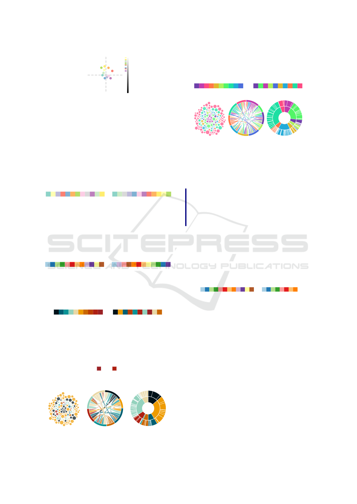
Figure 3: Set3 in CIELAB.
the Set3 colorscheme. It is categorized in the d3
colorscheme library as one of the categorical color
palettes. This would mean that the colors should
have no sequential relationship between them. Which
means, the palette should not come close to looking
like it has sequential relationships. However, we can
trace one line in the CIELAB space so that the colors
can be sorted and look like they were extracted from
a rainbow colorscheme. Here is a sorting of the col-
ors in the palette that minimizes the distances between
one color and the next:
→
Total distance: 384.7 Total distance: 217.7
The previously, definitely categorical Set3 color
palette is now looking like a rainbow palette, just
through scrambling the colors. This can in part mean
that the difference in use classifying a palette as either
categorical or sequential also lies in the order in which
colors are presented to us. This is another example on
the Paired colorscheme:
→
Total distance: 461.4 Total distance: 295.2
A similar exercise can be repeated the other way
around, taking a sequential palette and transforming
into a categorical palette by maximizing the distance
between subsequent colors:
→
Total distance: 159 Total distance: 490
The palette on the left—clearly a sequential one—
is presented on the right maximizing the distance be-
tween one color and the next. While this still presents
a few issues (some colors are too similar), the palette
still offers a good amount of very distinguishable col-
ors. If we remove the colors that are too close together
to be distinguishable ( and , which have a distance
of 7.1), we obtain a viable palette where the minimum
distance between colors is 17.1.
This works also on a rainbow colorscheme: the
following is generated using d3’s interpolateRainbow
function.
→
Total distance: 202.5 Total distance: 641.5
Taking care of the sequentiality of colors is going
to affect mainly visualizations that use color in a se-
quential way, such as a stacked barchart/area chart. In
case the charts do not have this aspect, the palettes
need no sorting, but attention should be paid to adja-
cent areas.
Takeaways: Palettes classified as sequential can
be used in place of categorical palettes, but in
case we are developing a visualization with a
sequential aspect, we should pay attention to
color order.
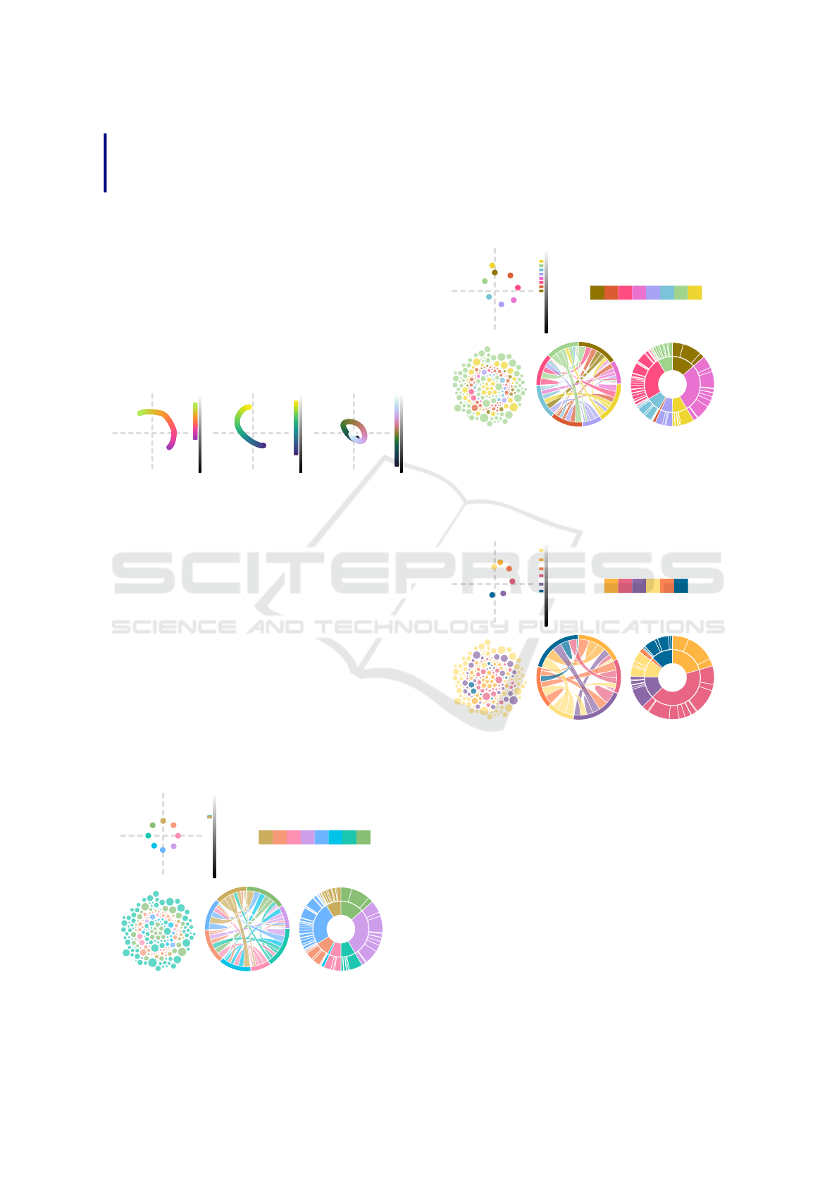
Slicing or Augmenting Palettes to Adapt to a Dif-
ferent Number of Categories: Colorbrewer offers
their palettes with a variety of selections of parame-
ters. However, their shorter palettes are just the longer
ones, sliced sequentially. The example below shows
the Paired palette in the 12 color option, and in the 8
color option, which shows that the shorter version is
just the longer, sliced.
→
Total distance: 461.4 (38.45) Total distance: 250.9 (31.36)
Slicing palettes in this way can lead to sections
of the colorspace to become underutilized - meaning
that parts of the perceptual colorspace could go un-
derused, and that opportunities for more vibrant and
distinguishable colors could be overlooked.
In certain cases we can encounter the opposite
problem: we have more categories than the entries
in a colorscheme. Because each color must be dis-
tinct, there is a practical limit to the number of cate-
gories that can be effectively represented before the
colors become hard to differentiate (Adobe, for in-
stance, states that it should be 6 at most (Guidelines,
nd)). However, cases that require a larger number of
categories are always going to exist — one example
is the 25-pair color code (pair color code, nd), used
in twisted pair wiring for telecommunications. We
should thus try to still offer options for such cases,
even though they might be not optimal.
Reflections on the Uses and Available Choices of Categorical Colorschemes
847
Takeaways:
Palettes should be designed for the amount
of colors that they are going to be used with.
5 CREATING NEW PALETTES
After exploring a few pitfalls and considerations
about currently existing color palettes, we discuss
some consideration on how to build new palettes that
fit the criteria necessary to make a good, properly dis-
tinguishable categorical palette. We can take inspira-
tion from already established palettes that were made
to be perceptually uniform. Here are a few examples:
Warm from Nic-
coli’s perceptual
rainbow (Niccoli,
2013)
Viridis from
Van der Welt
and Smith
(matplotlib (Col-
ormaps, nd))
CubeHelix from
Green (Green,
2011)
The above palettes are continuous, but show how
the colors are designed to attempt to draw an arc of
uniform distance in the CIELAB space. This guaran-
tees perceptual uniformity in the colors that compose
the palette. The luminosity of the colors is also
normally distributed, spanning along the luminosity
axis. While the first two — warm and viridis — form
arcs, cubehelix goes so far as forming an entire loop,
which spans across the entire luminosity axis, which
would look like a spiral if seen in three dimensions
(Eddins, 2006).
Sampling from an arc and maintaining the same
distance from the center of the CIELAB space, we
obtain the following:
Total distance: 214, Mean: 35.6
However, this method makes them look muddy—
even though the colors are perceptually uniform and
nothing stands out more than the others, their com-
plete uniformity might look confusing.
If we also skew the colors on the luminosity axis,
as it is done for the continuous palettes above, we ob-
tain a much better effect, where the colors look vi-
brant and are distinguishable enough:
Total distance: 214, Mean: 35.6
We can also consider the option where we want
to exclude a section from the colorspace, such as the
case in which we have a colored background and want
to avoid shades too similar to it. Here is an example
of a 6 color palette that avoids greens:
Total distance: 214, Mean: 35.6
Overall, sampling colors from spirals or arcs in
CIELAB space can produce good results. Maintain-
ing the same distance from the center creates percep-
tually uniform sets of colors, and sampling the colors
across an arc going around the a* and b* axis — in
addition to spread in luminosity — produces easily
distinguishable colors. Ultimately, what is going to
truly make or break a palette are the colors that have
the least distance, the ones with a minimum value that
is too close in table 1. In the appendix of the paper, we
provide a snippet that can be used to test different pa-
rameters for generating different colorschemes based
on the aforementioned principles. Here is an example
of a palette formulated following such methodology:
IVAPP 2025 - 16th International Conference on Information Visualization Theory and Applications
848
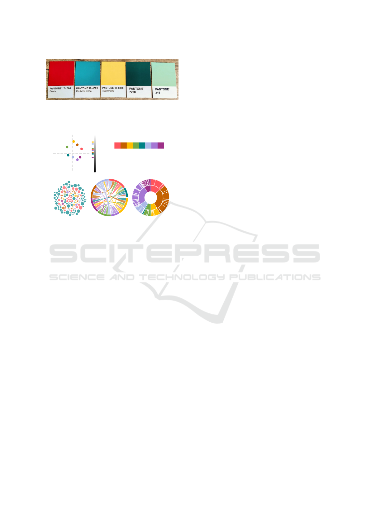
Figure 4: Formulating palettes by picking and sorting col-
ored pieces of paper can help in the intuitive, creative pro-
cess. The use of Pantone colors allowed us to match the
color with its exact hexadecimal value.
Total distance: 214, Mean: 35.6
[”#acbae8”,”#a577d4”,”#9e3188”,
”#ff555d”, ”#c46100”,”#ffbf00”,
”#75aa46”,”#008286”]
More examples of values and options can be found in
the appendix.
We argue for a more creative, intuitive process of
building a palette, by simply picking colors accord-
ing to our own sense of aesthetics, while trying to
take careful attention to not include colors that are too
similar or too perceptually unbalanced. In fig. 4, we
show an attempt at creating one by arranging Pantone
cards. The same principles used to craft palettes, ex-
plained in the previous paragraphs, can also be used to
test empirically-formulated palettes — after formulat-
ing one, we can use distances and charts to check that
we avoided pitfalls and have a balanced palette. Al-
though a solution based on precise algorithms would
be the preferable solution for the task, all the most
common palettes are formulated through a creative
design process, as documented in the colorbrewer pa-
per (Harrower and Brewer, 2003), the tableau blog
(Stone, 2016), and, recently, the description of the
design process to formulate the observable10 col-
orscheme (Pettiross, 2014).
6 LIMITATIONS AND FUTURE
WORK
This work is nothing but a speck of dust within the re-
search about categorical color palettes, and more than
anything else, a call for more creativity and freedom
in categorical color choices in visualization.
The space of viable research is enormous, and is
subject to ample use and exploration. Here are a few
limitations of this paper: We are currently setting
aside any semantic meaning of the underlying data,
or cultural influences that might appear on color per-
ception, and focusing exclusively on objectively sep-
arable colors. While certainly an incredibly interest-
ing field of study, we believe it would need a much
more in-depth exploration, that we set aside for space
reasons of this short paper. We also did not discuss
nearly enough the accessibility of the colorschemes
for people with color vision deficiencies — which
should be taken into account and it is a frequently dis-
cussed topic in visualization research (Geissbuehler
and Lasser, 2013). Visualizations of the colorschemes
in other spaces are also an option that should be ex-
plored (such as CIECAM02 (Li et al., 2000)). Fi-
nally, we should also take into account how colors
interact with the rest of the context they are inserted
in: the background color of a visualization, for in-
stance, can have a relevant effect on how colors stand
out from one another.
This is preliminary work towards an investiga-
tion on how color is used in visualization. We already
started to analyze the use of categorical colorschemes
in vis papers, analyzing what colorschemes and what
choices are made in combination with the tasks sup-
ported by the visualizations, and we plan to use this
preliminary work to compare the findings of this new
investigation in a future submission.
REFERENCES
Adobe (n.d.). Adobe color. Available at https://color.adobe.
com/de/, accessed April 24.
Aisch, G. (n.d.). chroma.js - color palette helper. Available
at https://gka.github.io/chroma.js/, accessed 2024-01-
10.
Bartram, L., Patra, A., and Stone, M. (2017). Affective
color in visualization. In Proceedings of the 2017 CHI
Conference on Human Factors in Computing Systems,
CHI ’17, page 1364–1374, New York, NY, USA. As-
sociation for Computing Machinery.
Bernard, J., Steiger, M., Mittelst
¨
adt, S., Thum, S., Keim,
D., and Kohlhammer, J. (2015). A survey and task-
based quality assessment of static 2D colormaps. In
Kao, D. L., Hao, M. C., Livingston, M. A., and Wis-
chgoll, T., editors, Visualization and Data Analysis
2015, volume 9397, page 93970M. International So-
ciety for Optics and Photonics, SPIE.
Bostock, M., Ogievetsky, V., and Heer, J. (2011). D3 data-
driven documents. IEEE Transactions on Visualiza-
tion and Computer Graphics, 17(12):2301–2309.
Colormaps, M. (n.d.). https://bids.github.io/colormap/.
D3 Gallery (n.d.). https://observablehq.com/@d3/gallery.
Reflections on the Uses and Available Choices of Categorical Colorschemes
849

Dhakar, L. (n.d.). Color-thief. Available at
https://lokeshdhakar.com/projects/color-thief/,
accessed April 24.
Dougherty, D. (2002). Vischeck. Available at https://www.
vischeck.com/, accessed April 24.
Eddins, S. (2006). A lab-based uniform color scale.
https://blogs.mathworks.com/steve/2006/05/09/
a-lab-based-uniform-color-scale/.
Fang, H., Walton, S., Delahaye, E., Harris, J., Storchak,
D. A., and Chen, M. (2017). Categorical colormap
optimization with visualization case studies. IEEE
Transactions on Visualization and Computer Graph-
ics, 23(1):871–880.
Geissbuehler, M. and Lasser, T. (2013). How to display data
by color schemes compatible with red-green color per-
ception deficiencies. Opt. Express, 21(8):9862–9874.
Gramazio, C. C., Laidlaw, D. H., and Schloss, K. B. (2017).
Colorgorical: Creating discriminable and preferable
color palettes for information visualization. IEEE
Transactions on Visualization and Computer Graph-
ics, 23(1):521–530.
Green, D. A. (2011). A colour scheme for the display of as-
tronomical intensity images. https://doi.org/10.48550/
arXiv.1108.5083 [Preprint].
Green-Armytage, P. (2006). The value of knowledge
for colour design. Color Research & Application,
31(4):253–269.
Guidelines, A. S. (n.d.). https://spectrum.adobe.com/page/
color-for-data-visualization/.
Harrower, M. and Brewer, C. A. (2003). Colorbrewer.org:
An online tool for selecting colour schemes for maps.
The Cartographic Journal, 40(1):27–37.
Heer, J. and Stone, M. (2012). Color naming models
for color selection, image editing and palette design.
In Proceedings of the SIGCHI Conference on Hu-
man Factors in Computing Systems, CHI ’12, page
1007–1016, New York, NY, USA. Association for
Computing Machinery.
Kim, Y., Thayer, K., Gorsky, G. S., and Heer, J. (2019).
Color names across languages: Salient colors and
term translation in multilingual color naming models.
In EuroVis (Short Papers), pages 31–35.
Kita, N. and Miyata, K. (2016). Aesthetic rating and color
suggestion for color palettes. Computer Graphics Fo-
rum, 35:127–136.
Lee, W.-Y., Gong, S.-M., and Leung, C.-Y. (2009). Is color
preference affected by age difference. International
Association of Societies of Design Research, pages
1837–1846.
Li, C. J., Luo, M. R., and Hunt, R. W. G. (2000). A revision
of the ciecam97s model. Color Research & Applica-
tion, 25(4):260–266.
Lim, W. C., Wong, C. O., and Wong, L. K. (2021). Color
aesthetic enhancement for categorical data visualiza-
tion. In Advances in Visual Informatics: 7th Interna-
tional Visual Informatics Conference, IVIC 2021, Ka-
jang, Malaysia, November 23–25, 2021, Proceedings,
page 15–26, Berlin, Heidelberg. Springer-Verlag.
Lu, S. and Meeks, E. (2022). Viz palette. Available at https:
//projects.susielu.com/viz-palette, accessed April 24.
Mittelst
¨
adt, S., J
¨
ackle, D., Stoffel, F., and Keim, D. A.
(2015). ColorCAT: Guided Design of Colormaps for
Combined Analysis Tasks. In Bertini, E., Kennedy,
J., and Puppo, E., editors, Eurographics Conference
on Visualization (EuroVis) - Short Papers. The Euro-
graphics Association.
Mittelst
¨
adt, S., Stoffel, A., and Keim, D. A. (2014). Meth-
ods for Compensating Contrast Effects in Information
Visualization. Computer Graphics Forum.
Niccoli, M. (2013). Perceptual rainbow palette –
the method. https://mycartablog.com/2013/02/21/
perceptual-rainbow-palette-the-method/.
pair color code, . (n.d.). https://en.wikipedia.org/wiki/
25-pair color code.
Pettiross, J. (2014). Crafting data colors and stay-
ing on brand. https://observablehq.com/blog/
crafting-data-colors.
Shimizu, C. and Meyer, G. W. (2010). Color styling tools.
In International Conference on Communications in
Computing.
Stone, M. (2012). In color perception, size matters. IEEE
Computer Graphics and Applications, 32(2):8–13.
Stone, M. (2016). How we designed the new color palettes
in tableau 10. Available at https://www.tableau.com/
blog/colors-upgrade-tableau-10-56782, accessed
April 24.
Szafir, D. A. (2018). Modeling color difference for visu-
alization design. IEEE Transactions on Visualization
and Computer Graphics, 24(1):392–401.
Waskom, M. L. (2021). seaborn: statistical data visualiza-
tion. Journal of Open Source Software, 6(60):3021.
Zeileis, A., Hornik, K., and Murrell, P. (2009). Escaping rg-
bland: Selecting colors for statistical graphics. Com-
putational Statistics & Data Analysis, 53(9):3259–
3270.
IVAPP 2025 - 16th International Conference on Information Visualization Theory and Applications
850
