
Inconspicuous Guides: A Qualitative Study to Understand the Degree of
Intrusiveness in Visualization Onboarding
Margit Pohl
1 a
, Benjamin Potzmann
1 b
, Christina Stoiber
2 c
and Wolfgang Aigner
2 d
1
TU Wien, Austria
2
St. P
¨
olten University of Applied Sciences, Austria
{first author, second author}@tuwien.ac.at, {third author, fourth author}@fhstp.ac.at
Keywords:
Visualization Onboarding, Learning, Accepted Annoyance, Visualization Literacy, Intrusiveness.
Abstract:
Current visualizations are becoming more and more complex. Visualization onboarding is a possibility to
assist users in understanding such visualizations. Nevertheless, previous research indicates that users tend to
ignore this kind of assistance, even if it is evident that they need help to interact with the system efficiently.
This investigation aims to collect prototypes of visualization onboarding systems taking into account the de-
gree of intrusiveness through a user inquiry using sketching and a questionnaire. We conducted a study with
65 participants. We asked them to what extent intrusion on the part of the system (e.g., compulsory tutorials,
automatic pop-up messages) would be acceptable. In addition, we asked them to create solutions to this prob-
lem. Most found less intrusive visualization onboarding forms (e.g., tooltips, optional and concise tutorials)
helpful. Compulsory visualization onboarding forms were considered less helpful. Participants also suggested
chatbots or ML algorithms as convenient solutions for visualization onboarding.
1 INTRODUCTION
The increasing size and complexity of modern
datasets often surpass the capabilities of traditional
visualizations like bar charts, line graphs, and pie
charts to effectively represent the underlying data.
As data becomes more complex, these methods fre-
quently fail to capture its full depth. While advanced
visualization techniques can address this, many users
struggle to interpret them, which leads to misinter-
pretations (B
¨
orner et al., 2016; Galesic and Garcia-
Retamero, 2010). This can result in frustration and
reluctance to use these otherwise powerful tools.
Despite the availability of visualization onboard-
ing systems (Stoiber et al., 2022d; Stoiber, 2023;
Dhanoa et al., 2022) designed to guide users in inter-
preting and navigating these complex visualizations,
users tend to ignore them (Pohl et al., 2023). In-
stead, they often rely on a “trial-and-error” approach,
attempting to figure out the visual encoding and the
system’s functionality on their own (Mahmud et al.,
2020; Andrade et al., 2009). This behavior increases
a
https://orcid.org/0000-0001-7880-8702
b
https://orcid.org/0000-0002-5286-2433
c
https://orcid.org/0000-0002-1764-1467
d
https://orcid.org/0000-0001-5762-1869
the risk of users drawing incorrect conclusions from
the data, as they may not fully understand the vi-
sual mappings or the capabilities of the system (Pohl
et al., 2023; B
¨
orner et al., 2016; Galesic and Garcia-
Retamero, 2010). Moreover, unlike traditional soft-
ware, where errors typically trigger clear feedback
or error messages, visualization systems often do not
provide such indicators when users misinterpret in-
formation. This makes it difficult for users to recog-
nize when they have made a mistake (Lee et al., 2016;
Rezaie et al., 2024).
Thus, it is crucial to understand how to motivate
users to engage with visualization onboarding sys-
tems. The challenge lies in finding the “sweet spot”
between effectively onboarding users (nudging) and
avoiding annoyance. Research in the area of help
systems has shown that this is a difficult balance to
strike (Mahmud et al., 2020; Andrade et al., 2009). If
the assistance is too unobtrusive, users may not no-
tice it; if, however, it is too intrusive, users may find
it annoying and deactivate it completely. The case of
Microsoft’s Clippy is a prime example of how a well-
intentioned but poorly executed help system can lead
to widespread user frustration and a general aversion
to such systems (Chundury et al., 2023; Yalc¸ın, 2016).
To contribute to the challenge of finding the right
degree of intrusiveness in visualization onboarding
706
Pohl, M., Potzmann, B., Stoiber, C. and Aigner, W.
Inconspicuous Guides: A Qualitative Study to Understand the Degree of Intrusiveness in Visualization Onboarding.
DOI: 10.5220/0013135900003912
Paper published under CC license (CC BY-NC-ND 4.0)
In Proceedings of the 20th International Joint Conference on Computer Vision, Imaging and Computer Graphics Theory and Applications (VISIGRAPP 2025) - Volume 1: GRAPP, HUCAPP
and IVAPP, pages 706-717
ISBN: 978-989-758-728-3; ISSN: 2184-4321
Proceedings Copyright © 2025 by SCITEPRESS – Science and Technology Publications, Lda.

systems, we conducted a user inquiry using sketch-
ing (Roberts et al., 2015) with 65 Computer Science
master students at a university. Their feedback was
instrumental in generating innovative design ideas for
visualization onboarding solutions in complex visual-
ization systems that consider the degree of intrusive-
ness. Furthermore, we developed a questionnaire to
collect their opinions and attitudes toward visualiza-
tion onboarding.
Our investigation focuses on three key research
questions:
RQ1. What kind of attitudes do participants have
regarding the intrusiveness of visualization on-
boarding?
RQ2. What suggestions do participants have con-
cerning the intrusiveness of visualization on-
boarding?
RQ3. What kind of onboarding prototypes do they
construct to avoid intrusiveness? How do they
combine different features of onboarding?
By addressing these questions, this paper con-
tributes to the ongoing discourse on designing effec-
tive visualization onboarding systems and their role in
enhancing user interaction with complex data visual-
izations. In detail, the main contributions of the pa-
per are the following: (1) Discussion of related work
in the field of help systems, visualization onboard-
ing, and guidance as related fields (in Section 2); (2)
Presentation of the results of an investigation with 65
participants aiming to find a feasible visualization on-
boarding concept that is accepted by users in terms of
intrusiveness (Section 3). (3) Additionally, we present
examples of the participants’ resulting sketches (see
Section 3.4.3).
2 RELATED WORK
Within the landscape of Human-Computer Interaction
(HCI), research has intensively examined the chal-
lenges users face while seeking help with complex,
feature-rich software (Kiani et al., 2019). Visualiza-
tion onboarding (Stoiber, 2023; Dhanoa et al., 2022)
and guidance (P
´
erez-Messina et al., 2022; Ceneda
et al., 2017, 2019a; Sperrle et al., 2021) are integrated
as part of user assistance (Stoiber et al., 2022a) in
visual analytics (VA), helping users during different
phases of analysis by providing structured introduc-
tions and support for interpreting data (Stoiber et al.,
2022d, 2023a, 2021). Guidance provides support for
users as they solve analytical tasks (P
´
erez-Messina
et al., 2022). In the context of data visualization and
VA, a recommendation system, also known as a rec-
ommender system, refers to any system that proposes
content to a user based on a calculated correlation
between the content and the user’s interests (Pazzani
and Billsus, 2007; Zhou et al., 2023). Recommender
systems for VA can suggest relevant visualizations,
data filters, or analysis methods to users (Resnick
and Varian, 1997). Some recommender systems al-
ready use AI-based approaches (e.g., some forms of
content-based filtering). The widespread adoption of
ChatGPT indicates a possible additional area of re-
search. The first attempts for software tasks (Khurana
et al., 2024) and programming-related tasks (Xu et al.,
2022) have been made. To the best of our knowledge,
extensive research in the context of visualization on-
boarding, guidance, or help systems has not yet been
conducted in this area.
The synergy between these areas lies in their col-
lective goal to empower users to effectively engage
with complex systems, particularly in VA. In the fol-
lowing, we discuss related work in the field of (1) help
systems, (2) visualization onboarding, and (3) guid-
ance in VA.
2.1 Help Systems
The design of help systems has been discussed at
some length in the scientific literature. Grayling
(2002), for example, provides an overview of ap-
proaches on how to design help systems. Accord-
ing to him, research indicates that users tend to ig-
nore help systems and prefer trial and error. He sug-
gests possible solutions to this problem, e.g., tooltips
or embedded help panels. In general, he states that
help should be context-specific, useful, obvious to
invoke, non-intrusive, and easily available. Vouligny
and Robert (2005) describe an approach for help sys-
tems based on situated action theory. They also point
out that users are often sceptical of help systems.
Technical documentations often provide descriptions
of a system’s functionalities, but they are not tailored
to assist users in their tasks and are, therefore, rarely
used. The authors also discuss the issue of intrusive
help systems. They argue that these systems are often
annoying because they rely on simplistic assumptions
about the users’ intentions. Silveira et al. (2001) pro-
pose a semiotic engineering approach. The emphasis
of this approach is on identifying the intents of the
users and the design of appropriate help messages.
The authors developed a taxonomy of users’ utter-
ances expressing specific needs for help (e.g., Where
is . . . ?, What’s this? What happened?). Our research
indicates that similar to research on help systems,
users enjoy finding out about the features of the sys-
Inconspicuous Guides: A Qualitative Study to Understand the Degree of Intrusiveness in Visualization Onboarding
707

tems themselves and prefer unobtrusive and context-
sensitive forms of assistance.
2.2 Visualization Onboarding
Visualization onboarding methods (Stoiber et al.,
2022d; Stoiber, 2023; Stoiber et al., 2023a; Dhanoa
et al., 2022) aim to support end users in compre-
hending data visualizations and taking full advan-
tage of the tools at hand. There are different types
of help-seeking behaviors: help initiated by the user
(pull) vs. the system (push) (Horvitz, 1999; Kiani
et al., 2019). Visualization onboarding can be exter-
nal (Stoiber et al., 2022c), separate from the tool, or
in-situ (Stoiber et al., 2023a), i.e., integrated within
it. In-situ systems use either the “pull” or “push” ap-
proach for providing help (Horvitz, 1999; Kiani et al.,
2019).
So far, most visualization onboarding systems
can be categorized as external learning environ-
ments (Stoiber et al., 2022c), detached from the core
visual analytics tools. For example, Firat et al. (2020)
developed an interactive pedagogical treemap appli-
cation for training. Additionally, Peng et al. (2022)
present results of a study to evaluate six parallel co-
ordinate literacy modules based on Bloom’s taxon-
omy (Bloom et al., 1956) using videos, tests, and
tasks. Both examples provide a platform to enhance
students’ visualization literacy.
The few papers where in-situ visualization on-
boarding is observed explain the features of the vi-
sualization tool by exploring both push and pull
onboarding assistance, with the main focus on the
“pull” help-seeking behavior. Yalc¸ın (2016) pre-
sented HelpIn, a system designed for the Keshif vi-
sualization tool that demonstrates some aspects of
“push” and “pull” models, providing contextual in-
situ help (Chundury et al., 2023) without disrupting
user tasks. They utilize the “push” model through no-
tifications to suggest relevant help topics on the fly.
The notifications are designed in such a way that users
are not disrupted in their exploration tasks. Similarly,
IBM Cognos (Analytics, 2022) and Advizor (Solu-
tions, 2022) employ step-by-step tours with tooltips,
overlays, and textual descriptions, respectively, thus
aligning with the “pull” model (Horvitz, 1999). How-
ever, these examples primarily focus on feature expla-
nation.
Stoiber et al. developed four visualization on-
boarding methods for visualization tools: a step-by-
step guide, scrollytelling, video tutorials, and in-situ
scrollytelling (Stoiber et al., 2022d; Stoiber, 2023).
They conducted studies with MTurk workers and stu-
dents to assess the impact of these methods on user
performance and experience. They also examined dif-
ferent instruction styles (concrete vs. abstract) in a
separate study (Stoiber et al., 2022b). Building on
their findings (Stoiber et al., 2022d, 2021, 2022c,b),
they recently proposed nine design actions for ef-
fective visualization onboarding, emphasizing in-situ
methods and considering factors like user engagement
and accepted annoyance (Stoiber et al., 2023a).
Furthermore, the literature reveals a variety of vi-
sualization onboarding concepts focusing on explor-
ing different teaching methods and learning types in
the broader context of visualization literacy. Tana-
hashi et al. (2016) contrast top-down and bottom-up
approaches, while Kwon and Lee (2016) highlight
the effectiveness of active learning strategies in un-
derstanding complex visualizations like parallel coor-
dinate plots. Ruchikachorn and Mueller (2015) em-
phasize the power of learning by analogy in grasping
unfamiliar visualization methods.
In summary, the current landscape of visualization
onboarding systems predominantly consists of exter-
nal learning environments with limited examples of
in-situ integration. Moreover, the subtle balance be-
tween providing sufficient assistance and causing an-
noyance – a critical aspect of the push model – re-
mains an underexplored area.
2.3 Guidance in Visual Analytics
The concept of guidance was initially introduced by
Schulz et al., serving as an umbrella term encompass-
ing various aspects such as “recommender systems”,
“user support”, and “assistance” within Visual Ana-
lytics (VA) (Schulz et al., 2013). Ceneda et al. fur-
ther refined this definition, describing guidance as a
computer-aided method designed to actively bridge a
user’s knowledge gap during interactive visual analyt-
ics sessions (Ceneda et al., 2017).
Their work also discusses the importance of unob-
trusiveness in guidance in VA, emphasizing the need
for guidance methods that do not hinder the analytical
process (Ceneda et al., 2017). They propose a model
of guidance that gradually narrows the gap hindering
the effective continuation of data analysis, highlight-
ing the significance of unobtrusive guidance (Ceneda
et al., 2019a).
Several factors influence the optimal timing for
guidance and help-seeking behavior. Firstly, the com-
plexity of the analytical task and, secondly, the user’s
skill level play a crucial role in determining the tim-
ing for guidance (P
´
erez-Messina et al., 2022). In this
regard, Ceneda et al. also explored the issue of the
proper timing of guidance by using facial recognition
software and a machine learning model trained to de-
IVAPP 2025 - 16th International Conference on Information Visualization Theory and Applications
708

tect when to guide according to changes in the user’s
facial expressions (Ceneda et al., 2021).
Summary. The takeaways of this body of research
show that successful visualization onboarding sys-
tems should provide assistance that is contextually
relevant, minimally intrusive, and adaptable to in-
dividual user preferences and skill levels (Grayling,
2002; Silveira et al., 2001; Stoiber et al., 2023a;
Ceneda et al., 2019b). The degree of intrusiveness
accepted by the user of visualization onboarding sys-
tems is still an open question, particularly when it
comes to the utilization of pull or push models (Chun-
dury et al., 2023), which set the stage for further in-
vestigations. Therefore, we conducted a study to find
ideas and concepts of visualization onboarding that
consider nudging and intrusiveness (see Section 1).
We present our investigation in the following, dis-
cussing the study design, participants, and derived re-
sults in detail.
3 INVESTIGATION
3.1 Study Design & Procedure
Study Design. We conducted the study with a dual
objective: to understand participants’ subjective ex-
periences with visualization onboarding systems, and
to gather innovative ideas for designing effective on-
boarding solutions for complex visualization systems
(see research questions section 1).
We designed a questionnaire and a user inquiry
using sketching with our study participants to an-
swer our research questions. We wanted to under-
stand which visualization onboarding solutions (e.g.,
tutorials, pop-ups, tooltips) the participants favored,
found effective, or disliked and what their attitudes
concerning the trade-off between helpfulness and in-
trusiveness were. From previous research, we know
that systems might be helpful but intrusive when they
offer unsolicited help messages indicating features
that have been overlooked by users. We also in-
cluded questions on how the participants thought pro-
grams might detect when users need assistance and
how users can realize their need for help. The ques-
tionnaire consisted of the following questions:
• What kind of onboarding system would you per-
sonally be most willing to use?
• What kind of systems might be helpful but unus-
able or intrusive?
• What level of annoyance is necessary?
• How could users realize that they need help?
• How could programs detect that the users need
help?
A practical component of the study, the sketching
sessions, involved participants sketching prototypes
for onboarding solutions tailored to a complex visu-
alization system featuring various visualization types
and filtering options. This task was intended to re-
veal the range of approaches participants considered
effective for encouraging the use of onboarding sys-
tems. The goal of developing the prototype was to
determine whether they could devise concrete solu-
tions for the visualization onboarding process they ap-
preciated, and what kind of nudging they suggested.
Possible existing approaches to this problem were not
discussed with the participants so as not to influence
them in the development of creative solutions.
Procedure. The participants were given a document
consisting of the following parts: 1. a short descrip-
tion of the investigation, 2. an informed consent form,
3. a questionnaire, and 4. a brief description of the
task of developing the prototype. Before starting to
work, one of the co-authors met the participants and
gave them an introduction of about one hour regard-
ing the goals of the investigation and the study pro-
cess. The participants had eight weeks to complete
both tasks. They filled in the questionnaires individ-
ually but were allowed to develop the prototypes in
pairs because we assumed that if they could discuss
their solution with a colleague, they would reflect on
it more and create more creative solutions. Nine pairs
of participants cooperated to develop the prototype.
The other 47 participants developed the prototypes on
their own. Participants were required to create a pro-
totype consisting of a textual description and drafts of
screenshots.
3.2 Participants
As detailed in Table 1, we recruited 65 students (av-
erage age ≈ 25.7 years) from an international mas-
ter’s program in computer science at Vienna Univer-
sity of Technology, conducting the study within a lec-
ture setting (16 female, 49 male, the students came
from several different European countries). Upon ex-
amining their self-reported skills, it became clear that
most participants had a strong foundation in visualiza-
tion design, with about half also indicating experience
in UX design. In contrast, very few had experience
in designing help or support systems. The partici-
pants were master’s students in data science; many al-
ready worked part-time as computer scientists in that
Inconspicuous Guides: A Qualitative Study to Understand the Degree of Intrusiveness in Visualization Onboarding
709

Table 1: Distribution of proficiency and education levels. This table presents the 65 participants’ self-reported proficiency
in three areas: visualization design, UX design, and help/support system design.
Proficiency Viz Design Help Design UX Design Education n
Beginner 13 56 31 Bachelor’s 57
Intermediate 30 7 28 Master’s 5
Advanced 21 1 4 PhD 1
Expert 0 0 1 Undergraduate 1
area. These students were not only potential users
but also future developers of systems administrating
large datasets. As such, they had already developed
their first ideas about designing such systems during
their studies. They might be called semi-experts, and
their ideas about motivating users to study IT systems
representing large datasets in detail are undoubtedly
relevant.
3.3 Data Analysis
We conducted a qualitative and exploratory investi-
gation to get an overview of the issues relevant to
the research question. We chose a qualitative con-
tent analysis approach (Schreier, 2012) to examine
the participants’ responses to the questionnaire and
the prototypes and ideas they generated. We were
able to break down the data into manageable, discrete
pieces of information by identifying recurring pat-
terns and themes, especially the kinds of visualization
onboarding solutions that the participants mentioned.
Through iterative rounds of refinement, we developed
a nuanced understanding of the participants’ perspec-
tives and experiences as well as their preferences and
expectations. Two co-authors met repeatedly to dis-
cuss the data analysis, compare the results, and re-
solve diverging interpretations.
We developed a set of codes distinguishing be-
tween different features of visualization onboarding
systems. There are “push features” (e.g., pop-up
fields, compulsory tutorials), “pull features” (e.g., op-
tional tutorials, documentation), and features in be-
tween that can be designed either as “push” or as “pull
feature.” Tooltips, for example, can be interpreted as
a “pull feature”, but when they are opened because
a user moves the mouse unintentionally over the fea-
ture, it can be seen as “push feature”. Chatbots or in-
telligent recommender systems can be designed both
ways. They either give advice only when the user ac-
tivates them, or they are always active.
The codes were partly based on previous re-
search (Stoiber et al., 2022d) and partly derived
from the analyzed material. The following set of
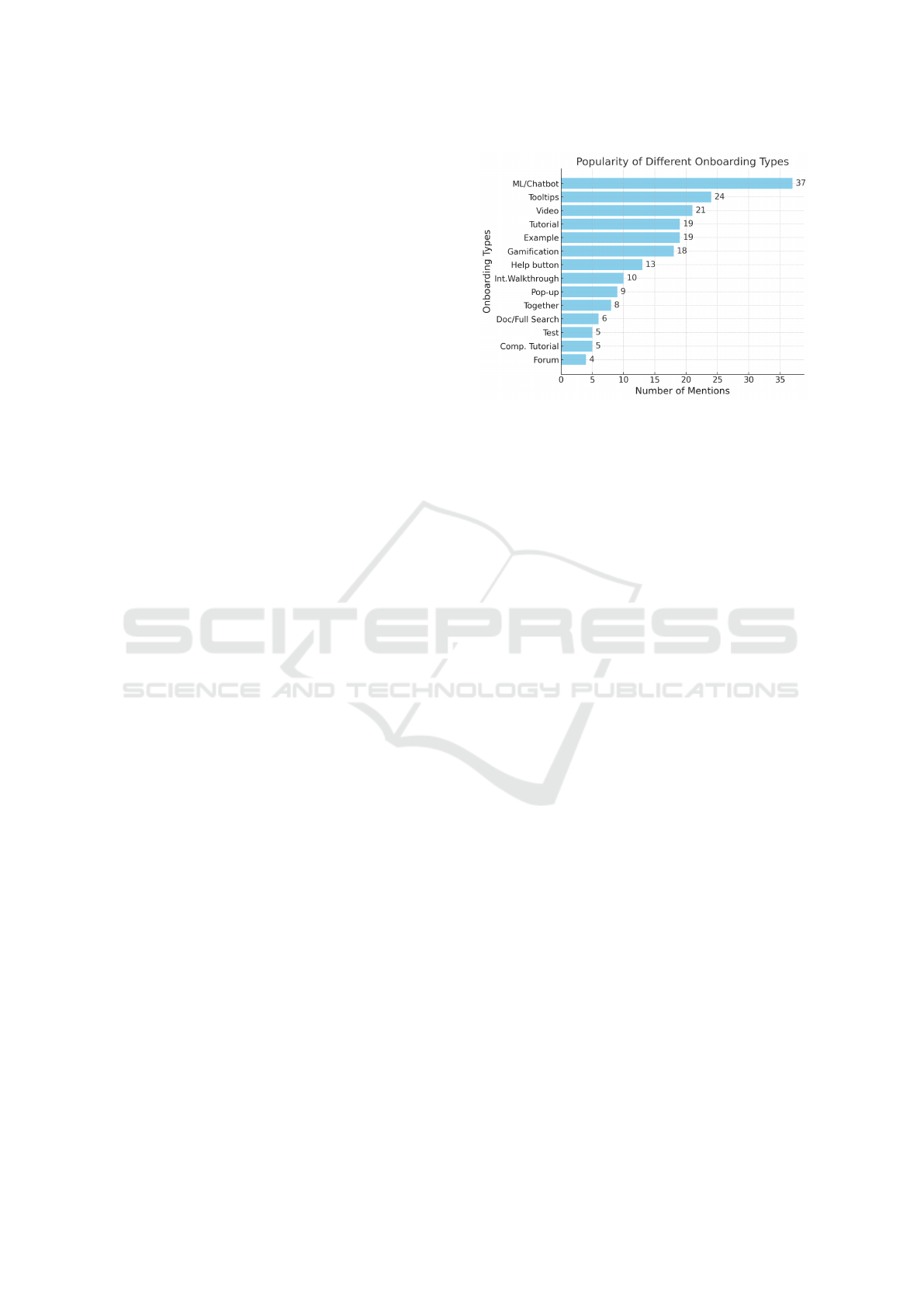
codes was used for the analysis (see also Figure 1):
ML/chatbots, tooltips, video, tutorial, example, gami-
fication, help button, interactive walkthrough, pop-up,
together, doc/full search, test, compulsory tutorial, fo-
rum. Participants mainly suggested using either ma-
chine learning or chatbots (code ML/chatbots), but
the code encompasses any kind of AI-based support.
Some participants suggested offering practical exam-
ples (sometimes with solutions) to assist users. Gam-
ification was considered to motivate users more to use
visualization onboarding than simple tutorials. An in-
teractive walkthrough is supposed to be an interactive
form of tutorial. Pop-ups are always generated by the
system and are therefore “push features”. Doc/Full
search is meant to be documentation with full-text
search capabilities. Tests are entry tests to assess
users’ knowledge. A forum was sometimes suggested
so users could exchange experiences and help each
other. Some participants explicitly mentioned that a
specific subset of these features should be combined
to create an appropriate visualization onboarding sys-
tem (code: together).
3.4 Results
In this section, we present the results of this investi-
gation, divided into the questionnaire and prototype
results based on the sketching sections.
3.4.1 Results of the Questionnaire
The goal of the questionnaire was to clarify the per-
sonal opinions of the participants concerning nudging
and acceptable annoyance in onboarding systems.
Nudging Preferences. The first question pertained
to the participents’ personal preferences concerning
the nudging behavior of visualization onboarding sys-
tems. Participants primarily chose in-situ tooltips as
the preferred form of nudging (36 participants out of
65). Tooltips are a very subtle and unobtrusive form
of nudging, which makes them seem very attractive.
Participants also appreciated onboarding systems that
include AI/ML elements (21 out of 65). Tutorials (14
out of 65) and learning by concrete and practical ex-
amples (13 out of 65) were mentioned as unobtru-
sive concepts. Eight participants explicitly said they
preferred to explore independently and use assistance
only when completely stuck.
IVAPP 2025 - 16th International Conference on Information Visualization Theory and Applications
710
Perceptions of Intrusiveness vs. Helpfulness. We
also asked participants about visualization onboard-
ing features that might be intrusive but still helpful.
The answers to this question were more general. 22
participants mentioned compulsory tutorials as help-
ful but intrusive, and 31 said that pop-ups were help-
ful. Participants said visualization onboarding should
not be nudging users constantly (e.g., by pop-ups that
appear frequently and are difficult to eliminate). Visu-
alization onboarding should be manageable in length.
Additionally, it should not present unnecessary or un-
wanted information.
Degree of Intrusiveness. In a third question, we
asked about the necessary level of annoyance or intru-
siveness that would be acceptable for the participants.
In this case, the answers were sometimes very general
and provided no clear indication of specific features
that would or would not be acceptable. Those partic-
ipants who gave more precise answers said that short
and concise tutorials at the beginning would be ac-
ceptable (9 participants). Another possibility was to
use AI-based recommendations (9 participants) and,
surprisingly, pop-up messages (8 participants). In this
context, AI-based recommendation summarizes any
visualization onboarding system that uses machine
learning, for example, to track and react to user be-
haviors or AI concepts such as “virtual” assistants
to answer questions similar to ChatGPT. Participants
also mentioned that the amount of intrusiveness de-
pends on the users’ previous experience (10 partici-
pants) and the complexity of the tool (5 participants).
Detection of Help-Seeking Behavior. We also
asked the participants how users could find out that
they needed help. 35 out of 65 participants said that
users notice that they need help when they cannot fin-
ish their task, are confused, and show specific interac-
tion patterns (e.g., doing the same actions repeatedly
without result). 15 participants answered that users
should know they need help when receiving repeated
error messages from the system. Only 10 participants
mentioned that users should know they need help be-
cause of a general understanding of visualizations or
a test before using the visualization. The last ques-
tion was about the system’s ability to detect whether
users needed help. Almost all participants (64 out of
65) said the visualization system should monitor the
users’ activities and detect inappropriate behavior.
Lessons Learned. The study revealed a preference
for subtle in-situ nudging techniques in visualization
onboarding (RQ1), with a general skepticism towards
more intrusive methods. The participants showed an
Figure 1: Distribution of mentioned onboarding types (pro-
totypes).
interest in AI-based assistance but also had high ex-
pectations for system capabilities in detecting and re-
sponding to user needs. The participants said they
found intrusive features acceptable for inexperienced
users and complex visualizations (RQ2).
3.4.2 Results Prototype
Participants were asked to generate ideas or very
small prototypes for visualization onboarding consid-
ering nudging and intrusiveness (see Figure 1). Par-
ticipants were generally very reluctant to force users
to seek assistance. They tried very hard to find so-
lutions that could, on the one hand, motivate users
to learn about the visualization but that, on the other
hand, did not interfere too much with the users’ work-
flow.
Interestingly, the participants most frequently
mentioned any kind of features supported by artificial
intelligence (code ML/Chatbots) in a very broad sense
(37 out of 65 participants). Sometimes, we got the
impression that the participants had unrealistic ideas
about the capabilities of AI. Some suggested a kind
of personal assistant who unobtrusively looked over
their shoulder and reminded them cautiously and re-
strainedly about possible better solutions. Most had
at least some sort of chatbot in mind that would an-
swer questions. Additionally, it should be mentioned
that these AI-based features were usually not the main
component of the small prototype that the participants
suggested. Rather, they were additional features ac-
companying other onboarding methods.
Another very frequently mentioned feature was
tooltips (34 out of 65 participants) (see Fig. 1). In con-
trast to pop-ups, tooltips are unobtrusive and only ap-
pear upon mouse-over. Tooltips are a borderline case
as far as the activity of the system is concerned. They
are relatively unobtrusive but can appear without the
Inconspicuous Guides: A Qualitative Study to Understand the Degree of Intrusiveness in Visualization Onboarding
711

user asking for help. In addition, the information of-
fered by tooltips is usually very short. It was often
mentioned throughout the investigation that help texts
should be short and concise and offer necessary infor-
mation only. Tooltips meet these requirements, which
makes them very popular. Other features that were
also mentioned quite often were videos (21 out of 65),
the use of concrete and practical examples (19 out of
65), optional tutorials (19 out of 65), and gamification
(18 out of 65). Gamification was seen as a possibility
to motivate users to use the visualization onboarding
system by giving them rewards or by using features
that increase enjoyment and a positive mood so that it
was not seen as a burden. Short initial tutorials, espe-
cially for inexperienced users, were seen as an accept-
able possibility for visualization onboarding. Some
participants also mentioned MS Word’s spell-check
as a good example of an unobtrusive way of showing
users how to correct errors.
Compulsory tutorials (5 out of 65), (ability) tests
at the beginning (5 out of 65), extensive documen-
tation with full-text search capabilities (6 out of 65),
and pop-ups (9 out of 65) were features of visualiza-
tion onboarding systems that were hardly mentioned
at all. Compulsory tutorials and pop-ups in particular
generated very negative comments among the partic-
ipants. Communication in a user forum or interactive
walkthroughs was not seen as attractive, either. Some
users intended to use several features combined (code:
together).
Lessons Learned. Summarizing the results of the
qualitative content analysis on the prototypes for vi-
sualization onboarding showed that tooltips, AI fea-
tures, and interactive methods such as videos and
practical examples (tutorials) were favored, as shown
in Figure 1. Conversely, features perceived as forc-
ing information onto the user, such as compulsory
tutorials and repetitive pop-ups, were regarded unfa-
vorably (RQ3). The results from the development of
prototypes aligned closely with the questionnaire re-
sponses.
3.4.3 Examples of Prototypes
The results of the overall analysis of the prototypes
developed by the participants conform to the results of
the analysis of the questionnaires. Nevertheless, the
prototypes, investigated individually, indicate that the
participants came up with a wide variety of solutions.
The four examples, three of which are illustrated
in Figure 2, Figure 3, and Figure 4, are discussed in
the following and show this nicely. They were chosen
for their clarity of presentation and lucid structure.
Example 1: Self-Test. First-time users of the visu-
alization receive a self-test (see Figure 2). The system
provides feedback about the user’s answers. If they
make a mistake, they are offered a demo video. These
videos should be short and to the point. While the
user is working, the system monitors their activities.
When the system detects an error, the user is asked
whether they need help. This is intrusive but helps the
users to solve their tasks quickly. Another possibility
is tooltips (called “hover info buttons” here), which
are less intrusive. Extensive documentation should
also be available when needed.
Example 2: e-Learning System. This solution of-
fers an onboarding system that is similar to an e-
learning system but aims to teach the specific infor-
mation that users need at the time they need it (see
Figure 3). The system tries to engage users by moti-
vating them to solve examples on their own. A sidebar
is added to the existing visualization on the left-hand
side of the screen. This sidebar contains challenges
that are ordered according to their difficulty. Each has
a clearly defined goal and several steps to reach it.
Multiple-choice questions are shown if a user selects
a challenge (see Figure 3). Each question contains the
next step required to reach the solution. The system
explains the correct solution when the user clicks on
the wrong solution. In addition, a scoring system can
be introduced, adding an element of gamification.
Example 3: Exemplary Workflows and Use Cases.
The system proposed by this participant consists of
various elements. It starts out with a short test at
the beginning to assess the user’s level of expertise.
This helps to avoid presenting hints and onboarding
tools to users who do not need them. The system
will also provide information about typical workflows
with numbers and explanatory text (see Figure 4).
This helps to inform the user on the correct sequence
of steps to perform a task. In addition, there will be a
concrete use case informing the user about interactive
features in particular. If the user does not fulfill the
task, feedback is provided about how to solve it suc-
cessfully. The onboarding system will also contain
videos.
Example 4: Chatbot. This prototype is unique be-
cause a chatbot forms the main element of the on-
boarding system. In contrast, most other prototypes
only use chatbots or AI-based features as assistive
features. This chatbot is supposed to accomplish sev-
eral different tasks. It answers questions about how
to complete specific tasks. In addition, it provides in-
formation about the data (e.g., the mean values of the
IVAPP 2025 - 16th International Conference on Information Visualization Theory and Applications
712
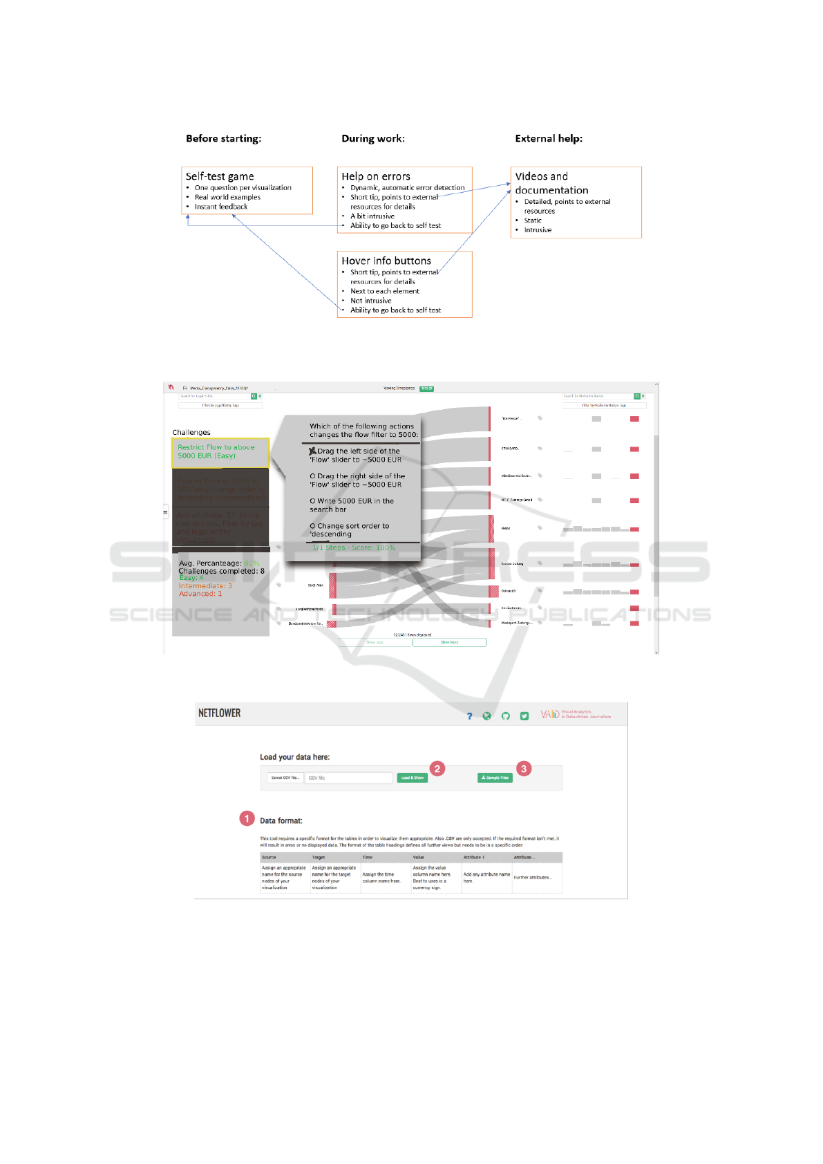
Figure 2: The example of this prototype is highly structured. Several features provide help (self-test game, automatic error
detection, videos and documentation, tooltips). These different features are related, and the system can move from one feature
to another when needed.
Figure 3: This figure shows a screenshot of example 2. On the left-hand side are the challenges that users have to solve. Right
beside it are the multiple-choice questions to be answered by the users.
Figure 4: Description of a workflow with numbers and tooltips.
data) and the appropriate interpretation of the data.
One of its key features is its ability to become ac-
tive when it detects a user error (e.g., when the user
employs many different tools without finishing the
task), providing reassurance that users are always sup-
ported. In this case, the user is asked whether they
need help. In addition to the chatbot, the system also
contains an optional tutorial video and tooltips.
Inconspicuous Guides: A Qualitative Study to Understand the Degree of Intrusiveness in Visualization Onboarding
713

Lessons Learned: The overall analysis of the pro-
totypes indicates some clear tendencies among par-
ticipants. However, the analysis of the individual
prototypes shows that the participants’ solutions vary
considerably. The participants generally do not stick
to one idea but distinctly combine different features.
They typically combine more and less intrusive fea-
tures, sometimes targeted at more or less experienced
users. Machine learning or AI features (especially
chatbots) are usually added as an auxiliary feature.
Gamification is often used with the explicit goal of
motivating users to interact with the onboarding sys-
tem and overcoming users’ annoyance with intrusive
onboarding. Step-wise introductions or practical ex-
amples are also seen as a possibility to engage users.
Again, the idea is to overcome the annoyance of the
users with more intrusive forms of onboarding.
4 DISCUSSION & FUTURE
WORK
This investigation aimed to identify what kind of vi-
sualization onboarding users of visualizations found
annoying and intrusive, and what would be more ac-
ceptable. This research question is based on previ-
ous research (Pohl et al., 2023) indicating that users
of visualizations are sometimes not aware that they
need help and, therefore, come to erroneous con-
clusions about the data presented to them. While
there is some research on users struggling with vi-
sualizations (B
¨
orner et al., 2016; Galesic and Garcia-
Retamero, 2010; Rezaie et al., 2024; Lee et al., 2017),
this specific issue has, to the best of our knowledge,
not yet been addressed in research. In the next para-
graph, we present lessons learned based on our re-
search.
User Skepticism Towards Active Assistance. The
participants generally indicated that they were pretty
skeptical about visualization onboarding, especially
systems actively trying to assist them. Many partic-
ipants mentioned that they preferred to find out how
the system worked themselves, following a trial-and-
error strategy (cf. Mahmud et al. (2020); Andrade
et al. (2009)).
Preference for Subtle, Contextualized Nudging.
Participants preferred unobtrusive onboarding meth-
ods such as tooltips, concise tutorials or videos, and
small pop-ups in unused screen areas. These meth-
ods were seen as minimally disruptive and helpful.
Some users also mentioned MS Word’s spell-check as
a positive example of a system’s unobtrusive but ac-
tive help. They argued that something similar should
be developed for visualizations (e.g., systems that in-
dicate the next necessary step in the interaction pro-
cess through subtle highlighting). Participants argued
that visualization onboarding should preferably be in
situ (integrated into the system) so that their workflow
would not be interrupted.
Pop-ups that appeared repeatedly, covered large
parts of the screen, or were difficult to close were
seen as highly annoying and intrusive. Participants
also criticized long and complex tutorials with unnec-
essary information. Nudging should be adapted to the
context, they said.
Borderline Cases. While participants preferred less
intrusive solutions, they argued that in some cases, in-
trusiveness might be annoying but helpful. It depends
on the situation whether intrusiveness is acceptable.
Participants found it appropriate that the amount of
nudging for inexperienced users and during interac-
tion with complex visualizations could be higher. In
this case, compulsory tutorials might be helpful. Pop-
ups (e.g., with hints of the day) appearing in unused
areas of the screen were deemed acceptable provided
that this does not occur frequently, and that the pop-
ups disappear by themselves. In all these cases, the
text should be short. Some users would also find it
acceptable for a chatbot to give advice, thus interrupt-
ing the workflow.
This finding suggests that onboarding systems
should be adaptive, offering more guidance to novices
and less to experienced users, thus tailoring the on-
boarding experience to the user’s level of expertise.
Potential of AI-driven Visualization Onboarding
Methods. Participants were open to the idea of AI-
driven onboarding systems that could monitor user
activity and provide context-sensitive hints or alter-
native solutions. In detail, they imagined that an AI
system might monitor their activities and offer hints
or alternative ways of actively solving a problem to
assist users. Participants mentioned wanting to ask
the AI questions and discuss solutions with this sys-
tem. AI-driven onboarding is a more acceptable form
of nudging than many others. To what extent this can
be realized with existing generative AI models, like
ChatGPT, is an open question. First attempts have
been made to solve this problem (Joshi et al., 2024;
Zhao et al., 2024), but future work will show whether
such ideas are realistic. This is certainly a promising
area for future research.
IVAPP 2025 - 16th International Conference on Information Visualization Theory and Applications
714

Misalignment Between Users’ Expectations and
Visualization Realities. Most participants appar-
ently use a model from more conventional systems
to reason about problems with visualizations. This
model assumes one clear and identifiable path to the
solution to a problem. The system can detect any de-
viation from this path and either show an error mes-
sage or an inappropriate result. As mentioned above,
this does not always apply to visualizations. Inter-
action with visualizations is an exploratory process
(Battle and Heer, 2019), and often no clear path to
the solution can be identified. Visualization systems,
therefore, are sometimes unable to identify appropri-
ate or inappropriate user behavior or assess the valid-
ity of the insights generated by them. Many partici-
pants expected the system to always provide feedback
when errors occured. Visualization onboarding sys-
tems should also raise awareness of this problem.
Potential of Combining Different Features of On-
boarding. In developing their prototypes, partici-
pants systematically combined various features of on-
boarding systems. They usually combined more and
less intrusive features to provide different possibilities
for user onboarding. Using gamification and practical
examples can counterbalance the negative effects of
more intrusive onboarding.
4.1 Limitation
While our study was limited by the demography of
the participants, who were primarily data science stu-
dents, it is important to note that these students are
the future data scientists, many of whom also work
part-time in the field. We also conducted an investiga-
tion with professionals from a software development
company and found that they were also very skepti-
cal about more intrusive visualization onboarding and
preferred subtle nudging (tooltips and very short tuto-
rials) (Potzmann et al., 2023). This aligns with other
research findings (Stoiber et al., 2023b; Baur and
Stephaner, 2018). Further research should address
this issue more systematically, offering a wealth of
potential for future exploration.
Our approach mainly addresses the attitudes of
potential designers/users and a sketch-based approach
similar to constructive visualization by Huron et al.
(2014). An alternative approach would be to ask study
participants to solve tasks and use observation to de-
termine whether users apply onboarding, and what
specific features they use. However, we would like
to point out that this is a very challenging approach.
Researchers need detailed knowledge about the users’
level of experience to construct appropriate study ma-
terial. If this material is too easy so that participants
do not need onboarding, no appropriate results can
be gained. In addition, tasks have to be developed
specifically so that users are compelled to use various
onboarding features. Furthermore, to get detailed in-
sights about the users’ cognitive strategies, thinking
aloud or conducting interviews would be necessary to
explain why users adopt certain features of the on-
boarding system, or not. Nevertheless, the results of
such an investigation would be interesting.
5 CONCLUSION
We conducted an empirical study on the acceptance
of more intrusive forms of visualization onboarding.
The participants of our study accepted only very sub-
tle forms of intrusion. It seems that AI-based ap-
proaches might be more acceptable than traditional
forms of assistance. In contrast to existing visualiza-
tion onboarding solutions in visualization, we suggest
visualization onboarding integrated into the system.
This also conforms to research on help systems.
ACKNOWLEDGEMENTS
This work was funded by the BMK under the ICT of
the Future program (#874018), the Austrian Science
Fund (10.55776/I5622), as well as by the Austrian
Federal Ministry of Labour and Economy, the Na-
tional Foundation for Research, Technology and De-
velopment, and the Christian Doppler Research Asso-
ciation. For the purpose of open access, the author has
applied a CC BY public copyright license to any Au-
thor Accepted Manuscript version arising from this
submission.
REFERENCES
Analytics, I. C. (2022). IBM Cognos Analytics. https://
www.ibm.com/at-de/products/cognos-analytics. Ac-
cessed: 2022-01-31.
Andrade, O. D., Bean, N., and Novick, D. G. (2009). The
macro-structure of use of help. In Proceedings of
the 27th ACM International Conference on Design of
Communication, SIGDOC ’09, page 143–150. ACM.
Battle, L. and Heer, J. (2019). Characterizing exploratory
visual analysis: A literature review and evaluation of
analytic provenance in tableau. In Computer graph-
ics forum, volume 38, pages 145–159. Wiley Online
Library.
Inconspicuous Guides: A Qualitative Study to Understand the Degree of Intrusiveness in Visualization Onboarding
715

Baur, D. and Stephaner, M. (2018). Everything except the
chart. http://webvis-do.minik.us/. Accessed: 2023-
01-11.
Bloom, B., Engelhart, M., Furst, E., W.Hill, and Krath-
wohl, D. (1956). Taxonomy of Educational Objec-
tives, Handbook 1: Cognitive Domain. Longman,
New York; New York; London, 2nd edition edition
edition.
B
¨
orner, K., Maltese, A., Balliet, R. N., and Heimlich, J.
(2016). Investigating aspects of data visualization
literacy using 20 information visualizations and 273
science museum visitors. Information Visualization,
15(3):198–213.
Ceneda, D., Arleo, A., Gschwandtner, T., and Miksch, S.
(2021). Show me your face: towards an automated
method to provide timely guidance in visual analyt-
ics. IEEE Transactions on Visualization and Com-
puter Graphics, 28(12):4570–4581.
Ceneda, D., Gschwandtner, T., May, T., Miksch, S., Schulz,
H.-J., Streit, M., and Tominski, C. (2017). Character-
izing guidance in visual analytics. IEEE Transactions
on Visualization and Computer Graphics, 23:111–
120.
Ceneda, D., Gschwandtner, T., and Miksch, S. (2019a). A
Review of Guidance Approaches in Visual Data Anal-
ysis: A Multifocal Perspective. Computer Graphics
Forum, 38(3):861–879.
Ceneda, D., Gschwandtner, T., and Miksch, S. (2019b). You
get by with a little help: The effects of variable guid-
ance degrees on performance and mental state. Visual
Informatics, 3(4):177–191.
Chundury, P., Yalc¸in, M. A., Crabtree, J., Mahurkar, A.,
Shulman, L. M., and Elmqvist, N. (2023). Contex-
tual in situ help for visual data interfaces. Information
Visualization, 22(1):69–84.
Dhanoa, V., Walchshofer, C., Hinterreiter, A., Stitz, H.,
Groeller, E., and Streit, M. (2022). A process model
for dashboard onboarding. Computer Graphics Forum
(EuroVis ’22), 41(3):501–513.
Firat, E. E., Denisova, A., and Laramee, R. S. (2020).
Treemap Literacy: A Classroom-Based Investigation.
In Romero, M. and Sousa Santos, B., editors, Euro-
graphics 2020 - Education Papers, pages 29–38, n.p.
The Eurographics Association.
Galesic, M. and Garcia-Retamero, R. (2010). Graph Liter-
acy: A Cross-Cultural Comparison. Medical Decision
Making, 31(3):444–457. Publisher: SAGE Publica-
tionsSage CA: Los Angeles, CA.
Grayling, T. (2002). If we build it, will they come? a usabil-
ity test of two browser-based embedded help systems.
Technical communication, 49(2):193–209.
Horvitz, E. (1999). Principles of mixed-initiative user inter-
faces. In Proceedings of the SIGCHI Conference on
Human Factors in Computing Systems, CHI ’99, page
159–166, New York, NY, USA. ACM.
Huron, S., Jansen, Y., and Carpendale, S. (2014). Con-
structing visual representations: Investigating the use
of tangible tokens. IEEE transactions on visualization
and computer graphics, 20(12):2102–2111.
Joshi, A., Srinivas, C., Firat, E. E., and Laramee, R. S.
(2024). Evaluating the recommendations of llms to
teach a visualization technique using bloom’s taxon-
omy. Technical report, University of Nottingham.
Khurana, A., Subramonyam, H., and Chilana, P. K. (2024).
Why and when llm-based assistants can go wrong: In-
vestigating the effectiveness of prompt-based interac-
tions for software help-seeking. In Proceedings of IUI,
IUI ’24, page 288–303, New York, NY, USA. ACM.
Kiani, K., Cui, G., Bunt, A., McGrenere, J., and Chilana,
P. K. (2019). Beyond ”one-size-fits-all”: Understand-
ing the diversity in how software newcomers discover
and make use of help resources. In Proceedings of
the 2019 CHI Conference on Human Factors in Com-
puting Systems, CHI ’19, page 1–14, New York, NY,
USA. Association for Computing Machinery.
Kwon, B. C. and Lee, B. (2016). A comparative evalua-
tion on online learning approaches using parallel co-
ordinate visualization. In Proceedings of the SIGCHI
Conference on Human Factors in Computing Systems,
CHI ’16, pages 993–997, New York, NY, USA. ACM
Press.
Lee, S., Kim, S.-H., Hung, Y.-H., Lam, H., Kang, Y.-A., and
Yi, J. S. (2016). How do people make sense of unfa-
miliar visualizations?: A grounded model of novice’s
information visualization sensemaking. IEEE Trans-
actions on Visualization and Computer Graphics,
22(1):499–508.
Lee, S., Kim, S.-H., and Kwon, B. C. (2017). VLAT:
Development of a visualization literacy assessment
test. IEEE Transactions on Visualization and Com-
puter Graphics, 23(1):551–560.
Mahmud, S., Alvina, J., Chilana, P. K., Bunt, A., and Mc-
Grenere, J. (2020). Learning through exploration:
How children, adults, and older adults interact with
a new feature-rich application. In Proceedings of the
2020 CHI Conference on Human Factors in Comput-
ing Systems, CHI ’20, page 1–14, New York, NY,
USA. Association for Computing Machinery.
Pazzani, M. J. and Billsus, D. (2007). Content-Based
Recommendation Systems, pages 325–341. Springer
Berlin Heidelberg, Berlin, Heidelberg.
Peng, I., Firat, E. E., Laramee, R. S., and Joshi, A. (2022).
Evaluating Bloom’s Taxonomy-based Learning Mod-
ules for Parallel Coordinates Literacy. In Bourdin, J.-
J. and Paquette, E., editors, Eurographics 2022 - Edu-
cation Papers, pages 21–29, Eindhoven, The Nether-
lands. The Eurographics Association.
Pohl, M., Potzmann, B., Stoiber, C., and Aigner, W.
(2023). Visualization Onboarding Designed by Users:
an Empirical Study. In International Conference on
Cognition and Exploratory Learning in Digital Age
(CELDA), pages 3–10, Funchal, Madeira, Portugal.
IADIS Press.
Potzmann, B., Pohl, M., Moitzi, D., and Girardi, D. (2023).
Using design actions for a heuristic evaluation of hid-
den. Technical report, Technische Universit
¨
at Wien.
P
´
erez-Messina, I., Ceneda, D., El-Assady, M., Miksch, S.,
and Sperrle, F. (2022). A Typology of Guidance
Tasks in Mixed-Initiative Visual Analytics Environ-
ments. Computer Graphics Forum, 41(3):465–476.
IVAPP 2025 - 16th International Conference on Information Visualization Theory and Applications
716

Resnick, P. and Varian, H. R. (1997). Recommender sys-
tems. Commun. ACM, 40(3):56–58.
Rezaie, M., Tory, M., and Carpendale, S. (2024). Struggles
and strategies in understanding information visualiza-
tions. IEEE Transactions on Visualization and Com-
puter Graphics, 30(6):3035–3048.
Roberts, J. C., Headleand, C., and Ritsos, P. D. (2015).
Sketching designs using the five design-sheet method-
ology. IEEE transactions on visualization and com-
puter graphics, 22(1):419–428.
Ruchikachorn, P. and Mueller, K. (2015). Learning
visualizations by analogy: Promoting visual liter-
acy through visualization morphing. IEEE Trans-
actions on Visualization and Computer Graphics,
21(9):1028–1044.
Schreier, M. (2012). Qualitative content analysis in prac-
tice. Sage publications, Newbury Park, California.
Schulz, H.-J., Streit, M., May, T., and Tominski, C. (2013).
Towards a characterization of guidance in visualiza-
tion. In Poster at IEEE Conference on Information
Visualization (InfoVis), volume 2.
Silveira, M. S., de Souza, C. S., and Barbosa, S. D. (2001).
Semiotic engineering contributions for designing on-
line help systems. In Proceedings of the 19th an-
nual international conference on Computer documen-
tation, pages 31–38.
Solutions, A. (2022). Advizor Solutions. https://www.
advizorsolutions.com/platform/. Accessed: 2022-01-
31.
Sperrle, F., Jeitler, A., Bernard, J., Keim, D., and El-Assady,
M. (2021). Co-adaptive visual data analysis and guid-
ance processes. Computers & Graphics, 100:93–105.
Stoiber, C. (2023). Visualization Onboarding - Supporting
Users in Understanding Unfamiliar Visual Represen-
tations. PhD thesis, TU Wien, Wien,
¨
Osterreich.
Stoiber, C., Ceneda, D., Wagner, M., Schetinger, V.,
Gschwandtner, T., Streit, M., Miksch, S., and Aigner,
W. (2022a). Perspectives of visualization onboarding
and guidance in VA. Visual Informatics, 6(1):68–83.
Stoiber, C., Grassinger, F., and Aigner, W. (2022b). Ab-
stract and concrete materials: What to use for visual-
ization onboarding for a treemap visualization? In
Proceedings of VINCI, VINCI ’22, New York, NY,
USA. ACM.
Stoiber, C., Pohl, M., and Aigner, W. (2023a). Design
Actions for the Design of Visualization Onboarding
Methods. In IEEE VIS Workshop on Visualization
Education, Literacy, and Activities, Melbourne, Aus-
tralia. IEEE.
Stoiber, C., Radkohl, S., Grassinger, F., Moitzi, D., Stitz,
H., Goldgruber, E., Girardi, D., and Aigner, W.
(2023b). Authoring tool for data journalists integrat-
ing self-explanatory visualization onboarding concept
for a treemap visualization. In Proceedings of the 15th
Biannual Conference of the Italian SIGCHI Chapter,
CHItaly ’23, New York, NY, USA. Association for
Computing Machinery.
Stoiber, C., Wagner, M., Grassinger, F., Pohl, M., Stitz,
H., Streit, M., Potzmann, B., and Aigner, W. (2022c).
Visualization Onboarding Grounded in Educational
Theories. In Visualization Psychology. Springer Na-
ture, n.p.
Stoiber, C., Walchshofer, C., Grassinger, F., Stitz, H., Streit,
M., and Aigner, W. (2021). Design and compara-
tive evaluation of visualization onboarding methods.
In Proceedings of the 14th International Symposium
on Visual Information Communication and Interac-
tion, VINCI ’21, New York, NY, USA. Association
for Computing Machinery.
Stoiber, C., Walchshofer, C., Pohl, M., Potzmann, B.,
Grassinger, F., Stitz, H., Streit, M., and Aigner, W.
(2022d). Comparative evaluations of visualization on-
boarding methods. Visual Informatics, 6(4):34–50.
Tanahashi, Y., Leaf, N., and Ma, K. (2016). A study
on designing effective introductory materials for in-
formation visualization. Computer Graphics Forum,
35(7):117–126.
Vouligny, L. and Robert, J.-M. (2005). Online help system
design based on the situated action theory. In Pro-
ceedings of the 2005 Latin American conference on
Human-computer interaction, pages 64–75.
Xu, F. F., Vasilescu, B., and Neubig, G. (2022). In-ide code
generation from natural language: Promise and chal-
lenges. ACM Trans. Softw. Eng. Methodol., 31(2).
Yalc¸ın, M. A. (2016). A Systematic and Minimalist Ap-
proach to Lower Barriers in Visual Data Exploration.
Dissertation, University of Maryland, College Park.
Zhao, Y., Zhang, Y., Zhang, Y., Zhao, X., Wang, J., Shao,
Z., Turkay, C., and Chen, S. (2024). Leva: Using large
language models to enhance visual analytics. IEEE
Transactions on Visualization and Computer Graph-
ics, pages 1–17.
Zhou, Z., Wang, W., Guo, M., Wang, Y., and Gotz, D.
(2023). A Design Space for Surfacing Content Rec-
ommendations in Visual Analytic Platforms. IEEE
Transactions on Visualization and Computer Graph-
ics, 29(1):84–94.
Inconspicuous Guides: A Qualitative Study to Understand the Degree of Intrusiveness in Visualization Onboarding
717
