
Interactive Platform for Surveys in Information Visualisation
Barbara Nascimento
1,2 a
, Jo
˜
ao M. Cunha
2 b
and Evgheni Polisciuc
2 c
1
Institute for Interdisciplinary Research, University of Coimbra, Portugal
2
CISUC/LASI – Centre for Informatics and Systems of the University of Coimbra, Department of Informatics Engineering,
University of Coimbra, Portugal
{barbararamos, jmacunha, evgheni}@dei.uc.pt
Keywords:
Literature Browser, Web-Based Systems, Interactive Surveys, Survey Analysis, Information Visualisation.
Abstract:
Conventional literature review platforms typically present data in static formats, restricting users from fully ex-
ploring complex, multivariate information and hindering their ability to stay up-to-date with evolving research.
A way to address this involves the development of interactive platforms that enable users to dynamically ex-
plore data and the addition of new information. In this paper, we analyse existing platforms, identifying key
features that improve data visualisation and interaction. Our analysis is used to support the proposal of a novel
interactive survey platform aimed at improving the analysis and exploration of bibliographic data using various
visualisation and interactivity techniques. The proposed platform integrates data representation approaches,
such as grids, distribution charts, and tree diagram, and interaction techniques like filtering, selecting, and re-
configuring data layouts. To assess the usability of the platform, we applied it to a specific scenario – a survey
on data glyphs – and conducted a study with users. The results of the user study indicate that the platform’s
functionalities, which include various representation approaches and interactive techniques, enable deep ex-
ploration and effectively assist in conducting data analysis tasks. The platform is a promising step towards
creating more dynamic and interactive survey tools and it serves as a starting point for further development.
1 INTRODUCTION
Surveys and literature reviews are essential to the ad-
vancement of academic research, especially in dy-
namic and quickly-evolving areas such as information
visualisation, where new techniques and applications
are constantly emerging. Several examples include
the use of machine learning for visualisation (e.g.,
generation and evaluation of visual models), the use
of visualisation of explainability and trustoworthines
of AI models, among many others.
Such surveys most often consist of constructing
and analysing multidimensional dataset of diverse
types of attributes that characterise the area of fo-
cus. One of the main challenges is the complexity
of analysing and visualising the multivariate data that
surveys often involve. A promising solution to over-
come these limitations is the development of dynamic
interactive survey platforms. These platforms facil-
itate navigation through the data, enabling the user
to explore different levels of detail according to their
a
https://orcid.org/0000-0002-4185-0074
b
https://orcid.org/0000-0001-6502-3500
c
https://orcid.org/0000-0001-9044-2707
needs. In addition, they allow survey data to be up-
dated, making it possible to maintain its relevance and
ensure that it remains up to date for longer.
In recent years, several interactive survey plat-
forms have been proposed, addressing the topics of
analysis such as biological data visualisation (Kerren
et al., 2017), hierarchies (Schulz, 2011), text visu-
alisation (Kucher and Kerren, 2015), financial data
(Dumas et al., 2014), 3D visualisation (Kraus et al.,
2022), or Application of Machine Learning to Visual-
isation (Wang et al., 2021).
Despite their utility, such platforms have seen lim-
ited advancement in recent years. While they pro-
vide interactive navigation among research entries,
they lack sophisticated visualisation tools necessary
for conducting in-depth analyses. The data is typi-
cally presented in basic formats, such as lists or grids,
without offering advanced visualization capabilities
that could enhance analytical insights. Consequently,
researchers are often compelled to rely on external
tools or develop custom code, further extending the
already time-intensive process of survey analysis.
In this paper, we provide a comprehensive anal-
ysis of existing interactive survey platforms, with the
718
Nascimento, B., Cunha, J. M. and Polisciuc, E.
Interactive Platform for Surveys in Information Visualisation.
DOI: 10.5220/0013190600003912
Paper published under CC license (CC BY-NC-ND 4.0)
In Proceedings of the 20th International Joint Conference on Computer Vision, Imaging and Computer Graphics Theory and Applications (VISIGRAPP 2025) - Volume 1: GRAPP, HUCAPP
and IVAPP, pages 718-729
ISBN: 978-989-758-728-3; ISSN: 2184-4321
Proceedings Copyright © 2025 by SCITEPRESS – Science and Technology Publications, Lda.

aim to identify features that support efficient literature
analyses, as well as their weaknesses and limitations.
Based on this we designed and present in this paper
our new platform. The proposed platform incorpo-
rates interaction and visualisation techniques tailored
for survey tasks. A case study on data glyph survey is
used to demonstrate the platform’s functionalities.
The main contributions of this work are:
• Analysis of Existing Platforms: We perform an
analysis of interactive survey platforms, identify-
ing their most relevant features and functionalities
and focusing on how they facilitate the visualisa-
tion and exploration of data in surveys.
• Proposal of a New Platform: Based on the in-
sights obtained, we propose a new platform inte-
grating interactivity and visualisation techniques
to analyse multivariate survey data.
• Application in a Case Study: We demonstrate the
use of the proposed platform in a case study with
data glyphs and conduct a semi-structured study
with users.
This paper is organised as follows. In section 2,
we discuss previous work on interactive survey plat-
forms in the domain of visualisation. In Section 3, we
present details of the collection and analysis of the
platforms using the PRISMA guideline. In Section 4,
we present the design requirements elicitation based
on the analysis of existing platforms. In Section 5,
we dive into the details of the design and implemen-
tation of the proposed platform. Section 6 presents a
case study on data glyphs, where we applied the pro-
posed platform to visualise the survey samples. Fur-
ther, Section 7 presents a semi-structured user study,
describing its setup and results. Finally, a summary
of the paper is made in Section 8.
2 RELATED WORK
The field of information visualisation has grown con-
siderably in recent decades, today offering a wide
range of techniques and tools. As a consequence
of this rapid development, traditional survey articles,
which usually provide a static overview of references
and literary methods are quickly outdated (Kerren
et al., 2017). Currently, many surveys are exploring
non-static ways of presenting survey data (Jena et al.,
2020). This includes web-based platforms or, in the
case of static publications, an interactive tool is pro-
vided to assist in the presentation of the data. For
example, TimeVis (Tominski and Aigner, 2023) com-
piles time visualisation techniques, which are classi-
fied into several categories, such as date, time, and
visual representation, totalling 159 entries.
Various interactive survey platforms on different
topics have been proposed. Some interactive surveys
focus on specific visualisation techniques. The tree-
vis.net (Schulz, 2011) analyses a series of visualisa-
tions in trees, considering categories such as dimen-
sionality, edge representation and node alignment.
The dataphys.org (Dragicevic and Jansen, 2012) has
a collection of more than 372 physical visualisation
entries, ordered chronologically, since the first sam-
ple dated 5500 BC. Other examples include Dynamic
graph visualisation (Beck et al., 2014), sparklines lit-
erature (Beck and Weiskopf, 2017) and geospatial
network visualisation (Sch
¨
ottler et al., 2021).
Interactive surveys can also focus on visualisa-
tion within a particular application domain applica-
tion domain. The BioVis Explorer (Kerren et al.,
2017) presents techniques applied to visualise bio-
logical data and displays the samples using a galaxy
metaphor. The Financevis.net (Dumas et al., 2014)
analyses more than 50 papers with financial data vi-
sualisations. The EHR-STAR (Wang and Laramee,
2022), collects visualisations used to analyse elec-
tronic health records (EHR) and population health
records (PopHR).
When observing the existing interactive surveys,
the diversity of visualisation techniques and applica-
tion domains addressed is evident. However, one in-
teresting aspect is that the way the information is pre-
sented remains relatively uniform. In the next sec-
tions, we will perform an analysis of the form of rep-
resentation of these platforms as well as the interac-
tion techniques used.
3 SCOPE AND METHODOLOGY
This section describes the method used to collect and
analyse interactive survey platforms. Our approach
followed the PRISMA 2020 guidelines (Page et al.,
2021) to identify and categorise studies that con-
ducted systematic literature reviews (SLRs) within
the visualisation domain and presented interactive
platforms. To ensure the inclusion of relevant works,
we applied three inclusion criteria: (1) the article
should focus on the visualisation domain; (2) it should
be a systematic literature review; and (3) it should in-
clude or discuss an interactive platform that supports
the review process.
We reviewed academic databases, such as Web of
Science, ACM Digital Library and IEEE Xplore, to
ensure comprehensive coverage. The review process
involved a screening and selection phase, ensuring
Interactive Platform for Surveys in Information Visualisation
719
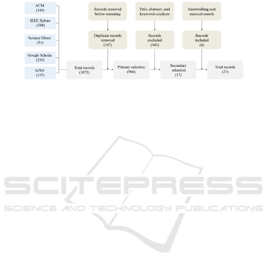
Figure 1: A birds-view research methodology flowchart, including query strategy, screening process and snowball inclusion.
that only articles that met all three inclusion criteria
were considered for analysis. In the final stage, we
categorised the interaction techniques and representa-
tion methods described in the selected studies. The
following subsections provide more details about the
survey strategy and categorisation structure applied in
this review.
3.1 Query Strategy
The research was formulated to find papers conduct-
ing a systematic literature review, so keywords such
as “survey”, “state of the art”, and “systematic re-
view” were used. We also used the keyword “visu-
alisation” to always ensure the paper was within the
visualisation domain.
The following databases were considered to iden-
tify and collect relevant manuscripts: (1) IEEE
Xplore, (2) ACM Digital Library, (3) Science Direct,
and (4) Google Scholar. Additionally, we collected
data from the arXiv platform to include grey litera-
ture in our survey.
We conducted three rounds of queries in each of
the databases, always with the restriction of finding
the keywords in the title of the articles. The final
query sequence was: (“visualisation”) AND (“liter-
ature systematic review” OR “survey” OR “state-of-
the-art”). Finally, one of the considered platforms
contained a list of other interactive surveys, which we
added to our list of surveys through snowballing re-
view.
Figure 1 presents the flowchart of the presented
methodology, which provides a birds-view of the pro-
cess. In the identification phase, we gathered 349 pa-
pers from ACM, 348 from IEEE Xplore, 51 from Sci-
ence Direct, 210 from Google Scholar, and 115 from
arXiv, totalling 1073 entries. Afterwards, we removed
107 duplicates that were present. In the screening pro-
cess, we filtered the 943 articles to follow inclusion
criteria 1–3 and were left with 17 entries. We included
six papers from the snowballing and manual query, fi-
nalising the screening process with 23 entries. The
results covered papers published between 2000 and
July 2024.
3.2 Categorisation
We analyse the platforms in two different aspects:
representation and interaction techniques. In the rep-
resentation category, we analyse how data is organ-
ised and viewed. This analysis aims to understand
how platforms present information to the user and
identify how these impact the analysis experience,
considering the amount of information displayed, the
need for interaction and the level of the offered visual
abstraction.
In the interaction techniques category, we em-
ployed the framework proposed by Yi et al. (Yi et al.,
2007) to categorise the survey platforms.
This framework uses seven different interaction
techniques which are as follows:
• Select: Allows users to mark items of interest and
track them during data exploration.
• Explore: Enables users to examine data subgroups
and visualise them from different perspectives.
• Reconfigure: Rearranges the spatial organisation
of data to facilitate comparisons and new insights.
• Encode: Lets users modify visual properties like
colour or shape to customise data representation.
• Abstract/Elaborate: Adjusts the data abstraction
level for a more general or detailed view.
• Filter: Applies filtering criteria to refine the
dataset and focus on relevant subsets.
• Connect: Highlights relationships and patterns
within the dataset for deeper analysis, by visu-
alise implicit or explicit connections among the
elements.
IVAPP 2025 - 16th International Conference on Information Visualization Theory and Applications
720

4 ANALYSIS OF EXISTING
PLATFORMS
The analysis follows the methodology descirbed ear-
lier in the paper. This is based on two pillars: repre-
sentation and interaction capabilities. The results are
discussed in the following section and summarised in
Table 1.
4.1 Representation
From the analysis of the platforms, we identify that
the two primary forms of representation are in list or
grid. Platforms with grid representation use thumb-
nail images to identify each sample, displaying more
information such as the title when the user moves
the cursor over the thumbnail and when the sample
is selected (e.g., the SentimentVis browser (Kucher
et al., 2018)). Most platforms with list representa-
tion already make visible more details about the sam-
ple, such as authors, year of publication and referring
categories, excluding the need to select the sample to
read the detailed content. In some of the platforms
that use list representation, the information presented
to the user is only textual, not presenting images (e.g.,
Immersive Analytics with Abstract 3D Visualisations
(Kraus et al., 2022)). The only interactive survey that
offers the option to choose the representation format
is the Physical visualisation survey (Dragicevic and
Jansen, 2012), which allows the entries to be dis-
played in a grid or list format.
Another type of frequent representation is a his-
togram, which shows the distribution of papers by
year of publication. In several approaches, such as
the one used in the performance visualisation survey
(Isaacs et al., 2014), the histogram is reactive to the
selectors, which is an important component for vi-
sual analysis. Although this kind of representation
is available in many platforms, it is usually a sec-
ondary element. Only two of the surveys analysed
showed different representation approaches: the Bio
Explorer (Kerren et al., 2017) uses spatial representa-
tion with a metaphor of galaxies, and the Image Syn-
thesis Pipeline (Tsirikoglou et al., 2020) presents a
tree visualisation of the samples.
4.2 Interaction Techniques
In survey platforms, an important component is the
interaction that enables the exploration and analysis
of the literary collection. To assess interaction we re-
lied on the interaction taxonomy by (Yi et al., 2007)
described earlier.
• Filter is the only interaction technique present in
all the platforms analysed, which allows the user
to change the group of data presented based on
certain criteria, such as the category being anal-
ysed.
• Abstract/Elaborate is one of the most present
interaction techniques among the platforms anal-
ysed. The abstraction/elaboration consists of pre-
senting a popup card with details of the selected
sample.
• Select allows the user to mark items of interest
and accompany them in the exploration. The only
platforms that provide the selection interaction
technique are the BioVis Explorer (Kerren et al.,
2017) and the platforms that use the SurVis sys-
tem (Beck et al., 2014; Isaacs et al., 2014; Liu
et al., 2017; Beck and Weiskopf, 2017; Sperrle
et al., 2021). SurVis (Beck et al., 2016) is a system
for literary collection that presents a word-size vi-
sualisation of the keywords used in the literary
collection. The system has selectors that, when
applied, highlight all the keywords that were used
in conjunction with that selector, along with a
sparkline graph showing the number of times each
keyword was used. The BioVis Explorer (Kerren
et al., 2017) highlights the selected sample and a
connection to all the most similar samples when
the user interacts with a sample by pressing the
right mouse button.
• Connect highlights associations and relationships
between the data presented. The only platform
that presented this interaction technique is the
BioVis explorer (Kerren et al., 2017), which ad-
ditionally employs spatial representation from a
metaphor of galaxies based on the dimensionality
reduction.
• Explore is the interaction technique that allows
the user to examine different subgroups of data
and visualise the data from a different perspec-
tive. The only survey that presents this type
of technique is the Bio Explorer (Kerren et al.,
2017) which uses zooming and panning to navi-
gate through the visualisation.
• Reconfigure interaction technique was found in
two platforms (Wang and Laramee, 2022; Kraus
et al., 2022) for enabling the user to sort the sam-
ples.
• Encode was found in none of the analysed sur-
veys analysed.
Based on our analysis, we have identified several
gaps in the current platforms that can be explored.
Some platforms offer visualisations of bibliographic
Interactive Platform for Surveys in Information Visualisation
721
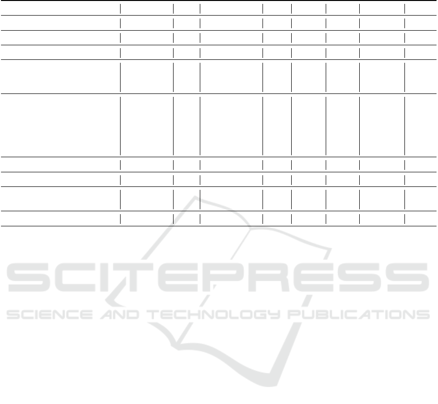
Table 1: Assessment of related systems in relation to the form of representation used and the presence or absence of the
interaction techniques proposed by Yi et al. (Yi et al., 2007).
Survey Representation Filter Abstract/Elaborate Select Connect Explore Reconfigure Encode
(Bach et al., 2017) List •
(Tsirikoglou et al., 2020) List + Tree •
(Xu et al., 2020; Sch
¨
ottler et al., 2021) Grid •
(Beck et al., 2014; Liu et al., 2017;
Beck and Weiskopf, 2017; Sperrle
et al., 2021; Isaacs et al., 2014)
List + Bars • •
(Kucher and Kerren, 2015;
Chatzimparmpas et al., 2024; Kehrer
and Hauser, 2013; Dumas et al., 2014;
Schulz, 2011; Tominski and Aigner,
2023; Figueiras, 2013; Kucher et al.,
2018; Lu et al., 2017)
Grid • •
(Dragicevic and Jansen, 2012) Grid + List • •
(Butler et al., 2021) List • •
(Wang and Laramee, 2022; Kraus
et al., 2022)
List • • •
(Kerren et al., 2017) Scatter Plot • • • • •
material in grid and list formats, which, while use-
ful for viewing multiple entries at once, can make it
challenging to analyse the dataset as a whole. This
limitation is especially significant in surveys, where
understanding the relationships between multiple en-
tries and their classifications is crucial.
Although certain platforms, like BioVis Ex-
plorer (Kerren et al., 2017), provide more ad-
vanced visualisations—such as galaxy-based spatial
representations—they primarily focus on visualise
items by their mutual dissimilarity using multidimen-
sional scaling (MDS) based on factors like publica-
tion year and author similarity. While this approach
is valuable in specific contexts, it does not effectively
display how variables relate or how the database en-
tries are distributed across different categories of anal-
ysis. This is particularly limiting for survey tasks,
which require a more thorough analysis, not only
based on connections but also on correlation and dis-
tribution of various database entries based on the cat-
egories being examined.
In general, the current platforms provide valuable
features for exploration (e.g., filtering, abstracting,
representation in grids). However, we believe that a
platform that uses advanced forms of representation
and offers a broader range of interaction techniques
is essential for a more complete and efficient user ex-
perience. Further, using appropriate tools for survey
query can streamline the process, allowing users to
efficiently apply various types of analysis. This is
the direction we have taken when developing a new
platform, which we will elaborate on in the following
sections.
4.3 Requirements
Based on the insights derived from our analysis we
have compiled a final list of design requirements for
the development of a the platform. It is important
to mention that the requirements such as functional,
data, implementation, are out of scope of this paper.
The derived requirements focus on improving both
the representation of data and the range of interac-
tion techniques available. The following are the main
requirements for a platform proposal:
• Multiple Data Representation Options. The
proposed platform must support different forms of
data representation specific for survey tasks. The
ability to switch between representations will en-
hance flexibility and cater to different user prefer-
ences.
• Interactive Filtering Mechanism. The platform
must include filtering options, allowing users to
refine the dataset based on specific criteria, such
as publication year, category, or keyword rele-
vance.
• Abstract/Elaborate Interaction. Users must be
able to control the level of detail displayed about
a sample, with options to expand or collapse in-
formation. This “abstract/elaborate” technique is
commonly implemented via popups or additional
IVAPP 2025 - 16th International Conference on Information Visualization Theory and Applications
722
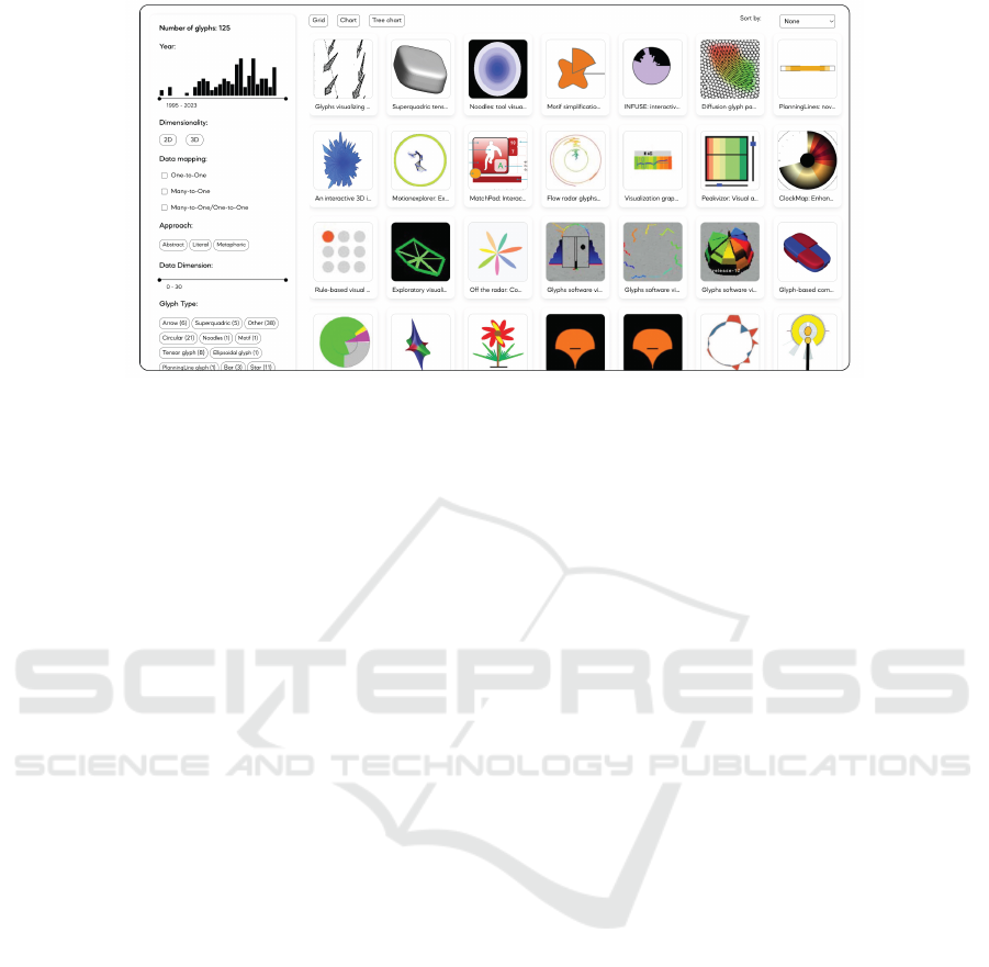
Figure 2: Interface of the proposed platform, showing the filtering panel (left) and the main panel in grid mode (right).
information cards.
• Reconfiguration of Data Layout. Users should
have the ability to reconfigure the layout of vi-
sualised data, enabling them to sort or rearrange
samples based on different criteria (e.g., publica-
tion date, author, or relevance).
• Customisable Data Encoding. Although absent
in the platforms analysed, adding the ability to
change visual elements (e.g., colour, shape, or
size) based on different data attributes will en-
hance the platform’s flexibility. Users should be
able to customise these aspects to fit their ana-
lytical needs, making visualisations more intuitive
and insightful.
With these insights, we intend to create a plat-
form that simplifies the analysis of systematic bibli-
ographic reviews, offering a clear and accessible vi-
sualisation.
5 PROPOSED PLATFORM
Having outlined the fundamental considerations for
the interactive survey platform, we will now describe
the proposed platform, focusing on its design and
functionalities. This section will provide a detailed
overview of how the platform is structured.
The platform consists of two panels: a left-side
panel with filtering options, and the main panel,
where the database entries are displayed (see Fig. 2).
The initial representation mode shows entries as
thumbnails of representative images, each with part
of its title below, arranged on a grid. In addition to the
grid approach, the user can explore the entry collec-
tion using two other representation approaches: distri-
bution charts (Fig. 3, (b-d)) and tree diagram (Fig. 3,
(e)).
The second representation option is based on dis-
tribution charts, where a different chart is selected ac-
cording to the selected variables as seen in Figure 3.
The user can choose the attributes for the x-axis, the
y-axis and the colour through three dialogue boxes in
the upper right corner of the screen. When selecting
only the x-axis, a bar chart appears; when selecting
the x-axis and y-axis, a bubble chart appears; when
the x-axis and colour are selected, a stacked bar chart
is presented; and when attributes for the x-axis, y-
axis and colour are selected, a scatterplot is presented.
This approach aims to facilitate data analysis and vi-
sualises the distributions between the different cate-
gories analysed.
The third representation option is a tree diagram
(see Fig. 3, (e)). This visualisation provides the user
with a comprehensive view of all publications and
clearly highlights the distribution of entries between
the different categories.
Regarding the interaction techniques, we imple-
mented the following:
• Filter: the filtering of the data is performed
through the side panel (e.g. (Fig. 2), where there
is a word cloud of the tags with the different cat-
egories to be filtered. The tags also indicate the
frequency with the number of entries classified in
the tag reference. In addition, the side panel has
a histogram showing the frequency distribution of
data entries divided by the year of publication.
• Abstract/Elaborate: the user can see more or less
details of each publication by selecting it. When a
publication is selected, a popup with a card is pre-
sented, showing information such as the full title,
year of publication and all the categories analysed.
• Select: the platform allows the selection of publi-
Interactive Platform for Surveys in Information Visualisation
723
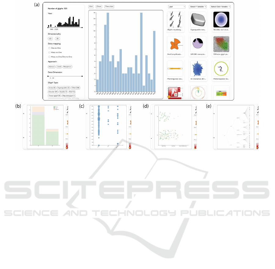
Figure 3: Platform interface displaying different visualisations. (a) Full-screen view of the interface with the bar chart
visualisation. Below, close-up views highlight the other available visualisation options: (b) stacked bar chart, (c) bubble chart,
(d) scatter plot, and (e) tree diagram.
cations. When a publication is selected by press-
ing the right mouse button, it is highlighted, facil-
itating identification during the exploration of the
data, as seen in Figure 4, either through filtering
or reconfiguration.
• Connect: associations and relationships between
data entries can be observed by using the tree di-
agram approach (Fig. 3), where the distribution is
made through the different nodes and links.
• Explore: this interaction technique is available
through the possibility of zooming and panning
in the graph view (Fig. 3).
• Reconfigure: this interaction technique is em-
ployed as the option to sort the samples in the
first representation panel, where the publications
are arranged in a grid with thumbnails. In addi-
tion, the user can reconfigure the second panel by
changing the layout of the chart by choosing the
attributes of the x-axis, y-axis and the colour, see
in Figure 3.
The platform’s design and functionality have been
carefully thought out to meet the considerations iden-
tified in the previous section. With a variety of repre-
sentation and interaction options, the platform aims to
provide the user with an efficient and comprehensive
way of exploring the data, wich will be demonstrated
in the next section.
6 CASE STUDY: DATA GLYPHS
To explore the functionality of the proposed platform,
we conducted a case study on data glyph design. Data
glyphs are composite graphic objects that use visual
and geometric attributes to encode multidimensional
data (Borgo et al., 2013). There are several types of
data glyphs with different designs and concepts, from
pictorial to abstract representations, such as the Cher-
noff face and its variations (Chernoff, 1973; Ramos
et al., 2023) or the Star Glyph (J.H. et al., 1972).
The objective of the survey is to collect a series of
application studies in data glyphs, analyse the differ-
ent visual characteristics of the data glyphs and their
application context, and compare the different design
proposals. It is worth mentioning that the case study
presented in this paper is part of an ongoing research
project on data glyphs (Ramos et al., 2023; Cunha
et al., 2018) and it is only briefly described for illus-
trative purposes. A more detailed report will be made
available in the near future.
6.1 Data Glyphs Classification
In the analysis of data glyphs, we classified the glyphs
based on their visual characteristics. First, we looked
at their dimensionality, classifying them as either 2D
or 3D. Then, we examined their visual approach,
IVAPP 2025 - 16th International Conference on Information Visualization Theory and Applications
724
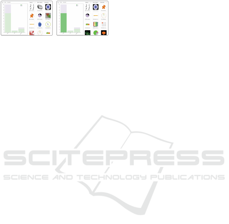
Figure 4: Sample selection and highlight in stacked bar
chart visualisation, showing the approach (abstract, literal
and metaphoric) on the x-axis and dimensionality with
colour (2D as green and 3D as purple).
identifying whether they were abstract or pictorial
and, if pictorial, whether they used literal, metaphor-
ical, or metonymy figures. In addition, we classified
glyphs by type, such as faces, stars, or other shapes
(Ward, 2008).
Data mapping was another aspect evaluated based
on the Ward taxonomy (Ward, 2002). We categorised
the glyphs into three data mappings: one-to-one, one-
to-many, and many-to-one. We also looked at the data
dimension, i.e., how many attributes the glyph was
encoding.
For the analysis tasks, we use Andrienko’s taxon-
omy (Andrienko and Andrienko, 2006) to classify the
glyphs into synoptic and elementary tasks. Synoptic
tasks include clustering/sorting, anomaly detection,
pattern analysis, visual search, and overview. Ele-
mentary tasks include benchmarking and data enrich-
ment.
Finally, we classify the application of glyphs in
different areas proposed by Borgo et al. (Borgo et al.,
2013), such as medical, event, multifield, geospatial,
flow, and tensor visualisation. In each of these areas,
glyphs provide an intuitive and effective way to visu-
alise complex, multidimensional data.
6.2 Operations of Analysis
In research such as data glyphs, the main objective is
to understand the approaches already used and their
visual characteristics. Therefore, it is important that
the platform allows the detailed visualization of each
data entry, in this case of each glyph design collected,
and a broad view of the dataset as a whole, thus al-
lowing groupings and comparisons between samples.
We have listed five operations that both the author and
general readers may want to perform when searching
for data glyphs:
O1. Get an overview of the entire data glyph dataset.
O2. Compare different designs within a category.
O3. Group glyphs based on their similarities.
O4. Analyse possible correlations between cate-
gories.
O5. Compare glyph distributions between variables.
O1 is directly related to the analysis of the taxon-
omy used to classify the glyphs. It may be important
for the author to identify if a particular category has
a low incidence of data glyphs and can be reassessed
or even eliminated, or the opposite if there is any cat-
egory in which all glyphs are present. For example,
one of the categories analysed is the dimensionality
of the glyphs. The author may need to know if more
than 90% of the glyphs are within the 2D category or
if there is no glyph in the 3D category.
O2 is connected to O1. Authors must be able to
perceive the data set as a whole, identifying the num-
ber of entries and their distributions.
O3 deals with the possibility of a detailed view of
the glyph. As research on the design of data glyphs, it
can be necessary for the author and readers to nav-
igate between the already analysed categories and
analyse the data glyph image in the search for new
characteristics.
As in O1, in O4, it may be important to analyse
the taxonomy to evaluate possible correlations and co-
dependencies between the categories. For example,
the author may want to assess whether there is any
connection between the visual approach used in the
data glyph design and its application domain.
The case study research classifies the glyphs into
eight different categories and a number of possible
variables; that is, they are multivariate data. O5 is re-
lated to the possibility of cluster formation, grouping
the glyphs based on their similarities.
6.3 Analysing Data
Within the platform, the user can perform tasks us-
ing the different visualisation panels and interactiv-
ity techniques provided. Below, we present how each
panel helps in the analysis of the survey on glyphs.
The first panel of the platform, Figure 2, allows
the reader to get an idea of the number of entries in
the survey. With its thumbnail view, the reader can
visually identify the characteristics of the glyphs and
possible similarities with other entries when filters are
applied. For example, when we filter the glyphs and
display only those with 2D dimensionality that repre-
sent more than five attributes, they have a data dimen-
sion equal to or greater than five. Most of the glyphs
presented have a circular structure.
The distribution charts, Figure 3, allows for the
identification of the distribution of entries within the
different categories. For example, it can be seen that
there are many more glyphs with a Many-to-One data
mapping than one-to-one. Furthermore, the possibil-
ity of reconfiguring the graph allows the reader to ex-
Interactive Platform for Surveys in Information Visualisation
725

plore the data, thus finding possible correlations. In
the data glyph survey, we noticed that the majority
of glyphs with 3D dimensionality have a higher Data
Dimension value, being between 16 and 18.
The tree diagram representation lets the user un-
derstand the hierarchies within the categories anal-
ysed, Figure 3 (e). When viewing the tree diagram, it
is possible to see that there are many more glyphs with
abstract approach and many-to-one data mapping, ei-
ther with 2D or 3D dimensionality.
7 EVALUATION
The goal of the proposed platform is to facilitate the
analysis of survey data using visualisation. To as-
sess if the implemented interface elements and in-
teraction techniques meet this goal, we conducted a
semi-structured evaluation. The evaluation focused
on two main aspects of the platform: application of
filters and exploration of visualisations.
7.1 Setup
The semi-structured evaluation was conducted in in-
dividual sessions in a quiet and closed room. The
evaluation was conducted with 5 participants, aged
between 25 and 36 years. The group consisted of
three men and two women. The participants were
students from the computer engineering field (2) and
from the design field (3). Each session lasted between
25 and 45 minutes and was divided into three main
parts: (i) introduction to the platform, (ii) execution of
11 tasks by the participants, and (iii) open questions.
Participants were encouraged to think out loud during
the activities, allowing the recording of their percep-
tions and difficulties. The tasks were designed to sim-
ulate real scenarios of use, covering the application of
filters (T1-T5), exploration of graphs (T6-T9) and de-
tailed analysis of glyphs in the cards (T10-T11). Ex-
amples of the tasks are: “Filter the data glyphs to only
show the last five years” (T1 Filter by Year); “Create
a stacked bar chart by selecting the X variable and
colour” (T8 Stacked bar chart); and “Try to visualise
more details about a glyph. What can you discover?”
(T10 Detailing a Glyph).
At the end of each task, participants were asked
to evaluate a statement regarding the clarity and ease
of performing the task – e.g. the sentence for T10
was Finding information about the glyph was easy.
The participants were expected to answer this ques-
tion with a number on a Likert scale from 1 to 5,
where 1 would correspond to “completely disagree”
and 5 to “completely agree”. Additionally, for some
Table 2: Results of participants’ evaluations of statements
related to task ease using a Likert scale [1-5], where 1 cor-
responds to “completely disagree” and 5 to “completely
agree” – the higher the values the easier it is to complete
the task. The table presents mode (mo), median ( ˜x), average
( ¯x) and standard deviation (σ ).
Task mo ˜x ¯x σ
T1 – Filter year 5 5 4.6 0.55
T2 – Filter combination 5 5 5.0 0.00
T3 – Domain filter 5 5 4.8 0.45
T4 – Multiple Filters 5 5 5.0 0.00
T5 – Glyph type filter 5 5 4.6 0.89
T6 – Create a Bar chart 5 5 4.0 1.22
T7 – Create a Bubble chart 5 4 4.2 0.84
T8 – Create a Stacked bar chart 5 5 4.8 0.45
T9 – Analyse the Tree diagram 5 5 4.4 0.89
T10 – Detailing a Glyph 5 5 4.8 0.45
T11 – Find Oldest glyph 5 5 4.8 0.45
tasks, supplementary questions were asked to gain a
better understanding of any difficulties experienced.
In the third part of the evaluation, the participants
were asked open-ended questions aimed at getting an
overview of the participant’s experience and improve-
ment suggestions. The questions were: (i) How would
you describe the experience with the filters, visualisa-
tions and analysis of the cards? (ii) Was any part of
the process confusing or complicated?, and (iii) If you
could suggest an improvement, what would it be?
7.2 Results and Discussion
Table 2 summarizes the results obtained in regards to
the ease and clarity of conducting the tasks, where
higher values correspond to greater ease, presenting
mode (mo), median ( ˜x), average ( ¯x) and standard de-
viation (σ ) for all tasks. Overall, the results show that
the tasks were easy to conduct ( ¯x ≥ 5 for all tasks). In
the remainder of this section, we describe the results
obtained for each task, reporting the answers of par-
ticipants to task-specific questions and discussing the
suggestions for improvements. The section is divided
into two parts, based on the two aspects addressed in
the study – the application of filters and the explo-
ration of visualisations.
7.2.1 Filter Tasks
The first five tasks focused on applying different fil-
ters within the platform. After each task, participants
were to evaluate the ease of use and clarity of the fil-
ters (Table 2).
In task T1, the participant was asked to filter the
glyphs so that only the last 5 years appear. The re-
sults indicate that participants found the filter by year
IVAPP 2025 - 16th International Conference on Information Visualization Theory and Applications
726

easy to use (mo = 5, ˜x = 5, ¯x = 4.6, σ = 0.55). Ad-
ditionally, as the year filter consists of a slider but-
ton and a histogram displaying the number of entries
for each year, participants were asked if the histogram
helped them understand the distribution of the glyphs.
Four participants answered with a score of 5 (strongly
agree), while one gave a score of 4 (partially agree),
noting that they would like the option to input the
year value directly, in addition to dragging the slider
pointer.
In T2, participants applied a filter to display only
the data glyphs with 3D dimensionality and Many-to-
One mapping. The results show that the combination
of filters was clear (mo = 5, ˜x = 5, ¯x = 5, σ = 0).
Task T3 involved filtering the data glyphs by do-
main. The results demonstrated that the display of re-
sults after applying the filter was clear (mo = 5, ˜x = 5,
¯x = 4.8, σ = 0.45). Additionally, at the end of this
task, participants were asked if the results after ap-
plying the filter were clear. All participants answered
with a score of 5 (strongly agree), indicating that they
had no difficulty visualizing the results after applying
the filters.
In T4, which required the combination of three or
more filters, the participant could choose which fil-
ter to apply. The results show that the participants
found the process of applying multiple filters simple
(mo = 5, ˜x = 5, ¯x = 5, σ = 0). At the end of the
task, participants were also asked if there any confus-
ing parts in the interface used to select multiple filters.
Three participants answered 1 (strongly disagree), in-
dicating that they had no difficulties, while two partic-
ipants rated 4 (partially agree) and 5 (strongly agree),
noting that the number of entries displayed in the filter
tags was confusing.
Finally, in T5, participants were asked to identify
the type of glyph with the highest number of entries.
They considered this process intuitive (mo = 5, ˜x = 5,
¯x = 4.6, σ = 0.89).
The analysis of the tasks related to the application
of filters reveals that, in general, users find system fil-
tering tools intuitive and effective when used individ-
ually. However, there is evidence that the interaction
between multiple filters can be confusing, and some
participants had difficulty interpreting the tags, affect-
ing their performance in Tasks T3 and T4. Addition-
ally, some participants had difficulty finding the total
number of data glyphs being visualised. Based on the
results of the tasks and feedback collected from par-
ticipants during open-ended questions, we have iden-
tified potential improvements to be made in future
developments of the platform. These improvements
mostly concern clarifying the interface when multiple
filters are applied simultaneously and introducing in-
structions or indicators that help guide users through
the multiple filtering process. In particular, two par-
ticipants suggested the need for specific input options
within filters, such as enabling users to select or type
a year directly instead of relying solely on dragging a
slider. For tag-based filters, participants noted that the
number of entries displayed in each tag corresponded
to the total number of glyphs on the platform and
did not update dynamically when a filter was applied.
This created a misleading impression that data glyphs
existed in categories that did not match the active fil-
ters. Another improvement recommended by partic-
ipants is the implementation of a ”reset” button for
filters. During the tasks, users often needed to apply
multiple filters, but the lack of an easy way to reset
them was inconvenient and negatively impacted the
user experience.
7.2.2 Visualisation Tasks
Tasks T6 to T11 were designed to evaluate the repre-
sentation approaches, specifically the various graphic
visualisations offered by the system. The goal was
to check how clear, useful, and easy is to use these
visualisations.
In T6, participants created a bar chart by select-
ing an attribute for the x-axis. The results indicated
that participants found the graph configuration pro-
cess easy and intuitive (mo = 5, ˜x = 5, ¯x = 4.0,
σ = 1.22). Additionally, they were asked if the vi-
sualisation helped them understand the distribution of
glyphs; all of them answered positively that the chart
was clear and the visualisation helped them under-
stand the distribution. These findings suggest that the
bar chart interface is easy to use and provides clear
insights.
Task T7 involved creating a bubble chart by
changing the attribute on the x-axis and adding an-
other attribute to the y-axis. Participants found the
bubble graph helpful in visualising the relationship
between variables X and Y (mo = 5, ˜x = 4, ¯x = 4.2,
σ = 0.84). In addition, participants were asked if they
experienced any difficulty when interpreting the bub-
ble chart. One participant answered with a 1 (strongly
disagree), indicating no difficulties; one answered
with a 2 (partially disagree); one with a 3 (neutral);
and two with a 5 (strongly agree), indicating signif-
icant difficulty in interpreting the chart. All partici-
pants who reported any level of difficulty noted that
they struggled to identify which categories had the
highest number of entries and found it impossible to
determine the exact values.
In T8, participants created a stacked bar chart by
selecting attributes for the x-axis and colour. They
found this visualisation clear and valuable (mo = 5,
Interactive Platform for Surveys in Information Visualisation
727

˜x = 5, ¯x = 4.8, σ = 0.45). Additionally, the partici-
pants were asked if the visualisation by colours helped
analyse the distribution in the categories. All the par-
ticipants unanimously agreed, and the majority of the
participants (4) commented that this chart was easier
to analyse than the bubble chart.
Task T9 required participants to observe a tree di-
agram. The clarity of the tree diagram received posi-
tive evaluations (mo = 5, ˜x = 5, ¯x = 4.4, σ = 0.89).
In T10, participants were asked to find informa-
tion about a specific data glyph. They reported that
it was easy to find additional information (mo = 5,
˜x = 5, ¯x = 4.8, σ = 0.45).
Finally, Task T11 consisted of identifying the data
glyph with the oldest publication date. They consid-
ered this process intuitive (mo = 5, ˜x = 5, ¯x = 4.8,
σ = 0.45).
The analysis of the tasks related to the representa-
tion options reveals positive feedback on the usability
and clarity of the graphic visualisations offered by the
platform. Most participants found the visualisations
helpful in gaining insights into the data. However,
some areas presented challenges, such as the interpre-
tation of the bubble graph and the detailed analysis of
the tree visualisation. Additionally, participants men-
tioned a lack of captions and information about the
graphics presented. Suggested improvements include
reviewing the choice of charts, especially the bubble
chart, and improving the interface by adding a title,
a more evident caption system for the displayed at-
tributes, and indications that the chart is selectable.
8 CONCLUSION
In this paper, we present an interactive survey plat-
form that offers multiple forms of representation and
interaction techniques, aiming to provide a compre-
hensive and effective experience for the users. The
development of this platform was informed by an
analysis of existing platforms, identifying aspects to
be improved. To assess the quality of the imple-
mented platform, we used it to analyse data from a
survey on data glyphs and we conducted a user study
to evaluate the platform’s functionalities. The user
study demonstrated how the different representation
approaches, along with interactivity techniques, help
in the execution of data analysis tasks. However, for
future work, it is essential to validate the platform’s
usability with a bigger sample of users and explore
possibilities for improvement, such as the inclusion
of advanced visual coding techniques and the imple-
mentation of sophisticated data exploration methods.
With these continuous adjustments, our platform has
the potential to become a benchmark in the field of
interactive surveys, facilitating the research and anal-
ysis of information in various areas of study. Addi-
tionally, we intend to employ this platform for other
ongoing research, such as the survey of methods for
visualisation evalutation and application of machine
learning in this domain. It is important to test the ca-
pability of the platform on a knowledge base, which
has little to none of visual content.
ACKNOWLEDGEMENTS
This work is funded by national funds through the
FCT – Foundation for Science and Technology, I.P.
(grant number 2023.02333.BD), within the scope of
the project CISUC (UID/CEC/00326/2020), and co-
funded by national funds through the FCT – Foun-
dation for Science and Technology, I.P., under the
project/support 2022.15675.CMU.
REFERENCES
Andrienko, N. and Andrienko, G. (2006). Exploratory
Analysis of Spatial and Temporal Data: A Systematic
Approach. Exploratory Analysis of Spatial and Tem-
poral Data. Springer-Verlag Berlin Heidelberg.
Bach, B., Dragicevic, P., Archambault, D., Hurter, C., and
Carpendale, S. (2017). A Descriptive Framework
for Temporal Data Visualizations Based on General-
ized Space-Time Cubes. Computer Graphics Forum,
36(6):36–61.
Beck, F., Burch, M., Diehl, S., and Weiskopf, D. (2014).
The State of the Art in Visualizing Dynamic Graphs.
EuroVis - STARs, page 21 pages.
Beck, F., Koch, S., and Weiskopf, D. (2016). Visual Analy-
sis and Dissemination of Scientific Literature Collec-
tions with SurVis. IEEE Transactions on Visualization
and Computer Graphics, 22(1):180–189.
Beck, F. and Weiskopf, D. (2017). Word-Sized Graphics for
Scientific Texts. IEEE Transactions on Visualization
and Computer Graphics, 23(6):1576–1587.
Borgo, R., Kehrer, J., Chung, D. H., Maguire, E.,
Laramee, R. S., Hauser, H., Ward, M., and Chen, M.
(2013). Glyph-based visualization: Foundations, de-
sign guidelines, techniques and applications. In Euro-
graphics (State of the Art Reports), pages 39–63.
Butler, M., Holloway, L. M., Reinders, S., Goncu, C., and
Marriott, K. (2021). Technology Developments in
Touch-Based Accessible Graphics: A Systematic Re-
view of Research 2010-2020. In Proceedings of the
2021 CHI Conference on Human Factors in Comput-
ing Systems, pages 1–15, Yokohama Japan. ACM.
Chatzimparmpas, A., Kucher, K., and Kerren, A. (2024).
Visualization for Trust in Machine Learning Revis-
IVAPP 2025 - 16th International Conference on Information Visualization Theory and Applications
728

ited: The State of the Field in 2023. IEEE Computer
Graphics and Applications, pages 1–14.
Chernoff, H. (1973). The use of faces to represent points in
k-dimensional space graphically. Journal of the Amer-
ican statistical Association, 68(342):361–368.
Cunha, J. M., Polisciuc, E., Martins, P., and Machado, P.
(2018). The many-faced plot: strategy for automatic
glyph generation. In 2018 22nd International Con-
ference Information Visualisation (IV), pages 71–77.
IEEE.
Dragicevic, P. and Jansen, Y. (2012). List of physical vi-
sualizations. www.dataphys.org/list. Last accessed
2024-04-22.
Dumas, M., McGuffin, M. J., and Lemieux, V. L. (2014).
Financevis. net-a visual survey of financial data visu-
alizations. In Poster Abstracts of IEEE conference on
visualization, volume 2, page 8.
Figueiras, A. (2013). A Typology for Data Visualization on
the Web. In 2013 17th International Conference on
Information Visualisation, pages 351–358, London,
United Kingdom. IEEE.
Isaacs, K. E., Gim
´
enez, A., Jusufi, I., Gamblin, T., Bhatele,
A., Schulz, M., Hamann, B., and Bremer, P.-T. (2014).
State of the Art of Performance Visualization. EuroVis
- STARs, page 20 pages.
Jena, A., Engelke, U., Dwyer, T., Raiamanickam, V., and
Paris, C. (2020). Uncertainty Visualisation: An Inter-
active Visual Survey. In 2020 IEEE Pacific Visualiza-
tion Symposium (PacificVis), pages 201–205.
J.H., S., E.J., F., R.M., G., and H.P., F. (1972). The surgi-
cal implications of physiologic patterns in myocardial
infarction shock. pages 126–141.
Kehrer, J. and Hauser, H. (2013). Visualization and Vi-
sual Analysis of Multifaceted Scientific Data: A Sur-
vey. IEEE Transactions on Visualization and Com-
puter Graphics, 19(3):495–513.
Kerren, A., Kucher, K., Li, Y.-F., and Schreiber, F. (2017).
BioVis Explorer: A visual guide for biological data vi-
sualization techniques. PLOS ONE, 12(11):e0187341.
Kraus, M., Fuchs, J., Sommer, B., Klein, K., Engelke, U.,
Keim, D., and Schreiber, F. (2022). Immersive An-
alytics with Abstract 3D Visualizations: A Survey.
Computer Graphics Forum, 41(1):201–229.
Kucher, K. and Kerren, A. (2015). Text visualization tech-
niques: Taxonomy, visual survey, and community in-
sights. In 2015 IEEE Pacific Visualization Symposium
(PacificVis), pages 117–121.
Kucher, K., Paradis, C., and Kerren, A. (2018). The State of
the Art in Sentiment Visualization. Computer Graph-
ics Forum, 37(1):71–96.
Liu, S., Maljovec, D., Wang, B., Bremer, P.-T., and Pas-
cucci, V. (2017). Visualizing High-Dimensional Data:
Advances in the Past Decade. IEEE Transactions on
Visualization and Computer Graphics, 23(3):1249–
1268.
Lu, Y., Garcia, R., Hansen, B., Gleicher, M., and Ma-
ciejewski, R. (2017). The State-of-the-Art in Pre-
dictive Visual Analytics. Computer Graphics Forum,
36(3):539–562.
Page, M. J., McKenzie, J. E., Bossuyt, P. M., Boutron,
I., Hoffmann, T. C., Mulrow, C. D., Shamseer, L.,
Tetzlaff, J. M., Akl, E. A., Brennan, S. E., Chou,
R., Glanville, J., Grimshaw, J. M., Hr
´
objartsson, A.,
Lalu, M. M., Li, T., Loder, E. W., Mayo-Wilson, E.,
McDonald, S., McGuinness, L. A., Stewart, L. A.,
Thomas, J., Tricco, A. C., Welch, V. A., Whiting, P.,
and Moher, D. (2021). The prisma 2020 statement:
an updated guideline for reporting systematic reviews.
BMJ, 372.
Ramos, B. N., Mac¸
˜
as, C., Lourenc¸o, N., and Polisciuc, E.
(2023). Towards contextual glyph design: Visualizing
hearing screenings. In 2023 27th International Con-
ference Information Visualisation (IV), pages 96–102.
IEEE.
Schulz, H.-J. (2011). Treevis.net: A Tree Visualization Ref-
erence. IEEE Computer Graphics and Applications,
31(6):11–15.
Sch
¨
ottler, S., Yang, Y., Pfister, H., and Bach, B. (2021). Vi-
sualizing and Interacting with Geospatial Networks:
A Survey and Design Space. Computer Graphics Fo-
rum, 40(6):5–33.
Sperrle, F., El-Assady, M., Guo, G., Borgo, R., Chau, D. H.,
Endert, A., and Keim, D. (2021). A Survey of Human-
Centered Evaluations in Human-Centered Machine
Learning. Computer Graphics Forum, 40(3):543–568.
Tominski, C. and Aigner, W. (2023). The TimeViz Browser
– A Visual Survey of Visualization Techniques for
Time-Oriented Data. https://browser.timeviz.net. Ver-
sion 2.0.
Tsirikoglou, A., Eilertsen, G., and Unger, J. (2020). A Sur-
vey of Image Synthesis Methods for Visual Machine
Learning. Computer Graphics Forum, 39(6):426–451.
Wang, Q., Chen, Z., Wang, Y., and Qu, H. (2021). A sur-
vey on ml4vis: Applying machine learning advances
to data visualization. IEEE transactions on visualiza-
tion and computer graphics, 28(12):5134–5153.
Wang, Q. and Laramee, R. (2022). Ehr star: The state-
of-the-art in interactive ehr visualization. Computer
Graphics Forum, 41(1):69–105.
Ward, M. O. (2002). A taxonomy of glyph placement strate-
gies for multidimensional data visualization. Informa-
tion Visualization, 1(3-4):194–210.
Ward, M. O. (2008). Multivariate data glyphs: Principles
and practice. In Handbook of data visualization, pages
179–198. Springer.
Xu, K., Ottley, A., Walchshofer, C., Streit, M., Chang, R.,
and Wenskovitch, J. (2020). Survey on the Analysis of
User Interactions and Visualization Provenance. Com-
puter Graphics Forum, 39(3):757–783.
Yi, J. S., Kang, Y., Stasko, J., and Jacko, J. (2007). Toward
a Deeper Understanding of the Role of Interaction in
Information Visualization. IEEE Transactions on Vi-
sualization and Computer Graphics, 13:1224–1231.
Interactive Platform for Surveys in Information Visualisation
729
