
UIVLP: An Improved User Interface and Visualization Technique to
Visualize Learners’ Performances
Mukesh Kumar Rohil
a
and Trishna Paul
b
Department of Computer Science and Information Systems, Birla Institute of Technology and Science, Pilani, India
Keywords: User Interface, Visualization, Clustering, Principal Component Analysis, Scatter Plot.
Abstract: In most of the educational setups, the grading of students’ performance is based on their relative standing in
the class. In this work, we develop and present a user interface to visualize students’ performance, expressed
in terms of marks, out of same maximum marks for each subject, scored by the students in various evaluation
components for a subject. First, we statistically select three most informative subjects for the whole class and
then find the individual student’s average score in all components along with the overall average of whole
class for an evaluation component. We assume that the three courses’ performance for which the 3D
visualization is required, is either specified by the evaluator or selected by the system basis principal
component analysis. The visualization procedures have been developed for both, the individual student and
the entire class. The interactive 3D visualization and the bar-graphs can be compared side-by-side and we
visually observe that the scatter-plot of clusters provides better insights as compared to the conventional bar-
graphs. We also observe that the proposed visualization is better than the bar-graphs basis no-reference
BRISQUE image quality assessment. However, there may be certain situations when both types of graphs
might be needed.
1 INTRODUCTION
YA data collection can consist of scalar numbers,
vectors, higher-order tensors, or any mix of these data
types. Data sets can exhibit either two-dimensional or
multi-dimensional characteristics. Color coding is a
singular method for representing a collection of data
visually. Other methods encompass contour plots,
graphs, charts, surface renderings, and depiction of
volume interiors. Furthermore, the integration of
image processing techniques with computer graphics
is employed to provide a multitude of data
visualizations (
Hearn & Baker, 2015; Johnson &
Wichern, 2007
).
The objectives of scientific visualization include:
1) Investigating and utilizing data and information, 2)
Improving comprehension of concepts and processes,
3) Acquiring novel (unanticipated, profound)
insights, 4) Presenting essential characteristics
effectively by rendering the unseen visible. 5)
Ensuring the accuracy and reliability of simulations
and measurements, 6) Enhancing scientific output
a
https://orcid.org/0000-0002-2597-5096
b
https://orcid.org/0000-0003-2823-0812
and efficiency, and 7) Facilitating communication
and collaboration among researchers (
Hearn & Baker,
2015; Johnson & Wichern, 2007
).
In the present work we propose a technique to
visualize students’ performance in a course by
clustering the display around the average (mean) of
the marks obtained by student in various evaluation
components assuming that each evaluation
component has been evaluated out of same maximum
marks. In many universities the relative grading for a
course is done based on the total marks obtained by
the student. For this purpose the evaluator uses
histogram of the marks (i.e. count of students scoring
a particular marks is arranged in increasing or
decreasing order of marks). The histogram is plotted
as bar graph. We suggest to draw the marks of
students in three subjects or topics and three areas are
selected as the top three principal components.
After this short introduction, subsequently the
paper has been structured as follows. The Section 2,
Related Work provides a review of the related
literature, The Section 3, summarizes the Theory
Rohil, M. K. and Paul, T.
UIVLP: An Improved User Interface and Visualization Technique to Visualize Learners’ Performances.
DOI: 10.5220/0013191000003890
In Proceedings of the 17th International Conference on Agents and Artificial Intelligence (ICAART 2025) - Volume 3, pages 861-867
ISBN: 978-989-758-737-5; ISSN: 2184-433X
Copyright © 2025 by Paper published under CC license (CC BY-NC-ND 4.0)
861

related to the purpose of clustering in the context, The
Section 4 describes the problem, methodology,
implementation and experimentation. The Section 5
describes the results and finally the Section 6,
concludes the findings and lists scope for future
research.
2 RELATED WORK
The progress in human-computer interaction has led
to the development of novel approaches for
examining graphical data in a dynamic manner,
allowing users to have adaptable control. Although
the majority of this research focuses on the
presentation of statistical data, there has also been
significant collaboration with advancements in
information visualization as a whole. This is
especially true for the representation of extensive
networks, hierarchies, databases, and text, where the
difficulties of handling massive amounts of data
persistently arise (Hearn & Baker, 2015; Al-Barrak & Al-
Razgan, 2016).
The field of statistical graphics encompasses the
creation of various contemporary methods for
visualizing data, including bar and pie charts,
histograms, line graphs, time-series plots, contour
plots, and other techniques. Thematic cartography
evolved from individual maps to extensive atlases,
which portrayed data on diverse subjects such as
economics, society, ethics, medicine, and physical
features. This advancement also offered innovative
methods of representing information through various
symbols (Hearn & Baker, 2015; Johnson & Wichern,
2007).
Most of the work related to the visualization of
the students’ performance are focusing on the user
interface for the students to visualize their
performance rather than helping the evaluator to
visualize the insights in the dataset of the marks.
These simply displays the marks in 3D or 2D without
performing principal component analysis. Some
works related to visualization of data mining and
predictions of the students’ performance (Al-Barrak &
Al-Razgan, 2016; Misailidis et al., 2018) are helping the
both the students and the evaluators. The work done
by Humphries et al. (2006) helps the students to
visualize their grade as their performance and the
work by Deng et al. (2019) is course specific and does
not combine more number of related or selected
courses.
Most of the learning analytics tools and discussed
in (Darcy, 2022; Paolucci et al., 2024; Mukred et al., 2024;
Atif et al., 2013) displays bar graphs, pie-charts etc.
depicting the distribution of learners’ performance
including performance improvement (or degradation)
over time, but these tools do not display 3D scalar and
vector plots for most discriminating courses of study.
3 PURPOSE OF CLUSTER
ANALYSIS
Cluster analysis aims to condense a vast dataset into
significant subgroups of individuals or things. The
division is achieved by categorizing the objects based
on their similarity across a predetermined set of
parameters. Anomalies pose a challenge to this
methodology, frequently arising from an excessive
number of extraneous factors. It is essential for the
sample to accurately reflect the population, and it is
preferable for the components to be independent of
each other. There are three primary clustering
techniques: hierarchical, which follows a tree-like
procedure suitable for smaller data sets; non-
hierarchical, which necessitates specifying the
number of clusters in advance; and a hybrid approach
that combines both methods. The development of
clusters is guided by four primary principles:
distinctiveness, accessibility, measurability, and
profitability (sufficiently significant to have an
impact).
In the present work for 3D visualization we
cluster the marks about the point in 3D representing
the mean of scores in three subjects. These three
subjects are selected by Principal Component
Analysis (Johnson & Wichern, 2007).
4 PROBLEM, METHODOLOGY,
AND IMPLEMENTATION
The problem dealt in this paper is a multivariate
problem so that students’ performance can be graded
using this. Cluster analysis technique is employed to
solve this problem.
A. Problem Description
The problem is to graphically represent marks
obtained by different students. We take a case of four
students. Each student registers in three different
subjects. Each student attempts fixed number of tests,
given by the instructor, in each of the three subjects.
So input for the problem is four text files, one for each
student namely student1.txt, student2.txt,
student3.txt, student4.txt. In other words all the data
related to marks obtained by a particular student is
ICAART 2025 - 17th International Conference on Agents and Artificial Intelligence
862
stored in a single text file. Thus there are four
different files for four students. In each text file
numerical data is provided in a matrix form. Row1
represents test1 (i.e. evaluation component 1) marks,
Row2 represents test2 (i.e. evaluation component 2)
marks, and so forth. Similarly, column1 represents
subject1, column2 represents subject2 and so forth
(please refer tables I to IV).
B. Input
Input data for the problem is presented in the form of
tables below. Each text file corresponding to
particular student is presented as a table i.e. Each
table corresponds to a particular student.
Table 1: Marks of Student 1.
Subject 1 Subject 2 Subject 3
Test 1 250 150 70
Test 2 250 250 250
Test 3 270 250 90
Test 4 310 150 50
Test 5 280 170 50
Above table shows the marks of student1 in three
different subjects i.e. subject1, subject2 and subject3.
Table 2: Marks of Student 2.
Subject 1 Subject 2 Subject 3
Test 1 0 100 20
Test 2 0 200 0
Test 3 20 200 40
Test 4 60 100 0
Test 5 90 130 0
Above table (i.e. Table 2) shows the marks of
student2 in three subjects i.e. subject1, subject2 and
subject3.
Table 3: Marks of Student 3.
Subject 1 Subject 2 Subject 3
Test 1 0 0 100
Test 2 0 100 0
Test 3 100 0 0
Test 4 100 100 0
Test 5 0 100 100
Marks of student3 in different subjects are
presented in the Table 3.
Table 4: Marks of Student 4.
Subject 1 Subject 2 Subject 3
Test 1 150 50 70
Test 2 0 100 0
Test 3 100 0 0
Test 4 100 100 0
Test 5 0 100 100
Marks of student4 in three subjects are presented
in the above table.
C. Methodology, Implementation, and
Experimentation
Now all the numerical data from one text file has to
be represented as one cluster i.e. marks obtained by a
particular student in different subjects for different
tests has to be represented as one cluster. Therefore
four different clusters should be obtained for four
different students i.e. each cluster represents marks
obtained by a particular student.
For showing these clusters in three dimensional
space three axes X-axis, Y-axis and Z-axis are drawn
on a frame developed in Java Language. Each axis
represents a subject. Hence the values in first column
of the text file mapped along the X-Coordinates of a
three dimensional point. Similarly values of second
column are mapped to the Y Coordinates and values
of third column are mapped to the Z-Coordinates. So
marks obtained by a student in three subjects in a
particular test are represented by a point in three
dimensional space.
Numerical data from each file is read and the
values are plotted in three dimensional space using
graphics functions in Java Programming Language.
Mean values for the X-Coordinates, Y-Coordinates
and Z-Coordinates in text file are calculated. The mean
value of X-Coordinates of a particular text file
represents the average value of the marks obtained by
the student in all tests of subject1. This becomes the X-
Coordinate for the data point corresponding to the
mean value of marks obtained by a student in all tests
of three different subjects. In the same way mean
values of Y-Coordinates and Z-Coordinates represents
average marks obtained by a student in all tests of
subject2 and subject3 respectively. These values
become Y-Coordinate and Z-Coordinates for the mean
value data point. It implies that we have a mean value
data point for each student i.e. for each cluster
representing marks of student there is a corresponding
mean value data point. Then a line is drawn from each
data point (representing marks in three subjects) of a
cluster to its corresponding mean value data point.
The lines drawn from each point of a cluster to its
corresponding mean value data give clear picture of
UIVLP: An Improved User Interface and Visualization Technique to Visualize Learners’ Performances
863
deviation of the average marks of all tests from the
marks obtained in each test or looking in a different
perspective we can say that these lines give an idea
about the closeness of the average marks in all tests
from the marks obtained in each test.
Conventionally, in a university setup, for the
relative grading of students’ performance the
visualizations of the frequency-histogram represented
as bar-graph but we propose to use 3D-Visualization
of clusters also to arrive at cutoff for grading because
as we explore later 3D-Visualizations of cluster
provides more insights like depth-queuing and
relative standing of a student’s performance with
respect to three subjects (or three topics) as compared
to the total marks as depicted in the bar-graphs. To
show it we use Blind/Reference less Image Spatial
Quality Evaluator (BRISQUE), no-reference image
quality scores, calculated as per the algorithm given
by
(Mittal et al., 2012)
, and its interpretation is as
follows, smaller the score better the image quality and
better the visualization considering the image quality.
5 RESULTS
For comparison, in Figs. 1 to 5, we plot bar-graphs
and cluster plots side-by-side and provides specific
details in the figure caption. The following screen
shots presents the output of the Java program
developed as a solution to this problem.
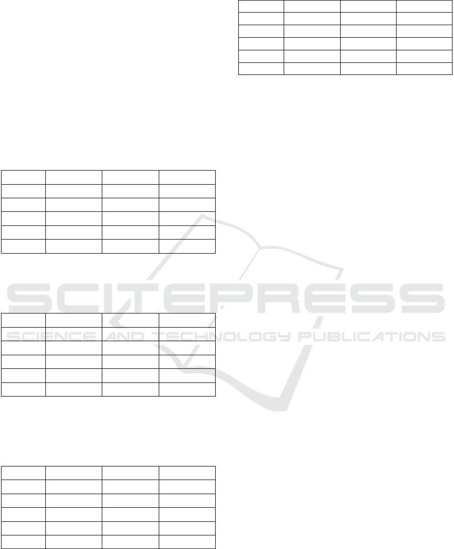
a) BRISQUE
Score = 45.66
b) BRISQUE
Score = 47.635
c) BRISQUE
Score = 44.64
Figure 1: Visualization of marks of student 1, a) Subject
wise totals; subject1 marks are denoted by left-most bar,
subject2 marks are to the right of it, and so on, b) Evaluation
component marks subject-wise; list of bars in the left-most
portions represents marks obtained
b
y the student in Test1
to Test5 in subject1; to the right of this, subject2 marks fo
r
five tests taken by the student are displayed and subject3
marks for five tests are displayed right-most, c) 3D display
of marks for five tests clustered about mean-score of three
subjects evaluation-wise for the corresponding student.
In the screen capture (Figure 1) one can clearly
see the graphical visualization in three dimensional
space. Distribution of marks obtained by student 1 is
represented as a cluster. Cluster representing the
marks of student 1 can be clearly seen. Lines are
drawn from each data point to the data point
corresponding to the mean value of the marks of
student 1. Deviation of the average of marks from all
tests from marks obtained in each test in the case of
student 1 can be estimated using these lines.
We observe that because of no slanting lines in
Figure 1 (a) and (b) (i.e. display is mostly generated
by horizontal and vertical lines which are usually
smooth), visually the Figure 1 (a) and (b) may seem
good compared to Figure 1 (c) but image quality
analysis in the terms of BRISQUE score evaluates to
best for the Figure 1 (c).
a) BRISQUE
Score = 46.21
b) BRISQUE
Score = 45.14
c) BRISQUE Score =
44.64
Figure 2: Visualization of marks of student 2, a) Subject-
wise totals; subject1 marks are denoted by left-most bar,
subject2 marks are to the right of it, and so on, b) Evaluation
component marks subject-wise; list of bars in the left-most
portions represents marks obtained by the student in Test1
to Test 5 in subject1; to right of this, subject2 marks fo
r
fives tests taken by the student are displayed and subject3
marks for five tests are displayed right-most, c) 3D display
of marks for five tests clustered about mean-score of three
subjects evaluation-wise for the corresponding student.
In the above screen capture (Figure 2) one can
clearly see the graphical visualization in three-
dimensional spaces. Distribution of marks obtained
by student 2 is represented as a cluster. Cluster
representing the marks of student 2 can be clearly
seen. Lines are drawn from each data point to the data
point corresponding to the mean value of the marks
of student 2. Deviation of the average of marks from
all tests from marks obtained in each test in the case
of student 2 can be estimated using these lines. Image
quality analysis in the terms of BRISQUE score
evaluates to best for the Figure 2 (c).
ICAART 2025 - 17th International Conference on Agents and Artificial Intelligence
864
Three dimensional space can be clearly in the
above screen shot (Figure 3) too. Distribution of
marks obtained by student 3 is represented as a
cluster. Cluster representing the marks of student 3
can be clearly seen. Lines are drawn from each data
point to the data point corresponding to the mean
value of the marks of student 3. Deviation of the
average of marks from all tests from marks obtained
in each test in the case of student 3 can be estimated
using these lines. Image quality analysis in the terms
of BRISQUE score evaluates to best for the Figure 3
(c).
a) BRISQUE
Score = 45.51
b) BRISQUE
Score = 48.18
c) BRISQUE
Score = 44.66
Figure 3: Visualization of marks of student 3, a) Subject-
wise totals; subject1 marks are denoted by left-most bar,
subject2 marks are to the right of it, and so on, b) Evaluation
component marks subject-wise; list of bars in the left-most
portions represents marks obtained by the student in Test1
to Test 5 in subject1; to the right of this, subject2 marks for
five tests taken by the student are displayed and subject3
marks for five tests are displayed right-most, c) 3D display
of marks for five tests clustered about mean-score of three
subjects evaluation-wise for the corresponding student.
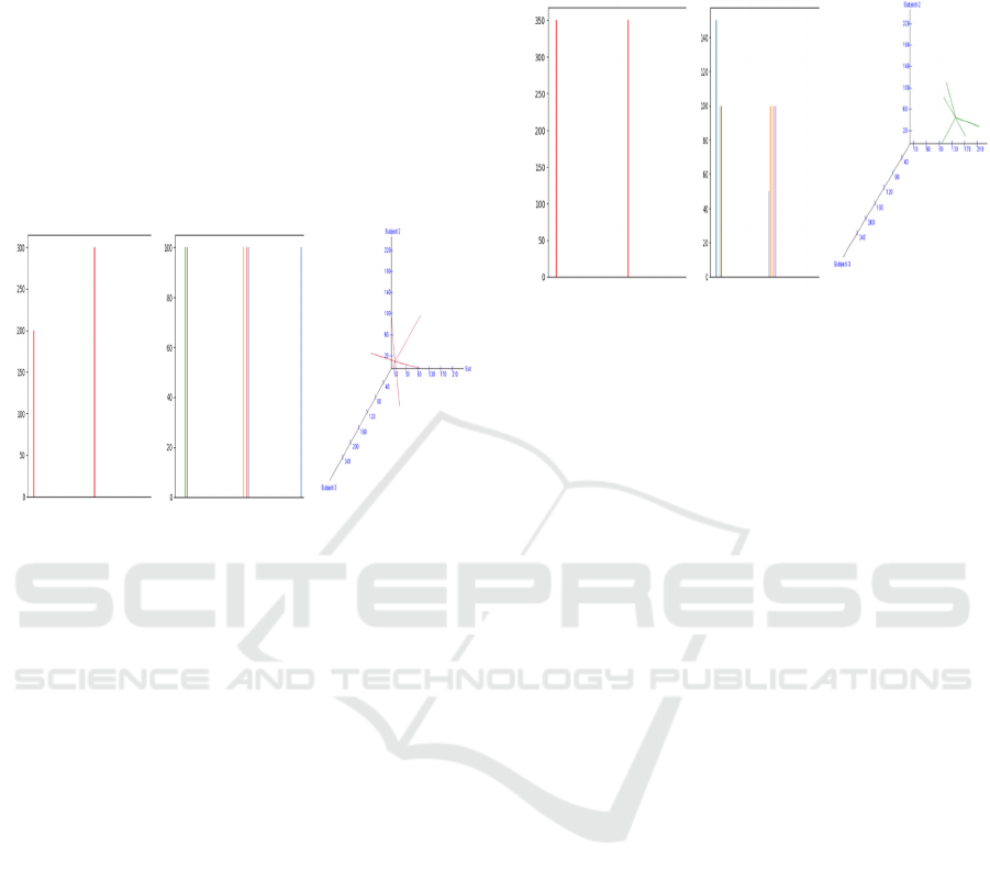
Figure 4 clearly presents the graphical visualization
of three dimensional spaces. Distribution of marks
obtained by student 4 is represented as a cluster.
Cluster representing the marks of student 4 can be
clearly seen. Lines are drawn from each data point to
the data point corresponding to the mean value of the
marks of student 4. Deviation of the average of marks
from all tests from marks obtained in each test in the
case of student 4 can be estimated using these lines.
Image quality analysis in the terms of BRISQUE
score evaluates to best for the Figure 4 (c).
From Figure 5 (a), we observe that the student1
performs the best, however student1’s performance in
subject3 is inferior as compared to the performance in
subject1 and subject2. This is also evident from the
Table I. The performance of the student3 is poor as
we can see that the entire cluster is closer to the origin.
Similarly, insights about other students can deducted
and if required can be verified from the corresponding
tables.
a) BRISQUE
Score = 47.32
b) BRISQUE
Score = 45.75
c) BRISQUE
Score = 44.64
Figure 4: Visualization of marks of student 4, a) Subject-
wise totals; subject1 marks are denoted by left-most bar,
subject2 marks are to the right of it, and so on, b) Evaluation
component marks subject-wise; list of bars in the left-most
portions represents marks obtained by the student in Test1
to Test 5 in subject1; to the right of this, subject2 marks fo
r
five tests taken by the student are displayed, and subject3
marks for five tests are displayed right-most, c) 3D display
of marks for five tests clustered about mean-score of three
subjects evaluation-wise for the corresponding student.
If we align the 3D cluster plots of the students
horizontally, vertically or along main diagonal then
we can get more insights. For example, horizontal
arrangement will depict easy understanding of
variations in the performance of the students in
subject2.
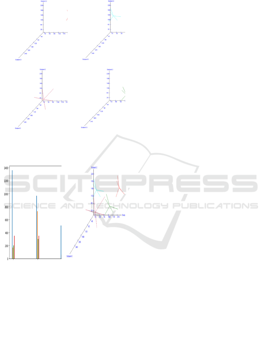
The screen-shot, Figure 6, gives complete output
showing the clustering of the data of all the students.
All the four clusters representing marks of all the
students are represented here. This shows
multivariate clustering of the numerical data from all
the files. In a similar way this example can be
extended to a large number of students and clustering
can be visualized as above. Performance of each
student can be assessed by observing this clusters and
distribution of marks gives a clear picture of their
relative performance. Image quality analysis in the
terms of BRISQUE score evaluates to better for the
Figure 6 (b) as compared to Figure 6 (a).
UIVLP: An Improved User Interface and Visualization Technique to Visualize Learners’ Performances
865
a) Marks of Student 1 b) Marks of Student 2
c) Marks of Student 3 d) Marks of Student 4
Figure 5: 3D display of marks for the four students in five
tests clustered about mean-score of three subjects
evaluation-wise.
a) BRISQUE Score =
46.38
b) BRISQUE Score =
44.83
Figure 6: Visualization of marks of the four students, a)
Evaluation component marks subject-wise, b) 3D display o
f
marks clustered about mean-score evaluation-wise.
6 CONCLUSIONS
The problem of visualization of students’
performance in terms of marks obtained in various
subjects can be solved using the Cluster Analysis
technique of multivariate analysis. Graphical
visualization of clusters representing the marks of
multiple students in different subjects is implemented
in Java. The distribution of marks of the students and
deviation from average of marks from all tests from
marks obtained in each test can be clearly observed
from the graphical visualization provided. The 3D
visualizations are compared with the bar-graph using
no-reference image quality scores, BRISQUE, and it
is observed that the BRISQUE scores are slightly
better than the 2D bar-graph displays because lower
the BRISQUE score better the image quality. In
addition to this, it is observed that 3D cluster plots
provide 3D clues and depth cues for further
differentiating the students’ performance for grading
by considering marks in three subjects rather than just
the total marks. As a future work, user interface (UI)
can be developed for arranging the 3D plots along a
selected axis so that UI can provide more insights.
These insights can help in deciding the boundary
cases for adjusting the cut-off for grading. In addition
of this, future use of k-means clustering or Isodata
algorithms can be made to visualize the students’
performance along selected or most discriminating
dimensions.
REFERENCES
Hearn, D., & Baker, M. P. (2015). “Computer Graphics C
Version”, Pearson Education, 2003.
Johnson, R. A., & Wichern, D. W. (2007). Applied
multivariate statistical analysis, Pearson Education Inc.
Al-Barrak, M. A., & Al-Razgan, M. (2016). Predicting
students final GPA using decision trees: a case
study. International journal of information and
education technology, 6(7), 528.
Misailidis, E., Charitopoulos, A., & Rangoussi, M. (2018,
November). Visualization of educational data mined
from the moodle e-learning platform. In Proceedings of
the 22nd Pan-Hellenic Conference on Informatics (pp.
82-87).
Humphries, W., Gawrilow, J., Turner, S., Perez-Quinones,
M., & Edwards, S. (2006, June). Helping Students
Visualize Their Grade Performance. In 2006 Annual
Conference & Exposition (pp. 11-683).
Deng, H., Wang, X., Guo, Z., Decker, A., Duan, X., Wang,
C., ... & Abbott, K. (2019). PerformanceVis: Visual
analytics of student performance data from an
introductory chemistry course. Visual Informatics, 3
(4), 166–176.
Darcy Dario (2022), 12 Learning Analytics Software,
Published October 6, 2022, EdApp LMS Homepage,
ST Training, https://training.s afetyculture.com/
blog/learning-analytics-software/
Paolucci, C., Vancini, S., Bex II, R. T., Cavanaugh, C.,
Salama, C., & de Araujo, Z. (2024). A review of
learning analytics opportunities and challenges for K-
12 education. Heliyon.
ICAART 2025 - 17th International Conference on Agents and Artificial Intelligence
866

Mukred, M., Asma’Mokhtar, U., Hawash, B., AlSalman,
H., & Zohaib, M. (2024). The adoption and use of
learning analytics tools to improve decision making in
higher learning institutions: An extension of technology
acceptance model. Heliyon, 10(4).
Atif, A., Richards, D., Bilgin, A., & Marrone, M. (2013).
Learning analytics in higher education: a summary of
tools and approaches. In Ascilite-australian society for
computers in learning in tertiary education annual
conference (pp. 68-72). Australasian Society for
Computers in Learning in Tertiary Education.
Mittal, A., Moorthy, A. K., & Bovik, A. C. (2012). No-
reference image quality assessment in the spatial
domain. IEEE Transactions on image
processing, 21(12), 4695-4708.
UIVLP: An Improved User Interface and Visualization Technique to Visualize Learners’ Performances
867
