
Best Practices and Evaluation Methods for Narrative Information
Visualizations: A Systematic Review
Andrea Lezcano Airaldi
1a
, Emanuel Irrazábal
1b
and Andrés Diaz Pace
2c
1
Software Quality Research Group – FaCENA-UNNE, Corrientes, Argentina
2
ISISTAN, CONICET-UNICEN, Tandil, Buenos Aires, Argentina
Keywords: Information Visualization, Data Storytelling, Narrative Visualizations, Evaluation, Systematic Review.
Abstract: Evaluating narrative visualizations presents unique challenges due to their integration of data and storytelling
elements, making traditional assessment methods insufficient. This paper presents a systematic mapping study
(SMS) aimed at identifying best practices for designing visualizations and the current evaluation methods
used to assess them. It synthesizes 116 studies from 1984 to 2024, examining both traditional information
visualizations and narrative visualizations. The study reveals that the application of best practices is highly
context-dependent, with trade-offs between simplicity and comprehensiveness. Furthermore, it highlights the
lack of standardized evaluation frameworks for narrative visualizations, as existing methods often fail to
capture narrative elements. The paper contributes by offering a synthesis of design guidelines, laying the
groundwork for future research focused on improving the evaluation of narrative visualizations.
1 INTRODUCTION
Narrative visualizations combine information
visualization with storytelling techniques to present
complex information in an engaging and accessible
manner (Segel & Heer, 2010). They integrate charts,
images and annotations into a cohesive narrative
structure to communicate data and insights. The
growing prevalence of narrative visualizations across
domains such as journalism (Hao et al., 2024), and
healthcare (Meuschke et al., 2022) –including the
COVID-19 pandemic– demonstrates their
effectiveness in enhancing comprehension.
Evaluating narrative visualizations presents
significant challenges due to their human-centered
nature (Carpendale, 2008; Lam et al., 2012; Plaisant,
2004). Traditional evaluation methods, which focus
on quantitative metrics like task completion time or
accuracy, are insufficient for assessing qualitative
aspects such as user engagement, emotional response,
and narrative clarity. The subjective experiences of
users, influenced by individual perception and
interpretation, make it difficult to establish
standardized criteria for what constitutes an effective
a
https://orcid.org/0000-0003-1361-2797
b
https://orcid.org/0000-0003-2096-5638
c
https://orcid.org/0000-0002-1765-7872
visualization (Wu et al., 2018). As a result, current
evaluation practices are often informal and ad hoc,
lacking systematic guidelines tailored to narrative
visualizations (Errey et al., 2024).
In this paper, we present a systematic mapping
study (SMS) of 116 information visualization and
data storytelling studies published between 1984 and
2024. Our goal is to collect and summarize best
practices for designing visualizations, and current
evaluation criteria and methods to assess them.
The findings reveal that applying best practices is
context-dependent, with trade-offs between
recommendations, such as balancing simplification of
complex ideas with providing detailed context. We
also found a lack of standardized evaluation methods
for narrative visualizations, as current approaches
often do not capture narrative elements.
The primary contribution of this work is a
synthesis of existing best practices and evaluation
methods, identifying gaps in current approaches and
offering a foundation for developing tailored
frameworks for narrative visualizations that address
their unique challenges while incorporating general
visualization principles.
378
Lezcano Airaldi, A., Irrazábal, E. and Diaz Pace, A.
Best Practices and Evaluation Methods for Narrative Information Visualizations: A Systematic Review.
DOI: 10.5220/0013202000003928
Paper published under CC license (CC BY-NC-ND 4.0)
In Proceedings of the 20th International Conference on Evaluation of Novel Approaches to Software Engineering (ENASE 2025), pages 378-389
ISBN: 978-989-758-742-9; ISSN: 2184-4895
Proceedings Copyright © 2025 by SCITEPRESS – Science and Technology Publications, Lda.

This review is organized as follows. Section 2
summarizes the background and related works.
Section 3 describes the methodology for conducting
the SMS. Section 4 reports the results and findings.
Section 5 discusses our research questions and
presents the threats to validity for our study. Finally,
Section 6 concludes and outlines future work.
2 BACKGROUND
2.1 Evaluation in Information
Visualization
Evaluation has long been acknowledged as one of the
most complex aspects of visualization research
(Carpendale, 2008). The core difficulty lies in the
exploratory nature of visualizations, which are
designed for supporting deeper cognitive processes
like insight generation and communication.
Traditional metrics—such as task completion time or
error rate—do not capture these higher-order
objectives (Plaisant, 2004).
Isenberg et al. (Isenberg et al., 2013) reviewed
581 papers and provided a quantitative and objective
report of the types of evaluation practices
encountered in the visualization community. They
found an increasing trend in the evaluation of user
experience and user performance. Although it has
improved over the years, the general level of rigor
when reporting evaluations is still low.
Lam et al. (Lam et al., 2012) identified the need to
broaden the scope of evaluation to include not just
performance measures but also the underlying
cognitive processes that visualizations are meant to
support. Evaluation, in this sense, extends beyond
efficiency—it requires a deep understanding of how
users reason with data, communicate insights, and
collaborate in decision-making processes. This
requires researchers to select metrics that encompass
interaction quality and the cognitive or
communicative outcomes.
Despite these advancements, many evaluations
still rely on anecdotal evidence or “validation by
example,” where visualizations are merely presented
without systematic testing (Elmqvist & Yi, 2015).
This ad-hoc approach limits the replicability and the
generalizability of findings across different contexts.
In response, Elmqvist and Yi (Elmqvist & Yi, 2015)
introduced a pattern-based evaluation framework,
aiming to formalize informal practices and make
them more systematic.
1
https://doi.org/10.17605/OSF.IO/8RYPC
In the context of narrative visualization, these
challenges become even more pronounced.
Conventional evaluation methods are insufficient for
assessing the storytelling effectiveness and user
engagement inherent in narrative visualizations
(Saket et al., 2016). Qualitative end-user evaluation
methods, such as "walk-throughs," "think-aloud"
protocols, and interviews, offer insights into user
comprehension and experience(Andrews, 2006;
Figueiras, 2014). However, these methods are
resource-intensive, limiting their scalability
(Carpendale, 2008).
Visualization practitioners often rely on heuristic
evaluation as a common inspection technique.
Existing heuristic sets, such as those developed by
Zuk et al.(Zuk et al., 2006) and Forsell &
Johansson(Forsell & Johansson, 2010), are grounded
in usability principles but lack the specificity required
to assess narrative elements effectively. Recent work
by Errey et al. (Errey et al., 2024) addresses this gap
by examining the methods practitioners employ when
evaluating narrative visualizations. Their findings
reveal that many practitioners rely on peer feedback
and experience rather than structured approaches.
They introduced a practice-led heuristic framework
aimed at providing a more systematic approach to
narrative visualization evaluation. Their work
emphasizes the need for more structured approaches
to narrative visualization evaluation, as the lack of
stablished guidelines means that the process is rarely
systematic.
Building on these insights, this SMS aims to
synthesize and map the strengths and limitations of
existing evaluation methods. By doing so, we aim to
guide future developments in evaluation frameworks,
ensuring they capture general visualization principles
as well as narratives aspects.
3 METHODOLOGY
In this section, we describe the steps of the SMS
process, following the guidelines by Kitchenham and
Charters (Kitchenham & Charters, 2007) and
Petersen (Petersen et al., 2015). to ensure rigor and
reproducibility. Additionally, we followed guidelines
for conducting automated searches (Singh et al.,
2018) and effective data extraction (Garousi &
Felderer, 2017). All data analyzed for this SMS are
available at Supplementary materials
1
.
Best Practices and Evaluation Methods for Narrative Information Visualizations: A Systematic Review
379
3.1 Research Questions
As stated in previous sections, the goal of this SMS is
to identify, analyze and summarize best practices for
the design of information and narrative visualizations
and existing evaluation methods. To this end, we
formulate the following research questions:
RQ1: What are the visualization design best
practices reported in the literature and how are they
implemented?
RQ2: What are the current strategies to evaluate
visualizations?
3.2 Search Strategy
The search and selection process of the primary
studies was performed in three steps to control the
number and relevance of the results: automated
search, study selection, and snowballing search.
Database Search: We conducted a series of
database searches on three indexing systems related
to the Software Engineering field: ACM Digital
Library, IEEE Xplore, and Scopus. The search string
was divided into two parts: one containing a keyword
that describes our main subject and its synonyms, and
another one focusing on the different topics of the
research questions. The search was limited to title,
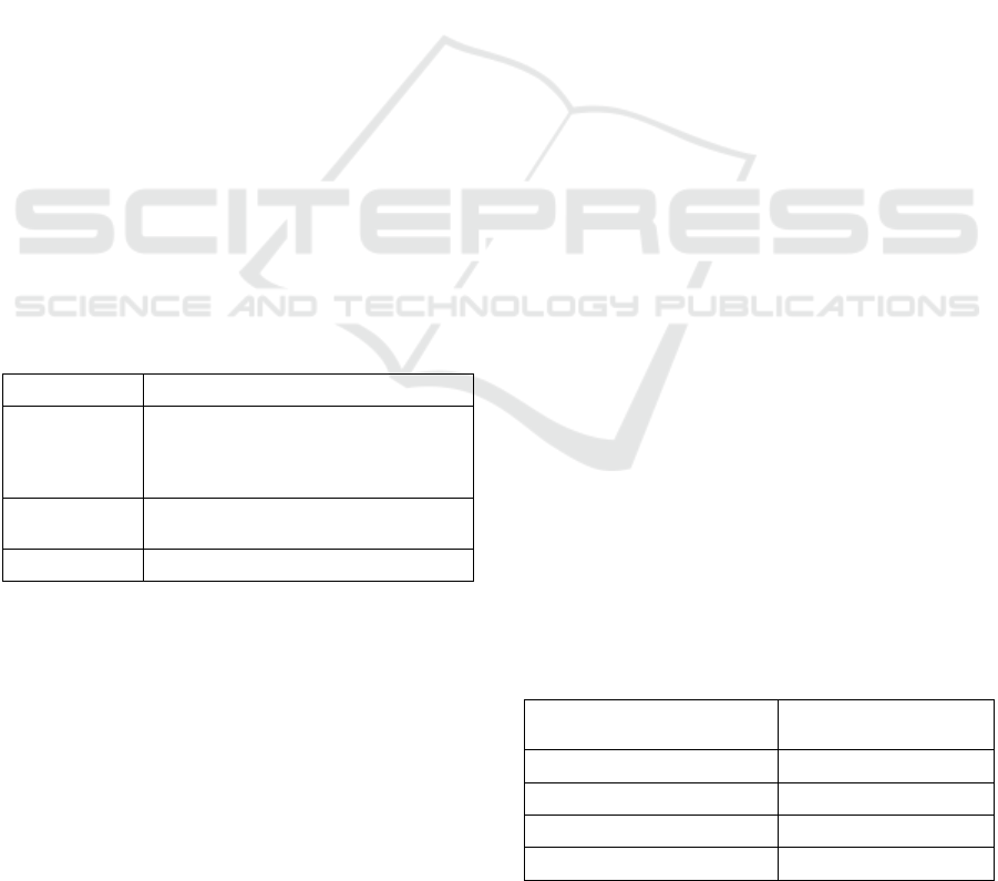
abstract and keywords. Table 1 presents each term
together with its keywords.
Table 1: Main terms and synonyms used in the search
string.
Main Term Keywords
Data storytelling
"data storytelling” OR “data-driven
storytelling” OR “data story” OR“data-
driven story” OR “data visualization” OR
“information visualization”
Best practice
“best practice” OR practice OR guideline
OR principle
Evaluation evaluation OR assessment
Snowballing Search: We complemented the
database search with forward and backward
snowballing. The goal of this step was to expand the
set of relevant papers by focusing on papers citing or
being cited by previously included studies (Wohlin,
2014).
3.3 Inclusion and Exclusion Criteria
We defined the following inclusion (I) and exclusion
(E) criteria based on the guidelines proposed by (B.A
Kitchenham, 2007) to select appropriate studies and
filter out unrelated ones. Our focus was on primary
academic research studies, published in any year up
until 2024, that presented significant contributions or
advancements in the fields of data storytelling,
information visualization and evaluation.
To narrow the scope of the study, we excluded
articles about data comics. While they have gained
recognition for their contributions to storytelling,
authoring them requires a higher degree of design
expertise(Wang et al., 2019, 2022). Moreover, due to
their leisure and entertaining nature, data comics are
less commonly employed for conveying sensitive or
serious topics(Chen et al., 2022; Zhao & Elmqvist,
2023). Thus, we preferred to maintain a focus on
more formal and structured approaches.
Inclusion Criteria:
I1: The title, abstract and keywords explicitly
state that the paper is related to data storytelling
and information visualization.
I2: The study is a full paper with empirical
evidence.
I3: The paper is peer-reviewed (journal article,
conference paper)
I4: The full text of the paper is available.
I5: The paper was published in any year up to
2024.
Exclusion Criteria:
E1: The paper is not written in English.
E2: The paper’s full text is not accessible.
E3: The paper is a gray publication without
peer review.
E4: The paper is explicitly a short paper.
E5: The paper is focused on data comics.
3.4 Study Selection
We identified a total of 1,181 articles published
between 1984 and 2024 by following the search
strategy outlined in Section 3.3. The search was
conducted using titles, abstracts, and indexed
keywords (see Table 2 for details).
Table 2 Automated search details.
Database Search results
ACM Digital Library 163
IEEE Xplore 243
Scopus 775
Total 1181
ENASE 2025 - 20th International Conference on Evaluation of Novel Approaches to Software Engineering
380
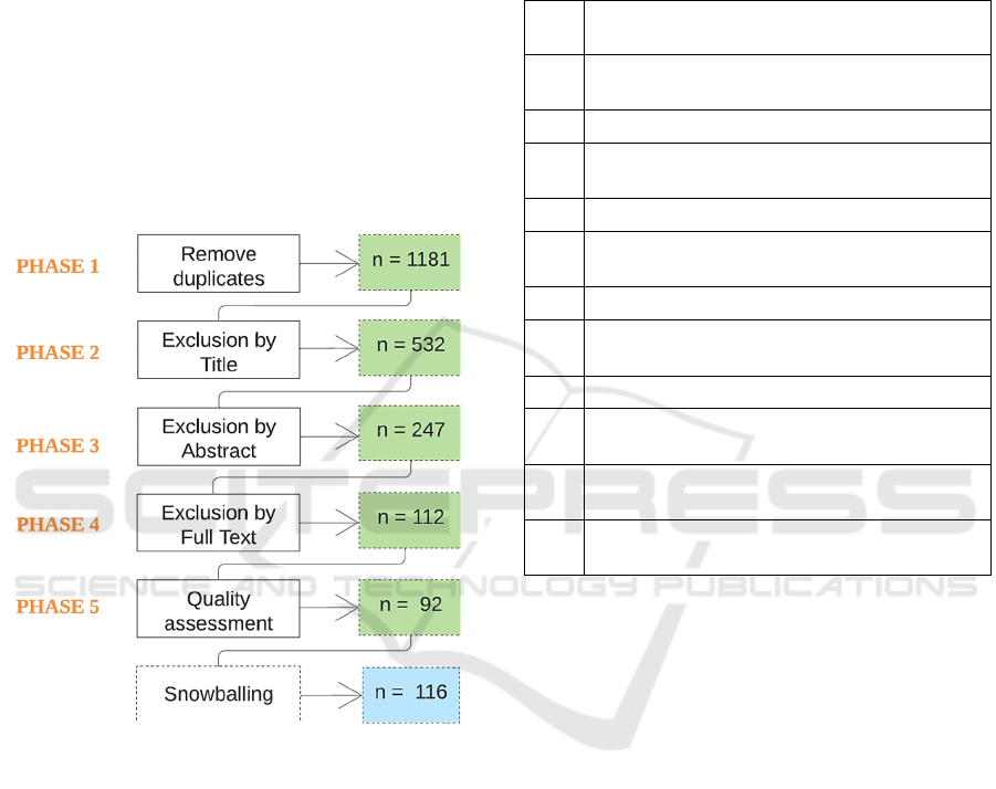
The study selection process consisted of five
phases (Figure 1). In Phase 1, we retrieved studies
from electronic databases and consolidated the results
into a single spreadsheet after removing duplicates. In
Phase 2, we screened the titles based on I/E criteria,
selecting relevant articles for further consideration.
Phase 3 involved reviewing abstracts and excluding
papers that lacked sufficient relevance or detail. In
Phase 4, we conducted a thorough full-text review to
assess each paper's contribution. Finally, in Phase 5,
the selected studies underwent a quality assessment
before inclusion. We also supplemented our selection
with additional studies identified through snowball
sampling. Each study was assigned an identity code,
listed in Table 8 (Appendix). The asterisk (*)
indicates the studies most relevant to this review.
Figure 1: Study selection process.
3.5 Quality Assessment
In addition to the inclusion/exclusion criteria, it is
critical to assess the quality of the primary
studies(Kitchenham & Charters, 2007). The quality
assessment (QA) of the selected studies was achieved
by a scoring technique to evaluate their credibility,
completeness, and relevance. All papers were
assessed against a set of eleven quality criteria. The
assessment instrument is presented in Table 3.
Questions Q1, Q2, Q4-Q11 were adopted from the
literature (Dermeval et al., 2016b; Kitchenham &
Charters, 2007), while question Q3 is a proposal of
the authors.
Each quality assessment question is judged
against three possible answers: “Yes” (score = 1),
“Partially” (score = 0.5) or “No” (score = 0). The
quality score for a particular study is computed by
taking the sum of the scores of the answers.
Table 3: Quality assessment checklist.
ID
Question
Q1
Is there a clear statement of the goals of the
research?
Q2 Is there sufficient discussion of related work?
Q3
Are the visualizations under study clearly
described?
Q4 Is the purpose of the analysis clear?
Q5
Is the investigation process adequately
documented?
Q6 Are the statistical methods described?
Q7
Are the study participants or observational units
adequately described?
Q8 Are all study questions answered?
Q9
Is there a discussion about the results of the
study?
Q10
Are the limitations of this study explicitly
discussed?
Q11
Are the lessons learned interesting and relevant
for practitioners?
3.6 Data Extraction
We used the template shown in Table 5 to extract data
from the selected primary studies. Collected data
includes general information (e.g., title, authors, year
of publication, and source) and information related to
the research questions. Before the actual data
extraction, we performed an extraction pilot with a
random set of ten papers to calibrate the instrument,
assess the extraction strategies, and avoid possible
misunderstandings.
For each paper, we considered abstract,
introduction, methodology, results, and conclusion.
In some cases, a comprehensive reading of the paper
was necessary. Any conflicts were discussed and
resolved internally by the authors to reduce bias and
ease reproducibility. To quantify agreement between
researchers, we employed Cohen’s Kappa
statistic(Pérez et al., 2020), achieving a value of 0.87
which reflects substantial agreement.
Best Practices and Evaluation Methods for Narrative Information Visualizations: A Systematic Review
381
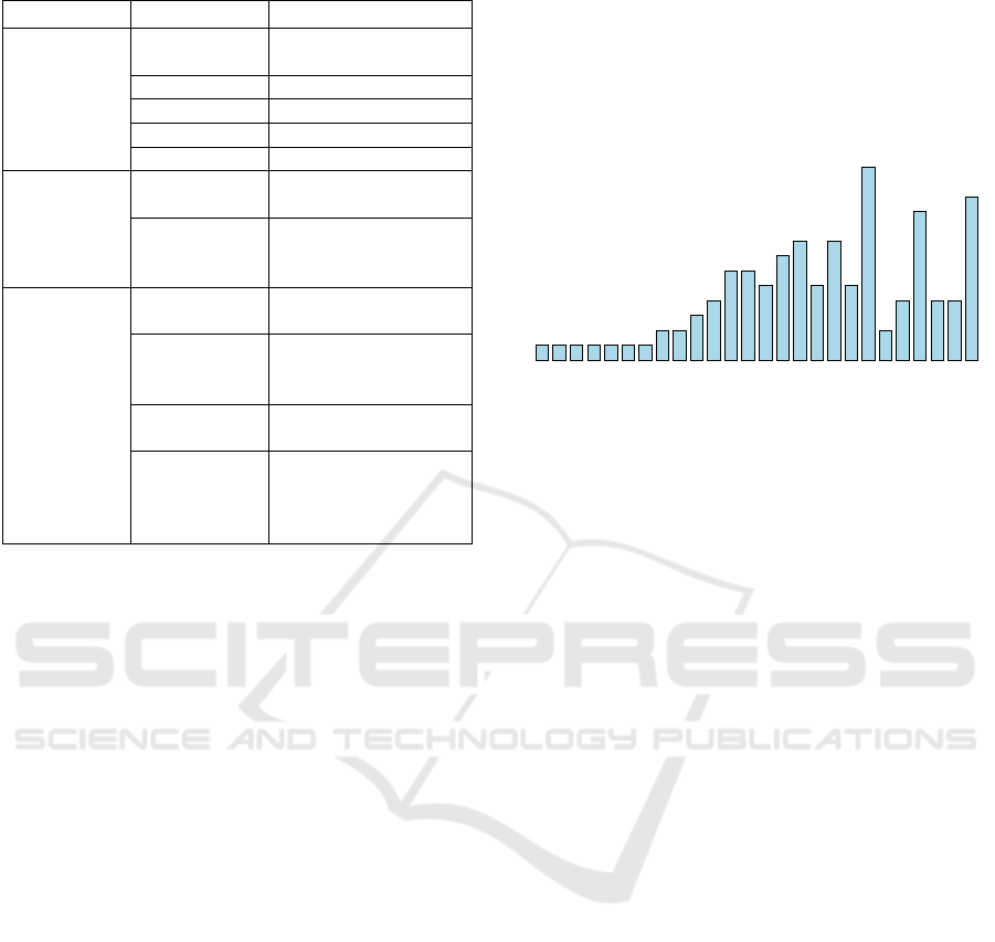
Table 4 Quality assessment checklist.
Focus Item Description
General
Information
Identifier
Reference number
g
iven to the article
Bibliograph
y
Author, year, title
Source Journal/Conference
Aim Goal of the study
T
yp
e of stud
y
Em
p
irical strate
gy
RQ1
Best practice
Recommended
p
ractice or guideline
Application
Ways to implement
the guidelines and
b
est
p
ractices
RQ2
Evaluation
metho
d
Strategy to evaluate
data visualizations
Type of chart
The visualization
technique covered by
the evaluation metho
d
Metrics
Values measured by
the evaluation metho
d
Tools
Software applications,
models and
algorithms used to
su
pp
ort evaluation
To support this task, we used Atlas.ti (ATLAS.Ti |
The #1 Software for Qualitative Data Analysis -
ATLAS.Ti, n.d.). For RQ1, we used an open and axial
coding strategy based on grounded theory (Corbin &
Strauss, 2012). First, we read each guideline and
assigned it a best practice (BP) id, such that a new BP
was created for guidelines that did not resemble
previous ones. Then, we used axial coding to compare
the best practices to each other and identify categories
or themes, by relying on general knowledge and
categorizations proposed by other authors.
4 RESULTS
4.1 Quality Assessment Results
The quality assessment helped us increase the
reliability and achieve a coherent synthesis of results
(Dermeval et al., 2016a). We present the results of the
assessment in Supplementary Materials according to
the questions described in Table 4. The results
indicate that the overall quality of the studies is high
since the quality mean was 90%.
4.2 Overview of Selected Primary
Studies
The selected primary studies were published between
1984 and 2024. Figure 2 presents the number of
studies by year of publication. Overall, we found at
least one study each year since 2005. An increasing
number of publications is observed starting in 2010,
with the majority of them conducted between 2013
and 2024. The highest number of studies was in 2018.
This demonstrates a trend in the topic of information
visualization and data storytelling.
Figure 2: Distribution of selected primary studies over the
years 1984 – 2024.
Regarding the use of narrative visualizations, we
encountered a diverse range of application domains.
While the specific use cases varied, they spanned
fields such as healthcare(Amri et al., 2015),
government (Brolcháin et al., 2017; Yovanovic et al.,
2021) and journalism (Hao et al., 2024). Although
each domain has its unique challenges and
opportunities, it underscores the benefits and
versatility of narrative visualization as a tool to
convey complex information. A detailed exploration
of each application domain is beyond the scope of this
paper, though this demonstrates the value of data
storytelling across a range of disciplines.
4.3 RQ1: What Are the Visualization
Design Best Practices Reported in
the Literature and How Are They
Implemented?
We identified 21 best practices, summarized in Table
5. These practices encompass a range of visualization
principles, with some specifically tailored to narrative
visualizations and others applicable to broader
information visualization contexts. For instance,
“Simplify complex ideas” (BP1) and “Declutter
visualizations” (BP9) are relevant to general
visualization design. In contrast, practices like
“Communicate a narrative clearly” (BP16) and
“Incorporate tangible or situated feelings to evoke
experiences” (BP15) are more aligned with
storytelling techniques.
11
1
1111
22
3
4
66
5
7
8
5
8
5
13
2
4
10
44
11
1984
1994
2000
2005
2007
2009
2011
2013
2015
2017
2019
2021
2023
ENASE 2025 - 20th International Conference on Evaluation of Novel Approaches to Software Engineering
382
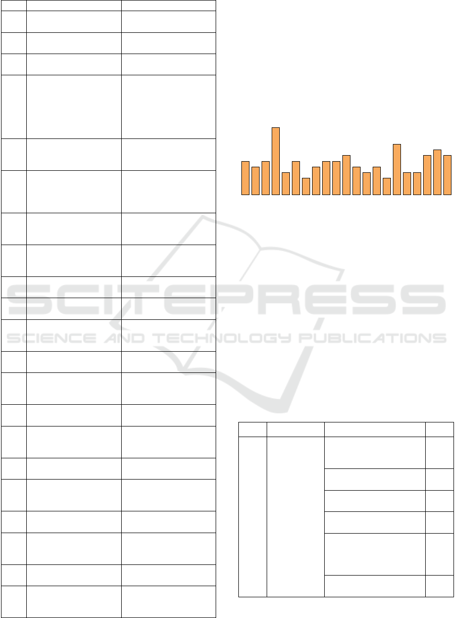
Table 5: Best practices found in the literature.
ID Best Practice Reference
BP1 Simplify complex ideas
S03, S08, S16, S91,
S100, S102, S108, S113
BP2
Provide contextual
information
S23, S41, S42, S52, S85,
S97
BP3
Map visual signs to
im
p
licit meanin
g
s
S03, S23, S96, S112
BP4
Select visualization
techniques appropriate
for the data and tasks
S01, S12, S15, S20, S21,
S24, S35, S38, S40, S42,
S45, S46, S51, S65, S67,
S69, S74, S75, S77, S84,
S87, S91, S93, S94, S96,
S98, S105, S115
BP5
Use a common baseline
to facilitate
com
p
arisons
S37, S50, S115
BP6
Map information and
data dimensions to the
most salient features
S03, S12, S22, S23, S30,
S32, S33, S40, S42, S51,
S54, S64, S74, S79, S84,
S90, S99, S110
BP7
Provide redundancy to
improve comprehension
and memorabilit
y
S16, S57, S69
BP8
Focus on important data
points
S02, S03, S30, S47, S76,
S78, S81, S90, S95,
S101, S102, S113, S114
BP9 Declutter visualizations
S10, S13, S19, S39, S37,
S42, S55, S81, S96
BP10
Maximize the data-ink
ratio
S13, S17, S34, S82, S83,
S39, S67, S72
BP11
Use text, labels, and
annotations
S02, S19, S23, S25, S49,
S50, S57, S60, S92, S23,
S100, S109, S113, S115
BP12
Avoid obscuring
information
S03, S29, S34, S43, S50,
S56, S83, S88
BP13
Provide credits for data
provenance and design
transparenc
y
S03, S08, S23, S80, S91,
S96
BP14
Avoid omitting
im
p
ortant information
S03, S24
BP15
Incorporate tangible or
situated feelings to
evoke experiences
S23, S34, S43, S56, S57,
S81, S102, S107, S116
BP16
Communicate a
narrative in a clear wa
y
S02, S03, S08, S23, S62,
S100, S102, S107, S116
BP17
Layout the elements of
the charts and the whole
story logicall
y
S25, S26, S62, S75,
S109
BP18
Maintain consistency
throu
g
hout the stor
y
S02, S47, S99
BP19
Include interaction
techniques to allow
ex
p
loration
S02, S03, S04, S08, S29,
S62, S68, S98, S100,
S103, S112
BP20
Make information
accessible to all users
S23, S25, S78, S95,
S111
BP21 Use color strategically
S12, S22, S23, S30, S64,
S74, S79, S90, S98, S99,
S102, S109
In addition to best practices, we found 122 unique
implementations, which provide concrete examples
of how these practices are applied. For instance, the
practice of simplifying complex ideas (BP1) includes
implementations like visualizing only essential
variables, grouping data where possible, and
introducing complex data gradually. Similarly,
providing contextual information (BP2) can be
implemented through instructions or explanations to
aid interpretation or adapting designs based on users'
skill levels.
Figure 3: Number of implementations found per best
practice.
The number of implementations varies across
practices. For example, practices like selecting
appropriate visualization techniques (BP4) have a
greater number of implementations. In contrast,
practices such as providing redundancy (BP7) or
incorporating tangible emotions (BP15) have fewer
implementations, indicating their more specialized
use, as shown in Figure 3. Table 6 shows an excerpt
of implementations for best practices. The
“Reference” column specifies the primary study
where it was found. For the complete set of guidelines
and implementations, see Supplementary Materials.
Table 6: An example of best practices implementations.
ID Best Practice Implementation Ref.
BP1
Simplify
complex
ideas
Visualize only essential
variables to simplify the
re
p
resentation.
S03
Provide text and visual
summaries.
S03
Group or aggregate data
where possible.
S03
Introduce complex data
graduall
y
S109
Provide clear
explanations of how
different components
relate to each othe
r
S112
Allow users to combine
datasets that are similar.
S08
6
5
6
12
4
6
3
5
66
7
5
4
5
3
9
44
7
8
7
BP1
BP2
BP3
BP4
BP5
BP6
BP7
BP8
BP9
BP10
BP11
BP12
BP13
BP14
BP15
BP16
BP17
BP18
BP19
BP20
BP21
Best Practices and Evaluation Methods for Narrative Information Visualizations: A Systematic Review
383
Table 6: An example of best practices implementations
(cont.).
ID Best Practice Implementation Ref.
BP2
Provide
contextual
information
Include instructions or
explanations for
interpreting complex
visual data.
S23,
S03
Adapt designs to users’
skill levels.
S41,
S44
Consider individual
differences like
perceptual speed and
workin
g
memor
y
.
S41,
S44
Provide additional
support (e.g., simplified
legends) for users who
need it.
S44
Emphasize textual
elements for users with
lower verbal working
memor
y
.
S44
BP3
Map visual
signs to
implicit
meanings
Apply visual metaphors
like “up = more” or “left
= past” for meaning.
S03
Match categories with
colors or t
yp
o
g
ra
p
h
y
.
S03
Match the emotional tone
of the visualization with
the data content
S107,
S109
Use familiar visual
metaphors or objects to
make the content more
recognizable and easier to
remembe
r
S109
4.4 RQ2: What Are the Current
Strategies to Evaluate the Quality
of Narrative Visualizations?
The table below provides an overview of the current
evaluation methods identified in the literature. The
Evaluation Objective column specifies the primary
aim of each method, i.e., the criteria it assesses. For
instance, Zhu et al. [S28] focus on cognitive load,
while Padda et al. [S31] emphasize design
comprehension. These methods highlight the
importance of considering user experience from the
design stage.
The Approach column outlines whether the
method is user-centric or visualization-centric. User-
centric methods focus on assessing how users engage
with and comprehend visualizations. For example,
the visualization literacy assessments by Boy et al.
[S18] and Lee et al. [S59] measure users’ ability to
interpret visualizations, using questionnaires to test
their memory and understanding of visual elements.
Similarly, the recallability models by Wang et al.
[S101] assess how well users remember specific
details of visualizations, providing insights into how
visualizations can be improved for clarity and
memorability.
Table 7: Current evaluation methods found in the literature.
Ref. Year Objective Approach Tool
S28 2007
Complexity
Co
g
nitive loa
d
Vis-centric
Theoretical
model
S31 2008 Comprehension Vis-centric
Theoretical
model
S86 2009
Data richness,
useful
information
Vis-centric
Theoretical
model
S14 2011
Contextual fit,
p
ur
p
ose
Vis-centric
Theoretical
model
S18 2014
Visualization
literac
y
User-centric Questionnaire
S36 2017
Usability,
decision
su
pp
ort
Vis-centric
Heuristic
checklist
S59 2017
Visualization
literac
y
User-centric Questionnaire
S61 2017 En
g
a
g
ement Use
r
-centric Questionnaire
S67 2018 Consistenc
y
Vis-centric Al
g
orith
m
S70 2018
Usability,
decision
support
Vis-centric
Heuristic
checklist
S58 2018 Usabilit
y
Vis-centric Questionnaire
S73 2019
Value,
usefulness
Vis-centric
Heuristic
checklist
S23 2021
Usability,
ex
p
ressiveness
Vis-centric
Heuristic
checklist
S98 2022
Usability,
aesthetic
a
pp
eal
Vis-centric
Theoretical
model
S101 2022 Memorabilit
y
Use
r
-centric Questionnaire
S104 2023
Usability,
En
g
a
g
ement
User-centric Questionnaire
S109 2024
Storytelling,
En
g
a
g
ement
Vis-centric
Heuristic
checklist
Visualization-centric methods, on the other hand,
focus more on the characteristics of the visualization
itself, without direct user involvement. For instance,
Lan et al. [S23] extend traditional heuristics by
categorizing them into usability and expressiveness,
providing a framework to assess visual and functional
aspects of a visualization. The consistency score
introduced by Wang et al. [S67] considers how well
visualization techniques align with the underlying
data for comparative charts and trend analyses.
Most methods, such as the heuristic evaluations
by Forsell and Johanesson [S36], Dowding and
Merril [S70], and Wall et al. [S73], are designed for
general information visualizations, focusing on
usability and decision-making support. The heuristic
framework by Errey et al. [S109] is explicitly tailored
for narrative visualizations, assessing storytelling
elements, composition, and user engagement.
Additionally, certain methods are tailored for
specific contexts. For example, Liu et al. [S98]
provides a framework for evaluating COVID-19
ENASE 2025 - 20th International Conference on Evaluation of Novel Approaches to Software Engineering
384

pandemic data visualizations, focusing on chart types,
color usage, and interaction modes to improve the
readability and aesthetic appeal of pandemic-related
information. This highlights the practical applications
of these methods in specific domains.
The Tool column highlights whether a method
comes with practical tools or frameworks. Some
methods, like heuristic checklists [S36, S70, S109],
offer structured guidelines that help designers
evaluate visualizations based on established usability
principles. Others, such as the UXIV questionnaire
[S104], provide comprehensive questionnaires that
capture qualitative and quantitative feedback on user
experience. Methods like the consistency score [S67]
offer algorithmic approaches, while theoretical
models like Bai’s purposeful visualizations [S14]
guide designers conceptually but may not provide
concrete tools for direct application.
5 DISCUSSION
5.1 RQ1: What Are the Visualization
Design Best Practices Reported in
the Literature and How Are They
Implemented?
The goal of this question was to identify and
summarize best practices for designing effective
visualizations, focusing on how they are
implemented. Our findings show that best practices
for narrative visualizations are often integrated into
broader visualization design principles, though some
are specifically tailored for storytelling purposes.
The most frequently referenced practice was BP4
“Select visualization techniques appropriate for the
data characteristics and user tasks,” which had the
highest number of implementations (12). This
highlights the importance of aligning design choices
with the nature of the data and the demands of the task
(Teets et al., 2010). As discussed in several primary
studies, different charts (or design choices within a
single chart) perform better than others depending on
the task, and designers must consider how they want
the display to support a specific task, at potential cost
for others (Albers et al., 2014). For instance, spotting
outliers in a scatterplot would be difficult at low
marker opacity but estimating data density could
benefit from it (Micallef et al., 2017).
Other frequently implemented practices include
BP1 “Simplify complex ideas” and BP9 “Declutter
visualizations.” Both focus on reducing cognitive
load and improving interpretability by presenting
essential information clearly. Storytelling-focused
practices, such as BP16 “Communicate a narrative
clearly” and BP15 “Incorporate tangible or situated
feelings to evoke experiences,” emphasize creating an
emotional connection with the viewer and crafting a
coherent narrative. These practices are important for
narrative visualizations aimed at engaging users and
conveying more than just data. Adding annotations or
metaphors can enhance the impact and memorability
of a visualization.
Guidelines can also present contrasting
recommendations. For instance, BP11 “Provide
redundancy to improve comprehension” suggests
repeating information or key messages, which can
improve clarity but potentially clutter the
visualization. This contrasts with BP1 and BP9,
which advocate for removing unnecessary elements.
These examples highlight the trade-offs in
visualization design between clarity and
comprehensiveness and illustrate the inherent
complexities and context-dependencies in
establishing guidelines for narrative visualizations.
This indicates that the effectiveness of a particular
best practice may vary depending on the specific
objectives, audience, and nature of the data in each
visualization project.
5.2 RQ2: What Are the Current
Strategies to Evaluate the Quality
of Narrative Visualizations?
The findings show that evaluation strategies vary
significantly in their approach, focus, and
applicability. One key observation is the lack of a
standardized evaluation approach for narrative
visualizations. While there are well-established
methods for general information visualizations, as
seen with heuristic evaluations, narrative
visualizations introduce additional layers of
complexity due to their focus on storytelling,
engagement, and emotional resonance. This
complexity suggests that existing evaluation methods
may need to be adapted or expanded to fully capture
the unique qualities of narrative visualizations. For
example, while Lan et al. [S23] extend traditional
heuristics by incorporating expressiveness, this
remains primarily focused on usability rather than the
storytelling elements. Errey et al. [S109] developed a
heuristic framework explicitly aimed for narrative
visualizations, standing out as the only approach
dedicated to this type of evaluation.
The results also highlight that many evaluation
methods are domain specific. Liu et al. [S98], for
instance, focuses specifically on visualizations
Best Practices and Evaluation Methods for Narrative Information Visualizations: A Systematic Review
385

related to the COVID-19 pandemic, where the clarity,
usability, and aesthetic appeal of the data have
immediate and practical implications. This domain-
specific focus demonstrates that evaluation methods
cannot be one-size-fits-all and should be tailored to
the context in which the visualizations are applied.
The challenge here is that narrative visualizations
span a wide range of fields—from journalism and
education to public health—requiring flexible
evaluation strategies that can adapt to different
storytelling needs. This raises questions about how to
balance generalizable evaluation criteria with the
specificity required for different narrative
visualization contexts.
There is also a clear need for practical tools to
support the application of evaluation frameworks.
While theoretical models provide valuable
conceptual insights, their practical applicability can
be limited. For instance, Bai’s “purposeful
visualizations” [S14] offers a comprehensive
framework for ensuring that visualizations align with
their intended purpose, but without concrete tools for
implementation. Methods like heuristic checklists
[S36, S70, S109] or algorithmic approaches such as
the consistency score [S67] provide structured,
actionable tools that can guide designers in the
evaluation process.
Finally, it is worth discussing the interdisciplinary
nature of narrative visualization evaluation. While
many of the methods identified are rooted in
information visualization research, narrative
visualizations often draw on concepts from
storytelling, cognitive science, and media studies.
This interdisciplinary approach requires evaluators to
consider not only how the data is presented but also
how it is experienced by the viewer. For example,
memorability, as discussed by Wang et al. [S101],
extends beyond simple recall to how the visualization
resonates with the viewer and contributes to decision-
making or behavioral change. This intersection of
cognitive and emotional factors makes the evaluation
of narrative visualizations particularly challenging,
requiring more integrated frameworks that draw from
multiple fields of research.
5.3 Threats to Validity
This section discusses the limitations that may impact
this study regarding construct, internal, external, and
conclusion validity.
Construct Validity: Construct validity refers to
how well we capture what we intend to measure.
Primary studies could have been missed during the
search. To mitigate this, we searched across multiple
libraries covering most high-quality publications in
SE and used forward and backward snowballing.
Additionally, we re-executed our search query to
capture newly published papers during the research.
Internal Validity: Internal validity concerns the
risk of incorrect conclusions about causal
relationships. Researcher bias is a potential threat. To
address this, we conducted an iterative selection
process. During data extraction, we performed a pilot
phase to validate the extraction form, with one
researcher extracting data and another reviewing it.
Disagreements were resolved through discussion, and
we measured agreement using Cohen's Kappa
statistic.
External Validity: External validity refers to the
generalizability of findings. Selection and publication
bias may affect the scope of included studies. To
ensure the widest coverage possible, we included
papers published from 1984 to 2024.
Conclusion Validity: Conclusion validity
reflects the reproducibility of the study. This was
mitigated by following the protocol outlined by
(Kitchenham & Charters, 2007), commonly used in
SE research, to guide research questions, search
strategy, inclusion/exclusion criteria, quality
assessment, data extraction, and study selection.
6 CONCLUSIONS
This paper presented SMS of 116 studies on
information visualization and data storytelling. Our
goal was to identify and synthesize the best practices
for visualization design, along with the methods to
evaluate them.
The results revealed a broad spectrum of best
practices, many of which are applicable to general
information visualizations. However, specific
practices related to storytelling, such as emotional
engagement and narrative clarity, were less
frequently addressed. Similarly, while various
evaluation methods exist for general visualizations,
few focus on the unique aspects of narrative
visualizations, highlighting a gap in the current
research. This gap could be addressed by developing
more targeted evaluation frameworks that incorporate
both general visualization principles and storytelling
elements.
This review contributes to the field by offering a
structured synthesis of best practices and evaluation
methods. Future work will focus on leveraging the
identified best practices to develop an evaluation
model tailored to narrative visualizations.
ENASE 2025 - 20th International Conference on Evaluation of Novel Approaches to Software Engineering
386

ACKNOWLEDGEMENTS
This work is supported by National Council on
Scientific and Technical Research (CONICET) under
a PhD Fellowship (RESOL-2021-154-APN-DIR#CO
NICET) and the National University of the NorthEast
(SCyT - UNNE) under grant 21F005. It is part of the
research conducted under the Computer Science
Doctorate Program at UNNE, UNaM and UTN.
REFERENCES
Albers, D., Correll, M., & Gleicher, M. (2014). Task-Driven
Evaluation of Aggregation in Time Series Visualization.
Proceedings of the SIGCHI Conference on Human
Factors in Computing Systems. CHI Conference, 2014,
551–560. https://doi.org/10.1145/2556288.2557200
Amri, S., Ltifi, H., & Ben Ayed, M. (2015). Towards an
intelligent evaluation method of medical data
visualizations. 2015 15th International Conference on
Intelligent Systems Design and Applications (ISDA),
2016-June, 673–678. https://doi.org/10.1109/ISDA.201
5.7489198
Andrews, K. (2006). Evaluating information visualisations.
Proceedings of the 2006 AVI Workshop on BEyond Time
and Errors Novel Evaluation Methods for Information
Visualization - BELIV ’06, 1. https://doi.org/10.1145/11
68149.1168151
ATLAS.ti | The #1 Software for Qualitative Data Analysis -
ATLAS.ti. (n.d.). Retrieved October 23, 2024, from
https://atlasti.com/
B.A Kitchenham. (2007). Guidelines for performing
systematic literature reviews in software engineering. In
Technical report, Ver. 2.3 EBSE Technical Report. EBSE
(Vol. 1).
Brolcháin, N., Porwol, L., Ojo, A., Wagner, T., Lopez, E. T.,
& Karstens, E. (2017). Extending open data platforms
with storytelling features. ACM International
Conference Proceeding Series, Part F1282, 48–53.
https://doi.org/10.1145/3085228.3085283
Carpendale, S. (2008). Evaluating Information Visualizations.
In Information Visualization: Vol. 4950 LNCS (Issue
January 1970, pp. 19–45). Springer Berlin Heidelberg.
https://doi.org/10.1007/978-3-540-70956-5_2
Chen, Q., Cao, S., Wang, J., & Cao, N. (2022). How Does
Automation Shape the Process of Narrative
Visualization: A Survey on Tools. 1–20. http://arxiv.org/
abs/2206.12118
Corbin, J., & Strauss, A. (2012). Basics of Qualitative
Research (3rd ed.): Techniques and Procedures for
Developing Grounded Theory. Basics of Qualitative
Research (3rd Ed.): Techniques and Procedures for
Developing Grounded Theory. https://doi.org/10.4135/
9781452230153
Dermeval, D., Vilela, J., Bittencourt, I. I., Castro, J., Isotani,
S., Brito, P., & Silva, A. (2016a). Applications of
ontologies in requirements engineering. Requirements
Engineering, 21(4), 405–437. https://doi.org/10.1007/S0
0766-015-0222-6
Dermeval, D., Vilela, J., Bittencourt, I. I., Castro, J., Isotani,
S., Brito, P., & Silva, A. (2016b). Applications of
ontologies in requirements engineering: a systematic
review of the literature. Requirements Engineering,
21(4), 405–437. https://doi.org/10.1007/S00766-015-
0222-6/TABLES/15
Elmqvist, N., & Yi, J. S. (2015). Patterns for visualization
evaluation. Information Visualization, 14(3), 250–269.
https://doi.org/10.1177/1473871613513228
Errey, N., Liang, J., Leong, T. W., & Zowghi, D. (2024).
Evaluating narrative visualization: a survey of
practitioners. International Journal of Data Science and
Analytics, 18(1), 19–34. https://doi.org/10.1007/s41060-
023-00394-9
Figueiras, A. (2014). How to tell stories using visualization.
Proceedings of the International Conference on
Information Visualisation, 18–26. https://doi.org/10.11
09/IV.2014.78
Forsell, C., & Johansson, J. (2010). An heuristic set for
evaluation in information visualization. Proceedings of
the International Conference on Advanced Visual
Interfaces - AVI ’10, 199. https://doi.org/10.1145/18429
93.1843029
Garousi, V., & Felderer, M. (2017). Experience-based
guidelines for effective and efficient data extraction in
systematic reviews in software engineering. ACM Inter-
national Conference Proceeding Series, Part F1286,
170–179. https://doi.org/10.1145/3084226.3084238
Hao, S., Wang, Z., Bach, B., & Pschetz, L. (2024). Design
Paterns for Data-Driven News Articles. Conference on
Human Factors in Computing Systems - Proceedings.
https://doi.org/10.1145/3613904.3641916
Isenberg, T., Isenberg, P., Chen, J., Sedlmair, M., & Moller,
T. (2013). A systematic review on the practice of
evaluating visualization. IEEE Transactions on
Visualization and Computer Graphics, 19(12), 2818–
2827. https://doi.org/10.1109/TVCG.2013.126
Kitchenham, B., & Charters, S. M. (2007). Guidelines for
performing Systematic Literature Reviews in Software
Engineering.
Lam, H., Bertini, E., Isenberg, P., Plaisant, C., & Carpendale,
S. (2012). Empirical Studies in Information
Visualization: Seven Scenarios. IEEE Transactions on
Visualization and Computer Graphics, 18(9), 1520–
1536. https://doi.org/10.1109/TVCG.2011.279
Meuschke, M., Garrison, L. A., Smit, N. N., Bach, B.,
Mittenentzwei, S., Weiß, V., Bruckner, S., Lawonn, K.,
& Preim, B. (2022). Narrative medical visualization to
communicate disease data. Computers and Graphics
(Pergamon), 107, 144–157. https://doi.org/10.1016/
j.cag.2022.07.017
Micallef, L., Palmas, G., Oulasvirta, A., & Weinkauf, T.
(2017). Towards Perceptual Optimization of the Visual
Design of Scatterplots. IEEE Transactions on
Visualization and Computer Graphics, 23(6), 1588–
1599. https://doi.org/10.1109/TVCG.2017.2674978
Pérez, J., Díaz, J., Garcia-Martin, J., & Tabuenca, B. (2020).
Systematic literature reviews in software engineering—
enhancement of the study selection process using
Cohen’s Kappa statistic. Journal of Systems and
Software, 168, 110657. https://doi.org/10.1016/J.JSS.20
20.110657
Best Practices and Evaluation Methods for Narrative Information Visualizations: A Systematic Review
387
Petersen, K., Vakkalanka, S., & Kuzniarz, L. (2015).
Guidelines for conducting systematic mapping studies in
software engineering: An update. Information and
Software Technology, 64, 1–18. https://doi.org/10.1016/
J.INFSOF.2015.03.007
Plaisant, C. (2004). The challenge of information
visualization evaluation. Proceedings of the Workshop
on Advanced Visual Interfaces AVI, 109–116.
https://doi.org/10.1145/989863.989880
Saket, B., Endert, A., & Stasko, J. (2016). Beyond usability
and performance: A review of user experience-focused
evaluations in Visualization. ACM International
Conference Proceeding Series, 24-October, 133–142.
https://doi.org/10.1145/2993901.2993903
Segel, E., & Heer, J. (2010). Narrative visualization: Telling
stories with data. IEEE Transactions on Visualization
and Computer Graphics, 16(6), 1139–1148.
https://doi.org/10.1109/TVCG.2010.179
Singh, P., Galster, M., & Singh, K. (2018). How do
secondary studies in software engineering report
automated searches? a preliminary analysis. ACM
International Conference Proceeding Series, Part
F1377. https://doi.org/10.1145/3210459.3210474
Teets, J. M., Tegarden, D. P., & Russell, R. S. (2010). Using
cognitive fit theory to evaluate the effectiveness of
information visualizations: An example using quality
assurance data. IEEE Transactions on Visualization and
Computer Graphics, 16(5), 841–853. https://doi.org/
10.1109/TVCG.2010.21
Wang, Z., Bach, B., & Dingwall, H. (2019). Teaching data
visualization and storytelling with data comic
workshops. Conference on Human Factors in
Computing Systems - Proceedings. https://doi.org/10.114
5/329060 7.3299043/SUPPL_FILE/CS26.MP4
Wang, Z., Romat, H., Chevalier, F., Riche, N. H., Murray-
Rust, D., & Bach, B. (2022). Interactive Data Comics.
IEEE Transactions on Visualization and Computer
Graphics, 28(1), 944–954. https://doi.org/10.1109/TVC
G.2021.3114849
Wohlin, C. (2014). Guidelines for snowballing in systematic
literature studies and a replication in software
engineering. ACM International Conference Proceeding
Series, 1–10. https://doi.org/10.1145/2601248.2601268
Wu, A., Wang, Y., Shu, X., Moritz, D., Cui, W., & Zhang, H.
(2018). AI4VIS : Survey on Artificial Intelligence
Approaches for Data Visualization. XX(Xx).
Yovanovic, I., Goñi, I., & Miranda, C. (2021). Remote
Usability Assessment of Topic Visualization Interfaces
with Public Participation Data: A Case Study. JeDEM -
EJournal of EDemocracy and Open Government, 13(1),
101–126. https://doi.org/10.29379/jedem.v13i1.640
Zhao, Z., & Elmqvist, N. (2023). The Stories We Tell About
Data: Surveying Data-Driven Storytelling Using
Visualization. IEEE Computer Graphics and
Applications, 43(04), 97–110. https://doi.org/10.1109/
MCG.2023.3269850
Zuk, T., Schlesier, L., Neumann, P., Hancock, M. S., &
Carpendale, S. (2006). Heuristics for information
visualization evaluation. Proceedings of the 2006 AVI
Workshop on BEyond Time and Errors Novel Evaluation
Methods for Information Visualization - BELIV ’06, 1.
https://doi.org/10.1145/1168149.1168162
APPENDIX
Table 8: List of selected primary studies.
Ref. Pa
p
er Title
S01
Graphical Encoding for Information
Visualization: An Empirical Study
S02 * Narrative Visualization: Telling Stories with Data
S03 *
Visualization Rhetoric: Framing Effects in
Narrative Visualization
S04
Suggested Interactivity: Seeking Perceived
Affordances for Information Visualization
S05
Graph and chart aesthetics for experts and laymen
in design: The role of familiarity and perceived
ease of use
S06
A Study on Designing Effective Introductory
Materials for Information Visualization
S07 The Attraction Effect in Information Visualization
S08
Extending Open Data Platforms with Storytelling
Features
S09
Evaluating Visualizations Based on the Performed
Tas
k
S10
Improving 2D scatterplots effectiveness through
sam
p
lin
g
, dis
p
lacement, and user
p
erce
p
tion
S11
Investigating the Comprehension Support for
Effective Visualization Tools
–
A Case Stud
y
S12 *
Perceptual Guidelines for Creating Rectangular
Treemaps
S13 * Whis
p
er, Don’t Scream: Grids and Trans
p
arenc
y
S14 Pur
p
oseful Visualization
S15 A Stud
y
on Dual-Scale Data Charts
S16 *
An Empirical Study on Using Visual
Embellishments in Visualization
S17
Selecting the Aspect Ratio of a Scatter Plot Based
on Its Delaunay Triangulation
S18
A Principled Way of Assessing Visualization
Literac
y
S19 Clutte
r
-Aware Label Layout
S20
Towards Perceptual Optimization of the Visual
Desi
g
n of Scatter
p
lots
S21 Evaluating Cartogram Effectiveness
S22
Rainbows Revisited: Modeling Effective
Colorma
p
Desi
g
n for Gra
p
hical Inference
S23 *
Smile or Scowl? Looking at Infographic Design
Through the Affective Lens
S24
Visual Reasoning Strategies for Effect Size
Judgments and Decisions
S25
Improving the Visualization of Hierarchies with
Treema
p
s: Desi
g
n Issues and Ex
p
erimentation
S26 Evaluating Visual Table Data Understanding
S27
Effects of 2D Geometric Transformations on
Visual Memor
y
S28
Complexity Analysis for Information
Visualization Design and Evaluation
S29 *
The Effect of Aesthetic on the Usability of Data
Visualization
S30
Perceptual Dependencies in Information
Visualization Assessed by Complex Visual
Search
ENASE 2025 - 20th International Conference on Evaluation of Novel Approaches to Software Engineering
388

Table 8: List of selected primary studies (cont.).
Ref. Pa
p
er Title
S31
Comprehension of Visualization Systems -
Towards Quantitative Assessment
S32 Evaluation of Symbol Contrast in Scatterplots
S33
Evaluating the Effectiveness and Efficiency of
Visual Variables for Geographic Information
Visualization
S34 *
Useful Junk? The Effects of Visual
Embellishment on Comprehension and
Memorabilit
y
of Charts
S35
Using Cognitive Fit Theory to Evaluate the
Effectiveness of Information Visualizations: An
Example Using Quality Assurance Data
S36
An Heuristic Set for Evaluation in Information
Visualization
S37 * Gra
p
hical Perce
p
tion of Multi
p
le Time Series
S38
Eye tracking for visualization evaluation: Reading
values on linear versus radial
g
ra
p
hs
S39
The Effect of Colour and Transparency on the
Perception of Overlaid Grids
S40 Comparing Averages in Time Series Data
S41
Towards Adaptive Information Visualization: On
the Influence of User Characteristics
S42
How Capacity Limits of Attention Influence
Information Visualization Effectiveness
S43
Evaluating the Effect of Style in Information
Visualization
S44
Individual User Characteristics and Information
Visualization: Connecting the Dots through Eye
Trackin
g
S45
Evaluation of Alternative Glyph Designs for Time
Series Data in a Small Multiple Setting
S46
Data Visualisation, User Experience and Context:
A Case Study from Fantasy Sport
S47 *
A Deeper Understanding of Sequence in Narrative
Visualization
S48 * What Makes a Visualization Memorable?
S49
Sample-Oriented Task-Driven Visualizations:
Allowing Users to Make Better, More Confident
Decisions
Best Practices and Evaluation Methods for Narrative Information Visualizations: A Systematic Review
389
