
SnakeTrees: A Visualization Solution for Discovery and Exploration of
Audiovisual Features
Xiao Tan
a
,
¨
Unsal Satan, Jonas Zellweger
b
, Gaudenz Halter,
Barbara Fl
¨
uckiger, Renato Pajarola
c
and Alexandra Diehl
d
Department of Informatics, University of Zurich, Binzm
¨
uhlestrasse 14, Z
¨
urich, Switzerland
{xtan, satan, halter, pajarola, diehl}@ifi.uzh.ch, jonas.zellweger@uzh.ch, baflueckiger@gmail.com
Keywords:
Exploratory Data Analysis, High-Dimensional Data Visualization, Digital Humanities.
Abstract:
Digital archives, especially audiovisual archives, often contain a large number of features of interest to digital
humanities scholars, including video, audio, metadata, and annotation data. These large and complex datasets
pose numerous challenges, such as how to get an overview of the overall data structure, how to identify
associations between relevant data features, and how to formulate hypotheses based on observations or elicit
new conceptualizations. To address these challenges, we propose a visualization tool SnakeTrees that allows
digital humanities scholars to explore audiovisual archives in a novel interactive way based on computational
grouping and similarity analysis provided by dimensionality reduction methods and clustering techniques.
The main goal of visualizing and exploring these abstract representations is to encourage the finding of new
concepts, discover new unexpected connections between different audiovisual elements, and engage users in
exploratory analysis. Our approach uses interactive visualization and computational hierarchical structures to
provide pre-configured groupings and categorizations that users can use as a basis for exploration and analysis.
1 INTRODUCTION
Computational methods are an integral part of
computer-assisted data analysis, particularly e.g. in
statistical surveys or digital humanities. What started
with basic statistical analysis and text processing
evolved into a field entailing a large diversity in both
the methods used in their applications as well as the
type of data. In fact, in the field of digital humani-
ties, computational methods have become a substan-
tial data analytics aspect (Ell and Hughes, 2013).
Digital archives, particularly audiovisual archives
and statistical surveys, often hold a large number
of feature vectors, metadata, as well as annotation
data. Typically, high-dimensional features are ex-
tracted from the raw input to facilitate classification,
identification, comparison, annotation, visualization,
and searching tasks based on user guidance. These
large and complex datasets present numerous chal-
lenges, such as how to gain an overview of the overall
data structure, how to identify associations between
a
https://orcid.org/0009-0000-5030-0675
b
https://orcid.org/0009-0008-5426-4972
c
https://orcid.org/0000-0002-6724-526X
d
https://orcid.org/0000-0002-2943-4051
relevant data features, and how to formulate hypothe-
ses based on observations or elicit new conceptual-
izations. In this context, the use of efficient computer
assisted and visual data analysis approaches is a pow-
erful tool for supporting interactive explorative hy-
potheses finding and verification, comparative anal-
ysis, and idea generation.
In this paper, we introduce a visualization tool
SnakeTrees that allows digital humanities scholars,
film scholars, and digital humanities amateurs to
explore audiovisual archives in a novel interactive
way with the main goal of eliciting new conceptu-
alizations, discovering new unexpected connections
among different audiovisual elements, and engaging
users on the exploratory analysis. Our approach lever-
ages interactive visualization and computational hi-
erarchical structures to offer pre-configured grouping
and categorization, which users can employ as a foun-
dation for exploration and analysis.
Our solution allows users to get a quick overview
of the general feature distribution using a domain-
agnostic hierarchical structure that projects the high-
dimensional data into a lower-dimensional space and
clusters audiovisual elements using machine learning
techniques. We use dimensionality reduction to cap-
ture how close two audiovisual elements are in the
740
Tan, X., Satan, Ü., Zellweger, J., Halter, G., Flückiger, B., Pajarola, R. and Diehl, A.
SnakeTrees: A Visualization Solution for Discovery and Exploration of Audiovisual Features.
DOI: 10.5220/0013241500003912
Paper published under CC license (CC BY-NC-ND 4.0)
In Proceedings of the 20th International Joint Conference on Computer Vision, Imaging and Computer Graphics Theory and Applications (VISIGRAPP 2025) - Volume 1: GRAPP, HUCAPP
and IVAPP, pages 740-751
ISBN: 978-989-758-728-3; ISSN: 2184-4321
Proceedings Copyright © 2025 by SCITEPRESS – Science and Technology Publications, Lda.

high-dimensional space, characterizing global prox-
imities between data points and similarities that do
not necessarily belong to a specific feature. In this
way, our goal is to deconstruct the existing predefined
models and data categorizations of audiovisual data
and provide users with a new refreshing view and ex-
ploratory tool.
We exemplify our approach through a series of
use cases that study high-dimensional audiovisual
archives within the digital humanities, specifically the
Montreux Jazz Digital Project (MJDP) (Dufaux and
Amsallem, 2019).
2 RELATED WORK
2.1 Hierarchical Data Visualization
Elmqvist and Fekete (Elmqvist and Fekete, 2009) em-
phasized the importance of effective overviews for
complex datasets. They proposed hierarchical ag-
gregation as a practical solution and provided a de-
tailed model for visual encoding, tasks, and interac-
tions. These concepts were followed by numerous
research works (Herr et al., 2016; Gotz et al., 2019;
Walchshofer et al., 2020). Hierarchical data struc-
tures and representations have been widely studied in
visualization (Schulz et al., 2010). There is a wide
list of related antecedents in areas such as graph vi-
sualization (Von Landesberger et al., 2011; Vehlow
et al., 2015), hierarchical tree structures (Li et al.,
2019; Robinson and Pierce-Hoffman, 2020), network
visualization (Huang et al., 2020), glyphs aggrega-
tion (Fuchs et al., 2016), and machine learning and
visualization (Tatu et al., 2012; H
¨
ollt et al., 2019;
Chatzimparmpas et al., 2020). Fuchs et al. (Fuchs
et al., 2016) presented a dendrogram aggregated
glyph visualization that has a similar layout to our
approach. However, in our method, we use Sankey
Diagram inspired lines, named Snakelines, which en-
code the strength of the relationship in the thickness
of the lines. Other approaches exploit parallel co-
ordinate plots (PCP) (Heinrich and Weiskopf, 2013;
Garrison et al., 2021), and scatterplot matrices (Yuan
et al., 2013; Yates et al., 2014) to encode multi-
ple dimensions of pairwise relationships. Instead, in
our approach we use a radial layout approach to en-
code many-to-many relationships across features and
groups of data points in one single view. Moreover,
other antecedents tackled this problem using com-
bined versions of the aforementioned techniques to
generate a whole picture of the multi-feature rela-
tions (Eckelt et al., 2022; Goodwin et al., 2015; Cibul-
ski et al., 2023). Lex et al. (Lex et al., 2010) presented
a visualization technique, Caleydo Matchmaker, that
uses PCP and vertical heat maps as axes of PCP to
arbitrarily arrange and simultaneously compare pair-
wise groups of dimensions. However, our approach,
supported by its radial layout, allows the user to per-
form many-to-many or one-to-many data point com-
parisons across multiple features, unlike a PCP lay-
out.
Other recent work has combined clustering and di-
mensionality reduction to overview high-dimensional
datasets (Zhou et al., 2019; Watanabe et al., 2015;
Grossmann et al., 2022; Walchshofer et al., 2020;
Eckelt et al., 2022; Cavallo and Demiralp, 2018). Our
approach follows a similar idea, but it adds hierarchi-
cal structure and aggregation, which is essential to
break down the complexity of the dataset. Further-
more, hierarchical edge bundling techniques are suit-
able for visualizing adjacency relations in hierarchical
data (Holten, 2006; Lex et al., 2010). Our hierarchi-
cal edge bundling technique is inspired by this, but we
adapted it by applying the SankeyTree (SankeyTrees,
2023) metaphor to the bundles.
Our visualization method combines both hierar-
chical clustering and dimensionality reduction as an
aggregated hierarchy carefully arranged in a single
radial view. We use a radial layout because radial
visualization has been shown to be effective for vi-
sualizing high-dimensional datasets (Cao et al., 2012;
Hoffman et al., 1999; Pagliosa and Telea, 2019).
2.2 High-Dimensional Data Reduction
Our method uses dimensionality reduction to orga-
nize features into groups and depict their relation-
ships in a 2D visualization. Many methods have
been proposed for this task, such as Principal Com-
ponent Analysis (PCA), Multi-Dimensional Scal-
ing (MDS), Self-Organizing Maps (SOM) (Kohonen,
1998), t-distributed Stochastic Neighbor embedding
(t-SNE) (van der Maaten and Hinton, 2008) with
its variants or Uniform Manifold Approximation and
Projection (UMAP) (McInnes et al., 2018). Recently,
tree-SNE has been introduced (Robinson and Pierce-
Hoffman, 2020), which stacks one-dimensional t-
SNE embeddings on top of each other, revealing hi-
erarchical structures within the data. Also, the work
of Hinterreiter et al. (Hinterreiter et al., 2021) mod-
els paths as clustered high-dimensional datasets and
mapped them using reduction techniques such as t-
SNE and UMAP to visualize trajectories and reveal
hidden path patterns.
Our method utilizes techniques such as t-SNE or
UMAP to reduce complexity. However, we compute
the embedding only once and then apply hierarchical
SnakeTrees: A Visualization Solution for Discovery and Exploration of Audiovisual Features
741
(d) Thumbnail view
Leaves
(c)SnakeTrees view
Cell
Snakeline
(f)Timeline view
(e) TreeMap view
(a) Summary view
(b)Selection box view
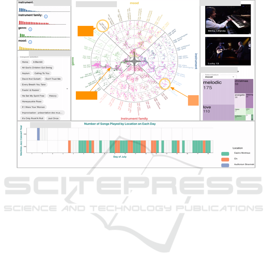
Figure 1: The SnakeTrees visualization showing the audiovisual archives from the Montreux Jazz Digital Project (MJDP).
(c) The main SnakeTrees view shows the distribution of the MJDP datasets across four main semantic features: genre, mood,
instrument, and instrument family. (a) The summary view shows the distribution of the semantic feature classes’ probabilities
mean values. (b) The selection box shows the names of the selected data points. (d) The thumbnail view shows a detailed
list of the selected data points of the audiovisual archives. The user can hover over any item to analyze further details such as
artists and dates. With a click the user can watch the video. (e) The TreeMap view shows the distribution of the selected data
points across a selected semantic feature. (f) The timeline view gives an overview of the metadata for the selected data points,
including the dates and the locations of the concert videos.
clustering to support a global-to-local visualization
exploration without losing the spatial similarity distri-
bution given by the dimensionality reduction method
and the overall shape of the clusters through the hier-
archy. It is important, however, to note that our ap-
proach is not limited to any particular dimensionality
reduction or clustering method.
The novelty of our design lies in the combina-
tion of these approaches for data exploration of non-
normative categorizations or new relationships result-
ing from the agnostic dimensionality reduction tech-
niques and hierarchical clusters for a general audience
visiting a museum as well as non-experts in computer
science coming from domains such as film studies,
documentary, or museology.
3 DATA PROCESSING
We demonstrate our SnakeTrees visualization tech-
nique based on an exemplary dataset coming from the
digital humanities area which includes live concert
music videos from the Montreux Jazz Digital Project
(MJDP) (Dufaux and Amsallem, 2019; MJDP, 2024).
The MJDP data consists of songs, with audio and
video files available for each individual song from ev-
ery of the 5000 concerts since 1967, representative of
the greatest artists and musical trends of the last 50
years. The metadata is available online and openly
accessible at OpenData Swiss.
3.1 General Structure
Our approach is specifically designed to work with
multidimensional data that is classified into multiple
feature categories, described by the following general
structure:
IVAPP 2025 - 16th International Conference on Information Visualization Theory and Applications
742

1. Each multidimensional data point P
i
∈ R
D
con-
sists of K sub-feature vectors F
k
i
, hence P
i
=
F
1
i
, F
2
i
, . . . F
K
i
.
2. For each data point P
i
, the lengths ∥F
k
i
∥, dimen-
sion of the k-th sub-feature vector, add up to D.
3. Each data point P
i
is thus segmented into K sub-
feature data points F
1
i
, F
2
i
, . . . F
K
i
.
4. All sub-feature points F
k
i
of one feature category
k are hierarchically clustered.
Hence, we can consider each vector F
k
i
to describe
a separate feature category or semantic aspect of the
data over which a separate hierarchical clustering H
k
has been defined, with the total number of |H
k
| = N.
Therefore, there exist K separate cluster hierarchies
H
k
, each organizing all N data points P
i
with respect
to a particular sub-feature F
k
i
.
Equivalently, we can consider the dataset to con-
sist of K · N feature points F
k
i
, where the K differ-
ent feature vectors F
k
i
describe different aspects of
the same common element i. Our proposed visualiza-
tion technique is specifically designed to support the
interactive visual analysis and exploration of poten-
tial relations between the different feature point sets
F
1
i
, F
2
i
, . . . F
K
i
.
In our project, for each song i, K = 4 feature vec-
tors F
mood
i
, F
genre
i
, F
instrument
i
, F
instrument f amily
i
are ex-
tracted that capture the song’s mood, genre, audio-
extracted instruments, and video-extracted instrument
families. The feature vectors are class probabilities
obtained from applying a neural network based fea-
ture classification approach. More specifically, the
feature vectors for mood, genre, and audio instru-
ment are extracted using Tensorflow Audio Models
in Essentia from the Essentia (Alonso-Jim
´
enez et al.,
2020) framework. The video instrument family fea-
ture vector is extracted using the network from a kagel
project Explore Instruments dataset. The two neural
networks output all the probabilities for the four fea-
ture vectors F
mood
i
, F
genre
i
, F
instrument
i
, F
instrument f amily
i
.
Note that the total dimension D =
∑
k
∥F
k
i
∥, or
number of attributes of the MJDP data is 56 +
87 + 40 + 28 = 211, thus representing a very high-
dimensional data space.
3.2 Dimensionality Reduction
The high-dimensional dataset is projected into 2D by
applying dimensionality reduction for each of the four
semantic features. To ensure a low number of sizable
groups in a hierarchical clustering within the 2D em-
bedding, in our experiments, we use UMAP or t-SNE,
for which we set the perplexity to be the default value
(30) of the sklearn.manifold library. We want to point
out that we can use any other low-dimensional em-
beddings, such as PCA or MDS, and that there is no
restriction to which dimensionality reduction method
is used.
3.3 Clustering
Based on the 2D embeddings, we apply a hierarchi-
cal clustering algorithm to group the data points into
clusters. We compute a hierarchy H
k
for each fea-
ture category k recursively until the desired number
of hierarchy levels is reached. Therefore, the gener-
ated output for each feature category is a tree H
k
of
clusters which transition from global to local struc-
tures with increasing depth in the tree in a common
2D embedding. While we have used a binary k-means
clustering with four recursion levels in our examples,
there is no restriction to this, and other branching fac-
tors or recursion depths could be used. Furthermore,
also unbalanced cluster hierarchies over each feature
category could easily be considered.
Eventually, over each of the four feature point sets
F
mood
i
, F
genre
i
, F
instrument
i
, and F
instrument f amily
i
, a hier-
archical binary clustering is formed. Therefore, the
data points are organized in K = 4 rooted binary trees
H
mood
, H
genre
, H
instrument
, and H
instrument f amily
.
3.4 Scaling
While being relevant to the visual design of the ra-
dial layout of the hierarchical SnakeTrees visualiza-
tion, given an input dataset and the feature extraction,
the relative radial mapping can be predetermined in
the data processing stage. The hierarchical cluster-
ing trees H
k
are scaled such as to fit the sector areas
of the SnakeTrees visualization. After dimensionality
reduction, every data point is represented by an or-
thogonal coordinate in a unit square. In order to fully
make use of the sector space, the orthogonal coordi-
nates are first mapped to polar coordinates. Then, ac-
cording to the start and end angles, together with the
inner and outer radii of the sector cell, we scale the
angle and the radius of all the data points in the cell,
so that the whole distribution of the data points in the
same cell is stretched to fit the space of the radial sec-
tor. Eventually, the polar coordinates are transformed
to orthogonal image coordinates again for visualiza-
tion.
SnakeTrees: A Visualization Solution for Discovery and Exploration of Audiovisual Features
743
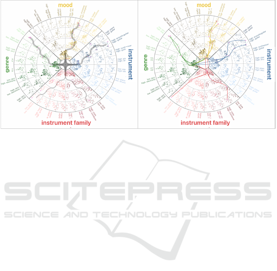
(a) Snakelines (b) Multilines
Figure 2: Snakelines (a) and Multilines (b) views, showing the aggregated or detailed connections between data points in
different feature categories.
4 VISUAL DESIGN
The SnakeTrees visualization shown in Fig. 1 is our
proposed method for multi-level visual exploration
of high-dimensional data with multiple feature cat-
egories, which can be represented as described in
Sec. 3. In this section, we describe how the visualiza-
tion is created and how the accompanying interactive
features support the analysis and exploration of data
points, clusters, and feature relationships.
4.1 SnakeTrees View
The core component of our SnakeTrees visualization
is an overview widget. Our multidimensional and
multi-feature data is arranged in K rooted trees H
k
,
one for each set of feature vectors F
k
i
. These trees are
arranged radially in sectors, each such tree H
k
ex-
hibits multiple cell layers which are increasingly sub-
divided outwards corresponding to the depth of the
hierarchy, similar to sunburst charts. Fig. 1 shows
a SnakeTrees visualization for the MJDP example
dataset. The concert song videos are organized into
K = 4 features genre, mood, instrument, and instru-
ment family defining the circular sectors. These fea-
tures can be specific for a given application domain,
as in the MJDP example, or more generalizable to a
broader class of data.
The SnakeTrees overview panel supports two dif-
ferent visual representations of the correlation be-
tween data points in different feature categories, ei-
ther as aggregated Snakelines or as Multilines.
4.1.1 Snakelines
Given a selection of data points, Snakeline connec-
tions depict the interconnections among cluster and
sub-cluster centers in the different feature categories,
as shown in Fig. 2(a). The overall topology and
branching of the Snakelines shows the spread and dis-
tribution of the selected data points among the dif-
ferent semantic features, allowing for the exploration
and analysis of intra-connections among them. The
thickness of the line is proportional to the number of
points at the endpoint of the connection, indicating the
strength of the connections across sectors and cells.
4.1.2 Multilines
The Multilines shown in Fig. 2(b) are designed differ-
ently, depicting individual connections, in contrast to
the aggregated view. Instead of cluster or cell centers,
the individual point coordinates are used, and for ev-
ery point, the connection to the same point in another
feature category or depth level is identified and then
given as a curved line path. The main goal of Multi-
lines is to show in detail how two points are linked in
the selection.
4.1.3 Feature Sectors
In each feature sector, the data points are visualized as
mini scatter plots inside each node’s cell of the cluster
hierarchy using a distinctive color (hue), as shown in
Fig. 3 for the mood or instrument feature categories.
Complementary colors are used to differentiate each
IVAPP 2025 - 16th International Conference on Information Visualization Theory and Applications
744
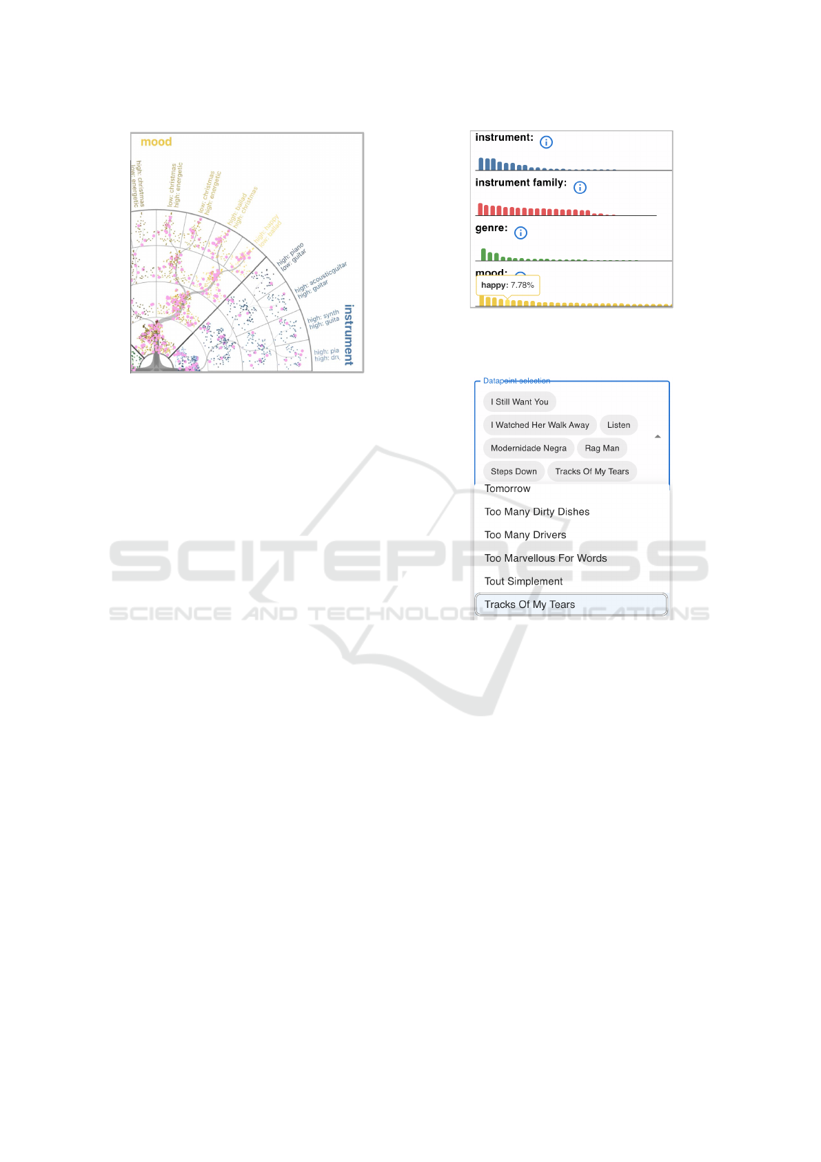
Figure 3: Detailed visualization of the SnakeTrees mood
section in shades of yellow. In the center, the entire dataset
is embedded in 2D based on mood probabilities. Each sub-
sequent outer layer divides the data points using a clustering
algorithm.
feature group. The thick Snakelines are subdivided
and show how the data points are distributed from a
parent cell to a particular sub-cell cluster. The thick-
ness of the lines indicates the number of common
points between the source upper cell and the target
sub-cell cluster.
The outermost leaf labels, in one feature, cor-
respond to the two classes with the highest differ-
ences, when comparing the averages of values/prob-
abilities of selected data points and all of the entire
dataset. Hence, the two most significant differentiat-
ing classes, not the ones just with highest probability,
within that feature category, are depicted as annota-
tion of a leaf node.
4.2 Summary View
In addition to the main overview panel, our Snake-
Trees visualization includes a summary panel show-
ing the distribution of probabilities’ mean for every
semantic feature classes as shown in Fig. 4. When
selecting the information symbol besides the feature,
the description of the feature category will be shown.
When hovering over the bars, the mean probabily of
the selected points for the corresponding class will be
shown in the tooltip.
4.3 Selection Box View
The selection box below the summary view, see
Fig. 5, shows the names of all selected data points.
When the user clicks on a selected name, the corre-
sponding data point will become unselected. When
Figure 4: Summary view showing the distribution of proba-
bilities’ mean for every semantic feature classes for the se-
lected data points.
Figure 5: Selection box view showing the names of all se-
lected data points. Selected data points are highlighted in
blue.
the user clicks again on the name of an unselected
data point, the corresponding data point will become
selected again.
4.4 Thumbnail View
The thumbnail view shows a detailed list of the se-
lected data points/audiovisual archives. The user can
not only hover over any item to analyze further de-
tails such as artists and concert dates when the song
was played, but also click on any of them to play the
video and listen to the song, as shown in Fig. 6.
4.5 TreeMap View
The TreeMap view in Fig. 7 below the thumbnail pro-
vides more detailed information for the selected data
points about the distribution of all classes in the se-
lected semantic feature. In this view, every data point
SnakeTrees: A Visualization Solution for Discovery and Exploration of Audiovisual Features
745
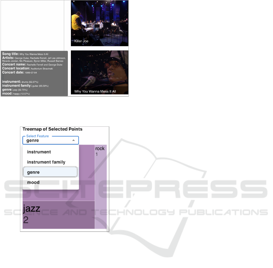
Figure 6: Thumbnail view showing detailed information
about the selected data points. The user can click on any
item to play the video and listen to the song.
Figure 7: TreeMap view showing the distribution of all
classes in the selected semantic feature for the selected data
points. The feature category can be selected from a drop-
down menu above the TreeMap.
is assigned to the top class according to its maximum
probability in the selected feature. The area of ev-
ery rectangle in the TreeMap indicates how many data
points are labeled with that same class. The area of
the entire TreeMap square indicates the total number
of all selected data points. The feature category to be
shown can be selected from a drop-down menu above
the TreeMap.
4.6 Timeline View
In order to visualize additional metadata, we provide
a timeline to help the user analyze the year, date and
location information for the selected data points. The
concert locations are color encoded. The horizontal
axis represents the day in July, since in this dataset,
the concerts were always held in July, and the verti-
cal axis represents the year of the event. Every large
(day) cell is divided into several smaller sub-cells,
corresponding to the maximum number of songs per-
formed on a day from the selected data points. There-
fore, the colored sub-cells in the chart represent songs
played on a specific day at a specific location. The
gray sub-cells represent that no more songs, from the
current selection, were played on that specific day.
The interaction with these panels is described in more
detail below in the Sec 4.7.
4.7 Interactive Features
The primary purpose of the various display panels
and interactive features is to support the discovery of
unexpected connections and groupings of the audio-
visual archives, in particular, to allow the discovery
of new relationships between different groups of fea-
tures.
To design the interactive features, we focus on two
main tasks: (1) exploring a single feature set and how
the dataset expresses that feature set across the other
features, and (2) exploring a particular data point and
extending the analysis to nearby points and clusters
of points. These two interactive features are intended
to help users explore and discover new ways in which
data points relate to each other.
For this goal, we depict the relationships between
different feature groups using the Snakeline visualiza-
tions in the main overview (Fig. 1(c)). The rationale
is based on the hypothesis that relationships between
different feature groups can be identified by looking
at the distribution of feature expressions across their
hierarchy. Our visualization method highlights these
relevant relationships by drawing thick curved lines
through the hierarchy trees, bridging different feature
groups as individual lines or aggregated as Snake-
lines, as shown in Fig. 3. The thickness of a Snake-
line represents the strength of the relationship, which
is defined by the number of items the target cluster
shares with the initial selection.
Multiple cells and/or lasso-selected subsets of
points from one or more cells can be selected in the
SnakeTrees view (see also Fig. 1(c)). This type of se-
lection acts as a filter on the data and the item/thumb-
nail views, which will be adjusted accordingly. Thus,
supporting common overview first and zoom and filter
actions for interactive visual data exploration.
Further interaction options such as zoom in and
out, individual data point selection, TreeMap view se-
lection, and audiovisual play, complement the inter-
active selection feature in the main SnakeTrees view.
The main purpose of all the supported interaction fea-
IVAPP 2025 - 16th International Conference on Information Visualization Theory and Applications
746
SnakeTrees
Statistical
data
Montreux
Jazz
Digital
Project
videos
Automated
feature extraction
using Essentia
Feature
conversion
Meta data extraction
Data preparation
Construction of
feature hierarchies
and radial layout
generation
Interactive visualization
Metadata records
for all N data items
Feature vectors
<latexit sha1_base64="vWFd8fyfYPhG6RIVAsn+lliSfSM=">AAACG3icZVDJSgNBEO2JW4xb1KOXwRDwFGbE7RgUxGMEs0Ayhp5OJWnSs9BdEwxDPsOj+jHexKsHv8WLPZNBTFLQ8Hivql71c0PBFVrWt5FbWV1b38hvFra2d3b3ivsHDRVEkkGdBSKQLZcqENyHOnIU0AolUM8V0HRHN4neHINUPPAfcBKC49GBz/ucUdRUuzMGFt9OH0dd3i2WrIqVlrkM7AyUSFa1bvGn0wtY5IGPTFCl2rYVohNTiZwJmBY6kYKQshEdQFtDn3qgnDg9eWqWNdMz+4HUz0czZf9PxNRTauK5utOjOFSLWkL+aeU5K+xfOTH3wwjBZzOnfiRMDMwkALPHJTAUEw0ok1wfa7IhlZShjqkw55NsD9F70n9J96VEBUETOi17MZtl0Dit2BeV8/uzUvU6yy1PjsgxOSE2uSRVckdqpE4YCcgzeSVvxovxbnwYn7PWnJHNHJK5Mr5+AT5LoiE=</latexit>
F
k
i
for all N data items
Load data
Update selection
of data points
Calculate top
differences
Get and
play video
Update selection
of feature
Calculate
average
Figure 8: Overview over the SnakeTrees visualization framework.
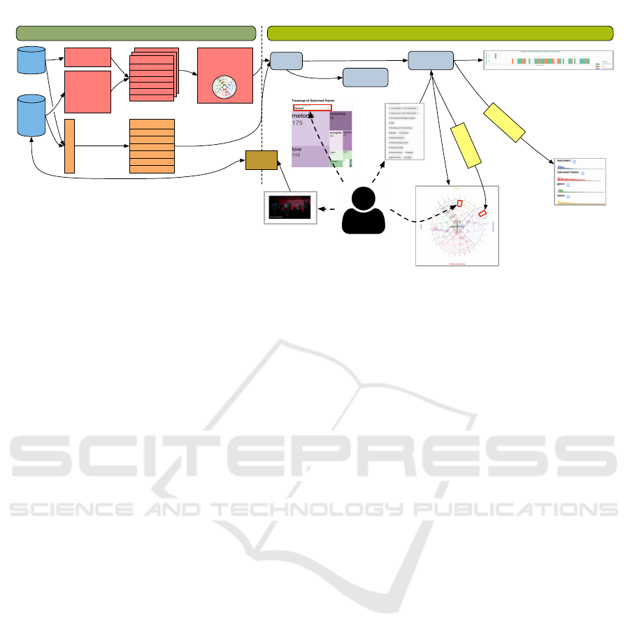
tures is to allow the users to drill down, refine their
selection, and go further in their explorative tasks.
5 IMPLEMENTATION
Our project consists of two main components: a back-
end server-side web API for data preparation and a
frontend single-page web application for the interac-
tive visualization as illustrated in Fig. 8. The backend,
a server-side web API written in Python and Flask,
is responsible for data preparation and computation
of the hierarchical radial visualization elements. The
backend also loads the data from the local drive and
sends it to the frontend through HTTP calls.
To improve the performance, data preparation
and computation of the radial visualization elements
are conducted before the client-side web application
starts. This approach ensures that the backend can
quickly respond to frontend requests, enabling users
to interact with the application interactively.
The frontend, a single-page web application writ-
ten in JavaScript with React.js, is responsible for dis-
playing the data, drawing the user interface elements,
handling all user interactions, and coordinating all
views. The frontend is designed to handle all data
requests and communicate with the backend through
HTTP calls. The SnakeTrees overview in the fron-
tend is implemented with D3.js, videos are displayed
using video.js, and side effects (API calls) are man-
aged through Redux-Sagas. The design and layout
are created with Material-UI. The application store is
kept with Redux.
All views support linked-brushing. Every user se-
lection in the client-side web app leads to a recalcula-
tion of the drawn visual elements, such as the Snake-
lines, the Multilines, the summary, the TreeMap, the
timeline chart, as well as the descriptive thumbnails.
6 USE CASE MONTREUX JAZZ
FESTIVAL
In this following use case, we filtered the Montreux
Jazz Festival (MJF) concert video archives by the 20
most frequent singers who performed at MJF from
the year 1995 to 2000 and got a dataset containing
451 videos. We illustrate the features of our visual-
ization tool with two use cases. A user may start the
exploration and analysis with the feature: genre. Us-
ing the Cell selection and the Snakelines options, they
can select one of the deepest cluster cells with the
two significant differentiating classes Low rock and
High jazz. This cluster includes 63 songs, which are
distributed quite evenly in mood and instrument fam-
ily features, but more in the cluster High piano and
Low electricguitar in feature instrument as shown in
Fig. 9(b). The user further filters the data by instru-
ment, specifically selecting the cell labeled Low piano
and High electricguitar. This filtering results in two
songs: Killer Joe and Why You Wanna Mess It All.
However, the two songs are clustered in two different
cells in feature mood and feature instrument family as
shown at the right bottom of Fig. 9(b).
In the Thumbnail view, the user can browse the re-
sults and view detailed information about the audio-
visual archives, including the song title, artists, festi-
val edition, concert name, location, date, and the top
feature class for all semantic features (see Fig. 9(d)).
By clicking the video, the user discovers that the
instruments captured in these two songs are signifi-
cantly different. In Killer Joe, piano is captured more
SnakeTrees: A Visualization Solution for Discovery and Exploration of Audiovisual Features
747
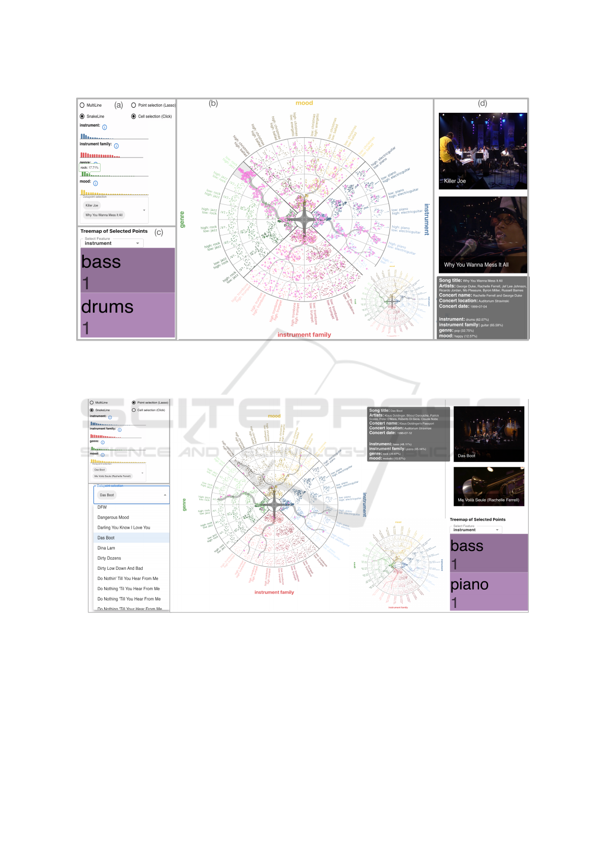
Figure 9: The SnakeTrees visualization displays a selected group of data points and its corresponding Snakelines. Panel (a)
presents the distribution of feature classes and their details. Panel (b) shows the Snakelines. Panel (c) displays the TreeMap
view, which gives an intuitive view of the distribution of the semantic feature classes. Panel (d) is the thumbnail view which
shows video thumbnails of the songs. The user can click on a video thumbnail to play it.
(a)
(b)
(c)
Figure 10: The user can start with the selection in panel (b), and then choose Point selection in panel (a) to select the nearby
data point. Panel (c) shows both the Snakelines and the Multilines of the selected data points.
clearly, while in Why You Wanna Mess It All, there are
many frames focusing on the guitar. Therefore, the
two songs are clustered to different groups within the
feature instrument family. On the other hand, when
listening to the songs, the mood of the two songs is
also different, which is reflected in the different clus-
ters in the mood feature. In the Summary view, the
user can explore the general information about the
current data point selection. An extensive list of fea-
ture classes and probability distributions are displayed
for all the features, as it is shown in Fig. 9(a). In the
TreeMap view, the user can explore the distribution of
the top feature classes as shown in Fig. 9(c). By us-
ing the drop-down menu, the user can select the other
IVAPP 2025 - 16th International Conference on Information Visualization Theory and Applications
748

features to be shown in the TreeMap.
In the second use case, the user starts the explo-
ration by first selecting an interesting song in the se-
lection box, and then the corresponding data point
will be highlighted in the SnakeTrees visualization. In
our example, the song Das Boot is selected. Then the
user can explore the similar songs by Point selection
in feature genre and select the song Me Voil
`
a Seule.
Eventually, the user can analyze the similarity and dif-
ference between them in different features. The pro-
cess is shown in Fig. 10 with both the Snakelines and
the Multilines. From the Snakelines, the user can see
that the two songs are located in different clusters in
all the other features. From the tooltip in the Thumb-
nail view, the user looks into the detailed information
and discovers that the song Das Boot includes more
bass in the audio, shows more piano in the video;
while the song Me Voil
`
a Seule includes more piano
in the audio, shows more sitar in the video.
7 EXPERTS’ FEEDBACK
We conducted three rounds of interviews with five ex-
perts in digital humanities, music, and film studies to
get the experts’ feedback on our visual design. The
interviews included a pre-interview questionnaire, a
think-aloud session, and an optional post-experiment
questionnaire. The interviews lasted approximately
60 minutes. We recorded the screen and audio with
minimal intervention to reduce potential bias. We col-
lected anecdotal feedback on the visual design and
summarized key lessons learned and new ideas.
Because our tool is intended for exploratory anal-
ysis and discovery, we designed the SnakeTrees as
a general overview of the semantic features and
data point distribution, without additional clues about
where to start exploring.
However, during the interviews, we collected dif-
ferent experts’ strategies on how to start the ex-
ploratory analysis in order to optimize the interactive
experience as much as possible. Domain experts sug-
gested that a common point to start the exploration
would be the outer cells and features such as genre.
They also suggested that a good starting point could
be a song or an artist to then explore the feature dis-
tribution and the temporal distribution across differ-
ent years. This is particularly interesting since some
artists, such as Quincy Jones, have performed at the
Montreux Jazz Festival several times.
After a number of iterations, the experts were very
positive about the user experience and reported that
our visualization tool was impressive. They found the
interaction with the SnakeTrees view very appealing,
especially the lasso tool.
They suggested sereval ideas for the usage of our
tool. For example, domain experts suggested focus-
ing on analyzing a subset of songs by a given artist,
for example, Prince came to the Montreux Jazz Fes-
tival in 2013 and played three times, and on those
three nights he didn’t play the same concert. It was
always a very different concert, with different instru-
ments. Other artists came to the concert many times,
like Quincy Jones, Nina Simone, Miles Davis. Al-
though we did not initially plan to have a filter for
musicians, we plan to add it in future work. They also
pointed out that the combination of the SnakeTrees
view and the timeline could help analyze the evolu-
tion of different styles over time, from jazz to jazz fu-
sion, electronic jazz, and many other genres that are
part of the festival’s broad repertoire.
They also pointed out that the visualization inter-
face could be useful for interactive visualization in
museum installations, but in that case the casual user
might need more guidance and explanation of what
do the different clusters convey and what is expressed
by the global spatial distribution provided by the di-
mensionality reduction.
8 CONCLUSIONS
The relationships between groups of features are an
interesting and challenging target for visualization ap-
plications, especially in datasets where classifications
and semantic features are malleable and constantly
morphing, merging, and changing, as in the case of
digital humanities.
Traditionally, the problem of high dimensional-
ity has been circumvented by concatenating pairwise
scatter plots or 2D graphs into a grid of matrices, or
by using pairwise comparisons across parallel coordi-
nate plots or even composite views, which require the
user to mentally connect them into a coherent view
and then analyze the structure of the dataset and the
relationships between its points. However, this ap-
proach requires a hypothesis about their relationship
a-priori, which can be difficult to develop, especially
when dealing with large feature spaces without sharp
boundaries, such as music genre, styles, instrument
family, or visual complexity.
In this paper, we show how our SnakeTrees visu-
alization can support in a novel way the exploration
of multidimensional datasets, as well as inter- and
intra-feature correlations, at a glance in a single view.
Although the visual design requires an initial learn-
ing curve and might not immediately be intuitive at
first glance, previous research has shown that working
SnakeTrees: A Visualization Solution for Discovery and Exploration of Audiovisual Features
749

with complex visualizations can facilitate the analyti-
cal reasoning process (Hullman et al., 2011), which is
part of our main goal.
The provided auxiliary views support global-to-
local navigation in the dataset through agnostic, math-
ematically based hierarchies that assist experts in ex-
ploring new possible unexpected combinations or fea-
ture groupings in the local structure of cluster cells of
a single feature group and also across features.
Our prototype exhibits some limitations which we
plan to address in the future:
Interactivity: In the MJDP example, our data points
include image-based thumbnails as well as ref-
erences to the raw videos of the songs. This
makes accessing and manipulating a large num-
ber of data points challenging for the current com-
ponents of the web development stack. Access
to important ancillary binary data (images and
videos from external storage) affects interactiv-
ity and thus limits the number of data points that
can currently be used to a few hundred. We no-
ticed that with more than 1000 data points, the
web interface becomes laggy. A possible solution
to tackle this challenge could be the use of pro-
gressive visual analytics techniques (Fekete et al.,
2024).
Dimensionality: The scalability concerning the high
dimensionality of the data space has already been
shown, e.g. with the MJDP data. In this exam-
ple, we have data points with 491 dimensional
attributes. Nevertheless, our visual design may
not be able to accommodate more than 9 to 12
different feature categories. However, these are
also fundamentally known limitations of our vi-
sual perception system (Brewer, 1994).
Scalability: The scalability concerning a larger num-
ber of data points is another challenge that could
potentially cause overplotting problems. We ac-
knowledge that the current implementation is not
specifically addressing this, but overplotting of
too many data points could be tackled by sub-
sampling strategies, progressive visual analytics
as well as cell-specific interactive lenses.
ACKNOWLEDGEMENTS
The Swiss National Science Foundation sup-
ports this research through the SINERGIA grant
for the interdisciplinary project Narratives from
the Long Tail: Transforming Access to Audio-
visual Archives (grant number CRSII5 198632,
see https://www.futurecinema.live/project/, for the
project description). We also thank the support of
Prof. Barbara Fl
¨
uckiger and the VIAN project team,
ERC grant agreement No 670446 FilmColors.
REFERENCES
Alonso-Jim
´
enez, P., Bogdanov, D., Pons, J., and Serra,
X. (2020). Tensorflow audio models in essentia.
In ICASSP 2020 - 2020 IEEE International Con-
ference on Acoustics, Speech and Signal Processing
(ICASSP), pages 266–270.
Brewer, C. A. (1994). Color use guidelines for mapping. Vi-
sualization in modern cartography, 1994(123-148):7.
Cao, N., Lin, Y.-R., Sun, X., Lazer, D., Liu, S., and Qu,
H. (2012). Whisper: Tracing the spatiotemporal pro-
cess of information diffusion in real time. IEEE
transactions on visualization and computer graphics,
18(12):2649–2658.
Cavallo, M. and Demiralp, C¸ . (2018). Clustrophile 2:
Guided visual clustering analysis. IEEE transactions
on visualization and computer graphics, 25(1):267–
276.
Chatzimparmpas, A., Martins, R. M., Jusufi, I., Kucher, K.,
Rossi, F., and Kerren, A. (2020). The state of the art in
enhancing trust in machine learning models with the
use of visualizations. In Computer Graphics Forum.
Cibulski, L., May, T., Schmidt, J., and Kohlhammer, J.
(2023). Compo*sed: Composite parallel coordi-
nates for co-dependent multi-attribute choices. IEEE
Transactions on Visualization and Computer Graph-
ics, 29(10):4047–4061.
Dufaux, A. and Amsallem, T. (2019). The Montreux Jazz
Digital Project: From preserving heritage to a plat-
form for innovation. Journal of Digital Media Man-
agement, 7(4):315–329.
Eckelt, K., Hinterreiter, A., Adelberger, P., Walchshofer,
C., Dhanoa, V., Humer, C., Heckmann, M., Steinparz,
C., and Streit, M. (2022). Visual exploration of re-
lationships and structure in low-dimensional embed-
dings. IEEE Transactions on Visualization and Com-
puter Graphics.
Ell, P. S. and Hughes, L. M. (2013). E-infrastructure in the
humanities. International Journal of Humanities and
Arts Computing, 7(1-2):24–40.
Elmqvist, N. and Fekete, J.-D. (2009). Hierarchical aggre-
gation for information visualization: Overview, tech-
niques, and design guidelines. IEEE Transactions
on Visualization and Computer Graphics, 16(3):439–
454.
Fekete, J.-D., Fisher, D., and Sedlmair, M. (2024). Progres-
sive Data Analysis: Roadmap and Research Agenda.
Eurographics.
Fuchs, J., J
¨
ackle, D., Weiler, N., and Schreck, T. (2016).
Leaf glyphs: Story telling and data analysis using en-
vironmental data glyph metaphors. In Computer Vi-
sion, Imaging and Computer Graphics Theory and
Applications, pages 123–143.
IVAPP 2025 - 16th International Conference on Information Visualization Theory and Applications
750

Garrison, L., M
¨
uller, J., Schreiber, S., Oeltze-Jafra, S.,
Hauser, H., and Bruckner, S. (2021). Dimlift: In-
teractive hierarchical data exploration through dimen-
sional bundling. IEEE Transactions on Visualization
and Computer Graphics, 27(6):2908–2922.
Goodwin, S., Dykes, J., Slingsby, A., and Turkay, C.
(2015). Visualizing multiple variables across scale
and geography. IEEE Transactions on Visualization
and Computer Graphics, 22(1):599–608.
Gotz, D., Zhang, J., Wang, W., Shrestha, J., and Borland,
D. (2019). Visual analysis of high-dimensional event
sequence data via dynamic hierarchical aggregation.
IEEE Transactions on Visualization and Computer
Graphics, 26(1):440–450.
Grossmann, N., Gr
¨
oller, E., and Waldner, M. (2022). Con-
cept splatters: Exploration of latent spaces based on
human interpretable concepts. Computers & Graph-
ics, 105:73–84.
Heinrich, J. and Weiskopf, D. (2013). State of the art of
parallel coordinates. Eurographics (State of the Art
Reports), pages 95–116.
Herr, D., Han, Q., Lohmann, S., and Ertl, T. (2016). Vi-
sual clutter reduction through hierarchy-based projec-
tion of high-dimensional labeled data. In Graphics
Interface, pages 109–116.
Hinterreiter, A., Steinparz, C., Sch
¨
ofl, M., Stitz, H., and
Streit, M. (2021). Projection path explorer: exploring
visual patterns in projected decision-making paths.
ACM Transactions on Interactive Intelligent Systems
(TiiS), 11(3-4):1–29.
Hoffman, P., Grinstein, G., and Pinkney, D. (1999). Dimen-
sional anchors: a graphic primitive for multidimen-
sional multivariate information visualizations. In Pro-
ceedings ACM Workshop on New Paradigms in Infor-
mation Visualization and Manipulation, pages 9–16.
H
¨
ollt, T., Vilanova, A., Pezzotti, N., Lelieveldt, B. P. F.,
and Hauser, H. (2019). Focus+ context exploration of
hierarchical embeddings. Computer Graphics Forum,
38(3):569–579.
Holten, D. (2006). Hierarchical edge bundles: Visualiza-
tion of adjacency relations in hierarchical data. IEEE
Transactions on Visualization and Computer Graph-
ics, 12(5):741–748.
Huang, G., Li, Y., Tan, X., Tan, Y., and Lu, X. (2020).
Planet: A radial layout algorithm for network visual-
ization. Physica A: Statistical Mechanics and its Ap-
plications, 539:122948.
Hullman, J., Adar, E., and Shah, P. (2011). Benefitting in-
fovis with visual difficulties. IEEE Transactions on
Visualization and Computer Graphics, 17(12):2213–
2222.
Kohonen, T. (1998). The self-organizing map. Neurocom-
puting, 21(1-3):1–6.
Lex, A., Streit, M., Partl, C., Kashofer, K., and Schmalstieg,
D. (2010). Comparative analysis of multidimensional,
quantitative data. IEEE Transactions on Visualization
and Computer Graphics, 16(6):1027–1035.
Li, G., Zhang, Y., Dong, Y., Liang, J., Zhang, J., Wang, J.,
McGuffin, M. J., and Yuan, X. (2019). Barcodetree:
Scalable comparison of multiple hierarchies. IEEE
Transactions on Visualization and Computer Graph-
ics, 26(1):1022–1032.
McInnes, L., Healy, J., and Melville, J. (2018). UMAP:
Uniform manifold approximation and projection for
dimension reduction. arXiv:1802.03426.
MJDP (2024). Montreux Jazz Digital Project.
https://go.epfl.ch/mjdp.
Pagliosa, L. d. C. and Telea, A. C. (2019). Radviz++: Im-
provements on radial-based visualizations. Informat-
ics, 6(2):16.
Robinson, I. and Pierce-Hoffman, E. (2020). Tree-sne:
Hierarchical clustering and visualization using t-sne.
arXiv preprint arXiv:2002.05687.
SankeyTrees (2023). SankeyTrees.
https://medium.com/@timelyportfolio/visualizing-
trees-sankey-tree-18d1815f43e2.
Schulz, H.-J., Hadlak, S., and Schumann, H. (2010). The
design space of implicit hierarchy visualization: A
survey. IEEE Transactions on Visualization and Com-
puter Graphics, 17(4):393–411.
Tatu, A., Maaß, F., F
¨
arber, I., Bertini, E., Schreck, T., Seidl,
T., and Keim, D. (2012). Subspace search and visu-
alization to make sense of alternative clusterings in
high-dimensional data. In IEEE Conference on Visual
Analytics Science and Technology, pages 63–72.
van der Maaten, L. and Hinton, G. (2008). Visualizing data
using t-SNE. Journal of Machine Learning Research,
9(86):2579–2605.
Vehlow, C., Beck, F., and Weiskopf, D. (2015). The State of
the Art in Visualizing Group Structures in Graphs. In
Borgo, R., Ganovelli, F., and Viola, I., editors, Pro-
ceedings Eurographics Conference on Visualization
(EuroVis) - STARs.
Von Landesberger, T., Kuijper, A., Schreck, T., Kohlham-
mer, J., van Wijk, J. J., Fekete, J.-D., and Fellner,
D. W. (2011). Visual analysis of large graphs: State-
of-the-art and future research challenges. Computer
graphics forum, 30(6):1719–1749.
Walchshofer, C., Hinterreiter, A., Xu, K., Stitz, H., and
Streit, M. (2020). Provectories: Embedding-based
analysis of interaction provenance data. IEEE Trans-
actions on Visualization and Computer Graphics.
Watanabe, K., Wu, H.-Y., Niibe, Y., Takahashi, S., and Fu-
jishiro, I. (2015). Biclustering multivariate data for
correlated subspace mining. In IEEE Pacific Visual-
ization Symposium, pages 287–294.
Yates, A., Webb, A., Sharpnack, M., Chamberlin, H.,
Huang, K., and Machiraju, R. (2014). Visualizing
multidimensional data with glyph sploms. Computer
Graphics Forum, 33(3):301–310.
Yuan, X., Ren, D., Wang, Z., and Guo, C. (2013). Di-
mension projection matrix/tree: Interactive subspace
visual exploration and analysis of high dimensional
data. IEEE Transactions on Visualization and Com-
puter Graphics, 19(12):2625–2633.
Zhou, F., Bai, B., Wu, Y., Chen, M., Zhong, Z., Zhu, R.,
Chen, Y., and Zhao, Y. (2019). Fuzzyradar: visual-
ization for understanding fuzzy clusters. Journal of
Visualization, 22:913–926.
SnakeTrees: A Visualization Solution for Discovery and Exploration of Audiovisual Features
751
