
GLIMPSE-Med: Single-Screen Visualization of Multivariate Time Series
for a Single Individual
Hugo Le Baher
1,2,4 a
, J
´
er
ˆ
ome Az
´
e
1 b
, Sandra Bringay
1,3 c
, Pascal Poncelet
1 d
,
Arnaud Sallaberry
1,3 e
and Caroline Dunoyer
4,5 f
1
LIRMM, UMR 5506, University of Montpellier, CNRS, Montpellier, France
2
5 DEGR
´
ES, Paris, France
3
AMIS, Paul-Val
´
ery University of Montpellier, Montpellier, France
4
Health Data Science Unit, Public Health Service, Centre Hospitalier Universitaire de Montpellier, Montpellier, France
5
Desbrest Institute of Epidemiology and Public Health, UMR UA11, University of Montpellier — Inserm, Montpellier,
France
{hlebaher, aze, sandra.bringay, poncelet, arnaud.sallaberry}@lirmm.fr, c-dunoyer@chu-montpellier.fr
Keywords:
Visualisation Design and Techniques, Temporal Data, Multivariate Data, Healthcare.
Abstract:
The widespread digitization of hospital information systems is paving the way for the integration of interactive
visualization methods into decision support systems. This progress enhances the ability to anticipate critical
risks in monitored patients and alleviates the workload of healthcare providers. However, Electronic Health
Records (EHRs) encompass large, heterogeneous, and temporal records, making it a significant challenge to
develop tools that enable effective understanding trajectories embedded in these complex data. We introduce
GLIMPSE-Med, an interactive timeline-based visualization interface for temporal and heterogeneous events
in the EHR, incorporating a score generated by a predictive model. The evaluation of this interface, conducted
with healthcare professionals, confirmed that it meets two essential needs: (1) Assess the quality of data
collected in an EHR ; (2) Estimate the patient’s condition over time.
1 INTRODUCTION
Healthcare systems have recently undergone signif-
icant digitization, promising reduced diagnostic and
treatment errors, fewer redundant tests, and more
efficient resource allocation, while driving innova-
tion in preventive and therapeutic methods. Pa-
per records have largely been replaced by electronic
health records (EHRs), integrated into healthcare fa-
cilities after major organizational and technical shifts.
EHRs are critical tools for healthcare professionals,
aiding in decision-making, treatment monitoring, and
enhancing care continuity and coordination. Re-
searchers use them to extract data for clinical trials,
while data engineers leverage them to address errors.
Despite progress in integration and interoperability,
a
https://orcid.org/0000-0003-3107-7070
b
https://orcid.org/0000-0002-7372-729X
c
https://orcid.org/0000-0002-2830-3666
d
https://orcid.org/0000-0002-8277-3490
e
https://orcid.org/0000-0001-7068-176X
f
https://orcid.org/ 0000-0002-6789-4075
EHR systems still have room for improvement.
In a medical setting, the use of existing systems
raises several challenges. The evaluation of a pa-
tient’s condition through existing dedicated interfaces
can be difficult, even for experienced healthcare pro-
fessionals. While interactive systems are recognized
as indispensable, their use can sometimes lead to un-
comfortable user experiences. In the context of tem-
poral and multivariate data in particular, achieving a
comprehensive understanding of individual trajecto-
ries within these datasets is challenging. Additionally,
the progressive integration of predictive models into
these systems to support clinicians’ decision-making
can sometimes lack clarity. It is therefore essential
to propose visualizations that address these needs and
are tailored to the daily practices of healthcare profes-
sionals.
We propose GLIMPSE-Med (Graphical Longitu-
dinal Interface for Multimodal Pathways Search and
Expertise in Medicine). This novel visualization in-
terface aims to facilitate the understanding of individ-
ual pathways by compressing multivariate time series
into a single, unified view. Applied to a medical con-
Le Baher, H., Azé, J., Bringay, S., Poncelet, P., Sallaberry, A. and Dunoyer, C.
GLIMPSE-Med: Single-Screen Visualization of Multivariate Time Series for a Single Individual.
DOI: 10.5220/0013373300003912
Paper published under CC license (CC BY-NC-ND 4.0)
In Proceedings of the 20th International Joint Conference on Computer Vision, Imaging and Computer Graphics Theory and Applications (VISIGRAPP 2025) - Volume 1: GRAPP, HUCAPP
and IVAPP, pages 765-775
ISBN: 978-989-758-728-3; ISSN: 2184-4321
Proceedings Copyright © 2025 by SCITEPRESS – Science and Technology Publications, Lda.
765

text, the presented prototype aims to help the evalua-
tion a patient’s journey within a healthcare facility.
2 RELATED WORK
Multivariate temporal data visualization is widely
utilized across various fields, including healthcare,
where it has been extensively applied to the study of
Electronic Health Records (EHRs). The development
of EHR visualization techniques has been shaped by
successive contributions in the past 25 years. Life-
lines (Alonso et al., 1998) pioneered representation
of personal history records, enabling users to ex-
plore events along a timeline while maintaining con-
text. Approaches such as MIDGARD (Bade et al.,
2004), CareVis (Aigner and Miksch, 2006) or MIVA
(Faiola and Newlon, 2011) offers extensions of Life-
lines with various improvements such as integration
of computerized protocols or use of iconographic ele-
ments. Recently, ClinicalPath (Linhares et al., 2023)
introduced an efficient compressed, day-to-day sum-
mary view, but it lacks support for detailed data ex-
ploration. Notably, while non-medical domains such
as e-commerce employ advanced predictive visualiza-
tion tools (Zhang et al., 2022), (Wu et al., 2023), sim-
ilar innovations are yet to be fully adopted in health-
care settings.
Several frameworks have been proposed to clas-
sify visualization methods, distinguishing between in-
dividual and cohort-focused approaches (Combi et al.,
2010), (Aigner et al., 2011), (Rind et al., 2013), (West
et al., 2015). Recent reviews emphasize the impor-
tance of addressing gaps in current methods, such as
the representation of missing data and the integra-
tion of predictive models (Scheer et al., 2022), (Wang
and Laramee, 2022). However, no existing synthesis
focuses specifically on multivariate temporal data of
single individuals.
3 REQUIREMENTS
In practice, following the recommendations of Mun-
zner (Munzner, 2009) and the design process pro-
posed by Sedlmair et al. (Sedlmair et al., 2012), the
design of visual systems is conducted through suc-
cessive iterations involving: (1) defining user needs
and appropriate data structures, (2) proposing visual
encodings and interactive functionalities to address
these needs, and (3) presenting the results to users to
gather feedback and refine the requirements. To de-
velop GLIMPSE-Med, we identified a set of require-
ments derived from existing literature and through
collaboration with the targeted end users. We focus on
two primary audiences: (1) data engineers or statis-
ticians responsible for data integration, data quality,
and the development of automated indicators, and (2)
healthcare professionals who require rapid and com-
prehensive understanding of patient trajectories. The
experts involved were affiliated with the Montpellier
University Hospital.
• R1 – Global and Detailed View: To facili-
tate understanding and enable informed decision-
making, the interface must provide both a syn-
thetic and detailed visualization of the patient’s
condition. This requires offering a global sum-
mary of the context while providing easy access to
specific details on demand. Additionally, for prac-
tical use in healthcare settings, it is crucial that the
information density fits realistically on a standard
screen, such as a desktop computer.
• R2 – Trajectory: The interface must depict
changes in the patient’s condition over time by
consistently displaying all individual measure-
ments. By presenting a chronological sequence
of these measurements, healthcare professionals
can observe trends and variations in the patient’s
health.
• R3 – Heterogeneity: The interface must manage a
variety of data types related to the patient’s health,
including numerical or categorical values from di-
verse and often structured sources
• R4 – Quality: Users must be able to evaluate the
completeness, validity, consistency, and confor-
mity of the displayed records.
• R5 – Importance: The interface must highlight
specific records based on predefined criteria. By
emphasizing critical data points, the interface en-
ables healthcare professionals to quickly identify
and interpret essential information even within
large datasets.
• R6 – Prediction: This need involves integrating
a third-party predictive model into the interface.
Predictions regarding the patient’s health should
be visually presented alongside traditional records
and clearly distinguishable from them.
While all these needs target the two identified au-
diences, (R4) primarily addresses the concerns of data
engineers and statisticians.
4 GLIMPSE-Med
In this section, we present our interface, GLIMPSE-
Med, whose design prioritized the compression of
IVAPP 2025 - 16th International Conference on Information Visualization Theory and Applications
766
c1
c2
b
a
c
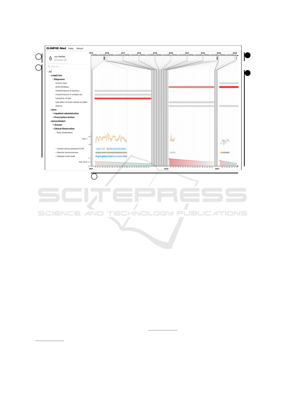
Figure 1: Screenshot of GLIMPSE-Med, showing a patient whose journey contains 7,885 data points covering three hospital
stays. (a) General patient information panel (anonymized). (b) Dropdown menu displaying measured modalities grouped by
categories and subcategories. A search bar allows users to filter displayed modalities. (c) Main data display in timeline form.
(c1) Linear time axis. (c2) Distorted time axis.
temporal axes and modalities. According to the tax-
onomy of (Aigner et al., 2011), our interface uses an
abstract reference frame, multivariate variables, lin-
ear time arrangement, both instant and interval tempo-
ral primitives, static visual correspondence, and two-
dimensional dimensionality. The source code is avail-
able in a public repository
1
.
The interface is illustrated in Figure 1, where it
displays data from a specific patient from MIMIC-III,
a publicly available database provided to the scien-
tific community free of charge upon request. It con-
tains clinical data from patients admitted to the Beth
Israel Deaconess Medical Center in Boston, Mas-
sachusetts, from 2001 to 2012. Its primary advan-
tage lies in the extensive anonymization of the data.
The dataset is accessible on the PhysioNet platform
(Goldberger et al., 2000) under the name MIMIC-
III Clinical Database (Johnson et al., 2015), (John-
son et al., 2016). The database includes records for
38,597 adult patients, covering a total of 53,423 hos-
pital stays. Here, this anonymized data is from a 65-
year-old woman. The interface consists of three main
parts: a panel displaying general patient information
(Fig. 1.a), a dropdown menu for navigating between
1
https://gite.lirmm.fr/advanse/glimpse-med/
different modalities (Fig. 1.b), and a timeline (Fig.
1.c). In terms of implementation, the interface uses
React
2
, D3
3
, and Tailwindcss
4
. The following para-
graphs provide an in-depth exploration of available
features and visual encodings.
General Information. A panel, illustrated in Fig-
ure 1.a, displays static patient information, encom-
passing data without temporal dynamics requiring
quick access. This panel serves as a dedicated space
for individual patient examination (R1), facilitating
quick access to demographic details (R2) for efficient
monitoring.
Modalities. Modalities (e.g., diagnoses, prescrip-
tions, vital signs) are organized in an expandable tree
menu (Figure 1.b). Users can click to expand or col-
lapse categories, with the leaf nodes representing spe-
cific records stored in the patient files. Only modal-
ities relevant to the patient are displayed. Selecting
a leaf node opens a detailed view of that modality.
2
https://react.dev/ accessed on 21/03/24.
3
https://d3js.org/ accessed on 21/03/24.
4
https://tailwindcss.com/ accessed on 21/03/24.
GLIMPSE-Med: Single-Screen Visualization of Multivariate Time Series for a Single Individual
767
While the hierarchy is typically based on medical tax-
onomies like the International Classification of Dis-
eases (ICD) for diagnoses, it is not required; all items
can simply be grouped under a single root if needed.
This organization helps users explore the data struc-
ture (R3) and spot potential errors or misclassifica-
tions (R4).
Search Bar. A search bar (Figure 1.b) is available
above the modalities menu. Users can filter modal-
ity or category titles not containing the term entered
in the bar, case-insensitively. Users can quickly find
desired elements within a dense structure (R1) and
identify data types that may not have been stored and
displayed (R4).
Timeline. Temporal data is displayed on a timeline
spanning from the first to the most recent measure-
ments, with margins to account for varying temporal
granularities. Vertical lines of different shades and
widths indicate subdivisions like years and months
(Figure 1). The timeline consists of three sections:
a linear axis (Figure 1.c1), a distorted axis (Figure
1.c2), and a transition region connecting the two. The
distortion compresses empty spaces where no data
was recorded, magnifying periods with patient activ-
ity and collected data. This allows users to navigate
all measurements in full temporal context (R2) while
maintaining global awareness of temporal relation-
ships (R1). The timeline dynamically adjusts using a
custom algorithm that recursively subdivides it into a
tree structure. Nodes represent calendar intervals tai-
lored to the temporal extent, optimizing screen space
utilization by adapting displayed data within prede-
fined axis parameters.
Hospital Stays and Zoom. Each stay within the pa-
tient’s journey is displayed on the linear axis with a
rectangular symbol (Figure 1.c1), with the left and
right sides corresponding to admission and discharge
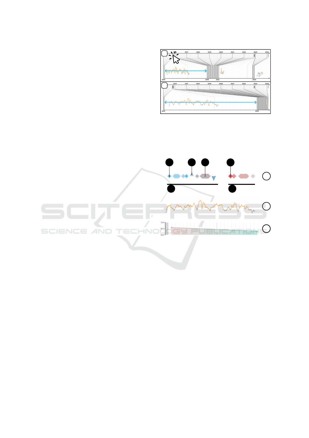
dates respectively. As illustrated in Figure 2, clicking
a symbol expands the display to the corresponding ad-
mission while maintaining the predefined portion of
the display. Users control the desired level of detail
by zooming in on an admission (R1).
Records. On the timeline, each record is repre-
sented by a diamond-shaped symbol. For instanta-
neous records indicating zero duration, the upper cor-
ner of the diamond aligns with the corresponding tem-
poral coordinate (Fig. 3.a1). For temporal periods,
the diamond extends horizontally, with left and right
peaks indicating start and end temporal coordinates
1
2
Figure 2: Illustration of zoom interaction. (1) The upper
figure shows the default view, where all hospital stays are
represented on the same scale within the distorted axis. (2)
The lower figure shows the display after clicking on the first
stay symbol. The distorted axis is then focused on the tem-
poral range of this admission.
b
a
a5 a6
a1
a2
a3
a4
c
Compact view:
Detailed view:
Score:
Figure 3: Symbolic representation of records. (a) Compact
view. (a1) Example of instantaneous record. (a2) Exam-
ple of significant increase. (a3) Example of interval. (a4)
Example of important data. (a5) Numerical records. (a6)
Non-numerical records. (b) Detailed view of a numerical
series. (c) Risk score.
respectively (Fig. 3.a3). For each recorded modality,
a sequential arrangement of corresponding records is
displayed on the interface as a series. Users choose to
display a series in either compact or detailed format.
Clicking the corresponding series toggles between the
two views. The characteristics and functionalities of
these two views are discussed in the following sec-
tions.
Compact Series View. When data is displayed in
compact view, it is distributed along a horizontal line.
If the record includes a numerical value, a small con-
centric diamond is inserted inside (Fig. 4.a2). Addi-
tionally, to indicate significant evolution of the series’
numerical value compared to the previous value, the
diamond shape transforms into a triangle, with trian-
IVAPP 2025 - 16th International Conference on Information Visualization Theory and Applications
768

a2
a1
Figure 4: Components of the symbol representing a record-
ing, including the external (a1) and internal (a2) parts. The
internal component is only visible if the recording has a nu-
merical value.
gle orientation (upward or downward) indicating in-
crease or decrease, respectively (Fig. 3.a2). In our
context, significant evolution corresponds to a change
greater than the standard deviation of the dataset for
the considered modality. Users can thus quickly dis-
cern the nature (R3) of a displayed series and iden-
tify potential anomalies such as missing values, du-
plicates, or outliers (R4). Furthermore, users capture
the global dynamics of the series (R2) at a glance.
Detailed View of a Series. During the detailed vi-
sualization of a series containing numerical record-
ings, the data are displayed as a linear graph. The spa-
tial coordinate Y of each symbol corresponds to the
numerical value of the associated recording, if avail-
able. Successive points are connected by straight seg-
ments (Fig. 3.b). However, only points belonging to
the same admission are connected, to avoid interpo-
lation between distinct data collection periods. This
method allows users to analyze the dynamics of mea-
surements (R2) and identify anomalies (R4) and vari-
ations (R5), while maintaining a contextual overview
(R1).
Highlighting of Recordings. Each recording is
represented by a symbol with two parts: the con-
tour and the internal component (Fig. 4). The inter-
nal component is visible only if a numerical value is
present (Fig. 4.a2). Both parts use independent color
schemes:
(1) Internal diamonds are colored based on stan-
dard value ranges. Due to the diverse semantics of
medical modalities, defining universal interpretations
for values is impractical. For example, while maxi-
mum values indicate stability in some measures (e.g.,
Glasgow Coma Scale), for others (e.g., heart rate),
values near the mean suggest a healthy state. To avoid
semantic bias regarding health impact, the palette
uses blue for below-normal values, orange for above-
normal values, and gray for values within the norm.
This palette, inspired by temperature-related colors,
leverages intuitive associations with ”hot” and ”cold.”
(2) Contours are highlighted in red to indicate
importance (Fig. 3.a4), a color chosen for its ef-
fectiveness in signaling critical or negative factors
(R6). While the importance criterion is adaptable and
context-dependent, in general, recordings flagged by
Figure 5: Illustration of a tooltip appearing when hovering
over a recording. Additionally, when hovering, a series is
highlighted with a light gray background.
the prediction model as contributing to patient deteri-
oration are emphasized using this palette.
Predicted Score. In conjunction with the display of
recordings, an estimate of the patient’s risk is dis-
played at the bottom of the interface (Fig. 3.c) (R6).
These predictions are independent of the models but
should be generated either by statistical estimators or
by machine learning models capable of temporal pre-
dictions. The prediction label is adaptable to corre-
spond to the application context, which requires ad-
justing the color palette and its semantics. Here, a
binary color gradient using shades of red and green
has been adopted, where the score represented indi-
cates a general estimate of the patient’s deterioration
(e.g., risk of mortality, cardiac insufficiency, or rein-
tubation).
Tooltip. When the mouse cursor hovers over an el-
ement, a tooltip is revealed to provide complete infor-
mation about it. This feature allows users to evaluate
the content of a particular recording (R1).
5 USER STUDY
5.1 Design
To evaluate the effectiveness of our interface, we con-
ducted a user study involving 14 participants on-site.
This diverse panel consisted of healthcare profession-
als from the Montpellier University Hospital, includ-
ing doctors, statisticians, and data engineers, compris-
ing nine women and five men. Participants received
no financial or privileged treatment. This study was
approved by the Montpellier University’s ethics com-
mittee, opinion number UM 2023-041bis. The ex-
periments were conducted using real patient trajecto-
ries from the MIMIC-III dataset (Johnson et al., 2015)
(Johnson et al., 2016). The information displayed on
the interface includes demographic data, vital signs,
laboratory test results, procedures, diagnoses, medi-
cations, and various clinical notes.
Each evaluation session, lasting approximately 40
minutes, began with a complete presentation of the
GLIMPSE-Med: Single-Screen Visualization of Multivariate Time Series for a Single Individual
769

study, providing an overview of the interface’s fea-
tures. Participants had access to two distinct patient
files, accessible via separate browser tabs. The expe-
rience consisted of three steps:
Step 1: Participants responded to closed-ended
questions through a multiple-choice questionnaire of
15 questions, interacting with the interface. The ques-
tions assigned to participants for task completion are
accessible in Table 1. These questions were de-
signed to encourage participants to explore all fea-
tures. Sometimes, advanced medical knowledge was
required (questions 14 and 15). Although participants
responded without assistance, they had the opportu-
nity to ask clarifying questions to the evaluator. Ad-
ditionally, participants were encouraged to verbalize
their thoughts, sharing any reflections or challenges
encountered during navigation in the interface.
Step 2: Participants completed the SUS (System
Usability Scale) questionnaire (Brooke, 1996). Since
all participants were French-speaking, we used the
French version of the questionnaire, F-SUS (Gronier
and Baudet, 2021). Comprising 10 questions, visible
in Table 2, this standard questionnaire aims to eval-
uate the effectiveness, efficiency, and satisfaction of
the interface. Participants responded to each question
on a 5-point Likert scale. The questionnaire generates
a score ranging from 1 to 100.
Step 3: Participants participated in open discus-
sions, responding orally to questions posed by the
evaluator. These questions were designed to gather
comments on general or specific aspects of the inter-
face. They provided an opportunity for participants to
express their thoughts openly.
5.2 Results
This section presents both quantitative and qualitative
analyses of the experimental results.
5.2.1 Quantitative Analysis
Table 1 presents the results of the quantitative anal-
ysis. Participants were presented with a multiple-
choice questionnaire designed to assess their abil-
ity to extract information from the presented data.
The average accuracy across all questions was 89%.
This high accuracy suggests that the system effec-
tively conveys relevant patient information and en-
ables users to accurately answer questions related to
the presented data. As shown in Table 1, participants
achieved an overall accuracy of 89% in answering
closed-ended questions using the interface. Accuracy
was calculated as the proportion of correct answers
to a given question out of the total number of partic-
ipants. As anticipated, the results were high, align-
ing with the intentional accessibility of the questions,
which served as a means for participants to explore
the interface with clear objectives in mind. As ex-
pected, participants demonstrated lower performance
on the last two questions (79% and 14% for questions
14 and 15, respectively), which required advanced
medical knowledge and familiarity with medical cod-
ing. Only one participant had experience with medi-
cal coding. They successfully answered the questions
related to this domain. Furthermore, it is important
to note that some participants overlooked recordings
of high importance, leading to performance below the
average for question 9.
In addition to the closed-ended questionnaire, par-
ticipants’ satisfaction with the interface was assessed
using the System Usability Scale (SUS) question-
naire. Based on the SUS score, participants expressed
satisfaction with their experience using the interface.
As shown in Table 2, the average score is 79.62,
placing it in the highest quartile in terms of abso-
lute scores. When compared to other studies (Bangor
et al., 2008), our interface also falls within the highest
quartile, receiving ratings between ”good” and ”ex-
cellent” on the adjective scale.
5.2.2 Qualitative Analysis
In addition to the quantitative evaluation, participants
were encouraged to share their thoughts aloud as they
completed the tasks and responded to open-ended
questions. This section presents a synthesis of these
feedback comments.
Visual Features. Numerous comments were gath-
ered regarding interface elements, particularly con-
cerning the primary contribution of our approach: the
compression of the two axes of representation for
temporal and multivariate measures - the temporal
axis and the modality menu.
A synthesis of these comments is presented in Ta-
ble 3. In this synthesis, we chose to extract positive
and negative opinions and represent them visually in
green and red, respectively. Participants were encour-
aged to express aloud any obstacles they encountered
and their opinions on features they disliked. The re-
sults show that they did not hesitate to do so. We
therefore represented the absence of comments as rel-
atively positive, with a green and gray hatch, under
the assumption that participants validated the features
about which they did not express negative feedback.
The presented synthesis summarizes only the opin-
ions regarding the main features.
The majority of participants appreciated the dis-
tortion of the temporal axis (Fig. 1.c2) since 10 ex-
pressed positive sentiments. All participants seem to
IVAPP 2025 - 16th International Conference on Information Visualization Theory and Applications
770

Table 1: Multiple-choice questionnaire used during task-based evaluation. The average accuracy is calculated based on the
responses of the 14 participants.
№ Questions Acc.
1. What is the patient’s age? 100 %
2. How many years are displayed on the screen? 100 %
3. How many admissions are shown on the interface? 100 %
4. What is the discharge modality for the second admission? 93 %
5. Among these choices, which diagnosis was identified in two different admissions? 100 %
6. What is the last measured value of “Heart Rate”? 100 %
7. Among these choices, which “Clinical Observation” does not vary during the last admission? 93 %
8. Which admission shows the peak risk? 93 %
9. What is the most important modality for risk estimation? 79 %
10. What is the date of the “Heart Rate” value shown as important? 93 %
11. How many values have a coding error in “Fluid output miscellaneous route”? 100 %
12. Which modality has coding errors only during the first admission? 93 %
13. What is the current risk level of the patient? 100 %
14. Could the diagnosis “Obesity” be coded for the patient’s admission? 79 %
15. Could the diagnosis “Essential hypertension” be coded for the patient’s admission? 14 %
Overall average accuracy: 89 %
Table 2: F-SUS Questionnaire. Scores calculated based on the original guidelines by (Brooke, 1996) and averaged across 14
participants.
№ Questions Score
1. I would like to use this interface frequently. 7.67
2. This interface is unnecessarily complex. 7.50
3. This interface is easy to use. 7.85
4. I would need the support of a technician to be able to use this interface. 8.75
5. The different functionalities of this interface are well-integrated. 7.67
6. There are too many inconsistencies in this interface. 8.22
7. Most people would learn to use this interface very quickly. 8.02
8. This interface is very cumbersome to use. 8.02
9. I felt very confident using this interface. 7.67
10. I needed to learn a lot of things before I could use this interface. 8.22
Overall Score: 79.62 /100
confirm the readability of this feature. The reservation
expressed indicates that in some cases, there would be
an advantage to keeping a linear temporal scale, since
the spaces between the measures would have seman-
tic importance.
Participants appreciated the presence and func-
tionality of the search bar. They successfully used the
tooltips (Fig. 5). The other features are more mixed,
such as the display of units, zoom interaction (Fig. 2),
navigation in the modality tree (Fig. 1.b) and the vi-
sual representation of the series (Fig. 3) even if these
features seem to be mostly readable and understand-
able.
The most contested element is the semantics of the
risk curve (Fig. 3.c) and the ”important” values (Fig.
3.a4). For example, three participants could not un-
derstand the link between the two, stating they were
unable to see which elements are involved in the risk
calculation and were unable to identify if a given red
value refers to the current or next stay.
Usage. The interface was designed for two main
objectives: (1) consulting patient electronic health
records in a clinical setting and (2) the ability to assess
data quality within these records. We then questioned
participants about the use of the interface based on
their experience. We aimed to confirm the interface’s
response to the requirements of these tasks and also to
identify new, unexpected applications of the interface.
As expected, two physicians expressed their in-
tention to use the interface in a clinical setting. For
example, upon arrival at the service, they wish to ob-
serve the vital signs of the previous day to connect
with the patient. During the service, they could mon-
itor the evolution of a specific parameter. They also
highlighted its usefulness in a consultation scenario,
GLIMPSE-Med: Single-Screen Visualization of Multivariate Time Series for a Single Individual
771

Table 3: Summary of user remarks provided during oral dis-
cussions, grouped by features in the form of horizontal bar
diagrams. Negative opinions are shown on the left in red
and positive opinions on the right in green. No opinions are
shown in green hatch in the center. A total of one comment
per participant, or 14 comments, are expected per feature.
Temporal Axis
Distorsion
Unit and Zoom
Modalities Tree
Clarity and Navigation
Arrangement
Search Bar
Series
Symbols
Colors
Tooltip
Risk and Importance
Sémantics
10
2 1
1 1
1
1
1
4
1
1
2
3
1
Positive
No FeedbackNegative
stating it would help find analysis results, reports or
determine if a particular test was performed.
As expected, four data engineers or statisticians
expressed their intention to use the interface for data
quality assessment, for applications such as prepar-
ing a study when working with clinicians or verifying
their work. They mentioned they could conduct re-
search in health warehouses, observe typical patient
cases to assess data availability and identify poten-
tial inconsistencies. For quality control purposes, they
could use it to verify data loading and inspect patient
data. We also identified an unexpected third use case
during the evaluation: six participants would use the
interface for retrospective studies, where researchers
need to explore patient trajectories a posteriori. Ac-
cording to participants, the interface would be useful
for developing hypotheses, for example, by observ-
ing correlations, planning the variables to analyze and
how, or determining if a genetic variant is causal. One
participant argued it would be faster than going into
the existing hospital software for these tasks. One par-
ticipant recommended using the interface for medical
coding. Another expressed the intention to use it for
machine learning, highlighting the interface’s ability
to show and explain a predictive score.
5.3 Discussion
The open-ended questionnaire and think-aloud feed-
back collected during the experiment provided valu-
able insights into the components users need to com-
plete tasks effectively. This feedback also highlighted
potential uses for the interface. These participant re-
sponses complement the quantitative analysis and are
essential for identifying precise areas for improve-
ment in the evaluated interface. Based on this eval-
uation, the general aesthetics were refined, and cer-
tain functionalities were adjusted to incorporate par-
ticipant feedback.
The evaluation demonstrated that the interface
could serve as a faster and simpler alternative to
the current hospital software for retrospective stud-
ies or for assessing the quality of medical records.
Its single-screen presentation allows users to explore
data with fewer clicks and less prerequisite knowl-
edge of the software. A task-based comparative study
would be necessary to confirm differences in the num-
ber of clicks required.
To the best of our knowledge, and beyond the
medical domain, GLIMPSE-Med is the only inter-
face that visually integrates data quality assessments
or prediction outputs with multivariate time series on
a single screen. In the medical field, this approach
is the first to contextually and focally compress both
temporal and modality axes.
Limitations. Some participants appeared to strug-
gle to evaluate the interface independently of the data
displayed or the predicted risk values used for demon-
stration purposes. The discrepancy between the ex-
perimental setting and users’ everyday configurations
may have influenced their ability to envision regu-
lar use of the interface. Furthermore, while partici-
pants were French-speaking, the interface’s labels and
modalities were written in English. Although no par-
ticipant reported linguistic difficulties, this factor may
have impacted the results.
Due to the composition of the participant panel
and the tasks evaluated, the effectiveness of the in-
terface in a clinical context cannot yet be validated.
However, participant feedback has been positive and
opens avenues for further interface development. A
new evaluation phase should include additional fea-
tures such as data export capabilities and the inte-
gration of textual content. Clinical transmissions or
reports should be incorporated as records within the
timeline, with a new interaction allowing users to
view raw textual data in a dedicated window. More-
over, the interface’s clinical effectiveness should be
studied with a panel of healthcare professionals (e.g.,
doctors, nurses) who work in daily clinical environ-
ments.
The primary issue identified during the evaluation
was the exploration of the modality menu (Fig. 1.b):
participants could only identify sub-elements of a cat-
egory by clicking on it. To address this, we plan to
implement a compact view for multiple series. Sub-
IVAPP 2025 - 16th International Conference on Information Visualization Theory and Applications
772

Acidosis
Acute vascular insufficiency
Anxiety state
Closed fracture of acetabulum
Essential hypertension
Hypovolemia
Obesity
Figure 6: Proof of concept for a compact view of multiple series displayed as an unsmoothed violin density diagram: the
records within a collapsed subtree are aggregated by temporal unit. Each aggregation is represented by a rectangle, with
vertical height indicating the volume of measurements. In the example, the average importance is highlighted using a red
color gradient. Additionally, details of the aggregated content are visible upon hovering.
elements of a collapsed tree node will be synthesized
into a violin density diagram. An example of this con-
cept is shown in Figure 6.
Future Works. In future versions, users will be
able to pin desired series to the upper portion of the
y-axis. Constant display of a user-selected set of se-
ries will enable personalized ordering and compar-
isons with other series. We also plan to incorporate
data export capabilities to external files.
The addition of such features is straightforward,
while other improvements present certain scientific
challenges:
(1) While the readability of the risk score (Fig.
3.c) and important values (Fig. 3.a4) independently
of each other was validated, the visual representa-
tion of their relationship requires further exploration.
In particular, the interactions between these elements
should be further refined to enhance their semantic
clarity for users. For instance, when a user hovers
over a prediction, the important values for that spe-
cific prediction should be dynamically highlighted us-
ing a new color palette, an extended tooltip, or spatial
links.
(2) Currently, GLIMPSE-Med only presents nu-
merical and categorical data. The EHR includes
two additional modalities: clinical notes and medical
imaging. To maintain visual consistency and make
use of the compression features in our interface, these
modalities must be adapted to the format of parallel
timelines. Since the interface relies on compressing
records visually while allowing users to view them
fully on demand, it is necessary to design both a com-
pact and a detailed view for each modality.
A simple approach would treat images and docu-
ments in the preview as simple records, without ana-
lyzing their content. Collections of documents or im-
ages could then be displayed as categorical timelines,
as shown in Figure 3.a, using symbols representing
an envelope or imaging icon to indicate their type.
Clicking on a symbol could open the raw content in
a sub-window. While this approach deviates from
the single-window display principle, it is intuitive.
However, it provides limited information, requiring
users to open the full content to find what they need.
To avoid this, both compact and detailed representa-
tions should offer as much useful information as pos-
sible. Using information extraction techniques could
generate richer and more informative representations,
such as extracting categorical or numerical data from
texts and images. These could be displayed in time-
lines without major interface changes. For detailed
views, compact representations could be achieved us-
ing summarization techniques. However, both infor-
mation extraction and automatic summarization for
texts and images remain challenging and require fur-
ther research.
Medical texts are often structured into paragraphs
with headings, which can guide information extrac-
tion. However, this structure varies between institu-
tions and over time. Automatic methods, like named
entity recognition or topic modeling (Vayansky and
Kumar, 2020), can identify relevant information or
keywords summarizing the content. For example,
(Wu et al., 2023) track the evolution of online video
comments by showing representative keywords and
visualizing semantic changes using the BERT lan-
guage model (Devlin et al., 2019).
For medical imaging, information extraction is
more complex. Models are typically specialized for
specific types of imaging, like MRI or CT scans
(Jalali and Kaur, 2020). A common technique is seg-
mentation, which classifies pixels to detect important
shapes (Qureshi et al., 2023). This can highlight key
regions of an image, offering an informative summary
useful for visualization.
6 CONCLUSION
We proposed GLIMPSE-Med, a visual interface tar-
geting two primary audiences: healthcare profession-
als and data engineers/statisticians. Through inno-
vative visual encodings and interactive functionali-
ties, the interface facilitated the presentation of large
and multivariate medical records in a single on-screen
view. Notably, its temporal distortion capabilities
and the ability to toggle between compact and de-
GLIMPSE-Med: Single-Screen Visualization of Multivariate Time Series for a Single Individual
773

tailed views of data series provided users with a sim-
plified navigation experience. An empirical evalu-
ation was conducted with 14 healthcare profession-
als affiliated with the Montpellier University Hospi-
tal. Results indicated an accuracy rate of 89% in
task resolution, while usability assessments using the
SUS scale placed the interface in the top quartile
for usability. Additionally, qualitative feedback ob-
tained from open-ended questions identified potential
areas for improvement. To the best of our knowl-
edge, GLIMPSE-Med is the first interface across do-
mains to visually integrate data quality and prediction
outputs with multivariate time series in a single on-
screen view. In the medical field, it is also the first
to compress both the temporal axis and the modality
axis. Although tested exclusively in a medical con-
text, GLIMPSE-Med is not limited to this use case.
The evaluation demonstrated that GLIMPSE-Med ef-
fectively addressed the problem at hand; however,
qualitative feedback and discussions with users high-
lighted opportunities for further interface improve-
ments.
REFERENCES
Aigner, W. and Miksch, S. (2006). CareVis: integrated
visualization of computerized protocols and tempo-
ral patient data. Artificial Intelligence in Medicine,
37(3):203–218.
Aigner, W., Miksch, S., Schumann, H., and Tominski, C.
(2011). Visualization of Time-Oriented Data. Human-
Computer Interaction Series. Springer, London.
Alonso, D. L., Rose, A., Plaisant, C., and Norman, K. L.
(1998). Viewing personal history records: A compar-
ison of tabular format and graphical presentation us-
ing LifeLines. Behaviour & Information Technology,
17(5):249–262.
Bade, R., Schlechtweg, S., and Miksch, S. (2004). Con-
necting time-oriented data and information to a co-
herent interactive visualization. In Proceedings of the
SIGCHI Conference on Human Factors in Computing
Systems, (CHI ’04), pages 105–112, New York, NY,
USA. Association for Computing Machinery.
Bangor, A., Kortum, P. T., and Miller, J. T. (2008). An
empirical evaluation of the system usability scale. In-
ternational Journal of Human–Computer Interaction,
24(6):574–594.
Brooke, J. (1996). SUS - A quick and dirty usability scale.
CRC Press.
Combi, C., Keravnou-Papailiou, E., and Shahar, Y. (2010).
Temporal Information Systems in Medicine. Springer
US, Boston, MA.
Devlin, J., Chang, M.-W., Lee, K., and Toutanova, K.
(2019). BERT: Pre-training of deep bidirectional
transformers for language understanding. In Proceed-
ings of the 2019 Conference of the North American
Chapter of the Association for Computational Lin-
guistics: Human Language Technologies, Volume 1
(Long and Short Papers), pages 4171–4186. Associ-
ation for Computational Linguistics.
Faiola, A. and Newlon, C. (2011). Advancing Critical Care
in the ICU: A Human-Centered Biomedical Data Vi-
sualization Systems. In Robertson, M. M., editor, Er-
gonomics and Health Aspects of Work with Comput-
ers, Lecture Notes in Computer Science, pages 119–
128, Berlin, Heidelberg. Springer.
Goldberger, A. L., Amaral, L. A. N., Glass, L., Hausdorff,
J. M., Ivanov, P. C., Mark, R. G., Mietus, J. E., Moody,
G. B., Peng, C.-K., and Stanley, E. (2000). Phys-
ioBank, PhysioToolkit, and PhysioNet: Components
of a new research resource for complex physiologic
signals. Circulation, 101(23):E215–220.
Gronier, G. and Baudet, A. (2021). Psychometric eval-
uation of the F-SUS: Creation and validation of the
french version of the system usability scale. In-
ternational Journal of Human–Computer Interaction,
37(16):1571–1582.
Jalali, V. and Kaur, D. (2020). A study of classification
and feature extraction techniques for brain tumor de-
tection. International Journal of Multimedia Informa-
tion Retrieval, 9(4):271–290.
Johnson, A. E. W., Pollard, T. J., and Mark, R. G. (2015).
MIMIC-III Clinical Database.
Johnson, A. E. W., Pollard, T. J., Shen, L., Lehman, L.-
W. H., Feng, M., Ghassemi, M., Moody, B., Szolovits,
P., Celi, L. A., and Mark, R. G. (2016). MIMIC-III,
a freely accessible critical care database. Scientific
Data, 3:160035.
Linhares, C. D. G., Lima, D. M., Ponciano, J. R., Oli-
vatto, M. M., Gutierrez, M. A., Poco, J., Traina, C.,
and Traina, A. J. M. (2023). ClinicalPath: A visu-
alization tool to improve the evaluation of electronic
health records in clinical decision-making. IEEE
Transactions on Visualization and Computer Graph-
ics, 29(10):4031–4046.
Munzner, T. (2009). A nested model for visualization de-
sign and validation. IEEE Transactions on Visualiza-
tion and Computer Graphics, 15(6):921–928.
Qureshi, I., Yan, J., Abbas, Q., Shaheed, K., Riaz, A. B.,
Wahid, A., Khan, M. W. J., and Szczuko, P. (2023).
Medical image segmentation using deep semantic-
based methods: A review of techniques, applications
and emerging trends. Information Fusion, 90:316–
352.
Rind, A., Wang, T. D., Aigner, W., Miksch, S., Wongsupha-
sawat, K., Plaisant, C., and Shneiderman, B. (2013).
Interactive Information Visualization to Explore and
Query Electronic Health Records. Foundations and
Trends® in Human–Computer Interaction, 5(3):207–
298.
Scheer, J., Volkert, A., Brich, N., Weinert, L., Santhanam,
N., Krone, M., Ganslandt, T., Boeker, M., and Nagel,
T. (2022). Visualization techniques of time-oriented
data for the comparison of single patients with mul-
tiple patients or cohorts: scoping review. Journal of
Medical Internet Research, 24(10):e38041.
IVAPP 2025 - 16th International Conference on Information Visualization Theory and Applications
774

Sedlmair, M., Meyer, M., and Munzner, T. (2012). Design
study methodology: Reflections from the trenches and
the stacks. IEEE Transactions on Visualization and
Computer Graphics, 18(12):2431–2440.
Vayansky, I. and Kumar, S. A. P. (2020). A review of topic
modeling methods. Information Systems, 94:101582.
Wang, Q. and Laramee, R. (2022). EHR STAR: The state-
of-the-art in interactive EHR visualization. Computer
Graphics Forum, 41(1):69–105.
West, V. L., Borland, D., and Hammond, W. E. (2015). In-
novative information visualization of electronic health
record data: a systematic review. Journal of the
American Medical Informatics Association : JAMIA,
22(2):330–339.
Wu, Y., Xu, Y., Gao, S., Wang, X., Song, W., Nie, Z., Fan,
X., and Li, Q. (2023). LiveRetro: Visual Analytics for
Strategic Retrospect in Livestream E-Commerce.
Zhang, C., Wang, X., Zhao, C., Ren, Y., Zhang, T., Peng,
Z., Fan, X., and Li, Q. (2022). PromotionLens: In-
specting Promotion Strategies of Online E-commerce
via Visual Analytics.
GLIMPSE-Med: Single-Screen Visualization of Multivariate Time Series for a Single Individual
775
