
AlertSets: Supporting Exploratory Analysis of Cybersecurity Alerts
Through Set Interactions
Franziska Becker
1 a
, Christoph M
¨
uller
1 b
, David Karpuk
2 c
, Tanja Blascheck
1 d
and
Thomas Ertl
1 e
1
Institute for Visualization and Interactive Systems (VIS), University of Stuttgart, Germany
2
WithSecure Corporation, Finland
Keywords:
Visual Analytics, Cybersecurity, Exploratory Analysis, Sets, Brushing.
Abstract:
Security providers typically deal with large numbers of alerts based on heterogeneous data from many endpoint
sensors. While the number of alerts is generally much smaller than the volume of raw data, most alerts are
false positives that do not reflect genuinely malicious activity. All types of experts work on such alerts, be it to
determine whether they are indeed false positives, to build machine learning models to support their analysis
or to keep an eye on the current threat landscape. We conducted a design study to support a diverse group
of experts whose working environments are connected to the same alert data. Based on an ongoing industry
project that clusters alerts, we designed and evaluated a visual analytics system which enables exploration via
powerful, easy-to-understand filtering mechanisms framed through set operations. In this article, we describe
our system, give a detailed breakdown of the design process and the lessons we learned. We discuss the results
from expert interviews, which showed the set-based framing to align with experts’ intuitive approach to data
analysis and helped users uncover improvement opportunities for the clustering and detection pipelines.
1 INTRODUCTION
Defending the digital infrastructure of companies,
government agencies, and public services against at-
tacks or espionage attempts has become an even more
critical issue in recent years. To deal with the vast
amounts of data collected in such cases, compa-
nies are constantly looking to improve their detection
pipelines and reduce workloads. Working with such
data often requires expertise not easily acquired or
communicated, making cybersecurity experts a scarce
commodity. Analysts who work in security oper-
ations centers (SOC) investigate alerts and decide
whether they refer to malicious activity or are false
positives. However, cybersecurity experts also design
and fine-tune data collection and data processing al-
gorithms that prepare the data for analysts. With the
immense amount of data that can be collected, de-
signing data pipelines that produce data which allows
for the extraction of information that, in turn, leads to
actionable insight is a considerable challenge.
a
https://orcid.org/0000-0001-6146-7841
b
https://orcid.org/0000-0002-9979-3682
c
https://orcid.org/0000-0003-3621-9752
d
https://orcid.org/0000-0003-4002-4499
e
https://orcid.org/0000-0003-4019-2505
Based on an alert clustering project at WithSecure,
we designed a visual analytics system for different ex-
perts to interact with the clustering results. However,
understanding and formulating user needs and tasks
was far from trivial. Analysts in the SOC should be
able to find opportunities to process batches of alerts
at once and judge whether it is safe to do so. Data sci-
entists should instead be able to gain an intuition of
what the clustering is doing, whether the results are
good, and how the model can be improved. Detection
engineers may want to dig deep into the features, rela-
tions between alerts and how the data is interpreted by
the clustering algorithm so that they can improve col-
lection and detection strategies. How to address these
needs was something even our collaborators found
hard to formulate clearly. With limited access to all
potential user groups, finding the right parts of the
data and the right visualizations was markedly tricky.
Which workflow best suits these high-level tasks was
something that only slowly emerged during the de-
sign phase. In our final design, the main focus is to
enable diverse exploration strategies through power-
ful filtering mechanisms. With sets and set operations
as a framing device, our system allows users to inves-
tigate the data from the angle best suited to them. In
this article, we provide contributions in three different
aspects, namely:
776
Becker, F., Müller, C., Karpuk, D., Blascheck, T. and Ertl, T.
AlertSets: Supporting Exploratory Analysis of Cybersecurity Alerts Through Set Interactions.
DOI: 10.5220/0013376800003912
Paper published under CC license (CC BY-NC-ND 4.0)
In Proceedings of the 20th International Joint Conference on Computer Vision, Imaging and Computer Graphics Theory and Applications (VISIGRAPP 2025) - Volume 1: GRAPP, HUCAPP
and IVAPP, pages 776-787
ISBN: 978-989-758-728-3; ISSN: 2184-4321
Proceedings Copyright © 2025 by SCITEPRESS – Science and Technology Publications, Lda.

• A visual analytics system that employs sets and
set operations to allow different types of experts
to explore data for their respective tasks.
• An in-depth analysis of system usability and
promising usage scenarios via expert interviews.
• Insights and lessons learned throughout the de-
sign process, facing challenges like a fuzzy
task description, working with data from an in-
development industry project, and with limited
access to target users.
2 RELATED WORK
Being situated in the domain of cybersecurity and vi-
sualization, we discuss related work on the intersec-
tion of these two topics. In addition, we review pre-
vious works on brushing-and-linking that employ set
operations or logical operations to combine filters.
Visualization for Cybersecurity. According to
three surveys (Komadina et al., 2022; Lavigne and
Gouin, 2014; Jiang et al., 2022) that looked at dif-
ferent areas of visualization for cybersecurity, visual-
izations in such systems span the complete visualiza-
tion toolkit: from basic charts showing statistical val-
ues and pixel-based visualizations to treemaps, node-
link diagrams and parallel coordinate plots. Jiang
et al. (2022) note that many tools also include tables,
and Komadina et al. (2022) show that more straight-
forward visualizations like basic charts are the most
common types of visualizations. Gates and Engle
(2013) list the use of custom visualizations that ex-
perts have a hard time understanding as a common
pitfall. Related to our domain of alert or incident
analysis is the work by Shi et al. (2018), who devel-
oped a radial visualization of alerts that are generated
by intrusion detection systems (IDS) from the 2011
and 2012 VAST challenges. These alerts are based
on network activity, meaning the data is much less
heterogeneous and more structured than alerts in our
case, leading to visualizations that focus more on the
where and when of alerts. The authors note that their
visualizations may face scalability issues with more
significant numbers of data points, which makes it
harder to get an overview and do exploratory anal-
ysis. Other works related to cybersecurity alerts in-
clude automatic narrative summaries for incident re-
ports (Gove, 2022), a force-directed graph of net-
work intrusion detection alerts (Hong et al., 2019)
that can show patterns in threats like Botnet attacks
and dashboard applications providing statistics about
alerts (Macedo et al., 2021; Carvalho et al., 2016).
Many related works focus on security analysts as
their target audience, which is sensible for scenar-
ios that do not transcend the boundaries between user
roles in a security context. However, our work con-
siders the needs and opportunities of different user
roles in the same company working with the same
alert data. In that respect, our situation aligns with
two of the five application-agnostic use cases defined
by Gates and Engle (2013): visualization for explo-
ration and visualization as a stepping stone. Regard-
ing the former, only one user role we consider has a
clear question to answer (i. e. if a cluster of alerts can
be treated similarly), whereas the others wish to see
what there is to find in the data. Exploration is conse-
quently key to finding interesting data that could hold
promise for further analysis, which connects to the
second use case of visualization as a stepping stone.
When dealing with ill-formed task descriptions that
can vary between users, visualization can provide the
bridge that brings users to the next point of analy-
sis rather than answering all questions alone. Such
vague tasks can be dealt with by enabling experts to
engage in exploratory search. Exploratory search is a
type of information seeking that can be characterized
by continuous querying and browsing to get a better
understanding of the problem and its possible solu-
tions (Marchionini, 2006; White and Roth, 2009).
Brushing-and-Linking. Brushing itself and
brushing-and-linking are well-known techniques in
the visualization community. In most cases, users can
define a single brush, e.g., in a scatterplot Becker and
Cleveland (1987), by directly marking an area of data
items resulting in a data selection. For linked views,
such a brushing action updates any related visualiza-
tions to indicate the brushed selection (Buja et al.,
1991). Over the years, different types of brushes
have been developed and investigated, though its
simplest form seems to dominate in practical use. In
our system, users can define multiple data subsets by
combining brushes (or filters) using logical (or set)
operations. Similarly, previous works used logical
operations to combine brushes to form complex data
selections. Designing interactions to create such
complex selections can be challenging to design.
Early iterations use dedicated interfaces and widgets
to let users manage brushes (Martin and Ward, 1995;
Doleisch et al., 2003), whereas others make use of
graphs Chen (2004); Koch et al. (2011) or employ
direction manipulation (Roberts and Wright, 2006).
Dedicated interfaces and graph-like visualizations
often make it easier to create and modify complex
compositions, but can incur additional effort and
disrupt the sensemaking process.
AlertSets: Supporting Exploratory Analysis of Cybersecurity Alerts Through Set Interactions
777

3 SYSTEM DESIGN
The problems our application tackles make it a suit-
able candidate for a design study (Sedlmair et al.,
2012), which is why we opted to follow this method-
ology. Our scenario includes multiple experts, who
do not know precisely how clustering and visualiza-
tion can help solve their problems or whose goals
are fuzzy, as described in section 1. This section de-
scribes the data from the clustering project, how we
process it, which user needs were identified during
the design process and what the final system design
looks like.
3.1 Data Description
Incidents or alerts—terms used interchangeably
throughout this paper—originate from WithSecure’s
analysis pipeline. An automated process sifts through
vast masses of data points from endpoint sensors to
find data, which is unusual and worth investigating—
creating an alert. Alerts can be understood as doc-
uments of key-value pairs that contain information
about run processes, network connections, console
commands or triggered detection rules. Clustering
algorithms have enjoyed several applications in cy-
bersecurity, for example, to understand the topology
of enterprise networks (Riddle-Workman et al., 2021;
Pavlenko et al., 2022) or to facilitate handling of se-
curity incidents by threat hunters (Silva et al., 2018;
Raj et al., 2020). The clustering pipeline by With-
Secure produces the data ultimately visualized in our
prototype and consists of the following steps: Alerts
are first vectorized in an application-specific way. As
a result, we get very high-dimensional vectors where
each dimension stands for a feature from the collec-
tion of documents, e. g. indicating that Powershell
was executed. Next, a bespoke version of the DB-
STREAM algorithm (B
¨
ar et al., 2014), a version of
DBSCAN (Ester et al., 1996) for streaming data, is
used to cluster these vectorized alerts. Millions of
vectors are fed into the clustering algorithm, each
with a dimension of around 400k components, re-
sulting in approximately 20k clusters in our datasets.
While the feature space is large, it is also sparse,
with the maximum number of nonzero features for
a single data point not exceeding 500. This scale
makes the data hard for users to work with, but re-
ducing it requires understanding how features can be
modified—creating a circular dependency of need-
ing to understand the data to reduce its scale, in or-
der to better understand it. As a last step, we cal-
culate a 2D embedding of the cluster centers using
the UMAP algorithm (McInnes et al., 2018), which
is then used to project the alerts. Due to the large
data size, putting all alerts into the dimensionality re-
duction algorithm was not possible. We experimented
with multiple algorithms for the dimensionality re-
duction, which showed the t-SNE algorithm (Van der
Maaten and Hinton, 2008) to be an equally suitable
method, though it usually performs worse in terms of
speed. More information about these experiments can
be found in the supplemental materials at OSF using
https://osf.io/rg5zd/.
3.2 Requirements
Experts voiced a few high-level requirements of what
they wanted to see or do in the application. They ex-
plicitly requested an overview of the complete data
landscape or its most recent snapshot. None of the
different users had this at their disposal in their daily
working lives. Such an overview can provide an idea
of what the “big picture” looks like and simultane-
ously serve as an entry point to finding interesting
subsets of the data to analyze. At the same time,
SOC analysts wanted to drill down to the alert level,
which is the data they are most familiar with and, is
consequently the information they base decisions on.
Finally, as we expect our system to act more as an
intermediate than a final stop, we wanted to include
connection opportunities where users could transfer
data to another tool if they wanted. Since many of our
target users often work in a web browser, using appli-
cations like Kibana, CyberChef or Python Notebooks,
we built our system as a single-page web application.
Apart from these high-level needs, we tried to find
common or essential activities in experts’ problem-
solving workflows. They knew their respective goals,
e. g. propagating resolution labels through clusters to
reduce false positives, but could not clearly articulate
the activities that are vital to reaching their goal. The
complex nature of such problems made precise tasks
or activities hard to pin down. Ultimately, we found
that these vague tasks are likely best served through
exploration, allowing users to learn more about the
data and how to solve their problems whilst interact-
ing with it. To effectively enable exploration of the
data, there must be a means for the user to define and
compare subsets of that data. Exploratory analysis via
comparison is a common strategy in many fields, es-
pecially when the data can naturally be divided into
different groups, e. g. normal and abnormal behavior.
As a baseline, it requires filtering the data into dif-
ferent subsets based on their attributes and analyzing
these subsets. With such functionalities in tow, users
can start a loop of analyzing the current data land-
scape, defining one or more subsets that seem promis-
IVAPP 2025 - 16th International Conference on Information Visualization Theory and Applications
778
ing and then going back to studying the updated data
landscape. To make this loop as efficient as possible,
both the action of filtering and the action of analyz-
ing data attributes should be fast and easy to perform.
Going beyond simple subsets, set operations provide a
natural extension to this concept that can increase the
expressive power of the basic filtering interactions it
is based on. Filters are commonly defined as a logi-
cal AND or intersection operation and can only be per-
formed once for any specific feature. Additional set
operations, like union or difference, allow for more
complex selections through chaining.
3.3 Visualization and Interactions
To better illustrate how visualizations and interactions
in our system work, we first consider how the set-
based framing, or brushing with logical operators, is
realized.
3.3.1 Set-Based Framing
Sets in our system are a collection of filters (or
brushes) that define which alerts belong to a set. A
filter consists of the attribute and value(s) it filters
for and the set operation that should be used when
combining it with other filters. Whenever a user de-
fines a new filter in our system—except for the first
one—a popup asks the user to choose the set opera-
tion they want to use for this filter. This prompt de-
picts all available operators (intersection, union, dif-
ference) as icon buttons at the current location of the
mouse cursor (cf. Figure 1). Upon choosing an oper-
ator, the new filter is added to the set and its resulting
alert collection is updated. Filters can be defined for
any alert attribute, including the cluster label, source
organization, and time of recording. Users can de-
fine an arbitrary number of sets, and sets can always
be modified, meaning that filters can be added or re-
moved. In addition, sets themselves can also be com-
bined using set operations. We chose a simple and
intuitive approach to creating and combining filters
for two reasons: First, the overall system complex-
ity should be minimized to reduce adoption barriers.
Second, it should support exploration without inter-
fering with the sensemaking flow.
3.3.2 System Components
Our visual analytics system employs a component-
based architecture. Its components are laid out from
top to bottom, with an increasing level of detail go-
ing down, as shown in Figure 2. Framed through the
lens of the famous visual information-seeking mantra
“Overview first, zoom and filter, then details on de-
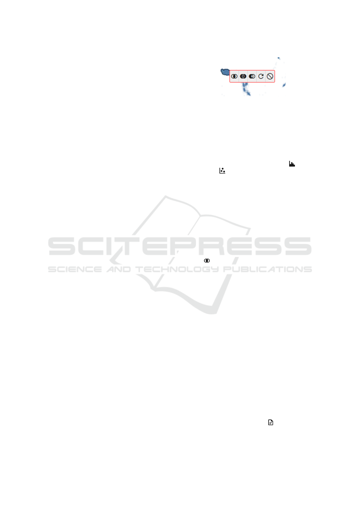
Figure 1: Filtering prompt displayed after a filter interac-
tion. The icons denote which set operation will be used
for combining the filter. The red border around the prompt
blinks continuously to direct the user’s attention towards it.
mand” (Shneiderman, 2003), we describe how our
system lets users explore clusters and their alerts.
Overview First. The complete dataset is visualized
in two components: the histogram panel ( ) and the
scatter plot ( ). Both serve as overviews and en-
try points into the analysis process. In the histogram
panel, we visualize high-level attributes of the alert
data, such as the resolution label, each in its own his-
togram akin to small multiples. The scatter plot dis-
plays all embedded alert vectors, which are colored
according to one of the attributes in the histogram
panel. Experts may choose which attribute is used
for coloring by clicking on the respective histogram
label. This allows users to quickly gauge the gen-
eral distribution of an attribute, which can be a start-
ing point for deeper analysis. Users can change the
color scale for the scatter plot in the foldable settings
panel (
) above the scatter plot. It also allows them
to define the dot size and drawing opacity. Both the
histogram panel and the scatter plot provide means to
define or modify a set: the histograms allow for brush-
ing if they show a numerical attribute; otherwise, sin-
gle bars can be clicked to create a filter. In the scatter
plot, experts can click on a single circle to select the
respective alert or select a whole region with the lasso
tool. In addition to showing alerts, the scatter plot has
two additional modes that visualize the clusters. The
first mode keeps the scatter plot as is, but also depicts
information about a data point’s cluster upon hover-
ing: It draws the cluster extent as a polygon and high-
lights all data points belonging to the cluster. Click-
ing on the alert creates a filter based on that alert’s
cluster. The second mode visualizes the active sets
and their cluster polygons, showing overlap between
them (cf. Figure 3). These modes give users an idea
of how clusters are distributed across the embedded
space and how they are connected to specific alerts.
Details on Demand. On the next level, we visual-
ize data about the alerts in any of the defined sets.
First, there is the set info panel ( ). It is a movable
floating window for each set and can be hidden on de-
AlertSets: Supporting Exploratory Analysis of Cybersecurity Alerts Through Set Interactions
779
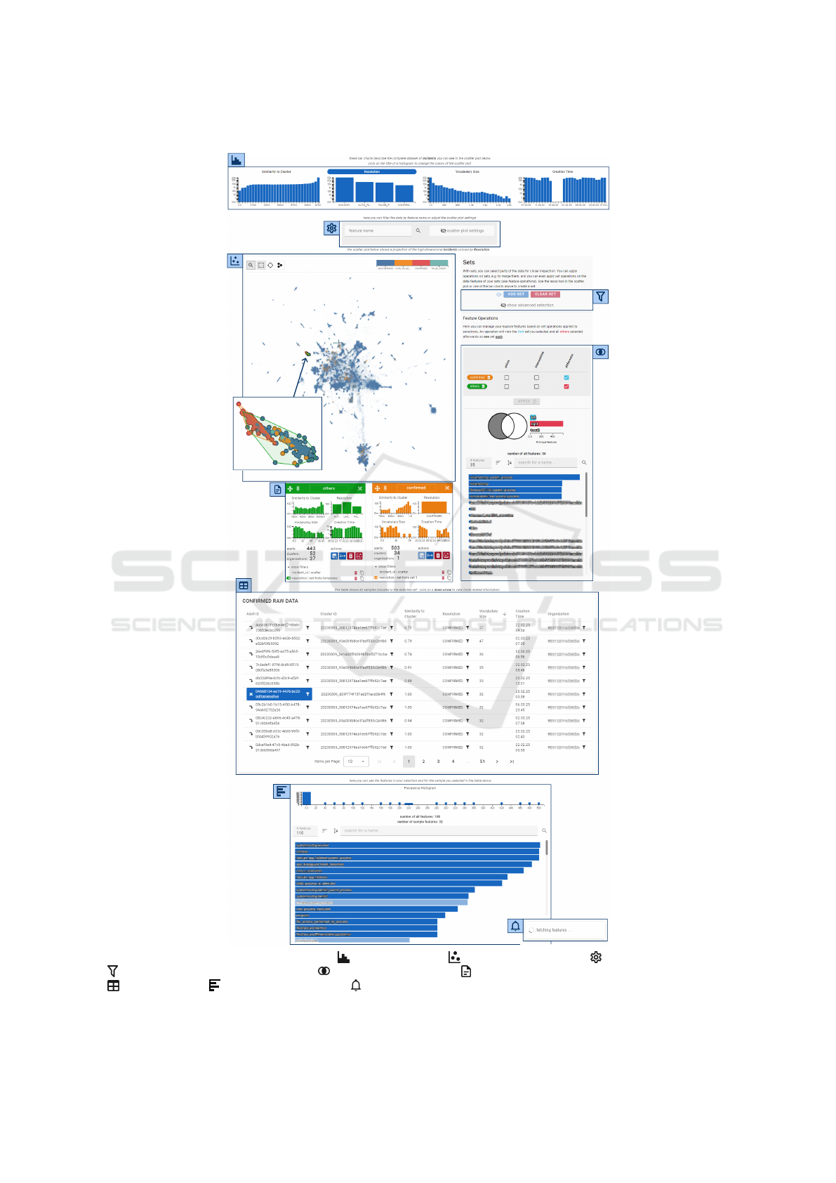
Figure 2: Overview of the improved system: ( ) histogram panel, ( ) interactive scatter plot, ( ) collapsed settings panel,
( ) advanced selection and set control, ( ) feature set operations, ( ) floating set info panels showing set information,
( ) raw data table, ( ) set feature panel and a ( ) toast that is displayed as long as computationally expensive requests or
operations are being handled. Feature names are pixelated for privacy.
IVAPP 2025 - 16th International Conference on Information Visualization Theory and Applications
780
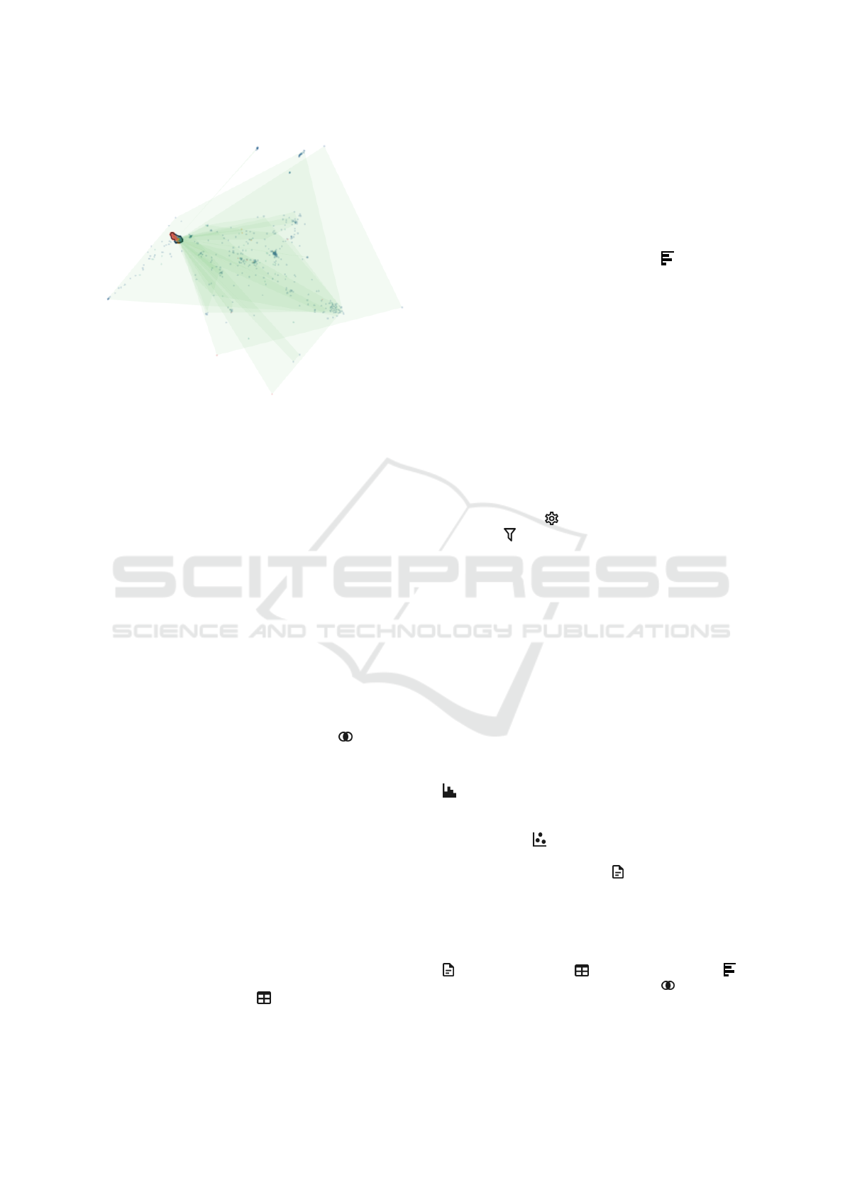
Figure 3: Scatter plot in the second mode, showing colored
polygons for all clusters that belong to the two active sets.
mand. The panel displays general information about
its respective set, like its number of alerts and clus-
ters. In addition, it displays small histograms for the
same attributes as the histogram panel but is limited to
the alerts contained in the set. Lastly, this component
includes action buttons related to the set, such as re-
moving the set or combining it with another set to cre-
ate a new set. A set’s filters are displayed at the bot-
tom of the panel in a list-like fashion. Each list item
shows the attribute that is filtered, from which com-
ponent the filter was created and which set operation
is used for it. Experts may delete a filter with the trash
icon button or copy all filters up to the selected one to
the active set with the copy icon button. Copying fil-
ters allows users to easily create slightly modified ver-
sions of the same set without recreating all its filters.
For the investigation of alert features, we supply users
with the feature operations component ( ), located
right next to the scatter plot. It lets users inspect how
the features of different sets relate to one another by
looking at feature prevalences. Specifically, experts
can choose to which sets they want to apply which set
operations. For example, an expert may want to see
the intersection of features for two sets: The result is
visualized in two bar charts after choosing the appro-
priate sets and set operation via checkboxes. The first
chart shows how many features are in the sets and the
result. The second chart displays the prevalence of
features in the result in a horizontal bar chart. On top
of each bar in the chart, the feature name is shown,
which can be clicked on to create a filter for the re-
spective feature.
Another component that lets users interact with set
data is the raw data table ( ). It is positioned below
the scatter plot and contains an interactive sortable ta-
ble for a set, which can be chosen via an action button
in the set info panel. The table’s columns contain all
the attributes shown in the histogram panel in addi-
tion to the alert ID and respective cluster ID. Each
column can be sorted, and the alert and cluster ID
cells can be clicked to create a filter for the respec-
tive ID. At the bottom of the page, users can find the
final component, the set features panel ( ), where ex-
perts can inspect the feature prevalences in a set and
compare it to the features of individual alerts or clus-
ters. When a set is loaded into the raw data table, it
is also loaded into this component, which shows the
same kind of horizontal bar chart used in the feature
operations component. This bar chart can be sorted
in ascending or descending fashion, filtered through
a text input widget, and lets users create a new fil-
ter based on a feature name. In the raw data table,
experts may select a single alert or cluster with an
icon button pointing downwards toward the set fea-
ture panel. Clicking on such a button highlights the
features that the chosen data has, drawing all other
features with a lower opacity. There are two addi-
tional means of creating filters in the system, one in
the settings panel (
) and one in the advanced selec-
tion panel ( ). Next to the settings panel is an input
widget where users can enter a feature name to fil-
ter. It includes an autocomplete functionality and also
accepts incomplete strings matching multiple feature
names. The advanced selection panel, which can be
hidden or shown on demand, allows users to enter an
alert ID or cluster ID to filter for. In case an alert ID is
entered, users can also create a filter for its respective
cluster with the click of a button.
3.3.3 Interaction Design
Our system employs common interaction techniques
from the field of information visualization, namely
multiple views and brushing-and-linking. For exam-
ple, brushing a range of bars in one of the histograms
( ) applies a filter to the active selection. This filter
is visualized by reducing the opacity of all histogram
bars outside the brushed region. All data points in
the scatter plot ( ) that belong to a user-defined set
are highlighted, and a polygon is drawn around them.
In addition, the set info panel ( ) is continuously up-
dated to reflect any changes in the active selection. An
overview of the complete data is constantly visible.
At the same time, user-defined sets are visually distin-
guished in the scatter plot. More details are available
in several other components, like the set info panel
( ), the raw data table ( ), the set feature panel ( )
and the feature operations component ( ). Since we
are working with many data points, some operations
or backend requests take longer than a second. In such
AlertSets: Supporting Exploratory Analysis of Cybersecurity Alerts Through Set Interactions
781

cases, our system displays a small toast ( ) for the
duration of the operation, as shown in Figure 2. Upon
completion, the toast is updated to indicate the result
and disappears automatically after a few seconds.
4 EVALUATION
We evaluated our visual analytics system with three
experts working at WithSecure, which this section de-
scribes in detail. The evaluation was carried out on
a previous iteration of our system, which was then
improved based on the evaluation feedback. Specif-
ically, instead of having the different layers in the
scatter plot ( ), we allowed participants to switch be-
tween an alert view and a cluster view. In each view,
the user could see the same components but show only
the data for either the alerts or the cluster centers. An-
other change was the extent of the set-based fram-
ing. Instead of including set operations for each fil-
ter, users could only combine different sets, i.e., data
selections, via set operations. Lastly, instead of the
feature set panel ( ), we showed users a bar chart
of feature prevalences for a single selected alert or
cluster center in combination with a table, which to-
gether constituted the sample info panel ( ). In case
they were in the cluster view, the table showed the ten
closest and ten farthest alerts to the cluster center. If
they were in the alert view, it only showed the selected
sample chosen in the raw data table.
4.1 Methodology
We opted to conduct expert interviews since we tar-
get experts and want to focus on understanding how
experts explore the data and how exploration is me-
diated by our system’s design. Our collaborator re-
cruited three participants who work at different po-
sitions at WithSecure Corporation. One of the par-
ticipants was a senior cybersecurity expert who over-
sees other SOC analysts. He was previously part of
a feedback session, where he saw an earlier iteration
of our system. Another participant, who worked as
a data scientist, had previously worked on the clus-
tering project, though his involvement ended more
than a year before the development of our visual-
ization. The last participant worked at the intersec-
tion of data science and cybersecurity and was not
involved in related projects. Because there are sig-
nificant geographical distances between the authors
and the participants, the interviews were conducted
remotely via Microsoft Teams. We chose to let par-
ticipants interact with the system in a modified ver-
sion of the pair analytics format (Arias-Hernandez
et al., 2011), which was conducted in the following
manner: Our prototype was set up on the machine
of our industry collaborator and co-author of this pa-
per shared his screen and performed any requested ac-
tions inside the system. The participant could either
directly specify what they wanted to do or state what
they wanted to see. All participants worked with the
same dataset containing real-world alerts, clustered
using the algorithm our industry collaborators imple-
mented. In addition, two more authors were present
during the interviews and participated in discussions,
helping when it was unclear how to perform a spe-
cific action best and directing the interview to system
parts previously unexplored. We chose this evaluation
method because we wanted participants to explore all
core features of the system, regardless of their visu-
alization expertise and without having to spend time
training to understand all of the system’s capabilities.
All participants received a demo video showcas-
ing the most relevant features of our prototype a few
days before the interview. They were also given a
short form to fill out, which contained questions re-
garding demographic information about their person
and their expertise in cybersecurity and visualization.
The questions and answer options of the question-
naire can be found in the supplemental materials. Ta-
ble 1 shows all participants’ recorded demographic
information and reported expertise. The interviews
lasted 80, 115 and 120 minutes, respectively, and
were recorded as a video. Each interview started
with a short introduction regarding the objective of
the interview, the system’s components and the un-
derlying data. Then, we addressed any questions par-
ticipants had already formed by watching the demo
video. This naturally led to exploring other parts of
the data or other functionalities of the prototype. As
such, participants did not explore the same parts of
the data and experienced the system from their per-
spectives. However, we tried to ensure that each par-
ticipant used all core functionalities at least once. We
continuously asked participants to elaborate on their
thought processes during the interviews while explor-
ing the data. After every core system functionality
had been visited and all of the participant’s questions
had been discussed, we concluded the interview by
asking five questions about their thoughts regarding
our system. Quite frequently, the topics included in
their answers were already touched upon during the
interviews beforehand, as participants naturally com-
mented on what they liked or what they felt was miss-
ing while interacting with the system.
IVAPP 2025 - 16th International Conference on Information Visualization Theory and Applications
782

Table 1: Information about participants related to demographic factors and expertise. Participants were asked to report their
expertise in years and rate their familiarity with the topic on a scale from 1 to 5, with the following value labels: none (1),
good (3) and expert (5).
Participant Age Gender Cybersecurity Expertise Visualization Expertise
P
1
30-45 male 15+ years, rated 3 (good) 15+ years, rated 3 (good)
P
2
30-45 male 4 years, rated 2 15 years, rated 3 (good)
P
3
45+ male 25 years, rated 5 (expert) 23 years, rated 3 (good)
4.2 Results
This subsection presents participants’ attitudes to-
wards our system by describing the common themes,
ideas and criticisms we found in the interviews. We
discuss the main topics extracted from participants’
responses to questions and comments made during
the interview. Finally, we analyze participants’ ex-
ploration strategies and usage experience.
4.2.1 Questionnaire
After the demonstration of the prototype, we asked
the experts (i) what they liked and (ii) what they dis-
liked about it, (iii) what they thought about the set-
based framing, (iv) how they would use our system
(or a modified version of it) and (v) whether their
view of the data, system or usage opportunities for
either changed after this interview. Overall, partici-
pants viewed the system positively, with one unani-
mous comment being that having an overview via the
scatter plot was a helpful place to start exploring the
data. Other than that, we identified four core themes
throughout their answers.
Integration. Expectedly, all participants mentioned
wanting the system to be integrated with other tools
inside the company infrastructure that handles the
same type of data, i. e. alerts. For example, participant
P
3
said: “I select these five incidents, and then I want
to click a button that opens [their current tool] in new
tabs, one for each incident. Then I can jump between
the tabs and inspect them.” We expected this issue to
be brought up after having discussed it during previ-
ous meetings in the design process, but it was impos-
sible to resolve in the prototype as WithSecure cannot
share the required details with third parties due to con-
tractual obligations with their customers. Therefore,
we could only resort to displaying unique identifiers,
e. g. for individual alerts, which could eventually be
used to connect to other web-based tools and access
the relevant details.
Missing Data. In a similar vein to the previous
topic, participants P
1
and P
3
, both familiar with cy-
bersecurity and common tasks cybersecurity analysts
deal with, mentioned that they felt some data was
missing. This included the raw alert data that ana-
lysts work on, which is not the same as the raw data
available in our system. Alerts that go into our sys-
tem only have a handful of attributes attached to them,
while the remaining attributes, like the specific detec-
tion that resulted in the alert or the hierarchy of related
processes, are lost to the vectorization process. Inter-
estingly, participant P
2
did not mention this aspect.
We think this may be connected to another topic we
discussed with participant P
1
, who talked about the
two angles from which he thinks this system can be
viewed, based on the person who does the viewing:
a data-driven and a knowledge-driven angle. For ex-
ample, participant P
2
worked as a senior data scientist
and was more interested in understanding the cluster-
ing and alerts in terms of the data that is available.
Set-Based Framing. We specifically asked partic-
ipants for their opinion on the set-based framing,
which participant P
2
had already voiced as the as-
pect of our system he liked in the first question. He
said that when they work with such data, the opera-
tions they would apply would likely also “be based
on some kind of set operations to massage the data.
And this is just a convenient way of doing it.” For
the other participants, these questions seemed harder
to answer, with participant P
1
explicitly saying: “For
me, it’s very difficult to say.” In this context, both
P
2
and P
3
remarked that they would like to be able
to hide data they are not interested in. For P
2
, this
was related to not being able to easily see alerts in the
scatter plot that have a rare label, such as confirmed,
since these are often occluded by the large mass of
data points with the label unconfirmed. Participant
P
3
approached this from a different angle, saying that
when investigating an alert, he would want to only see
the relevant context for that alert, meaning only alerts
from the same organization. Due to the significant
differences between organizations, an analyst might
be interested in other features or judge them differ-
ently based on the organization the alert came from.
We understood these comments as participants want-
ing to extend the set-based filtering to other features,
AlertSets: Supporting Exploratory Analysis of Cybersecurity Alerts Through Set Interactions
783

some of which are not part of our data, and also want-
ing to hide data that they are not interested in visually
or that is not a member of any defined set.
Usage Scenarios. The responses to the question
about fitting use cases for the system varied—though
there was some overlap. Participant P
1
said that the
best use would be for analysts to save time when in-
vestigating an alert. He stated that, provided our tool
was integrated into production systems and had ac-
cess to the missing data, he could see it being used
by analysts to increase their productivity by speeding
up decisions. Participant P
3
agreed that the system, as
we presented it, does not contain the information nec-
essary to make decisions about single alerts but that
an integrated version might assist him in “false alarm
hunting.” He remarked that this would enable detec-
tion engineers to use it. Detection engineers maintain
“the system”, but were not initially considered to be
part of the target audience. Being able to find patterns
that identify false alarms takes an immense amount
of experience, so any support for that task can be a
big help. In addition, he commented that the sys-
tem “[. . . ] is so much more efficient just for slicing
and dicing data than we can do with [their current
tool],”, which might enable more people to handle sit-
uations where he would otherwise have to step in and
help. Participant P
1
also mentioned that he could see
our system being used to do exploratory analysis—
to see whether there are new trends, strange behav-
iors, or even redundant or missing features in the data.
This was echoed by participant P
2
, who voiced that
he would use our system to understand better the ac-
tual “substance” of the data. During the interview, he
also speculated that it might be useful for users who
do not yet have much experience with such alert data
and could learn about it using our system. These opin-
ions mirror the position by Gates and Engle (2013): In
some cases, visualization can best serve its users as a
stepping stone.
4.2.2 Exploration Strategies
Although participants did not directly interact with
our system themselves, we still observed differences
in their exploration strategies based on their instruc-
tions. Overall, participants often started by investi-
gating the initial configuration, studying the scatter
plot ( ) and histogram panel ( ). They usually pro-
ceeded by defining a set through interactions with
said components and then consulting the attributes of
the set in the set info panel (
). From there, they
mostly changed their selection completely or split it
into multiple sets. If they decided to investigate sets,
they looked at both the raw data ( ) and employed
set operations ( ) to find differences between sets—
leading to new or further exploration based on the re-
sult. Participants often wanted to inspect the features
in a set before using the set operations in the feature
operations panel ( ), which was not as easy as they
liked. Participants tended to spend more time in the
view that better matched their expertise and rarely uti-
lized the sample info panel ( ); if it was used, it was
mainly done in the clustering view. As a consequence
of the two latter observations, we replaced the sample
info panel with the set feature panel ( ), which lets
users inspect features for the complete set as well as
single data points therein.
4.2.3 Usage Experience
Looking at the interactions and resulting user experi-
ence, we observed that defining sets, comparing them
and inspecting their details seemed easy for partic-
ipants to understand and structure their exploration
strategy by. They intuitively talked about the data
in terms of sets that are defined by specific features
or combinations thereof. Our system even helped
two participants discover ideas to improve the clus-
tering pipeline or find data parts they would like to
inspect in more detail. However, there were also sev-
eral problems, even if users themselves did not nec-
essarily identify them as such. Defining the desired
sets sometimes took too many steps, also mentioned
as a limitation by participant P
2
, making it cumber-
some and time-consuming. For example, to get three
different sets that each include alerts from the same
region in the scatter plot but differ in the resolution
label, the user has to select the region, select the label
and then declare this selection as a new set each time.
Analysts also encountered a few situations where they
could not create the filter they wanted, like selecting
by cluster ID. In addition, not seeing the alerts when
looking at the clusters, and vice versa, was also some-
thing that hindered users during their exploration.
4.2.4 Improvements
Some usability issues were addressed in a revised it-
eration of our prototype, as described in section 3.
To get preliminary feedback on these changes, one
of our previous participants watched a video show-
casing them—together with five questions in writing.
Both the questions and responses can be found in the
supplemental materials. Overall, our expert viewed
the revision positively, saying that it expands the sys-
tem’s functionality where he sees the highest benefit:
having easier ways of combing through the data.
IVAPP 2025 - 16th International Conference on Information Visualization Theory and Applications
784

5 DISCUSSION
We split the discussion of the evaluation results and
what can be learned from them into two groups: those
related to the design of our system and those related
to the overall context in which our work exists, the
sphere of visualization for cybersecurity applications.
5.1 System Functionality and Usability
Analyzing what participants said and how they inter-
acted with the system, the set-based framing seems
to align well with how users think about the data in
the first place and provides an easy mechanism for
them to start exploring. All participants found it an
appropriate means of exploring the data, with one of
them highlighting the concept as what he liked most
about the system as a whole. Framing exploration
through sets and set operations is easy to understand
and simultaneously allows for powerful selection me-
chanics that create visualizations for specific subsets.
In turn, these might show interesting patterns not so
effortlessly found by manually sifting through data.
While all participants were able to explore the data
for their respective focus successfully, we were sur-
prised that they all concentrated so heavily on the res-
olution labels. Throughout discussions in the design
phase, other features oftentimes dominated the con-
versation, e. g. the size of clusters and the number
of unique nonzero features. During the interviews,
participants did not consider these features much and
mainly viewed the data through the lens of resolution
labels at the start of their analysis. This strategy ex-
posed the limits of filtering the data by this feature,
which could quickly become cumbersome. Partici-
pant P
2
also commented that it was not immediately
apparent to him whether an interaction would affect
the selection or only highlight data.
In general, we found that the extent to which set
operations could be chained in the system’s previous
iteration was too limited. While it was possible to
combine different conditions, be it the location in the
scatter plot or any of the features in the histograms,
chaining conditions based on the same feature was not
possible in the most straightforward manner. With the
extended filtering functionalities and more opportuni-
ties to create filters, this issue could already be mit-
igated in the revised system version. Based on user
feedback, clusters and alerts should be more closely
connected so that both can be investigated simultane-
ously. A first attempt to tighten this connection was
made in the revised prototype through the layers and
interactions in the scatter plot; more work is needed
to test whether this approach supports users’ work-
flows. In addition, two practical limitations restrict
the utility of our system: missing data and integra-
tion. However, these require our industry partner’s
side to solve. Lastly, the potential for misinterpreta-
tion should also be kept in mind. Using clustering and
dimensionality reduction introduces uncertainty into
the analysis, which can suggest meaning where none
may be found. Distances in the scatter plot may not
correlate with similarity in the data, and clusters may
not provide a fitting grouping of alerts. Hence, users
need to be aware of such potentially confounding fac-
tors. One participant mentioned that he would like
to select alerts in the scatter plot based on distances
in the high-dimensional space. However, this could
introduce a lot of confusion because of discrepancies
between low- and high-dimensional distances and the
unintuitive nature of high-dimensional spaces.
5.2 Insights and Lessons Learned
Reflecting on the design process and evaluation of our
visual analytics system for cybersecurity alerts, one
critical lesson emerged: the centrality of collabora-
tion. Initially, our design process adhered to strict,
disconnected user roles. This clear separation mir-
rored the everyday workflows of cybersecurity pro-
fessionals and aligned with the distinct expertise and
responsibilities that define these roles. Analysts, data
scientists, and detection engineers often operate in
separate environments, tackling specific tasks tailored
to their respective skill sets. However, we see un-
tapped potential for collaboration across these roles.
While the division of labor brings efficiency and fo-
cus, it can unintentionally silo expertise, preventing
the exchange of insights that might lead to innovative
solutions. Collaboration, when facilitated effectively,
can help uncover new perspectives on the data, iden-
tify opportunities for system improvement, and ulti-
mately shape better approaches for tackling similar
problems in future projects.
The need for collaboration across roles in cyber-
security is not a new insight. Experts often recog-
nize the value of sharing knowledge but face barri-
ers in practice. A key challenge, as noted by our in-
dustry partner, is the lack of tools designed to fos-
ter meaningful collaboration. Current systems often
do not support users in identifying specific aspects
of the data where their unique expertise could pro-
vide value. As a result, opportunities for improve-
ment are missed because experts are either unaware
of these opportunities or lack the context to engage
with them effectively. This challenge became ev-
ident during one of our interviews. For example,
a participant highlighted adaptations to the feature
AlertSets: Supporting Exploratory Analysis of Cybersecurity Alerts Through Set Interactions
785

modeling—such as removing some features originat-
ing from PowerShell scripts—that could improve the
clustering pipeline. The same expert also speculated
about potential refinements to detection rules for iden-
tifying malicious activity. These ideas did not sur-
face earlier, despite security experts already looking
at the data. We suspect this is because the tools at
their disposal did not let them find these issues be-
cause they weren’t looking at the data from this par-
ticular angle. Looking back at the design process,
having different user groups interact with the data
and prototypes in a collaborative setting could also
have sped up and improved the development of our
system. Of course, getting a hold of experts, espe-
cially in the cybersecurity domain, is a well-known
problem (Adams and Snider, 2018; D’Amico et al.,
2016). However, visualization with different users
in mind could present an approach to improve opera-
tional effectiveness through easier collaboration. Ad-
ditionally, companies may even find use in applying
the design study methodology to find opportunities
for workflow improvements or the collection and pro-
cessing of data—even if it does not result in an appli-
cation that will be integrated into production.
5.3 Future Work
We see two main avenues for future work. First, there
are still many ways in which our system design can
be improved. Although we already added some of
these and received positive feedback, the set fram-
ing could be extended through provenance features,
making it easier to track different sets and filters over
time. Asynchronous insight externalization and an-
notation could help different experts exchange and
store their insights. In this manner, insights and the
data they are tied to are more easily exchanged, and
the system can be evaluated in terms of the insights
it supports best. The second avenue goes in a dif-
ferent direction, as suggested by a participant during
the interviews. He explained that he would be in-
terested in manipulating both the clustering and the
embedding via interactions in our application. This
idea goes into the direction of interactive machine
learning (Fails and Olsen, 2003) and human-machine
teaming (Wenskovitch et al., 2021), where users work
together with machine learning algorithms, providing
feedback that incorporates their knowledge into the
algorithm, which in turn can show patterns in the data
not visible beforehand. While this is an interesting
idea, the scale of the data makes an interactive system
hard to implement—the clustering model used in this
work already takes a few hours to compute.
6 CONCLUSION
We designed and evaluated a visual analytics system
for different expert users in a cybersecurity company
to explore high-dimensional clustered alerts. The data
we visualize comes directly from an ongoing project
from an industry partner, with the initial goal of im-
proving their handling of alerts, especially false pos-
itives. Due to fuzzy task descriptions, our design fo-
cuses on exploration through set operations, letting
users easily find and analyze interesting subsets of the
data. Using this framing, we provide experts with a
simple and familiar construct to explore their massive
and sometimes hard-to-understand data. The evalua-
tion of our system showed that different users could
use our system to work on various tasks, even if it
served more as a stepping stone than an all-around so-
lution. Participants were able to identify directions for
further analysis and found potential means of improv-
ing the clustering pipeline and detection rules. We
described the design process and the lessons learned
from the development and evaluation. In our case,
creating a generic but powerful system for exploration
allowed different experts to contribute their unique in-
sights and find directions for further investigation.
ACKNOWLEDGEMENTS
Tanja Blascheck is funded by the European Social
Fund and the Ministry of Science, Research and Arts
Baden-W
¨
urttemberg.
REFERENCES
Adams, C. N. and Snider, D. (2018). Effective data visual-
ization in cybersecurity. In SoutheastCon, pages 1–8.
Arias-Hernandez, R., Kaastra, L. T., Green, T. M., and
Fisher, B. (2011). Pair analytics: Capturing reasoning
processes in collaborative visual analytics. In Hawaii
Int. Conf. Sys. Sci., pages 1–10.
Becker, R. A. and Cleveland, W. S. (1987). Brushing scat-
terplots. Technometrics, 29(2):127–142.
Buja, A., McDonald, J. A., Michalak, J., and Stuetzle, W.
(1991). Interactive data visualization using focusing
and linking. In Proc. 2nd Conf. Vis. ’91, pages 156–
163.
B
¨
ar, A., Casas, P., Golab, L., and Finamore, A. (2014).
Dbstream: An online aggregation, filtering and pro-
cessing system for network traffic monitoring. In Int.
Wireless Comm. Mob. Comp. Conf., pages 611–616.
Carvalho, V. S., Polidoro, M. J., and Magalh
˜
aes, J. P.
(2016). Owlsight: Platform for real-time detection
and visualization of cyber threats. In IEEE 2nd Int.
IVAPP 2025 - 16th International Conference on Information Visualization Theory and Applications
786

Conf. Big Data Sec. Cloud (BigDataSecurity), IEEE
Int. Conf. High Perf. Smart Comp. (HPSC), and IEEE
Int. Conf. on Int. Data Sec. (IDS), pages 61–66.
Chen, H. (2004). Compound brushing explained. Informa-
tion Visualization, 3(2):96–108.
D’Amico, A., Buchanan, L., Kirkpatrick, D., and Walczak,
P. (2016). Cyber operator perspectives on security vi-
sualization. In Nicholson, D., editor, Advances in Hu-
man Factors in Cybersecurity, pages 69–81, Cham.
Springer Int. Publishing.
Doleisch, H., Gasser, M., and Hauser, H. (2003). Inter-
active feature specification for focus+context visual-
ization of complex simulation data. In VisSym, pages
239–302. The Eurographics Association.
Ester, M., Kriegel, H.-P., Sander, J., and Xu, X. (1996).
A density-based algorithm for discovering clusters in
large spatial databases with noise. In Proc. Int. Conf.
Know. Disc. Data Mining, KDD’96, pages 226––231.
AAAI Press.
Fails, J. A. and Olsen, D. R. (2003). Interactive machine
learning. In Proc. of the Int. Conf. on Intelligent User
Interfaces, pages 39–45.
Gates, C. and Engle, S. (2013). Reflecting on visualization
for cyber security. In IEEE Int. Conf. on Intelligence
and Security Informatics, pages 275–277.
Gove, R. (2022). Automatic narrative summarization for
visualizing cyber security logs and incident reports.
IEEE Trans. Vis. Comp. Graph., 28(1):1182–1190.
Hong, J., Lee, J., Lee, H., Chang, Y., Choi, K., and Cha,
S. K. (2019). AlertVision: Visualizing security alerts.
In Kang, B. B. and Jang, J., editors, Information Secu-
rity Applications, pages 173–184, Cham. Springer Int.
Publishing.
Jiang, L., Jayatilaka, A., Nasim, M., Grobler, M., Zahedi,
M., and Babar, M. A. (2022). Systematic literature
review on cyber situational awareness visualizations.
IEEE Access, 10:57525–57554.
Koch, S., Bosch, H., Giereth, M., and Ertl, T. (2011). It-
erative integration of visual insights during scalable
patent search and analysis. IEEE Trans. Vis. Comp.
Graph., 17(5):557–569.
Komadina, A., Mihajlovi
´
c,
ˇ
Z., and Gro
ˇ
s, S. (2022). Analy-
sis of the design space for cybersecurity visualizations
in vizsec. In IEEE Symp. Vis. Cyber Sec., pages 1–11.
Lavigne, V. and Gouin, D. (2014). Visual analytics for cy-
ber security and intelligence. The Journal of Defense
Modeling and Simulation, 11(2):175–199.
Macedo, I., Wanous, S., Oliveira, N., Sousa, O., and Prac¸a,
I. (2021). A tool to support the investigation and visu-
alization of cyber and/or physical incidents. In Trends
Appl. Inf. Sys. Tech., pages 130–140, Cham. Springer
Int. Publishing.
Marchionini, G. (2006). Exploratory search: From finding
to understanding. Commun. ACM, 49(4):41–46.
Martin, A. R. and Ward, M. O. (1995). High dimen-
sional brushing for interactive exploration of multi-
variate data. In Visualization ’95, pages 271–278, Los
Alamitos. IEEE Computer Society Press.
McInnes, L., Healy, J., Saul, N., and Großberger, L. (2018).
UMAP: uniform manifold approximation and projec-
tion. Journal of Open Source Software, 3(29):861.
Pavlenko, E. Y., Eremenko, I. S., and Fatin, A. D. (2022).
Computer network clustering methods in cybersecu-
rity problems. Automatic Control and Computer Sci-
ences, 56(8):957–963.
Raj, C., Khular, L., and Raj, G. (2020). Clustering based in-
cident handling for anomaly detection in cloud infras-
tructures. In Int. Conf. Cloud Comp., Data Science &
Engineering, pages 611–616.
Riddle-Workman, E., Evangelou, M., and Adams, N. M.
(2021). Multi-type relational clustering for enterprise
cyber-security networks. Pattern Recognition Letters,
149:172–178.
Roberts, J. C. and Wright, M. (2006). Towards ubiquitous
brushing for information visualization. In Banissi, E.,
editor, Information Visualization, pages 151–156, Los
Alamitos, Calif. IEEE Computer Society.
Sedlmair, M., Meyer, M., and Munzner, T. (2012). Design
study methodology: Reflections from the trenches
and the stacks. IEEE Trans. Vis. Comp. Graph.,
18(12):2431–2440.
Shi, Y., Zhao, Y., Zhou, F., Shi, R., Zhang, Y., and Wang,
G. (2018). A novel radial visualization of intrusion
detection alerts. IEEE Comp. Graph. App., 38(6):83–
95.
Shneiderman, B. (2003). The eyes have it: A task by data
type taxonomy for information visualizations. In The
Craft of Information Visualization, pages 364–371.
Elsevier.
Silva, D., Dell’Amico, M., Hart, M., Roundy, K. A., and
Kats, D. (2018). Hierarchical incident clustering for
security operation centers. In Proc. of KDD Workshop
on Interactive Data Exploration and Analytics. ACM.
Van der Maaten, L. and Hinton, G. (2008). Visualizing data
using t-sne. Journal of Machine Learning Research,
9(11).
Wenskovitch, J., Fallon, C., Miller, K., and Dasgupta, A.
(2021). Beyond visual analytics: Human-machine
teaming for ai-driven data sensemaking. In IEEE
Workshop on TRust and EXpertise in Visual Analyt-
ics, pages 40–44.
White, R. W. and Roth, R. A. (2009). Exploratory search:
Beyond the query-response paradigm, volume 1. Mor-
gan & Claypool Publishers.
AlertSets: Supporting Exploratory Analysis of Cybersecurity Alerts Through Set Interactions
787
