
Studying Parallel Coordinates Under Varying Aspect Ratios
Leon Meka
1
, Mirjam Kronsteiner
1
and Johanna Schmidt
1,2 a
1
Visual Analytics, VRVis GmbH, Austria
2
Institute of Visual Computing & Human-Centered Technology, TU Wien, Austria
Keywords:
Information Visualization, Parallel Coordinates, Aspect Ratio, Visualization Literacy.
Abstract:
In constraint layout environments like dashboards and multi-view applications, designers have less freedom
in selecting the correct aspect ratios for plots. Especially for web-based, responsive dashboards, designers
have little to no control over the layout and size of the presented plots. The effect of aspect ratios on the
readability of line charts and scatter plots has already been studied. However, more evidence is needed for
parallel coordinates, where line slopes indicate correlations between variables. This paper presents a first
step towards understanding the effect of aspect ratios on the readability of parallel coordinates. We present a
statistical analysis of aspect ratio effects and summarize the results of a quantitative user study on user literacy
under different aspect ratios. The statistical analysis revealed that angle parameters stay more homogeneous
when changing the plot size in case landscape orientation is used. The user study showed that human observers
perform well when judging correlation based on the angles under differences between plot width and height.
1 INTRODUCTION
In recent years, dashboard creation has become in-
creasingly popular in data-driven workflows in many
applications (Wexler et al., 2017). Dashboards are
regularly used in business intelligence (BI) but have
also entered other domains like healthcare (Zhuang
et al., 2022), infrastructure planning (Matheus et al.,
2020), sports (Goudsmit et al., 2022), and the public
discourse during the pandemic (Zhang et al., 2023).
A dashboard can be defined as a visual display of es-
sential information found in the underlying data to
communicate insights. Dashboards enable the effi-
cient handling and interpretation of vast amounts of
data and provide quick overviews on one screen with-
out the need to scroll or switch views. Dashboard de-
signers consolidate and arrange numbers, metrics, key
performance indicators, and visualizations on a single
screen, allowing users to track data points, monitor
trends, and make informed decisions quickly. Dash-
boards may be but are not required to be interac-
tive (Sarikaya et al., 2019). Interactions may involve
selections, filtering, design adaptations (e.g., chang-
ing color scales), and view customization (e.g., adapt-
ing layout and re-arranging views).
When designing data visualizations, designers can
rely on existing best practices for visualization de-
a
https://orcid.org/0000-0002-9638-6344
sign (Midway, 2020). Guidelines usually involve sug-
gestions for color choices, visual encodings, and chart
types. Less focus has been put on the size of the plots
since, when designing a single visualization, it is easy
to use as much space as possible. However, when
placing data visualizations inside a dashboard layout,
constraints regarding the available space and shape of
the visualization apply. Users may also be allowed
to change the size and position of views in the dash-
board, leading to other visualizations being adapted
accordingly. In addition, dashboard applications are
increasingly built in a web-based manner to enable
easy, cross-platform access where users do not have
to install any software. Responsive designs for dash-
boards ensure that users can view dashboards on de-
vices with varying screen sizes (Zeng et al., 2024). As
such, web-based settings give designers less control
over the exact layout as it adapts to different screens.
The aspect ratio of a data visualization affects how
quickly users can detect trends and patterns in a data
visualization (see also Figure 1). The aspect ratio is
critical when plotting time series data. In line charts,
trends are judged based on the slope of plotted lines,
which are greatly affected by the aspect ratio of the
graph. As a rule of thumb, researchers already recom-
mended selecting an aspect ratio of a graph by bank-
ing line segments of the graphed data to an angle of 45
degrees (known as banking to 45°) (Cleveland, 1986).
992
Meka, L., Kronsteiner, M. and Schmidt, J.
Studying Parallel Coordinates Under Varying Aspect Ratios.
DOI: 10.5220/0013379300003912
Paper published under CC license (CC BY-NC-ND 4.0)
In Proceedings of the 20th International Joint Conference on Computer Vision, Imaging and Computer Graphics Theory and Applications (VISIGRAPP 2025) - Volume 1: GRAPP, HUCAPP
and IVAPP, pages 992-999
ISBN: 978-989-758-728-3; ISSN: 2184-4321
Proceedings Copyright © 2025 by SCITEPRESS – Science and Technology Publications, Lda.
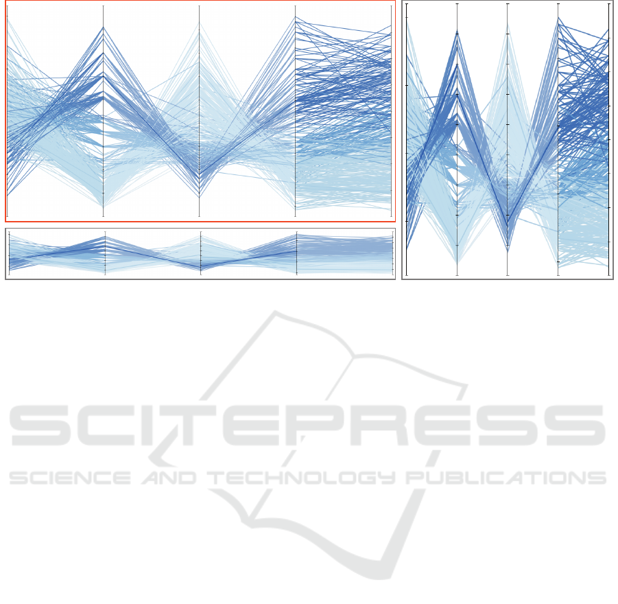
Figure 1: Parallel coordinates plots with different aspect ratios. Line angles are an essential indicator in parallel coordinate
plots to show positive or negative correlations between variables and variables without any strong correlations. Usually,
parallel coordinates are rendered in a rectangular plot (marked in orange). However, especially in dashboard and multi-view
settings, plots may appear in unexpected aspect ratios (marked in gray).
This rule and later variants based on it (Heer and
Agrawala, 2006) emphasize the importance of con-
sidering aspect ratios when creating a chart, mainly
when lines are used as geometric primitives.
Similar to line charts, parallel coordinates plots
use lines to depict data values. Due to the point-line
duality, data points become polylines when arranging
axes in parallel. Line slopes between two axes play
an important role in parallel coordinates. The visible
line patterns indicate whether we can see a strong pos-
itive correlation (parallel lines) or a strong negative
correlation (X-shape) between two variables (Ware,
2012). Since angles are an important visual indica-
tor in parallel coordinates, researchers have used line
angles to develop matching interaction mechanisms.
Angle-dependent selection mechanisms allow to fil-
ter lines based on their angles (Hauser et al., 2002)
and to select lines based on their slope (Sahann et al.,
2021). Line angles and slope guide the user when ex-
ploring data in parallel coordinates. The effect on the
interpretability of line angles in parallel coordinates
under different aspect ratios has yet to be studied. To
improve the general understanding in this regard, we
• present a statistical analysis of the effect of as-
pect ratios on parallel coordinate plots,
• summarize the outcomes of a quantitative user
study targeted to learn more about the users’ lit-
eracy under different aspect ratios, and
• provide first guidelines and ideas for future work.
2 RELATED WORK
Our research addresses the topics of parallel coordi-
nates, dashboard design, and design considerations
regarding aspect ratio.
2.1 Parallel Coordinates
Parallel coordinates are a powerful visualization tech-
nique for representing multi-dimensional data (Kelle-
her and Wagener, 1985). Axis, which are arranged in
parallel, represent data dimensions and data points are
depicted as polylines. Parallel coordinates are widely
used in various fields, including engineering (Cibul-
ski et al., 2023), material sciences (Rickman, 2018),
and ensemble data (Firat et al., 2023). Johansson
and Forsell (Johansson and Forsell, 2016) presented
an extensive study on different rendering techniques
and evaluated them regarding their usefulness for data
analysis. Parallel coordinates offer a variety of re-
search directions (Heinrich and Weiskopf, 2013) for
improved rendering (e.g., bundling), solving overplot-
ting, and integrating interaction. A full review of
all research results on parallel coordinates, including
bundling techniques and axis reordering, goes beyond
the scope of this paper. We concentrate on visual
structures within and literacy of parallel coordinates
plots. Dasgupta and Kosara (Dasgupta and Kosara,
2010) presented a screen-space metrics to evaluate
parallel coordinates plots. The metric takes visual
Studying Parallel Coordinates Under Varying Aspect Ratios
993

structures like the number of line crossings, crossing
angles, convergence, overplotting, and other features
into account. The best layouting for a plot can be cho-
sen according to this metric. Parallel coordinates lit-
eracy (i.e., the ability to read and interpret the plots)
has been intensively studied by Firat et al. (Firat et al.,
2022). Howe and Purves (Howe and Purves, 2005)
studied the perception of angles and oriented lines in
images. Johansson et al. (Johansson et al., 2008) stud-
ied the ability of humans to perceive patterns in par-
allel coordinates and concluded that a maximum of
11 variables should be used not to overwhelm users
during exploration. Kaur and Karki (Kaur and Karki,
2018) used additional connected views to improve the
readability of parallel coordinates. The effect of vary-
ing aspect ratios on angle perception in parallel coor-
dinates has not been studied yet. Our studies con-
tribute new knowledge on angle perception in par-
allel coordinates under varying aspect ratios.
2.2 Dashboard Design
Dashboards, also called multiple-view visualiza-
tions (Qu and Hullman, 2018), have only lately been
identified as an essential aspect to study in visualiza-
tion research (Sarikaya et al., 2019). Dashboards are
already ubiquitously used in different domains, espe-
cially business intelligence, but also tourism (Antolini
et al., 2024), social media analysis (Lughbi et al.,
2024), or healthcare (Zhuang et al., 2022). Design-
ing a dashboard requires the consideration of known
guidelines for designing visualizations and layout op-
timization. Summarized as dashboard design pat-
terns (Bach et al., 2023), designers are provided with
design suggestions based on the genre their dash-
board is settled in. Kristiansen et al. (Kristiansen
et al., 2022) provided a semantic snapping approach
to help novice users complete dashboards based on
existing views. Setlur et al. (Setlur et al., 2024) who
developed a heuristics for cooperative dashboard de-
sign. Conrow et al. (Conrow et al., 2023) proposed
a design framework for dashboards for mobility data,
which usually contain geospatial information. Epper-
son et al. (Epperson et al., 2023) suggested a dash-
board authoring system where designers do not need
to create every visualization individually. Chen et
al. (Chen et al., 2021) extracted design patterns from
360 images from previous publications, incorporat-
ing the extracted knowledge into a dashboard de-
sign recommendation system. DMiner (Lin et al.,
2024) is another dashboard recommendation system
based on 854 dashboards that have been crawled on-
line. Dashboard recommendation systems are use-
ful for many applications where designers may not
have a visualization background (Soni et al., 2024).
Increasingly, researchers integrated artificial intelli-
gence (AI) tools into the dashboard generation pro-
cess (Wu et al., 2022). Ma et al. (Ma et al., 2021)
proposed a deep-learning-based dashboard authoring
system that suggests dashboards based on an image
or a sketch. Other AI-based approaches concentrate
on user intent (Pandey et al., 2023) or intended in-
sights (Deng et al., 2023) when suggesting dashboard
designs. We contribute new guidelines about how
to properly insert a parallel coordinates plot into a
dashboard layout, which future dashboard recom-
mendation approaches may consider.
2.3 Aspect Ratio in Visualization
Design considerations for visualization usually tar-
get color scales, shapes, simplicity, and chart types.
Guidelines for designing effective data visualization
is essential in visualization research not to mislead
viewers (McNutt et al., 2020). In their fifth of the ten
guidelines for effective data visualization, Kelleher
and Wagener (Kelleher and Wagener, 2011) address a
carefully chosen aspect ratio as an important design
consideration, especially for time series data. The
effect of different aspect ratios has been intensively
studied for line plots. As a first approach, Cleve-
land (Cleveland, 1986) suggested the banking to 45°
approach, where line segments in a line plot should all
have an angle of 45 degrees. Further approaches built
on this rule and suggested extensions toward consid-
ering both axes (Wang et al., 2018), integrating spec-
tral analysis (Heer and Agrawala, 2006), and comput-
ing a slope ratio estimation (Talbot et al., 2012). Tal-
bot et al. (Talbot et al., 2011) suggested minimizing
the arc length of the data curve in a line plot to find the
optimal aspect ratio. Other approaches concentrated
on finding an optimal aspect ratio for scatter plots.
Fink et al. (Fink et al., 2013) proposed an approach
based on Delauney triangulation of the plot. Wang et
al. (Wang et al., 2019) used the information from the
rendered plot images to compute an optimal aspect
ratio. Wei et al. (Wei et al., 2020) concentrate on the
users’ perception of scatter plots with varying aspect
ratios and identify a linear relationship between geo-
metric changes and introduced bias. Ceja et al. (Ceja
et al., 2021) studied the effect of changing aspect ra-
tios on bar charts and noticed that wide aspect ratios
lead to overestimating bars, and narrow aspect ratios
lead to underestimating bars. We contribute a statis-
tical analysis and results from a quantitative user
study on the effect of changing aspect ratios for
parallel coordinates.
IVAPP 2025 - 16th International Conference on Information Visualization Theory and Applications
994
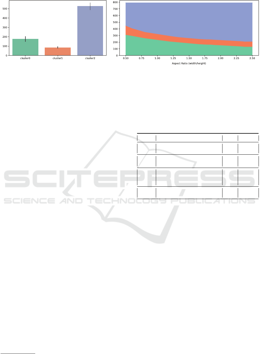
Figure 2: Clustering results. Clustering all plots according to angle parameters revealed three clusters. The plot on the left
side shows the cluster sizes and depicts that primarily cluster2 can be found in the data. The plot on the right side shows the
distribution of clusters among different aspect ratios. Larger aspect ratios show less variety in cluster distribution.
3 ANGLES UNDER VARYING
ASPECT RATIO
We studied the effect of angles in parallel coordinates
under varying aspect ratios from two different direc-
tions. As a first step, we collected statistical infor-
mation on how different aspect ratios affect the dis-
tribution of angles (described in Section 3.1). As a
second approach, we conducted a user study to learn
more about users’ perception of angles under varying
aspect ratios (described in Section 3.2).
3.1 Statistical Analysis
The statistical analysis aimed to study the distribution
of angle parameters under different aspect ratios. We
created a web-based application where it was possi-
ble to load different datasets (stored as CSV files),
display the dataset in a parallel coordinates plot, and
change the aspect ratio (either by drag-and-drop or by
assigning a specific ratio). Our application also al-
lowed us to calculate the following angle parameters
for all lines between all axes: (i) average angle, (ii)
minimum angle, (iii) maximum angle, and (iv) sum
of all angles.
We selected a set of datasets for the study to con-
duct a statistical analysis (Table 1). We queried Open
Source repositories like Kaggle
1
. We left out large
datasets, since plotting all lines in the plot would have
led to overplotting and it would have been impossible
for human observers to identify angles. We also tried
to avoid datasets with a majority of categorical dimen-
sions. Dimensions consisting of only a few categories
(e.g., boolean data) caused particular patterns in the
plot that we wanted to avoid. The datasets we were
interested in contained a manageable number of rows
and columns (i.e., could be rendered without causing
1
https://kaggle.com
overlaps) and predominantly numerical values.
Table 1: The datasets we used for the statistical analysis
contained a moderate number of columns and rows and only
a small portion of categorical attributes.
Dataset Content Rows Columns
Cereals nutritional information of 80 cereal
brands
80 16
Cars information about different car brands
from the year 2022
199 16
WHO information about development fac-
tors for countries in the world for the
year 2000
193 22
Health data about human subjects that were
evaluated for various health metrics
374 13
The four selected datasets were imported into our
analysis application. We used a collection of normally
distributed values of aspect ratios. For every aspect
ratio we exported an analysis file for all datasets. The
individual analysis files were later combined into one
complete dataset. We aimed to find groups where the
angle parameters are distributed similarly within the
aspect ratios. We applied k-means clustering on the
angle parameters to find aspect ratios with similar be-
havior. Since we had calculated more than one an-
gle parameter, we extended standard k-means clus-
tering to work with multidimensional vectors. The
clustering was performed in Python using the scikit-
learn package. We used the elbow method to esti-
mate the number of clusters, where we calculated the
total within the sum of squares for each k number of
clusters and plotted the result as a line. Furthermore,
the average silhouette and Calinski-Harabasz meth-
ods were applied. The optimal number of clusters was
estimated to be 3 in all cases.
The cluster analysis results are shown in Figure 2.
In the first plot, the cluster sizes are depicted. One
particular distribution of angle parameters (cluster2)
was found more often in the data than the other two
Studying Parallel Coordinates Under Varying Aspect Ratios
995
(cluster0 and cluster1). We then plotted the distribu-
tion of clusters among different aspect ratios, shown
in the plot on the right. We calculate the aspect ra-
tio as width divided by height. Smaller aspect ratios
correspond to portrait orientations, while larger ratios
represent landscape orientations. When looking at the
area chart, we can see that larger aspect ratios tend
to have less cluster variety than smaller aspect ratios.
Data points with larger aspect ratios are primarily put
into one cluster (cluster2), which depicts a more uni-
form distribution of angle parameters.
3.2 User Study
In the user study, we aimed to gain more information
on how easy it is for human observers to extract in-
formation about the angles from parallel coordinate
plots under varying aspect ratios. We conducted a
web-based user study asking participants to judge the
correlation between two axes based on the line angles.
3.2.1 User Study Design
In the user study, we only used representations for
two axes with lines in between. We are aware that
this does not show an entire parallel coordinates plot.
However, the focus of the user study was on angles in
particular. Therefore, we wanted to ensure that partic-
ipants focused on the angles and were not distracted
by other axes, maybe confused by the axes in question
with different relationships, or looked elsewhere.
Table 2: The user study parameters from which we, in total,
generated 135 different images to be used in the study.
Correlation # Lines Aspect Ratio
-0.97 to 0.0 to 0.97 100, 200, 300 16:9, 4:3, 1:1, 3:4, 9:16
In total, 57 participants finished the study. 37 par-
ticipants (65%) were between 25 and 54 years old, al-
though we also had participants within the age group
18 − 24 and 55 − 64. We searched for participants
who already had some experience with data visualiza-
tion. 25 participants (43.8%) were occupied in a com-
pany, 15 participants (26.3%) worked in academia,
15 participants (26.3%) were students, and 2 partic-
ipants selected ’Other’. One-third of the participants
(36.8%) classified themselves as advanced users of
data visualization, another third (33.3%) said to have
intermediate experience, and the last third (29.8%)
identified themselves rather as beginners.
Participants were given a link where they could
access the online user study. In the beginning, they
were informed that their data would be kept secure
and only stored anonymously. We assigned a token
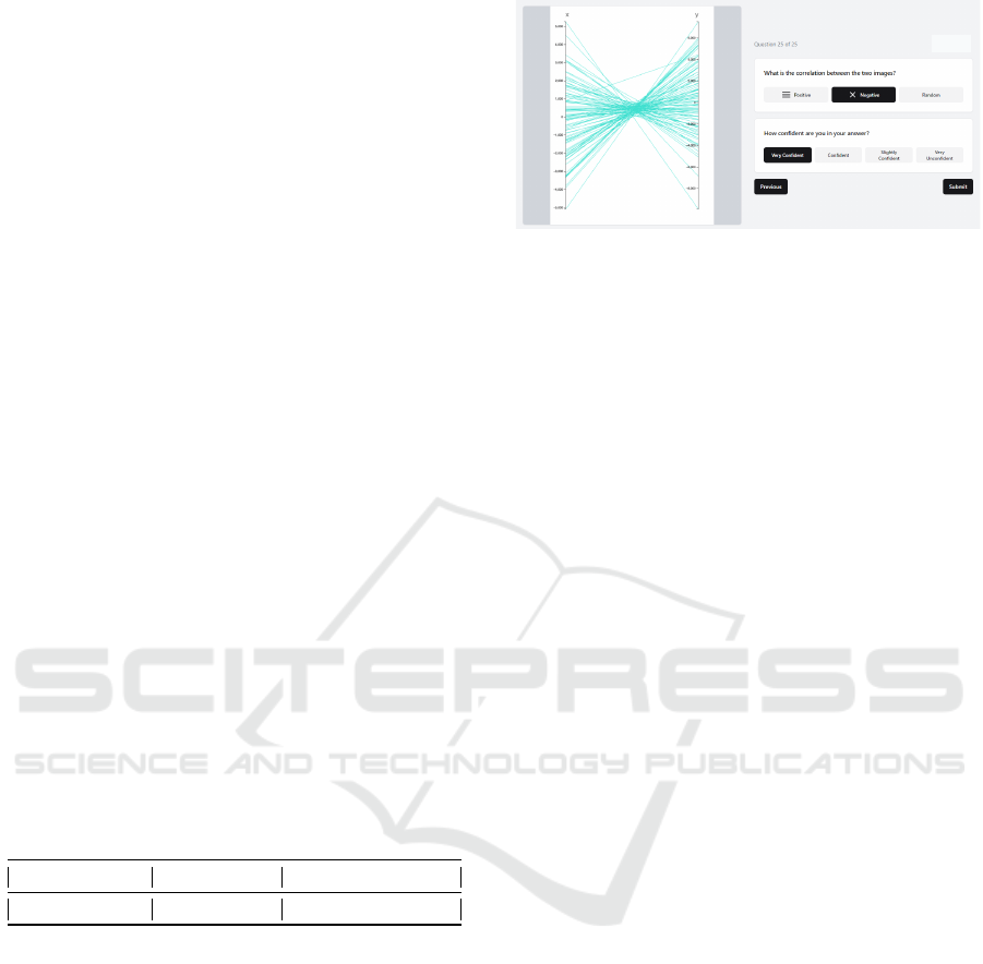
Figure 3: User study task. Participants were shown lines be-
tween two variables and had to judge the correlation based
on the line angles. Participants also had to rate their confi-
dence in their answers.
to every participant. After finishing the study, the re-
sults were imported into a database. Dropouts were
not recorded. After starting the study, participants had
to read an introduction to parallel coordinates, how
positive or negative correlation can be judged based
on the line angles (i.e., X-shape versus parallel lines),
and how a random distribution can be identified. Par-
ticipants then had to complete 25 tasks with randomly
selected images of parallel coordinates. An example
of one of the 25 tasks that participants had to solve
is shown in Figure 3. Participants also had to record
their confidence on a 4-point Likert scale for every
task. We pre-rendered parallel coordinate axes with
different sizes, aspect ratios, and correlation coeffi-
cients. The parameters we varied can be seen in Ta-
ble 2. Participants reported that completing the study
was easy and fast, and they did not report any issues.
3.2.2 Results
The user study results are summarized in Figure 4.
Participants performed best (i.e., achieved the lowest
error rate) for quadratic representations (aspect ratio
1:1). The error rate was also lower for 4:3 and 3:4
representations, as seen on the left side in Figure 4.
With longer (16:9) and more narrow (9:16) settings,
participants started to make more errors. The differ-
ence in the distribution of the correct and incorrect
answers was statistically significant for aspect ratios
1:1 and 9:16 (p < 0.0001). The difference was not
statistically significant for the other pairs of aspect ra-
tios. The error rate changes according to the corre-
lation value, as shown in Figure 4 on the right side.
Generally, the error rate was lower for negatively cor-
related variables and higher for positively correlated
variables. For negatively and positively correlated
variables, the error rate was lower for strong corre-
lations (< 0.9 and > 0.9). The confidence scores of
the participants were equally distributed for all aspect
ratios. Confidence, similar to error rate, more strongly
depends on the correlation.
IVAPP 2025 - 16th International Conference on Information Visualization Theory and Applications
996
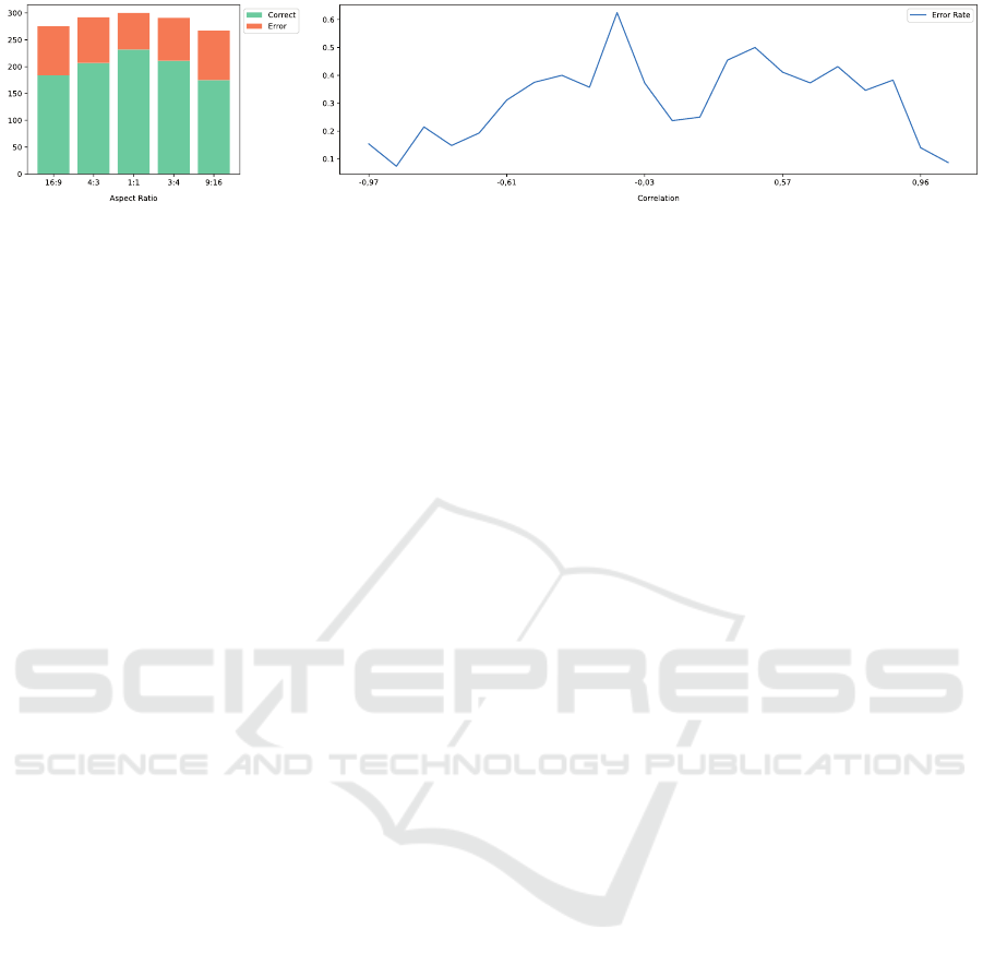
Figure 4: User study results. The ratio between correct and incorrect answers did not reveal big differences between the
tested aspect ratios (left plot). However, participants performed best for quadratic, 4:3, and 3:4 settings. The error rate is also
greatly influenced by the type of correlation (right plot). The error rate was generally lower for negatively correlated variables
(X-shape), independent of the aspect ratio.
4 RESULTS AND
INTERPRETATION
The statistical analysis revealed that angle parame-
ters stay more consistent among larger aspect ratios.
Aspect ratios were calculated as width divided by
height, so larger aspect ratios refer to landscape ori-
entation. In landscape-oriented plots, the angle pa-
rameters stay more consistent even under changing
sizes, while square or portrait-oriented plots behave
less predictably.
The results of the user study were less significant.
The results indicate that human observers’ detection
of angle parameters stays relatively consistent along
aspect ratios between 4:3 and 3:4. For more elongated
settings (16:9 and 9:16), participants started to make
more errors. The error rate is closely related to cor-
relation. Our results confirm earlier studies (Heinrich
and Weiskopf, 2015) where it was stated that nega-
tive correlation leads to a very strong visual pattern
in the plot, in contrast to a less pronounced pattern of
parallel lines in the case of a positive correlation.
For designers and programmers integrating paral-
lel coordinates into dashboards, we can present first
preliminary guidelines to rely on. Derived from our
statistical analysis and the user study, we suggest
to rely on landscape orientation and quadratic to
3:4/4:3 settings for the individual variable connec-
tions. Landscape orientations seem less prone to
abrupt changes in the angle parameters when the size
of the plot changes. The error rates of human ob-
servers were satisfactory for quadratic to 3:4/4:3 set-
tings for every two axes connections. In a responsive
or dynamically resizable parallel coordinate view, it
might be preferable only to allow landscape orienta-
tions, if possible.
Our results depict a first step towards a better un-
derstanding of properly integrating plots into dash-
board environments. Our study links to previous re-
search results on the banking to 45° rule for line
charts and studies on the effect of aspect ratio on
bar charts and scatterplots (as outlined in Section 2).
We strongly believe that further research is needed to
fully understand the effect of aspect ratios on paral-
lel coordinates and to make solid statements about
the optimal aspect ratio for a given plot. First of
all, we conducted both studies using relatively small
datasets. While this was sufficient to gain first results,
we would like to conduct further studies with larger
and more dense datasets. Also, the effect of cate-
gorical values on angle parameters needs to be un-
derstood better. Second, we did not study the effects
of line width, color, and other design decisions on the
perception of angles by human observers. Studies on
the perception of patterns in scatterplots under vary-
ing dot size and opacity exist (Strain et al., 2024), and
we would like to extend this knowledge by studying
similar effects for parallel coordinates.
5 CONCLUSION
We presented preliminary results of a statistical analy-
sis of angle parameters and a user study of the percep-
tion of angles in parallel coordinate plots under vary-
ing aspect ratios. From the statistical analysis, we can
derive that landscape-oriented plots tend to have more
consistent angle parameters even when changing the
plot size. From the user study we can derive that
human observers prefer almost quadratic settings for
the individual variable connections. Based on these
first results, we can suggest that dashboard designers
take care that parallel coordinate plots are presented
in landscape orientation.
We were generally surprised about the lack of
perception studies on parallel coordinates. Previous
studies compared the effectiveness of finding cor-
relations between scatter plots and parallel coordi-
nates (Li et al., 2010), studied the learning effect of
novice users (Siirtola et al., 2009), and identified bar-
Studying Parallel Coordinates Under Varying Aspect Ratios
997

riers for reading parallel coordinates (Srinivas et al.,
2024). However, profound perception studies of the
depiction of patterns in parallel coordinates under dif-
ferent circumstances are still missing. In the future,
we will continue our research on finding guidelines
for integrating parallel coordinates into multi-view
and desktop environments.
ACKNOWLEDGEMENTS
VRVis is funded by BMK, BMAW, Styria, SFG, Tyrol
and Vienna Business Agency in the scope of COMET
which is managed by FFG (No. 879730). The work
was funded by the project REINFORCE (FFG, No.
4141421).
REFERENCES
Antolini, F., Terraglia, I., and Cesarini, S. (2024). Inte-
grating multiple data sources to measure sustainable
tourism in Italian regions. Socio-Economic Planning
Sciences, 95:101959.
Bach, B., Freeman, E., Abdul-Rahman, A., Turkay, C.,
Khan, S., Fan, Y., and Chen, M. (2023). Dashboard
Design Patterns. IEEE Transactions on Visualization
and Computer Graphics, 29(1):342–352.
Ceja, C. R., McColeman, C. M., Xiong, C., and Franconeri,
S. L. (2021). Truth or Square: Aspect Ratio Biases
Recall of Position Encodings. IEEE Transactions on
Visualization and Computer Graphics, 27(2):1054–
1062.
Chen, X., Zeng, W., Lin, Y., AI-maneea, H. M., Roberts,
J., and Chang, R. (2021). Composition and Configu-
ration Patterns in Multiple-View Visualizations. IEEE
Transactions on Visualization and Computer Graph-
ics, 27(2):1514–1524.
Cibulski, L., May, T., Schmidt, J., and Kohlhammer, J.
(2023). COMPO*SED: Composite Parallel Coor-
dinates for Co-Dependent Multi-Attribute Choices.
IEEE Transactions on Visualization and Computer
Graphics, 29(10):4047–4061.
Cleveland, W. S. (1986). The Elements of Graphing Data.
The American Journal of Psychology, 99(3):443–448.
Conrow, L., Fu, C., Huang, H., Andrienko, N., Andrienko,
G., and Weibel, R. (2023). A conceptual frame-
work for developing dashboards for big mobility data.
Cartography and Geographic Information Science,
50(5):495–514.
Dasgupta, A. and Kosara, R. (2010). Pargnostics: Screen-
Space Metrics for Parallel Coordinates. IEEE Trans-
actions on Visualization and Computer Graphics,
16(6):1017–1026.
Deng, D., Wu, A., Qu, H., and Wu, Y. (2023). DashBot:
Insight-Driven Dashboard Generation Based on Deep
Reinforcement Learning. IEEE Transactions on Visu-
alization and Computer Graphics, 29(01):690–700.
Epperson, W., Wongsuphasawat, K., Whilden, A., Du, F.,
and Talbot, J. (2023). A Declarative Specification for
Authoring Metrics Dashboards. In Proceedings of the
IEEE Workshop Visualization in Data Science, VDS
’23, pages 6–10, Melbourne, Australia.
Fink, M., Haunert, J.-H., Spoerhase, J., and Wolff, A.
(2013). Selecting the Aspect Ratio of a Scatter
Plot Based on Its Delaunay Triangulation. IEEE
Transactions on Visualization and Computer Graph-
ics, 19(12):2326–2335.
Firat, E. E., Denisova, A., Wilson, M. L., and Laramee,
R. S. (2022). P-Lite: A study of parallel coordinate
plot literacy. Visual Informatics, 6(3):81–99.
Firat, E. E., Swallow, B., and Laramee, R. S. (2023). PCP-
Ed: Parallel coordinate plots for ensemble data. Visual
Informatics, 7(1):56–65.
Goudsmit, J., Otter, R. T. A., Stoter, I., van Holland,
B., van der Zwaard, S., de Jong, J., and Vos, S.
(2022). Co-Operative Design of a Coach Dash-
board for Training Monitoring and Feedback. Sensors
(Basel), 22(23):9073.
Hauser, H., Ledermann, F., and Doleisch, H. (2002). An-
gular brushing of extended parallel coordinates. In
Proceedings of the IEEE Symposium on Information
Visualization, INFOVIS ’02, pages 127–130, Boston,
MA, USA.
Heer, J. and Agrawala, M. (2006). Multi-Scale Banking to
45 Degrees. IEEE Transactions on Visualization and
Computer Graphics, 12(5):701–708.
Heinrich, J. and Weiskopf, D. (2013). State of the Art of
Parallel Coordinates. In Proceedings of 34th Annual
Conference of the European Association for Computer
Graphics - State of the Art Reports, EUROGRAPH-
ICS ’13, Girona, Spain.
Heinrich, J. and Weiskopf, D. (2015). Parallel Coordi-
nates for Multidimensional Data Visualization: Ba-
sic Concepts. Computing in Science & Engineering,
17(3):70–76.
Howe, C. Q. and Purves, D. (2005). Natural-scene geometry
predicts the perception of angles and line orientation.
Proceedings of the National Academy of Sciences of
the United States of America, 102(4):1228–1233.
Johansson, J. and Forsell, C. (2016). Evaluation of Paral-
lel Coordinates: Overview, Categorization and Guide-
lines for Future Research. IEEE Transactions on Vi-
sualization and Computer Graphics, 22(1):579–588.
Johansson, J., Forsell, C., Lind, M., and Cooper, M. (2008).
Perceiving Patterns in Parallel Coordinates: Deter-
mining Thresholds for Identification of Relationships.
Information Visualization, 7(2):152–162.
Kaur, G. and Karki, B. B. (2018). Bifocal Parallel Coordi-
nates Plot for Multivariate Data Visualization. In Pro-
ceedings of the 13th International Joint Conference
on Computer Vision, Imaging and Computer Graphics
Theory and Applications, IVAPP ’18, Funchal, Portu-
gal.
Kelleher, C. and Wagener, T. (1985). The plane with parallel
coordinates. The Visual Computer, 1:69–91.
Kelleher, C. and Wagener, T. (2011). Ten guidelines for
effective data visualization in scientific publications.
Environmental Modelling & Software, 26(6):822–827.
IVAPP 2025 - 16th International Conference on Information Visualization Theory and Applications
998

Kristiansen, Y. S., Garrison, L., and Bruckner, S. (2022).
Semantic Snapping for Guided Multi-View Visualiza-
tion Design. IEEE Transactions on Visualization and
Computer Graphics, 28(1):43–53.
Li, J., Martens, J.-B., and van Wijk, J. J. (2010). Judging
Correlation from Scatterplots and Parallel Coordinate
Plots. Information Visualization, 9(1):13–30.
Lin, Y., Li, H., Wu, A., Wang, Y., and Qu, H. (2024).
DMiner: Dashboard Design Mining and Recommen-
dation. IEEE Transactions on Visualization and Com-
puter Graphics, 30(7):4108–4121.
Lughbi, H., Mars, M., and Almotairi, K. (2024). A Novel
NLP-Driven Dashboard for Interactive CyberAttacks
Tweet Classification and Visualization. Information,
15(3):137.
Ma, R., Mei, H., Guan, H., Huang, W., Zhang, F., Xin,
C., Dai, W., Wen, X., and Chen, W. (2021). LADV:
Deep Learning Assisted Authoring of Dashboard Vi-
sualizations From Images and Sketches. IEEE Trans-
actions on Visualization and Computer Graphics,
27(9):3717–3732.
Matheus, R., Janssen, M., and Maheshwari, D. (2020).
Data science empowering the public: Data-driven
dashboards for transparent and accountable decision-
making in smart cities. Government Information
Quarterly, 37(3):101284.
McNutt, A., Kindlmann, G., and Correll, M. (2020). Sur-
facing Visualization Mirages. In Proceedings of the
SIGCHI Conference on Human Factors in Computing
Systems, CHI ’20, page 1–16, Honolulu, HI, USA.
Midway, S. R. (2020). Principles of Effective Data Visual-
ization. Patterns, 1(9):100141.
Pandey, A., Srinivasan, A., and Setlur, V. (2023). MED-
LEY: Intent-based Recommendations to Support
Dashboard Composition. IEEE Transactions on Visu-
alization and Computer Graphics, 29(1):1135–1145.
Qu, Z. and Hullman, J. (2018). Keeping Multiple Views
Consistent: Constraints, Validations, and Exceptions
in Visualization Authoring. IEEE Transactions on Vi-
sualization and Computer Graphics, 24(1):468–477.
Rickman, J. M. (2018). Data analytics and parallel-
coordinate materials property charts. npj Computa-
tional Materials, 4:5.
Sahann, R., Gajic, I., M
¨
oller, T., and Schmidt, J. (2021). Se-
lective Angular Brushing of Parallel Coordinate Plots.
In Proceedings of EuroVis Short Papers, EuroVis ’21,
Zurich, Switzerland.
Sarikaya, A., Correll, M., Bartram, L., Tory, M., and Fisher,
D. (2019). What Do We Talk About When We Talk
About Dashboards? IEEE Transactions on Visualiza-
tion and Computer Graphics, 25(1):682–692.
Setlur, V., Correll, M., Satyanarayan, A., and Tory, M.
(2024). Heuristics for Supporting Cooperative Dash-
board Design. IEEE Transactions on Visualization
and Computer Graphics, 30(1):370–380.
Siirtola, H., Laivo, T., Heimonen, T., and R
¨
aih
¨
a, K.-J.
(2009). Visual Perception of Parallel Coordinate Vi-
sualizations. In Proceedings of the 13th International
Conference Information Visualisation, IV ’09, pages
3–9, Barcelona, Spain.
Soni, P., de Runz, C., Bouali, F., and Venturini, G. (2024). A
survey on automatic dashboard recommendation sys-
tems. Visual Informatics, 8(1):67–79.
Srinivas, C., Firat, E. E., Laramee, R. S., and Joshi, A.
(2024). An Inductive Approach for Identification of
Barriers to PCP Literacy. In IEEE VIS Workshop on
Visualization Education, Literacy, and Activities, Edu-
VIS ’24, St. Pete Beach, FL, USA.
Strain, G., Stewart, A. J., Warren, P. A., and Jay, C. (2024).
Effects of Point Size and Opacity Adjustments in
Scatterplots. In Proceedings of the SIGCHI Confer-
ence on Human Factors in Computing Systems, CHI
’24, Honolulu, HI, USA.
Talbot, J., Gerth, J., and Hanrahan, P. (2011). Arc Length-
Based Aspect Ratio Selection. IEEE Transactions on
Visualization and Computer Graphics, 17(12):2276–
2282.
Talbot, J., Gerth, J., and Hanrahan, P. (2012). An Em-
pirical Model of Slope Ratio Comparisons. IEEE
Transactions on Visualization and Computer Graph-
ics, 18(12):2613–2620.
Wang, Y., Wang, Z., Fu, C.-W., Schmauder, H., Deussen,
O., and Weiskopf, D. (2019). Image-Based Aspect
Ratio Selection. IEEE Transactions on Visualization
and Computer Graphics, 25(1):840–849.
Wang, Y., Wang, Z., Zhu, L., Zhang, J., Fu, C.-W., Cheng,
Z., Tu, C., and Chen, B. (2018). Is there a robust tech-
nique for selecting aspect ratios in line charts? IEEE
Transactions on Visualization and Computer Graph-
ics, 24(12):3096–3110.
Ware, C. (2012). Information Visualization: Perception for
Design. Morgan Kaufmann Publishers Inc.
Wei, Y., Mei, H., Zhao, Y., Zhou, S., Lin, B., Jiang, H., and
Chen, W. (2020). Evaluating Perceptual Bias During
Geometric Scaling of Scatterplots. IEEE Transactions
on Visualization and Computer Graphics, 26(1):321–
331.
Wexler, S., Shaffer, J., and Cotgreave, A. (2017). The Big
Book of Dashboards: Visualizing Your Data Using
Real-World Business Scenarios. John Wiley & Sons,
Inc.
Wu, A., Wang, Y., Zhou, M., He, X., Zhang, H., Qu, H., and
Zhang, D. (2022). MultiVision: Designing Analytical
Dashboards with Deep Learning Based Recommen-
dation. IEEE Transactions on Visualization and Com-
puter Graphics, 28(1):162–172.
Zeng, W., Chen, X., Hou, Y., Shao, L., Chu, Z., and
Chang, R. (2024). Semi-Automatic Layout Adapta-
tion for Responsive Multiple-View Visualization De-
sign. IEEE Transactions on Visualization and Com-
puter Graphics, 30(7):3798–3812.
Zhang, Y., Sun, Y., Gaggiano, J. D., Kumar, N., Andris, C.,
and Parker, A. G. (2023). Visualization Design Prac-
tices in a Crisis: Behind the Scenes with COVID-19
Dashboard Creators. IEEE Transactions on Visualiza-
tion and Computer Graphics, 29(1):1037–1047.
Zhuang, M., Concannon, D., and Manley, E. (2022). A
Framework for Evaluating Dashboards in Healthcare.
IEEE Transactions on Visualization and Computer
Graphics, 28(4):1715–1731.
Studying Parallel Coordinates Under Varying Aspect Ratios
999
